Arch Daily |
- House RM / SALWORKS
- La Seine Musicale / Shigeru Ban Architects
- DYEJI / Costa Lopes
- APARAT Headquarters / Qastic
- New Collectivism / O-office Architects
- SOI 16 / STUDIO PLP
- Tower of Wood: The EY Centre / fjmt
- Kai-Uwe Bergmann on How BIG is Changing to Keep Up with Their Meteoric Growth
- VA House / Eduardo Parra Grave
- SHoP Selected to Design Campus for Fulbright University Vietnam in Ho Chi Minh City
- Magasinet / Sweco Architects
- 3XN to Helm Design of World's Largest Fish Market in Sydney
- OZ House / Stanley Saitowitz | Natoma Architects
- "Faith Estates" Proposes a New Approach to Religious Pilgrimage by Excavating Holy Sites
- Transformation of a Townhouse / Wuelser Bechtel Architekten
- From Foundations to Roofs: 10 Detailed Wood Construction Solutions in 3D and 2D
- Aedas Unveils Dragon-Inspired Complex Design in Zhuhai, China
- LODOVNIA Ice Cream Shop / mode:lina architekci
| Posted: 27 Jun 2017 10:00 PM PDT  Courtesy of SALWORKS Courtesy of SALWORKS
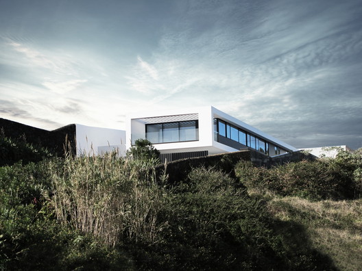 Courtesy of SALWORKS Courtesy of SALWORKS From the architect. Exposed to the South the RM House floats over the city of Ponta Delgada and the sea.  Courtesy of SALWORKS Courtesy of SALWORKS The shape of the lot, narrow and rectangular, with a strong slope, and its direction along the longitudinal axis North-South defines decisively the design of the RM House. 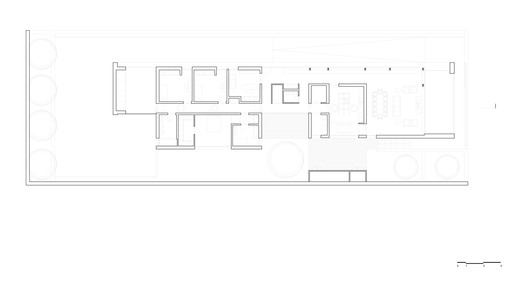 Plan Plan A retaining wall in structural concrete supports the house and with its last section in console ensures privacy and distance from the public road just below. 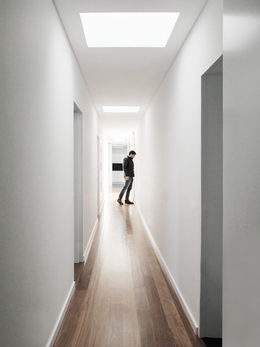 Courtesy of SALWORKS Courtesy of SALWORKS The base plan, clearly familiar and on one floor, explores the most of this deployment, dividing the home in the central axis, organizing the entry and a private courtyard in the West. In the North are the individual rooms and the suite areas. In the South are the support areas, the kitchen and the common room.  Courtesy of SALWORKS Courtesy of SALWORKS A passage to the East connects the main entrance to the social area and guarantees a view of the town and the mountains, finishing in an outdoor patio, in a console opened to the sea, which ensures a leisure place linked to the main room of the House. 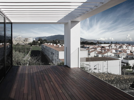 Courtesy of SALWORKS Courtesy of SALWORKS The reflected light in the white exterior walls on the North and West expands the boundaries of the surrounding. 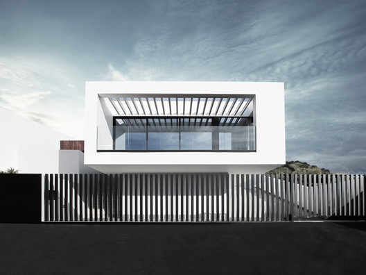 Courtesy of SALWORKS Courtesy of SALWORKS The privacy guaranteed by the deployment of the House, the use of the light as a central element for each space defines a spatial positive daily experience. 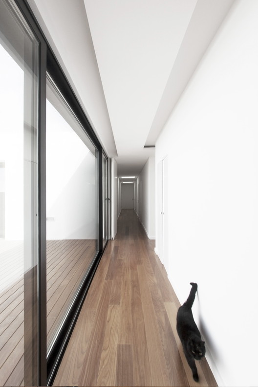 Courtesy of SALWORKS Courtesy of SALWORKS This posting includes an audio/video/photo media file: Download Now |
| La Seine Musicale / Shigeru Ban Architects Posted: 27 Jun 2017 08:00 PM PDT  © Boegly + Grazia photographers © Boegly + Grazia photographers
 Courtesy of Shigeru Ban Architects Courtesy of Shigeru Ban Architects From the architect. The site was not selected by chance. It is an island in the middle of the Seine–the centre of the region–the beating heart of the Vallée de la Culture in Hauts- de-Seine. With La Seine Musicale, Seguin Island has become its beacon.  Courtesy of Shigeru Ban Architects Courtesy of Shigeru Ban Architects Beyond the metaphor, it is also a reality. Firstly, the name: La Seine Musicale. It links music, an art that touches our souls and brings them together at each concert, to the river that shapes our region, and carries us well beyond it. The name calls to mind both its local foundation and its international outreach. The name speaks to us all. There is also the architecture, recognizable and remarkable, created by Shigeru Ban and Jean de Gastines, who have admirably ful lled the wish of the Department and its partners to offer a place that is both ambitious and welcoming.  Courtesy of Shigeru Ban Architects Courtesy of Shigeru Ban Architects  Section Section  Courtesy of Shigeru Ban Architects Courtesy of Shigeru Ban Architects Last but not least, it is a cultural facility that is opening its doors: a place for live performance, emotions, and leisure, which also provides space to talented artists in residence (Laurence Equilbey and Insula Orchestra, Gaël Darchen and La Maîtrise des Hauts-de-Seine, Philippe Jaroussky and his Académie Musicale).  Courtesy of Shigeru Ban Architects Courtesy of Shigeru Ban Architects A place for life, where the extraordinary meets the everyday: the auditorium, the modular main hall, the garden, the unen- closed boutiques, and the numerous venues for musicians including spaces for ensembles in residence, rehearsal studios and the like...  Courtesy of Shigeru Ban Architects Courtesy of Shigeru Ban Architects Whether novice, curious passer-by, artist, initiate, adult, child, enthusiast or professional, everyone can meet and share their emotions at La Seine Musicale.  Courtesy of Shigeru Ban Architects Courtesy of Shigeru Ban Architects In order to see the light of day, the La Seine Musicale project needed to bring together skill, commitment, and ambition. It is rstly thanks to the support of the City of Boulogne-Billancourt and its mayor, Pierre-Christophe Baguet.  Courtesy of Shigeru Ban Architects Courtesy of Shigeru Ban Architects  Plan GF Plan GF  Courtesy of Shigeru Ban Architects Courtesy of Shigeru Ban Architects La Seine Musicale is equally the object of a partnership contract that has united the Department des Hauts-de-Seine andTempo-Île Seguin since 2013.  Courtesy of Shigeru Ban Architects Courtesy of Shigeru Ban Architects Music, song, applause, pregnant pauses, children's laughter... La Seine Musicale is ready to receive its audiences and to resonate with a thousand sounds.  Courtesy of Shigeru Ban Architects Courtesy of Shigeru Ban Architects This posting includes an audio/video/photo media file: Download Now |
| Posted: 27 Jun 2017 07:00 PM PDT  © Fabrice Fouillet © Fabrice Fouillet
 © Fabrice Fouillet © Fabrice Fouillet From the architect. The urban border of Luanda bay has been continued to Cape Island, remote origin of the city and, for a long time, local fishing community and Luanda recreational point. The new landfills on the island's inner front give it a new urbanity, amongst the unobstructed views of the city center.  © Fabrice Fouillet © Fabrice Fouillet The Dyeji Building is located in one of the most central blocks of Parcel 3 of the new embankments, between a set of 57 lots (from the Hotel Marinha to the Nautical Club), in the zone of greater narrowing of the Island. Altough conditioned by the respective plan, it responds to a housing program and some tertiary, enhances the privileged visual exposure and, above all, seeks to help build the new front of the Island.  © Fabrice Fouillet © Fabrice Fouillet The 8 floors of 28 apartments are built from the basement of the gallery, which is fluido ver the surrounding area and is destined to a tertiary (shops and offices). The functional rationality of the apartments is complemented by bellows fronts, which are very vibrant, resulting from the overlap of floors and expressive capacity of the angled balances of the reinforced concrete structure. Thus, on each floor, a very glassy facade is allowed on the landscape, which, when distended on terraces with brises-soleil, ensures environmental and exterior meditation of living, and accentuates the building expression.  © Fabrice Fouillet © Fabrice Fouillet  Section Section  © Fabrice Fouillet © Fabrice Fouillet On the whole, there is a desire to have a strong urban presence on the new horizon of Cape Island and, above all, to make a city.  © Fabrice Fouillet © Fabrice Fouillet This posting includes an audio/video/photo media file: Download Now |
| Posted: 27 Jun 2017 03:00 PM PDT  © Deed studio © Deed studio
 © Deed studio © Deed studio From the architect. The initial concept of APARAT Headquarters (known as the YouTube of Iran), was established by two fundamental questions. First, we analyzed how we can re-define and create an open Space that fosters a conductive collaboration between employees within an existing building. Second, we explored creating Subspaces for independently operating offices which can take advantage of potential interactions through a series of interconnected common areas within the office environment.  © Deed studio © Deed studio Conceptual Gap  Courtesy of Aparat Courtesy of Aparat  Diagram Diagram Event  © Deed studio © Deed studio  Schematic Section Schematic Section  © Deed studio © Deed studio Moment  © Deed studio © Deed studio  Ground and First Floor Plan Ground and First Floor Plan  © Deed studio © Deed studio This posting includes an audio/video/photo media file: Download Now |
| New Collectivism / O-office Architects Posted: 27 Jun 2017 01:00 PM PDT  © Chaos.Z © Chaos.Z
 © Chaos.Z © Chaos.Z From the architect. Collectivism had been one of the core spirits that motivated contemporary China's modernisation, despite its relation with politically mandatory. The current social condition of fragmentation and individualisation caused by comprehensive, rapid urbanisation has seemingly diluted that former ideology.  © Chaos.Z © Chaos.Z This new staff dorm-building gave the architect a unique opportunity to construct a new collectivist form of living in Vanke's Song Shan Hu Building Industrialization Research Centre. The 96-by-30-meter rectangular building site locates at the south-east corner of the centre, neighbouring another type of collectivist dwelling form, the primitive urban fabric evolved from former villages, lying outside the site boundary. The design task was to building a congregate dormitory to offer mainly weekday living studio to 155 staff, from security guards to technical specialists working in the research centre. The dorm building includes standard dormitory rooms, public dining spaces, gymnasium, library and other necessary facilities. Application of Vanke's prefab reinforced concrete frame system, as well as a series of related new eco-building technology to this building is one of the basic demands from Vanke. The completed building contains 5 floors, on a 89.2 metre (east-west) by 9.1 metre (north-south) footprint.  © Chaos.Z © Chaos.Z  Plans Plans  © Chaos.Z © Chaos.Z The volume of the basic living unit limits in a standard module of 3.6Mx7.2Mx2.95M defined by the prefab structural system. There are three interior types, single room, twin room and 4-bed room. The total 55 living units are constructed in 3-floor volume, named Habita. The south facade of Habita is constituted by prefab private balconies for all units, while 5 big open steel boxes, public living spaces on different floors, are hung on the north facade, over-looking the entire research centre site. Public facilities are formulated into an L-shape timber volume, the Mount, which grows from the ground level to public dining room on the top. "Mount" is not only a metaphor. A climbing wall combined with Vanke's green-wall is built directly on its east facade. The Mount volume discontinues on the ground floor, leaving a 24 metres' shaded open space. A small hill, stacked with prefab concrete blocks, grows from the landscaping ground and creates an informal outdoor theatre in the covered space. The part of ground Mount volume on the west side contains the library and gymnasium. Between its roof and the Habita volume is a quiet recreational space. Staircases, elevator, corridors and bridges circulate the whole building into a vertical micro-community.  © Chaos.Z © Chaos.Z  © Chaos.Z © Chaos.Z The collectivism here becomes a vivid and spontaneous gathering, initiated from simple social and architectural concept.  © Chaos.Z © Chaos.Z This posting includes an audio/video/photo media file: Download Now |
| Posted: 27 Jun 2017 12:00 PM PDT  © W Workspace © W Workspace
 © W Workspace © W Workspace From the architect. SOI 16 is a pub and music venue in the famous night life street known as Walking Street in Pattaya, Thailand. Influenced by the essence of Thai architectural design, triple- gables are used as the main structure of the building, along with clay roof tiles lining the front gable. The check and stripy façade, borrowed from the pattern of the Pa Kao Ma (traditional Thai sarong), plays well with the mess of electricity wires in front of the site.  © W Workspace © W Workspace "Our intention was to make this building like a street Thai Sala, combining many fun Thai gimmicks and cultural characteristics," the architect said.  Concept Concept Once visitors step inside, they are immediately notice the fun and cheerful atmosphere that was inspired by the lively environment of a traditional Thai fresh market. The seats are made out of fruit crates, the DJ booth is based on a truck that delivers fruit to the fresh market, while the tables are made from road signs. The kitchen and cashier areas are designed to look like market stalls, while the typography used throughout the club was inspired by the font used on the stickers that are ubiquitous to delivery trucks in Thailand. All of these quirky details reflect the fresh market theme.  © W Workspace © W Workspace  Section Section  © W Workspace © W Workspace The design of the club's restrooms is influenced by market butchers, with white and red tiles, neon signs of meat, fish and poultry, and a general atmosphere like the interior of a giant fridge. The restroom signs are Sita and Hanuman, famous characters from the Ramayana.  © W Workspace © W Workspace Continuing the local theme, the stairs leading to the upstairs mezzanine section of the club feature iridescent metal railings inspired by the chrome motorcycles favoured by Thai teens. The upstairs Sports Bar features pool tables and booths designed like tuk-tuk seats, but in colours that are more contemporary and chic.  © W Workspace © W Workspace SOI 16 mixes and matches aspects of local Thai street culture in a fun and playful way. This idea is reflected in the first thing that visitors see from outside the club – the bright neon "Soi 16" sign amusingly clashing with the exterior architecture! The subtle and not-so-subtle details clash and combine to make a truly modern yet local space – a space that puts well-known local details into a new context, resulting in a fun, familiar yet surprising spot for socialising.  © W Workspace © W Workspace This posting includes an audio/video/photo media file: Download Now |
| Tower of Wood: The EY Centre / fjmt Posted: 27 Jun 2017 10:00 AM PDT  © Brett Boardman © Brett Boardman
 © Rodrigo Vargas © Rodrigo Vargas From the architect. At the heart of this project is both workplace design and city making. We have sought to make a building that reinterprets and honours the uniqueness and history of this place, positioned at the edge of Sydney's Tank-Stream (the first water source of the colony of New South Wales).  Axonometric Axonometric We envisaged a different type of city tower; warm, human and responsive, to create a healthy and sustainable workplace.  © Gareth Hayman © Gareth Hayman A Tower Rising from the Sandstone of the Old Shoreline The beautiful Yellow Block sandstone on which this City and our site rests was quarried and blocked, and is used to clad the core of the new tower, rising from the earth to form the spine of the new tower.  © Brett Boardman © Brett Boardman Into this sandstone is carved a beautiful artwork by Aboriginal artist Judy Watson. It is a work deep in meaning and interpretation of the rich cultural history of the site. The ground of the new building, kiosk and public space is formed in stone, curved and folded up to create steps, and a place to display the site's archaeological findings from Sydney's colonial and Victorian-era.  © Brett Boardman © Brett Boardman A bronze line has been incised through the floor of the public domain and into the lobby, marking the edge of the water from the pre-european estuary.  Foyer RCP Foyer RCP Forming a soft edge to the street and public foyer is a suspended awning of folded timber planes reaching out, protecting the footpath and reflecting light into the lobby interior. This gently curving and folding awning is like a row of trees providing shelter at the edge of the tank stream.  © Demas Rusli © Demas Rusli A Tower of Wood This is achieved through a facade made from multiple layers. The outer layer is a single sheet of low iron clear glass, behind which is a layer of automated louvres of natural timber, located within a sealed, air-pressured cavity that is clean and dust free, and finally the inner layer is a double glazed high performance insulating unit.  © Brett Boardman © Brett Boardman The result is a facade that outperforms any of the surrounding grey glass buildings and looks nothing like them. It is clear and transparent and the natural colour of the wood glows in the sun.  Section (North-South) Section (North-South) In essence, 200 George Street is a building made of traditional materials, stone, wood and glass; material that we have been building with for thousands of years, but here unitising the most advanced technology systems.  © Brett Boardman © Brett Boardman A Responsive Workplace Tower  © Brett Boardman © Brett Boardman Importantly the envelope is a responsive skin, a kinetic architecture, adjusting automatically to the position of the sun and time of day to control heat load and sky glare. This progressively adjusting timber screen filters the light into a warm timber glow reaching deep into the interior.  © Sandor Duzs © Sandor Duzs From outside, the building changes in appearance as the sun moves, the western facade clear and open in the morning and more closed and timber in appearance in the afternoon.  © Brett Boardman © Brett Boardman We have looked carefully at the history and great richness of this place and tried to both reveal and deepen it, despite the presence of a large building on a tight site in the heart of the city.  © Brett Boardman © Brett Boardman In this increasingly global context and the international city that Sydney is, this is a work of Australian Design; a collaboration of Australian architects, designers, consultants, artists, furniture designers and manufacturers, contractors and developers. We have tried to make our competing global city more desirable and competitive through making it more unique and true to itself.  © Mark Merton © Mark Merton This posting includes an audio/video/photo media file: Download Now |
| Kai-Uwe Bergmann on How BIG is Changing to Keep Up with Their Meteoric Growth Posted: 27 Jun 2017 09:30 AM PDT  VIΛ 57 West, New York City. Image © Nic Lehoux VIΛ 57 West, New York City. Image © Nic Lehoux BIG is getting even bigger. The firm's ever expanding project load – since just last fall, 6 projects have been completed with 7 more under construction – has prompted some major changes and expansions, including the establishment of an in-house engineering department in March and the continued development of the think tank research group, BIG IDEAS. In this profile for Building Design in Construction Network, BIG Managing Partner and Head of Global Business Development Kai-Uwe Bergmann discusses the upcoming move of the firm's New York office into their new 52,000-square-foot offices in the Brooklyn neighborhood of Dumbo – a space more than double their current location in lower Manhattan – and the shifting role of the practice's founder and charismatic front man, Bjarke Ingels.  8 House, Copenhagen. Image © Bjarne Tulinius 8 House, Copenhagen. Image © Bjarne Tulinius Highlights from the article include Ingels' worry about his public identity – "But Ingels is also aware of the hazards of publicity: in a recent freewheeling profile in Rolling Stone magazine, he expressed concern that a segment about BIG on "60 Minutes" made him look like a 'salesman.'" – and Bergmann's opinion of Ingels' role in the office: "Despite his indefatigable pace and commitments, Ingels remains involved in every project, and Bergmann portrays him as 'the conductor of a symphony.'" Read the full profile and get caught up on their projects' recent progress here.
This posting includes an audio/video/photo media file: Download Now |
| VA House / Eduardo Parra Grave Posted: 27 Jun 2017 08:00 AM PDT  © César Béjar © César Béjar
 © César Béjar © César Béjar From the architect. The family that lives in the house, chose this part of the forest seeking direct contact with nature.  © César Béjar © César Béjar Lovers of the outdoor life and of receiving visits, were conditioned terraces, balconies, patios and roofs. At the street level rises a single level, respecting the scale of the neighbors. In the back rise 5 levels, reaching the same height of the trees that existed.  © César Béjar © César Béjar The ground floor is free of walls. At 5 meters under the street is the house entrance, parking spaces and a double height dining room. The kitchen and guest bedroom, with privacy towards the street protected by a green slope and looking for the sun with large windows and open towards the forest. It connects to the wine cellar and access to a covered glass pergola to see trees protected from the rain, with a barbecue for outdoor meals and a pool under the frond of the trees.  Ground Floor Plan Ground Floor Plan The upper floor is the intimate area of the house, the bedrooms have a balcony running over the trees that even cross it.  © César Béjar © César Béjar The roof is prepared as a meeting point, at the height of the treetops and a viewpoint overlooking the forest towards the valley.  © César Béjar © César Béjar To avoid the humidity the house does not have contention walls, it displaces on a free platform.  Section Section To have privacy the facade facing the street is almost a blind wall, to the sides and back of the house is completely of glass to receive the sun and have a view towards the forest.  © César Béjar © César Béjar Marble and hardwood were used on floors, stone as exterior coatings and wood to cover interior walls to help the fireplace increase the temperature.  © César Béjar © César Béjar This posting includes an audio/video/photo media file: Download Now |
| SHoP Selected to Design Campus for Fulbright University Vietnam in Ho Chi Minh City Posted: 27 Jun 2017 07:15 AM PDT  Downtown Ho Chi Minh City, where FUV's second campus will be located. Image © Pixabay user dMz. Licensed under CC0 Public Domain Downtown Ho Chi Minh City, where FUV's second campus will be located. Image © Pixabay user dMz. Licensed under CC0 Public Domain SHoP Architects has been selected as lead master planners and designers of the campus for Fulbright University Vietnam (FUV) to be located in Ho Chi Minh City, Vietnam. The new university, announced in 2016 by President Obama on his visit to the country, is Vietnam's first independent, non-profit institution of higher education. The university was established with the goal of offering innovative teaching programs and impactful research that will serve the country's continued development and finding solutions to the large problems facing Vietnam and the world.  Saigon Hi-Tech Park, site of FUV's future main campus. Image © Wikimedia user Nguyễn Thanh Quang. Licensed under CC BY-SA 3.0 Saigon Hi-Tech Park, site of FUV's future main campus. Image © Wikimedia user Nguyễn Thanh Quang. Licensed under CC BY-SA 3.0 SHoP was selected as the winner of the competition for the masterplan and design ahead of more than a dozen internationally-reputable firms. The campus will split across two sites within Ho Chi Minh City: a 25-hectare (62-acre) main campus at the Saigon High Tech Park in District 9 and a one-hectare (2.5-acre) downtown campus in District 7, which will focus on professional education and advancing public connections. "Working with the FUV team from the ground up to develop the university's programs and spaces is an incredible honor and just the sort of challenge we thrive on," SHoP Principal Gregg Pasquarelli said. "The best buildings and public spaces often come from a process where architects are given the chance to push the envelope beyond traditional design services." Work on the project has already begun, with the first facilities anticipated to open in 2018. News via SHoP.
This posting includes an audio/video/photo media file: Download Now |
| Posted: 27 Jun 2017 06:00 AM PDT  © Per Eriksson © Per Eriksson
 © Per Eriksson © Per Eriksson From the architect. Magasinet is a cultural center in Falun situated in an old. On behalf of Kulturföreningen Magasinet, Sweco's architects in Falun were given the opportunity to design a new extension. The vision was to exhibit the entrance and provide space for the wardrobe, which had previously taken an overly large area. The building has got a modern design language, which is in line with the multifaceted cultural activities that are currently being conducted in the magazine. Form plays with the old buildings roof landscape and coincides with the roof angle of the building.  © Per Eriksson © Per Eriksson Inside, the rooms are filled with light from the skylights and the walls consist of white painted wood paneling with ground concrete flooring. The external material is banded black plate on both walls and ceilings. The new entrance building has been cautiously docked to the magazine, and you clearly see the transition between the new building and the Magasin's hot red brick walls.  © Per Eriksson © Per Eriksson  Section Section  © Per Eriksson © Per Eriksson Magasinet was built in 1898 as a storage hall for the railroad. Today it is a center for cultural events. The building is owned by the cultural association Magasinet as office, film and photo studio and as a venue for exhibitions and concerts.  © Per Eriksson © Per Eriksson  Ground Floor Plan Ground Floor Plan  © Per Eriksson © Per Eriksson This posting includes an audio/video/photo media file: Download Now |
| 3XN to Helm Design of World's Largest Fish Market in Sydney Posted: 27 Jun 2017 05:15 AM PDT  © 3XN © 3XN Danish practice 3XN Architects has revealed design plans for what will be the world's largest fish market in Sydney, Australia. Selected from a submission pool of more than 60 international design studios, 3XN's design will relocate the existing Syndey Fish Market from its location in Pyrmont to a nearby wharf in Blackwattle Bay on Bridge Road in Glebe, creating a new food and dining destination on the Sydney inner harbor. "Sydney Fish Market is a beloved institution among Sydneysiders, Australians and international visitors," said Sydney Fish Market General Manager Bryan Skepper. "Therefore, it was integral to select a design team that will modernise and improve the site whilst recognising its longstanding heritage and retaining the authentic experience that attracts customers and visitors."  © 3XN © 3XN "Danish designers delivered the iconic Sydney Opera House and we have great expectations that the Danes will deliver again with an iconic new Sydney Fish Market. We're inspired by 3XN's credentials and are excited to work with them to see our redevelopment vision come to life." The architects focused on community building and placemaking as core principles, resulting in a scheme described by UrbanGrowth NSW Head of Projects Portfolio, Barry Mann, as "dynamic, sustainable, and sympathetic to the local area." "We are incredibly excited to be working with UrbanGrowth NSW and Sydney Fish Market to create not just an authentic fish market, but an iconic destination for Australia," said 3XN Architects Creative Director and Founding Partner Kim Herforth Nielsen. "We place people at the centre of any architectural response, with an emphasis on place-making to foster a strong sense of community." The project will be carried out by a collaborative design consortium that includes sustainability engineers GXN, Sydney firm BVN as executive architect, landscape architects Aspect Studios, and public art specialist WallnerWeiss. The new fish market project is estimated to cost over $250 million – an amount the NSW government believes "will be offset by [the] mixed-use development on the site of the present fish market and car park." More detailed draft designs of the fish market will be revealed later this year for public comment. Construction is slated to begin in late 2018. News via 3XN.
This posting includes an audio/video/photo media file: Download Now |
| OZ House / Stanley Saitowitz | Natoma Architects Posted: 27 Jun 2017 04:00 AM PDT  © Bruce Damonte © Bruce Damonte
 © Bruce Damonte © Bruce Damonte From the architect. The site is a hilltop in Atherton, accessed via the winding Ridgeview Drive, ending in a circular cul de sac. The entry gate is framed by a concrete wall from which the house number, 96, is incised. Once inside, views in other directions unfold, and in the distance, the skyline of San Francisco framed by the entry canopy.  © Bruce Damonte © Bruce Damonte  © Bruce Damonte © Bruce Damonte Two L shapes bars balance on top of each other creating courts and overhangs, de ning indoor and outdoor spaces with bridges and cantilevers.  © Bruce Damonte © Bruce Damonte  1st Floor Plan 1st Floor Plan  © Bruce Damonte © Bruce Damonte  2nd Floor Plan 2nd Floor Plan  © Bruce Damonte © Bruce Damonte Services are solid elements which comb the space with walls of mechanism and storage oating within the open lines of the bars.  © Bruce Damonte © Bruce Damonte The basement is for family play and casual entertaining, opening to a large grassed area below. A light court carved into the ground illuminates the other side of the L. Above is the main level for formal entertaining which cantilevers over the basement and looks to the city view. Dining, kitchen and family areas are in the other leg of the L, where stairs go up to the bedroom L, inverted and oating above. The leg facing the city view is the master, cantilevered over the wing below creating an outdoor room, the other leg are four children's suites, connected by an of ce, sitting area and laundry, and bridging a void below which connects to the garages.  © Bruce Damonte © Bruce Damonte The house is a reduced expression of sheer material and absolute form where connections and inter- sections are minimized to non-existence, cast almost of a single piece, like an iPhone.  © Bruce Damonte © Bruce Damonte The building threads and weaves, making holes in things, or making things that make holes in things that are not. The bars twist and fold, cross and loop, bridge and divide. At the intersections are vertical connections. These abstract geologies do not impose, but expose, expanding the realm of space and diminishing the role of form.  © Bruce Damonte © Bruce Damonte The interest is in transparency and lightness contrasted with solidity and mass, folded on themselves, slipping and sliding through space as they frame and connect.  © Bruce Damonte © Bruce Damonte This posting includes an audio/video/photo media file: Download Now |
| "Faith Estates" Proposes a New Approach to Religious Pilgrimage by Excavating Holy Sites Posted: 27 Jun 2017 02:30 AM PDT  Machaerus religious development. Image © Akarachai Padlom, Eleftherios Sergios, Nasser Alamadi Machaerus religious development. Image © Akarachai Padlom, Eleftherios Sergios, Nasser Alamadi In a time of what seems to be ever-increasing religious and political conflict, Bartlett students Akarachai Padlom, Eleftherios Sergios, and Nasser Alamadi instead chose to focus on collaboration between religions in their thesis project entitled "Faith Estates," which outlines a new method of mass religious tourism. In an area around the Dead Sea characterized by disputed boundaries and conflicting ownership claims, the group aims to reimagine the relationship between the world's three monotheistic religions, but also to rethink the relationship between religion, tourism, and the landscape. The design consists of large-scale excavation sites which form tourist resorts along a pilgrimage route with the goal of forming a mutually beneficial relationship.  Machaerus development. Image © Akarachai Padlom, Eleftherios Sergios, Nasser Alamadi Machaerus development. Image © Akarachai Padlom, Eleftherios Sergios, Nasser Alamadi The proposed pilgrimage route runs from Machaerus, Jordan, down to the shore of the Dead Sea, and across to the West Bank, with sites spread along the way combining archaeological excavation with mass leisure tourism. The excavation sites employ forced sightlines to create a visual connection to either Machaerus or Jerusalem by facing the V-shaped excavation voids in the chosen direction. By literally disrupting the land, the project gives it life and animation, thereby breaking some of the restrictive bonds placed upon nature by politics and legal disputes.  The processional route toward the Dead Sea. Image © Akarachai Padlom, Eleftherios Sergios, Nasser Alamadi The processional route toward the Dead Sea. Image © Akarachai Padlom, Eleftherios Sergios, Nasser Alamadi  Elevation of the Dead Sea development with Machaerus at the top. Image © Akarachai Padlom, Eleftherios Sergios, Nasser Alamadi Elevation of the Dead Sea development with Machaerus at the top. Image © Akarachai Padlom, Eleftherios Sergios, Nasser Alamadi In response to the region's political strife, Faith Estates is not timid about staking a claim on the land, instead offering a "mechanism of using religious claims in order to construct tourism." The design takes a tangible and literal approach to the ownership of "Holy Land" via cutting and carving the topography wherein religious groups manage and care for their respective excavation sites while migrant tourists make short visits along the proposed pilgrimage route. The aim of the pedagogy is for tourists to be exposed to the rituals and customs of the different religions while the excavation is seen as a way to liberate the oppressed territory and an opportunity to claim and protect the land in a productive way.  Dead Sea development. Image © Akarachai Padlom, Eleftherios Sergios, Nasser Alamadi Dead Sea development. Image © Akarachai Padlom, Eleftherios Sergios, Nasser Alamadi  Horkania model. Image © Akarachai Padlom, Eleftherios Sergios, Nasser Alamadi Horkania model. Image © Akarachai Padlom, Eleftherios Sergios, Nasser Alamadi Acknowledging the importance of the excavation of religious artifacts and remains in land disputes, the project takes the satirical and almost irreverent approach that innumerable sacred artifacts may be lying in wait to be discovered via the proposed excavations, presenting the possibility that both a religion's ownership claims and tourist interest at any given site could be suddenly strengthened with a new discovery. As Padlom, Sergios, and Alamadi state:
 Hotel room in the Dead Sea development. Image © Akarachai Padlom, Eleftherios Sergios, Nasser Alamadi Hotel room in the Dead Sea development. Image © Akarachai Padlom, Eleftherios Sergios, Nasser Alamadi  Machaerus model. Image © Akarachai Padlom, Eleftherios Sergios, Nasser Alamadi Machaerus model. Image © Akarachai Padlom, Eleftherios Sergios, Nasser Alamadi The juxtaposition of religious observance and the capitalism of leisure tourism is in large part what makes the project interesting; there's an undercurrent that someone is being taken advantage of, but it's unclear just who the victim may be, and who the perpetrator. Perhaps the exploitation is mutual--the arrangement is meant to be mutually beneficial as well--in that both parties need to give something in order to gain. The third party in the equation is the natural landscape; is there a benefit to the land being so violently utilized in this way or only loss? It could, at least, be preferable to the untouchable, unusable state in which it was rendered by political stalemates. At least in this design scenario, the land is productive, one way or another.  Machaerus overlooking the sacred hill. Image © Akarachai Padlom, Eleftherios Sergios, Nasser Alamadi Machaerus overlooking the sacred hill. Image © Akarachai Padlom, Eleftherios Sergios, Nasser Alamadi  Horkania archaeological development. Image © Akarachai Padlom, Eleftherios Sergios, Nasser Alamadi Horkania archaeological development. Image © Akarachai Padlom, Eleftherios Sergios, Nasser Alamadi The design disputes the nature of the "sacred" and argues that something can be too precious, too well-guarded, that it crosses the line into obsolescence. While it may seem an idealistic vision at first glance, what Faith Estates truly captures is a facet of human nature, that of wanting to capitalize when presented with an opportunity for gain. The question remains who is complicit and who is unaware of the true nature of a given space. Ignorant bliss may play a part, as well as willful ignorance, or maybe even an unspoken understanding to undermine the powers that be. In the quote above, the design team implies that the tourists and pilgrims are the groups being exploited by an unspecified political force, but the project itself seems to give some power back to those groups with the way in which the land is reclaimed and made useful, even if for capital gain and leisure pursuits. If capital and leisure are what people are after, perhaps it lessens the hold of politics when they get what they want and reclaim the system as their own. This posting includes an audio/video/photo media file: Download Now |
| Transformation of a Townhouse / Wuelser Bechtel Architekten Posted: 27 Jun 2017 02:00 AM PDT  © Stefan Wuelser © Stefan Wuelser
 © Stefan Wuelser © Stefan Wuelser TRILOGY OF INTERVENTIONS – FROM GROUND FLOOR UPWARDS: Ground floor – sculpture and collage  © Stefan Wuelser © Stefan Wuelser In order to cast the new concrete structure in a tiny house, the formwork and the pouring of the concrete had to be minutely planned. On the ground floor, besides the extensive formwork, there was only a very small passage for accessibility and the important vibration of concrete. On the upper storey, existing floors had to be temporarily opened so that the concrete could be evenly distributed in all the arms and parts of the sculpture. A rather tough mixture of white cement and broken, local limestone was sandblasted directly after the stripping , in order to reveal the typical air inclusions and to give the material more depth. It perfectly blends in the interplay of existing unsealed surfaces and materials and links to the open-pored haptic qualities of the 1929 house. The velvety and rather rough conrete body, the new oiled cement spatula floor and the uncoated lime-cement plaster meet the right tone for a self-assured but calm interpretation of the space.  Axonometric Axonometric The existing wooden floor was cut up rather inconspiciously and reassembled in it's geometry to a new whole. Parts of the waste were reused to restore the had-to- be-destroyed area under the concrete framework in front of the chimney. Thus, the floor is today a simplified, carpet-like element between entrance, concrete sculpture and garden facade. On the garden facade is the only externally visible intervention of the conversion. The parapet height of the living room window has been carefully adjusted. The old window sill was removed from the wall and walled at a lower height again. The relief of the side gowns were reproduced using simple wooden framework and concrete casting again.  © Stefan Wuelser © Stefan Wuelser First floor – renewal and materiality  © Stefan Wuelser © Stefan Wuelser  First Floor Plan First Floor Plan  © Stefan Wuelser © Stefan Wuelser Top floor – the caravan  © Stefan Wuelser © Stefan Wuelser Opposite, the wall contains a shower with a toilet and a lavabo as well as the new distribution of all technical installations. On the street side, a deep sideboard pushes the edge of the room further towards the gable. So the lowest walkable area of the room measures 1.50m and makes it possible to properly furniture a bed. The existing paneling, the window frames, the chimney and all new surfaces are painted in a silky white tone. This, in combination with the lively fir floor, leads to a certain calmess for the small room with many angles and edges and emphasizes the view into the properties beautiful garden.  © Stefan Wuelser © Stefan Wuelser This posting includes an audio/video/photo media file: Download Now |
| From Foundations to Roofs: 10 Detailed Wood Construction Solutions in 3D and 2D Posted: 27 Jun 2017 01:00 AM PDT  Cortesía de POLOMADERA Cortesía de POLOMADERA Developed by the POLOMADERA Program at the University of Concepción, the 3D Building Construction Solutions Catalog is a free tool that helps users design construction details for lightweight wooden structural systems. Though created with the intention of meeting new standards soon to be implemented nationally in Chile (and therefore in Spanish), the catalog was developed jointly with international experts from the Wood Construction Institute at the Holzbau Institut in Germany, and thus incorporates best practices that are applicable around the world. The catalog allows users to find and download different construction solutions in wood, with details categorized under Foundations, Mezzanines, Doors and Windows, Partitions, Roofs, and Terraces. FoundationsRaft Foundation with Basement.  Cortesía de POLOMADERA Cortesía de POLOMADERA  Cortesía de Polo Madera Cortesía de Polo Madera Strip Foundation with Floor Framing. 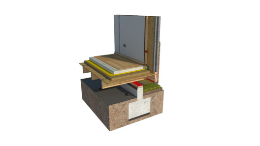 Cortesía de POLOMADERA Cortesía de POLOMADERA  Cortesía de Polo Madera Cortesía de Polo Madera MezzaninesIntersection with Exterior Facing.  Cortesía de POLOMADERA Cortesía de POLOMADERA  Cortesía de Polo Madera Cortesía de Polo Madera Projecting on Outer Face.  Cortesía de POLOMADERA Cortesía de POLOMADERA  Cortesía de Polo Madera Cortesía de Polo Madera Doors and WindowsExterior Door.  Cortesía de POLOMADERA Cortesía de POLOMADERA  Cortesía de Polo Madera Cortesía de Polo Madera Bow Window.  Cortesía de POLOMADERA Cortesía de POLOMADERA  Cortesía de Polo Madera Cortesía de Polo Madera PartitionEstructural Partition with Space for Installations.  Cortesía de POLOMADERA Cortesía de POLOMADERA .jpg?1497642345) Cortesía de Polo Madera Cortesía de Polo Madera Intersection with Angle Greater than 180 Degrees. 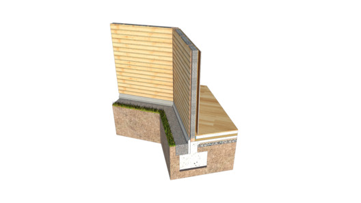 Cortesía de POLOMADERA Cortesía de POLOMADERA .jpg?1497642356) Cortesía de Polo Madera Cortesía de Polo Madera RoofsRoof Ridge.  Cortesía de POLOMADERA Cortesía de POLOMADERA  Cortesía de Polo Madera Cortesía de Polo Madera Output of Unheated Ducts. 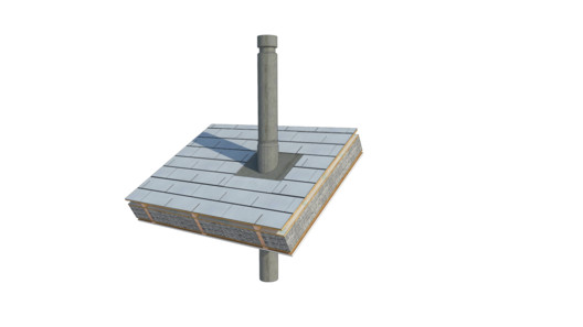 Cortesía de POLOMADERA Cortesía de POLOMADERA .jpg?1497642381) Cortesía de Polo Madera Cortesía de Polo Madera TerracesTerrace Deck of a Permeable First Floor.  Cortesía de POLOMADERA Cortesía de POLOMADERA 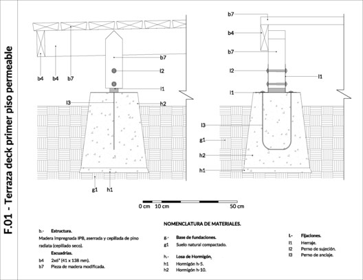 Cortesía de Polo Madera Cortesía de Polo Madera Habitable Flat Roof with Sill. 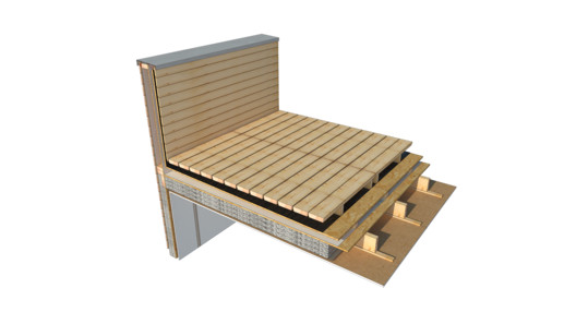 Cortesía de POLOMADERA Cortesía de POLOMADERA .jpg?1497642406) Cortesía de Polo Madera Cortesía de Polo Madera This catalog is completely free and is available (in Spanish) here.This posting includes an audio/video/photo media file: Download Now |
| Aedas Unveils Dragon-Inspired Complex Design in Zhuhai, China Posted: 26 Jun 2017 11:00 PM PDT _01.jpg?1498397754) Courtesy of Aedas Courtesy of Aedas Aedas has unveiled their Phase II designs of Hengqin Headquarters Complex in Zhuhai, China. The site is located on an island that sits near the Lotus Bridge linking Zhuhai to Macau, overlooking some of the largest casino resorts across the river. The form of the main buildings is said to have taken inspiration from a traditional Chinese flood dragon, symbolizing the convergence of talent from Zhuhai, Macau, Hong Kong and Shenzhen (Guangdong) at Hengqin. _05.jpg?1498397822) Courtesy of Aedas Courtesy of Aedas _03.jpg?1498397789) Courtesy of Aedas Courtesy of Aedas The complex is set to be an integrated cultural tourism-oriented complex with two high-rise Grade-A office towers and a series of retail, banquet, entertainment and leisure venues. Inspired by the famous painting 'Nine Dragons' (dating from the southern Sung Dynasty), the design of the two skyscrapers alludes to the myth of two dragons and a pearl: _09_Metaphors.jpg?1498398177) Courtesy of Aedas Courtesy of Aedas _10_Sketch.jpg?1498398142) Courtesy of Aedas Courtesy of Aedas
_11_Sketch.jpg?1498398158) Courtesy of Aedas Courtesy of Aedas _04.jpg?1498397804) Courtesy of Aedas Courtesy of Aedas _02.jpg?1498397770) Courtesy of Aedas Courtesy of Aedas The podium design takes inspiration from the existing Lotus Bridge, resembling a blooming lotus flower with "leaves" wrapping around the shopping center and retail streets. The master plan is arranged to drive out traffic from various retail, leisure and green hubs towards the central sunken plaza. The upper levels will serve as shelters for people on the lower levels in both sunny and rainy weather characteristic of Zhuhai. _07.jpg?1498397856) Courtesy of Aedas Courtesy of Aedas _14_Sketch.jpg?1498398232) Courtesy of Aedas Courtesy of Aedas _06.jpg?1498397838) Courtesy of Aedas Courtesy of Aedas Hengqin Island is no stranger to architecture giant Aedas, who has also designed the nearby MCC Port Complex (for the same client) and has recently won a competition for a mountaintop resort in Hengqin. Dragon-based symbols are also a growing theme in the China-based firm, who won another competition to design a dragon/phoenix-inspire transportation hub in Sanya, China. _13_Sketch.jpg?1498398211) Courtesy of Aedas Courtesy of Aedas _08.jpg?1498397871) Courtesy of Aedas Courtesy of Aedas Construction of the complex has already begun, as is set to be complete in 2019.
News via: Aedas
This posting includes an audio/video/photo media file: Download Now |
| LODOVNIA Ice Cream Shop / mode:lina architekci Posted: 26 Jun 2017 10:00 PM PDT  © Patryk Lewiński © Patryk Lewiński
From the architect. LODOVNIA, a new mobile ice cream shop with a unique elevation, found its place right in the heart of Poznań's Stary Browar!  © Patryk Lewiński © Patryk Lewiński Since the building took a central spot in the Courtyard of Art, mode:linaTM studio designers approached its façade as if it was a piece of art. Dark walls were extended with the use of almost one thousand white sport cones, referring to LODOVNIA's fagship product – natural ice cream in a cone.  © Patryk Lewiński © Patryk Lewiński  Elevations Elevations  © Patryk Lewiński © Patryk Lewiński Large glazed panels not only allow to peek in, but they also refect the surrounding Stary Browar's architecture.  © Patryk Lewiński © Patryk Lewiński The interior is a black and white composition as well, warmed by triangle-shaped elements made of natural plywood. Both the triangles and the shape of a sport cone further connect with the letter V in LODOVNIA's logo, which makes the architectural result consistent with the ice cream shop's visual identity system.  © Patryk Lewiński © Patryk Lewiński This posting includes an audio/video/photo media file: Download Now |
| You are subscribed to email updates from ArchDaily. To stop receiving these emails, you may unsubscribe now. | Email delivery powered by Google |
| Google Inc., 1600 Amphitheatre Parkway, Mountain View, CA 94043, United States | |
Nema komentara:
Objavi komentar