Arch Daily |
- Clapham House / MWArchitects
- Serralves Collection: 1960-1980 / COR Arquitectos
- Villa-Safadasht / Kamran Heirati Architects
- JIXI Christian Church / XING DI
- Modern Sampran Wangprom Office / Apostrophy's
- Collage Cottage / TUNEplanning
- Skypark Car Park / May + Russell Architects
- OOPEAA Wins 2017 Spotlight Prize for Emerging Architects
- Armstrong Avenue Residence / The LADG
- Foster + Partners' Milan Apple Store to Feature Public Plaza and Waterfall Entrance
- Home of the Tree House / ARKITITO Arquitetura
- Explore Endless Palladian-Inspired Facades Using This Random Generator
- Ixi’im Restaurant / Central de Proyectos SCP + Jorge Bolio Arquitectura + Mauricio Gallegos Arquitectos + Lavalle / Peniche Arquitectos
- When Frank Lloyd Wright and Le Corbusier Had a Public Argument in The New York Times
- Hudson Valley Guest House / Janson Goldstein
- Community, History and Art Collide in Illuminating Michigan Pavilion
- Emerging Studio Wins Competition to Expand one of Norway’s Largest University Campuses
| Posted: 26 May 2017 10:00 PM PDT  © French + Tye © French + Tye
 © French + Tye © French + Tye From the architect. This is a dramatic transformation of a small, semi-detached Victorian house. Despite being arranged over three floors, it was so shallow in depth that the proportions were cottage like.  © French + Tye © French + Tye We dropped the floor at lower ground level, and excavated a substantial portion of the garden to make space for a two-storey extension made predominantly in glass. The existing rear wall was flattened off and rebuilt in traditional London stock brick, in contrast with the contemporary glazing.  © French + Tye © French + Tye Internally, we opened up the space on all three levels to create generously proportioned rooms behind a traditional facade.  Sections Sections The first floor, formerly three poky rooms, is dedicated to the master suite. We removed the ceiling, exposing the pitched roof, which was restructured to remove any visible trusses. The double-height space has a contemporary feel within a traditional envelope, complete with three timber sash windows.  © French + Tye © French + Tye On the ground floor there is a guest room and bathroom and a reception room/study which overlooks the double height void. A huge frameless glass corner window gives open views of the garden.A small upper terrace is accessible from the study. A new steel staircase connects this level with the open-plan living area below. Light pours in to this room from the double height void and, being below ground, privacy is maintained without a loss of splendour.  Proposed Floor Plans Proposed Floor Plans A large sliding door leads onto the lower terrace and external stairs go back up to garden level.  © French + Tye © French + Tye This posting includes an audio/video/photo media file: Download Now |
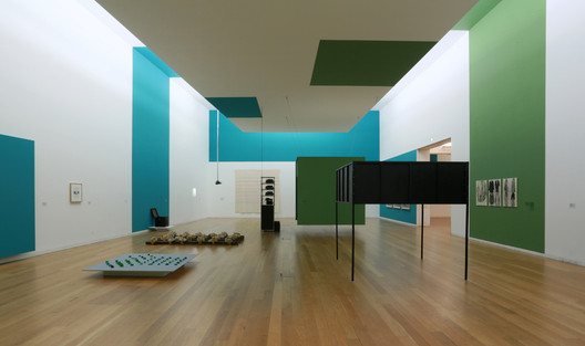
| Serralves Collection: 1960-1980 / COR Arquitectos Posted: 26 May 2017 08:00 PM PDT  © Nicolò Galeazzi © Nicolò Galeazzi
 © Nicolò Galeazzi © Nicolò Galeazzi From the architect. Serralves Collection: 1960-1980 presents the work of Portuguese and international artists from the collection of the Serralves Museum. This new display, which marks the beginning of a series that gives continued visibility to the Serralves Collection, privileges the decades of 1960 and 1970 as foundational to our understanding of contemporary art and to the development of the Collection since the establishment of the Serralves Foundation in 1989. The Works on view reflect a diversity of artistic production, ranging from the beginnings of post-minimal and conceptual art and their expressions in Portugal and diferente parts of the world, to experimentation with abstraction, figurative representation, performance and the use of new media.1  © Nicolò Galeazzi © Nicolò Galeazzi  © Nicolò Galeazzi © Nicolò Galeazzi  © Nicolò Galeazzi © Nicolò Galeazzi When Suzanne Cotter, the museum director, invited us to draw the collection’s exhibition, she challenged us to find a clever solution to show the treasures of the museum to the general public. We had a sequence defined by the three curators (Cotter, Ribas, Nicolau), a constructed narrative and a story to tell, because there is always a story to tell, made of heroes. We had rooms of the museum designed by Álvaro Siza, heavily humanized spaces. We had the landscape, outside, inside. A constant feature of the museum's management, since Suzanna Cotter’s arrival, is to keep the windows overlooking the garden as an integral part of each exhibition, as it was thought by the museum's author.  © Nicolò Galeazzi © Nicolò Galeazzi  Sketch Sketch  © Nicolò Galeazzi © Nicolò Galeazzi The public is led by the landscape that suddenly enters the rooms in the form of colours which rise through the walls to the ceiling of the museum. These are the colours of the garden. The seven colours give rhythm to the rooms as partitions of narrative groups, creating defined spaces where displays float in space trying not to contaminate the relationship between works or artists; helping the sudden scale changes between works and space, between visitor and museum.  © Nicolò Galeazzi © Nicolò Galeazzi  Sketch Sketch  © Nicolò Galeazzi © Nicolò Galeazzi Beginning in the sixties, and throughout the seventies, the social and environmental conscience of the artists mixes with the practices and techniques of representation. From Art Povera to Body Art - works by Etel Adnan, Helena Almeida, Richard Artschwager, John Baldessari, Lothar Baumgarten; René Mel Bochner, Fernando Calhau, Alberto Carneiro, Merce Cunningham, Marlene Dumas, Hans-Peter Feldmann, David Goldblatt, Dan Graham, Giorgio Griffa, Richard Hamilton, Jannis Kounellis, Fernando Lanhas, Álvaro Lapa, Marwan, Cildo Meireles, Ana Mendieta, Robert Morris, Antoni Muntadas, Bruce Nauman, Silke Otto-Knapp, Nam June Paik, Charlotte Posenenske, Yvonne Rainer, Paula Rego, Gerhard Richter, Joaquim Rodrigo, Martha Rosler, Dieter Roth, Ed Ruscha, Julião Sarmento, Nikias Skapinakis, Robert Smithson , Ângelo de Sousa, Ana Vieira, Pires Vieira, Franz Erhard Walther, Hannah Wilke, Lynette Yiadom-Boakye (among others) - vibrate between the spaces of colour.  © Nicolò Galeazzi © Nicolò Galeazzi  © Nicolò Galeazzi © Nicolò Galeazzi  © Nicolò Galeazzi © Nicolò Galeazzi There are large rooms, which look like wunderkamera. It was the way we found to surprise and showcase the collection treasures.  © Nicolò Galeazzi © Nicolò Galeazzi  © Nicolò Galeazzi © Nicolò Galeazzi Many years ago, wandering aroundh Porto with Pierluigi Nicolin and Giovanna Borasi, I was entrusted by Pierluigi with a mission: colorare Siza! I haven’t thought about it again, but it happened. It's still going to happen.  © Nicolò Galeazzi © Nicolò Galeazzi 1 Note of the curators. This posting includes an audio/video/photo media file: Download Now |
| Villa-Safadasht / Kamran Heirati Architects Posted: 26 May 2017 07:00 PM PDT  © Abdolreza Bassiri © Abdolreza Bassiri
 © Ali Daghigh © Ali Daghigh From the architect. This project seeks to develop one of the essential structures of Persian architecture, The" Garden". In a persian garden, architecture seeks to see the building and the site as a whole and unique entity.  © Ali Daghigh © Ali Daghigh  First and ground floor plans First and ground floor plans  © Abdolreza Bassiri © Abdolreza Bassiri This project also, intends to identify itself as a passage or a frame to emphasize on the presence of the site not only as the exterior but also as a stream which flows around and inside the building.  © Ali Daghigh © Ali Daghigh  Scheme Scheme  © Abdolreza Bassiri © Abdolreza Bassiri The axes of the building and the site intersect at the center or the "heart" of the building. The heart in this scenario is a space where the exploration of the building starts and ends. This posting includes an audio/video/photo media file: Download Now |
| JIXI Christian Church / XING DI Posted: 26 May 2017 03:00 PM PDT  © Sun Haiting © Sun Haiting
 © Sun Haiting © Sun Haiting From the architect. Church of Christ in Jixi got support from the church workers of Wenzhou in 2014, and purchased an old silk factory in Zhiyuan village located in the southeast of Jixi city. It became the first holy place where Christian can pray after basic renewal. Since the limited budget, the building never got completely repair. Even it was dangerous, the number of believers was still increasing. After ten years, the Church of Christ decided to tear down the old building and build a new one in 2013. Every believer was willing to devote themselves, and the rebuilding things finally kicked off.  © Sun Haiting © Sun Haiting The place is a little cramped. It's close to hillside in the north, facing the street in the west, separated only by a wall with farmer's house in the east. It's the open hill in the south with full of crops. In the distance, it's the endless mountains of Jixi. The shape of the place is so irregular since its such complicated location. Jixi is located at the Huizhou region where is pretty well done on the protection of Chinese traditional culture. There were so many problems, such as how to make the local culture comply with the religion things, how to accommodate 1000 people and provide accommodation with the aged proposed by the Church of Christ, and how to break the limitation of budget, which brings so many difficulties on the design and rebuilding work.  Sketch Sketch The idea of new building is just to meet the current terrain. The square place in the east is designed as the chapel, the long and narrow place in the west is designed as apartments for the aged. In order to connect the two buildings, the loop rampway and union bridge are built utilized by the existing hillside. The prayers can arrive at the entrance of chapel walking along the rampway from the yard.  © Sun Haiting © Sun Haiting The Chapel is central-symmetrical square plane, built above the stylobate on the ground, matched with the ground height. The main structure is consisted of triangle plane and the central square plane. The triangle can not only increase the capacity but also provide the subject structure, meet the requirements including central-symmetrical prayer area, astylar hall with long span, little meditation area, reading area and evacuated channels, divided into service area and un-service area.  Floor Plans Floor Plans  Section Section The main building has two floors, the first floor is used to small church room, prayer room, choir room and office, the second floor is used as the main church hall. The base of the building is used to park and store some equipment. The natural light comes into the hall from the 70cm gap on the roof. The ringlike light not only draws the outline of concrete rooftop with the central force but show the difference between the central and the surroundings, just like as the hall of traditional Huizhou dwellings. The inner space structure just reflects the external things. The four triangular prisms and one central cube just hold up each other, full of original power.  © Sun Haiting © Sun Haiting  © Sun Haiting © Sun Haiting It's a big challenge for architects to make the firm architecture show its warmhearted humane care with limited budget. We think that architecture should be alive and the living architecture should have sense of hearing, vision, smell, touch, and time-related. So we make use of the lively wood at all touchable places such as the walls, doors, windows, chairs and the cross which makes you feel the nature. Besides, it's very meaningful for the four triangle windows. There is an inverted shape V on the wall in the west. The white ground glass filters the noise outside, and only pure sunlight is left, it looks colorful as time goes on. The horizontal window is installed at the height of 80cm on wooden wall both at the south and north, which is eyes of the building. It's just like a beautiful landscape painting when you look at the surrounded view through the window. The main entrance of church is at the east, there is a tall and heavy wooden door, it's a bridge and resting pavilion to the apartments for the aged out of the door. The believers can listen to the world outside.  © Sun Haiting © Sun Haiting The appearance of the building is the simple style with the waterproofing coatings, which is the popular way for the Huizhou traditional residential buildings. The building is overall dark red which is just similar with red soil around the church, and this kind of alignment just combines with the nature. The details design makes the church show the tender feelings from godhood to humanity. Since the limited budget, these simple design expressions just become the language of the regional buildings with modern architecture. This is just the design language for regional buildings what we want. We never follow other people just on those external things but to focus on the customers and meet the new requirements. We put high value to build the link between the architecture and human-beings and trigger the memories and momentary feelings through the materials and space with the architecture language.  © Sun Haiting © Sun Haiting This posting includes an audio/video/photo media file: Download Now |
| Modern Sampran Wangprom Office / Apostrophy's Posted: 26 May 2017 01:00 PM PDT  © Sitthisak Namkham © Sitthisak Namkham
 © Sitthisak Namkham © Sitthisak Namkham From the architect. The renovation project for Thai traditional herbal products manufacturer "Wangprom" has been completed by Apostrophys. This place will bring back into 80's, the origin time of brand "Wangprom" at Sampran district, Nakorn Pathom Province, Thailand by using the local element twist with modern design process and context and then become the main concept "Modern Sampran"  Concept Concept Firstly, the existing 250 square meters hold the compact office has been redesign for more space and meaning. The existing dense wall has been demolished and replaced by steel frame glass, and also the partition which is clear in vision and flexible to organize the interior space in any purposed. Furthermore, the reflected mirror has been use as the leg and the support of the suspended reception counter and meeting table that made the large wooden top seem to be floating in the air and also illusion more space and lightweight.  © Sitthisak Namkham © Sitthisak Namkham Then, focusing on material selection and style, the designer avoids to using the modern elements, styles and space design like another trendy office but made it be warm as home because of the brand "Wangprom" in Thai consist of 2 words "Wang" means Palace and "Prom" means Brahma goddess. So, the existing column and beam have been finished by dark wood veneer which inspired from the local palace from 80's. And, on another side, fresh dark green, the corporate color has been used as the color scheme for wall and fabrication. There are several hand painting herbal figure, and certificated hang on the dark green wall which tell us the brand image. In addition, another meaningful element; customized wallpaper which illustrated many herbs, the major ingredient of "Wangprom" products was placed in every part in the space even pantry and restroom. As well as the scent of the product from the production line beside this office that highlighted the brand identity harmoniously to the space.  Isometric Isometric In conclusion, "Modern Sampran, Wangprom Office" can point out that creativity can merge with local business that bring the local brand into global scale. It is the real power of creativity and design that revive the local brand and modernized into the current situation.  © Sitthisak Namkham © Sitthisak Namkham This posting includes an audio/video/photo media file: Download Now |
| Collage Cottage / TUNEplanning Posted: 26 May 2017 12:00 PM PDT  © Yoe Inu © Yoe Inu
 © Yoe Inu © Yoe Inu From the architect. The designer added "I considered about what Korean vintageness was. In general, Korean beauty reminds of Hanbok (traditional Korean house), Hanbok (traditional Korean clothes), Hanji (traditional Korean paper made from mulberry tree)and Korean food. However, I conceived a concept to keep Korean vintageness without dating back to so far. "All of a sudden, l thought that we might restrict beautiful things in a word 'Korean'.  © Yoe Inu © Yoe Inu "I looked back on the period of Korea from 1920s to 1940s, and thought that modern Korean vintageness might be more familiar to us. Emotion of the period when joys and sorrows under the rule of Japanese colonization were embraced and Western civilization started to come in is more Korean, isn't it? Therefore, I planned this space with the themes of two writers and a sculptor in those days; Sang Lee, Dong-Ju Yun, and Jin-Kyu Kwon."  Section A Section A Saying this, the designer showed the appearance of this house before being renovated. It was a multiplex house built entirely with red bricks. There were four houses under the same roof, but he combined two of them. After removing all of illegally enlarged parts, three houses became to have their own terrace respectively and roodtop house became pleasant terrace. Basement was transformed into brunch café for guests staying in guest house.  Section B Section B Mental images in the designer's mind was born as a space. Mental images of three persons seemed to be quite romantic. The first house on the second floor in Collage, Sang Lee's room was designed with somewhat aesthetic feeling, the second room for Dong-Ju Yun is with distinctive black and white, and the last room on the third floor for Jin-Kyu Kwon was planned by the designer's thought about his own house and terra-cotta artwork. Sang Lee's room is divided into bedroom and kitchen structurally, and the bedroom occupies large area relatively.  © Yoe Inu © Yoe Inu This posting includes an audio/video/photo media file: Download Now |
| Skypark Car Park / May + Russell Architects Posted: 26 May 2017 10:00 AM PDT  © Kiernan May © Kiernan May
 © Kiernan May © Kiernan May From the architect. User-friendliness through well-ordered planning and efficient structural resolution is at the core of multi-level carparking architectural design. The aim being to simplify the experience of car parking and pedestrian movement. However, the design of Skypark was not just about efficiency, it was also about place making and urban context.  © Kiernan May © Kiernan May  © Kiernan May © Kiernan May The building consists of seven stories of carparking accommodating 870 cars located above 4,000 m² of commercial development on two levels, fronting two streets of a corner site. The commercial floors serve to activate the street by creating a public realm and providing good commercial exposure. The building is situated in the suburb of Phillip on the edge of Woden Town Centre. The suburb was named after Captain Arthur Phillip, commander of the First Fleet that sailed from England in 1788 to establish the initial British colonial settlement in Australia. The buildings and streets in the area are named after ships and officers of the First, Second and Third fleets.  © Kiernan May © Kiernan May  Ground Floor Plan Ground Floor Plan  © Kiernan May © Kiernan May The concept for the form and detail of the facade design was derived from the memory of the first fleets and their great voyages, and was conceived to add meaning in the context of the naming of the surrounding buildings and streets. The architectural language, based on an openly affirmed structure overlaid by a filigree skin, depicts a swirling, foamy sea that laid immense challenge to the men and women of the first fleets; officers, sailors, soldiers, and convicts alike.  © Kiernan May © Kiernan May The building owner's vision was to create a public realm that will be 'owned' by everyone i.e. office workers, residents and visitors within the Woden Town Centre, and the Canberra community. It was to build a 'place' where people could go to have good coffee, good food, perhaps tapas and wine after the workday, exercise in a state of the art double-height gym and to visit markets on the weekend.  © Kiernan May © Kiernan May This posting includes an audio/video/photo media file: Download Now |
| OOPEAA Wins 2017 Spotlight Prize for Emerging Architects Posted: 26 May 2017 09:00 AM PDT  Periscope Tower / OOPEAA. Image © Anssi Lassila Periscope Tower / OOPEAA. Image © Anssi Lassila Finnish practice OOPEAA has been awarded the 2017 Spotlight Prize for emerging architects. First given in 2009, the award was established by the Rice Design Alliance to celebrate the work of architects from around the world within their first 15 years of professional practice. Past winners of the award have included Cadaver & Sola-Morales, OUALALOU+CHOI, 5468796, Interboro Partners, Pezo von Ellrichshausen, LA DALLMAN, Sou Fujimoto, and Anton García-Abril.  Suvela Chapel / OOPEAA. Image © Mika Huisman Suvela Chapel / OOPEAA. Image © Mika Huisman This year, OOPEAA was unanimously selected by the Board of Directors of the Rice Design Alliance, recognizing the firm's "outstanding and inspiring work." "[OOPEAA and Anssi Lassila's] architecture displays an interest in combining a sculptural form with traditional materials and innovative techniques," the Rice Design Alliance explains. "In his approach he emphasizes the potential embedded in exploring new methods and techniques as a means of developing new solutions in building."  Kärsämäki Church / OOPEAA. Image © Jussi Tiainen Kärsämäki Church / OOPEAA. Image © Jussi Tiainen OOPEAA founder and director Anssi Lassila will accept the award and give a lecture in Houston on September 6. See more of OOPEAA's work on ArchDaily here and learn more about the Spotlight Prize here. This posting includes an audio/video/photo media file: Download Now |
| Armstrong Avenue Residence / The LADG Posted: 26 May 2017 08:00 AM PDT  © Nathaniel Riley © Nathaniel Riley
 © Nathaniel Riley © Nathaniel Riley From the architect. The Los Angeles Design Group has recently completed a transformative residential renovation in Silver Lake, Los Angeles, California, reconfiguring a hermetically sealed box into a lightfilled,1,894 squarefoot, threestory home. The design draws inspiration from the iconic stepped form of Marcel Breuer's former Whitney Museum in New York, yet in reverse. Whereas Breuer cantilevers his building toward the busy Manhattan street to provide shelter for a sunken courtyard garden, the LADG cantilevers the house in three steps over the rear yard, bringing a sense of enclosure to the rear yard against a steep hillside. Two of the house's windows also nod to Breur, referencing his angular forms.  © Nathaniel Riley © Nathaniel Riley  Section Section  © Nathaniel Riley © Nathaniel Riley The first window is a torqued cutout in the front facade that reorients the view from the master bedroom towards the Silver Lake Reservoir, providing a cinematic experience of the immediate surroundings. The second window juts out into the backyard, framing the hillside. Programmatically, the house itself is upside down, with an unusual splitlevel configuration that results in two floors in the front and two floors in the back. These levels are filled with bedrooms, bathrooms, and the study, while the newly constructed top floor—a wide open plinth that sits atop the split levels—contains the kitchen, living, and common areas. As a result, the social space normally adjacent to the yard is instead perched on top. The exterior facade of the house is predominantly charred cedar wood, with natural wood on select surfaces to emphasize the cuts made into an otherwise solid monolith.  © Nathaniel Riley © Nathaniel Riley This posting includes an audio/video/photo media file: Download Now |
| Foster + Partners' Milan Apple Store to Feature Public Plaza and Waterfall Entrance Posted: 26 May 2017 07:00 AM PDT  via apple.com via apple.com Renderings have been revealed for the upcoming apple store in Milan's Piazza Liberty, designed by Foster + Partners in their latest collaboration with the technology giant. Following an extremely site-specific approach, the new flagship store will be located under the existing piazza, introducing a new public amphitheater and waterfall feature that will double as the store's entrance.  via apple.com via apple.com Unlike a traditional storefront, the Apple Store Piazza Liberty has been envisioned as a place for public gathering. The retail area has been intentionally hidden beneath the piazza, accessed by passing between two walls of water, intended as a tribute to the historic fountains of Italian public spaces and the close connection between Milan and its canals. A glass elevator will provide an additional, accessible entrance.  via apple.com via apple.com  via apple.com via apple.com  via apple.com via apple.com Inside, the store has been designed to house range of events including technology seminars and children's programs to encourage public use of the space. A date for completion has not yet been announced. Learn more about the project here. News via Apple.  via apple.com via apple.com  via apple.com via apple.com
This posting includes an audio/video/photo media file: Download Now |
| Home of the Tree House / ARKITITO Arquitetura Posted: 26 May 2017 06:00 AM PDT  © Vivi Spaco © Vivi Spaco
 © Vivi Spaco © Vivi Spaco From the architect. The site is located in a condominium at 45km north of São Paulo. Its steep topography with a slope of approximately 15m from the entrance to the end of the plot, where there’s a privileged view of part of the native forest Serra dos Cristais.  © Vivi Spaco © Vivi Spaco The main idea of the project was to maintain the connection between the forest and the house, so the owners could enjoy the local landscape.  © Vivi Spaco © Vivi Spaco The stilt structure concept was adopted to avoid ground impacts and by making the house elevated, like a treehouse.  Ground Floor Plan Ground Floor Plan Divided in two blocks with different levels and roofing: one has two bedrooms and a cement roof tile over wooden beams and plywood ceiling; the other has a living room with a porch that gives a 360º view of the surrounding area.  © Vivi Spaco © Vivi Spaco The colors remind old farm houses and differs from the raw concrete blocks and the burnt cement floor.  © Vivi Spaco © Vivi Spaco This posting includes an audio/video/photo media file: Download Now |
| Explore Endless Palladian-Inspired Facades Using This Random Generator Posted: 26 May 2017 05:00 AM PDT In his seminal work, Four Books on Architecture (1570), Andrea Palladio outlined the architectural elements that would make up his signature style, borrowing from the architecture of the ancient Romans and the principles directed by Vitruvius and Leon Battista Alberti. In designing his buildings, Palladio employed a full palette of motifs, from pediments to loggias to porticos, resulting in structures that followed a certain formula, while remaining individually distinct. Recognizing the architectural patterns in his work, programmer "23" (Paul O'Leary McCann) set out to create a code project that could randomly generate Palladian-inspired facades. Adjusting the to size of your screen, the program can create facades ranging in scale from one-story temples to elaborate mega-structures that bear similarity to the magnificent toy block towers created by future-architect children. Check out the site for yourself, here.
This posting includes an audio/video/photo media file: Download Now |
| Posted: 26 May 2017 04:00 AM PDT  © Eduardo Calvo Santisbón © Eduardo Calvo Santisbón
 © Eduardo Calvo Santisbón © Eduardo Calvo Santisbón From the architect. The Ixi'im Restaurant comprises the re-use of the engine house of an old henequen farm, whose productive splendor in the second half of the 19th century and subsequent decline in the second half of the 20th century has generated new uses for our built cultural heritage. The site consists of several independent structures, including the engine room, which shape the public space or main square. A north - south axis connects, since its original use, the main set of the hacienda with other nearby settlements.  © Eduardo Calvo Santisbón © Eduardo Calvo Santisbón  Elevations Elevations  © Eduardo Calvo Santisbón © Eduardo Calvo Santisbón The proposal starts by establishing a pause in this circulation through a subtle threshold that contains virtually the space of access to ruin. Referring to the original activity and its industrial elements, the intervention strategy is materialized in a large metallic enclosure that weaves, through the preexisting building, the new architectural program. This articulating frame, whose internal offset liberates the existing walls from structural responsibility, generates a new interstitial space of dialogue between heritage and intervention. At the same time, it allows the filtering of indirect natural light, thermally confining the interior and supporting the display of the largest collection of crafted liquors in the country.  © Eduardo Calvo Santisbón © Eduardo Calvo Santisbón  General Floor Plan General Floor Plan  © Eduardo Calvo Santisbón © Eduardo Calvo Santisbón Produced by the last active rope factory in Yucatan, the suspended henequén strings in the interior, besides their acoustic function, they witness the material that gave origin to the building. The spatial sequence allows the visitor to transit between epochs, finishing in the contemporary addition, whose physical and visual integration with the main square and its components closes a cycle of respect and belonging.  © Eduardo Calvo Santisbón © Eduardo Calvo Santisbón This posting includes an audio/video/photo media file: Download Now |
| When Frank Lloyd Wright and Le Corbusier Had a Public Argument in The New York Times Posted: 26 May 2017 02:30 AM PDT  Left: Frank Lloyd Wright photographed by Al Ravenna. Image <a href='https://commons.wikimedia.org/wiki/File:Frank_Lloyd_Wright_portrait.jpg'>via Wikimedia</a> in Public Domain. Right: Le Corbusier. Image © Willy Rizzo Left: Frank Lloyd Wright photographed by Al Ravenna. Image <a href='https://commons.wikimedia.org/wiki/File:Frank_Lloyd_Wright_portrait.jpg'>via Wikimedia</a> in Public Domain. Right: Le Corbusier. Image © Willy Rizzo Frank Lloyd Wright and Le Corbusier are both architects who were known for their grand and innovative ideas—as well as for their high esteem for their own opinions. The two did not, however, see eye to eye in their visions for the future of American cities and civilization. Both architects had utopian, all-encompassing plans for their ideal American city, combining social as well as architectural ideas. In 1932, both described these ideas in The New York Times; in these two articles Frank Lloyd Wright and Le Corbusier made their differing beliefs perfectly clear to the public. The disagreement began on January 3, 1932, when Le Corbusier published an article in The Times which ran under the title "A Noted Architect Dissects Our Cities – Le Corbusier Indicts Them as Cataclysms and Describes His Ideal Metropolis." Discussing cities like Paris, New York, and Chicago, Le Corbusier explains his vision for what we know today as Ville Radieuse, which he calls in the article the Green City. Writing that American skyscrapers have yet to earn the title of architecture, but are "merely small objects such as statuettes or knick-knacks, magnified to titanic proportion," Le Corbusier proposes his plan for the skyscraper.  Ville Radieuse. Image <a href='http://land8.com/'>via land8.com</a> Ville Radieuse. Image <a href='http://land8.com/'>via land8.com</a> Including a soundproof, well-lit living room and a double-façade of glass to control the effects of outside temperature, Le Corbusier's habitable towers were to include at least twelve dwelling floors each and accommodate 1,000 people per hectare (2.47 acres). Beyond the towers themselves, his vision includes broader recommendations for city life, most notably the separation of pedestrians and cars. The key aspect of this solution he termed "autostrades," elevated motorways 16 feet (4.8 meters) above the pedestrian domain on the ground. Believing that this separation would solve both pedestrian safety and automobile traffic concerns, Le Corbusier states that "[t]he only solution is to restore to the pedestrian the surface of the city, all the surface, the earth." Believing that the society of his day was not properly utilizing the machines which they had created, and that the current cities were all "outdated," the core of Le Corbusier's ideas for Ville Radieuse is epitomized in the description, "knowledge, ethics, and esthetics, all are one, expressed in architecture; a new unity."  Ville Radieuse. Image <a href='https://iamyouasheisme.wordpress.com/?s=corbusier#jp-carousel-914'>via iamyouasheisme.wordpress.com</a> Ville Radieuse. Image <a href='https://iamyouasheisme.wordpress.com/?s=corbusier#jp-carousel-914'>via iamyouasheisme.wordpress.com</a> Not three months later came Frank Lloyd Wright's rebuttal. "'Broadacre City': An Architect's Vision – Spread Wide and Integrated, It Will Solve the Traffic Problem and Make Life Richer, Says Frank Lloyd Wright" was published in The New York Times on March 20, 1932. Never mentioning Le Corbusier by name, Wright nonetheless references his contemporary's argument by using Le Corbusier's terms and ideas directly and responding (unfavorably) to them, but The Times' introduction makes the connection to the earlier article by Le Corbusier perfectly clear, describing Wright's ideas as "diametrically opposed" to Le Corbusier's. In his opening sentence, Wright implores us not to "childishly try to tear the city down to get the green country in and set the city up in it again on its old site – feudal towers a little further apart," in an obvious first punch.  Frank Lloyd Wright's Broadacre City sketches. Image © <a href='https://www.flickr.com/photos/41894185893@N01/3444914'>Flickr user kjell</a> licensed under <a href='http://https://creativecommons.org/licenses/by-sa/2.0/deed.en'>CC BY-SA 2.0</a> Frank Lloyd Wright's Broadacre City sketches. Image © <a href='https://www.flickr.com/photos/41894185893@N01/3444914'>Flickr user kjell</a> licensed under <a href='http://https://creativecommons.org/licenses/by-sa/2.0/deed.en'>CC BY-SA 2.0</a> Wright's ideas, instead, focus on decentralization, writing that we have plenty of space and that skyscrapers are unnecessary except to the landlords who charge rent. Focusing on organic growth, Wright sees it as the natural next step for humanity to remove itself from busy city life based on (what he saw as) likely future innovations in transportation. "Why deck or double-deck or triple-deck the city streets at a cost of billions of dollars, only to invite increase and meet inevitable defeat?" Wright asks of Le Corbusier's autostrades. Obviously believing his adversary's ideas to be impractical and beneficial only to the wealthy, Wright criticizes Le Corbusier's housing towers further, asserting "[t]here is no life in them. There is only rent." Stating that Broadacre City is the only democratic form for a city due to its systematic integration of individual units, Wright embraces the existing highway system. Amenities are spread along the highways and homes are nestled in parks and gardens and small farms, all surrounded by beautiful natural landscapes; Wright argues that "1,000 people to the hectare (2.47 acres) is looking not so far ahead. It is 980 too many." With the convenience of modern transportation and future innovations to come, Wright asks why proximity to the city is important. In contrast once again to Le Corbusier, Wright predicts that "[t]he traffic problem will be solved as architecture. But not by verticality." ") Broadacre City model. Image Courtesy of The Frank Lloyd Wright Foundation Archives (The Museum of Modern Art | Avery Architectural & Fine Arts Library, Columbia University, New York) Broadacre City model. Image Courtesy of The Frank Lloyd Wright Foundation Archives (The Museum of Modern Art | Avery Architectural & Fine Arts Library, Columbia University, New York) Neither architect lived to see their vision come true, but both were right about some aspects of their future, today's present. Le Corbusier's opinions of technology during his time continue to ring eerily true today. "We have invented the machine and it should be liberating our minds and our leisure hours. Instead it has harnessed us to itself and plunged us into slavery," he wrote. Also, we have arguably not yet made the progress toward seamless technological integration he had hoped for. Current technology, in fact, seems to be moving away from the standardization Le Corbusier hoped for and closer to the personalization and customization championed by Wright in his article. On the other hand, neither did Wright succeed in his wishes to rid our cities of skyscrapers and landlords (and in fact proposed his own mile-high skyscraper two decades later.) His dreams of a certain amount of land for each person have been realized to a point in American suburbs, but many of these bedroom communities lack the amenities on which Wright would have insisted. Not to mention, the natural landscape certainly was not given priority in planning most suburban settlements. While we've yet to see cars hurtling by unimpeded 16 feet above ground as Le Corbusier wished, various methods of separating cars from pedestrians have been attempted in cities around the world. Skyscrapers and other buildings today do take up more than 12 percent of the available land area in cities, but today's urban planners and designers are pushing for increased density, something Le Corbusier would have likely appreciated.  Ville Radieuse. Image <a href='http://land8.com/'>via land8.com</a> Ville Radieuse. Image <a href='http://land8.com/'>via land8.com</a> Neither Le Corbusier nor Frank Lloyd Wright could truly be said to have won the argument played out in the 1930s newspaper, as both got some ideas right and many wrong. But if you look at their visions more as a commentary on society and an exploration of concepts rather than a literal plan to destroy and rebuild cities (though they certainly may have intended the latter), it becomes clear that both architects recognized the same problems inherent in their cities. By taking opposite paths to the solution, the public was left with an abundance of ideas for solving problems, and future generations were able to pick and choose the best ideas from both plans. Our cities today are certainly still not perfect, and likely both architects would have been disappointed—but the pair nevertheless set a foundation for discourse (and public debate) that continues to influence city planning and architecture today. This posting includes an audio/video/photo media file: Download Now |
| Hudson Valley Guest House / Janson Goldstein Posted: 26 May 2017 02:00 AM PDT  © Scott Frances © Scott Frances
 © Scott Frances © Scott Frances From the architect. The master plan for this four-acre hillside site outside of the Upstate New York town of Hudson includes a new guesthouse and pool adjacent to an existing contemporary home. The 20-foot- by-45- foot pool takes advantage of the property's Hudson Valley views, while the guesthouse, nearly surrounded by a new meadow, forms an entry court with the main structure.  © Scott Frances © Scott Frances  Ground Floor Plan Ground Floor Plan  © Scott Frances © Scott Frances A covered breezeway divides the guesthouse into two sides, one a gym for the homeowners and guests, the other a living-and- sleeping area for guests. The opening acts as a bridge between the sides, allowing for privacy as well as connection to the surrounding landscape. Clad in vertical wooden slats, the structure's simple construction, including exposed rafters and concrete flooring, features an elegant glass wall that maximizes the building's transparency and view.  © Scott Frances © Scott Frances This posting includes an audio/video/photo media file: Download Now |
| Community, History and Art Collide in Illuminating Michigan Pavilion Posted: 26 May 2017 01:00 AM PDT  Courtesy of Mohamed Elgendy Courtesy of Mohamed Elgendy Cairo-based architect Mohamed Elgendy has won an international competition for the design of a new community pavilion in Roseville, Michigan. The Pavilion at Utica Junction competition, organized by the Roseville DDA, sought to attract proposals for a public pavilion on the site of an old tavern, creating a gathering space for residents and visitors to stage events, socialize, and play. The vision behind Elgendy's winning scheme was for a dialogue between three elements – a plaza, a ramp, and an indoor pavilion.  Courtesy of Mohamed Elgendy Courtesy of Mohamed Elgendy  Courtesy of Mohamed Elgendy Courtesy of Mohamed Elgendy The scheme is dominated by a large rectangular plaza, with alternating ground levels creating informal seating, set on a strict grid of illuminated thin pillars. Defining the plaza's perimeter, a gently rising ramp creates a monumental wall to give local artists an opportunity to exhibit their work. The ramp rises to a maximum height of 8 meters, giving visitors a unique view of surrounding historic structures.  Courtesy of Mohamed Elgendy Courtesy of Mohamed Elgendy Facing the plaza, an indoor pavilion creates space for conferences, exhibitions, and informal events. The roof of the pavilion connects with the 8m-high ramp, before gently stepping down to ground level, providing further space for people to sit and interact. A phased construction of the scheme, beginning with the plaza, is due to commence following the securing of additional funding.  Courtesy of Mohamed Elgendy Courtesy of Mohamed Elgendy
 Courtesy of Mohamed Elgendy Courtesy of Mohamed Elgendy  Courtesy of Mohamed Elgendy Courtesy of Mohamed Elgendy News via: Mohamed Elgendy. This posting includes an audio/video/photo media file: Download Now |
| Emerging Studio Wins Competition to Expand one of Norway’s Largest University Campuses Posted: 25 May 2017 11:00 PM PDT . Image Courtesy of KOHT Arkitekter") New university buildings form a spatial framing, where the park is the unifying element. The square is enriched with small landscape interventions, and facilitates external business activities. (Illustration by Beauty and the Bit). Image Courtesy of KOHT Arkitekter New university buildings form a spatial framing, where the park is the unifying element. The square is enriched with small landscape interventions, and facilitates external business activities. (Illustration by Beauty and the Bit). Image Courtesy of KOHT Arkitekter KOHT Arkitekter has won an international competition to expand one of Norway's s largest university campuses. The Norwegian University of Science and Technology (NTNU) in Trondheim launched their masterplan competition in December last year, setting the deadline for the first stage in January 2017. The emerging studio, consisting of Anders Olivarius Bjørneseth (27), Kenneth Larssen Lønning (25), Jonas Velken Kverneland (27) and Christopher Wilkens (32) beat 39 competing proposals before winning in the two-stage competition. Trondheim is the third largest city in Norway, and home to some of the country's leading science, technology and medical institutions including various campuses of the NTNU, Sør Trøndelag University College and St Olavs University Hospital. The brief for the new proposal was to create a conceptual new structure for the campus while integrating existing facilities within the competition area. The area to be transformed is west of the existing main campus in Gløshaugen, totaling 120,000 square meters. . Image Courtesy of KOHT Arkitekter") New additions include a campus library, not included in the competitions initial footprint (Illustration by Beauty and the Bit). Image Courtesy of KOHT Arkitekter New additions include a campus library, not included in the competitions initial footprint (Illustration by Beauty and the Bit). Image Courtesy of KOHT Arkitekter
 North Lift. Image Courtesy of KOHT Arkitekter North Lift. Image Courtesy of KOHT Arkitekter  Promenade. Image Courtesy of KOHT Arkitekter Promenade. Image Courtesy of KOHT Arkitekter KOHT Arkitekter's proposal seeks to open up Gløshaugen "inward facing" campus, turning westward facing buildings outward towards the city. By opening the site's prominent west front by a series of sloping walkways and crossings, as well as accessible promenades throughout the campus park the design aims to create good living space by cultivating existing qualities in the city. Additions include a library, a Technology and University Centre and new residential housing.  Elgeseter Park. Image Courtesy of KOHT Arkitekter Elgeseter Park. Image Courtesy of KOHT Arkitekter  Technology and University Centre, Innovation Square. Image Courtesy of KOHT Arkitekter Technology and University Centre, Innovation Square. Image Courtesy of KOHT Arkitekter
 Towards the campus' main building. Image Courtesy of KOHT Arkitekter Towards the campus' main building. Image Courtesy of KOHT Arkitekter  Courtesy of KOHT Arkitekter Courtesy of KOHT Arkitekter The expansion of the university is planned to take place between 2016-2025.  West Slope West Slope
News via: KOHT Arkitekter. This posting includes an audio/video/photo media file: Download Now |

.jpg?1495587779)
| You are subscribed to email updates from ArchDaily. To stop receiving these emails, you may unsubscribe now. | Email delivery powered by Google |
| Google Inc., 1600 Amphitheatre Parkway, Mountain View, CA 94043, United States | |
Nema komentara:
Objavi komentar