Arch Daily |
- Atelier Marco Bagnoli / Toti Semerano
- Lonna Sauna / OOPEAA
- Seminargebäude ‘Erweiterung Süd’ / Simon Freie Architekten BDA
- Marble House / OPENBOX Architects
- My House - The Mental Health House / Austin Maynard Architects
- Expo 2016 Antalya Observation Tower / Nita Architects
- Maitland House / Kennedy Nolan
- Renderings Revealed for New Residential Building at Hudson Yards in New York
- Kinfolk / Berg Design Architecture
- Norman Foster Foundation Includes Aravena, Ive and Other Leading Names in Their 2017 "Future is Now" Conference
- Vaughan City Hall / KPMB Architects
- Helsinki Airport to Be Transformed with Undulating Roof and Public Landscape
- Indios Desnudos House / Cañas Arquitectos
- A Simple Guide to Using the ADA Standards for Accessible Design Guidelines
- Proa House / GÓmez & GOrshkova
- How to Get a Job in Architecture Without Any Experience
- Steven Holl Architects Break Ground on Houston Museum of Fine Arts Extension
| Atelier Marco Bagnoli / Toti Semerano Posted: 06 Jun 2017 10:00 PM PDT  © Mario Lensi © Mario Lensi
 © Stefano Zanardi © Stefano Zanardi From the architect. The basic idea of the project is to create a core set, which consists of one studio atelier that has the potential to evolve gradually over time into a more complex organism; a center of contemporary arts that can host exhibitions and performances in close relationship with the territory and its specificity, with great attention to art academies and in close contact with the workshops at the place.  © Stefano Zanardi © Stefano Zanardi A wall-fence- path surrounds and interacts with the essential volumes of the atelier-marking empty spaces ... spaces for art.  Ground Floor Plan Ground Floor Plan Working to dig-subtraction in the original profiles of the hill, the atelier spaces reveal themselves gradually with the thrill of discovery where natural light draws changing scenarios in constant relationship with the surrounding landscape. The wall-fence- path is configured accordingly, not as antagonistic to the landscape, but wants to integrate with the surrounding environment through a dialogue of materials and transparencies. In order to perceive the artwork displayed by different points and heights, the project is just taking place from a ramp, which with its gently sloping spiral, energizes and connects all outdoor spaces, penetrates the main body, it laps the wide terraces and finally descends into the hillside in order to become an underground path to support the future space expansion expected entirely dug into the hillside. It is a botanic architecture that will follow the reed degradation cycle, which mixed with the local land covers its surface, ideal support for the growth of vegetation that gradually will replace it; leaves flowers and fruits ... why not? A skin alive never the same over time.  © Stefano Zanardi © Stefano Zanardi The architecture willingly renounces to remain immutable in time but always gives more space to the vegetation, on the contrary, adjusts itself to be invaded.  Section Section The project for its vocation pays great attention to the materials and the use of sustainability criteria, in particular has been designed to use wood for supporting structures and a part of the external cladding. Stone, natural fibers, lime and clay to the other external coatings.  © Mario Lensi © Mario Lensi This posting includes an audio/video/photo media file: Download Now |
| Posted: 06 Jun 2017 08:00 PM PDT  © Jussi Tiainen © Jussi Tiainen
 © Tommi Kortesniemi © Tommi Kortesniemi From the architect. The Lonna Sauna is a new a public sauna located on the small island of Lonna in the archipelago just in front of the city center of Helsinki. It is part of the historical continuum of the tradition of public saunas in Finland. On the border between urban and nature, between the busy life of the city and the open landscapes on the sea, with views framing the silhouette of the city on one side and opening towards the see on the other, the Lonna Sauna sits in the context of a group of old historical structures built during the Russian rule in the 19th century.  © Jussi Tiainen © Jussi Tiainen The Lonna island used to be occupied by the military and has only very recently been opened to the public. It is located right next to the larger Suomenlinna island which is a world heritage site. The old buildings on the Lonna island are landmarked and the nature on the island is delicate and special. Offering people a way to relax and enjoy the nature and the sea, just a short boat trip away from the city, the Lonna Sauna is part of the unique environment of the island where the man-made meets the natural and enters into dialogue with it. With its wood-burning stove it offers a great bathing experience. It allows the bathers to enjoy the view to the sea while relaxing in the warmth of the sauna.  Diagram Diagram  Diagram Diagram  Diagram Diagram As the functions on the island change, so does the sauna culture in Finland. Public saunas were once lively places and numerous throughout the country, but today there is only a few of them left. However, in recent years, there has been a renewed interest in the tradition of public saunas and a number of new public sauna buildings have opened in various parts of the city in Helsinki. The unique natural features of the Lonna island create a special and authentic atmosphere adding a new aspect to the experience of an urban public sauna. It brings together the calming and peaceful experience of the sauna ritual and the social aspect of the public sauna as a gathering place for people. Located very close to the city center, the island is accessible only by boat. Water separates it from the boost of urban life, preserving its natural environment and making it the perfect location for tranquility, or a special place for a social gathering in the form of a lively party under the summer skies.  © Jussi Tiainen © Jussi Tiainen  Ground Floor Plan Ground Floor Plan  © Jussi Tiainen © Jussi Tiainen The compact 190 m2 building is built solely with natural materials with a sculptural pitched roof in zinc plate and a masterfully handcrafted wooden log structure, which is left visible and untreated. Furnished with wood-burning stoves it recreates the calm and almost sacred feeling of the traditional Finnish sauna, while placing it in a new, contemporary architectural frame. The skillful use of larch in the furnishings and the large windows opening on to the archipelago create strong contemporary interiors. The terrace is directly accessible from the sauna rooms and from the outdoor shower space bridging the sauna with the seashore.  © Jussi Tiainen © Jussi Tiainen The Lonna Sauna was inaugurated in June 2017. The building is commissioned by the Governing Body of Suomenlinna.  © Jussi Tiainen © Jussi Tiainen This posting includes an audio/video/photo media file: Download Now |
| Seminargebäude ‘Erweiterung Süd’ / Simon Freie Architekten BDA Posted: 06 Jun 2017 07:00 PM PDT  © Brigida Gonzalez © Brigida Gonzalez
 © Brigida Gonzalez © Brigida Gonzalez From the architect. The Stuttgart Media University (HdM) can look forward to another office and lecture theatre building on the campus of the University of Stuttgart-Vaihingen.After two years of construction, the extension, designed by Stuttgart-based office Simon Freie Architekten, was officially inaugurated on 21 October. It has been used by lecturers and students since the beginning of the summer semester in March 2016.  © Brigida Gonzalez © Brigida Gonzalez The four-storey cube, designed as a freestanding building, offers around 1,850 m2 of additional space, and thus much needed space relief, to the fast-growing university. In addition to generously designed seminar and project rooms, it also accommodates a lecture theatre, a photo studio, the further education centre and a so-called "creativity lab", which can be used for various functions. An attractive outdoor orientation is established through a west-facing outdoor area which can also be used as a "green classroom".  Floor Plan Floor Plan Apart from the concise cubic shape, the new lecture building is characterised by simple, timeless elegance. Its closed facades are designed to be load-bearing and consist of prefabricated concrete sandwich elements. The distinctive, large-format window openings with their uniform dimensions create transparency and at the same time ensure a bright, friendly learning environment. The large panes function as a shop window, so to speak - wide views into the surroundings and fragmentary insights into inner processes are equally possible. Wide, padded benches in the windows – the so-called "chill areas" – offer retreats and resting spaces.  © Brigida Gonzalez © Brigida Gonzalez Architect Christof Simon emphasised the greatest possible flexibility and openness in the building, taking into account the changing space requirements of a university. The seminar-, project and office spaces have non-loadbearing dry walls, allowing for subsequent modification and adaptation. On the ground floor flexible glass walls can be used to join different areas into a single surface.  © Brigida Gonzalez © Brigida Gonzalez On the upper floors, the rooms are grouped around a central communication and lounge area, which is naturally ventilated and illuminated by breakthroughs in the floor ceilings and a roof glazing as well as the north-facing location. Ceiling breakthroughs, as well as transparent door elements with side glazing, provide visual reference, and also communication between the floors as well as the individual rooms.  © Brigida Gonzalez © Brigida Gonzalez This posting includes an audio/video/photo media file: Download Now |
| Marble House / OPENBOX Architects Posted: 06 Jun 2017 03:00 PM PDT  © Wison Tungthunya © Wison Tungthunya
From the architect. The initial idea is to allow habitant's behavior to carve a dwelling space into a monolithic piece of marble sculpture. The main piece appears so solid, yet so light it floats to defy the gravity, while external landscape space flows underneath through the center courtyard. Residual marble pieces fell onto the ground to become part of the landscape features, isolated, yet visually related so boldly, as they use to be part of the marble boulder.  © Wison Tungthunya © Wison Tungthunya The excavation of unique shape, form and space is created by shifting the building inear and non-linear planes. The Marble House is placed on one end of a rectangular land plot with a large, magnificent Rain tree on the opposite end. The visual impression of the Rain tree is enhanced by a modern architecture style pavilion. A contrast of the simplest structure and a fully grown, natural-formed Rain tree, over a reflective swimming pool surface create a memorable, signature scene for the house.  © Wison Tungthunya © Wison Tungthunya Marble finishes is, in fact, a large scale, light-weight, wall tiles with marble pattern print. As an external finishes applied over a layer of internal brick wall, it also acts as weather cladding, shielding the house from direct Sunlight, and external heat of Bangkok summer, and therefore help to cool down the interior during the day.  © Wison Tungthunya © Wison Tungthunya Relationship between architecture and landscape is subtly displayed everywhere. The overall square shaped form surrounds an open courtyard in the center, allowing natural light and ventilation to reach all remotest corners. Bamboo in the center courtyard moves and sways to create the presence of the wind.  © Wison Tungthunya © Wison Tungthunya  Sections Sections  © Wison Tungthunya © Wison Tungthunya The concept "private balconies" are very useful for an urban residence, surrounded by neighbors. Pockets of enclosed open terraces create privacy, but still welcome natural light and ventilation. The void above such area becomes a great feature, as the terms given by the architect, "the private sky".  © Wison Tungthunya © Wison Tungthunya Some windows have to be placed on the neighboring side. The concept of tilting of windows towards more open corner of surroundings also contributes to the form of the house. After all, it all started by having the habitants behavior and view preference to naturally form this piece of sculpture. The play of materials, space and forms flows seamlessly inside-out, and outside-in making strong connections between architecture, landscape and interior.  © Wison Tungthunya © Wison Tungthunya This posting includes an audio/video/photo media file: Download Now |
| My House - The Mental Health House / Austin Maynard Architects Posted: 06 Jun 2017 01:00 PM PDT  © Tess Kelly © Tess Kelly
 © Tess Kelly © Tess Kelly From the architect. Some architects are masochists. Some architects are readily self-destructive, not in a fun adventurous way, but in a boring "I'm over-worked, exploited and unfulfilled" way. As research emerges, it appears working conditions can lead to some significant mental health issues within the profession.  © Tess Kelly © Tess Kelly Many of the issues surrounding working conditions are detailed in the (surprisingly popular) essay I wrote: Work/Life/Work Balance published on Parlour, Archdaily and the AMA website. I didn't make public at the time that the essay was a result of my own struggles with mental health. In many ways the essay was not just a rant about working conditions, as much as it was a catharsis.  © Tess Kelly © Tess Kelly "In Australia, it's estimated that 45 per cent of people will experience a mental health condition in their lifetime. In any one year, around 1 million Australian adults have depression, and over 2 million have anxiety." Beyond Blue  © Tess Kelly © Tess Kelly It was the end of winter and I visited my doctor to discuss my increasing levels of anxiety and stress. Whilst discussing mental health, my doctor pointed out that he experiences a sharp spike in patients seeking help during the late-winter/early-spring months, maybe due to lack of sunlight and vitamin D. He asked me what my house was like. Dark, I said.  Floor Plans Floor Plans My-House is my home. It is also the office of Austin Maynard Architects. My family and I live upstairs, whilst Austin Maynard Architects occupies the shopfront downstairs.  © Tess Kelly © Tess Kelly As part of my return to mental wellbeing I decided I would renovate my home. I would use my skill set to maximise my mental health. I was living in a dark terrace, and I decided that I didn't just want to get more light. I decided to create the complete antithesis of the original terraces spaces. I aimed to create a dichotomous home. The original terrace remains with all of its problems and charms, yet the new extension is a bright, elaborate greenhouse. The terrace has high ceilings and small windows. The extension has a clear Thermoclick roof. A large glass wall opens the kitchen/dining area out onto the sun drenched garden. There is a box in the centre of the house that has a bathroom, kitchen and a utility area for Austin Maynard Architects. Above is an open platform, full of plants, that we lounge around on.  Diagram Diagram My-House is an experiment that I live in. It is a home that I dare not impose on my clients. It breaks many important rules, often not in a good way. My-House lets in sunlight where a house should not. Whilst it is a very sustainable home, My-House is not as thermally efficient as the homes I design for others. Issues of privacy and personal comfort are often challenged in My-House. It is for these reasons that my family and I also love it.  © Tess Kelly © Tess Kelly This posting includes an audio/video/photo media file: Download Now |
| Expo 2016 Antalya Observation Tower / Nita Architects Posted: 06 Jun 2017 12:00 PM PDT  © Gürkan Akay © Gürkan Akay
 © Gürkan Akay © Gürkan Akay From the architect. Major structure of the iconic tower was focused on representing EXPO 2016 and a design to symbolize Antalya.  © Gürkan Akay © Gürkan Akay ANTALYA  © Gürkan Akay © Gürkan Akay EXPO 2016 ANTALYA  © Gürkan Akay © Gürkan Akay IDEA  © Gürkan Akay © Gürkan Akay PROGRAM  © Gürkan Akay © Gürkan Akay CIRCULATION  Roof Floor Plan Roof Floor Plan FORM FOLLOWS FUNCTION  © Gürkan Akay © Gürkan Akay SYMBOL OF THE CITY  © Gürkan Akay © Gürkan Akay SOLAR HEAT PROTECTION  © Gürkan Akay © Gürkan Akay PERFORATED ALUMINIUM FAÇADE OPEN AND CLOSED VIEW DECKS This posting includes an audio/video/photo media file: Download Now |
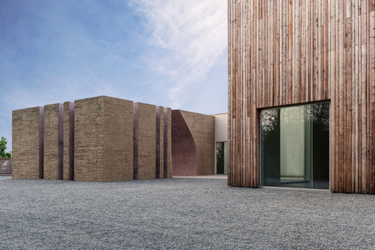
| Maitland House / Kennedy Nolan Posted: 06 Jun 2017 10:00 AM PDT  © Derek Swalwell © Derek Swalwell
 © Derek Swalwell © Derek Swalwell From the architect. This is an alteration and addition to a post-war brick veneer house. The project was executed in 2 stages: an interior refurbishment of the existing house was then followed by the major addition of kitchen, dining, living and swimming pool.  Floor Plan Floor Plan The palette is restrained. White painted brick and unfilled saw-cut travertine define what has been added. An L-shaped plan determines that most of the day-to-day living flank the rear garden. Living spaces are bright and visually connected by large areas of glazing.  © Derek Swalwell © Derek Swalwell An over scaled steel bird's beak fascia binds the L-shaped plan. The rear elevation becomes a dramatic assembly of horizontal and vertical, with the fascia terminating in a graphic chimney element.  © Derek Swalwell © Derek Swalwell Monumental and monochromatic, this single storey addition speaks of our clients' love of Modernism. New wraps the old and the architecture seeks to drag interior program to the outdoors.  Section Section The scale is unexpected, almost not domestic. Our practice continues to explore the motifs of hearth, chimney and horizontal roofline.  © Derek Swalwell © Derek Swalwell This posting includes an audio/video/photo media file: Download Now |
| Renderings Revealed for New Residential Building at Hudson Yards in New York Posted: 06 Jun 2017 09:00 AM PDT  Courtesy of Related Companies Courtesy of Related Companies  Courtesy of Related Companies Courtesy of Related Companies With construction of the Hudson Yards megadevelopment moving ahead at full steam, new renderings have been released of One Hudson Yards, the second residential building being constructed as part of the complex. Designed by Davis Brody Bond, with interiors by Andre Kikoski Architect, the stone and glass structure will be located adjacent to both transforming culture pavilion 'The Shed' and the Hudson Yards centerpiece, Heatherwick Studio's 'Vessel'. The 33-story tower will feature a red stone and glass facade rising from a podium and rooftop terrace. With leasing set to launch this summer, One Hudson Yards will offer 178 apartments ranging from one- to three- bedroom units and one four-bedroom penthouse residence.  Courtesy of Related Companies Courtesy of Related Companies Amenities for the building include an 82-foot-long pool, a spa, an Equinox-curated fitness center, a bowling alley, a game lounge, a half basketball court, a penthouse lounge, entertainment room, terrace, and children's playroom, among other offerings. One Hudson Yards will follow the development's first residential building, 15 Hudson Yards, which will rise from the base of The Shed. It is also adjacent to the Robert A.M. Stern-designed rental building, Abington House. News via Related Companies.
This posting includes an audio/video/photo media file: Download Now |
| Kinfolk / Berg Design Architecture Posted: 06 Jun 2017 08:00 AM PDT  © Edward Caruso © Edward Caruso
 © Edward Caruso © Edward Caruso From the architect. The project is located in the Wythe Avenue corridor in Williamsburg, Brooklyn: a neighborhood composed of mostly low rise industrial buildings which support local manufacturing. The corridor is also home to Kinfolk Studios, formed in 2008 by friends from New York, Los Angeles and Tokyo, Japan. The concept of a "Kinfolk life" evolved from their desire to create products and experiences they'd imagine but couldn't find to purchase.  © Edward Caruso © Edward Caruso Combining experience from a variety of disciplines, the group set out to source the highest quality designers, builders and techniques to develop lasting products and unique experiences.  © Edward Caruso © Edward Caruso As an organization, Kinfolk is a creative collective that uses their space at 90 Wythe Ave for various functions not the least of which are coffee shop, bar and restaurant. For the neighboring site at 94 Wythe Avenue, we were hired to design a multi-disciplinary event/performance space, bar and retail store. The existing building, a former mechanics garage, is a 75' x 50' brick structure with 20' tall ceilings and storefront glazing facing Wythe Avenue.  Axonometric Axonometric As a design directive the client asked that the space look like it was designed by a "Pacific North West hippie Mathematician". The bar area had to feel intimate on a slow night with only 30-40 people but feel connected to the rear event space when the venue is filled to capacity with 150 people. The bar and event space needed to be adaptable to a variety of uses including art gallery shows, movie screenings, DJ dance parties, musical performances and large dinner parties.  © Edward Caruso © Edward Caruso In the middle of the main space three set pieces were inserted; two "geo - shells" and the bar canopy. The geo-shells are geodesic inspired sections of a dome and are clad in Douglas fir and Western red cedar to materially reference the Pacific North West. The retail space utilizes the glass store front system for display and has a designated street entrance. The experience from the street is that there is an entire geodesic dome in the space.  Plan Plan One enters the bar/event space through an intentionally dark entry hall which is angled at the end to only reveal the interior space of the dome at the end of the hallway. Upon entering, the bar structure is the visual focal point and a foil to the geo-shells. The bar structure's trusses support the liquor bottles and the canopy which spatially defines the bar area. Both geo-shells while slightly different in scale and radius create semi enclosed spaces with intimate seating areas differentiated by changes in elevation; one seating array is slightly raised while another is recessed into the floor referencing George Nelson era "conversation pits" . The geo shell in the rear of the space is carefully perforated to connect to the rear event space which contains a small stage, DJ booth and gallery lighting. Removable panels were designed to infill the openings in the shell and modulate the level of connection between the two spaces.  © Edward Caruso © Edward Caruso This posting includes an audio/video/photo media file: Download Now |
| Posted: 06 Jun 2017 07:15 AM PDT  © Norman Foster Foundation © Norman Foster Foundation Last month the Norman Foster Foundation, created to promote "interdisciplinary thinking and research to help up-and-coming architects, designers and urbanists to anticipate the future," coincided the opening of its new Madrid-based headquarters with an international conference. Future is Now pulled together a broad collection of professionals—including Sir Jonathan Ive, Marc Newson, Olafur Eliasson, Maya Lin, Alejandro Aravena, and Luis Fernández-Galian—who addressed an audience of 1,800 (including 1,100 students) in the Spanish capital's Royal Theater. Watch the conference in its entirety, or read a summary, after the break.  © Norman Foster Foundation © Norman Foster Foundation The conference was was organized in three sessions focusing on Cities, Technology and Design, and Infrastructure. Each session was led by the Foundation's Director, María Nicanor. The following summary has been provided by the Norman Foster Foundation. CitiesThe first session included a keynote speech from Norman Foster. Francine Lacqua, editor-at-large at Bloomberg, interviewed Michael Bloomberg, honorary trustee of the Foundation, philanthropist, businessman and three-time mayor of New York City, who said: "There are problems with living in cities but the solutions are there too. We need leaders to say this is where we are going to go and I'm going to explain to you why we are going to go there. Norman Foster is this kind of leader." In the discussion that followed, architect and artist Maya Lin advised the audience to "never stop learning. Stay curious. Think outside the box. Think holistically." Richard Burdett, professor of Urban Studies at the London School of Economics said: "Many schools don't teach students that they need to work together. They are siloed. That is part of why this Foundation is so important." Technology and DesignThe second session began with a keynote speech from Matthias Kohler, professor of Architecture and Digital Fabrication at the Swiss Federal Institute of Technology, who spoke about changes in how people make and build things. Gillian Tett, U.S. managing editor at The Financial Times, interviewed Jonathan Ive, chief design officer at Apple and honorary trustee of the Foundation, who discussed his inspiration and view of the world, saying: "Dismissing ideas too quickly is dangerous. Over the past 25 years, I think one of the things that we've learned is how profoundly important an idea is and how fragile it is but how over the course of development it can become so powerful. It worries me how easily an idea can be compromised in its infancy." Also taking part in the discussion were Niall Ferguson, a senior fellow of the Hoover Institution, and Nicholas Negroponte, co-founder of MIT Media Lab and member of the Foundation's advisory board, who had opposing outlooks on how technology will impact the world. Ferguson warned: "Major technological innovation always has different impacts than intended," while Negroponte said: "Soon we will be able to do what nature does. We will design buildings by planting a seed in the ground and it will grow from the ground up. We will do it as well as or better than nature." Marc Newson, designer, and professor in Design at the Sydney College of the Arts; Neri Oxman, architect, designer and founder and director of Mediated Matter Group at MIT Media Lab; and Patricia Urquiola, designer, architect and founder of Studio Urquiola, continued the discussion, exploring digital technologies, artificial intelligence and the interaction between technology and humanity. InfrastructureIn the third session the keynote speech was given by Alejandro Aravena, executive director of ELEMENTAL and winner of the 2016 Pritzker Architecture Prize, who spoke of the inequality in cities and the idea that infrastructure can help even the field. Christiane Amanpour, chief international correspondent for CNN, interviewed Henk Ovink, special envoy for International Affairs for the Netherlands, who stated: "if as a decision maker, if you cannot include everyone at a local level, your initiatives will fail. Inclusion is a critical driver of change." Participating in the discussion were Luis Fernández-Galiano, trustee of the Foundation, professor at Madrid's School of Architecture, ETSAM, and director of the journals AV/Arquitectura Viva; Jonathan Ledgard, director of Rossums Group, founder of Redline, former director of Afrotech and member of the École Polytechnique Fédérale de Lausanne (EPFL); Mariana Mazzucato, director of the Institute for Innovation and Public Purpose at University College London; and Janette Sadik-Khan, director of Transportation at Bloomberg Associates. Sadik-Khan spoke about the importance of having a vision and moving quickly so that people believe in the possibility of change. In the event's closing conversation, artists Cornelia Parker and Olafur Eliasson spoke of the necessity of interdisciplinary interactions in inspiring people to make social change.  © Norman Foster Foundation © Norman Foster Foundation
This posting includes an audio/video/photo media file: Download Now |
| Vaughan City Hall / KPMB Architects Posted: 06 Jun 2017 06:00 AM PDT  © Maris Mezulis © Maris Mezulis
 © Tom Arban © Tom Arban From the architect. Originally a rural township located at the northern edge of Toronto, the City of Vaughan is one of the region's fast-growing suburban municipalities. The new Civic Centre, the winning scheme in an invited design competition, is an exemplar for cultivating civic landscapes and environmentally responsible development for the 21 st century.  Implantation Implantation Rather than a singular building, a campus of low-rise buildings defines a public terrain of open space. It is organized according to a series of bands, referencing both the clarity of Ontario town planning and the north-south concession grid of the rural agrarian landscape.  © Tom Arban © Tom Arban  Ground Floor Plan Ground Floor Plan  © Tom Arban © Tom Arban The City Hall and Civic Tower anchor the composition. The exterior cladding incorporates terracotta and double- and triple-glazed glass curtain wall. Canadian "Kodiak" granite is used for the exterior landscape and interior floor finishes. Interior spaces are finished in exposed concrete, oak panels, terrazzo and oak floors, and carpet tile.  © Tom Arban © Tom Arban  Section A-A' Looking North Section A-A' Looking North  © Tom Arban © Tom Arban The plan is organized around interconnected, centrally located atria to maximize access to daylight and fresh air. The orientation and optimum amounts of glazing greatly reduce solar heat gain and reliance on large HVAC systems and artificial lighting. Offices have raised floors and flexible workstations. The overall structure is concrete slab with a concrete framework of circular columns and flared capitals. The project is LEED Gold certified.  © Maris Mezulis © Maris Mezulis This posting includes an audio/video/photo media file: Download Now |
| Helsinki Airport to Be Transformed with Undulating Roof and Public Landscape Posted: 06 Jun 2017 05:15 AM PDT  Rendering by VIZarch. Coutesy of ALA Architects Rendering by VIZarch. Coutesy of ALA Architects The team consisting of ALA Architects, HKP Architects and Ramboll Finland has won an invited competition for the renovation and expansion of Helsinki Airport's Terminal 2 with their entry titled "City Hall." Organized by Finnish airport operator Finavia, the competition asked four international firms to create a new airport plan centered around a reenvisioned terminal that will allow the airport to efficiently serve up to 20 million passengers per year.  Rendering by VIZarch. Coutesy of ALA Architects Rendering by VIZarch. Coutesy of ALA Architects The winning scheme achieves these goals by creating an undulating public terrain which connects a new public plaza with the departure and arrival halls, simplifying passenger circulation through the airport, and a matching flowing wooden ceiling that references Finnish sculpture and the country's rugged Lappish scenery. The terminal expansion consists of two main building volumes: "City Hall," the check-in and arrival hall; and "Security Box," the security control and baggage claim. Positioned at the entrance, City Hall and it's dramatic form will become the new face of the terminal, while further back "Security Box" will stand out for its bright blue facade.  Rendering by VIZarch. Coutesy of ALA Architects Rendering by VIZarch. Coutesy of ALA Architects  Rendering by VIZarch. Coutesy of ALA Architects Rendering by VIZarch. Coutesy of ALA Architects The arrival hall will feature a rolling roof structure, constructed of pre-fabricated spruce-clad glulam elements and inspired by the work o Finnish sculptor Tapio Wirkkala, specifically the plywood wall sculpture "Ultima Thule" commissioned by the Finnish government for the Nordic pavilion at the Expo 67 in Montreal. The terraced plaza outside also draws from an artistic source: Laila Pullinen's copper bas-relief "Sun of the Fells," also presented at Expo 67 and planned for display in the new Terminal 2. "The plaza is like a counterpart to the ceiling of "City Hall," explain ALA. "The three-dimensional surface hides the deck-like structure of the plaza and the drop-off ramp. This surface connects the different levels and routes both visually and physically."  Rendering by VIZarch. Coutesy of ALA Architects Rendering by VIZarch. Coutesy of ALA Architects  Rendering by VIZarch. Coutesy of ALA Architects Rendering by VIZarch. Coutesy of ALA Architects The plaza has been designed with site drainage solutions in mind – in the summer, runoff will create a tranquil pool in the plaza, which in the winter will be transformed into a public skating rink. The stairs wrapping around the plaza will allow for transfer between terminal levels, while doubling as seating. "The design of the terminal expansion emphasizes the equality of the routes of the arriving and departing passengers," the architects continue. "The lower level is used by arriving passengers, as well as by those coming to the terminal by bus, train, bike or foot and those coming from the parking facilities. This is why the identity of this level receives as much attention in the design as the departure hall. The large openings on the upper departure hall level visually link the two spaces."  Rendering by VIZarch. Coutesy of ALA Architects Rendering by VIZarch. Coutesy of ALA Architects  Rendering by VIZarch. Coutesy of ALA Architects Rendering by VIZarch. Coutesy of ALA Architects Surrounding the terminal expansion, other new construction will provide access to the train station and a variety of buildings, parks and bridges as part of the airport city district. These interventions will result in a highly-walkable urban environment. The expansion will be built in phases beginning in Fall 2018 at the earliest, with a preliminary completion date set for 2021. News via ALA Architects.
This posting includes an audio/video/photo media file: Download Now |
| Indios Desnudos House / Cañas Arquitectos Posted: 06 Jun 2017 04:05 AM PDT  © Jordi Miralles © Jordi Miralles
 © Ricardo Chaves © Ricardo Chaves From the architect. In the Papagayo peninsula, placed on the tip of an seaward pointing, and slightly downward sloping ridge of a peninsular shaped lot, with forest on both sides ( one a natural reserve), is the house named Indios Desnudos.  Site Plan Site Plan It is named after some of the most characteristic trees on the lot, indio desnudo (naked indian) they make up a focal point of the house, especially in the main living area.  © Jordi Miralles © Jordi Miralles A house is designed to enjoy outdoor living and the views. Because of this, it is designed to be comfortable without the (optional) use of air conditioning. The internal spaces are integrated with the exteriors, which makes being in the interior feels like being outside.  © Jordi Miralles © Jordi Miralles All living spaces have a view of the sea or the forest reserve. It has its main access via a lobby from which you can see the social area and the view to the sea. From here you can use the wooden boardwalk-like walkways that hover above scattered river stones that make up the two axes of circulation that structure the floor plan, or use the stairs to get to the two main bedrooms via bridges.  © Jordi Miralles © Jordi Miralles The main double-height space contains living room, dining room and kitchen and opens with large windows towards the pool terrace and towards the Forest Reserve where one of several Indios Desnudos is framed. The window opens with sliding doors erasing any barrier between the interior and the terrace.  © Jordi Miralles © Jordi Miralles The pool merges with a water/terrace/ mirror that surrounds an outside living room in its entirety. It is located below the master bedroom and framed by a set of diagonal columns. This shaded "island" is the pivot of the social area, located in a strategic place near the kitchen and receives the sea breezes and enjoys magnificent views of both the forest and the sea.  © Jordi Miralles © Jordi Miralles Through the main bridge on second floor which crosses the double height of the social space, you reach the master bedroom, which enjoys the same view and breezes as the island. The second bedroom upstairs is reached by a secondary bridge that runs parallel to the same space from which you can also enjoy views to the sea.  © Jordi Miralles © Jordi Miralles The ground floor bedrooms overlook the forest reserve. They are reached via another of the wooden walkways that ends in family room, named by the owner the "monkey room". From this small cosy space, this walkway crosses a narrow skylit space of variable height, that opens to the double height social area on one side and on the other, towards the forest that is reflected in the mirror of water. It continues outside and passes next to the main terrace and the outdoor terrace "island", and ends on a balcony that is projected over the treetops towards the sea and sunset.  Section B-B Section B-B It is a journey rich in sensations produced by the diversity of spaces, by the quality of light, and by differences in heights, scales and views.  © Jordi Miralles © Jordi Miralles Indios Desnudos is, in short, a house designed to live abroad enjoying the breeze of the sea, the sun, the sea views and a forest full of tropical and wild flora and fauna.  © Ricardo Chaves © Ricardo Chaves This posting includes an audio/video/photo media file: Download Now |
| A Simple Guide to Using the ADA Standards for Accessible Design Guidelines Posted: 06 Jun 2017 02:30 AM PDT  Obstructed high forward reach. Image Courtesy of United States Department of Justice Obstructed high forward reach. Image Courtesy of United States Department of Justice Only a special few architects can truly say they enjoy reading building codes. There's no doubt that it's daunting and it can certainly pose challenges to your design. Over time you'll likely become familiar with the types of things you need to look out for on a project, but even the most experienced architects may still need to double-check a code question or two during the design process (or have an intern check it for them.) Unfortunately, many code documents are unwieldy to say the least, and there are few cases in which this is more true than the 279-page ADA Standards for Accessible Design. However, once you understand the layout and how to use a code book or the ADA guidelines, they become more manageable. This guide aims to describe each chapter in the ADA 2010 guidelines to give a foundation for navigating them. Luckily for designers in United States, the documentation for the ADA Standards for Accessible Design is available online. Keep reading for a quick summary (all information and diagrams are directly from the guidelines). Check out the whole document here if you need it—or for convenience, each subheading in this article links directly to the relevant section in the PDF! OverviewThe Americans with Disabilities Act (ADA) of 1990 is a civil rights law in the United States that prohibits discrimination based on disability. Because of its status as law, compliance is not optional. Municipalities do not have to adopt ADA in the way they adopt other building codes; it is already mandatory. The most recent version of the design standards for public spaces was released by the Justice Department in 2010 and it is what designers follow today. Keep in mind that similar to codes, things like clear floor space and wheelchair maneuvering space are given in the guidelines as a minimum—you can always design more generously and it's always good practice to keep universal design in mind on any public project. For those reading this outside the United States, many of the standards are likely shared broadly across countries. However, the ADA guidelines referenced in this article apply specifically to the United States and designers in other countries should be sure to cross-reference them with their local codes and regulations. Chapter 1: Application and Administration Diagram conventions. Image Courtesy of United States Department of Justice Diagram conventions. Image Courtesy of United States Department of Justice The first chapter of the ADA guidelines helps readers understand how to use the rest of the guide, including conventions for understanding the diagrams and a long list of definitions. The terms that are defined in this section are italicized throughout the text so readers can ensure they understand the intent of a word or phrase as it relates to these guidelines. Chapter 2: Scoping Requirements Parking space requirements. Image Courtesy of United States Department of Justice Parking space requirements. Image Courtesy of United States Department of Justice Use this chapter to determine how the ADA standards apply to the project you're working on. It addresses existing buildings, historic buildings, and exceptions to the guidelines. Chapter 2 also defines and describes the accessible route and where it is required, a fundamental part of an ADA-compliant project. Accessible means of egress, parking, and fire alarm systems are addressed. The rest of the chapter consists of short sections about each type of space discussed later in the guidelines, explaining when and how compliance is necessary and noting the relevant section for further details. Chapter 3: Building Blocks Clear floor space. Image Courtesy of United States Department of Justice Clear floor space. Image Courtesy of United States Department of Justice The Building Blocks chapter lays the foundation for accessible design, and all subsequent sections reference the information found here. Especially important and ubiquitous are the clear floor spaces, which are required in front of many elements, including kitchen and bathroom fixtures. The guidelines also make provisions for clear floor space in an alcove and give detailed information on knee and toe space, reach requirements, and other necessary clearances. Chapter 4: Accessible Routes Accessible route clear width. Image Courtesy of United States Department of Justice Accessible route clear width. Image Courtesy of United States Department of Justice In most cases, at least one accessible route (described in Chapter 2) must be provided within the site from all site arrival points to the accessible entrance(s). The guidelines include tables and diagrams about door opening clearances, acceptable slopes for ramps, accessible elevator design, and guardrail and curb requirements.  Required door clearances. Image Courtesy of United States Department of Justice Required door clearances. Image Courtesy of United States Department of Justice  Required door clearances. Image Courtesy of United States Department of Justice Required door clearances. Image Courtesy of United States Department of Justice Chapter 5: General Site and Building Elements Accessible parking space sizes. Image Courtesy of United States Department of Justice Accessible parking space sizes. Image Courtesy of United States Department of Justice Before delving into the building's interior, Chapter 5 addresses site elements, including accessible parking spaces and passenger loading zones. Also included are some general stair guidelines and detailed handrail requirements. Chapter 6: Plumbing Elements and Facilities Toilet compartment clear space. Image Courtesy of United States Department of Justice Toilet compartment clear space. Image Courtesy of United States Department of Justice This chapter details the requirements for each type of plumbing fixture, including clear floor spaces, heights of fixtures, and necessary grab bars. In many cases, the guidelines give options for layout and type of fixture to address design intent.  Bathtub clearances. Image Courtesy of United States Department of Justice Bathtub clearances. Image Courtesy of United States Department of Justice Chapter 7: Communication Elements and Features Braille signage standards. Image Courtesy of United States Department of Justice Braille signage standards. Image Courtesy of United States Department of Justice Fire alarms, signage, and other more specific forms of communication (such as ATMs and public telephones) are discussed in the chapter on Communication Elements. Signage deserves a lot of attention in terms of accessible design and the guidelines detail requirements for raised characters, Braille, installation height and location, visual characters, pictograms, and symbols of accessibility.  Signage standards. Image Courtesy of United States Department of Justice Signage standards. Image Courtesy of United States Department of Justice Chapter 8: Special Rooms, Spaces, and Elements Kitchen layout clearances. Image Courtesy of United States Department of Justice Kitchen layout clearances. Image Courtesy of United States Department of Justice The last three chapters of the standards deal with specialized situations. Some of the scenarios covered in Chapter 8 include wheelchair seating in an auditorium setting, fitting rooms, guest rooms in hotels, holding cells and courtrooms, and transportation facilities. An important section of the chapter discusses kitchens, which gives requirements for different layouts and details necessary clear floor space and types of appliances needed for compliance. Following the kitchen section is a section describing the other requirements for residential dwelling units, which refers back to the kitchen section as well as to the sections in Chapter 6 concerning bathrooms. Chapter 9: Built-In Elements ADA compliant bench. Image Courtesy of United States Department of Justice ADA compliant bench. Image Courtesy of United States Department of Justice Chapter 9 focuses on smaller details of the built environment that must also comply with accessibility guidelines. Specifically, the ADA compliant bench, found in this chapter, has been known to cause layout difficulty in areas like locker rooms. So, do yourself a favor and study the bench before it becomes a problem. Also in the chapter are things like dining surfaces, checkout aisles, and food service lines. Chapter 10: Recreation Facilities Golf facility standards. Image Courtesy of United States Department of Justice Golf facility standards. Image Courtesy of United States Department of Justice Recreation Facilities in this chapter covers a wide range of program spaces; the definition for "recreation facilities" is found in Chapter 2. From amusement park rides, to boating facilities, to golf courses and swimming pools and more, the guidelines are here.  Pool sloped entry. Image Courtesy of United States Department of Justice Pool sloped entry. Image Courtesy of United States Department of Justice All information and diagrams are from the 2010 ADA Standards for Accessible Design from the United States Department of Justice. This posting includes an audio/video/photo media file: Download Now |
| Proa House / GÓmez & GOrshkova Posted: 06 Jun 2017 02:00 AM PDT  © Jesús Granada © Jesús Granada
 © Jesús Granada © Jesús Granada «Everything that the forests, rivers or the air do / Fits amongst the walls that believe to enclose the room»  © Jesús Granada © Jesús Granada This recreational house is built on an old majada, as stone sheds are known in the Sierra de Aracena, auxiliary buildings that serve as pantry, chicken coop or for storing implements. It is for this reason that they are usually located on the edge of villages, closer to the rich orchards, like those bordering Cortelazor. The building we found here was a soon to be ruin that had fallen into disuse long ago.  © Jesús Granada © Jesús Granada  Floor Plans Floor Plans  © Jesús Granada © Jesús Granada The small building stands on the complex pentagonal geometry that resulted from property changes generation after generation. Reconciling the difficult spatial conditions with the requirements of reasonable living standards represented the main challenge. Under the strong influence of the tight plot limits, the adopted strategy solves the project with very simple resources. Starting with the layout, for which the subsidiary uses (toilets, heating, kitchen, storage, stairs...) are located towards the perimeter, thus releasing a clear domestic centrality that is occupied by the kitchen in the livable basement, the living room downstairs and the bedroom and study upstairs.This arrangement gives the building its characteristic pierced shell image, a protected area that does noy restrict to interiority, but opens with generous windows to the depth of the landscape. Hills and valleys are welcome into the domestic warmth, lending its immensity to the bosom of a humble home. Perhaps this is its greatest ambition, otherwise the inhabiting experience seeks no more than a renewed vita simplex built around food, rest and conversation.  © Jesús Granada © Jesús Granada Beyond the strict regulatory architectural requirements in place the project lies on the extensive common ground shared by popular architecture and contemporary taste. Our present understanding of the traditional aesthetic floor translates, once more, in an eulogy to simplicity, manifested in a palette made just of wood, roof tile, clay and the ubiquitous white.  Constructive Section Constructive Section Proa house is the first finished sample of a management model aimed at recovering small obsolescent buildings and provide their owners with modern affordable homes in places of environmental quality.  © Jesús Granada © Jesús Granada This posting includes an audio/video/photo media file: Download Now |
| How to Get a Job in Architecture Without Any Experience Posted: 06 Jun 2017 01:00 AM PDT  © VisualHunt, Under License CC0 1.0 © VisualHunt, Under License CC0 1.0 I believe one of the biggest problems recently graduated architects are encountering is their lack of professional experience. That’s totally normal. Without knowing what to do, finding employment in architecture can be very costly, both financially and time wise. Personally, I started my professional career with some internships where I saw how an architecture project in the street worked: the paperwork that’s involved, the invoices, the budgets, the smell of the ink from the plans in the office, how the models feel under your fingers. Honestly, you have no idea how open other architects are to sharing their knowledge and making room for the new generations that come after. It makes sense because in a way they see themselves in the new generation, as they were a few years ago. I started by doing a few internships, these were my first steps in the working world, but once you are inside it is much easier to progress and move in that environment. It’s like moving going from living on land to being in the water, at first you are clumsy and slow, but then you learn to swim on your own. But I'm not going to lie to you, all that glitters is not gold. Put it this way, people looking for their first job as an architect are like "salt". Just an object for trade, a mere commodity. You’ll notice that it usually doesn’t matter what kind of salt you prefer. All salt looks the same. You could change one brand of salt for another and no one will notice the difference. In fact, the price of salt is extremely low. So you don’t want to be "salt" you want to be "caviar", something so unique and scarce that people pay huge amounts of money to get it. If you behave like "caviar", architecture studios wouldn’t even consider passing you up, because you have demonstrated clearly through your application that you are the solution to their problems. At least a part of them. This will make you unique. Put yourself in the hiring manager’s shoes for a minute and imagine the resumes that come through the studio. For example, I’m the manager of Arturo Montilla Architecture, and two days after posting a job offer online we had 400 candidates. Most of them are average candidates, pretty similar to one another. In this case, your job is to make your application stand out. I know because I have looked over more than 1,000 applications (yes, for about 10 seconds each). In fact, thoroughly researching and chatting with close friends who are dedicated to Human Resources, I have discovered that every person in charge of reviewing job candidates does the same thing. Obviously, there’s not enough time to thoroughly review each one. Therefore, when an applicant is "caviar", they immediately stand out from the rest. These are the three things you can do to stand out and get your first job as an architect. 1. Be Specific![© 準建築人手札網站 Forgemind ArchiMedia [Flickr], Under License CC BY-NC-ND 2.0](https://lh3.googleusercontent.com/blogger_img_proxy/AEn0k_so_nzfDsOdsa-qMgJrZgHZ4ZpiMORLcvA54nDGCcNpODggbdHTrfHhEGqZ9sUTO9pNaDcW5k_J07ZnYBYsmoKo7d9p430_B87RkmY9hxGFNv0YKHpEHkQpfPGJ2gJsSUlavYe2FBO-ZKtRWZt9lTLvpKoe9NHH-HiJ-OOWRCaOBRafD0Yh4aIwbcboJw=s0-d "© 準建築人手札網站 Forgemind ArchiMedia [Flickr], Under License CC BY-NC-ND 2.0") © 準建築人手札網站 Forgemind ArchiMedia [Flickr], Under License CC BY-NC-ND 2.0 © 準建築人手札網站 Forgemind ArchiMedia [Flickr], Under License CC BY-NC-ND 2.0 In the last selection process I had - which, coincidentally was what finally pushed me to write this article - I asked the following question: "What’s your dream job?" Guess what 90% of the candidates answered? Something around these lines:
That was almost everyone’s response. This is all "salt". Now, check out what the "caviar" said:
Notice the difference? People in human resources do! When you’re specific you don’t waste the person in charge of reading your application’s time. You have done your homework and you’re not waiting for someone to find work for you, you have already defined what you want your job to be in advance. Once you know what you want, it will be much easier to go to your network and ask them to help you connect with other people or architecture studios. Personally, when somebody gives the salt response, I’m always a little hesitant. It’s so generic and vague that I’m not sure where to send it. However, if you tell me exactly what you want, I could connect you with one or two people that fit that description right now. 2. Refine Your Search and Your Interview Preparation![© Stock-Asso [Shutterstock]](https://lh3.googleusercontent.com/blogger_img_proxy/AEn0k_u3OBi3y51g6E8tdNNGFNPunCfMs-vvHgv7pJWSHXw7_O1TYv8fRB38YAT_cJLNK-18LtTu22UQR3q2j16J4BQPxqdVruDQWgICdX5MkigCvvBJ-IV3fpcYs6OEMPkCV_wH221w2bPcQBUs5giKI9mBil05ZuGD3S4ND21cKlsjLaJCmfGk8oga0qg=s0-d "© Stock-Asso [Shutterstock]") © Stock-Asso [Shutterstock] © Stock-Asso [Shutterstock] Have you ever had a job interview before? Let's look at the answers I saw:
Sounds hard, right? Good. Most of the candidates aren’t going to do the hard work. Basically, if you invest three times the effort on making a good impression, you could get thirty times the results. Yes, you’ll have to work and work hard, but you’ll get the job. 2. Get a Recommendation from Somebody! Anybody!![© Townsville Chamber [Wikimedia Commons], Under License CC-BY-SA-3.0](https://lh3.googleusercontent.com/blogger_img_proxy/AEn0k_uyB72W3f4EiilR6r8OlII-sVenYEMtUF7DLhi5T9XBHBGML91pT63jnxnFJJFDTnxqSUi4J19JeryGnVjou_EtY7gkjvq-TJhq-XRi5WUSDB0ZpRB7Sbyn8Hs7KDPB6OwP7mDzTxU_V3RA2xAMOrM8MQxZbwDhCIC7bVYG7gCE4EgFHQBoL18ff_-cHG0St_AzkFwRBg-5i-vrQCiFoKvFpJ3xEZZ9NgHKM7xckxguxWmG-Bsnjhql6D4frO1jr9ZD85KcG7ujrapn-FHKkMq5HYPxaAuQB9tXb5Sb2g=s0-d "© Townsville Chamber [Wikimedia Commons], Under License CC-BY-SA-3.0") © Townsville Chamber [Wikimedia Commons], Under License CC-BY-SA-3.0 © Townsville Chamber [Wikimedia Commons], Under License CC-BY-SA-3.0 Young people love to complain about why we don’t have a good network of professional contacts. And I ask, "Really? Who did you try to contact?" The answer is usually a shrug. Let's look at examples:
Huge difference, right? Actually, as I see it when looking for work you can stand out in several ways:
Ask yourself ... "What would "salt" do in this phase of the search? What would a true "caviar" do?" And repeat it to yourself throughout the process. It is essential that you take into account this paradigm shift to proceed with a successful job application. So, please, internalize these concepts and be more like "caviar." Guide by: Yo Soy Arquitecto. This posting includes an audio/video/photo media file: Download Now |
| Steven Holl Architects Break Ground on Houston Museum of Fine Arts Extension Posted: 05 Jun 2017 11:00 PM PDT  Courtesy of Steven Holl Architects Courtesy of Steven Holl Architects Steven Holl Architects has broken ground on the Nancy and Rich Kinder Building for Modern and Contemporary Art at The Museum of Fine Arts in Houston, Texas. Selected through an international competition in 2012 among finalists Snøhetta and Morphosis Architects, the winning proposal is a 164,000-square-foot museum building that will be one of the campus's two newest additions. To expand and unite its campus as an integral experience, the Museum is also realizing a new Glassell School of Art also designed by Steven Holl Architects, totaling a 14-acre redesign led by the office.
 Courtesy of Steven Holl Architects Courtesy of Steven Holl Architects  Courtesy of Steven Holl Architects Courtesy of Steven Holl Architects Permeability is a key strategy surrounding the new museum building, shaped by "gardens of horizontal porosity and open on all sides." Seven gardens "slice" the perimeter of the campus, marking points of entry. The largest central garden court serves as the entry point onto the main campus grounds.  Courtesy of Steven Holl Architects Courtesy of Steven Holl Architects  Courtesy of Steven Holl Architects Courtesy of Steven Holl Architects A unique feature of the building's design is its distinctive sliced-canopy roof. Steven Holl Architects describe the roof as "concave curves, imagined from cloud circles" that "push down on the roof geometry, allowing natural light to slip in with precise measure and quality" – a key feature for its top-lit galleries. The undersides of the ceiling elements also reflect light onto the interior gallery spaces.  Courtesy of Steven Holl Architects Courtesy of Steven Holl Architects  Courtesy of Steven Holl Architects Courtesy of Steven Holl Architects A triple-height central forum serves as the program's atrium with vertical circulation to the upper floors. A stepped ramp and elevators link the lobby and gallery levels for direct access to all galleries. Gallery rooms are organized horizontally on two levels, punctuated by views of the seven gardens.  Courtesy of Steven Holl Architects Courtesy of Steven Holl Architects  Courtesy of Steven Holl Architects Courtesy of Steven Holl Architects  Courtesy of Steven Holl Architects Courtesy of Steven Holl Architects The museum's translucent skin is composed of glass tubes, providing natural light to the galleries and forming a 'cool jacket' around the new building. The transparent skin serves a dual purpose reducing solar gain and creating cooling energy. At night the façade will be lit from the inside, with its "glowing walls" serving as "an open invitation to enter the museum." Steven Holl Architects previously won the Daylight Award in Architecture in 2016 for their innovative use of light in designing interior spaces, including their Nelson-Atkins Museum in Kansas, and the Museum of Ocean and Surf in Biarritz.  Courtesy of Steven Holl Architects Courtesy of Steven Holl Architects  Courtesy of Steven Holl Architects Courtesy of Steven Holl Architects  Courtesy of Steven Holl Architects Courtesy of Steven Holl Architects
 Courtesy of Steven Holl Architects Courtesy of Steven Holl Architects The entire MFAH campus redevelopment project is slated for completion in late 2019.
News via: Steven Holl Architects.
This posting includes an audio/video/photo media file: Download Now |


| You are subscribed to email updates from ArchDaily. To stop receiving these emails, you may unsubscribe now. | Email delivery powered by Google |
| Google Inc., 1600 Amphitheatre Parkway, Mountain View, CA 94043, United States | |
Nema komentara:
Objavi komentar