Arch Daily |
- Reporting From reSITE 2017, Monocle 24 Talks to Mayors, Chief Architects and City Planners
- Kew House / McLaren.Excell
- House V / Stéphane Nikolas
- Congo Kintele Congress Centre / AVCIARCHITECTS
- Wind Tower / AGi Architects
- Mountain Lake Park Playground / Bohlin Cywinski Jackson
- Flagship Building / Geodesic Design
- Supplyframe DesignLab / Cory Grosser + Associates
- Sydney’s Brutalist Sirius Building Saved from Demolition after Court Ruling
- El Palmar / David Cervera
- 7 Top Teams Shortlisted in Competition to Design Centre Pompidou Brussels
- Yoox Net-A-Porter Tech Hub / Grimshaw
- Norman Foster Discusses the Dawn of High-Tech Architecture in This 1971 Interview
- COR Shop / BLOCO Arquitetos
- How Architecture Affects Your Brain: The Link Between Neuroscience and the Built Environment
- 'ARQ RIFA G’2010' House / Emilio Garateguy + Ignacio Trecca
- Yoga Poses For Architects
- Spotlight: Eduardo Souto de Moura
- IN CASTRO – Ideas and Business Center / Campos Costa Arquitetos
| Reporting From reSITE 2017, Monocle 24 Talks to Mayors, Chief Architects and City Planners Posted: 25 Jul 2017 09:00 PM PDT reSITE, an annual conference held in Prague, is among the world's most important forums for discussing cities and urbanism. Pooling together experts, architects, mayors, planners, municipal leaders, real estate developers and city makers from twenty countries, the event brings almost 1,000 participants together. In these two episodes of The Urbanist, Monocle 24's weekly "guide to making better cities," the team report from this year's incarnation—entitled "In/visible City"—talking to the likes of Kathryn Gustafson, Jean-Louis Missika (Deputy Mayor of Paris), Adriana Krnáčová (Mayor of Prague), and Marlena Happach (the Chief Architect for Warsaw).   © PLANE—SITE © PLANE—SITE  Host of Monocle 24's "The Urbanist", Andrew Tuck. Image © PLANE—SITE Host of Monocle 24's "The Urbanist", Andrew Tuck. Image © PLANE—SITE Learn more about the conference, here. This posting includes an audio/video/photo media file: Download Now |
| Posted: 25 Jul 2017 08:00 PM PDT  © Simone Bossi © Simone Bossi
 © Simone Bossi © Simone Bossi From the architect. Kew House involved the complete re-structuring of a Victorian London house and former stable yard in Richmond, turning a house of many small rooms into a series of orchestrated spaces that allow the house to breathe and flow.  © Simone Bossi © Simone Bossi The project principally involved the building of a rear extension, comprising of two chamfered forms nestling together. Externally, the extension sits in sharp contrast to the background of the painted-out rear façade of the original house – standing proud and distinct, with walls of pale and pitted masonry bedded down on lime mortar applied roughly and heavily brushed across the brick face.  Ground Floor Demolition Details Ground Floor Demolition Details  Ground Floor Plan Ground Floor Plan The simplicity of the exterior belies the complexity of concealed structures, interlocking pitched roofs and wedge shaped walls – all neatly resolved so as not to compromise the purity of form. The faceted nature of the exterior is accentuated by tapering window and door reveals – their depth and shadow lend a massive quality which, together with the rough pointed brickwork and grounding concrete plinths, results in a structure possessed with a sense of mass and permanence, as though carved out of a rock.  © Simone Bossi © Simone Bossi Internally, the form and structure combine to produce a dramatic folding and interlocking ceiling-scape, stitching together the two external forms and bringing together the old and new elements of the house. The theme of mass and solidity continues, with in-situ concrete elements defining the arrangement of rooms and providing the backbone to the interior scheme.  © Simone Bossi © Simone Bossi A concrete floor floods the interior and forms the visual base to the concrete structural elements on which the scheme pivots: a central spine wall forms the core of the building around which circulation space, the staircase, a cloakroom and the kitchen all hang, and a sculptural concrete work island sits at the centre of the main living space. Views of the garden have been framed through monumental openings, positioned to converge on the mature Magnolia tree at the center of the garden, whose depth provides deep sills on which to sit.  © Simone Bossi © Simone Bossi The structural gravitas is tempered by the internal wall paneling and joinery. Slender oak fluting and wall panels conceal extensive storage and give a necessary visual lift and softness to the scheme. As with the faceted exterior, relief is used to animate the interior surfaces. Daylight is carefully controlled through a deep window and roof light reveals, and the paneling extends into the period rooms within the house - running across bay windows in the form of a shutter, filtering daylight and providing privacy, sitting in juxtaposition to the restored Victorian detailing.  © Simone Bossi © Simone Bossi A simply crafted oak staircase rises up through the house – ascending from the crepuscular entrance hall, light fills and hallways and landings as the stair climbs. Simple bedrooms and bathrooms finish the scheme and complete the transition from the earthy sculptural massing below.  © Simone Bossi © Simone Bossi This posting includes an audio/video/photo media file: Download Now |
| Posted: 25 Jul 2017 07:00 PM PDT  Courtesy of Stéphane Nikolas Courtesy of Stéphane Nikolas
 Courtesy of Stéphane Nikolas Courtesy of Stéphane Nikolas From the architect. Located in the south of France near Montpellier, in the village of Saint Aunès, the house takes place on a land of vines, cultivated since the Romans, bathed by the sun of the Mediterranean Sea, a short 15- minutes drive away. The project includes another building, under construction, whose destination is that of an artist's workshop for the owners.  Ground Floor Plan Ground Floor Plan A simple parallelepiped, a cocoon of steel and glass set between two horizontal planes which delimit the view, oriented towards the vibrating light of the south, the volume, light, detached from the ground, seems to rest on the green of the original vine. The two white lines of the gangway, slender and taut, draw a minimal intervention, on a vegetable background formed of cypresses, fig trees, laurels and other olive trees. The drawing is meant to be purified, a striking contrast between the hand of man and the work of nature, complementary, balanced, without harming or diminishing the presence of the other.  Courtesy of Stéphane Nikolas Courtesy of Stéphane Nikolas Placed on a concrete base, an expression of durability and solidity, the steel cage of the structure, with optimized spans and stitches, wants to express the lightness and transparency of a habitat completely open on the outside. Bathed in the sun, catching its rays in winter, when it is low, protected from its flames in summer when it rises in the sky, the interior of the house is one with the garden, visually and physically. The bay windows of the south facade open on the entire stay and allow to extend it on the outer passageway, the terrace and the garden below.  Courtesy of Stéphane Nikolas Courtesy of Stéphane Nikolas The surface is not important. What is important is the perception of volume and the relation to nature, outside, which multiply the spatial sensation.  Courtesy of Stéphane Nikolas Courtesy of Stéphane Nikolas Made for a family of three, two adults and a boy, the program responds to a request for two bedrooms, a guest room, an office/library, and a large basement for the cellar and garage.  Courtesy of Stéphane Nikolas Courtesy of Stéphane Nikolas The metal frame was constructed as a Mecano, assembled and bolted on site, with cold bent sections. Fixed on the base of the cellar it has been dressed externally of an aluminum corrugated siding that corresponds to the industrial character of the structure, visible on the posts or the gangway. The large thermal insulation that fills the interstices of the framework allows a very small loss, compensated in winter by the solar contributions and an air/water heat pump that feed the heating by the ground. A thermodynamic hot water balloon coupled with a single flow ventilation produces the necessary hot water. The house meets the French BBC standards (building low consumption) with a consumption less than 29kwhPE / m2year.  Structure Axonometric Structure Axonometric This posting includes an audio/video/photo media file: Download Now |
| Congo Kintele Congress Centre / AVCIARCHITECTS Posted: 25 Jul 2017 05:00 PM PDT  © Emre Dörter © Emre Dörter
© Emre Dörter From the architect. The new Kintele Congress Centre and Resort Hotel (KCC) is in a newly developing area of Brazzaville, to the north of the new Olympic Centre. The site has panaromic views of the Congo River to the south and a forested unbuilt landscape to the north. The topography of the site is a valley carved out by the great Congo River which creates an island M'Bamaou in the foreground and the buildings sit parallel to the contours of this valley falling towards the river.  Floor Plan Floor Plan  © Emre Dörter © Emre Dörter  Floor Plan Floor Plan The positioning of the buildings on the site is largely dictated by this topography where we were concerned to minimise excessive excavation and shifting of earth away from the site. The larger objects of the programme: the 1500 seat Congress Hall, the 300 person Presidential Hall, the 1000 seat Banquet Hall and the 1000 person Public Piazza were placed in a line sequence interrupted by courtyards, and all reached by a public sheltered collonade that links these elements. The Hotel on the other hand is positioned 5 meters above this general public promenade, largely to give it better views to the river, while making a public / private segragation of functions on the site. All but two courtyards linking the enclosed volumes are accessible to the public, and allow us to form landscaped intermissions amongst the large masses of these functions. Thus the form of the KCC settles in to the landscape, avoiding the appearance of an out of scale overbearing large mass of buildings while providing views of the Congo River from all hotel rooms.  © Emre Dörter © Emre Dörter The 350 meter long collonade also acts as a linear public space in itself sheltering people from the ever present rain that prevails most of the year around in this part of the world. The two ends of the Collonade also act as public gates to the whole complex. Attached to this public collonade are the Press Hall to the Western gate and Museum to the Eastern gate. At this end the Museum forms the southern edge of the Piazza, while the shops and the Public Restaurant form the Northern and Eastern edges of the Piazza. This open space is also sheltered from the rain with a square occulus that allows the rain to fall in to a shallow pool at its centre.  © Emre Dörter © Emre Dörter For at least 6 months of the year rain is an everpresent climate phenomenon in Congo and defines the way people interact in public and with public space. Therefore great effort was made in this sense to shelter people while out in the open but to not distance from nature, and the presence of rain because while it is raining it is still very warm and ofcourse humid. There fore while it is important to shelter from rain it is also important to allow air to flow and cool such sheltered spaces. The presence of water is celebrated by making its fall from roofs visible and audible as it reaches the earth and fills open pools which take overflow from large roof areas using gargoyles and water falls.  © Emre Dörter © Emre Dörter Another aspect of the local tropical climate is the constant presence of a high level of humidity which makes use of natural ventilation as a way of minimising energy consumption difficult and the use of airconditioning of public spaces essential for comfort conditions to be achieved to acceptable comfort standards. Our main objective in this case is to minimise the cooling loads by reducing the incidence of sunlight on exposed glass facades. Thus glazing is always deeply set in to the façade on the north (in this case it is actually the true north façade which receives the midday sun due to the location of the site below the equator) and low sunlight from the east and west is minimised by vertical shading elements and perforated metal screens.  © Emre Dörter © Emre Dörter The use of materials in the KCC were to a large extent dictated by the requirement of speed of construction, and availability of modern construction and cladding materials, of which none exist in The Congo Republic. Thus although it would be more cost effective, concrete frame was ruled out in favour of steel and more easily transportable lighter cladding materials such as aluminium panelling for massive cladding elements such as block or brick work. Beyond that efforts were made to use natural materials at all times such as timber, and stone.  © Emre Dörter © Emre Dörter The larger elements are signified by a series of perforated cladding elements which are laser cut in geometric Congolese patterns derived from the traditions of the larger region, connecting the buildings to their place. At times these patterns find themselves recalled in interior elements such as floor patterns and screens which divide interior spaces, and at times on external wall elements creating shading or privacy between inside and outside. Vertical shading elements are a lighter coloured bronz/brass finish, set against a background of larger darker coloured panels and of course glass. The overall colour palatte of the project is infact derived from a series of lighter and darker shades of bronz and brass.  Section A Section A  Section B Section B The 200 bedroom resort hotel also acts as an adjunct to the Congress Centre, providing both facilities for some of the presidential guests, with 6 presidential suites and their entourage, with a series of suites and standard rooms. On the ground floor are the spa, restaurant, bars and the pool all of which stand 5 metres above the level of the Congress Centre, providing panoramic views across the Congo Valley.  © Emre Dörter © Emre Dörter Pedestrian links lead from the hotel pool side down to the major event courtyard below which also serves as an extension of the Public Piazza, which links again to the collonade running East West. This posting includes an audio/video/photo media file: Download Now |
| Posted: 25 Jul 2017 03:00 PM PDT  Courtesy of AGi architects Courtesy of AGi architects
 Courtesy of AGi architects Courtesy of AGi architects Wafra Vertical Housing introduces a new concept to urban living that adapts to the evolving lifestyle of 21st Century contemporary Kuwait. Considering the increasing demand for land in the city, the transformation of single family dwelling typologies becomes a must, where tenants should be able to enjoy privacy as well as benefit from vertical solution amenities and prime location.  Courtesy of AGi architects Courtesy of AGi architects Understanding and reinterpreting local environmental techniques is one of the main targets of this design. The services core of the building is thus located on the southern wing, in order to minimize sun exposure and consequently reduce energy consumption – acting as a thermal barrier to the rest of the building. Hence, minimum openings are placed on the aforementioned façade, while on the other hand the building opens to the North, facing the sea and enjoying its privileged views. Optimal opportunities for natural lighting and cross ventilation also become an essential driving force for the design, which give the tower its character and determine its final orientation. Taking the idea of the traditional middle-eastern courtyard typology and developing it volumetrically, the initial concept flourishes in the form of the tower. The courtyard is no longer constrained to the core of the building; instead, it borrows light and ventilation from the facade, funnels it through the pool area and flows through all levels finding its way out through the opposite façade.  Courtesy of AGi architects Courtesy of AGi architects  Floor plans Floor plans  Courtesy of AGi architects Courtesy of AGi architects Granite stone is chosen for the façade, in order to give the tower an aspect of a monolithic sculpture that is carved by the wind, in contrast with the smooth surfaces of the interior courtyard that are rendered in white plaster.  Courtesy of AGi architects Courtesy of AGi architects Functionally and geometrically, the tower is raised on a plinth that comprises 2 levels, where public spaces – including swimming pool and gym area – are located. The apartments rise up organically and allow for light and ventilation to penetrate through. Full tower height is 13 levels, where 12 duplex apartments are piled in order to preserve privacy. An extra penthouse crowns the building, including rooftop gardens and terraces that are advantageously profited.  Courtesy of AGi architects Courtesy of AGi architects  Sections Sections  Courtesy of AGi architects Courtesy of AGi architects This posting includes an audio/video/photo media file: Download Now |
| Mountain Lake Park Playground / Bohlin Cywinski Jackson Posted: 25 Jul 2017 01:00 PM PDT  © Nic Lehoux © Nic Lehoux
 © Nic Lehoux © Nic Lehoux From the architect. Tucked behind a row of Edwardian homes in San Francisco's Richmond District, Mountain Lake Park Playground is nestled amidst mature evergreen trees and gently slopes down to the shore of Mountain Lake on the southern edge of Presidio National Park. The new design works seamlessly within this context, creating a feeling that the playground has always been there—specific to this place and this part of San Francisco.  Playground Plan Playground Plan The renovated playground takes advantage of the site's topography, with separate play areas on terraces, organized according to age and play ability, threaded together by a series of meandering pathways that provide an accessible route throughout the playground, including to the top of the slide. The centerpiece of the playground—a treasured concrete slide that cascades down the side of a large earthen mound—has been preserved, anchoring the updated playground to the cherished memories of the community's past. Midway on the journey to the top of the slide, an observation platform sits perched on a forest of steel columns, evocative of the trees in the surrounding park. The platform overlooks the pre school area below while facilitating expansive views of Mountain Lake. Apertures in the platform provide framed moments of intrigue for the users both above and below.  © Nic Lehoux © Nic Lehoux  © Nic Lehoux © Nic Lehoux Additional design elements draw on the rich natural history of the site. The 'sand dunes' of the preschool area represent the rolling sand dunes that once spread across the region; the ribbed pattern of the concrete walls is an abstraction of tulle reeds that line the shores of Mountain Lake; tracks of birds and animals native to the area imprint the surface of the wall that borders the school age area; while large sculptures, including a frog and turtle, acknowledge the native aquatic life in the lake. These site-specific references are enriched by large timber play structures, giving the impression that they were fashioned from logs of the surrounding forests.  © Nic Lehoux © Nic Lehoux  Section C Section C  © Nic Lehoux © Nic Lehoux The effort to renovate the playground was spearheaded by a group of three local mothers, in partnership with the San Francisco Recreation and Parks Department. The three women formed the "Friends of Mountain Lake Park Playground" (FMLPP) in 2010 after they learned a renovation could only happen with the support of community advocates. The project was earmarked to receive funding through the Clean & Safe Neighborhood Parks Bond because of FMLPP's initial efforts, which also included a substantial donation from the group itself. Remaining funds were raised mainly through small- and medium-sized donations from the community, as well as donated services from Bohlin Cywinski Jackson, Lutsko Associates, and Holmes Structures.  © Nic Lehoux © Nic Lehoux This posting includes an audio/video/photo media file: Download Now |
| Flagship Building / Geodesic Design Posted: 25 Jul 2017 12:00 PM PDT  © Beer Singnoi © Beer Singnoi
 © Beer Singnoi © Beer Singnoi From the architect. Silpakorn University had acquired a plot of land in Muang Thong Thani, a growing urban development in the northern part of grater Bangkok to build a new campus. After the master plan was laid out, it was decided that a small building would be built to pioneer the presence of the university at the new location. The building must be designed and built within a year to be ready for the academic year of 2017. Geodesic Design proposed a 4,000 sqm. multipurpose building that would be easily adapted to various requirements and changes. The design also aimed for the building to be rapidly construct and could be dismantled in the future if a larger building is required.  © Beer Singnoi © Beer Singnoi The design direction came from the architect's evolving idea of Thai modernism. Modern building that interacts with tropical monsoon climate. Building skin that let fresh air into built space. Natural daylight that is used in a way that interior environment still stays comfortable. Power consumption is to be considered. Construction waste is to be minimized.  © Beer Singnoi © Beer Singnoi The building's lightness in appearance is rooted in Thai traditional architecture. The ground floor is raised. The skin is variation of traditional Thai high pitch roof. Overlap walls create openings that let air flow in and out. These walls of translucent polycarbonate panel filter sunlight toward proper degree of illumination. The changing of time and season can be felt from the inside. At night, the building glows.  © Beer Singnoi © Beer Singnoi The plans are composed of three parts. First, the main circulation space that is put on the rim as building parameter. This circulation space act as barrier to keep out solar radiation. Surroundings are vaguely experienced through translucent skin. This is intended to create concentration in the classroom. Second, the center of floor plan is an open well that visually connects various ongoing activities together. Floor height varies with various usage that can be observed and give meanings to each floor. Third, relation to landscape ; the building was built over an existing pond to take advantage of the cooling condition of the body of water  © Beer Singnoi © Beer Singnoi  Interior Space Interior Space  © Beer Singnoi © Beer Singnoi Prefabricated building parts and construction technics were used to speed up the build period. Main structure such as column, beam, stair are steel. Flooring are concrete hollowed core floor slabs. Polycarbonate panel system can be quickly installed on steel skeleton on all four sides of the building. The top floor outer wall is of lightweight concrete panel. Roof is polyexterene waterproof sheet covered fiber cement board.  © Beer Singnoi © Beer Singnoi  Exploded Structure Exploded Structure  © Beer Singnoi © Beer Singnoi As the campus first building the design pioneers the architecture that is transparent , direct, sharp and simple. Shape and form that work together with engineering. The story and logic in an architecture that will inspirit into the building's habitant.  © Beer Singnoi © Beer Singnoi This posting includes an audio/video/photo media file: Download Now |
| Supplyframe DesignLab / Cory Grosser + Associates Posted: 25 Jul 2017 10:00 AM PDT  © Benny Chan Fotoworks © Benny Chan Fotoworks
 © Benny Chan Fotoworks © Benny Chan Fotoworks From the architect. The idea for the Design Lab began when Supplyframe, a premier tech company in Pasadena, acquired Hackaday, an incredibly popular website with an online community of over six million engineers sharing innovative ideas on a daily basis. This creative community inspired the concept for Design Lab, a place where hackers and creatives could come together and, through collaboration and access to the right tools, take their ideas from hypothetical or digital into real physical place.  © Benny Chan Fotoworks © Benny Chan Fotoworks The Supplyframe DesignLab was conceived with a mission to be a workspace and collaboration hub bringing together inventors and entrepreneurs to explore the future of how hardware projects are built and brought to the market. The 4,900 square foot studio space was to be a hothouse of hardware innovation, entrepreneurial thinking, education and thought leadership – a hacker space at the next level.  Floor Plan Floor Plan The completed space combines areas for brainstorming, rapid prototyping, model making and fabrication as well as a gallery and assembly space for community events.  © Benny Chan Fotoworks © Benny Chan Fotoworks The historic building housing DesignLab is typically Old Town Pasadena, with bow-arched ceilings, exposed wood beams, and brick walls. These qualities were preserved and consciously juxtaposed against the new construction of clean white ceiling clouds, polished concrete floors and industrial steel-clad walls, all of which speak of the Supplyframe brand and Hackaday vibe.  © Benny Chan Fotoworks © Benny Chan Fotoworks In contrast to the current creative workplace design focus on spaces that are light, airy and warm, DesignLab is deliberately stark, industrial and elegant – a space designed to encourage the raw energy and passion needed to create something entirely new. The lab isn't a warm-loft concept, but a design inspired by caffeine-fuelled all-nighters, late night coding sessions and underground skunk works.  © Benny Chan Fotoworks © Benny Chan Fotoworks Referencing traditional factories and workshops, the design team employed a material palette of blackened cold-rolled steel, raw concrete and rough-sawn timber, while the use of glass, glossy black and white surfaces and premium furnishings reflect the elegance of workspaces in high-end creative agencies.  © Benny Chan Fotoworks © Benny Chan Fotoworks Circulation is organized around a 40ft long free-standing box housing an ideation space and rapid-prototyping lab. Clad in blackened steel and glass, this volume protrudes into the street-facing gallery to hint at the innovation areas behind. In a theatrical gesture, glass walls punctuate both volumes, inviting passers-by to peer inside.  © Benny Chan Fotoworks © Benny Chan Fotoworks An open-benching area includes custom-made furniture that can be reconfigured to accommodate either individual or group work. There is also a kitchen, designed as a place to refuel and meet at custom high-top tables, and a large shop area filled with the latest in cutting-edge prototyping equipment, flanked by a garage area with a roll-up door to facilitate the creation of large-scale works.  © Benny Chan Fotoworks © Benny Chan Fotoworks With a wood shop and other machinery to be incorporated in the space and regularly in use alongside areas intended for concentrated work and meetings, acoustic challenges were resolved by working with the construction team to build extra-thick, sound-stage level insulated walls, as well as by carefully organizing the layout of the space so that "noisy" spaces and "quiet" spaces are located with as much distance between them as possible. This posting includes an audio/video/photo media file: Download Now |
| Sydney’s Brutalist Sirius Building Saved from Demolition after Court Ruling Posted: 25 Jul 2017 09:30 AM PDT  © <a href='http://https://www.flickr.com/photos/andreas/2951113717'>Flickr user andreas</a>. Licensed under CC BY 2.0 © <a href='http://https://www.flickr.com/photos/andreas/2951113717'>Flickr user andreas</a>. Licensed under CC BY 2.0 In a major victory for preservationists, one of Sydney's few examples of brutalist architecture, the Sirius Apartment Building, has been saved from the wrecking ball after court ruled against the government's attempt to deny it a place on the State Heritage Register. The government of North South Wales had been attempting to sell the building in order to fund the development of new public housing, arguing that putting the Sirius building on the heritage list would reduce its value by as much as $70 million, causing "undue financial hardship." However, the court ruled that the government had ignored a recommendation by the heritage council to list it on the register, rejecting their argument as grounds for refusing an application for listing. It also ordered the government to pay costs to the Millers Point Community Association, who have fought the building's demolition through crowdsourced means – nearly $50,000 was donated through fundraising efforts for the legal battle. The ruling does not automatically grant the Sirius building heritage listing, but requires the government to provide it the opportunity to apply. Read more about the story at the Sydney Morning Herald. This posting includes an audio/video/photo media file: Download Now |
| Posted: 25 Jul 2017 08:00 AM PDT  © David Cervera © David Cervera
 © David Cervera © David Cervera From the architect. The palmar is a project of a summer house, located in the Port of Chuburna Yucatan Mexico.  © David Cervera © David Cervera With a very small program since it only has a room kitchen living area and swimming pool.  © David Cervera © David Cervera As a first objective, we thought to locate the house at the bottom of the land to the south side as in the adjacent houses (in the whole context) the houses are crisscrossed to the front and leave the backyard unused.  © David Cervera © David Cervera In this case, it was invested to leave to the front of the house the palm trees that were in the place.  © David Cervera © David Cervera  © David Cervera © David Cervera Also, they are in the north air, better lighting ventilation and visuals. It is a simple scheme of 3 spaces looking to the north a semi-open terrace, a living area with kitchen that extends the space with an outside terrace that approximates to the palm trees and integrates with the swimming pool and the bedroom a little more private to the east.  © David Cervera © David Cervera Materials used in the region, the finish on the walls is Chukum (a finish made with the roots of a tree called Chukum) is A waterproof material that does not wear paint. The floors are white polished concrete apprehended with compacted mosaics  © David Cervera © David Cervera This posting includes an audio/video/photo media file: Download Now |
| 7 Top Teams Shortlisted in Competition to Design Centre Pompidou Brussels Posted: 25 Jul 2017 07:00 AM PDT  Courtesy of SAU-MSI Courtesy of SAU-MSI The Urban Development Corporation (SAU-MSI) has announced the seven shortlisted teams competing for the design of the latest Centre Pompidou outpost in Brussels, Belgium. The finalist teams were selected from 92 entries to the competition, which sought proposals to transform the existing Art Deco Citroën Yser garage in the heart of the city into a mixed-use museum complex focusing on contemporary art and architecture. To be known as the Citroën Cultural Centre, the $135 Million project will consist of 375,000 square feet (35,000 square meters) of public cultural, education and recreation space, including 160,000 square feet (15,000 square meters) designated for the new Centre Pompidou Brussels. An additional 108,000 square feet (10,000 square meters) will host a museum run by Brussels' International Centre for Urbanism, Architecture & Landscape. The shortlist includes for the project includes:
Many top firms were left out of the shortlist, including Richard Rogers, designer alongside Renzo Piano of the original Pompidou Centre in Paris, which is celebrating its 40th anniversary this year. The full longlist featured:
The seven shortlisted teams will submit detailed proposals for the site later this year, with the winner to be announced in March 2018. Learn more about the project, here. This posting includes an audio/video/photo media file: Download Now |
| Yoox Net-A-Porter Tech Hub / Grimshaw Posted: 25 Jul 2017 06:00 AM PDT  © Philip Vile © Philip Vile
 © Gabriel de la Chapelle © Gabriel de la Chapelle From the architect. Grimshaw has designed the fit-out for Yoox Net-A –Porter's new Tech Hub, where the 70,000 sq ft office environment is now home to 500 staff. The design team worked to translate the architectural values of adaptability, flexibility, and sustainability into the interior design which comprises natural materials and innovative furniture with various pods and seating configurations enabling staff to work freely around the space.  Floor Plan Floor Plan The reception area creates a distinguished initial impression, welcoming visitors with a desk encased in bronze, and a sculptural 'arbour walk' comprising softly-lit timber baffles. An Innovation Lab is nestled at the end of the arbor walk and provides a key collaboration space. It is home to a digital 'ideas wall', where up to seven people can work together using mobile technology to manipulate each other's data.  © Gabriel de la Chapelle © Gabriel de la Chapelle The Tech Hub encompasses a variety of informal and formal spaces, with five 'tea houses' throughout the office designed to promote conversation. Product launches and events can be held in a multifunctional area, which holds up to 175 people, and contains flexible furniture options including stools which are stacked within the walls. A cinema-like presentation room offers plush seating for client presentations.  © Philip Vile © Philip Vile Combining contrasting concepts is a design detail that runs throughout the work environment, with two core themes of the 'code behind the catwalk' and 'London meets Milan', with the latter embodied through visual references to both locations. The idea of contrasts is translated into a 'warp and weft' aesthetic with complementary materials and colors providing a sense of movement and texture.  © Philip Vile © Philip Vile A calm and refined atmosphere is created through material choice which includes timber, concrete, velvet, leather, felt, bronze and ceramics. The centerpiece of the boardroom is a handcrafted table made from solid olive ash with blackened steel legs, accentuated by caramel-toned Italian leather chairs.  © Gabriel de la Chapelle © Gabriel de la Chapelle Chairman of Grimshaw, Sir Nicholas Grimshaw has said, "This project emerged out of deep discussions with Federico, and it has been a rewarding process to work with a client who champions quality design. The resulting project delivers an inspiring environment for an agile and global workforce, maximizing technology and providing a flexible space for the future." This posting includes an audio/video/photo media file: Download Now |
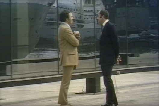
| Norman Foster Discusses the Dawn of High-Tech Architecture in This 1971 Interview Posted: 25 Jul 2017 05:00 AM PDT "It's quite evident that you're prepared to abandon traditional ways of sitting," Bernard Keeffe exclaims as he collapses into a bright yellow beanbag in Norman Foster's home. "For years," he continues, "people have thought that if they sat down they would have to sit on a chair, but now you have demonstrated that this is not necessary!" In this lengthy 1971 interview with Lord Foster, drawn from the archives of Thames TV, Keeffe questions the practice's early hi-tech approach to architecture in the context of a landscape in which buildings were becoming "ever more complicated." . Image Courtesy of Thames TV") Bernard Keeffe and Norman Foster (1971). Image Courtesy of Thames TV Bernard Keeffe and Norman Foster (1971). Image Courtesy of Thames TV Visiting the Fred Olsen Boat terminal (1969) at Millwall Docks, London—often considered to be the breakout project of Foster + Partners—Keeffe questions the architect on the complexities of designing contemporary spaces for people that deal with an increasingly mechanised urban landscape: "There seems a danger that the human element, the people using it, come to be regarded as elements in the whole machinery." Lord Foster's response (08:05):
. Image Courtesy of Thames TV") Bernard Keeffe and Norman Foster (1971). Image Courtesy of Thames TV Bernard Keeffe and Norman Foster (1971). Image Courtesy of Thames TV This posting includes an audio/video/photo media file: Download Now |
| Posted: 25 Jul 2017 04:00 AM PDT 
From the architect. The COR shop is located in the underground parking of a shopping mall in Brasília, Brazil.  © Haruo Mikami © Haruo Mikami The client´s briefing for the shop “COR” (color in portuguese) asked us to create a space that could work both as a showroom for a brazilian brand of paintings and architectural coatings and as the backdrop for the display of the work of the furniture designer Paulo Alves, from São Paulo. At the same time the space should be flexible enough to host parties and events. How to connect such different uses in a small space?  © Haruo Mikami © Haruo Mikami We looked at the work of Paulo Alves as a starting point. We saw his love for the concrete art as an element that could connect all the proposed uses: color. According to Theo Van Doesburg in his Concrete Art manifesto from 1930, “Concretism is not abstract because nothing is more concrete and real than the line, the color and the surface”. In this case we were interested in transforming the abstract notion of color into something palpable in space. Therefore we looked at the work of artists such as Felix varini and George Rousse and their aim of creating certain forms that only exist when observed from a specific point of view.  © Haruo Mikami © Haruo Mikami  Isometric Isometric  © Haruo Mikami © Haruo Mikami We created a series of white walls that serve mainly as a backround for the furniture. These walls were positioned in space according to a single point of perspective at the main entrance of the shop. Therefore, from that specific point of view, the showroom looks like a sequence of white walls, floosr and ceiling. This specific point of observation is marked by a white circle on the floor inside the black room that precedes the entrance. However, small “pockets” of colorful walls, floors and ceilings are revealed as one enters the shop. This was achieved following the lines of perspective from the defined point of view to define the limits of the color surfaces. The internal colors are only revealed through the movement of the visitor.  © Haruo Mikami © Haruo Mikami  Floor Plan Floor Plan  © Haruo Mikami © Haruo Mikami A secondary display window faces small group of parking spaces. Only from this point of view it is possible to see the whole internal space at once.  © Haruo Mikami © Haruo Mikami This posting includes an audio/video/photo media file: Download Now |
| How Architecture Affects Your Brain: The Link Between Neuroscience and the Built Environment Posted: 25 Jul 2017 02:30 AM PDT  <a href='http://www.archdaily.com/533664/ad-classics-thorncrown-chapel-e-fay-jones'>Thorncrown Chapel / E. Fay Jones</a>. Image © Randall Connaughton <a href='http://www.archdaily.com/533664/ad-classics-thorncrown-chapel-e-fay-jones'>Thorncrown Chapel / E. Fay Jones</a>. Image © Randall Connaughton This article was originally published by Common Edge as "Sarah Williams Goldhagen on How the Brain Works and What It Means for Architecture." Sarah Williams Goldhagen has taken a big swing. Her new book, Welcome to Your World: How the Built Environment Shapes Our Lives, is nothing less than a meticulously constructed argument for completely rethinking our way of looking at architecture. A longtime critic for The New Republic and a former lecturer at the Harvard Graduate School of Design, Goldhagen has taken a deep dive into the rapidly advancing field of cognitive science, in an attempt to link it to a new human-centered approach to the built world. The book is both an examination of the science behind cognition (and its relevance to architecture), and a polemic against the stultifying status quo. Recently I talked to the author, who was busy preparing for a year-long trip around the world, about the book, the science, and the state of architectural education. Martin C Pedersen: Your book argues that the built environment has a profound impact on people's lives. I agree. And, yet, given the state of architecture today, you wouldn't know it. Not just with what's on the ground, which you write about very eloquently, but also the greater perception. We're surrounded with architecture, and yet it's stunning the extent to which we're oblivious. What's that disconnect about? Sarah Williams Goldhagen: I've thought a lot about this. When I started writing criticism for a general audience, one of my earliest articles was on why most of the built environment, particularly in the US, was so bad. Economics is only part of it. More important is that people don't value the built environment and fail to appreciate how it's affecting them. People can gravitate to spaces, for example, that may not be psychologically good for them. Research shows that when we habituate to something, whether it's an environment or a pattern of buying, we tend to prefer that pattern, even if we'd be better off with something else. This gets at one of the book's main arguments, which is that most of our experiences in the built environment are nonconscious. I use that word quite specifically. It's not unconscious, because that suggests something that we'd be unable to access. Nonconscious refers to cognitions that we could access consciously, but mostly don't. Most of our cognitions fall below the radar of conscious cognition. If we stopped to focus on them, we could become more aware of them. A good deal of cognition—some experts put it as high as 90 percent—is nonconscious. So, if you're not aware that something is affecting you, then society's failure to accord built environmental design the immense value that it deserves makes some sort of perverse sense. As it is now, there's this mass of buildings of which we're only dimly aware, and then there's the occasional piece of architecture, which is essentially a luxury good purchased by elite clients. But what we now know about cognition and human experience demonstrates that this cannot stand as a paradigm. There's no such thing as a "neutral" environment: your built environment is either helping you, or it's hurting you.  MCP: You cite a lot of studies in the book. But the science and research around the built environment that I've come across is pretty thin. Where did you find, what I'm guessing, is better science? SWG: It's an excellent question. Most of the research that directly pertains to architecture and landscape happens in environmental psychology. But that's not a field that so-called hard scientists take very seriously. It's difficult to conduct verifiable, reproducible studies on the built environment because you can't sufficiently control for all the factors. There is good work out there, but this is the challenge that researchers of the built environment face. When I started working on Welcome to Your World I knew that from new imaging technologies we were learning a lot more about how the brain works than we'd known even one generation before. Our understanding of how memory works has radically changed in last 20 years; our understanding of spatial navigation has been revolutionized. I could go through the list. Brain mapping is reliable, albeit rapidly developing, science. Most of the studies that I clawed through didn't have much to do with the built environment, per se. They focused on human cognition and perception. In many cases, I was the one making the links: these scientists weren't specifically researching the built environment. I was the one who was sitting there, knocking my head against these studies, thinking: OK, what does that mean for how we understand the built environment? MCP: Where's the specific link between cognition and the built environment? SGW: The easiest example relates to long term memory. There was a famous experiment published in 2009 called the London Taxi Drivers study. To be a cabbie in London, you basically have to memorize the layout and street names of the entire city. Acquiring what's known as "The Knowledge" takes between two and four years. So the researchers did FMRI scans of the cabbies in training before they started building these detailed cognitive maps of the city, then scanned their brains again, once the cabbies had passed the test. They discovered that an area of the brain called the hippocampus had grown enormously. That was a significant finding, in and of itself, because it meant that even in adulthood, the brain changes. We used to think that people's brains develop and change until they reach maturity, around age 21; then, you more or less had what you had. This and subsequent studies provide concrete evidence that our brains change as we learn, and that one of the properties of the human brain is neural plasticity. And that brain is changing in part in response to your environment. Now, the other fascinating part of this is that the hippocampus is the area of the brain in which we consolidate long term memories: It controls spatial navigation, and contains what we now know to be place recognition neurons and even building recognition neurons. What this means is, you can't develop a long term memory that doesn't contain something of the place that you were in, when you had that experience. We navigate space using some of the same neural pathways that we use to develop autobiographical memories. So what does that mean? It means nothing less than that architecture and the built environment is central to the formation of our identities. That finding alone gives the built environment a kind of importance and weight that nobody would have thought.  <a href='http://www.archdaily.com/533664/ad-classics-thorncrown-chapel-e-fay-jones'>Thorncrown Chapel / E. Fay Jones</a>. Image © Randall Connaughton <a href='http://www.archdaily.com/533664/ad-classics-thorncrown-chapel-e-fay-jones'>Thorncrown Chapel / E. Fay Jones</a>. Image © Randall Connaughton MCP: All of the science is going to continue to progress, so that we'll know even more about how the brains works in the coming years. How do you see all that work helping us to build a better built environment? SWG: I'll give you an example. Thomas Albright is a scientist at the Salk Institute, who works on vision. He's part of an organization called the Academy of Neuroscience for Architecture. He is interested in what he calls the phenomenon of co-linearity, which is the arrangement of one sequence in the same linear order as another sequence. The example that he gives is Thorncrown Chapel by Fay Jones. Of course that is parallel, but because you're looking at it from below, they don't look parallel, and they change as you walk through the space. The reason that people respond so well to co-linear patterns, Albright posits, is because those patterns resonate with the way that our visual system works and appropriates information. Just as we know, for example, that when we listen to music the neurons in our brain actually fire in the exact same pattern that we're listening to as we hear it. Albright's hypothesis is that something analogous is happening when we experience co-linear designs. MCP: In the book, you were fairly critical about architectural education. You spent many years at the GSD. Tell me how your thinking evolved concerning the education of young architects. SWG: One thing I was struck by when I was teaching history and theory is how off limits, not just at the GSD but everywhere I taught, the topic of built environmental experience was. If you brought it up, it often wasn't long before someone would say—this was in the 1990s and the 2000s, when I was there—"Oh, that's too subjective, we can't talk about this." MCP: It was like talking about "beauty." SWG: "Beauty," you never discussed! This is because, throughout the academy, post-structuralism had such a profound influence. The cultural relativism that came out of post-structuralism, identity politics, and so forth, there was nothing wrong with it, but it became a sort of inviolable belief system. Even so, it wasn't really until I was invited to be the architecture critic for the New Republic that I began to think seriously about what experiential design might mean. I didn't want to be one of these, "It's great!/It's terrible!" critics. I had to develop a set of clear, critical criteria for how I was judging, and the reader had to understand what those were. That threw me back into the realm of "experience." Because I started thinking, who am I writing for? What's important? And the answer to me was obvious. What's important is what's on the ground, and how people respond to it. Ultimately, the architect's intentions are of secondary importance. Back to architectural education: I found that the paradigms that I saw students being taught, so-called "critical architecture," left the user experience out of the equation. Because the fact of the matter is, whether a building's structure is expressed, doesn't matter at all to the user. What does matter is if they see and understand how the principles of gravity are working, or the methods of construction. Whether there's an internal structure that has cross beams that you can't see—nobody, except other architects, cares about that. If you can do something with that architectural idea that accords with the cognitive principles that people need, want, and seek in buildings, then great. But it's is not an ideology of design, in and of itself. MCP: And it's often taught as that. SWG: Yes, it's often taught as that. The methods of construction are important, materials, details. All of that stuff is important. But structure itself, per se, as a guiding principle? I find a lot of these ideologies get at some of the cognitive things that are important, but it's almost like they get there by happenstance, rather than through knowledge. In school, there were the tectonic people, on the one hand, and the "critical" people on the other hand, and the parametric guys, on the third hand. What was absent from a lot of these discussions was how the users would actually experience these spaces. Martin C. Pedersen is executive director of the Common Edge Collaborative. A writer, editor and critic, he served as executive editor at Metropolis magazine for nearly fifteen years. This posting includes an audio/video/photo media file: Download Now |
| 'ARQ RIFA G’2010' House / Emilio Garateguy + Ignacio Trecca Posted: 25 Jul 2017 02:00 AM PDT  Courtesy of SMA Courtesy of SMA
From the architect. The house is the first prize of the characteristic architectural Housing Contest "Arquitectura RIFA G'2010" from Facultad de Arquitectura, Diseño y Urbanismo, FADU - UDELAR. This is a Student Contest, once they select the winning proposal begins a process advised of development that culminates with the construction of the winning project. The property is located in a corner in front of the sea in Ciudad de la Costa, a suburban area adjacent to Montevideo. The low vegetation on the side of the beach and the wide avenue, make it difficult to see toward the sea on the ground floor. Here is the "Key" of the project. The main spaces in relation to the ground or with the view on an upper floor?  Courtesy of SMA Courtesy of SMA The short facade facing the Rambla and account with a non-buildable area of 15m, which conditions its implementation toward the bottom. The choose, to maximize the use of the venue, solving the housing in a massive volume on the ground floor, appropriating the extensions to the outdoor spaces, looking for care privacy with respect to the nearest street and communicate fluently interior and exterior spaces in the longitudinal direction. The access is given by a patio, generating a controlled outer space also works, next to the kitchen, separator of the social areas and the most deprived of housing. It is the spiral staircase of access to the barbecue and upper terrace, generating a functional circuitry. The living-dining area is located toward the Rambla, using the entire width of the constructible space. It is conceived as an open space and fluid, with both the more intimate patio access as the front garden. In the farthest part of the visual and sound pollution of the Rambla are the bedrooms and services. The services are conceived as a nucleus, also playing with the logic of the massive volume. In contrast the divisions of the rest of the interior spaces are lightweight enclosures, it is the furniture that generate the separations. The two main bedrooms facing the street perpendicular to the coast, and the area next to it, it is proposed a semi-outdoor gallery permeable, which allows a visual filter to the outside, in addition to providing an extension to the same, creating a pleasant microclimate in the summer months, and allowing the entry of the sun in the coldest months.  Courtesy of SMA Courtesy of SMA  Floor Plan Floor Plan  Courtesy of SMA Courtesy of SMA With regard to the speech raised, we look to the ground floor is a massive volume, while the barbecue is a lightweight and transparent. We found on the brick as a material capable of achieving a volume hard and in turn with the sufficient versatility for different types of permeability thus regulating privacy and light keeping the reading of rustic and heavy volume. At the same time, allows a continuous surround on all sides of the prism, including the deck, where is implemented a system of on high ceiling to achieve this continuity material only. We studied carefully the rigging of brick, allowing the permeability when needed without interrupting the pace of the carcass dissection.  Courtesy of SMA Courtesy of SMA  Cross Section Cross Section  Courtesy of SMA Courtesy of SMA The treatment is quite simple since you are looking for the protagonist of the massif of brick. Toward the Rambla is raised against the denser vegetation limit to generate sound and visual privacy and leaving a large esplanade green as an extension of the dwelling. The courtyard of the fund has a different character, more private and service  Courtesy of SMA Courtesy of SMA This posting includes an audio/video/photo media file: Download Now |
| Posted: 25 Jul 2017 01:00 AM PDT  Courtesy of The Leewardists Courtesy of The Leewardists Learning to adapt and be flexible; it's something that comes in handy both in an architecture firm and yoga studio. The everyday motions you go through as an architect can sometimes feel like a strenuous physical routine. Whether it be performing tasks for work or sneaking ways to get some precious shut-eye, architects need to learn how to be nimble to get through the long days and nights (coffee doesn't hurt either). Take some deep inhalations and exhalations as you check out, in four easy to follow steps, some common positions architects find themselves in.  Courtesy of The Leewardists Courtesy of The Leewardists  Courtesy of The Leewardists Courtesy of The Leewardists  Courtesy of The Leewardists Courtesy of The Leewardists  Courtesy of The Leewardists Courtesy of The Leewardists  Courtesy of The Leewardists Courtesy of The Leewardists  Courtesy of The Leewardists Courtesy of The Leewardists  Courtesy of The Leewardists Courtesy of The Leewardists Centuries of civilizations built on structures designed by architects and yet, their voice is lost among the countless stories of rulers and armies and sometimes wondrous monsters. The Leewardists are rewriting the contemporary history of our civilization through the voice of this elusive being, The Architect. For more of The Architect Comic Series follow them on Facebook, Instagram, or visit their website. This posting includes an audio/video/photo media file: Download Now |
| Spotlight: Eduardo Souto de Moura Posted: 24 Jul 2017 11:00 PM PDT  Casa das Histórias Paula Rego. Image © Fernando Guerra | FG+SG Casa das Histórias Paula Rego. Image © Fernando Guerra | FG+SG Eduardo Souto de Moura (born 25 July 1952), the Portuguese architect that won the 2011 Pritzker Prize, is known for designs that are formally simple yet serious and at times, dramatic, created through his thoughtful use of colors and materials. His architecture is both versatile and consistent, contextual yet universal, and rarely affected by current trends or styles.  Eduardo Souto de Moura, 2011 Pritzker laureate, in front of the Casa das Histórias Paula Rego. Photo by Francisco Nogueira. Eduardo Souto de Moura, 2011 Pritzker laureate, in front of the Casa das Histórias Paula Rego. Photo by Francisco Nogueira.  Braga Municipal Stadium. Image © Leonardo Finotti Braga Municipal Stadium. Image © Leonardo Finotti Born in Porto, Souto de Moura enrolled at the School of Fine Arts in Porto, studying sculpture and later transferring to architecture at the University of Porto—a decision he credits to a meeting with the artist Donald Judd. While still a student, Souto de Moura interned in the studio of Álvaro Siza, where he worked for five years until starting his own practice in 1980, following Siza's advice. Although his early career included mostly private homes, as his career has progressed Souto de Moura has been commissioned for larger public buildings, including the Braga Municipal Stadium (2004), the Burgo Tower (2007), and the Casa das Histórias Paula Rego (2008).  Burgo Tower. Image © Fernando Guerra | FG+SG Burgo Tower. Image © Fernando Guerra | FG+SG  27 Dwelling in Sete Cidades / Eduardo Souto de Moura + Adriano Pimenta. Image © Luis Ferreira Alves 27 Dwelling in Sete Cidades / Eduardo Souto de Moura + Adriano Pimenta. Image © Luis Ferreira Alves Souto de Moura has been described as "neo-Miesian," something he addressed in an interview with El Croquis by saying "I find Mies increasingly fascinating... There is a way of reading him which is just to regard him as a minimalist. But he always oscillated between classicism and neoplasticism... He was already so modern he was 'post.'" This tension can also be seen in Souto de Moura's work, as he balances materiality and minimalism, plastic form-making and abstraction.  Casa da Musica Subway Station. Image © Fernando Guerra | FG+SG Casa da Musica Subway Station. Image © Fernando Guerra | FG+SG  Braga Municipal Stadium. Image © Leonardo Finotti Braga Municipal Stadium. Image © Leonardo Finotti In 2011, he was awarded the Pritzker Prize; the jury praised Souto de Moura for "his unique capacity to embrace reality while employing abstraction," noting that Souto de Moura's architectural language "transforms physicality into the metaphysical."  Convento Das Bernardas. Image © Luis Ferreira Alves Convento Das Bernardas. Image © Luis Ferreira Alves See all of Eduardo Souto de Moura's work featured on ArchDaily via the thumbnails below, and further coverage via the links beneath those: 2011 Pritzker Prize: Eduardo Souto de Moura Eduardo Souto de Moura to receive Israel's prestigious Wolf Prize AD Interviews Eduardo Souto de Moura On His Latest Prize Eduardo Souto de Moura Wins the Ibero-American Award for Architecture and Urbanism Winners Announced for 2013 Veronica Rudge Green Prize in Urban Design Siza, Souto de Moura, Kuma Reflect on Their 'Sensing Spaces' Exhibitions Video: Projects by Eduardo Souto de Moura References: Pritzker Prize, Wikipedia This posting includes an audio/video/photo media file: Download Now |
| IN CASTRO – Ideas and Business Center / Campos Costa Arquitetos Posted: 24 Jul 2017 10:00 PM PDT  © Gonçalo Pacheco © Gonçalo Pacheco
 © Walter Vinagre © Walter Vinagre From the architect. Located in the municipality of Castro Verde in Alentejo, IN CASTRO – IDEAS AND BUSINESS CENTER has been a great propellant for local entrepreneurs’ success since its inauguration in 2015. The site is positioned within two fronts, Rua Manuel Assunção Mestre and Rua da Olivença, at the extremity of a block which once represented an agricultural warehouses’ neighbourhood.  © Walter Vinagre © Walter Vinagre This intervention is based on two aspects: on the one hand, the rehabilitation of the existing warehouse and, on the other hand, a new complementary extension building.  © Walter Vinagre © Walter Vinagre  Floor Plan Floor Plan  © Walter Vinagre © Walter Vinagre The warehouse presents a slight intervention. Without interfering with the principal and existing walls, it allows the possibility of having a clear vision of the space, especially in the two-story height ceiling area. The new building aims to redefine the borders of the block without imposing a contrasting scale, but rather becoming harmoniously integrated within the urban context. In this sense, its diagonal shape also sets out as an opportunity for new public spaces. These “empty corners” allow a new perception of the complex and a better link with the surroundings.  Axonometric Axonometric The small courtyard, with its triangular shape, becomes a space of dialog between the two buildings. Due to its position with minimal solar exposure, the courtyard presents itself as a cool place, fulfilling a bioclimatic freshening performance. Likewise in a bioclimatic perspective, the South facade, lacking in windows and having a highly dense exterior insulation, allows remarkable thermal gains. The passive thermal behavior of the building was, among others, a key issue that has influenced the overall design. Formally speaking, the total height of the new building accompanies the height of the existing warehouse, favouring a relationship between two languages that, although distinct, manage to fit in the context.  © Gonçalo Pacheco © Gonçalo Pacheco This posting includes an audio/video/photo media file: Download Now |

.jpg?1500971896)
.jpg?1500544085)
| You are subscribed to email updates from ArchDaily. To stop receiving these emails, you may unsubscribe now. | Email delivery powered by Google |
| Google Inc., 1600 Amphitheatre Parkway, Mountain View, CA 94043, United States | |
Nema komentara:
Objavi komentar