Arch Daily |
- Extension to Secondary School / Paul Dillon Architects
- Highgate Bowl / HASA Architects
- Forment House / Mano de Santo
- Paulaner Headquarter / Hierl Architekten
- V1 House / TNT architects
- House in Tokushima / FujiwaraMuro Architects
- Call for Entries - Student Design Competition: New San Francisco Federal Building Plaza
- TFD Restaurant / Leaping Creative
- Damas 45 Building / dmp arquitectura
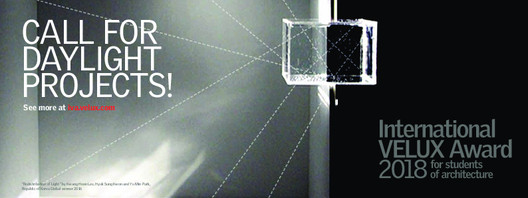
- Call for Entries: International VELUX Award 2018 for Students of Architecture
- House 10x10 / Oficina de Arquitetura
- Holiday House in Cap Ferret / Atelier du Pont
- Zaha Hadid Architects Wins Competition for Port of Tallinn Masterplan in Estonia
- Lab City CentraleSupélec / OMA
- Curators and Theme Announced for US Pavilion at 2017 Venice Biennale
- How an Artist Constructed a Wooden Replica of Mies' Farnsworth House
- Sol Duc Cabin / Olson Kundig
- This Adjustable Tensegrity Structure is Constructed From Just Two Structural Elements
- Paulo Mendes da Rocha and MMBB's Newest SESC Franchise Opens in São Paulo
| Extension to Secondary School / Paul Dillon Architects Posted: 31 Aug 2017 10:00 PM PDT  © Ros Kavanagh © Ros Kavanagh
 © Ros Kavanagh © Ros Kavanagh From the architect. This project provides three new classrooms and three new shelters for a small rural secondary school on the west coast of Ireland. Externally, the shelters are intended as social areas to wait before and after school, or eat lunch. Internally, a folding wall allows the joining of two classrooms to provide the school with its only assembly room, which also serves as a meeting place for the local community. The extension is presented as a separate building set back from the line of the original school. The new building forms a sheltered courtyard at the heart of the school.  © Ros Kavanagh © Ros Kavanagh  Section - Plan Section - Plan  © Ros Kavanagh © Ros Kavanagh The project won Best Education Building at the 2017 RIAI (The Royal Institute of the Architects of Ireland) Awards. A spokesperson for the RIAI said, "The Jury welcomed the return of a strong Boyd Barrett type national school typology, applauding the project for apparent simplicity, skilfully designed with limited means. The scale is consistent and modest demonstrating skill with a restricted school budget. The Architectural language was admired for its appropriateness to child and adult alike. Space-making within the school site was an intrinsic part of the designs and contributes successfully to the scheme as a whole and its relationship with its context".  © Ros Kavanagh © Ros Kavanagh This posting includes an audio/video/photo media file: Download Now |
| Highgate Bowl / HASA Architects Posted: 31 Aug 2017 08:00 PM PDT  © Simone Bossi © Simone Bossi
 © Simone Bossi © Simone Bossi From the architect. HASA Architects has completed works to transform a derelict horticultural glasshouse at Highgate Bowl in North London into a new event space. The project, inspired by the frame and construction of the original building, explores the possibilities of this forgotten piece of the city by bringing it back into use through a series of small-scale interventions. These sensitive interventions take the form of new external and internal pathways, as well as rooms and furniture pieces that guide visitors through the large open bays of the glasshouse while framing views of the surrounding landscape and Bowl beyond.  © Simone Bossi © Simone Bossi The practice visited the site in January 2017 and set about devising a proposal that would result in the restoration of the derelict glasshouse, creating a versatile event space that could be used for a range of activities including exhibitions and performances. They presented their vision for the glasshouse to the client in February 2017 convincing them of the site's potential and work began shortly thereafter.  © Simone Bossi © Simone Bossi The design's plywood skin creates a folded landscape that is inspired by the original structure's frame and panel construction. The new pathways, rooms and furniture pieces are designed in a modular configuration to negotiate the change in levels between each bay and provide separation between visitors and the fragile glass outer skin.  © Simone Bossi © Simone Bossi  Plan Plan  © Simone Bossi © Simone Bossi Birch plywood, finished in a white Osmo oil, is used to form the new platform and joinery components. The original sliding doors are replaced with new plywood doors with oversized handles that mimic the structural fins that form the sides to the platform. The use of one material throughout creates continuity and reinforces the connection between each bay while the light tone of the plywood finish offers a subtle contrast against the glasshouse and the landscape. To provide contrast, the application of a dark finish is applied to the existing structure creating a distinction between old and new.  © Simone Bossi © Simone Bossi To ensure completion by the opening of the Chelsea Flower Show in May, the detail design was developed using physical models and 1:1 mock-ups of the structural elements. The works were carried out on site within a 6-week period, phased into three separate packages: i) restoration to the glasshouse; ii) application of protective film to the glass; and iii) installation of the joinery elements.  Axonometric Axonometric The plywood components were manufactured off site using CNC (computer numerical control) cutting services and assembled within a 10-day period. The white Osmo oil was applied to the wood once the components were on site to ensure consistency throughout the structure.  © Simone Bossi © Simone Bossi This posting includes an audio/video/photo media file: Download Now |
| Posted: 31 Aug 2017 07:00 PM PDT  © Diego Opazo © Diego Opazo
 © Diego Opazo © Diego Opazo From the architect. The projected building is the result of a double intervention in the existing building, expanding the room with the addition of a large porch to south and an inner, facades and roofrenovation.The solution adopted takes into account on the one hand customer requirements, both functional and aesthetic needs, as the construction features of the existing building and its location.  Drawing Drawing The volume, buildable area, urban parameters defined by the particular planning regulations for this area, with the premise of the architects to achieve a right integration and use up to the conditions of the plot and its orientation, resulting in a simple building, of pure volumes with a very careful treatment of the facades design according to their orientation and views, with a renewed composition carpentry, shutters design treatment and the choice of materials.  © Diego Opazo © Diego Opazo  First Floor Plan First Floor Plan  © Diego Opazo © Diego Opazo The solution of the dwelling is basically in two floors, ground floor and first floor. On the ground floor, where the main entry is located, the living-dining room piece is laid up (facing the yard),kitchen is practically the existing one but with a different relation with the other pieces, a laundry room, a bathroom, a small cellar, a small second living room and a bedroom attached; there is also a connecting space which starts the section that leads to the upper floor. The first floor is solved with a small connecting space that gives access to three double bedrooms, a shared bathroom and a main bedroom with bathroom and dressing area. Thereis no basementfloor. Roofs are designed as inverted gravel roof, removing the existing pitched tile roof.  © Diego Opazo © Diego Opazo The volumetry of the building is clear and simple, they emphazise the vertical latticework that decompose the volume and breath life into the image. These latticeworks solve the greatest dimension glass walls solar shading. This new built volume is designed in smooth finished gray exposed concrete, and the rest of the existing facades are cladded with a double isolated wall of continuous finished Aquapannel boards.  © Diego Opazo © Diego Opazo This posting includes an audio/video/photo media file: Download Now |
| Paulaner Headquarter / Hierl Architekten Posted: 31 Aug 2017 05:00 PM PDT  © Edzard Probst © Edzard Probst
 © Edzard Probst © Edzard Probst From the architect. Urban development and landscape planning competition for the subsequent use of the company premises of the Paulaner brewery, Munich 1st prize, architectural design competition, administration building.  Site Plan Site Plan The design falls back on the type of courtyard development that is both suitable for giving the Paulaner headquarters an identifiable building and also for making reference to the history of the place and thus continuing the tradition of the former Zacherl brewery.  © Edzard Probst © Edzard Probst Furthermore, it enables the creation of an administration building with various usages, flexible mixed, and with variable, largely hierarchy-free occupancy, short distances, and compact dimensions. The inner courtyard, as an expressive space and central point of the building, makes it a distinctive location.  © Edzard Probst © Edzard Probst In the basement, the function rooms such as the banqueting hall and the restaurant are organized around the inner courtyard, which can be involved in all usages. On the ground floor, there is a generously sized entrance area that connects the main entrance – in the originally reconstructed gate hall – with the southern entrance plus conference zone. The upper floors contain the office areas with views across the city and into the inner courtyard.  © Edzard Probst © Edzard Probst  © Edzard Probst © Edzard Probst The still existent substance of the listed Zacherl brewery consists of the exterior façades up to the central buttress, the gate hall – thought to have been influenced by Leo von Klenze – and the cellar vaults. In terms of a credible history formulation, the authentic components are being faithfully preserved or restored in their materiality and geometry. Apart from that, a building is being erected on the historical urban ground plan, a building that is contemporarily designed in granularity and materiality, in the volumetry of the memorial.  © Edzard Probst © Edzard Probst This posting includes an audio/video/photo media file: Download Now |
| Posted: 31 Aug 2017 03:00 PM PDT  © Triệu Chiến © Triệu Chiến
 © Triệu Chiến © Triệu Chiến From the architect. We always pursue the design concept of "Architecture is a bridge", the bridge between people and people, architecture, and nature, the present and the past. When combined with the basic demands of the owner for a two-generation family, we created the V1 HOUSE.  © Triệu Chiến © Triệu Chiến V1 HOUSE is located in the old residential area of Vinh city in Nghe An province. It is surrounded by low-rise buildings. However, the house is facing south and the wind direction is typical of this area because Hong Mountain is in the distance in front of the house, and behind the house is Lam River. Moreover, it is 2km away from the city center square with festivals and annual fireworks.  © Triệu Chiến © Triệu Chiến The site is located in the lowland, flooded in the rainy season, thus the first floor is pushed higher than the road surface. The space structure is organized according to the common flooring style of Vietnamese townhouses, in order to give the owner a sense of familiarity as well as maximum efficiency in terms of area.  © Triệu Chiến © Triệu Chiến For us, each floor is like a different garden, alternated between small gardens and functional space. This makes the space horizontally continuous in each floor and creates an effect in the confused ambiguity, so the users, going into the house, feel go out and vice versa. It is the feeling that gives the user a vague nostalgia for courtyard space, in the traditional townhomes they used to use or garden houses surrounded by trees.  © Triệu Chiến © Triệu Chiến  Second Level Plan Second Level Plan  © Triệu Chiến © Triệu Chiến The house is modern but familiar with the previous life of the owner. The small gardens combined with the light well to get the light from the top, connecting the floor vertically, reducing the limitations of the floor structure. The house is pushed up to four floors in order to exploit the view of the building. The front of the house is in the south, consequently, it is completely open for the cool breeze. Due to the front narrow alley, the higher floors are backed up to create a view.  © Triệu Chiến © Triệu Chiến According to the feng shui concept of the east, the north of the house is in the crooked land, which is not good, thus we sealed off and designed a garden here, this allows all the functional space behind the house there. The view is very good, private, quiet, relaxing while avoiding cold winds in the winter.  © Triệu Chiến © Triệu Chiến  Section 1 Section 1  © Triệu Chiến © Triệu Chiến Life in the V1 HOUSE is fun, like a farmer's family cultivating, caring and harvesting after office hours, they do it happily. It helps people living around close to each other. When we arrived, we were told that they had harvested clean vegetables for their neighbors... and their neighbors learning from them.  © Triệu Chiến © Triệu Chiến This posting includes an audio/video/photo media file: Download Now |
| House in Tokushima / FujiwaraMuro Architects Posted: 31 Aug 2017 01:00 PM PDT  © Toshiyuki Yano © Toshiyuki Yano
 © Toshiyuki Yano © Toshiyuki Yano From the architect. This house does not have a typical Japanese entry hall, but rather features a double-sliding glass front door that opens directly onto a traditional doma or concrete-floored space where shoes need not be worn, facing the kitchen. A large wood slab table is immediately visible on entering this space.  © Toshiyuki Yano © Toshiyuki Yano A gas range is built into the table, and together this unit serves as the home's central gathering place. A wrought-iron hood hangs above the range, its stovepipe-like ventilation duct drawing eyes to a void above the kitchen and living area that gives the space a sense of openness.  Ground Floor Plan Ground Floor Plan  Section A Section A  Upper Level Plan Upper Level Plan The first floor is comprised of the central kitchen, the living area, the bathroom, and the concrete entry/storage space. The floor height rises step-wise from the kitchen to the living room and then to the second floor. The floor of the living area is partially covered in tatami mats, with stairs leading from there to the second floor.  © Toshiyuki Yano © Toshiyuki Yano Looking from the kitchen past these stairs, one sees a large bookshelf spanning the entire back wall. Books can be pulled from some of the shelves when climbing the stairs, while less accessible shelves are used to display photographs or other items.  © Toshiyuki Yano © Toshiyuki Yano The second floor includes a long desk that runs along the hallway overlooking the void, as well as a space with a loft for each of the three children and, at the end of the hallway, a study and bedroom for the couple. The study includes a window facing onto the void that allows whoever is inside to keep an eye on the rest of the home. Adjacent to the bedroom is an exterior space for drying clothes, which provides both ventilation and privacy to the bedroom.  © Toshiyuki Yano © Toshiyuki Yano This posting includes an audio/video/photo media file: Download Now |
| Call for Entries - Student Design Competition: New San Francisco Federal Building Plaza Posted: 31 Aug 2017 12:30 PM PDT  Photo of the 90 7th street plaza. Photo credit: Tim Griffith Photo of the 90 7th street plaza. Photo credit: Tim Griffith Continuing a legacy of outstanding public architecture, the General Services Administration (GSA) Design Excellence Program seeks to commission our nation's most talented designers and artists to design federal buildings of outstanding quality and value. These projects are to demonstrate the value of true integrated design that balances aesthetics, cost, constructability, and reliability; create environmentally responsible and superior workplaces for civilian federal employees; and give contemporary form and meaning to our democratic values. In this context, the GSA invites students in architecture, landscape, and urban design programs to envision a design intervention that activates the New San Francisco Federal Building plaza. Winning ideas will also address the Guiding Principles for Federal Architecture, building tenant needs for the facility, community goals, feasibility, and will also achieve the best value for the American taxpayer through good design. The intervention may take the form of physical renovation of the plaza, programming new use(s), and/or some other means of transformation designed to activate public space. Entries will be juried by Thom Mayne and winners will be awarded cash prizes. Please see the detailed announcement on Challenge.gov for more information about this competition.
This posting includes an audio/video/photo media file: Download Now |
| TFD Restaurant / Leaping Creative Posted: 31 Aug 2017 12:00 PM PDT  © Zaohui Huang © Zaohui Huang
 © Zaohui Huang © Zaohui Huang From the architect. Guangzhou based renowned lifestyle store brand TFD (The Fashion Door) is adding a restaurant to its business, Leaping Creative believes that the space should indicate the brand's fashion sense and at the same time provide its customers with an unordinary dining experience.  © Zaohui Huang © Zaohui Huang Rather than following the popular trend of industrial or Nordic interior style in China, Leaping Creative is inspired by fashion designers and their love for black and white as well as their trick of using dots, lines and planes. We aim to create a minimalist, intriguing dining space.  © Zaohui Huang © Zaohui Huang "Our design concept is well carried out from initial sketches to the final outcome, which made it a very interesting design process." Said Zen Zheng, leading designer of the Leaping team.  © Zaohui Huang © Zaohui Huang The long extended façade is outlined by the black frames, in which a stereograph is embedded as a signage, presenting the TFD logo with a 3D door image that can be seen both opened and closed by the passers-by. It embodies the brand's name The Fashion Door, and also creates an external visual focus.  Sketch Sketch The space is neatly parted by black and white colors, where the two colors interacts with each other in various ways. Lights covered with black globes are attached to the white ceiling using ordered black lines, while black wires are bended to form some "fashion quotes" on the white wall.  © Zaohui Huang © Zaohui Huang Black partitions created a more private area with the Chinese Logo "门(door)" embodied onto it, and the white mesh pattern of the bar stools and tables dotted the black background with lines and planes.  Floor Plan Floor Plan In a secret corner of the restrained space, a group of black spheres floats out of a mysterious door that left unlatched, breaking the structured grid pattern and gradually integrating into the wall, such that we probe into the dialectical relation between the individuals and the world they live in.  © Zaohui Huang © Zaohui Huang The bright yellow color that appears from the crack inserts in the conceptual scenery of black and white, inferring the existence of a Parallel World hidden behind the door. Inside, eggs as the main ingredient of the menu also play the leading role; a ready-to-serve poached egg is fleeing from the dish, yet it is framed by a small window attached with a pair of hand models using folk and knife; so that an unexpected humorous scene can be found on the other side of the window when people wandering about the TFD store.  © Zaohui Huang © Zaohui Huang This posting includes an audio/video/photo media file: Download Now |
| Damas 45 Building / dmp arquitectura Posted: 31 Aug 2017 10:00 AM PDT  © Omar Chavez Godoy © Omar Chavez Godoy
 © Omar Chavez Godoy © Omar Chavez Godoy From the architect. It is located in Mexico City, San José Insurgentes, the project is developed in 5 levels, in which 7 apartments and 2 Pent-House are distributed. The units are housed in two volumes connected to the center by the vertical circulation nucleus, achieving an almost symmetrical type plant.  © Omar Chavez Godoy © Omar Chavez Godoy  4th Level 4th Level  © Omar Chavez Godoy © Omar Chavez Godoy Accessibility was an important theme of the project, so the main access to the building is by means of a ramp that goes from the street and is contained by the wall of the neighborhood, this wall covered with vegetation and open sky. On the low level are located two apartments, one overlooking the street and another to an interior terrace, following this same party are located the type departments in the following levels. One of the Pent-House is developed in three levels, separating the public, private and open spaces, the other is developed in two levels had a space of coexistence in the upper part.  © Omar Chavez Godoy © Omar Chavez Godoy The façade of Damas Street integrates the different types of departments making it homogeneous, in it the vertical concrete lines containing the vain and solid masses contrasting in color grims oxford stand out. This same scheme is reflected in the interior façades with a set of positions between vain and massive. The vegetation is fundamental in this project since it is always present in the terraces and facades, it also achieves a contrast with the range of black, gray and white colors of the project.  Section Section This posting includes an audio/video/photo media file: Download Now |
| Call for Entries: International VELUX Award 2018 for Students of Architecture Posted: 31 Aug 2017 09:00 AM PDT  Courtesy of Velux Courtesy of Velux The International VELUX Award 2018 for Students of Architecture challenges students of architecture all over the world to explore the theme of daylight and consider its role in our lives as an ever-relevant source of light, life and energy in buildings - and as an important discipline in architecture. Students can register from 1 September 2017 to 1 April 2018 and submit their daylight projects before 15 June 2018.
Reviewed by a high-profile juryIn June 2018, an international jury with high-profile architectural professionals and UIA (International Union of Architects) representatives will convene to review all the submitted projects online, and will appoint 5 regional winners in each of the two categories. The ten regional winners then personally present their project to the jury, who elect one global winner in each of the two categories.
All winning projects will be awarded within a total prize sum of up to €30,000, and the winners will be celebrated at an award event in October 2018.  Global Winner 2016 - Daylight in Buildings. Image Courtesy of Velux Global Winner 2016 - Daylight in Buildings. Image Courtesy of Velux What is required to participate?To participate, you need to be enrolled at a school of architecture and register your participation at iva.velux.com and eventually submit your daylight project by 15 June, 2018. There are two project categories: 1) daylight in buildings; and 2) daylight investigations. Every student project needs to be backed by a tutor and both the winning students and their tutors are recognised and win prizes.  Global Winner 2016 - Daylight Investigations. Image Courtesy of Velux Global Winner 2016 - Daylight Investigations. Image Courtesy of Velux The No. 1 global award for students of architectureThe overall theme of the International VELUX Award 2018 for Students of Architecture is "Light of Tomorrow." Running every second year, the award has grown into the biggest global student award within architecture, since it was held for the first time in 2003. So far, 4,500 student teams have participated over the years, representing more than 60 countries worldwide, and the juries have included 30 high-profile architects from practice and teaching. See all winning projects as well as the award brief and detailed information about registration and participation on the IVA website.This posting includes an audio/video/photo media file: Download Now |
| House 10x10 / Oficina de Arquitetura Posted: 31 Aug 2017 08:00 AM PDT  © Lêda Brandão © Lêda Brandão
 © Ana Roman © Ana Roman From the architect. Some major goals have guided us in the design process: to ensure a comfortable house, the continuous presence of nature, and flexible spaces to allow changes in the short and long term. Therefore, the patio (inner courtyard) house which appears in every culture seemed the best solution to meet all those conditions. The layout is a kind of quilt, mixing open and closed spaces.  Ground Floor Plan Ground Floor Plan A slightly asymmetric axis connects the spaces both horizontal and vertically. Thus we enter this integrated space through a patio that other than being a garden, reunites a vehicle shelter on one side, and the laundry on the other. From this patio, we access the first covered block that houses the living-room, the dining-room, and the kitchen, all of them distributed in a single though clearly zoned space.  © Lêda Brandão © Lêda Brandão Both rooms are sided by a patio full of plants, bushes, and small-scale trees, despite their rather small dimensions. Between the patios, a short hallway gives access to a multi-use room that accommodates the architect's office, an area for space for drawing/ watercolor classes, and for yoga practice. The passage still makes room for the staircase that leads to the upper floor, where we find a library and the bedroom separated by a bathroom.  © Ana Roman © Ana Roman This simple space division allows its immediate flexible use. It also allows a future subdivision to conform a two-story block with three bedrooms, 2 bathrooms, and the library that might become a dressing room or an office. Related plumbing and drywalls were used to ensure and simplify the possible future changes.  Section Section Alternating open and closed spaces create a large visual expansion but at the same time, keeps a certain degree of privacy. This concept applies both to the spaces inside the house as well as to the relationship house-street. Despite being a glass house, people passing on the sidewalk do not see the inside.  © Lêda Brandão © Lêda Brandão All the openings of the house have been thought to create a balance between the outside and the inside, the thermal comfort, and the amount of light. As the primary concept was the presence of nature, we decided to use lots of glass. At the same time, in order to reinforce the contact between nature and comfort we believed it was essential plentiful natural light.  Elevation Elevation Thus, skylights were created over the kitchen, the toilet, the bathroom, and the library. They also guarantee the constant ventilation of the spaces. They are allies of plants and trees that with their shade, help to soften the entrance of heat that would otherwise be excessive, given the amount of glass on all the faces of the building.  © Ana Roman © Ana Roman This posting includes an audio/video/photo media file: Download Now |
| Holiday House in Cap Ferret / Atelier du Pont Posted: 31 Aug 2017 06:00 AM PDT  © Takuji Shimmura © Takuji Shimmura
 © Takuji Shimmura © Takuji Shimmura From the architect. The terrain that slopes gently towards the sea is typical of Cap Ferret: a small forest of strawberry tree, yucca, and pines. The challenge was to design a project that would exist in harmony with its surrounding landscape and have a limited impact on the existing vegetation.  © Philippe Garcia © Philippe Garcia  Section Section  © Philippe Garcia © Philippe Garcia The house echoes forest cabins and the multiple openings serve to accentuate its relationship to nature. Its implantation allowed to preserve a maximum of existing trees, and the façade uses mostly wood to mimic the pine grove around it.  © Takuji Shimmura © Takuji Shimmura The construction blends into the topography of the terrain. The spaces were designed for a large sibling so that everyone while getting together, can still benefit of intimacy and calm. The «cabins» are connected to one another through a series of terraces. A large internal curved lines stairway exists in counterpoint to the triangular openings and the other diagonal lines that frame the views of the surrounding nature.  © Philippe Garcia © Philippe Garcia  Lower Floor Plan Lower Floor Plan  © Philippe Garcia © Philippe Garcia  Upper Floor Plan Upper Floor Plan This posting includes an audio/video/photo media file: Download Now |
| Zaha Hadid Architects Wins Competition for Port of Tallinn Masterplan in Estonia Posted: 31 Aug 2017 05:30 AM PDT  Courtesy of Port of Tallinn / Zaha Hadid Architects Courtesy of Port of Tallinn / Zaha Hadid Architects Zaha Hadid Architects has been selected as the winners of an international competition to masterplan the revitalization of the Old City Harbour in Tallinn, Estonia. Beating out an esteemed shortlist of 6 teams, including AZPML, KCAP Architects & Planners and Helsinki-based ALA Architects, ZHA's proposal was lauded by the client for its "innovative and integrated approach to Tallinn's maritime gateway.  Courtesy of Port of Tallinn / Zaha Hadid Architects Courtesy of Port of Tallinn / Zaha Hadid Architects "Zaha Hadid have very skilfully created a balanced connection between urban space and the port area with some carefully considered access roads and traffic solutions," said Valdo Kalm, the chairman of the management board of the Port of Tallinn. "What stands out in their designs are the diagonals running through them of the pedestrian footpaths, around which a very diverse and memorable city space has been established. "  Courtesy of Port of Tallinn / Zaha Hadid Architects Courtesy of Port of Tallinn / Zaha Hadid Architects  Courtesy of Port of Tallinn / Zaha Hadid Architects Courtesy of Port of Tallinn / Zaha Hadid Architects "Interesting details include the water features they've designed along Reidi Street and their partial – and very smooth and effective – raising of the areas for pedestrians up to another level. Adding to the overall feel of integration in their designs is the urban square and greenery they've come up with for the area around Admiralty Basin, stretching all the way from the front of Terminal A to the front of Terminal D. Their entry was also marked out by strong logistics and property development analysis and a convincing and realistic projection of the implementation of the Masterplan stage by stage."  Courtesy of Port of Tallinn / Zaha Hadid Architects Courtesy of Port of Tallinn / Zaha Hadid Architects Among other criteria, the jury evaluated each of the finalists entries based on their cohesion with the surrounding environment, the strength of connection between the port and city, the quality of innovation in the solution and the project's overall feasibility. Aimed at realization by 2030, the masterplan competition was launched with the aim of reconnecting the city and public realm to the port, while spurring new development that will complement and enhance the existing port functions.  Courtesy of Port of Tallinn / Zaha Hadid Architects Courtesy of Port of Tallinn / Zaha Hadid Architects  Courtesy of Port of Tallinn / Zaha Hadid Architects Courtesy of Port of Tallinn / Zaha Hadid Architects Zaha Hadid Architects will now work alongside Latvian architectural firm RemPro, engineering consultant Tyrens UK real estate consultants Colliers Estonia and RLB UK and VA-Render for visuals to further develop the project, with a final scheme targeted for the end of 2017. At that point, detailed architectural and economic plans will be produced to determine an exact timeline for implementation. News via Port of Tallinn.  Courtesy of Port of Tallinn / Zaha Hadid Architects Courtesy of Port of Tallinn / Zaha Hadid Architects  Courtesy of Port of Tallinn / Zaha Hadid Architects Courtesy of Port of Tallinn / Zaha Hadid Architects  Courtesy of Port of Tallinn / Zaha Hadid Architects Courtesy of Port of Tallinn / Zaha Hadid Architects This posting includes an audio/video/photo media file: Download Now |
| Lab City CentraleSupélec / OMA Posted: 31 Aug 2017 04:52 AM PDT  Photograph by Philippe Ruault, Courtesy of OMA Photograph by Philippe Ruault, Courtesy of OMA
 Photograph by Philippe Ruault, Courtesy of OMA Photograph by Philippe Ruault, Courtesy of OMA From the architect. In an era of privatization, cities are facing a major challenge: investment in the public domain depends increasingly on the private sector. As a result of this reframing of the collective agreement, the role of architecture is often reduced to the visual impact of its shape and surface rather than contributing to a new educational, social and civic dimension. The competition launched by the Ecole Centrale Paris for the design of a new engineering school has become the perfect opportunity to explore ways to answer this demanding challenge.  © OMA. Concept © OMA. Concept  © OMA . Site Plan © OMA . Site Plan  Photograph by Frans Parthesius, Courtesy of OMA Photograph by Frans Parthesius, Courtesy of OMA Laboratories are typically planned as linear buildings, a large box divided by endless corridors. Such a typology creates a "blackout" of the urban conditions; the building becomes a gigantic wall due to its extremely isolated and internalized programs. We can instead imagine laboratories as a collection of discreet parcels in an open plan grid; in this way, a city can  Photograph by Vitor Oliveira, Courtesy of OMA Photograph by Vitor Oliveira, Courtesy of OMA  Photograph by Vitor Oliveira, Courtesy of OMA Photograph by Vitor Oliveira, Courtesy of OMA This re-contextualization implies freedom to formulate new types of learning styles that promote community, plurality and diversity of the population within a dense field of knowledge, while ensuring the pure operation of the engineering school as an educational incubator. OMA's design integrates urbanism with the school, supplanting the previous homogeneous experience  Photograph by Philippe Ruault, Courtesy of OMA Photograph by Philippe Ruault, Courtesy of OMA  © OMA . Level 0 Plan © OMA . Level 0 Plan  Photograph by Philippe Ruault, Courtesy of OMA Photograph by Philippe Ruault, Courtesy of OMA Thus, the concept of a Lab City was formed. The architecture of the Lab City generates an open urban school, with creative disorder framed under a structural skeleton. By creating a main street, cutting diagonally across the Lab City, the design allows a seamless experience between the building and its surroundings, providing a convenient public route between the future heart of the neighbourhood and the future subway station. Around this urban spine, the program is spread in different buildings of various typologies and sizes, organized on an urban grid served by secondary streets. A unique lightweight roof covering the entire complex completes the scheme by creating a strong link between the different buildings and allowing "external" protected spaces to be used freely all year long.  Photograph by Frans Parthesius, Courtesy of OMA Photograph by Frans Parthesius, Courtesy of OMA This posting includes an audio/video/photo media file: Download Now |
| Curators and Theme Announced for US Pavilion at 2017 Venice Biennale Posted: 31 Aug 2017 03:45 AM PDT  Images by Project Projects, Daniele Resini ©SRGF, NY. Images by Project Projects, Daniele Resini ©SRGF, NY. The U.S. State Department has announced the individuals and institutions that will serve as curators and commissioners of the United States Pavilion at the 2018 Venice Architecture Biennale. Selecting through an open competition and recommendations from the Federal Advisory Committee on International Exhibitions, the exhibition will be led by co-commissioners The School of the Art Institute of Chicago (SAIC) and the University of Chicago and curators Niall Atkinson, Associate Professor of Architectural History at the University of Chicago; Ann Lui, Assistant Professor at SAIC and co-founder of Chicago-based architecture practice Future Firm; and Mimi Zeiger, a critic, editor, curator, and educator based in Los Angeles. Under the theme of Dimensions of Citizenship, the exhibition will explore "the meaning of citizenship as a cluster of rights and responsibilities at the intersection of legal, political, economic, and societal affiliations."  Curators from left to right: Mimi Zeiger, Niall Atkinson, Ann Lui. Image by Nancy Wong Curators from left to right: Mimi Zeiger, Niall Atkinson, Ann Lui. Image by Nancy Wong "It is urgent that architecture act as an important tool in understanding, shaping, and envisioning what it means to be a citizen today," said the curators in a statement released with the news announcement. "Our goal is to present the United States as a site of critical research and practice in architecture, at the intersection of old and new forms of community engagement, political action, and public policy. Globalization, digital technology, and geopolitical transformations are continuing to challenge conventional notions of citizenship across scales. This exhibition will present works by architects, designers, artists, and thinkers who are responding to today's shifting modes of citizenship, and putting forth visions of future ways of belonging." The individual exhibitors that will contribute to the U.S. Pavilion will be announced over the upcoming months. The pavilion will be on display at the 2018 Venice Biennale from May 26 to November 25, 2018. This posting includes an audio/video/photo media file: Download Now |
| How an Artist Constructed a Wooden Replica of Mies' Farnsworth House Posted: 31 Aug 2017 02:30 AM PDT  © Pedro Marinello © Pedro Marinello In December 2010, Manuel Peralta Lorca completed the work "Welcome Less Is More," a wooden reconstruction of Mies van der Rohe's Farnsworth House that was installed inside the Patricia Ready Gallery in Santiago, Chile. This September, a new version of this work will be mounted in the hall of Santiago's Museum of Contemporary Art, under the name "Home Less is More."  © Ricardo Leiva Ilabaca © Ricardo Leiva Ilabaca  © Ricardo Leiva Ilabaca © Ricardo Leiva Ilabaca
 © Ricardo Leiva Ilabaca © Ricardo Leiva Ilabaca  © Ricardo Leiva Ilabaca © Ricardo Leiva Ilabaca As could be expected, as soon as the invitation to realize the "Welcome Less is More" exhibition arrived, Manuel Peralta Lorca, who had studied several years of architecture at the University of Chile, decided to build his own version of the Mies house at 1:1 scale—the dream of any architect. But Peralta wanted to impose upon himself two elements of difficulty: the house would be rebuilt exclusively in wood and would be installed inside the space of the gallery.
 © Ricardo Leiva Ilabaca © Ricardo Leiva Ilabaca  © Ricardo Leiva Ilabaca © Ricardo Leiva Ilabaca The artist considered it fundamental that the work should be executed without plans, understanding the project not as a reconstruction or a new version of the house but rather as something a little more sophisticated than the result of reading the plans. Through this approach, an interesting process began, with successive conversations with the team of carpenters with whom he would build the house. Peralta had to tell them the history of the original house, as well as explain to them who Mies was and the influence of his concepts in the history of contemporary architecture.
 © Ricardo Leiva Ilabaca © Ricardo Leiva Ilabaca The house was built with pine boards and plywood, materials that usually aren't valued highly in Chile, as they are considered materials for emergency or low-cost housing. With the help of a structural architect, Peralta was able to respond to the material and structural properties of the wood, allowing him to remain faithful, as far as possible, to the actual dimensions of the metal structure of the Mies house.  © Ricardo Leiva Ilabaca © Ricardo Leiva Ilabaca
 © Ricardo Leiva Ilabaca © Ricardo Leiva Ilabaca  © Ricardo Leiva Ilabaca © Ricardo Leiva Ilabaca As happens in life, as the construction progressed, things began to move according to the ideal that Peralta had in mind, all helped by the team of carpenters who by that time already found themselves completely immersed in the "rules" of Mies.
 © Pedro Marinello © Pedro Marinello  © Pedro Marinello © Pedro Marinello This posting includes an audio/video/photo media file: Download Now |
| Posted: 31 Aug 2017 02:00 AM PDT  © Benjamin Benschneider © Benjamin Benschneider
 © Benjamin Benschneider © Benjamin Benschneider From the architect. This 350-square-foot cabin is a small perch for its occupant. When you're inside or on the deck, you are raised up above the landscape with an excellent view out onto the Sol Duc River. And the interior is like a warm, dry nest. It is located in one of the few temperate rainforests in the world, and "rainforest" here means wet and rather cold, as opposed to wet and hot. Putting the cabin on stilts protects it from the clammy dampness and occasional flooding.  © Benjamin Benschneider © Benjamin Benschneider The owner is an avid steelhead fisherman, and the Sol Duc has some of the best steelhead fishing in Washington State. The design allows him and his wife to arrive at this remote location, open the place up, and get to fishing as quickly as possible. The shutters are operated manually via custom steel rods. The large panels slide on hardware that was originally designed for sliding barn doors, attached to the steel roof beam structure.  © Benjamin Benschneider © Benjamin Benschneider That it seals up entirely when not in use is important partly because the location is so remote and also because the elements can be punishing. Although the building is virtually indestructible: it's made of unfinished, mild steel and structural insulated panels. The insides are mostly wood, for a sense of warmth.  © Benjamin Benschneider © Benjamin Benschneider  Plans Plans  © Benjamin Benschneider © Benjamin Benschneider The materials are a direct response to the surrounding wilderness. Most of the cabin was prefabricated off-site, which minimized construction wastage and site disruption. The loft floor is made from two-by-fours the owner had on site. We simply stacked and glued the pieces together, then threaded bolts through the stack to secure it.  © Benjamin Benschneider © Benjamin Benschneider This posting includes an audio/video/photo media file: Download Now |
| This Adjustable Tensegrity Structure is Constructed From Just Two Structural Elements Posted: 31 Aug 2017 01:00 AM PDT This investigation by Kuan-Ting Lai, developed as part of his thesis on Reconfigurable Systems of Tensegrity at the University of Stuttgart, is an exploration of the capabilities of structural principles in creating transformable architectural structures. The project, a prototype made of pneumatic cylinders and polycarbonate panels, explores different methods of reconfiguration based on the basic rules of tensegrity, demonstrating the potential to rapidly adjust the lighting or ventilation conditions offered by the structure.  Cortesía de Kuan-Ting Lai Cortesía de Kuan-Ting Lai Description from the Architect. The project explored the possibilities of utilizing tensegrity principles to build a structural system that can reconfigure itself. The research begins with understanding the basic tensegrity rules, then exploring the methods of reconfiguring tensegrity structures, and finally the prototype construction.  Cortesía de Kuan-Ting Lai Cortesía de Kuan-Ting Lai There are three primary objectives in this project—reconfigurability, responsiveness, and deployability. The structure can provide various architectural spaces and different illumination or ventilation conditions. In addition to that, the system is transportable and can either be installed on existing structures as a canopy or deployed as a self-supporting tent structure. This can be achieved with the same component layout but different anchoring methods.  Cortesía de Kuan-Ting Lai Cortesía de Kuan-Ting Lai Tensegrity is a unique structural system which consists of continuous tension members and discontinuous compression members. Each member of the system takes either tension or compression load. Due to this particular structural behavior, the project developed a geometry-based approach to approximate the equilibrium states of the system.  Cortesía de Kuan-Ting Lai Cortesía de Kuan-Ting Lai The scope focused on a parallel strut layout with 4 tensioning members connected to each end of the struts. The reconfiguration is done by adjusting the strut lengths. The approach of varying strut length is not only chosen because there are fewer struts than cables, but also because changing the strut length has significantly more influence on the global geometry. Kangaroo 2 was used in the kinematic studies to understand how the system adapts its shape when strut lengths change.  Cortesía de Kuan-Ting Lai Cortesía de Kuan-Ting Lai Based on the knowledge built from the geometric studies, a prototype with 13 units was designed and produced. The compression members are pneumatic actuators and the tension members are replaced by bendable polycarbonate panels. The main characteristic of this project is that the system only consists of just two elements—actuators and panels. The first actuates the structure while taking compression loads, whereas the panels provide shading and act as tensioning members. The system can be controlled and formed into the desired configurations by utilizing the tensegrity principles.  Cortesía de Kuan-Ting Lai Cortesía de Kuan-Ting Lai Designer: Kuan-Ting Lai, ITECH MSc. 2016 Master Thesis, University of Stuttgart This posting includes an audio/video/photo media file: Download Now |
| Paulo Mendes da Rocha and MMBB's Newest SESC Franchise Opens in São Paulo Posted: 30 Aug 2017 11:00 PM PDT  © FLAGRANTE © FLAGRANTE Last Saturday, after months of anticipation, the SESC 24 de Maio in downtown São Paulo was inaugurated, making it the newest unit of the franchise. Designed by Paulo Mendes da Rocha in partnership with MMBB office, the project intervenes an old department store, transforming the interior spaces from the existing structure and creating a new central structure that supports a pool on the rooftop.  © FLAGRANTE © FLAGRANTE During the inauguration of the long awaited project, FLAGRANTE studio had the opportunity to photograph the internal and external spaces of the newly equipped SESC of the downtown area in São Paulo. You can see the photoset below:  © FLAGRANTE © FLAGRANTE  © FLAGRANTE © FLAGRANTE  © FLAGRANTE © FLAGRANTE  © FLAGRANTE © FLAGRANTE  © FLAGRANTE © FLAGRANTE  © FLAGRANTE © FLAGRANTE  © FLAGRANTE © FLAGRANTE  © FLAGRANTE © FLAGRANTE  © FLAGRANTE © FLAGRANTE  © FLAGRANTE © FLAGRANTE To see more of FLAGRANTE's works, visit the studio page or follow them on Instagram. This posting includes an audio/video/photo media file: Download Now |

| You are subscribed to email updates from ArchDaily. To stop receiving these emails, you may unsubscribe now. | Email delivery powered by Google |
| Google Inc., 1600 Amphitheatre Parkway, Mountain View, CA 94043, United States | |
Nema komentara:
Objavi komentar