Arch Daily |
- Plaza del Museo Apartment Refurbishment / PAUZARQ arquitectos
- Farmhouse Oudeblidtzijl / Lautenbag Architectuur
- VICE Beijing Office / Cao Pu
- Dongsimwon Multi-Household House / SOSU ARCHITECTS
- Hanhai Luxury Condominiums / Amphibianarc
- Indiana Hardwood CLT / IKD
- Statue of Liberty "Luxury Makeover" Calls Out Contemporary Development Practices
- Los Angeles Icon Angel's Flight Reopens After Renovations
- Architectural System for Rural Social Interest Housing / Ensamble de Arquitectura Integral
- Mama Gaia Restaurant / archimania
- 3XN Wins Competition for Copenhagen Children's Hospital with 'Playfully Logical' Design
- Ro House / Aarón Carrillo Díaz
- A Virtual Look Inside the Case Study House #23A by Killingsworth, Brady & Smith
- Cumberland Street Townhouse / Elizabeth Roberts Architecture and Design
- AD Classics: Neviges Mariendom / Gottfried Böhm
- 13 UNESCO World Heritage Sites Located in Brazil
| Plaza del Museo Apartment Refurbishment / PAUZARQ arquitectos Posted: 01 Sep 2017 10:00 PM PDT  © Xabier Aldazabal © Xabier Aldazabal
 © Xabier Aldazabal © Xabier Aldazabal From the architect. This apartment in Bilbao possessed two singular features that conditioned the planned approach right from the beginning. On one hand, a powerful reinforced concrete structure with edged girders; on the other hand, a polygon-shaped facade, furnished with sash windows that advanced over the front line.  Old Layout Plan Old Layout Plan  Renovated Layout Plan Renovated Layout Plan With this refurbishment what was tried to achieve was to enhance and maximize these particular characteristics so they could stand out. For that purpose, it was decided firstly to uncover the concrete girders and beams giving them an exposed finish; and secondly, a distribution in which the existing long and dark corridor was removed and integrated in the main room was projected.  © Xabier Aldazabal © Xabier Aldazabal Moreover, the newly projected layout was inherited and conditioned by the disposition of the existing structure; thus, the decision was taken to place all the partition walls in track with the girders. In order to emphasize and fully show the structure, walls do not conceal the beams, they do not even touch them, and in fact some centimetre distance is kept leaving a gap that in addition is used as illumination pit.  © Xabier Aldazabal © Xabier Aldazabal With the abovementioned conditions the apartment rooms were neatly allocated, those humid-rooms standing along the interior yard and keeping the front facade for the living room and bedrooms.  © Xabier Aldazabal © Xabier Aldazabal Moreover, the kitchen, dining room and living room lie in a central hub, shaping a sequence that stands from side to side, embracing the whole span of the house. In addition, these pieces are visually connected yet offering the chance to become independent thanks to a glass and wood partition together with two sliding doors concealed into the walls.  © Xabier Aldazabal © Xabier Aldazabal In terms of material use for the enclosures, two types of partition walls are differentiated: on one hand, towards the principal façade there are the heavy ones, made from blocks of thermo-clay without other coating than painting, showing the rugosity of their texture next to the concrete structure. On the other hand, towards the interior yard, the light ones were built using wooden studs and plasterboard, that provide rhythm and warmth emphasizing the difference with the enclosures at the other end.  © Xabier Aldazabal © Xabier Aldazabal Some pre-existing elements of the former house were reused, as it happened with the cast iron radiators and the floor. The last one was extended to the new area of the dressing room (formerly occupied by the kitchen and bathroom). The boundary between old and new pavement was solved creating a transition area where both meet and are interspersed generating a blurred impression.  © Xabier Aldazabal © Xabier Aldazabal The lighting of the apartment is integrated in the walls, reducing the width of the fake ceiling to accentuate the height of the house. Light is focused downwards illuminating the thermo-clay walls and upwards on the wooden blocks. Lined up with them, illuminating the walls and emphasizing the difference of textures between the two types of partitions, the rugosity and imperfections on the one side against even and smoothness on the other. This posting includes an audio/video/photo media file: Download Now |
| Farmhouse Oudeblidtzijl / Lautenbag Architectuur Posted: 01 Sep 2017 07:00 PM PDT  © Marcdefotograaf © Marcdefotograaf
 © Marcdefotograaf © Marcdefotograaf From the architect. We were asked to thoroughly renovate an original Dutch farmhouse from 1831 in Oudebildtzijl. The clients wish was to enlarge the front house with a significant part of the old stables. The size and height of the stables gave us great tools to work with.  © Marcdefotograaf © Marcdefotograaf The interior of the existing house and a sizable part of the barn has been completely stripped and rebuilt. Many valuable characteristic elements of the original farm have been given a prominent place in the new design. For example, the ancient beams remained visible and the old cabinet doors have been reused.  © Marcdefotograaf © Marcdefotograaf The roof windows provide a beautiful light in the kitchen and the entrance. The views to the high roof and the contrast of stucco, steel, and glass with the existing old elements give a great spaciousness and character to the house.  Section Section In the living-kitchen large glass sliding doors have been placed in the facade which brings the landscape inside. The voids, the steel doors with glass and the beautiful open staircase connect the different living spaces to each other and provide great views.  © Marcdefotograaf © Marcdefotograaf The use of materials is simple and fully aligned with the original character of the farm. Yet the surprising combination of materials, contemporary materials, and stunning floor, roof and wall openings have created a beautifully restored and characteristic home.  © Marcdefotograaf © Marcdefotograaf This posting includes an audio/video/photo media file: Download Now |
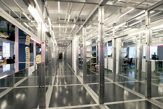
| Posted: 01 Sep 2017 03:00 PM PDT  © Youtao Cao © Youtao Cao
 © Youtao Cao © Youtao Cao From the architect. Recycled material came from Coachella festival stage, which reformed a corridor with bookshelves, standing desk and bar. It divided the original space into two long parts, the office working area that needs the daylight, and the editing area that doesn't need so much light.  © Youtao Cao © Youtao Cao  Floor Plan Floor Plan  © Youtao Cao © Youtao Cao The corridor became a indoor functional traffic hub, installed with mirrors and lights. All of the above were hidden behind the closet in the guest room, the point is to make the guests remember the experience of entering the office.  © Youtao Cao © Youtao Cao This posting includes an audio/video/photo media file: Download Now |
| Dongsimwon Multi-Household House / SOSU ARCHITECTS Posted: 01 Sep 2017 01:00 PM PDT  © Mineun Kim © Mineun Kim
 © Mineun Kim © Mineun Kim 1. Background  © Mineun Kim © Mineun Kim The owner wanted to build a healthy and clean building to provide a good impression to neighbors considering the site located at the entrance of the alley. The owner has told first about effects of his new space to the city before discussing inner spaces of his life, his good will has guided the direction of the design.  Section B Section B 2. Concept  © Mineun Kim © Mineun Kim 1) Living with neighbors.  © Mineun Kim © Mineun Kim Relationships with Alley Privacy and residential environment 2) Different families live together  Section A Section A Collapsed boundary of rooms  © Mineun Kim © Mineun Kim 3. Small scale multi-housing as an alternative of downtown residence  © Mineun Kim © Mineun Kim Because of the limit of individual owners' capital and the constraint of Building Code, those multiplex houses produce more inferior city environment than the large-scale development does so. Small scale multiplex house is the residential type of affordable and flexible structure to contain individual life in a city of a high land price.  © Mineun Kim © Mineun Kim  Axonometric Diagram Axonometric Diagram  © Mineun Kim © Mineun Kim This is the minimum residential unit for a humane life in the downtown providing delight of living with neighbors together. It's time to concentrate on the potentiality of small scale multiplex house as an alternative of downtown residence and pay more attention to this healthy housing unit which concerns relationship with the city. This posting includes an audio/video/photo media file: Download Now |
| Hanhai Luxury Condominiums / Amphibianarc Posted: 01 Sep 2017 12:00 PM PDT  © Zhejia Dai © Zhejia Dai
 © Zhejia Dai © Zhejia Dai From the architect. Hanhai Luxury Condominiums consists of 215,000 m2 of built area divided up into twelve high-rise residential towers with subterranean parking, two semi-public club houses and a nine classroom kindergarten arranged around a central garden space, carefully sited for solar exposure and views of the adjacent waterway. The residences are organized by unit size, with towers containing 90 m2, 180 m2, 220 m2, 330 m2, and 650 m2 units each respectively. The club houses include amenities such as a café, tea house, gymnasiums, locker rooms and a pool, and retail establishments. The main club house will also function as the project's sales center on an interim basis. Coupled with the kindergarten facility, these elements provide many amenities on-site and all within walking distance to the residents.  Courtesy of Amphibianarc Courtesy of Amphibianarc The project is located next to the city's CBD area, and it is positioned to compete in the region's high-end residential demographic, with the goal of becoming a leader in this project type. As such, our design looks to an amenity and feature rich project which provides a unique and luxurious environment to attract an exclusive clientele.  © Zhejia Dai © Zhejia Dai The design draws inspiration from concept of the "cloud". It represents the design concept of combining nature with human lift. Meanwhile, the design team also extends the concept of all-intelligent "cloud" community to the architectural design visually. The building facade design uses large areas of dark glass that stand in sharp contrast with the sleek white terraces and balconies, highlighting a spirit of dynamic lightness for the overhangs visually. The tower building's design features are extended to the design of the three facility buildings, which also emphasize organic shapes and sleek lines. Each building looks like a group of peaceful cloud in sky.  © Zhejia Dai © Zhejia Dai The primary consideration for the building design was to create a residential development which set itself apart from the typical high rise residential complex found in the City. This goal is accomplished on two fronts, by architectural design and by programming. The programming is accomplished through the inclusion of high-end luxury amenities within the units and the site, and by providing residential units with large areas. Through the architecture we break down the massing and repetitiveness usually found in this type of construction by producing visual ambiguity in the size and type of residential units from an exterior view. This ambiguity is created by giving the residential towers the illusion of large expansive glass walls through the use of a hybrid curtain wall system of glass and aluminum panels. This hybrid system is used to mask the punched stacked openings of typical residential construction and blur the distinction between solid wall and opening. The ambiguity is reinforced by the exterior balconies and patios, which swoop from floor to floor, turn around corners at different points, and extend in various lengths along the building faces.  © Zhejia Dai © Zhejia Dai The residential units have been designed for privacy and comfort with ample opportunity for cross ventilation and multiple spaces with good solar exposure. The large private terraces and small balconies bring the landscape to each unit, and the terraces allow each unit to expand the living spaces into the outdoors through the use of large sections of operable glass walls. This strong connection to the outdoors and landscape help meet the goal of providing each residence the feeling of a garden villa, only in the sky. Special features for the larger unit types include double height living spaces, double master suites, western and Chinese kitchens, bathrooms, and terrace swimming pools.  King Tower Typical Floor Plan Type A King Tower Typical Floor Plan Type A  Tower Typical Floor Plan Type A Tower Typical Floor Plan Type A Beyond amenities and features, a design leading presence is called for. The balconies and terraces are carefully placed on the buildings and articulated to maximize the benefits to the interior while also breaking up the mass and repetitiveness of the 100m towers. The club houses and kindergarten buildings continue to define the design aesthetic by creating a visually dynamic statement, aimed towards the adjacent main roadway, canal, and University District.  © Zhejia Dai © Zhejia Dai The glass and aluminum panels are designated to be finished with dark colors, the synthetic stone and plaster are designated to be in white. Material colors are selected to provide a strong contrast between the dark mass of the basic residential building forms and the light playfulness of the expressive balconies and curving building forms of the lobbies, clubhouses and kindergarten. At the residences, the glass exterior finish extends beyond the top and bottom of any window openings to give the illusion of floor to floor glazing, broken up only by a thin band of synthetic stone at the floor line. The strong contrast between forms and the blurring of the distinction between what is solid and what is open further set the project apart from the typical.  © Zhejia Dai © Zhejia Dai This posting includes an audio/video/photo media file: Download Now |
| Posted: 01 Sep 2017 10:00 AM PDT  Courtesy of IKD Courtesy of IKD
 Courtesy of IKD Courtesy of IKD From the architect. IKD's proposal for the Cleo Rogers Memorial Library plaza, titled Conversation Plinth, pays homage to J Irwin Miller and aims to celebrate the community of Columbus. Its form takes cues from the conversation pit in the living room in the Miller House, as well as the plinths that elevate the important landmarks immediately surrounding the site—the library designed by I. M. Pei, the First Christian Church designed by Saarinen church, and the Large Arch by Henry Moore.  Courtesy of IKD Courtesy of IKD  Project Facts Diagram Project Facts Diagram  Courtesy of IKD Courtesy of IKD The installation offers a place for the community to gather and converse, and elevates people, both literally and metaphorically. Starting around the perimeter of the Moore sculpture on the eastern half of the site, large shifting timber discs compose a series of plinths that rise upward towards the west.  Courtesy of IKD Courtesy of IKD By bridging across the now defunct rotary and occupying what is now an empty area of the plaza, the installation seeks to restore programmatic function to the site, encourage dynamic circulation around the sculpture, and allow the plaza to be experienced in a new way, in both horizontal and vertical directions.  Courtesy of IKD Courtesy of IKD The installation would be made of a hi-tech engineered timber product called CLT, or Cross Laminated Timber. Although softwood CLT already exists in the US, hardwood CLT, native and abundant in Indiana, does not. The proposal aims to jumpstart and accelerate the development and use of hardwood CLT fabricated from parts of logs harvested from Indiana forests that can currently only be used to produce low-value wood products. It seeks to demonstrate the viability and the benefits of a new, high-value timber market in Indiana.  Process Diagram Process Diagram IKD has secured support from various private and public interests: Smartlam, one of the two only manufacturers of CLT in the US, Bensonwood, a leading engineering firm highly knowledgeable in engineered timber, the Indiana Hardwood Lumbermen's Association, who could assist with material procurement, and several local academic institutions, who could assist with testing the composition and structural capacity of hardwood CLT.  Courtesy of IKD Courtesy of IKD As a result of encouragement from the US Forest Service, IKD intends to apply for a Wood Innovations Grant to help fund the project. This is an ambitious project that aims not only to honor the most important patron and vibrant community of Columbus, but also to place the city on the forefront of new material research, and ultimately to contribute significantly to the timber industry of Indiana by developing and substantiating the use of hardwood CLT.  Courtesy of IKD Courtesy of IKD This posting includes an audio/video/photo media file: Download Now |
| Statue of Liberty "Luxury Makeover" Calls Out Contemporary Development Practices Posted: 01 Sep 2017 09:00 AM PDT  via ONE|LIBERTY™ via ONE|LIBERTY™
This tongue-in-cheek tagline is one of a number quips featured on a satirical teaser site for what would surely be New York City's most exclusive new development – a luxury community located within the city's most famous symbol, the Statue of Liberty. Created by New York comedians Connor Toole and Evan Krumholz, the trendily all-capitalized and unnecessarily punctuated "ONE|LIBERTY™" is a spot-on parody of the ever-growing number of ultra-luxury lifestyle developments popping up in the city – accurately lampooning the hyperbolic language and long amenity lists touted by developers and realtors. "Immigrate to Luxury," the website proclaims, while boasting of the building's "one-of-a-kind freshwater pool, sourced directly from the pristine Hudson," "crowntop terrace," and celebrity-chef-backed "hot dog cart concept." The faux-development even name drops one of New York's most prolific starchitects, listing Rafael Viñoly as the designer of its "72 impeccable residences." For the most ambitious buyers, an "in-torch penthouse" would offer panoramic views "from gown to crown." The site creators even coined a new neighborhood nickname for the community: LiBi (a horrendous bastardization of Liberty Island), located within the "historic Ellis District."  via ONE|LIBERTY™ via ONE|LIBERTY™  via ONE|LIBERTY™ via ONE|LIBERTY™ The parody seems especially poignant at a time when many of the city's historic buildings are being razed or renovated beyond recognition to make way for a select number of new ultra-luxury residences. In addition to high-profile projects like Williamsburg's Domino Sugar Factory transformation, many other less revered, yet historically significant buildings such as NoMad's Beaux Arts-style Kaskel & Kaskel building are currently threatened by new condominium towers. All the while, unaffordable housing is popping up all over the city, forcing existing residents to relocate to new homes further from the city center.  via ONE|LIBERTY™ via ONE|LIBERTY™ For generations, the Statue of Liberty welcomed in immigrants from across the globe, a symbol of freedom and opportunity for families making New York their new home. But today, many of those original immigrant locales have been redeveloped for the rich – with the only "immigrants" represented by super-rich businessmen looking for an investment property to store their capital in. What does the Statue of Liberty represent to this new wave of immigrants? Giving what is perhaps New York's most iconic structure the realtor treatment takes these concerns to their most absurd, but also raises some very real questions: how do we best go about preserving a city's historic structures, and what is the effect of these "exclusive" developments on the public realm? Check out the site for yourself, here. This posting includes an audio/video/photo media file: Download Now |
| Los Angeles Icon Angel's Flight Reopens After Renovations Posted: 01 Sep 2017 08:01 AM PDT Los Angeles' beloved downtown icon Angel's Flight has reopened for the first time in four years after undergoing extensive renovations to improve the safety and longevity of the attraction. Sometimes referred to as the "world's shortest railroad," the hillside structure is actually a funicular system – both cars share a single cable and are propelled forward in part with the potential energy afforded from the counterweight of the opposing car. Opened in 1901 adjacent to the Third Street tunnel, the 282-foot-long inclined railway was dismantled in 1969 before being located to its current Bunker Hill site in 1996. Over the following 15 years, however, the attraction was plagued with safety issues, including a derailment in 2001 that caused one death and seven injuries. The railway was subsequently closed until 2010, but another derailment in 2013 (this one injury-free) led to its shuttering for significant improvements.  A 1955 photograph showing Angel's Flight in its original location © <a href='http://https://www.flickr.com/photos/7552532@N07/2566472239/'>Flickr user ATOMIC hot links</a>. Licensed under CC BY-NC-ND 2.0 A 1955 photograph showing Angel's Flight in its original location © <a href='http://https://www.flickr.com/photos/7552532@N07/2566472239/'>Flickr user ATOMIC hot links</a>. Licensed under CC BY-NC-ND 2.0 To quell any worries this time around, the recent reopening comes with a $5 million of new safety features including repairs to the tracks, cars and motors and the installation of an emergency stairway. "Angels Flight is a treasure that captivates us universally as Angelenos," commented Los Angeles City Councilmember José Huizar at the reopening ceremony. "It speaks to our past and a restored and safer Angels Flight points to our future as a modern, multi-modal Downtown Los Angeles." News via Curbed. This posting includes an audio/video/photo media file: Download Now |
| Architectural System for Rural Social Interest Housing / Ensamble de Arquitectura Integral Posted: 01 Sep 2017 08:00 AM PDT  © Juan Pablo Pardo © Juan Pablo Pardo
 © Juan Pablo Pardo © Juan Pablo Pardo From the architect. With the goal of imagining new and better housing alternatives that fulfil the requirements of the rural population that apply to the housing grants offered by the government, the National University and the Agricultural Bank opened the 2012 Low-income rural housing (VISR) Competition, which was the seed of the project that was later awarded the Corona ProHabitat Prize 2015.  © Simón Fique © Simón Fique As a result of that last competition, the National Coffee-growers Federation of Colombia (FNC), with the support of ENSAMBLE AI, built in 2016 the first prototype of the project with a budget of 10.000$ USD, which was donated to a low-income coffee-growers house selected at random by the FNC.  Drawing Prototype C1 Drawing Prototype C1 In addition to the difficulty of designing quality low-income housing, the challenge was to tackle the diversity of climates and geographies present in the different rural regions of Colombia. The approach, then, avoided proposing a single and unique housing unit or model for mass production. On the contrary, the project consists of an architectural system that is flexible, appropriable and cheap, and that marks an intermediate point between mass production and the regionalization of participative processes for housing production. The system allows for different configurations of its parts in order for the resulting prototypes to adapt to different social, climatic and topographic conditions, covering the majority of Colombia's rural scape. It is composed of two main modules (rooms / common areas and services) and three complementary modules (floor module, eaves module and roof module).  © Juan Pablo Pardo © Juan Pablo Pardo The main modules have storage space between the ceiling and the actual roof which, at the same time, works as a thermal regulation air cushion. The module's parts where designed to be easily and quickly mass-produced, transported to any region and assembled by local workers and without the need for any special equipment or construction experience.  Prototype E1 Section Prototype E1 Section Finally, the project was designed to produce the fewer environmental impact possible: the structure is assembled from certified timber, the palafitte foundations require a minimum intervention on the site, the assembly process produces next to none waste and the generous roof surface allow for the quick and easy implementation of rain water collection and solar energy systems.  © David Moreno © David Moreno This posting includes an audio/video/photo media file: Download Now |
| Mama Gaia Restaurant / archimania Posted: 01 Sep 2017 06:00 AM PDT  © Hank Mardukas Photography © Hank Mardukas Photography
 © Hank Mardukas Photography © Hank Mardukas Photography From the architect. The design strategy uses minimal gestures with a natural material pallet allowing the restaurant's signage and the menu of raw, whole foods provide the only color within the space. As a relief to the massive scale of the existing building, the restaurant offers a variety of more intimate conditions with the enclosed booth seating, expansive community table, four-top tables, bar seating, and two-top tables in the corridor.  © Hank Mardukas Photography © Hank Mardukas Photography The existing tenant space—part of a recently renovated 1930's distribution warehouse—was broken into a variety of space-defining volumes articulated in plywood and gypsum board and site built wood furniture. The materiality of the raw plywood with exposed end grain relates to the essence of the restaurant's food and identity while adding warmth within the predominately cool, concrete space.  Axonometric Diagrams Axonometric Diagrams  © Hank Mardukas Photography © Hank Mardukas Photography  Exploded Diagrams Exploded Diagrams The various types of furniture, with a large community table at its core, are comprised of forms that attempt to remain honest to the scale and type of user interaction. The two space defining elements, one at the booth seating and another extending overhead from the kitchen to the dining, are composed of plywood fins that are supported by gypsum board volumes in distinct yet related ways.  © Hank Mardukas Photography © Hank Mardukas Photography A large garage door facilitates a connection between the inside of the restaurant and the public building corridor, which is adjacent to an original loading dock area, now populated with exterior benches and tables for outdoor dining.  © Hank Mardukas Photography © Hank Mardukas Photography This posting includes an audio/video/photo media file: Download Now |
| 3XN Wins Competition for Copenhagen Children's Hospital with 'Playfully Logical' Design Posted: 01 Sep 2017 05:30 AM PDT  Atrium. Image Courtesy of 3XN Atrium. Image Courtesy of 3XN Danish practice 3XN's 'Playfully Logical' proposal has been selected as the winner of a competition to design the new National Children's Hospital in Copenhagen, Denmark, emphasizing the power of play as an integral part of medical treatment. Working with Architema Architects, Niras, Rosan Bosch Studio and Kirstine Jensens Tegnestue, 3XN's scheme for BørneRiget takes the form of two hands grasping together to support the various aspects of pediatric care. The hospital has been designed to allow children to stay close to their families while maintaining as much of a regular day-to-day routine as possible.  Exterior view. Image Courtesy of 3XN Exterior view. Image Courtesy of 3XN "When our children become ill, the whole family is affected," said Kim Herforth Nielsen, Creative Director and Founder of 3XN. "We have therefore aimed to create an environment where the family can stay close to the patient and have a life as close to what they are used to. We have worked a lot with the healing qualities of architecture, considering factors from airflow to daylight while creating opportunities for play and creativity."  Concept Diagram. Image Courtesy of 3XN Concept Diagram. Image Courtesy of 3XN  Aerial view. Image Courtesy of 3XN Aerial view. Image Courtesy of 3XN The formal "hands" also serve as the organizational structure of the building. Each "hand" is anchored by a public "wrist" with a family lounge, while each "finger" leads to patient rooms and atmospheric winter gardens. This layout also ensures minimal walking distances between each programmatic area of the building, with a maximum separation of just 20 meters. "The ambition is to create a hospital with a home-esque and informal atmosphere where patients and their families will have a safe journey with relatable contexts and playful frameworks," added Stig Vesterager Gothelf, 3XN Design Manager, and Partner. "It is crucial that children and their families feel protected in the course of treatment and that they can maintain the best possible quality of life."  Outdoor playspace. Image Courtesy of 3XN Outdoor playspace. Image Courtesy of 3XN  View from entrance . Image Courtesy of 3XN View from entrance . Image Courtesy of 3XN The winning scheme was lauded by the judges for its iconic appearance and embodiment of the playful spirit the hospital is striving for. "The building has a sculpturally healthy appearance and will become an icon for BørneRiget with its playful and inviting mode of expression," said jury member Anders Danøe. "It is a building that meets a lot of the users' many demands and wishes for a building that needs to be clinically effective and at the same time provide safety for children, adolescents, and families. A project that in every way deserves its central location in Copenhagen's skyline with the headline: The world's best hospital for children and family, nothing less."  Play area. Image Courtesy of 3XN Play area. Image Courtesy of 3XN  Model. Image Courtesy of 3XN Model. Image Courtesy of 3XN  Patient room. Image Courtesy of 3XN Patient room. Image Courtesy of 3XN The new children's hospital will accommodate up to 900 patients as well as 1,200 doctors, nurses and other staff members. The project is estimated to cost approximately $350 million and to be completed in 2024. News via 3XN. This posting includes an audio/video/photo media file: Download Now |
| Ro House / Aarón Carrillo Díaz Posted: 01 Sep 2017 04:00 AM PDT  © Pablo García Figueroa © Pablo García Figueroa
 © Pablo García Figueroa © Pablo García Figueroa From the architect. Located in Pachuca, in a private complex with geography and particular climates, the residence Ro poses a specific problem from the beginning. Due to a climate where in the afternoon the temperature drops considerably and there are cold winds coming from the mountains, outdoor spaces, green courtyards and terraces have become ornate elements and not spatial resources to promote family coexistence, Integrating and dignifying the meaning of home.  © Pablo García Figueroa © Pablo García Figueroa The intention of the project is to retake the values that we consider important in a residence and reintegrate them. To do this, the concept of the project is to create a direct connection between the interior and exterior spaces through the use of covered terraces that allow the integration of daily life into areas of family life and contemplation, maintaining a relationship from any space in the project.  © Pablo García Figueroa © Pablo García Figueroa  Lower Plan Lower Plan  © Pablo García Figueroa © Pablo García Figueroa The first of the volumes is presented as the services of the Residence, including the kitchen and breakfast area, trapped in a dry contemplative courtyard covered by a glass dome. The second volume gives way to the living room and the dining room, which is interlaced between the patio that accompanies the breakfast room and the space designed with small terraces and green platforms that unify the volumes, this same, with a treatment of glass roofs and concrete slabs that are protecting the daily life of the home. Finally, the third volume containing the recreation spaces, and as a finishing touch, the last patio that is outdoors. All this results in a single multifunctional space and full of visuals, green areas and platforms that carry the  © Pablo García Figueroa © Pablo García Figueroa No less important, the volume of the circulations allows the transit between the spaces in a double height and it directs us to the stairs, in which we accede in a second level to the private part of the house, where the rooms are given complementing in every sense the generating idea of the house.  © Pablo García Figueroa © Pablo García Figueroa This posting includes an audio/video/photo media file: Download Now |
| A Virtual Look Inside the Case Study House #23A by Killingsworth, Brady & Smith Posted: 01 Sep 2017 02:30 AM PDT Only three of the Arts & Architecture Case Study Houses were built outside Los Angeles, and those three formed a united concept. The Triad Houses in La Jolla, a seaside suburb of San Diego, share a single driveway, motor court, and design vocabulary, while being created to meet different needs. In keeping with the Case Study mission, all three houses used open-plan design, affordable modern materials (such as aluminium and concrete with wood frames), and plenty of glass to create a fresh and open mood. The emphasis was on strong geometric forms, careful detailing, horizontal lines (with perfectly flat roofs) and – this being the Californian coastline – dramatic views and outdoor living space, creating the illusion of more interior space than was actually present. One striking feature of the Triad designs was the reflecting pools and planting at the entrances, serving both to soften the stark rectangular facades and to enhance the drama of the landscape – which included views of the other houses – when looking out. House A, the largest and most formal of the houses, also has the largest such pool, occupying the area between the two wings of the U-shaped house. White concrete stepping stones lead across the water to the front door, providing a marked sense of occasion to every entrance.  © <a href='https://www.flickr.com/photos/kid_pro_quo/254175647/'>Flickr user kid_pro_quo</a> licensed under <a href='https://creativecommons.org/licenses/by/2.0/'>CC BY 2.0</a> © <a href='https://www.flickr.com/photos/kid_pro_quo/254175647/'>Flickr user kid_pro_quo</a> licensed under <a href='https://creativecommons.org/licenses/by/2.0/'>CC BY 2.0</a> Once through the front door, the same precast white concrete flooring, flanked by smaller reflecting pools and glass walls, extends the outdoor experience into the entry hall. Behind a screening wall (re-sawn redwood, to match the outdoor cladding), the living room offers spectacular views towards the sea. The far wall of floor-to-ceiling glass is interrupted only by a white concrete pillar for the fireplace; and moreover, the glass extends around the left wall too, opening onto a semi-enclosed terrace that wraps around to connect with the master bedroom.  Courtesy of Archilogic Courtesy of Archilogic From this terrace, it is possible to look right through the bedroom and bathroom, which features yet another glass wall, to an enclosed sunbathing terrace. This master bathroom with its bold glass side sports dramatic flourishes such as a sunken tub – with Pomona Laurel Leaf tiles, to create patterned reflections in the water – and walnut cabinets, suspended from a mirrored wall.  Courtesy of Archilogic Courtesy of Archilogic The right wing is formed by the family space: a kitchen leading to a "snack area" and three children's bedrooms, sharing a bathroom (compartmentalized for maximum privacy) and each opening onto the outside play area. This use of outdoor space to extend the living area, not just visually but practically, is consistent with many other Case Study designs and by now, synonymous with modern California style.  Courtesy of Archilogic Courtesy of Archilogic All the Triad houses had high ceilings and made ample use of full-length glass walls and sliding doors, with quality finishes providing a sense of luxury. More than any of those details, though, it is the indoor-outdoor circulation, the ample light (and views!) that made these houses so aspirational, and that along with the rest of the Case Study designs had such a profound influence on mid-century desires. Take a walk through Archilogic's cardboard-inspired 3D model – this is still the way we want to live: a relaxed, glamorous style that seems to promise ample time to enjoy its pleasures. Don't miss Archilogic's other models of Case Study Houses and seminal projects shared on ArchDaily—click here to see them all! This posting includes an audio/video/photo media file: Download Now |
| Cumberland Street Townhouse / Elizabeth Roberts Architecture and Design Posted: 01 Sep 2017 02:00 AM PDT  © Dustin Aksland © Dustin Aksland
 © Dustin Aksland © Dustin Aksland From the architect. The Cumberland St Townhouse is located on a park block in the neighborhood of Fort Greene in Brooklyn, NY. The house was in a dilapidated state when the owners purchased the building; the rear wall was falling down and water had been entering the building for several years.  © Dustin Aksland © Dustin Aksland  Ground and Second Floor plans Ground and Second Floor plans  © Dustin Aksland © Dustin Aksland The house was completely transformed with a new rear wall and a two-story addition at the back of the house. The addition is open to the living room above and is connected through interior steel and glass windows that mimic the two-story exterior windows. The doors at the garden open completely to create a seamless connection between the kitchen / dining level and the garden. Vines were planted in recessed planters along the 2 story party walls in the dining room--the room was designed to be an indoor-outdoor space where the garden melds with the interior spaces. The vines now cover the double-story party walls and add an organic quality to the connected interior spaces. The top of the addition serves as a private balcony for the master bedroom  © Dustin Aksland © Dustin Aksland This posting includes an audio/video/photo media file: Download Now |
| AD Classics: Neviges Mariendom / Gottfried Böhm Posted: 01 Sep 2017 01:00 AM PDT  © Laurian Ghinitoiu © Laurian Ghinitoiu Standing like a concrete mountain amid a wood, the jagged concrete volume of the Neviges Mariendom ["Cathedral of Saint Mary of Neviges"] towers over its surroundings. Built on a popular pilgrimage site in western Germany, the Mariendom is only the latest iteration of a monastery that has drawn countless visitors and pilgrims from across the world for centuries. Unlike its medieval and Baroque predecessors, however, the unabashedly Modernist Mariendom reflects a significant shift in the outlook of its creators: a new way of thinking for both the people of post-war Germany and the wider Catholic Church.  © Yuri Palmin © Yuri Palmin Pilgrims have been making their way to Neviges since the late 18th Century, when the church of the time first played host to an Imacculata (a venerated copper engraving depicting the Immaculate Conception of the Virgin Mary). The site's popularity proved too great for the existing Baroque monastery, leading to the construction of an annex structure in the early 20th Century. Even with this purpose-built structure, a spike in pilgrimages following the Second World War again saw the church at Neviges significantly over its modest capacity. In 1960, it was decided that a new pilgrimage church would be built to cope with the influx of visitors.[1.2]  © Yuri Palmin © Yuri Palmin With this goal in mind, the Archbishopric of Köln (Cologne) organized an architectural competition to take place between 1963 and 1964. The contest called for a church building with seats for 900 worshippers, with standing room for 3,000 more; other required elements included two chapels, a confessional church, a sacristy, a bell tower, and other ancillary spaces. The winner, chosen by both the jury and particularly by Köln's Archbishop Josef Frings, who was almost blind at the time, was a German architect named Gottfried Böhm.[3,4]  © Laurian Ghinitoiu © Laurian Ghinitoiu Frings had overseen a great deal of church construction in the area around Köln since rising to the seat of Archbishop in 1942. This was part of the greater effort to rebuild Germany in the wake of the devastation of the Second World War: hundreds of churches, having stood for centuries, were obliterated in seconds by bombs toward the war's end. Their replacements were almost universally built in Modernist style, reflecting both post-war austerity and changing liturgical mandates and procedures. Frings himself advocated for greater emphasis on the public celebration of Mass; accordingly, he felt that the altar should not be ensconced behind the choir, but should be a free-standing table standing amongst the congregation itself. This drive toward greater inclusivity and openness, reflected in many of the churches built under Frings' oversight, would find pronounced expression in Böhm's design.[5]  © Yuri Palmin © Yuri Palmin  © Laurian Ghinitoiu © Laurian Ghinitoiu Despite being situated in a small, relatively remote community, the Mariendom is monumental in scale. Böhm was a noted German Expressionist who felt that sacred architecture—contemporary or otherwise—should elicit emotion in the viewer. Whether approaching by rail, road, or on foot, one can see a mountain-like peak of concrete from a far way off. The path up to the church is lined on one side by a wall and by the offices and convent on the other, forming a sense of formal procession as pilgrims make the final leg of their journey.[6]  © Laurian Ghinitoiu © Laurian Ghinitoiu Were it not for the metal cross adorning the Mariendom's highest peak, there would be no indication that the imposing concrete structure was a church at all. Composed of a series of compressed concrete cubes and pyramids, the jagged, amorphous mass was, according to Böhm, designed to reflect the mountainous terrain of the region. (Casual observers, however, have noted that the Mariendom more closely resembles a concrete iceberg than the more rounded, verdant hilltops of the Rhineland.) [7]  © Laurian Ghinitoiu © Laurian Ghinitoiu Once visitors enter the church, the towering mass of the building is briefly obscured in a relatively low-ceilinged foyer, providing a moment of visual suspense before one enters into the cavernous volume of the main worship space. Like the exterior, the interior is formed of geometrically irregular concrete on the scale of a cathedral, the joints of the angled roof planes above interspersed with louvers that allow natural light into the space. The space is dominated by the altar, which, although not quite on axis with the main entrance, is placed centrally per Archbishop Frings' preference. Three stories of galleries line the right side, allowing pilgrims views and proximity to the altar even when the church is crowded. On the left side, shrouded in relative darkness, are two chapels, including the Marienkapelle which houses the copper relic.[8,9]  © Laurian Ghinitoiu © Laurian Ghinitoiu In keeping with Böhm's particular style, the otherwise featureless gray expanses of concrete are punctuated with windows of brilliantly colored stained glass. Primarily red, blue, and green, the windows—designed by Böhm himself—depict, in abstract, a number of typical Marian themes, including a large red rose. For the Marienkapelle, Böhm also created an elaborate composition centered around the Ichthys, the symbolic fish which represents Christ. Scattered throughout the church are sculptural works by other artists, including a marble column and altar designed by Elmar Hillebrand; Gottfried Böhm's own son, Markus, was also responsible for the painting of the lower church.[10]  © Laurian Ghinitoiu © Laurian Ghinitoiu Once constructed and consecrated in 1968, the Neviges Mariendom became the second-largest church in Germany, outdone only by the Gothic cathedral in Köln itself. The concrete mass of the building, while giving the impression that it was impregnable, actually began to leak by the 1980s; at the time of construction, concrete's natural tendency to crack had evidently not been taken into account. Concrete patchwork done during the 1980s elicited criticism, as the patches, being of a different shade than the original material, were seen as ruining the building's aesthetic purity. Under the supervision of the architect's son Peter Böhm, however, a second effort to patch the concrete is expected to resolve the issue while maintaining the original outward appearance of the church for both pilgrims and architectural enthusiasts alike.[11]  © Laurian Ghinitoiu © Laurian Ghinitoiu References
This posting includes an audio/video/photo media file: Download Now |
| 13 UNESCO World Heritage Sites Located in Brazil Posted: 31 Aug 2017 11:00 PM PDT  Ouro Preto - MG. Image © Marina Aguiar, via Flickr. Licence CC BY 2.0 Ouro Preto - MG. Image © Marina Aguiar, via Flickr. Licence CC BY 2.0 With more than five centuries of recorded history and many more years of pre-colonial traditions and customs, Brazil is listed in UNESCO's World Heritage List with 13 historical sites. The website Viagem Turismo compiled a list with images and detailed information about each of the 13 sites. The list ranges from the Serra da Capivara National Park, "full of rocky caves covered with rock paintings" made more than 25 thousand years ago, to the modern capital of Brazil, Brasília, founded in 1960. The thirteen historical sites listed by UNESCO are:
The full article can be found on the Viagem Turismo's website. This posting includes an audio/video/photo media file: Download Now |


.jpg?1503671953)
| You are subscribed to email updates from ArchDaily. To stop receiving these emails, you may unsubscribe now. | Email delivery powered by Google |
| Google Inc., 1600 Amphitheatre Parkway, Mountain View, CA 94043, United States | |
Nema komentara:
Objavi komentar