Arch Daily |
- Hus Nilsson / Tina Bergman Architect
- Office Building in Za bramką Street/ Ultra Architects
- Topkapı Imperıal Kıtchens / TEGET
- House in Hong Kong / Millimeter Interior Design
- Springing Stream / WEI architects/ELEVATION WORKSHOP
- ID Hospital / Dongjin Kim + L'eau Design
- River View Service Station / ZHOU Wei + ZHANG Bin / Atelier Z+
- A Plane That Skidded Off Its Runway Could Become A Turkish City's Newest Library
- Modular House 01 / abarca+palma
- Harvard's Popular Free Online Architecture Course Returns for 2018
- La Ruina Park Bar / Tamen Arquitectura
- Herzog & de Meuron's Royal College of Art Flagship Building Receives Planning Approval
- REE Campus in Tres Cantos / IDOM
- The 13 Types of Student You Encounter During an All-Nighter
- Brunhais House / Rui Vieira Oliveira
- Universal Design and Accessibility Manuals from Latin America and Spain
- World’s Largest 16th-Century Map Digitally Re-Assembled at Stanford University
- Herbal House Refurbishment / BuckleyGrayYeoman
| Hus Nilsson / Tina Bergman Architect Posted: 29 Jan 2018 07:00 PM PST .jpg?1516737542 "© Peter Guthrie") © Peter Guthrie © Peter Guthrie
.jpg?1516737395 "© Peter Guthrie") © Peter Guthrie © Peter Guthrie Text description provided by the architects. HUS NILSSON is a summer house situated at the Norrfjärden bay in the archipelago ofnorth Sweden, on a steep slope between the forest and the sea. Despite being on the east coast, the site is facing west. Buildings in the area are mainly summer houses, scatteredalong the coast line and accessed from behind by a net of private roads. The bay is livelywith people fishing and bathing in the summer, and ice skating in the winter.The existing house on the site was a very small cabin from the 1950s, without water in thewinter and mainly built for short visits - somewhere to get warm after fishing and skating.The family wanted a house inhabitable during all seasons, with internal and external spacesturning towards the beautiful view across the bay and towards the forest.  Site Plan Site Plan They also wanteda house which could both be sociable and allow for privacy for the different members of thefamily, also in the long term.The new house, a singular long and narrow building volume with a steep pitched roof andclosed gables, spans across the site and aims to be the connection between the forest andthe water. By its form and its placement on the site, it allows many of its rooms a view ofthe sea; the placement also affords privacy and prevents the house from feeling overlookedby its neighbours. The building is tied to its site by being sat directly upon an existing stoneretaining wall; the wall creates a natural outdoor terrace overlooking the sea, onto whichthe internal spaces connects. On the forest side, the site is excavated in order to create amore generous space for play and outdoor work. .jpg?1516737474 "© Peter Guthrie") © Peter Guthrie © Peter Guthrie The visual and physical contact between the house and with its surroundings is achieved bythe general layout of the spaces: a central open and sociable living space with bedrooms oneither ends which can be connected or closed off. This configuration incoorporatescirculation space in order to minimize wasted floor area, and creates different ways ofmoving through the house, which together with enhanced sightlines increases theperception of space and gives a feeling of that the house is bigger than it is. This feeling isfurther emphasized by the central and freestanding fireplace which also provides a focalpoint and divides the large space into dining and living areas.The one commonly featured'outdoor room' in Nordic private houses is here integrated in the main volume; by making itan external passage through the house, it not only creates a visual and physical connectionbetween the forest and the sea, it also lifts it from its normal periferal position to be thenave of the building.Hus Nilsson is by its form and materiality connecting to the local building tradition in thearea. .jpg?1516737589 "© Peter Guthrie") © Peter Guthrie © Peter Guthrie  Details Details .jpg?1516737491 "© Peter Guthrie") © Peter Guthrie © Peter Guthrie Although being situated by a fairly sheltered bay in the Baltic sea, the impact of theclimate on buildings in this part of the country is significant. The roof has a steep pitch inorder to reduce snow load, and is given a large overhang to better protect against wind andsalty water. The facade is clad with heart of pine treated with a silicon protection andcomplemented with a cement based stone cladding on the forest facing elevations.The roofis of aluminium-zinc coated sheet steel. The structure is entirely made out of timber; loadcarrying timber studs with a gluelam roof structure. The foundation is a concrete slabfoundation.The building was completed in the summer of 2017. The construction took 7 months fromthe demolition of the existing cabin until completion, and was made possible by an efficientand very successful collaboration between the architect, client, and contractor. .jpg?1516737525 "© Peter Guthrie") © Peter Guthrie © Peter Guthrie This posting includes an audio/video/photo media file: Download Now |
| Office Building in Za bramką Street/ Ultra Architects Posted: 29 Jan 2018 06:00 PM PST  © Przemysław Turlej © Przemysław Turlej
 © Przemysław Turlej © Przemysław Turlej Text description provided by the architects. Seven-storey office building rise up in the city centre of Poznań in Za bramką street, completing one of the quarters of downtown buildings.  Concept Concept This location was the main factor in determining the form of the building. From the streets surrounding the quarter, facades of the new edifice create modern and calm composition fitting to the urban frontage. With reference to adjacent old town houses, storeys are separated by cornices. Vertical, high windows are rhythmically disposed. Big glazing allow daylight to penetrate building's interiors despite relatively narrow and shady streets in this part of city. Each window is equipped with an opening element allowing for natural ventilation.  © Dawid Majewski © Dawid Majewski From the inside of the quarter, shape of the building looks completely different. Each subsequent floor is set back from the previous one, creating a recreation terraces with wooden floors and greenery. Thanks to glazed facades, visual boundary between the interior and the exterior of the building is blurred, allow the interpenetration of these zones. Apart from terraces, also building's roof covered with grass will be a biologically active surface.  Ground Floor Ground Floor Three underground floors and a part of ground floor is occupied by a parking space with 299 places for cars, motorcycles and bikes.  © Przemysław Turlej © Przemysław Turlej  © Przemysław Turlej © Przemysław Turlej Between the newly designed office building and the existing building of Poznan Welfare Center will arise additional public space, a small square with benches and greenery.  1st Floor Plan 1st Floor Plan Next to the office building there are few street lanterns designed by us. However they are not usual lanterns – there is a secret life within.  © Dawid Majewski © Dawid Majewski PREGNANT LAMP Park lamp with a built-in nest box. The lamp is designed in three versions. The basic one has only a built-in, exchangeable nest box. The second version is an educational version with a camera inside the box and a small LCD screen in the lower part of the lamp. It allows to observe the birds inside the nest box. An information about the bird's species and it's habits can be also displayed on the screen. The third version gives a possibility to live-stream the picture from the camera straight to a website, where one can observe what happens in the nest boxes all around the world. Product Description. In this building, the Zieta Prozessdesign product was used for the very first time on the façade. Panels from the 3 Plus series are visible on the façade as white vertical stripes next to the windows. These sheets cover the opening parts of the façade, which enable natural ventilation of the interior. Ventilation elements designed at the first turned out to be too expensive, so we had to find a cheaper solution. We decided to use simple, full, tilting elements of facades and cover them with perforated sheet. We've been looking for a pattern for these covers for a long time, until we finally found a sample of 3 Plus. It is a very light, stiff, perforated material. Very aesthetically made. Therefore, after talking with the designer Oskar Zięta, we decided to use it. This solution reduced initial costs by nearly 60%.  © Skyflash © Skyflash This posting includes an audio/video/photo media file: Download Now |
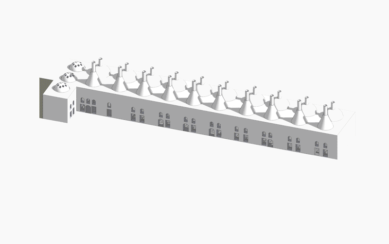
| Topkapı Imperıal Kıtchens / TEGET Posted: 29 Jan 2018 04:00 PM PST  © Cemal Emden © Cemal Emden
 © Cemal Emden © Cemal Emden Text description provided by the architects. Construction of the Imperial Kitchens of Topkapi Palace first started in the 15th century. Under the rule of Sultan Suleyman, the complex remodeled and brought up to date by the architect Mimar Sinan. An internal street/courtyard with its additional facilities such as dorms, a bath, a mosque were arranged.  © Cemal Emden © Cemal Emden
 © Cemal Emden © Cemal Emden TEGET has been chosen to design the new exhibition in this important building: the culinary culture of Ottomans in Imperial Kitchens of Topkapi Palace.  © Cemal Emden © Cemal Emden Keeping this important historical background in mind, the main attempt was to preserve the space as the building itself is an important exhibition element as well. A grid which works like a topography with its different exhibition elements with different sizes envisioned. This grid was thought as a new structure that stands out from the historical building without touching it. First element of this grid was the platform. Higher from the original floor, this comfortable walking surface also provided a hidden space for technical equipment under it.  Section A Section A  © Cemal Emden © Cemal Emden  Plan Plan Produced with the same material of the platform, bases –the hills of the grid topography- located in the grid for exhibition objects. Finally, completely transparent showcases designed to not to intervene the visual continuum between the building and the exhibition objects. This visual continuum was also achieved by ending the platform at some points to show the original floor.  © Cemal Emden © Cemal Emden This posting includes an audio/video/photo media file: Download Now |
| House in Hong Kong / Millimeter Interior Design Posted: 29 Jan 2018 02:00 PM PST  Courtesy of Millimeter Interior Design Courtesy of Millimeter Interior Design
 Courtesy of Millimeter Interior Design Courtesy of Millimeter Interior Design Text description provided by the architects. Situated in the suburban district of Hong Kong, this 4,600 square-feet house is a light, tranquil, yet stylish home. The designer applied contemporary white walls with light wooden flooring make the house warm and inviting. The transparent design of the garage makes this a dream house for the car enthusiastic owner, who can admire his collection in the living room anytime.  Courtesy of Millimeter Interior Design Courtesy of Millimeter Interior Design More, instead of the ordinary concrete stairs, the designer replaced it with the aesthetic iron staircase, not only reducing the visual disturbance from the beloved cars, but also connects to the angle bracket featured living room wall, which adds a sense of vitality alongside the Lamborghini. Extending the minimal feeling, the dining room is illuminated by white two extra-enormous pendant lamps, make the room less dull.  Courtesy of Millimeter Interior Design Courtesy of Millimeter Interior Design Meanwhile, the master bedroom comprises of a bathroom, study room and walk-in closet, all opened and spacious. With the serene countryside view, the owner can be relax and enjoy sunset while sitting in the opened study room.  Courtesy of Millimeter Interior Design Courtesy of Millimeter Interior Design This posting includes an audio/video/photo media file: Download Now |
| Springing Stream / WEI architects/ELEVATION WORKSHOP Posted: 29 Jan 2018 12:00 PM PST  © Weiqi Jin © Weiqi Jin
.jpg?1515987709 "© Weiqi Jin") © Weiqi Jin © Weiqi Jin Text description provided by the architects. Springstream House is a renovation project of an abandoned house located in Chixi Village, which is the first Poverty Alleviation Village situated in rural valley in Fujian, China. .jpg?1515987566 "© Weiqi Jin") © Weiqi Jin © Weiqi Jin Inspired by the surrounding natural landscape, the design aims to create a living house, just like a tree that rooted in the ground, growing inside its surroundings. After the renovation, the original ruined two-storey wooden house with a sheep shed on the side becomes a new 275sqmwide guesthouse. .jpg?1515987657 "© Weiqi Jin") © Weiqi Jin © Weiqi Jin Adhering to the design concept of "Considering Landscape First", the guidance of the entire project is people’s circulations and sightlines with the relationship of far-distance mountain, short-distance landscape and architecture. .jpg?1515987878 "© Weiqi Jin") © Weiqi Jin © Weiqi Jin The double brick wall on the east side is completely preserved to maintain the same height and shape as the original one. Towards the stream, there is an eave-roofed courtyard in the first floor, which is a curved dougong. .jpg?1515987846 "© Weiqi Jin") © Weiqi Jin © Weiqi Jin The cornice of wooden structure has changed into a natural arched curve, which becomes a design highlight through the whole project. .jpg?1515987211 "© Weiqi Jin") © Weiqi Jin © Weiqi Jin By the creative use of traditional sloped roofs in Southern China, its curves are integrated in the nearby tea gardens, far-distant mountainous, and clouds floating between the peaks. .jpg?1515987824 "© Weiqi Jin") © Weiqi Jin © Weiqi Jin The house mainly adopts the traditional tenon and mortise structure and wooden enclosure.  Section Section The majority of materials are old timber collected from the local bearing wood, wood panels, doors and windows. .jpg?1515987857 "© Weiqi Jin") © Weiqi Jin © Weiqi Jin For the interior, a series of delicate changes of materials allow better circulation within the space while also hinting at changes in the surrounding environment. .jpg?1515986990 "© Weiqi Jin") © Weiqi Jin © Weiqi Jin .jpg?1515987155 "Diagram") Diagram Diagram Stepped into the house, the calendered concrete floor with curved brass lines inlaid lead people from the entrance to kitchen and tearoom on the right, inward yard at front, and double-layers living room on the left. .jpg?1515986978 "© Weiqi Jin") © Weiqi Jin © Weiqi Jin On the right side of the gate is an open kitchen. According to the local tradition, hearth is considered the “heart” of the house. .jpg?1515987024 "© Weiqi Jin") © Weiqi Jin © Weiqi Jin Therefore, we decided to preserve the hearth’s original place, re-building it following the local, traditional methods. At the same time, on the other side of the kitchen, we set modern appliances, such as an induction cooker, a range hood and an oven. .jpg?1515987049 "© Weiqi Jin") © Weiqi Jin © Weiqi Jin Next to the kitchen, on the right, there is a tearoom: we used a special local way to design the window between kitchen and tea house. It can be a flap when it’s closed, and a countertop when it’s open. We make particular windows for promoting ventilation. Using local seasonal wind direction's changes, it also can increase convection to achieve passive cooling and dehumidifying. .jpg?1515987814 "© Weiqi Jin") © Weiqi Jin © Weiqi Jin The tearoom is located on the west side of the main building. Its north side is intended as dining room and equipped with a long table, while the south side is for tea drinking. The tearoom is a grey space, the roof form and orientation is conceived to improve inner ventilation. .jpg?1515987835 "© Weiqi Jin") © Weiqi Jin © Weiqi Jin The tea table is made by a local stone--Fudingblack, manufactured on site. Local bamboo and vegetation are used on courtyard between teahouse and guesthouse. The garden lamps are entirely made on site by local bamboo. .jpg?1515987558 "© Weiqi Jin") © Weiqi Jin © Weiqi Jin This posting includes an audio/video/photo media file: Download Now |
| ID Hospital / Dongjin Kim + L'eau Design Posted: 29 Jan 2018 11:00 AM PST .jpg?1516968323 "© Shin, Kyungsub") © Shin, Kyungsub © Shin, Kyungsub
.jpg?1516968259 "© Shin, Kyungsub") © Shin, Kyungsub © Shin, Kyungsub Text description provided by the architects. So far, the beauty was like that an object reproduces the sublimity of nature or reaches to the ideal aesthetic standard like the golden ratio. However, the contemporary art seems to keep the distance from the previous beauty. Modern architect, Adolf Loos, who said that 'the decorations are the sins', discussed the value of the architectural aesthetic in tune with the time. But, whenever we see high-rise buildings composing the urban concrete jungle, they just generate individual aesthetic values of the sculptures and showy images like a nightclub, they actually have no concern about the intrinsic value requested by the present day. The site is located in the centre of the Gangnam Daero and in a row of high rise office buildings. Due to the globalization of the Korean medical technology of cosmetic surgery, a new type plastic surgery hospital building that is connected with the associated medical facilities and has a total management program integrated with beauty and care is emerging in the Gangnam area.  Program Diagram Program Diagram This total plastic surgery centre requires a new type of architecture that is different from a medical facility dealing with just a single subject or a general university hospital. In order for diverse programs to have space enough for their programs, each volume was planned that inner and outer surfaces are designed together, and a space for a specific function has its own properties in the exterior. These formed programmatic bands allow building a vertical stacking composition freely. This means an active architectural response in accordance with the change of the client and the time, such as the scale alternation of hospitalization, treatment, and operation space and the change of the business operation. If the Seagram Building by Mies was planned to change the inner space by the neutral architecture, the ID Hospital is the architecture having the programmatic flexibility giving the characteristic of a specific space by itself. .jpg?1516968209 "© Shin, Kyungsub") © Shin, Kyungsub © Shin, Kyungsub This ID centre suggests the Editologocal Gradation Tower responding to an evolving program by the flexibility of the vertical stacking arrangement. In the body of the tower, 16 floors are composed of two sections, medical and beauty care. And the top floor is arranged as the Roof Lounge for a lobby area, and the Meditel Lounge is placed for counselling and specialized consultation at the below the top floor. Also, the Beauty-Care Lounge is arranged in the basement. The three lounges are placed dispersively upon consideration of the flexibility of the programs to help the circulation of the high-rise building. The first floor, which can be crowded, is left open as a free access hall. Also, the Gradation Skin of the plastic arrangement made by the programmatic band will an element adopting the environment, changing in accordance with the characteristic of the inner programs or the vertical arrangements. In the process of construction, there was two alternation of the vertical arrangements by two programmatic changes. .jpg?1516968631 "© Shin, Kyungsub") © Shin, Kyungsub © Shin, Kyungsub Now, it discards the solid building in a well-dressed suit, and then, the responding architecture combined with changing the inner programs by itself from the alternation of the exterior environment is required as leaving the possibility of partial change open. In contrast to the previous high-rise buildings have a limitation for users to adapt to a uniform system regardless of the inner programs by concentrating on the exterior surfaces, this architecture makes the plastic edit by the change and insert of the programs possible architecturally. The value of the modern aesthetic seeks the value of the selection and wish to respond to the endless changes. And it requires no fixed rigid body, but a body available for the plastic edit, which makes responses to instant changes partially possible. .jpg?1516968188 "© Shin, Kyungsub") © Shin, Kyungsub © Shin, Kyungsub This posting includes an audio/video/photo media file: Download Now |
| River View Service Station / ZHOU Wei + ZHANG Bin / Atelier Z+ Posted: 29 Jan 2018 09:00 AM PST  © Qingshan Wu © Qingshan Wu
 © Qingshan Wu © Qingshan Wu "River Viewing Service Station" is a service station at Lujiazui northern riverside section on the eastern bank of the Project on "Connecting Both Sides of Huangpu River of Shanghai", providing citizens with rest spaces and public toilets. The station is within a narrow levee-shaped green field defined by riverside running path and inner riding path. It is an extension of the access of an existing underground garage staircase. The site is more than two meters above the city roads with the northern riverside slightly higher than the southern side. In the neighborhood there are many old trees, forming a small forest.  © Qingshan Wu © Qingshan Wu In order to balance an extremely short project schedule of only one month and our unremitting pursuit for quality and space experience and to give consideration to problems such as space constraint and control of garage roof structural weight, we adopted the steel and wood hybrid system mainly composed of laminated wood to make a rapid construction possible. With a high prefabricated rate, the site is basically adopting dry construction, which has little impact on the environment.
Backed by a succession of skyscrapers in Lujiazui and separated by Huangpu River from Old Bund and North Bund, this site is a key public space in central Shanghai. This small station has provided us with opportunities to explore the relationship between architectures and sceneries that have exceeded its own dimension. We hope that this station can intensify its own features while serving the citizens in an easily approachable atmosphere so that the architectures can become a scenery amplifier. The name of "River Viewing Service Station" has highlighted the double appeals of the service station.  © Qingshan Wu © Qingshan Wu The station can be divided into two sections: The eastern part is a relatively closed public toilet while the western section is an L-shaped lounge combined with garage staircase. The northern and western sides facing the Bund are both full-height glazing and rest platforms. On the northern river-viewing platform is provided with benches along the station´s external wall, where visitors can take fitness break. Between these two parts there is a roofed vestibule cutting through the architecture, which connects the riding path in relatively low south with the river-viewing platform in relatively high north. The square planar contour of the station is in sharp contrast to the relatively complicated half-spiral straight line curved surface single-direction purline roofing structure made of copper imitated Al-Mg-Mn Alloy Sheeting.  © Qingshan Wu © Qingshan Wu  Section Section  © Qingshan Wu © Qingshan Wu Viewed from the riverside, the station resembles a large pavilion with far-extending eaves and a lithe crimped roof, which is slightly elevated from the site. The umbrella-shaped radial purlines under the counter-slope eaves in the north have become a visual focus. The purlines converge to form a natural triangular skylight, one half in the lounge and the other half above the vestibule, illuminating the dark roof recesses and strengthening the space depths.  © Qingshan Wu © Qingshan Wu Viewed from the riding path in the south, the station roof is divided into two halves respectively in the east and west, which have different heights but both tilt inward. Especially, the roof at the corner of western-section stair case in the center has been depressed almost to the lowest point of visual horizon and the copper imitated plates roofing has extended to western section´s southern façade. This specially depressed dimension and the continuity between roof and façade have strengthened the entering sense of the side back to the river, guiding visitors from the central vestibule to the river scene.  © Qingshan Wu © Qingshan Wu Ascending step by step from the riding path through the narrow and low-rise vestibule, the roof will gradually rise with your body movement, the dense tree crowns originally at the end of the vestibule will also raise in your field of vision, breaking through the high and spacious eaves in the north. Standing on the open and clear river-viewing platform and viewing through the trunks at the bottom, you can see the glistening river surface is stretching horizontally, constituting a flowing scene with figures walking or running along the riverside.  © Qingshan Wu © Qingshan Wu  © Qingshan Wu © Qingshan Wu The benches on both sides of the vestibule will attract people to sit idly and appreciate the river scene leisurely. At this moment, you can only see the glistening river surface and feel a special tranquility when the city at the other side of the river is concealed by the trees. Of course, when you descend from the platform and zigzag down the stepping stones in the forest, you will access the running path and waterborne platform, where you can enjoy a panoramic view of the magnificent city skylines across both sides of Huangpu River.  © Qingshan Wu © Qingshan Wu This posting includes an audio/video/photo media file: Download Now |
| A Plane That Skidded Off Its Runway Could Become A Turkish City's Newest Library Posted: 29 Jan 2018 08:00 AM PST  via youtube user Ihlas News Agency via youtube user Ihlas News Agency An airplane that skidded off the runway in Trabzon, Turkey, earlier this month (with no injuries) may soon be repurposed into a library for the city. Five days after the plane was removed from its cliffside perch, Trabzon Mayor Orhan Fevzi Gümrükçüoğlu has reached out to the general manager of airline involved in the incident, Pegasus Airlines, to ask if they will donate the plane as a gift with the condition that it will be used as a library space, explaining that "keeping it here will also erase the bad memories attached to the plane." The plane, a Boeing 737-800, measures in at 110 feet long and has a wingspan of 117 feet, with a cabin floor area of approximately 970 square feet. This would put it on the small side for a library, but in a city troubled with a lack of adequate library space, it is already common practice to transform former structures into book storage spaces. Nearby towns of Giresun and Datça feature similar small-scale libraries that allow residents to drop off and pick up books on an honor system. Read more about the incident, here. News via Interesting Engineering. This posting includes an audio/video/photo media file: Download Now |
| Modular House 01 / abarca+palma Posted: 29 Jan 2018 07:00 AM PST  © Andres Maturana © Andres Maturana
© Andres Maturana Text description provided by the architects. This residence is in the "Los Maquicillos" hills, between Matanzas Square and Vega de Pupuya. Its implantation on the hill provides a wide view to the sea and a very close view of the hills, big trees and the powerful rural landscape of the ravine "La vega de Pupuya".  © Andres Maturana © Andres Maturana The house has an interior of 77m2 that include two bedrooms, a bathroom and a kitchen integrated to the living and dining room that communicates directly to a covered porch and a corridor that projects over the terrain in its sloping part. All environments have a view that can cross the entire region of the ravine and the distant sea.  Floor Plan Floor Plan This first Modular Home is part of a system of prefabricated modules and a serial structure fabricated on construction sites adaptable to the terrain. The wooden structure is built in situ by joiners before the arrival of prefabricated panels that are mounted over it.  © Andres Maturana © Andres Maturana  Axonometric Axonometric  Section Section It is a mixed system, where carpentry tradition and the industry can directly connect with each other.  © Andres Maturana © Andres Maturana The structure built in pine wood is composed by the method of piers, beam, composite pillar and serial trusses that construct a cover that protects the totality of the residence.  © Andres Maturana © Andres Maturana  Section A Section A The prefabricated panels are of SIP type with variable thickness according to the climatic zone of the country.  © Andres Maturana © Andres Maturana In climate terms, the house is characterized by a great cover that protects the entire area built with edges of more than a meter long, which ensure protection from rain and sun, giving greater durability to the residence coatings and decreasing considerably the maintenance. The coverage is separated from the modules to reduce the incidence of heat on them, as well as to promote air circulation. Finally, the width of the residence and the sequence of windows allow cross ventilation in all rooms.  © Andres Maturana © Andres Maturana Five modules were used for this residence: Double Bedroom Module, Single Bedroom Module, Bathroom and Kitchen Module, Living Module and Balcony Module, as well as a corridor throughout the front of the house. This posting includes an audio/video/photo media file: Download Now |
| Harvard's Popular Free Online Architecture Course Returns for 2018 Posted: 29 Jan 2018 06:15 AM PST  © Flickr user <a href='http://https://www.flickr.com/photos/peterhess/5827561640'>peterhess</a>. Licensed under CC BY 2.0 © Flickr user <a href='http://https://www.flickr.com/photos/peterhess/5827561640'>peterhess</a>. Licensed under CC BY 2.0 The Harvard Graduate School of Design's popular free online course, The Architectural Imagination, has returned for 2018, again offering anyone across the globe the opportunity to study the fundamentals of architecture from one of the world's foremost design schools at absolutely no cost. Led by professors Erika Naginski, Antoine Picon, and K. Michael Hays, alongside PhD student Lisa Haber-Thomson, the 10-week course will begin on February 28th, and will cover topics ranging from learning to "read" buildings as cultural expression to technical drawing and modeling exercises. The course description explains: "Architecture is one of the most complexly negotiated and globally recognized cultural practices, both as an academic subject and a professional career. Its production involves all of the technical, aesthetic, political, and economic issues at play within a given society. Over the course of ten modules, we'll examine some of history's most important examples that show how architecture engages, mediates, and expresses a culture's complex aspirations." While the course is completely free, students can receive a verified certificate of completion for an additional $99. Learn more about the course, here. This posting includes an audio/video/photo media file: Download Now |
| La Ruina Park Bar / Tamen Arquitectura Posted: 29 Jan 2018 05:00 AM PST  © Alexander Potiomki © Alexander Potiomki
 © Alexander Potiomki © Alexander Potiomki Text description provided by the architects. This project was developed in a place where a textile factory was previously located, in the city of Hermosillo, Sonora. Nowadays, this place is known as "La Ruina Park" and it has become an iconic landmark of the city, in the field of events, nightlife and gastronomy.  Floor Plan Floor Plan Due to the increase in the flow of Hermosillenses in this establishment, the need arises to meet a greater demand. For this, TAMEN architecture, in collaboration with the Park La Ruina, analyzed the operation of the establishment and the user experience, to create a new concept that allows to take advantage of the flexibilities of the place, projecting a quality image that integrates the experience of enjoying from an old and traditional canteen, with all the comforts of a modern establishment. For this, the logistics and equipment of the place has been innovated and improved, particularly with the current bar, which allows serving more than 100 users at a time.  © Alexander Potiomki © Alexander Potiomki Thus, with finishes that reflect history - like the marble counter that runs from wall to wall, antique framed mirrors of wood that were formerly installed in the factory, luminaires exposed to oxidation framing the bar area, and areas covered with aluminum laminate simulate the restoration of the bar - a new environment is created and its more welcoming to the user, which together with a game of indirect lighting, manages to maintain the original nature of the bar La Ruina and all its accessories.  © Alexander Potiomki © Alexander Potiomki This posting includes an audio/video/photo media file: Download Now |
| Herzog & de Meuron's Royal College of Art Flagship Building Receives Planning Approval Posted: 29 Jan 2018 04:00 AM PST  © Herzog & de Meuron © Herzog & de Meuron Herzog & de Meuron's design for the new flagship building of the Royal College of Art's Battersea campus has been granted planning approval by Wandsworth Council. Unveiled last fall, the £108 million building will mark an "important step" in the evolution of the RCA into a STEAM (Science, Technology, Engineering, Art and Mathematics)-focused postgraduate university. .jpg?1517244654 "© Herzog & de Meuron") © Herzog & de Meuron © Herzog & de Meuron The new building will house facilities for a range of art, design and innovation programs, including laboratories for computers, robotics wearing technologies, material science and advanced manufacturing. Additionally, space will be allocated to host start-up businesses as part of the InnovationRCA incubator program. Central to the building design will be a double-height construction and exhibition space where large-scale works can be assembled and displayed. Student amenities will include a publicly accessible cafe and an art materials store. The building has been designed throughout for intuitive circulation and connections to the surrounding area and public space.  © Herzog & de Meuron © Herzog & de Meuron  © Herzog & de Meuron © Herzog & de Meuron "The new Battersea campus expansion will be a new centre for the UK and the Royal College of Art's culture of design innovation and entrepreneurialism at the intersection of science and the arts," commented Ascan Mergenthaler, Senior Partner, Herzog & de Meuron. "Workshops are the nucleus of the College and of the new campus extension. Our design is rooted in the surrounding townscape – it is simple, robust, and flexible, and delivers a formula for the transforming dynamic of the RCA."  © Herzog & de Meuron © Herzog & de Meuron  © Herzog & de Meuron © Herzog & de Meuron Royal College of Art Vice-Chancellor Dr. Paul Thompson added, "The creation of the new Battersea campus is a landmark moment in the history of the RCA, as we embrace new design and creative disciplines, and offer our students unparalleled studio, workshop and high-tech facilities. It has been a huge privilege working with Herzog & de Meuron on this extraordinary design process; we are delighted by the support we have received from both local and central government in helping us realise an entirely new type of art and design university, which will contribute to the developing cultural quarter in Battersea."  © Herzog & de Meuron © Herzog & de Meuron .jpg?1517244643 "© Herzog & de Meuron") © Herzog & de Meuron © Herzog & de Meuron Half of the £108 million financing was committed by the Government in 2016, with the remainder to be secured through private donations and RCA investment. A fundraising campaign known as GenerationRCA is scheduled to launch later this year. Site work is scheduled to begin in Spring 2018, with completion slated for April 2020. News via RCA
This posting includes an audio/video/photo media file: Download Now |
| REE Campus in Tres Cantos / IDOM Posted: 29 Jan 2018 03:00 AM PST  © Aitor Ortiz © Aitor Ortiz
 © Aitor Ortiz © Aitor Ortiz Text description provided by the architects. The Spanish Electricity Network commissioned IDOM for the complete rehabilitation of two buildings at the Tres Cantos Technology Park (Madrid). The operation comprises an integral adaptation to the new training and technological needs of the company, modernizing all the buildings through an environment that allows to comply the energy efficiency requirements.  Axonometric Axonometric The distribution of the new campus seeks to increase the quality of spaces and classrooms, as well as an efficient organization, taking full advantage of the available space, generating clear and recognizable access areas, reducing and clarifying the area of the project destined to the common areas.  Floor Plan Floor Plan From the formal point of view, the project seeks to value the particular spatial conditions of the building from four main elements: the closed communication and sanitary cores, the new inner courtyard, the organization of the plants and the exterior image of the building.  © Aitor Ortiz © Aitor Ortiz The new inner courtyard aims to provide natural light to the central area of the building which is currently very dark. The appreciation of this new patio allows it to act as an open visual background from both levels of the building. Around the patio are organized the training and meeting rooms with natural light coming through the courtyard. Among them, the divisions will be formed by opaque panels to control the classrooms acoustics.  Section SL1 Section SL1 The current facade is composed of glass panels, some of them are inclined (on the main facade) and opaque areas formed by brick walls covered with monolayer mortar. The elimination of the inclined panel of the main facade is expected.  © Aitor Ortiz © Aitor Ortiz The buildings are energetically rehabilitated in their entirety, applying passive strategies to improve their energy behavior: insulation in the roof, threshold and blind facades; glass and high-performance joinery; sun protection and infiltration control. It is made by a high technical level energetic performance in the building.  © Aitor Ortiz © Aitor Ortiz In front of the facade was installed a metallic protection composed of galvanized steel sheets of variable opacity, supported by a main structure and joined by horizontal uprights of variable size according to the orientation of the facade, in order to avoid direct solar radiation. The proposal for the facades of the building seeks, on the one hand, to improve its thermal properties and, on the other hand, to improve its image without changing its volumetry.  © Aitor Ortiz © Aitor Ortiz In relation to the active strategy applied to buildings, a GEOTABS solution is projected, which includes a thermo-activation of the existing structure in combination with a geothermal field use as the only production system. The existing structure is common and unidirectional, in order to carry out the thermo-activation of the existing structure, IDOM is forced to innovate since there are no direct solutions in the market to carry it out. Tests were carried out with three different technologies (wet mortar, dry mortar and plaster application) and an in-situ sample of each of them. Finally, the building confirms both comfort and exceptional energy results.  © Aitor Ortiz © Aitor Ortiz The environmental impact of the reform is minimal, responding to the electricity grid standards and the needs of today's society.  © Aitor Ortiz © Aitor Ortiz This posting includes an audio/video/photo media file: Download Now |
| The 13 Types of Student You Encounter During an All-Nighter Posted: 29 Jan 2018 01:30 AM PST  © Andrea Vasquez © Andrea Vasquez Days (or rather, nights) before the deadline, the studio becomes a haven for all those students madly rendering, photoshopping, and printing the last pieces of their presentation, using the adrenaline of the deadline for motivation. While it's common for people to disagree even on the true definition of an all-nighter—is it classed as working until the sun rises, being awake for a period of over 24 hours, or even working right through to bedtime the following evening?—students often unhealthily boast about how many they have survived. People's true personalities begin to blossom in the early hours of the morning, and you get to experience the person they truly are. Although many of us have probably experienced such nights, it is luckily a culture that we grow out of throughout architecture school, or at least something we get wise to and begin to reassess our priorities. But the memories of those who suffered through with us will never be forgotten. The Robot © Andrea Vasquez © Andrea Vasquez The robot is usually found sat at their desk with their eyes fixated on the screen for ten hours straight (often longer) as only their hands move to type in commands and move the cursor. Even if the fire alarm were to go off, they would stay glued to their chair, continuously working without respite. The PerfectionistNo one knows why they are still in the studio as, to human eyes, their work appears complete. Yet there they must stay, furiously rendering and photoshopping until they agree it is perfect. The EgotistHaving finished hours before everyone else, they relish in everyone else's pain and suffering. Around 11 pm you can usually find them circulating the studio, boasting to everyone that they are already done and can get a full night of sleep. The Social Butterfly © Andrea Vasquez © Andrea Vasquez Moving from one person to the next, they keep themselves busy chatting away and offering advice on everyone's project but their own. Whether they are actually interested in other people's work or just using it as a form of procrastination is up for debate. The Good SamaritanA more light-hearted version of The Egotist, but without the bragging. They too have annoyingly finished their own work, but remain to offer support and help to anyone and everyone who needs it. The Adrenaline JunkieIt takes the risk of not finishing in time to motivate this person into being productive and getting all the drawings done. No matter how late they leave it though, they always seem to finish seconds before it's due. The Night Owl © Andrea Vasquez © Andrea Vasquez Their sleeping pattern has been totally neglected throughout the project and by the end they are wide-eyed in the middle of the night, thriving in the early hours and rarely seen during the day. The MagicianAt the beginning of their night in the studio, they have little-to-no work to show for themselves, yet by using some unknown wizardry they can churn out all the drawings and plans they need by the end of it. How they do it is a closely guarded secret only a select few know. The RocketHow they have so much energy at 4 am baffles most people—but it must be said that their technique of star jumps and push-ups to wake themselves up really does work. The Compulsive Liar © Andrea Vasquez © Andrea Vasquez They say they do all-nighters, but no one can remember ever seeing them after 10 pm. While they are living the dream of going to bed at a healthy time, they want to be included in the exclusive group of all-nighter survivors, making the claim that staying until any time after 7 pm counts. The ComplainerWe get it, working all night sucks. But rather than using all their energy to get their project done so they can go to bed, The Complainer instead wastes it on counting how many hours they have gone without sleep and reciting it every half hour to any poor soul in the room. The SuperhumanPossibly even more annoying than The Egotist, this person seems to be simply inhuman in their ability to work. Besides the 30 drawings they have already produced, they are maintaining a part-time job producing renders for top architects, while still planning to finish more overnight than you thought possible. The Coffee Addict © Andrea Vasquez © Andrea Vasquez While coffee is a habit most architects and students can relate to, the worst addicts are up every twenty minutes to refill their mug with liquid energy for the night ahead. Images for this article were kindly provided by Andrea Vasquez. This posting includes an audio/video/photo media file: Download Now |
| Brunhais House / Rui Vieira Oliveira Posted: 29 Jan 2018 01:02 AM PST  © Fernando Guerra | FG+SG © Fernando Guerra | FG+SG
 © Fernando Guerra | FG+SG © Fernando Guerra | FG+SG Text description provided by the architects. Brunhais is a small village surrounded by mountains and a huge blue sky in the north of Portugal. Immersed in a paradoxically rocky and verdant landscape, this house is part of a set of three projects belonging to three brothers.  © Fernando Guerra | FG+SG © Fernando Guerra | FG+SG The program was elementary, the project should host a couple and support the activity of the family´s company.  © Fernando Guerra | FG+SG © Fernando Guerra | FG+SG  Ground floor plan Ground floor plan  © Fernando Guerra | FG+SG © Fernando Guerra | FG+SG The slightly uneven terrain allowed the overlapping of two volumes. These two volumes materialize the surroundings and marks these two different functions. The white one for living and the gray one volume made of natural stone, a kind of laboratory.  © Fernando Guerra | FG+SG © Fernando Guerra | FG+SG The entrance is made through the void left by the upward movement of one of the sculpted planes. This sculpted U-shaped volume allowed us to separate the private and social areas and create the traditional courtyard open to the sky and facing the sunset in the long summer nights. Once used for agricultural activities this patio would now have a playful function.  © Fernando Guerra | FG+SG © Fernando Guerra | FG+SG  Section H/1 Section H/1  © Fernando Guerra | FG+SG © Fernando Guerra | FG+SG When we perceive the final result we got the perception of having carved a piece of white stone that contrasts in a huge blue sky. We wanted to create movement, dynamics. Imagine a rock that glides on another, this movement would create new spaces.  © Fernando Guerra | FG+SG © Fernando Guerra | FG+SG This posting includes an audio/video/photo media file: Download Now |
| Universal Design and Accessibility Manuals from Latin America and Spain Posted: 29 Jan 2018 12:00 AM PST  Guidelines and Requirements for Inclusive Architecture Projects. Image via Municipalidad de Rosario Guidelines and Requirements for Inclusive Architecture Projects. Image via Municipalidad de Rosario Last year we shared a guide to the United States' ADA Standards for Accessible Design. Given the article's success and the diversity of our audience, we're making available a collection of guideline documents from Latin America and Spain. Whether you're working on projects in these countries or you're looking to broaden your knowledge of universal design, these guides should come in handy. These documents—published as PDFs—have been made available by institutions and organizations and refer to the requirements and laws of the indicated countries. Normas Técnicas Accesibilidad 2016 (Manual of Technical Norms for Accessibility 2016) / Mexico City, MexicoVia CDMX / Secretaría de Desarrollo Urbano y Vivienda (Secretary of Urban Development and Housing)  via CDMX / Secretaría de Desarrollo Urbano y Vivienda via CDMX / Secretaría de Desarrollo Urbano y Vivienda Accesibilidad al Medio Físico y al Transporte (Accessibility for Physical Space and Transportation) / Costa RicaVia CONAPDIS, Consejo Nacional de Personas con Discapacidad  via CONAPDIS, Consejo Nacional de Personas con Discapacidad via CONAPDIS, Consejo Nacional de Personas con Discapacidad Guía de Consulta Accesibilidad Universal (Universal Accessibility Reference Guide) / ChileVia Corporación Ciudad Accesible / Por Andrea Boudeguer S. (Arquitecto), Pamela Prett W. (Directora Ciudad Accesible)  via Corporación Ciudad Accesible / Por Andrea Boudeguer S., Pamela Prett W. via Corporación Ciudad Accesible / Por Andrea Boudeguer S., Pamela Prett W. Diseño Universal en el Espacio Público (Universal Design in Public Space) / ChileVia SERVIU Región Metropolitana  via SERVIU Región Metropolitana via SERVIU Región Metropolitana Pautas y Exigencias para un Proyecto Arquitectónico de Inclusión (Guidelines and Requirements for Inclusive Architecture Projects) / Rosario, Argentina via Municipalidad de Rosario via Municipalidad de Rosario Hacia una Ciudad Accesible (Towards an Accessible City) / Buenos Aires, ArgentinaVía Capbauno (Colegio de Arquitectos de la Provincia de Buenos Aires) ") via Capbauno (Colegio de Arquitectos de la Provincia de Buenos Aires) via Capbauno (Colegio de Arquitectos de la Provincia de Buenos Aires) Buenas Prácticas en Accesibilidad Universal (Best Practices for Universal Accessibility) / Castilla La Mancha, SpainVia Gobierno Autónomo de Castilla-La Mancha  via Gobierno Autónomo de Castilla-La Mancha via Gobierno Autónomo de Castilla-La Mancha Manual de Accesibilidad para Espacios Públicos Urbanizados del Ayuntamiento de Madrid (Accessibility Manual for Urban Public Spaces by the Municipality of Madrid) / Madrid, Spain Courtesy of Ayuntamiento de Madrid Courtesy of Ayuntamiento de Madrid Guía de Diseño Accesible y Universal (Universal Design and Accessibility Guide) / Colombia via COLDEPORTES via COLDEPORTES Are you aware of other online manuals that can be shared with ArchDaily readers? Leave us a comment below!
This posting includes an audio/video/photo media file: Download Now |
| World’s Largest 16th-Century Map Digitally Re-Assembled at Stanford University Posted: 28 Jan 2018 10:00 PM PST  The Urbano Monte World map reconstructed by Stanford University. Image via David Raumsey Map Collection, Stanford University The Urbano Monte World map reconstructed by Stanford University. Image via David Raumsey Map Collection, Stanford University Stanford University experts digitally assembled what is considered the largest world map produced in the 16th-century. The representation of the world of 1587 by the Milanese cartographer Urbano Monte was divided into 60 pages and published in atlas form, but with clear instructions on how to reassemble it. David Rumsey, director of the university's historical map collection, acquired the map from a historian in 2017. The publication has only one other handwritten copy in the world and has never been assembled in map form. Unlike the Mercator projection, often used in world maps to preserve the shape of the continents, Mount's projection departs from the North Pole and, although it distorts the regions closest to the South Pole, fairly conserves the relation of the land masses to the oceans.  Map detail: Southern Europe and North Africa. Image via David Raumsey Map Collection, Stanford University Map detail: Southern Europe and North Africa. Image via David Raumsey Map Collection, Stanford University The scanned pages form a map of more than three square meters and are available online, as well as the composite planisphere, both free of copyright. "We are convinced that any material that is free of copyright should be on the Internet with the highest quality possible available to everyone," said Salim Mohammed, chief curator of the institution in an interview with the El País newspaper.  Map Projection seen by Google Earth. Image via David Raumsey Map Collection, Stanford University Map Projection seen by Google Earth. Image via David Raumsey Map Collection, Stanford University "It is the largest world map of the 16th century," said Rumsey, and "is also artistically large; has eclipses information, information about the sun, the direction of the winds and the day length in the different regions of the world." See the map on slides and mounted in the shape of the globe, here. This posting includes an audio/video/photo media file: Download Now |
| Herbal House Refurbishment / BuckleyGrayYeoman Posted: 28 Jan 2018 09:00 PM PST  © Peter Landers © Peter Landers
 © Peter Landers © Peter Landers Text description provided by the architects. Constructed in 1928 as a printworks for the Daily Mirror, Herbal House later became part of the academic campus of Central St Martins College of Art and the London College of Printing. The building sits within the Hatton Garden Conservation Area. BuckleyGrayYeoman's design is a radical reinvention which has celebrated and breathed new life into an iconic example of London's industrial architecture. Celebrating the heritage and character of the building, the architects have stripped features back to their original materials, re-introducing the industrial character of the building and bringing the space up to contemporary standards of accommodation.  © Peter Landers © Peter Landers  Section Section  © Peter Landers © Peter Landers Features such as the original brickwork and stone detailing have been repaired and refurbished, whilst the original Crittal windows have been replaced with visually-similar modern equivalents. The building has been extended upwards by two storeys with a steel-clad rooftop extension, the extension houses office space, roof terraces, and six duplex apartments with private access via refurbished cores on Back Hill and Herbal Hill. An existing loading bay on Back Hill has been converted to create a dramatic triple-height space, extending upwards from the basement and linking to the upper ground floor.  © Peter Landers © Peter Landers  © Peter Landers © Peter Landers A new circulation core has been introduced, connecting the new extension and residential space with the office floors below, as well as creating the option to split the office floorplate for multiple occupiers. A new vertical lightwell has also been introduced, welcoming natural light down through the centre of the building right through to the lower levels. Robin Carr, Co-chief Investment Officer at Ærium, said: "Herbal House is located in the heart of London's best-established hub for digital, design and creative business, and also benefits from excellent public transport links including the forthcoming Elizabeth line, which will launch in 2018. We look forward to welcoming businesses to experience this exclusive and imaginative office space in Clerkenwell."  © Peter Landers © Peter Landers This posting includes an audio/video/photo media file: Download Now |

| You are subscribed to email updates from ArchDaily. To stop receiving these emails, you may unsubscribe now. | Email delivery powered by Google |
| Google, 1600 Amphitheatre Parkway, Mountain View, CA 94043, United States | |
Nema komentara:
Objavi komentar