Arch Daily |
- Calders House / narch
- Hug House / React Architects
- Lopera House / David Ruiz Molina
- Family House in Pavilnys / DO architects
- Wuyuan Skywells Hotel / anySCALE
- The Courtyard House / Auhaus Architecture
- Bamboo Amphitheater Space Structure / Bambutec Design
- Dendy Park Sporting Pavilion / CohenLeigh Architects
- Stefano Boeri Architetti Designs 3 Schools in Tirana That Will Be Open 24 Hours a Day
- Admiral House / Molina Designs
- MVRDV Wins Competition for Dual Tower Mixed-Use Complex in Rotterdam
- The way through the Forest / VAUMM
- Saucier + Perrotte Architectes Wins 2018 RAIC Gold Medal
- Pirajá House / Estúdio BRA
- How Microsoft Is Making Data-Driven Decisions to Craft its New Workplace Design Language
- Grove at Grand Bay / BIG
- 20 Technical Architecture Drawing Tips
- The Architecture Drawing Prize Exhibition
- How the Urban Tower Retro67 Will Celebrate the Vulnerable Heritage of Lebanon
| Posted: 21 Feb 2018 09:00 PM PST  © Adrià Goula © Adrià Goula
 © Adrià Goula © Adrià Goula Text description provided by the architects. The house, located in Calders (a small village in the centre of Catalonia), is the new home to a couple with two children. The site is at the end of the village with the natural park of "Sant Llorenç del Munt i l´Obac" just in front. They requested to include an office, common living space, three private rooms, two bathrooms and a garage.  © Adrià Goula © Adrià Goula  Ground Floor Plan Ground Floor Plan The site has a slope of one floor. All the houses of the neighbourhood have the garage in the ground floor next to the garden and the living space area in the upper floors. Our decision was to make the opposite. We placed the garage and the studio in the upper floor at the level of the street and the common living area and rooms in the ground floor in order to connect them with the garden.  © Adrià Goula © Adrià Goula The acces through the garage is used as a garden, a porch, a flexible in-between space. A double-height at the living and dining area opens onto the garden and the natural park. A steel staircase in white match the flooring on the lower level. The staircase is flanked by wires to accentuate the lightweight airy feeling you get from being height up with a view down to the rest of the house.  © Adrià Goula © Adrià Goula This is a house with a very small budget but with open-minded clients. We wanted to create "just a roof". The house is a "bay window", designed to draw the eye from even the most breathtaking landscape. In order to emphasize the natural environment, we create a structure of concrete horizontal slabs with columns of steel H-sections of 120mmx120mm to create a building with no walls. The structure defines the form of the house.  Section Section We wanted to design a house that is more like exterior garden than interior, a space in which furniture and plants are placed directly under the blue sky. Our aim is a living space with a feeling of openness and connection to the richness of the environment.  © Adrià Goula © Adrià Goula A series of sliding glass doors transforms an indoor space in an inside out. The wall-less transparent building provides an environment with maximum sunlight and well natural ventilated.  © Adrià Goula © Adrià Goula We wanted to create a continuity between the natural setting and the house. We wanted to bring the exterior in and became part of the interior, where the inside and outside were surprisingly continuous. We like the idea of designing a house with the feeling "Volkswagen camper van" being seen as a rolling symbol of independence and freedom, combining comfort, performance and style living with nature.  © Adrià Goula © Adrià Goula The residents can feel "an architecture of four seasons", they can feel the movement of time, and they can appreciate the changes of nature, the enjoyment of climate. This posting includes an audio/video/photo media file: Download Now |
| Posted: 21 Feb 2018 07:00 PM PST  © George Messaritakis © George Messaritakis
 © George Messaritakis © George Messaritakis 'A hug is a form of physical intimacy, universal in human communities, in which two or more people put their arms around the neck, back, or waist of one another and hold each other closely'.  Exploded Axonometric Exploded Axonometric The work is situated at the Aghios Ioannis Detis location on the island of Paros. It has an eastwards orientation, with a view towards the sea and the Naoussa bay. The area is under a special protection order, and adjacent to it the Environmental Park of Aghios Ioannis Detis has been created.  © George Messaritakis © George Messaritakis The complex consists of two buildings with a shared open-air space and a swimming-pool. The large mass of a single building is broken down into two and is harmoniously adapted to the terrain. The masses are laid out facing the view, and the central courtyard has been created between them, adapted to the slope of the terrain and protected from the north winds.  © George Messaritakis © George Messaritakis The entrance is on the western side of the site, at its highest point, and has been inserted between the masonry buttressing walls. The buildings, of a small mass, are adapted as much as possible to the incline and topography of the terrain. A basic aim has been the least burdening with a building mass of the protected area. The courtyard at the rear, protected from the strong winds, organises the functions by creating a nucleus with direct reference to the building masses. Such forms are encountered in monasteries, which have the cells on the perimeter and the church in the centre. Similar arrangements are also to be found in traditional complexes of 'katoikiés'.  Section Section  © George Messaritakis © George Messaritakis  Section Section The stone walls encircle and 'hug' the building, protecting it from prying eyes. Ιn some places, the walls become a building, and in others, courtyards are created, adapted to the ground and to the environment. The plastered white walls of the buildings are visible only from the inner courtyard, and fragments of the elevations can be seen by the passer-by. The elevations consist of walls around the central courtyard; in this way plasticity of form is achieved, integrated into a unitary approach to architecture. The design of the apertures is combined with the architectural character of the building. The feature of the repetition and standardisation predominates. The apertures in the perimeter wall are as few as possible. Great emphasis is placed on the 'fifth elevation', the roofs, as there are views from the hills round about.  © George Messaritakis © George Messaritakis By employing the features of Cycladic architecture, we have de- signed an ensemble of buildings and a landscaping of the terrain adapted to the waterless Cycladic conditions, with a view to leaving the smallest possible footprint on the environment. . The transformation of the morphological features of Cycladic architecture with a view to creating a contemporary architectural language is, together with its integration into the natural landscape, the guiding principle of the design.  © George Messaritakis © George Messaritakis The totality of the intervention realised is in dialogue with the land- scape and creates a space for habitation. Βy breaking down the boundaries between the roofed and open-air space, it embraces human activity in creating a familiarity with the space and the locality.  © George Messaritakis © George Messaritakis This posting includes an audio/video/photo media file: Download Now |
| Lopera House / David Ruiz Molina Posted: 21 Feb 2018 06:00 PM PST  © David Frutos © David Frutos
 © David Frutos © David Frutos Text description provided by the architects. The Lopera House is a single-family home in a neighborhood with single- and multi-family housing in northern Pozoblanco, located in Cordoba, Spain.  © David Frutos © David Frutos Three fundamental ideas are at the core of the design: natural light, entrance through a garden, and openness while retaining privacy. On a north-east-oriented plot, the H-shaped house, articulated by two courtyards, allows natural light to penetrate into every interior and exterior space. A pure and clean geometry enhances the massive nature and privacy of the proposal. The entry opens into a light-filled central courtyard, where a vertical garden has been designed as a new interpretation of the traditional patio of Andalucia.  © David Frutos © David Frutos The search for simplicity and privacy gives the project a pure and radical character where the geometry of simple lines creates an attractive volume. While utilizing the typical white color of the town, the façade's setbacks and projecting shades create a dynamic elevation with the changing daylight. This light composition sits on a heavy granite base, accentuating the home's privacy and idea of stability. The sloped roof also enhances the street corner, creating a unique interior double-height space. The roof skylights enrich the interior lighting, creating a series of bright and beautiful spaces.  Section 03 Section 03 The house's core is located in its center, simply distributing air and water to all spaces. The ground floor consists of a garage, kitchen, powder room, storage, and washing area. The upper level consists of a study-library, master bedroom with a dressing room and bathroom, and two guest rooms with a bathroom.  © David Frutos © David Frutos  Section 01 Section 01  © David Frutos © David Frutos Custom-designed furniture uniquely compliments the architecture, creating clean and clear spaces. A high level of detail and integration was the central idea to create a beautiful, holistic aesthetic.  © David Frutos © David Frutos This posting includes an audio/video/photo media file: Download Now |
| Family House in Pavilnys / DO architects Posted: 21 Feb 2018 04:00 PM PST  © Norbert Tukaj © Norbert Tukaj
Text description provided by the architects. Life is measured in moments and, above all, in our ability to be open to reality, opportunity, the magic of the simplest everyday details that surround us.  © Norbert Tukaj © Norbert Tukaj Architecture of private housing creates spaces for sharing the everyday chaos and opens opportunities to play. Watching the trains pass by, deers coming to your garden to eat apples, putting feet on fresh cut grass while the kids are climbing on you and playing snowfights. It does not mean a clean house, but it sure means fantastic memories.  © Norbert Tukaj © Norbert Tukaj Life doesn't have to be perfect to be wonderful. This story is not about the house, but a home. Located in Pavilnys Regional Park in Vilnius this humble and practical house offers a sense of richness beyond materiality: pure comfort, enjoyment, and quality of life.  © Norbert Tukaj © Norbert Tukaj  Floor plan Floor plan  © Norbert Tukaj © Norbert Tukaj The building is split into two functional halves. On one side, an open common space containing the kitchen, dining, and living areas spans the entire length of the house. This space facilitates everyday family life in a vibrant and shared environment, without conforming itself to formality or tidiness. There are no separate rooms for reading, eating, or working, only a dynamic and ever-changing space that embraces everything that makes a house a happy home: some messiness, a bit of chaos, and lots of laughter.  © Norbert Tukaj © Norbert Tukaj A wall of glazing connects the common space to the garden, where an apple orchard attracts the occasional deer and the natural surroundings of the regional park form a dynamic backdrop to life inside the house. The contrast between inside and out is blurred, and the atmospheres of the changing seasons are felt as much indoors as they are outside.  Section Section Situated along the other half of the building, bedrooms and quiet spaces offer secluded areas for family members to retreat from the commotion, allowing for privacy and personal space, without total disconnection from the rest of the house. East facing skylights bring morning light to both the bedrooms and the common space, ensuring the house is bright and airy throughout the day.  © Norbert Tukaj © Norbert Tukaj The building shows that good architecture need not be excessive. The house does not offer richness through expensive materials or things, rather through its ability to set the scene for life. This is a home at one with nature, where you feel a part of your surroundings, where you can play with your children in the snow, and pick apples in the garden. This is a home of contrast, offering both seclusion and connectivity. A rail line borders the site providing a 7 minute trip into the city, as well as entertaining the children with every passing train. This is a home that facilitates memories, embraces family, and celebrates everyday life.  © Norbert Tukaj © Norbert Tukaj This posting includes an audio/video/photo media file: Download Now |
| Wuyuan Skywells Hotel / anySCALE Posted: 21 Feb 2018 02:00 PM PST  General. Image © Marc Goodwin General. Image © Marc Goodwin
 General. Image © Marc Goodwin General. Image © Marc Goodwin Text description provided by the architects. The Wuyuan Skywells' finished form strikes a sophisticated balance between Chinese heritage and modern comfort. The team respectfully restored the 300-year-old mansion, neglected for decades, to its former glory.  Reception. Image © Marc Goodwin Reception. Image © Marc Goodwin The team approached restoration not only with the intent of creating a high-end boutique hotel experience, but that of invigorating the essence of the building, and upgrading it while honoring its spirit and history.  Reception. Image © Marc Goodwin Reception. Image © Marc Goodwin  Courtesy of anySCALE Courtesy of anySCALE  Public. Image © Marc Goodwin Public. Image © Marc Goodwin Heritage architectural features such as the Tian Jing (Skywells) that let in light into the inner courtyards, the timber frame, and elaborate wooden carvings in courtyards were either painstakingly renovated, or fully recreated with the help of meticulously-sourced local craftsmen.  Public. Image © Marc Goodwin Public. Image © Marc Goodwin The contemporary interiors of the 14 suites ensconced within the early Qing era design lend the property a subtle contrast with traditional Huizhou-style design in public areas, inspiring awe in guests' minds.  Bedroom. Image © Marc Goodwin Bedroom. Image © Marc Goodwin Elegant, luxurious, and wholly authentic, the edifice integrates tastefully with its physical context- the millennium old Yan village in Eastern China- all while retaining a striking presence.  General. Image © Marc Goodwin General. Image © Marc Goodwin This posting includes an audio/video/photo media file: Download Now |
| The Courtyard House / Auhaus Architecture Posted: 21 Feb 2018 12:00 PM PST  © Mike Baker © Mike Baker
 © Mike Baker © Mike Baker Text description provided by the architects. Located in Barwon Heads, Victoria (Australia), the Courtyard House is part of the 'Auhaus Release' built by the LifeSpaces Group.  © Mike Baker © Mike Baker Hidden behind the soaring private entrance, is a modern four bedroom home designed for relaxed living and outdoor entertaining. The Courtyard House brings a sophisticated combination of modern living intertwined with texture, warmth, raw simplicity, and earthy luxuriance.  © Mike Baker © Mike Baker Crafted out of the finest quality bluestone and natural hardwood, these honest, earth-drawn materials and textures create an impression of harmony between the house and nature itself. Horizontal bluestone slabs and vertical hardwood is combined with perfection; a reflection of design poise coupled with breath-taking craftsmanship. Aesthetic appeal is complimented by the durability of the materials, which are designed to withstand the adverse conditions the Australian coast has to offer.  © Mike Baker © Mike Baker The arrangement of the living spaces around a large, open courtyard helps bring the natural world into the heart of the domestic realm. Drawing natural light and breezes into the house, the courtyard accentuates the lofty ceilings and the endless space that is central to its design. The semi enclosed courtyard functions as an outdoor room onto which all internal areas flow; perfect for summer entertaining, or simply relaxing beneath the open sky.  © Mike Baker © Mike Baker  Floor Plan Floor Plan  © Mike Baker © Mike Baker The modern matte black kitchen, accented with brass fittings and oak timber flooring make a stylish statement to the heart of the home.  © Mike Baker © Mike Baker The Courtyard House caters for both work and relaxation; featuring a study space, and designated reading nook with floor-to-ceiling bookshelves. The two living rooms foster interaction and family time, and can be used to entertain the kids or bring the family together at the end of a busy day.  © Mike Baker © Mike Baker The challenge of finding enough storage space within a burgeoning family home is also addressed with extensive storage and joinery throughout, coupled beautifully with American Oak shelving and accents.  © Mike Baker © Mike Baker This posting includes an audio/video/photo media file: Download Now |
| Bamboo Amphitheater Space Structure / Bambutec Design Posted: 21 Feb 2018 11:00 AM PST  © Juan Dias © Juan Dias
Text description provided by the architects. The Bamboo Amphitheater Space Structure is a mobile free-form roof spanning 17 x 12 meters, in a total of 200m² of covered area. The Amphitheater is located on the banks of the Rainha River on an inclined site in the tropical climate, built in the green campus of the Pontifical Catholic University of Rio de Janeiro, Brazil. The bamboo structure was designed on the foundation previously designed by the architect Carlos Pingarrilho. The structural design was developed through a form-finding method, using physical scale models and computer models in interaction.  © Juan Dias © Juan Dias The roof applies a textile hybrid bamboo structure formed by self-stressed active bending beams and tensile pantographic grids, resulting in double curved surfaces, avoiding buckling of the structural members. Self-stressed active bending beams and pantographic grids were subjected to external loads up to an elastic limit of strain in the beams, generating a load-bearing structure. The structure was erected by supporting bipod pylons and presents a self-supporting behaviour. Six touch-down pylons and reinforced concrete anchors fix the structure on the ground, preserving it from the direct contact of the soil moisture.  Arches 1 and 2 Details Arches 1 and 2 Details  Planned Truss 1 and 2 Planned Truss 1 and 2 Gridshell modules were disposed of discontinuously in overlapping steps 0.5m apart, allowing air circulation and natural lighting. The modular space frames apply resistant and naturally acoustic forms. Concave surfaces maintain and distribute the sound in the ambient. The roof employs pre-stressed acrylic membranes, protecting from the sun and rain. The design was inspired by the forms of nature. Textile flexible connections were developed, allowing the mobility and the deployability of the pieces. Deployable structural modules present kinetic properties as seen in the body of vertebrate animals. Flexible joints design applying polyester ropes and biocomposites allowed low mechanical stresses in the structural members, free of torsion stresses.  © Juan Dias © Juan Dias The structure was assembled in 25 working days, using creative techniques and an engineering design with low environmental impact. Mobile prefabricated modules, pantographic grids, textile membranes and a mobile lifting device were developed. The assembly procedure doesn't need cranes and heavy equipment. The built structure is also fully reversible. The structure presents a proper weigh of 1.4 tons, i.e. 7 kgf/m² and consists in a bio-based ultra-lightweight structural system. Its lightness and strength are only comparable to modern composite structures of advanced polymers. Since it was inaugurated in 2014, the Bamboo Amphitheater Space Structure hosts events, shows and lectures. The Amphitheater is used by students and the university staff for leisure, rest and reading. The project received the financial support from the Fundação Carlos Chagas Filho de Amparo à Pesquisa do Estado do Rio de Janeiro, FAPERJ.  © Juan Dias © Juan Dias  Axonometric Axonometric  © Juan Dias © Juan Dias This posting includes an audio/video/photo media file: Download Now |
| Dendy Park Sporting Pavilion / CohenLeigh Architects Posted: 21 Feb 2018 09:00 AM PST  © Tom Blachford © Tom Blachford
 © Tom Blachford © Tom Blachford Text description provided by the architects. Specifically designed for the exponential growth in junior women's soccer in Victoria, and recognizable by its brick super graphic & dynamic roofline, this new community sports hub actively promotes participation across all ages.  © Tom Blachford © Tom Blachford Featuring eight changerooms, a Community Social Space, Umpires areas, Kiosk & Storage spaces the design balances an array of subtleties for a large scale facility in a popular parklands environment.  © Tom Blachford © Tom Blachford At the entrance, 'Dendy Park' is superimposed as a brick super graphic, using Flemish bond patterning, referencing the local red clinker brick history of Brighton East while also providing a new visual identity celebrating the popular parklands. A dynamic angular roof line shapes itself to active frontages and provides passive shade protection to public viewing areas, breaking up the volume of the building in the parkland setting.  © Tom Blachford © Tom Blachford  West Elevation West Elevation  © Tom Blachford © Tom Blachford Environmental Sustainable Design (ESD) is a key driver throughout the project. Passive heating, cooling & natural ventilation is achieved into all changerooms & social areas while the community space has dual orientation for northern aspect & flexible community use. Rain water gardens, low VOC materials, rain water tanks & water efficient fixtures are seamlessly integrated throughout.  © Tom Blachford © Tom Blachford  Floor Plans Floor Plans  © Tom Blachford © Tom Blachford Into the future, the facility will generate substantial benefit for local community groups, while actively promoting sporting participation in Soccer & Cricket.  © Tom Blachford © Tom Blachford This posting includes an audio/video/photo media file: Download Now |
| Stefano Boeri Architetti Designs 3 Schools in Tirana That Will Be Open 24 Hours a Day Posted: 21 Feb 2018 08:30 AM PST  Courtesy of Stefano Boeri Architetti Courtesy of Stefano Boeri Architetti Stefano Boeri Architetti has revealed the design of three new innovative schools to be built in Tirana, Albania, that will be open 24 hours a day, everyday of the year, transforming them into essential social centers for residents of all ages. The three new structures will be integrated into Stefano Boeri Architetti's competition-winning masterplan for Tirana, positioned within key social nodes of the Albanian capital's northwest quarter: the neighborhoods of Don Bosco, Kodër-Kamëz and Shqiponja Square. Multiple schools will be housed within each of the three structures, which will also contain meeting and social spaces open and available to the entire community.  Courtesy of Stefano Boeri Architetti Courtesy of Stefano Boeri Architetti "The school must be open to a new rhythm of life," explains Stefano Boeri. "It must be an active place in all the hours of the day, every day of the year, for everyone, at all ages: grandparents, young people, local associations, creative enterprises, institutions. The open school is the heart of our society, that beats together with the life, that flows in and around it. " "The new school hosts meetings, discussions, dialogs for associations without head offices. It opens the doors to those seeking a space to start a social and cultural venture. It welcomes book clubs and organizes courses to explore the most intriguing, bizarre and extreme depths of knowledge."  Courtesy of Stefano Boeri Architetti Courtesy of Stefano Boeri Architetti  Courtesy of Stefano Boeri Architetti Courtesy of Stefano Boeri Architetti The new schools will use traditional materials found in Tirana – red brick and white cement – and will cover a total area of 29,609 square meters. The Don Bosco School Complex will house nursery, pre-school, middle school and high school (9,812 square meters); the Kodër-Kamëz School Complex nursery, pre-school, middle school and high school (11,898 square meters); and the Shqiponja School Complex nursery, pre-school education and middle school (7,898 m2).  Courtesy of Stefano Boeri Architetti Courtesy of Stefano Boeri Architetti  Courtesy of Stefano Boeri Architetti Courtesy of Stefano Boeri Architetti Project Manager Francesca Cesa Bianchi describes the schools as new "local epicenters" where public life of the area will congregate: "Our schools will be the true urban squares of the neighborhoods, used by students during school hours, and by the community on weekends and holidays."
This posting includes an audio/video/photo media file: Download Now |
| Admiral House / Molina Designs Posted: 21 Feb 2018 07:00 AM PST  © Pierre Galant © Pierre Galant
 © Pierre Galant © Pierre Galant Text description provided by the architects. The project is located in the city of Los Angeles a few miles from Venice Beach, in a neighborhood that has been growing substantially in the last decade due to its privileged location of being between the Pacific Ocean coast and the center of the city.  Ground floor plan Ground floor plan  First floor plan First floor plan The project is located in a traditional sector where there are many styles of homes with pitched roofs and where you can find various examples of what constitutes the single-family house style in Southern California. The new urban developments are changing the morphology of these traditional residences, presenting an overall chaotic vision of contrast between new projects and the characteristics of the existing areas.  © Pierre Galant © Pierre Galant A high percentage of these new developments encompass the trend "box type house design" or houses in the form of cube, which appear locally and internationally as a trend widely used by contemporary architecture.  © Pierre Galant © Pierre Galant The appearance of these box-like houses in areas such as Mar Vista cause a deterioration of the coherent and harmonious morphological reading that occurs in the area. This has forced cities in the metropolitan region of Los Angeles to implement regulations and design guidelines to ensure a compatibility in the incorporation of new projects to the traditional urban morphology.  Diagram 01 Diagram 01 The main premise for the project is "to be a contemporary contribution to a traditional sector of very defined characteristics."  © Pierre Galant © Pierre Galant The idea was to seek an affinity between the project and surrounding residential styles through aspects such as: the materials, the conformation of its facade to a sloping roof, the presence of the porch as an element of the facade, etc.  © Pierre Galant © Pierre Galant Other aspects were:  © Pierre Galant © Pierre Galant The conservation and seclusion of the most private spaces of the house from the exterior world, created by closed side facades.  © Pierre Galant © Pierre Galant The simultaneous intermingling with outside environment created by the two patios on either side of the staircase in the central part of the house, so that ventilation and natural lighting flow through all spaces.  © Pierre Galant © Pierre Galant This posting includes an audio/video/photo media file: Download Now |
| MVRDV Wins Competition for Dual Tower Mixed-Use Complex in Rotterdam Posted: 21 Feb 2018 06:20 AM PST .jpg?1519240599 "View of towers. Image © Mozses") View of towers. Image © Mozses View of towers. Image © Mozses MVRDV has revealed the design of Weenapoint, a new mixed-use development for the firm's home city of Rotterdam, The Netherlands. Located in the Rotterdam Central District adjacent to Rotterdam Central Station, the 50,000-square-meter scheme will add to the recent transformation of the Weenapoint complex led by developer Maarsen Groep. The third and final phase of the master plan, MVRDV's proposal will add 17,000 square meters of office space, a life-filled commercial plinth and up to 300 residential units. .jpg?1519240623 "View from street. Image © MVRDV") View from street. Image © MVRDV View from street. Image © MVRDV The first two phases of the Weenapoint redevelopment saw the construction of the FIRST Rotterdam office towers (completed in 2016) and the completion of Weena 750 and the renovation of the site's monumental domed building and courtyard (2016). For the third phase, the existing building on Kruisplein will be removed and replaced with MVRDV's dual-tower scheme. .jpg?1519240651 "Night view. Image © MVRDV") Night view. Image © MVRDV Night view. Image © MVRDV __MVRDV.jpg?1519240731 "Concept diagrams. Image © MVRDV") Concept diagrams. Image © MVRDV Concept diagrams. Image © MVRDV The new building articulates its program elements into 3 volumes of individual character and expression, but united through a gridded language and high sustainability targets. "By making recesses in both towers, the design meets urban design requirements for sunning public space," explain the architects. "The new towers of Weenapoint phase 3 have 'sun cuts' at different heights that provide extra sunlight at street level. An important link in the design is the covered square in the heart of the building that connects the green courtyard of Weenapoint and the street." .jpg?1519240713 "View of the plinth. Image © Mozses") View of the plinth. Image © Mozses View of the plinth. Image © Mozses _MVRDV.jpg?1519240764 "Plinth diagram. Image © MVRDV") Plinth diagram. Image © MVRDV Plinth diagram. Image © MVRDV MVRDV was selected to design the third phase of Weenapoint as a result of an international design competition. The project is scheduled to complete in mid-2022. News via MVRDV .jpg?1519240576 "Corner view. Image © Mozses") Corner view. Image © Mozses Corner view. Image © Mozses
This posting includes an audio/video/photo media file: Download Now |
| The way through the Forest / VAUMM Posted: 21 Feb 2018 05:00 AM PST  © Aitor Ortiz / Aitor Estévez © Aitor Ortiz / Aitor Estévez
 © Aitor Ortiz / Aitor Estévez © Aitor Ortiz / Aitor Estévez Text description provided by the architects. There are projects that overlap different scales, despite at first sight seem inconjugable; scales that impact the city but that fasten its architecture in constructive matter.
City is urban form, urban mesh, public and private, even the population who inhabits the city. The aging of the population is an undeniable reality indeed. In our society, 9 million people are over 65 years old. In 2050, its growth could make reach 15 million, that is, 1 out of 3 citizens could be over 65 years old. Impacts and effects on health, economy or sociology.. are more than evident, but, how will be the impact on our cities?  © Aitor Ortiz / Aitor Estévez © Aitor Ortiz / Aitor Estévez Alaberga quartier in Errenteria, Gipuzkoa, was built in the 60s, in full industrial development, to accommodate a large number of people the fastest way possible. The pitched topography divided the settlement into two different areas: one in the lower level organized around the church, with linear blocks that generate blocks and streets; and another area with disseminated buildings that climb the hillsides, leaving the steepest areas empty. Nowadays Errenteria has extended to the highest point, surrounding that empty space as an urban green area that divides the township, with a difference of level of more than 40 meters between them.  © Aitor Ortiz / Aitor Estévez © Aitor Ortiz / Aitor Estévez
 © Aitor Ortiz / Aitor Estévez © Aitor Ortiz / Aitor Estévez A split town, which can be reconnected for the pedestrians through two urban lifts, which are linking all important levels, intermediate roads, accesses to the Church or close residences. As well as that of a new path that lets get in a block of 6 portals and 42 flats at the same level of the doorway, without having to climb a narrow and 10-meter stairs to the doorway. This intervention can only be explained from the urban point of view, as a direct solution to the obsolescent city scheme that was designed in the past for another profile of inhabitant. Nowadays it becomes unacceptable for a large majority of citizens.  © Aitor Ortiz / Aitor Estévez © Aitor Ortiz / Aitor Estévez On the other hand the proposal must be specified and respond to the place where it is located. The project puts the focus and intensity on controlling the perception of these two infrastructures that cross the hillside. That residual space, given to nature due to its extreme conditions for building, is an urban physical barrier but also a green lung of great value that must be preserved. An extensive deciduous forest whose appearance radically changes from summer to winter, creating different perceptions of a new place.  Facade Facade The faceted planes of both structures and their mirror polished aluminum cladding, claims a direct relationship with that changing environment. To play with fun with the mechanisms that govern the perception of the spectator supposes for the architects the possibility of organizing a new world of surprises or imbalances that challenges the security of the previous knowledge of the world. In the end, perception is nothing but the way in which our brain interprets the different stimuli it receives through the senses, to form an aware impression of the reality of the context through which we move. The reflections and overlays of roofs, clouds, branches and leaves become the material itself of towers and footbridges. Somehow the landscape seems to flow, taking possession of the built volume, blurring its boundaries, varying its mass. We don´t know for sure la if the landscape has reabsorbed the architecture, or on the contrary, it´s the constructed architecture which has appropriated the nature.  © Aitor Ortiz / Aitor Estévez © Aitor Ortiz / Aitor Estévez This posting includes an audio/video/photo media file: Download Now |
| Saucier + Perrotte Architectes Wins 2018 RAIC Gold Medal Posted: 21 Feb 2018 03:40 AM PST  Saint- Laurent Sports Complex. Image © Olivier Blouin Photographer Saint- Laurent Sports Complex. Image © Olivier Blouin Photographer Gilles Saucier, FIRAC, and André Perrotte, FIRAC, founding partners of Saucier + Perrotte Architectes, have been awarded the 2018 RAIC Gold Medal, the highest honor bestowed by the Royal Architectural Institute of Canada to an individual or team of individuals in recognition of "a significant and lasting contribution to Canadian architecture." Founded in Montreal in 1988, Saucier + Perrotte Architectes have worked at the highest levels over their 30 year career, completing a range of project types both within Canada and internationally. The firm was lauded by the jury for pushing boundaries of innovation while maintaining a sense of elegance and refinement.  and Andre Perrotte. Image © Justine Latour") Gilles Sauicer (left) and Andre Perrotte. Image © Justine Latour Gilles Sauicer (left) and Andre Perrotte. Image © Justine Latour "They have built and maintained a high quality of work for decades," the five-member jury wrote in their citation. "They are one of the few firms that are recognized both nationally and internationally. The work is always innovative and interesting. It's timeless, consistently elegant, beautifully detailed. They integrate nature beautifully."  Perimeter Institute for Theoretical Physics. Image © Marc Cramer Perimeter Institute for Theoretical Physics. Image © Marc Cramer Key projects by the firm include the Usine C (1995) and Cinémathèque Québécoise (1997) theaters in Montreal; the First Nations Pavilion at the Montreal Botanical Garden (2001); the Perimeter Institute for Theoretical Physics (2006); the UBC Faculty of Pharmaceutical Sciences (2012); the Anne-Marie Edward Science Building at John Abbott College (2012); the Stade de Soccer Montreal (2015); and mostly recently, the Saint-Laurent Sports Complex (2017).  First Nation Garden Pavilion. Image © Marc Cramer First Nation Garden Pavilion. Image © Marc Cramer  UBC Faculty of Pharmaceutical Sciences / CDRD. Image © Marc Cramer UBC Faculty of Pharmaceutical Sciences / CDRD. Image © Marc Cramer The two recipients serve different roles in the architectural process – Saucier is the firm's design partner while Perrotte is the lead project architect responsible for coordinating the design and construction process. Both attended the Laval University school of architecture in Quebec City. "It is with great honour that we accept this award recognizing 30 years of passionate and dedicated work," the duo said in a joint statement. "We are grateful for the numerous fruitful collaborations that have helped us shape and realize our vision. We proudly receive this medal as a reward for our unyielding commitment to architectural excellence."  Stade de Soccer de Montréal. Image © Olivier Blouin Photographer Stade de Soccer de Montréal. Image © Olivier Blouin Photographer  Anne-Marie Edward Science Building at John Abbott College. Image © Marc Cramer Anne-Marie Edward Science Building at John Abbott College. Image © Marc Cramer The RAIC Gold Medal is typically awarded on an annual basis to a person or persons who has made a major contribution to Canadian architecture, having "lasting influence on the theory and/or the practice of architecture, either through demonstrated excellence in design; and/or, excellence in research or education." Some past winners have included Roger Terence du Toit (2017), Brian MacKay-Lyons (2015), Peter Busby (2014), His Highness the Aga Khan (2013), Bing Thom (2011), John and Patricia Patkau (2009), Frank O. Gehry (1998), Raymond Moriyama (1997), Moshe Safdie (1995), Phyllis Lambert (1991) and Jane Jacobs (1981). Learn more about the award, here. This posting includes an audio/video/photo media file: Download Now |
| Posted: 21 Feb 2018 03:00 AM PST .jpg?1519141685 "© Maíra Acayaba") © Maíra Acayaba © Maíra Acayaba
.jpg?1519141558 "© Maíra Acayaba") © Maíra Acayaba © Maíra Acayaba Text description provided by the architects. A roof turned into a slab garden Belonging to the third generation of the same family, this house in the city of Sao Paulo was renovated to receive the new residents, a young couple and their dog. The overly compartmentalized spaces with low lighting and low ceiling did not meet expectations. .jpg?1519140851 "© Maíra Acayaba") © Maíra Acayaba © Maíra Acayaba In order to adapt the house to the contemporary way of living, the old structure was demolished and only the masonry walls were maintained, which are made of solid brick and had a structural function.  Courtesy of Estúdio BRA Courtesy of Estúdio BRA
 Courtesy of Estúdio BRA Courtesy of Estúdio BRA After the demolition, the urban plot measuring 4x24 meters was occupied with the new program which was divided into three levels: ground floor, upper and garden cover. .jpg?1519140798 "© Maíra Acayaba") © Maíra Acayaba © Maíra Acayaba On the ground floor the interpretation of the spatial organization is clear, the dialogue between the kitchen, living room, garden, barbecue is frank, free of vertical closures.  Ground Floor Plan Ground Floor Plan  First Floor Plan First Floor Plan The course begins in the frontal retreat in which the landscaping formed by species native to the Atlantic forest makes the arrival the house seductive. The access to the house is from a pivoting door and a sliding frame, which when open completely allow the extension of the social area.  Section AA Section AA The dining table next to the island made of marble cooking organize on one side the kitchen and on the other the circulation of those who go to the living area. The kitchen is composed of furniture designed in carpentry by the Architects, floor in hydraulic tile and stone bench. Together, the environments measure 3.60 x 5.15 meters. .jpg?1519140688 "© Maíra Acayaba") © Maíra Acayaba © Maíra Acayaba In the living room, the structure becomes apparent: cylindrical section metal pillars, metal beams, panel slabs, massive bricks and finally the metal sheet shelf that was designed by the Architects.  © Maíra Acayaba © Maíra Acayaba The central garden, between the living room and the barbecue, received an adult jabuticabeira, transplanted in the final phase of the work. In addition to contributing to thermal comfort, the tree shares its fruits with the residents.  Section BB Section BB In the final portion of the lot, the barbecue and the toilet are divided below the covering slab, which houses fruit trees of medium size. .jpg?1519141654 "© Maíra Acayaba") © Maíra Acayaba © Maíra Acayaba The route to the upper floor takes place from the ladder executed in mixed structure in two sets that do not touch itself, the first in polished concrete and the other in folded sheet metal. The upper floor is divided between two suites. .jpg?1519141034 "© Maíra Acayaba") © Maíra Acayaba © Maíra Acayaba The metal ladder extends to the cover, which is accessed from the automated hatch. The new structure added to the raised floor for the passage of the infrastructure made possible the installation of a lawn with garden and vegetable garden on the same level as the wooden deck. The laundry and the infrastructure equipment are solved in a volume that can be opened or closed by perforated metal doors of the "shrimp type". .jpg?1519141470 "© Maíra Acayaba") © Maíra Acayaba © Maíra Acayaba This posting includes an audio/video/photo media file: Download Now |
| How Microsoft Is Making Data-Driven Decisions to Craft its New Workplace Design Language Posted: 21 Feb 2018 01:30 AM PST This article was originally published by Metropolis Magazine as "The Big Ideas Behind Microsoft's New 'Design Language.'" Microsoft is undertaking an ambitious overhaul of its 800 offices around the world and uncovering great insights about the intersections of technology and workplace design in the process. The technology giant's global director of workplace strategies, Riku Pentikäinen, speaks to Metropolis's Avinash Rajagopal about the company's new workplaces, collaborating with designers and furniture manufacturers, and how his team takes a data-driven approach to office design.
Avinash Rajagopal: You recently opened a number of new workplaces, and there's a broader strategy around workplace design in place at Microsoft. What drove that? Riku Pentikäinen: Going back a couple of years, I saw Microsoft doing a lot of cool spaces from a design perspective, but they didn't have a whole lot in common. Two years ago, we started a project to establish a design language for Microsoft. It's very tricky to do—everybody will have a view, and most times it's not aligned, so how do you establish that for a company? What should Microsoft look and feel like? As a result of a ton of work, we established what is now the Microsoft design language. Today, many of our new offices are reflective of the design language. We use that as guidance to architects on our aspirational direction, design-wise. But that's what it is—a direction. We did not want to be prescriptive in terms of color, carpet. It's about setting a direction that is welcoming, warm, homely, residential. Quite honestly, I've been blown away by the reception we've gotten for our design language. You would think that architects would feel that we're taking something away from them, but they've been really appreciative that we're clear on what we're expecting. Therefore, we're seeing less iteration and it does increase speed. I'll take Milan, for example. Italians are known for their design, and I was certain that they wouldn't align with our design language, because they'd want to do their own thing. But they loved it and they embraced it, and that site [Microsoft House in Milan] is one of the best examples of our design language. AR: You bring up a very interesting point about your relationship with architects and designers who design your spaces. Can you talk a little bit more about that? What does a typical process look like? RP: First and foremost, we want to attract architects who want to work with us. If I think about our workplace programs, where we get into trouble, time and again, is when the architects' view is not aligned with ours in terms of program. While we welcome the challenge, we know our end users best. I have a team of people working together, whether it's our sales or our engineering side, purely understanding how they work. The regional workplace strategists are the first spoke, in terms of contact with the architects. They give design direction and support to the architects, and it's a very strong dialogue with the architects on the direction that we want to take. But at the same time, I can't stress enough the importance of challenging [every idea], and out of that I see us getting the best design outcomes.  Under the leadership of CEO Satya Nadella, Microsoft began a process of transformation in 2014, which included remodeling its offices around the world. With the aim of fostering a more collaborative, learning-driven work culture, the company has put together a framework called "The Design Language for Place." Shown here is its Milan office, designed by DEGW in Herzog & de Meuron's Feltrinelli building. Image Courtesy of Microsoft Under the leadership of CEO Satya Nadella, Microsoft began a process of transformation in 2014, which included remodeling its offices around the world. With the aim of fostering a more collaborative, learning-driven work culture, the company has put together a framework called "The Design Language for Place." Shown here is its Milan office, designed by DEGW in Herzog & de Meuron's Feltrinelli building. Image Courtesy of Microsoft AR: To get into the technology angle a little bit more, I know that the Milan and London offices had a data-driven approach to design. Can you talk about your space-utilization technology and how you used it for those projects? RP: A couple years back, we changed the fundamentals of how we design space. We used to do the industry practice of square feet per head; however, we really wanted to go toward utilization-based planning. In the end, we connected with our data science team and we developed what we call our PAA, which is our peak average attendance. In essence, it takes the badge files in and, through machine learning, learns to associate those badge files with a wireless or wired connection that is activated. Which then, on the hind side, gives us exit times, which gives us actual utilization of space at any given point of time in any of our buildings. That has then enabled us, on a global level, to reduce our footprint significantly. I think one of the biggest benefits in this area is that Microsoft is a super data-driven company. When you have the data—when you're able to show that for the last six months, this is how much use, or lack of use, your site saw—we don't need to use as much of our time and energy trying to convince customers. It has quite fundamentally changed the way we work with our end users. AR: You're talking about taking data and using it to inform, say, square footage or space allocation. But do you foresee a future where it might be able to inform design decisions? RP: We have in a pilot phase the ability to use a wireless LAN to triangulate positioning and then create heat maps, which tell us what kinds of spaces are being used. That's something we will launch in due course. We are bringing in the data feed on how space is being utilized. We are also bringing in MyAnalytics, which is this whole host of data about how and with whom the individual collaborates. That then can be elevated to data sets on how business groups and units work with one another. As a very classic example, we can see how much engineering collaborates with sales. From a physical-environment perspective, we can support driving that collaboration. That's another data feed that we're bringing into our space programming. Beyond that, we are looking at data feeds like HR data. We're bringing in survey data, in terms of personal preferences of people. So on a broader trend, I see our space programming becoming more complex, because we're bringing in more and more data feeds, but it will enable creating environments that will maximize productivity.  and the flagship Milan office was informed by a new tool called space-utilization technology. Using data points collected over 180 days through Wi-Fi, Microsoft can now analyze how people use its office spaces. Image © Hufton + Crow") The design of Microsoft's 106,000-square-foot London office (pictured) and the flagship Milan office was informed by a new tool called space-utilization technology. Using data points collected over 180 days through Wi-Fi, Microsoft can now analyze how people use its office spaces. Image © Hufton + Crow The design of Microsoft's 106,000-square-foot London office (pictured) and the flagship Milan office was informed by a new tool called space-utilization technology. Using data points collected over 180 days through Wi-Fi, Microsoft can now analyze how people use its office spaces. Image © Hufton + Crow AR: Some of this data comes from people with experience providing input. Design has that experiential dimension as well. RP: Getting input is not blindly looking at a data source. You need to have the subjective and the objective to form a holistic view of how space is performing. We're looking to do it in a manner where we're easily able to configure the space to bring in another team, and the space they're given adjusts itself. That's an area where we work with the likes of Steelcase, Herman Miller, Knoll, and Haworth to push them to bring us more solutions that enable that adaptation. We also work with the likes of Orange Books and Framery to bring that flexibility into the space. Ultimately, we're seeking a flexibility such that the end users themselves can do the changes, and the space transforms itself for a new team, or for more concentration or collaboration. That's something that we are super focused on: giving more flexibility to the end users. AR: Could you talk about some of the pieces of the puzzle that you're still figuring out in workplace design and technology? RP: One of the questions I want to get to the bottom of is how the expectation of the future workforce will change, and how we can adjust our space to meet that. We're getting insight into what that expectation might look like. We are not yet at the phase of translating that into a physical layout, so that is still an unknown for me. I've seen a lot of the input that we get from what I would call the future workforce on different levels, because we look further than university: kids starting elementary school, how they work, and how they will expect to work. That to me is still an unknown. And another part of the research program is about understanding how some of the disruptions that we're seeing today impact the workplace. What is the impact of 3D printing of furniture on the workplace? What is the impact of the gig economy, and what does that mean for the physical environment? The list of unknowns is very long, but what gives me confidence is that we've established a top-notch team, combining people from within and outside Microsoft. AR: As technology and culture change, do you foresee the Microsoft language being a sort of living, flexible framework? Will it change over time? RP: One of the first criteria for our design language was that it needs to be timeless with distinction. So our design language will remain. I'd say that a space we will build ten years from now will have some of the same feel to it as Milan. However, we will continue to evolve. It will continue to take the future workforce into account. We will not throw the design language out and go, "Now we need to start fresh." That was one of the key criteria for the design language when we were creating it: that it needs to be timeless with distinction, and it needs to be founded on the new Microsoft culture. I think that will ensure that it will be relevant in the future. This posting includes an audio/video/photo media file: Download Now |
| Posted: 21 Feb 2018 01:00 AM PST  © Rasmus Hjortshøj © Rasmus Hjortshøj
 © Rasmus Hjortshøj © Rasmus Hjortshøj Text description provided by the architects. Miami has developed a contemporary vernacular of condominiums that includes brise-soleil-style balconies with floor-to-ceiling windows that offer panoramic water views. We have taken these indigenous elements of the new Miami skyline and continue the evolution of their local architectural language. Coconut Grove's identity is closely tied to its untamed jungle-like vegetation, yet the center sadly lacks this quality.  © Rasmus Hjortshøj © Rasmus Hjortshøj  Diagram Diagram  © Rasmus Hjortshøj © Rasmus Hjortshøj Our design "re-groves" the heart of Coconut Grove, and create a landscape in tune with the surroundings. The two towers of the Grove at Grand Bay respond to the surroundings and to each other, to give optimum views at every level. The towers take off from the ground to capture the full breadth of panoramic views from sailboat bays and the marina to the Miami skyline. The dancing motion of the towers creates a new landmark in the community. A lush abundance of plant-life blankets over the parking and amenity spaces, folding down to create pedestrian and vehicular access to the towers.  © Rasmus Hjortshøj © Rasmus Hjortshøj  Diagram Diagram  © Rasmus Hjortshøj © Rasmus Hjortshøj This posting includes an audio/video/photo media file: Download Now |
| 20 Technical Architecture Drawing Tips Posted: 21 Feb 2018 12:00 AM PST 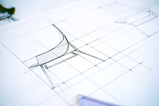 The black sheep of all architectural drawing has got to be technical drawing. Everybody loves drawing perspectives, sketches —you know the creative, interesting and expressive part of architectural drawing. But what about the aspects of drawing: the technical, logical, rational part? It might not be as sexy as freehand drawing, but it is just as important. If you don't know proper technical drawing skills it will show in your work; your perspectives will look 'less smart' and badly proportioned and your designs will lack consistency. So in order to make technical drawings look less cold and more approachable, I'm sharing the best 20 technical drawing tips I've come across.  These technical drawing tips might destroy your preconceived notions regarding technical drawing, but they will help you befriend the beast (and also get a lot better at drawing axonometrics, sections, plans, and even descriptive geometry). So sit back, relax, and get a pen and paper to take notes. .jpg?1519147130 "Courtesy of Michael Neatu | freehandarchitecture.com") Courtesy of Michael Neatu | freehandarchitecture.com Courtesy of Michael Neatu | freehandarchitecture.com 1. Start seeing technical drawing as important as freehand drawing.The natural tendency is to completely ignore technical drawing. I suggest that you see it for what it is and start allocating several hours per week to getting better at it! When you get better at technical work, you will improve your overall drawing and design skills. 2. Always clean your triangles and drawing board to keep the smudging to a minimum.A big no-no for achieving great technical drawings is smudging the sheet and making your drawings look messy and clumsy. You can easily avoid this by always cleaning your triangles.  Pyramid Section Planar Change. Image Courtesy of Michael Neatu | freehandarchitecture.com Pyramid Section Planar Change. Image Courtesy of Michael Neatu | freehandarchitecture.com 3. Cover your triangles in paper scotch tape – that is going to reduce smudging as well.Paper scotch tape will remove most grime from your drawing sheet; just remember to change it from time to time. This technique works very well with tip #2. 4. Construct your technical drawings using an HB pencil.HB gives enough clarity while keeping smudging to a minimum. Use that to your advantage! You can harden the construction lines later using a softer pencil (2B+).  Courtesy of Michael Neatu | freehandarchitecture.com Courtesy of Michael Neatu | freehandarchitecture.com 5. See the virtue in patience. Don't lose your cool when faced with challenging technical drawings.Technical drawing is famous (or infamous) for being a brain twister. Accept this upfront—trust me, that's going to save you a lot of hassle and heartache later on. You'll have to do this for a while until you get used to it. 6. Start seeing the beauty in descriptive geometry… and practice descriptive geometry each and every day.Descriptive Geometry is notorious for being the hardest of all technical drawing types. However, you can understand it and master it with enough practice. Constant practice will get you comfortable with descriptive geometry. Want a quick way to begin? Try this free lesson from my course 'Technical Drawing 101'. It will teach you everything you need to draw a complex isometric axo with constructed cast shadows.  Pyramid Planar Change Unwrapped Volume. Image Courtesy of Michael Neatu | freehandarchitecture.com Pyramid Planar Change Unwrapped Volume. Image Courtesy of Michael Neatu | freehandarchitecture.com 7. Commit to becoming so excellent at technical drawings that you're able to outsource any part of your designs to drawing them on the drafting board.This is a stage in itself; once you cross this mental bridge, you will start being less tense about technical drawing and actually start enjoying it! 8. Get a proper A2-A1-A0 drafting board. Stop it with the small A4-A3 drawings.You know the stereotypical image of the architect working in front of a drafting board? Guess what—you need to become like that. Get the proper drawing tools in order to draw large drawings on a proper-sized drafting board.  Courtesy of Michael Neatu | freehandarchitecture.com Courtesy of Michael Neatu | freehandarchitecture.com 9. Do a 30-day technical drawing challenge. (No excuses!)Chip away at technical drawing every day for 30 days in a row. Your progress will be obvious! It might get frustrating after day #17, but don't lose faith!  Cube Section Planar Change 1. Image Courtesy of Michael Neatu | freehandarchitecture.com Cube Section Planar Change 1. Image Courtesy of Michael Neatu | freehandarchitecture.com 10. Use dotted lines to show the back edges of your drawings.This way you keep your work tidy and clean. And, as a bonus, you make it look smart and elegant as well. Different line types add different kinds of information. And that looks good.  Octahedron Mirror Planar Change. Image Courtesy of Michael Neatu | freehandarchitecture.com Octahedron Mirror Planar Change. Image Courtesy of Michael Neatu | freehandarchitecture.com 11. Understand the principles and thinking behind sections.Understanding sections is 90% about developing your 3-dimensional vision. This will make more sense as you practice it.  Hexagonal Inclined Prism Sections. Image Courtesy of Michael Neatu | freehandarchitecture.com Hexagonal Inclined Prism Sections. Image Courtesy of Michael Neatu | freehandarchitecture.com 12. Know at least three different types of axonometrics.There are several types of axonometric drawings out there that show the same volume at slightly different angles. I've prepared a video for you here, so you can get started with drawing different types of axos ASAP. 13. Know what a dodecahedron is and how to draw it in triple projection and axonometric.There are several "simple" volumes out there that you need to know how to draw: the dodecahedron is the most approachable of the lot. Start with a triple projection, then axonometric.  Dodecahedron Triple Projection and Isometric. Image Courtesy of Michael Neatu | freehandarchitecture.com Dodecahedron Triple Projection and Isometric. Image Courtesy of Michael Neatu | freehandarchitecture.com 14. Master triple projections.A triple projection shows a volume from a frontal, top and side view. If you've used any computer software, you already are familiar with these concepts from the front, top and side viewport. If you know how to draw the volume line by line, then you're much better off. 15. Learn to solve 100 Descriptive Geometry ProblemsYou want to become smarter, more disciplined and faster in your thinking as an architect or designer? Try the '100 descriptive geometry problems' challenge and we'll talk after that.  Complex Prism Unwrapping and Section. Image Courtesy of Michael Neatu | freehandarchitecture.com Complex Prism Unwrapping and Section. Image Courtesy of Michael Neatu | freehandarchitecture.com 16. Learn to draw custom ellipses in all types of axonometric drawings.Ellipses are notoriously hard to draw in a normal axonometrics, so drawing custom ones will help you get better and better.  Cylinder Hexagonal Pyramid Intersection. Image Courtesy of Michael Neatu | freehandarchitecture.com Cylinder Hexagonal Pyramid Intersection. Image Courtesy of Michael Neatu | freehandarchitecture.com 17. Develop a passion for solving any descriptive geometry problem you come across.Most architects just run away from descriptive geometry (Don't believe me? Try asking one to draw a simple dodecahedron sitting on its spatial diagonal). You need to do what everyone else isn't doing and become genuinely passionate about learning how to do it yourself.  Standard Roofing Exercise. Image Courtesy of Michael Neatu | freehandarchitecture.com Standard Roofing Exercise. Image Courtesy of Michael Neatu | freehandarchitecture.com 18. Know how to draw all the standard primitives: cube, pyramid, cylinder, cone, tetrahedron etc.Obviously drawing them in triple projection and different types of axonometrics is best. How do you start with that? Pick a standard cube with the length of 4 cm. Go draw a triple projection and 3 different axos of it. 19. Know how to draw all standard geometrical shapes: square, circle, pentagon, hexagon.Get started with planar geometry. You will use this later for facade and planar studies. Also, as a tip: knowing multiple types of geometry will help you get proportions right for all your designs.  Three Tetrahedra Sphere Tangency. Image Courtesy of Michael Neatu | freehandarchitecture.com Three Tetrahedra Sphere Tangency. Image Courtesy of Michael Neatu | freehandarchitecture.com 20. Ink all your best drawings – whether they are sections, technical details, artistic axonometrics etc.Inking drawings (tracing over them with a liner instead of just leaving them in standard pencil) is the best option out there for preserving them. How do you apply these tips to get better results with your architectural drawing? To get started asap with technical drawing and get consistent results I recommend taking my course on technical drawing called 'Technical Drawing 101'. It will get you from being a complete "noobie" with zero spatial vision to being able to draw complex axonometrics, cast shadows and master other architectural technical drawings. This posting includes an audio/video/photo media file: Download Now |
| The Architecture Drawing Prize Exhibition Posted: 20 Feb 2018 11:00 PM PST : Utopia. Image Courtesy of Sir John Soane's Museum") Ubaldo Occhinegro (commended, Hand-Drawn category): Utopia. Image Courtesy of Sir John Soane's Museum Ubaldo Occhinegro (commended, Hand-Drawn category): Utopia. Image Courtesy of Sir John Soane's Museum The Architecture Drawing Prize received 166 entries from 26 different countries, offering a fascinating cross-section of approaches to and uses of architectural drawing today: from highly sophisticated design drawings to lyrical hand-drawn sketches, and everything in between. The exhibition retains a sense of this variety so along with the three category winners, it was decided to showcase the ten entries that received commendations from the judges. : Memento Mori: A Peckham Hospice Care Home. Image Courtesy of Sir John Soane's Museum") Jerome Xin Hao (winner, hybrid category): Memento Mori: A Peckham Hospice Care Home. Image Courtesy of Sir John Soane's Museum Jerome Xin Hao (winner, hybrid category): Memento Mori: A Peckham Hospice Care Home. Image Courtesy of Sir John Soane's Museum The exhibition is being staged in the Foyle Space, a small gallery added to the museum in 1890 by its then curator, James Wild. Originally called the New Picture Room, the gallery was designed for the display of 2D works, and it is therefore fitting to be using it as first intended. The three walls usable for displaying works are each assigned to one of the prize's three categories: hand-drawn, digital and hybrid. The digital and hybrid works are displayed relatively conventionally. However, because there were six works in the hand-drawn category, including one panorama view over 3-metres long, they have been "triple-hung," visually relating this display to the very dense hang that Soane favored in his famous Picture Room, as well as elsewhere in the museum. : Deep Water Purgatory. Image Courtesy of Sir John Soane's Museum") Christopher Wijanto (winner, Digital category): Deep Water Purgatory. Image Courtesy of Sir John Soane's Museum Christopher Wijanto (winner, Digital category): Deep Water Purgatory. Image Courtesy of Sir John Soane's Museum The Architecture Drawing Prize is joint initiative by Make Architects, the World Architecture Festival and Sir John Soane's Museum. : Scenarios for a post crisis landscape. Image Courtesy of Sir John Soane's Museum") Dimitris Grozopulos (winner, Hand-Drawn category): Scenarios for a post crisis landscape. Image Courtesy of Sir John Soane's Museum Dimitris Grozopulos (winner, Hand-Drawn category): Scenarios for a post crisis landscape. Image Courtesy of Sir John Soane's Museum
: Hydrological cluster. Image Courtesy of Sir John Soane's Museum") Anna Budnikova (commended, Hybrid category): Hydrological cluster. Image Courtesy of Sir John Soane's Museum Anna Budnikova (commended, Hybrid category): Hydrological cluster. Image Courtesy of Sir John Soane's Museum : Knowledge Hub and Community Support Spaces - Studying Seasons and Community Interactions. Image Courtesy of Sir John Soane's Museum") Emily Seden-Fowler (commended, Hybrid category): Knowledge Hub and Community Support Spaces - Studying Seasons and Community Interactions. Image Courtesy of Sir John Soane's Museum Emily Seden-Fowler (commended, Hybrid category): Knowledge Hub and Community Support Spaces - Studying Seasons and Community Interactions. Image Courtesy of Sir John Soane's Museum : Renovation of Denggao Village. Image Courtesy of Sir John Soane's Museum") Xinyuan Cao (commended, Digital category): Renovation of Denggao Village. Image Courtesy of Sir John Soane's Museum Xinyuan Cao (commended, Digital category): Renovation of Denggao Village. Image Courtesy of Sir John Soane's Museum : The fallen monument. Image Courtesy of Sir John Soane's Museum") Sergei Tchoban (commended, Hand-Drawn category): The fallen monument. Image Courtesy of Sir John Soane's Museum Sergei Tchoban (commended, Hand-Drawn category): The fallen monument. Image Courtesy of Sir John Soane's Museum This posting includes an audio/video/photo media file: Download Now |
| How the Urban Tower Retro67 Will Celebrate the Vulnerable Heritage of Lebanon Posted: 20 Feb 2018 10:00 PM PST  Courtesy of IDDQD Studio Courtesy of IDDQD Studio Beirut has seen an influx of wealth into the area ever since the end of the Lebanese Civil War in 1990. Large-scale developments and designer architecture from Herzog & de Meuron, Snøhetta and David Adjaye have been popping up throughout the capital, much like its Middle Eastern neighbors. Retro67 by Andrea Vattovani Architecture will celebrate the appearance of the old town of Beirut and reinterpret the traditional stylistic elements with the modern flair that is becoming the city's favored style.  Courtesy of AVA and Paul Gorra Courtesy of AVA and Paul Gorra Retro67's unique identity and connection to the city's heritage will be distinguished by the external curtains defining the open façade. Due to a large amount of sunshine in Beirut, it is imperative for the architects to protect the building from direct light and heat through some form of sunshade. Drawing from the local context of the city and sticking to tradition, the ethereal curtains will prevent overheating throughout the day and offer the residents privacy at night. On plan, the difficult shape of the site has led AVA to design a curved façade for Retro67. This will continue the language of the streets below while it associates with the several round buildings quintessential of Beirut's architecture. The building's design respects the structure of the city in plan and will improve it.  Courtesy of IDDQD Studio Courtesy of IDDQD Studio  Courtesy of IDDQD Studio Courtesy of IDDQD Studio On the ground floor, Retro67 will facilitate several retail spaces and above there will be six floors of duplex apartments with floor seven bearing simplex apartments. All of the apartments will include generous terraces outside the loft-style spaces with the facilities for the residents to grow their own vertical garden across the façade. The duplex apartments will include a mezzanine level for the bedrooms with double height windows allowing sunlight to fall onto the living spaces below. At the top, there will be the penthouse boasting 270-degree views across the Beirut that can be enjoyed along with a swimming pool on the terrace.
News via: Retro67. This posting includes an audio/video/photo media file: Download Now |


| You are subscribed to email updates from ArchDaily. To stop receiving these emails, you may unsubscribe now. | Email delivery powered by Google |
| Google, 1600 Amphitheatre Parkway, Mountain View, CA 94043, United States | |
Nema komentara:
Objavi komentar