Arch Daily |
- Les Carrés de Bellefontaine / Taillandier Architectes Associés
- Arknat / Sweco Architects
- The Light-Art Gallery / Renesa Architecture Design Interior
- Cofco Plaza Renovation / KOKAISTUDIOS
- Bellad & Co. Head Office / SJK Architects
- Glen Forrest House + Church / iredale pedersen hook architects
- Tia Santa Restaurant / Vilalta Arquitectura
- SOM Unveils Images of Chicago Office Tower With Five-Story Open-Air Deck
- Ground Floor Restaurant IAB-SP / Gabriel Kogan + Guilherme Pianca
- Former Citroën Factory to be Converted Into Brussels "Centre Pompidou"
- Es Garbí / Nook Architects
- 7 Ancient Ruins Around The World "Reconstructed" with GIFs
- El Boldo House / SUN Arquitectos
- This Instagram Account Collects Hilarious Construction Fails and Home Improvement Disasters
- Architects Propose 120 Incremental Social Houses for Iquitos, Peru
| Les Carrés de Bellefontaine / Taillandier Architectes Associés Posted: 23 Mar 2018 10:00 PM PDT  © Roland Halbe © Roland Halbe
 © Roland Halbe © Roland Halbe Text description provided by the architects. In the southwest of Toulouse, "Les Carrés de Bellefontaine" consists of a mixed-use program: collective social housing, a professional training center, a restaurant and private office spaces.  Plan RDC Plan RDC The project is composed of 5 apartment blocks 4 stories high and implemented according to the historic north/south Mirail masterplan drawn by the architect George Candilis in the sixties.  © Roland Halbe © Roland Halbe The main blocks are interconnected by volumes composed of loggias and balconies, while a secondary block of intermediate housing 2 to 3 stories high is set back at the rear of the project and completes the composition organised around a central garden occupying the centre of the project.  Section Section  © Roland Halbe © Roland Halbe  Section Section The positioning of the blocks in relation to the street creates a staggered set-back from the public space. These spaces ae planted with trees lining the street as is typical of the neighbourhood.  © Roland Halbe © Roland Halbe Every apartment block has an independent entrance and hallway in order to have a maximum of 4 apartments per landing. The majority of apartments benefit from a double or triple exposition and all apartments have large balconies or loggias partially shaded by wooden slats protecting the privacy of these spaces. These volumes of loggias and balconies animate the façades of the project.  © Roland Halbe © Roland Halbe The choice of materials is voluntarily reduced to a minimum: glass, concrete, wood and metal.  © Roland Halbe © Roland Halbe This posting includes an audio/video/photo media file: Download Now |
| Posted: 23 Mar 2018 07:00 PM PDT  Courtesy of Sweco Architects Courtesy of Sweco Architects
ArkNat – a Scandinavian Architectural Festival  Courtesy of Sweco Architects Courtesy of Sweco Architects The High Coast area in the Gulf of Bothnia is designated a World heritage. It's a place of spectacular nature and breathtaking views. Here, outdoorsman and entrepreneur Jerry Engstrand from Friluftsbyn teamed up with Martin Björklund and Kristina Tengstrand from Sweco Architects to create this event. Applications for ArkNat 2018 is open and we wanted to share last year's projects. ArkNat 2017 focused on three different sites where new resting stops or shelters were constructed with special attention to the relation with the surrounding nature.  Courtesy of Sweco Architects Courtesy of Sweco Architects Team Sea - The grove  Courtesy of Sweco Architects Courtesy of Sweco Architects The concept consisted of creating a building that communicates with the site and the clearing it stands in, and relates to its exposed location facing the sea. Jiajun LU, Bergen School of Architecture, Norway  Sea / Section Sea / Section  Courtesy of Sweco Architects Courtesy of Sweco Architects  Sea / Plan Sea / Plan Team Mountain - Over the edge  Courtesy of Sweco Architects Courtesy of Sweco Architects The old shelter was a timber construction with a damaged roof and a damaged foundation. The team chose to reuse some parts – combining new and old materials and techniques. Transportation, with helicopter due to the inaccessible site, was one of the biggest challenges. The team designed and built modules to be air-lifted and then placed by hand on-site.  Courtesy of Sweco Architects Courtesy of Sweco Architects Anders Thelaus, Chalmers school of architecture, Sweden  Courtesy of Sweco Architects Courtesy of Sweco Architects  Mountain / Sketch 02 Mountain / Sketch 02  Courtesy of Sweco Architects Courtesy of Sweco Architects Team Forest – Forest Cradle  Courtesy of Sweco Architects Courtesy of Sweco Architects The result is the Forest Cradle. A 20sqm floating platform hanging from four trees, inviting the users to have a well-deserved pause and experience the swaying of the treetops and each other. The shape of the platform invites new angles of view of the surrounding focusing on the National Park.  Forest / Section Forest / Section The anchoring spruce where selected with help from the park ranger and are protected by an armored rubber band from the wire construction. Eva Troive, Lund School of Architecture (LTH), Sweden  Courtesy of Sweco Architects Courtesy of Sweco Architects This posting includes an audio/video/photo media file: Download Now |
| The Light-Art Gallery / Renesa Architecture Design Interior Posted: 23 Mar 2018 03:00 PM PDT  © Vibhor Yadav © Vibhor Yadav
 © Vibhor Yadav © Vibhor Yadav Text description provided by the architects. The Light-Art Gallery/ DBEL Studio works on the concept of creating focal points within the sculpturesque flowing volumes in the gallery arena. The ideology of commanding the monolithic curves as per the design and placement of the lights was to initially conceal the heavy structural members at the site as well as provide a design harmony to the viewers path of the latest lighting and art design trends at offer .  © Vibhor Yadav © Vibhor Yadav Design Scheme  Sketch 01 Sketch 01  Sketch 02 Sketch 02 The solid expression of the exterior section continually merges with a carved out interior and increases the sculptural appearance of the interior section of this gallery. Multiple arches altering in size and orientation create a continuous, gentle curve which becomes a sculptural interpretation of the sculpturesque lighting with the paintings exhibited in the background gallery arena.  © Vibhor Yadav © Vibhor Yadav Within the arches, the entrance sculpture inhabits an information desk, an experiential room and the main circulation staircase, which guides visitors to the basement with a lighting arena gallery while screening the employees official area on the other hand.  Exploded Axonometric Exploded Axonometric The idea was simple , to create the right blend of art and architecture with the overlapping of the customizable light design solutions and provide an overwhelming artistic experience to the viewers and the buyers.  © Vibhor Yadav © Vibhor Yadav This posting includes an audio/video/photo media file: Download Now |
| Cofco Plaza Renovation / KOKAISTUDIOS Posted: 23 Mar 2018 01:00 PM PDT  © Seth Powers © Seth Powers
 © Seth Powers © Seth Powers Text description provided by the architects. COFCO Plaza was built in 1996 and it occupies one of the best locations in the city; located 1 KM from the Forbidden City and Tiananmen Square along Jianguomen street at the cross with Chang'an Avenue. Kokaistudios has completed the architectural and interior design renovation of the COFCO Plaza building in Beijing.  © Seth Powers © Seth Powers The building is the symbol of an era in COFCO's development as it was the first modern headquarter building for COFCO; a Fortune 500 company and one of China's most important enterprises; and it was a witness to the incredible development of the company from a local enterprise into a world class business operating primarily in the food and real estate industries and stands as the embodiment of the COFCO spirit. While the main headquarters of the group moved to new premises over one year ago; the building still houses many main departments and is also home to the China headquarter offices for many large domestic and multi-national enterprises. Moreover the building is also representative of a style of public architecture of Beijing in the 1990's. The main unique features of the building are the two V-shaped fourteen storey office towers (Block A&B) that cut into the surrounding urban environment at a 45 degree angle. These two structures on the North and South side of the plot are linked together by the central square shaped complex (Block C). This combination creates a structure with sharp corners that endow the building with a strong geometry that occupies a unique position on the Beijing sky-line. The original façade, preserved in the office towers, consists of horizontal stripes of beige granite stone alternated with reflective glazed strip-windows over a brown stone-clad plinth, capped by a golden roof. The interiors, largely renovated, are composed with a combination of beige stone tiles interspersed by geometric combinations of green and red marble, with stainless steel columns and railings typical of the post-modern design style of the 1990's.  Axonometric Axonometric Kokaistudios was initially hesitant to accept this renovation project as the transformation of such an iconic building with such a strong design language into a contemporary urban space comes with its challenges. The existing interior condition of the atrium was characterized by an extremely concave / convex design with complicated contour lines and limited floor to ceiling heights. Having not been renovated in twenty years one of the major challenges to confront in the renovation was to adapt the building to modern codes and requirements. The renovation project has been divided into two phases, with Phase 1 covering the ground and below ground areas of the central Block C building, its external façade and landscaping. Phase 2 will cover the lobbies of the Block A and B buildings as well as their communal public areas. This strategy of implementation by stages imposes limitations and restrictions on the efficiency and final impact of the intervention however it was required by the client to ensure the on-going rental of the building by the current office tenants.  © Seth Powers © Seth Powers In determining the strategy for the re-development of the building we built on our root focus on the concept of 'innovation through renovation' that has guided our previous work on many innovative heritage and modern building transformations. Kokaistudios has worked to enrich the urban fabric by the re-purposing and re-examination of the potential of existing buildings. In addition we worked closely with the COFCO team to understand their brand and their culture and design a project that embraced and translated this culture into a spatial experience.  Plan Plan Prior to its renovation the central core of the building was home to many home-furniture showrooms, however this market had shifted to new locations in Beijing over the years and the determination was made to re-position the area to more corporate / office functions. Kokaistudios however did not take a traditional approach and instead we conceived of these areas as a hybrid office / hospitality project; where we would create both offices and also communal areas to support the function of main offices that occupied the towers above. This hybrid area contains fitness, dining, and business conference functions supporting the office towers and COFCO has established its own branded '3C' System for the office building; COFFICE (Smart Office System), COFCO Life (Dinning and Healthy Life) and COFCO Fantasy (Innovation Space, Shared Office and Gallery Exhibition).  © Seth Powers © Seth Powers The upgrade and reconstruction of Block C and the North-South axis to Block A& B has created an entirely new feeling to the building with the ground floor of Block C now functioning as an open city 'piazza' with customers inter-mingling and mixing on their way to the various areas of the building complex. The new service functions are a destination in and off-them-selves and create an appealing working and living urban environment for the users of the building.  Section Section The target of the interior design intervention was first and foremost simplicity. We wanted to eliminate the variations of the existing decorations that were not in harmony with the architectural space and recover the original concise spatial relationships of the building. With the architectural interventions programmed for Stage 2 of the project - in particular the demolition of the slab above the entrance in Block B - the 3 main Blocks will respectively be characterized by the main geometric shapes of the hexagon, the square and the pentagon.  © Seth Powers © Seth Powers Moreover, the spatial sequence of expanded and compressed public spaces - the three atria and corridors linking across them - will fulfill its potential and reach its climax in the central atrium, Block C, now open both above, below and around, seamlessly connected to the surroundings landscape through its new transparent curtain wall, a vertical composition of metal and glass.  © Seth Powers © Seth Powers On the top floors of the central Block C sunlight floods into the central square atrium from the circular dome that has been maintained from the original architectural project. This floating glass box reflects and refracts the sunlight to create a geometrical interplay that changes with the sun's arc and creates a kaleidoscopic light effect that bathes the green space indoor gardens occupying the indoor courtyard. Precisely in order to blur the boundaries between inside and outside, the ground floor has been conceived from the outdoor landscape gardens in-wards, creating an inviting space which houses a series of cafes and restaurants.  © Seth Powers © Seth Powers The main architectural feature of the basement areas is the newly built spiral staircase, an elegant aerial sculpture that hovers it way downwards and allows people to perceive the entire central atrium of the building. The COFCO branded areas, including COFCO Life on B1, COFCO Fantasy on B2 and the fitness and leisure areas on B3, combine to create an enticing series of services that add value to office building and create a better environment for its users.  © Seth Powers © Seth Powers This focus on creating an inviting and comfortable environment guided the selection of materials, with an emphasis on sustainability, and plenty of green-spaces that have resulted in a tranquil environment that stands in strong contrast to the dull patterns of conventional office buildings. The creation of a modern and comfortable working and living environment however has been achieved in conjunction with a desire to dialogue respectfully with the original nature and design of the building; namely through the maintenance of two of the main original building materials; the green inlaid stone that serves as the demarcations of the main office block atriums and walkways linking the project and the stainless steel columns that give a continuity to the space  © Seth Powers © Seth Powers The re-design of the façade is also a representative of the fine line between the preservation of the original design of the building in Block A and B and the striving for innovation with the Block C building façade. Previously composed as an entirely solid block, it has being re-designed to meet the new needs of the office tenant areas as well as to gain its own individual expression and presence within the complex, while maintaining an equilibrium with the other two blocks.  © Seth Powers © Seth Powers Since the completion of the renovation project the COFCO Plaza has been lauded as a positive example of how urban renewal and regeneration projects can be under-taken in Beijing; respectful of the original design of the building yet aiming strongly at creating a new urban environment representative of the new needs of the Beijing market. Since re-opening the public areas of the COFCO Plaza have been rejuvenated and enlivened not only for the tenants of the building but also for the surrounding areas and the space has become a hub and catalyst for change also for the for the surrounding buildings and neighborhood.  © Seth Powers © Seth Powers This posting includes an audio/video/photo media file: Download Now |
| Bellad & Co. Head Office / SJK Architects Posted: 23 Mar 2018 12:00 PM PDT  © Suleiman Merchant © Suleiman Merchant
 © Suleiman Merchant © Suleiman Merchant Text description provided by the architects. This was to be a straightforward office project until we visited the site. This client desired a head office for his automobile dealership company and the same was to be located on the 3rd level of a commercial building cum showroom (for a particular Indian Bike brand) owned by the client. The building prominently sat along the main commercial street in the city of Hubli (2nd largest city in the Indian state of Karnataka, after its capital city Bangalore). Having previously seen an office-building project done by the firm in Bangalore, the client approached us to design their head office and hoped to build the same on the 3rd floor of the building they own. When we visited the site, we observed the 3rd floor was a later date addition to an otherwise G+2 building and had a rather robust structural system of columns & deep beams, as we proceeded towards familiarizing ourselves with the site and its context, we realized the building had a terrace waiting to be explored – a well scaled metal structural frame with a temporary curved metal sheet roof functioned as a shed/yard to store "Bikes" and otherwise housed all the Building MEP services like Water tanks, several Air conditioning outdoor units, a Diesel generator, a mobile network tower…etc.  © Suleiman Merchant © Suleiman Merchant  Design diagram Design diagram  © Suleiman Merchant © Suleiman Merchant We jumped at this opportunity and expressed to the client, our desire to transform this "Terrace shed" into a "Terrace Office" and thus began a journey to create an office space that relishes its high volumes, under a curved plywood roof with cabins, cubicles and open workstations, arranged in the midst of long balconies and lush green terraces, strategically located to cut down the harsh summer sun and bring in diffused day light & breeze via full height doors along the East & West, allowing cross ventilation & peripheral "PAUSE" spaces that one can walk out to!  © Suleiman Merchant © Suleiman Merchant  Fourth floor plan Fourth floor plan  © Suleiman Merchant © Suleiman Merchant Other than the usual program on functional office spaces required by any office, the brief here required us to create a dual purpose space: a Training room cum Conference space for about 30 pax and the same had to be worked such that this space is not accessed via the Main office reception area and is still connected with the Main office space. Having understood the brief for this space and that it required controlled light & temperature, the most glare-free space along the North was chosen to locate this function. This space overlooks a lush green Terrace Café created on the floor below & functions as a leisure space to unwind, thus allowing a Work-Leisure balance.  © Suleiman Merchant © Suleiman Merchant  Third floor plan Third floor plan  © Suleiman Merchant © Suleiman Merchant Hubli is blessed with a beautiful climate- cool & windy most of the year and given that the buildings here are small storeys, this Terrace office enjoys great wind circulation, thus ensuring a naturally ventilated office space, replete with mosquito meshes and fans. The use of air conditioning is limited to the extreme summer months of March-May. The addition of balconies and the deep metal curved roof overhangs, adequately shades the otherwise glazed façade and brings in diffused day light along with polycarbonate skylights punctuated along the curved metal roof, thus allowing the office to optimize day light, using almost "No Electricity" throughout the day in non-summer months.  © Suleiman Merchant © Suleiman Merchant Being a Terrace shed that housed various Mechanical, Electrical & Plumbing services for rest of this building, the task was to seamlessly re-accommodate these services across the building and make way for habitable spaces here.  © Suleiman Merchant © Suleiman Merchant The space itself – black Cudappah floor (a black limestone locally available), concrete partitions and plywood doors, plywood workstations and a curved plywood ceiling, is all about the light…. the sunlight that streams in from skylights, through the greenery of the terraces, and accentuates the neutral raw palette of materials. To solely read the curved plywood ceiling, it was important to carefully & discreetly suspend all mechanical services like A.C ducting, ceiling fans, a Lighting system- that explores a suspended floating metal structure with LED CAN lights, thus creating a subtle ambience of artificially lit space that accentuates the warmth of the plywood across the project. The office was occupied last year and they seem to enjoy every bit of openness and greenery they experience within their new space. This posting includes an audio/video/photo media file: Download Now |
| Glen Forrest House + Church / iredale pedersen hook architects Posted: 23 Mar 2018 10:00 AM PDT  © Peter Bennetts © Peter Bennetts
 © Peter Bennetts © Peter Bennetts Conceptual Framework  © Peter Bennetts © Peter Bennetts The house emerges out of the ground as a long-refined bar, hugging the south boundary to then open the site and maintain the view from the road to the church. The definition of the south boundary focuses attention to the church with a new sense of intensity allowing the public to maintain visual and emotional contact with the church. The house materiality is derived from the church but introduced in unexpected ways. The roof sheeting becomes the main material with lower level brickwork anchoring the house to the lower site. A long veranda on the north side animates the site and connects house, church, and gazebo. It echoes the form of the church porch (added in 1987) but never touches it. A walk along the veranda reveals the church with abstracted views through grey polycarbonate and recycled jarrah timber battens (the slick and the hairy).  © Peter Bennetts © Peter Bennetts A path of recycled brick meanders through the site from the street to the point where all three elements meet. The church shifts from being the focus on an approach to an equal 'weight' in the composition. There is no front door, entry is deliberately created from the veranda that reveals the immediate context and distant context. This separation of elements allows the church to be used independently from the house with the opportunity to once more host public events. In contrast to the informality of the walk through the native garden, the house is designed with a sequence of axis derived from the micro axis of the church. The veranda panels frame the axis, extruding interior space, creating depth and focusing the mature trees and native garden whilst providing sun protection and privacy.  © Peter Bennetts © Peter Bennetts When first approached by the owners to build a house for less than $400,000 inc gst ($1600m2) we noted this could only be achieved if they trusted us to make cost decisions and worked with one particular builder. Openly minded workshops with the structural engineer and builder resulted in the impossible being possible. Roof lights and PV cells provide power and natural lighting to both the church and house. Water is retained on site to form part of a natural stream that begins uphill. The church is once more restored to be a valuable asset to the street and community with a presence far greater than when originally built.  © Peter Bennetts © Peter Bennetts Sustainable Architecture  © Peter Bennetts © Peter Bennetts Lighting  © Peter Bennetts © Peter Bennetts This posting includes an audio/video/photo media file: Download Now |
| Tia Santa Restaurant / Vilalta Arquitectura Posted: 23 Mar 2018 08:00 AM PDT  © Mauricio Fuertes © Mauricio Fuertes
 © Mauricio Fuertes © Mauricio Fuertes Text description provided by the architects. Tia Santa is a new healthy food restaurant chain. Vilalta Arquitectura was commissioned to design the architecture of the first restaurant in the heart of Barcelona, near the crossroads of the main avenues Passeig de Gràcia and Diagonal.  © Mauricio Fuertes © Mauricio Fuertes For this first restaurant, the interior was composed considering the distribution of existing space, which consisted of three levels connected by stairs. The reception area was placed at the intermediate/street level. The upper level was converted into the main dining room and the basement was transformed into a space for groups and the restaurant technical areas.  Floor Plan 01 Floor Plan 01 A key decision on the design was to rebuild the existing stairs between the reception and the dining area with steel and glass to bring natural light into the basement. The other staircase that connects the entrance with the basement was also reconstructed to improve the circulation.  © Mauricio Fuertes © Mauricio Fuertes The whole project incorporates natural materials from sustainable sources: floors and tabletops made of bamboo and ceilings and shelves made of pine wood. Nature is incorporated into the interior design with a modular vertical garden system placed at the entrance and at the back of the dining room salad bar. Also, at the basement, nature is presented in a large natural parterre. The whole lighting system, direct and indirect, was designed and built using LED technology. It highlights a light sculpture of 200 resin balls over the entrance and a translucent glass wall with shadows of plants at the basement.  © Mauricio Fuertes © Mauricio Fuertes This posting includes an audio/video/photo media file: Download Now |
| SOM Unveils Images of Chicago Office Tower With Five-Story Open-Air Deck Posted: 23 Mar 2018 07:05 AM PDT _SOM.jpg?1521821900 "Courtesy of SOM") Courtesy of SOM Courtesy of SOM Chicago-based Skidmore, Owings, and Merrill (SOM) have unveiled new images of their proposed 18-story office tower in the trendy Fulton Market area of Chicago. "The Porch," situated on 330 North Green, will feature a five-story open-air deck, and series of luxury amenities to support the new office environment. _SOM.jpg?1521822174 "Courtesy of SOM") Courtesy of SOM Courtesy of SOM _SOM_(2).jpg?1521821875 "Courtesy of SOM") Courtesy of SOM Courtesy of SOM The 670,000-square-foot (62,000-square-meter) SOM scheme features floor-to-ceiling windows set behind exposed steel, with a center core construction maximizing natural light and open space. Set on a 30ft x 30ft (9m x 9m) grid, and a floor-to-ceiling height of 14ft (4.2m), the interior provides flexible co-working and event space, supported by an outdoor fitness terrace, cafe, bar, library, and 200 car parking spaces. _SOM.jpg?1521822257 "Courtesy of SOM") Courtesy of SOM Courtesy of SOM _SOM.jpg?1521821786 "Courtesy of SOM") Courtesy of SOM Courtesy of SOM A key component to the scheme is a five-story open-air deck overlooking Chicago's West Loop, accessed via a folding glass façade. Other outdoor spaces include a 7700-square-foot (715-square-meter) fitness deck with paddle tennis courts and a 6000-square-foot (550-square-meter) rooftop indoor/outdoor tenant lounge with expansive views across the city. On ground floor, the scheme will integrate into the neighborhood with 25,000 square feet (2300 square meters) of retail. _SOM.jpg?1521822412 "Courtesy of SOM") Courtesy of SOM Courtesy of SOM _SOM.jpg?1521821583 "Courtesy of SOM") Courtesy of SOM Courtesy of SOM The scheme is expected to be delivered in 2020. News via: SOM This posting includes an audio/video/photo media file: Download Now |
| Ground Floor Restaurant IAB-SP / Gabriel Kogan + Guilherme Pianca Posted: 23 Mar 2018 06:00 AM PDT  © Pedro Vannucchi © Pedro Vannucchi
 © Pedro Vannucchi © Pedro Vannucchi Text description provided by the architects. At the end of 2017, the project for the preservation and adaptation of use converted the ground floor of the emblematic Institute of Architects of Brazil (IAB-SP) - designed in 1946 by Rino Levi, Roberto Cerqueira César, Abelardo de Souza, Hélio Duarte, Zenon Letufo, Jacob Rucht, Galian Ciampaglia and Miguel Forte - at the Z Deli Sandwich Shop.  © Pedro Vannucchi © Pedro Vannucchi Downtown Architecture  © Pedro Vannucchi © Pedro Vannucchi Materials and atmospheres  © Pedro Vannucchi © Pedro Vannucchi Furniture  © Pedro Vannucchi © Pedro Vannucchi Lighting  © Pedro Vannucchi © Pedro Vannucchi Drawing
2 - Wall aligned with the axis of the last circular pillar of the hall designed to garnish the hall, both the smoke coming from the cooking area and hamburger plate as well as the cold light from the kitchen. This intervention, uncommon in modern architecture, maintains the visual relation between kitchen and salon and exposes the assembly lines of the restaurant through a square window of 1.80 meters.  © Pedro Vannucchi © Pedro Vannucchi Modern Heritage  © Pedro Vannucchi © Pedro Vannucchi The downtown restaurants  © Pedro Vannucchi © Pedro Vannucchi As a tribute to these restaurants and their architectures - almost always with unknown authors - we have left a list of places we have frequented and inspired ourselves in the development of this project. Architectures of extreme functional intelligence, constructive and aesthetic, that survive the fast and aggressive growth of the metropolis. 1. Churrasqueto - Wood / Formic panel, built-in hood in formic-coated structure; high school chair, only washers. Barbecue and onion sauce with delicious rosette bread. R. 24 de Maio, 237 – República; Download here all the executive drawings of this project This posting includes an audio/video/photo media file: Download Now |
| Former Citroën Factory to be Converted Into Brussels "Centre Pompidou" Posted: 23 Mar 2018 05:00 AM PDT  Exterior view. Image Courtesy of NOA / EM2N / SBA Exterior view. Image Courtesy of NOA / EM2N / SBA A team comprising noAarchitecten, EM2N, and Sergison Bates has won a design competition for the transformation of a former Citroën factory in Brussels into a cultural hub, merging a Museum of Contemporary Art, architecture center, and public amenities under the name "KANAL – Centre Pompidou." The architects' vision was for a scheme which reflects on the role of the twenty-first-century museum in society, one which opens out towards the city to entice the general public.  Exterior canal view. Image Courtesy of NOA / EM2N / SBA Exterior canal view. Image Courtesy of NOA / EM2N / SBA At 215,000 square feet (20,000 square meters), The former Citroën garage offers a large blank canvas in the heart of the Brussels Capital Region. The architects' proposal celebrates this icon by stripping it to its core elements in a move which increases transparency and invites the city inside. The old showroom acts as the main entrance, operating a dual function of exhibition hall and public space. Behind the showroom, a vast factory workshop once alive with the sound of industry is extended horizontally, gently divided by floors, ramps, and glass roofs.  Interior space. Image Courtesy of NOA / EM2N / SBA Interior space. Image Courtesy of NOA / EM2N / SBA  Interior space. Image Courtesy of NOA / EM2N / SBA Interior space. Image Courtesy of NOA / EM2N / SBA Inside the existing space, three volumes will be inserted, containing a museum, architecture archive, and large auditorium. The volumes create spaces of different scales and atmospheres, meeting the precise climatic conditions required for their respective functions. Highly visible from the outside, thee volumes serve as beacons to entice the public into the building.  Auditorium. Image Courtesy of NOA / EM2N / SBA Auditorium. Image Courtesy of NOA / EM2N / SBA  Showroom. Image Courtesy of NOA / EM2N / SBA Showroom. Image Courtesy of NOA / EM2N / SBA
 Exhibition hall. Image Courtesy of NOA / EM2N / SBA Exhibition hall. Image Courtesy of NOA / EM2N / SBA  Exhibition Hall. Image Courtesy of NOA / EM2N / SBA Exhibition Hall. Image Courtesy of NOA / EM2N / SBA The scheme is underlined by a goal of bringing production back into the city, with artistic output replacing industrial output. Schools, artists, and makers will be invited to work and exhibit in the center, reaching beyond the traditional idea of a museum as "archive." Similarly, the scheme offers public amenities beyond a traditional museum brief, with auditoria, workshops, restaurants, and educational rooms, in what the architects describe as a "tribute to the public and a celebration of life in the city." News via: Sergison Bates
This posting includes an audio/video/photo media file: Download Now |
| Posted: 23 Mar 2018 04:00 AM PDT  © Marcela Grassi © Marcela Grassi
 © Marcela Grassi © Marcela Grassi Text description provided by the architects. Next to the Mediterranean Sea runs the historic Camí de Ronda, a route that connects the towns and beaches of the Costa Brava. In a stop of the road and in an unbeatable location, we find this house between party walls that is part of a protected area.  Site Site The house, staggered on the rock, prolongs the journey inside four floors, connecting directly with the sea through its private pier.  © Marcela Grassi © Marcela Grassi The owner was looking for a simple and comfortable house that would allow independent uses in the secondary rooms and, at the same time, common and related uses in the main space open to the largest terrace of the house. A readjustment of the functional program was also necessary, turning part of the shady terrace on the second floor into a new room and adding bathrooms on the second and third floors.  Axonometric Axonometric The entire existing building has been intervened; restoring facades, roofs and terraces. The general volume has been respected and, in facades, the traditional composition, aesthetics and chromatism, characteristic of the Mediterranean coast, has been maintained.  © Marcela Grassi © Marcela Grassi The interior layout has been modified, as well as openings and skylight has been enlarged to enhance the views, the interior crossed visuals and the capture of natural light in all spaces.  Floor Plan 0 Floor Plan 0  Floor Plan 1-2 Floor Plan 1-2 The carpentry of the facade to the sea allows a total opening, diluting boundaries between interior and exterior. This connection allows to unite the common spaces, transforming the terrace into an extension of the living room to the outside.  © Marcela Grassi © Marcela Grassi Climatically only a system of ceiling fans has been installed to complement the natural cross ventilation through facades and skylights. Outside, the blinds and the pergola avoid excess solar radiation inside the house, allowing optimal comfort in summer.  © Marcela Grassi © Marcela Grassi The original elements of the house, such as hydraulic pavements, carpentry and wooden beams, have been recovered to preserve the traditional character of the construction. These enter into dialogue with the new elements of wood, concrete, steel and ceramics that, although contemporary, maintain the values of sobriety and austerity of the original construction.  © Marcela Grassi © Marcela Grassi The use and design of custom furniture is especially important in the project. It provides a functional value to each room and works as an active element in the formation of spaces, working as a dividing element or catalyst of natural light into interior spaces.  © Marcela Grassi © Marcela Grassi The result of the rehabilitation is a house that functionally responds to contemporary schemes but that makes clear its traditional and Mediterranean origin, where natural lighting and visuals on the excellent location are the main protagonists that make this a privileged house.  © Marcela Grassi © Marcela Grassi This posting includes an audio/video/photo media file: Download Now |
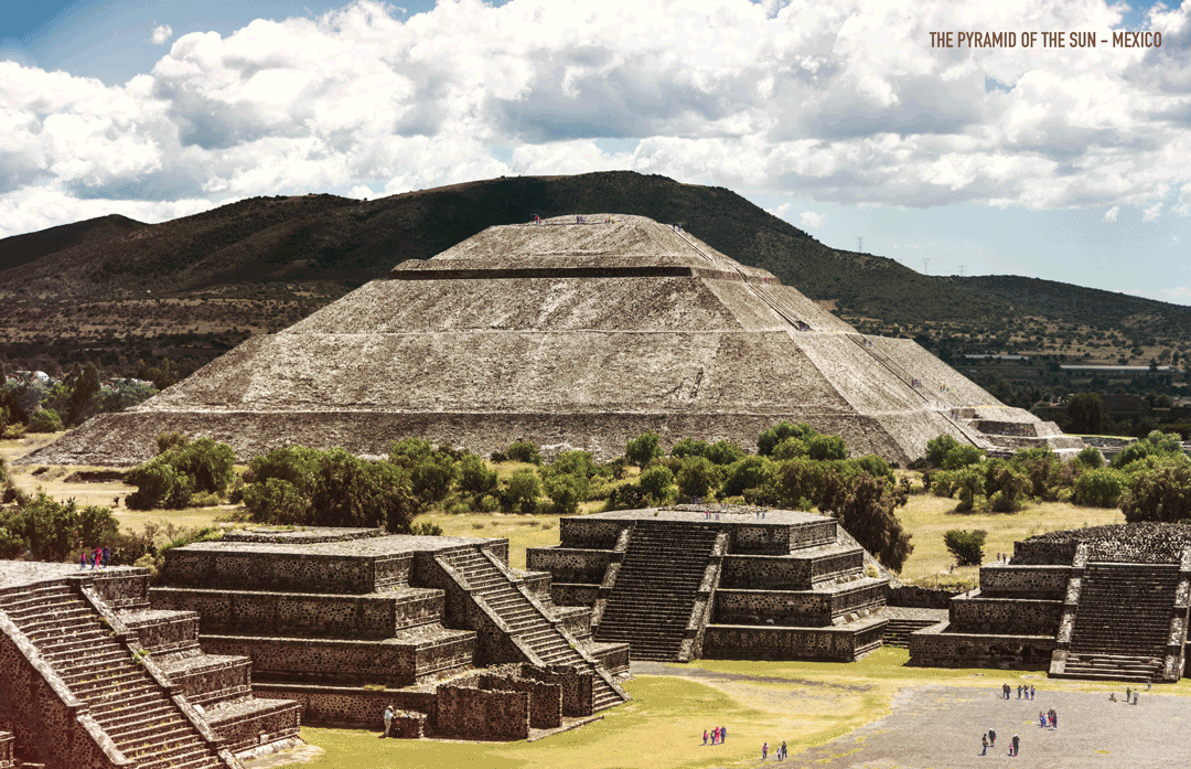
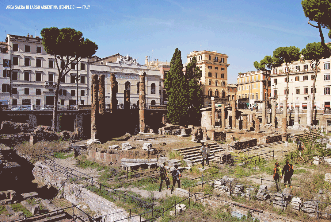
| 7 Ancient Ruins Around The World "Reconstructed" with GIFs Posted: 23 Mar 2018 02:30 AM PDT
Ancient ruins, like the Parthenon and Luxor Temple, can teach us about the past in a unique way. Through architectural remains, we can gather what building techniques and civilizations were like long ago. Even so, ruins can't compare to the real deal, and historical reconstructions of these architectural wonders are key to a fuller understanding of the cultures that created them. In these GIFs made for Expedia by NeoMam and Thisisrender, seven architectural wonders are reconstructed into their original form, allowing us to see how the ruins visible today developed from the initial structures in all their glory. The ParthenonAthens, Greece / 432 BC
Luxor TempleLuxor, Egypt / 1380 BC
Nohoch Mul Pyramid (Coba)Quintana Roo, Mexico / 100 BC-100 AD
Temple of JupiterPompeii, Italy / 200 BC
Milecastle 39 (Part of Hadrian's Wall)Northumberland, England / 100 AD
The Pyramid of the Sun, TeotihuacánTeotihuacan, Mexico / 200 CE
Area Sacra di Largo Argentina—Temple BRome, Italy / 101 BC
This posting includes an audio/video/photo media file: Download Now |
| El Boldo House / SUN Arquitectos Posted: 23 Mar 2018 02:00 AM PDT  © Nico Saieh © Nico Saieh
 © Nico Saieh © Nico Saieh Text description provided by the architects. The project is located in front of Zapallar bay, 169 km from Santiago de Chile in the region of Valparaiso. An isolated house in the forest at 450 m above the sea level, on the southern slope of the hill where El Boldo Park, a sclerophylls’ forest, is located. The thick stone walls modify the extreme topography in habitable levels, achieving two horizontal planes, in between the forest, which gives virtue to the territory and roots the architecture in an intimate relationship with its environment and the forest that surrounds it. Its complex variety of materials is balanced and related accepting each quality and its contrasts, managing to moderate its conditions, matching the appearance between concrete, wood, stone, and marble, all noble and long-lived materials, which contrast its rustic and warm persistence, with glass and steel roof, materials that give a contemporary look, an innovative and mixed face to the outside.  © Nico Saieh © Nico Saieh PROGRAM The internal space is divided into two floors, a level of access and main use, with a parking area, and all the service areas gathered, communicated with the living spaces, such as living room, dining room and terrace, which are connected in a fluid way. The level which goes from the main room to the pool space of free movement, that provides habitability and comfort to the owners of the house, a couple of the third age, who asked as a fundamental requirement, to provide this continuous transit without slopes, due to their age. Topping the end of the housing circuit there is the living room, which conquers an almost complete transparency with the exterior, in an intimate relationship with the hill, its vegetation and the view to the beach.  © Nico Saieh © Nico Saieh  Floor Plan Floor Plan  © Nico Saieh © Nico Saieh VOLUMETRY The horizontal composition of the house is divided between two realities that contrast their characteristics; A half-buried body of stone that emerges from the topography, it configures the access as an ancestral cave, which highlights the roughness of the materials and is organically covered with a vegetal roof, that gives continuity to the hill over the service area, hiding part of the size and controlling its presence as an upper facade to the view of the park's paths behind it. Separated by a sequence of light patios and glazed ceilings, there is the living space, warm barn-style wooden pavilion and a shell-like roof, like an inverted wooden boat that leans according to the use and the greatness of the space accompanying the sloping terrain in its same cutting graduality.  © Nico Saieh © Nico Saieh  Section Section  © Nico Saieh © Nico Saieh Interior with external vocation, light in its essence and wide in its use relationships, which reward the permanence in virtue of the distant.  © Nico Saieh © Nico Saieh LIGHT The house is oriented with the predominant views of the bay, facing away from the orientation of the sun, which forces us to receive natural light in a zenith way, through skylights that capture and transmit natural light to the interior and thus provide warmth to the spaces. The kitchen is illuminated by gratifying overhead light from the green roof, which covers all the independent service zone too.  © Nico Saieh © Nico Saieh This posting includes an audio/video/photo media file: Download Now |
| This Instagram Account Collects Hilarious Construction Fails and Home Improvement Disasters Posted: 23 Mar 2018 01:00 AM PDT  We've all seen them: cringeworthy designs and abysmal construction fails. For architects and designers, it's difficult not to hone in on the details of every space we encounter. And, it's even harder not to laugh at doors incapable of opening, plaster jobs that could have been completed by a 4-year old, and an overly liberal use of caulking to solve any construction mishap. Inspired by this guilty pleasure, the Instagram account of "Certified Caulk Installer" Trevor Lahey aka greaseball1987 has collected the best of the worst home improvement disasters for your viewing pleasure. See more of Lahey's plethora of hilarious tragedies below.
This posting includes an audio/video/photo media file: Download Now |
| Architects Propose 120 Incremental Social Houses for Iquitos, Peru Posted: 22 Mar 2018 11:00 PM PDT
Building and growing are two actions that should be considered more often than not at the same time. This is how the 2017 "Build to Grow" social housing competition, looked to establish bases that sustain a flexible way of living. The event took place in the Belén district in the city of Iquitos, on 3.7 hectares plot of land. The project that received first place proposed to locate 120 incremental homes, that alternatively allowed users to modify and expand it according to their needs and economic means. In short, a home with a solid nucleus formed by a structure that supports changing activities. The national social housing competition was organized by the Peruvian Ministry of Housing, the U.S. Department of Agriculture, the Engineered Wood Association, and the Mi Vivienda Fund. The objective of the fifth edition was to contribute to the urban and architectural development of the country, through projects proposed by different experts in the field to generate urban proposals with a sustainable and preventive approach against the effects of natural disasters. The jury awarded innovative and economical proposals that have the possibility to grow, with a bioclimatic and eco-friendly focus. The proposal from architects Rafael Arana Parodi, Carlos Suasnabar Martínez, Amed Aguilar Chunga, and Santiago Nieto Valladares, won the professional category, where more than 300 proposals were submitted by different teams nationwide. Likewise, it was awarded an honorable mention in the eco-sustainable category for creating comfort in the face of weather conditions with high solar incidence and high rainfall. Next, we present the details of the project.  2_URBANO_AEREA. Image Cortesía de Rafael Arana 2_URBANO_AEREA. Image Cortesía de Rafael Arana From the architects: Urban Approach We took on the contest by analyzing the current way social housing is executed in Peru, which is based on a purely quantitative approach, which gives predictable results and which limits the project to a repeated housing module as many times as necessary to occupy the land. This generates monotonous and fragmented neighborhoods that lack quality public spaces. That is why our proposal has a mixed approach. It is quantitative because it meets technical objectives: it is modular, economical, progressive and easy to construct. And qualitative, because there is a certain unity when it is considered as a whole, while the location of the houses and the public spaces respond to the shape of the land and the urban fabric, this means that the project has different types of free spaces, such as malls, parks and squares, which are connected to each other, also integrating adjacent lots that seemed to be isolated.  1_URBANO_PLANTA. Image Cortesía de Rafael Arana 1_URBANO_PLANTA. Image Cortesía de Rafael Arana The houses are located in such a way that they contain public spaces, creating a large recreation area with an appropriate scale for the neighbors, making it safe place, while also allowing them to socialize with each other, and identify with their neighborhood.  3_URBANO_PLAZA REDONDA. Image Cortesía de Rafael Arana 3_URBANO_PLAZA REDONDA. Image Cortesía de Rafael Arana The Housing Module The concept of the housing module is based on providing a nucleus of noble material with basic services, which is complemented by a wooden structure that will eventually contain the rest of the rooms.  0_PROCESO CONSTRUCTIVO_DIAGRAMA. Image Cortesía de Rafael Arana 0_PROCESO CONSTRUCTIVO_DIAGRAMA. Image Cortesía de Rafael Arana  1_UNIFAMILIAR 1 PISO_1. Image Cortesía de Rafael Arana 1_UNIFAMILIAR 1 PISO_1. Image Cortesía de Rafael Arana  6_UNIFAMILIAR 1 PISO_6. Image Cortesía de Rafael Arana 6_UNIFAMILIAR 1 PISO_6. Image Cortesía de Rafael Arana The nucleus contains the social area of the house, the kitchen, and the bathroom, which are the only parts of the house that accommodates the water and drainage networks, and the main electrical network. The nucleus has a cross circulation that allows the house to grow on its 4 sides. The progressive stages are modular and flexible and permit the owner to choose their use and the type of material for the finish. The proposed design makes the progressive growth of the house always orderly since it is limited by the roof, creating a consolidated urban image.  14_MODULO_SALA COMEDOR. Image Cortesía de Rafael Arana 14_MODULO_SALA COMEDOR. Image Cortesía de Rafael Arana  15_MODULO_DORMITORIO. Image Cortesía de Rafael Arana 15_MODULO_DORMITORIO. Image Cortesía de Rafael Arana The one-floor module was proposed as a single-family home; and the two floor model as a single, or multi-family detached house.  1_MODULO_1PISO_1. Image Cortesía de Rafael Arana 1_MODULO_1PISO_1. Image Cortesía de Rafael Arana  9_MODULO_2PISOS_4. Image Cortesía de Rafael Arana 9_MODULO_2PISOS_4. Image Cortesía de Rafael Arana Environmental Strategy The environmental challenge of designing housing in Iquitos is the excess sunlight and the excessive rain. The strategies to generate comfort in the midst of these conditions were the following: First, for thermal comfort, the roof was created to function as an air collector, and as a buffer between the exterior and the interior. In addition to separating it from surfaces that capture heat, the floor was lifted above the ground surface.  11_MODULO_EXTERIOR INCOMPLETO. Image Cortesía de Rafael Arana 11_MODULO_EXTERIOR INCOMPLETO. Image Cortesía de Rafael Arana  12_MODULO_EXTERIOR COMPLETO. Image Cortesía de Rafael Arana 12_MODULO_EXTERIOR COMPLETO. Image Cortesía de Rafael Arana  13_MODULO_EXTERIOR COMPLETO LLUVIA. Image Cortesía de Rafael Arana 13_MODULO_EXTERIOR COMPLETO LLUVIA. Image Cortesía de Rafael Arana Secondly, to protect it from heavy rainfall, the roof is tilted to properly allows rain to evacuate, locating all the openings of the house under covered terraces.  5_PROCESO CONSTRUCTIVO_5. Image Cortesía de Rafael Arana 5_PROCESO CONSTRUCTIVO_5. Image Cortesía de Rafael Arana  1_LAMINA PAISAJISMO. Image Cortesía de Rafael Arana 1_LAMINA PAISAJISMO. Image Cortesía de Rafael Arana  4_LAMINA PROPUESTA URBANA. Image Cortesía de Rafael Arana 4_LAMINA PROPUESTA URBANA. Image Cortesía de Rafael Arana Main architects: Rafael Arana Parodi, Carlos Suasnabar Martínez, Amed Aguilar Chunga, Santiago Nieto Valladares This posting includes an audio/video/photo media file: Download Now |


| You are subscribed to email updates from ArchDaily. To stop receiving these emails, you may unsubscribe now. | Email delivery powered by Google |
| Google, 1600 Amphitheatre Parkway, Mountain View, CA 94043, United States | |
Nema komentara:
Objavi komentar