Arch Daily |
- Atlas Garden / Sweco Architects
- Hambarde Residence / 4th Axis Design Studio
- Discovering Taiwan / Studio TING
- Boeun House / Y GROUP
- RAC Coffee & Bar / MASS DESIGN
- Barn at Critter Creek / Furman + Keil Architects
- OMA Reveals Pavilion Design for Wilshire Boulevard Temple in Los Angeles
- Meridionale Fondiaria Real Estate HQ / Tomas Ghisellini Architects
- Studio Fuksas Releases Images of Competition-Winning Double-Ellipse Tower in Slovenia
- TANO House / Eduardo Ramírez Urrea
- Ma Yansong: “Some People May Say My Work Is Futuristic, But I See It as Traditional”
- 520 West 28th / Zaha Hadid Architects
- On the Other Side of the Wall of Shame in Lima, Peru
- T2.a Architects Uses Algorithm to Design Customizable Apartment Complex
| Atlas Garden / Sweco Architects Posted: 30 Mar 2018 07:00 PM PDT  © Tim Meier © Tim Meier
 © Tim Meier © Tim Meier Text description provided by the architects. The renovation of the Lokstallet block in central Stockholm transformed an anonymous building into a modern office building - Atlas Garden. The land on which the building stands conceals an historic locomotive shed built in conjunction with the adjacent railway.  © Tim Meier © Tim Meier  Third + Sixth floor plans Third + Sixth floor plans  © Tim Meier © Tim Meier The goal was to create a modern office building that would fit in with the row of high-profile buildings located along the railway. The building has been renovated to offer extremely flexible floorplans for tenants. Office floors can be divided into four leasable units with regard to fire doors, wet group placement and entrances. Tenants can choose to have multiple private offices, an open floorplan or a combination of the two. One Atlas Garden tenant chose to have several private offices along with a conference room and a large staff lunchroom. Another tenant has an open floorplan along with a conference room and quiet rooms.  © Tim Meier © Tim Meier The property was transformed by the renovation and expansion into a flexible, modern office building, with new technological solutions that provide many possible variations for leased office spaces.  © Tim Meier © Tim Meier The building's street-facing glass façade is imprinted with a pattern of words selected from poems associated with the railway – which can only be deciphered if you stand near the building. The railway-facing façade has extra insulation and is covered with zinc shingles. The roof is covered with green plants and, when viewed from above, the building blends in with the adjacent park.  Section Section Inside, the building's colour scheme is simple but powerful. The brightness contrast of the colours used was carefully selected to facilitate navigation throughout the building for people with impaired vision or an otherwise impaired sense of direction. The dark grey doors stand out distinctly from the white walls. Waiting rooms have unique floor and wall colours. Large numbers are painted in the stairwells to indicate floor number, and each floor has its own colour palette.  © Tim Meier © Tim Meier This posting includes an audio/video/photo media file: Download Now |
| Hambarde Residence / 4th Axis Design Studio Posted: 30 Mar 2018 03:00 PM PDT  © Hemant A Patil © Hemant A Patil
 © Hemant A Patil © Hemant A Patil The Client:  Ground Floor Plan Ground Floor Plan  © Hemant A Patil © Hemant A Patil The Site Planning:  © Hemant A Patil © Hemant A Patil Design brief:  First Floor Plan First Floor Plan  © Hemant A Patil © Hemant A Patil The ground floor was accessible from the east side, 18 Meter wide road. The ground floor hosted public, private and semi-private spaces for family, guests and also public. In addition to the large living room, the outside lawns are not only used for family gatherings but also, guest meetings during summers. The interior spaces reflected the glory and social status of the client. The double height-ed living room did not only provide a monumental scale to the house but also allowed adequate flow of light and wind within. The overlooking and interlocking spaces visually connected the floors making the building more visually accessible from inside.  © Hemant A Patil © Hemant A Patil The ground floor also hosted a pantry and a guest bedroom in addition to living room. To ensure the maximum and efficient flow of natural light and ventilation, the courtyard was introduced on the ground floor. The courtyard also provided a visual connection from all floors reducing the overwhelming volume inside. Upper floors of the house incorporated overlooking spaces that helped control the mass and volume of the house on the outside. The dedicated terrace on the second floor, that was used by the family for a get-together, parties and recreational activities. As the Gymnasium was positioned near the terrace on the second floor, the floor mostly became a private area for the family of the Politician, which helped them cut off from the daily stress.  © Hemant A Patil © Hemant A Patil The facade plays an important role in any building and this being the house for the politician, it was necessary that it made a suitable statement about the contribution that the client had made to the city of Nanded. The choice of black leather finished granite on the facade did not only help control the volume but also provided a subtle covering outside.Overall, the bungalow for Mr Hambarde makes a statement about it being an important and inseparable part of the public and the city.  Second Floor Plan Second Floor Plan  © Hemant A Patil © Hemant A Patil This posting includes an audio/video/photo media file: Download Now |
| Discovering Taiwan / Studio TING Posted: 30 Mar 2018 01:00 PM PDT  © Christophe Gaubert © Christophe Gaubert
 © Christophe Gaubert © Christophe Gaubert Text description provided by the architects. Discovering Taiwan is a permanent exhibition dedicated to the History of the collections of the National Taiwan Museum, the History of the Natural and Aboriginal Treasures of Taiwan, and the History of Japanese Researchers who built this institution one century ago. The exhibition scenography links this past to the future by questioning the prospect of cultural heritage through 367 pieces including 265 of the most important pieces from the Museum's collection, facing sculptural, video and sound installations created by contemporary Taiwanese artists.  Plan Plan The National Taiwan Museum is the earliest Museum of Natural History in Taiwan. For its centenary, the multicultural team of Studio TING (惠栢設計) had the privilege to contribute to the global renovation by designing the permanent exhibition dedicated to the institution's heritage. Based on the artefacts provided by the museum curators, and respecting the historical nature of the building, our team composed of scientists, architects and designers worked closely with the museum teams to organize and display the content, and tell the story of the collections. The overall design of the exhibition plays with the metaphor of nature, using natural elements converted to an abstract language of shapes and colors in the space, stimulating curiosity and transcending the knowledge with a dimension of imagination.  © Christophe Gaubert © Christophe Gaubert  Elevation. Image Courtesy of Studio TING Elevation. Image Courtesy of Studio TING  © Christophe Gaubert © Christophe Gaubert Located on the entire top floor of a historical colonial-style building from the Japanese era, the exhibition is divided in three spaces, two lofts with entrances on both sides and a central space surrounding the dome of the building. Each exhibition space unveils a distinct theme, both visually and in soundscape.  © Christophe Gaubert © Christophe Gaubert East entrance, The Path of Discovery. This first space leads the audience to experience the atmosphere in which the early naturalists explored the Taiwanese primitive mountain forest for the first time. A deep green low-key ambiance resounding with an insect and bird chorus, reveals aboriginal treasures and representative animal species, some of which are now extinct. In its center, a cabinet of curiosities displays the wonder of Taiwanese biodiversity that the first scientists started to inventory and share  © Christophe Gaubert © Christophe Gaubert  Elevation. Image Courtesy of Studio TING Elevation. Image Courtesy of Studio TING  © Christophe Gaubert © Christophe Gaubert Central room, Taiwan's New Scopes. This white space, along a corridor, displays the major findings through the history of the museum. Playing with the abstraction of natural patterns and forms, the scenery is a tribute to all these specimens extracted from nature in the service of collective knowledge, in addition to their genuine beauty. Each of the showcases is dedicated to one of the researchers who contributed to the history of the collections, displaying their major findings. In this whiteness and an atmosphere of warm wind music and under the patterns of arboreal shadows, a wall reveals in its thickness a number of images and stories about the building itself through the decades.  © Christophe Gaubert © Christophe Gaubert West entrance, The Past is the Future. The last space leads the audience into a dark blue ocean of shadows where the fragility of aboriginal pieces and rare animal specimens interact with contemporary pieces of art. The electronic soundscape, the contemporary weaves and the animated projections of multimedia art enable the visitor to view the knowledge incarnated by the museum at the crossroads between the preservation of a heritage dedicated to the current generations and the scientific research which opens new understandings of the world. This space reminds us that knowledge of cultural roots is the best inspiration to invent the world of tomorrow.  © Christophe Gaubert © Christophe Gaubert This posting includes an audio/video/photo media file: Download Now |
| Posted: 30 Mar 2018 12:00 PM PDT .jpg?1522258035 "© Namsun Lee") © Namsun Lee © Namsun Lee
.jpg?1522257454 "© Lovehouse") © Lovehouse © Lovehouse Text description provided by the architects. The fifth house. A house similar to stem and leaves, gratitude house. This is a house of multi-cultural family of Korea and Vietnam. It's a house that has the biggest area of 6 house and two families parents, children, and marriage couple, total of 7 people will live. Considering two families parents' line of flow, no private space for marriage couple before, no bathroom for the children, we agonize how to arrange the space. .jpg?1522257907 "© Namsun Lee") © Namsun Lee © Namsun Lee Persimmon Promenade .jpg?1522258004 "© Namsun Lee") © Namsun Lee © Namsun Lee Concept of Village Hall .jpg?1522257738 "© Namsun Lee") © Namsun Lee © Namsun Lee Private and Public  First Floor Plan First Floor Plan Various Volume .jpg?1522257779 "© Namsun Lee") © Namsun Lee © Namsun Lee Other rooms .jpg?1522257892 "© Namsun Lee") © Namsun Lee © Namsun Lee Yard .jpg?1522257974 "© Namsun Lee") © Namsun Lee © Namsun Lee Gap .jpg?1522257990 "© Namsun Lee") © Namsun Lee © Namsun Lee Node .jpg?1522257809 "© Namsun Lee") © Namsun Lee © Namsun Lee Color .jpg?1522258047 "© Namsun Lee") © Namsun Lee © Namsun Lee This posting includes an audio/video/photo media file: Download Now |
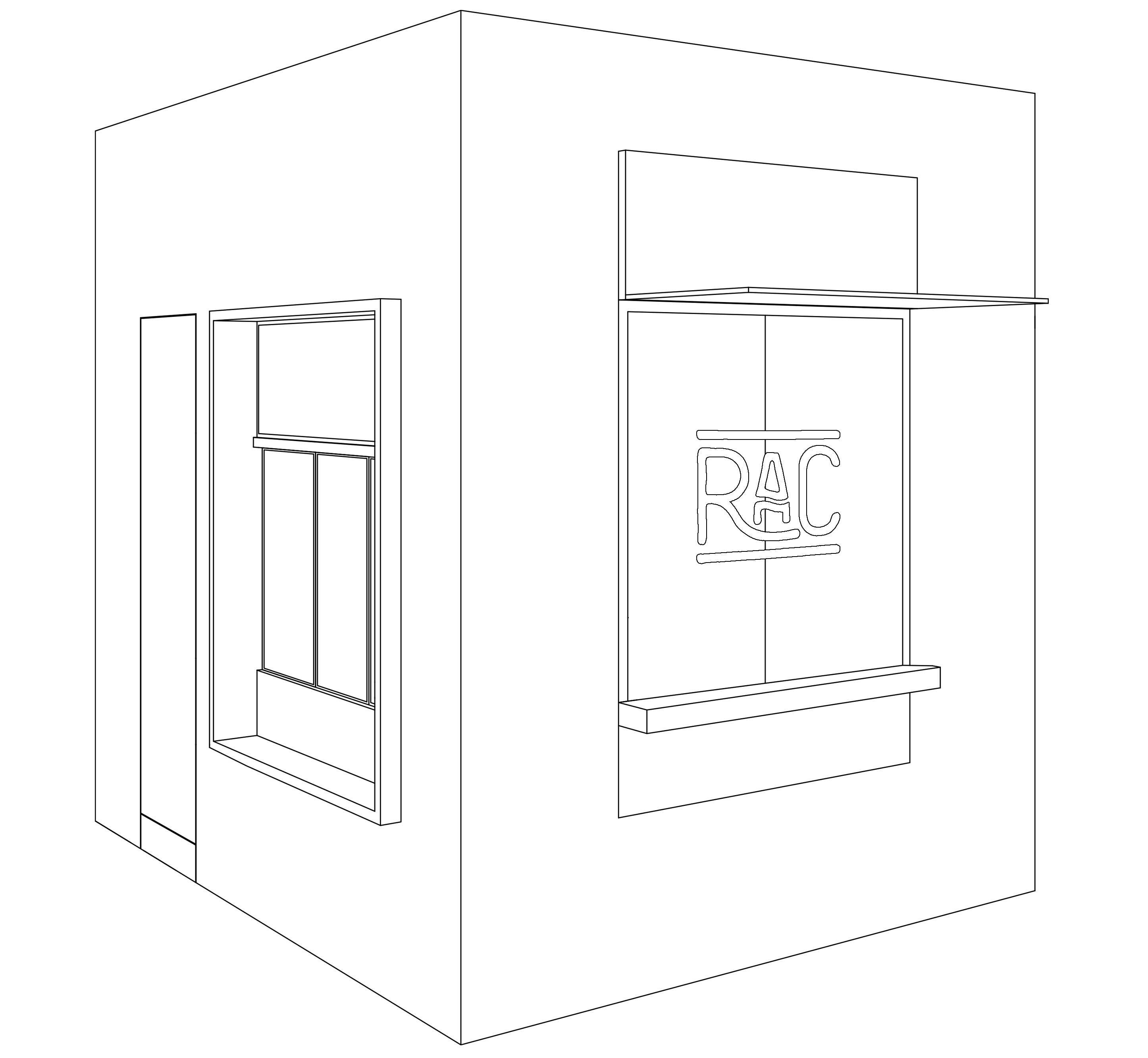
| RAC Coffee & Bar / MASS DESIGN Posted: 30 Mar 2018 10:00 AM PDT  © Feng Shi © Feng Shi
 © Feng Shi © Feng Shi Text description provided by the architects. At the intersection of Anfu and Wukang roads in the former French Concession, you'll find RAC Bar & Coffee. The locale has been long-known for its many Western restaurants and desirably central location - that also means the standards for design in this area are higher. The owners of RAC aimed to stand out with their authentically French vibe, speciality coffee, French pastries, crepes and organic wines.
RAC is both a cafe and bar combined. Originally the cafe was a streetside security post at the entrance to the property. The restaurant and bar section sits at the end of the entrance passageway. That separation presented MASS DESIGN with a challenge: How could design create interaction and connection between these two disparate sections?  © Feng Shi © Feng Shi The solution was to treat this outdoor space as a bridge between the two spaces, re-thinking the area as a public area like a park or a courtyard. Operable windows and a marble sill were inserted on the wall facing the courtyard creating an in-between dining table on the facade. Patrons can sit inside the shop, outside in the sun with their coffee or dine across both spaces. The bar was deliberately moved to open a service window facing the courtyard, allowing visitors from the adjacent office building easy access. In doing so, MASS created a space to enjoy in many ways, activating this courtyard and coaxing more visitors to enter RAC.  © Feng Shi © Feng Shi RAC Coffee is less than 10 square meters, designed strictly for making coffee and the minimum necessary storage. Instead, MASS has taken advantage of the space's streetside location, creating a special coffee window where the barista can easily serve people on the sidewalk and also allure passerby to take a closer look and walk into the courtyard.  © Feng Shi © Feng Shi The interior design for RAC Coffee uses a technique called "mise en abyme", a technique in which an image contains a smaller copy of itself. The main material is a white terrazzo scattered speckled with red throughout. The combination of arches and mirrors makes for an entryway that beckons and entices - is the scene you glimpse a peek into the small courtyard, or a reflection of Anfu Road behind you?  RAC Bar Floor Plan RAC Bar Floor Plan MASS also drew inspiration from the European habit of drinking coffee while standing at the bar. By installing a small wooden bar, complete with hooks for hanging bags and coats, MASS not only found a clever way to solve the lack of space for seating, but also inadvertently created a central meeting place for residents and regulars to chat over coffee.  © Feng Shi © Feng Shi The design for the restaurant and bar section is inspired by RAC's core product: organic wine. The transparent wine cabinet allows an easy glance of their selection from your seat at the bar. The prevailing color throughout the space - a shade of wine bottle green - can be found on finishings like the door, window and cabinet frames as well as in the marble floors. The central table was cut directly from tree trunk, preserving its natural textures and providing a visual, visceral reminder of the rich soils and vineyards of southern France.  © Feng Shi © Feng Shi People have long misunderstood what "French" style means. In order to avoid trite, gaudy or even faux "French" design clichés, MASS used real materials like stone, existing concrete, glass, metal and wood to imbue the space with authenticity. MASS choose to scrape away the white paint from the columns, revealing their original forms replete with many "flaws" - the exposed steel bars and leftover etc things - to showcase how the building's vibrant history still lives on.  © Feng Shi © Feng Shi The marble of the restaurant floor is undoubtedly the design highlight of the whole project. It repurposes the "scraps" of Italian marble-cutting to give the material a brand new life through a novel inlaid geometric pattern. The countertops and console tops make use of a common wall material used in countryside homes: travertine stone. Once construction was completed, the owners sourced decor from Paris to mark the space with their own personal touch. They've achieved a space that feels as if you were standing in the home of a typical French family: gathered around the table, eating, chatting, enjoying and relaxing.  © Feng Shi © Feng Shi This posting includes an audio/video/photo media file: Download Now |
| Barn at Critter Creek / Furman + Keil Architects Posted: 30 Mar 2018 08:00 AM PDT  © Dror Baldinger © Dror Baldinger  © Dror Baldinger © Dror Baldinger Text description provided by the architects. The bones that compose the multi-purpose barn at Critter Creek had a previous life as the owners' home. After sheltering the homeowners for two decades, the structure was initially slated for demolition to make way for the family's new home. Instead, the firm and client decided to repurpose and relocate the existing structure, preserving the spirit and memory embedded in this place.  © Dror Baldinger © Dror Baldinger Exposed timber frame beams and rafters were carefully dismantled and numbered for reassembly. Re-engineered with new galvanized steel connectors, the rebuilt timber frame was extended to complete the entire barn interior.  Site Plan Site Plan  Floor Plans Floor Plans The new building features spaces for art projects, repairs, vehicle maintenance and storage, along with the occasional party. A mezzanine was added to take advantage of the existing height within the structure and to segregate activities.  © Dror Baldinger © Dror Baldinger Rocks quarried from the site compose the two end gable walls. A cantilevered steel brow protects the five aluminum and glass garage doors. With the addition of two large dormers cross ventilation and natural light filter deep into the space. The reuse of douglas fir siding from the original interiors reinforces the memories of the previous home.  Structure Structure  Section Section The sensitive reuse of this structure provides the family with a reflection on the past while accommodating their dreams for the future.  © Dror Baldinger © Dror Baldinger This posting includes an audio/video/photo media file: Download Now |
| OMA Reveals Pavilion Design for Wilshire Boulevard Temple in Los Angeles Posted: 30 Mar 2018 07:00 AM PDT  The scheme will be situated beside a 1929 Byzantine-Revival sanctuary. Image Courtesy of OMA New York / Luxigon The scheme will be situated beside a 1929 Byzantine-Revival sanctuary. Image Courtesy of OMA New York / Luxigon OMA New York has released initial details of its design for the Audrey Irmas Pavilion, a new addition to the Wilshire Boulevard Temple in Los Angeles, California. The OMA scheme, currently seeking planning approval, seeks to "forge new connections within the existing campus and create a new urban presence to engage Los Angeles." Having won a competition for the pavilion's design in 2015, the OMA scheme represents the firm's first commission from a religious institution and their first cultural building in California. Designed in collaboration with Gruen Associates, the Audrey Irmas Pavilion will form the newest addition to the Wilshire Boulevard Temple, the oldest Jewish congregation in Los Angeles. The scheme will serve as a multi-purpose gathering space in what Rabbi Steve Leder regards as "the city's most diverse neighborhood." The scheme will be situated beside a 1929 Byzantine-Revival sanctuary located on Wilshire Boulevard. The pavilion's form offers an expression of respect to its surrounding buildings with the west façade sloping away from the existing temple, and the south façade leaning away from a historic school.
The scheme is comprised of three distinct gathering spaces: a main event space, a smaller multi-purpose room, and a sunken garden. The three interlocking spaces are vertically stacked to frame views, while creating a series of openings that filter light and guide visitors through the complex. The building is expected to break ground in late 2018, with a public opening in 2020. News via: OMA New York
This posting includes an audio/video/photo media file: Download Now |
| Meridionale Fondiaria Real Estate HQ / Tomas Ghisellini Architects Posted: 30 Mar 2018 06:00 AM PDT  © Tomas Ghisellini © Tomas Ghisellini
 © Tomas Ghisellini © Tomas Ghisellini Text description provided by the architects. Meridionale Fondiaria originates from the common intentions of two young entrepreneurs who in 1980 decided to build together their idea of real estate agency, thus laying the foundations of what would become the reference franchise for the city of Lecce and all of the Salento region.  © Tomas Ghisellini © Tomas Ghisellini Today, Meridionale Fondiaria Real Estate can count on thousands of operations and a dense network of collaborators and agencies located in a vast area of Puglia. Professionalism, passion, transparency and integrity. These are the founding values of the brand, as well as the key concepts that have guided the design of the new headquarters, established within one of the most prestigious historic buildings in the capital of the Italian Baroque.  © Tomas Ghisellini © Tomas Ghisellini A space conceived such as what draws on the sphere of the most profound personal intimacy: the home.  Facade Facade  Section Section A domestic meeting place where barriers dissolve in the light of visually fragile and almost imperceptible partitions. An environment where information is clear and shared, as a common heritage; where occlusive separations fall and glances get lost through crystalline visuals; where rooms are large as a sigh of relief and at the same time soft, welcoming, rational and extraordinarily simple.  © Tomas Ghisellini © Tomas Ghisellini The project rewrites the succession of traditional home spaces and in a completely innovative scheme for the real estate brokerage activities, evoking in its articulation a bunch of contemporary living spaces. The small "village" of functional and mysterious volumes becomes the undisputed protagonist of the grand, giving the inner environments different levels of visual permeability.  © Tomas Ghisellini © Tomas Ghisellini Large soundproof crystal sheets allow an efficient separation of the sales rooms, protecting the privacy of buyers and at the same time preserving the extreme transparency of the living spaces. A familiar and comfortable place to feel home, dream home, buy a home.  © Tomas Ghisellini © Tomas Ghisellini This posting includes an audio/video/photo media file: Download Now |
| Studio Fuksas Releases Images of Competition-Winning Double-Ellipse Tower in Slovenia Posted: 30 Mar 2018 05:00 AM PDT  Courtesy of Archivio Fuksas Courtesy of Archivio Fuksas Massimiliano and Doriana Fuksas have released images of their competition-winning "Capo Grande Tower," a tower and bridge situated on the Slovenian coastline linking Giusterna Beach to Monte San Marco. Designed in collaboration with Slovenian architect Sandi Pirš, the scheme consists of a 365-foot-high (111-meter-high) double-ellipse structure inclined slightly towards the sea, seeking to "immediately become a new symbolic element of the city."  Courtesy of Archivio Fuksas Courtesy of Archivio Fuksas  Courtesy of Archivio Fuksas Courtesy of Archivio Fuksas The scheme is located in the coastal Slovenian city of Koper which, like many cities along the coastline, see the coexistence of two cultures – Italian and Slovenian. The double-ellipse structure of the tower symbolizes the relationship between these two cultures, forming a "Tower of Peace" between East and West. During the evening, the two intertwining structures will be illuminated, meeting at the top to create a thin beam of light hovering over land and sea.  Courtesy of Archivio Fuksas Courtesy of Archivio Fuksas  Courtesy of Archivio Fuksas Courtesy of Archivio Fuksas Although the scheme primarily serves as a link between Giusterna Beach and Monte San Marco, the architects have sought to create a landmark which serves as a tourist attraction in its own right. Adjacent to the tower, a panoramic platform named "Capo Grande" is intended to host bars, restaurants, and a gathering spot for tourists and locals. The platform is accessed via a 330-foot-long (100-meter-long) covered walkway, clad with glass walls to permit views across the Slovenian landscape. The scheme also serves a recreational purpose, with areas for slides, climbing walls and bungee jumping provided, and a play space for children at the base of the tower.  Courtesy of Archivio Fuksas Courtesy of Archivio Fuksas News via: Studio Fuksas This posting includes an audio/video/photo media file: Download Now |
| TANO House / Eduardo Ramírez Urrea Posted: 30 Mar 2018 04:00 AM PDT  © Eduardo Ramírez Urrea © Eduardo Ramírez Urrea
 © Eduardo Ramírez Urrea © Eduardo Ramírez Urrea Text description provided by the architects. The architectural objective was to achieve the maximal optimization of land which is 200 square metres (2,152 square feet), which would promote cohabitation as a family and at the same time, offer intimate spaces with the privacy required for each of the family’s daily activities, taking care of the relationship with the exterior, so the privacy character is achieved.  © Eduardo Ramírez Urrea © Eduardo Ramírez Urrea The aim was to create an interior space that would articulate the whole house and where family coexistence would develop. This was solved by a longitudinal dynamic space that goes from the street to an interior courtyard.  Floor Plans Floor Plans The interior patio is the most intimate space of the house. Since privacy is a very important element, several resources were used; In the inner courtyard the walls were raised to double height and on the other side, on the street façade, a filter was created by means of a terrace where a latticework with white concrete elements was placed, like a kind of mask, which tricks the views from the street, but keeps a subtle communication from the inside. The latticework is placed on the entire front of the house giving character to the north façade while accentuating the abstraction of the volume.  © Eduardo Ramírez Urrea © Eduardo Ramírez Urrea In the patio, an abundant gardening was proposed as a visual finishing and element of buffering to the great walls that delimit it.  © Eduardo Ramírez Urrea © Eduardo Ramírez Urrea Since a total integration of the interior space with the exterior was pursued, door-windows were created that hide over the walls, managing to merge the spaces completely. Something important to achieve was: "see raining without getting wet" for which cornices and pergolas were arranged that allow to have the doors open while it rains.  Elevation / Section Elevation / Section On the second floor there are two spacious bedrooms, with bathrooms and closets. In the bathrooms, great natural lighting was sought, as well as privacy. On the third floor there is a study, which is a more private space, separated from the family hustle and bustle, which can be converted into an occasional bedroom since it has a bathroom. In this one, a feeling of integration with the outside was sought, but maintaining its privacy, for which a courtyard bordered by latticework was arranged, repeating the pattern of the main latticework.  © Eduardo Ramírez Urrea © Eduardo Ramírez Urrea The roofs become livable spaces applying the concept of interior-exterior integration, as well as "see raining without getting wet", for which two pergolas made of steel, wood and glass were laid out, of which its structure is evident.  © Eduardo Ramírez Urrea © Eduardo Ramírez Urrea The study is oriented towards the pleasant views created by the large trees of the neighboring park.  © Eduardo Ramírez Urrea © Eduardo Ramírez Urrea The urban sights were intentionally avoided. The space is delimited by a system of beams and walls, which frames the views and forms a more coherent and homogeneous exterior volumetry, enhancing the abstraction of the volumes.  © Eduardo Ramírez Urrea © Eduardo Ramírez Urrea The last roof becomes a viewpoint where you can admire the sight of the volcanoes on the valley. This space is accessed by a metal spiral staircase, also of exposed structure, with a strong chromatic treatment, giving it a sculptural plastic character.  © Eduardo Ramírez Urrea © Eduardo Ramírez Urrea This posting includes an audio/video/photo media file: Download Now |
| Ma Yansong: “Some People May Say My Work Is Futuristic, But I See It as Traditional” Posted: 30 Mar 2018 02:30 AM PDT  Huangshan Mountain Village. Image © Hufton + Crow Huangshan Mountain Village. Image © Hufton + Crow With the unconventional, undulating forms of his buildings—and the fact that his path to architectural success included a stint working for Zaha Hadid—Ma Yansong is often miscategorized as an architect of the latter generation of Deconstructivists, interested only in futuristic forms that push the boundaries of technology for the sake of innovation as an end in itself. But in fact Ma's designs, especially those in his home country of China, are deeply rooted in nature and tradition, as he explains in the latest interview from Vladimir Belogolovsky's "City of Ideas" series. Vladimir Belogolovsky: If someone wants to understand what your work is about, what project would you show and what would you say about it? Ma Yansong: To tell you the truth, I don't mind if people don't understand my work or who I am. [Laughs.] It is hard to choose because I am a different person while working on every project. Every project is about different emotions.  Harbin Opera House. Image © Iwan Baan Harbin Opera House. Image © Iwan Baan VB: One critic wrote that the Harbin Opera House is the most beautiful building in all of China. MY: Yes. But for me, I even think it is too beautiful... Because when I design, I don't really think about every line, proportions, or colors. For example, our Chaoyang Park Plaza, which just finished construction here in Beijing, contrasts greatly with its surroundings. If you think of the many buildings nearby or typical office towers in general, most of them are very similar box-like structures. They represent power and capitalism. Even Rem Koolhaas's CCTV complex wants to outdo them all, not by building taller but by imagining the most original icon. But, as a result, it is a critique of the other towers, which makes his building even more dominant. VB: You don't like that. MY: My approach is different. The Chaoyang Park Plaza is very close to the park and lake, so I close my eyes, I close my ears, I don't want to communicate with the manmade world; I only want to relate to the nature in front of me. And, if you insert our building into a traditional Chinese landscape painting, it fits very well. But if you look around and compare it to other buildings you may see it as something very bold and conflicting. Some people even say it is ugly. I don't think so. Because culturally, it fits very well, but contextually, it is somewhat foreign because the urban context is not Chinese.  Chaoyang Park Plaza. Image © Hufton + Crow Chaoyang Park Plaza. Image © Hufton + Crow VB: The urban context here is imported from the West. MY: Yes, but that's the context that we now have and there is judgment about my work not fitting in. VB: You said earlier that you don't care if your work may be judged either as beautiful or ugly. What is it you care about? What is the main intention of your architecture? MY: I don't like what has happened to our cities, as this is the result of us having followed modernism for such a long time. Everything has started to look the same and lacks an inner spirituality. Nowadays, function is prioritized over nature and emotions. My architecture is about making a statement. But we are not making a building as an object, we are trying to create a landscape inside the urban environment. I derive my inspiration from traditional Chinese architecture where nature is an integral part of daily life in the city. I am looking for ways to adapt the Chinese traditions of blending nature and architecture to contemporary architecture on urban scale.  Chaoyang Park Plaza. Image © Hufton + Crow Chaoyang Park Plaza. Image © Hufton + Crow VB: You said your architecture is about making a statement. Now you have become a large office with projects being built all over the world. Seriously, how many statements do you need? MY: [Laughs.] Well, despite that, I try to make every project differently and consider their cultural context, but the statement is always the same: I try to turn my architecture into a landscape and interweave its functions into the natural environment. Of course, this nature is artificial, it is manmade. There is no pretense about that, but the intention is to create an emotional experience, to reconnect humans with nature. It is not about creating a building as object to display its functions or technology. When I talk about nature, I mean emotions, spirituality. Nature is not a tree or flower; nature is an emotional atmosphere—a place where one can seek their innermost being. One of my heroes, for example, is Louis Kahn. In a way, he is an anti-modern architect because at the core of his work there is a conversation with nature. VB: You said, "We should discover new ways to make humans and nature closer." MY: Yes.  Harbin Opera House. Image © Hufton + Crow Harbin Opera House. Image © Hufton + Crow VB: You also said, "I think it is important to practice architecture with an attitude." MY: Yes, I did. VB: What does it mean to you to practice architecture with an attitude? MY: Drawing inspiration from culture. Being critical... Critical about the context... And really thinking about what kind of cultural impact we want to leave in our urban centers. Do you know what I mean? VB: Not really... MY: Well, when we started working on our Chaoyang Park Plaza tower I said – I don't like any of the towers around; I wanted something different. Not like CCTV, but something more beautiful. I wanted to build something that would bring nature into the city context, and would make people rethink the approach we take towards future urban developments both in China and around the world. That's an attitude.  Chaoyang Park Plaza. Image © Hufton + Crow Chaoyang Park Plaza. Image © Hufton + Crow VB: It reminds me the approach you just criticized... You look around and then you close your eyes, your ears... MY: But I open my eyes to nature. That's my attitude. Many of my projects are built more in opposition to their contexts. Sometimes, they are more integrated. In my Hutong Bubble 32 project built in central Beijing the bubble-like, futuristic form that contains a toilet and stairs to the rooftop seems to be alien to its historical surroundings, but at the same time it reflects everything around it with its shiny surface and, in a way, disappears entirely. Yet, this strange form attracts curiosity and opens the possibility for newly imagined spaces that promise to revitalize the historical fabric of the city. On the other hand, Harbin Opera House is isolated; it stands alone. My intention there was to create a mountain. There was no "crime" there before...  Hutong Bubble 32. Image © Shu He Hutong Bubble 32. Image © Shu He VB: Would you say that architecture for you starts with a conversation? MY: Architecture for me is a conversation, in which I look back to the past and project my ideas into the future. Architecture is art, attitude, and emotions. All these things need to be linked. VB: You said once, "I treat my projects as art." Could you elaborate? MY: Art is all about emotions. Art is about seeing things in a personal way. You can start a project with a site analysis or its function... VB: But you don't do that. MY: No, I don't. My emotions come from the cultural context. Each location represents a particular culture and brings out a different attitude, and mood in me. I look for different ways to respond to projects that are relevant to their particular context.  Hutong Bubble 32. Image © Shu He Hutong Bubble 32. Image © Shu He VB: When you talk about your architecture, you often refer to the idea of Shan Shui, which is a style of traditional Chinese brush and ink landscape paintings featuring mountains, rivers, and waterfalls... MY: Shan Shui is a cultural typology. It is not just limited to paintings. You can come across Shan Shui music, poems... even urban planning. It refers to both aesthetic and spiritual values.  Huangshan Mountain Village. Image © Hufton + Crow Huangshan Mountain Village. Image © Hufton + Crow VB: Also Shan Shui paintings are not representative but rather contemplative. Shan Shui painting is not an open window for the viewer's eye, but rather a tool for the viewer's mind and a device for reflective thinking. Could you talk about the relationship between your work and Shan Shui? MY: I grew up right here, in old Beijing. The city was originally planned around lakes and gardens. They are all manmade, but collectively the interweaving aesthetics with functionality gave the feeling that we were immersed in this verdant landscape; while the nature created here is imaginary nature, it is what people perceive of as nature, not nature itself. This is what modern architecture is lacking, an inner spirituality. I want to bring this into our urban centers. Shan Shui is a philosophy; it is about establishing emotional connections to nature. And this concept can be applied to projects on many different scales, even the large urban scale, in both our existing cities and newly developing ones. This is what I am trying to do with my Shanshui City vision, as you can see in my project Huangshan Mountain Village. The village blurs the boundaries between the geometries of architecture and nature; it is part of the local landscape and geology. I like how nature is a part of the city here in central Beijing, but I don't like how it is missing from new neighborhoods. So, as an architect I want to take these key features of traditional architecture and translate them into new developments on a much bigger scale than we are building today. And I want to bring something unfamiliar into these new projects. I want to build buildings that no one has ever seen before. I don't want the middle ground. Some people may say my work is futuristic, but I see it as traditional because I carry old Eastern philosophy and use it to respond to new challenges.  Huangshan Mountain Village. Image © Hufton + Crow Huangshan Mountain Village. Image © Hufton + Crow VLADIMIR BELOGOLOVSKY is the founder of the New York-based non-profit Curatorial Project. Trained as an architect at Cooper Union in New York, he has written five books, including Conversations with Architects in the Age of Celebrity (DOM, 2015), Harry Seidler: LIFEWORK (Rizzoli, 2014), and Soviet Modernism: 1955-1985 (TATLIN, 2010). Among his numerous exhibitions: Anthony Ames: Object-Type Landscapes at Casa Curutchet, La Plata, Argentina (2015); Colombia: Transformed (American Tour, 2013-15); Harry Seidler: Painting Toward Architecture (world tour since 2012); and Chess Game for Russian Pavilion at the 11th Venice Architecture Biennale (2008). Belogolovsky is the American correspondent for Berlin-based architectural journal SPEECH and he has lectured at universities and museums in more than 20 countries. Belogolovsky's column, City of Ideas, introduces ArchDaily's readers to his latest and ongoing conversations with the most innovative architects from around the world. These intimate discussions are a part of the curator's upcoming exhibition with the same title which premiered at the University of Sydney in June 2016. The City of Ideas exhibition will travel to venues around the world to explore ever-evolving content and design. This posting includes an audio/video/photo media file: Download Now |
| 520 West 28th / Zaha Hadid Architects Posted: 30 Mar 2018 02:00 AM PDT  © Hufton+Crow © Hufton+Crow
 © Hufton+Crow © Hufton+Crow Text description provided by the architects. There is a powerful urban dynamic between the streets of New York and the High Line, a layered civic realm that has developed over generations and in many iterations. 520 West 28th conveys this contextual relationship, applying new ideas and concepts to create the latest evolution of the site's rich history.  © Hufton+Crow © Hufton+Crow The split levels of the design define varied living spaces and echoes the multiple layers of civic space on 28th Street and the High Line.  © Hufton+Crow © Hufton+Crow These split levels are expressed within the interlocking chevrons of 520 West 28th's hand-crafted steel façade which carries the spirit of Chelsea's industrial past; its detailed workmanship continues the venerable tradition within New York's historic architecture of enhancing the public realm. .jpg?1522286772 "Façade Articulation Study") Façade Articulation Study Façade Articulation Study  © Hufton+Crow © Hufton+Crow .jpg?1522286930 "Formal Composition Study") Formal Composition Study Formal Composition Study Designed and constructed with a practiced understanding of material qualities and manufacturing techniques, the façade conveys the attention to detail evident throughout 520 West 28th—brushed and tinted by hand to resonate with the adjacent structures of the High Line and its neighbourhood.  © Hufton+Crow © Hufton+Crow The 11-storey 520 West 28th houses 39 residences with 11-foot coffered ceilings, tailored interiors that incorporate Boffi kitchens by Zaha Hadid Design, and integrated technologies including automated valet parking and storage.  © Hufton+Crow © Hufton+Crow With multiple cores to give most residences private elevator lobbies, the amenities of 520 West 28th include the wellness level with spa and 25-yard sky-lit lap pool, sculpture garden, and entertainment suite with IMAX theatre.  © Scott Francis © Scott Francis  Fourth + Fifth Floor plan Fourth + Fifth Floor plan  © Scott Francis © Scott Francis Within an established community of over 350 art galleries that has seen the High Line's transformation from abandoned freight rail line to public park, 520 West 28th embodies a commitment to uphold the distinctive character of its neighbourhood; creating a building with its own architectural presence, yet very much of its surroundings.  © Hufton+Crow © Hufton+Crow This posting includes an audio/video/photo media file: Download Now |
| On the Other Side of the Wall of Shame in Lima, Peru Posted: 30 Mar 2018 01:00 AM PDT  © Orestis Karagiannis © Orestis Karagiannis Warning: this article proposes a narrative according to the route taken from one side to the other of the wall, from the predictable to the most unpredictable. To better situate ourselves, the narrative will be told through my personal experience. "Do you know the wall that divides the rich from the poor?," asked three Greek travelers who, after visiting the "pretty" side of Lima, suspected that something was hiding behind appearances. But, "how is it that from, even though you're from the other side of the world, you knew about the wall?" Well, news travels. And "why is this wall something that has to be seen in our city?" if it's not a cause for pride. I knew exactly what they were talking about. I spelled it out: the wall of shame. Certainly, I wasn't familiar with it in situ either, since I hadn't left my urban bubble, like many of those who live in these parts, so with the same curiosity, as a tourist of my own city, we made our way. From this side—the most urbanized—at some point you can see the extensive wall in the distance: high, white, and as impenetrable as it is imposing. In the area of Las Casuarinas (Surco) and part of La Molina hides San Juan de Miraflores (SJM), which is just next to the wall. But we couldn't even imagine the universe behind it. The best way is to see it from the other side, we were advised. .jpg?1489166284 "© Henry Cárdenas") © Henry Cárdenas © Henry Cárdenas
In situAt the end of the dirt road, there is a cemetery that is integrated into the landscape, with niches in the shape of miniature houses. You arrive at the point in which the car can climb and then you go on foot. We reach a platform of land where there is a soccer field, some shops next to a local restaurant, and a small library under construction with plastic bottles. There is an evident lack of amenities and public space.  © Orestis Karagiannis © Orestis Karagiannis  © Orestis Karagiannis © Orestis Karagiannis  © Delia Esperanza © Delia Esperanza We get out of the taxi, and the taxi driver becomes our guide. It's common knowledge. Climbing those steep blue stairs to the sky of approximately 12 floors requires pauses of reflection. As you go up, you notice the needs of the place more and more, and when you reach the top, you can appreciate it all. All that you had read or seen was there, and more. First, you collide with the wall, then you notice an expected contrast, and then you turn around to look at what you have gone through and you stay there as if time had stopped, with this side, at your side: because simplicity captures the view that is invaded by pure life.  © Orestis Karagiannis © Orestis Karagiannis  © Delia Esperanza © Delia Esperanza
 © Delia Esperanza © Delia Esperanza Duality: Rich and Poor
Finally, the wall is in front of you, and suddenly there is that moment when you realize that Lima is divided in two. And you belong either way, to one side or the other. Immediately you become a part of "those on the other side" and everything that that imaginary entails. It's an uncomfortable feeling. .jpg?1489166267 "© Henry Cárdenas") © Henry Cárdenas © Henry Cárdenas Before your eyes, there is a strong division between rich and poor, but that doesn't only include the close opposites (Casuarinas and the ruined houses) but also, the formal and the informal. And that the other side of white purity, at times, could also mean power and control that distances itself from color and spontaneity. It is the rigid side separated from the organic side. The hill itself is the only thing they have in common without being really shared. The wall is kilometers away from the rich for whom the hill is intact, while for the poor the hill is completely invaded after a few steps. The houses are "mansion" style and vary from 1000 to 3000 m2, while the "huts" style dwelling are on average 15 m2. Other figures indicate that San Juan de Miraflores, in the district of Pamplona Alta, is the second least safe neighborhood in Lima, according to the NGO Ciudad Nuestra. On the other hand, Surco, in the district of Las Casuarinas, is the fourth safest neighborhood in Lima.  Cortesía de Juan Caycho Cortesía de Juan Caycho  © Orestis Karagiannis © Orestis Karagiannis The first thing we see from above is a contiguous urbanization: Las Casuarinas, which was created in the 1950s, is one of the most luxurious areas of Lima with one of the most privileged views of the capital. It is highly sheltered. At its limit towards the slope of the hill is this wall, while at the entrance of said urbanization, there is a fence. So exclusive is the area that they ask for identification when entering (which is alright) but the problem is when they bother you and question you. I remember it perfectly. I went to investigate one of the huge houses with a large garden and swimming pool, and the security guard was not satisfied with my ID. He asked me to get out of the car and tell another guard what I was planning to do in there. Perhaps it's best to get past this wall.  © Orestis Karagiannis © Orestis Karagiannis  © Delia Esperanza © Delia Esperanza What is life like on the other side of the wall?
 © Orestis Karagiannis © Orestis Karagiannis  © Orestis Karagiannis © Orestis Karagiannis The children complain, although they are afraid of those that have told them what there is on the other side. It even seems true. The children place stones in the manner of a ladder to climb the wall and look over to the other side, but their sight has nothing more to envy than the sea.  © Delia Esperanza © Delia Esperanza In this way of life you need to get the most out of the least. Pamplona Alta is a settlement, an informal neighborhood built through encroachment on the land, with little resources, and without any form of urban planning. Life is communal, immigrants from other parts of the country coexist and are integrated and supported by their neighbors. The people here are workers, many share personal anecdotes of the trajines at dawn when they wake up at 4 or 5 in the morning to leave to be on time on the other side of the wall.  © Delia Esperanza © Delia Esperanza  © Delia Esperanza © Delia Esperanza  © Delia Esperanza © Delia Esperanza The houses are made of mats, tiles, plywood, wood, plastic and all kinds of recycled materials. They sit on sloping terrains with tires, sacks of compacted earth and stones, as this is the fastest and most economical way to fill and create platforms. "There is no water. We got electricity just a few months ago," because until recently, there were no services.  © Delia Esperanza © Delia Esperanza  © Delia Esperanza © Delia Esperanza The interesting thing about the way of life here and which perhaps resonates most with the residents is its location with respect to the wall, as a limit of arrival or departure, where spaces are integrated between the wall and the housing units, or where the house supports one of its own walls to this bigger wall. On the other hand, all the houses, with their few constructive elements, have spaces to sit and talk in the shade—whether created by steps, a terrace or a "roof" they are spontaneous spaces for coexistence.  © Delia Esperanza © Delia Esperanza  © Orestis Karagiannis © Orestis Karagiannis Thus, the inhabitants of these informal settlements do not build walls, but rather open them to the street. Despite invading in an unplanned way, they have the wisdom of what it is to interact with neighbors, that gregarious feeling of a city. This is nothing new, it happens in the periphery of Lima and in other Latin American cities, and we carry on without really seeing them. But what is surprising is the peace and tranquility that is breathed here, in spite of its reputation of crime and danger.  © Delia Esperanza © Delia Esperanza
 © Delia Esperanza © Delia Esperanza The WallWhat’s it like? A snake shape. It is almost three meters in height, and approximately 10 km in length. It's a concrete wall with barbed wire. It is white on the outside and colored on the inside. (Seeing it from the side where we are standing). While on the other side, this wall is as clean as possible; this side has colored parts that identify the neighbors or some interventions made by artists or different collectives together with local children and young volunteers who express some message of union. Others like the Muralist Brigade, paint landscapes and skies as a way to cross over the wall using art, and others, like Poetic Action, break barriers with poetry.  © Orestis Karagiannis © Orestis Karagiannis
 Cortesía de Brigada Muralista Cortesía de Brigada Muralista  Cortesía de Volante y Rasante Cortesía de Volante y Rasante Only three years ago there were posters on the wall that warned against any attempt to cross to the other side: "Entrance prohibited. Order to shoot." It is an impenetrable wall, but there is an exception: a small door that remains closed from dusk to dawn, and is open during the day under the control of a guard who permits entrance with ID for those who work at La Molina as guards, domestic employees, gardeners, etc. And if it wasn't for this pass, which allows them to travel quickly in just minutes, they would have to make the full trip, which would take almost three hours. It is an insufficient connection attempt ...
 © Delia Esperanza © Delia Esperanza Why does it exist? There are many versions that derive from the situations that our country has gone through and directly affected the area: providing security in the face of violence and crime, preventing more invasions on the hill from one side to another, hiding the "huts" from view, differentiating social classes, perhaps an act of discrimination, etc. For others, the cause is simple: a notable and widespread absence of urban planning in the city.  © Delia Esperanza © Delia Esperanza
 © Delia Esperanza © Delia Esperanza The Pamplona Alta area began to be invaded in the 1970s, says Diana Rivas, an anthropologist who wrote a thesis on the wall. At that time the invasions increased due to the massive arrival of immigrants from rural areas that were fleeing from the misery created by the crisis that the country was going through as well as the violence from the internal conflict caused by Shining Path guerrillas. That is how the physical origin of the wall came about when an emblematic private Jesuit school, encircled the perimeter of the school to, among other things, prevent neighbors from stealing the products of their gardens.
 © Orestis Karagiannis © Orestis Karagiannis Little by little the wall expanded and its construction advanced as did the invasions along the hill, extending towards the west of the city. In recent years, another stretch was made around 2011, with the emergence of the Fronteras Unidas (United Frontiers) settlement; finally, the last section of the wall was erected 3 years ago in front of the Vista Hermosa settlement. It took months to build.
 © Delia Esperanza © Delia Esperanza This wall contains contrasts and paradoxes. One of these paradoxes is that the same neighbors who live in precariousness are also hired to build the wall that separates them. They take advantage of any work that they can get as an opportunity. Despite some obvious reasons, we keep asking ourselves why it still exists today. PerceptionsToday, the wall represents several things: fear, security, a solution, disconnection, distance, isolation, inequality, frustration, discomfort, excess, conformism, resignation, segregation, peace, chaos ... there are as many interpretations as there are people and their freedom of expression.  © Orestis Karagiannis © Orestis Karagiannis "There is a difference in the perception of the wall," says Pedro Elías, a community psychologist at Ayni Peru Educación Alternativa, an association that has built a small school there. During the construction process he noticed the different perspectives: for the children it's like a game or something anecdotal, or they even believe that it's to avoid invasions from the other side; the parents are more resentful about it, because many feel unequal and isolated. For others, it is ironic, but in the sense that they feel that they are disturbing each other from one side to the other. These people have come to accept that the wall is a "symbol of peace to resolve conflicts" and thus they avoid relating to, or having problems due to their very different ways of thinking. Finally, there are those who find it normal, because it has been there since before they arrived and they don't know what it was like without the barrier. In the eyes of many of those who live here or visit the place, the wall is a symbol of social inequality in the country.
 © Delia Esperanza © Delia Esperanza Mental limitations are stronger than physical limitationsBehind this physical wall, there is a stronger wall still: the closed mind. It is alarming that after so many years of evolution where walls have been diminished, that the easy solutions exist, like that of placing or maintaining a wall and conveniently forgetting about the real problem, and even worse, creating other problems around this division/barrier/limit. Urban segregation. Whatever we choose to call it, in the end, it is a shame. Apart from the distances, today we have to witness this situation, our wall and the Trump wall, but the main wall that must be thrown down is the wall of indifference and social injustice; it is precisely there that architecture plays its most important role: to give human lives the spaces and dignity that has been conquered throughout history.  © Orestis Karagiannis © Orestis Karagiannis What alternatives does architecture offer us against this? On this side of the wall, informal and spontaneous growth is the unpredictable aspect, because nobody knows how it will end up being, how it will continue to grow, as the invasions continue and continue into the future until we address them with greater urban planning ... but, as architects, on which side of the wall are we? Or rather, how do we eradicate walls and instead connect with public space, outline subtle permeable boundaries, and dilute barriers with art. It is complex, but we can address the issue very carefully and find other, more inclusive solutions that benefit both parties as one.  © Delia Esperanza © Delia Esperanza We return to the formalities, back to our side a little dizzy and intoxicated from the pure, and hard reality. Back on the other side of the wall you realize that the poor side is actually the one that decides to turn its back on the informal settlements; they are poor in mind, in solutions and they have impoverished souls. The other side of the wall has the richness of living together in community.  © Delia Esperanza © Delia Esperanza Note: If you have been left wanting to demolish walls for peace, you have understood the background of this story-journey. Photo credit: Orestis Karagiannis, Henry Cárdenas, Juan Caycho This posting includes an audio/video/photo media file: Download Now |
| T2.a Architects Uses Algorithm to Design Customizable Apartment Complex Posted: 29 Mar 2018 11:00 PM PDT  Courtesy of DANUBIO/T2.a Architects Courtesy of DANUBIO/T2.a Architects Imagine having input in the design process for your custom apartment built alongside the second largest river in Europe. T2.a Architects has unveiled their design for DANUBIO, a new residential development in Budapest, which aims to do just that. The driving concept behind the development of DANUBIO is to give the freedom of design back to the residents, inviting them to give input into the configuration of units within the building. Using Grasshopper, a Rhinoceros plug in, a script was developed to allow creative flexibility in the design of each resident's future home. This algorithm is altered every time a new resident enters the community by allowing them to define the typology, orientation, and location of their future home during the design process. Oriented towards having as many views of the river as possible, the building will also feature large outdoor balcony spaces which will feel more like a continuation of indoor areas than a separate patio space. The form of the building, which bends and winds along the river's edge, gives the complex a sculptural appearance. Featuring floor to ceiling windows, natural light will allow the building to reduce its environmental impact on the site. DANUBIO is slated to be the first residential development in Hungary to be assessed by BREEAM, the world's leading sustainability evaluation method and is expected to obtain either a "Very Good" or an "Excellent" rating. DANUBIO situates itself on a site that is currently under a large amount of public development. Once completed in 2019 it will be located near a public promenade, a large park, playground, and a beach area. News via: T2.a Architects. This posting includes an audio/video/photo media file: Download Now |
| You are subscribed to email updates from ArchDaily. To stop receiving these emails, you may unsubscribe now. | Email delivery powered by Google |
| Google, 1600 Amphitheatre Parkway, Mountain View, CA 94043, United States | |
Nema komentara:
Objavi komentar