Arch Daily |
- Earth Memorial / Gitai Architects
- Song's Chinese Cuisine / Republican Metropolis Architecture
- Wejherowo / PB STUDIO
- Patrick Heath Public Library / LPA
- Weirdo Talk Creative Lab / hyperSity
- Center for People with Disabilities ASPAYM ÁVILA / amas4arquitectura
- Orna Café / Moca Arquitetura
- St Joseph Seminary / DIALOG
- OMA Reveals New Feyenoord Stadium Design in Rotterdam
- Albina Yard / LEVER Architecture
- KPF's Spiraling Scroll Tower will be the Tallest Building in Tel Aviv
- Avenida Italia Shop / Amunátegui Valdés Architects
- OMA's Latest Fails to Live Up To Its Own Pedagogy
- The Electric Automated Cities of the Future, According to Jaguar and Barr Gazetas
- VR House / Alexanderson Arquitectos
- Jaworznickie Planty Water Playground / RS + Robert Skitek
- Happy Holidays from Architects Around the World (2018 Edition)
| Earth Memorial / Gitai Architects Posted: 21 Dec 2018 06:00 PM PST  © Yohan Zerdoun © Yohan Zerdoun
 © Yohan Zerdoun © Yohan Zerdoun Text description provided by the architects. Reflecting on a piece of land can awake different senses and memories from stories and events that occurred to us in the past and that might happen in the future. The contemplation on our environment is a process that juxtaposes our own narrative and a observation of a piece of land into a single moment. The observer takes a travelling gaze to look at his nature and at the same time provokes a journey within himself that, through a plurality of paths, shapes his mental landscape.  Memorial 03 Memorial 03 These Layers of time and stratification were embodied and took form in a specific project by Ben Gitai Architects. Commissioned by the city of Haifa in 2017 to create a space of commemoration for the soldiers who died in the last height decade of war. The architecture and design project proposal is a memorial park in Kyriat haim in Israel which is entirely made with earth Adama in Hebrew. In terms of landscape and architecture it is the first of the kind, no memorial was done till today in this particular technic. memorial reassembles in it spatial qualities, craftsmen-shift, materiality and people's memory into this piece of Landscape.  © Yohan Zerdoun © Yohan Zerdoun In this project, we transform the public space into a place where the memory of the fallen soldiers are immersing with the nature, the earth. In an open architectural configuration of the plan, each earth elements his situated in an open room system, Therefor the eyes and the ears can absorb from all directions and to connect to the place, so the death could dialogue with the living of the space.  Memorial 04 Memorial 04 We decided to locate, the memorial near the children background that are an integrated part in the piece, it is this specific overlaying source that feeds and animates the memorial itself by a system of sound streaming composition in a form of earth benches Soundscape.  © Yohan Zerdoun © Yohan Zerdoun This earth song is a Harmonization through the names of the fallen, each letter is composing a specific note in this song. The Harmonic basis through which nature is transformed. Each three minute a chord is realized where each first name of the fallen soldiers triggers one tone into the environmental transformation, articulation the sound of absent with the chores and pass in time were a person as fallen.  © Ben Gitai © Ben Gitai The streaming living sounds perceives auditory space as devoid of any specific focus, field or sphere - negating permanent and stable boundaries - as if it is made of the thing itself, rather than the space containing the thing it opens out with the open form system of the earth elements and to the memory of each visitor will awoke a sonor travel into himself.  Updated Objects Updated Objects The earth memorial is becoming in this moment neither visual nor delineated, but dynamic, constantly changing and creating its own dimensions of space that represents memory through time. It has no set boundaries or background. While the eye of the visitor focuses, locates, makes abstract, and places each earth elements in physical space in relation with the surrounding.  © Yohan Zerdoun © Yohan Zerdoun This posting includes an audio/video/photo media file: Download Now |
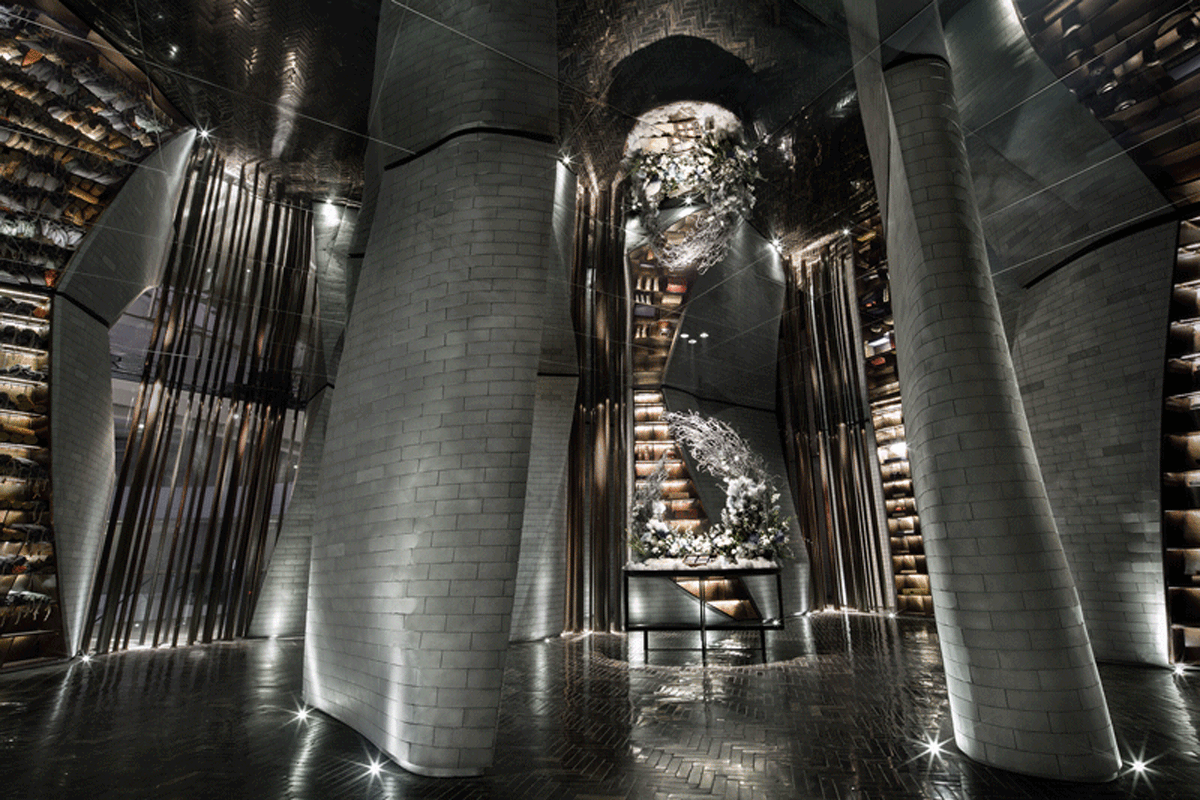
| Song's Chinese Cuisine / Republican Metropolis Architecture Posted: 21 Dec 2018 03:00 PM PST
 © Jack Qin | RMA, Kaijian Lee © Jack Qin | RMA, Kaijian Lee Text description provided by the architects. The ancient books"lucky crane map"had recorded: on the second ninght of Lantern Festival in the second year of Northern Song Dynasty , suddenly the sky above the capital, the clouds floated, and the cranes flew over the palace. They hovered for a long time and refused to leave. The two cranes fell on the two tall kisses on the left and right sides of the palace.The people who attracted theimperial palace were astonished and the people on the road stopped to watch.The aerial crane looks like an understanding of the meaning of the person. It seems to be screaming for something, and it does not scatter over time. Later it flies northwest.  © Jack Qin | RMA, Kaijian Lee © Jack Qin | RMA, Kaijian Lee Song's Chinese Cuisine uses modern materials and design techniques to interpret Chinese restaurants. 100,000 pieces of heterosexual stainless steel bricks and 400,000 pieces of colored feathers constitute the basic form of the Song's Restaurant.The curving shape of the surface breaks the imagination of the Chinese restaurant and creates a unique spatial experience. ") Courtesy of Republican Metropolis Architecture(RMA) Courtesy of Republican Metropolis Architecture(RMA)  Human and Spatial Relationship Human and Spatial Relationship As the guests walk through the restaurant, the space gradually becomes narrow ; It can be in close contact with the feathers, and the feathers that have been cast at high temperature slide over the fingertips. The smooth feathers leave the residual temperature in the hands, and its touch makes us experience everything we have experienced, one soft and one resolute, smart and shining. The stainless steel brick wall, seamless, hard, smooth; The brick floor of the collage has traces of years of friction, and the interspersed body makes the interior energetic.  © Jack Qin | RMA, Kaijian Lee © Jack Qin | RMA, Kaijian Lee  © Jack Qin | RMA, Kaijian Lee © Jack Qin | RMA, Kaijian Lee The modern materials and details selected by Song's Restaurant reveal the pursuit of atmosphere and ultimate taste.The people can feel the reappearance of the ancient scene, and it seems that people can immediately throw away the urban impetuous outside, and the heart becomes clean and immersed to appreciate the ancient cultural heritage.  © Jack Qin | RMA, Kaijian Lee © Jack Qin | RMA, Kaijian Lee This is a place where experiencer are sheltered in the building.Building becomes a form that creates a place that is different from indoors and different from nature. People feel the sun and the breeze, but we are in the building again,this is my favorite feeling.  © Jack Qin | RMA, Kaijian Lee © Jack Qin | RMA, Kaijian Lee The Space is no longer just a by-product of the order of events.A dynamic and fast-moving space ideally should be able to feel the state of the material as it passes through it.  © Jack Qin | RMA, Kaijian Lee © Jack Qin | RMA, Kaijian Lee The fluidity of the film brings people a narrative, and the flow of people in the architectural space also brings continuity to the dynamic space experience. To a certain extent, it is also narrative and forms a unique spatial experience.  © Jack Qin | RMA, Kaijian Lee © Jack Qin | RMA, Kaijian Lee This posting includes an audio/video/photo media file: Download Now |
| Posted: 21 Dec 2018 01:00 PM PST  © Jakub Piórkowski © Jakub Piórkowski
 © Jakub Piórkowski © Jakub Piórkowski Text description provided by the architects. The project featured renovation and extension of a historical building from 1890 in the city of Wejherowo, north of Poland.  © Jakub Piórkowski © Jakub Piórkowski  Ground floor plan Ground floor plan  © Jakub Piórkowski © Jakub Piórkowski The main idea behind the project was to recreate the original character of the historical building and to juxtapose it with a modern form of the new extension.  © Jakub Piórkowski © Jakub Piórkowski  Axonometry 01 Axonometry 01  © Jakub Piórkowski © Jakub Piórkowski We decided to use a wooden façade cladded in a rhomb pattern which would reference a typical garden-like pavilion; the dark tinted color emphasizes the modern character of the extension and puts it in contrast with the historical part of the building. Large golden anodized aluminum windows open the interior views to the surrounding garden.  © Jakub Piórkowski © Jakub Piórkowski  Section Section  © Jakub Piórkowski © Jakub Piórkowski The graphite wooden pattern was also implemented in other elements like fencing and landscape design.  First floor plan First floor plan The interior design of the hotel and restaurant reflects the character of the period building while the multi-purpose open space in the new pavilion has a much more minimalistic and modern character with large glazing blending the border between inside and outside.  © Jakub Piórkowski © Jakub Piórkowski The rhomb ornament used in the wooden façade can be also found in subtle interior details and finishing materials.  Axonometry 02 Axonometry 02  © Jakub Piórkowski © Jakub Piórkowski This posting includes an audio/video/photo media file: Download Now |
| Patrick Heath Public Library / LPA Posted: 21 Dec 2018 12:00 PM PST  © Dror Baldinger | Mark Menjivar © Dror Baldinger | Mark Menjivar
 © Dror Baldinger | Mark Menjivar © Dror Baldinger | Mark Menjivar Text description provided by the architects. The Patrick Heath Public Library was designed to support a goal of providing the community a sense of belonging and connection to the environment. A priority for the building is to provide a comfortable space for reading, viewing and listening for pleasure and lifelong learning. The sole library in Boerne, Texas, a community just west of San Antonio, exists in harmony with the city's renowned bucolic surroundings.  © Dror Baldinger | Mark Menjivar © Dror Baldinger | Mark Menjivar The LEED Gold certified library was purposefully sited along a creek to be enveloped by a park-like setting to the east which gives library visitors an opportunity to enjoy that natural area, a precious sight in parched Central Texas. The building includes expansive windows on the eastern side that showcase the creek, stately Live Oak trees, and wooded Hill Country vistas beyond. The architects oriented many of the programmed spaces, such as the internet cafe, quiet room, meeting rooms, reading areas, and a screened-in balcony eastward to highlight the unbroken panoramic landscape, keeping service desks and support areas necessarily near the main entrance on the western side.  © Dror Baldinger | Mark Menjivar © Dror Baldinger | Mark Menjivar Outdoor seating arrangements and terraces encourage readers to take activities outside in pleasant weather. In this sunny climate, building shade structures and preserving the existing leafy Live Oaks was essential to designing usable outdoor space. Materials provide a subtler connection to the region: indigenous limestone comprises both exterior and interior walls and reclaimed regional Longleaf Pine is used in pivot walls that enhance functionality. Cisterns tie the creekside views back to the importance of water conservation. In these ways, the library succeeds in connecting Boerne to its most striking feature: the celebrated Texas Hill Country that begins right outside its windows. This posting includes an audio/video/photo media file: Download Now |
| Weirdo Talk Creative Lab / hyperSity Posted: 21 Dec 2018 11:00 AM PST  Courtesy of hyperSity Courtesy of hyperSity
 Courtesy of hyperSity Courtesy of hyperSity Text description provided by the architects. MEWE is a media enterprise, whose " Weirdo Talk " is a well-known talk show in China. Founder Ma Dong hopes that through a bold creative space, the team can brainstorm here and deliver inspiration. Some specific scenes are needed to combine with the daily creative output, including an activity hall where many people can share with each other, and some meeting rooms that can be divided flexibly and closed for brainstorming and discussion.  Courtesy of hyperSity Courtesy of hyperSity Before the spatial geometry coming out, the architect sorted out the spatial logic, since there are many pipelines on the north side. The architect arranges the pipelines mainly on north side to ease the southern side for the newly constructed mezzanine space. The final space increased from 600 square meters to more than 900 square meters.  Concept Concept The architects then tried to create some contrasting and conflicting spaces that many spaces squeezed into very small corners, and some are unbridled and released into large and open scale. For example, the sunken area in the hall equals to the public plaza in the city that allows people sitting on the steps for communication. From the staircase opposite the spherical meditation room that next to the square, there is a long cantile-shaped corridor, linking to a particularly narrow space, where is leading to a tatami area on the second floor. The staff can stay in this quiet space for immersive thinking.  Courtesy of hyperSity Courtesy of hyperSity  Courtesy of hyperSity Courtesy of hyperSity In the large activity hall, it set up the possibility of various ways of watching, such as people can sit on the steps of the square, and also stand on the stairs to the second floor corridor, through different angles around the big screen. The audiences are especially at a state of freedom.  Courtesy of hyperSity Courtesy of hyperSity On the choice of material, the whole space emphases the basic tones with some strong color. Different colors of parquet, self-leveling cement flooring as well as PVC ground flooring are used. Brain storming sessions are walled with acoustic blankets. The facade finishes are mixed with timber cladding and metal plates, white perforated plates and double-skin treatment.  Courtesy of hyperSity Courtesy of hyperSity  Courtesy of hyperSity Courtesy of hyperSity The work eventually tries to respond to the creative needs from founder Ma Dong and his team---that in fact, MEWE's lab is a very vague and undefined space where people can freely exchange ideas and achieve infinite possibilities.  Courtesy of hyperSity Courtesy of hyperSity  Courtesy of hyperSity Courtesy of hyperSity This posting includes an audio/video/photo media file: Download Now |
| Center for People with Disabilities ASPAYM ÁVILA / amas4arquitectura Posted: 21 Dec 2018 09:00 AM PST ") © MOI (Pedro I. RAMOS) © MOI (Pedro I. RAMOS)
 Text description provided by the architects. The ASPAYM Foundation, for disabled people, in its XXV anniversary, has decided to build this small center near Ávila (Spain). The program turns around the rehab space, which is an extension of the hall. These areas are polyvalent, because the absence of structure and the transparency of many partitions. All the corridors, bathrooms, furniture and rooms are for disabled people. ") © MOI (Pedro I. RAMOS) © MOI (Pedro I. RAMOS)  Plan Plan ") © MOI (Pedro I. RAMOS) © MOI (Pedro I. RAMOS) The building is a rectangular ground floor pavilion along the street. It divides the plot into an access porch, a parking and a backyard. In an ugly environment, still unfinished, we have opted for the autonomy of an hermetic volume, with a strong material presence. But as soon as people enter, they can held a gaze out the window, towards the garden. ") © MOI (Pedro I. RAMOS) © MOI (Pedro I. RAMOS) The entire construction is resolved with a ceiling with laminated wood beams that floats on the ground at 2.70 m. The beams are separated 1.50 m to axes and are 72 cm wide. It gives the roof a strong presence and a plastic relief. In this way it is expected that the views and the interior atmosphere will be trapped under a singular but kind "lid". The energies of the project are concentrated in this sculptural ceiling because users perform a good part of the rehabilitation activities lying on stretchers facing upwards, or have a low vision because the wheelchairs. ") © MOI (Pedro I. RAMOS) © MOI (Pedro I. RAMOS) The roof is supported by perimeter walls made of white concrete, which form a façade that is more closed to the street and a discontinuous façade to the garden. The windows and the main partitions are resolved with glass from floor to ceiling to preserve the continuity of the space. There are only opaque walls in offices and toilets, to the bottom of the beams, such as doors and windows. In all areas, the floor is made of large-format non-slip porcelain tiles, also in the baseboards. The floor is radiant-refreshing, and all the other conduits run through the false ceiling, to leave visible the beams. ") © MOI (Pedro I. RAMOS) © MOI (Pedro I. RAMOS) This posting includes an audio/video/photo media file: Download Now |
| Posted: 21 Dec 2018 08:00 AM PST  © Eduardo Macarios © Eduardo Macarios
 © Eduardo Macarios © Eduardo Macarios Text description provided by the architects. Located in the cosmopolitan district of Batel, in downtown Curitiba, Orna Café was idealized by sister bloggers looking forward to diversifying their industry. As they decided to open a coffee shop, they gathered sponsors and supply partners, which were a limiting factor that influenced the construction of the final architectural environment proposal. Finally, the partner architects from Moca Arquitetura, Ana Sikorski and Kátia Azevedo, conceived a design based on elements found in Curitiba’s acknowledged architecture, combined with a contemporary footprint.  © Eduardo Macarios © Eduardo Macarios  Planta Térreo Planta Térreo  © Eduardo Macarios © Eduardo Macarios The antique house where the coffee shop was implemented suffered from structural complications that required a complete refurbishment in its interior. That allowed the architects to replace the staircase and reshape the upper floor into a mezzanine, generating a two-story high ceiling in the entrance, where an imposing golden ceiling fixture stands out with its contemporary and art-déco references. Under the fixture, the circular coffee bar counter allows the clients to freely move around in the room.  © Eduardo Macarios © Eduardo Macarios Through the use of claddings, colors, textures, and shapes that refers to material purity and aesthetics fineness, Orna Café’s interior is inspired by Scandinavian minimalism. Therefore, the black and white are a background for the colors found in the frames, plants and upholstered furniture. An important aspect of minimalism, the essentiality, applied with grace and functionality, plays a key role in Orna Café, offering the users a welcoming and aesthetically pleasant experience.  © Eduardo Macarios © Eduardo Macarios  Axonométrica Explodida Axonométrica Explodida  © Eduardo Macarios © Eduardo Macarios This posting includes an audio/video/photo media file: Download Now |
| Posted: 21 Dec 2018 06:00 AM PST  © Jason Ness © Jason Ness
 © Jason Ness © Jason Ness Text description provided by the architects. How does faith take physical form? That was a question that helped guide DIALOG's team through the design of St. Joseph Seminary in Edmonton, Alberta. St. Joseph Seminary and Newman Theological College has been educating Catholic priests in the Canadian prairies since 1927.  © Jason Ness © Jason Ness When it was time to move to a more central location in the city, the Catholic Archdiocese of Edmonton commissioned DIALOG to design their new post-secondary college and seminary.  © Jason Ness © Jason Ness This extraordinarily beautiful site at the crest of the North Saskatchewan River bank overlooking downtown Edmonton became an enduring, elegant symbol of Catholic faith in the community when the seminary opened in September 2010.  Elevations Elevations Reverend Richard Smith, Archbishop of Edmonton, made a statement at the outset of the project: "The Catholic Church thinks in hundreds of years." This simple phrase helped shape every aspect of the design, guiding the project team to create a beautiful seminary and college with a sense of permanence, a modern rendition of traditional church architecture with timeless elegance.  © Jason Ness © Jason Ness The design of the Seminary speaks to faith and community. It is grounded in the history and tradition of religious architecture with spaces for learning, prayer, community and contemplation. At the same time, it is open and inviting, the embodiment of a contemporary and vital institution with strong connections to the broader community.  © Jason Ness © Jason Ness It is sustainable and enduring architecture, appropriate and respectful of its surroundings. At the heart of the Seminary is the chapel. Its white concrete walls, embracing curves, stained glass windows and dark sandstone floors create a movingly spiritual space. A walled garden extends the chapel outward to engage nature, a quiet, contemplative outdoor space in the middle of an active urban environment. This posting includes an audio/video/photo media file: Download Now |
| OMA Reveals New Feyenoord Stadium Design in Rotterdam Posted: 21 Dec 2018 05:00 AM PST  Feyenoord Stadium. Image Courtesy of OMA Feyenoord Stadium. Image Courtesy of OMA OMA has released images and plans for the new Feyenoord Stadium at the Maas. Feyenoord will set up a new multi sports club for the residents of Rotterdam Zuid, as OMA designed the masterplan after reaching initial city approval in 2016. The 63,000 stadium will rise along the river as the largest football stadium in the Netherlands. The stadium features a perfect bowl shape formed by continuous curved tiers in close proximity to the pitch, and will feature a main concourse with views into the stadium across the Rotterdam skyline.  Feyenoord Stadium. Image Courtesy of OMA Feyenoord Stadium. Image Courtesy of OMA Led by OMA Managing Partner David Gianotten, the Feyenoord Stadium was designed with Kees van Casteren and Shinji Takagi. The new Feyenoord stadium is part of a larger urban masterplan for Rotterdam South – Feyenoord City – that has been developed by OMA in collaboration with Football Club Feyenoord, Stadium Feijenoord, the Feyenoord City project team, and the municipality of Rotterdam over approximately the past 2.5 years.  Feyenoord Stadium. Image Courtesy of OMA Feyenoord Stadium. Image Courtesy of OMA Gianotten said that: "The new Feyenoord Stadium will be as iconic and intense for the supporters and players of Feyenoord, and for the Dutch national team, as the historic Stadium de Kuip has been – but now fulfilling all top level UEFA regulations, and setting a new benchmark in contemporary stadium design. We look forward to finalizing the design and seeing the completed stadium in our hometown of Rotterdam."  Feyenoord Stadium. Image Courtesy of OMA Feyenoord Stadium. Image Courtesy of OMA  Feyenoord Stadium. Image Courtesy of OMA Feyenoord Stadium. Image Courtesy of OMA OMA's masterplan for Feyenoord City consists of five main elements: a new and larger stadium for Feyenoord, renovation of De Kuip, and development of the Urban Bridge, the Strip and the Kuip Park. The current stadium De Kuip is to be renovated and redeveloped into apartments, commercial space, an athletics sports center and a public square. The area surrounding the stadium, de Kuip Park, will offer green space for sport and leisure activities as well as residential units. De Strip, a three-dimensional pedestrian walkway, will connect the old stadium with the new stadium and include new public and commercial space as well as parking facilities. Following the official approval of the schematic design by Feyenoord, OMA will proceed with the detailed design of the stadium. The new stadium is planned to open in 2023. This posting includes an audio/video/photo media file: Download Now |
| Albina Yard / LEVER Architecture Posted: 21 Dec 2018 04:00 AM PST  © Jeremy Bittermann © Jeremy Bittermann
 © Jeremy Bittermann © Jeremy Bittermann Text description provided by the architects. First building in the US made from domestically-fabricated Cross Laminated Timber (CLT)  © Jeremy Bittermann © Jeremy Bittermann Albina Yard is a new 16,000 sf speculative office building with ground floor retail located in North Portland. The building utilizes mass timber construction, with a glue-laminated timber frame and CLT panels manufactured and prefabricated in Riddle, Oregon.  © LEVER Architecture © LEVER Architecture The project's primary goal was to utilize domestic CLT in a market-rate office building that would pave the way for broader market adoption of renewable mass timber construction technologies in Portland and the US. The design approach reflects a commitment to this sustainable technology by developing an architecture focused on economy and simplicity, material expression, and the careful resolution and integration of all M/E/P building systems to foreground the beauty of the exposed Douglas fir structural frame.  © Jeremy Bittermann © Jeremy Bittermann At the street level, the floor plan is organized around activating a small "L" shaped infill site in a mixed residential / light industrial neighborhood. The side-loaded structural core connects the public entry to a day-lit CLT egress stair that opens onto a private south-facing courtyard. The retail space also connects to the street with a café/bar adjacent to the courtyard space. The upper floors have expansive views of Mt. Hood and downtown Portland, and are also divisible into four smaller units.  © Jeremy Bittermann © Jeremy Bittermann Two different structural systems were designed in parallel for pricing: one with standard tongue and groove wood decking and one with CLT. Working collaboratively with our engineers and fabricators, we optimized costs by simplifying our details and leveraging CLT's superior two-way spanning capacity to utilize fewer glue-laminated beams. The wood columns and beams were prefabricated offsite to 1/8-inch tolerances using a Hundegger K2-ROBOT six-axis joinery machine. The prefabrication allowed components to be assembled on site five times faster than a conventional wood decking system.  © LEVER Architecture © LEVER Architecture  Section Section  © Jeremy Bittermann © Jeremy Bittermann The dynamic form of the street-facing façade is a direct expression of the four-foot cantilevering capability of a four-inch think 3-ply CLT panel. Metal panels trim out the angled floor plates, framing four levels of a structural Douglas fir glue-laminated wood window wall system. Viewed from an oblique perspective, the window frames resemble a wall of wood.  © Jeremy Bittermann © Jeremy Bittermann This posting includes an audio/video/photo media file: Download Now |
| KPF's Spiraling Scroll Tower will be the Tallest Building in Tel Aviv Posted: 21 Dec 2018 03:00 AM PST _KPF_(2).jpg?1545383310 "© KPF") © KPF © KPF Kohn Pedersen Fox (KPF) has unveiled the design of their landmark Azrieli Tower in Tel Aviv. The 340-meter-tall elliptical building, Tel Aviv's tallest, seeks to establish a dynamic new identity in a cluster of perfectly square, circular and triangular towers. Designed in collaboration with MZA and Azrieli Group, the KPF scheme takes for the form of a spiraling scroll, with the outer layer of the spiral wrapping around an existing retail base. As the motif ascends, the façade wraps around the shaft of the new tower, narrowing to shape optimum office floorplates. At the top, the smaller floorplates will accommodate residential and hotel programs. _KPF_(1).jpg?1545383289 "© KPF") © KPF © KPF In total, the scheme will contain 65,000 square meters of office space, 17,000 square meters of residential, 15,000 square meters of hotel space, and 15,000 square meters of retail. The pinnacle of the tower will be allocated for public gathering and entertainment, with sweeping views across Tel Aviv towards the Mediterranean Sea.
_KPF_(3).jpg?1545383263 "© KPF") © KPF © KPF The scheme marks the latest accolade for KPF, who have also designed the tallest buildings in Paris (Tour First), Seoul (Lotte World Tower), Beijing (CITIC Tower), and Shenzhen (Ping An Finance Centre). Last week, the firm released images of their proposed Huamu Lot 10 towers in Shanghai, seeking to create a "new participatory urbanism." News via: KPF This posting includes an audio/video/photo media file: Download Now |
| Avenida Italia Shop / Amunátegui Valdés Architects Posted: 21 Dec 2018 02:00 AM PST  Cortesía de Amunátegui Valdés Cortesía de Amunátegui Valdés
 Cortesía de Amunátegui Valdés Cortesía de Amunátegui Valdés Text description provided by the architects. Avenida Italia Shop was organized around a series of architectural references. Whereas the façade draws from some of Loos’ densely composed commercial building elevations, the shop itself celebrates the still lively galleries and passages located in the neighboring downtown of Santiago.  Cortesía de Amunátegui Valdés Cortesía de Amunátegui Valdés  Floor Plan and Section Floor Plan and Section  Cortesía de Amunátegui Valdés Cortesía de Amunátegui Valdés Here, the narrowness of the plot is emphasized through a set of three freestanding columns supporting a 21m long double-vaulted ceiling. These elements enhance the already pronounced perspective of the site, which at the back features a small tower with facilities—a reenactment of so many self-referential architectural experiments of the 1970s—, and a patio mediating between these two interiors.  Constructive Detail Constructive Detail If the shop is long, narrow, and evenly-lit, the walls enclosing the backyard are tall and dark, amounting for a more dramatic "room" whose light changes with the hours of the day. Considered as a whole, Avenida Italia Shop is the addition of four different architectural artifacts—the Loosian façade, the passage-like interior, the room-like backyard, and the self-referential tower.  Cortesía de Amunátegui Valdés Cortesía de Amunátegui Valdés This posting includes an audio/video/photo media file: Download Now |
| OMA's Latest Fails to Live Up To Its Own Pedagogy Posted: 21 Dec 2018 01:30 AM PST  The first tower of OMA's Norra Tornen project. Image © Laurian Ghinitoiu via Metropolis Magazine The first tower of OMA's Norra Tornen project. Image © Laurian Ghinitoiu via Metropolis Magazine This article was originally published on Metropolis Magazine as "In His Latest Residential Building, OMA's Reinier de Graaf Doesn't Practice What He Preaches". Last month in Stockholm, OMA partner Reinier de Graaf took a not-so-sly swipe at Bjarke Ingels: "I'm not a reincarnation of Harry Potter," he said to a packed lecture theater at Stockholm's KTH University.
 Norra Tornen at ground level. Image © Laurian Ghinitoiu via Metropolis Magazine Norra Tornen at ground level. Image © Laurian Ghinitoiu via Metropolis Magazine De Graaf's address—following Ingels' own characteristically slick presentation—was part of a rare architectural double feature: the launch of OMA's Norra Tornen alongside Bjarke Ingels Group's (BIG) 79&Park, both residential projects for a private Swedish developer. Though Ingels once sat next to him at OMA (Ingels worked at the firm from 1998 to 2000), de Graaf seemed to do his best to create rhetorical distance between himself and the charismatic Danish architect. He also seemed to disavow his own project, running through his thoughts on derivative architectural style, economic disparity, and property ownership, before making a comic point of mumbling through rushed slides of Norra Tornen. In fact, de Graaf's demeanor felt so unconcerned that he seemed embarrassed of the project. He should be. Norra Tornen (North Towers, in Swedish) is a pair of towers holding luxury housing—the penthouse apartment is on the market for over $7 million—in Stockholm's rapidly developing north-eastern district of Hagastaden. The first tower, completed last month, stands at 35 stories and is now the tallest building in Sweden. When the second tower is completed in 2019 they will form an imposing pseudo-gateway to the city center. OMA's towers, as well as Ingels' 79&Park, three miles to the east, are projects by Oscar Properties, the eponymous business of Oscar Engelbert, a media-savvy developer from an established Stockholm family whose vision is "to help improve the city landscape in whatever way" he can. This entails working through a who's who of contemporary starchitects (Herzog & de Meuron are next) to produce a series of architectural landmarks marketed to an emerging demographic of aspiring upper-middle class residential consumers.  BIG'S 79&Park. Image © Laurian Ghinitoiu via Metropolis Magazine BIG'S 79&Park. Image © Laurian Ghinitoiu via Metropolis Magazine As has been—and continues to be—learned by Londoners, New Yorkers, and others, viewing the city as a landscape or set of architectural trinkets tends to mean private investment in unaffordable properties that are not needed by the citizens who live and work there. In-keeping with the trend, Sweden, once renowned alongside its Nordic peers for its progressive social democracy and strong welfare state, is experiencing a housing shortage and increasing inequality in line with its neoliberal turn in the 1980s. It's thus disappointing to witness the participation in this project by de Graaf, an architect-cum-theorist who has argued directly against its likes: "…modern architecture's social mission—the effort to establish a decent standard of living for all—seems a thing of the past," wrote de Graaf in Four Walls and a Roof, his tome published last year. "Once more, architecture is a tool of capital, complicit in a purpose antithetical to its one-time ideological endeavor," he continues. So what's the ideological endeavor at work at the Norra Tornen? Back in Stockholm, at a press conference preceding the lecture with Ingels, de Graaf tried a little harder to defend the project, backing its "aggressive, confident manifestations of modernity" and arguing, preposterously, that the tower's self-described Brutalist architecture will guarantee the full occupation of its apartments, as opposed to their purchase by absent investors.  Detail of Norra Tornen exterior. Image © Åke E:son Lindman via Metropolis Magazine Detail of Norra Tornen exterior. Image © Åke E:son Lindman via Metropolis Magazine Ingels, usually the showman, made a similar point with a little more nuance. During the press conference he posited that by avoiding "cookie-cutter" design and introducing a variety of domestic unit scales, the development will be less likely to become "an investment subject." Oscar Properties' acquisition of a building contractor in 2016 meant that the company's control over construction is greater than other commercial developers. This allows BIG's 79&Park, for example, to feature 169 residential units assembled across a ziggurat of cedar-clad units overlooking a national park, each one with a different floor plan. BIG's offering is certainly more contextually aware than OMA's—the lower end of the sloped stack echoes the scale of a typical Stockholm city block, as does its interior courtyard—although the price range is similar (79&Park's penthouse will likely sell for over $3 million).  79&Park Interior courtyard. Image © Laurian Ghinitoiu via Metropolis Magazine 79&Park Interior courtyard. Image © Laurian Ghinitoiu via Metropolis Magazine de Graaf's claims in Stockholm are striking, not least because social media's #brutalist revival has now leap-frogged from mugs, maps, and tea towels to luxurious apartment buildings—a far cry from Brutalism's original project to provide a decent standard of housing for all. Again, frustratingly, de Graaf knows this. In the same essay, he argues, in reference to the gentrification of London's Brutalist housing such as the Trellick Tower, that the "same architecture that once embodied social mobility in béton brut, now helps to prevent it." "Brutalism" at Norra Tornen comes via a stack of cuboids with facades built from prefabricated panels of ribbed concrete with an exposed pebble mix. Texturally, Norra Tornen is akin to the Barbican in London, its brutaluxury predecessor, albeit a little smoother and defined by a rectilinear surface geometry. The tone of the material was chosen specifically to ape the yellowish palette of the Stockholm cityscape. More than concrete, however, glass windows occupy a large central portion of the concrete units' surface area on the facade, while glass parapets for the apartment balconies add to the stacked effect of the units across the structure's 35 floors. Rather than the glazed "pixels" of OMA's recent Timmerhuis in Rotterdam and Blox in Copenhagen, the visual effect at Norra Tornen is more a stack of electronic screens—perhaps an allusion to Stockholm's propensity to produce wildly successful tech startups, Skype and Spotify among them. Tellingly, the Financial Times reported in September that leading tech firms are threatening to leave Stockholm, as their employees are affected by the housing affordability crisis. With the recent citizen rejection of a new Apple store for the Kungsträdgården park, a move that would have resulted in the sale of symbolically and geographically central public land, and the attendant resurgence of grassroots urban activists such as Alternative Stad, these issues will likely continue to come to a head in the years to come. Reinier de Graaf, with the expertise and understanding of the economics behind contemporary urban development, displayed so adeptly in Four Walls and a Roof, should be on the side of these activists and not the commercial developers they oppose. Stockholm knows it can do better. Reinier de Graaf should too.  Norra Tornen. Image © Laurian Ghinitoiu via Metropolis Magazine Norra Tornen. Image © Laurian Ghinitoiu via Metropolis Magazine This posting includes an audio/video/photo media file: Download Now |
| The Electric Automated Cities of the Future, According to Jaguar and Barr Gazetas Posted: 21 Dec 2018 01:00 AM PST  © Barr Gazetas © Barr Gazetas Car manufacturer Jaguar has teamed up with architect Tom Barton of Barr Gazetas to imagine the consequences of an electrified automotive future on cities. Taking four case studies across the United Kingdom, the team speculated on existing infrastructural issues, and the opportunities for improvement made possible by the advent of electric cars. With 180,000 electric vehicles on UK roads in 2018 and 1 million estimated by 2020, the case studies imagine a future where green alternatives to fossil fuels power transport and buildings in zero-emission cities. Below, we have republished the four scenarios, featuring a motorway, inner-city car park, industrial wasteland, and a wider urban landscape. Motorway Scenario © Barr Gazetas © Barr Gazetas Barr Gazetas: We reimagined Forton Services as an architectural intervention that could be completed today. The removal of the petrol/diesel forecourt brings the building to the foreground, improving offerings of retail and leisure the cars can be charged in the car park. Car Park Scenario © Barr Gazetas © Barr Gazetas Barr Gazetas: At a time when 50% of car's fuel is expected to be delivered from a plug in someone's home, Welbeck Street car park is reimagined as an inner-city charging silo, where city dwellers without access to a drive can charge their cars. Industrial Wasteland Scenario © Barr Gazetas © Barr Gazetas Barr Gazetas: Stanley dock in Liverpool imagines a city where cars have been banned from the centers, improving air quality and pedestrian experience, this also revitalises currently underused industrial sites which act as a 'last-mile' interchange for access to the city. City Scenario © Barr Gazetas © Barr Gazetas Barr Gazetas: Finally, with the rise in electric powered transport, major city centres become more pleasant places to live as the air quality improves. Here we imagine London with drone transport and electric vehicles charged by new electricity generation infrastructure within the city. News via: Barr Gazetas This posting includes an audio/video/photo media file: Download Now |
| VR House / Alexanderson Arquitectos Posted: 21 Dec 2018 12:00 AM PST  © César Bejar © César Bejar
 © César Bejar © César Bejar Text description provided by the architects. Located into a residential area in Guadalajara, in a land of rugged topography and a peculiar geometry; the project is conceived starting from the idea of a garden, a clear intention of experience the sensation of living around a tree and to be in constant contact with nature.  © César Bejar © César Bejar  Upper Floor Plan - Color Upper Floor Plan - Color  © César Bejar © César Bejar Two main axes divide the different areas of the house (Day-Night), one of these contains the prominent staircase that serves both as an entrance and a reception but also separate services out of the rest of rooms.  © César Bejar © César Bejar Landscape views are always framed by strategically located windows and large sliding windows that emphasize the prominent vegetation.  © César Bejar © César Bejar The atmosphere of the house has an intention of provoking warmness so we use materiality as the main conductor of this feeling. The stone, wood, marble and earthy colors produce the sensation of placement and enrich the atmosphere and make the house more enjoyable.  © César Bejar © César Bejar This posting includes an audio/video/photo media file: Download Now |
| Jaworznickie Planty Water Playground / RS + Robert Skitek Posted: 20 Dec 2018 10:00 PM PST  © Tomasz Zakrzewski © Tomasz Zakrzewski
 © Tomasz Zakrzewski © Tomasz Zakrzewski Text description provided by the architects. The project included designing of water playground with public greeneries land at the former coal mine terrains. The plan sets up a group of rounded plazas merging with greenery and connected with streams flowing down to the central part. The water playground is situated in the focal point, surrended by green hills. It is recessed regard to the sorrounding alleys level. It makes a comfortable situation for little users, not being visible to walkers from the main alley.  Site Plan + Section A-A Site Plan + Section A-A Playground is entwined with shallow stream, acting as footbath pool. Floors pattern refers to sprilling water and makes a background for colorful water toys. Around the water playground there are benches and seats for parents. That helps them taking care for their playing children.  © Tomasz Zakrzewski © Tomasz Zakrzewski  © Tomasz Zakrzewski © Tomasz Zakrzewski A technical building with toilets is hidden inside one of the green hills alongside the main alley. Unusual shapes of curved benches create a green and quiet places, perfect for a resting, meeting with friends and looking at the sky laying on the hanging nets.  © Tomasz Zakrzewski © Tomasz Zakrzewski Carefully designed greenery, rustling grass, colorful bushes and flower meadow complete the whole project. The plan assumed keeping a previous trees localization in the south part.  Sections Sections Now, these trees make a balmy, cold shadow in the sizzling hot days. Rounded plazas, due of its form, make a comfortable and cosy exteriors, coax walkers to integrate, by its harmonious and consistent plan.  © Tomasz Zakrzewski © Tomasz Zakrzewski This posting includes an audio/video/photo media file: Download Now |
| Happy Holidays from Architects Around the World (2018 Edition) Posted: 20 Dec 2018 09:00 PM PST
'Tis the season of holiday cheer, and with that comes the creative greetings from offices, museums, photographers and collaborators around the world! See our favorites below (or check out our best reader-submitted cards). Here's to a joyful, exciting, and architecture-filled 2018! See the best projects and articles published this year, here. Happy Holidays from the ArchDaily team!  MUDA Architects MUDA Architects  Ponto Atelier Ponto Atelier  Schmidt Hammer Lassen Schmidt Hammer Lassen  Adjaye Associates Adjaye Associates
.jpg?1545239117 "ZHA (Zaha Hadid Architects)") ZHA (Zaha Hadid Architects) ZHA (Zaha Hadid Architects)  LYCS LYCS  Mecanoo Mecanoo
.jpg?1545388216 "The Design Museum") The Design Museum The Design Museum  SAAHA SAAHA
.jpg?1545421190 "MAD Architects") MAD Architects MAD Architects  Reiulf Ramstad Arkitekter Reiulf Ramstad Arkitekter  WIercinski Studio WIercinski Studio
 Museum of Estonian Architecture Museum of Estonian Architecture  Luis Ferreira Alves Luis Ferreira Alves  Miralles Tagliabue / EMBT Miralles Tagliabue / EMBT  KWK Promes KWK Promes  Gustavo Penna Arquiteto Associados Gustavo Penna Arquiteto Associados  Estonian Centre for Architecture Estonian Centre for Architecture .jpg?1545305307 "Boost Studio") Boost Studio Boost Studio  Jose Campos Jose Campos This posting includes an audio/video/photo media file: Download Now |


| You are subscribed to email updates from ArchDaily. To stop receiving these emails, you may unsubscribe now. | Email delivery powered by Google |
| Google, 1600 Amphitheatre Parkway, Mountain View, CA 94043, United States | |
Nema komentara:
Objavi komentar