Arch Daily |
- PURO Kraków Kazimierz Hotel / Conran and Partners
- Mosha Twin Villa / Special Space Studio
- Enka Power Station Headquarters / GAD Architecture
- Creative Imagination Space for Youth / BLACKhome
- The 6 Winter Stations Chosen to Warm Toronto's Frosty Beaches
- Guaíba Orla Urban Park / Jaime Lerner Arquitetos Associados
- The AIA Toolkit for Architects in the Era of Climate Change
- Unitarian Universalist Society / Neumann Monson Architects
- Intruders in the Boys' Club: Women Redefining Success in Architecture
- Narrow Door House / Alberto Craveiro
| PURO Kraków Kazimierz Hotel / Conran and Partners Posted: 22 Dec 2018 06:00 PM PST  © Anna Stathaki © Anna Stathaki
.jpg?1542952960) © Anna Stathaki © Anna Stathaki Text description provided by the architects. A new flagship hotel with interior design by Conran and Partners for Polish hotel group, PURO, has opened in Kraków. The 228-room hotel – which occupies a corner site in Halicka Street, Kazimierz, the city's former Jewish quarter – provides a destination and curated experiences for local residents as much as for tourist and business guests.  © Anna Stathaki © Anna Stathaki Conran and Partners' design concept for the Kraków Kazimierz Hotel is 'Bohemian Modern'. .jpg?1542953021) © Anna Stathaki © Anna Stathaki The design clearly references elements of the area's history, including its once-bustling industrial heritage, while still achieving a strong residential feel. This has resulted in a welcoming hotel, designed to encourage guests to inhabit the ground floor spaces, morning, noon and night. The café, restaurant and bar incorporate indoor and outdoor areas with private 'pockets' of space where guests can enjoy PURO's hospitality. On entering PURO Kraków Kazimierz, guests are welcomed by a bespoke reception desk, with the lobby floor showing an etched outline of Kazimierz quarter street pattern.  © Anna Stathaki © Anna Stathaki  Floor Plan Floor Plan .jpg?1542952898) © Anna Stathaki © Anna Stathaki The wall behind the reception area features a bold graffiti art installation by Polish artist 'Nawer' and is a taster of the wider artwork collection which is to be found throughout the hotel. PURO Kraków Kazimierz incorporates the MAK bakery and café at ground floor level which connects directly with the street frontage. MAK offers freshly-baked bread, pastries, and cakes, including traditional cheesecake and poppy seed bread. The space has a sunken lounge, open fire and sharing table. The hotel also incorporates the Halicka restaurant, offering diners a menu of dishes using locally sourced ingredients, and an independently-run, destination cocktail bar.  © Anna Stathaki © Anna Stathaki The overall palette mixes natural, raw materials such as terracotta, faded bronze and reclaimed timber with bold splashes of color balanced with the black-and-white layered tones of the PURO brand. A base palette runs throughout the hotel which has been adapted to give a defined personality and character to each of the key spaces. The approach seeks to draw upon the various historical and cultural layers of Kazimierz – including the area's former warehouses and workshops as well as its more recently-acquired galleries and street art – which have combined to bring a 'decayed charm' to one of city's most attractive quarters to live and work in. .jpg?1542953695) © Anna Stathaki © Anna Stathaki Guestrooms are flooded with natural light via full-height windows, each incorporating a generous shower area. An etched, grooved, fluted glass screen physically separates the shower from the bedroom while allowing light and abstracted views through. The beds are backed by bespoke, woven headboards and covered by specially-designed throws referencing one of Conran and Partners' early concept sketches for the hotel. .jpg?1542953343) © Anna Stathaki © Anna Stathaki Other key features include: Artwork curation was undertaken by PURO while Conran and Partners styled 'The Workshop' as part of a collaborative design approach. Polish street artists and local artists were commissioned to showcase their paintings as part of the room designs, as well as in the reception and bar areas. .jpg?1542953286) © Anna Stathaki © Anna Stathaki This posting includes an audio/video/photo media file: Download Now |
| Mosha Twin Villa / Special Space Studio Posted: 22 Dec 2018 03:00 PM PST 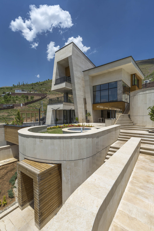 © Parham Taghioff © Parham Taghioff
 © Parham Taghioff © Parham Taghioff Text description provided by the architects. The project is located in Mosha, Iran and is about design of two villas in a site with an area of 2000 sq.m. And 40% slope. The important point at the beginning of the design is about locating zones on site and according to client order, the site was divided into 3 parts and the middle part is the common area between two villas. In this area, we placed pool volume as a valuable element and two stairs that are backbones of design and dividers of each villa's border. 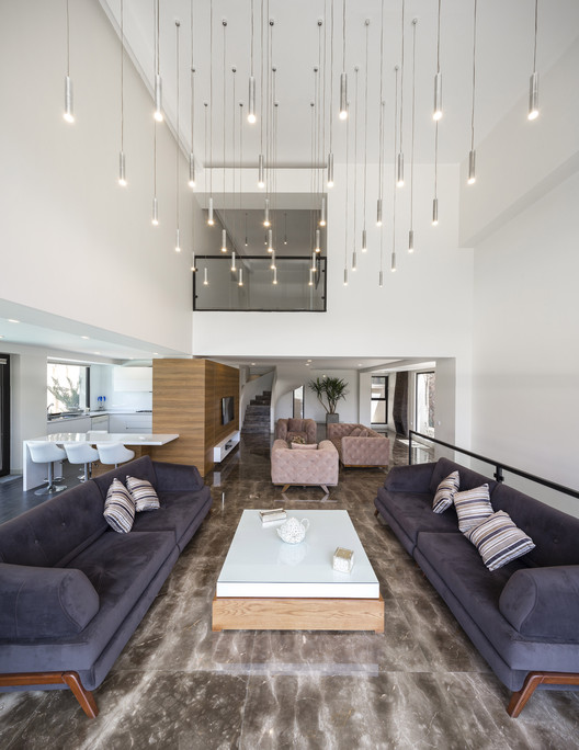 © Parham Taghioff © Parham Taghioff  Ground Floor Plan Ground Floor Plan  © Masoud Banafsheh © Masoud Banafsheh These stairs connect the lowest level of the site to the highest level. In the left and right side, we placed two villas so that they embrace the yard and stairs. Their public zones are facing to the common yard and private zones to site. According to this zoning, three levels of each block was created. Site stairs come to the landings in each level and lead to yards in front of openings.  Sections A and B Sections A and B The possibility of water flow in the project was a positive result of sites' high slope. Rainwater moves in streams and stores in the ponds in the lowest level of the site. The roofs were sloped in different directions and large openings were created to answer to climate restrictions. Openings give the most view from the inside out and in reverse. In this way, the visual privacy was obtained.  © Parham Taghioff © Parham Taghioff This posting includes an audio/video/photo media file: Download Now |
| Enka Power Station Headquarters / GAD Architecture Posted: 22 Dec 2018 01:00 PM PST  © Soner Gürsoy © Soner Gürsoy
 © Soner Gürsoy © Soner Gürsoy Text description provided by the architects. Architecture for modern infrastructural systems such as transportation, energy or public utilities has consistently employed industrial materials to achieve material and structural continuity with the technical infrastructure they serve. In this administrative building for a natural gas power station for the ENKA company in the Adapazari region of western Turkey, a steel and glass architecture was applied wıth detailed attention to the rural context and operational needs of its engineering staff. The design for the ENKA Station administrative building responds to the technical requirements for managing the power station while also providing an exemplary office environment in a rural location. This is achieved through a structural aesthetic that provides ecological efficiencies and an optimal office environment for the staff. This architecture, a robust application of a building system in light steel and glass, generates a contemporary interior enviroment with both aesthetic and enviormental priorites. Sunlight, space and natural elements are balanced in the interior creating a postivie workplace but also importantly generating savings on electric energy, an important feature in a building for energy management.  © Soner Gürsoy © Soner Gürsoy  Ground floor plan Ground floor plan  © Soner Gürsoy © Soner Gürsoy 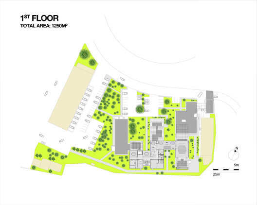 First floor plan First floor plan 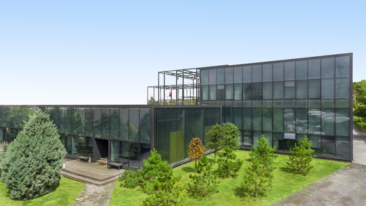 © Soner Gürsoy © Soner Gürsoy This orientation of an architecture that priorities workplace well being and environmental concerns is derived from a thoroughly modernist steel and glass structures and then optimised for the natural topography of the site and interior plan. The two-storey building consists of a series of staggered glass boxes organised inside the dramatically visible steel structure. These glass boxes are inserted into the exposed structure of arches, braces and trusses around a series of courtyards. 3 different types of glass, opaque and transparent tempered glass and translucent channel glass are used to mediate sunlight based on functions. Located in a active seismic area the resulting structure also had to accommodate strict building regulations. The architecture for ENKA Station in this way realises a performative, steel architecture yet in a original and elegant way not commonly found in buildings for infrastructure. The rural location and technical needs are also subtly balanced to give symbolic weight to an architecture where perforamnce on many levels is achieved.  © Soner Gürsoy © Soner Gürsoy This posting includes an audio/video/photo media file: Download Now |
| Creative Imagination Space for Youth / BLACKhome Posted: 22 Dec 2018 11:00 AM PST 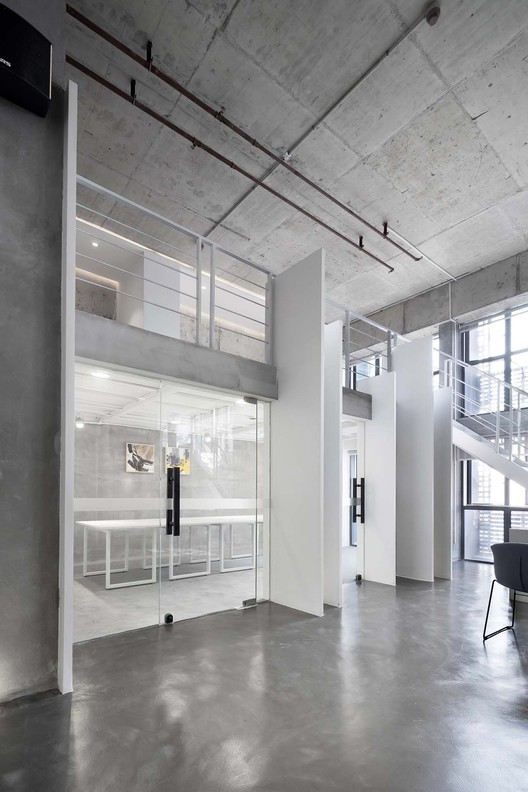 © Jey Zhu(Nantu) © Jey Zhu(Nantu)
 © Jey Zhu(Nantu) © Jey Zhu(Nantu) Text description provided by the architects. Architecture studio "BLACKhome" and the creative real estate brand "ZHAOYANG Real Estate" created a new three-dimensional community for young people – Youth union type of FOSHAN O-Cube.The "Creative Imagination Space" is located on the top floor of this skyscraper and is an important part of the youth union program.  © Jey Zhu(Nantu) © Jey Zhu(Nantu) Work And Life  © Jey Zhu(Nantu) © Jey Zhu(Nantu) Privacy And Openness  © Jey Zhu(Nantu) © Jey Zhu(Nantu)  © Jey Zhu(Nantu) © Jey Zhu(Nantu) Coloured And Coloureless  © Jey Zhu(Nantu) © Jey Zhu(Nantu) Thick And Thin  © Jey Zhu(Nantu) © Jey Zhu(Nantu) This posting includes an audio/video/photo media file: Download Now |
| The 6 Winter Stations Chosen to Warm Toronto's Frosty Beaches Posted: 22 Dec 2018 06:00 AM PST  Courtesy of Winter Stations Design Competition Courtesy of Winter Stations Design Competition Five years ago, Raw Design, Ferris + Associates and Curio founded the Winter Stations Design Competition to bring innovative design concepts to Toronto's beaches in the winter months. This year, four designs were selected from hundreds of submissions and will be joined by two student submissions to dot the beachfront alongside vacant lifeguard stations. The six successful design concepts explore the concept of "migration." This concept was internalized by each team who generated six unique and original designs that explore contemporary social issues, political issues, and the human condition surrounding "migration." From their investigations, each team brought a design to the seasonal waterfront, drawing people to the beach and inviting dialogue.
Below, we have outlined the six winning entries for the 2019 Winter Stations Design Competiton. The pavilions are expected to be built early in the new year. More information is available on the competition's official website here, and from our previous coverage of the annual event. Above the Wall Courtesy of Winter Stations Design Competition Courtesy of Winter Stations Design Competition Designed by Joshua Carel and Adelle York of Boston, "Above the Wall" allows visitors to climb adjoining staircases that connect at the top of a solid wall directly in between. This barrier, constructed around the existing lifeguard stand, is both a physical and symbolic barrier meant to evoke feelings and start a discussion about attempts to strengthen boundaries and physically inhibit individuals from crossing borders. The creators imagined one visitor ascending a staircase on one side of the wall, and another visitor on the other. The act of meeting in the middle is transformed into a psychologically unifying moment. Mind Station Courtesy of Winter Stations Design Competition Courtesy of Winter Stations Design Competition Created by Tomasz Piotrowski and Lukasz Chaberka, Mind Station provides visitors with the ability to survey the beach landscape from a new position. Once guests gather together inside the pavilion's wall, each individual is able to stand on a circular pedestal and insert their head through the circular holes in the pavilion's roof. While the body remains underneath the platform, the head or soul of the visitor can survey the landscape or interact with the other guests that are having a similar experience in the pavilion. The Forest of Butterflies Courtesy of Winter Stations Design Competition Courtesy of Winter Stations Design Competition Conceptualized by Luis Enrique Hernandez, The Forest of Butterflies represents a specific forest in Michoacan, Mexico. Each year the monarch butterfly migrates to this forest, performing a natural marvel. Many butterflies travel more than 4,000 kilometers from Canada to the Mexican forest. The beach installation is a constellation of CNC cut and assembled panels that mimic the shape of the monarch's wing. Cavalcade Courtesy of Winter Stations Design Competition Courtesy of Winter Stations Design Competition Designed by John Nguyen, Victor Perez, Anton Skorishchenko, Abubaker Bajaman, and Stephen Seungwon Baik of Toronto, Canada, the Cavalcade installation explores the human quest of life, inner reflection, and social connections with an interactive design that surrounds the masked lifeguard chair at its epicenter. The designers described their artistic intentions, stating, "Cavalcade is an installation that reflects the collective spirit of human movement and transversal. Not just in the contemporary political sense of global migration, but in the consensus that the human quest for a better life is one that is timeless and universal. Cavalcade depicts people migrating towards something better." Ground-Squared Courtesy of Winter Stations Design Competition Courtesy of Winter Stations Design Competition Ground-Squared was created by students at Humber College in Toronto. The installation combines a series of elevated platforms each placed at a different height above the beach's sandy floor. The experience of traveling from one platform to the next is meant to evoke the journey of migration and its shifting perspectives and fluctuating boundaries. Each platform, differing only marginally in height and beach location, provides a new place of reflection for the users who are encouraged to walk and climb from one geometric plateau to the next. Intuit Courtesy of Winter Stations Design Competition Courtesy of Winter Stations Design Competition Intuit, designed by students at Sheridan College, embraces the existing structure of the lifeguard stand by replicating the structure as a physical element that is migrating itself. By manipulating the scale, position, and direction of the stand, the installation causes visitors to examine patterns in placement and location - exploding the familiar. News via: The Winter Stations International Design Competition
This posting includes an audio/video/photo media file: Download Now |
| Guaíba Orla Urban Park / Jaime Lerner Arquitetos Associados Posted: 22 Dec 2018 05:00 AM PST  © Arthur Cordeiro © Arthur Cordeiro
 © Arthur Cordeiro © Arthur Cordeiro Text description provided by the architects. The Guaíba Orla Urban Park is an important gesture of the City Hall of Porto Alegre, giving back to the city and its citizens the use and appreciation of one of its most precious natural assets: the Guaíba River. It is a 56.7ha intervention along 1.5km from the shore of Lake Guaíba in Porto Alegre, the largest metropolis in southern Brazil. Serious problems related to safety, abandonment and degradation have made the area, originally part of the flood control system, a problem for the city. With the establishment of the park, a meeting point is created qualified for its 1.5 million inhabitants; 4.2 million on a metropolitan scale.  © Arthur Cordeiro © Arthur Cordeiro  © Arthur Cordeiro © Arthur Cordeiro  © Arthur Cordeiro © Arthur Cordeiro It is a project of urban and environmental regeneration that will positively affect the quality of life of Porto Alegre, generating social, economic and environmental systemic effects. People, culture, history and nature are connected in a virtuous circle of appreciation. Adjacent to the central area of Porto Alegre, the park is very well connected to the urban network, being easily accessible to pedestrians and cyclists, subway, buses and cars in general. The program brings the necessary elements for the valuation of its surroundings, through the growth of tourism, real estate valuation and recovery of the natural environment. It is an integration project that brings elements of the natural and built environments, allowing people to meet and enjoy this new space, equipped with bars, cafes, sports areas, toilets, among others. What once burdened the municipality becomes an important asset, an element of sustainability, reducing costs and adding value.  © Arthur Cordeiro © Arthur Cordeiro  © Arthur Cordeiro © Arthur Cordeiro  © Arthur Cordeiro © Arthur Cordeiro The architectural qualities of the project are linked to how it fits into the landscape, taking advantage of the topography to accommodate the necessary infrastructure and create scenic walks of contemplation. The materials are concrete, glass, wood and steel in their natural finishes, guaranteeing lightness to the whole. The curved forms take advantage of the plasticity of the concrete and the drawing relates to the movement of the waters, developing gently along the terrain. The scenic dimension of the estuary will be enhanced by the installation of bleachers that run throughout the park, offering the best seats to enjoy the "most beautiful sunset in the world". An important element of the solution is light. During the day, the light of the sun and its reflections in the Guaíba guide the spectacle; after dark, it is the turn of architecture with its lighting design to create on the boardwalk the semblance of a starry sky.  © Arthur Cordeiro © Arthur Cordeiro  Drawing 16 Drawing 16  © Arthur Cordeiro © Arthur Cordeiro The landscaping project is carefully thought about the ecological aspects of this habitat and seeks to reintroduce native species to the environment, promoting its regeneration. The remaining native vegetation remains respected by the constructed elements, implanted around it. For each sector (for example, areas subject to natural floods or the highest dry areas), specific species were selected. Overall, the project works not only as a regeneration plan, but as an open, living, and permanent environment of environmental education. From the recovery of the natural environment and the creation of a new address, the park becomes the stage for various forms of cultural and artistic expression, both traditional, as the Farroupilha Week, and new. The heritage built in the region - the Gasometer Cultural Center, the Mauá Pier and the Civic Center - will gain new visibility. The steady stream of people in the park will overflow into the city center, increasing the public to these attractions as well as injecting a new mood into the local economy.  © Arthur Cordeiro © Arthur Cordeiro  © Arthur Cordeiro © Arthur Cordeiro In addition, the park has a great positive impact on the social fabric of the city; when recovering a degraded area, increases the sense of belonging of the population and demonstrates the care of the city for its patrimony and its inhabitants. Through the architecture, landscaping and lighting technology, in conjunction with a wide range of activities, the Guaíba Urban Park shows how the symbiosis between the built and natural environments is possible, creating a vibrant and sustainable place in Porto Alegre.  © Arthur Cordeiro © Arthur Cordeiro This posting includes an audio/video/photo media file: Download Now |
| The AIA Toolkit for Architects in the Era of Climate Change Posted: 22 Dec 2018 02:00 AM PST 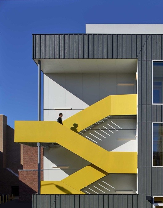 Mundo Verde at Cook Campus / Studio Twenty Seven Architecture Mundo Verde at Cook Campus / Studio Twenty Seven Architecture A misconception often surfaces in design circles that architectural beauty and evidence-based environmental performance are mutually exclusive. To address this, the American Institute of Architects (AIA) Committee on the Environment (COTE) is releasing a new tool that can assist architecture firms in designing high-performance energy-efficient buildings. Despite the federal stance on paramount environmental issues, the AIA upholds and advocates for the responsibility of architects to mitigate against the effects of climate change. Aware that the construction industry consumes nearly 40% of the energy supply nationwide, the AIA COTE® Top Ten Toolkit presents a series of strategies to promote sustainability without compromising the design.  Albion District Library / Perkins + Will Albion District Library / Perkins + Will Angela Brooks, FAIA, COTE chair and Principal at Brooks + Scarpa Architects Inc., states, "The COTE Top Ten Toolkit is a resource, accessible to all architects, that closes the information gap to designing high performing, equitable, beautiful buildings. The toolkit is designed to provide relevant, general guidance to architects incorporating deep green principles from the beginning of every project."  Fort Mason Center for Arts & Culture / LMS Architects Fort Mason Center for Arts & Culture / LMS Architects In creating such high-performance buildings, the Toolkit poses a series of fundamental questions:
 Family House / LMS Architects Family House / LMS Architects Among the 2018 Cote Top Ten, projects such as Perkins + Will's Albion District Library and Skidmore, Owings, and Merrill's United States Courthouse are recognized for their persistence in social, economic, and ecological excellence. Not only celebrating buildings that use energy-efficient technology, the AIA also aims to encourage environmentally-conscious construction processes.  Sawmill / Olson Kundig Sawmill / Olson Kundig In an effort to promote the AIA 2030 Challenge to design buildings that prioritize energy performance, the organization is reinforcing their commitments to sustainability within the profession. With a goal of facilitating efficient passive and active systems - no matter the program or the budget - this maneuver advocates for a more circular culture within construction and design. News via American Institute of Architects This posting includes an audio/video/photo media file: Download Now |
| Unitarian Universalist Society / Neumann Monson Architects Posted: 22 Dec 2018 01:00 AM PST  © Integrated Studio © Integrated Studio
 © Integrated Studio © Integrated Studio Text description provided by the architects. The Unitarian Universalist Society facility harmonizes with its natural landscape to provide reflective spaces for worship, fellowship, religious education, and administration. The congregation's collaborative decision-making engaged all 300 members to inform a deeply considered, conscientious design. Its organic form and fundamental qualities– sustainability, accessibility, flexibility, efficiency, and austerity—reinforce the Society's core principles. The facility is currently on track to achieve Zero Energy Building (ZEB) certification from the International Living Future Institute (ILFI).  © Integrated Studio © Integrated Studio  Section Section  © Integrated Studio © Integrated Studio Natural outdoor playscapes, woodland walking trails, food gardens, and charging stations optimize the site's performative and experiential potential. Volunteers patiently deconstructed the property's small existing residence, leaving a wealth of sorted materials to local non-profits. Native grasses, a geothermal heat pump loop, and photovoltaic arrays located to the building's west create a buffer to the street. Bioretention cells capture all stormwater run-off, mitigating impact to the nearby creek.  Plan Plan Locating the building in an open clearing minimizes its impact on wooded habitats and sets the stage for an understated, visceral entry procession. Through the portal-like front door, one passes through the lower, curved support program bar into a transparent Narthex that separates the Fellowship Hall on the north from the Sanctuary to the south. The transition from compression to expansive openness invites the natural panorama to provide a dramatic sense of arrival. Beyond fully-glazed walls, the forest provides dappled intimacy. The sanctuary's prow extends south, a stone's throw from a mature evergreen grove. Services pause respectfully as deer and woodland creatures pass.  © Integrated Studio © Integrated Studio This posting includes an audio/video/photo media file: Download Now |
| Intruders in the Boys' Club: Women Redefining Success in Architecture Posted: 21 Dec 2018 11:30 PM PST 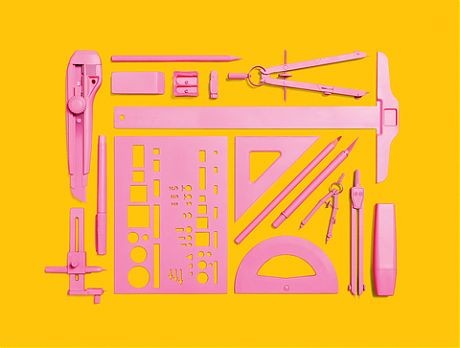 via Alexandra Lange via Alexandra Lange Whether it be the overly-dainty posture of scale model figures or the assumptions of being the in-house decorator, the portrayal of women in architecture is often one of subservience. Despite Despina Stratigakos' hands-on efforts behind Architect Barbie or the global impacts of the legacy of starchitect Zaha Hadid, there continues to be a lack of visibility of women in the profession. In a recent article in the New York Times, writer Allison Arieff poses the echoed question that the architectural community keeps asking itself, "Where are all the female architects?" No longer an issue of uneven gender ratios in architectural schooling, the persistence of dwindling numbers of women principals at the top of firms simply does not resonate. She postulates, that perhaps more significant than the statistics, the real problem lies in the definition of success.  Zaha Hadid Zaha Hadid Rampant within architecture schools, the histories and teachings of white male architects dominate, while there remains to be a stark deficit of female names on course syllabi and occupants in boardroom chairs that perpetuate this lone idea of aspiration. In this increasingly multiplicious profession, these single stories are no longer sufficient. Landing high-end commissions for corporate skyscrapers or prominent museums is commendable, but certainly not the only way to succeed in the profession. If these alternative paths or different individuals in positions of power are not represented, how can one start to envision different goals? Perhaps, this is why the low numbers of women recur in practice.  Liz Ogbu Liz Ogbu Arieff discusses the types of success for three different practicing women that are accomplished by anyone's definition, yet they receive inadequate recognition for their contributions in the field. Liz Ogbu, a trained architect at the Harvard Graduate School of Design prefers her self-dubbed title of a "social innovator" as she designs homes for low-income urban dwellers in Ghana. She shares her own definition of success:
 Jeanne Gang Jeanne Gang Receiving commendation for being a "good woman architect" or promotions for balancing the gender ratios in a firm devalues the resultant goal. In promoting true equality, Arieff quotes Jeanne Gang, the founder of Studio Gang, who writes, "Unlike other measures of value, pay is a number. It's tangible and objective." These efforts by Gang represent the simple and immediate change to encourage and sustain female participation and success. As Amale Andraos, the dean of Columbia GSAPP and co-founder of WorkAC, puts it, "There is so much available to be reinvented. The definition of success is up for grabs." News via The New York Times This posting includes an audio/video/photo media file: Download Now |
| Narrow Door House / Alberto Craveiro Posted: 21 Dec 2018 09:00 PM PST  © Alberto Collet © Alberto Collet
 © Alberto Collet © Alberto Collet Text description provided by the architects. Architectural project of a building to support parish activities in Gamil, in the municipality of Barcelos. The land has an area of 14 836.00 m2 and is owned by the applicant, Factory of the Parish Church of St. John the Baptist of Gamil. The terrain has the shape of an irregular polygon, with a slightly accentuated and leafy relief. A construction of 106.18m2 on 1 floor based on a land of 14 836.00m2. The implementation of the construction was defined by the pre-existence to be recovered.  © Alberto Collet © Alberto Collet The entrance to the land will be made by the existing street. From the entrance there is an access that sits on the ground and serves both the proposed equipment and the parish residence.  Plan Plan The whole construction envelope is made with facings in granite masonry. The living spaces will be turned towards the interior of the land. The entrance will be made by the outer zone marked with a steel-colored portico and from this succeed the various living spaces in a clear and linear path.  © Alberto Collet © Alberto Collet In total there will be a youth room, a youth office, an oratory, two toilets and a storage area. It was decided to implant the construction inside the ruins enlarging a bit the construction area in the southwest direction taking advantage of the views.  Corte Corte The outer coatings adopted will recall the existence of simple granite walls, with aluminum frames and glass cloths. All the logic of the architectural intervention goes in the sense of minimizing the impacts of the intervention, trying to integrate as much as possible the architecture in the place, maintaining the morphology of the land and the existing afforestation. Some exterior wall panels will be in granite masonry, with an inner cloth in plasterboard, holding between them an air box insulated and insulated. The structure will be in reinforced concrete. The exterior window frames will be white aluminum, with double glazing. The cover will be insulated with extruded polyurethane sheets, Roof-Mate / Dow type, and plasma-ceramic tile coated. The apparent skylight on the roof will be in white towed concrete. From the inside the sides and ceilings will be smooth and painted white. The interior doors will be in MDF lacquered in white.  © Alberto Collet © Alberto Collet The pavement of automobile and pedestrian circulation will be constituted by cube of blue granite, maintaining joints with about 5 cm of edge, without guides and laid in sand cushion on compacted soil. The land will be maintained in its natural state.  © Alberto Collet © Alberto Collet It also has two toilet facilities that can be used by disabled people, with enough circulation for free access to the toilet. The building is designed to ensure its use by people with special needs / mobility.  © Alberto Collet © Alberto Collet This posting includes an audio/video/photo media file: Download Now |
| You are subscribed to email updates from ArchDaily. To stop receiving these emails, you may unsubscribe now. | Email delivery powered by Google |
| Google, 1600 Amphitheatre Parkway, Mountain View, CA 94043, United States | |
Nema komentara:
Objavi komentar