Arch Daily |
- B&B La Mugletta / Integrate Collective
- Open House at Central Embassy / Klein Dytham architecture
- 8 Urban Elevators That Bring Connectivity and Continuity to Cities
- This Wood Pavilion is Supported Entirely Through Origami Folds
- Granja Julieta House / Jamelo Arquitetura
- Alvaro Siza’s Galician Center of Contemporary Art Through the Lens of Fernando Guerra
- 6 Must-See Architecture Documentaries and Series on Netflix
- Erweiterung Primarschule Evilard / dolmus Architekten
- 5 Online Resources That Explore The Intersection Between Landscape, Architecture and Culture
- Pirogovka Apartment / Le Atelier
| B&B La Mugletta / Integrate Collective Posted: 29 Jul 2017 07:00 PM PDT 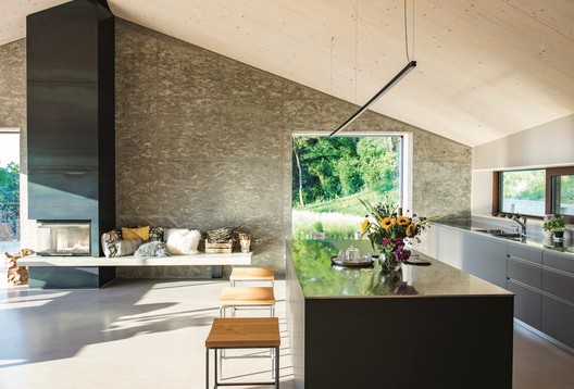 © Antony Wilder © Antony Wilder
 © Antony Wilder © Antony Wilder From the architect. A place where nature is part of the well-being of the home and its inhabitants: the project of the IntegrateCollective for the B&B La Mugletta eliminates every barrier between interior and exterior space. The research and creativity behind the project La Mugletta, a B&B in the Euganean Hills near Padua, has evolved in harmony with the desire of the owners to create a cozy and comfortable place for receiving guests, offering a stay in an atmosphere of peace, being able to live real moments of true "otium" (leisure) feeling embraced by nature.  © Antony Wilder © Antony Wilder The project has created a place where, in addition to accommodations and hospitality for single events, it is also possible to carry out ceramic workshops and experimentation in the kitchen. In the future, it is the aim that these will become occasions and moments of integration with a disability, eliminating not only the physical but also the mental frontiers.  Ground Floor Plan Ground Floor Plan Family, nature, protection, sustainability, growth, care, relaxation, diversity, ability and disability integration, well-being, time, serendipity, sharing, simplicity and conviviality are the client's key words on which the design idea of IntegrateCollective is founded and which gave rise to a single space in which nature and architecture are seamlessly intertwined and where the strongly characterizing element of the large corner glass is the focal point of this continuum between in and out.  © Antony Wilder © Antony Wilder To strengthen the bond with the surrounding nature, the project uses natural materials and high-tech solutions for a home with low environmental impact. The structure was made of XLAM wood with wood fiber insulation and external larch lining; the basement in reinforced concrete laid in wooden texture boxes, with cellular glass (Foamglass) insulation. The materials are all used in their original essence: wood, cement, iron.  Underground Floor Plan Underground Floor Plan Energetically the house is autonomous: heating and cooling are produced with heat exchangers using the thermal energy present in the ground through two geothermal probes positioned at 150 meters deep. Total rainwater recovery is carried out, which is conveyed by rainwater and drainage systems to an underground tank.  © Antony Wilder © Antony Wilder The use of the lights (all LED) also contributes to the recognition of internal and external building volumes and enhances the properties of the materials used and differentiates the interior spaces according to their function. All the elements of this project have been tailor-made: from architecture to furnishings, from lights to brand.  © Antony Wilder © Antony Wilder Together with the architectural project, IntegrateCollective has also created a name and logo. The name is a descendant of the family surname in a unique, pleasant and at the same time mysterious and catchy sound: La Mugletta. The logo was born from the evolution of the sign that the buyer used for his ceramic works, integrating the initials of family names (U.-E.-S.-V.-M.) into a single distinctive sign, like a flower (nature) embedded in an almost heraldic form (the family). Name and logo together express the warm feeling of this family dream. A feeling that is perceived strongly by living in this "natural architecture"...  © Chap Achen © Chap Achen The integration with nature, of course, means that special attention has to be also given to the design of the garden. This was aimed at connecting naturally the main elements of the surrounding landscape with the interior and exterior of the building. Nature enters the garden design with a soft-shaped composition. Through their natural rhythms, groups of evergreens, shrubs, herbaceous perennials and grasses mark the seasons in harmony. It's a garden that lives. Growth, variations in shape, color, and succession of blooms throughout the year contribute to creating movement, enhancing the natural appearance and bonding with the landscape. Adapting to morphology, terrain display and preserving existing elements, the three basic colors that characterize the interiors of the building and the rooms: green, yellow and orange have been reworked and inserted. These colors are proposed through the vegetation, in various shades and textures.  © Antony Wilder © Antony Wilder The old trees have been kept and the maple of completed maples enhanced by the panoramic views enjoyable on the terrace. The orchard has been integrated with new species and allows to exploit the most sloping areas otherwise unused, while a large area already in the garden allows enjoying the fruits of the earth. This posting includes an audio/video/photo media file: Download Now |
| Open House at Central Embassy / Klein Dytham architecture Posted: 29 Jul 2017 01:00 PM PDT 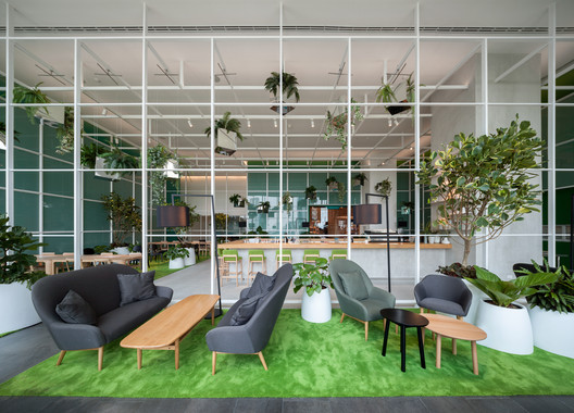 © Ketsiree Wongwang © Ketsiree Wongwang
From the architect. Open House is located in the Central Embassy complex 50m above Bangkok. It features a village of spaces each with a familiar human scale - restaurants, bars, galleries, stores, pop-ups, libraries and workspaces that all seamlessly work together. In today's mega cities there is nowhere to pause, take a breath, sit or simply get back in control of your senses, especially in the stifling heat of Bangkok. Open House is the antidote to this - it is an oasis, a getaway - a place where you can feel at home.  © Ketsiree Wongwang © Ketsiree Wongwang The brief revolved around fourteen restaurants and bars, a bookstore, a co-working space, a kids space and various communal areas. With this many components and functions it soon became clear that navigation was the key to the project. How could we break down this aircraft-hanger-like space into an understandable and seamlessly connected village? By developing a series of towers for each of the restaurants we could: • Make the restaurants visible from a distance by making the towers act like totems  © Spaceshift Studio © Spaceshift Studio The towers are clad in a family of different timber fretwork patterns; the variety in these patterns serves to change the way light passes through the towers as you move through the space. Mirrored panels on the ceiling around the towers make them appear to extend beyond the space and also break down the immensity of the ceiling.  Floor Plan Floor Plan The bookstore element is linear and a path with reading stops along the way weaves its way through the space. A tall book tower anchors the bookshop at one end of the space, and a large double height library wall wraps around at the other end. The bookstore seamlessly integrates into the bar and restaurant spaces and allows people to browse freely.  © Ketsiree Wongwang © Ketsiree Wongwang An Art Tower sits under the main roof light, which contains a small gallery and a look-out surrounded by trees on top. The internal gallery forms an intimate space within the Open house for art exhibitions. Externally the tower has illuminated shelves for displays and large plain surfaces for future art exhibitions and installations.  © Ketsiree Wongwang © Ketsiree Wongwang Open House also includes 'the greenhouse' a co-working space which is located behind the book wall and provides a quieter, more secluded space for working and a suite of meeting rooms. Food and drinks from any one of the restaurants can be ordered and delivered to your desk.  © Ketsiree Wongwang © Ketsiree Wongwang The Central Embassy complex is in a surprisingly leafy area of Bangkok, overlooking the British Embassy complex on one side and more green tree tops on the other. We wanted to extend this notion of greenery inside and to achieve this and reduce the impact of the extensive white ceiling, we devised a pattern of leaves that spreads cross the whole space. The 9,600 leaves were hand painted over a series of 6 weeks and collectively create an amazing art work, an iconic and memorable element of the space.  © Ketsiree Wongwang © Ketsiree Wongwang This posting includes an audio/video/photo media file: Download Now |
| 8 Urban Elevators That Bring Connectivity and Continuity to Cities Posted: 29 Jul 2017 09:00 AM PDT  When working in an urban area with a complex topography, one of the biggest challenges is urban integration. Worldwide, many socially deprived neighborhoods are situated in complicated geographical locations surrounded by steep slopes. Such areas complicate mobility for pedestrians, cyclists, and the elderly, with a lack of accessibility often excluding them from taking part in city life effectively. In this context, urban elevators can be a novel solution which combine elements of both functional connectivity and sculpture. With some rising up to 30 meters in height, they become urban and touristic landmarks, creating new viewpoints and walkways. Additionally, in many cases, they can help to uphold the historic legacy of the city. Below we have collected some interesting examples of urban elevators that have been key in the spatial planning of the urban environment. New Access to Gironella's Historic Center / Carles Enrich © Adrià Goula © Adrià Goula Urbanization and Urban Elevator in Galtzaraborda / VAUMM © Aitor Ortiz © Aitor Ortiz Accessible Ribadeo / Abalo Alonso Arquitectos © Santos Diez © Santos Diez Limmat Footbridge and Promenade Lift / Leuppi & Schafroth Architekten © Roger Frei © Roger Frei The Roman Walls of Lugo Elevator / Antonio Pernas Varela © Antonio Vázquez © Antonio Vázquez Urban Elevator in Echavaoiz / Ah Asociados © Image2 visualization studio © Image2 visualization studio Pfaffenthal Lift / STEINMETZDEMEYER © Boshua - Bohumil Kostohryz © Boshua - Bohumil Kostohryz Urban Elevator and Pedestrian Bridge / VAUMM Courtesy of VAUMM Courtesy of VAUMM This posting includes an audio/video/photo media file: Download Now |
| This Wood Pavilion is Supported Entirely Through Origami Folds Posted: 29 Jul 2017 07:00 AM PDT
As part of Concéntrico 03, architects Manuel Bouzas Cavada, Manuel Bouzas Barcala and Clara Álvarez Garcí designed a temporary exhibition pavilion in the Escuelas Trevijano Plaza, with the objective of "making the unclear, transparent, and the heavy, light." A paper sheet alone does not sustain itself, but when formed in a series of precisely folded sheets, they are capable of sustaining not only themselves but also much greater forces. With the same logic, a wooden panel does not sustain itself but when formed as a series of precisely folded wooded panels, it has the capacity to sustain not only itself but to support much more. An example of this is the information pavilion at Concéntrico 03.  © Josema Cutillas © Josema Cutillas  © Josema Cutillas © Josema Cutillas The idea is simple; we want to generate an icon, an attractive exhibit that seeks to stir curiosity and catch the attention of the city´s inhabitants. But also, we want to show that the Garnica panels are self-supporting; we haven't used any supporting structure or sub-structures. We have only used the starting material, the Garnica panels: 39 of them. The construction is also simple; the panels are joined with hinges that permit rotation.  Courtesy of Manuel Bouzas Courtesy of Manuel Bouzas Once all the panels are connected, we let them fall and, voila! Gravity does its job. Just like a piece of folded paper, like origami.  © Josema Cutillas © Josema Cutillas  Courtesy of Manuel Bouzas Courtesy of Manuel Bouzas
 © Josema Cutillas © Josema Cutillas About the architects: Manuel Bouzas Cavada is an architect from the Superior Technical School of Architecture of A. Coruña (1988), with more that 25 years of experience in design, project management and leadership in property and urbanism. He also consults on projects and BIM interventions, is a guest professor in graduate universities and actively participates in research projects. Manuel Bouzas Barcala and Clara Álvarez García are two young architects from the Superior Technical School of Architecture of Madrid (2016). Their academic paths have taken them through different university and cities of the world such as: Madrid, Lisbon, Santiago of Chile, Seoul and Tokyo. They have collaborated on a range of different architectural research projects with Aires Mateus and Associates and Atelier Bow Wow. Additionally, they have complemented this experience in the practical field with research completed in the Superior Technical School of Architecture of Madrid. This posting includes an audio/video/photo media file: Download Now |
| Granja Julieta House / Jamelo Arquitetura Posted: 29 Jul 2017 06:00 AM PDT  © Nelson Kon © Nelson Kon
 © Nelson Kon © Nelson Kon From the architect. The house is located in a quiet residential neighbourhood in the south of the city of São Paulo, very close to a beautiful square widely used by local residents. Embedded into an urban lot, the residence is composed by a single volume that has been placed in the frontal part of the terrain leaving room for a large rear garden. Apart from the pedestrian entrance, by the street there's only a parking spot for two cars and, behind a side green wall, the small uncovered service area.  © Nelson Kon © Nelson Kon The owners wanted an integrated living area with the rear garden and to be able to enjoy them privately. Therefore, the project left the laundry room and the employees bathroom in the front side of the volume and opened both to the side corridor. Besides that, as an extension of the service area, a storage room was built in the basement.
This layout made it possible to completely open the kitchen and living rooms and combine them with the garden through the terrace and large glass sliding doors. Over the terrace there's a pergola with climbing plants, creating a transition between the internal and external spaces. The upper floor houses four suites arranged around a family room. The rooms facing the garden or the street have large floor-to-ceiling windows that open to the outside area and, in the case of the main suite, to a small balcony.  © Nelson Kon © Nelson Kon  Site Plan Site Plan  © Nelson Kon © Nelson Kon The construction system consists of in situ concrete structure, clay hollow bricks and concrete slabs. To improve the buildings energetic performance the roof slab was covered with thermoacoustic tiles.  © Nelson Kon © Nelson Kon The house's materialization is frugal and unpretentious. The project thematised the contrast between a heavy, almost crude, facade and simple and light interiors. Externally there's the rusticity of brownish bricks opposing to the materials used internally, such as: clean porcelain tiles in the wet areas, smooth wooden floors in the interior areas and white walls and ceilings. Dark doors and windows outline the spaces. The tailor-made PVC frames were developed with the factory and painted accordingly to the project.  © Nelson Kon © Nelson Kon It was the owner's choice to use simple, but always high-quality materials and finishes. The result is a very elegant construction.  © Nelson Kon © Nelson Kon This posting includes an audio/video/photo media file: Download Now |
| Alvaro Siza’s Galician Center of Contemporary Art Through the Lens of Fernando Guerra Posted: 29 Jul 2017 05:00 AM PDT
The following photo set by Fernando Guerra focuses on the Galician Center of Contemporary Art, a project by Portuguese architect Álvaro Siza Vieira. Located in the Spanish city of Santiago de Compostela, the Galician Center for Contemporary Art was developed in 1993. Its declared horizontality and respect for the surrounding buildings and the urban structure are configured in the most remarkable gestures of this project. The solid and austere volumes form the boundaries of the area to the streets, with subtractions that make it accessible. The center has several permanent and temporary exhibition rooms, auditorium, library, cafeteria and administrative rooms. 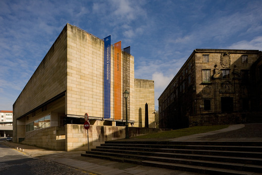 © Fernando Guerra | FG+SG © Fernando Guerra | FG+SG 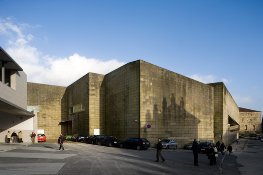 © Fernando Guerra | FG+SG © Fernando Guerra | FG+SG Granite is used blending to the surroundings, with the material "aging" along with the building, resembling the neighboring buildings, that are also built of the same material. Inside, Siza concentrated on three main materials: granite, marble, and wood, with a sobriety that allows a clear reading of the volumes. The sculptural details of the terrace and the presence of the light in the interior conform transform each ambiance when moving between the rooms. 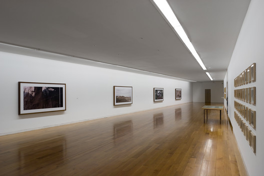 © Fernando Guerra | FG+SG © Fernando Guerra | FG+SG According to the architect, the building is configured as a longitudinal structure oriented in the north-south direction, composed of two heights and volumes with three L-shaped plans that interpenetrate at the south end, to give rise to a triangular intermediate courtyard. The average height of the volumes coincides with the neighboring buildings, a convent, and a church. The volume fulfills a mediating role between the various scales of the surrounding buildings.  © Fernando Guerra | FG+SG © Fernando Guerra | FG+SG Full photoset in the gallery below: Reference: This posting includes an audio/video/photo media file: Download Now |
| 6 Must-See Architecture Documentaries and Series on Netflix Posted: 29 Jul 2017 02:30 AM PDT  via Netflix via Netflix Netflix isn't just a great service for relaxing or procrastinating—it can also be a great learning tool for architecture and urbanism. That is why we have put together seven tips—including both series and documentaries—for architecture-related viewing that, in addition to being entertaining, can help broaden your knowledge. Abstract: The Art of Design
Grand Designs
Bikes vs Cars
Minimalism: A Documentary About the Important Things
Secrets of Great British Castles
NOVA: Ground Zero Supertower
This posting includes an audio/video/photo media file: Download Now |
| Erweiterung Primarschule Evilard / dolmus Architekten Posted: 29 Jul 2017 02:00 AM PDT  © Bern & Aytac Pekdemir © Bern & Aytac Pekdemir
 © Bern & Aytac Pekdemir © Bern & Aytac Pekdemir From the architect. The urban figure refers strongly to the existing complex. A two-storey building is placed on the back of the existing schoolhouse. It is connected to the school at the narrowest point. This creates an elongated court, which creates an atmospheric meeting, residence and communication space for the school.  Site plan Site plan The old building remains visible and is formed together with the new building into a whole. The constant continuation of the roof design will be experienced as a unit throughout the school area.  © Rolf Siegenthaler © Rolf Siegenthaler The new building is developed from the old building. Due to the given interior structure of the old building, three connection points are created. Thanks to the passerelles between old and new buildings, the school building works as a whole. The passerelles generate covered outside areas, which also define the inputs.  © Rolf Siegenthaler © Rolf Siegenthaler On the ground floor, the dayschool and the multi-purpose room are accommodated with the adjoining rooms. The dayschool is characterized by an open space design, whereby the rooms can be divided according to needs. The main rooms have a two-sided exposure, on the one hand to the court and the northern playground.  © Rolf Siegenthaler © Rolf Siegenthaler The classrooms are located on the upper floor. The school rooms are also exposed on two sides. The group rooms are appropriately placed between two classrooms. This grouping is based on a clear grid. All of the rooms have large window areas and profit of optimal lighting conditions.  Plans 02 Plans 02 The corridors are complemented in important circulation areas with spacious open zones. The accommodation and working spaces of the teaching staff are located in the existing building on the southeast side. The central location next to the entrance area ensures short distances, a good overview of the area and thus a simple school operation.  © Bern & Aytac Pekdemir © Bern & Aytac Pekdemir The facades are equipped with additive windows with an adequate restraint. The visible concrete construction takes over the existing yellow colour from the neighbouring school buildings.  © Bern & Aytac Pekdemir © Bern & Aytac Pekdemir The compact school building takes account of the land reserve in the east of the center for future expansion buildings.  © Rolf Siegenthaler © Rolf Siegenthaler This posting includes an audio/video/photo media file: Download Now |
| 5 Online Resources That Explore The Intersection Between Landscape, Architecture and Culture Posted: 29 Jul 2017 01:00 AM PDT  At times, Landscape design lacks proper consideration or its overlooked within architecture, as a result of current but preconceived notions within architectural practice and education that privilege building over site, or the constructed over the existing. While at face value, landscape is treated as an abject and constant entity of sorts, the reality is that it possesses a layered complexity of patterns and ecosystems, much of which is increasingly impacted by our own actions, more significantly than what meets the eye. At the same time, the definition of landscape is constantly evolving to encompass a greater number of influences and factors. We have cultural, built and ecological landscapes, which influence one another and come about as a result of the intersection between the architecture and the environment that we are presented with. As a result, it is important to view terrain in a more holistic light, acknowledging its ecological underpinnings and well as the anthropological effects it is subject to, both physically and theoretically. Here is a list of five online resources, which investigate the interdisciplinary nature of landscape design and its relation to architecture and culture.  Landformation Catalogue Focussing on the rapid anthropogenic activity that has drastically altered the condition of the Earth, Landformation Catalogue is an online platform for an exhibition previously organised by members of the Harvard University Graduate School of Design (GSD). This resource delves into various forms of human intervention in relation to land forming, specifically through lenses of morphology, assembly, technology, application and history (all of which are defined on the website). Information is conveyed via the predominant use of typological maps and diagrams, which in turn offer examples on representation techniques. At the forefront of the catalogue's content is the literal impact we have on our landscapes, and the methods we undertake that result in this.  Places Journal Founded at MIT in 1983, Places Journal is a free academic resource that provides trusted scholarly opinion on the future of contemporary landscape architecture and urbanism. The journal is associated with numerous academic institutions across the world, and is a resource for leading voices in their respective fields to provide insight into problems and conditions currently faced by our built and natural environment, and how to pave a way forward. The website celebrates user engagement through the creation of public reading lists, which compile environmental, political and cultural topics, such as climate change, technological innovation, real estate economics, racial geographies and media. The content ranges from journalism to scholarly work, and is a valuable resource to educate and influence research on contemporary landscape.  Socks Studio Self-described as "a nonlinear journey through distant territories of human imagination", Socks is a visual curation of interdisciplinary precedents, ranging from unbuilt architecture and musical scores to scientific principles and geometry. Founded by the Paris based pair of Italian architects, Mariabruna Fabrizi and Fosco Lucarelli, the notion of territory appears as a central theme throughout the website, tying the various categories together. Landscape is not solely treated as the nature that surrounds us; it extends to encompass cultural influences, patterns in the built environment and the underlying permanence that transcends and shapes the variety of environments created at the intersection between architecture, society and landscape.  Atlas of Places Photography and research are the two main outlets through which Atlas of Places explores existing relationships between large scale architecture and its site, relying primarily on aerial photography and maps to capture the essence of projects and geologies, all of which are featured as submissions. Through the aerial photographs and maps, one can see the gradation of colour as it bleeds through the earth, the way rivers weave through changes in topography, and the man-made geology created as infrastructure interacts with land. Created by Thomas Paturet and and Muriz Djurdevic, the non-profit journal highlights the actual immense scale of the land and water networks in which we fit in, something that we are unable to truly understand at the human scale and through architecture on its own.  Scenario Journal Scenario is an online publication based on the idea of "landscape urbanism", which was also the journal's original name (whose archives are available on the website). Derived from the 20th century idea of scenario planning, the journal provides a list of built and conceptual projects that respond to the changing conditions of landscape "with nimble and contingent operations rather than singular and totalizing designs", offering techniques and methods to incorporate within one's own practice. Environmental performance, urban infrastructure and migration are a few areas of importance that articles focus on, with six different issues to date contributed by individual submissions.
This posting includes an audio/video/photo media file: Download Now |
| Pirogovka Apartment / Le Atelier Posted: 28 Jul 2017 10:00 PM PDT  © Ilya Ivanov © Ilya Ivanov
 © Ilya Ivanov © Ilya Ivanov From the architect. Our client spent her whole childhood in this apartment, and we were to make it Home for her and her husband. It makes a great difference between reconstructing an old apartment and working with a new one, where you should simply customize and personalize an empty box. In this project the space, originally, was not empty, but was full of memories and emotions. This is exactly the case when you are facing a dual task — you should keep the memories skipping some them and adding something new at the same time. A lot of our spatial decisions were based on this very idea of duality.  © Ilya Ivanov © Ilya Ivanov  Axonometric 4 Axonometric 4  © Ilya Ivanov © Ilya Ivanov The composition of the apartment includes three main blocks which seem to fill one common space: a long black cabinet, kitchen island, and emerald block, including kitchen, bathroom, and bedroom. We deliberately faded out the borderlines between repaired and destroyed, between rooms and colors. The color filling the bedroom spreads farther beyond its space borders. The color borders of the emerald block could be clearly marked, but instead they spread blurring the space borders.  Apartment Plan Apartment Plan The white color of the floor, which, in some way, reflects everything happening in the room, comes over the wall slowly vanishing and uncovering a plain ceiling that has been here since the very beginning, thus, linking this new Home with memories of the past. The black cabinet, filling the whole space of the living room, and the black kitchen island present the clearly bordered blocks. However the cabinet, being reflected in the mirror of the hallway, seems to be quite endless. Another theme of the apartment is presented by transparent scribed grid applied to the new space painted by chairs, armchairs, bathroom window, and ceiling fitting wires covered by white tubes. The grid of the tile is changeable itself and sparkles with different colors. Some items from the old house — cut-glass ware and some pieces of furniture stuffed with memories — are whispering about something important. But we can't say anything about it — this story is not ours.  © Ilya Ivanov © Ilya Ivanov This posting includes an audio/video/photo media file: Download Now |
| You are subscribed to email updates from ArchDaily. To stop receiving these emails, you may unsubscribe now. | Email delivery powered by Google |
| Google Inc., 1600 Amphitheatre Parkway, Mountain View, CA 94043, United States | |


Nema komentara:
Objavi komentar