Arch Daily |
- The Escape Pod / Podmakers
- Can Clariana Cultural Civic Center / BCQ arquitectura
- Triumfalnaya Square / Buromoscow
- Aluminium House / Ayutt and Associates Design
- Issana Beach House / Chinthaka Wickramage Associates
- Take in The Views With This Prefabricated Curved Glass Sliding Doors
- New Public Transit Map Series Launches with London Underground
- #6 / Studio Wills + Architects
- Stunning Images of Stone Architecture, Take II: The Best Photos of the Week
- Hiroshi Sambuichi: "I Take Something that People Already Like, and Make Them Even More Aware of It"
- 400 Fairview / SkB Architects + Kendall/Heaton Associates
- Draw Inspiration From These 21st Century Bathroom Designs
- Manufacture Design / Saguez & Partners
| Posted: 19 Nov 2017 09:00 PM PST  © Tim Brotherton © Tim Brotherton
 © Tim Brotherton © Tim Brotherton Text description provided by the architects. The Escape Pod is an elliptical, organic, rotating pod. An engineered, unique outdoor space which can be used as a garden office, studio, snug or retreat. Designed and crafted in the Gloucestershire countryside, the Escape Pod was born out of a desire to create a beautiful, striking outdoor structure. One that nestles into its environment, is made to a high-quality finish and is contemporary in style. A unique space to escape to, the Escape Pod offers a place to work, meditate, socialize or sleep.  Section Section  © Tim Brotherton © Tim Brotherton To achieve its curved form, the pod's design exploits innovative CNC milling and making techniques. This enables it to be fabricated with precision in the workshop, entirely from wood. Birch plywood, chosen for its strength and aesthetic qualities, forms the structure. It is exposed internally; from the pod's framework to the bespoke laminated door hinge. Externally, the pod is clad with cedar shingles and the stairs and window sills are clad in European Oak, which has natural weather resilient properties. Over time the Cedar and Oak develop a silver hue, allowing the pod to blend harmoniously into its surroundings.  © India Ash © India Ash The organic nature of the Escape Pod's materials contrasts with the engineering employed in its design. Amongst its most impressive features is an aircraft-style plug door with a unique wooden hinge mechanism. The pod sits on a raised platform half a meter from the ground which allows it to be rotated - by lifting the steps, it is spun to face the desired direction. Each pod can be tailored to suit the clients' needs, from the window placement and internal finish to the integrated fittings and furnishings. Heating (wood burner or underfloor), electrics and insulation options can also be incorporated. The price of the Escape Pod starts at £19,800 but will vary slightly, depending on style specifications.  © India Ash © India Ash Dominic Ash and Jeremy Fitter have collaborated to create the Escape Pod, a union of high-quality furniture design and a desire to engineer small spaces. Podmakers benefits greatly from working closely with Dominic Ash Ltd and the 30 years of design experience Dominic brings to the team. After a Master's in civil engineering, specializing in treehouse design, Jeremy's ideas were planted on more solid ground after working for Dominic Ash Ltd. Combining his engineering background with a passion for creating imaginative spaces has propelled Jeremy to create the escape pod.  © India Ash © India Ash This posting includes an audio/video/photo media file: Download Now |
| Can Clariana Cultural Civic Center / BCQ arquitectura Posted: 19 Nov 2017 07:00 PM PST  © Jordi Sánchez (BCQ arquitectura barcelona) © Jordi Sánchez (BCQ arquitectura barcelona)
 © Jordi Sánchez (BCQ arquitectura barcelona) © Jordi Sánchez (BCQ arquitectura barcelona) Text description provided by the architects. The new civic center, formerly known as Espai Felip II, was a medium sized old theater within the Association of neighbors of the Congrés-Indians neighborhood, which has become obsolete due to the deterioration in time.  © Jordi Sánchez (BCQ arquitectura barcelona) © Jordi Sánchez (BCQ arquitectura barcelona)  Scheme Scheme  © Jordi Sánchez (BCQ arquitectura barcelona) © Jordi Sánchez (BCQ arquitectura barcelona) It is an austere and rational construction, while simple in its materials.  © Jordi Sánchez (BCQ arquitectura barcelona) © Jordi Sánchez (BCQ arquitectura barcelona)  Section Section  © Jordi Sánchez (BCQ arquitectura barcelona) © Jordi Sánchez (BCQ arquitectura barcelona) These actions make sense from the moment when they are aimed at providing the theater maximum functionality and comfort.  © Jordi Sánchez (BCQ arquitectura barcelona) © Jordi Sánchez (BCQ arquitectura barcelona) This posting includes an audio/video/photo media file: Download Now |
| Triumfalnaya Square / Buromoscow Posted: 19 Nov 2017 06:00 PM PST  © Vlad Feoktistov © Vlad Feoktistov
 © Vlad Feoktistov © Vlad Feoktistov Text description provided by the architects. Triumfalnaya square is located at the crossing of Moscow's main street Tverskaya with the Garden Ring. Buromoscow design has been chosen as a result of a first open competition for a public square in Moscow in 2013. The competition aimed at bringing back to life city square by Soviet architect Chechulin built in 1958, that in the last years became a transit space, half occupied by parking. Buromoscow proposed 5 steps for improvement:  Steps Diagram Steps Diagram  © Vlad Feoktistov © Vlad Feoktistov 1. Divide a square and a garden  © Vlad Feoktistov © Vlad Feoktistov 3. Make it more classical.  Diagram Diagram Lilac garden gives the place a true Moscow inner courtyard feel.  © Vlad Feoktistov © Vlad Feoktistov This posting includes an audio/video/photo media file: Download Now |
| Aluminium House / Ayutt and Associates Design Posted: 19 Nov 2017 04:00 PM PST  Courtesy of Ayutt and Associates Design Courtesy of Ayutt and Associates Design
 Courtesy of Ayutt and Associates Design Courtesy of Ayutt and Associates Design Text description provided by the architects. This Aluminium House tackles head on the brief of combining sculptural modern architecture with the everyday requirements of a good ventilation, heat protection, liveable and home. The house is located on a single land plot in suburb of Bangkok, Phutthamonthon Sai3 road, Thailand. The house was designed by Ayutt and Associates design (AAd) for 3 families of the 3 generations : grand parent, Daughters and grand son. The house comprises of 1,500 sq.m. of useable space. There are 5 bedrooms with their own private bathroom, main living space, Asian and Western kitchen, Multi-function space and Support function. The main living space, corridors, swimming pool, terrace and garden were designed as the open plan layout for the visual-linkage for all of the said area. This house revolts the contrasts requirements of any ordinary- house requirements with the demand for an engaging sculptural form architecture.  Courtesy of Ayutt and Associates Design Courtesy of Ayutt and Associates Design The house concept was begun with simple idea as stacked boxes. The space is composed of three elements as the solid box, the glass box, and the aluminium box that encloses the central courtyard and swimming pool. The house becomes a right angle "H" shape to embrace and open the house to landscape. The simplicity of each courtyard distills the experience of nature, garden and water. Every interior space is connected to these exterior and landscape space. The layering of spaces from exterior to interior to courtyard collapses the boundaries between them.  Exploded Axonometry Exploded Axonometry  Courtesy of Ayutt and Associates Design Courtesy of Ayutt and Associates Design Above the parent's room downstair, here the volume got a shift towards in and out side with a large window. This way, the room gives a nice dynamic to the front elevation and make the bedroom upstair to cantilever out for sun shading and float above the swimming pool. The living room maximally enjoys the best part of the panoramic landscape on both side. 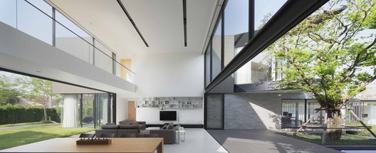 Courtesy of Ayutt and Associates Design Courtesy of Ayutt and Associates Design The House reflects the contrasting requirements of a demanding owner brief; one requiring privacy, one requiring openness, but all in an engaging the sculptural form. Then the aluminium facade was suggested for the design feature. The aluminium facades provide amazing linear texture to buildings and have unlocked an entire new world of exterior aesthetics. AAd created the architectural signatures, but still provide the idea of heat protection. To have the privacy, the Aluminium facade facing the street is almost a blind wall. The rear facade of the house is a solid facade, while the other side to the internal court opens freely towards a large, sunny garden and swimming pool. The windows are large and can be fully opened, like gigantic canvases that frame the landscape. They contribute to the purity of shape. And nothing could disturb it.  Courtesy of Ayutt and Associates Design Courtesy of Ayutt and Associates Design  Courtesy of Ayutt and Associates Design Courtesy of Ayutt and Associates Design This posting includes an audio/video/photo media file: Download Now |
| Issana Beach House / Chinthaka Wickramage Associates Posted: 19 Nov 2017 12:00 PM PST 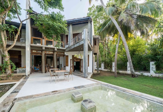 © Thilina Wijesiri © Thilina Wijesiri
 Ground Floor Ground Floor 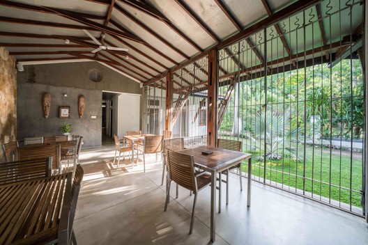 © Thilina Wijesiri © Thilina Wijesiri Text description provided by the architects. Located between Matara and Thangalle on Sri Lanka's lush South – Coast, "Issana Beach house" is ideally situated for visitors who wish to base themselves on a beach and explore the Southern region. At 200 kilometers from Colombo, it is close enough to reach in a few hours but further enough to remain quiet and unspoilt, away from heavy development and crowds at Bentota, Hikkaduwa & Unawatuna. Mahawela Beach, a 3 Kilometer crescent of light yellow sand, lapped by a turquoise sea, is rightly regarded as one of the finest on the South – Coast. Rocky Promontories at either end ensure that the current and waves remain placid, making it an ideal Beach for families and older travelers.  © Thilina Wijesiri © Thilina Wijesiri The design of this Beach Housel drew inspiration from the Vernacular Buildings of the nearby small towns and villages as well as the local culture. Main Public Areas of the Beach house is located centrally, while Bed rooms were orientated in order to give the best possible 'view' of the Garden, the Beach and the Sea beyond while giving increasing Privacy to Guests.  Section Section  © Thilina Wijesiri © Thilina Wijesiri Simple Low Rise Buildings of this Beach House were designed to merge with the surrounding landscape with heavy reliance on locally available materials. Significant architectural features of the buildings include a mixture of plastered brick masonry walls and worm yellow colour random rubble walls, timber columned Verandahs and half round clay tiled steep roofs.  © Thilina Wijesiri © Thilina Wijesiri Upper floors of the Beach house is made of light weight timber / decks to give it a light and airy feeling and Japanese touch. Visitor is first taken to a large Forecourt area before approaching the Reception. After checking-in the Visitor is "Squeezed "through a tall narrow Cathedral like triple height access Corridor to the relevant Bed rooms. The tall narrow corridor terminates in a triple height lounge area giving silhouetted Views of the Garden, the Beach and the Indian Ocean beyond. The garden landscaped with tropical lush green vegetation is accessed through a cobble stone paved Pier complete with plunge pool etc. On one side of the Lobby is located the formal Dining area over-looking a Trapezium shaped courtyard with large tropical tree.  © Thilina Wijesiri © Thilina Wijesiri Kitchen, Pantry and the Laundry areas are tucked to the rear of the site. Overall the buildings express a contemporary Vernacular Sri Lankan architectural idiom. This posting includes an audio/video/photo media file: Download Now |
| Take in The Views With This Prefabricated Curved Glass Sliding Doors Posted: 19 Nov 2017 08:00 AM PST  Courtesy of LUMISHELL Courtesy of LUMISHELL Born from a system of sliding, curved glass doors, and inspired by its potential presence in nature, this house takes new technology and uses it in a beautiful way. LUMISHELL is a collaboration between a young engineer and architect, Christophe Benichou, and LUMICENE, a company developing curved and reversible glass windows. The result is a small, pre-fabricated accommodation unit that capitalizes on the nature of the curved windows to generate living and bedroom spaces. The house rolls in on itself, creating privacy between the three areas and allowing the full rotation of the windows, which can spin to open up each wing to the outside.  Courtesy of LUMISHELL Courtesy of LUMISHELL The effect is a kind of cocoon-like curved pavilion. Private and open, compact and airy, mirrors are strategically placed to bring the panoramic views inside and speak to the aluminum-clad skin of the exterior.  Courtesy of LUMISHELL Courtesy of LUMISHELL  Courtesy of LUMISHELL Courtesy of LUMISHELL The images of the project intentionally locate the house within surreal and beautiful landscapes, giving it an other-worldly feel. The simplicity of the design extends to the installation process - there is no need to lay foundations and the house will be manufactured off-site, transported by truck or container and assembled in four to five days. A flat surface capable of taking the weight of the structure is the only requirement.  Courtesy of LUMISHELL Courtesy of LUMISHELL Worldwide delivery starts in 2018, and as LUMISHELL say: "only the view matters." News via: lumi-shell.com
This posting includes an audio/video/photo media file: Download Now |
| New Public Transit Map Series Launches with London Underground Posted: 19 Nov 2017 06:00 AM PST  Tottenham Court Road mural by Eduardo Paolozzi. Image © Will Scott for Blue Crow Media Tottenham Court Road mural by Eduardo Paolozzi. Image © Will Scott for Blue Crow Media Your obsession with transit-oriented design has been answered with the newest map series by Blue Crow Media. The first in this series, London Underground Architecture and Design Map curates original content by transport design historian, Mark Ovenden paired with photography by Will Scott to depict the London Underground. Mark Ovenden is a specialist in graphic design, cartography, and architecture in public transport with an emphasis on underground rapid transit, making him the natural fit for the design of this map.  © Will Scott for Blue Crow Media © Will Scott for Blue Crow Media London Underground Architecture and Design Map highlights destinations across London's underground network, from unusual signage, clocks, and murals, to the iconic Johnston font and the architecture of entire stations. Each mapped feature is then highlighted on the reverse side with photographs, facts and details, making for the perfect pocket guide while impressing (or exhausting; refer to numbers 11-12 in this list of 20 Things your Non-Architect Friends Think About You) your travel companions.  Clapham Common by Charles Holden. Image © Will Scott for Blue Crow Media Clapham Common by Charles Holden. Image © Will Scott for Blue Crow Media  Park Royal by Felix James Lander. Image © Will Scott for Blue Crow Media Park Royal by Felix James Lander. Image © Will Scott for Blue Crow Media The map features stations designed by Norman Foster, Sir Richard MacCormac, and Michael Hopkins & Partners alongside Charles Holden, Leslie Green and Stanley Heaps. Not only the architecture and graphic design are noteworthy in the underground, murals such as those by Eduardo Paolozzi are also a sight not to miss.  Canary Wharf by Norman Foster. Image © Will Scott for Blue Crow Media Canary Wharf by Norman Foster. Image © Will Scott for Blue Crow Media  © Will Scott for Blue Crow Media © Will Scott for Blue Crow Media Available for $12 USD, €10, and £9 here, the guide is perfect for exploring or to take along for your daily commute on the Underground. This is Blue Crow Media's twelfth map dedicated to London, but be sure to read about their maps on cities including New York, Tokyo, and Berlin here. This posting includes an audio/video/photo media file: Download Now |
| #6 / Studio Wills + Architects Posted: 19 Nov 2017 05:00 AM PST  © Beton Brut © Beton Brut
 © Beton Brut © Beton Brut  Lower / Upper 1st Storey Plan Lower / Upper 1st Storey Plan #6 is an A&A (Additions and Alterations) to an existing pair of semi-detached houses in the eastern part of Singapore. This pair of houses, 'mirrored' along a shared party-wall, became stark contrast in scale when one of the pair was rebuilt, dwarfing its other half. This spurred the owner of the other half to rebuild their house.  © Beton Brut © Beton Brut  Diagram Diagram Planning Guidelines allow houses of 2 storeys and an attic with a permissible aggregate height of 13.1 m (4.5+3.6+5). As the guidelines are imposed on all houses within the neighborhood, every house will be of the same height if they are built to what is permissible. The design objective to make the house appear taller than what is permissible thus became the starting point of #6.  © Beton Brut © Beton Brut The permissible building volume is sliced by large canopies, with floor lines masked behind 'bands' of ventilation blocks formed by the amalgamation of clerestory windows and parapet walls in this building material, resulting in a house with multiple stacked volumes. The placement of ventilation blocks of diminishing sizes from the largest modules within the lowest 'band' to the smallest modules in the topmost 'band', accentuates the building height through false perspectives.  © Beton Brut © Beton Brut Ventilation blocks and deep overhangs, formed by large canopies, are common building material and element in this region evolved from a response to the climatic conditions. Their unique deployment in #6, results in a house which also appears like a sculpture rising amongst the 'Sea of Houses' in the neighborhood.  © Beton Brut © Beton Brut This posting includes an audio/video/photo media file: Download Now |
| Stunning Images of Stone Architecture, Take II: The Best Photos of the Week Posted: 19 Nov 2017 04:00 AM PST  © César Bejar © César Bejar The use of stone is gaining popularity more and more in architectural design. Though it is an ancient construction technique, these days the texture that stone offers to spaces is having an undeniable impact on the many architects incorporating the material into their projects. For this reason, this week we present a second installment of stunning images of stone architecture, including 15 amazing images of this construction system by renowned photographers such as Hannes Henz, César Bejar, and Erieta Attali. Hannes HenzBuilding in Brione / Wespi de Meuron © Hannes Henz © Hannes Henz Erieta AttaliRodia Stone House / Nikos Smyrlis Architect © Erieta Attali © Erieta Attali Hannes HenzHouse Renovation In Treia / Wespi de Meuron © Hannes Henz © Hannes Henz Brett BoardmanStone House / CHROFI © Brett Boardman © Brett Boardman Relja IvanicVilla Monja / Enforma Studio © Relja Ivanic © Relja Ivanic David MonteroVilla Slow / Laura Alvarez Architecture © David Montero © David Montero Randhir SinghMax Estates Visitors Pavilion / Vir.Mueller Architects © Randhir Singh © Randhir Singh Hannes HenzStone House Transformation in Scaiano / Wespi de Meuron © Hannes Henz © Hannes Henz Erieta AttaliRodia Stone House / Nikos Smyrlis Architect © Erieta Attali © Erieta Attali César BejarRancho El Descanso / RE+D © César Bejar © César Bejar Soraia OliveiraEira House / AR Studio Architects © Soraia Oliveira © Soraia Oliveira Hannes HenzHouse Renovation In Treia / Wespi de Meuron © Hannes Henz © Hannes Henz Wespi de MeuronHouse in Scaiano / Wespi de Meuron Cortesía de Wespi de Meuron Cortesía de Wespi de Meuron Hannes HenzBuilding in Brione / Wespi de Meuron © Hannes Henz © Hannes Henz César BejarRancho El Descanso / RE+D © César Bejar © César Bejar This posting includes an audio/video/photo media file: Download Now |
| Hiroshi Sambuichi: "I Take Something that People Already Like, and Make Them Even More Aware of It" Posted: 19 Nov 2017 01:30 AM PST In this extended interview from the Louisiana Channel, Japanese architect and experimentalist in sustainable architecture Hiroshi Sambuichi explains how he integrates natural moving materials—sun, water and air—into his architecture. A rare symbiosis of science and nature, each of his buildings are specific to the site and focus on the best orientation and form to harness the power of Earth's energy, particularly wind. Two of his projects displayed in the video, the Inujima Seirensho Art Museum and the Orizuru Tower, force a contraction of air to make it flow faster and circulate with you through the building, while the Naoshima Hall takes a more sensitive approach due to the nature of the building, reducing the wind's velocity as it passes.  Courtesy of Louisiana Channel Courtesy of Louisiana Channel
 Courtesy of Louisiana Channel Courtesy of Louisiana Channel Sambuichi's love of nature stemmed from a childhood spent surrounded by water in the Seto Inland Sea, and this can be seen in his natural integration of architecture. His philosophy is that "Architecture should become a detail of the Earth," thriving much like a plant in the planet's ecosystem, breathing oxygen and using the energy of the sun.  Courtesy of Louisiana Channel Courtesy of Louisiana Channel  Courtesy of Louisiana Channel Courtesy of Louisiana Channel
Video via Louisiana Channel This posting includes an audio/video/photo media file: Download Now |
| 400 Fairview / SkB Architects + Kendall/Heaton Associates Posted: 19 Nov 2017 01:00 AM PST  © Spencer Lowell, Magda Biernat, Hannah Rankin © Spencer Lowell, Magda Biernat, Hannah Rankin
 © Spencer Lowell, Magda Biernat, Hannah Rankin © Spencer Lowell, Magda Biernat, Hannah Rankin Text description provided by the architects. The nature of development in the urban realm is changing from buildings that are predominantly single-purpose structures into multi-use destinations and connected communities—and 400 Fairview embodies this change. At thirteen stories and 337,000-square-feet, this mixed-use building was conceived as a catalyst for urban engagement. Designed to knit into its neighborhood and foster a sense of community and connection, the building resets development expectations for commercial design in terms of public/private engagement and functional design.  © Spencer Lowell, Magda Biernat, Hannah Rankin © Spencer Lowell, Magda Biernat, Hannah Rankin  Section Section Programmatically, the building is divided into two components. The podium is a richly-toned and textured, sinuously-curving three-story element notable for its porous ground plane that merges its prominent market hall with outdoor spaces to create a hub of activity. A contrasting, narrow, ten-story office tower featuring dynamically patterned windows rises above the podium. The tower is hinged slightly at mid-block to enhance views. Both podium and tower are formed with integrally-colored precast concrete panels; a sandblasted pattern of circles at street level, and a smooth texture for the tower. The solution to resetting the typical language of commercial development is achieved through an open, engaging and informal approach to architectural expression that is present throughout the building—from plan to massing, and materiality.  © Spencer Lowell, Magda Biernat, Hannah Rankin © Spencer Lowell, Magda Biernat, Hannah Rankin Everything about the street-level experience is designed to increase the sense of invitation and engagement with its surroundings: large and frequent entries on all sides of the building, including the alley, improve movement throughout the site; the creation of a market hall that runs the length of the block to merge retail, office workers and passersby; a rich palette of materials that spills into sheltered exterior spaces, including a plaza and large-scale stoops; and the curation of local retail to create a rich and varied experience that brings life to the building from morning until night. Natural light floods into the market hall from three large, fully-glazed monitors, which also open to podium-level offices and afford views across floors. The building's top floor accommodates a rooftop restaurant and deck that is open to the public—a rare opportunity for the community to enjoy views of the city and Lake Union.  Elevation Elevation  © Spencer Lowell, Magda Biernat, Hannah Rankin © Spencer Lowell, Magda Biernat, Hannah Rankin The patterning of the tower fenestration was inspired by the rustic weave found in natural fabrics, such as linen, flax or silk—irregularities that contribute to its relaxed, natural feel. Rather than employ ribbon windows found on so many office buildings, glazing is composed of five distinct modules. A system of ten-foot-wide window and precast panel modules are offset and rotated horizontally and vertically to create the varied window layout. White or black window frames create an additional layer of visual texture, which is revealed as one approaches the building. An additional benefit of the atypical window module is that it translates into a wide variety of room sizes, providing more flexibility for tenants. Inside, the unique "side-core" design moves the elevator and service functions from the middle of the floor plate to the edge, thereby increasing the efficiency and flexibility of the large floor plates. The building is LEED Platinum certified.  © Spencer Lowell, Magda Biernat, Hannah Rankin © Spencer Lowell, Magda Biernat, Hannah Rankin  Section Section This posting includes an audio/video/photo media file: Download Now |
| Draw Inspiration From These 21st Century Bathroom Designs Posted: 19 Nov 2017 12:00 AM PST
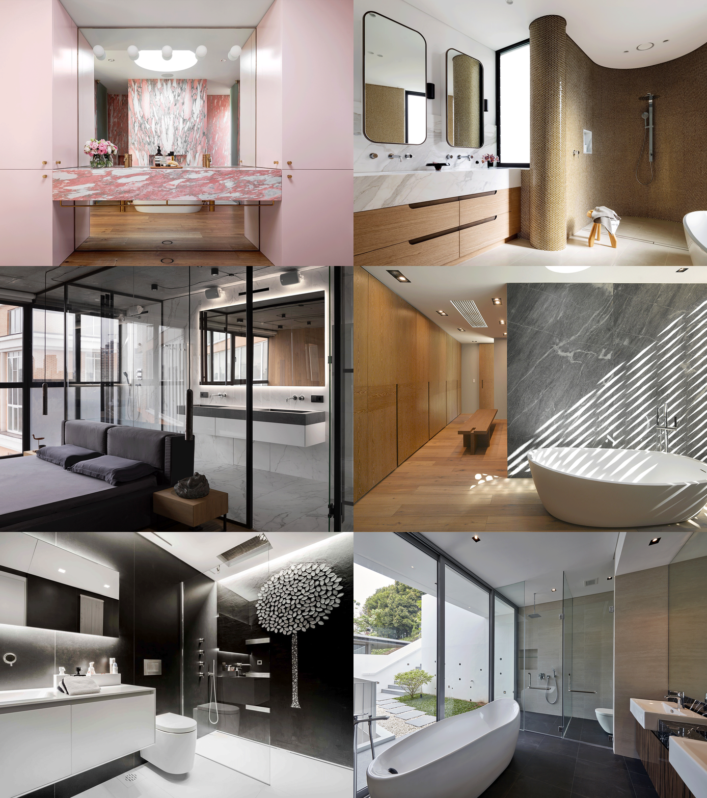
The bathroom is one of the most static and traditional spaces in any residence. However, in recent times, this space has gained an identity that relates directly to the interior and exterior design of the house. As architects, we strive to create a warm, dynamic and attractive space for users. S. Félix Department / AF Arquitectos © Francisco Nogueira © Francisco Nogueira Zinc House / Studio B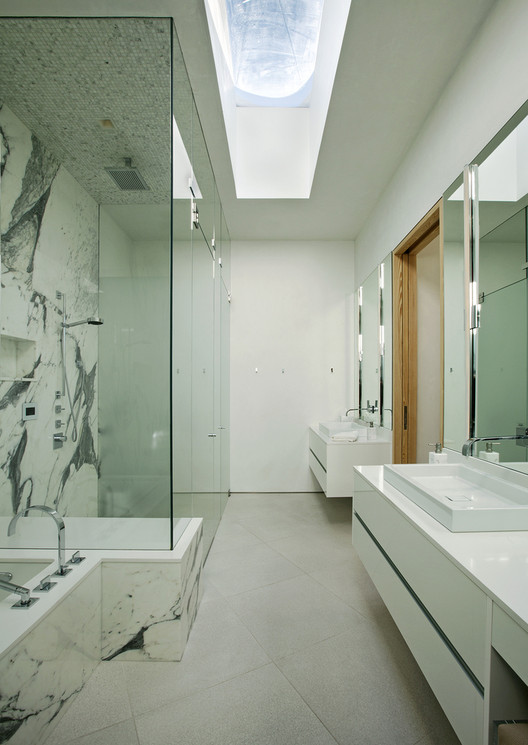 © Derek Skalko © Derek Skalko Bougainvillea Row House / Luigi Rosselli © Justin Alexander © Justin Alexander Cut Out, House H / bergmeisterwolf architekten © Gustav Willeit © Gustav Willeit House Reconstruction for a Young Family / TSEH Architectural Group © Sergey Polyushko © Sergey Polyushko Mosman House / Rolf Ockert Design © Luke Butterly © Luke Butterly Tamarama House / Porebski Architects © Justin Alexander © Justin Alexander House in Dobra / Anna Thurow © Bartłomiej Bieliński © Bartłomiej Bieliński Party Apartment / Nghiêm Phong + Đào Thành © Quang Tran © Quang Tran SODA Apartments / Gresley Abas Architects © Dion Robeson © Dion Robeson The Mod Apartment in Kyiv / Sergey Makhno Architects © Andrey Avdeenko © Andrey Avdeenko North Bondi II Residence / Tobias Partners © Justin Alexander © Justin Alexander K.Por House / Sute Architect © Issira Tonehongsa © Issira Tonehongsa Two Holiday Houses in Firostefani / Kapsimalis Architects © Yiorgos Kordakis © Yiorgos Kordakis Laurelhurst MidCentury / mw|works architecture + design © Jeremy Bittermann © Jeremy Bittermann The Portal House / Reasoning Instincts Architecture Studio © Krunal Mistry © Krunal Mistry Sursock Apartment / platau © Wissam Chaaya © Wissam Chaaya AP House Urbino / GGA gardini gibertini architects © Ezio Manciucca © Ezio Manciucca Summer Cave House in Santorini / Kapsimalis Architects © Vangelis Paterakis © Vangelis Paterakis Lorimer Street Townhouse / Elizabeth Roberts Architecture and Design © Dustin Aksland © Dustin Aksland UP23-UBIKO Dwelling / Viraje arquitectura © German Cabo © German Cabo Sussex Street House / Mountford Architects © Stephen Nicholls © Stephen Nicholls Box House / Ming Architects Cortesía de Ming Architects Cortesía de Ming Architects Taringa Treehouse / Phorm architecture + design © Christopher Frederick Jones © Christopher Frederick Jones 6 Leadwood Loop / Metropole Architects © Grant Pitcher © Grant Pitcher House at Namly Place / Designshop © Aaron Pocock © Aaron Pocock Southern Sunshine Home / HAO Design © Hey!Cheese © Hey!Cheese The Barrancas House / EZEQUIELFARCA arquitectura y diseño © Roland Halbe © Roland Halbe 8A House / Dionne Arquitectos © Pupe Fabre © Pupe Fabre Tula House / Patkau Architects © James Dow © James Dow Travelers Tale / Goodnova-Godiniaux © Karo Avan Dadaev © Karo Avan Dadaev A House in the Woods / William Reue Architecture © Steve Freihon © Steve Freihon A House Forever / Longhi Architects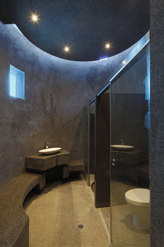 © Juan Solano © Juan Solano Raval Hideaway / Mariana de Delás + Marcos Duffo © Jose Hevia © Jose Hevia This posting includes an audio/video/photo media file: Download Now |
| Manufacture Design / Saguez & Partners Posted: 18 Nov 2017 09:00 PM PST _EL.jpg?1508927947) © Éric Laignel © Éric Laignel
_EL.jpg?1508928567) © Éric Laignel © Éric Laignel A new model of design agency in a classified historic industrial hall Moving into a Grand Paris mixed-use eco-development, the global design agency Saguez & Partners has reinvented its headquarters as an incubator laboratory that aims to live and to work better together with the city, the students, and their clients. To be more open on the outside life, Saguez & Partners set up in its headquarters Design Act! the first school in agency, and Yaya, a Mediterranean food restaurant. The agency's architects and designers built their new Manufacture Design in the only historic industrial hall conserved in the district The Docks, an early twentieth century Alstom locomotives factory. They found the right balance between the powerful and monumental nature of the structure and an open and inspiring "think tank", thanks to the quality of the plan, the light, the volumes, the frame, insulation and acoustics. _EL.jpg?1508928306) © Éric Laignel © Éric Laignel An exemplary sustainable development and social diversity Respecting the character of the original structure, the new building adheres entirely to the district's sustainable development. Raw materials are warm and chosen or their environmental performances, their insulating properties, long lifespan and low carbon footprint, like exterior walls in Cross Laminated Timber®, or Moso heat-compressed bamboo whose stability ensures long-term durability. Effective ventilation cools the air naturally and replaces air conditioning.  Section Section At each hour of the day, natural light enters through the six-meter double-height glass canopy at the reception, the skylights and large bay windows across all three levels, reflecting off the office's pale-colored floors, which involves energy savings.  © Éric Laignel © Éric Laignel Office & hôtel services Around the generous Tropical Garden and its bivouac tent inspired by Saguez's projects in Brazil, where palm trees and more than thirty exotic plants flourish, the first floor is fit to welcome the visitors and for employees' well-being: a tea-room, a cloakroom and a exhibition place in the welcome desk, two lounges, six different sizes and furnished meeting rooms, two gym rooms with locker rooms and bathrooms, and a canteen where are served each day fifty home-cooked lunches. _EL.jpg?1508929248) © Éric Laignel © Éric Laignel Open-space offices and meeting rooms to work differently inside/outside The Saguez Workstyle® team, specialized in workplace design made their new office its preferred playground. The spaces are modular: a gym room becomes an offbeat brainstorming room with ottoman seating. Specific places are set-aside for moments of hyperconnectivity, meetings, tests, conference calls or concentration, prototyping like in the material library. Workstations are positioned along two large open desks on two floors, which stimulate sharing, fluidity, mobility and creativity. Two big green terraces offer different places to work, meet or breathe. The plans balance out cold and warm zones, opening up the indoors to the outdoors. They allow modular spaces, in a kind of bivouac way. Horizontal and vertical connections make the circulation of people more fluid in order to stimulate exchange and encounters.  © Éric Laignel © Éric Laignel Just like a permanent laboratory, open to the city, the new Manufacture Design favors a diversity of collaborative ways of working in a free and open space, to create design practices for tomorrow. This posting includes an audio/video/photo media file: Download Now |
| You are subscribed to email updates from ArchDaily. To stop receiving these emails, you may unsubscribe now. | Email delivery powered by Google |
| Google, 1600 Amphitheatre Parkway, Mountain View, CA 94043, United States | |
Nema komentara:
Objavi komentar