Arch Daily |
- Serralves’ Pavilion / Fala Atelier
- Äripäev Office / Arhitekt 11
- Where Is The Toilet, Please? / M2.senos
- The Sounding Space / Prusta
- Africa Fintech Foundry Headquarters / MOE+ Art Architecture
- REVAHOUSE / MSSM Associates
- Ciao Amici Bar / Hejidesign Shenzhen
- Diller Scofidio + Renfro Named WSJ's 2017 Architectural Innovator of the Year
- GitarrenHaus / BIJL Architecture
- Cukrowicz Nachbaur Architekte Beats Out 30 Top Firms in Munich Concert Hall Competition
- Holmen Aquatics Center / ARKIS architects
- 3 Countryside / BOSS.architecture
- 5 Emerging Firms Shortlisted for 2017 MoMA PS1 Young Architects Program
- Postmodern Revivalism Doesn't Exist; Now Is Not the Time to Be Criticizing It
- RIJNSTRAAT 8 / Ellen van Loon / OMA
- How Bridges Evolved Into Signifiers of Urban Identity
- Tianjin Binhai Library / MVRDV + Tianjin Urban Planning and Design Institute
- Giving People Agency in Public Space: The Artwork of Rafael Lozano-Hemmer
- OOPEAA Wins Multi-functional Church and Social Housing Proposal in Helsinki
| Serralves’ Pavilion / Fala Atelier Posted: 02 Nov 2017 10:00 PM PDT  © Ricardo Loureiro © Ricardo Loureiro
 © Ricardo Loureiro © Ricardo Loureiro Text description provided by the architects. On the occasion of the 32nd São Paulo Biennial, a temporary art gallery was to be installed in a slopped garden at the Serralves' Foundation. The brief was vague and open to speculation.  Collages Collages A folly, as the word itself suggests, is an extravagant, frivolous or unreal building, thought more for an artistic expression than for functional reasons. The pavilion is, indeed, all of that. Through a polyphonic repertoire, it aims at being both a temple, a temporary construction and a toy, neo-classical and post-modern.  © Ricardo Loureiro © Ricardo Loureiro A rational structure encloses a cubic volume. The understandable metric of the wood elements finds a mismatch in the proportions of the openings and in the apparently arbitrary colours. A plinth erases the relationship with the sloping terrain, claiming for autonomy. Two round black marble elements mark the entrances while a red beam crosses the inner space. Inside, five lounger chairs provide an uncertain sense of domesticity to the otherwise monumental construction.  © Ricardo Loureiro © Ricardo Loureiro The folly is a playful combination of pragmatic seriousness and frivolous irony. A composition where each element has its own value, complementing and contradicting each other.  Plans Plans Priscila Fernandes' film about contemplation and leisure found a dialogue with both the park and the light-heartedness of the architecture. Perhaps, the folly was to architectural languages what Priscila's film is to leisure: a joyful and reflective pastiche…  © Ricardo Loureiro © Ricardo Loureiro This posting includes an audio/video/photo media file: Download Now |
| Posted: 02 Nov 2017 08:00 PM PDT  © Tõnu Tunnel © Tõnu Tunnel
 © Tõnu Tunnel © Tõnu Tunnel Text description provided by the architects. For Arhitekt 11, the inspiration for planning the Äripäev office was a very special factory building built at the beginning of the 20th century and the media company's wish for an open office for 280 employees. Äripäev is Estonia's most famous and largest business newspaper, radio and publishing company. The chosen space, Luther's Machine Room, is a former Luther plywood manufacturing plant, one of the largest industrial buildings in the Baltic States from that time. The office space has a maximum height of 12.6m, office length 63.7m and a width of 38.3m. Äripäev office has a total of 2739 m², of which 2326 m² is located on the main office floor.  © Tõnu Tunnel © Tõnu Tunnel  Second Level Plan Second Level Plan  © Tõnu Tunnel © Tõnu Tunnel A modern open-space media company office for 280 people has been created in this historic space with activity-based working principles. The working landscape is on the outer perimeter of the space, moving to the center there are open and closed meeting rooms and in the center is a public space with a library and work-cafe. Existing materials like limestone walls and concrete posts, beams, and ceilings have been preserved and cleaned. 50% of the closed glass nave has been opened up. In order to exhibit the unique constructions of the building, there is a small atrium between the ground floor and the main floor, from where a whole constructive post can be seen from top to bottom.  © Tõnu Tunnel © Tõnu Tunnel Inspired by the birch veneer produced in Luther's factory in the first half of the 20th century, plywood boards are used as a finishing material for the „room inside a room" objects. The objects - meeting rooms covered with plywood form an intermittent and interesting landscape on the human level and leave the concrete body of a dignified factory building untouched. Inner streets form between the objects, where the light from the top and the trees create an outdoorsy feel. The biggest challenge was to achieve the acoustics needed for working. Since there are not enough wall surfaces, all closed ceilings are covered with acoustic wool boards. There are also many acoustic materials used in the furniture - the screens on tables, the backs of cabinets, telephone chairs. Acoustic measuring and feedback from employees of Äripäev are proof that the results are satisfying.  © Tõnu Tunnel © Tõnu Tunnel This posting includes an audio/video/photo media file: Download Now |
| Where Is The Toilet, Please? / M2.senos Posted: 02 Nov 2017 07:00 PM PDT  © Nelson Garrido © Nelson Garrido
 © Nelson Garrido © Nelson Garrido Text description provided by the architects. Toilettes in a cemetery do not seem to be the most appealing projects. Not even for the design brief. Not even for the place. Not even for the budget. Nevertheless, for us, it was exciting! We have been there a few times before and we were always uncomfortable, looking at the floor trying not to stumble in the narrow paths between the great marble stones. So when we were asked to do the rehabilitation of the toilettes (the old building), it was as if it was the first time there. We perceive the hierarchies, the streets, the paths, the square, the church, the entrances and the exits, the trees, the stones, and the green flowerbeds… How beautiful and organized!  © Nelson Garrido © Nelson Garrido The (old) building was huge and absolutely out of the context, with vast flat roofs that almost touch the chapel. It was a "sacrilege" to see this scenario from the south entrance of the cemetery. All we did was to reduce the size and to summarize the information. An abstract exercise to create an abstract object: no doors, no windows, no sheds or porches. The idea of using ceramic tile coating came naturally. And it was evident: the ceramic tiles had to be green. The object should be more related to the natural elements, and less with the constructed ones, highlighting the church that is so closeby. To achieve this, to create a uniform and neutral object, the ceramic tile must coat the entire building, from the facades to the rooftop. But then comes the reality: technical and economic reality – and rightly so!  © Nelson Garrido © Nelson Garrido  Demolition/Reconstruction Demolition/Reconstruction  © Nelson Garrido © Nelson Garrido The workers did not know how to do it. And the time schedule? Was it expensive? The design solves everything! We add some plasters to optimize the stereotype of the tiles and to reduce the technical difficulties. A teamwork! Through the two extracted mass on the facades, we get in the building. On the south side, we access the new facilities for supporting the cemetery workers staff. The main entrance is from the north and takes us to the central space, inside the building, but with exterior features, pointed out by the natural light and the Portuguese Pavement on the floor (the sidewalks that surround the building continuity). Here, there are the washbasins and is a space that works for a pivotal area, between the female, male and accessible facilities.  © Nelson Garrido © Nelson Garrido This is a building without technology, which means that is the wind (strengthened by the north-south orientation) that dehumidifies and renews the air. Sating on the pre-existing walls we have a timber roof truss with a white glaze. All the interiors are white and have natural lighting through skylights, which reinforces luminous comfort. The marble washbasins match with the outdoor objects of the cemetery. The candle burner is a sturdy and resistant piece made of black painted iron despite the delicate design. As a whole, these two objects reinforce the hierarchical network of the cemetery, not ceasing to be, of the scale and synthetic unit, plus one of its "salt and pepper shakers".  © Nelson Garrido © Nelson Garrido This posting includes an audio/video/photo media file: Download Now |
| Posted: 02 Nov 2017 05:00 PM PDT .jpg?1494846180 "© Leonas Garbaciauskas") © Leonas Garbaciauskas © Leonas Garbaciauskas
.jpg?1494846308 "© Leonas Garbaciauskas") © Leonas Garbaciauskas © Leonas Garbaciauskas Text description provided by the architects. This spacious interior of this house harmoniously combines delicious interior highlights: Open monolithic construction and natural greyish wood become a beautiful background for the vivid oriental pieces. White marble, black metal, glass, stainless steel, soft textile inserts, aged wood - here everything is alive, natural and very real. .jpg?1494846466 "© Leonas Garbaciauskas") © Leonas Garbaciauskas © Leonas Garbaciauskas The four-person family had chosen to live in the residential district of Vilnius which is surrounded by the remarkable beauty and tranquillity of the forest. One of the goals for the new interior was to create stylistically uncluttered space that is suitable for already existing furniture peaces and interior elements such as old cupboards, tables, chairs and carpets. As those things are quite vivid and warm colours dominant, so walls, ceilings and floor colours should have been as neutral as possible and also in cool shades. .jpg?1494846107 "© Leonas Garbaciauskas") © Leonas Garbaciauskas © Leonas Garbaciauskas It was not intended to create traditionally perceived minimalism – rather it was an attempt to create a space which reveals objects functional and decorative features, as well as people who are living here individuality and distinctive characters. The interior combines contradictory, but complementary stylistic trends: minimalism, modernism and industrial oriented ethnic style with oriental elements. .jpg?1494846367 "© Leonas Garbaciauskas") © Leonas Garbaciauskas © Leonas Garbaciauskas The main principal of this house interior concept is not the separate elements, but rather their interaction: minimalist walls, ceiling and floor solutions are such that highlights some specific interior accents. So, first of all, dialogues between different textures such as wood and concrete, stone (Italian slate) and wood, white marble and concrete are created here.  2nd Floor Plan 2nd Floor Plan Creating the interior for a family housing, it is always tempting to reveal hobbies and interest of the people who will live here. Probably, Kitchen area is the space that reflects owners hobbies most of all. It recalls the real restaurant's cuisine: the powerful industrial hood is used here, larger than a standard gas cooker, steel cabinets and worktops. Such furniture is very functional - it is hygienic and easy to maintain. .jpg?1494846096 "© Leonas Garbaciauskas") © Leonas Garbaciauskas © Leonas Garbaciauskas Another hobby of the inhabitants of this house is - travelling. It is quite distinctly revealed by the textile elements that are exhibited in different spaces the house. Most carpets and tapestries were brought from travelling in Africa, the Middle and the Far East, Asia and other countries. .jpg?1494846155 "© Leonas Garbaciauskas") © Leonas Garbaciauskas © Leonas Garbaciauskas This posting includes an audio/video/photo media file: Download Now |
| Africa Fintech Foundry Headquarters / MOE+ Art Architecture Posted: 02 Nov 2017 03:00 PM PDT  © Medina Dugger and Deji Atte © Medina Dugger and Deji Atte
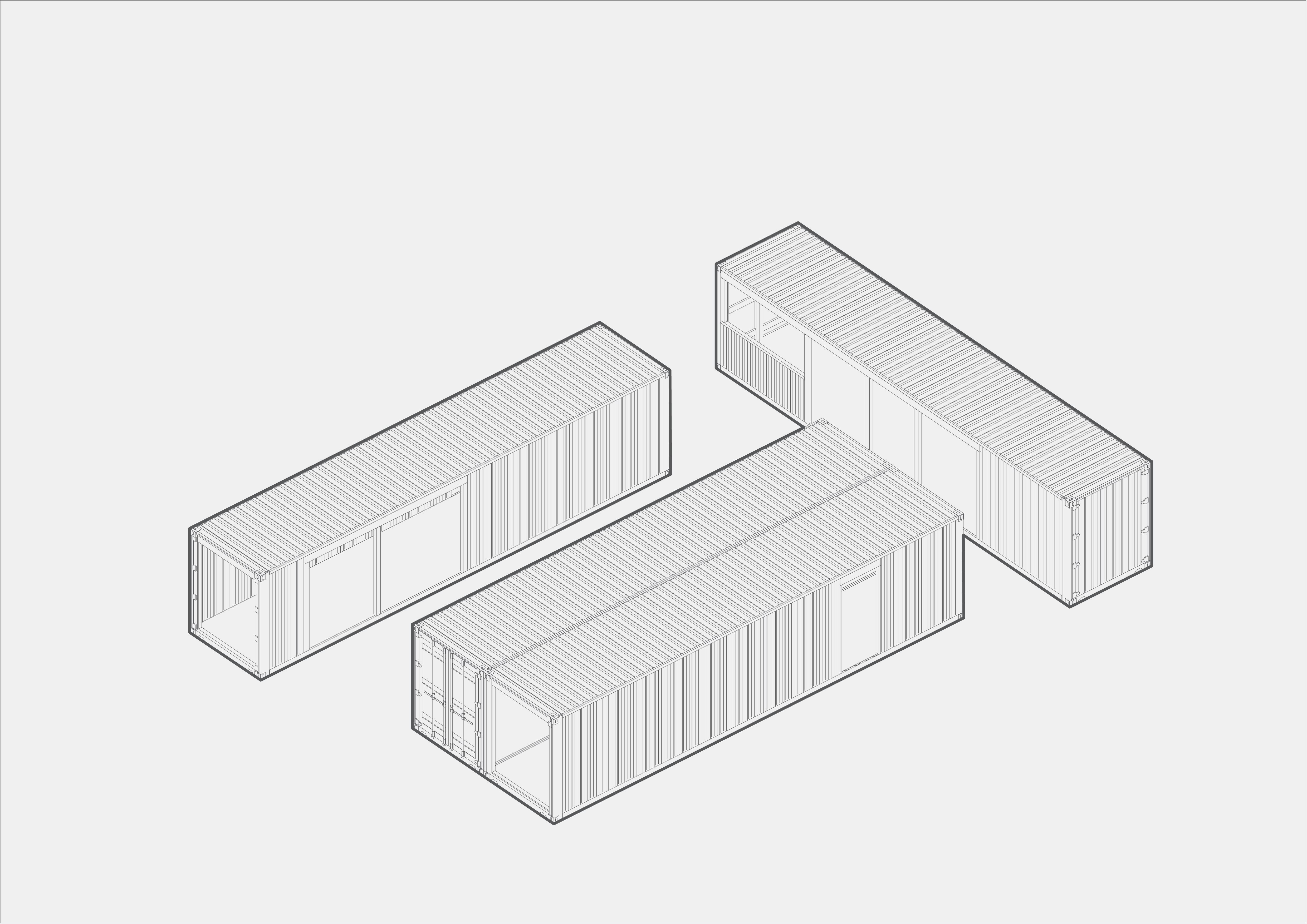
 © Medina Dugger and Deji Atte © Medina Dugger and Deji Atte Text description provided by the architects. This project is a technology accelerator and co-working space in Lagos, Nigeria. During the summer of 2016 a competition was launched to design a building for a team of software developers and system architects at the African Fintech Foundry. The brief was a contemporary and stimulating workspace for fostering innovation through the collaborative production and incubation of ideas. Also important to the client was that the building be rapidly deployable and have a feeling of non-permanence.  Ground floor plan Ground floor plan  © Medina Dugger and Deji Atte © Medina Dugger and Deji Atte  First floor plan First floor plan Lagos is a place where new technologies are being shaped, designed for the African consumer and the African market within a burgeoning economy of over 22 million. The African Fintech Foundry has its headquarters in Victoria Island Lagos where it is at the epicentre of a search for innovation in financial technology and ecommerce. Lagos is also a regional port city historically connected to major trade routes and heavily engaged with traditional forms of commerce; thousands of new and secondhand shipping containers reach its port every day and are used and reused for decades, denting, scarring and rusting over time.
We have designed a compact and spatially efficient building from stacking locally-sourced, old shipping containers. The project was executed in 3 months; through the aggregation of a simple base unit the structure and internal spaces were created with a narrow triple height atrium forming in the centre which terminates in an elongated skylight. On a constrained site the shifting of the containers results in overhangs which shade the ground floor exterior spaces and high level terraces for miniature gardens and outdoor sitting space. Glassy, bright interiors encourage the play of light within a restrained material palette of soft and dark greys while the central staircase, balustrades and entrance aim to communicate some of the vibrancy of the wider city in the distinctive yellow of Lagos' "Danfo" buses and public taxis.  © Medina Dugger and Deji Atte © Medina Dugger and Deji Atte MOE+ Art Architecture is an office of urbanists, architects, artists, interiors + product designers based in Lagos. The office work is programmed along creative thinking, urban engagement, civic interventions, sustainability, exploration, collaboration and locally implemented solutions. We are driven by the collaboration between Art and Design.  Axonometric Section Axonometric Section This posting includes an audio/video/photo media file: Download Now |
| Posted: 02 Nov 2017 01:00 PM PDT  © Sonny Sandjaya © Sonny Sandjaya
 © Sonny Sandjaya © Sonny Sandjaya Text description provided by the architects. The rapid change of social lifestyle demands a small, flexible, efficient and non-traditional house. The question that has been raised is how a life-work residence can be designed to be able to enhance both productivity and family life. The first challenge of the design is to integrate work and family life seamlessly through the house design. The private areas, the office, and the master bedroom are located separately opposite to the main house, thus creating a seamless open space and a joined function in the middle of the house in the shape of a foyer area.  © Sonny Sandjaya © Sonny Sandjaya Small dwellings must be carefully designed because rough decisions can have a big impact on the character of the dwelling. The strategies employed is to increase the natural light as much as possible, to give the sense of openness and lightness inside. Moreover, the house provides a direct interconnection with the landscape, with the use of large openings. Automated controlled curtains are used to negotiate the segregation between public and private spaces.  Sketch Plan Sketch Plan Open floor plans are chosen in order to increase its use and spatial effect. Therefore, a spatial overlap between different functions can reduce the need for single-purpose spaces and create a floor plan in which spaces flow into each other and can be used as multipurpose areas. This can increase the space's versatility and efficiency; it also allows light from windows to travel freely throughout the house. The other aspect of this house's design is an innovative landscaping; the design is benefited from the site's architectural potential view. The house is located on the hill facing 180 degrees of city view. Instead of sitting and fitting to the existing site, the design tends to dominate and capture the light and view within the site.  © Sonny Sandjaya © Sonny Sandjaya A secondary aspect that constitutes a decision-important factor in the latter phase of the project is the playfulness souled concept of the house. As a young family with a great passion in toy & furniture collection, the house is configured as a canvas and container for many of furniture & toy designer collection. Careful choices of light concrete floor mixed with natural colored french oak and transparent floor to ceiling glass dominate the material schedule. One experimental architectural design element for the house is the embedded outdoor toys cabinet that was designed carefully in order to enhance the playful experience throughout the whole site.  Sketch Section Sketch Section Revahouse is built with an interconnected network automation system that is fully controlled via handheld devices and adapt to the environmental conditions. The HVAC system is designed in order to automatically detect the outdoor temperature informed by internet-based information, the curtains will automatically close and open during the day & night depending on the sunlight direction throughout the day in order to gain efficiency for the HVAC and reduce the heat inside the house.The next installation program for the house is an active solar-powered one, driven by high energy costs and development of energy-efficient dwellings for the future of architecture.  © Sonny Sandjaya © Sonny Sandjaya This posting includes an audio/video/photo media file: Download Now |
| Ciao Amici Bar / Hejidesign Shenzhen Posted: 02 Nov 2017 12:00 PM PDT  © Tony Chen © Tony Chen
 © Tony Chen © Tony Chen Text description provided by the architects. Named of Italian greeting word "Ciao amici", a new bar which is located in Shenzhen China and designed by Hejidesign studio. The glow of the neon sign beckons from beyond the clear glass door to the bar. This is the entrance to the glass house, shining out into the dark neighborhood, attracting customers with its warm glow. See through the glass wall, the main spirit of the space – a 5 meter high feature wall with golden light. Made of brushed stainless steel, the shelfs rise layer by layer, just like golden wave in the dark night softly coming to the people.  © Tony Chen © Tony Chen Concealed golden lights illuminate the façade, a theme consisting of the bar's interior. All five main areas of the design (the façade, the main hall, the mezzanine, a VIP suite and the restroom) flow into one another with perfect harmony.  Ground Floor Plan Ground Floor Plan From the ceiling hangs some diamond chandeliers which reveal the aesthetic is cohesive with the feature wall and similarly twinkles in the warm light, like stars in the night sky.  © Tony Chen © Tony Chen Groupings of 3-4 seats are scattered throughout the main space. The smaller groups provide a feeling of privacy and comfort for customers. The high ceiling provides space for a small mezzanine with 2-3 groups of seating. The glass railing creates transparency for the view and opens up the space. Besides these main lighting elements, there are several reflective metal elements inside the main room and along the stair that bounce light within the space, as a light show.  © Tony Chen © Tony Chen The VIP lounge has a wine display wall. The concept of it is a residential parlor. It is a kind of secret space – dimly lit, with dark materials, a comfortable sofa and a view out to beyond the glass wall. You sit, hidden, and look out to the brighter space.  © Tony Chen © Tony Chen The 3D wine bar flows down and continue the mood throughout the hallway and into the restroom. The vanity features are the same black marble as the wine bar, with bronze mirror walls. The materials are solid, but cast in the soft warm glow of the lights above creates an accent of chic elegance.  © Tony Chen © Tony Chen This posting includes an audio/video/photo media file: Download Now |
| Diller Scofidio + Renfro Named WSJ's 2017 Architectural Innovator of the Year Posted: 02 Nov 2017 10:01 AM PDT  The Juilliard School, New York City. Image © Iwan Baan The Juilliard School, New York City. Image © Iwan Baan The Wall Street Journal has selected New York-based firm Diller Scofidio + Renfro as their 2017 "Architecture Innovator of the Year." Led by partners Liz Diller, Ricardo Scofidio, Charles Renfro and Benjamin Gilmartin, over the past decade the firm has quickly grown from a largely conceptual practice focused on installations, performance and unbuilt works to a full-fledged, international office with completed and in-progress projects around the globe.  Ricardo Scofidio, award presenter Roni Horn, Liz Diller, Benjamin Gilmartin and Charles Renfro. Image © BFA.com") (from left) Ricardo Scofidio, award presenter Roni Horn, Liz Diller, Benjamin Gilmartin and Charles Renfro. Image © BFA.com (from left) Ricardo Scofidio, award presenter Roni Horn, Liz Diller, Benjamin Gilmartin and Charles Renfro. Image © BFA.com The firm was lauded by the Wall Street Journal for their performative architecture and ability to constantly reinvent themselves. "DS+R is the firm for anyone who holds fast to the idea of design as coessential with art, especially avant-garde performance and installation art," writes the WSJ's Ian Volner in a profile on the firm. "It's the hometown team, carrying the flag for an architecture of nerve and sophistication into new and ever more challenging terrain." Check out a gallery of highlights from the firm's recent work in the gallery below, and read the full profile by clicking the twitter embed here (direct link leads to paywall):
This posting includes an audio/video/photo media file: Download Now |
| GitarrenHaus / BIJL Architecture Posted: 02 Nov 2017 10:00 AM PDT  © Katherine Lu © Katherine Lu
 © Katherine Lu © Katherine Lu Text description provided by the architects. As the property is in a conservation area characterised by the sandstone and masonry dwellings of Walter Burley-Griffin, it was important to celebrate and improve the expression of the existing dwelling and its own masonry construction.  © Katherine Lu © Katherine Lu  Ground Floor Plan Ground Floor Plan  © Katherine Lu © Katherine Lu Our approach was to deploy a monochromatic colour palette and simplify the material language of the dwelling, so that the existing substantial sandstone lower ground floor and rear volume could be refurbished and brought back to life. This included streamlining the fenestration, which had previously been very fussy and in poor condition, and consolidating the awkwardly shaped deck which has expansive views that were not maximised in the previous arrangement of the dwelling's key spaces.  © Katherine Lu © Katherine Lu Bushfire and maintenance considerations were also required for the property, and as such we retained and repainted the existing painted brickwork, and relined and extended the existing eaves of the roof with stained timber boards, providing a naturalistic warmth to the interface of the dwelling with the external spaces.  © Katherine Lu © Katherine Lu This posting includes an audio/video/photo media file: Download Now |
| Cukrowicz Nachbaur Architekte Beats Out 30 Top Firms in Munich Concert Hall Competition Posted: 02 Nov 2017 08:30 AM PDT  1st Prize - Cukrowicz Nachbaur Architekten. Image Courtesy of Cukrowicz Nachbaur Architekten 1st Prize - Cukrowicz Nachbaur Architekten. Image Courtesy of Cukrowicz Nachbaur Architekten The Austrian firm Cukrowicz Nachbaur Architekte has been selected as the winner of an international competition for the design of a signature new concert hall in Munich, Germany, beating out proposals from 30 of the world's most notable architecture practices. The competition tasked architects with designing a stand-alone new structure on a 5,300-square-meter site near the Ostbahnhof train station in the neighborhood of Werksviertel. The building program included an overall floor area of approximately 9,500 square meters, including a larger 1800-seat concert hall and a more intimate 600-seat venue that satisfy "the most exacting acoustic requirements." Other functions include a new venue and practice halls for the Munich College for Music and Drama, a musical education area, a foyer, dining option, retail and offices. A underground garage below the structure will contain several levels of parking spaces. The jury lauded Cukrowicz Nachbaur's entry as "restrained and expressive at the same time," as its glassy facade did not preference any single elevation, but could instead been seen as a beacon for the neighborhood. At 45 meters tall, it would offer up a variety of views both out to the city, and from the plaza to the activity within. 1st PrizeCukrowicz Nachbaur Architekten  Courtesy of Cukrowicz Nachbaur Architekten Courtesy of Cukrowicz Nachbaur Architekten  1st Prize - Cukrowicz Nachbaur Architekten. Image Courtesy of Cukrowicz Nachbaur Architekten 1st Prize - Cukrowicz Nachbaur Architekten. Image Courtesy of Cukrowicz Nachbaur Architekten  1st Prize - Cukrowicz Nachbaur Architekten © <a href='http://www.wuthenow-photo.de'>Hans-Joachim Wuthenow</a> 1st Prize - Cukrowicz Nachbaur Architekten © <a href='http://www.wuthenow-photo.de'>Hans-Joachim Wuthenow</a> 2nd Prize 2nd Prize - PFP Planungs. Image Courtesy of PFP Planungs 2nd Prize - PFP Planungs. Image Courtesy of PFP Planungs  2nd Prize - PFP Planungs. Image Courtesy of PFP Planungs 2nd Prize - PFP Planungs. Image Courtesy of PFP Planungs  2nd Prize - PFP Planungs © <a href='http://www.wuthenow-photo.de'>Hans-Joachim Wuthenow</a> 2nd Prize - PFP Planungs © <a href='http://www.wuthenow-photo.de'>Hans-Joachim Wuthenow</a> 3rd Prize 3rd Prize - David Chipperfield Architects. Image Courtesy of David Chipperfield Architects 3rd Prize - David Chipperfield Architects. Image Courtesy of David Chipperfield Architects  3rd Prize - David Chipperfield Architects. Image Courtesy of David Chipperfield Architects 3rd Prize - David Chipperfield Architects. Image Courtesy of David Chipperfield Architects  3rd Prize - David Chipperfield Architects © <a href='http://www.wuthenow-photo.de'>Hans-Joachim Wuthenow</a> 3rd Prize - David Chipperfield Architects © <a href='http://www.wuthenow-photo.de'>Hans-Joachim Wuthenow</a> 4th Prize 4th Prize - 3XN. Image Courtesy of 3XN 4th Prize - 3XN. Image Courtesy of 3XN  4th Prize - 3XN. Image Courtesy of 3XN 4th Prize - 3XN. Image Courtesy of 3XN  4th Prize - 3XN © <a href='http://www.wuthenow-photo.de'>Hans-Joachim Wuthenow</a> 4th Prize - 3XN © <a href='http://www.wuthenow-photo.de'>Hans-Joachim Wuthenow</a> 5th Prize 5th Prize - Staab Architekten. Image Courtesy of Staab Architekten 5th Prize - Staab Architekten. Image Courtesy of Staab Architekten  5th Prize - Staab Architekten. Image Courtesy of Staab Architekten 5th Prize - Staab Architekten. Image Courtesy of Staab Architekten  5th Prize - Staab Architekten © <a href='http://www.wuthenow-photo.de'>Hans-Joachim Wuthenow</a> 5th Prize - Staab Architekten © <a href='http://www.wuthenow-photo.de'>Hans-Joachim Wuthenow</a> Honorable Mentions Honorable Mention - Henning Larsen Architects. Image Courtesy of Henning Larsen Architects Honorable Mention - Henning Larsen Architects. Image Courtesy of Henning Larsen Architects  Honorable Mention - Henning Larsen Architects. Image Courtesy of Henning Larsen Architects Honorable Mention - Henning Larsen Architects. Image Courtesy of Henning Larsen Architects  Honorable Mention - Henning Larsen Architects © <a href='http://www.wuthenow-photo.de'>Hans-Joachim Wuthenow</a> Honorable Mention - Henning Larsen Architects © <a href='http://www.wuthenow-photo.de'>Hans-Joachim Wuthenow</a>  Honorable Mention - Zaha Hadid Architects. Image Courtesy of Zaha Hadid Architects Honorable Mention - Zaha Hadid Architects. Image Courtesy of Zaha Hadid Architects  Honorable Mention - Zaha Hadid Architects. Image Courtesy of Zaha Hadid Architects Honorable Mention - Zaha Hadid Architects. Image Courtesy of Zaha Hadid Architects  Honorable Mention - Zaha Hadid Architects © <a href='http://www.wuthenow-photo.de'>Hans-Joachim Wuthenow</a> Honorable Mention - Zaha Hadid Architects © <a href='http://www.wuthenow-photo.de'>Hans-Joachim Wuthenow</a>  Honorable Mention - Mecanoo. Image Courtesy of Mecanoo Honorable Mention - Mecanoo. Image Courtesy of Mecanoo  Honorable Mention - Mecanoo. Image Courtesy of Mecanoo Honorable Mention - Mecanoo. Image Courtesy of Mecanoo  Honorable Mention - Mecanoo © <a href='http://www.wuthenow-photo.de'>Hans-Joachim Wuthenow</a> Honorable Mention - Mecanoo © <a href='http://www.wuthenow-photo.de'>Hans-Joachim Wuthenow</a>  Honorable Mention - Christ & Gantenbein. Image Courtesy of Christ & Gantenbein Honorable Mention - Christ & Gantenbein. Image Courtesy of Christ & Gantenbein  Honorable Mention - Christ & Gantenbein. Image Courtesy of Christ & Gantenbein Honorable Mention - Christ & Gantenbein. Image Courtesy of Christ & Gantenbein  Honorable Mention - Christ & Gantenbein © <a href='http://www.wuthenow-photo.de'>Hans-Joachim Wuthenow</a> Honorable Mention - Christ & Gantenbein © <a href='http://www.wuthenow-photo.de'>Hans-Joachim Wuthenow</a> You can also check out models and renderings for the other 22 entries, including proposals by Herzog & de Meuron, Barozzi Veiga, Ateliers Jean Nouvel, Snohetta and more, here (click the "further participants" tab). News via Concert Hall Munich Design Competition This posting includes an audio/video/photo media file: Download Now |
| Holmen Aquatics Center / ARKIS architects Posted: 02 Nov 2017 08:00 AM PDT  © Tove Lauluten © Tove Lauluten
 © Tove Lauluten © Tove Lauluten Text description provided by the architects. Holmen Aquatics Center is a continuation of Holmen beach, by protecting and reinforcing the site's natural qualities. The footprint occupied by the building is replaced with a roof garden that further enhances the experience of the beach with spectacular views.  © Tove Lauluten © Tove Lauluten  Floor Plan Floor Plan  © Tove Lauluten © Tove Lauluten The focus point of the project's concept is the activation of the building's roof as an integral part of Holmen beach recreation area. The grassy roof slopes towards the south and provides an uninterrupted view over Oslo fjord's isles and reefs.  © Tove Lauluten © Tove Lauluten  Section 2 Section 2  © Geir Andres Rybakken Orslien © Geir Andres Rybakken Orslien The main entrance, reception, changing rooms and swimming pool hall are located on the building's main level, rising over the lawn that slopes up to the building. The lower level houses gym, multifunction hall, technical spaces and staff facilities.  © Tove Lauluten © Tove Lauluten This posting includes an audio/video/photo media file: Download Now |
| 3 Countryside / BOSS.architecture Posted: 02 Nov 2017 06:00 AM PDT  © Raul Garcia © Raul Garcia
 © Raul Garcia © Raul Garcia Text description provided by the architects. Nestled into the rural, rolling landscape of Cherry Hills Village, this home presents a modest face to the street that belies its 11,000 square foot size. Stone walls and a landscaped front courtyard accessed through a sculptural bronze gate, create a layered entry sequence. At the rear, the house opens as it cascades down the hillside, creating multiple zones of interconnected outdoor living space. The living room, kitchen, and dining room each have a different scale, but work in a symbiotic way around a central courtyard they all access through sliding glass walls. A green wall in the courtyard creates a focal point opposite the kitchen. The courtyard opens to views to the pool a level below.  © Raul Garcia © Raul Garcia The kitchen features walnut cabinets with a matte finish and a wall of glass above the cooktop which allows for views to the side yard. The side yard features an expansive lawn and a custom light sculpture. At the edge of the lawn, a path parallels a concrete wall and leads to the pavilion which hovers over a field of grasses. The serene master bedroom wing extends into the landscape and features a closet volume that cantilevers over the hillside. The custom wood bed anchors the bedroom, where carefully framed views ensure privacy. A floating vanity links the two sides of his and her master bathroom.  © Raul Garcia © Raul Garcia The lower level is accessed by a walnut and glass stair that descends into a media room. The media room opens onto the lower patio, where a fire feature highlights the stone wall below the overhanging dining room. Accessible from the lower patio, the Casita features a kitchen, bedroom, and bathroom. This independent space can serve as the pool house or guest house depending on the need. A palette of polished white concrete floors, wood ceilings, and black walls provide a consistent backdrop for dramatic design features, furniture, and art. These include the hair on hiding rug that runs from wall to floor in the dining room, an unexpected glass ceiling in a powder room, and the Massimo Vitali diptych in the living room.  © Raul Garcia © Raul Garcia This posting includes an audio/video/photo media file: Download Now |
| 5 Emerging Firms Shortlisted for 2017 MoMA PS1 Young Architects Program Posted: 02 Nov 2017 05:00 AM PDT  Lumen by Jenny Sabin Studio for The Museum of Modern Art and MoMA PS1's Young Architects Program 2017. Image courtesy MoMA PS1. Photo by Pablo Enriquez. Lumen by Jenny Sabin Studio for The Museum of Modern Art and MoMA PS1's Young Architects Program 2017. Image courtesy MoMA PS1. Photo by Pablo Enriquez. The Museum of Modern Art and MoMA P.S.1 have announced the five finalists of their 2018 Young Architects Program (YAP). Now in it's 18th year, the competition was founded to offer emerging architectural talent the opportunity to design a temporary, outdoor installation within the walls of the P.S.1 courtyard for MoMA's annual summer "Warm-Up" series. Architects are challenged to develop creative designs that provide shade, seating and water, while working within guidelines that address environmental issues, including sustainability and recycling. The finalists include:
The five firms were selected following a nomination process that asked deans of architecture schools and editors of architectural publications to submit names of firms comprised of students, recent graduates, or established architects experimenting with new styles or techniques. Over 30 firms were considered for this year's YAP. A winner will be announced in early 2018. Last year's winner was Jenny Sabin Studio for their light catching installation, "Lumen." Other previous winners include Escobedo Soliz Studio's Weaving the Courtyard (2016), Andrés Jaque / Office for Political Innovation's COSMO (2015), The Living / David Benjamin's Hy-Fi (2014), CODA / Caroline O'Donnell's Party Wall (2013), HWKN's Wendy (2012), Interboro Parners' Holding Pattern (2011), SO-IL's Pole Dance (2010), MOS' Afterparty (2009) and Work AC's Public Farm 1 (2008).
This posting includes an audio/video/photo media file: Download Now |
| Postmodern Revivalism Doesn't Exist; Now Is Not the Time to Be Criticizing It Posted: 02 Nov 2017 04:30 AM PDT  The Democratic Monument: Adam Nathaniel Furman's Manifesto for a New Type of Civic Center. Image © Adam Nathaniel Furman The Democratic Monument: Adam Nathaniel Furman's Manifesto for a New Type of Civic Center. Image © Adam Nathaniel Furman This essay by the academic and writer Martin Lampprecht responds directly to an opinion piece penned by Sean Griffiths, a former partner of FAT, entitled "now is not the time to be indulging in postmodern revivalism". Oh my. Where to begin? My first impulse was just to move on and shake my head in wonder, perhaps, that a well-established designer and architectural thinker would wish to publish an article so dyspeptic. It is, after all, a common pattern: the young pranksters of yesteryear, once their hairlines have started to recede, transform into schoolmasters as befitting their recently-acquired academic sinecures. It's all just part of the normal generational cycle that keeps a culture moving forward. Business as usual. If I write this at all then it is because Sean Griffiths' argument singles out—explicitly or implicitly—an entire group of young architects and designers whose work I have been following with great interest for some time. It takes the form of a rather mean-spirited ad-hominem attack against them by implying that they somehow "don't get" the political and cultural climate that we find ourselves in, but are also guilty of moral and political failings by making all the wrong noises at the wrong time. Of course, one of the best ways to sharpen and polish your brand has always been to make enemies. And one of the best ways to make enemies has always been to simply fabricate them by erecting a straw man against whom to present your intellectual arms. (Choosing a crop of up-and-coming designers who are simply making their first public splashes, instead of some of the older people of your own generation who really have influence and institutional power, may seem a bit low – but that's all a part of the traditional ritual, too.) So you could, for example. invent an entire movement and label it "postmodern revivalism". No weapon kills more effectively than the taxonomical pin with which to pierce an all too colorful butterfly and forever assign it the correct (derivative) place in the public's entomological cabinet. You may have to distort both the intention of your pet peeves' work and ignore what they publicly say about it, but that's how this strategy tends to work. The butterfly that Griffiths has chosen here as his pars pro toto for the wider family is Adam Nathaniel Furman. I have been watching Furman's work for some time now, both as a designer and as a prolific and insightful commentator on architecture and design – and, of course, as a cultural mediator. He may wear many hats, but there's one thing that he certainly is not, and has never claimed to be: a postmodernist, whether "neo", "retro", "revival" or otherwise. It is, therefore, quite regrettable that, in the public eye, he has become superficially known as the go-to "pomo guy", simply because among his historical interests modern classicism and postmodernism figure prominently. As a lobbyist for architectural conservation, he has been drumming up support for the overdue protection of postmodern architectural heritage, which is currently still receiving a rough deal from critics, conservationists, and public authorities. But while his own design work evidently demonstrates the influence of his interest in and commitment to postmodern precedents and (classical) design history at large, his intentions and strategies are far from the derivative "neo-postmodernism" which Griffiths claims to see. Griffiths' claims hinge on two conceptual shortcuts: "ornament and heightened attention to colourful surface = pomo" and "pomo = irony". And yet Furman's work, among others, is not primarily occupied with irony, distancing effects, and conceptual quotations marks. What he and they are after is rather a new richness of stimuli, an aesthetic and semiotic density (both formally and historically) that draws the observer into a highly engaging interaction with the work, rich with associations, ambiguities, and playful possibilities of spatial disorientation. Insofar as their work draws on postmodern precedents it does so because, on a formal level, certain postmodernists experimented with similar strategies of ornamental densification, formal complexity, and playful cognitive overkill. Far from rhetorical gestures of "irony", the works explore possibilities of spatial and semiotic experience in a complex, multi-layered and mediated modern environment: their fun is serious business. (In other words: just what Griffiths claims for his own achievements of twenty years ago.) Having lumped together a group of designers as "neo-neo-postmodernists" (and as a result, adding an unnecessary appendix to FAT's own work of the 1990s and 2000s too late and apparently for the wrong reasons), his principal argument is, unsurprisingly, political: in the world of Trump, Brexit, fake news and the alt-right, in which shifting signifiers and ambivalent meanings are exploited by sinister forces, the moment for irony has passed. The same, one suspects, is true for color, ornament, visual complexity and other frivolous luxuries of happy times gone by: Griffiths' suggestions as to where architecture might go from here exude a somewhat puritanical spirit of (tactile) hair shirts and reasonable visual modesty. But it's all for the greater good, because we know how easily architecture's useful idiots are appropriated and swallowed whole by political circumstances: "If your building looks fascistic, [...] it is ripe for appropriation by fascistic values." This is somewhat surprising given how Griffiths' whole condemnation of the supposed "neo-neo-postmodern" cabal starts with the assumption that architecture does not "speak", as it is not a language. How such non-speaking architecture can be so eloquent as to be readily recognizable as and appropriated by an ideology appears as a bit of a mystery. But then, of course, does Griffiths himself really believe in a non-signifying, semiotically mute architecture? That architecture is not related to literature and therefore does not "speak" or convey a complex, let alone linear "narrative" is a truism. However, it is equally true that architecture, thanks to cultural context, is evocative and symbolically rich, and therefore a means of communication. To paraphrase Paul Watzlawick: architecture cannot not communicate. There is no semiotically neutral, ideology-free zone for architecture, especially not for the kind of architecture now espoused by Griffiths, which "strives heavily to actively resist visual signification, that tries to disappear, that abjures meaning, an architecture that makes no attempt to speak and can tell no lies". An architecture so unburdened of meaning, in a virgin state of non-signification, is a fantasy. Whether a building looks fascistic is for fascists to say, and what ideology Griffiths' tactile, visually chaste, semiotically teetotalling architecture might or might not come to represent is not something that is intrinsic to its design: a building's meaning has everything to do with context, and a lot with intention, and none of these are eternally inscribed into the built structure itself. One can ask whether, upon a more generous reading of both context and intention, Adam Nathaniel Furman's work and that of other contemporary ornamentalists is in fact likely to somehow play into the hands of the dark cultural and political forces of post-truth political culture and the alt-right. Because, as far as I can see, the latter aren't much attracted to exuberant hedonism, or historical complexity, or eclectic pluralism, or confidently ambiguous and fluid (one might say, "queer") messaging, or creative irreverence in dealing with the past. These are all qualities an unprejudiced observer might find in the kind of work Griffiths is declaring obsolete, politically naïve, and potentially dangerous. Which, ultimately, begs the question: what's your problem, professor? As John Cage might have put it: if you have nothing to say, at least say it better than in a condescending, ungenerous opinion piece. Martin Lampprecht is an academic specializing in film and media, with a strong interest in architecture and urbanism, and currently works at the University of Bordeaux. He writes on cinema, architecture, music, mass culture, and seriality.
This posting includes an audio/video/photo media file: Download Now |
| RIJNSTRAAT 8 / Ellen van Loon / OMA Posted: 02 Nov 2017 03:00 AM PDT  Photograph by Delfino Sisto Legnani and Marco Cappelletti, © OMA Photograph by Delfino Sisto Legnani and Marco Cappelletti, © OMA
 Photograph by Delfino Sisto Legnani and Marco Cappelletti © OMA Photograph by Delfino Sisto Legnani and Marco Cappelletti © OMA Text description provided by the architects. Rijnstraat 8, the renewed government office building housing the Ministry of Foreign Affairs, the Ministry of Infrastructure and Water Management, the Central Agency for the Reception of Asylum Seekers and the Immigration and Naturalistation Service, was officially opened by the Dutch King yesterday. A Public Private Partnership under the name of PoortCentraal, consisting of BAM, ISS and OMA, has renovated and transformed the 90.000 m2 building located next to The Hague's central station, giving it a second life as a modern and transparent working space for the Dutch government.  Architectural Concept Architectural Concept Partner architect of OMA Ellen van Loon led the transformation project, designing a building that accommodates flexible ways of working which require less office space. The transformation of Rijnstraat 8 is the first large-scale implementation of the Dutch government's new real estate strategy which aims to reduce the real estate owned by the government. The involvement of the private sector is encouraged both in designing, building and financing governmental office space, and maintaining and operating the building's energy supply, for which it is responsible for the duration of 25 years. Various sustainability measures, such as the application of triple glass in the atria, the use of solar panels, LED lights and implementation of a heat and cold storage, result in a significantly reduced energy consumption. The use of new materials has been minimized: of the 20% of the building that was demolished, 99.7% has been reused.  Photograph by Delfino Sisto Legnani and Marco Cappelletti, © OMA Photograph by Delfino Sisto Legnani and Marco Cappelletti, © OMA With the transformation of Rijnstraat 8, a careful balance has been struck between maintaining the strong architectural and sustainability concepts from the original design by Jan Hoogstad from 1993 and renewing the building for future use. The introduction of open plan offices and a new walkway running the entire length of the building improves the sense of direction within the building, and the replacement of solid walls with a glass facade facilitates the connection with the city. The interaction between Rijnstraat 8 and the surrounding city is further enhanced through the creation of a new, enlarged passage that acts as a public square.  Photograph by Nick Guttridge, © OMA Photograph by Nick Guttridge, © OMA  Program Diagram Program Diagram  Photograph by Delfino Sisto Legnani and Marco Cappelletti, © OMA Photograph by Delfino Sisto Legnani and Marco Cappelletti, © OMA Ellen van Loon states: "I have redesigned the former VROM building as a super flexible and sustainable multi-ministry building, which increases the visibility between departments and promotes the interaction between the Ministries and the city life of The Hague through its transparent facade and clearly visible entrances."  Photograph by Delfino Sisto Legnani and Marco Cappelletti, © OMA Photograph by Delfino Sisto Legnani and Marco Cappelletti, © OMA The project was led by Ellen van Loon and project architect Bart Nicolaas. The design has been established in cooperation with Ector Hoogstad Architecten, Wessel de Jonge Architecten, DGMR, ARUP, BAM Advies & Engineering and Valstar Simonis.  © Nick Guttridge © Nick Guttridge  Conceptual Drawing Conceptual Drawing  Photograph by Nick Guttridge, © OMA Photograph by Nick Guttridge, © OMA The transformation of Rijnstraat 8 marks the beginning of a new series engagements of OMA in political capital The Hague, where Ellen van Loon is the lead architect for the renovation of the Second House of Parliament.  Photograph by Delfino Sisto Legnani and Marco Cappelletti, © OMA Photograph by Delfino Sisto Legnani and Marco Cappelletti, © OMA This posting includes an audio/video/photo media file: Download Now |
| How Bridges Evolved Into Signifiers of Urban Identity Posted: 02 Nov 2017 02:30 AM PDT  Margaret Hunt Hill Bridge, Dallas, Texas. Image © Greig Cranna Margaret Hunt Hill Bridge, Dallas, Texas. Image © Greig Cranna Increasingly close collaboration between architects and engineers has caused an explosion in bridge design over the last few decades, resulting in structures that are both bold yet rational. As a result, cities have exploited bridges as great monuments of design, to foster pride in the residents and promote themselves as a destination for tourists. These ideas have inspired photographer Greig Cranna as he travels the world, capturing the elegance of today's bridge infrastructure. Cranna has been documenting some of his stunning photography on Instagram, collating it over the past 20 months into a forthcoming book, Sky Architecture—The Transformative Magic of Today's Bridges. In capturing these entrancing structures, the photos show the impact of the bridges as an addition to the landscape and revel in their contemporary silhouettes and designs. Bridges began their life as simply a safe crossing for those on foot, and later went on to bear horses and carriages. With relatively minimal loads, the focus of the designs could be spent on the overall appearance. Take the ornamentation of the 16th century Rialto Bridge in Venice for example; its human scale design allowed for an experience of grandeur, creating an architectural icon.  East Bay Bridge, San Francisco, Ca. Image © Greig Cranna East Bay Bridge, San Francisco, Ca. Image © Greig Cranna At the turn of the 19th century, industrialization and the invention of the railway demanded bridges with much larger spans to be built that could handle the greater loads. The need for stronger connections between cities led to the emphasis being shifted to the structural qualities of the bridge and aesthetics were arguably forgotten. At this point, bridges were primarily built out of steel for greater structural support and appeared utilitarian in their look. Forth Bridge in Scotland demonstrates this engineering triumph, with its multiple cantilevering sections covering a span of over half a kilometer.  Infinity Bridge, Stockton-On-Tees, England. Image © Greig Cranna Infinity Bridge, Stockton-On-Tees, England. Image © Greig Cranna Today, bridges see much more involvement of architects in their designs. Now more than ever, improving technology has enabled explorations of form and granted opportunities to experiment with structure. The power of bridges to influence people's perceptions of a place has not gone unnoticed by cities as they are "branding themselves around signature structures," explains Cranna.  Erasmus Bridge, Rotterdam, Netherlands. Image © Greig Cranna Erasmus Bridge, Rotterdam, Netherlands. Image © Greig Cranna Society's reliance on transportation has provided us with famous landmarks in the past such as the Brooklyn Bridge, Golden Gate Bridge and Sydney Harbour Bridge that instantly are associated with the location they belong to. These days, bold design is a requirement for contemporary bridges to stand out in the same way to become a recognizable structure. These distinct forms are apparent in Cranna's photographs; however, it is the pedestrian bridges that he finds most interesting. Harking back to the early stages of the bridge, they are much more personal and human-scale, creating an individual experience going from A to B. As well as the interaction with people, pedestrian bridges present an environmental advantage, encouraging a greener approach to travel.  BP Bridge, Chicago, IL. Image © Greig Cranna BP Bridge, Chicago, IL. Image © Greig Cranna Among the pedestrian bridges photographed by Cranna is the BP Bridge in Chicago. Designed by Frank Gehry, it takes you on a winding journey between two parks and across a road. The serpentine path is deliberately curved to provide a longer, gradual ramp for the bridge to be accessible to all and the broad form acts as an acoustic barrier from the road below. This attention to the human senses and how we perceive such a space is an architectural quality that can only be achieved on infrastructure at this personal level.  Gateshead Millenium Bridge, Newcastle-On-Tyne, England. Image © Greig Cranna Gateshead Millenium Bridge, Newcastle-On-Tyne, England. Image © Greig Cranna Cranna has also photographed Gateshead Millennium Bridge, designed by Wilkinson Eyre Architects, that responds to the need for pedestrian crossings over the River Tyne in Newcastle, England. The tilting bridge has become an iconic attraction, drawing crowds to watch the dynamic structure move like a blinking eye for larger boats to pass. Unlike the BP Bridge, its minimal design is lightweight and allows views up and down the river as an integral part of the experience for the users.  Ft. Vancouver, Wash.. Image © Greig Cranna Ft. Vancouver, Wash.. Image © Greig Cranna As pedestrian bridges emerge across the world, the way in which they respond to the human senses has led to the more playful forms. Besides those photographed by Cranna, we can see abstract shapes appear in Lucky Knot by NEXT Architects, which creates viewpoints across the landscape, and in RDG Planning & Design's High Trestle Trail Bridge, whose whimsical tunnel of blue lights transforms the space at night.  Bond Bridge, Kansas City, Mo. Image © Greig Cranna Bond Bridge, Kansas City, Mo. Image © Greig Cranna Although there is still an obvious demand for larger infrastructure to handle vehicles, it is important that we continue this evolving passion for pedestrian bridges. We now see bridges not only as a method to cross roads or rivers but as a sculptural piece of technology that people want to visit and experience. The emphasis on bridges that can improve pedestrian transport has benefits both environmentally and for the tourism industry, so it is important that we continue to create these spatial and sensual experiences—and welcome that such developments are cataloged and celebrated by photographers such as Cranna. This posting includes an audio/video/photo media file: Download Now |
| Tianjin Binhai Library / MVRDV + Tianjin Urban Planning and Design Institute Posted: 02 Nov 2017 01:45 AM PDT  © Ossip van Duivenbode © Ossip van Duivenbode
 © Ossip van Duivenbode © Ossip van Duivenbode Text description provided by the architects. MVRDV in collaboration with local architects TUPDI has completed the Tianjin Binhai Library, a 33,700m2 cultural centre featuring a luminous spherical auditorium around which floor-to-ceiling bookcases cascade. The undulating bookshelf is the building's main spatial device, and is used both to frame the space and to create stairs, seating, the layered ceiling and even louvres on the façade. Tianjin Binhai Library was designed and built in a record-breaking time of only three years due to a tight schedule imposed by the local municipality. Next to many media rooms it offers space for 1,2 million books.  © Ossip van Duivenbode © Ossip van Duivenbode The library was commissioned by Tianjin Binhai Municipality and is located in the cultural centre of Binhai district in Tianjin, a coastal metropolis outside Beijing, China. The library, located adjacent to a park, is one of a cluster of five cultural buildings designed by an international cadre of architects including Bernard Tschumi Architects, Bing Thom Architects, HH Design and MVRDV. All buildings are connected by a public corridor underneath a glass canopy designed by GMP. Within the GMP  © Ossip van Duivenbode © Ossip van Duivenbode The building's mass extrudes upwards from the site and is 'punctured' by a spherical auditorium in the centre. Bookshelves are arrayed on either side of the sphere and act as everything from stairs to seating, even continuing along the ceiling to create an illuminated topography. These contours also continue along the two full glass facades that connect the library to the park outside and the public corridor inside, serving as louvres to protect the interior against excessive sunlight whilst also creating a bright and evenly lit interior. .jpg?1509628637 "Step Diagram") Step Diagram Step Diagram "The Tianjin Binhai Library interior is almost cave-like, a continuous bookshelf. Not being able to touch the building's volume we 'rolled' the ball shaped auditorium demanded by the brief into the building and the building simply made space for it, as a 'hug' between media and knowledge" says Winy Maas, co-founder of MVRDV. "We opened the building by creating a beautiful public space inside; a new urban living room is its centre. The bookshelves are great spaces to sit and at the same time allow for access to the upper floors. The angles and curves are meant to stimulate different uses of the space, such as reading, walking, meeting and discussing. Together they form the 'eye' of the building: to see and be seen."  © Ossip van Duivenbode © Ossip van Duivenbode The five level building also contains extensive educational facilities, arrayed along the edges of the interior and accessible through the main atrium space. Public program is supported by subterranean service spaces, book storage, and a large archive. From the ground floor visitors can easily access reading areas for children and the elderly, the auditorium, the main entrance, terraced access to the floors above and connection to the cultural complex. The first and second floors consist primarily of reading rooms, books and lounge areas whilst the upper floors also include meeting rooms, offices, computer and audio rooms and two roof top patios.  © Ossip van Duivenbode © Ossip van Duivenbode The library is MVRDV's most rapid fast track project to date. It took just three years from the first sketch to the opening. Due to the given completion date site excavation immediately followed the design phase. The tight construction schedule forced one essential part of the concept to be dropped: access to the upper bookshelves from rooms placed behind the atrium. This change was made locally and against MVRDV's advice and rendered access to the upper shelves currently impossible. The full vision for the library may be realised in the future, but until then perforated aluminium plates printed to represent books on the upper shelves. Cleaning is done via ropes and movable scaffolding. .jpg?1509628646 "Diagram - Book Mountain Activities") Diagram - Book Mountain Activities Diagram - Book Mountain Activities Since its opening on 1 October, 2017 the building has been a great hit in Chinese media and social media; reviews describe it as an 'Ocean of Books' (CCTV) and the 'Most beautiful library of China' (The Bund). Comments on social media call the building a 'sea of knowledge', 'Super Sci-Fi' or simply 'The Eye.' Most importantly, it is clear that the people of Tianjin have embraced the new space - and that it has become the urban living room it was intended to be.  © Ossip van Duivenbode © Ossip van Duivenbode Tianjin Binhai Library was built according to the Chinese Green Star energy efficiency label and has achieved two star status. MVRDV collaborated with Tianjin Urban Planning and Design Institute (TUPDI), structural engineers Sanjiang Steel Structure Design, TADI interior architects and Huayi Jianyuan lighting design. It is the second realised MVRDV project in Tianjin following TEDA Urban Fabric, completed in 2009.  © Ossip van Duivenbode © Ossip van Duivenbode This posting includes an audio/video/photo media file: Download Now |
| Giving People Agency in Public Space: The Artwork of Rafael Lozano-Hemmer Posted: 02 Nov 2017 01:00 AM PDT  © Rafael Lozano-Hemmer © Rafael Lozano-Hemmer In the past, cities were often constructed in the likeness the public--the built environment reflected citizens and local culture. It is questionable whether this can be said of the modern world. Much construction today is a product of capitalism, generating buildings and areas in which local people have no attachment or sense of agency over. Artist Rafael Lozano-Hemmer believes this to be a fundamental crisis within our cities, and he is committed to reestablishing the relationship and representation of people within urban space. His work is examined in a new short film by PLANE-SITE, titled Public Interruptions.
Lozano-Hemmer is globally recognized for his work in "relational architecture." He has spent over two decades working to disrupt the modern narratives of globalization and return agency within their cities to the people. The public's thoughts and actions become the mechanism behind Hemmer's work which he then translates into forms of art, visible on a public scale. The purpose is to amplify the role of the citizen and create a feeling of individual representation within an urban space.
Public Interruptions explores Lozano-Hemmer's deep engagement with public space and ambition to offer agency to urban cities. Through an interview with the artist and a look at several of his larger-scale interventions, the short film illustrates the profound impact and significance Lozano-Hemmer contributes to the urban environment. This posting includes an audio/video/photo media file: Download Now |
| OOPEAA Wins Multi-functional Church and Social Housing Proposal in Helsinki Posted: 01 Nov 2017 11:00 PM PDT  Courtesy of OOPEAA Courtesy of OOPEAA OOPEAA and Lujatalo worked together to design the winning proposal for a new multi-functional church and social housing project for Tikkurila, Helsinki entitled Church in the City. The project is unique in the way that the architect, builder, and client participated in a highly collaborative design process. The new church will be centrally located while relating to the urban fabric of eastern Helsinki. Because Tikkurila is the business center of Vantaa, Church in the City will incorporate office and meeting spaces to better serve the community it occupies. The project will also adjoin 11,700 square meters of social and student housing. These 185 units, called Bethania Housing, are planned be built simultaneously with Church in the City.  Courtesy of OOPEAA Courtesy of OOPEAA While Church in the City will be Tikkurila's newest landmark, its interior spaces intend to be at a more intimate, calm human scale. The main church hall will have the capability to seat 500 parishioners or be divided to entertain smaller, concurrent events. Church facilities will include: a café, a store, an outdoor gathering space and workrooms for up to 143 people.  Courtesy of OOPEAA Courtesy of OOPEAA Church in the City is scheduled to be completed in 2020 and is commissioned by Vantaa Parishes; who also commissioned Bethania Housing along with the Foundation for Student Housing in the Helsinki Region. For more information on the New Tikkurila Church, see here.
This posting includes an audio/video/photo media file: Download Now |
| You are subscribed to email updates from ArchDaily. To stop receiving these emails, you may unsubscribe now. | Email delivery powered by Google |
| Google Inc., 1600 Amphitheatre Parkway, Mountain View, CA 94043, United States | |
Nema komentara:
Objavi komentar