Arch Daily |
- Soriano House / Beyt Architects
- B Nordic 26 / DO ARCHITECTS
- Brzeg Dolny / NA NO WO architekci
- Deltion College Building Grey / ARES architecten
- Bodrum Demirbuku Houses Club House / Erginoglu & Çalışlar
- Lantern House / atelier NgNg
- Toyama Kirari / Kengo Kuma and Associates
- The Louna Architects Bookshop / The Scarcity and Creativity Studio
- Quarry House / Finnis Architects
- L&M DESIGN LAB Shanghai Office / L&M DESIGN LAB
- Water Street / Rob Paulus Architects
- Drone Footage Reveals Shanghai Planetarium Construction Progress
- Ville-Marie Apartment / NatureHumaine
- Boston's Tallest Residential Tower Tops Out, Designed by Pei Cobb Freed
- Deane’s House / Horton Harper Architects
- BIG, Gensler, and James Corner Field Operations to Design Oakland Athletics Baseball Stadium
- MINI Living Urban Cabin / FreelandBuck
- Fast Food Slowed Down: What's Behind the All the Redesigns - and Is It Enough?
- Castro House / Aguirre Arquitetura
- How to Use a Drone to Create a Detailed 3D Context Model
| Soriano House / Beyt Architects Posted: 23 Aug 2018 10:00 PM PDT  © Adrián Mora Maroto © Adrián Mora Maroto
 © Adrián Mora Maroto © Adrián Mora Maroto Text description provided by the architects. Beyt Architects developed the concept design of this Mediterranean house, and teamed up with BAC Estudio de Arquitectura for the stages of technical design and to follow the works on site.  © Adrián Mora Maroto © Adrián Mora Maroto The house has two main design driving ideas: Firstly, a clean and efficient layout due to its long and narrow plot size; and secondly the use of patios and louvers to create an interplay of light and privacy throughout the house.  © Adrián Mora Maroto © Adrián Mora Maroto  Plans Plans  © Adrián Mora Maroto © Adrián Mora Maroto Volumetrically, the house is designed around a straightforward sloping 35 meter long facade only broken by a strong element of bare concrete at its ground floor. The contrast between the pure white volume and the concrete inlayed with wood textures, is accentuated with the dialogue of an identical expression of vertical louvers in both volumes.  © Adrián Mora Maroto © Adrián Mora Maroto Three main patios connect the different floors: a small one at the entrance in the intersection of both volumes, a second one connecting also with the underground, guides the stairs through the vertical circulation, and the final one opens the dining room to the backyard.  Section + Elevatioins Section + Elevatioins The living room opens widely to the garden with a 4 meter long glass sliding door, and the kitchen replicates the concept with an open corner that brings the landscape and the olive tree inside the house as well as project the cooking area into the outside.  © Adrián Mora Maroto © Adrián Mora Maroto A bespoke bookcase frames the main staircase into the double height space opening into the main living area and the rest of the interiors have been left pure and neutral, letting the materials and design speak by themselves.  © Adrián Mora Maroto © Adrián Mora Maroto This posting includes an audio/video/photo media file: Download Now |
| Posted: 23 Aug 2018 08:00 PM PDT  © Norbert Tukaj © Norbert Tukaj
 © Norbert Tukaj © Norbert Tukaj Vision of a Nordic Co working  Scheme Scheme Architecture of the former bank building  © Lauryna Narkevičiūtė © Lauryna Narkevičiūtė  First floor plan First floor plan  © Lauryna Narkevičiūtė © Lauryna Narkevičiūtė  Axonometry Axonometry  © Lauryna Narkevičiūtė © Lauryna Narkevičiūtė  Fourth floor plan Fourth floor plan  © Norbert Tukaj © Norbert Tukaj Hygge in the Interiors  © Norbert Tukaj © Norbert Tukaj This posting includes an audio/video/photo media file: Download Now |
| Brzeg Dolny / NA NO WO architekci Posted: 23 Aug 2018 07:00 PM PDT  © Maciej Lulko © Maciej Lulko
 © Maciej Lulko © Maciej Lulko Text description provided by the architects. The concrete structure found on the construction site was the key point of the arrangement. It was completed by oak planks, concrete, plywood and steel. Demolishing the walls and replacing them with an industrial glass door has illuminated the dark lobby and connected it with the kitchen and living room. Cubic island, sofa in the furniture and TV located in the kitchen integrate the family and create an extension of the living room. The kitchen has become not only a place for work, but also relaxation.  © Maciej Lulko © Maciej Lulko  Plan Plan  © Maciej Lulko © Maciej Lulko  Axonometry 01 Axonometry 01 Stainless steel from which the kitchen island was made and the cube covering the ventilation hood above it, refer to the industrial nature of the arrangement, corresponding with the concrete, wood and black steel door. Its shiny surface catches the eye creating a unique element, and the island made of it becomes a jewelry not only in the kitchen but in the whole daily space.  © Maciej Lulko © Maciej Lulko This posting includes an audio/video/photo media file: Download Now |
| Deltion College Building Grey / ARES architecten Posted: 23 Aug 2018 06:00 PM PDT  © Rob van Esch © Rob van Esch
 © Rob van Esch © Rob van Esch Text description provided by the architects. We have designed a school building for Deltion College training institute at Zwartewaterallee in Zwolle, the Netherlands.  © Rob van Esch © Rob van Esch The total surface area of the building measures over 5000m2. Since sports form an important part of the training, the building benefits from 11 large changing and shower rooms. An important aspect of the design concerns the functional organisation of the training institute. The wide variety of uses within the building is arranged in such a way that mutual nuisance is avoided, thereby creating "calmness".  © Rob van Esch © Rob van Esch Rooftop sports field:  Isometric Isometric  Sections + Elevations Sections + Elevations Flexibility:  © Rob van Esch © Rob van Esch Budget:  © Rob van Esch © Rob van Esch This posting includes an audio/video/photo media file: Download Now |
| Bodrum Demirbuku Houses Club House / Erginoglu & Çalışlar Posted: 23 Aug 2018 05:00 PM PDT .jpg?1535028997) © Cemal Emden © Cemal Emden
.jpg?1535029268) © Cemal Emden © Cemal Emden Text description provided by the architects. Surrounded by the forest on the north and the seaside at the east, our project is aimed at being one of the best examples of integration in its natural context. Situated on Bodrum peninsula, this summer housing complex needed a Beach Restaurant which would be flexible enough to host a project information center at first and being built very fast with a minimum of impact in its environment. .jpg?1535028941) © Cemal Emden © Cemal Emden The area around the building is reserved for the beach facilities only, as a protected area. The abundant existing trees give a natural asset, in between which will be, organized sunbathing terraces, play areas for kids, small pools, changing areas and toilets. A 400m long sanded beach is directly connected to this green area, only 100m away from the building. It brings the visitors directly into nature. .jpg?1535029294) © Cemal Emden © Cemal Emden  Floor Plan Floor Plan .jpg?1535029134) © Cemal Emden © Cemal Emden The building is situated just close to a stream bed, bringing freshness and water sounds effects to the visitors. To facilitate the access of the customers a small parking has been arranged at the entrance, as well as a pier on the seaside. The pedestrian way to access the building is passing through the existing trees and cross over the small river with a light bridge. .jpg?1535028963) © Cemal Emden © Cemal Emden We first designed a large platform, shaded with a large pergola. Our building has been then inserted in between the platform and the pergola, as a separate element. In this way, the project information center can be easily reduced or increased according to the needs of the next users, inside the platform limits which are limited by the local authorities. It can also be totally dismounted while preserving the platform.  Section A Section A .jpg?1535029373) © Cemal Emden © Cemal Emden  East Elevation East Elevation As a project information center, we managed to arrange flexibility, grandness, and comfort, as well as representative architecture for the rest of the project, while working on the relationship with its natural context, opening to the sea, and using local materials. .jpg?1535029029) © Cemal Emden © Cemal Emden .jpg?1535029050) © Cemal Emden © Cemal Emden This posting includes an audio/video/photo media file: Download Now |
| Posted: 23 Aug 2018 04:00 PM PDT  © Han Deo © Han Deo
 © Han Deo © Han Deo Text description provided by the architects. When asked to design a house in a highly dense neighborhood of Ho Chi Minh City, Vietnam, we are faced with many challenges (a West-facing long and narrow building lot with three sides blocked by other houses), which simultaneously pose fascinating opportunities for economical and innovative design solutions. The attempt is to create refreshing and playful living spaces for the young couple with their two small children as well as interesting photography opportunities for their business.  © Han Deo © Han Deo Learning from Vietnam's diminishing traditional shop-house topology, we apply one of its most prominent characteristics – the use of multiple courtyards sandwiched in between living spaces, allowing for natural light, wind, as well as big plants to reach every corner of the building. This spatial organization ultimately brings nature into this small urban dwelling. The courtyard in the middle also acts as a connecting device, both visually and physically, where the majority of circulation happens on a sculptural stair made from single-sheet iron with the light structure that activates the whole space. Shifted floor plates and glass walls/ floor sections also help enhance the idea of continuous space and make the house feel bigger.  © Han Deo © Han Deo Bright colors, often time seen in Vietnamese traditional decorative arts and architecture are used for the glass windows facing the courtyard and the glass beams above the light well. These accent colors liven up the space with dynamic reflections/ shadows and create a sense of playfulness, especially for the two 'young adults' in the house. The West-facing façade is designed with a system of automatic door-sized louvers, protecting the house from the severe tropical sun in the afternoon; the air inside is cooled down as wind pressure is changed when passing through the tiny holes on this facade.  Longitudinal Section Longitudinal Section The louvers are both functional and ornamental when closed will create an image inspired by patterns found on Vietnam's ancient Dong Son drums. At night, the house becomes a lantern shining brightly within the neighborhood. Fengshui principles are also applied creatively, with the screen acting as a shield and air/ light purifier; the colored beams to balance out the neutral colors of glass and iron, and the water pond to the back of the roof to cool down and neutralize the air flow.  © Han Deo © Han Deo This posting includes an audio/video/photo media file: Download Now |
| Toyama Kirari / Kengo Kuma and Associates Posted: 23 Aug 2018 03:00 PM PDT  © Yi-Hsien Lee Photography © Yi-Hsien Lee Photography
 © Yi-Hsien Lee Photography © Yi-Hsien Lee Photography Text description provided by the architects. Toyama Kirari is located at the heart of Toyama City. It is a building that integrates a glass art museum, city library, and a local bank.  © Yi-Hsien Lee Photography © Yi-Hsien Lee Photography  Floor plans Floor plans  © Yi-Hsien Lee Photography © Yi-Hsien Lee Photography A diagonal void at the center of the building distributes natural light from the south effectively, and helps to connect the three main programs. Panels of local solid cedar surrounding the void contribute to create a warm and friendly atmosphere, and is worthy of being called the core of the community.  © Yi-Hsien Lee Photography © Yi-Hsien Lee Photography  Section Section  © Yi-Hsien Lee Photography © Yi-Hsien Lee Photography The glass art museum and the library are naturally unified by way of this central space, which helps to remove the typically cold and formal image of conventional public buildings.  © Yi-Hsien Lee Photography © Yi-Hsien Lee Photography This posting includes an audio/video/photo media file: Download Now |
| The Louna Architects Bookshop / The Scarcity and Creativity Studio Posted: 23 Aug 2018 02:00 PM PDT  Courtesy of The Scarcity and Creativity Studio Courtesy of The Scarcity and Creativity Studio
 Courtesy of The Scarcity and Creativity Studio Courtesy of The Scarcity and Creativity Studio Text description provided by the architects. After decades of concentrating resources on urban industrial development, China has turned its attention to its rural areas where it is sponsoring a variety of development initiatives. One of these is the Louna International Architects' Village initiated by Urban Environment Design (UED) Magazine and CBC (China Building Centre), which occupies a small, beautiful valley called Louna, in Yilong District, Qianxinan Buyei and Miao Autonomous Prefecture, Guizhou Province.  Courtesy of The Scarcity and Creativity Studio Courtesy of The Scarcity and Creativity Studio Louna International Architects' Village is viewed as a "Peach Colony", a Chinese reference to an idyllic dream. In pursuance of the policy of "rural revival" "and "beautiful countryside", this Village gathers renowned architects, artists, scholars and cultural workers from home and abroad, such as Ryue Nishizawa, Seung, H-sang, and Xinggang Li. UED and CBC invited The Scarcity and Creativity Studio, AHO, to design the village's bookshop. Architectural education is a significant component of rural revitalization and Louna International Architects' Village is committed to becoming a research and education center focused on future rural revival.  Floor Plan Floor Plan The Louna Architects' Bookshop  Courtesy of The Scarcity and Creativity Studio Courtesy of The Scarcity and Creativity Studio When SCS discussed these trends, it decided not to dilute the relation of people and books by introducing other activities. To highlight this decision the Louna Architects' Bookshop is conceived as a small part of a large National or University library, where you walk through endless narrow aisles bounded on two sides by floor to ceiling bookshelves. The natural light of this long and narrow space comes from a very high east-facing window, which does not permit exterior views. The only concession to comfort is the provision of two niches where customers can sit to peruse books for longer times.  Section Section Blessed with a stable and temperate semi-tropical climate, the landscape around the bookshop was conceived as a place where you could read books and magazines outdoors. The building is composed of two parts; the main tall space containing the books is the space that clients will experience. The lower concrete block part contains the servicing spaces, an office, sales counter, storages, and a toilet. To highlight the difference between these two parts, we chose to build each in different materials.  Courtesy of The Scarcity and Creativity Studio Courtesy of The Scarcity and Creativity Studio The book-space is timber; black, treated softwood on the outside, and light colored maple cladding on the inside. In recent times in China, rapid urbanization, increases in population, and decreases in available forests have resulted in the reduction of the use of timber as a building material. In contrast, timber remains the main building material of suburban and rural Norway; a material that SCS is familiar with. To distinguish the book space from the servicing volume, we decided to use concrete blocks for the latter. As China is the largest producer of cement in the world, concrete blocks are the ubiquitous building material, both in cities and rural areas.  Courtesy of The Scarcity and Creativity Studio Courtesy of The Scarcity and Creativity Studio This posting includes an audio/video/photo media file: Download Now |
| Quarry House / Finnis Architects Posted: 23 Aug 2018 01:00 PM PDT  © Tom Roe Photography © Tom Roe Photography
 © Tom Roe Photography © Tom Roe Photography Text description provided by the architects. A modern bluestone clad family home on a corner site in Brighton, Australia. The Quarry house balances strong exterior form with seamlessly integrated interiors that promote shared spaces in the heart of the home and a connection with its context.  © Tom Roe Photography © Tom Roe Photography By utilizing a refined palette of bluestone, powder coated steel and timber clad soffits, exterior elevations that complimented the bluestones material properties were developed. Clad in a grid format, a focus on vertical and horizontal lines compliments the rectilinear form while concealing the exposed concrete sub structure. Being a natural and aged material immediately integrated the new build into its context, giving the feeling of a home that has been there for years and will be for many to come.  © Tom Roe Photography © Tom Roe Photography The large columns add to the solid nature of the home and balances with the high amount of glazing which aids in dissolving the barrier between interior and exterior, providing a transparent, soft touch. These columns also aid in providing an extremely free floor plan which suited the clients desire for an open plan living, dining and kitchen area.  © Tom Roe Photography © Tom Roe Photography The highly considered floor plan responds to the modern-day family, allowing for separate living zones and an open plan lifestyle. The ground floor consisting of communal spaces such as kitchen, living and dining are orientated towards the private open space directly responding to our client's desire for seamlessly transitional experience between interior and exterior. This transitional experience is purposely framed by custom steel pivot doors that help by adding a sense of formal repetition that helps ground a highly contemporary interior.  © Tom Roe Photography © Tom Roe Photography  Site Plan Site Plan  © Tom Roe Photography © Tom Roe Photography The double height void over the dining area enables light to penetrate through the heart of the home. This void is also a central location for transition and connection to the first-floor bedrooms. With bluestone being a dominant material, it was crucial that the interior material and colour palette would soften and complement the exterior, with lighter timber finishes seen on the stair balustrade and ceiling battens.  © Tom Roe Photography © Tom Roe Photography The backyard is where this home truly established itself as a prime example of modern living. The home was to have neither a front or a backyard, rather a space that would transition from the entry and be able to flow and surround the living, kitchen and dining area on the ground floor. This also visually connected the four bedrooms on the first floor while incorporating bluestone into all the paving from the entry through to the backyard tied the different areas together.  © Tom Roe Photography © Tom Roe Photography The Quarry house is a home, that in its materiality will age gracefully and grow with the family.  © Tom Roe Photography © Tom Roe Photography This posting includes an audio/video/photo media file: Download Now |
| L&M DESIGN LAB Shanghai Office / L&M DESIGN LAB Posted: 23 Aug 2018 12:00 PM PDT  "Silvery vortex" resembles time tunnel. Image © Yijie Hu "Silvery vortex" resembles time tunnel. Image © Yijie Hu
 Entrance with strong sense of direction. Image © Yijie Hu Entrance with strong sense of direction. Image © Yijie Hu Text description provided by the architects. L&M DESIGN LAB recently completed the renovation of its office in Shanghai. After one month, a ground-floor flat in 90s residential neighborhood was transformed to a modern and contemporary office. The "time tunnel" brings both lightness and vitality into the once dark, narrow flat, invoking a feeling of dream and fantasy.  Night view of the studio. Image © Yijie Hu Night view of the studio. Image © Yijie Hu The original flat had a linear layout (3.3 meters wide, 20 meters deep) with two rooms and one dark little patio. The poor lighting and ventilation condition and cramped space made it difficult to be connected with the idea of a pioneer studio.  Communication between the "logic belt" and "magic belt". Image © Yijie Hu Communication between the "logic belt" and "magic belt". Image © Yijie Hu Mirror Bridge  Introduce Mirror Bridge Introduce Mirror Bridge How to reflect the precious sunlight on the ground floor indoors as much as possible?|  View from entrance to workplace. Image © Yijie Hu View from entrance to workplace. Image © Yijie Hu The twisted metal surface allows the light to be reflected multiple times indoors, increasing the illumination as well as creating a magic time-tunnel experience. Meanwhile, the open work area allows the air flow through windows on both sides, which improves the indoor environment significantly.  The mirror polished stainless steel enhances overall brightness in the room. Image © Yijie Hu The mirror polished stainless steel enhances overall brightness in the room. Image © Yijie Hu  Structure analysis of the mirror polished vortex Structure analysis of the mirror polished vortex  The "magic belt" that connects north and south sides of the room. Image © Yijie Hu The "magic belt" that connects north and south sides of the room. Image © Yijie Hu After determining the overall design direction, a series of structure studies optimized the construction logic of the stainless steel itself. The form of the ground-supported portion and the tension of its shape partially reduced the difficulty of construction.  Horizontally extended meeting room. Image © Yijie Hu Horizontally extended meeting room. Image © Yijie Hu Integrate the design philosophy into the house  Multi-fuctional logic belt. Image © Yijie Hu Multi-fuctional logic belt. Image © Yijie Hu In this case, it is natural to connect the meeting room with kitchen and courtyard. If we compare the mirror polished stainless steel bridge to a "magic belt", then the circular storage space may be the "logic belt" that integrate many practical functions.  Morphology analysis of the mirror vortex Morphology analysis of the mirror vortex The surrounding scenery is incorporated into the "magic belt" and flows into the interior along its surface.  The hole between the kitchen and meeting room can deliver wine and coffee conveniently. Image © Yijie Hu The hole between the kitchen and meeting room can deliver wine and coffee conveniently. Image © Yijie Hu The vortex gradually shrinks in the lounge area and form the fishtail bar in the end, which not only realizes the function but also avoids direct sight from the entrance to the workplace.  The starting point of "logic belt" in the meeting room. Image © Yijie Hu The starting point of "logic belt" in the meeting room. Image © Yijie Hu Different from the traditional obstructive scenery, the material and curvature of the silvery vortex make it reflect the extraordinary dimensionality of the surrounding space, both modern and magic.  Vibrant sunroom on south side. Image © Yijie Hu Vibrant sunroom on south side. Image © Yijie Hu The renovation of L&M DESIGN LAB give an example of how Shanghai's 40 million square meters of stock housing can be transformed and how design can activate and bring vitality to our everyday life.  View from the street. Image © Yijie Hu View from the street. Image © Yijie Hu This posting includes an audio/video/photo media file: Download Now |
| Water Street / Rob Paulus Architects Posted: 23 Aug 2018 10:00 AM PDT  © Liam Frederick © Liam Frederick
 © Liam Frederick © Liam Frederick Text description provided by the architects. A master suite addition and new guest house are added to a long lot in a neighborhood near a major university to create new infill density in the Sonoran Desert.  Drawing Drawing The design concept re-interprets the existing roof slopes of the existing bungalow onsite to create new space that emphasizes natural light and open interiors. A skewed wall plane is shared by both the master suite addition and the new freestanding guest house to provide continuity and emphasis of the deep lot.  © Liam Frederick © Liam Frederick Large openings are oriented north while narrow vertical slits slice the east and west walls to create a constantly moving sundial effect throughout the day. Shaded courtyard areas affront the north facing glazing providing welcoming outdoor space for each unit. Energy efficiency is paramount for the small spaces with exo-rigid insulation at walls and roof, high performance soy based expanding insulation in framing cavities and a thick concrete raft slab that floats on rigid insulation to provide a thermal fly-wheel for the interiors.  Floor plan Floor plan A durable enclosure system was desired by the owners and provided with integral color concrete rainscreen board that wraps the exterior wall attached with precision stainless steel fasteners. Cold rolled corrugated steel on the roof finishes the outside to establish a maintenance free enclosure system for this rental occupancy.  © Liam Frederick © Liam Frederick The proximity to higher education and the attention to detailing of the project create highly desirable, smart growth housing that taps into existing infrastructure and urban possibilities.  © Liam Frederick © Liam Frederick This posting includes an audio/video/photo media file: Download Now |
| Drone Footage Reveals Shanghai Planetarium Construction Progress Posted: 23 Aug 2018 09:00 AM PDT  Shanghai Planetarium. Image Courtesy of Ennead Architects Shanghai Planetarium. Image Courtesy of Ennead Architects Taking to the skies, Ennead Architects have released drone footage of the construction progress on their Shanghai Planetarium project. First revealed back in 2016, the 38,000-square-meter planetarium will be one of the largest in the world. By early June, nearly 85 percent of civil construction has been completed, and a new milestone was reached as temporary braces were removed with the 2,000-ton cantilever structure. The drone footage showcases the museum design and the construction process that's bringing it to life.  Shanghai Planetarium - Construction Drone Footage The Shanghai Planetarium is being built to define a new identity for the Shanghai Science and Technology Museum in the Lingang district of Shanghai's Pudong New Area. Designed with three main "celestial bodies" or forms — the Oculus, the Inverted Dome, and the Sphere, the project celebrates the continuum of time and space. The planetarium was create to symbolize the future of China's space exploration and reinterpret the history of Chinese astronomy. The design centers on the concept of orbital motion.  Shanghai Planetarium. Image Courtesy of Ennead Architects Shanghai Planetarium. Image Courtesy of Ennead Architects  Shanghai Planetarium. Image Courtesy of Ennead Architects Shanghai Planetarium. Image Courtesy of Ennead Architects Drone footage by Ennead reveals how the three main forms are being constructed and organized, a process to support the flow of visitors through the galleries. Built to remind future visitors how conceptions of time originate in astronomical objects, the footage gives an aerial perspective that shows how the structure will act as an astronomical instrument. The project grounds are also shown, which will also include exterior exhibits, a seventy-eight-foot-high solar telescope, and evening activities at a Youth Observation Camp and Observatory. The Planetarium is on track for final completion in 2020. This posting includes an audio/video/photo media file: Download Now |
| Ville-Marie Apartment / NatureHumaine Posted: 23 Aug 2018 08:00 AM PDT  © Adrien Williams © Adrien Williams
 Gif 02. Image Courtesy of NatureHumaine Gif 02. Image Courtesy of NatureHumaine  Before Before Text description provided by the architects. The project is located in a 1980's downtown tower. The interior renovation project aims to completely open a space originally partitioned and to compensate for the lack of light at the heart of the apartment.
 Plan Plan  © Adrien Williams © Adrien Williams A series of oak veneered sliding panels bring a rhythm to the classic partition of the dwelling, in which rooms are distributed on either side of the corridor. The flexibility of these panels allows indirect daylight to penetrate into the corridor area and multiplies the possibilities of use of the rooms, according to the degree of privacy required. Therefore, the office occasionally turns into a second guest room.  © Adrien Williams © Adrien Williams  © Adrien Williams © Adrien Williams The kitchen, which now opens into the living area, is distinguished by sober colour tones, from white to dark gray. The use of glass for the backsplash goes along with the idea of maximizing reflection and creating a captivating depth. The bathrooms are characterized by touches of colours, which, together with the integrated furniture of the vanities, bring a singularity to the project.  © Adrien Williams © Adrien Williams This posting includes an audio/video/photo media file: Download Now |
| Boston's Tallest Residential Tower Tops Out, Designed by Pei Cobb Freed Posted: 23 Aug 2018 07:00 AM PDT  © Four Seasons One Dalton © Four Seasons One Dalton The Four Seasons Hotel & Private Residences One Dalton Street, Boston's tallest residential building, has reached its full height of 742 feet, forming a significant presence on the Boston skyline. Designed by Henry N. Cobb of Pei Cobb Freed & Partners, in collaboration with Cambridge Seven Architects, the 61-story scheme features 160 residences, a five-star hotel, and an adjacent park. Cobb's design for One Dalton comes 40 years after he designed another noted Boston landmark, the John Hancock Tower.  © Four Seasons One Dalton © Four Seasons One Dalton For the design of One Dalton, Cobb's team sought to craft a modern skyscraper "inspired by both Boston's storied history as well as its progressive future." A "soft triangle" form features bay window facades to create multidirectional panoramas while maintaining a sleek, clean aesthetic.  © Conor Doherty © Conor Doherty  © Conor Doherty © Conor Doherty The tower's 160 residences are perched on the tower's higher floors to maximize views, complete with 11-foot cove ceilings, state-of-the-art kitchens, and private balconies. Beneath, a 215-room Four Seasons Hotel will feature 20,000 square feet of amenity space accessible to residents, including a swimming pool, fitness center, and theater.  © Kwesi Arthur of Cambridge Seven Associates © Kwesi Arthur of Cambridge Seven Associates Other collaborators for the scheme include Thierry Despont, who is leading One Dalton's Private Residences Lobby, and landscape architect Michael Van Valkenburgh, who has designed a 5,000-square-foot public park connecting the building to the surrounding area.  © Kwesi Arthur of Cambridge Seven Associates © Kwesi Arthur of Cambridge Seven Associates Having broken ground in 2015, the scheme is expected to be completed by 2019. News via: Carpenter & Company This posting includes an audio/video/photo media file: Download Now |
| Deane’s House / Horton Harper Architects Posted: 23 Aug 2018 06:00 AM PDT  © Kevin G. Reeves © Kevin G. Reeves
 © Kevin G. Reeves © Kevin G. Reeves Text description provided by the architects. Located amidst the densely packed steelworker cottages, bodegas, and boutiques of Cleveland's Tremont neighborhood, this single-family residence tells onlookers as much about its unconventional location as it does about its eccentric owner. The site, a triangular parcel etched by the intersection of the neighborhood's two street grids, and the owner, a retired attorney with a revolving and idiosyncratic furniture and art collection, serves as the impetus for the house's conceptual framework.  Context and Site Plan Context and Site Plan
To optimize the potential of the site's modest and constrained footprint, the home is conceived as a solid volume built to the extents of the property line. Portions of the volume are thoughtfully carved away to activate the ground plane along the street, to establish pedestrian and vehicular lines of site, and to respond to the shifting building typologies of its environs.  © Kevin G. Reeves © Kevin G. Reeves Divided by a central stair, the private and public spaces organize themselves from South to North, respectively, as the building tapers in width while expanding in height. The private space, a series of modestly sized rooms (bedrooms, utilities, storage), occupy the deep southern half of the parcel and orient themselves orthogonally along the W.10th Street grid system. A drive-through garage connects both streets and doubles as a workshop.  Section and West Elevation Section and West Elevation Conversely, the public spaces (kitchen, living, dining, and foyer) occupy a single room, aligning with the Thurman Avenue grid. Both public and private are bound together by an elevated porch (in the plan) and a thickened continuous canopy (in elevation). Though seemingly random when viewed within its urban context, the fenestration is governed by functional logic when experienced internally.  © Kevin G. Reeves © Kevin G. Reeves Large expanses of glazing occupy the public spaces and reduce in size as they inch closer to the private, allowing for curated placement of art and an ever-changing offering of daylight. Sill heights are lifted only enough to maintain visual privacy from the sidewalk. One window, residing quietly at the floor, serves as a moment of singular exception and a place for Deane to offer up daily thoughts, scribed on paper and posted to passersby where they may capture a limited glimpse of his private interior.  © Kevin G. Reeves © Kevin G. Reeves The building's restrained material palette, exposed concrete, glass, and steel was the first choice of Deane as well as the architect. It alludes to both the rich history of the City and the nostalgic sensibilities of the owner. All materials were sourced locally and selected specifically for their ability to weather over time. The steel panels are smooth and varied along W.10th Street, responding to the fenestration and rhythm of the street.  Section Axonometric Sketch Section Axonometric Sketch Along Thurman Avenue, a one-way alley lacking sidewalks and building frontage, a vertically oriented corrugated pattern react to the undefined scale. Smooth cast in place concrete serves as the podium for Deane's exterior space while CMU blocks serve as the plinth for the polygonal structure. The weathering steel skin is lifted off the plinth along the perimeter, giving the heavy steel structure a delicate presence at its tapered corner. This posting includes an audio/video/photo media file: Download Now |
| BIG, Gensler, and James Corner Field Operations to Design Oakland Athletics Baseball Stadium Posted: 23 Aug 2018 05:00 AM PDT  The existing Oakland-Alameda County Coliseum. Image via BIG The existing Oakland-Alameda County Coliseum. Image via BIG The Oakland Athletics baseball team have hired Bjarke Ingels Group (BIG), James Corner Field Operations, and Gensler to lead the design process for their new ballpark and surrounding development in California. The new stadium will replace the Oakland A's existing 51-year-old Oakland-Alameda County Coliseum, which the A's share with the Oakland Raiders football team. It has been reported by the San Francisco Business Times that BIG will lead the masterplan for the privately-financed ballpark, either at Howard Terminal or near the existing stadium, while Gensler will collaborate on the ballpark design. Field Operations will adopt the role of landscape architect for the development.
The news comes following a period of speculation on the design of a new stadium for the A's, with HOK, Sasaki, Snohetta and Studio T-Square all linked to the potential development. A's President Dave Kaval has been vocally optimistic about the new project, hinting that BIG's design could integrate the design ethos of classic ballparks such as Boston's Fenway Park and Chicago's Wrigley Field. Kaval also expressed an eagerness to incorporate BIG's affordable housing expertise into the new development plans.
News via: The San Francisco Business Times This posting includes an audio/video/photo media file: Download Now |
| MINI Living Urban Cabin / FreelandBuck Posted: 23 Aug 2018 04:00 AM PDT  © Laurian Ghinitoiu, Courtesy MINI © Laurian Ghinitoiu, Courtesy MINI
 © Laurian Ghinitoiu, Courtesy MINI © Laurian Ghinitoiu, Courtesy MINI Text description provided by the architects. FreelandBuck was commissioned to design a new site-specific installation in cooperation with MINI LIVING at the 2018 Los Angeles Design Festival. This was the third stop of the MINI LIVING Urban Cabin tour the car brand first launched in 2017, and will be the first of MINI's commissioned installations to house overnight guests. The Urban Cabin is a continuous installation project, a small living unit that travels to various locations across the world, adapted for each city by local architects. Each variation is designed with limited space and inspired by local surroundings, demonstrating creative approaches to the challenge of saving space while creating unique identities.  © Laurian Ghinitoiu, Courtesy MINI © Laurian Ghinitoiu, Courtesy MINI  Plan Plan  © Laurian Ghinitoiu, Courtesy MINI © Laurian Ghinitoiu, Courtesy MINI The Urban Cabin in Los Angeles is formed by two predesigned outer residential sections designed by MINI LIVING that flank a central 'experience' space designed by FreelandBuck. Though the microcabin as a residential type typically focuses on efficiency within a small space, the MINI LIVING Urban Cabin in Los Angeles provides a public space to enhance collective experience, rather than focusing on just the domestic needs of one occupant. FreelandBuck focused on extending the perceptual boundaries and the contemplative life of a living space through spatial effects and experimental material assemblies.  © Laurian Ghinitoiu, Courtesy MINI © Laurian Ghinitoiu, Courtesy MINI  Urban Cabin Unfolded Elevation 02 Urban Cabin Unfolded Elevation 02  © Laurian Ghinitoiu, Courtesy MINI © Laurian Ghinitoiu, Courtesy MINI Two nested boxes constructed with aluminum framing are wrapped in translucent polycarbonate printed with the image of a third box that appears to be projected through the structure.The three-dimensional graphic surfaces vary between graphic alignment and kaleidoscopic effects as one moves around and through them. The indoor/outdoor quality created by the translucent skin is accentuated by a hanging garden which forms another cubic volume suspended from the enclosure.  © Laurian Ghinitoiu, Courtesy MINI © Laurian Ghinitoiu, Courtesy MINI This posting includes an audio/video/photo media file: Download Now |
| Fast Food Slowed Down: What's Behind the All the Redesigns - and Is It Enough? Posted: 23 Aug 2018 02:30 AM PDT  Courtesy of Giorgi Khmaladze Courtesy of Giorgi Khmaladze Some restaurants don't need a review to get attention. You might know them for their longevity, their presence, or even just their advertisements. But most importantly, whether it's their grand luminous logo, or the building's prominent architecture and color palette, these franchises are more or less the same (the menu, the music, the interior design…), wherever you are, be it London, Lima, or Lahore. Recently, however, a few of these places have begun to shift away from the "architectural stamp" that they use in all their branches, hiring design firms to rebrand their restaurants - and by extension, their image. This bespoke approach can result in outposts that are atypically site-specific, understated, and individual. For users, it may be a point of curiosity; a reason to revisit what you think you already know. For the brand, it's an attempt to cater to evolving tastes (culinary and otherwise) without having to alter the core product. The end result? A high-end looking restaurant that still caters to all. When designing a restaurant, regardless of the type of cuisine, two factors must be considered. The first is the narrative, or concept behind the design; the second is the operation and functionality of the space. Designing a restaurant, from interior to façade, is about having a solid concept that encapsulates the restaurant's identity. In successful cases, this permeates throughout the entire space, even down to the details. To be able to provide customers with a proper experience, many questions have to be answered: what should guests see, hear, or smell when they arrive? How should they enter the restaurant and be seated? How many tables are there and how distant are they from one another? How is the food delivered? Casual and fast food establishments are all about providing a quick service with a quick turnover - and the operations have, historically, been designed to a science and implemented almost as rigorously. Upon entering any typical fast food establishment, the first impression is one of lighting and colors. Fast-food restaurants are notoriously well-lit, often relying on stark whites (intended to imply cleanliness) and vibrant shades of red, yellow, and orange (colors known to have an effect on appetite and mood.) Music is played loud and seats are intentionally uncomfortable to dissuade prolonged visits and keep people moving through the space, allowing more customers to comfortably pass through. In recent years however, fast food restaurants (particularly flagship locations) have shifted away from this approach, instead opting for more less-branded and softer designs. The overall operational system, however, is left intact, as the aim of these renovations is not to change the business or core product, but to catch up with the evolving tastes of the clientele. McDonald's - Rotterdam, the Netherlands McDonald's Rotterdam. Image © Jeroen Musch McDonald's Rotterdam. Image © Jeroen Musch Perhaps the most famous example of fast food redesign comes from Rotterdam-based Mei Architects. Their take on the brand, renovating what was once known as "Rotterdam's ugliest building," renovated a typical mid-century fast food joint into a glowing light box on the corner of one of the city's main boulevards. The two-storey structure boasts a spiraling stair and is clad in perforated gold panels, allowing the building to shine in the day and glow after sundown. The building is not just a successful example of brand redesign, but also of timely urban intervention - it was completed at nearly the same time as OMA's Timmerhuis, located just around the corner.
 © Jeroen Musch © Jeroen Musch McDonald's - Champs-Elysees, Paris, France Champs-Elysees McDonald's . Image Courtesy of Patrick Norguet Champs-Elysees McDonald's . Image Courtesy of Patrick Norguet When Patrick Norguet was put in charge of rebranding the McDonald's franchise in France, he made sure each branch reflected the nature of their site and catered to people's needs, all while staying loyal to the McDonald's brand. The Champs-Elysees location is an exercise in tasteful restraint, moody lighting, and a welcoming atmosphere that extends beyond the register. Since the boulevard is a lavish, high quality area, the vibrant (and occasionally garish) reds and yellows typical of the brand were included only periodically in concrete panels and metal sheets, offering texture and sheen as well as tone.
.jpg?1534749421) Champs-Elysees McDonald's . Image Courtesy of Patrick Norguet Champs-Elysees McDonald's . Image Courtesy of Patrick Norguet McDonald's - Batumi, Georgia Fuel Station + McDonald's, Georgia. Image Courtesy of Giorgi Khmaladze Fuel Station + McDonald's, Georgia. Image Courtesy of Giorgi Khmaladze Where other projects pursued an approach of subtlety, perhaps one of the more architecturally daring projects comes from architect Giorgi Khmaladze. His interpretation of the McDonald's brand, located in Batumi, Georgia, entwines the architecture of the restaurant with the urbanism of its surroundings. The restaurant, situated on two levels (one partially underground), is a spiral of glass whose back side hides, of all things, a fuel station.
Burger King - Singapore Burger King Garden Grill . Image Courtesy of Outofstock Burger King Garden Grill . Image Courtesy of Outofstock Similarly, Burger King's Singapore branch also underwent a modern takeover, inspired by the city's landscape. Design firm Outofstock transformed the Burger King Garden Grill into an Earth-toned, garden-inspired burger joint.
 Burger King Garden Grill . Image Courtesy of Outofstock Burger King Garden Grill . Image Courtesy of Outofstock Starbucks - Chelsea, New York City, USA Starbucks Chelsea, NYC. Image Courtesy of Starbucks Starbucks Chelsea, NYC. Image Courtesy of Starbucks Where Outofstock's Singapore Burger King used nature as the keystone for their site-specific concept, Starbucks' in New York City take their inspiration wholly and unabashedly from the urban. The brand has recently reworked multiple brances in the bustling metropolis, fitting their surroundings a catering to their clientele's design preferences. The result is coffee shops that often aren't even recognizable as a Starbucks. Their Chelsea location, for instance, is a visual translation of the city's cultural heritage and art scene. The design is inspired by the coffee plant itself, and incorporates a rotating wall within the space populated with curated art pieces in collaboration with UpriseArt.
Starbucks - Dazaifu, Japan Starbucks Fukuoka-shi, Japan. Image © Masao Nishikawa Starbucks Fukuoka-shi, Japan. Image © Masao Nishikawa Another unique Starbucks branch can be found on the opposite side of the globe in Dazaifu, Japan. Dazaifu houses one of the most significant shrines in Japan; the approach to the town is flanked by a series traditional Japanese buildings. When Kengo Kuma and his office took on the project, the primary goal was to make sure the new structure reflected the surroundings and the deep cultural heritage of the area.
While these examples suggest an evolving approach from the brands, it's notable that they are changes to architecture, not to product or operations. If the traditionally in-and-out approach to delivery remains, does dimmed lighting and earthy hues make a difference to the user? The changing tastes of a savvy, typically urban clientele may soon force brands to think embrace design (and redesign) in more profound ways. It's a good thing that's what architects do best. This posting includes an audio/video/photo media file: Download Now |
| Castro House / Aguirre Arquitetura Posted: 23 Aug 2018 02:00 AM PDT  © Leonardo Finotti © Leonardo Finotti
 © Leonardo Finotti © Leonardo Finotti Text description provided by the architects. The project was designed for a small family, who wanted an integrated home, where its social areas were well-defined, clearly separated from the private areas and services which are isolated from the neighbors. Given these assumptions, the project developed in a minimalist manner, opting in this case natural-looking materials, with pure and imposing forms.  Plans Plans The project was conceived as a construction mix of steel and concrete. These elements were purposely selected to enhance the aesthetics and coziness of the residence.  © Leonardo Finotti © Leonardo Finotti The whole building was strategically planned to create an internal bio-climate pleasing to its users; such factors as large openings and high ceilings for better air circulation, massive concrete walls, sealed and protected slabs, landscaping, etc. contributed in this respect.  © Leonardo Finotti © Leonardo Finotti Concrete was key in defining the aesthetics of the house. Also, the use of structural metal can be seen transforming a constructive element into an aesthetic one within the architectural composition. Wood was used to add charm and coziness to the architecture and of course, at times, functions as brise-soliel for solar protection.  © Leonardo Finotti © Leonardo Finotti The house was designed to take advantage of natural day lighting, allowing artificial lighting to be more aesthetic, highlighting important areas and interacting subtly with the architecture. In the living room the light permeates indirectly by the illumination of the massive concrete wall, accompanied by multidirectional track lighting. In other areas of the house, all lighting follows a minimalist and efficient line, always paying attention to surface finishes to get a refined result.  © Leonardo Finotti © Leonardo Finotti The tropical landscaping invades the house and architectural volumes providing a play of light and shadow as the sun sets. The garden wall displays the greenery integrated with the architectural. elements The choice of plant species reflects a predominance of green, punctuated by the red of the Alpineas between the Dracenas trees which soften the side corridor accessing the pool, coloring the living area and integrating the path between the garden wall and the beautiful wall of concrete. The recreation area has Ravenalas between Guaibes spilling over the edge of the pool and terminating in the symmetry of the two 100% Brazilian Jaboticaba trees.  © Leonardo Finotti © Leonardo Finotti This posting includes an audio/video/photo media file: Download Now |
| How to Use a Drone to Create a Detailed 3D Context Model Posted: 23 Aug 2018 01:00 AM PDT 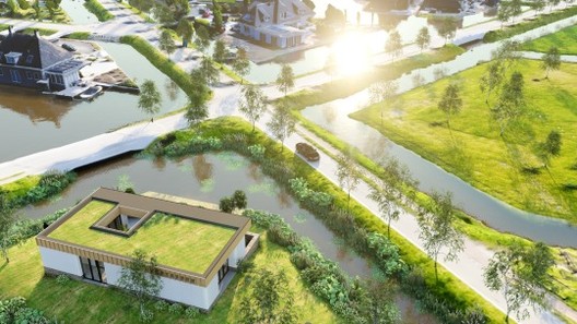 Courtesy of Studio Aaan. ImageNesselande Project with context made from this drone-to-3D workflow Courtesy of Studio Aaan. ImageNesselande Project with context made from this drone-to-3D workflow While working in 3D-visualization software such as Lumion, features such as OpenStreetMap (OSM) and satellite ground planes can provide some context for your design. They are suitable options for quickly building urban or rural environments relevant to your project's location, but they're also limited. For instance, OSM only provides rough building shapes, rendered white, and the satellite maps are flat, often outdated, and the resolution is too low for client visualization. 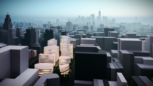 NYC skyline with context provided by OpenStreetMap, rendered in Lumion 8.3. Image Courtesy of Lumion NYC skyline with context provided by OpenStreetMap, rendered in Lumion 8.3. Image Courtesy of Lumion This all got me thinking—there has to be a better way to improve fast context-building without having to sacrifice photorealism. I investigated several options, starting with Google Maps and Google Earth SDKs, but these services do not allow their data to be used outside the scope of Google Maps and Google Earth, such as for architectural visualization. One solution is to create a 3D model of the environment using a series of photographs taken by a drone. This technique is sometimes used at construction sites to monitor progress, but it is not yet widely used for architecture design and visualization. To test its viability, we used a drone-to-3D workflow for several real-life design projects. From our experiences, we derived a workflow simple enough to be used by architects (and not only 3D specialists). Using a modern drone and the software RealityCapture, it is now possible to capture an area of 300 x 300 meters and create a textured 3D model of sufficient quality for presenting a realistic background for your Lumion visualization. Oh, and you can do all of this in one day. Workflow SummaryThis summary is a condensed version. Click here for the full drone-to-3D workflow story (PDF). Step 1: Buy a Drone Drones are getting cheaper, smaller and increasingly powerful by the minute. For this workflow, I used the DJI Mavic Air. It costs $800, weighs less than half a kilogram and it can fly for 20 minutes on one battery. The DJI Mavic Air can also cover a distance of 10 kilometers and make 4K video and 4000 x 3000 images with good resolution. This is adequate for our purpose of creating 3D environments as a backdrop for architecture design or visualization. 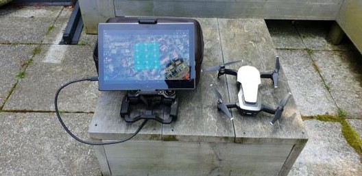 10-inch tablet and tablet holder next to the DJI Mavic Air. Image Courtesy of Lumion 10-inch tablet and tablet holder next to the DJI Mavic Air. Image Courtesy of Lumion Also, I'd recommend that you buy some extra drone batteries and, if needed, a 10-inch Android tablet. Step 2: Capture Drone Images Using a special app on your tablet for controlling a drone such as Drone Harmony, the second step is to capture images around the area of interest. The Drone Harmony app lets you draw the area of interest on a map, and then it calculates the flight path of the drone, capturing images automatically with a 60% overlap from the previous shot. This overlap is needed for automatic 3D model construction. 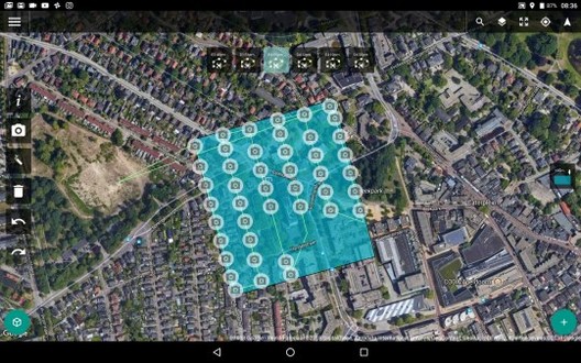 Example flight path in Drone Harmony. Image Courtesy of Lumion Example flight path in Drone Harmony. Image Courtesy of Lumion Do five runs of the same flight path above the desired area, but make sure you assign a different camera angle for each flight. For instance, you can fly the first run with the camera pointed down and the other four runs with the camera tilted at 45 degrees. Each run takes 7 to 15 minutes, so the entire flying will take about 1 to 1.5 hours overall. Step 3: Enter images into RealityCapture (RC) While there are many different software programs for compiling drone images into a 3D model, I found RealityCapture to be the best option. RealityCapture automatically aligns all of the images and then creates a 3D model, adds textures, and inspects the model's quality. This literally takes a few minutes of manual work, and a few hours at most of background processing by the RealityCapture software. 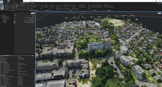 Constructed 3D model after RC aligned and processed the images from your drone flights. Image Courtesy of Lumion Constructed 3D model after RC aligned and processed the images from your drone flights. Image Courtesy of Lumion Step 4: Cut out the less-detailed areas and unwanted objects If the quality of the model is OK, the next step is to cut out the less-detailed areas and unwanted objects and then simplify the 3D model to a smaller model. Depending on the model's size and complexity, this can be anything between 30 thousand and 1 million triangles. 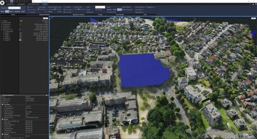 Cut out a specific area where you will insert your CAD building or spaces. Image Courtesy of Lumion Cut out a specific area where you will insert your CAD building or spaces. Image Courtesy of Lumion Texture the model again and export it in an FBX format. Cutting and simplifying the model takes between 20 minutes and one hour. Step 5: Import the model into Lumion After importing the 3D drone model into Lumion, you can dress it up with trees, cars, people, furniture, etc. You can also import your design from SketchUp or your CAD/BIM program (Revit, 3ds Max, AutoCAD, Rhino, etc) on a separate layer, and make renders and animations. 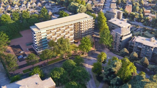 Westpoint Apeldoorn Project, rendered in Lumion 8.5 after going through the drone-to-3D workflow. Image Courtesy of Lumion Westpoint Apeldoorn Project, rendered in Lumion 8.5 after going through the drone-to-3D workflow. Image Courtesy of Lumion This typically takes anywhere between 15 minutes and several hours. If you want the full story, with detailed information and tons of great images and videos, check out the full Drone-to-3D workflow (PDF). Testing the Workflow on Real-Life ProjectsI used this workflow for several projects. One was a test project of a beach and dune area featuring an existing Lumion example house. The remaining two were commercial design projects from local architects. These are briefly described in the next sections. Beach and Dune Area 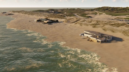 Courtesy of Lumion Courtesy of Lumion Test project. Existing Lumion beach bungalow added to a 500 x 500-meter captured beach area near The Hague, The Netherlands. (Download this Lumion Project) Nesselande Project / Studio Aaan  Courtesy of Studio Aaan Courtesy of Studio Aaan Private house design on a small island in a new residential area near Rotterdam, The Netherlands.  Courtesy of Studio Aaan Courtesy of Studio Aaan From architect Hilbrand Wanders of Studio Aaan: "Only once a house is finished and the owners move in, one can precisely see how certain trees are creating shadows in the house, what objects in the surroundings are blocking views from a certain position, or how window openings are positioned relative to window openings of the surrounding buildings. These aspects are highly influential on the living qualities and are difficult and too time-consuming to model by hand completely early in the design process. It is very interesting for a designer to consider the correct 3D environment from the first moment on, to test the first design-ideas within a correct 3D surroundings, but also to communicate these to a client in a very clear and tempting format."  Courtesy of Studio Aaan Courtesy of Studio Aaan 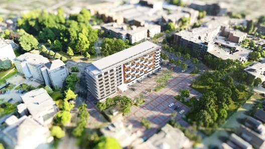 Paul Spaltman's design of a refurbished office building in Apeldoorn, The Netherlands. Image Courtesy of Lumion Paul Spaltman's design of a refurbished office building in Apeldoorn, The Netherlands. Image Courtesy of Lumion Westpoint Apeldoorn Project / Paul Spaltman 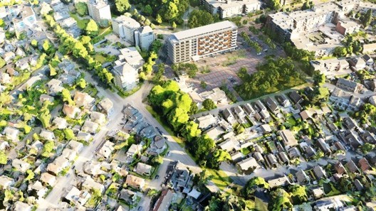 Another aerial render showing city context created from the Drone-to-3D workflow. Image Courtesy of Lumion Another aerial render showing city context created from the Drone-to-3D workflow. Image Courtesy of Lumion 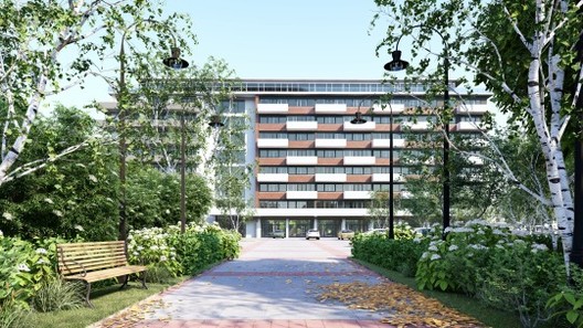 Front of the Westpoint Apeldoorn Project. Image Courtesy of Lumion Front of the Westpoint Apeldoorn Project. Image Courtesy of Lumion Refurbishment of an existing office building into 98 apartments, each with a balcony, in Apeldoorn, The Netherlands. From architect Paul Spaltman: "The fact that my design was embedded so clearly in the environment is an added value, not only during the design, but also during presentations and discussions with the customers, governments, and local citizens or whoever is involved." 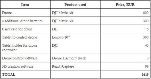 Courtesy of Lumion Courtesy of Lumion Cost OverviewThe following table sums up the software and hardware components I used. Other components may be needed, with additional costs, as well: Creating Your Own 3D Environments with DronesMy experiences have shown that creating 3D environment models from drone images is very straightforward and feasible for any architecture design visualization. The investment in time and money is relatively low, and any architect can do it without extensive training and/or the need for a 3rd-party service provider. The resulting models have value both in the design process (Lumion LiveSync) and for communicating with clients and other interest parties, like the city council and local citizens (Lumion rendered images and animations). This posting includes an audio/video/photo media file: Download Now |
| You are subscribed to email updates from ArchDaily. To stop receiving these emails, you may unsubscribe now. | Email delivery powered by Google |
| Google, 1600 Amphitheatre Parkway, Mountain View, CA 94043, United States | |


Nema komentara:
Objavi komentar