Arch Daily |
- Flexim Headquarters / ZRS Architekten
- House Rehabilitation in Villanueva de Duero / Arias Garrido Arquitectos
- Markthalle Panzerhalle / smartvoll
- Youth Housing, Nansensgade / Christensen & Co. Architects
- TKSTYLE Office / JACKY.W DESIGN
- Canopy House / Rob Paulus Architects
- RUMORS / Narmal Design
- Rohan / Ashwin Architects
- Space-time Cave in Echigo-Tsumari Art Triennale / C+ Architects
- 3033 Wilshire Tower / Steinberg Hart
- Hello Wood's POP-UP Park Adds a Splash of Color to an Underused Square in Budapest
- Casa Cusipata / SOMA Lima
- Dubai Plans for One Quarter of Buildings to be 3D Printed by 2025
- 17 Spectacular Living Roofs in Detail
- Ibirapuera Apartment / Casa14 Arquitetura
- David Chipperfield's IMPACT Centre Offers a Contemporary Interpretation of Edinburgh's Georgian Fabric
- Amos Rex / JKMM Architects
- The Most Important New Tool for Architects: Instagram
- Colonel Nesmith Readiness Center / Hacker Architects
- The World's Largest Telescope Takes Shape in Southern China
| Flexim Headquarters / ZRS Architekten Posted: 28 Aug 2018 08:00 PM PDT  © ZRS Architekten © ZRS Architekten
 © ZRS Architekten © ZRS Architekten Text description provided by the architects. Flexim GmbH is an internationally leading company in the development and production of ultrasound measuring devices. The concept for their new headquarters building in Berlin-Marzahn was based on six courtyard buildings that could be constructed in stages to accommodate the firm's gradual expansion over a number of years, the first two volumes of which were completed in 2016. The concept aims to most efficiently accommodate the complex production and logistic processes that take place in the building while offering flexible spaces and a generous number of shared and communicative areas.  © ZRS Architekten © ZRS Architekten  © ZRS Architekten © ZRS Architekten The building is constructed in an innovative timber-concrete structural system. Thus the below ground level is in reinforced concrete and the upper floors have concrete cores, central columns and primary beams spanned by a timber-concrete hybrid floor system. Apart from the core, the entire light-weight 4th floor is built completely in timber. Furthermore, the vapour permeable and climate-active building shell is a complete timber construction. These material properties are complemented by an appropriate amount of glass as well as shading and night-time ventilation elements to provide an optimal level of user comfort throughout the year and a low primary energy requirement. Through the additional provision of regenerative energy sources (heat reclamation from underground sewage pipes, solar collectors and PV panels), the building is 30% below the strict German EnEv standard.  © ZRS Architekten © ZRS Architekten This posting includes an audio/video/photo media file: Download Now |
| House Rehabilitation in Villanueva de Duero / Arias Garrido Arquitectos Posted: 28 Aug 2018 07:00 PM PDT  © Rubén Hernández Carretero © Rubén Hernández Carretero
 © Rubén Hernández Carretero © Rubén Hernández Carretero  © Rubén Hernández Carretero © Rubén Hernández Carretero Text description provided by the architects. This small construction, property of the local council of Villanueva de Duero, was built in the 1950s as the house for the bailiff. It responds to a very common building typology during the post-war period, in social promotions carried out in Valladolid by the Ministry of Housing and the National Housing Institute. These were very simple constructions, with load-bearing brick walls as support system and brick vaults that cover the space, considering the high costs of steel structures and that the use of wood was in disgrace.  © Rubén Hernández Carretero © Rubén Hernández Carretero  Plans Plans  © Rubén Hernández Carretero © Rubén Hernández Carretero The intervention draws from a very tight budget, which forced the use of low-cost materials and solutions that ensured the recovery of the house according to current regulations. The original volume of approximately 60 m2, with two bedrooms, a living room and a kitchen, is restored, eliminating later expansions that were executed in a more modest way and that were also pretty damaged. This renovation seeks to highlight the properties of the house, pointing the brick vault out, keeping and emphasizing the original textures of the interior partition walls and the outside rugged plaster walls, and restoring the traditional gloria. The enclosure walls are lined inside with plywood and polycarbonate panels. The patio is solved with maximum simplicity, using concrete block enclosure, pebbles pavement, and a concrete deck.  © Rubén Hernández Carretero © Rubén Hernández Carretero  © Rubén Hernández Carretero © Rubén Hernández Carretero This posting includes an audio/video/photo media file: Download Now |
| Markthalle Panzerhalle / smartvoll Posted: 28 Aug 2018 06:00 PM PDT  © Tobias Colz © Tobias Colz
 © Tobias Colz © Tobias Colz Text description provided by the architects. The hall, located on the outskirts of Salzburg, once churned out tanks and materials for the war effort. Its rebirth as a market hall required two distinct aspects: embracing the industrial charm and reinterpreting market typology. The market structure begins in the middle of the hall, where the existing brick walls serve as a frame. This creates an exciting contrast between a historical structure and modern architecture.  © Angi Huber © Angi Huber A sophisticated space concept turns the historic industrial substance into a melting pot of producers of high-quality regional goods that are presented in such a manner that transcends shopping and creates a world of enjoyment. There are no direct paths, no counters and no specific floor plan, thus ensuring that visitors are in constant movement. Vendors and visitors experience the space, the production, shopping and enjoyment together, as a one-of-a-kind world of sensation.  Section Section The ease of appearance
 © Tobias Colz © Tobias Colz Explaining the space concept is no easy task: it's more of a model of staged room structure developed in all areas, levels and directions—also towards the top. Floor plans, walls and ceiling landscapes morph into one another to continuously create new impressions of rooms, niches and structures. The order seems random. But the space concept has been organized in painstaking detail as a stage for products—always with the respective user in mind, always tailored to their requirements. It is also a stage for people, where vendors and customers exchange their assigned roles and places, and thus communicate, enjoy and consume in a completely different manner.
 Model Model Nothing is more difficult to plan than chaos; nothing is as unnatural as planned nature. The new market hall is centrally organized, thus keeping the walls and the old brick walls in the forefront. Individual market stands are a variation of "one and the same," while yet retaining their individual character.
 © Tobias Colz © Tobias Colz Living order
 © Tobias Colz © Tobias Colz The containers form the structure, while simultaneously performing the role of buckle from room to room. But they also fulfill a very pragmatic purpose: in addition to the inexpensive construction costs, they contain the building's mechanical and electrical equipment, like the ventilation system.
 © Tobias Colz © Tobias Colz Materiality and Design
In addition to showcases, shelves and presentation areas, tables of varying height are also used, thus ensuring that working spaces or service areas are also individually designed. You can lean, stand or sit—but classic countertops are nowhere to be found.  © Tobias Colz © Tobias Colz Microcosm
 © Tobias Colz © Tobias Colz This posting includes an audio/video/photo media file: Download Now |
| Youth Housing, Nansensgade / Christensen & Co. Architects Posted: 28 Aug 2018 05:00 PM PDT  © Niels Nygaard © Niels Nygaard
 © Niels Nygaard © Niels Nygaard Text description provided by the architects. The compact infill holds nine small apartments for socially vulnerable citizens. The building site is only 10 meters wide, this physical limitation of the architecture is turned into a design quality, as only two apartments to each floor gives the young inhabitants a sense of privacy, while also giving them the security of being part of a community. Each apartment has its own kitchen and a bathroom along with a niche for relaxing while enjoying the view of one of Copenhagen's most vibrant streets. Outside, the facade is clad in coppery warm toned aluminum and has a relief motive; apart from creating variation and vibrancy in the urban environment, the protruding bay windows offer views down the street from each apartment niche.  © Niels Nygaard © Niels Nygaard  Plan Plan  © Niels Nygaard © Niels Nygaard The bay windows are a central design feature, which is both aesthetically and functionally innovative, as they contribute to the overall architectural expression of the building and creates an entirely different experience of light and air in each apartment. In the facade, the proportions of protruding elements connect to the rhythm and flow of the urban environment. To achieve this the building is divided into smaller units that correspond to the existing urban space. The units occur as a result of the juxtaposition between elements, which is in turn created to ensure shading from direct sunlight. To further incorporate the relief motive into the surrounding built environment, the protruding elements align with the horizontal markings and cornices of the neighboring buildings.  © Niels Nygaard © Niels Nygaard At the 6th floor, the roof terrace incorporates difference in height between the surrounding buildings, and provide the inhabitants with a private outdoor space. At the ground floor, a public bike repair shop opens up the building towards the street and the social connection is further enhanced by areas for stay near the entrance.  © Niels Nygaard © Niels Nygaard This posting includes an audio/video/photo media file: Download Now |
| TKSTYLE Office / JACKY.W DESIGN Posted: 28 Aug 2018 04:00 PM PDT  Reception. Image © Wenyao Photography Reception. Image © Wenyao Photography
 Reception. Image © Wenyao Photography Reception. Image © Wenyao Photography Text description provided by the architects. It is commonly considered that people cannot enjoy work and life at the same time, although they are hardly separated from each other completely. Through breaking the routines and bringing a "home" into the workspace, JACKY.W DESIGN created an open and multifunctional living experience space for the fashion brand TKSTYLE BOUTIQUE.  Interior landscape in the reception. Image © Wenyao Photography Interior landscape in the reception. Image © Wenyao Photography  First floor plan First floor plan  Reception. Image © Wenyao Photography Reception. Image © Wenyao Photography At the entrance, several clusters of dry corn stalks are placed by the wall, bringing nature into the space. The large 360-degree revolving door neutralizes the space temperament dominated by cement with its warm wooden texture.  Lobby. Image © Wenyao Photography Lobby. Image © Wenyao Photography  Lobby. Image © Wenyao Photography Lobby. Image © Wenyao Photography The designers gave full play to the structure and height (8 meters) of the original space, and ingeniously integrated functional areas for working, reception, fitness and conference, etc. into the two-story space without rigid partitions. There are windows in each wall, which ensures sufficient natural lights to penetrate to the space, thereby resulting in a bright and airy environment.  Reception. Image © Wenyao Photography Reception. Image © Wenyao Photography  Reception. Image © Wenyao Photography Reception. Image © Wenyao Photography The open layout of the space made it possible for the designers to apply the concept of co-living and cooperative working. Integrating household settings with the workspace in a harmonious way requires quality execution of design and sensibility to details. The design features a industrial style, combined with the exquisite upholstered furniture and adornments, making the overall space rough, simple yet delicate.  Washroom. Image © Wenyao Photography Washroom. Image © Wenyao Photography  Second floor office. Image © Wenyao Photography Second floor office. Image © Wenyao Photography The flourishing plants highlight the original beauty of the concrete extensively exposed on the floor, walls, beams and pillars. The designers tried nine times for the testing and proofing of cast-in-place cement slabs, so as to ensure the stability of the texture. The strict selection and utilization of materials is also manifested in the ultra -white glass and ultra-thin marble slabs with white patterns exported from Spain. With ingenious application of colors and lines, the designers optimized the spatial texture and experience.  Junction of lobby and reception. Image © Wenyao Photography Junction of lobby and reception. Image © Wenyao Photography  Washroom entrance. Image © Wenyao Photography Washroom entrance. Image © Wenyao Photography If we're lucky enough to be engaged in a industry that interests us, work will become a joy. This is exactly true for TKSTYLE BOUTIQUE and JACKY.W DESIGN. Perhaps this is the reason that the TKSTYLE Office came into being, which improves work to a new level -- "life is work".  Gym. Image © Wenyao Photography Gym. Image © Wenyao Photography This posting includes an audio/video/photo media file: Download Now |
| Canopy House / Rob Paulus Architects Posted: 28 Aug 2018 03:00 PM PDT  © Cooperthwaite Photography + Productions © Cooperthwaite Photography + Productions
 © Cooperthwaite Photography + Productions © Cooperthwaite Photography + Productions Text description provided by the architects. This renovation for a physician and author opens the house up in plan and section to embrace the lush landscape of its desert site while improving the flow and experience of the property. New forms are crisp and clean to contrast with the heavy and rounded vocabulary of the existing building.  © Cooperthwaite Photography + Productions © Cooperthwaite Photography + Productions Using a reductive approach on the interior, walls are taken down to provide better function, circulation and views. On the exterior, an existing trellis porch is transformed into an outdoor living room and kitchen with a new raised canopy. This 20 x 40 foot rectangle of wood and steel lifts up and over the existing house to provide more light and views to the lush courtyard oasis and big, blue sky of the Sonoran Desert.  Plan Plan A natural material and color palette dominates the new scheme with an emphasis on Douglas Fir wood that was influenced by the clients desire to create nature inspired spaces. This warm wood is used on all interior cabinetry but also appears on the exterior as the underside of the roof plane that hovers over the outdoor living area. The existing closed in house is transformed to engage the outdoors while creating calming interior space in a decidedly modern overhaul.  © Cooperthwaite Photography + Productions © Cooperthwaite Photography + Productions This posting includes an audio/video/photo media file: Download Now |
| Posted: 28 Aug 2018 02:00 PM PDT  The freehand roof. Image © Dongrui Xie The freehand roof. Image © Dongrui Xie
.jpg?1534815899 "RUMORS new bund store. Image © Dongrui Xie") RUMORS new bund store. Image © Dongrui Xie RUMORS new bund store. Image © Dongrui Xie Text description provided by the architects. Based on "Problem solving" concept, Narmal Design help our client discover the "niceness" that they already possessed, and present it in a "Narmal"way. .jpg?1534815889 "RUMORS new bund store. Image © Dongrui Xie") RUMORS new bund store. Image © Dongrui Xie RUMORS new bund store. Image © Dongrui Xie In our long-term cooperation with RUMORS, we have carried out the overall brand planning of RUMORS from visual system to product packaging and spatial image.  The freehand roof. Image © Dongrui Xie The freehand roof. Image © Dongrui Xie The name of RUMORS generated from the owner Mr. Nakayama's mentor - Mr.Ono (his shop name is Kawa rumor, "friends and family" in Indonesian). Roasting is the soul of RUMORS. They use their unique roast method, and the roasting time is doubled comparing to other companies.Therefore, we doubled the initial letter "R" (RUMORS AND ROAST) to make a new version RUMORS logo, which also represents the Japanese emblem of RUMOR family, in order to correspond the profound meaning of the brand.  Plan Plan In the process of designing this RUMORS NEW BUND STORE, the concept of RUMORS("friends home" ) has been strengthened. We created a typical Japanese courtyard space through a freehand roof and a short fence around it.  Old friend home. Image © Dongrui Xie Old friend home. Image © Dongrui Xie .jpg?1534815955 "The eaves. Image © Dongrui Xie") The eaves. Image © Dongrui Xie The eaves. Image © Dongrui Xie Meanwhile, the image of RUMORS's first shop in Shanghai (Hunan Road store) was implanted at the rear part of the café and expressed "the spirit of the professional" of RUMORS by differentiating the wood colors and materials in interior space.  Old friend home. Image © Dongrui Xie Old friend home. Image © Dongrui Xie Product design is focus on expressing the essence of the brand while meeting pragmatic needs. We use the silhouette of Mr. Nakayama in the roasting process as a visual theme, since Mr. Nakayama is the founder, and also the exemplary of RUMORS's core value. This pattern is used in the design of the coffee bag and the gift box. Narmal design,transmit the niceness on.  Outdoor. Image © Dongrui Xie Outdoor. Image © Dongrui Xie This posting includes an audio/video/photo media file: Download Now |
| Posted: 28 Aug 2018 01:00 PM PDT  © Shamanth Patil © Shamanth Patil
 © Shamanth Patil © Shamanth Patil "Rohan" built on a tiny lot measuring 20' x 30' (600 sft) with the road on the western side. Such tiny lot houses are typical and many of the plots are government sanctioned to encourage housing for the masses. The challenge was to provide a habitable place with all amenities & luxuries to last a lifetime.  © Shamanth Patil © Shamanth Patil Considering that the buildings abut each other, tapping light and ventilation into our building had to be done with considerable planning & thought. To cut down the western light, we have incorporated shading devices which run like horizontal beams. Considerable thought in planning helped us use these shading devices to generate interesting shadows on the inside to create a sense of "dark" and "light".  Section Section A small green pocket at the entrance gives a sense of abundance and the feeling of a larger plot. A similar double height experience in the living room spatially expands it and makes it more inviting. A functional and gadget filled parallel kitchen takes care of all the cooking needs.  © Shamanth Patil © Shamanth Patil Master bedroom with a small pocket performing the function of a private sit-out can help in reading that occasional book. A rope acts as the safety railing for the cantilever steps. The zig-zag pattern of the railing breaks the regularity of the spaces. Warm white lights complement this uncomplicated building to improve the ambience.  © Shamanth Patil © Shamanth Patil This posting includes an audio/video/photo media file: Download Now |
| Space-time Cave in Echigo-Tsumari Art Triennale / C+ Architects Posted: 28 Aug 2018 12:00 PM PDT  Inside Corner. Image Courtesy of C+ Architects Inside Corner. Image Courtesy of C+ Architects
 exhibition site. Image Courtesy of C+ Architects exhibition site. Image Courtesy of C+ Architects A 10-foot square hut - Through observing a micro world, seeing a macro universe  Facade. Image Courtesy of C+ Architects Facade. Image Courtesy of C+ Architects Have you ever experienced a complete Japanese tea ceremony? For nearly half a day, people felt the universe by drinking a bowl of tea. More importantly, in a small space, reflect and observe one's inner world through tea soup, utensils and a series of behavioral action.  Courtesy of C+ Architects Courtesy of C+ Architects Designed by the C+ Architects team, the "Space-time Cave" is set to be a mobile tea house that can accommodate 2 to 3 people. In this small "cave" of 2.4x2.4x2.4 meters, people experience time and space through changes in light, air and even rain.  Exhibition Corridor. Image Courtesy of C+ Architects Exhibition Corridor. Image Courtesy of C+ Architects  Facade. Image Courtesy of C+ Architects Facade. Image Courtesy of C+ Architects Unlike the traditional tea room, the installation is displayed in the corridor of the Echigo-Tsumari Satoyama Museum of Contemporary Art, which can be said to be an "architecture within architecture". The designer avoids the appearance of building components to the greatest extent, and realizes various openings to archive the function of windows and doors in architecture language, making the whole more abstract and purer. At the same time, through the slender hole, viewers can also enjoy the artwork created by the artist Leandro Erlich in the central courtyard of the museum.  Facade. Image Courtesy of C+ Architects Facade. Image Courtesy of C+ Architects Mortise and Tenon / Assembly  View From Corner. Image Courtesy of C+ Architects View From Corner. Image Courtesy of C+ Architects Scaling Up of Furniture / Scaling Down of Architecture  Inside Corner. Image Courtesy of C+ Architects Inside Corner. Image Courtesy of C+ Architects The four corners of the cube are cut away, forming windows and door openings, letting light entering the space from different directions, forming a box of light. When people are inside the "hut", different angles of sky and scenery can be seen through various openings.  Detail. Image Courtesy of C+ Architects Detail. Image Courtesy of C+ Architects This posting includes an audio/video/photo media file: Download Now |
| 3033 Wilshire Tower / Steinberg Hart Posted: 28 Aug 2018 10:00 AM PDT  © Hunter Kerhart © Hunter Kerhart
 © Hunter Kerhart © Hunter Kerhart Text description provided by the architects. With its sculpted profile, high-quality residential units, and thoughtfully planned social areas, this high-density, mixed-use development is set to become an architectural icon, connecting downtown Los Angeles to Koreatown. Sitting at the corner of Wilshire Boulevard and Virgil Avenue, the building stands out as one of the first luxury mixed-use projects to be constructed along the 16-mile historic corridor that stretches west from downtown.  © Hunter Kerhart © Hunter Kerhart  Ground Floor Plan Ground Floor Plan  © Hunter Kerhart © Hunter Kerhart From the rooftop deck, residential balconies cascade down the sleek glass and aluminum exterior. Employing glass as the primary skin element, the protruding decks change size as they move up the building, creating a fluid appearance across the facade. The 190 residential units — including studios, one-and-two-bedroom apartments, and several penthouse suites — were designed with an unmatched emphasis on material quality and location experience.  © Hunter Kerhart © Hunter Kerhart The rooftop sky deck features a pool and spa, as well as an enclosed clubroom and demonstration kitchen. The surrounding views capture Downtown LA, the Hollywood Hills, and the Pacific Ocean, all in one sweeping glance. Additional amenities include a lobby lounge, fitness center, dining/conference room, and golf simulator. The street level includes 5,500 SF of commercial retail space.  © Hunter Kerhart © Hunter Kerhart  Section Section  © Hunter Kerhart © Hunter Kerhart This posting includes an audio/video/photo media file: Download Now |
| Hello Wood's POP-UP Park Adds a Splash of Color to an Underused Square in Budapest Posted: 28 Aug 2018 09:00 AM PDT  © Petra Gaspar © Petra Gaspar Hello Wood has revived its highly-successful POP-UP Park, bringing a touch of vibrancy to an underused square in downtown Budapest. Having built the structures in the summer of 2017, the park has returned one year later to provide "a democratic space for all social groups embedded within the everyday movement of the city." Open 24 hours per day, the park acts as a free-to-use space for people from all walks of life. Supported by the Municipality of Budapest, the scheme is situated in a frequented though empty spot beside the Budapest City Hall. The park consists of a series of curved, wooden structures providing ample space to sit or lie in the summer sun. The vibrant palette combines with palm plants and olive trees to add a splash of color to an otherwise dull, cobblestone square.  © Petra Gaspar © Petra Gaspar Sail shades have been added to the scheme to provide respite from the city's intense summer sun, addressing the lack of tree shade. Solar panels provided by Hungarian startup Platio provide the means for nomadic workers to plug in laptops, or leisurely tourists to recharge phones. After sunset, strings of quaint evening lighting maintain a cozy environment against the darkness.  © Petra Gaspar © Petra Gaspar Referencing Budapest's upcoming status as 2019's European Capital of Sport, this year's edition also features sporting equipment including workout equipment provided by HardBodyHang, ping pong, and Tegball, a Hungarian invention combining table tennis and football. The addition allows the park to transition between a place of leisure and a functional hub for health of fitness.  © Petra Gaspar © Petra Gaspar The POP-UP Park will be open until October 2018. News of the structure's return comes weeks after Hello Wood showcased the results of its 2018 Project Village of tiny cabins with a group of international students and architects.  © Petra Gaspar © Petra Gaspar Click on any of the images above to reveal the full gallery of the 2018 POP-UP Park. News via: Hello Wood Concept: András Huszár, Péter Pozsár, Dávid Ráday This posting includes an audio/video/photo media file: Download Now |
| Posted: 28 Aug 2018 08:00 AM PDT  © Renzo Rebagliati © Renzo Rebagliati
 © Renzo Rebagliati © Renzo Rebagliati Text description provided by the architects. The temporary house is located in Chaclacayo, an hour east of Lima, place where many families seek for an escape away from the chaotic city. The architectural program includes a house with a living and dining room, four bedrooms, kitchen, T.V. room and service area, and a separate volume that holds additional bedrooms for visitors.  © Renzo Rebagliati © Renzo Rebagliati  Ground floor plan Ground floor plan  © Renzo Rebagliati © Renzo Rebagliati The emplacement of the volumes in an “L” shape allow the main spaces to face the green view but also contain the garden and the social terrace. As you come across the front door, the main house is framed by an extensive garden, along with the mountains and blue sky.  © Renzo Rebagliati © Renzo Rebagliati The main house has an over dimensioned, integrated living and dining room, as this was the most important place for the family to gather. With a tall roof, the space expands vertically and horizontally, and connects seamlessly interior and exterior.  © Renzo Rebagliati © Renzo Rebagliati The bedroom area opens to a different garden to maintain privacy, while other social spaces, such as the kitchen, and T.V. room, integrate visually to the rest of the house.  © Renzo Rebagliati © Renzo Rebagliati Volumetrically, the first floor of the house is composed by two separate brick boxes — the bedrooms and kitchen to one side and the service area to the other — that support a long white and pure volume that contains the social area.  © Renzo Rebagliati © Renzo Rebagliati This posting includes an audio/video/photo media file: Download Now |
| Dubai Plans for One Quarter of Buildings to be 3D Printed by 2025 Posted: 28 Aug 2018 07:00 AM PDT  Dubai. Image via Creative Commons Dubai. Image via Creative Commons Dubai has launched 3D Printing Strategy, a global initiative to make the city the world's leader in 3D printing. The initiative is designed to promote the status of the UAE and Dubai as a leading hub of 3D printing technology. His Highness Sheikh Mohammed bin Rashid Al Maktoum, Vice President and Prime Minister of the UAE and Ruler of Dubai, has created the plan for one quarter of new buildings to be 3D printed by 2025. The strategy hopes to utilize 3D printing to cut costs in the medical and construction sector and restructure economies and labor markets.  Office of the Future by Killa Design. Image © WAM Office of the Future by Killa Design. Image © WAM The Dubai Future Foundation has stated that the city aims to reduce labor by 70% and cut overall costs by 90% with their 3D Printing Strategy. The plan takes aim at redefining productivity "because the time needed for 3D printing of buildings and products will be 10% of the time taken in traditional techniques." The Dubai Future Foundation has stated that the initiative will focus on lighting products, bases and foundations, construction joints, facilities and parks, buildings for humanitarian causes and mobile homes.  Office of the Future by Killa Design. Image © WAM Office of the Future by Killa Design. Image © WAM Dubai originally announced plans to build the world's first 3D printed structure back in 2015. The resulting project, the Office of the Future by Killa Design, became the world's first fully functional and permanently occupied 3D printed office. The printer featured an automated robotic arm to implement the printing process which lasted 17 days and was installed on site in two days. Featuring a super insulated cladding system, the project components were fabricated using computer controlled manufacturing techniques to form the unique and complex geometry of the building envelope. The office is currently home for the Dubai Future Foundation. Dubai municipality's regulations will start in 2019 with a gradual increase to the strategic 2025 goal. This posting includes an audio/video/photo media file: Download Now |
| 17 Spectacular Living Roofs in Detail Posted: 28 Aug 2018 06:30 AM PDT  © José Hevia © José Hevia In Le Corbusier's 5 points of architecture, he advocates the inclusion of flat roofs hosting roof gardens, providing valuable outdoor space for the inhabitants of the building in order to replace the ground lost to the construction of the building. But while this acknowledgement of outdoor space was important for people, Le Corbusier's sculptural concrete roof gardens were little consolation to the non-human flora and fauna that were displaced by his works. Recent improvements in our understanding of ecosystems and the environment, as well as a better scientific understanding of the needs of plants, have changed this dramatically. In the past few decades, green roofs and living roofs have exploded in popularity, and now adorn every kind of building--from small private houses to the gigantic surface of Barclay's Center in Brooklyn. We've collected together some excellent examples of these living roofs, including the structural detailing that makes them possible. Read on for 17 spectacular green roofs that achieve environmental benefits including reduced stormwater runoff, and reductions in energy use and the heat island effect. Vias Cultural Center / Estudio SIC © Esaú Acosta © Esaú Acosta  Centro Creación Joven Espacio Vias / Estudio SIC Centro Creación Joven Espacio Vias / Estudio SIC House at León / ALARCÓN + ASOCIADOS © Cortesía de Alarcón + Asociados © Cortesía de Alarcón + Asociados  Casa en León / Alarcón + Asociados Casa en León / Alarcón + Asociados House C / Hiroshi Nakamura & NAP © Hiroshi Nakamura & NAP © Hiroshi Nakamura & NAP  Casa C / Hiroshi Nakamura & NAP Casa C / Hiroshi Nakamura & NAP Galeria Mario Sequeira / Carvalho Araújo © Pedro Lobo © Pedro Lobo  Galería Mario Sequeira / Atelier Carvalho Araújo Galería Mario Sequeira / Atelier Carvalho Araújo Cubierta Verde / Cardoso + Zúñiga © Luis Alonso © Luis Alonso  Cubierta Verde / Cardoso + Zúñiga Cubierta Verde / Cardoso + Zúñiga Senior Citizen Community Center / F451 Arquitectura © José Hevia © José Hevia  Senior Citizen Community Center / F451 Arquitectura Senior Citizen Community Center / F451 Arquitectura OS House / NOLASTER © José Hevia © José Hevia  Casa OS / Nolaster Casa OS / Nolaster Volcano Buono / RPBW © RPBW © RPBW  Vulcano Buono / Renzo Piano Vulcano Buono / Renzo Piano Villa Bio / Enric Ruiz Geli © Lluís Ros / Optical Adiction © Lluís Ros / Optical Adiction  Villa Bio / Enric Ruiz Geli Villa Bio / Enric Ruiz Geli Line of Work / Jill Anholt Studio © Martin Tessler © Martin Tessler  Line of Work / Jill Anholt Studio Line of Work / Jill Anholt Studio Sports Pavilion / Filipe Brandão and Nuno Sanches © Nuno Sanches © Nuno Sanches  Pabellón de Deporte / Felipe Brandão y Nuno Sanches Pabellón de Deporte / Felipe Brandão y Nuno Sanches House LLP / Alventosa Morell Arquitectes © Adrià Goula © Adrià Goula  Gozu House / OPUS © Isaac Ramirez © Isaac Ramirez  KCEV / Petr Hajek Architekti © Benedikt Markel © Benedikt Markel  Sun Rain Room / Tonkin Liu Architects_(1).jpg?1535405382 "© Edmund Sumner") © Edmund Sumner © Edmund Sumner 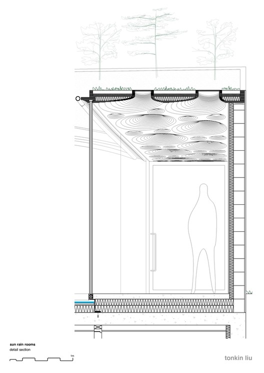 Nk'Mip Desert Cultural Centre / DIALOG © Centro Cultural del Desierto Nk'Mip / DIALOG © Centro Cultural del Desierto Nk'Mip / DIALOG  The Hill Cork House / Contaminar Arquitectos © Fernando Guerra | FG+SG © Fernando Guerra | FG+SG  Check out more great projects with green roofs here. This posting includes an audio/video/photo media file: Download Now |
| Ibirapuera Apartment / Casa14 Arquitetura Posted: 28 Aug 2018 06:00 AM PDT  © Maira Acayaba © Maira Acayaba
 © Maira Acayaba © Maira Acayaba Text description provided by the architects. This never inhabited triplex covers 900m2 and is located nearby the Ibirapuera Park, in São Paulo (Brazil). Its original environments were fragmented and darkish. The project, signed by the architects of Casa 14 Arquitetura, Mariana Andersen and Mariana Guardani, aimed at integrating the floors and stressing the character of the materials.  © Maira Acayaba © Maira Acayaba  Plan 1 Plan 1  © Maira Acayaba © Maira Acayaba  Plan 3 Plan 3 The generous openings of the walls offered a visual connection between different environments in each of the three levels of the apartment. The Project also emphasized the relationship between the environment, gardens and circulations. The staircase - a folded steel plate lined with wood on the bottom and white stone on the top - appears as the sculptural element that interlinks the three decks. The vertical structure stands out.  © Maira Acayaba © Maira Acayaba Each floor was designed for a specific use. In this order: live, work and rest. On the first level are the rooms, kitchen and service area. The second was designed to receive a library of 5 thousand titles integrated into a garden where the resident works, reads and writes. The last level brings the leisure area, with a music studio, hot tub, sauna and a barbecue, permeated by a vertical garden in all its extension.  © Maira Acayaba © Maira Acayaba  © Maira Acayaba © Maira Acayaba The furniture sheds light on the Brazilian design. The art pieces, carpets, among others, establish a counterpoint to the absence of ornaments and the straight lines of the residence.  © Maira Acayaba © Maira Acayaba The main materials - wood, glass, light stone and vegetation - allow a dialogue with the environment and produce a luminous and inspiring atmosphere for the residente, who works as a writer at home.  © Maira Acayaba © Maira Acayaba This posting includes an audio/video/photo media file: Download Now |
| Posted: 28 Aug 2018 05:00 AM PDT  © Hayes Davidson © Hayes Davidson David Chipperfield Architects have released new details of their proposed IMPACT Centre in Edinburgh, Scotland. Addressing the need for a purpose-built, medium-sized performance venue in a city of profound cultural heritage, the scheme will serve as a base for the Scottish Chamber Orchestra with a main, 1000-seat auditorium. Situated in Edinburgh's UNESCO World Heritage Site, the scheme will replace an existing office building to become the first dedicated new space for music and performing arts in the city in 100 years. The scheme seeks to "form an urban composition centered around Dundas House," a 1771 Grade-A listed civic building whose rear façade abuts the proposed scheme.  © Hayes Davidson © Hayes Davidson The IMPACT Centre manifests as three compact, intersecting volumes. A central concert hall sits within an oval volume, crafted for optimal acoustic performance and topped by a shallow dome. The scheme's overlapping lower orthogonal volumes house ancillary and public functions, including a 200-seat studio for performance, recording, and rehearsals.  © Hayes Davidson © Hayes Davidson The order and materiality of the exterior facades draw inspiration from the architecture of Edinburgh's Georgian New Town. The typical expression of a base, middle, and top in neoclassical buildings is communicated in the building's massing while the texture and tone of the New Town are conveyed through various sandstones and a metal-clad dome.  © Hayes Davidson © Hayes Davidson The scheme's program is vertically arranged with the main concert hall lifted off the ground to create an entrance level underneath. With three entrances addressing different approaches, the expansive ground floor increases permeability across the site while uniting the diverse urban conditions surrounding it. The foyer is envisaged as a "new public room for the city" outside of performance hours, encompassing public functions such as information, ticketing, a café, and an informal performance and exhibition space.  © Hayes Davidson © Hayes Davidson A foyer staircase will connect the ground floor with the main concert hall upstairs, or the studio at basement level. Corridors will wrap around the auditorium at each level to provide access, acoustic isolation, and breakout space, while at the upper level, a colonnaded promenade below the dome will offer 360-degree views of Edinburgh.  © Hayes Davidson © Hayes Davidson Chipperfield won the competition for the scheme's design in 2017. The IMPACT Centre is expected to be completed in 2021. News of the design comes weeks after Chipperfield revealed the design of their new addition to the Turner Contemporary Gallery in Margate, England.  © Hayes Davidson © Hayes Davidson News via: David Chipperfield Architects This posting includes an audio/video/photo media file: Download Now |
| Posted: 28 Aug 2018 03:43 AM PDT  © Mika Huisman © Mika Huisman
 © Mika Huisman © Mika Huisman Text description provided by the architects. Amos Rex has its origins in the Amos Anderson Art Museum, which since 1965 has been Helsinki's leading private museum. To meet changes in the practice and display of contemporary art in the 21st Century, the trustees of the Amos Anderson Art Museum concluded that a new venue would be better suited for providing new art experiences than the museum's existing accommodation in converted newspaper offices. The nearby Lasipalatsi building, one of Finland's best-preserved examples of 1930s functionalist architecture was identified as a new home for the museum.  © Mika Huisman © Mika Huisman The Lasipalatsi has been comprehensively refurbished as part of the project, with special care given to preserve original features that include the first external neon lighting in Finland. Detailed research from historic sources as well as analysis of material on-site, conducted in partnership with the Helsinki City Museum, allowed JKMM to recreate a palette of materials and colours that is true to the original design. _Tuomas_Uusheimo_(5).jpg?1535465194 "© Tuomas Uusheimo") © Tuomas Uusheimo © Tuomas Uusheimo  Floor Plan Floor Plan _Tuomas_Uusheimo_(2).jpg?1535465026 "© Tuomas Uusheimo") © Tuomas Uusheimo © Tuomas Uusheimo  Floor Plan Floor Plan _Tuomas_Uusheimo_(13).jpg?1535466919 "© Tuomas Uusheimo") © Tuomas Uusheimo © Tuomas Uusheimo Bio Rex, the 590 seat cinema within the Lasipalatsi building has been restored to its 1930s glory and incorporated into the new institution, giving half of its name to create the Amos Rex identity.  © Mika Huisman © Mika Huisman From the foyer of the refurbished Lasipalatsi, visitors descend a staircase past a picture window that affords views over the public square, into the basement galleries. The roof of the new gallery is formed by a series of domes with angled roof lights that frame views of the surrounding buildings and allow exhibitions to be lit with natural light if the curators choose. The shape of the domes is expressed in the topography of the newly landscaped public square which sits above the galleries, as a series of gently rolling forms clad in concrete tiles.  © Mika Huisman © Mika Huisman  Section Section _Tuomas_Uusheimo_(9).jpg?1535466704 "© Tuomas Uusheimo") © Tuomas Uusheimo © Tuomas Uusheimo The existing restaurants and shops within the Lasipalatsi will continue to trade and will help contribute to the life and activity of the public square, which is a focal point for the social life of Helsinki city centre and one of the most important public spaces in the shopping and entertainment district. The square also provides an opportunity for Amos Rex to create a programme of outdoor events to support its gallery shows.  © Tuomas Uusheimo © Tuomas Uusheimo The gallery will be supported by world-class technical and storage spaces in an additional basement storey beneath the galleries, giving Amos Rex the necessary facilities to loan artefacts from other institutions internationally. _Tuomas_Uusheimo_(19).jpg?1535467937 "© Tuomas Uusheimo") © Tuomas Uusheimo © Tuomas Uusheimo _Tuomas_Uusheimo_(4).jpg?1535465098 "© Tuomas Uusheimo") © Tuomas Uusheimo © Tuomas Uusheimo The opening exhibition teamLab: Massless features five digital artworks: four fully immersive spaces created using digital projection, including a new work making its debut at Amos Rex, and an LCD screen-based display. The exhibition will be one of the largest completed by the collective outside Japan and the first teamLab exhibition in the Nordic region. _Tuomas_Uusheimo_(21).jpg?1535468161 "© Tuomas Uusheimo") © Tuomas Uusheimo © Tuomas Uusheimo Entry to Amos Rex will be free for everybody under the age of 18 and an art education workshop dedicated to children and youngsters will occupy space alongside the main gallery. Visitors between the ages of 18 and 30 will pay a special reduced entry fee of €5. _Tuomas_Uusheimo_(12).jpg?1535466804 "© Tuomas Uusheimo") © Tuomas Uusheimo © Tuomas Uusheimo Amos Rex was constructed through a joint venture between the City of Helsinki and the Föreningen Konstsamfundet, an arts foundation set up as the bequest of the philanthropist Amos Anderson. Föreningen Konstsamfundet operated the Amos Anderson Art Museum and has provided all the funding for the new Amos Rex. The foundation will operate Amos Rex as a private institution. _Tuomas_Uusheimo_(1).jpg?1535464979 "© Tuomas Uusheimo") © Tuomas Uusheimo © Tuomas Uusheimo This posting includes an audio/video/photo media file: Download Now |
| The Most Important New Tool for Architects: Instagram Posted: 28 Aug 2018 02:30 AM PDT In the current iteration of our digital age, Instagram is king in the social media. Boasting 1 billion (yes, with a "b") active monthly users, if you are a business and not on Instagram, you are missing out. Given the visual nature of the platform, architects and designers have flocked to the platform, using it to market their work, promote new ideas, and even pull in commissions. Other aggregator accounts use the platform to find and foster new talent, creating an entirely digital architectural community that is open to all.  © <a href='https://www.flickr.com/photos/148443584@N05/32570819444'>Flickr user Perzonseo Webbyra</a> licensed under <a href='https://creativecommons.org/licenses/by/2.0/'>CC BY 2.0</a> © <a href='https://www.flickr.com/photos/148443584@N05/32570819444'>Flickr user Perzonseo Webbyra</a> licensed under <a href='https://creativecommons.org/licenses/by/2.0/'>CC BY 2.0</a> But while the platform is bursting with design inspiration, it's also interesting to take a look at the way businesses use the platform to share architecture. Highlighted in this article are a few that represent a range of experiences, while ultimately achieving the same thing: increased public interest in architecture. In order to fully grasp the main idea illustrated in this case study of sorts, it's helpful to understand how most architecture firms are currently using Instagram so that you really appreciate those a step ahead. When Instagram started in 2010, it was conceived as little more than novelty platform on which you could share and view pictures with friends and family. Since then, the platform has evolved dramatically. Key additions in the last years including Stories, video, direct messaging, advertising, and most recently, Instagram TV (IGTV) have greatly increased the creative potential available on the platform. The overall quality of the content on Instagram has also grown alongside the platform itself. The camera in your pocket (your smartphone) is now often superior even to the point-and-shoot cameras on the market - the success of Instagram is part of the reason why. You have the power to take a near-professional quality image, edit that image to your liking with incredibly powerful post-production apps, and then share it with the world all at the tips of your fingers. But of course, the ease and availability of such tools has a flipside: anything less than top quality will no longer cut it. There is no excuse for painfully blurry site construction photos, even less for those hastily composed, dimly lit, "studio desk" photos. Where is the creative spirit? Beyond just simply sharing your work, architects have a respected reputation for creating beautiful things, which should be carried throughout their work, regardless of media (built, drawn, digital, or otherwise.) Laney LA (@laneylainc) is a California-based residential firm that utilizes nearly every aspect of Instagram to not only provide a behind-the-scenes look at their young studio but ultimately have a conversation about design with its community of nearly 10K followers. At first glance, any of their content immediately envokes a sense of design. Whether it's a crisp 3D-model or a skeleton-framing site photo paired with the exterior rendering, each post provides a peek into the overall design intent of their projects. The firm also takes advantage of an often neglected aspect of Instagram: stories. Co-founder and Partner Anthony Laney (@anthonylaney) often shares office design presentations or site visits, but every time with a consistent composition that reflects the firm its vision for architecture and design. Instagram can also be utilized as a means to explore and share ideas behind a specific style of design. There are a plethora of database-like accounts that showcase work from various users, but one specific creator named Zean Macfarlane (@zeanmacfarlane) uses the platform to share visualizations that reflect graphic collages. Macfarlane is one of many creators like this (perhaps KooZA/rch is the best known), but he has grown a following of nearly 60K around his unique style and continues to contribute to the digital drawing conversation daily. Beulah International, the development firm behind the recent Melbourne landmark Southbank Precinct overhaul, created an impressive social media campaign to drum up more interest and community engagement in the process of choosing a proposal. While they are not an architecture or design firm, the purpose behind the campaign remained the same: create curated content meant to excite the public and increase interest in the project. The investment should be made in creating content worthy of the architectural design standard. This posting includes an audio/video/photo media file: Download Now |
| Colonel Nesmith Readiness Center / Hacker Architects Posted: 28 Aug 2018 02:00 AM PDT  © Lara Swimmer © Lara Swimmer
 © Lara Swimmer © Lara Swimmer Text description provided by the architects. In an effort to strive for design excellence, the Oregon Military Department selected Hacker and Lease Crutcher Lewis as part of a design-build team for this 40,000 sqft facility. The Colonel Nesmith Readiness Center provides administrative, training, recruiting and family support space for the 162nd Combat Engineering Company of the Oregon National Guard.  © Lara Swimmer © Lara Swimmer  Floor Plan Floor Plan  © Lara Swimmer © Lara Swimmer The project includes educational classrooms, a library, a learning center, a physical fitness area and a vault and weapons training simulator. The building's form clearly organizes program elements with the administrative functions in one wing, the Guard's storage and training facilities in the other and public spaces connecting them.  © Lara Swimmer © Lara Swimmer The assembly hall, with sweeping views out to the rural landscape, is central to the design. The interior of the assembly hall filters daylight from skylights through a wood framework reminiscent of the wooden barns of the surrounding landscape but deployed in a highly ordered rhythm appropriate for the Guard's drills and ceremonies.  Interior Sketch Interior Sketch The building's finishes were required to be low maintenance, highly impact resistant, and acoustically absorptive. This facility is both welcoming and secure, celebrating the beauty of the Willamette Valley and fitting gracefully within its surroundings. The Readiness Center is pending LEED Gold certification.  © Lara Swimmer © Lara Swimmer The assignment: Design a facility to support the Oregon National Guard's training, recruitment, and administration functions / Put the assembly hall at the heart of the project as a gathering place for the Guard and for the surrounding community / Create a facility that is both welcoming and secure / Celebrate the beauty of the Willamette Valley / Utilize simple, humble materials that fit with the landscape / Design for easy constructability, low maintenance, and high impact resistance.  © Lara Swimmer © Lara Swimmer  © Lara Swimmer © Lara Swimmer This posting includes an audio/video/photo media file: Download Now |
| The World's Largest Telescope Takes Shape in Southern China Posted: 28 Aug 2018 01:00 AM PDT  FAST. Image © Liu Xu - Xinhua News Agency, Getty Images FAST. Image © Liu Xu - Xinhua News Agency, Getty Images Galaxies, quasars and gas clouds are a little bit closer, thanks to China's Five-Hundred-Meter Aperture Spherical Radio Telescope, or FAST. Built as the world's largest telescope, the project was made to sense radio waves from space. Sited in the Dawodang depression, a natural basin of the Guizhou Province in southwest China, the telescope was completed in September 2016. Now two years later, the telescope has begun to radically transform tourism and the urban evolution of Guizhou.  FAST. Image © Liu Xu - Xinhua News Agency, Getty Images FAST. Image © Liu Xu - Xinhua News Agency, Getty Images FAST was designed as a giant geodesic dome shaped out of 4,450 triangular panels. Created at a cost of $180 million, the project aspires to be the leading site for radio astronomy in the world. At the same time, the local government has invested in a series of nearby developments including housing, cultural projects, hotels and public spaces. The resulting Astronomy Town hopes to increase tourism and spur economic revival in the area.  FAST. Image © Liu Xu - Xinhua News Agency, Getty Images FAST. Image © Liu Xu - Xinhua News Agency, Getty Images As a remote site, the Dawodang depression provides the ideal location to pick up remote radio waves. The Tianyan dish has a 500-meter diameter, nearly five football fields laid end to end. During its official opening in 2016, FAST received its "first light," from a pulsar 1,351 light-years away. The opening was the first part of a commissioning phase scheduled to be complete by late 2019. In that time, the number of regular tourists allowed at the site per day is capped at 3,000 to limit radio frequency interference. Overseen by the National Astronomical Observatories of the Chinese Academy of Sciences, a total of 71 scientists, technicians and site professionals currently work at the project.  FAST. Image © Liu Xu - Xinhua News Agency, Getty Images FAST. Image © Liu Xu - Xinhua News Agency, Getty Images Within three miles of the telescope, the government passed legislation establishing a radio-quiet zone, an area where thousands of resident villagers were relocated to deter radio interference. The nearby Astronomy Town hopes to be a leading astronomical tourism zone worldwide. Tourism development has led the town to grow at an unprecedented rate in recent years, and the result is a continuously unfolding urbanism centered on the telescope itself. As the town continues to be supported by government backing, the relationship between the telescope and growing radio interference remains to be seen. This posting includes an audio/video/photo media file: Download Now |
| You are subscribed to email updates from ArchDaily. To stop receiving these emails, you may unsubscribe now. | Email delivery powered by Google |
| Google, 1600 Amphitheatre Parkway, Mountain View, CA 94043, United States | |
Nema komentara:
Objavi komentar