Arch Daily |
- Residential Building with 15 Units / METAFORM Architects
- FA 4 Parking / DeA architectes
- East China Normal University Affiliated Bilingual Kindergarten / Scenic Architecture Office
- Sunnybanks House / Core Collective Architects
- Event House / UAARL_Urban Alternative Architecture Research Lab
- Lauriston House / Seeley Architects
- The Best Art & Architecture Installations of Coachella 2017
- NS24 Rain Water Deposit in Sweden / ON Arkitekter
- AIA Pushes for Elimination of “Intern” Title for Young Architects
- Coroflot's Mobile Work Unit / LOS OSOS
- John Pawson and Hiroshi Senju Selected as Recipients of the 2017 Isamu Noguchi Award
- Irish Hunger Memorial / 1100 Architect
- How to Pronounce the Names of 22 Notable Architects
- House with Bricks / Martín Aloras
- Easily Reproduced Disaster Relief Constructions in Bamboo
- This Pottery Printer Explores the Boundary Between Digital and Analog Machines
- 3S Eisgratbahn Gondola Lift at Stubai Glacier / ao-architekten
| Residential Building with 15 Units / METAFORM Architects Posted: 17 Apr 2017 08:00 PM PDT  © Steve Troes Fotodesign © Steve Troes Fotodesign
 © Steve Troes Fotodesign © Steve Troes Fotodesign From the architect. When it comes to housing, one of the main problems people are facing in most urban areas today, often places of constant growth and raising housing demands, is a need to choose an apartment typology over single-family houses not because of their desire, but out of necessity. Their main concerns can be summed up as following:
 © Steve Troes Fotodesign © Steve Troes Fotodesign  Floor Plan 00 Floor Plan 00  © Steve Troes Fotodesign © Steve Troes Fotodesign In our approach, the idea was to carefully analyze these issues and respond by using them as a base point of transformation into resources, and furthermore into qualities, thus bringing a new vision of a collective housing typology.  © Steve Troes Fotodesign © Steve Troes Fotodesign Urban context, specific terrain conditions and plot shape gave a possibility for unique approach, with reflection and response to the named issues.  Section Section Curved street, very steep topography and three-century-old trees – all conditioned the initial shape. Due to specific context (small-scaled housing units on one side and large-scale apartment block on the other) splitting the main volume into six vertically shifted blocks adjusts the building to its surroundings. The density is preserved, and so is the feeling of belonging, identity, human scale. By splitting and shifting, volumes now allow for the natural light, open the panoramic views towards the landscape and create the visual contact with the sky.  © Steve Troes Fotodesign © Steve Troes Fotodesign The punctual vertical communication allows for the transversal apartment configuration with three-side orientation. Indoor common space encourages social interactions, and gives a sense of community living while preserving the peace of others.  Elevation Elevation Our overall aspiration was to 'marry' current housing needs and issues with specific site conditions; to design a collective housing building that offers people a sense of belonging, identity and community.  © Steve Troes Fotodesign © Steve Troes Fotodesign Materials and Structure  © Steve Troes Fotodesign © Steve Troes Fotodesign An important aspect of the energy concept of the building is the orientation; the large openings appear mainly on the south and eastern facades, whereas the north facade is mostly closed. According to Luxembourgish laws the building is classified as a low-energy building (Class B-B). A centralized ventilation system as well as solar panels for hot water production are also included in order to optimize the energy efficiency of the project.  © Steve Troes Fotodesign © Steve Troes Fotodesign The used façade materials have been chosen in order to allow for the minimal maintenance. This posting includes an audio/video/photo media file: Download Now |
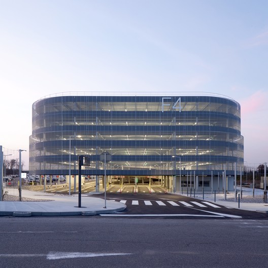
| FA 4 Parking / DeA architectes Posted: 17 Apr 2017 07:00 PM PDT  © Pierre-Manuel Rouxel / Gagnepark © Pierre-Manuel Rouxel / Gagnepark
 © Pierre-Manuel Rouxel / Gagnepark © Pierre-Manuel Rouxel / Gagnepark From the architect. The Basel-Mulhouse Airport experiences a strong growth due to its unique bi-national status and the exceptional economic activity of the Basel area. A masterplan has been designed by our office to allow a structured and progressive urban development between the A35 Highway and the terminal. The first step of this strategy is the re-organization of the parking system of the airport, with the construction of a 2500-place car park on the site. This large six-storey architectural volume will be lined up with the main terminal with which it will form a structured urban front. The construction has been shaped according to the form of its plot: fluid and longilineal. Its layout is organized according to an obvious circulation pattern, around two central helicoidal ramps.  © Pierre-Manuel Rouxel / Gagnepark © Pierre-Manuel Rouxel / Gagnepark The plain volume of the building will be highly visible from the highway and the whole airport site. Its envelope has been designed to express this formal simplicity while playing with light effects and view angles. It will be made of a delicate corrugated metal mesh, which will enhanced the monolithic aspect of the car-park in broad daylight. At sunset, it will let the internal light of the building shine through, making it resemble a gigantic lantern at the entrance marking the entrance of the airport.  © Pierre-Manuel Rouxel / Gagnepark © Pierre-Manuel Rouxel / Gagnepark  Axonometric Axonometric  © Pierre-Manuel Rouxel / Gagnepark © Pierre-Manuel Rouxel / Gagnepark This posting includes an audio/video/photo media file: Download Now |
| East China Normal University Affiliated Bilingual Kindergarten / Scenic Architecture Office Posted: 17 Apr 2017 03:00 PM PDT 
 Courtesy of 山水秀建筑事务所 Courtesy of 山水秀建筑事务所 From the architect. Courtyard, in Chinese architecture, is not only a tradition of physical space, but also a core of emotion and communication. It helps people to keep cohesion of the family and strengthen the contacts with friends and relatives, and to connect nature and universe in a touchable way. Yet this heritage is today already an impossible dream for most of urban citizens.  Courtesy of 山水秀建筑事务所 Courtesy of 山水秀建筑事务所 Anting is an urbanized suburban town near the boundary between northwestern Shanghai and Suzhou Huaqiao. The kindergarten located in a new residential neighborhood to the south of Anting station of Metro line 11, is an early bird in the construction plan of a public facility compound. Although a tight site to house 15-classes within 7400sqm, we still want to provide this kindergarten a courtyard environment for children to perceive nature, to recognize society and to build up themselves with a memory of courtyard life.  Courtesy of 山水秀建筑事务所 Courtesy of 山水秀建筑事务所  轴测图 轴测图  Courtesy of 山水秀建筑事务所 Courtesy of 山水秀建筑事务所 Courtyards need enclosure of building units. Following the leaning western border of the site, we organized the units in a setback “W” shape to earn the maximum sunlight from west, south and east, and we use Hexagon for the plan shape of the unit. The honeycomb composition fits better the leaning border, it provides more dynamic indoor and outdoor spaces with sense of concentration while diluting the axis monumentality of traditional four-sides courtyard. We ended up with an irregular hexagonal unit for either classroom or courtyard. Three of the six sides were designed in equal to accommodate more flexible combination as per the needs of sunlight and functionality.  Courtesy of 山水秀建筑事务所 Courtesy of 山水秀建筑事务所 After entering the gate, students and teachers will follow the zigzag corridors along the hexagon edges, go through the vestibule and the lobby, pass by different classes, with flowers and grasses in layers of courtyards, with bifurcating and merging paths before approaching their own classroom.  Courtesy of 山水秀建筑事务所 Courtesy of 山水秀建筑事务所 The collective activity in the classroom encircles the round column in the center of the room,while a team or individuals can use the protruding window spaces along the wall to read and write or to take care of their small plants. Every two classrooms have a shared courtyard space with direct indoor-outdoor connections. Departing from their own courtyards, the kids can restart their journeys to other places including library, musical room, fine arts room, canteen, multifunction room, small farm and other classes in other courtyards. Students at 2nd and 3rd floors can also join the big playgrounds conveniently through two covered outdoor staircases from both east and west sides.  Courtesy of 山水秀建筑事务所 Courtesy of 山水秀建筑事务所  一层平面图 一层平面图  Courtesy of 山水秀建筑事务所 Courtesy of 山水秀建筑事务所 By connecting different interior and exterior spaces in various scales on the corridor paths, we make every outing of the kids an experience of touching “nature” and “society”. We believe that all these experiences of exploration, perceiving and communication would become part of their precious childhood memories in an unconscious and healthy way.  Courtesy of 山水秀建筑事务所 Courtesy of 山水秀建筑事务所 This posting includes an audio/video/photo media file: Download Now |
| Sunnybanks House / Core Collective Architects Posted: 17 Apr 2017 01:00 PM PDT  © Adam Gibson © Adam Gibson
 © Adam Gibson © Adam Gibson From the architect. This is a special house designed for a retired couple, making the move from Sydney to the luscious landscape of Middleton in southern Tasmania. It's a home in which to live in, to connect with the land, to watch the weather and the stars, and to accommodate visiting family members.  © Adam Gibson © Adam Gibson "We were looking for an aesthetically pleasing low energy, solar efficient home that made the most of the stunning Southern Tasmania landscape. Core Collective provided that and much more; exceeding our expectations with a design that we have fallen in love with."  Floor Plan Floor Plan We found our clients the perfect site, located on a gentle hill oriented to the north for the sun and the views of the D'entrecasteaux Chanel. We wanted the house to sit with the contours of the hill, nestling into the bank and opening up its long north-facing side to the panoramic views and warming sunshine.  © Adam Gibson © Adam Gibson Knowing that this part of Tasmania can experience wild weather throughout the year, we built in a sheltered outdoor entertaining area, covered by a roof and with an outdoor fireplace to keep warm by. The house is 9 Star energy rated, and uses the warmth of the sun, storing it in the insulated floor and walls, for gradual release throughout the day and night. Our clients were thrilled to discover they could comfortably walk around bare-foot in the depths of winter, with no need to turn the heaters on!  © Adam Gibson © Adam Gibson Our client's have a beautiful collection of furniture, artworks, literature and music. We wanted the house to be a quiet backdrop to all of these beauties, so we selected a simple material pallete of concrete, steel, lime rendered masonry and Tasmanian timbers.  © Adam Gibson © Adam Gibson As always, we were very involved during construction. We like to work with the builder and tradespeople to refine the designs together. At Sunnybanks house, there was a range of custom steel items, including the landscape screening and internal storage shelving. Our steel fabricator welcomed us into his workshop to refine the details together. We designed a large outdoor copper light fitting and had a studio working-bee to install the light on site.  © Adam Gibson © Adam Gibson We prepared the landscape design and selected plant species to suit the site and the client's needs. A green roof was incorporated over the garage, planted with Tasmanian natives.  © Adam Gibson © Adam Gibson "We engaged Core Collective on a full-service contract basis that took us from conceptual design to handover; they were totally professional and put our best-interests ahead of all other considerations, which ensured that for us, the build was a pleasurable and rewarding experience."  © Adam Gibson © Adam Gibson This posting includes an audio/video/photo media file: Download Now |
| Event House / UAARL_Urban Alternative Architecture Research Lab Posted: 17 Apr 2017 12:00 PM PDT  © Jae Youn Kim © Jae Youn Kim
 © Jae Youn Kim © Jae Youn Kim From the architect. The house was designed for a couple. The husband is a college professor at art department. The site is placed on a hillside with a sweeping view and a broad slope to the northwest, and faces a mountain to the south. It poses a particular challenge that the orientation of the house and of the main view cannot be the same.  Exploded Isometry Exploded Isometry The couple wanted a place for various social activities and events, in addition to residence, after the husband retires. To do so, they wanted a separate guest house apart from the main house, an independent study-cum-atelier for the husband, as well as a multi-purpose space that can accommodate about 20 people.  © Jae Youn Kim © Jae Youn Kim Considering the site conditions and the couple's needs, we decided to maximize a view to the northwest and design a flexible space to accommodate various events, with a careful section planning. Using the slope, we put south-facing living quarters on the upper level, separated into a main house and a guest house. On the lower level, we designed a multi-purpose room that connects the two buildings.  © Jae Youn Kim © Jae Youn Kim The most notable spatial feature is a stepped courtyard that spans the two levels, located between the main house and the guest house. This serves as a spatial center of the house, and is the most interesting place. The courtyard connects the upper and the lower levels, and can flexibly accommodate various events. The courtyard is topped by a viewing deck that connects the main house with the guest house, serving as a scenic point of the house with a panoramic view.  Floor Plan Floor Plan As for finishing materials, dark gray bricks and zinc panels, light gray cement panels were used to create a monochromatic exterior so that the house can naturally blend into the surrounding. Inside the house, also monochromatic colors and natural tone of white birch were used to emphasize the contrast with the surrounding view seen through windows. Architectural elements of the exterior and interior of the house were linked, thereby expanding spatial scope of the house as the exterior space is perceived as an extension of the interior, and vice versa.  © Jae Youn Kim © Jae Youn Kim This posting includes an audio/video/photo media file: Download Now |
| Lauriston House / Seeley Architects Posted: 17 Apr 2017 10:00 AM PDT  © Peter Hyatt © Peter Hyatt
 © Peter Hyatt © Peter Hyatt From the architect. A deep engagement with the expansive and undulating rural context of the house was the starting point for the design of the Lauriston house, with a design response that simultaneously buries into and leaps from the hilly landscape near Kyneton Victoria. The geometrically aligned rows of olive trees set against a voluptuous landscape evoke a quiet, unspoken tension. The house mimics this tension with the relationship of a meticulously detailed and structured frame against a seemingly effortless floating, sinuous roof. Inspiration for the material palette was taken from local materials and textures. Messmate timber linings follow the twists of the expressive ceiling, complimented by wide Messmate flooring and French pattern bluestone inspired by the colonial footpaths of Piper Street in nearby Kyneton. The home respects and enhances its environment, offering prospects of retreat and respite, an evocative place for gathering.  © Peter Hyatt © Peter Hyatt The concept for the project was to create a home which would provide a heightened experience of the natural environment by interpreting the qualities of the surrounding landscape into the architectural plan and form. An expansive sinuous roof, clear structural rhythm, bold cantilever, recycled natural materials and a linear plan were the techniques employed to realise this concept. These techniques combine to provide a recessive, yet rich enclosure with a delicately controlled boundary to the external environment. Indigenous flora and majestic gums on the site are set against structured olive groves and the proximity of these contrasting settings evokes a sense of tension. The house mimics the tension in its landscape with the relationship of a meticulously detailed, structural frame and a seemingly floating sinuous roof.  © Peter Hyatt © Peter Hyatt The predominately glazed structural frame and cantilever of the building, contribute to the appearance that the house touches its site lightly. Furthermore, the cantilever emphasises the natural fall of the site, creating living areas that float above the ground with expansive view across the heart of the property. Its perpendicular orientation to the existing 1970's house, creates a threshold on the site, which upon arrival is akin to entering a two-sided walled garden and thereby creating a secluded space within a substantial landscape.  Upper Level Plan Upper Level Plan Whilst being a private residence, this house has the potential to contribute to a growing paradigm of contemporary rural architecture, which expresses a uniquely Australian response to shelter.  © Peter Hyatt © Peter Hyatt An elegant linear plan form is employed resolve the program, with public and private spaces arranged either side of a centrally located informal, alfresco entrance. The resolution of the program is reinforced by the sectional relationship of the house to its site. To the east, bedrooms are connected to the land and to a courtyard created with the existing house. To the West, the living areas and deck cantilever over the landscape, offering magnificent views to rolling hills, dams and olive groves.  Sketch Sketch Passive design solutions, considered energy systems, rainwater capture measures in the design, ensure that the house will provide a cost effective and comfortable enclosure into the future.  © Peter Hyatt © Peter Hyatt Our client's aspirational brief was that the house should allow a sense of intimacy with the outdoors, particularly with sunsets and the feeling of co-habituating with the abundant wildlife around them. The design reinforces the sense of connection to the surrounding landscape, sky and environs from most rooms within the home, therefore affirming one with its sense of place amongst the olive groves and gum trees. The brief also called for a pragmatic response to the challenge of outdoor entertaining through all seasons. The design responds by providing careful placement and design to shield and shelter from insects, sun, rain and seasonal prevailing winds. This posting includes an audio/video/photo media file: Download Now |
| The Best Art & Architecture Installations of Coachella 2017 Posted: 17 Apr 2017 09:00 AM PDT Spring is finally here, which means over 100,000 people are making the trip to the California desert for the 2017 edition of the Coachella Valley Music and Arts Festival. In addition to the top-billed musicians, the event has become known as a showcase for some of the best up-and-coming artists, designers and architects to work on a large-scale, instagram-friendly scene. With the first weekend now in the books, we've rounded up some of the best art/architecture installations from this year's festival. Crown Ether / Olalekan JeyifousIn "Crown Ether," a community on columns rises towards the sky, exploring the "relationship of the terrestrial to the sublime," explains Brooklyn-based artist Olalekan Jeyifous, who spent part of his childhood in Ilé-Ifẹ̀, Nigeria. Like much of Jeyifous' work, the title belies an interest in both the symbolic and the scientific, referring to the cyclic compound molecules that cluster in the form of a ring. These sculptures, too, crowning trunk-like pillars, gather towards each other in a circle, "like a coming together of people around the music and the arts," says the Cornell-trained architect. Even though Jeyifous no longer works on permanent residences, the possibility of prospective inhabitants is not far from mind. His artworks – accompanied by detailed renderings and narratives of who might live there – are part of a longstanding interest in experimental public architecture. Lamp Beside the Golden Door / Gustavo PradoFor his "lighthouse" (the uppermost curve pointing south toward another country), Prado arranged thousands of rounded mirrors at "concurrent yet separated angles" to create a tower from light-catching fragments. "It's a way to empirically present how the mind turns the continuous interconnectedness of phenomena into separate beings," Prado says of his waypost for travelers, which takes its title from the last line of the Emma Lazarus poem inscribed at the the Statue of Liberty. "The changes produced by the mirrors are not limited to a well-defined geometric, enclosed space and a body that walks in it. It encompasses the changes in light during the day, a much larger landscape, and all of its idiosyncratic qualities. But, more importantly, a group of viewers" – the not-so-huddled masses – "that now overlap each other as they approach." Chiaozza Garden / Chiaozza"We want to create a visual bath, something you can explore and get lost in," says Adam Frezza of the immersive ecosystems – like "wobbly" islands and a greenhouse full of imaginary plants – he makes with partner Terri Chiao. As Chiaozza (pronounced like "wowza"), the Brooklyn-based artists spent three months in the Coachella Valley constructing a nearly acre-spanning landscape of whimsical geographic features recalling the shifting views around each bend of a boulder field. Chiao and Frezza handbuilt each stucco-covered sculpture with a "huge and varied" crew spanning artist friends, highly skilled carpenters and fabricators, and a local seamstress who "usually makes quinceanera dresses," and who redirected her talents to the playful fabric fronds reaching out of the tips. "The driving element in our practice is to create curious and optimistic works that encourage a sense of joy," Frezza says. Strolling through Chiaozza's buoyant garden is about being present in the moment, to "find a beautiful spot to spend some time, a place to rest, or to run around and be excited with the world around you." Is This What Brings Things Into Focus? / Joanne Tatham and Tom O'SullivanLike the ancient fable about the blind man and the elephant, UK-based artists Joanne Tatham and Tom O'Sullivan create work that is observable only in sections but larger than its individual parts. "I've been thinking about how to make a work that both fits and doesn't," [Tatham] says, of anti-monuments at once grand and awkward, or like "the elephant in the room." In the photographic evidence of this year's Coachella, the duo's "herd" – rising up to six stories (75 feet) – will almost certainly be unintentional photobombers. But despite lumbering size and vaguely mammalian forms, the sculptures are not meant to be any particular animal. "I was interested in the idea of a beast-without-identity. Almost like a comic fool character, or a kind of everyman or underdog," says O'Sullivan, who has represented Scotland in the Venice Biennale. It's also a deliberate subversion of spectacle: to make something with oversized visual impact but that "might unintentionally reveal things about the situation it blunders into," he adds. "It's treating an artwork as a kind of complex instrument for viewing the world – bringing certain things in and out of focus." Beacon Pavilion / Do LaBIn additional to organizing and promoting music festivals around the world, events producer Do LaB constructs interactive environments and unique structures that "exhibit and celebrate our ethos of human connection, art as transformative experience, and environmental sustainability. New to Coachella this year is the Beacon pavilion, which used over 15 different software programs to create design elements, including modeling software, engineering calculation software, modeling software for sun studies and video software for content design. A floating center column supports 2000 pounds of structure, which is held in place mid-air using 21 cables and the principles of tensegrity. Project descriptions from the festival's website, Beacon pavilion description via Do Lab. This posting includes an audio/video/photo media file: Download Now |
| NS24 Rain Water Deposit in Sweden / ON Arkitekter Posted: 17 Apr 2017 08:00 AM PDT  © Johan Fowelin © Johan Fowelin
 © Johan Fowelin © Johan Fowelin From the architect. Trafikverket (the National Transportation Authority) had to increase the drainage capacity for the motorway and therefore needed to construct a depository where rain water from the road is contained and purified before it is released and led to lake Mälaren.  © Johan Fowelin © Johan Fowelin Conditions  © Johan Fowelin © Johan Fowelin Design  © Johan Fowelin © Johan Fowelin  © Johan Fowelin © Johan Fowelin This posting includes an audio/video/photo media file: Download Now |
| AIA Pushes for Elimination of “Intern” Title for Young Architects Posted: 17 Apr 2017 07:10 AM PDT  © Jim Richards © Jim Richards For recent architecture school graduates setting off on their careers for the first time, being referred to by the traditional title of "intern" can feel a little trivializing – as a full-time employee with a completed degree and real responsibilities, the title does little to capture a new hire's true role within the firm. Cognizant of this discrepancy, the AIA is now taking steps to eliminate the use of 'intern,' a term grandfathered in from the days of architectural apprenticeships and more linear paths through the architectural profession. In December of last year, the AIA Board of Directors updated the Institute's official position statement clarifying the term "intern" to refer to a student working in an architectural office while still pursuing an architecture degree, and not to those who have already earned a NAAB-accredited degree and are currently working towards licensure. For those individuals, the AIA now recommends the use of the titles "architectural associate" or "design professional." "'Architectural' as the adjective and 'associate' as the noun means this individual is associating with the profession, with licensed architects, and working with them," explains Danielle Mitchell, Assoc. AIA, design professional at Fung Associates, past president of the American Institute of Architecture Students, and member of the AIA Intern Titling Work Group. "The phrase itself indicates that you're working toward licensure, toward the success of the profession, but you're not licensed." The statement from the AIA matches a similar decision made by NCARB in 2015 to discard the title, though at the time offering no replacement term. Removing the title entirely from use, however, will still face challenges ahead; several architects have already voiced concerns with the suggested replacement titles. "Many firms already use 'associate' in an ownership or leadership sense," says As Alicea, an associate at Dattner Architects in New York City, "and you need to be registered to be considered a 'professional.' The chances of being able to change that nomenclature is slim, because once that box is opened there will be a rush to change other things as well. So there's a fear of opening it at all." Read more about the AIA's suggested changes here. News via AIA.
This posting includes an audio/video/photo media file: Download Now |
| Coroflot's Mobile Work Unit / LOS OSOS Posted: 17 Apr 2017 06:00 AM PDT  © Josh Partee © Josh Partee
 © Josh Partee © Josh Partee From the architect. The project was commissioned by Coroflot, a design recruitment site. When they wanted to expand their team they were looking for a space that clearly communicated how creativity was central to their mission. Also as they are just getting started here in Portland they wanted to keep things open to growth opportunities.  © Josh Partee © Josh Partee The building where the Mobile Work Unit is located is a one story unreinforced masonry garage built in 1920. It is raw and inspiring; when people enter the space they feel the potential of it. It is the same feeling when you talk about ideas or are sketching -- things aren't burdened by being resolved yet, they are still pure and boundless. LOS OSOS wanted to retain that in the space while still putting it to use. An office space requires improvement: climate control, nice finishes, segmentation for different uses. We didn't want to "improve" the building in the typical way; the solution needed to make the space useful as office but in a way that retained its inspiring essence. We opted for a box within a box approach - letting the bigger space communicate positive associations between Coroflot and creative potential and the smaller space expressing common design values of attention to detail and quality fabrication. Concentrating those things in a small footprint kept things good budget-wise as well. The solution needed to work on a programmatic level for Coroflot too. They are a small team still so communication and collaboration are very important functions which the space needs to support. The floor plan focuses these in tight nodes of activity while the materials and surfaces permit light and views to pass through, ensuring there is not an accompanying sense of personal confinement.  © Josh Partee © Josh Partee We designed a modular furniture system (STIX) as a natural extension of the Mobile Work Unit. To make the most of the small space it felt natural to develop a system that used the periphery of the office as a structure. Something for activity to latch on to and to organize the space while retaining some flexibility for the end user. The bigger picture is that we often end up systematizing projects - I think it is the natural impulse of designers to do so.  © Josh Partee © Josh Partee  Axonometric Axonometric  © Josh Partee © Josh Partee  © Jim Golden © Jim Golden Maybe what makes modularity such an attractive thing for designers is that it is not in itself the actuator. Ultimately modularity doesn't make a space flexible and dynamic. People do. The team shapes the space and the space shapes the team. The power of design is spun out to the user and hopefully hooks them into a preoccupation with shaping their own direction.  © Jim Golden © Jim Golden The MWU is innovative in that it brings together some trends and traditions in a way that solves some basic space needs for small businesses. The construction method of post and beam is traditional but when applied here creates the opportunity for walls to become translucent since they've been freed of their structural duties. This really changes the idea of an office cubicle, activity is confined but imagination isn't.  © Josh Partee © Josh Partee This posting includes an audio/video/photo media file: Download Now |
| John Pawson and Hiroshi Senju Selected as Recipients of the 2017 Isamu Noguchi Award Posted: 17 Apr 2017 05:00 AM PDT  Interior Remodeling of St. Moritz Church / John Pawson. Image © Hufton+Crow Interior Remodeling of St. Moritz Church / John Pawson. Image © Hufton+Crow The Noguchi Museum has selected architect John Pawson and painter Hiroshi Senju as the recipients of the 2017 Isamu Noguchi Award. Now in its fourth year, the annual award was established to honor individuals who "share Noguchi's spirit of innovation, global consciousness, and commitment to East/West cultural exchange." The award is presented each year to one architect and one artist or designer, honoring the multi-faceted career of artist/architect Isamu Noguchi. Previous winners of the award have included Tadao Ando and Elyn Zimmerman in 2016; architect Yoshio Taniguchi and industrial designer Jasper Morrison (2015); and winners of the inaugural award, Norman Foster and artist Hiroshi Sugimoto (2014). , image by Cindy Palmano; and Hiroshi Senju, image courtesy of Isamu Noguchi Museum") John Pawson (left), image by Cindy Palmano; and Hiroshi Senju, image courtesy of Isamu Noguchi Museum John Pawson (left), image by Cindy Palmano; and Hiroshi Senju, image courtesy of Isamu Noguchi Museum Internationally acclaimed architect John Pawson was recognized by the museum for his wide range of work, from private homes to retail showrooms, from monasteries to yachts. Having spent four years working in Japan under the tutelage of designer Shiro Kuramata, Pawson's work draws from a variety of traditions united through a strict minimalist approach. "Pawson's work continues to grow out of the expressions of simplicity that have formed a consistent component of both Eastern and Western traditions, from Japanese concepts of Zen to Cistercian monastic architecture," the museum notes. Recent projects by Pawson include the the Feuerle Collection in Berlin and the renovation of Design Museum in London, which was recently named to the 2017 RIBA London shortlist.  Hiroshi Senju Museum, Nagano / Ryue Nishizawa. Image © Daici Ano Hiroshi Senju Museum, Nagano / Ryue Nishizawa. Image © Daici Ano Japanese-born painter Hiroshi Senju was selected as a recipient for his "sublime, frequently monumental images of waterfalls and cliffs that combine a minimalist visual language that is rooted in Abstract Expressionism with ancient Japanese painting techniques." "He is one of a handful of contemporary masters of the 1,000-year-old nihonga style of painting, using pigments made of minerals, ground stone, shell, and corals suspended in glue made of animal hide," the museum explains. "Senju creates his waterfalls by pouring paint onto mulberry paper on board, conjuring not only the appearance of rushing water, but also its sound, smell, and feel. Senju was the first Asian artist to receive an Honorable Mention Award at the Venice Biennale (1995)." The Award will be presented to Pawson and Senju at the museum's annual benefit on May 16. News via Isamu Noguchi Museum.
This posting includes an audio/video/photo media file: Download Now |
| Irish Hunger Memorial / 1100 Architect Posted: 17 Apr 2017 04:00 AM PDT  © Peter Aaron © Peter Aaron
 © Peter Aaron © Peter Aaron From the architect. To create a memorial commemorating the Great Irish Hunger of 1845-1852, the Battery Park City Authority selected a team consisting of 1100 Architect, landscape architect Gail Wittwer-Laird, and artist Brian Tolle. Located in Battery Park City on a site adjacent to the Hudson River, the memorial is a contemplative space where visitors explore the famine and its connections to world hunger today.  © Peter Aaron © Peter Aaron  Site Plan Site Plan  © Peter Aaron © Peter Aaron On a base of Irish limestone and illuminated glass, the team re-created a rugged landscape that comprises abandoned potato fields, various species of native Irish plants, and walls made of stones from each of Ireland's 32 counties. The monument's base is inscribed with text that recounts the history of the Great Irish Hunger and that frames the tragedy within the wider context of hunger world-wide. From the base's west side, visitors enter and ascend through a passageway that opens into a ruined famine-era cottage from County Mayo, donated to the project and reconstructed into the memorial. Leaving the cottage, visitors may wander through the fields and overgrown potato furrows. The landscape cantilevers out over an illuminated stone and glass base structure, rising from street level at its southeastern corner to a height of 25 feet at its western end, where it provides visitors with views of the Hudson River, the Statue of Liberty, and Ellis Island.  © Peter Aaron © Peter Aaron This posting includes an audio/video/photo media file: Download Now |
| How to Pronounce the Names of 22 Notable Architects Posted: 17 Apr 2017 02:30 AM PDT  There's no doubt that one of the best things about architecture is its universality. Wherever you come from, whatever you do, however you speak, architecture has somehow touched your life. However, when one unexpectedly has to pronounce a foreign architect's name... things can get a little tricky. This is especially the case when mispronunciation could end up making you look less knowledgeable than you really are. (If you're really unlucky, it could end up making you look stupid in front of your children and the whole world.) To help you out, we've compiled a list of 22 architects with names that are a little difficult to pronounce, and paired them with a recording in which their names are said impeccably. Listen and repeat as many times as it takes to get it right, and you'll be prepared for any intellectual architectural conversation that comes your way. 1. Adolf Loos 2. Antoni Gaudí 5. David Adjaye 6. Eero Saarinen 8. Juhani Pallasmaa 9. Jørn Utzon 10. Kazuyo Sejima 11. Kenzō Tange 12. László Moholy-Nagy 13. Le Corbusier 14. Luis Barragán 15. Ma Yansong (Mǎ Yánsōng) 16. Mies van der Rohe 17. Moshe Safdie 18. Pierre de Meuron 19. Smiljan Radić 20. Vo Trong Nghia 21. Wolf D. Prix Anyone we've missed out? Comment with any names you find difficult to pronounce, and we can try to figure it out for you in a future article. This posting includes an audio/video/photo media file: Download Now |
| House with Bricks / Martín Aloras Posted: 17 Apr 2017 02:00 AM PDT  © Walter Salcedo © Walter Salcedo
 © Walter Salcedo © Walter Salcedo From the architect. From Golf Aldea Private Neighbourhood, outside the City of Rosario, we received the assignment of a family house that included certain requirements such as a big gallery, some hermeticism with respect to the street and the possibility of a future expansion that would host the main bedroom.  © Walter Salcedo © Walter Salcedo The land dimensions, similar to those of the ML House designed in our studio, invite us to take it to the next level and to, once again, set out a compact mass controlled by a structural sequence and shifts, but, at this time, in both directions.  © Walter Salcedo © Walter Salcedo  Sections Sections  © Walter Salcedo © Walter Salcedo The fact that the edge is next to the square of the place, invites us to generate an empty space so as to include the square into the project, and right there we open an “eye” that will take a look at the children of the residents while they play.  © Walter Salcedo © Walter Salcedo The bedrooms package advances towards the end of the plot to make room to that half-covered big space requested to us, and also to a series of indoor patios.  © Walter Salcedo © Walter Salcedo  © Walter Salcedo © Walter Salcedo These movements radically dominate and demand the structure that, in this occasion, not only hides in a surface made of bricks in search of a larger tectonics relation with the neighborhood, but also breaks the constructive logic in a playful way.  © Walter Salcedo © Walter Salcedo The decision of the material that would be used also honours the work of the Architect Marcelo Villafañe, carried out close to the plot.  © Walter Salcedo © Walter Salcedo This posting includes an audio/video/photo media file: Download Now |
| Easily Reproduced Disaster Relief Constructions in Bamboo Posted: 17 Apr 2017 01:00 AM PDT  Cortesía de rOOtstudio Cortesía de rOOtstudio In 2015, after the catastrophic earthquake in Nepal, Maria da Paz invited Joao Boto Caeiro from RootStudio to design and build a model house in Nepal. Using local and accessible materials, they built two prototype houses out of bamboo and partitions, via a collaboration between locals and volunteers that came to the region. The prototypes respond to the need for housing that is able to be built quickly with the goal of providing independence and immediate shelter, while at the same time introducing basic building techniques using bamboo and bricks. In doing so, they're able to create a set of tools that allow for future construction that the community can make themselves. From the architects: The structure is comprised of a four column base made out of brick that supports a bamboo truss responsible for the roof. The bamboo structure is covered with rows of reed and then zinc sheets.  Cortesía de rOOtstudio Cortesía de rOOtstudio The brick used, both for the columns and the floor lining are the salvaged remains of the destructed buildings in the area. The bamboo is also locally sourced and immunized on the spot.  Cortesía de rOOtstudio Cortesía de rOOtstudio The continuity of this project lies in the transmission of the building process through example. The bamboo structure can be adapted, enlarged or even be built on a larger scale due to the introduction of the basic bamboo connections.  Modelo preliminar Modelo preliminar Future projects can be based on these principles and expand on them providing the tools for further accomplishments.  Planimetrías preliminares Planimetrías preliminares  Estructura final Estructura final Project: João Boto Caeiro & Maria da Paz Braga This posting includes an audio/video/photo media file: Download Now |
| This Pottery Printer Explores the Boundary Between Digital and Analog Machines Posted: 16 Apr 2017 11:00 PM PDT  Courtesy of Tobias Titz / National Gallery of Victoria Courtesy of Tobias Titz / National Gallery of Victoria In celebration of the inaugural Melbourne Design Week, which took place in March 2017, Chilean design studio Great Things to People (gt2P) presented their Catenary Pottery Printer, aimed at exploring the boundaries between digital and analog machines. Throughout the design festival, local designers and students used the pottery printer to create their own custom works, with visitors welcomed to watch the craft in action.  Courtesy of Tobias Titz / National Gallery of Victoria Courtesy of Tobias Titz / National Gallery of Victoria Developed in collaboration with staff and students from the RMIT University School of Architecture and Design, and displayed under the Federation Court atrium at the National Gallery of Victoria, the project reveals the thought process behind the creation of non-standard objects – a process often reserved for inside computers.  Courtesy of Tobias Titz / National Gallery of Victoria Courtesy of Tobias Titz / National Gallery of Victoria Despite its technological undercurrents, gt2P's printer operates through a low-tech system, using a fabric sling suspended at adjustable intervals to mold liquid clay into beautiful vessels. As ceramic slips, drains, and dries, one-of-a-kind objects are created.  Courtesy of Tobias Titz / National Gallery of Victoria Courtesy of Tobias Titz / National Gallery of Victoria  Courtesy of Tobias Titz / National Gallery of Victoria Courtesy of Tobias Titz / National Gallery of Victoria News via: National Gallery of Victoria. This posting includes an audio/video/photo media file: Download Now |
| 3S Eisgratbahn Gondola Lift at Stubai Glacier / ao-architekten Posted: 16 Apr 2017 10:00 PM PDT  © Günter Richard Wett © Günter Richard Wett
 © Günter Richard Wett © Günter Richard Wett From the architect. Three station buildings for one ropeway means three starkly different topographies at a great vertical and horizontal physical distance (none of the other buildings can be seen from any of the three buildings). Accordingly, three different typologies are being developed from the respective location and corresponding function. Riding the ropeway makes their combination to a whole tangible, as do the cabins attached to the cables to a certain extent.  © Günter Richard Wett © Günter Richard Wett Valley Station Though it is the lowest of the three stations, this one reflects high-alpine influences most strongly: On the stream side, there is a solid, black-colored concrete wall as (mandated) protection against the wild stream which flows by, and in particular as protection for the valley station located behind it against the threat of avalanches from the opposite slope. Other structural components, such as ticket offices, administration, sporting goods store, delivery area etc. are also made of solid concrete.  © Günter Richard Wett © Günter Richard Wett The station's rounded form is derived from ropeway technology and is crystallized by its materialization with vertical, low-iron profiled glass windows, some matt, some clear.  Section Section Midway Station Adjoining at the side of another existing ropeway, it is largely characterized by the incline of the ropeway line. The ground floor zone is a solid construction due to the wild stream and avalanche situation, and house the engineering and ancillary rooms. The upper story area is a steel structure with profiled glass facades like the valley station, but with a far more stringent formal layout. The inner connection of the ropeway entrances and exits and flows of people was rearranged with a shared access to both ropeways. The solidity of the ground floor zone is broken by the covered pass-through alpine ski trail. The entire customer level in the upper story is flooded with light from matt and clear profiled glass windows, offering both protection and views.  © Günter Richard Wett © Günter Richard Wett  Section Section  © Günter Richard Wett © Günter Richard Wett Top Station Here, passengers finally arrive in the ski area in the heart of the Eisgrat station building and functional complex. The ropeway is integrated into the existing building with the extant visitor zones for food service and the sporting goods store, the ski area functional rooms like engineering rooms and garages for piste maintenance equipment, and the connection to another distributing gondola lift. The present, highly heterogeneous building structure is defused by the central location of the high-volume new building. Its facades with the aluminum panels invoke the surfaces of the existing buildings. Meticulously located, generous glazed surfaces illuminate the station level, guide customers to a large distributing ramp and provide orientation.  © Günter Richard Wett © Günter Richard Wett This posting includes an audio/video/photo media file: Download Now |
| You are subscribed to email updates from ArchDaily. To stop receiving these emails, you may unsubscribe now. | Email delivery powered by Google |
| Google Inc., 1600 Amphitheatre Parkway, Mountain View, CA 94043, United States | |
Nema komentara:
Objavi komentar