Arch Daily |
- Russian Monastery of St. Georg / Tchoban Voss Architekten
- retaW store Harajuku / The Archetype
- Independent, Community Lead Initiative Looks at "Leftunder" Infrastructure Land in Melbourne
- Rebuilt Travel Agency Receives a More Fluid and Dynamic Space
- Lapa House / Martin Dulanto
- Big Data Becomes Architecture in This CNC-Milled Screen Wall for IBM
- Immerse Yourself in Architectural Spaces Worldwide With the NYT's Daily 360
- Perro Libre Tap Room / Tellini Vontobel Arquitetura
- Visit Over 2,500 Museums Worldwide From Your Desk With Google Arts & Culture
- Refugi Guardat de L’illa / Arteks Arquitectura + Ginjaume Arquitectura i Paissatge
| Russian Monastery of St. Georg / Tchoban Voss Architekten Posted: 29 Apr 2017 07:00 PM PDT  © Lev Chestakov © Lev Chestakov
 Site plan Site plan  © Lev Chestakov © Lev Chestakov From the architect. This calm, secluded place in the midst of the Uckermark landscape seems to be perfect for a church construction: the idyllic village Götschendorf has only 200 inhabitants and is located on a lakeside, about one and a half hour drive from Berlin. Surrounded by the forest the gently sloping plot ranges from the village road to the lakeshore, for several centuries the small village was in possession of the Arnim family.  © Lev Chestakov © Lev Chestakov The monastery church of St. George was built by order of the Diocese of Berlin and Germany of the Russian Orthodox Church. In addition to this new construction the project also provides for the reconstruction of the existing building according to heritage preservation requirements: in future the manor house and adjoining buildings will be converted into a guest house for visitors and pilgrims.  © Lev Chestakov © Lev Chestakov Located in the front part of the plot the church building became a new significant eye-catcher of the site. Despite its Russian-Byzantine building tradition with cupola, round lantern and onion dome the church is of touching plainness with its modified and simplified forms. The four-gabled volume without a plinth has a quadratic footprint with lateral length of 17 meters, 10 meters headroom in the cupola and a central spire of 6 meters height. Three apses extend the footprint in the altar area.  Ground floor plan Ground floor plan  First floor plan First floor plan Far from big gestures the church does not contrast with the surrounding buildings but is fully integrated into the existing complex. Some few details accentuate the façades. Bricks in a bright beige-grey palette were additionally whitewashed which, depending on the light situation, evokes a slight silver or golden shimmer. Similar to this effect the light grey shingled roofs seem to have a slight metallic glow in the sunlight.  © Lev Chestakov © Lev Chestakov The curved narrow wooden cornices emphasize the rounded forms of the apses. The double jamb of the main door along with the stepped window cladding and pilaster strips gives the façades some more depth and movement. Narrow vertical windows reduce the interaction of the inner space with the surrounding and underline the sacral character of the building.  © Lev Chestakov © Lev Chestakov The church offers space for about 200 people: After having passed through the semicircle inner vestibule the visitor finds an artless, calm interior and gazes to the limed crossed-dome and to the cylinder of the light roof lantern.  Section Section Product Description:  © Lev Chestakov © Lev Chestakov This posting includes an audio/video/photo media file: Download Now |
| retaW store Harajuku / The Archetype Posted: 29 Apr 2017 01:00 PM PDT  © SHIMIZU KEN © SHIMIZU KEN
 © SHIMIZU KEN © SHIMIZU KEN From the architect. As retaW's first street level store, retaW store Harajuku functions as a showcase for the fragrance brand. The space is comprised of three elements (sections) with distinctive functions: "By Product," "By Fragrance" and "Backspace."  © SHIMIZU KEN © SHIMIZU KEN  Floor Plan Floor Plan "By Product" is used to display and introduce the brand's full range of products. Featuring display cases of products arranged by category, the section resembles a convenience store, a space designed in a straightforward manner based on its purpose and function. The section also embodies a distinctively Japanese or Tokyo-like style.  © SHIMIZU KEN © SHIMIZU KEN "By Fragrance" is the section in which customers can experience the brand's various fragrances. The space incorporates a gently curved surface in order to provide customers with an emotive experience as they sample the fragrances. Referencing the brand's name, an inversion of the word "water," tiles were used for the displays and convey the atmosphere of a domestic space.  © SHIMIZU KEN © SHIMIZU KEN "Backspace" is located at the rear of the space. Finished with predominantly wooden materials, the section expresses the warmth of an everyday living space In order for these three distinctively different elements (sections) to be constructed in harmony, the utmost care was taken to balance materials, use unexpected elements, refine section details and colors, use natural light and develop an interior lighting plan. The space was constructed in a way that resembles adding layers to a meticulous creation.  © SHIMIZU KEN © SHIMIZU KEN This posting includes an audio/video/photo media file: Download Now |
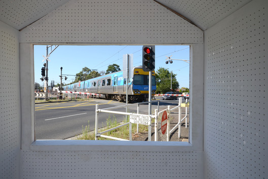
| Independent, Community Lead Initiative Looks at "Leftunder" Infrastructure Land in Melbourne Posted: 29 Apr 2017 09:00 AM PDT  Courtesy of LEFT UNDER Courtesy of LEFT UNDER With Melbourne's contentious elevated rail project starting construction, an independent group has taken the opportunity to critique the way that this key piece of infrastructure is engaging with the public. The project, leftunder, is a platform for alternate, community driven proposals for the public space being made available adjacent to this new infrastructure, that which might normally be overlooked and undermaintained. Run by not-for-profit OFFICE, the project has recently culminated in an exhibition at The National Gallery of Victoria's Design Week.  Courtesy of LEFT UNDER Courtesy of LEFT UNDER The leftunder project is aimed at generating a conversation and proposals among community groups and local residents about how they could occupy the 22.5 HA of land being made available below the development of the Sky Rail in Melbourne's south-eastern suburbs. This is not only a critique on current developer driven process in Melbourne and wider Australia but also an alternative to the current community engagement strategies.  Courtesy of LEFT UNDER Courtesy of LEFT UNDER The research has identified that there are 1200+ community groups within the suburbs adjacent to the development, all with a strong identity and skill set. The goal of leftunder is to look at how these vibrant communities that are often unseen can be expressed within this soon to be created public space. A number of engagement strategies have been undertaken, the two most prominent of which have been the launch of the leftunder website as an online forum for discussion, where residents submit proposals, these are then translated into axonometric diagrams for the wider community to engage with and comment on. The second key strategy has been that of the series of information booth installations, culminating in an exhibition of this work as a part of National Gallery of Victoria Design Week.  Map of intervention suggestions from the NGV exhibition. Image Courtesy of LEFT UNDER Map of intervention suggestions from the NGV exhibition. Image Courtesy of LEFT UNDER The exhibition collated a series of nine installations at each of the nine proposed level crossings to be removed by the state government in Melbourne's eastern suburbs, from Carnegie to Noble Park. The exhibition installation, in the form of an information booth, created a forum for participants, locals, and professionals to view and discuss a range of responses to the occupation of the 22.5 ha of land being created from the elevation of the train line. It highlighted the difference of demographics as the project passes through three councils and the values that these locals hold. News via: leftunder and OFFICE. This posting includes an audio/video/photo media file: Download Now |
| Rebuilt Travel Agency Receives a More Fluid and Dynamic Space Posted: 29 Apr 2017 07:00 AM PDT  © Rafael Shcmidt © Rafael Shcmidt This article is part of our series "Material in Focus", where we ask architects to share with us their creative process through the choice of materials that define important parts of the construction of their buildings. From the demolition of the existing building to the making of a new one better suited to the travel agency's requirements of more open space, the new project also needed to leave the remaining neighboring building intact. The solution they went with was to create a new structure away from the wall, stripped to let the bricks show, and within that underlying area create a space with vertical circulation, natural lighting, gardens, and service areas like a kitchenette, restrooms, and a technical shaft. We spoke with architect Baldomero Navarro Gomes from NN Architects Associates to learn more about his choices on materials and the determining role they played in his design concept.  © Rafael Shcmidt © Rafael Shcmidt What were the main materials you used for this project? BNG: Steel frames, concrete containment supports, laminated glass on the roof and tempered glass in the frames, waterproofing in the containment supports and the roof slab.  © Rafael Shcmidt © Rafael Shcmidt What were your main sources of inspiration and influence when you were choosing the materials used in the project? BNG: Budget, deadlines and legal constraints were more important than any outside influences.  © Rafael Shcmidt © Rafael Shcmidt Describe how decisions on materials influenced the design of the project. BNG: The desire for a lightweight, quick-fit structure to avoid interfering with in the neighboring buildings, in addition to the difficulties from excavation and deep foundations in such a fragile terrain made the choice of structural steel the best solution.  © Rafael Shcmidt © Rafael Shcmidt What were the advantages that this material offered for the construction of the project? BNG: Fast assembly and precision in construction on such a small lot.  © Rafael Shcmidt © Rafael Shcmidt Did the choice of materials impose any kind of challenges to the project? BNG: The lot posed challenges, especially because of the limited space for movement of equipment. The foundations were done by special small equipment and the structure was all pre-assembled in a factory and later assembled in very little time at the construction site. This avoided the movement constraints on the work required by shuttered tiles, stanchions, and scaffolding.  © Rafael Shcmidt © Rafael Shcmidt Did you ever consider the possibility of other materials for the project? If so, how would that have changed the project? BNG: Yes, we thought about building using reinforced bricks, which we decided against because of the deadline, and about steel frame, which we didn't do because of the high costs since it was a small job and just a one-time thing.  © Rafael Shcmidt © Rafael Shcmidt How did you research suppliers and builders suitable for materials used in the project? BNG: Some were chosen because of very positive previous experiences (OYTO construction, BR Aço) and others we found on the internet or through recommendations from colleagues. The waterproofing of the concrete on the containment supports with the Penetron additive and the Penebar in the steel joints with the reinforced concrete were instances of the latter.  © Rafael Shcmidt © Rafael Shcmidt This posting includes an audio/video/photo media file: Download Now |
| Posted: 29 Apr 2017 06:00 AM PDT  © Juan Solano © Juan Solano
 © Juan Solano © Juan Solano From the architect. El proyecto busca desde su concepción tener un impacto mínimo en el terreno y su entorno. Teniendo esto presente, se plantea la casa de tal manera que ésta se perciba más chica de lo que realmente es, llegando a ser hasta un 15% más pequeña que una vivienda promedio de las existentes en el club, priorizando la relación de la arquitectura con el terreno natural.  © Juan Solano © Juan Solano  Scheme Scheme  © Juan Solano © Juan Solano Teniendo en cuenta que el terreno fue cortado antes de diseñar el proyecto, éste ha sido planteado de tal manera que se adapte al corte actual del terreno, para lo cual, se genera una plataforma que se incrusta levemente. Ésta contiene el servicio e ingreso. Sobre la plataforma se encuentra el bloque principal de la casa (caja blanca), el cual tiene niveles y se ha orientado de tal manera que desde él se pueda contemplar el mar. En el primer nivel de este bloque (segundo nivel de la casa) se tiene el área social. Un espacio que, en el eje de visual al mar, tiene ambas caras abiertas. Y más bien sus caras laterales son cerradas, pues cargan estructuralmente estos dos niveles de la casa y configuran el volumen. De esta forma la plataforma permite que el área social se extienda a la superficie de la misma (área social exterior) y se vincule visualmente con el terreno y con el exterior.  © Juan Solano © Juan Solano  © Juan Solano © Juan Solano Asimismo, la búsqueda de relación con el exterior se ve presente en la circulación vertical de la vivienda. Una escalera de forma libre y escultórica se despliega entre el bloque y el terreno, comunicando los tres niveles de la casa. A su vez, su forma escultórica con el fondo del terreno genera, en el área social, otro foco visual opuesto a la vista de la bahía.  Section Section  Section Section El tercer y último nivel, que completa el bloque sobre la plataforma, contiene la zona privada de la vivienda: Los dormitorios. En este nivel tanto la habitación principal como la de invitados disfrutan de una vista panorámica del horizonte. Ambas habitaciones cuentan con una celosía de aluminio blanca que termina de configurar el volumen del bloque y, a su vez, permite cubrir el ingreso directo de luz solar y les da privacidad. Cabe resaltar que las dos habitaciones restantes están debidamente iluminadas y ventiladas por ventanas altas.  © Juan Solano © Juan Solano En síntesis, la casa se compone de tres elementos. La plataforma, que hace de zócalo que emplaza el proyecto al terreno. El bloque que, montado sobre ésta, contiene el programa de vivienda. Y la escalera escultórica, que los vincula y se suelta formalmente de los dos primeros elementos.  © Juan Solano © Juan Solano  Floor Plan Floor Plan Planta segunda nivel: piscina; terraza y parrilla al aire libre; un gran espacio que contiene la cocina, el comedor y la sala; asimismo en este nivel se tiene el baño de visitas, el cual ventila por medio de un extractor de aire, con ducto hacia el techo del proyecto.  © Juan Solano © Juan Solano Planta tercer nivel: En este nivel se encuentran 3 dormitorios, cada uno con baño propio, iluminados y ventilados a través de teatinas. Adicionalmente se encuentra aquí el dormitorio principal, con su propio baño integrado. La ventilación e iluminación del baño principal se da de la misma forma que el dormitorio principal, por ventanas hacia el exterior. Asimismo en este nivel se encuentra la lavandería y patio tendal.  Floor Plan 03 Floor Plan 03 This posting includes an audio/video/photo media file: Download Now |
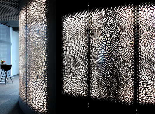
| Big Data Becomes Architecture in This CNC-Milled Screen Wall for IBM Posted: 29 Apr 2017 05:00 AM PDT  Courtesy of Synthesis Design + Architecture Courtesy of Synthesis Design + Architecture Responding in part to recent debates on how big data will affect our built environments, Synthesis Design + Architecture have teamed up with IBM Watson Analytics to design an interior feature wall for the Watson Experience Center in San Francisco. The project, named Data Moiré after the dizzying patterns created by overlapping sets of lines, uses data from the influence of mobile phones on monthly consumer spending to create a precise screen material that defines the wall.  Courtesy of Synthesis Design + Architecture Courtesy of Synthesis Design + Architecture  Courtesy of Synthesis Design + Architecture Courtesy of Synthesis Design + Architecture The data-driven patterns on the surface of the wall are a result of parametric modeling based on Watson's own data analysis, thus not only forming a part of the showroom but actively showing off the capabilities of the system itself. The generative design was CNC milled onto two sheets of aluminum, which together create an intricate screen of information that is lit from between the two layers.  Courtesy of Synthesis Design + Architecture Courtesy of Synthesis Design + Architecture  Courtesy of Synthesis Design + Architecture Courtesy of Synthesis Design + Architecture On its own, the installation is a standout advertisement for IBM's showroom. Without any explanation, the design gives little indication that it represents a massive data set. But in the presence of a knowledgeable guide, the full narrative of the space as the materialization of an abstract set of data provides new meaning. "While the project is driven by data, the legibility of that data is abstract rather than literal," explains Synthesis Design + Architecture in a press release. "Rather than provide a statistical or analytical reading of the data, the project instead provides a spatial and atmospheric reading that enhances the experience of visitors to the center and encourages them to engage spatially."  Courtesy of Synthesis Design + Architecture Courtesy of Synthesis Design + Architecture Data Moiré's gentle spiral shape allows visitors to become immersed in a tangible thing that, due to the baffling scale of the data it represents, would be impossible to grasp otherwise. That it required a supercomputer to make enough sense of the data for it to materialize in the form of aluminum screens opens an entire discussion about the role of the human in the sea of information we create every day.  Courtesy of Synthesis Design + Architecture Courtesy of Synthesis Design + Architecture  Courtesy of Synthesis Design + Architecture Courtesy of Synthesis Design + Architecture This posting includes an audio/video/photo media file: Download Now |
| Immerse Yourself in Architectural Spaces Worldwide With the NYT's Daily 360 Posted: 29 Apr 2017 03:30 AM PDT  via The New York Times Daily 360 via The New York Times Daily 360 With 360 camera technology, the ability to transport people into a space through film has become all the more immersive. Viewers are able to turn the viewport in every direction to see the whole scene, or even to put on a headset for a more natural way of viewing a scene. Of course, this has important implications for viewing architecture, which many believe has become too image based, and therefore two-dimensional. 360 videos leave no corners conveniently hidden, as a traditional video or image would, perhaps providing a fuller picture of a place - could this perhaps open up a more human-scale understanding of space? The New York Times have treated their Facebook followers to some great architectural insights through their Daily 360, getting more than their money's worth out of their 360 camera equipment. Some of these must-see videos include a dance rehearsal taking place in the Guggenheim Museum's rotunda, as well as an aerial view of La Paz, Bolivia. Read on to take a peek into the richness of earth's urban spaces: This posting includes an audio/video/photo media file: Download Now |
| Perro Libre Tap Room / Tellini Vontobel Arquitetura Posted: 29 Apr 2017 02:00 AM PDT  © Cristiano Bauce © Cristiano Bauce
 © Cristiano Bauce © Cristiano Bauce From the architect. Perro Libre produce craft beers and have called us to create an innovative design with a system of 10 taps integrated with ipads and card reader. The customer arrives, checks in and credits a value, thereby releasing the chopp taps. The concept we created was to make a cool space, creative and different. The challenge was to design a place for the chopp barrels. We had the idea of showing, inside a super stainless steel freezer, with glass doors and internal lighting.  © Cristiano Bauce © Cristiano Bauce All furniture, except the internal banquettes, was designed by us. We mix stainless steel with plywood, and black metallic structures. To create a warmth with the right foot, we created a system of metal beams to support the industrial luminaires and focal black spots.  © Cristiano Bauce © Cristiano Bauce The walls are covered with 20x20 white tile from Eliane, so we can integrate the kitchen part with the taps. In the kitchen area, we use those ancient menus, of plastic letters. The staff of the Perro asked us for a place to sell products (shirts, glasses). So we created a pine frame with glass for the T-shirts and shelves at the bottom of the counter for the other items.  © Cristiano Bauce © Cristiano Bauce In the outdoor area, with deck, we created a furniture, also of pine, in a style of stacked cubes, and we draw loose benches. To give safety, we put a black metal structure leaked on the side to climb creepers. On the front, Texas grass was used.  © Cristiano Bauce © Cristiano Bauce This posting includes an audio/video/photo media file: Download Now |
| Visit Over 2,500 Museums Worldwide From Your Desk With Google Arts & Culture Posted: 29 Apr 2017 01:00 AM PDT  Dr. Bhau Daji Lad Mumbai City Museum. Image via Google Arts & Culture Dr. Bhau Daji Lad Mumbai City Museum. Image via Google Arts & Culture Technology giant Google, through the Google Arts & Culture project, is offering a different experience in terms of culture. In addition to providing thousands of online exhibits, the project offers the possibility to explore more than 2,500 museums through a feature very similar to Google Street View. Users can virtually visit museums all over the world, the project offers 360° views of places that can often be inaccessible due to financial costs or distance. Altogether there are 2,779 museums available for virtual visits. Each site has been visited and registered through Google Maps, making even the artworks they house available online. The tool allows visitors to search by the name of the museum, the artist or even the work of art. The descriptions are very detailed, from the date to the material used in of the paintings, sculptures or photographic works.  Museu de Arte Islâmica, Qatar. Image via Google Arts & Culture Museu de Arte Islâmica, Qatar. Image via Google Arts & Culture The Google Arts & Culture platform can also be used as a support for teachers as it brings historical information on cultural movements, materials, and texts related to the museums. Start your visit here. News via: Canal do Ensino and Google Arts & Culture. This posting includes an audio/video/photo media file: Download Now |
| Refugi Guardat de L’illa / Arteks Arquitectura + Ginjaume Arquitectura i Paissatge Posted: 28 Apr 2017 10:00 PM PDT  © Pol Viladoms © Pol Viladoms
 © Pol Viladoms © Pol Viladoms From the architect. The new Illa mountain hut is situated at 2.488 m height in the idyllic surroundings of the Andorran Pyrenees, a place of an extraordinary beauty resulting from the interaction between man and environment, which gave rise to the characteristic aspect of the existing construction built in the 30’s and whose comprehensive refurbishment and enlargement would be the objective of this project.  Floor Plan Floor Plan  Sketch Sketch  © Pol Viladoms © Pol Viladoms  © Pol Viladoms © Pol Viladoms The main difficulties we encountered when considering the project were the interaction with the protected and sensitive environment’s pre-existences (UNESCO World Cultural Heritage), the extreme weather conditions that only allowed working during the summer, an enclave without road access and finally the energy self-sufficiency.  © Pol Viladoms © Pol Viladoms  Axonometric Axonometric  Elevation Elevation  Diagram Diagram All these extraordinary challenges were transformed through strategic decisions into the characteristic elements that would shape the project.  © Pol Viladoms © Pol Viladoms  Section Section  © Pol Viladoms © Pol Viladoms Formally, using the existing building as a structural base helped us to minimize the economic cost and the generation of waste in an environmentally sensitive habitat.  © Pol Viladoms © Pol Viladoms The wooden frame structure gives warmth to the interiors but also a modern look. It also takes advantage of the whole space heights and, with its studied roof angles, helps to discharge the big snow load accumulated during the winter and to optimize the energy gain from solar and photovoltaic panels.  © Pol Viladoms © Pol Viladoms A characteristic and unique fact that has endowed with an added complexity to the whole process and has determined the chose for light and prefabricated materials has been that the site can only be reach by helicopter. Most of the interior elements are wooden prefabricated in workshop and assembled on site. As a result, the building weighs about a third of a conventional construction of the same characteristics and its total execution time has been only 6 months.  © Pol Viladoms © Pol Viladoms Finally highlight that the building is 100% disconnected from any supply network. Because of this, one goal was to reach at least 4 days of energy self-sufficiency. To achieve it, the whole program with climatic requirements was grouped in the new building which is perfectly isolated and conditioned, leaving the rest of the program related to the services in the existing one. Precisely, the installations are an important part to achieve the mentioned self-sufficiency by the use of solar and photovoltaic panels, the autonomous system to treat the waters equipped with coconut filters that allows to return them to the environment, and finally, a controlled and efficient ventilation system that avoids the direct exchange of air with the extreme exterior cold.  © Pol Viladoms © Pol Viladoms The result responds to the natural habitat’s evolution and also to the new uses and the rapid growth of mountain activities in the Pyrenean environment, turning the old and deteriorated building into a modern mountain hut, the 4th higher shelter in the Pyrenees. A place prepared to accommodate both hikers and guards who live together comfortable and cozy way, in a hut equipped with all the necessary services to enjoy a unique and privileged environment.  © Pol Viladoms © Pol Viladoms This posting includes an audio/video/photo media file: Download Now |

| You are subscribed to email updates from ArchDaily. To stop receiving these emails, you may unsubscribe now. | Email delivery powered by Google |
| Google Inc., 1600 Amphitheatre Parkway, Mountain View, CA 94043, United States | |
Nema komentara:
Objavi komentar