Arch Daily |
- AD Classics: Paris Métro Entrance / Hector Guimard
- Saint Joseph in the Woods / Messner Architects
- Westkaai Towers 5 & 6 / Tony Fretton Architects
- House in Rishpon / Studio de Lange
- Setsugekka Japanese Cuisine / Shanghai Hip-Pop Architectural Decoration Co.
- Trough House / Youichi Kouno
- BOY Siam Square / Stu/D/O Architects
- Kingsville Residence / Richard King Design
- Students Construct 7 Inhabitation Structures at Hello Wood's 2017 Project Village
- Teletón Infant Oncology Clinic / Sordo Madaleno Arquitectos
- gmp Architekten Designs Glass Tower Headquarters for China UnionPay in Shanghai
- FF Houses / TEC Taller EC
- FXFOWLE's 3 Hudson Boulevard Could Be Hudson Yards' Tallest Building
- The Six / Brooks + Scarpa Architects
- The One Redeeming Feature That Brings Humanity to the Sameness of Suburban Sprawl
- 239 House / UNA Arquitetos
- New Renderings Revealed for Helmut Jahn's Upcoming 832 Foot Skyscraper in Chicago
- Winners of 2017 "Rethinking The Future" Awards Present Radical Solutions to Present-Day Problems
- Watch Eyal Weizman Explain Forensic Architecture's Pioneering Investigatory Methods
| AD Classics: Paris Métro Entrance / Hector Guimard Posted: 09 Aug 2017 09:00 PM PDT Scattered throughout the streets of Paris, the elegant Art Nouveau entrances to the Métropolitain (Métro) subway system stand as a collective monument to the city's Belle Époque of the late 19th and early 20th Centuries. With their sinuous ironwork patterned after stylized plants, the Métro entrances now count among the most celebrated architectural emblems of the city; however, due to the city's wariness in the face of industrialization and architect Hector Guimard's decision to utilize a then-novel architectural aesthetic, it would take decades before the entrances would earn the illustrious reputation that they now enjoy. Paris' radical transformation from medieval labyrinth to Second Empire metropolis between the 1850s and 1870s coincided with the construction of London's first underground railways. Although the flurry of demolition and reconstruction taking place in the French capital would have been an ideal time to install a subway system, Prefect of the Seine Georges-Eugène Haussmann had no apparent interest in implementing such a scheme. The state and local governments argued over who would be in charge were the system built, while the public—horrified at the thought of their city being swallowed up by something so industrial—expressed their ardent disapproval.[1] Ultimately, it took the Exposition Universelle of 1900 to convince the city it needed a modern subway transportation system. Charles Garnier, the architect best known for designing the Paris opera house which now bears his name, advised the Minister of Public Works that in order for the people to accept the Métro it would have to be seen as more than an industrial creation – it would have to be a work of art.[2] With this in mind, the Société Centrale des Architectes held a contest to select an architect to design the Métro's aboveground entrances. Although the firm Duray, Lamaresquier, and Paumier won the competition, the selection was overruled by Adrien Benard, the president of the Conseil Municipal de Paris; in their stead, he chose Hector Guimard, a noted Art Nouveau architect who had not submitted for the contest.[3]  During the first construction phases, tracks were dug just below street level. Via <a href="https://commons.wikimedia.org/wiki/File:Paris_Metro_construction_03300288-3.jpg">National Library of France</a> licensed under Public Domain. Image Courtesy of National Library of France During the first construction phases, tracks were dug just below street level. Via <a href="https://commons.wikimedia.org/wiki/File:Paris_Metro_construction_03300288-3.jpg">National Library of France</a> licensed under Public Domain. Image Courtesy of National Library of France A graduate of the Paris École des Beaux-Arts, Guimard was fascinated by Eugène Viollet-le-Duc's theories of structural rationalism, if not by the the Gothic architecture Viollet-le-Duc so admired. Blending this inspiration with the influences of the British Arts and Crafts Movement and the Art Nouveau work of Victor Horta, he developed his own form of Art Nouveau rationalism – one which stood apart from the eclectic, Classicist proposals made by his competitors and ultimately won Adrien Benard's interest and approval.[4]  Place du Bastille (Carte postale ancienne éditée par les Magasins Réunis). © <a href="https://commons.wikimedia.org/wiki/File:Magasins_R%C3%A9unis_171_-_PARIS_-_Station_du_M%C3%A9tropolitain_-_Place_de_la_Bastille.JPG">Claude_Villetaneuse</a> (1908) licensed under Public Domain. Image Courtesy of Claude Villetaneuse Place du Bastille (Carte postale ancienne éditée par les Magasins Réunis). © <a href="https://commons.wikimedia.org/wiki/File:Magasins_R%C3%A9unis_171_-_PARIS_-_Station_du_M%C3%A9tropolitain_-_Place_de_la_Bastille.JPG">Claude_Villetaneuse</a> (1908) licensed under Public Domain. Image Courtesy of Claude Villetaneuse Rather than the masonry designs presented by the winners of the competition, Guimard instead proposed that the Métro entrances be built in cast iron and glass. The decision had several practical benefits: most significantly, iron entrances took up far less space than stone, a necessity in many of the chosen sites for Métro stations. Iron was also cheaper and easier to produce and transport, and allowed for greater ease of mass production than masonry.[5]  Place du Bastille (Carte postale ancienne éditée par les Magasins Réunis). © <a href="https://commons.wikimedia.org/wiki/File:Magasins_R%C3%A9unis_171_-_PARIS_-_Station_du_M%C3%A9tropolitain_-_Place_de_la_Bastille.JPG">Claude_Villetaneuse</a> (1908) licensed under Public Domain. Image Courtesy of Claude Villetaneuse Place du Bastille (Carte postale ancienne éditée par les Magasins Réunis). © <a href="https://commons.wikimedia.org/wiki/File:Magasins_R%C3%A9unis_171_-_PARIS_-_Station_du_M%C3%A9tropolitain_-_Place_de_la_Bastille.JPG">Claude_Villetaneuse</a> (1908) licensed under Public Domain. Image Courtesy of Claude Villetaneuse Beyond these logistical concerns, cast iron was also far better suited to the sinuous, naturalistic and slender curves that embody Art Nouveau. Using a set of modular structural elements, Guimard created five entrance types, ranging from simple railings to lavish covered pavilions; each station entrance shared the same green paint (meant to resemble bronze patina) and a sign bearing the word Métropolitain in a typeface designed by Guimard himself. The simplest and most common variant was a set of railings with a pair of amber-colored lightbulbs shaped like flower buds, their tinted light illuminating the Métropolitain sign mounted between them. The greatest sensation, however, was in response to the elaborate pavilion entrances, with their fanned glass awnings crowning the stairways beneath.[6,7]  A typical beacon light outside the entrance to a Paris Métro station. ImageVia <a href="https://pixabay.com/">Pixabay</a> licensed under <a href="https://creativecommons.org/publicdomain/zero/1.0/deed.en">CC0 1.0 (Public Domain)</a> A typical beacon light outside the entrance to a Paris Métro station. ImageVia <a href="https://pixabay.com/">Pixabay</a> licensed under <a href="https://creativecommons.org/publicdomain/zero/1.0/deed.en">CC0 1.0 (Public Domain)</a> Although they are now celebrated as an iconic element of the Parisian cityscape, Guimard's Métro entrances were initially met with contempt by irate Parisians, who pronounced the unusual font on the signs "un-French" and the faux-patina green to be "German."[8] By 1904, 141 stations had been built using Guimard's five modular variations. The latest version for a station adjacent to the Opéra Garnier, however, was rejected by the Conseil Municipal, which declared its style to be incongruous with the existing architectural traditions of the city and therefore inappropriate for construction next to the Opéra.[9]  A typical station entrance in the Paris Métro. ImageVia <a href="https://pixabay.com/">Pixabay</a> licensed under <a href="https://creativecommons.org/publicdomain/zero/1.0/deed.en">CC0 1.0 (Public Domain)</a> A typical station entrance in the Paris Métro. ImageVia <a href="https://pixabay.com/">Pixabay</a> licensed under <a href="https://creativecommons.org/publicdomain/zero/1.0/deed.en">CC0 1.0 (Public Domain)</a>  Replica Métro Station entrance in Chicago, USA © <a href="https://commons.wikimedia.org/wiki/File:2012-07-21_7000x4912_chicago_art_nouveau_metra.jpg">Wikimedia Commons user J. Crocker</a> (2012) licensed under Public Domain. Image Courtesy of J. Crocker Replica Métro Station entrance in Chicago, USA © <a href="https://commons.wikimedia.org/wiki/File:2012-07-21_7000x4912_chicago_art_nouveau_metra.jpg">Wikimedia Commons user J. Crocker</a> (2012) licensed under Public Domain. Image Courtesy of J. Crocker Only 86 of the original 141 Métro entrances now remain, with many having been demolished in the decades before Art Nouveau was recognized as a style worthy of preservation policies. Those stations that do remain are now seen as the inspiration for the eponymous Métro style, their verdant ironwork and elegant lettering irrevocably associated with the entire visual branding of the Métro system. Despite the short-lived prominence of Art Nouveau and the initial disgust of the city's residents, Guimard's remaining Métro entrances have—like their distant cousin, the wrought iron Eiffel Tower—become an integral, even beloved, symbol of Paris.[10]
References [1] Ayers, Andrew. The Architecture Of Paris: An Architectural Guide. Stuttgart: Edition Axel Menges, 2004. p381-382. This posting includes an audio/video/photo media file: Download Now |
| Saint Joseph in the Woods / Messner Architects Posted: 09 Aug 2017 08:00 PM PDT  © Davide Perbellini © Davide Perbellini
 © Davide Perbellini © Davide Perbellini From the architect. The church in Stella is an appreciated spiritual place for people from far and wide, not least because it is located along the popular Sigmund Freud path in the alpine woods at 1300 m.a.s.l.  © Davide Perbellini © Davide Perbellini The conversion and renovation of the building dating back to the fifties is aimed at reevaluating the existing structure and making it more attractive.  © Davide Perbellini © Davide Perbellini The east facade of the building was broken through to provide the church interior with more daylight. The huge rectangular opening behind the presbytery bathes the interior in light and underlines the pursuit of linking inside to outside, in a way spiritual to profane. The fleeting glimpse inside is claiming people's attention and stimulating to enter the church.  © Davide Perbellini © Davide Perbellini The prevailing ‚genius loci', the spirit of the place, is strikingly expressed with the phrase ‚church in the wood' . The framed view is characterized by a continuously changing landscape in the course of the seasons. The contemplation of nature gives the opening its highly meditative meaning.  © Davide Perbellini © Davide Perbellini Inside the church the previously existing height difference between presbytery and nave is reduced and replaced by a ramp with an incised canyon. The configuration as a ramp dissolves the separation of the space and creates the impression of a shaped landscape.  Section / Plan Section / Plan A freestanding panel of translucent glass opposite to the front door works as a protective and informative shield.  © Davide Perbellini © Davide Perbellini The reconfiguration of the prebytery originates with the recently passed away artist Franz Messner. Solid monoliths of a local variety of gneissic rock rest on the translucent glass bases. The light breaks through the fragile bases and makes the heavy masses hover above the ground. The weightlessness of the design strongly expresses the aspiration for the divine and the closeness to heaven.  © Davide Perbellini © Davide Perbellini In the course of the conversion the previously unused attic floor was restructured and recovered as a place for meditation, silence and retreat. The attic floor consists in an entrance area with a cloakroom, a restroom, a storage room and a spacious event room.  © Davide Perbellini © Davide Perbellini The entire timber-framed supporting structure was demolished and substituted by a three-hinged arch. The subsequently unsupported tent-like space was improved in its physical properties by insulating the wood-shingled roof. The brickwork of the western gable was demolished to further provide the meditation space with daylight.  © Davide Perbellini © Davide Perbellini The entire surface of the gable wall is closed by a glass facade which opens up the view to the piazza. A stepped terrace enlarges the meditation space with an attractive free area connecting inside to outside visually and mentally too.  © Davide Perbellini © Davide Perbellini In the end only two architectural interventions determine the conversion of the church in the wood. On one hand it is the breakthrough of the sacred space to the landscape, on the other hand it is the opening of the gable to the piazza. Both interventions trigger off a dialogue between inside and outside, in other words between the man-made and the grown. Ease and coziness inspirit the tend-like meditation space. Brightness and peace ensoul the sacred space.  © Davide Perbellini © Davide Perbellini This posting includes an audio/video/photo media file: Download Now |
| Westkaai Towers 5 & 6 / Tony Fretton Architects Posted: 09 Aug 2017 07:00 PM PDT  © Filip Dujardin © Filip Dujardin
 © Peter Cook © Peter Cook From the architect. As part of the extensive redevelopment of the Antwerp Docks six residential towers are ranged along the waterfront of the Westkaai. The two towers closest to the city were completed by Basel practice Diener and Diener in 2009. The irregular fenestration and subtle colour differences of their glass facades provide the monumental quality required by the urban design, but they also have unexpected similarities to the colour and window patterns of the smaller scale dockland buildings in the wider vicinity. For the centre of the range David Chipperfield Architects have designed a pair of calm and stylistically self-contained towers in the same fine white pre-cast concrete of their building in the Novartis campus in Basel. Our contribution is a pair of monumentally simple forms in brick, with horizontal emphasis in tower 5, which faces the new Limaplein shopping square and vertical in tower 6 that faces out across the harbour and finishes the ensemble. The diversity and range of Flemish bricks allow a subtle colour difference between the pair. Tower 5 is yellow and tower 6 red, the classic colours of brickwork, but chosen in tones that make their colour highly ambiguous. Vertical and horizontal emphases are created very simply and obviously by projecting bricks. Corners are left open and the top of tower 6 extends up against the sky to give a sense of the building extending into space. Our intention is to make the towers seem both material and unreal. Tower 6 is crowned with a lit metal mesh screen. The landscape is designed by Michel Desvigne.  © Peter Cook © Peter Cook  Floor Plans Floor Plans  © Filip Dujardin © Filip Dujardin This posting includes an audio/video/photo media file: Download Now |
| House in Rishpon / Studio de Lange Posted: 09 Aug 2017 05:00 PM PDT  © Amit Geron © Amit Geron
 © Amit Geron © Amit Geron From the architect. Laid on an 8,000 sqm (20 Acre) plot, two concrete rectangles perpendicular to one another form the letter T. Between them stands a light vertical element. This home was envisioned as an unfolding sequence of simple geometric forms that compose an entire spatial experience.  © Amit Geron © Amit Geron The abundant landscape, including grassland areas and pool, was seen as an integral part of the whole form. Weaving their way through the concrete structures, they merge the outdoors with the built environment.  Site Plan Site Plan The design plan is minimalist and the material scale is monochrome. It includes natural stone, exposed concrete, and aluminum, all found in varying quantities on the exterior as well as the interior of the home.  © Amit Geron © Amit Geron The material and color palettes were greatly restrained so not to overbear the space; allowing space itself to be an adequate airy platform for the residents and their exquisite art and design collection.  © Amit Geron © Amit Geron Concrete and white walls combine with large slabs of natural stone flooring. These are strung together by natural wood staircases that delicately stitch the different floors.  © Amit Geron © Amit Geron The prominent color detail found is an array of black. Used throughout in architectural details, such as all the window profiles & outdoor porches as well as in design choices such as the entry door and kitchen façade.  © Amit Geron © Amit Geron  Ground Floor Plan Ground Floor Plan  © Amit Geron © Amit Geron Black is used in both wood and metal textures, as those are complementary to the exposed concrete; which serves as the base material in the palette.  © Amit Geron © Amit Geron This work is the result of a fruitful dialogue with veteran clients who have vast knowledge and love for art and design. It is the owners' art and design collection, intertwined with the architecture that creates this home elegant atmosphere.  © Amit Geron © Amit Geron This posting includes an audio/video/photo media file: Download Now |
| Setsugekka Japanese Cuisine / Shanghai Hip-Pop Architectural Decoration Co. Posted: 09 Aug 2017 03:00 PM PDT  © Jing Zhang © Jing Zhang
 © Jing Zhang © Jing Zhang From the architect. No matter how exquisite the concept and definition are, they most likely end up to be judge about "Form". Therefore chief designer from Shanghai Hip-pop as well as main designer of this project Mr. Sun said: we may reject any form of theory or opinion, however, we can't refuse the potential influence from the architectural and interior environment that we live in. It seems "what do you want to convey" is more significant than to argue "what it is".  © Jing Zhang © Jing Zhang The seemingly roundabout self-praise is actually a spiritual attitude with great sincerity, and this is the reason why the designer took "Setsugekka" as the name of this restaurant in the very beginning.  © Jing Zhang © Jing Zhang  Basement Plan Basement Plan  © Jing Zhang © Jing Zhang Whether verses: "Tonight is snowing, someone must be passing the Hakone" by Matsuo Basho who is called "Forever Traveler"; "What a pity that the moon is covered by blizzard" by Maruyama; or "Happy to see snow coming", "Flowering is not for someone" or "Enjoy the bright moon for a long time"; in Japanese Waka & Haiku, Setsugekka represents natural beings, as well as joy and sadness emotions — for top space designers, the perfection of technique has already become prerequisite; what makes one's work out-performs other's is the vision and understanding of culture that contains greatness in simplicity.  © Jing Zhang © Jing Zhang  © Jing Zhang © Jing Zhang The ultra-clear glass engraved with the sakura, blue led light band, complete black background of sushi counter... everywhere is amazing, but nowhere alone can give full expression to the sense of Zen of the whole space — only when all of these mix harmoniously, then an appropriate design is obtained. And it comes the most perfect cause and effect while the designer uses "appropriate" to describe honestly the design. As for the style of the design and the comment from the industry, both of which are attached great importance by other designers; yet Mr. Sun has not much interest in them.  © Jing Zhang © Jing Zhang  © Jing Zhang © Jing Zhang The essence of Japanese Cuisine is "right time to eat", "you have to prepare for the snapper when you feel the chills in your heart" (quoted from Hirohisa Koyama). Besides fine knife skills and precise touch feel, to get a perfect Japanese Cuisine, your inner insight is the key, so dose design — while enjoying rippling blossom before the eyes, it comes the "aha moment". But the marvelous insight does not come for no reason, it dues to years of practicing experience in design industry.  © Jing Zhang © Jing Zhang This posting includes an audio/video/photo media file: Download Now |
| Posted: 09 Aug 2017 01:00 PM PDT  © Makoto Kunisada © Makoto Kunisada
 © Makoto Kunisada © Makoto Kunisada From the architect. A single-story house built on a large site surrounded by a double-decker house.The walls of the building are on the borderline instead of the walls.The figure which emphasizes the horizon is a combination of different materials, enriches the expression, and presents a dignified appearance while building a single story.  © Makoto Kunisada © Makoto Kunisada Although it is a seemingly closed design, it adopts the louver to the exterior wall which is the boundary with the next door, and it has the indirect connection which filters the opening to the courtyard. The eaves of the cedar which made use of the color of the material as it is brings the appearance of a natural atmosphere.  Floor Plan Floor Plan The courtyard as a private outer space protects the privacy and incorporates light and wind into the room. And through this courtyard, each room is loosely connected to each other and it is a plan to feel the signs of the family wherever they are.  © Makoto Kunisada © Makoto Kunisada The small Japanese-style rooms have beams and cedar ceilings, and there is an alcove with a modern and peaceful atmosphere.  © Makoto Kunisada © Makoto Kunisada The entrance finished with Miwato and stepping stones is an interior that is conscious of the sum which used wood abundantly.I am finished in a space with a bright depth thanks to the window of the foot.  © Makoto Kunisada © Makoto Kunisada The children's room has a high loft with windows, creating a three-dimensional space, and directing a pleasant atmosphere.It is a bright, open room connected to the courtyard. The black ceiling of the corridor connecting the room is set to a low height as a moving space, and has a different impression. When you open the windows on both sides of the corridor, it connects slowly to the courtyard of both sides, and the space inside and outside melts together.  Elevations / Sections Elevations / Sections The bathroom is connected to the courtyard with terrace. You can take a bath on the outdoor terrace. In this single-story house, various wood materials have been adopted everywhere. The experience of visual and tactile space enriches the daily life of this family.In addition to improving the living environment, a variety of courtyards convey the changing nature and stimulate sensitivity.  © Makoto Kunisada © Makoto Kunisada This posting includes an audio/video/photo media file: Download Now |
| BOY Siam Square / Stu/D/O Architects Posted: 09 Aug 2017 12:00 PM PDT  © Ketsiree Wongwan © Ketsiree Wongwan
 © Ketsiree Wongwan © Ketsiree Wongwan From the architect. As BOY Rikyu planned to expand the salon to the upper floor to provide more waiting area and multi-purpose space, Stu/D/O has developed a way to tie two levels together with a loop of continuous steel rod, which serves mainly as a structure for the new mobile cutting units. This raw steel rod runs from the front reception to the cutting area, up through the open void, into the waiting and multi-purpose area, and back down in a continuous loop, weaving different functions into a united space. Mirror units and shelving units are designed to hang with this rod system rather than attaching to walls, so furnishings can be positioned to fit any purpose or situation.  Second floor plan Second floor plan  © Ketsiree Wongwan © Ketsiree Wongwan  Third floor plan Third floor plan While the floor and service counters were in natural concrete color, the interior was painted white to provide a sense of neutrality for client and to accent the users and activities in the room.  © Ketsiree Wongwan © Ketsiree Wongwan  Elevation B Elevation B  © Ketsiree Wongwan © Ketsiree Wongwan BOY was designed in a simple approach with 'connectivity' in mind to reflect the salon's closely knitted experience between staffs and customers. The space is minimized down to its main functions in order to emphasize the people within the salon, yet allowed dynamic adaptability to serve the users.  © Ketsiree Wongwan © Ketsiree Wongwan This posting includes an audio/video/photo media file: Download Now |
| Kingsville Residence / Richard King Design Posted: 09 Aug 2017 10:00 AM PDT  © Tom Roe © Tom Roe
 © Tom Roe © Tom Roe From the architect. RK-D were engaged to design this house remodel, which took close to two years to complete. A dilapidated, Federation cottage with a 1990s lean-to was extensively demolished and extended into a two-level, contemporary house, which follows passive-house design principles.  © Tom Roe © Tom Roe The property grew from 85m² to 185m². The existing gable-end roof line was extended through to the rear, to reference the buildings original architectural character.  © Tom Roe © Tom Roe We utilized the generous roof height and proportions to add on a mezzanine level and double-height space, at the rear of the property. The house has a mix of private, social and work spaces. The front portion of the house is retained as bedroom and "adult" living space.  Ground Floor Ground Floor  Mezzanine Mezzanine A central spine corridor connects the old part of the house to the contemporary extension. Additional bedrooms, bathroom, entrance/laundry lead onto a double height, open-plan kitchen, dining and "social" living room at the rear. A feature staircase connects to a large mezzanine study and en-suite.  © Tom Roe © Tom Roe This posting includes an audio/video/photo media file: Download Now |
| Students Construct 7 Inhabitation Structures at Hello Wood's 2017 Project Village Posted: 09 Aug 2017 09:30 AM PDT Since the first Hello Wood Project Village debuted in 2015, architecture, art and design students from all over the world have gathered together each summer in Hungary to imagine and build structures using innovative wood construction techniques. With each passing year, the village has grown more complex, with new students using the decisions of their predecessors to inform and evolve subsequent designs. The 2017 edition has brought this exercise to its logical summit – exploring how the settlement could actually be inhabited by its builders. In doing so, participants created a village center consisting of 7 new structures containing spaces for sleeping, bathing, cooking, eating, viewing lectures and celebrating. New infrastructure including a village well and future solar panels also contribute to the village's accountability and help to shape the relationships between the village's structures. "As architects, we all have an idea of what the ideal village is like, but what makes this programme interesting is that, once we are confronted with the actual needs of a community, constraints of the terrain, or the opinion of your neighbour, you need to be open to adapt," said Johanna Muszbek, curator of Project Village. See the 7 projects with descriptions from the designers, after the break. GARDEN COURTYARD © Tamás Bujnovsky © Tamás Bujnovsky Team leaders: Alfredo Ramirez, Clara Oloriz, Liam Mouritz (Groundlab) Working in the village's communal garden gives people the chance to work together, talk, share common activities, and take care of the plants. Gardening is looking after the landscape and our environment, an important element in communal life. The village garden gives us the opportunity to reflect upon the landscape as arranged and shaped by man. All this reflects the fact that in the latest geological age, the so-called Anthropocene era, human activity will also shape the natural environment all around us. The garden – planted with varieties that will resist the harsh winters here – can be compared to the school of Epicurus, an ancient philosopher, also a garden. The ancient philosopher taught in his green plot on the edge of Athens. And though the garden was far from the city centre, it was not marked by isolation. The garden was open to everyone, and allowed all its visitors to get a sense of perspective on the goings on in town. In a similar way, Hello Wood's communal garden gives us a chance to think about mankind and its role in the landscape. HELLO WOOD TOWER © Tamás Bujnovsky © Tamás Bujnovsky Team leaders: Bence Pásztor Dávid Tarcali Soma Pongor (Studio Nomad) The tower is one of the most important archetypes of our settlements. It is a symbol of continuity in time and space that connects the past and the present. Climbing the viewing tower, we can see not only the expanded Csóromfölde with its new buildings from this year, but from its top we can also glance back at Csórompuszta, the former site of Project Village. The tower is on the axis between the current village and the manor in the distance, being located precisely at the end of the high street. It also preserves something of the past in its construction, recalling the first phase of the community's settlement: the shape of the top of the tower reminds us of chimneys in Csórompuszta, and wood from earlier projects that have lost their function was also used to build it. The project's symbolic element is reinforced by the fact that it doesn't just have one entrance, like a traditional building; you can get to the top from any of its sides. HELLO PIZZA © Tamás Bujnovsky © Tamás Bujnovsky Team leaders: Danny Wills, Gianmaria Socci, Zsófia Szonja Illés The communal kitchen was created with the intention of allowing the village to stage and celebrate its annual ritual. No matter which culture or which country we look at, the oven or cooking place in a village has played an important role in shaping the community since ancient times. People not only eat and prepare food around a big communal stove, but also talk, gossip, and live their social lives. The goal of the project is to draw all the settlers into making pizza, so that the communal kitchen is used not only to serve up the inhabitants' food. The counters around the stove are at the same time both workspaces and dining tables. Symbolically deconstructing the framework around the kitchen and opening up the workings of the space, the counters can be supported from either inside or outside, which means there is enough room to enable one person to eat their pizza while another makes the dough a couple of tables down. The stove – given that it's not made of wood – is a permanent structure and suggests that the kitchen, with the garden behind it – will be serving the village's inhabitants for years to come. CARAVANSERAI © Tamás Bujnovsky © Tamás Bujnovsky Concept: Angelo Ferrara Caravanserais were one of the first forms of built hostelries. Located initially in Persia and North Africa, they were closed structures with single entrances and large open courtyards, above which travellers in the desert could stay for one or more nights in open seraglios. Travellers could sleep here, deposit their baggage, and rest their animals. In Sicily, caravanserais were in many cases built around pre-existing towers, and it is this Sicilian tradition that the Project Village team has followed in deciding to form an interior courtyard around a pre-existing building, the villa. Thanks to this, a sort of dialogue was able to develop between the intentions of the former builders and the plans of the new settlers. The original idea behind the caravanserai – adapted to local circumstances – which allows people to relax, meet and exchange views, had to be reviewed from time to time, which is how, for example, a tree also became an integral part of the construction though it had originally been in the settlers' way. CLOISTER AND CHAPTER HOUSE © Tamás Bujnovsky © Tamás Bujnovsky Team leaders: Neal V. Hitch, Neal Lucas Hitch The cathedral in the Hello Wood village is under construction and has been expanding now for a second year running. This year, the church built on the ruins of the settlement that existed here three hundred years ago has been expanded with further elements: the communal spaces of a chapter house and a cloister. A special feature of the latter is that it is always open towards the interior garden of the chapter house, and so though it shuts out the outside world, this does not mean that its structure is not welcoming: inside, it makes space for people to gather. One part of the communal spaces, also newly created, is reminiscent of a living room, while another is more fitted to fulfilling the functions of a bedroom thanks to the reclining spaces within. The residents of Hello Wood may just be visiting, staying temporarily in the village, but they still need places that can provide them with the comforts of home. At the same time, the expanded cathedral is a structure that can adapt flexibly to any kind of need. It can be a private residence for its builders, but it can also accommodate the more than one hundred residents of the village on a more spiritual occasion, such as for example a concert. ED AND ACT © Tamás Bujnovsky © Tamás Bujnovsky Team leaders: Bence Komlósi, Nicolas Ziesel The project manager of the ED and ACT pavilion has been working as an architect for years in the refugee camp in Calais, France. The camp, with its several thousand residents, is in many ways reminiscent of a working village. It has streets, shops, barbershops, mosques, churches, and schools. The architects behind the Hello Wood village pavilion experienced first hand how the remarkably diverse community of people in Calais, despite its difficult circumstances, functioned perfectly: people could organise their lives, helping and supporting each other. The basis of this smooth co-operation was the school. The pavilion here is inspired by these schools in Calais. The building provides a perfect occasion to bring people together and is also a space for learning from one another - as well as other communal activities, like for example, teaching, art therapy classes, language lessons or yoga classes. Its very form pre-determines its social nature, but the space within the pavilion is flexible and can be adapted for any kind of event. CROSS-SECTION © Tamás Bujnovsky © Tamás Bujnovsky Team leaders: Rufus van den, Ban Suzana Milinović, Joao Prates Ruivo, Keimpke Zigterman Nine six-metre tall poles planted along a single straight line with a hole in the middle of each pole are associated with the various buildings in the village. If we set off from the first such pole and stick to the line, stopping at the second, third and finally the ninth pole as well, we will have passed the village's kitchen, bar, parliament, former baths and caravanserai. Since in many cases these stops are buildings that concentrate more on their inner courtyards and exclude the outside world, the poles help the spaces above open towards one another and help us travellers to get a little glimpse into the projects. But the poles do not only create larger connections between individual elements of the village, they also develop a private dialogue between each project and the stake erected next to it. During the course of construction, it was very important to communicate with the neighbouring building in determining how the pole could help and complement the project. This is how the pole near the former baths became a washing line, and this is why another pole collects rainwater a little farther off. More than one of the poles, which can be perfectly adapted to the environment, make use of the properties of the trees that break the continuity of the straight line. This is how, for example, the final pole has a tree-house on top shaded by the leaves of a nearby tree. News and project descriptions via Hello Wood This posting includes an audio/video/photo media file: Download Now |
| Teletón Infant Oncology Clinic / Sordo Madaleno Arquitectos Posted: 09 Aug 2017 08:00 AM PDT  © Jaime Navarro © Jaime Navarro
 © Jaime Navarro © Jaime Navarro From the architect. Since 1999 the Teletón Foundation has undertaken a great effort to attend to the needs of disabled children. In pursuit of the same ideals, it created the Teletón Infant Oncology Clinic (HITO) to support children with cancer, in response to one of the leading causes of death in Mexico. The city of Querétaro was chosen for its central location in the country, and its high rates of growth and development.  © Jaime Navarro © Jaime Navarro The architectural concept is based on the idea of a chain of cells making different movements, which represented the principle of cell regeneration. Each of these cells is represented by a volume, to give a total of nine sections, which contain the entire project within their curving form.  © Jaime Navarro © Jaime Navarro  Second Level Plan Second Level Plan  © Jaime Navarro © Jaime Navarro On the façade, each volume plays with a different inclination and has a series of vertical brackets that function as structural columns, eliminating the need for internal columns, as well as protecting from excess solar gain. They also highlight the movement of each volume to achieve a visual language that maintains the architectural identity of the CRIT (Children Rehabilitation Centers -Teletón). The HITO is located on an elevated site with an undulating topography that provides extensive views over the city.  © Jaime Navarro © Jaime Navarro The main entrance is located in the center of the complex, and the distinct areas are distributed from the reception over different levels. There are four general levels, with an extra level in some of the sections, to accommodate future growth in the wards and chemotherapy areas.  © Paúl Czitrom © Paúl Czitrom The HITO has the highest level of specialist child oncology services, and each department is distributed within the building formed by the nine sections. These departments include imaging, nuclear medicine, radiotherapy, blood bank, laboratory, pathology, intensive care, chemotherapy, and chapel.  © Jaime Navarro © Jaime Navarro The total area of the site is 45,130 square meters, which includes a large area intended for a nature reserve and another section set aside for future expansion.  © Jaime Navarro © Jaime Navarro This posting includes an audio/video/photo media file: Download Now |
| gmp Architekten Designs Glass Tower Headquarters for China UnionPay in Shanghai Posted: 09 Aug 2017 07:35 AM PDT  © Crystal Digital Technology © Crystal Digital Technology gmp Architeckten (von Gerkan, Marg and Partners) has revealed their competition-winning design for a 150 meter-tall glass tower at the new global headquarters . Located across from the former Expo site on the banks of the Huangpu River, the tower features a vertically structured glass facade offering expansive views and reflecting its impressive surroundings back towards visitors to the site.  © Crystal Digital Technology © Crystal Digital Technology The design of the 90,000-square-meter (968,700-square-foot) complex consists of three squares, with a central high-rise flanked by two five-story buildings at its base, each slightly shifted to match the geometry of the site. A glass bridge at the 4th and 5th floors connecting the buildings together doubles as a covered entrance area and allows access from both the south and north directions.  © Crystal Digital Technology © Crystal Digital Technology Important program elements, such as the entrance hall, the lounge, exhibition areas, the employee cafeteria, meeting rooms and management offices, are emphasized through subtle differentiation in the facade; when brought together, these elements create a logical composition of verticals and horizontals. "Thanks to finely tuned detailing involving the glass facade and the structural steelwork, which was designed as a "tube-in-tube" system in cooperation with schlaich bergermann partner (sbp), it is possible to integrate the upright supports in the plane of the facade, creating shallow facade depths and, on the inside, functional areas without vertical support members," explain the architects. "In the plinth area, the columns have been gathered to converge into four points, which allows for an open and transparent design of the entrance areas."  © gmp Architekten © gmp Architekten  © Crystal Digital Technology © Crystal Digital Technology gmp Architekten was chosen as the competition winner in 2015. News via gmp Architekten  © Crystal Digital Technology © Crystal Digital Technology
This posting includes an audio/video/photo media file: Download Now |
| Posted: 09 Aug 2017 06:00 AM PDT  © BICUBIK - Sebastián Crespo / Andrés Fernández © BICUBIK - Sebastián Crespo / Andrés Fernández
 © BICUBIK - Sebastián Crespo / Andrés Fernández © BICUBIK - Sebastián Crespo / Andrés Fernández From the architect. The concept of the project originates due to the physical parameters of the terrain - steep slope due to its location in the Cordillera de los Andes - and the client requirements of 4 single-family homes of 300 m2. An analysis is made both in section and plan of the plot where a collective project is conceived, interpreted by a series of volumes introduced in the ground with different heights and depths that generate terraced green areas at different levels, each one of the interior spaces has views of the forest to the front and access to the different terraces that are conjugated with the natural environment of the site.  Axonometric Axonometric All the volumes are projected as visors that have a direct relationship - visual and spatial - between interior and exterior spaces, achieving continuity between public, semi - public and private spaces. The served spaces are located towards the exterior due to the views, illumination and ventilation while the vertical circulations that connect these volumes are semi buried and illuminated from the roof, turning the project into a composition of lights and shadows in its inside, working the fifth facade as a main layer, within the programmatic system that generates different dynamics in its internal spaces.  © BICUBIK - Sebastián Crespo / Andrés Fernández © BICUBIK - Sebastián Crespo / Andrés Fernández  Floor Plan A Floor Plan A  © BICUBIK - Sebastián Crespo / Andrés Fernández © BICUBIK - Sebastián Crespo / Andrés Fernández Each house is made up of 3 volumes of different proportions which are located at different levels according to the internal activity and its pedestrian and vehicular entrances, breaking the internal monotony where the double height main volume contains public activities - with a mezzanine with semi public activities, and 2 simple height volumes for private activities. These volumes are connected by a main vertical core with a continuous circulation, which alternates to the other volume as it distributes the spaces.  Section Section  © BICUBIK - Sebastián Crespo / Andrés Fernández © BICUBIK - Sebastián Crespo / Andrés Fernández  Section Section The 12 volumes that make up the 4 houses are located strategically to adapt to the slope of the terrain but the use of these is overlapping in each body like a fabric, that is to say, the internal use is moving horizontally and vertically in the project generating both transverse and longitudinal views in the exterior and interior, transforming the built masses into a urban landscape.  © BICUBIK - Sebastián Crespo / Andrés Fernández © BICUBIK - Sebastián Crespo / Andrés Fernández This posting includes an audio/video/photo media file: Download Now |
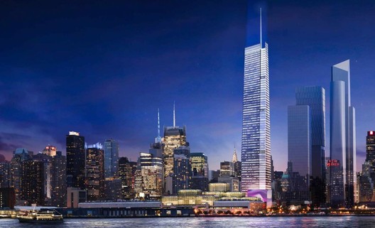
| FXFOWLE's 3 Hudson Boulevard Could Be Hudson Yards' Tallest Building Posted: 09 Aug 2017 05:05 AM PDT  Rendering of the updated design. Image © FXFOWLE. Via New York YIMBY Rendering of the updated design. Image © FXFOWLE. Via New York YIMBY New York Yimby has uncovered a new rendering of the FXFOWLE-designed 3 Hudson Boulevard showing an updated design featuring a 300-foot spire that would make the building the tallest in the Hudson Yards complex, and one of the tallest in the city. Reports indicate that the building, formerly known as the Girasole, would rise a total of 1,350 feet, placing it just below 432 Park Avenue's 1,397 foot peak. Approximately 1,050 feet of the building's height would be occupiable, with 1.8 million square feet of office space spread across 66 total floors.  An earlier rendering of the project. Image © FXFOWLE. Via New York YIMBY An earlier rendering of the project. Image © FXFOWLE. Via New York YIMBY The project is being developed by New York developer Moinian Group, who have yet to confirm the latest iteration of the design. Preparatory construction and foundation work began in May of last year, but a completion date has yet to be announced. Learn more about the project here. News via New York YIMBY. This posting includes an audio/video/photo media file: Download Now |
| The Six / Brooks + Scarpa Architects Posted: 09 Aug 2017 04:00 AM PDT  © Tara Wucjik © Tara Wucjik
 © Tara Wucjik © Tara Wucjik From the architect. The SIX is a 52-unit LEED Platinum affordable housing project that provides a home, support services and rehabilitation for disabled veterans. It is located in the MacArthur Park area of Los Angeles. McArthur Park has one of the highest densities in the USA with over 38,000 people per square mile and a total population of 120,000 people in 2.72 square miles.  © Tara Wucjik © Tara Wucjik  Perspective Section Perspective Section  © Tara Wucjik © Tara Wucjik Offering shelter and comfort for disabled veterans, the SIX breaks the prescriptive mold of the traditional shelter by creating public and private "zones" in which private space is deemphasized, in favor of personal and group social spaces. The organization of the space is intended to transform the way people live-away from a reclusive, isolating layout towards a community-oriented, interactive space.  © Tara Wucjik © Tara Wucjik  Sustainability Diagram Sustainability Diagram  © Tara Wucjik © Tara Wucjik This posting includes an audio/video/photo media file: Download Now |
| The One Redeeming Feature That Brings Humanity to the Sameness of Suburban Sprawl Posted: 09 Aug 2017 02:30 AM PDT  Scottsdale, Arizona. Image <a href='https://commons.wikimedia.org/wiki/File:Scottsdale_cityscape4.jpg'>via Wikimedia</a> in public domain Scottsdale, Arizona. Image <a href='https://commons.wikimedia.org/wiki/File:Scottsdale_cityscape4.jpg'>via Wikimedia</a> in public domain This article was originally published by Common Edge as "The Work of Architecture in the Age of Mechanical Reproduction." I attended graduate school, in geography, in Tucson, Arizona, in the late 1990s. Tucson draws fame from a number of things, including its Mexican-American heritage, its chimichangas, its sky islands, and its abundant population of saguaro cacti. Plenty of things about Tucson, though, are perfectly, achingly ordinary. Perhaps the most ordinary thing about Tucson led me to develop something halfway between a hobby and an academic pursuit. On occasion, whether for sport or research, friends and I used to go "sprawl-watching." We were not exactly, say, Walter Benjamin strolling through the arcades, embracing the human pageantry of Paris. But we did our best to plumb Tucson's depths. Needless to say, sprawl-watching is not an action sport. It does not happen before one's eyes the way trains pass (for trainspotters, to cite another essential '90s reference) or planes land. And yet, there it was, bright as day, churning ever so slowly across priceless desert habitat. I grew up in a place that had once engaged in the action of sprawling but had solidified long before I came along. West Los Angeles of the 1970s and 1980s was, if not urban, at least built-out. But in the tract housing developments on Tucson's outskirts, or whatever the outskirts were at the time, sprawl was indeed a verb. Naturally, you don't gobble up desert by the acre with anything resembling original architecture. The offenses of tract-home design have been cataloged prodigiously, and I won't belabor them here. I'll simply say that the uniformity dazzled me. A half-century after the heyday of Levittown, the business model was thriving.  Suburban homes in Colorado Springs, Colorado. Image © <a href='https://commons.wikimedia.org/wiki/File:Suburbia_by_David_Shankbone.jpg'>Wikimedia user David Shankbone</a> licensed under <a href='https://creativecommons.org/licenses/by-sa/3.0/deed.en'>CC BY-SA 3.0</a> Suburban homes in Colorado Springs, Colorado. Image © <a href='https://commons.wikimedia.org/wiki/File:Suburbia_by_David_Shankbone.jpg'>Wikimedia user David Shankbone</a> licensed under <a href='https://creativecommons.org/licenses/by-sa/3.0/deed.en'>CC BY-SA 3.0</a> If you spend any time around saguaro cacti, before long you can't help but marvel at the conditions that enable a tiny seed to take root, bubble up into a pup, and climb slowly skyward. The process requires just the right conditions, and it yields mighty succulents that are each mighty in their own way. Like snowflakes and fingerprints, no two are alike. We cannot say the same for their neighbors, the tract homes, with their identical floorplans, identical facades, and identical amenities. As modernity advanced, mass-produced housing arrived relatively late. The British manufactured ceramics and textiles by the late 1700s. Carnegie's furnaces were on full blast by the early 1900s, and Ford developed the assembly line soon thereafter. During World War II, Douglas and Lockheed produced fighter planes by the tens of thousands. Craftsmanship and artisanal skill had been on the wane for a long time. In fact, by 1936, not much was unique anymore. That's the year Walter Benjamin published "The Work of Art in the Age of Mechanical Reproduction." I prefer the more literal translation of its title: "The Work of Art in the Age of Its Mechanical Reproducibility," implying that art does not merely accompany mechanical reproduction but it is, in many ways, superseded and changed by mechanical reproduction. Benjamin argued that art—which is supposedly the apotheosis of uniqueness, originality, and human imaginativeness—was not merely a bystander in the industrial revolution, as the common title implies, but was, or could be, itself a product of technological production. Even in the 1930s, it wasn't hard to imagine that the same mechanical processes that were producing cars and phones and chemicals could be trained to produce art as well. Or, rather, reproduce it. Benjamin does not discount the importance of the artist in the creation of original work. But he implies that human mastery of chemistry and materials science, paired with the precision of the assembly line, could essentially produce copies indistinguishable from their originals and do so in limitless numbers. Mechanical arms could create brushstrokes in oil to mimic those of Da Vinci and Van Gogh, while mechanical chisels would turn fresh blocks of marble into new Davids and Birds in Space. They would not be forgeries but rather true reproductions. Originals would retain their importance only through their "auras"—that ineffable contact with their respective creators, however arbitrary and immaterial that connection may be. Benjamin probably overstepped. Even today, the originality of artwork—its imperfectness—provides one of our few steadfast links to our own humanity, even as technology eclipses anything Benjamin could have imagined. And yet, his thesis remains haunting, nihilistic, even: what if the mechanical can obliterate the artistic? This question vexed me from the moment I read Benjamin as an undergraduate all the way up to the moment I visited my first Tucson tract home development. There, in the most unassuming, offensive landscape, I discovered that architecture may yet preserve our sense of humanity. What struck me then as I strolled those expectant streets (possibly in ways that the residents never will) was that, for all the sameness of the homes, each one retained an essential uniqueness. Those developments, like most such developments, offered a few designs, each with lame, disembodied names like "The Nantucket" or whatever. They weren't so much designs as they were collections of amenities and necessities united under roofs. And yet, each occupied its own special, if not necessarily distinctive, plot of desert.  Houses in Tucson, Arizona. Image <a href='https://www.flickr.com/photos/daquellamanera/446405917'>via Flickr user daquellamanera</a> in public domain Houses in Tucson, Arizona. Image <a href='https://www.flickr.com/photos/daquellamanera/446405917'>via Flickr user daquellamanera</a> in public domain Sure, machines can reproduce structures. But architecture is more than just structures. The one and only thing that we cannot reproduce, be it in a chugging factory a humming 3D printer or a laboratory staffed by autodidactic nanobots, is landscape. I say "landscape" deliberately. We can absolutely produce and reproduce land. Many cities sit on landfill of some sort, from the Battery to the Bay Bay to Murano Island and The Palm Jumeirah. But, what every piece of land can claim—whether created by man or plate tectonics—is its uniqueness. We have one Earth, and every piece of it differs from every other piece. The totality of architecture encompasses structures, setting, relationships, uses, and even ideas that, in combination, create a landscape. Let's consider obvious exemplars: the Golden Gate Bridge, the Sydney Opera House, the monasteries of Tibet, the five-star bungalows of Tahiti, the Houses of Parliament, the Getty Center, Notre Dame, and the Casa Malaparte, and, yes, the Guggenheim Bilbao. (Esoteric though they may be, let's also add works of land art, like Spiral Jetty and The Lightning Field.) A great many architectural masterpieces owe their acclaim not just to their design—the part that lives on paper and could be constructed almost anywhere, but from their relationship with the land. Each of these structures looks the way it does because of its site and situation; from inside, they each look upon different views and, therefore, are capable of inspiring their own unique versions of awe. It's in these landscapes where humanism, if not humanity itself, may make its last stand. My own home is not a masterpiece because it enjoys a slightly different view and slightly different elevation from the one across the street. But the uniqueness of landscape ensures that architecture can be unique. And, just as Benjamin's point about reproducibility was subtle yet powerful, so is the importance of landscape. Benjamin was a weird one. On the one hand, he celebrated the extreme humanity of the city and the elemental activity of walking. On the other hand, he helped usher in not just the modern age—characterized by mechanical production—but indeed the postmodern age, characterized by reproduction and simulacrum. As intellectually interesting as postmodern ideas may be, they remain distressing. Nothing is special when everything is fake. Taken to its extreme, postmodernism presages the day when artificial intelligence does all our work for us and when no human relationship is unmediated by technology. That's why I take solace in special places and un-special places alike. And it's why I put a degree of faith in architecture, even when so many other human endeavors have slid into banality and self-reference. Of course, not every architect can, or should, be another Utzon or Meier. The world will always need far more workaday structures than it does masterpieces. The more we must strain to see our auras amid the banality of postmodern life, the more we may need to tighten our grip on the incredible places humanity has created. Nearly two decades later, I hope that plenty of happy families are living in those Nantuckets and Saratogas and whatevers. By now, many have raised children and perhaps sent them off to graduate school. They may or may not appreciate their unique places in the world. Indeed, placelessness is more prevalent than we ever could have imagined, with so much of life taking place online and in the cloud. But, while deserts sands may shift and buildings may topple, the fundamental facts of the land persist. Josh Stephens is contributing editor to the California Planning and Development Report and a freelance writer, specializing in urban planning. Based in Los Angeles, Josh writes frequently for Planetizen, Next City, and InTransition, among others. His website is joshrstephens.net. This posting includes an audio/video/photo media file: Download Now |
| Posted: 09 Aug 2017 02:00 AM PDT  © Nelson Kon © Nelson Kon
 © Nelson Kon © Nelson Kon From the architect. A house designed for a particular family, even when one always creates a project suitable to anyone.  © Nelson Kon © Nelson Kon  Site Plan - Landscape Site Plan - Landscape  © Nelson Kon © Nelson Kon Tending to be more feminine than masculine, the house embraces a 50-year-old fruit tree (a Jabuticabeira) at the center of the plot.  © Nelson Kon © Nelson Kon  Section Section  © Nelson Kon © Nelson Kon It shapes a small courtyard towards which every room opens: a porch, a living room, a dining room, a kitchen, a study room and a bedroom. The bending in of both of its wings aims at closer views of the tree and also of themselves, as in two small houses overlooking each other. The morning sunlight bathes the children bedrooms, and hits the facade with a fold on the concrete wall, which defines the entrance of the house. Other large trees, such as the Tipuanas, Jerivás, Palmeiras and Pitangueiras remain in the edges of the original plot.  © Nelson Kon © Nelson Kon To benefit from the view of these trees tops, along with the views of the city, a swimming pool and a terrace fill the entire rooftop.  © Nelson Kon © Nelson Kon This posting includes an audio/video/photo media file: Download Now |
| New Renderings Revealed for Helmut Jahn's Upcoming 832 Foot Skyscraper in Chicago Posted: 09 Aug 2017 01:00 AM PDT  Courtesy of 1000M Courtesy of 1000M Updated renderings have been revealed for renowned architect Helmut Jahn's 1000M, an upcoming 832-foot skyscraper that will take the place of a currently vacant lot on Chicago's historic Michigan Avenue. Accommodating 323 luxury residences and over 40,000 square feet of amenities, the building will be clad in a green and blue glass curtainwall, with horizontal metal spandrels running across and dividing it. The roof terrace is covered by a hovering metallic mesh crown, which is shown in the new renderings.  Courtesy of 1000M Courtesy of 1000M Construction on 1000M is scheduled to begin in 2018, with the skyscraper expected to be completed and ready for occupancy in 2021. News via: 1000M.
This posting includes an audio/video/photo media file: Download Now |
| Winners of 2017 "Rethinking The Future" Awards Present Radical Solutions to Present-Day Problems Posted: 08 Aug 2017 11:00 PM PDT  Architecture platform Rethinking the Future (RTF) has announced the winners for their annual "Rethinking the Future Awards," collecting over 500 entries from 30 countries. Established in 2012 in New Delhi, India, RTF aims to create a "new window on international trends in architecture and design" by considering "radical solutions for the present day problems facing the domain." "Each of these projects represents the best of architecture and design across the globe, where innovation and creativity are intersecting," says RTF on the 18 winning entries covering projects ranging from residential to cultural architecture. The competition was open to both students and professionals and drew a diverse collection of built and unbuilt works.
There were fifteen broad categories under which the projects were submitted. Read on for the list of all first place winners: Winning Entries:  Cocoon Cocoon Cultural (Built)- Cocoon by Manasaram Architects "The cocoon has been constructed as a Multi-use space that accommodates 40 persons simultaneously acting as an exhibition area for Krishi Vigyan Kendra. It is a unique project that qualifies as socially relevant because of the method in which it has been realized. Bamboo was required to be used for an unconventional form as it proved to be the most economically viable. Through this project, a wide spectrum of participants were brought together blurring social and cultural boundaries."  Seeking Roots Seeking Roots Cultural (Concept) - Seeking Roots With The Ghosts by Cheng Chieh Li "Our living place is our culture claim, which is called " Civic Museum". The Civic Museum should included a market and festival, which cohesion everyone's daily life. A market is a place not just for trading, but for communicating. The culture value is created by interacting with people, which can shorten their distance."  Infinite Forest Infinite Forest Hospitality (Concept) - Infinite Forest by Yitan Sun & Jianshi Wu "Our Project, named Infinite Forest, is an unprecedented type of hotel that strives to bring Manhattan's long-forgotten hilled land back. By excavating one of Manhattan's block down, the project reveals the hidden bedrocks that were buried over the last 400 years, upon which will be a new, natural park filled with trees and ponds what one would likely to only encounter back in the 17th Century. "  Out of the Box Out of the Box Housing (Concept) - Out Of The Box by Nudes "The eco-machine critiques the relationship between existing housing conditions, human health, consumption patterns and general well being. This project humbly explores an archetype for super dense urban housing that is significantly larger than the sum of its parts by actuating an effective eco-mechanic assembly by integrating housing, health, urban farming, sustainability, community space to improve the quality of life of its inhabitants and society at large."  Amanenomori Amanenomori Institutional (Built) - Amanenomori Nursery School by Aisaka Architects' Atelier "A nursery school of a two-story building with rooftop terrace features 3-dimensional and circuit style structure located in Funabashi city. The concept of its design is to provide enough space for 160 children to play around in nature and also for all their parents and nursery staff to feel safe."  Horoshkola Horoshkola Institutional (Concept) - Horoshkola by Krost ""Horoshkola" project is a part of the complete renovation of the residential district. The site restrictions shaped the volume of the school, making it quite high but discreet. Russian building code allows only for 4 floors for educational facilities."  AXL Jewelry Boutique AXL Jewelry Boutique Interior- Commercial (Built) -AXL–Jewelry Boutique by Labscape Design & Architecture "The collaboration between the architects and jeweler AXL started with a precise brief matching the brand universe: feminine, elegant and precious whilst avoiding the trivial codes of luxury. What was created is a kind of contemporary boudoir combining a certain nostalgia of the past with modern elegance and sophistication."  Project Bonaventure Project Bonaventure Landscape Design (Built) - Projet Bonaventure by City of Montreal "The vision for the project is built around three elements: (1) Create an entry to the city centre that is, at the same time, prestigious, functional and, convenient, (2) Promote the unity of neighbouring districts, in a North-South axis as well as East—West and (3) Support urban development with strategic public interventions."  Eco-Courtyard of City Eco-Courtyard of City Landscape Design (Concept) - Eco- courtyard of City- a Green Corridor in Taipei City by Chi Lin "We try to redesign this urban poché with rich green quality and extend its publicity. The site is given with traditional spatial values and images, combined with the idea of urban landscape. Visitors will experience various activities and delicate natural environmental arrangement. The linear public eco-courtyard is set up like a green corridor of city. We expect this corridor to connect its neighborhoods and redefine an active community."  Imagining the Vertical City Imagining the Vertical City Mixed Use (Concept) - Imagining The Vertical City by Vijul Shah "The future of the Indian cities can be envisioned as a collection of utopian settlements with tall skylines and self-efficient ecological living systems comprised majorly of skyscrapers. The country needs to address its shortcomings in order to achieve a higher pace on the journey towards a superpower which can be produced by unfolding the potentials of Skyscraper Architecture into a VERTICAL CITY itself."  Bamboo Symphony Bamboo Symphony Office Building (Built) - Bamboo Symphony by Manasaram Architects "Our office Bamboo Symphony is the major project presented depicting our principles, the symbiotic character and culture of Bamboo and the physical, chemical, ecological and environmental properties of materials expressed in the architecture as form, function, and aesthetics of the building. The building connects the past to the future."  XO Skeleton XO Skeleton Office Building (Concept) - XO Skeleton by EYP Architecture & Engineering "Our proposal investigates methods to reduce embodied energy in high rise design by combining skin and structure in a single integrated system and exploring alternative materials and systems to the traditional aluminum and glass curtain wall systems… XO Skeleton proposes a new way of thinking about high rise façade construction. Drawing from natural formations like coral reefs, we propose to combine structure and skin in a single X/O skeleton system."  Shi-An Shi-An Pop-Ups & Temporary (Built) - Shi-An by Katagiri Architecture+Design "This tea house is inspired by the beauty of transientness which represents Japanese sense of values towards space and environment. By using solely "Washi" paper as a structural element, the materiality elaborates a contemporary space in tradition."  Smart Lounger Smart Lounger Product Design (Built)- Smart Lounger by Studio Symbiosis "Sustainability is at the epicentre of the product. The design intent was to investigate kerfing as a technique for creating curved forms with minimal wastage. This was achieved through coding and iterative loops by stress analysis and generating the kerfing pattern accordingly. There is minimal wastage of material in the product to create a contemporary shape and the technique allows enough strength in the wood that is can take the load of a person sitting on it." ![Re[in]spired](https://lh3.googleusercontent.com/blogger_img_proxy/AEn0k_slZ5n_WLxAntQ_C4aXP7ItJl8beQkaeDSQUbYfReqdxkWYs0SJtOpzW6AUfI7z9SmvL7xodwhf_sDbPxjDJPhU-8l1FKj5S6RhxNVjU_vHcwKfZwtNEqSx4AChVENhFx1tOtQfQllI6LJDhjJOVV-ysSsvU8tT75zxZxXFPWYg-hvxWaMwd2aONI4I1L1t2elCzkBpIqlGWLrQ9wdHfw=s0-d "Re[in]spired") Re[in]spired Re[in]spired Product Design (Concept) - Re[in]Spired Architecture by Efthymia Douroudi & Lantavou Maria Lantavou "This project is about a new kind of garment, a prosthetic skin programmed to respire and improves the relationship between human body and environment. The experimental design procedure of this garment can also be applied in buildings, providing thermal comfort conditions to users, thus the title "re[in]spired architecture"."  Architectural Icon Architectural Icon Public Building (Concept) - Resurrection & Reinterpretation Of An Architectural Icon by Deepankar D. Sharma "This study examines and investigates various properties and phenomena associated with soap bubble intersection in nature. The investigated properties act as the driving rule for the form generative process. The rules along with the functional requirements for the program formed an algorithm which led to the global form of the structure through the local modules employed and intersected as per the functional needs."  The Pool House The Pool House Residence (Built) - The Pool House by Corneille Uedingslohmann Architekten "..the new building was designed for and around the desired swimming pool. Further complicating the design was the development of a structure that would fit within the restrictive polygonal plot while respecting the given lines of the street and neighboring homes. The resulting diamond-shaped shell responds precisely to these parameters while exploiting the spatial possibilities of the pointed piece of land it occupies."  Lagos's Wooden Tower Lagos's Wooden Tower Residence (Concept) - Lagos's Wooden Tower by HKA Hermann Kamte & Associates "The whole is oriented to maximize daylight and natural ventilation. The wooden envelope provides shading from the heat of the direct sun around the shape. Plants belt around each floor contribute to creating fresh airflow and keep a constant microclimate into living space while providing a visual comfort and aesthetic."  New York Horizon New York Horizon Urban Design (Concept) - New York Horizon by Yitan Sun & Jianshi Wu "The goal of the concept is to reverse the traditional relationship between landscape and architecture. Instead of building distant, flat landscapes to surround and complement individual architectural buildings, the natural landscape is now the centerpiece. In this case, the dynamic landscape is surrounded by characterless architecture that tries to be nothing but mirror that reflects nature." To see the full boards for each project, visit RTF HERE. Information and boards via RTF.
This posting includes an audio/video/photo media file: Download Now |
| Watch Eyal Weizman Explain Forensic Architecture's Pioneering Investigatory Methods Posted: 08 Aug 2017 09:00 PM PDT In this film produced by Vice, Eyal Weizman—director of London-based research agency Forensic Architecture—explains how his team have developed methods of investigating bombings in areas of conflict across the globe. Using cellphone footage, examining floor plans, and utilising road maps, Weizman brings together scientists, journalists, and graphic designers in order "to analyze destroyed buildings for evidence of human rights abuses."  Courtesy of Vice Courtesy of Vice This posting includes an audio/video/photo media file: Download Now |


.jpg?1502166918)
| You are subscribed to email updates from ArchDaily. To stop receiving these emails, you may unsubscribe now. | Email delivery powered by Google |
| Google Inc., 1600 Amphitheatre Parkway, Mountain View, CA 94043, United States | |
Nema komentara:
Objavi komentar