Arch Daily |
- PIVVZZA / Valentín Sanz Sanz
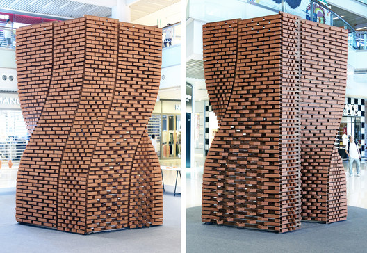
- More Than 2,000 Unique Robotically Manufactured Bricks Generate Variable Walls in This Pavilion
- Church of St. Wenceslas / Atelier Stepan
- Primary School La Couyere / Atelier 56S architectes
- Sublime Ordinariness Housing Project / DCOOP
- Butterfly House / HH Architects
- House in Hoshigaoka / Shogo ARATANI Architect & Associates
- Sky Crown Terraces / Bercy Chen Studio
- Olson Kundig, CookFox, Morris Adjmi Among Top Firms to Design Buildings for Revitalization of Downtown Tampa
- Demolition is Underway on Alison and Peter Smithson's Robin Hood Gardens in London
- Rua Maria Loft / KEMA studio
- CORE Modern Homes / Batay-Csorba Architects
- LEGO to Release 774-Piece Kit of BIG-Designed Experience Center
- Women House / Ignacio Correa
- 9 Important Photoshop Tips for Architects
- Outpost Studio House / Olson Kundig
- 5 Movies, 5 Cities
- The British Library Releases 570 Pages of Leonardo da Vinci's Manuscripts Online
| Posted: 29 Aug 2017 10:00 PM PDT  © Luis Díaz Díaz © Luis Díaz Díaz
 © Luis Díaz Díaz © Luis Díaz Díaz From the architect. I am the space where I am. Space is what I do of it. We must develop an open kitchen restaurant, capable of hosting a collection of "basic tools" and that only occupy a total area of forty square meters.  Isometric Isometric We understand that the project is reduced to organize, storing that set of objects and tools, an inventory that is completed with the rest of pieces needed in the restaurant. The shelf becomes an element that stores and organizes, but is also capable of filtering the information that the client receives. Absolute knowledge makes us disenchanted, so we produce an open kitchen with different levels of exposure to the public. The objects and the shelf act as a filter, hiding and showing the action.  © Luis Díaz Díaz © Luis Díaz Díaz Each element occupies a specific place inside the 40 square meters as well as that it find their position, relations between objects appears drawn up by proximity, relations that qualify and differentiate small zones of the space,this is how waiter ́s zone, assistant ́s space or chef ́s place appears.  Cross Section Cross Section The project is completed with the public area, the space that doesn ́t occupy the shelf is the dining area. To give it a stronger image and adaptation ability, we produce a stool inspired by the traditional stump capable of stacking in two, giving rise to a new piece able to work as high stool or table.  © Luis Díaz Díaz © Luis Díaz Díaz This posting includes an audio/video/photo media file: Download Now |
| More Than 2,000 Unique Robotically Manufactured Bricks Generate Variable Walls in This Pavilion Posted: 29 Aug 2017 09:00 PM PDT  © Christian J. Lange © Christian J. Lange Developed by researchers and students from the Faculty of Architecture at HKU and Sino Group, the 'Ceramic Constellation Pavilion' is built on a wooden structure that supports a series of "walls" formed by about 2,000 clay bricks. Each of these individual components is unique and has been manufactured using robotic technology and 3D printing, allowing to generate different types of transparency and opacity in their different faces. Description from the architects. The Pavilion is the first outcome of a new collaboration between The Faculty of Architecture at HKU and Sino Group. The research initiative that supports arts, cultures, and technology is intended to foster cultural awareness of new technologies for the built environment.  © Christian J. Lange © Christian J. Lange In a context that has been largely shaped by standardization and mass production, the project seeks to overcome the constraints of today's architectural production through the introduction of a structure made entirely of non-standard components.  © Christian J. Lange © Christian J. Lange This inaugural workshop of the "Sino Group Robotic Architecture Series" utilized terracotta clay to test the possibilities and limits within robotic fabrication and to revitalize a material system that has a significant tradition in Asia.  © Christian J. Lange © Christian J. Lange Departing from traditional brick bonds, the 3.8m tall project articulates a load-bearing composite structure with timber - where each of the nearly 2000 3d printed terracotta bricks is unique and different, enabling varying degrees of transparency, morphological shifts, and new experiences.  © Christian J. Lange © Christian J. Lange Around 700 kg of raw terracotta clay was printed over a period of 3 weeks into individual bricks that were then fired at 1025 degrees Celsius. With 2-3 minutes average printing time for each brick, the pavilion is one of the first of its kind in the world that incorporates this specific material system.  © Christian J. Lange © Christian J. Lange All components were fabricated with the equipment in the newly fitted Robotics Lab at HKU's Faculty of Architecture and assembled during a ten-day workshop by students from the Department of Architecture.  © Christian J. Lange © Christian J. Lange The project was recently on show in the North Atrium of Olympian City, West Kowloon and will find its new home soon on the campus of the University of Hong Kong.  Diagram Diagram  Diagram Diagram  Plan Plan Project Leaders: Christian J. Lange, Donn Holohan, Holger Kehne This posting includes an audio/video/photo media file: Download Now |
| Church of St. Wenceslas / Atelier Stepan Posted: 29 Aug 2017 08:00 PM PDT  © Jakub Skokan, Martin Tůma / BoysPlayNice © Jakub Skokan, Martin Tůma / BoysPlayNice
 © Jakub Skokan, Martin Tůma / BoysPlayNice © Jakub Skokan, Martin Tůma / BoysPlayNice From the architect. Church of St. Wenceslas in Sazovice is a modern rotunda and contemporary architecture built on conservative principles from Moravian architectural office Atelier Štěpán. The idea of building a church in Sazovice dates from the interwar period. In 2011 the people of Sazovice brought the idea again and founded the association of church building. The first important task was to find a particular location, which would help to amplify the spiritual sense of church. According to the masterplan, we discovered 4 possible sites for the building. Only one of them was in the heart of Sazovice perfectly linked with the surrounding building structure and its social connections.  © Jakub Skokan, Martin Tůma / BoysPlayNice © Jakub Skokan, Martin Tůma / BoysPlayNice The surroundings create a bay for the church that brings great importance to this place for following generations. Searching for the right form of the church started with a simple cylinder, which became a perfect volume for this place. The circle has always been understood as a divine symbol, in contrast to the worldly rectangle. The church establishes the focal point of the village, in the intersections of main directions and it makes you feel it's a sacred place. The building refers to rotundas built in St. Wenceslas' time in 10th century. He founded a rotunda, that has, according to the historical sources, similar diameter to the church in Sazovice. The old rotunda was rebuilt into a new gothic square shaped chapel within the Prague cathedral.  © Jakub Skokan, Martin Tůma / BoysPlayNice © Jakub Skokan, Martin Tůma / BoysPlayNice We circumscribed a circle around the square and continued to design with the same proportions and positioning of altar, entrance and stairs. The relics of St. Wenceslas are in the Prague chapel and newly in the altar in Sazovice. During the construction, we discovered a connection between the both buildings. While standing in front of the altar and looking through the main window, designed by intuition, you are watching in the direction of St. Wenceslas chapel. This fact supports the rightness of the design and may be a result of a contribution of force majeure.  © Jakub Skokan, Martin Tůma / BoysPlayNice © Jakub Skokan, Martin Tůma / BoysPlayNice  First Floor Plan First Floor Plan  © Jakub Skokan, Martin Tůma / BoysPlayNice © Jakub Skokan, Martin Tůma / BoysPlayNice "My aim was to dematerialize the building. When you observe the volume, you feel the lightness made by design principle of tapering the walls into tiny lines. It's like cutting a paper cylinder and exploring its possibilities. I created the windows by pushing and pulling the cuts and letting the light glide softly on the walls. I believe there is something or better Somebody behind the material world. In Sazovice I tried to find it through the volume and defined space. As an architect, I explore the space and its impact on people. The church should influence people's mind, whether they understand it consciously or subconsciously. This is the reflection of something divine in the volume, defined space and something what is behind the walls. The church invites us inside and provides a sense of quietness and peace. You can experience being alone with God if you want. The interior is very personal and it's better to come and live it out."  Section A-A' Section A-A' The interior is poeticaly minimalistic with modest decoration. Historical churches are full of visual information – the entire story is written in paintings, sculptures, in decorations. For example, interior in Baroque church was completely descriptive to give illiterate people an idea about Jesus' life. Nowadays we are overwhelmed with information and we tend to search for a quiet place of meditation and realizing own inner being.  © Jakub Skokan, Martin Tůma / BoysPlayNice © Jakub Skokan, Martin Tůma / BoysPlayNice  © Jakub Skokan, Martin Tůma / BoysPlayNice © Jakub Skokan, Martin Tůma / BoysPlayNice The altar is a bronze shell in a simple organic shape with a perfect surface symbolizing the God's touch (known from Sistine Chapel in fresco painting by Michelangelo). During the creative process, I explored the contact of masses, which is similar to the human contact. The touch creates a movement and it is a beginning of a new energy. The moment of the touch is concentrated in a point like a tangent to the circle. And the energy is flowing from one to another and it finally creates connection that brings a message. It reminds me of the rituals performed during confirmation, laying on of hands during sanctification or forwarding messages that have been being unfolded for two millennia since Jesus came.  © Jakub Skokan, Martin Tůma / BoysPlayNice © Jakub Skokan, Martin Tůma / BoysPlayNice This posting includes an audio/video/photo media file: Download Now |
| Primary School La Couyere / Atelier 56S architectes Posted: 29 Aug 2017 07:00 PM PDT  Courtesy of Atelier 56S architectes Courtesy of Atelier 56S architectes
 Courtesy of Atelier 56S architectes Courtesy of Atelier 56S architectes From the architect. The implantation of the project was dictated by the will of an urban re-organisation of the plots defined for the library, the TAP Hall, the multipurpose hall and the new school.  Courtesy of Atelier 56S architectes Courtesy of Atelier 56S architectes Each access from the public space to these plots was located in a different area, we created a footpath from east to west that distributes every new public equipment in a single area. The implantation of the school to the east of the plot alongside the new library reinforces this new public alley.  Floor Plan Floor Plan The project is based on the environment in its location, the minerality of the materials, the important surrounding vegetation, and the linear urban division divided by low stone walls located in the actual school's playground.  Courtesy of Atelier 56S architectes Courtesy of Atelier 56S architectes THE SCHOOL  Courtesy of Atelier 56S architectes Courtesy of Atelier 56S architectes A teaching core, simple and compact is created in the central area, isolated and protected from the weather, it reaches very high energetic performances (RT 2012 -30%). It is composed of two classrooms, a workshop, an office and service spaces. This core is surrounded by free use spaces enclosed by traditionnal brick walls. These walls are a continuity of the existing stone walls and create a real play experience, they are informal elements that allow amusement, these spaces are used as circulation, corridors, shelters and play areas. In the new playground, low brick walls are added to the existing stone walls and let the children sit, hide, play, learn and feel... and set their imagination fre .  Courtesy of Atelier 56S architectes Courtesy of Atelier 56S architectes A hybrid construction system between wood and concrete was the most appropriate, the outside is cladded with traditionnal hand-moulded bricks, and a lime coating covers the sheltered walls. For the insulation, natural materials were chosen, such as lin or cellulose wadding that fills the timber framed walls. The thermal weaknesses are stopped with wood fibers coated with lime. A vegetated roof covers the whole project.  Courtesy of Atelier 56S architectes Courtesy of Atelier 56S architectes Inside, the classroom are cladded with perforated wood panels that ensure the acoustic comfort and create a warm and cosy atmosphere. In the informal areas, the concrete is left visible with natural light brought in by various systems that depend on the needs of each space.  Courtesy of Atelier 56S architectes Courtesy of Atelier 56S architectes This posting includes an audio/video/photo media file: Download Now |
| Sublime Ordinariness Housing Project / DCOOP Posted: 29 Aug 2017 03:00 PM PDT  © Quaid Doongerwala © Quaid Doongerwala
 © Quaid Doongerwala © Quaid Doongerwala From the architect. The housing project is located about 60 km to the north east of Mumbai which houses 54 families of staff working in the industrial facility of a color coating plant for a large corporate group. Family, relatives, and community play a critical role in Indian society. The housing has been designed keeping these socio-cultural realities in mind.  Diagrams Diagrams Using the Mumbai chawl as a reference to organize the spaces, we saw it as a typology with the tremendous possibility of being a social catalyst. Four apartments of 540 sq.ft. each is strung along a corridor space. At the end of which sits the staircase.  © Quaid Doongerwala © Quaid Doongerwala On the ground floor, the apartments are accessible individually having their own small semi private space, resembling the characteristic "otla" ( raised entrance level plinth) seen in the traditional houses of India ( pols, wadas, etc.). Three blocks come together along with the semi round monolithic block to form this large central community space into which all the corridors open.  Exploded Axonometric Exploded Axonometric The form of each staircase is carefully articulated to give each block a little twist and hereby giving each an identity of its own. The construction system is a very simple brick and concrete system using locally available artisans. The structural system is carefully calibrated to produce a facade which helps to scale the building to a more humane level.  © Quaid Doongerwala © Quaid Doongerwala  © Quaid Doongerwala © Quaid Doongerwala The idea of the community and living together has been a key intent of this project. Corridors, staircases, balconies and "otlas" opening up into a larger public space creating a rejuvenated community spirit and reinforcing a sense of belonging and togetherness for people living in industrial facilities.  © Quaid Doongerwala © Quaid Doongerwala This posting includes an audio/video/photo media file: Download Now |
| Butterfly House / HH Architects Posted: 29 Aug 2017 01:00 PM PDT  © Namgoong Sun © Namgoong Sun
 © Namgoong Sun © Namgoong Sun From the architect. Nam-dong Butterfly House is a project that started in the Raum Village, Yongin housing complex, when a couple early forties dreaming of living in the yard with their two children. Utilizing the slope of the 4m elevation, created parking spaces and secret free space in the basement, the front yard has secured as much as possible for the children to play and furthermore to have every corner its own characteristics and functions (garden, mini basketball court, outdoor swimming pool, barbecue, etc.) The connection to the front yard-pool-dining room-back yard is designed so that the children can freely cross the space, and the husband and wife can always look at them comfortably.  © Namgoong Sun © Namgoong Sun  1st Floor Plan 1st Floor Plan  © Namgoong Sun © Namgoong Sun The shape of the house was shaped like two butterflies naturally by following the shape of the land, view, and the southern exposure, the sharp shape was chosen to overcome the legal constraints on the area called floor-area ratio. By considering the tendency of the client who does not use mobile furniture much, it is a way to visually expand the space and to have a spatial fun. Due to morphological diversity, material and color were abstained as much as possible. However, by using concrete as an architectural background, it provided the experience of various surface textures of concrete, such as plain concrete, patterned concrete, and exposed concrete, and etc.  © Namgoong Sun © Namgoong Sun This posting includes an audio/video/photo media file: Download Now |
| House in Hoshigaoka / Shogo ARATANI Architect & Associates Posted: 29 Aug 2017 12:00 PM PDT  © Shigeo Ogawa © Shigeo Ogawa
 © Shigeo Ogawa © Shigeo Ogawa From the architect. The site is located in North Eastern part of Osaka prefecture, where its surrounding neighborhood in mature residential quarter remains quiet, even though it is just a little away from the main road. While the site has a flat condition as it does not have any height difference, the surrounding residential area has ups and downs, and the site is in a sunken part of the area.  © Shigeo Ogawa © Shigeo Ogawa This is a project to design a small house for three adult residents—an elderly couple and their grown up child. Since the site is large enough compared to the requested volume of the house, it was possible to provide a parking space on the north side, a garden space on the south side, and a space for a wide approach on the west side of the site.  © Shigeo Ogawa © Shigeo Ogawa 1st and 2nd-floor volumes are layered in slightly shifted positions against each other, and a square hipped roof is placed on top of those volumes as if like an umbrella. The gaps produced by the shifted volumes are turned into elements such as an open ceiling space or a high side lighting—therefore the layering of the lower floor and upper floor volumes was carefully coordinated to define and adjust the dimensions of those elements. Finally, the depth of the eaves was defined in order to maximize the intake of daylight from the high side lighting.  Sections Sections The 1st-floor plan is set as a family gathering space and a space for the parents, while the 2nd floor is the space for the single child—thus each style of living is separately defined between the upper level and the lower level. However, each floor is connected through the open ceiling space so that each family member can feel the presence of others. It is also for the consideration of the possible case in the future for nursing the parents.  © Shigeo Ogawa © Shigeo Ogawa On the 1st floor, the family gathering space, a large earthen floor leading to the outside is provided for their dog, which forms a continuous space to the garden. This wide earthen floor is also considering the possibility in the future to be used as an approach for a wheelchair; thus the entrance door is provided as a large-sized swing door to be opened widely to the outside.  Floors Plans Floors Plans On the 2nd floor level, the shape of the square hipped roof with a slope of 30° is reflected the interior space. The space has a calm atmosphere, to be enveloped by the undulating ceiling in varying heights, with the daylight from the two top lights on the ceiling.  © Shigeo Ogawa © Shigeo Ogawa Such lighting condition is provided not only for those main living spaces, but also for the kitchen area, the water section with bathroom, and even for the storeroom. Various lighting conditions will promote changes and differences in those spaces, and that will enrich the living of the residents in this house. This posting includes an audio/video/photo media file: Download Now |
| Sky Crown Terraces / Bercy Chen Studio Posted: 29 Aug 2017 10:00 AM PDT  © Andrea Calo © Andrea Calo
 © Andrea Calo © Andrea Calo Sky Crown Terraces are two identical and adjacent houses designed and built by Bercy Chen Studio in Austin, Texas. The monolithic form, courtyards, and habitable flat roofs evoke the vernacular of the American Southwest interpreted by Modernism. Inspired by the sculpture of Michael Heizer, Eduardo Chillida, and Jorge Yazpik, the strategy of volumetric subtraction enhances the materiality of the basic conception of the houses as stucco boxes crowned by steel panels. The consequentiality of the vernacular together with the elegance of orthogonal abstraction clad in nakedly simple materials do nothing to distract from the peculiar delights of the understated landscape and raw climate of the Texas Hill Country.  © Andrea Calo © Andrea Calo Emphatic dichotomy  © Andrea Calo © Andrea Calo Nature penetrating interior life  © Andrea Calo © Andrea Calo  Ground Floor Plan Ground Floor Plan  © Andrea Calo © Andrea Calo Rooms outdoors  © Andrea Calo © Andrea Calo  Conceptual Design Conceptual Design  © Andrea Calo © Andrea Calo Coronation of the heavens  © Andrea Calo © Andrea Calo "Texas Wabi-Sabi" This posting includes an audio/video/photo media file: Download Now |
| Posted: 29 Aug 2017 09:20 AM PDT  Tampa skyline, after. Image Courtesy of Water Street Tampa Tampa skyline, after. Image Courtesy of Water Street Tampa Developer Strategic Property Partners has announced plans for a new $3 billion 50-acre mixed-use neighborhood in Tampa, Florida. To be known as Water Street Tampa, the multi-phase project will create 9 million square feet of commercial, residential, educational, cultural and entertainment space on a site currently underused and occupied by highways and surface parking. To carry out this vision, Water Street Tampa has enlisted several top firms to design the neighborhood's new buildings, including:
 Courtesy of Water Street Tampa Courtesy of Water Street Tampa In addition, construction on the nearby University of South Florida Morsani College of Medicine and Heart Institute, designed by HOK, is set to begin this Fall. Water Street Tampa will be carried out in phases over a 10-year period. The first phase, slated to be completed by 2020, will feature 11 projects containing 4 million square feet of mixed-use space. Phase two is scheduled for completion in 2023, with the final phase wrapping up in 2027. Learn more about the project here. News via Water Street Tampa. This posting includes an audio/video/photo media file: Download Now |
| Demolition is Underway on Alison and Peter Smithson's Robin Hood Gardens in London Posted: 29 Aug 2017 08:05 AM PDT  via <a href='http://https://twitter.com/saverobinhood/status/900359306658369536'>Twitter user @saverobinhood</a> via <a href='http://https://twitter.com/saverobinhood/status/900359306658369536'>Twitter user @saverobinhood</a> Demolition has officially commenced on East London housing development Robin Hood Gardens, bringing to an end any chance of a last-minute preservation effort for the Brutalist icon. Designed by British architects Alison and Peter Smithson and completed in 1972, plans for the site's clearing and redevelopment have been in the works for more than five years, before government indecision and a spirited protest campaign led by architects including Richard Rogers, Zaha Hadid, Robert Venturi, and Toyo Ito put those plans in doubt.
An example of the duo's "Streets in the Sky" concept, the Robin Hood Gardens featured wide concrete balconies on every third level of each building, providing views into the central garden and create communal space for residents to gather and for children to play. A lack of upkeep, however, caused the complex to fall into disrepair and become an incubator for crime.
 CF Møller's Phase 3 Plan for the Blackwall Reach development. Image Courtesy of CF Møller CF Møller's Phase 3 Plan for the Blackwall Reach development. Image Courtesy of CF Møller Once demolition is complete, developer Swan Housing Association will begin on the next phases of their Blackwall Reach Regeneration Project, which will create more than 1,500 new apartments and public spaces designed by Haworth Tompkins, Metropolitan Workshop and CF Møller. To be constructed over three phases, the scheme will retain only the central grassy mound from the original Robin Hood Gardens. Apartment units in the new development will be kept "affordable," although the accuracy of that term as defined by the UK is debatable, as it allows units to be priced up to 80 percent that of the market value. In Blackwall Reach, some apartments will cost as much as $1,855 per month. See complete coverage on ArchDaily, here.
This posting includes an audio/video/photo media file: Download Now |
| Posted: 29 Aug 2017 08:00 AM PDT  © João Morgado © João Morgado
From the architect. Project is located in Anjos, Lisbon, Portugal, a zone where the industry mixes with housing buildings in a very dense urban tissue.  Section A-A' Section A-A' The pre-existing space had a function of carpentry, with a limited access to light and a small, lacking identity exterior space.  © Marco Pezzutto © Marco Pezzutto We decided to maintain as much as possible in the interior, except for the part of a back facade to let more natural daylight in and enforce the relation between interior-exterior.  Before. Image Courtesy of KEMA studio Before. Image Courtesy of KEMA studio  Diagram Diagram  © João Morgado © João Morgado The intervention´s objective was to appreciate "the existing" and add to it. The "wet functions" were contained within rigid massive pre-existing brick walls, leaving all the "dry functions" in the remaining space. Further separation of functions was made by introducing 2 simple volumes defining the required functions. A black box, made from engineered coloured wood, created a technical zone together with a storage; a cork box, made from warm and acoustic cork panels, which created a private zone of double bedroom with direct connection to the exterior – both boxes made from sustainable, ecological materials produced in Portugal.  © João Morgado © João Morgado Materials were a fundamental aspect of this project. We kept heavy brick arches, steel structure and concrete pillars supporting it and by introducing new elements to it. In this way we were able to emphasize the pre-existing industrial character. We played with contrasts of colors, temperature and sound. We intended to make it homey but still maintain the "industrial" identity, so we paired black, cold, noisy steel with bright-toned, warm and quiet cork.  Floor Plan Floor Plan Throughout the process it was important for us not to lose the identity of the space. Since the local was a well known carpenter´s workshop, we decided to reuse all the wood left in the workshop and bring it back to life in a contemporary way, as a kitchen island top, bedside tables and exterior "pixel" wall – a composition made from over 14 different types of wood from all around the world.  © João Morgado © João Morgado All of this resulted in a well defined space, with a memory of what it used to be. A comfortable space, penetrated by morning light from the entrance zone and flooded by the afternoon sunlight coming in from the backyard. This posting includes an audio/video/photo media file: Download Now |
| CORE Modern Homes / Batay-Csorba Architects Posted: 29 Aug 2017 06:00 AM PDT  © Doublespace Photography © Doublespace Photography
 © Doublespace Photography © Doublespace Photography From the architect. CORE Modern Homes is a 16,000sf 7-unit townhouse development which explores the potential of spatially oriented apertures that work to induce movement and visual interest within an efficient volume which maximises programmatic potential. Located in Toronto's Leaside neighborhood, the development occupies a prime site along Eglinton Avenue.  Axonometric Section Axonometric Section This street is poised to be one of Toronto's new public transit corridors with the completion of the new LRT line. Designed with family life in mind, these contemporary residences offer generous living and dining rooms and spacious kitchens intended for the active cook. Each features three bedrooms, including a serene master suite that occupies an entire level, a flexible loft space perfect for family gatherings as well as 4 large completely private terraces each totaling 500–600 sqft per unit.  © Doublespace Photography © Doublespace Photography  Floor Plan 1 Floor Plan 1  © Doublespace Photography © Doublespace Photography The windows on the front street facing facades reference an inverted model of the traditional bay window, found on much of the city's Victorian housing stock. The perceived carving of the windows further emphasizes the monolithic nature of the masonry volume.  © Doublespace Photography © Doublespace Photography While the perspectively oriented windows animate the facade and work to maximize natural light and ventilation throughout each floor while extending visual limits of the house to embrace the primary view corridors of the site. Each residence establishes a continually unfolding relationship between its interior, exterior private garden spaces and the sky beyond.  © Doublespace Photography © Doublespace Photography This posting includes an audio/video/photo media file: Download Now |
| LEGO to Release 774-Piece Kit of BIG-Designed Experience Center Posted: 29 Aug 2017 05:15 AM PDT  via LEGO via LEGO LEGO has revealed the latest kit in their Architecture series, and it's a bit meta: a 774-piece model of the nearly complete LEGO experience center in Billund, Denmark, designed by BIG to resemble a stack of LEGO blocks.  via LEGO via LEGO The 197-step kit will be sold exclusively at the LEGO house, which will debut to the public in a grand opening ceremony on September 28th. Another 600 lucky fans will have the chance to grab the kit for themselves at a special pre-opening event on September 22nd.  via LEGO via LEGO  via LEGO via LEGO According to BIG founder Bjarke Ingels, the concept behind the LEGO House was to create "a cloud of interlocking LEGO bricks... a literal manifestation of the infinite possibilities of the LEGO brick." The building form is meant to resemble 21 oversized bricks stacked in a pyramidal shape and capped with "the Keystone," a scaled-up version of the classic eight-knob LEGO brick. See the full instructions and description of the kit here. News via LEGO, theBrickFan.
This posting includes an audio/video/photo media file: Download Now |
| Posted: 29 Aug 2017 04:00 AM PDT  © Aryeh Kornfeld © Aryeh Kornfeld
 © Aryeh Kornfeld © Aryeh Kornfeld From the architect. This project is located in the town of Maitencillo within the region of Valparaiso. Initial development of this holiday house began by recognising the need for height in such a way that would permit visibility of the landscape, thus allowing better lighting, exposure and ventilation.  © Aryeh Kornfeld © Aryeh Kornfeld  1st Floor Plan 1st Floor Plan  © Aryeh Kornfeld © Aryeh Kornfeld There are two types of zones that define this program: the living area and the dormitory area. They are organised into two volumes of distinct scale and dimension. The rotated parts are intersected against each other, in a way that the east facade could form the entrance of the Project, and the gathering space faces the north one.  © Cristobal Valdes © Cristobal Valdes  2nd Floor Plan 2nd Floor Plan  © Cristobal Valdes © Cristobal Valdes In terms of the materials used for this project, a modular system of 4 diagonal dimensional lumbars permitted suspension of the house and liberation of the ground floor. The volumes take place upon the structure, made from the same type of wood, with one side being sealed from the road and the other allowing for the paramount view.  © Aryeh Kornfeld © Aryeh Kornfeld This posting includes an audio/video/photo media file: Download Now |
| 9 Important Photoshop Tips for Architects Posted: 29 Aug 2017 02:30 AM PDT  This article was originally published by RenderPlan as "9 Powerful Photoshop Tips for an Effective Workflow." A powerful software like Photoshop can turn an average looking image or drawing into a stellar asset for a project. The trick is to learn to use some of its best features and optimize your workflow for maximum efficiency. Over the years Photoshop has become the go-to tool for architects for any kind of image-based editing. The software has become indispensible thanks to its versatile features. It is a powerful tool for tweaking renderings or create them from scratch. Some of the most renowned visualization artists rely heavily on Photoshop and use very crude masses done in 3d programs as a starting point. From photorealistic renderings to editing photographs of built projects and beautifying line work, Photoshop can be an architect's best friend. 1. Non-Destructive WorkflowAs with any type of software, it is important to maintain control of a project and allow yourself to go back and forth between steps without losing work. A non-destructive workflow can save you a lot of time and headache. Use masks and adjustment layers to preserve flexibility, reduce the number of layers in the layers palette so you can experiment and tweak specific things and see how they interact. Masks allow you to cut out parts of different layers and apply adjustments to specific areas of the image. Group layers and give them specific names to avoid confusion. If you duplicate a layer and leave it as "Layer 1 copy," you can easily end up with a messy file. 2. Smart ObjectsHave you ever placed an image on the canvas, scaled it back only to notice a loss in quality? This is what smart objects can mitigate. They can be scaled down or up to their original size and rotated without losing quality, unlike with a rasterized image. One of the great things about Smart Objects is how they save the Free Transform options that you apply to them. If you distort a Smart Object, for instance, and apply the transformation, your original transformation will still be available if you need to adjust the transformation later on. You can duplicate Smart Objects with the duplicates behaving like instances. If you want to work on them separately choose New Smart Object via Copy option. 3. HotkeysUsing hotkeys can significantly speed up your workflow. Learn to use the keyboard to quickly access specific features and options. Here are some of the hotkeys you'll need the most:  Courtesy of RenderPlan Courtesy of RenderPlan Create a layer: Flatten layers: Invert selection: Deselect the entire image: New layer via copy: New layer via cut: Increase/decrease brush size: Free Transform: Blending modes: Change image size: Change canvas size: 4. Sample Colors Outside PhotoshopInstead of importing an image into Photoshop just so you can sample a specific color, you can select the Eyedropper tool, left-click, hold and drag the cursor anywhere outside of Photoshop (desktop, other folders, images, web browser, etc.). 5. Protect your ImagesAs a professional, you'll possibly be sending Photoshop files to clients. It is important to protect your work and make sure clients don't use it without your permission or involvement. You can encrypt the file so that it requires a password to print or edit. You can save it as a PDF, and choose Security, then Permissions and enter a password to prevent printing and editing. 6. Reveal AllWhen working with different layers and placing images, you can miss the fact that there are hidden pixels outside of the canvas. This is where Reveal All can become useful. Go to Image > Reveal All to make the canvas large enough to fit all the pixels on every layer. 7. Test out FiltersApplying filters to images can be a memory-intensive task. It can take a while to apply a filter to a relatively large image. This is why it's good to select a smaller area and apply a filter to it as a test. 8. Match Color of an ImageTo maintain color consistency between several images of the same project, the Match Color command can save you a lot of time. You can open the two images-the source image and the target image–as two separate images or layers, then choose Image > Adjustments > Match Color… and select the source image from the Source pull-down menu. This reads the color statistics from one image and applies them to the other. You can also adjust luminance, color intensity and fade. 9. Learn to Let GoTweaking images in Photoshop can eat up a lot of your time if you don't learn to make decisions. The variety of options and the use of a non-destructive workflow are great, but can easily turn on you. It's important to set a time frame for yourself and not to get caught up in trying all possible styles. Learn to let go. This posting includes an audio/video/photo media file: Download Now |
| Outpost Studio House / Olson Kundig Posted: 29 Aug 2017 02:00 AM PDT  © Tim Bies © Tim Bies
 © Jean-Luc Laloux © Jean-Luc Laloux From the architect. Set in the remote, harsh high desert of Idaho, Outpost is an artist's live/work studio and sculpture garden. The building's compactness restricts site impact and reinforces the desire to be outside. This is a windy place, and the enclosed "paradise garden," is separated from the wild landscape by thick masonry walls. The footprint of the house is the limit of intrusion into the land—a simple, clearly defined space. This structure exemplifies Kundig's belief that the architect's job is to create an experience of place.  © Tim Bies © Tim Bies Outpost's compactness limits site impact and reinforces the desire to be outside. The architects chose a readily available construction material—concrete block—for the primary structure; commercial builders were able to quickly and cheaply assemble the building. Interior materials are left largely unfinished.  © Tim Bies © Tim Bies Kundig describes the concept as a Tootsie Roll Pop: hard on the outside and soft on the inside. The house is designed around one open, multifunctional room overlooked by a mezzanine bedroom, with separate studio/office and utility spaces on a lower entry level. Elevated above the ground (snowpack in winter), the main living levels have 360-degree views of the surrounding high desert and mountains.  © Tim Bies © Tim Bies Interior finishes include unfinished recycled fir floors, walls, and cabinets; plaster made from natural clays and pigments; and Carrara marble kitchen counters. Other materials used in the structure, including the concrete block, car decking (structural tongue-and-groove material), and plywood, require little or no maintenance and are capable of withstanding the extreme weather that characterizes the desert's four seasons.  Section Section In a windy environment, the enclosed garden provides protection to develop a culture space. Nothing outside the walls is modified. The footprint of the building is the limit of intrusion into the landscape—a simple, clearly defined space within the landscape.  © Jean-Luc Laloux © Jean-Luc Laloux This posting includes an audio/video/photo media file: Download Now |
| Posted: 29 Aug 2017 01:00 AM PDT  Screenshot of Wings of Desire, by Wim Wenders Screenshot of Wings of Desire, by Wim Wenders The overlap between cinema and architecture is a topic that has already been debated and even addressed in several articles published in ArchDaily. It is difficult to imagine a film that is not related in any way to the architecture, either through the construction of scenarios, the locations, or even the compositions within each plane and sequence - that make use of light, shadow, varied scales, and characters. In many films, architecture and the city play a much more decisive role than the mere backdrop or stage for the narrative, acting as crucial elements or even characters. Next, we selected five films in which landscape and urban spaces are essential for the construction of the plot. Wings of Desire, by Wim Wenders / Berlin, GermanyManhattan, by Woody Allen / New York, EUAFear and Loathing in Las Vegas, by Terry Gilliam / Las Vegas, EUAThe Bicycle Thief, by Vittorio De Sica / Rome, ItalyOldboy, by Chan-wook Park / Seul, Korea
This posting includes an audio/video/photo media file: Download Now |
| The British Library Releases 570 Pages of Leonardo da Vinci's Manuscripts Online Posted: 28 Aug 2017 11:00 PM PDT  via British Library. via British Library. A collaboration between the British Library and Microsoft, titled Turning the Pages 2.0, made 570 pages of Leonardo da Vinci's' Codex Arundel available for free online. Now anyone can navigate the writings of one of the most inventive minds of the Renaissance. In the hundreds of digitized pages are ideas for airplanes, helicopters, parachutes, submarines and automobiles, centuries before they were developed and brought to the world. During his lifetime, part of his ideas and reflections were recorded in his notebooks. Some of these manuscripts have been lost over the centuries, and those that remain have become rare objects accessed only by a select group of collectors and historians - until now. Painter, sculptor, architect, mathematician, engineer, botanist, historian, musician... it seems that Leonardo da Vinci's list of aptitudes is truly universal - and perhaps that is precisely why he is one of the most famous artists in the world, inside and outside the art circles.  via British Library. via British Library. The process of digitization began in 2007 today it is possible to "turn" the pages of the da Vinci's manuscript as if it were a real book, including notes from the British Library. Browse the texts and drawings of Leonardo da Vinci's manuscripts here, and to know more about the life and work of the inventor, see here.  via British Library. via British Library. Source: Openculture This posting includes an audio/video/photo media file: Download Now |


| You are subscribed to email updates from ArchDaily. To stop receiving these emails, you may unsubscribe now. | Email delivery powered by Google |
| Google Inc., 1600 Amphitheatre Parkway, Mountain View, CA 94043, United States | |
Nema komentara:
Objavi komentar