Arch Daily |
- Toropomodoro Restaurant / ALLARTSDESIGN
- AD Classics: Salk Institute / Louis Kahn
- La Licorne Office Building / PERIPHERIQUES Marin+Trottin Architectes
- WH Residence / M3 Architects
- Ranwu Lake Campsite/Xiao Yin Architecture Design Firm
- Molecure Pharmacy / Waterfrom Design
- House in Kobe / FujiwaraMuro Architects
- Chosunoak The Oak / By Seog Be Seog + mmoa. Studios
- Creative Industries Precinct 2, Queensland University of Technology / Richard Kirk Architect + HASSELL
- Yona Friedman on Empowering People with Adaptable Architecture
- 1200 Pieces Chapel / S-AR
- Drone Footage Shows BIG's LEGO House as it Nears September Opening Date
- Schmidt Hammer Lassen Architects Unveil Landmark Mixed-Use Development for Downtown Detroit
- Botequim Sapucaí / Alfredo Lanna Neto + Mateus Castilho
- S E L House / CampoTaller
- 11 Architect Salary Negotiation Tips
- Minimalist Home for Egg Boutique Owner / Jonathan Tuckey Design
- The 80 Best Architecture Drawings of 2017 (So Far)
- Dark Arkitekter Plans to Rejuvenate Oslo with National Theatre Rehabilitation
- House in L’ARMENTERA / CASANOVAS, GRAUS, PÉREZ arquitectes
| Toropomodoro Restaurant / ALLARTSDESIGN Posted: 28 Aug 2017 10:00 PM PDT  © Saranin Artemy © Saranin Artemy
 © Saranin Artemy © Saranin Artemy From the architect. In Perm there was an American pizzeria TOROPOMODORO in the old-brick lane (Ural, Russian Federation), the project was run by ALLARSTDESIGN studio, led by designer Saranin Artemy.  © Saranin Artemy © Saranin Artemy Pizzeria is not classical Italian, but American, so it should not have been similar to standard interiors. But still have a connection with Italy and the USA. The first pizzeria in America was founded by Gennaro Lombardi, an immigrant from Naples in New York in small Italy in 1905. Lombardi opened a grocery store in 1897 and eight years later received a license to sell pizza in the state of New York. The first pizzerias in New York used coal brick stoves and baked pizza with cheese on the bottom and sauce from above. And the main difference between Italian and American pizza is the filling.  © Saranin Artemy © Saranin Artemy A special feature was the Pompeian stove. The furnace ovens are made in the form of a hemisphere, so the hot air inside the oven circulates from the bottom up, making cooking. Uniqueness is also given by the "ovoid" form of the furnace.  © Saranin Artemy © Saranin Artemy The room itself has a vaulted 100-year-old ceiling, and has a small area of 38m2. The concept of American cuisine - offers pizza, cooked in an air Brooklyn test, over an open fire. In Toropomodoro the dough is prepared according to special secret recipes. Therefore, the taste of pizza is original and does not look like a classical idea.  Plans Plans The hall is a rectangular elongated form, there is an open kitchen and a hall. The interior is filled with simple and natural materials, such as metal, American wood (we ordered it from the states). Arch in the bathroom Saranin Artemy painted the markers, the images were made by the ingredients of the pizza. Landing has soft groups with extra chairs. The institution is always fully planted, so it's better to plan your trip to the American pizzeria Toropomodoro in advance.  © Saranin Artemy © Saranin Artemy This posting includes an audio/video/photo media file: Download Now |
| AD Classics: Salk Institute / Louis Kahn Posted: 28 Aug 2017 09:00 PM PDT  © Liao Yusheng © Liao Yusheng In 1959, Jonas Salk, the man who had discovered the vaccine for polio, approached Louis I. Kahn with a project. The city of La Jolla, California had provided him with a picturesque site along the Pacific coast, where Salk intended to found and build a biological research center. Salk, whose vaccine had already had a profound impact on the prevention of the disease, was adamant that the design for this new facility should explore the implications of the sciences for humanity. He also had a broader, if no less profound, directive for his chosen architect: to "create a facility worthy of a visit by Picasso." The result was the Salk Institute, a facility lauded for both its functionality and its striking aesthetics – and the manner in which each supports the other.[1,2]  © Liao Yusheng © Liao Yusheng  © Liao Yusheng © Liao Yusheng Along with these lofty instructions, Salk laid down a series of more practical requirements. Laboratory spaces in the new facility would have to be open, spacious, and easily updated as new discoveries and technologies advanced the course of scientific research. The entire structure was to be simple and durable, requiring minimal maintenance. At the same time, it was to be bright and welcoming – an inspiring environment for the researchers who would work there.[3] Kahn's scheme for the Institute is spatially orchestrated in a similar way to a monastery: a secluded intellectual community. Three zones were to stand apart, all facing the ocean to the west: the Meeting House, the Village, and the laboratories. The Meeting House was to be a large community and conference venue, while the Village was to have provided living quarters; each part of the complex would then have been separated from its parallel neighbors by a water garden. Ultimately, the Meeting House and Village were cut from the project, and only the laboratories were built.[4]  © Liao Yusheng © Liao Yusheng The laboratories of the Salk Institute, first conceived as a pair of towers separated by a garden, evolved into two elongated blocks mirroring each other across a paved plaza. The central court is lined by a series of detached towers whose diagonal protrusions allow for windows facing westward onto the ocean. These towers are connected to the rectangular laboratory blocks by small bridges, providing passage across the rifts of the two sunken courts which allow natural light to permeate into the research spaces below. Kahn included these courts not only as light wells, but as references to the cloisters of the monastery of St. Francis of Assisi – an example for which Salk had previously expressed his admiration.[5,6] Many of the design decisions Kahn implemented in the Salk Institute derived from lessons learned during his work on the Richards Medical Research Laboratories at the University of Pennsylvania. Issues with crowding at the Richards Laboratories led to the more open, unobstructed layout at Salk. It was also in Pennsylvania that Kahn first developed the notion of separating research spaces from utilities infrastructure on different floors, an innovation which would be applied more comprehensively in his later project. The alternation of laboratory and infrastructural levels allows for building maintenance to occur without disrupting the research taking place above or below.[7]  © Liao Yusheng © Liao Yusheng Per Salk's instructions, Kahn also designed the laboratories to be easily upgraded. Support beams are restricted to the edges of each lab, allowing for greater flexibility in reconfiguring the equipment and spaces within. Mechanical systems are not sealed away behind concrete, but behind block walls which can be moved out of the way during maintenance and renovations. Laboratory windows are held in place by screws, allowing them to be temporarily removed so that large equipment can be moved in and out of the building without requiring any of the structure to be demolished.The building is able to "guess tomorrow," Salk suggested in 1967.[8] The laboratories are, by design, spaces of shared enterprise and spontaneous collaboration; those seeking privacy must cross the bridges into one of the ten towers which line the central square. The towers contain small studies, with their west-facing windows directing views toward the square and the Pacific Ocean beyond.[9] The western ends of both laboratory wings are also devoted to office space, the result being that both the offices and studies are afforded views of the sea.[10]  Site Plan Site Plan  Plan Plan  Section Section Between the rhythmically-spaced study towers is a nearly featureless expanse of off-white travertine stone. Kahn initially planned to fill the space with a garden, but was convinced by architect Luis Barragán to leave the space as a void.[11] A thin channel of water bisects the plaza, drawing one's eye toward the blue horizon. The unfinished concrete which forms the walls of the Institute is nearly identical in color to the travertine in the square, lending the space a primitive and almost sublime monumentality that hints at ancient Roman forebears without direct stylistic reference. (The comparison is suggested, however, by Kahn's specification of pozzolanic concrete – the same type used in Roman construction.) Inset teak paneling identifies the locations of study and office windows, providing the only material relief from the monolithic concrete and stone used throughout the Institute.[12] In the five decades that have passed since the Salk Institute opened its doors in 1965, the external appearance of Kahn's masterwork remains largely unaltered. The concrete and stone have withstood the seaside elements almost entirely unscathed, while a recent preservation effort by the Getty Foundation sought to repair the teak paneling while preserving 70% of the original material. Salk and Kahn's foresight in the design of the laboratories has also allowed the Institute to remain a functioning facility for advanced research, one which has played host to half a dozen Nobel laureates since its founding. With its flexible design and masterful interplay of material and space, the Salk Institute is likely to retain its significance as both a research center and an architectural wonder far into the future.[13]  References
This posting includes an audio/video/photo media file: Download Now |
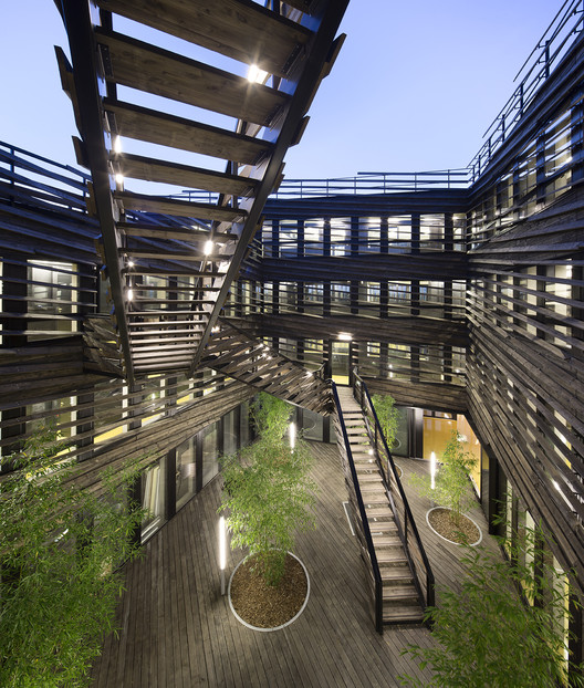
| La Licorne Office Building / PERIPHERIQUES Marin+Trottin Architectes Posted: 28 Aug 2017 08:00 PM PDT  © Luc Boegly © Luc Boegly
 © Luc Boegly © Luc Boegly From the architect. This building for innovative companies is situated in a new area of Laval city. Though it's located on a small size plot, this sparkling project wants to become an important landmark for its neighborhood.  © Luc Boegly © Luc Boegly The project wanted to keep the notion of an hotel, or a caravanserai welcoming merchant. The workspaces are a set of rooms and suites, which are all connected together by a pathway surrounding a large patio. This « enfilade » system, this succession of rooms, makes possible a certain modularity by giving the choice to link the spaces together or not.  © Luc Boegly © Luc Boegly  Ground floor plan Ground floor plan  © Luc Boegly © Luc Boegly Because of the project's program, our main goal was to give users a place with the best conditions of light, circulation and potential meeting area. During the competition, floors were partitioned with 30-50 sqm working room, as it was requested by the rules. But the structural grid of 1.35m and the light partition system used, allow any other type of interior partitioning.  © Luc Boegly © Luc Boegly  Axonometric Axonometric  © Luc Boegly © Luc Boegly The specific design of each facade depends on sun exposure in a way that it maximizes the contributions and protections. The interplay of sunshade points out the entrance and gives the façade a subtle kinetic appearance. The different skies that will illuminate the building will give a changing and atmospheric perception of it.  © Luc Boegly © Luc Boegly This posting includes an audio/video/photo media file: Download Now |
| Posted: 28 Aug 2017 07:00 PM PDT  Courtesy of M3 Architects Courtesy of M3 Architects
 Courtesy of M3 Architects Courtesy of M3 Architects From the architect. The residence is located in Odessa, Ukraine near the Black Sea coastal area. The neighborhoods of Arcadia is the main resort area in Ukraine which was defined as a main clubbing center of the country. The residence is erected from structures of two houses. Both buildings contain the same number of functions.  Courtesy of M3 Architects Courtesy of M3 Architects The main facades of these two buildings are combined into a composition and oriented to a luxury apartment house. This solution of two buildings makes the facade visually reserved and provide privacy to the owners. All functional areas are divided into three groups- private, public and technical areas.  Axonometric Axonometric The common space is located on the 1st floor. An entrance, wardrobes, a living room and a kitchen with a dining area make the composition of a public space. The recreation area includes a swimming pool with a terrace connected to spa zone. The inner space of the courtyard and a ground floor visually form one composition.  Courtesy of M3 Architects Courtesy of M3 Architects  Ground Floor Plan Ground Floor Plan  Courtesy of M3 Architects Courtesy of M3 Architects Performing the role of a base the ground floor can read easily through conditional boundaries with air and warm light. The front door, the living room with a kitchen and dining area are established on the same level to achieve the most convenient and open layout for the 1st floor. The technical area is located on the ground floor.  Courtesy of M3 Architects Courtesy of M3 Architects The open transparent volume of a staircase leads to the second and third floors which are performed like the private area. The bedrooms are established like separate units with bathrooms and wardrobes. Each bedroom has an exit to the terrace with a view of the courtyard. The key factor for architectural solutions for the residence was to create the most open, but private space of two separate symmetrical volumes in conditions of a dense urban environment.  Courtesy of M3 Architects Courtesy of M3 Architects This posting includes an audio/video/photo media file: Download Now |
| Ranwu Lake Campsite/Xiao Yin Architecture Design Firm Posted: 28 Aug 2017 05:00 PM PDT  © Arch-exist Photography © Arch-exist Photography
 © Arch-exist Photography © Arch-exist Photography From the architect. The campsite is located in Lare Village, Ranwu Lake. Its north is the winding G318, and its south is the dreamland Ranwu Lake. The campsite is the best spot for self-drive travelers to stop and enjoy the beautiful scenery of Ranwu Lake.  © Arch-exist Photography © Arch-exist Photography The campsite is high in the north and low in the south, with maximum altitude difference of 13 meters. The terrain slopes gently and is broad with a spectacular field of view. There are green grass and ancient trees beside the lake, green pine trees and azalea flowers on the mountainside, and blue sky and floating clouds above the mountains.  © Arch-exist Photography © Arch-exist Photography There are comprehensive travel services at the campsite, such as travel information center, service management center, simple snack, Chinese food, coffee, 24-hour convenience store, Tibetan medical culture exhibition center, Tibetan specialty exhibition and sales center, high-end holiday hotel, bar, tea bar, BBQ buffet, medical assistance center, star-rated bathroom facilities, vehicle repair, tent camping, recreational vehicle (RV) camping, children’s forest park, view platform and waterside terrace.  © Arch-exist Photography © Arch-exist Photography With a total project area of about 70 mu, Phase 1 Project uses an area of 2,400 square meters, and is composed of integrated service center, 9 high-end holiday hotel buildings, bar, tea bar, Tibetan specialty exhibition and sales center, BBQ buffet, medical assistance center, star-rated bathroom facilities, tent camping, 176 car parking lots, 5 tour bus parking lots, 7 RV parking lots, etc.  © Arch-exist Photography © Arch-exist Photography The average altitude of the campsite is lower than the G318 to its north. There is a drainage ditch at the north side of the high mountain flowing through the campsite area. All buildings are elevated. From north to south, i.e. from high altitude to relatively low altitude, there are parking lots, vehicle repair station, car washing station, landscape square, travel service center, holiday hotel, tent camping, view platform and bar in sequence.  © Arch-exist Photography © Arch-exist Photography By taking advantage of the original terrain height difference and combining the height adjustment of the building overhead layers, it can ensure that all buildings from the lakeside to the G318 are elevated and do not block each other. The main building of the travel service center can be 6-8 meters higher than the G318 by the height adjustment of the overhead layer. There is a landscape lighthouse of nearly 20 meters next to the entrance of the G318 to ensure the safety and visibility of the Project and the maximum utilization of the landscape resources.  © Arch-exist Photography © Arch-exist Photography In order to maximize the field of view, the main building of the integrated service center extends about 80 meters along the horizontal line of the G318. The bottom overhead of the building is about 8 meters. The lake side of the building is a glass wall to ensure the best view of the lake. The main building is made of white irregular lines and a large quantity of transparent glass. The changes of plane and vertical shape make the gentle slope to re-connect with the ground. The appearance of the main building is shaped by the terrain, just like an eagle spreading its wings near the lake shore.  © Arch-exist Photography © Arch-exist Photography There is travel information center, management center, simple snack, coffee, 24-hour convenience store, Tibetan specialty exhibition and sales center on the first floor of the main building. Simple snacks are mainly pastries, fast food and cakes, and coffee is freshly ground. The first floor serves as a wonderful place for tourists to relax and enjoy the view.  © Arch-exist Photography © Arch-exist Photography  3F Plan 3F Plan  © Arch-exist Photography © Arch-exist Photography Sitting on the large-cantilever view balcony, you can see the blue sky, white clouds, snow mountain and colorful forests reflecting their shadows on the crystal water of the lake. With the sound of wind, the gurgling of water, and the warm sunshine, you can take a sip of the delicious coffee or smell the fragrance of tea. You can also take a picture of your loved ones as a precious memory.  © Arch-exist Photography © Arch-exist Photography It provides safe, comfortable and qualified supporting service facilities for tourists via medical assistance center, star-rated bathroom facilities, Tibetan medicine culture exhibition center and equipment management room in lower part of the building where less viewing is required. No matter you are a pilgrim on foot, an adventurous cyclist, or a self-drive traveler hunting for novelty, this place has everything that you want, desire and are pleased with.  © Arch-exist Photography © Arch-exist Photography There are 8 independent holiday hotel buildings in front of the main building. The bottom overhead of the hotel is 2-4 meters. They are arranged high and low according to the visual requirements, and over 1.5 meters lower than the travel service center. This can ensure the privacy of hotel rooms and their view of the scenery, without blocking the field of view from the travel service center. The west side of the hotel rooms is a special feature wall made of local pebbles. The east and south side of the lake have two glass walls of 4 meters high and 180° wide. You can just lie on the bed to enjoy the beautiful snow mountains of the Ranwu Lake and the starry night. The outdoor terrain in front of the independent hotel buildings is lower. A campsite with comfortable double tents is planned among the green trees and on the pebbles to form a great area together with BBQ and the bar near the lake. You can drink highland barley wine and eat all kinds of game barbecue, with shining stars all over the sky. You can also dance near a campfire with locals before you go to sleep.  © Arch-exist Photography © Arch-exist Photography The lowest position near the lake is a bar of about 400 square meters. The top of the bar is a view platform which, through the view corridor, is directly connected with service center, hotels and a small square at the north of the service center. It is convenient for all functions to be made good use of. All sides of the bar have glass walls of 4 meters high, and the inside of the bar is spacious with no columns. You can have a good drink and enjoy yourself here. There is one independent suite hotel building at the southeast corner of the lakeshore. It has separate living room, recreation room, chess and cards room and an aerial view platform of about 40 square meters. Standing at every position in the room enables you to have a good view of the Ranwu Lake.  © Arch-exist Photography © Arch-exist Photography In order to make good use of the water level changes of Ranwu Lake, the bottom overhead of the suites hotel is about 4 meters high. The hotel is among water plants in dry season and above the glistening light of waves and the mist in wet season. “Face the sea, with spring flowers blossoming”, what a dream life! In recent years, there are more and more hikers and cyclers in Tibet, so this Project, for the cyclers’ convenience, is provided with a winding bicycle lane which leads directly to the bar, BBQ, view platform, waterside terrace and tent camping area near the lake. This Project also has public service facilities such as medical assistance station, car washing station, vehicle repair station and bathrooms with 24-hour hot water to provide high-quality travel service for self-drive travelers in Tibet.  Structure Structure In order to minimize the impact of this Project on the land and its neighboring environment and protect the natural environment of “Ranwu Lake Scenic Spot” better, by combining the difficulty in transporting the materials and the climate influence on the project construction, the buildings and structures of the whole project all use assembled steel structure except that the structural foundation uses reinforced concrete. Assembled steel structure has absolute advantages in environment protection, construction period, material transportation and anti-seismic effect.  © Arch-exist Photography © Arch-exist Photography This Project uses white and red preferred by Tibetans as the main color of the buildings. It creates a unique, natural, warm and extraordinary living space with a great combination of white cement-fiber plates, red weather-resisting steel plates, thick transparent glass, dark gray steel, local woods and local pebbles. In spring and summer when green is everywhere, the white cement plates, dark red weather-resisting steel plates, transparent glass and the green grass and trees are enhancing each other’s beauty. In late autumn, the colors of red, white, yellow and green are mingled to draw a colorful picture of the scenery. In winter when it snows, the buildings and the snow are integrated with each other, forming a beautiful picture.  © Arch-exist Photography © Arch-exist Photography This posting includes an audio/video/photo media file: Download Now |
| Molecure Pharmacy / Waterfrom Design Posted: 28 Aug 2017 03:00 PM PDT  © Kuomin Lee © Kuomin Lee
 © Kuomin Lee © Kuomin Lee From the architect. The owner of this project is a post 80s from a pharmacy family, as the third generation, he hopes to subvert the traditional image of pharmacy and melt it into the diversified modern environment. Just like MOLECURE is split and reorganized from words "Molecule" and "Cure", while approaching to the design, we returns to the original purpose of pharmacy- extracting molecule from nature to synthesize healing drugs. Thus we get the idea of building a space which we named "green in the lab", combining the seemingly conflicting qualities of "primitive" with "technology", just like new compounds formed due to molecular bombardment.  © Kuomin Lee © Kuomin Lee Ways of molecular aggregation varies from triangular to polygonal, spherical to cones, and the change on its shape due to different ways of aggregation could be amazing. We extracted the two characteristics of molecule - "connectivity" and "aggregation" into our design. For example, we used cement to stick cobblestones on the two towering walls on the left and right side, whose rough texture gives people a sense of being real. The metal, lightweight glass and transparent acrylics are crisscrossing, and straight lines are adopted to build the display racks which is in longitude-and-latitude shape; just as repeated expanding of the molecule - with drugs put on them, the display racks seem to disappear from the space, while the colorful drugs act as paintings to color the walls. The space is thus floating with breathtaking abstract art atmosphere.  1F Plan 1F Plan  Section Section  2FPlan 2FPlan One-way mode of traditional pharmacy counter service is avoided here, the core of the space is a laboratory table, where pharmacists interacts with customers .Together with the open dispensing area, and iPad embeddedconsulting service system,interactive information aggregation function and innovative customer experience are created. The laboratory table is stackedwith solid wood, original cortex of a trunk over a hundred year is taken as the base of the table, together with the hanging green plants that grow profusely, it looks like an original forest. This subvert the dumb atmosphere of a traditional pharmacy, and also turns medicine and health care into a healthier lifestyle.  © Kuomin Lee © Kuomin Lee As an unprecedented integration of three business types - drug display, dispensing experiments, and life experience, what connects them is a curvy copper corkscrew staircase, which makes people think of DNA double spiral structure in molecular biology. countless molecule-like triangular holes are cut by laser on the stairs to create shadows which symbols scattered shadow of leaves. This acts as asalute tothe nature.  © Kuomin Lee © Kuomin Lee Just as the owner desired, Molecure Pharmacy not only gets rid of the fixed stereotype of Pharmacies, brings the three-generations traditional pharmacy a totally different look and improves the value of existence of Taiwan's stagnant pharmacy industry, redefines the value of health from four aspects: drugs, health food, diet and exercise, but also brings people who pay increasing attention to health a new space which integrates function, aesthetics, and experimental spirit.  © Kuomin Lee © Kuomin Lee This posting includes an audio/video/photo media file: Download Now |
| House in Kobe / FujiwaraMuro Architects Posted: 28 Aug 2017 01:00 PM PDT  © Shintaro Fujiwara © Shintaro Fujiwara
 © Shintaro Fujiwara © Shintaro Fujiwara From the architect. The site for this project is located at the corner of building lots provided by cutting through a hilly topography. The ground level of this site is higher among other lots and next to the site on the north side of the building is a slope of a designated green area of the building lots.  First Level Plan First Level Plan According to the site with irregular shape, the building is configured in a triangular form. From the inside of the building, exterior view is provided to the slope covered with greenery on the north side of the lot.  © Shintaro Fujiwara © Shintaro Fujiwara A bedroom, a room for children, a lavatory, and a bathroom are allocated on the 1st floor, while a living room, a dining room, and a kitchen are gathered on the 2nd floor. Large windows of the dining room and the living room allow a clear view to the north side of the lot. The 3rd floor houses a guest room in a traditional Japanese style, which can be also used as a bedroom or a living room.  © Shintaro Fujiwara © Shintaro Fujiwara The kitchen has an open layout with L-shaped configuration, which allows this space to become the center of this house by enjoying cooking while seeing the scenery, or having a conversation with family members while cooking, or inviting friends and cooking together at the kitchen. This posting includes an audio/video/photo media file: Download Now |
| Chosunoak The Oak / By Seog Be Seog + mmoa. Studios Posted: 28 Aug 2017 12:00 PM PDT  © Yongjoon Choi © Yongjoon Choi
 © Yongjoon Choi © Yongjoon Choi The weight of 70 years of time Chosunoak, located in Euljiro, is a restaurant that started in 1947. It was not so common in this day and age to exist continuously in the same location with the same name for 70 years when it was awkward to live slowly these days. 'Chosunoak' is a restaurant that does not promote itself noisily and does not show itself to the outside world unlike other restaurants and is a restaurant that is only known among regular customers and run around regulars. However, recently it was introduced through a TV program called 'Wednesday Food Talk' on TVN and finally showed itself to the world.  © Yongjoon Choi © Yongjoon Choi Now, we can see the regular customers who can be called as the older generation eating and enjoying their food together with the younger generation who look to be in their 20s to 30s in one space in harmony. When we became in charge of the new space of 'Chosunoak', the weight of concerns was more than the weight of time, and we felt the heavy concerns of the client until they decided to present 'Chosunoak' to the world.  © Yongjoon Choi © Yongjoon Choi  Floor plan Floor plan  © Yongjoon Choi © Yongjoon Choi The present project is located on the second floor of the building where 'Chosunoak' is currently being operated. If we explain a bit more in detail, we can say this is the second brand of 'Chosunoak'. The current operator is the third generation, and it is said that the preceding operator has left a will to express his love for oak trees. The current operator wished to have that will to be incorporated when the restaurant is introduced to the world in a new appearance, and that's why its English name is 'Chosunoak' instead of 'Chosunok' and the official name of the space in the second floor is 'Chosunoak the Oak'.  © Yongjoon Choi © Yongjoon Choi Ordinary heritage We wanted to contain time, people and oak trees in the space, and we ultimately wanted to contain the thought that this is a space where people meet and enjoy culture. As always, this project started from the question that what is the essence of a space called 'restaurant', and we tried to make a space where people can fully feel the meaning of eating and enjoy it together with important people they are with in a not so heavy and yet not light space with 'Chosunoak the Oak'.  © Yongjoon Choi © Yongjoon Choi By minimizing the heavy lighting and by accepting the natural light from outside, we made the space feel like time was flowing through the light. Also, we tried to make the finishing stroke in the space that expressed naturalness by having the engraving works of Choi Yu-jeong.  © Yongjoon Choi © Yongjoon Choi  © Yongjoon Choi © Yongjoon Choi It seems that there is a conflict between the mind that wants to keep the good space or the restaurant to oneself and the mind that wants to introduce those places to others proudly. We hope that 'Chosunoak the oak' will become such a space for many generations and hope it becomes a place appreciated by many people.  © Yongjoon Choi © Yongjoon Choi This posting includes an audio/video/photo media file: Download Now |
| Posted: 28 Aug 2017 10:00 AM PDT  © Peter Bennetts © Peter Bennetts
 © Peter Bennetts © Peter Bennetts From the architect. Richard Kirk Architect was appointed Architect for QUT Creative Industries Precinct Phase 2 development in 2010 following a competitive tender process. The project requires a new master plan of the Gona Parade precinct of the QUT Kelvin Grove Campus, to provide for the new 10,000m2 Creative Industries building along with two commercial developments of 35,000m2.  Site Plan Site Plan The project has the opportunity to increase human activity on the ground plane which encourages a sense of place and arrival in this part of the campus. The context of the site is extremely dynamic; the master plan needs to respond to this shifting landscape of internal needs with those of external opportunities. The key influences are; education; heritage (which will impact on the site utilization); and interaction with the public realm. The strategic placement of the Creative Industries building is the critical element of the master plan.  © Peter Bennetts © Peter Bennetts Creative Industries Precinct 2 (CIP2) has been conceived to provide a unified address for the Creative Industries Faculty comprising Dance, Drama, Music and Visual Arts including Research and technical pursuits. CIP2 will be connected to the existing CIP stage 1 to become a singular identity and gateway for Students and staff associated with the Bachelor of Creative Industries.  © Peter Bennetts © Peter Bennetts Our vision for CIP2 is to create a place that anchors the creative industries into a cohesive village environment offering a rich and diverse sequence of spatial experiences to stimulate learning and social interaction. A key part of the concept is the placement of primary circulation paths, meeting areas, cafe and common areas to the precincts building edges with the lot 2 building incorporating a highly visible student 'street' to which studio spaces are addressed.  © Peter Bennetts © Peter Bennetts The street will be the place that student groups congregate between studio sessions to give a real sense of vitality and movement. It is intended for this 3-storey high space to be interactive with the outdoor environment and includes a series of cascading stairs and staggered voids to enable visual links to the upper levels.  © Peter Bennetts © Peter Bennetts The precinct development strategy is to introduce a new high profile faculty building up to 5 stories to be located on Lot 2 between the southern end of Gona parade to the east and Kelvin Grove Road to the west, opposite the northern landmark building is known as 'The Hub'. The location of this building is seen to be one of the highest profile opportunities for QUT in the Kelvin Grove campus.  © Peter Bennetts © Peter Bennetts The two buildings will combine to create a Gateway for QUT and more specifically the Creative Industries Precinct. Within CIP2, the new building forms the northern arm of a series of single story heritage buildings to be retained and upgraded. The heritage buildings frame Chauvel Place to complete an activate 'L' shaped edge for CIP2.  © Peter Bennetts © Peter Bennetts This posting includes an audio/video/photo media file: Download Now |
| Yona Friedman on Empowering People with Adaptable Architecture Posted: 28 Aug 2017 09:45 AM PDT
In this interview from the Louisiana Channel, architect and theorist Yona Friedman discusses the plight of the contemporary city, and how it is the responsibility of architects to design structures that can be inhibited for the widest range of individuals and purposes. In the video, Friedman discusses his breakthrough work 'Ville Spatiale' (1956), an enormous superstructure that could span over existing cities and would allow people to construct their own habitats within the larger framework. With the growing influx of refugees and immigrants currently challenging many of Europe's cities, the principles behind the work are once again topical – by allowing people to select their own environment, new residents are empowered to operate independently and to the benefit of all.
This posting includes an audio/video/photo media file: Download Now |
| Posted: 28 Aug 2017 08:00 AM PDT 
 From the architect. This is a small meditation chapel. The project is a small construction for a little chapel located on a great garden. It’s a chapel to be alone and contain one self within the open space of the garden. It’s also a structure that relates to a human scale in size and to a spiritual one in use.  Axonometric Axonometric   Axonometric Axonometric  On this very simple basis the structure becomes a constructive exercise under a repetitive tension system that comprises 1200 pieces of hollow red brick separated between them but united by a set of “guides" in the form of steel rods that form rings that vary in size according to the height of the chapel. The pieces are attached to the metallic structure with mortar but there’s no binding between them so they practically appear to float. The tensed structure is flexible but stable at the same time. In the same way that meditation requires a certain degree of introspection and solitude of the individual each piece of brick is alone in the structure immersed between tension and gravity.  This is a reaction to the power of one within thought and that of a material piece within a structural system of forces.  This posting includes an audio/video/photo media file: Download Now |
| Drone Footage Shows BIG's LEGO House as it Nears September Opening Date Posted: 28 Aug 2017 07:30 AM PDT Last time we checked in on the progress of the upcoming BIG-designed LEGO House experience center in Billund, Denmark, the structure had just topped out, with all of the major structural elements in place. Now, in drone footage released earlier this summer by LEGO, many of the building's final finishes, surfaces, and colors can be seen as it prepares for its grand opening next month. The drone footage captures the 21 LEGO brick-proportioned masses that make up the building in their full glory, including the rainbow of colors that make up the outer membrane of the building's flat roof system. These colors also indicate what type of program lies within, organized around the different aspects of a child's learning: the red indicates spaces that stimulate creativity; blue, cognitive skills; green, social; and yellow, emotional. The building has already been tried out by the families of employees on a special test day, but the building will officially open to the public on September 28th. Learn more about the project in our previous coverage, here. Video via LEGO. This posting includes an audio/video/photo media file: Download Now |
| Schmidt Hammer Lassen Architects Unveil Landmark Mixed-Use Development for Downtown Detroit Posted: 28 Aug 2017 06:01 AM PDT  Courtesy of Schmidt Hammer Lassen Architects Courtesy of Schmidt Hammer Lassen Architects Schmidt Hammer Lassen Architects has unveiled the design of their first-ever project in the United States: the Monroe Blocks, a new mixed-use development that will become an iconic symbol of the rejuvenation and future development of downtown Detroit. Prioritizing public access both indoors and out, SHL's scheme will consist of Detroit's first new highrise office tower in decades, more than 480 residential units and a network of new public plazas and green spaces.  Courtesy of Schmidt Hammer Lassen Architects Courtesy of Schmidt Hammer Lassen Architects Working with developer Bedrock Detroit and local architects Neumann Smith, Monroe Blocks will transform a 135,000-square-foot site located at the intersection of several of the city's historic neighborhoods, connecting downtown to its surroundings and opening up arteries to future development. Entertainment spaces, retail, food markets, sports facilities and exhibition venues will attract a variety of people to site, while residential units will ensure the development is used 24 hours a day.  Courtesy of Schmidt Hammer Lassen Architects Courtesy of Schmidt Hammer Lassen Architects  Courtesy of Schmidt Hammer Lassen Architects Courtesy of Schmidt Hammer Lassen Architects  Courtesy of Schmidt Hammer Lassen Architects Courtesy of Schmidt Hammer Lassen Architects "Detroit is a unique place, I believe everyone living in the Western World has at some point been influenced or touched by Detroit. We all know or can relate to its legacy: the US automobile industry, the architecture of Albert Kahn and Woodward, and obviously the music," said Kristian Ahlmark, Senior Partner at Schmidt Hammer Lassen. "We are honoured that our first US project is happening in this great city." "From our earliest visits, we experienced the unique optimism, energy and entrepreneurial spirit that defines Detroit. This project is very much a part of that movement. The challenge has been to create a new way of defining central business districts as a diverse and multifunctional area for the benefit of the wider community."  Courtesy of Schmidt Hammer Lassen Architects Courtesy of Schmidt Hammer Lassen Architects  Courtesy of Schmidt Hammer Lassen Architects Courtesy of Schmidt Hammer Lassen Architects Collaborating with engineers Buro Happold and landscape architects SLA, the team will draw from SHL's established principles of urban design developed in projects across the world. "Our Scandinavian heritage has a strong influence on the way we approach city building on this scale. We always try to think urbanism, city space and the built environment in that order," Ahlmark continues. "In Detroit, we found many existing spaces that held a great amount of urban qualities, but laid undefined due to the vast amount of open space."  Courtesy of Schmidt Hammer Lassen Architects Courtesy of Schmidt Hammer Lassen Architects  Courtesy of Schmidt Hammer Lassen Architects Courtesy of Schmidt Hammer Lassen Architects "Our project is very much about stitching together and re-establishing some of the indisputable qualities of the original masterplan. Whilst at the same time we aim to frame a new contemporary approach to city life - build on some of the keywords that Detroit is made of: Density, Dynamic and Diversity." Construction on the Monroe Blocks development will begin early next year with a completion date set for 2022. News via SHL  Courtesy of Schmidt Hammer Lassen Architects Courtesy of Schmidt Hammer Lassen Architects  Courtesy of Schmidt Hammer Lassen Architects Courtesy of Schmidt Hammer Lassen Architects
This posting includes an audio/video/photo media file: Download Now |
| Botequim Sapucaí / Alfredo Lanna Neto + Mateus Castilho Posted: 28 Aug 2017 06:00 AM PDT
 © Trópica Fotografia © Trópica Fotografia From the architect. Sapucaí Street, where the project is located, is part of the historical and cultural center of Belo Horizonte, with a privileged view of the iconic Santa Tereza viaduct, Municipal Park and Belo Horizonte Central Station. With a strong tendency to be a gastronomic center, the project brought as demand a sophisticated atmosphere who dialogues with the street.  © Trópica Fotografia © Trópica Fotografia The property was found in precarious state of conservation, with water infiltrations in walls and ceiling, alteration in the original tile floor, damages in the electric and plumbing systems and a wooden mezzanine with a ceiling height of 1.70cm.  Ground Floor Plan Ground Floor Plan Firstly, it was decided to redo all electric system through electrodes and conduits to allow greater flexibility in future modifications. The most damaged wall was covered by bolted OSB boards structured in light steel frame. The dark color of the walls, as well as the ceiling, was choosed to direct the viewer's gaze to the elements of decoration.  © Trópica Fotografia © Trópica Fotografia The reticulated mesh, present on the counter, on the outside grill and on the benches was inspired by the old stained glass window that was positioned behind the bar, creating a visual identity to the environment.  © Trópica Fotografia © Trópica Fotografia Despite the longitudinal appeal of the property, granitina flooring in the first half of the hall indicated the adoption of two distinct environments: the first, adorned with an oxidized iron grill, ferns and pendant lighting, seeks to welcome the client to the establishment, to know his interior; The second environment, where the bar is located, is decorated with engravings with architectural motifs of Belo Horizonte and copper-colored lamps.  Diagram Diagram The paraju (a Brazilian type of wood) counter, 65 cm wide, was designed to be a place of stay and interaction with the bartender, is crowned by a metallic structure coated with the reused wooden boards of the mezzanine (as well as the bathroom counter).  © Trópica Fotografia © Trópica Fotografia The kitchen, exposed to the public, has been designed so that employees can work in a comfortable environment, with central countertop for assembling dishes. At least, The old office was kept and turned into stock of drinks and furniture. The three bathroom cabins (two female and one male) share a single toilet composed of two sinks. This posting includes an audio/video/photo media file: Download Now |
| Posted: 28 Aug 2017 04:00 AM PDT  © Moritz Bernoully © Moritz Bernoully
 © Moritz Bernoully © Moritz Bernoully From the architect. The project is situated in in the Coyoacán neighborhood of Mexico City. It consists of the modification and intervention of a house built in the 1970s.  © Moritz Bernoully © Moritz Bernoully The proposal focuses on adapting the architectural concept that was no longer able to meet the needs of its new inhabitants.  Plan 01 Plan 01  Cortesía de CampoTaller Cortesía de CampoTaller  Plan 02 Plan 02 Modification One of the primary targets was admitting daylight into all interior spaces and improving the visual connection between the house and its immediate surroundings. The garden is dominated by a more than 80 years old peppercorn tree that is framed on two sides by the building. The original building structure had windows with false arches and thick wooden frames. Both have been changed and the new, rectangular steel frames offer a better view and general transparency on the ground floor level. The necessity of constructing a new cistern in the garden was taken as a pretext to create a surface of water on top of the container, serving as a mirror for the crown of the adjoining peppercorn tree and to cool down the air flowing through the garden.  © Moritz Bernoully © Moritz Bernoully The interior was reorganized, demolishing walls in order to organize kitchen, dining space and living room in a "plan libre". The newly introduced wooden staircase becomes part of the integrated furniture on ground floor and first floor.  Cortesía de CampoTaller Cortesía de CampoTaller Intervention The intervention consists of the reactivation of the roof terrace as a loggia/greenhouse, that also serves as the a vestibule to the first floor bedroom which is extended by an extra bathroom. A service room on the ground floor is reduced to a minimum, generating a service patio on the back of the house. This new exterior space offers light and ventilation for the kitchen.  © Moritz Bernoully © Moritz Bernoully  © Moritz Bernoully © Moritz Bernoully The now detached service room is provided with a new, permeable facade made out of extremely light clay tiles, stacked with minimum use of cement and a technique similar to a house of cards.  Sections Sections In order to make a visual distinction between the original structure and the new parts of the building, an experimental shuttering technique was used for the concrete elements cast in place: the surface structure is created by introducing petate-sheets (carpet-like elements that are hand woven out of palm-leaves) into the concrete  © Moritz Bernoully © Moritz Bernoully  © Moritz Bernoully © Moritz Bernoully The need for a cistern, gave way to propose a water mirror with the idea of reflecting the old peppercorn tree .  © Moritz Bernoully © Moritz Bernoully The almost organic looking concrete gives an additional reference to the clients, two biologists and plant lovers.  © Moritz Bernoully © Moritz Bernoully This posting includes an audio/video/photo media file: Download Now |
| 11 Architect Salary Negotiation Tips Posted: 28 Aug 2017 02:30 AM PDT  This article was originally published on Brandon Hubbard's blog, The Architect's Guide. I am not advocating you ask for an outrageous sum, but you should be clear about the value you bring to the table. You need to be aware what your skills and qualifications are worth in the current marketplace. For your reference, I covered those variables in greater detail in a previous article, 5 Factors Affecting Your Architect Salary. Most of the following tips refer to a new job offer but some also apply to renegotiating your current architecture salary. 1. They need to like youThe better you can position yourself with the hiring manager and/or the person that makes the salary decisions the better off you will be when it comes to the point of negotiation. They will be thinking throughout the interview and subsequent negotiation, "how much would I like working with this person?" You should go for an 11 out of 10! 2. They have to believe you deserve itThey will need to sell you internally to others that may be making the salary and hiring decisions. They will pay more if they think you are worth it. Don't feel compelled to ask for more if it is a fair offer, however you should always counter the offer. 3. Be flexible on "currency"Think about the total value of your deal. There is more to compensation than just salary. Vacation, retirement, personal days, work hours, sick days, and bonuses are all on the table. 4. They need to believe they CAN get youIf they know you are just interviewing to see what is out there or you have other better offers they will be less likely to fight for you internally. 5. Understand the person at the tableWho is this hiring manager or supervisor? What are their deadlines? Get all info you can including past employers, current employees, etc. This can be very useful to see what their hiring priorities are and ultimately why they might offer a more competitive salary. 6. Negotiate multiple things at the same timeAsk for A, B, C, and D at the same time but limit your demands. As mentioned above think about the total package of salary, bonus, vacation, start date, etc. Tell them what is the most important out of your list. Don't agree to salary then come back and also ask again for more vacation. Offers usually take time to put together so by asking for everything up front will likely reduce the frustration of the employer. 7. Stay "at the table"Stay involved. NEVER end the negotiation with a "no". Make sure you always get either a "yes" or a "reason why not". Don't be afraid to ask for more time to consider the offer, "can I get back to you tomorrow, I want a package that works for both of us, so that everyone involved is satisfied". 8. Don't use ultimatumsIf they present you with an ultimatum just simply ignore them, anything CAN change. Try to say something like "yes, I can but… as long as certain terms are met". 9. They should like me MORE as a result of the negotiationBy being proactive and firm with your demands should actually support your case. Don't burn any bridges or offend anyone by inappropriately refusing an offer. 10. A smaller firm usually has a bigger salary / package rangeThere is little precedent if they don't hire a large number of people, but range won't necessarily be HIGHER but will be LARGER. Use the information you have researched on the firm, location and your experience. Then pick a broad range and consider setting the top of your range 15% below your true ambitions. 11. Leave at least a day to respond to an offerDon't rush the negotiation. Take your time to think about the full package and how it compares to any other offers, if applicable. If necessary, create a spreadsheet of pros and cons for each position. By just writing it down can make the correct choice more obvious. I hope these tips have been helpful for your current or future salary negotiation. To help you with your architecture career goals, I've created a mega-pack of free resources that includes architecture resumes, cover letters, and an extensive collection of application documents. Click for a free download. This posting includes an audio/video/photo media file: Download Now |
| Minimalist Home for Egg Boutique Owner / Jonathan Tuckey Design Posted: 28 Aug 2017 02:00 AM PDT  © James Brittain © James Brittain
 © James Brittain © James Brittain From the architect. Jonathan Tuckey Design has completed a project for Egg, a fashion boutique known for its minimalist approach to the clothes it stocks and the way they are presented to the buyer, acting more like a gallery than a traditional shop. Egg is located on a small mews in Knightsbridge, discreetly hidden by timber shutters that open up to reveal plain white and wooden interiors. This recently finished phase is part of an ongoing re-configuration of what is actually a series of buildings centred around the mews, creating a new home for the boutique's owner and a much-needed expansion of the back-of-house facilities for the adjacent shop.  © James Brittain © James Brittain The arrangement of internal spaces and the materials selected were inspired by Egg's pared-back design ethos, which is both elegant and informal. A series of timber containers have been inserted into the existing building, dividing domestic and commercial functions and sometimes blending the two. These boxes sit within the volume of the roof and create the nest-like atmosphere of an attic or store room, with skylights allowing light to pour down into the spaces below. Small openings create surprising views through to adjacent rooms and a timber staircase is made up of a series of planks suspended above the hallway.  Model Model Interior walls remain unadorned and furniture is kept to a minimum, further emphasising the minimalist aesthetic and creating a collection of calm spaces to occupy. Built-in storage hides the clutter of everyday life as they blend into the walls when closed. On the ground floor the project includes a bespoke wooden bath supplied by Studio Anna van der Lei set within a bathroom that opens to the mews and that doubles as a meeting room for the Egg team. The shop display units match the material palette of the rest of the project, creating a plain backdrop from which to exhibit the stock.  © Dirk Linder © Dirk Linder  Section Section  © James Brittain © James Brittain Practice Director Jonathan Tuckey said: "It's been a joy to work on this home and shop for Egg and we've enjoyed the ambiguities of the two-sided brief for this live- work space. We have sought to carefully enhance the identity of the boutique while creating a distinct character and atmosphere for the new residence in the attic space above the shop."  © Dirk Linder © Dirk Linder This posting includes an audio/video/photo media file: Download Now |
| The 80 Best Architecture Drawings of 2017 (So Far) Posted: 28 Aug 2017 01:00 AM PDT  © David Florez © David Florez When it comes to forms of architectural representation, there is no method more expressive or foundational than the drawing. The series of decisions—drawing utensil, paper type, line style, hand versus digital—combined with the choices of what an architect includes (or excludes) in their drawings reveal the true intentions behind the design of a project in perhaps the noblest and purest fashion. Visualizations © Farhang Alipour © Farhang Alipour  © Zhen Lei © Zhen Lei  © Ko Anthony - Chun Ming © Ko Anthony - Chun Ming  ©Niko Smyrlis - Petro Babasikas - Savvas Kakalis - Alexandros Tzoutsas ©Niko Smyrlis - Petro Babasikas - Savvas Kakalis - Alexandros Tzoutsas  © Anabel Mendt © Anabel Mendt  © José Manuel Pérez Quereda © José Manuel Pérez Quereda  © Duong Vu Hong - Brygida Zawadzka © Duong Vu Hong - Brygida Zawadzka  © Thea Mihu © Thea Mihu  © Civic Architects © Civic Architects  © Barry McKenna © Barry McKenna  © Takenori Uotani © Takenori Uotani  © Duy Tran © Duy Tran  © EBA M © EBA M  © Luca Bussolino © Luca Bussolino  © Duy Tran © Duy Tran Axonometric - Isometric © David Florez © David Florez  © Josephin Ritschel © Josephin Ritschel  © Chenta Tsai © Chenta Tsai  © Alicia Jones - Rayan Itani © Alicia Jones - Rayan Itani  © Pablo Wegmann © Pablo Wegmann  © Yiqi Zhao © Yiqi Zhao  © Jiaqi Zhang © Jiaqi Zhang  © Lab SU © Lab SU  © Bui Quy Son © Bui Quy Son  © Sara Martinez Zamora © Sara Martinez Zamora  © Brian Baksa © Brian Baksa  © Natali Bezarashvili © Natali Bezarashvili  © Shivani Mehta - Pranav Thole © Shivani Mehta - Pranav Thole  © Yang Song © Yang Song Sections © Mindaugas Glodenis © Mindaugas Glodenis  © Andy Lim © Andy Lim  © Jiaqian Yuan © Jiaqian Yuan  © Jun Woo Kim © Jun Woo Kim  © Arnaud Jouanchicot © Arnaud Jouanchicot  © Xinyuan Cao © Xinyuan Cao  © Alexandros Tzortzis de Paz © Alexandros Tzortzis de Paz  © Breno Felisbino © Breno Felisbino  © Ben R Wylie © Ben R Wylie Collages © Boano Prismontas © Boano Prismontas  © David Legeai © David Legeai  © Jun Seong Ahn - Majed Abdulsamad - Maria Isabel Carrasco - Haochen Yang © Jun Seong Ahn - Majed Abdulsamad - Maria Isabel Carrasco - Haochen Yang  © Brygida Zawadzka © Brygida Zawadzka  © Ernesto Vela © Ernesto Vela  © Carol Nung © Carol Nung  © Denis Tantsyura © Denis Tantsyura  © Siyu Chen © Siyu Chen Context © Richard Morrison © Richard Morrison  © Karina Cazar Recalde © Karina Cazar Recalde  © Fupeng Mei © Fupeng Mei  Fernando Torres - Andrea Fuentes Fernando Torres - Andrea Fuentes  © Lucia Tahan © Lucia Tahan  © Boano Prismontas © Boano Prismontas  © Tony Gonzalez © Tony Gonzalez  © Zhifei Xu - Anthony Lam © Zhifei Xu - Anthony Lam  © Hayley Crone © Hayley Crone  © Gautier Rey - Lucien Desmenez - Amos Bok © Gautier Rey - Lucien Desmenez - Amos Bok  © Cécile Brissez © Cécile Brissez  © Alejandro Quinto - Maria Mas © Alejandro Quinto - Maria Mas  © Antoine Alves © Antoine Alves Sketches © Dominique Cheng © Dominique Cheng  © Alcindo Dedavid Junior © Alcindo Dedavid Junior  © Anam Tariq © Anam Tariq  © Katarzyna Marszalkowska © Katarzyna Marszalkowska  © Andreas Papastergiou © Andreas Papastergiou  © Alina Efimovich © Alina Efimovich  © Liugeshu © Liugeshu  © David Cárcamo Segovia © David Cárcamo Segovia  © Nada AlMulla © Nada AlMulla Plans © Nicola Ho © Nicola Ho  © Duong Vu Hong - Brygida Zawadzka © Duong Vu Hong - Brygida Zawadzka  © Rafael Sanchez Herrera © Rafael Sanchez Herrera  © Manuela Lourenço © Manuela Lourenço  © Megan Zeien © Megan Zeien  © Circolo A - Archimedia © Circolo A - Archimedia  © Michael Mayer © Michael Mayer
This posting includes an audio/video/photo media file: Download Now |
| Dark Arkitekter Plans to Rejuvenate Oslo with National Theatre Rehabilitation Posted: 27 Aug 2017 11:00 PM PDT  © Dark Arkitekter © Dark Arkitekter Oslo-based architecture firm Dark Arkitekter hopes to jumpstart the revitalization of the city's cultural center with their proposed rehabilitation of the National Theatre and redevelopment of the surrounding public space. The government is currently planning to renovate the 118-year-old structure, but Dark Arkitekter was unimpressed with the minimal-effort plan and so put forth their design on behalf of the Theatre.  © Dark Arkitekter © Dark Arkitekter  © Dark Arkitekter © Dark Arkitekter All other cultural institutions in the area have recently moved into new buildings, leaving only the Theatre behind in a space that has been inadequate since the beginning. The troubles have only increased with time and Dark Arkitekter's plan addresses three major concerns: the building's considerable maintenance needs, the underutilized and unsafe urban space surrounding the building, and the area required for the theater to be functional.  © Dark Arkitekter © Dark Arkitekter  © Dark Arkitekter © Dark Arkitekter  © Dark Arkitekter © Dark Arkitekter In the proposal, Dark Arkitekter would rehabilitate and upgrade the existing historic building to make it more accessible and functional, also adding meeting areas, a café, and a library. To avoid competing with the historic building, the remaining space needs for a modern theater would be met by expanding underground.  © Dark Arkitekter © Dark Arkitekter  © Dark Arkitekter © Dark Arkitekter  © Dark Arkitekter © Dark Arkitekter Above ground, the site design plans to open barriers and draw people in, creating a connection with the university and other major hubs. As the architect describes it, "[t]he entire site becomes a stage for urban life and theatrical performance, where the classical building plays the lead role."  © Dark Arkitekter © Dark Arkitekter  © Dark Arkitekter © Dark Arkitekter  © Dark Arkitekter © Dark Arkitekter
News via: Dark Arkitekter This posting includes an audio/video/photo media file: Download Now |
| House in L’ARMENTERA / CASANOVAS, GRAUS, PÉREZ arquitectes Posted: 27 Aug 2017 10:00 PM PDT  © Francisco Urrutia © Francisco Urrutia
 © Francisco Urrutia © Francisco Urrutia From the architect. L’ Armentera is a small town near the Fluvia river and the Emporda marshes, at about 6 Km from the coastline, with a lanscape full of fruit trees fields. In 2005, its urban growth was approved through the urbanization of a former farming area at the south side of the village, planned with straight streets and rectangular plots. The house places itself on a tiny plot, facing the street on one side and sharing the other three sides with the neighbor plots.  © Francisco Urrutia © Francisco Urrutia The closeness of the present and future neighbours (separated 3+3 metres as the urban planning allows), the difficulty to enjoy the distant views of the beautiful Emporda landscape, and the paid attention to the climatology (protection from north wind and getting the maximum use of the sun and easterly winds), define the proposal.  Floor Plan Floor Plan The plot dimensions (18x24 metres) don’t allow to include the whole functional programme in the ground floor without renouncing an exterior space that extends the interior common spaces: living room, dining room, kitchen and studio. Thus, ground floor shapes an “L” that faces a south oriented patio, protecting the house from the north wind and the street. The first floor stands on the longitudinal axis with an apparently blind façades that avoid the own or any others direct views from the street and neighbour plots.  © Francisco Urrutia © Francisco Urrutia  Section Section  © Francisco Urrutia © Francisco Urrutia Construction becomes the appearance. Façades are composed by a double ceramic wall, the interior is the main wall and the exterior fixed to the former and finished with lime mortar, defines an air gap with small ventilation that contains the continuous thermal insulation. The openings, with the exterior carpentry in the same plane of the thermal insulation, are protected from sun with ceramic latticework or rotang louver sheets. This allows a pleasant and excellent light and ventilation control during summer and spring, avoiding the existence of air conditioning. Roofs are partly smooth sloped in order to respect the urban regulations. There are no ceilings and thus, concrete joists, ceramic beam filler blocks and copper pipes for heating (produced by a low temperature aerothermal technology device) are exposed. Pavements in the ground floor are exposed reinforced concrete in the interior and exterior. A small swimming pool with the edge lifted as a bench is built in the garden and desired privacy of patio is trusted in the climbing plants planted through the perimeter fences.  © Francisco Urrutia © Francisco Urrutia This posting includes an audio/video/photo media file: Download Now |


| You are subscribed to email updates from ArchDaily. To stop receiving these emails, you may unsubscribe now. | Email delivery powered by Google |
| Google Inc., 1600 Amphitheatre Parkway, Mountain View, CA 94043, United States | |
Nema komentara:
Objavi komentar