Arch Daily |
- Maredo Flagship-Restaurant / Ippolito Fleitz Group
- Commercial Axis / Martins Architecture Office
- Stilted House / Wang Hsiao-Kuei Architecture Studio
- Vanke Early Learning Center / dot Architects
- Cat House / SeijiIwamaArchitects
- Wanaka Lodge / Pattersons
- TOKS Veracruz Restaurant / Legorreta + Legorreta
- IKEA Launches Home Solar Battery to Take on Tesla
- MANNERIEHOF / Philippe Samyn and Partners
- Pompidou Center to Open Gallery in Shanghai, Designed by David Chipperfield Architects
- Dubai’s Torch Tower Catches Fire for Second Time in Two Years
- Call for Classics Interns: Fall 2017
- Portobello House / Tripper Arquitetura
- How New Technologies Are Turning Awkward Elevator Rides into a Thing of the Past
- Call for ArchDaily Interns: Fall 2017
- OHLA Hotel EIXAMPLE / Isern Associats
- Why Every Architect Should Use a 360-Degree Camera to Capture Their Projects
- Finalists Announced for Redesign of Norwegian Government Headquarters After 2011 Attacks
| Maredo Flagship-Restaurant / Ippolito Fleitz Group Posted: 04 Aug 2017 10:00 PM PDT  © Zooey Braun © Zooey Braun
 © Clara Tuma © Clara Tuma From the architect. German steakhouse chain Maredo was founded in 1978. With around 50 restaurants nationwide, it is Germany's market-leader in the steakhouse sector. To remain competitive and cash in on the prevailing steak and burger hype, Maredo opted for a radical interior makeover and profile enhancement.  © Clara Tuma © Clara Tuma The restaurant chain is all about top quality. An important part of this promise is offering exceptionally high-quality meat, which Maredo sources straight from South America. We have put together a new interior concept that focuses on this key product and its origins, transforming quality into something much more tangible. The new materials and colour world is inspired by the raw material meat with its archaic connotations and intrinsic connection to fire. Its origins are condensed into the figure of the gaucho: the archetypal South American herdsmen. The essence of this is freedom, independence, a closeness to nature and a life lived on endless plains. The traditional gaucho poncho with its woven geometric pattern inspires the spatial elements that are formed from diamond and zigzag shapes and give the Corporate Architecture its high recognition value. It can be found in the floor tiles that were specially designed for Maredo, in the wallpaper on the walls, in the structure of the counter fronts and in the open, coffered wood ceiling. The materials world is characterised by living, natural surfaces such as wood and leather. Tree trunks and ropes, deployed as filter elements to zone the large space, and the traditional cast-iron barbecue grill are all references to the daily life and environment of the herdsman. Large-format photographs on the walls and bull horn and sombrero-shaped lights continue the spatial concept into the smallest detail.  © Clara Tuma © Clara Tuma Immediately adjacent to the entrance is a barbecue area with an open fire, which lets guests dive straight into an archaic ambience while whetting the appetite for grilled meat. The counter that is illuminated from beneath and a brass-clad hood give the generous barbecue area a qualitative and earthy feel, as well as functioning as the spatial translation of the Maredo quality promise concerning steak and its preparation. Opposite this area is a salad bar with a fresh and light appearance, which enters into a dialogue of opposites with the archaic nature of the charcoal fire. A long, open fire runs through the seating area furthest removed from the barbecue area at the very rear of the dining room, thereby guaranteeing a cosy, fireside atmosphere throughout the space. A balanced range of seating options – from a long, floating, marble table that can seat a good dozen people to more enclosed leather-upholstered berths in the rear areas of the restaurant – offers a variety of dining qualities, thus catering to guests' differing gastronomic desires.  © Clara Tuma © Clara Tuma  Floor Plan Floor Plan  © Zooey Braun © Zooey Braun The new spatial concept has been implemented for the first time in the Berlin branch in 'The Q' mall, next to Berlin's historic Gendarmenmarkt. The existing restaurant has been expanded to encompass a former post office branch next door, giving the new flagship restaurant almost 580 m² of floor space.  © Clara Tuma © Clara Tuma This posting includes an audio/video/photo media file: Download Now |
| Commercial Axis / Martins Architecture Office Posted: 04 Aug 2017 07:00 PM PDT  © NUDO © NUDO
 © NUDO © NUDO From the architect. A 32 year old bakery needed to refurbish and endorse a new contemporary image. The clients had already some commercial strategies and specific equipments to adapt.  © NUDO © NUDO The proposal was based on a commercial movement over the marble limit which contains in itself the products index. Through that line, the space was organized on a perpendicular axis (from the entrance pendulum) which means to improve two moments of perception: generic display (on the bottom wall shelves) and a particular approach (three sets of products: bread, food and cakes).  Facade Scheme Facade Scheme The employee point-in-space strategy is similar, on a first moment the fast consumption client and secondly the ones seated at the tables with other rhythms and types of consumption.  © NUDO © NUDO This posting includes an audio/video/photo media file: Download Now |
| Stilted House / Wang Hsiao-Kuei Architecture Studio Posted: 04 Aug 2017 03:00 PM PDT  © Cheng Chin-Ming © Cheng Chin-Ming
 © Cheng Chin-Ming © Cheng Chin-Ming From the architect. Located on a hillside in Yunlin and surrounded by mountains and beautiful scenery, Stilted house has a broad view of Taiwan's western coastline for as far as the eye can see.  © Cheng Chin-Ming © Cheng Chin-Ming In order to reduce the impact on the environment, the house is raised to preserve the original landscape and provides a better view while eliminating outside interference and maintaining privacy within the residence.  Plan Plan The owner's religious beliefs advocate natural simple living and focus on the quality of the space and material textures. These beliefs along with qualities are the essence of the building which drives the form.  © Cheng Chin-Ming © Cheng Chin-Ming Located in the middle, the family area is the main activity area and is connected to the living room, a Nakajima style kitchen, an outdoor platform steel staircase that connects to a pool underneath the house surrounding both sides of the house. With a total of four private suites, each suite can enjoy a corner bath and enjoy the panoramic views.  Section Section The corridor of the house allows the owners not only to enjoy the adjacent views but also emerges them in the natural beauty of the entire region.  © Cheng Chin-Ming © Cheng Chin-Ming The living space is under a sloping roof that creates a tall and spacious environment. The floor to ceiling windows bring in the beauty of the surroundings and create a tranquil living space. Outside the balcony invites the white clouds and the surrounding mountains into the house. With the changing of the four seasons the landscape creates beautiful views and resembles an indoor forest within the living room, creating leisurely mountain life.  © Cheng Chin-Ming © Cheng Chin-Ming The use of steel allows for the reduction of use in concrete and makes construction easier on the mountain side, leaving less of an environmental footprint. Teak doors and windows increase the warmth of the space and a shingled inclined roof with stainless steel mesh and railings incorporate modern materials. The use of simple furniture and a quiet space bring a harmonious appearance of space for the owner. Quiet, tranquil, rustic, harmonious shows the representation of the house. The house itself is also a scene of the mountains with a humble gesture into the environment; giving inhabitants a comfortable feeling in order to have a richer life.  © Cheng Chin-Ming © Cheng Chin-Ming This posting includes an audio/video/photo media file: Download Now |
| Vanke Early Learning Center / dot Architects Posted: 04 Aug 2017 01:00 PM PDT  © Wu Qingshan © Wu Qingshan
 © Wu Qingshan © Wu Qingshan From the architect. dot Architects has designed a new early learning centre for Chinese developer Vanke. The project locates in Qingdao, China. The early learning centre is on the third floor of a former sales gallery.  © Wu Qingshan © Wu Qingshan As the main users of the educational place will be preschool children, we are looking for something between a classroom and a playroom. Taking their active lifestyles and level of cognition into consideration, the design strategy focuses on creating an open and colourful space.  © Wu Qingshan © Wu Qingshan Although it is still a hypothesis, that social interaction and unstructured play are vital for children's development. An open space is required for such activities to happen. A stage is defined as the reading zone instead of a library room. It can be used for free play during classes or as a theatre stage for special events. We designed a scaled down children friendly house on top of the stage. The house is enclosed of wooden boxes which can be used to display books, plants or other exhibits. Children can sit and read anywhere, beside the table or on the stairs.  © Wu Qingshan © Wu Qingshan In order to create continuity in the space and to prevent a potential collision, the plan layout is defined with smooth curves. Two oval shaped skylights are introduced into the space to bring in the natural light, as the south facing windows are occupied by classrooms.  Plan Plan Classrooms are categorized under different climate regions. Each region is represented with a theme colour and its signature animals. It is a more efficient way for preschoolers to identify the classrooms than usual numbering system.  © Wu Qingshan © Wu Qingshan The interior of the classrooms use the same colour with a lighter shade. The furniture also has some coloured panels to make it more vivid.  © Wu Qingshan © Wu Qingshan As the budget for facade renovation is limited, the original curtain wall is remained with some panels replaced by the coloured ones. The entrance to the learning centre is defined by an illuminated logo. In designing spaces for children, we prefer abstract geometry and simple visual language. We believe that children's imaginations are more complex than any designed forms. It is better to design less to create a more imaginative space.  © Wu Qingshan © Wu Qingshan This posting includes an audio/video/photo media file: Download Now |
| Cat House / SeijiIwamaArchitects Posted: 04 Aug 2017 12:00 PM PDT  © Seiji Iwama © Seiji Iwama
 © Seiji Iwama © Seiji Iwama From the architect. It is a renovation project of a nearly 30 years old building. First of all, I put the building in a skeleton state and I changed the living room which was located on the first floor to the second floor greatly.  Plan Plan In urban areas of Japan, houses exist under dense conditions. Therefore, the first floor part is affected by the shade of the surrounding building, it is very sunny. The living room arranged on the second floor has created a sunny and comfortable environment.  © Seiji Iwama © Seiji Iwama  © Seiji Iwama © Seiji Iwama  © Seiji Iwama © Seiji Iwama In addition, stairs and toilets for cats are arranged in each place. The toilet for cats was placed on the ventilation path of the human toilet, and we built up a coexisting environment. In the living room shelves to rise to the beam are installed as a stairway.  © Seiji Iwama © Seiji Iwama This posting includes an audio/video/photo media file: Download Now |
| Posted: 04 Aug 2017 10:00 AM PDT  © Emily Andrews © Emily Andrews
 From the architect. The lodge is made up of three interconnected living volumes, crafted from local stone around a private courtyard. The volumes house the owners house, the childrens house and a flexible hanger-type space containing a large motor home. Based on the form of a 'masseria' – a fortified stone building in southern Italy with an insular courtyard, the arrangement of the volumes creates a series of outdoor spaces alive with a theatrical quality set around a tranquil water feature. The courtyard entry is concealed by large steel and translucent fiberglass doors. Matching wall cladding brings light into the living spaces while retaining privacy while large windows frame specific views of the surrounding mountains.  © Emily Andrews © Emily Andrews  Floor Plan Floor Plan  © Emily Andrews © Emily Andrews Product Description.The two large pavilions and private courtyard is crafted from local schist stone. The stone is punctuated by large openings, framing specific views of the surrounding mountains. This posting includes an audio/video/photo media file: Download Now |
| TOKS Veracruz Restaurant / Legorreta + Legorreta Posted: 04 Aug 2017 08:00 AM PDT  © Lucía Cervantes © Lucía Cervantes
 © Lucía Cervantes © Lucía Cervantes From the architect. The building where this project was developed is located in the Historical Center area of the city of Veracruz, in the Eastern State of Mexico. The area is completely covered by the temple’s nave that formed part of the Santo Domingo Monastery, constructed in the XVII Century.  © Roberto López © Roberto López  © Daniel Reyes © Daniel Reyes This Monastery was one of the rst that were established in Veracruz, with the arrival of the Dominican Order, and begun its construction in 1624, concluding in 1651. When President Benito Juárez launched the Reforma Laws, the complex became privately owned, and it was in 1857 when the warehouse “Casa Zaldo Hermanos” was founded. This local was in operation for more than 40 years. During the rst decade of the Twentieth Century, a building was erected where the main facade and atrium were located, leaving only the side facade untouched, where a half orange dome may be seen.  © Lucía Cervantes © Lucía Cervantes This building was afterwards used as a storage and parking area, and that is why some concrete structures were built on its internal perimeter, adding columns and beams that were anchored to the Temple’s original structure  Section Section  Section Section The process to transform this building implied the collaboration of a restoration team, whose investigation work in the site provided valuable information for the decision making and project development process, as well as the discovery of architectural elements that were completely concealed, such as some windows in the facade and some mural paintings in its interior, which were rare in this geographical region.  © Lucía Cervantes © Lucía Cervantes For the restoration process, there was a close collaboration with INAH’s Center in Veracruz (INAH is the National Anthropology and History Institute), where some requirements were added to adapt the existing structure and infrastructure for a restaurant’s needs. This meant adding a vertical circulation structure to connect its different storeys, or having a false oor with its corresponding lling where all of the MEP installations were placed in order to maintain the building’s original structure.  Ground Floor Ground Floor  2nd Floor 2nd Floor The selection of materials was determined by various factors, where the climate features of the place, their resistance, and use for a restaurant were taken into consideration, as well as a respect for the historical background and primary use of the building. For the floor in all of the restaurant area, we used Santo Tomás marble in two different finishes, for the flooring and a valance border. This was taken as a reference of the monasteries in the central part of the country. The woodwork elements such as doors, windows, screens and furniture were made in teak, due to its resistance to Veracruz’s climate conditions, with a contemporary design, being respectful of the building. The finishing in walls was made with a subtle tone in its interiors, while the exteriors we used a warm tone according to the INAH’s standards.  © Lucía Cervantes © Lucía Cervantes Some of the structures were preserved for the restaurant, in order to reuse them as a complement of the service areas lodged in the ground floor. The structures found in the main nave were demolished where the eating area is located.  © Lucía Cervantes © Lucía Cervantes The project consists of a restaurant with the areas destined for tables, chairs, booths and service stations as well as the main access and vestibule, all of them located in the ground floor. All of the service areas are located in two levels, where the ones that require direct access from the street such as the kitchen with its immediate connection with the dining area are located on the ground floor, and the rest in another level. This posting includes an audio/video/photo media file: Download Now |
| IKEA Launches Home Solar Battery to Take on Tesla Posted: 04 Aug 2017 07:30 AM PDT  Courtesy of Solarcentury Courtesy of Solarcentury A new challenger has stepped into the ring of home solar batteries, and it's a name you may recognize: global furniture retailer IKEA. A competitor to Tesla's now-available Powerwall home battery and solar roof system, IKEA's home battery will be first sold in the UK, where owners of solar-powered homes can typically only sell excess energy produced back to the national grid at a loss. The battery pack will instead allow that power to be stored for later use, helping homeowners reduce their electricity bills by as much as 70 percent. IKEA has partnered with LG and Sonnen to sell solar panels since 2013, but for battery production will be joining forces with the UK's largest solar supplier, Solarcentury. The advantage IKEA offers is their mass-marketing abilities – allowing batteries to be sold at much lower prices than previously widely available. The batteries will start at just £3,000, compared to more than £5,000 for Tesla's 14 kWh Powerwall. Learn more about IKEA's solar strategy in the video below: Find out more about IKEA's solar program, here. This posting includes an audio/video/photo media file: Download Now |
| MANNERIEHOF / Philippe Samyn and Partners Posted: 04 Aug 2017 06:00 AM PDT  © Laurent BRANDAJS © Laurent BRANDAJS
 © Steven MASSART © Steven MASSART The site  © Laurent BRANDAJS © Laurent BRANDAJS The intention  © Laurent BRANDAJS © Laurent BRANDAJS  Plans 01 Plans 01  © Laurent BRANDAJS © Laurent BRANDAJS The position  © Laurent BRANDAJS © Laurent BRANDAJS The garden is in the style of a farm with an orchard and a vegetable garden, positioned on the edge of a eld at the end of an access road. It is circular, making it highly space ef cient. The access road joins the curve of the pergola which encircles the garden and is lined with a row of native trees, providing a visual link between the house and the public domain. The entrance to the ac- cess road, marked by three walnut trees, is set back in order to be close to the centre of the hamlet.  © Laurent BRANDAJS © Laurent BRANDAJS The house  © Steven MASSART © Steven MASSART The house is formed by the main building which is extend- ed by two roofs, which act on one side as a carport and on the other side as a covered terrace. The main building is formed from two parallel arches. To the south, a glazed gallery is protected by eaves. Unheat- ed, it serves as both the hallway to the different rooms in the house and as thermal buffering for the north part of the house. The north part is formed from a building with substantial thermal insulation, containing the living rooms with exceptional views to the north.  Section 01 Section 01 The rooms are laid out from west to east – from public to private. The entrance, the of ce, the "Bierkeller", the living room, the dining room and the kitchen open onto the largest area of the gallery. An airlock separates the "public" area from the more private area containing the bedrooms and a "thermal" area (hammam and shower) located at the east end of the house. The house is com- pleted by an outdoor spa bath with views over the land- scape. The eye glides over the rounded roof, thus preventing a clash with the landscape.  © Steven MASSART © Steven MASSART Energy and sustainable development The structure, the facades and the external joinery are formed from wood, the curved roof is coated with a grey membrane.  © Laurent BRANDAJS © Laurent BRANDAJS This posting includes an audio/video/photo media file: Download Now |
| Pompidou Center to Open Gallery in Shanghai, Designed by David Chipperfield Architects Posted: 04 Aug 2017 05:15 AM PDT  Courtesy of DCA Courtesy of DCA David Chipperfield Architects has revealed the design of the newest home of the Centre Pompidou, the West Bund Art Museum in Shanghai. The Parisian institution revealed the details with the announcement of a 5-year deal with the West Bund Group to stage exhibitions in the museum beginning in 2019. Approximately 20 exhibitions – including a focus on contemporary Chinese art – will be included in the deal, described by the Centre Pompidou as "the most important long-term cultural exchange project" between France and China.  Courtesy of DCA Courtesy of DCA Description provided by the architects.  Courtesy of DCA Courtesy of DCA  Courtesy of DCA Courtesy of DCA  Courtesy of DCA Courtesy of DCA Three exhibition gallery volumes approximately 18m tall define the building massing on the North, West and South sides of the site. The exhibition galleries are stacked and the heights are configured to provide clerestory lighting to the lower level galleries, while the upper level galleries are mainly top lit. In addition, each upper level gallery contains an expansive view window providing views to downtown Shanghai, the local Huangpu river bank, and the park to the south.  Courtesy of DCA Courtesy of DCA  Courtesy of DCA Courtesy of DCA The museum is positioned on the outer edges of the site on these three sides to create a unique space at the riverside. This central area of the building contains 3 main space defining elements; a three storey lobby with a central triple-height atrium, a single storey long café pavilion located along the river's edge with a rooftop viewing terrace connecting the upper lobby with the riverside, and a landscaped sunken courtyard connecting the underground museum level with the riverside terrace and promenade.  Courtesy of DCA Courtesy of DCA  Courtesy of DCA Courtesy of DCA Project start: 2013 News via David Chipperfield Architects Berlin, Shanghai This posting includes an audio/video/photo media file: Download Now |
| Dubai’s Torch Tower Catches Fire for Second Time in Two Years Posted: 04 Aug 2017 04:30 AM PDT  via Instagram user <a href='http://https://www.instagram.com/p/BXXYKXOFc75/?tagged=torchtower'>siandonovan_</a> via Instagram user <a href='http://https://www.instagram.com/p/BXXYKXOFc75/?tagged=torchtower'>siandonovan_</a> One of the world's tallest residential towers, Dubai's Torch Tower, caught ablaze in the early hours of the morning, causing the evacuation of the building's 676 units and leaving lasting damage to the building and its immediately vicinity This is the second fire to affect the 79-story building in just two years, raising more questions about safety standards of materials used in highrise construction.
Authorities reported that all residents were successfully evacuated and the fire put under control by 3:40 am local time, largely thanks to the design of the building's smoke-free egress paths. "Thank God, there were no casualties because of the efforts of all teams on the ground," said Dubai Police chief Major General Abdullah Khalifa Al Marri.
Designed by architecture firm Khatib & Alami, Torch Tower was completed in 2011, at the time becoming the world's tallest residential tower. The fire is thought to have spread along the building's flammable aluminum composite facade panels – the same system thought to be responsible for the escalation of the fire at London's Grenfell Tower in June. In 2013, the UAE passed new regulations requiring buildings over 15 meters tall to be clad in fire-resistant materials. Buildings built before the new law, however, were not required to make updates. This is the second fire to hit Dubai's skyline this year, after a dramatic fire broke out at the under-construction Address Residences Fountain Views towers in April. Read more about the fire, here. News via New York Times, Dubai Media Office. This posting includes an audio/video/photo media file: Download Now |
| Call for Classics Interns: Fall 2017 Posted: 04 Aug 2017 04:15 AM PDT  ArchDaily is looking for a motivated and highly-skilled architecture-lover to join our team of interns for Fall 2017! An ArchDaily internship in Classics provides a unique opportunity to learn about our site and write about historically significant architecture projects. Interested? Then check out the requirements below.
If you think that you have what it takes, please fill out the following form by Friday, August 18th 9:00 AM EST. We will contact potential candidates (and only potential candidates) for follow-ups during the following week. Late submissions will not be accepted!
ArchDaily internships are compensated. This posting includes an audio/video/photo media file: Download Now |
| Portobello House / Tripper Arquitetura Posted: 04 Aug 2017 04:00 AM PDT  © Denilson Machado - MCA Estudio © Denilson Machado - MCA Estudio
 © Denilson Machado - MCA Estudio © Denilson Machado - MCA Estudio From the architect. The project starts from the interlocution between a topography that, concomitantly, shapes and is shaped by architecture. Conceived by the architect Marcelo Moura, from the Rio de Janeiro office Tripper Arquitetura, the residence is composed of a succession of overlapping plans, each one starting from the encounter with the ground to launch itself in cantilever, a fact that ends up establishing a double condition: The house is contiguous to the land, providing a perception of single-storey house on all floors, while the floors become slabs in suspension, that is, terraces in height. Through them, the architectural proposition approaches the tradition of the great Brazilian colonial house - the house surrounded by the generous porch. These solariums and balconies are the intermediation between the intimate spaces of the house and the exuberant natural landscape that surrounds it.  © Denilson Machado - MCA Estudio © Denilson Machado - MCA Estudio Located in Mangaratiba, on the coast of the state of Rio de Janeiro, the steep terrain is just a few minutes from the beach, but not in its view. What is unveiled is the vast mountain panorama, with a sequence of mountains covered by the Atlantic Forest. Portobello House is respectful of the existing nature of the land: it occupies a relatively small area of the lot, with little land movement, and uses constructive methods - especially the metallic structure - that minimize activities In loco and the size of the construction site.  Site Site In the basement are the areas of fruition. Embedded to the ground, the volume emerges at the top of which is the blue, L-shaped pool in which the artifice of the "infinite border" is laid. Even though it is structured in concrete, what we see of this lower prism is a combination of the water and the wood cumaru of the boards that line the walls and make up the deck. Almost imperceptible to those who, when climbing the ramp of access to the land, observes the whole set, a discreet door in the middle of the wooden rules of the basement leads us to the closed environments of leisure - games room, cinema and sauna. At the pool side, the solarium is contiguous to an enclosure covered by the upper suspended plane: in this space is the barbecue and a glass supporting meals and outdoor gatherings.  © Denilson Machado - MCA Estudio © Denilson Machado - MCA Estudio Climbing the steps of the stairs (identicals, but misaligned) that sit on the grassy slope, we arrive at the central plateau of the building - the ground floor of the house. A long contention wall of stone provides the fit of the edification to the relief. At this point there is also the end of the curved access road of the vehicles and then the plateau with wooden floor that surrounds the residence. There is a prominent section in it that launches in a cantilever structured by metallic I profiles. The protection of the limits of this enlargement of the deck does not happen by a conventional railing but by a bench with seats in cumaru wood and erected by thin and precise plates of steel of trapezoidal format that allow a slight expansion beyond the perimeter of the floor .  Section Section  Section Section The House Portobello consists of a metal structure with a square modulation of axes distant six meters from each other. On the social floor there are two modules for socializing (living and dining rooms in a unique environment), characterized by total transparency and continuity between exterior and interior - large glass sliding doors make this diaphanous mediation. On the other hand, the other module, in which the services are (kitchen, laundry, lavabo), is more closed and secluded under a wall covered in stone fillets - which in a way corroborates the tactile nature of the different plans and closings of the residence. These internal spaces are surrounded by a kind of porch (that is, by the slab of the upper storey in a swing), which protects the room from a higher incidence of the sun's rays and the weathering.  © Denilson Machado - MCA Estudio © Denilson Machado - MCA Estudio  Floor Plan Floor Plan  © Denilson Machado - MCA Estudio © Denilson Machado - MCA Estudio There is something solemn and astonishing as we climb up the inner staircase: we start with steps in travertine marble blocks, then we have a linear sequence of swaying wooden boards, where we can see the transition from the wide, horizontal area of the room to the narrow and vertical space above the skylight that is bathed with the atmosphere of natural light, and finally, unexpectedly, we do not reach a raised pavement, but a passageway contiguous with a small intimate garden - a brief lawn between the house and the beginning of the hill with the bush. If, at the back, we have a corridor glued to the ground, by the front facade we see the floor as a piano nobile.  © Denilson Machado - MCA Estudio © Denilson Machado - MCA Estudio In this floor, there are four suites arranged side by side. The rooms open to both sides - obtaining the proverbial cross ventilation, more than justified by the simultaneous coastal and mountain air of the place. On the other hand, the bathrooms are connected with the exterior always by the skylights in the ceiling, so the relation takes place by the sky, with a changing game of light and shadow, that distinguishes each season, month, and time of the day. This set of suites is surrounded by a generous balcony, which ends up having a double function, both of communication between the rooms and of being to contemplate the landscape. External to the double glass railing, the protection against excessive afternoon sunshine is made by six movable panels composed of horizontally parallel wooden battens. There is clearly a material correspondence between vertical and horizontal planes, between the brise soleiuls and the roofs in cumaru of the upper porch and the lower porch. The beacon of such relationships are the beams in metallic I profile (as a contemporary entablature) that structure and surround the slabs of both the floor of the suites and the roof - this, a flat slab covered with expanded clay.  © Denilson Machado - MCA Estudio © Denilson Machado - MCA Estudio  © Denilson Machado - MCA Estudio © Denilson Machado - MCA Estudio In addition to being a large residence with different spaces for leisure and rest of a family at weekends, there is in the proposal a set of references of a 30 years old architect that consubstantiate in the design rich in constructive details and in the regimentation of different materials. In the first and last instance, we are dealing with a project that seeks to reconcile natural soil with architectural ingenuity.  © Denilson Machado - MCA Estudio © Denilson Machado - MCA Estudio This posting includes an audio/video/photo media file: Download Now |
| How New Technologies Are Turning Awkward Elevator Rides into a Thing of the Past Posted: 04 Aug 2017 02:30 AM PDT  Lift with dynamic light show at the A'DAM Tower, Amsterdam. Designed by InventDesign, photography by Dennis Bouman. Image © InventDesign Lift with dynamic light show at the A'DAM Tower, Amsterdam. Designed by InventDesign, photography by Dennis Bouman. Image © InventDesign Elevator rides may offer an uplifting experience in the literal sense, but while they are indispensable in modern buildings, users face extremely compact spaces which are designed to fit effectively into buildings. Awkward looks at the floor or past other people's faces reveal our discomfort with the elevator's crowded anonymity. Couldn't a more spatial experience lead to a more exciting journey? Flat screens and projections are starting to be included in elevators, but these are just the beginning of a revolution in the atmospheres created during vertical transportation.  Lift with dynamic light show at the A'DAM Tower, Amsterdam. Designed by InventDesign, photography by Dennis Bouman. Image © InventDesign Lift with dynamic light show at the A'DAM Tower, Amsterdam. Designed by InventDesign, photography by Dennis Bouman. Image © InventDesign While the structures and facades of skyscrapers have changed significantly since their first emergence, the design of elevator cabins has not developed in a similar way. Clean stainless steel cabins and diffuse light often create a sterile character for changing floors. Even elevators in luxury buildings, equipped with stylish glossy surfaces, commonly fail to create an attractive welcoming gesture for visitors—especially in comparison to the diversity of striking staircase design. In buildings where the entrance is actually via an underground parking garage, the first impression you get of the building itself is generally the elevator after you have passed through the fire doors. However, this journey almost always lacks a sense of spatial experience. Due to the fact that most elevators are enclosed in shafts, and cabin walls are usually equipped with opaque materials, the visual perception of movement is limited to the display of changing floor numbers.  Illuminated elevator shaft at the Atomium in Brussels, Belgium. Designed by André Waterkeyn and architects André and Jean Polak. Image © Thomas Schielke Illuminated elevator shaft at the Atomium in Brussels, Belgium. Designed by André Waterkeyn and architects André and Jean Polak. Image © Thomas Schielke The first step towards breaking out of the compact cabin could be taken by visually opening the ceiling. An early example was introduced by the engineer André Waterkeyn and architects André and Jean Polak for the Atomium in Brussels, Belgium, for the 1958 World's Fair. They glazed the ceiling of the elevator cabin and mounted luminaires on the cabin's ceiling edges, directing light upwards. They therefore allowed the Expo visitors to follow their journey upwards through the illuminated lift shaft. In contrast to the dull perspective that would be offered by most elevator shafts, this ride visually benefits from the distinctive hexagonal steel frame structure combined with visible service pipes. In order to transform the usual monotonous shaft walls into stimulating visual narratives the New York designer Scott VanderVoort has experimented with graphic design and graffiti. One glass wall in the cabin and a hidden uniform illumination system for the wall art grants the passengers a vivid view. For a more vibrant atmosphere, designers have started to mount luminaires onto the walls of elevator shafts and established a sense of vertical movement through a building's floors with clear graphical patterns. A luminous ceiling at the top of the shaft transforms the ride into a spectacular ascension into light. In this way the claustrophobic black shaft can be converted into an uplifting space of light. Light artists like Olafur Eliasson with his "Weather Project" at the Tate Modern or James Turrell with his Sky Spaces have granted us an impressive sense of how powerful, light filled spaces can change our perception and feelings. The A'DAM tower in Amsterdam has heightened the sense of vertical movement with an extravagant scenography designed and supplied by InventDesign. Dynamic light lines and color changes in the elevator shaft evoke the feeling of a futuristic space ride.  Elevator for Top of the Rock observation deck at Rockefeller Center, New York. Designed by Bob Weis Design Island. Image © Thomas Schielke Elevator for Top of the Rock observation deck at Rockefeller Center, New York. Designed by Bob Weis Design Island. Image © Thomas Schielke Nevertheless, these abstract light patterns appear low-resolution compared to the high definition of today's television screens which surround us. Yearning for more TV-like entertainment in their elevators, the Rockefeller Center in New York has created an elevator ride to the observation deck which combines colorful lighting of the shaft with text projections for branding, designed by Bob Weis Design Island in 2005. When entering the elevator everything looks normal: the walls of the elevator car are dark, the ceiling is white and backlit. But once the ride starts, the cabin transforms: the ceiling panels clear to reveal the elevator shaft, which in turn changes into a huge, color-changing tunnel. Blue LED luminaires in the corners of the shaft mark the different floors. As they are passed they communicate scale, the dimension of the space and the feeling of speed more intensely. Pushing the limits of spatial experiences further requires designers to change the perspective for elevators again to include high-definition virtual reality or even the complete walls as a canvas for striking animations. Enclosed on all sides with highly detailed videos, which are linked to the vertical movement, broadens the horizon for the elevator passengers. Smart storytelling comes to the fore to relate the ride to the local environment for a unique experience. At the moment, New York offers the most advanced experiences for immersive elevator rides, with the Empire State Building and One World Trade Center competing for the most entertaining journey. The ascent in the Empire State Building, designed by Imaginary Forces in 2016, summarizes the narrative in a high-resolution screen in the ceiling. The screen plays an animation of the construction of the skyscraper. The dialogue of the workers and their risks in handling the flying girders grants the engineering process a pleasant human touch. In contrast, the descent feels more abstract. It leaves the construction behind, starting with the art deco details of the lobby and ending with a map of Manhattan and the elevation of the Empire State Building. Although the film creates an intense spatial image of verticality, passengers' eyes are merely fixed to the top of the cabin. One World Trade Center in Lower Manhattan has gone beyond this one-dimensional elevator setting and has converted their cabin's enclosed walls into an immersive virtual environment. While moving upwards at One World Trade Center, within sixty seconds visitors can virtually look out of "windows" to observe a 500-year time-lapse of New York City's evolution. The cabin creates the magical impression that one is riding in a glass-walled elevator. Moving upwards, tourists travel towards the present, culminating in the assembly of the steel construction of the new One World Trade Center. The ride gives the feeling that the skyscraper is just being finished, enclosing the elevator shaft before stepping out. The descent offers a different spatial experience. The glass cabin seems to float downwards, circling around the building before moving into the building through an open spot in the façade—although carefully avoiding any visions of crashing into the tower. The magic of the cinematic time machine, designed by Hettema Group and Blur Studio, lies in the surprising transformation of the vertical movement into a three-dimensional path with the spectacular gliding course around the skyscraper.  Lift with dynamic light show at the A'DAM Tower, Amsterdam. Designed by InventDesign, photography by Dennis Bouman. Image © InventDesign Lift with dynamic light show at the A'DAM Tower, Amsterdam. Designed by InventDesign, photography by Dennis Bouman. Image © InventDesign The future of elevator rides will definitely bring us dazzling parametric panels. They will replace uniform shaft walls with complex patterns of light and shadow. Color schemes will add an additional layer to the visual entertainment – either as painted surfaces or in combination with dynamic colored light. The other path for immersive elevator experiences will originate in virtual reality and screen technology. The Walls, floor, and ceiling will be an integral part of vertical CAVE-like journeys. Get in and the elevator cabin will uplift you to a new dimension combining perception, reality, illusion and augmented reality. Light matters, a monthly column on light and space, is written by Dr. Thomas Schielke. Based in Germany, he is fascinated by architectural lighting and works as an editor for the lighting company ERCO. He has published numerous articles and co-authored the books "Light Perspectives" and "SuperLux". For more information check www.erco.com, www.arclighting.de or follow him @arcspaces. This posting includes an audio/video/photo media file: Download Now |
| Call for ArchDaily Interns: Fall 2017 Posted: 04 Aug 2017 02:10 AM PDT  ArchDaily is looking for a motivated and highly-skilled architecture-lover to join our team of interns for Fall 2017! An ArchDaily Content internship provides a unique opportunity to learn about our site and write engaging, witty and insightful posts. Interested? Then check out the requirements below.
If you think that you have what it takes, please fill out the following form by August 18th 10:00 AM EST. Applications will be processed on a rolling basis; once we fill the position we will stop accepting applications. (Read: Submit early!) We will contact potential candidates (and only potential candidates) for follow-ups after April 13th. Late submissions will not be accepted! The form below is for News and Editorial interns. Would you prefer to work with us writing articles about architecture classics? Check out our call for AD Classics interns! (Or, you are welcome to apply for both.) ArchDaily internships are compensated. This posting includes an audio/video/photo media file: Download Now |
| OHLA Hotel EIXAMPLE / Isern Associats Posted: 04 Aug 2017 02:00 AM PDT  © Adrià Goula © Adrià Goula
 © Adrià Goula © Adrià Goula From the architect. All in all, it was not an easy task. An anodyne office building from the 1970s with not enough free height between the floor structures but at the same time higher than the current law allows, constructed above railway arches which subjected it to an insufferably high level of vibration.  Elevation Elevation  Elevation Elevation Ugly, too high, and at the same time, too low, and above all, unbearably noisy... what else can you ask for?  © Adrià Goula © Adrià Goula With the above three conditioning factors, the project was based around these three concepts: The Technology: this allowed us to install some seismic shock absorbers to each pillar on the ground floor level, activated by hydraulic jacks. This system divided the building into two parts leaving everything at street level separate from the basement, thus achieving the comfort that a hotel requires.  © Adrià Goula © Adrià Goula The Aesthetic: in the interior the project establishes a dialogue between the existent structure, which is left naked and exposed, and its use as a hotel, which is revealed in very high quality mate- rials which do not go beyond the perimeters of each room.  Type Plan Type Plan Therefore, in spaces with concrete floors, metal pillars and ceiling vaults, revealed by the use of wood, ceramic and plaster, a dialogue is established in which the two elements are not allowed to intrude on one another, and amongst which, some carefully chosen and perfectly lit pieces of furniture can be found.  © Adrià Goula © Adrià Goula The City: the facade, the manner in which a building relates to its surroundings, works as a way to filter out aspects of the location, which despite being very central, is made uncomfortable by the close proximity of Balmes Street.  © Adrià Goula © Adrià Goula A façade was thus composed of vertical and horizontal elements of great depth, which modulate a blurred vertical rhythm, making it difficult to work out the building’s number of floors. The façade is then disrupted by five wooden boxes, which act as balconies. Ceramic was chosen for the façade, a material which has a strong link to the city’s history, to which an extra value was added – music.  © Adrià Goula © Adrià Goula With the help of Cerámica Cumella and the IAAC, we invented an algorithm which, based on sound, created a model which a robot then engraved on the surface of the ceramic during its extrusion. This process allowed us to create an infinite number of pieces, each one unique and different but each with the same pattern.  © Adrià Goula © Adrià Goula For this piece, the musical composition “Vivaldi Recomposed” by Max Richter was chosen. This piece, like our project, uses as its base something from the past, in this case Vivaldi’s Four Seasons, which are then given a modern twist.  © Adrià Goula © Adrià Goula The same system is used to create the great ceramic mural which fills the whole of the ground floor, starting at reception and reaches right to the back of the restaurant. This posting includes an audio/video/photo media file: Download Now |
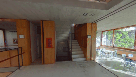
| Why Every Architect Should Use a 360-Degree Camera to Capture Their Projects Posted: 04 Aug 2017 01:00 AM PDT  As we know, architects are inveterate travelers. They like to see, understand, and capture the details of their favorite works. For this reason, at ArchDaily we believe that every architect should carry a 360-degree camera with them to capture and share their experiences across the world. Below are five reasons why. 1. You can visualize an entire space, not just one shot.
GIF from 360 video of Casa Scout by BAAG—check out the full video here. The reason why we like 360-degree videos so much is because of the control you have over them. Compared to a normal video where the author decides what you see, 360-degree videos let you see everything, allowing a detailed spatial understanding of the site. 2. You can connect them to practically any smartphone
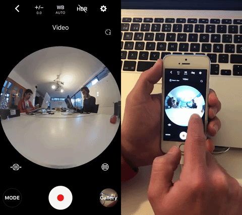
All 360-degree cameras have an app for their operation, letting you take immersive photos and videos, adjust the parameters to your liking and even apply filters. And don't forget, these apps also let us share our 360-degree views on social networks! 3. They fit in your pocket
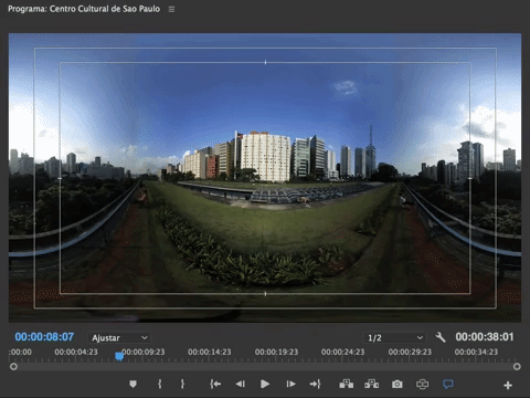
The majority of 360-degree cameras measure less than 10 centimeters in length and easily fit in your pocket or handbag. Additionally, they don't need accessories (unless you want them) and can be operated directly from the app on your smartphone or by pressing the buttons on the camera manually, without having to depend on a second device. 4. You can choose the angle that you want to show after you have taken a photograph or filmed a video
Once you have taken your video or photo in 360 degrees, you can select the specific shot that you are most interested in showing. In the editing stage, you can add text, photos or whatever you want, adding extra value to your videos. 5. They are a powerful tool to share spaces (not just technical drawings) with your clients
At university, we learned to develop a well-rounded spatial perception that unfortunately is not understood by everyone. However, 360-degree cameras will allow your clients, partners, students, and friends to comprehend the space we are designing, building, teaching, or even selling. This posting includes an audio/video/photo media file: Download Now |
| Finalists Announced for Redesign of Norwegian Government Headquarters After 2011 Attacks Posted: 03 Aug 2017 11:00 PM PDT  © Team Ubris / Statsbygg © Team Ubris / Statsbygg Two teams have been announced as the finalists of a competition to rebuild Norway's government headquarters after it was bombed in 2011 during the country's worst terrorist attack in modern history. The state building agency Statsbygg selected Team Ubris, comprised of A-Lab and LPO Architects, and G8+, which includes the firms Haptic and Nordic, out of a group of seven teams to create a safe, inviting hub of ministry buildings for central Oslo.  © Team Ubris / Statsbygg © Team Ubris / Statsbygg The 150,000 square-meter complex will be one of the largest architectural undertakings in the city's history, offering around 5,700 workplaces. The revitalization encompasses a renovation of three existing buildings and the addition of six new buildings to the historic Regjeringskvartalet area.  © Team Ubris / Statsbygg © Team Ubris / Statsbygg The proposal by Team Ubris focuses on the reintroduction of public spaces into the city through two urban squares and a park. To provide flexible workspaces, the buildings are low-rise and have large footprints. The buildings feature setbacks formed to take advantage of sunlight. The team was comprised of engineering firm Ramboll, SLA and Bjørbekk & Lindheim landscape studios, and consultants Asplan Viak, COWI, Aas-Jacobsen, Per Rasmussen, Scenario and NIKU.  © Team G8+ / Statsbygg © Team G8+ / Statsbygg G8+'s proposal envisions the site with a new central square that would provide a gathering space for government workers and the public. Circulation around the center is provided by both a network of ground-level paths and a series of raised bridges that connect the administrative buildings. Attention is placed on the appearance and usage of the first floors of the buildings. Designated as places for social interaction, each building's first floor is given a distinct character with visually expressive facades to attract visitors. The G8+ team included architecture firm Ratio, Gullik Gulliksen landscaping, engineering by Sweco, interior studio Iark, and consultants Norconsult and Dr Techn Olav Olsen.  © Team G8+ / Statsbygg © Team G8+ / Statsbygg The rebuilding in Oslo accompanies a handful of architectural responses to the devastating attacks. The most notable completed thus far is a memorial built by 3RW Arkitekter in 2015 to commemorate the shooting victims from the massacre on Utøya island.  © Team Ubris / Statsbygg © Team Ubris / Statsbygg The jury will choose one of the two projects to move forward by Fall 2017 after considering detailed proposals. The complex will begin construction in 2020, and is set to be completed by 2027.  © Team G8+ / Statsbygg © Team G8+ / Statsbygg This posting includes an audio/video/photo media file: Download Now |


_copy.jpg?1487764021)
.jpg?1501860574)
| You are subscribed to email updates from ArchDaily. To stop receiving these emails, you may unsubscribe now. | Email delivery powered by Google |
| Google Inc., 1600 Amphitheatre Parkway, Mountain View, CA 94043, United States | |
Nema komentara:
Objavi komentar