Arch Daily |
- Poix-Terron Cultural and Sport Centre / philippe gibert architecte
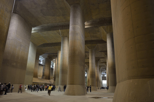
- Fresh Doubts Loom Over Japan's Vast Subterranean Water Control Systems
- Renault Symbioz Smart Home / Marchi architects
- Public Nursery in Glyfada / KLab architecture
- Dachland's HQ in Mainz / SYRA_Schoyerer Architekten
- Mausam - House of the Seasons / ZERO STUDIO
- Barozzi Veiga's Unbuilt Museum Project Immortalized In Blade Runner 2049
- Peak Office / Pure Architect
- MINTH Headquarters / MORE Architecture
- The Two Rock House / Wolf Architects
- Feilden Clegg Bradley Granted Approval on St Mary’s Hospital Project in London
- The Site Operations Center at BMW / Perkins+Will
- UBC Researchers Develop New Concrete That Resists Earthquakes
- National Holocaust Monument / Studio Libeskind
- Diller Scofidio + Renfro Win Commission for London Centre for Music
- GP House / Taller5 Arquitectos
- Saint-Laurent Sports Complex / Saucier + Perrotte architectes + HCMA
- 7 Architects Who Weren't Afraid to Use Color
- LEGO vs Architecture: BBC Film Explains How It's All Connected
- New Map Celebrates New York City’s Brutalist Concrete Architecture
| Poix-Terron Cultural and Sport Centre / philippe gibert architecte Posted: 10 Oct 2017 10:00 PM PDT  © Nicolas Waltefaugle © Nicolas Waltefaugle
 © Sergio Grazia © Sergio Grazia From the architect. This double request for a media library and a gymnasium allowed us to explore this programmes diversity and to offer a single building, a cultural and sports centre, instead of two different buildings. This hybrid equipment takes place in the landscape, between a multipurpose room and a business incubator, and communicates with its environment, including the big nineteenth century house behind, through mirrored glass panes.  © Marc-Olivier Luron © Marc-Olivier Luron The entrance, common for the two uses, is accessed via the forcourt, which gives its public building status. The shared hall, extension of the forcourt, opens on to the media library and the gymnasium, and also to an exhibition, reception or meeting space.  © Nicolas Waltefaugle © Nicolas Waltefaugle Transparency enhances spaces fluidity and helps the two uses not only to coexist but also to be complementary. This complementarity is reinforced outside by the choice of metal cladding, which reminds the neighbouring industrial buildings.  © Nicolas Waltefaugle © Nicolas Waltefaugle  Ground Floor Plan Ground Floor Plan  © Nicolas Waltefaugle © Nicolas Waltefaugle Media library space is completely opened, it's structured by volumetric division and wide vistas. The gymnasium part benefits from zenithal, and side subdued and soft, natural light. In the gymnasium extension the weight room is intimate and open to the back of the plot and the landscape.  © Nicolas Waltefaugle © Nicolas Waltefaugle This posting includes an audio/video/photo media file: Download Now |
| Fresh Doubts Loom Over Japan's Vast Subterranean Water Control Systems Posted: 10 Oct 2017 09:00 PM PDT Rising sea levels, and the potential of extreme conditions globally, are threatening coastal cities around the world. While the Netherlands are often considered to be leading the engineering battle against the tides, Japan—with a renewed sense of urgency—are investing heavily in high-end systems and infrastructure to protect their largest metropoli. In an article by The New York Times, the $2 billion anti-flood system below the streets of Tokyo "is an extraordinary example of the defenses that global cities are readying as they face an era of extreme weather brought on by climate change." But is it enough? You can read the article in full, here. Learn more about the Metropolitan Area Outer Underground Discharge Channel, here. This posting includes an audio/video/photo media file: Download Now |
| Renault Symbioz Smart Home / Marchi architects Posted: 10 Oct 2017 08:00 PM PDT  © Fernando Guerra | FG+SG © Fernando Guerra | FG+SG
 © Fernando Guerra | FG+SG © Fernando Guerra | FG+SG From the architect. Lighting designers from Philips Lighting (Euronext Amsterdam ticker: LIGHT), a global leader in lighting, have collaborated with automotive company Renault on a unique concept car and smart home unveiled at the 2017 Frankfurt Motor Show (September 14-24). The SYMBIOZ autonomous electric car is not just a car. It is an extension of the home. The vehicle's onboard digital technology makes it an interactive and personalized space, connecting its passengers to other cars, people and technologies in the smart home such as Philips connected LED lighting.  © Fernando Guerra | FG+SG © Fernando Guerra | FG+SG Parked in the smart home, SYMBIOZ doubles as a snug, mobile, comfortable and modular extra room. Its interior was inspired by the design of living rooms. As an elegant open or closed environment, the car connects with all manner of devices and appliances in the home, making it an ideal space to work in or relax. Its operating system is shown interacting with and controlling the smart home lighting.  © Fernando Guerra | FG+SG © Fernando Guerra | FG+SG  Ground Floor Plan Ground Floor Plan  © Fernando Guerra | FG+SG © Fernando Guerra | FG+SG Philips Lighting collaborated with Renault on the concept. The house at the motor show features Philips Hue in the lounge and kitchen, which automatically switches on before the car swings into the driveway. As SYMBIOZ enters at ground level, the walls automatically light up in welcome, illuminated by Philips Luminous Surfaces. The car then sits on a platform which elevates it to the living space or terrace. The home's center-piece cylinder enclosing the platform is lit with 5,368 dynamic Philips Color Kinetics iW Flex LED light points that change their shade of white to illustrate the connectivity status between the car and home; for example when the car is charging or on standby.  © Fernando Guerra | FG+SG © Fernando Guerra | FG+SG  Longitudinal Section 02 Longitudinal Section 02  © Fernando Guerra | FG+SG © Fernando Guerra | FG+SG "This collaboration with Renault illustrates perfectly how our connected LED lighting is designed to interact with different platforms and devices to simplify and enhance people's lives," explains Pierre-Yves Panis, Chief Design Officer for Philips Lighting This posting includes an audio/video/photo media file: Download Now |
| Public Nursery in Glyfada / KLab architecture Posted: 10 Oct 2017 07:00 PM PDT  © Mariana Bisti © Mariana Bisti
 © Mariana Bisti © Mariana Bisti From the architect. The design and construction of public buildings in Greece is problematic, as the architect is not in charge of the construction. One of the biggest challenges of this project was to reintroduce the role of the architect as the essential contributor.  © Mariana Bisti © Mariana Bisti Additionally, we intended to give prominence to the construction method of prefabrication. Prefabrication, one of the conditions of the competition also defined the final form of the building as the basic module would have to be transported on a truck.  Axonometric Axonometric The concept of the project was to design a building that would relate to the scale of its users while also introducing a new typology, that of the urban village. The main module draws inspiration from archetypal drawing of a house as perceived by a child. By replicating the basic module thrice, the classroom unit is created.  © Mariana Bisti © Mariana Bisti The nursery school was designed so that all the classrooms have three open sides. As a consequence, the arrangement of the classrooms is organized around a central courtyard while also formed by smaller atriums.  © Mariana Bisti © Mariana Bisti We attempted to employ rather common materials and construction methods in order to create a more complicated structure with a small energy footprint. The exterior walls were constructed 10cm thick allowing us to maximize the available interior area and were cladded, along with the roofs, with exterior wall insulation. Thus, by taking also into consideration the construction of wooden pergolas along the careful placement of the windows on the exterior walls, the building is sustainable providing comfort to the children.  Ground Floor Plan Ground Floor Plan On the other hand, we hope that the vegetation will become an quintessential element of the design as large Platanus trees will provide shade to the interior courtyard while other tree species will highlight the seasonal changes.  © Mariana Bisti © Mariana Bisti This posting includes an audio/video/photo media file: Download Now |
| Dachland's HQ in Mainz / SYRA_Schoyerer Architekten Posted: 10 Oct 2017 05:00 PM PDT  © SCHOYERER © SCHOYERER
 © SCHOYERER © SCHOYERER From the architect. The Dachland company specialises in roof insulation, rooftop greening and photovoltaics. Since being founded in 1969, the company has fitted more than 4 million square metres of roof insulation, both in Germany and abroad. A new company headquarters had become necessary for the approximately 50 employees at the site in Mainz, and so Dachland launched a competition, which SCHOYERER ARCHITEKTEN_SYRA won in December 2013.  © Jörg Hempel © Jörg Hempel About the urban planning The building plot was cleverly chosen, on the edge of a newly designated business park in the Hechtsheim district of Mainz, right in the middle of wheat fields and enjoying excellent visibility from the access road.  Diagram Diagram  © Schuppelius © Schuppelius  Diagram Diagram About the building structure and architecture – The company name personified For the author, this immediate transition to a landscape of fields suggested a building with a planted roof landscape, therefore personifying the company's name in the form of a landscaped structure. The Dachland company should be able to be found without any further explanation, and indeed this sight is unmistakable when viewed from the access road.  © Jörg Hempel © Jörg Hempel Parcels of land in business parks are usually very functional in structure. The visitor is often greeted by a sober view of warehouse spaces and containers, until he or she leaves the car park, which is flanked by token greenery, and arrives at a practical company building with a gesticulating entrance.  Section Section  Section Section But in this case, the architects placed great value on the seclusion of the entire site, meaning that the works yard, with all its functional requirements, is not visible from outside the site. The gate to the yard is normally closed. Immediately in front of it, visitors find the visitors' car park and the main entrance.  © SCHOYERER © SCHOYERER All roof areas have been planted. The yard is surrounded by a hall structure, which opens onto the yard at ground level, and in the area of the main building merges into a sloping roof space. Beneath it, a one to two-storey warehouse is concealed in the ground floor, and the top floor houses the administration level. This is accessible from the main entrance via a linear cascading stairway. A large recess in the sloping roof space forms the terrace for the conference room and managing director's office. The roof terrace is also visible and accessible from the foyer and hallway. This posting includes an audio/video/photo media file: Download Now |
| Mausam - House of the Seasons / ZERO STUDIO Posted: 10 Oct 2017 03:00 PM PDT .jpg?1507635867 "© Ar Hamid MM") © Ar Hamid MM © Ar Hamid MM
.jpg?1507634392 "© Ar Hamid MM") © Ar Hamid MM © Ar Hamid MM The Context More than being low budget, this house is the outcome of a realization that architecture need not be expensive and brand new. In the wake of globalization, when ideas and information are just a click away and are followed by a larger audience falling to different layers of the society, the image of what is good architecture has been stereotyped to a major extent. In developing countries like India, this is rooted in a notion that there is a certain kind of architecture that represents the financial status of the user especially in the case of residences where mostly everyone wants a home that 'looks' rich and expensive. Like elsewhere, this has caused residential architecture in Kerala too, to slowly drift away from using the vernacular materials, techniques and thus compromising aspects such as climatic responsiveness, energy efficiency in the due course. The kind of architecture prevailing in the Middle East and Europe where a good majority of Keralites work has also become an influence in defining their taste. Whatever be the style used, the affluent class has the privilege to afford air conditioned, automated systems in their residences, but the rest who lives in the cheaper ,at times smaller scale replicas of those huge mansions don't. They complain that there is a lack of comfort inside their homes; it's too hot inside them while they have spent a lion's share of their savings for them and thus are forced to stay unhappy in their dream-come- true homes. .jpg?1507634410 "© Ar Hamid MM") © Ar Hamid MM © Ar Hamid MM The Idea The attempt was to create awareness on the importance of having true- to-self buildings rather than look alike ones. Not that there should be distinction in architecture for the rich and the poor, the point here is that, whatever be the social status, residential architecture shall speak the language of simplicity and shall respond to the aspects of the given context of site, climate, vernacular building materials and the end user.  Sections Sections Here, the house is subtly placed in a setting where it is surrounded by the kinds of residences which fall to the stereotypes mentioned earlier, over a sloping landscape in a rubber plantation. As part of the deliberate effort to create a dialogue between the building and its passerby's, the house has been placed closer to the road despite the site being large enough to offer ample frontage. Though rural in setting, considerable traffic passes through the road in the front which connects several adjoining villages offering significant amount of visibility for the building. But the interesting part here was to decide on how to make use of this visibility along with the other primary concerns. To go with a modest, simple looking home amidst an array of the so called 'expensive looking' mansions was a crucial point in the whole process and the rest just followed; without compromising the requirements of the client, but not really an indication of his financial status .jpg?1507634646 "© Ar Hamid MM") © Ar Hamid MM © Ar Hamid MM The Client All that the client, a retired army officer wanted was a simple and peaceful home for his family comprising of his wife and four daughters in his ancestral land. At the same time it had to be house for two: he and his wife alone, and a house for whole of the family, for his daughters are settled at far off places and they come home occasionally. Design Placed along the contour, the spaces inside the house are placed in three levels connected by a stair which at the same time the vertical circulation element and also offers access points to all the three levels. The spaces are designed keeping in mind the dynamic requirements. Hence, the common spaces are expandable and the rest is kept optimum. Functional elements are actively contributing to the aesthetics of the house, for instance replacing windows with brick jalis. .jpg?1507634714 "© Ar Hamid MM") © Ar Hamid MM © Ar Hamid MM The choice of material has been from vernacular options: laterite bricks for the walls, terracotta tiles for roofing and flooring, natural timber etc. and has been brought into the design using local workmanship. Plastering of the laterite walls was affordable compared to leaving it exposed since it involved technical expertise which was rather very expensive.  Ground Floor Plan Ground Floor Plan The interior of the residence is kept minimal, with the structural elements which were left bare purposefully, keeps it true to its own self. Furniture from the client's old home has been remodeled and used. Also the roofing tiles were brought from a demolished house nearby. .jpg?1507634456 "© Ar Hamid MM") © Ar Hamid MM © Ar Hamid MM The clay roofing at varying heights keeps the heat gain (though very less compared to concrete) away from affecting the interiors. Along with the roof, the terracotta flooring, ample air movement ensured through the jalis also adds to the thermal comfort of the house. The jalis also help generate a play of natural light in the interiors at various times of the day. .jpg?1507634674 "© Ar Hamid MM") © Ar Hamid MM © Ar Hamid MM The Affordability Factor The optimization of design, methodology and material selection without compromising the aesthetic appeal as well as the requirements of the client, was the key factor in breaking the notion that all that is affordable is unattractive. This rather was an attempt to prove that affordability is a style of design to smartly bring the best out of it. .jpg?1507634436 "© Ar Hamid MM") © Ar Hamid MM © Ar Hamid MM The House and the Seasons The choice of landscape elements were derived from the site and its natural setting itself, comprising locally grown plants and trees and the existing rubber plantation in the backdrop. The house being merged to the landscape and placed along the contour blends with it. Thus, with the change in seasons the visual imagery of the house and its setting changes.  Sections Sections The house will look dry from outside during the summer; but inside, it keeps things cool; indicating the wishful wait for the seasons to come. It celebrates the rain in monsoon, blooms with the spring and romances with the morning breezes of the winter. This posting includes an audio/video/photo media file: Download Now |
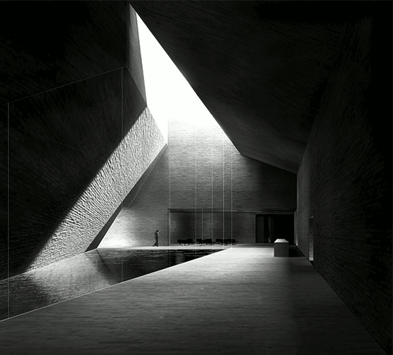
| Barozzi Veiga's Unbuilt Museum Project Immortalized In Blade Runner 2049 Posted: 10 Oct 2017 01:15 PM PDT
Blade Runner 2049, the recently-released sequel to the 1982 sci-fi classic, has prompted a deluge of interest in the futuristic, dystopian world in which it is set. However, it seems that some architects may have a more direct interest in the film than usual, as images surfacing on Twitter show an uncanny similarity between some of the film's concept art and a 2010 design by Spanish practice Estudio Barozzi Veiga. The image in question, tweeted by the film's concept artist Peter Popken, shows concept art for the office of Wallace, the film's main protagonist. As highlighted by another Twitter user Laura Broad, the image bears more than a passing resemblance to an image produced by Estudio Barozzi Veiga for their unbuilt 2010 design for the Neanderthal Museum in Piloña, Spain. ArchDaily wanted to know more about the incredible similarities, so we contacted Alberto Veiga for comment, who was in Santiago, Chile (ArchDaily's headquarters), for a symposium and lecture at the Universidad San Sebastian.
 Twitter user Klaustoon was the first to place the comparison side-by-side. Image <a href='https://twitter.com/klaustoon/status/917719794719346689'>via Twitter user @klaustoon</a> Twitter user Klaustoon was the first to place the comparison side-by-side. Image <a href='https://twitter.com/klaustoon/status/917719794719346689'>via Twitter user @klaustoon</a> When we asked Veiga what he felt about the image that he designed together with Fabrizo Barozzi exuding such drama and effect that it was used in the production of a majorly anticipated Hollywood movie as a villain's den, he said,
 Left: interior of Barozzi Veiga's 2010 Neanderthal Museum design. Right: Concept art by Peter Popken for the interior of Wallace's office in Blade Runner 2049. Image <a href='https://twitter.com/klaustoon/status/917719794719346689'>via Twitter user @klaustoon</a> Left: interior of Barozzi Veiga's 2010 Neanderthal Museum design. Right: Concept art by Peter Popken for the interior of Wallace's office in Blade Runner 2049. Image <a href='https://twitter.com/klaustoon/status/917719794719346689'>via Twitter user @klaustoon</a> We are awaiting comment from Peter Popken about how Barozzi Veiga's project made it onto the big screen. This posting includes an audio/video/photo media file: Download Now |
| Posted: 10 Oct 2017 01:00 PM PDT 
 From the architect. Peak home office project is located in Bangkok's Town in Town neighborhood, where most of the surrounding building on the site is low rise building with contemporary and traditional design. The objective of this project is to be able to turn the project into the neighborhood's new landmark while maintaining physical harmony with the surrounding environment. The design has to express the owner's characteristics and passion of car racing and establish a feeling of fast movement. This emotion of fast movement was represented by the design of the facade of this building. The facade was divided into two part constructed from different materials. 
 First part of the facade was built constructed by Biowood that is able to transform its shape and durable for its environment. This undulating wooden facade helps lessen the stiffness of the box-shaped mass of the building, resulting in visually dynamic elevation which deliver movement to the building. The second part of the facade was constructed using a series of horizontal grills functions as the shell that wraps the three sides of the building's glass exterior. This louvers are inserted in five different degree transforming the solid mass to be layer of movement. This louver screening outsider vision gives privacy to this home office, while user from inside can be able to see outside vision. This louvers were made using matte texture of EQUITONE fiber cement panels. This texture gives polite and gentle feeling.  The program consists of three main sections with the ground floor being where the parking and reception areas are located. The area from the second to the fourth floors hosts the office space for rent with the top floor being used as the owner's residential area. From the outside, the building bears the resemblance of a simple rectangular form that occupies almost the entire site. Certain parts of the program are turned into green spaces following the building laws and regulations. The post-tensioned floor system the architect employs for the structure allows for the project to contain more stories and maximized the space than it's neighboring buildings. The building filled almost the entire land capacity resulted the building to have rectangular shape. In order to serve the notion of fast moment within this rectangular shape, the facade become a highly significant element to fulfill the requirement. This facade design contributed to visually dynamic movement when people viewed from different directions, causing the rather dense mass of the building to be more spacious, modern and physically in sync with Town in Town's urban fabric.  This posting includes an audio/video/photo media file: Download Now |
| MINTH Headquarters / MORE Architecture Posted: 10 Oct 2017 12:00 PM PDT  © Wassink Lundgren © Wassink Lundgren
 © Wassink Lundgren © Wassink Lundgren From the architect. The Chinese office is facing dramatic changes. Unpredictable organizations, new types of work and the impact of technology alter the 21st century office in a major way. For the headquarters of car company MINTH, MORE designed a radical new office typology.  © Wassink Lundgren © Wassink Lundgren The transition from 'made in China' to 'designed in China', forces companies to rethink their activities and work methods. Collaboration and interaction foster innovation, and should be at the core of 21st century office work. Simultaneously, work has changed from desktop, to laptop to mobile. All this requires - for an office environment - to absorb these changes and turn them into opportunities.  Axonometric Axonometric In 2009, China overtook the U.S. as the world's biggest auto market. MINTH Group is a key player in this expanding and changing industry - a leading supplier of exterior auto parts with a growing impact globally. The Jiaxing-based company built a new office to house their 800 staff headquarters, in an area that was a farm field only 10 years ago – from no tech to high tech in a decade.  © Wassink Lundgren © Wassink Lundgren MINTH has experienced a similar lightning speed in its development since its start in 1992 – from the production of car parts to the design and production of electric vehicles. How to design a headquarters in such a dynamic yet unpredictable environment?  Courtesy of MORE Architecture Courtesy of MORE Architecture Collaboration and interaction foster innovation, and should be at the core of 21st century office work. Simultaneously, work has changed from desktop, to laptop to mobile. All this requires - for an office environment – to absorb these changes and turn them into opportunities.  Courtesy of MORE Architecture Courtesy of MORE Architecture MORE proposed a radical design strategy, not based on program, but at embracing change. The key driver is the unpredictability of the environment and the ability of the office to adapt. The design maximizes the contrast between the fixed items (screens, storage, pantries, printers, etc.) and the flexible ones (people) through a system of walls: the barcode.  Axonometric Axonometric The 'bars' in this scheme are fixed; the space in between can densify over time – depending on the development of the activities of the company, creating a crossover between the traditional cell office and the office landscape typologies.  Courtesy of MORE Architecture Courtesy of MORE Architecture Having a closed aluminum side for storage and an open translucent side for sharing information, the bars create a diverse setting; an aggregation of 'rooms' that can change and alter. The shifted bars allow for views and communication between project teams and departments. By placing the bars in a north-south direction, sunlight enters deep into the building.  Courtesy of MORE Architecture Courtesy of MORE Architecture The project is organized around the central lobby, which can be understood as the very heart of the building. A gentle stairs, which connects the lobby with the training center on the second floor, can be used for public events, gatherings and informal meetings – various sorts of collectivity.  © Wassink Lundgren © Wassink Lundgren The project contains several 'specials' to stimulate collectivity. The circular lecture room allows a speaker to stand in the middle of his audience, and the listeners to see each other. The VIP rooms on the second floor are entirely made out of wood – contrasting the industrial materials in the rest of the building. The green lobby creates a lush environment with plants where workers can unwind. The so-called 'war rooms' create confidential brainstorms in a 'James Bond-like' setting. Informal areas with dedicated designed furniture create space for spontaneous meetings.  © Wassink Lundgren © Wassink Lundgren The ceiling in the whole building is made of white steel mesh panels with all installations – HVAC, sprinkler, smoke detectors, baffles, lighting etc. – integrated above them. On every floor, the orientation of the LED lights differs, to generate a unique identity per floor.  Courtesy of MORE Architecture Courtesy of MORE Architecture The industrial materials – steel, glass, aluminum – and the flawless, grid-like organization, are a clear reference to MINTH's industrial background. Yet, they clearly define this firm's spirit in being a leading high tech company.  © Wassink Lundgren © Wassink Lundgren This posting includes an audio/video/photo media file: Download Now |
| The Two Rock House / Wolf Architects Posted: 10 Oct 2017 10:00 AM PDT  Courtesy of Wolf Architects Courtesy of Wolf Architects
 Courtesy of Wolf Architects Courtesy of Wolf Architects Two Rocks… Two Meanings… The Two Rock house, as the name suggests, sits in between two rocky formations on a hilltop site. WOLF Architects were able to overcome the challenges of a very difficult site and in turn, reap the benefits of the peculiar conditions. Careful studies of the site's topography and rock foundations created the opportunity for a 6 car basement garage, with a home theatre and ample storage. Toward the rear of the property, there is a double story music studio, overlooking yet another stunning view. The upper floor is externally very private with its carefully placed circular windows set in rusted steel panels and screened off balconies. However this upper floor also has a large central courtyard with swimming pool that reflects and filters light inwards.  Sketch Sketch Dominating the upper floor retreat is a sculptural fireplace built from the brass of melted Zildjian cymbals. One of the client was a drummer – the three circular windows on the front and back facade were symbolic of the three main cymbals on a drum kit. The client liked the idea that each one represented a member of the family; husband, wife and child. The positioning of the bedrooms loosely reflect the planning of a drum kit  Courtesy of Wolf Architects Courtesy of Wolf Architects A House for Two Rock Stars... The entire ground floor operates as one large entertainment space with just one bedroom for guests. The family's bedrooms and private spaces are all upstairs. Part of the brief was to make the upper floor completely soundproof from the level below with insulated concrete slabs a series of internal sound proofing screens.  Ground Floor Ground Floor A 25m lap pool extends majestically out to an infinity edge with an expansive view out toward the horizon. Near the edge of the house, the pool wraps around the outdoor entertaining spaces and has a shallow area for children.  Courtesy of Wolf Architects Courtesy of Wolf Architects The house is fully automated. The owners are able to remotely operate and survey the home and its grounds from any location. It allows the owners to keep the house secure and controlled while they may be overseas, even if it's being occupied by guests.  Courtesy of Wolf Architects Courtesy of Wolf Architects This posting includes an audio/video/photo media file: Download Now |
| Feilden Clegg Bradley Granted Approval on St Mary’s Hospital Project in London Posted: 10 Oct 2017 09:40 AM PDT  © FCB Studios © FCB Studios The Westminster City Council has granted planning permission for the New Outpatients Building at St Mary's Hospital in Paddington, London. Designed by Feilden Clegg Bradley Studios, the 8-story building will consolidate outpatient services currently spread across 40 different locations into one comprehensive care center, increasing comfortability and ease-of-use for both patients and employees.  © FCB Studios © FCB Studios "This new development is vital to help us meet the changing needs of our patients and will allow us to provide the very best care by taking advantage of the latest medical technologies and practices," said Michele Wheeler, director of redevelopment, at Imperial College Healthcare NHS Trust. "It will also make visiting outpatients a more convenient and welcoming experience as we replace ageing buildings that are inefficient and costly to maintain."  © FCB Studios © FCB Studios The Outpatients Building will be located along Praed Street on the eastern side of the St Mary's campus, replacing three existing buildings to become a new "cornerstone" of the hospital complex. An open ground floor space with central courtyard will activate the streetscape around the building, with hospital retail and cafe spaces positioned along the core circulatory arteries. A central atrium will provide daylight and vertical orientation across all eight levels.  © FCB Studios © FCB Studios  © FCB Studios © FCB Studios Borrowing from the architectural elements of its context, the facade will be clad in sculpted glazed ceramic panels that will reflect light into the narrow streetscape. Estimated to see about 500,000 patients per year, the Outpatients Building is the first phase of a wider master plan for expansion that will allow the hospital to serve the needs of the community for years to come.  © FCB Studios © FCB Studios "This has been a key project for the practice in the healthcare sector," added Sara Gohmann, Partner, Feilden Clegg Bradley Studios. "A carefully designed building that will substantially upgrade St Mary's outpatients facilities and will create a new carefully crafted addition to the surrounding neighbourhood." Learn more about the project on the Westminster City Council website here.
This posting includes an audio/video/photo media file: Download Now |
| The Site Operations Center at BMW / Perkins+Will Posted: 10 Oct 2017 08:00 AM PDT  Courtesy of Perkins+Will Courtesy of Perkins+Will
 Courtesy of Perkins+Will Courtesy of Perkins+Will From the architect. The Site Operations Center (SOC) at BMW is the first new executive building nestled into a beautiful 78-acre wooded preserve on the grounds of BMW Plant 10 in Spartanburg, South Carolina. This artfully systematic 65,000 square feet office building and site design embody the client's reputation for performance, innovative design, and quality. Perkins+Will's architects, landscape architects, interior designers, brand and workplace experts, designed a modern, innovative new workplace for over 300 BMW employees.  Site Plan Site Plan The BMW Plant 10 property is in the Piedmont region, a plateau located in the eastern United States, which is characterized by mixed hardwood and pine forest, rolling foothills, and an intricate system of streams, rivers, and lakes. As with most sites in the Piedmont region, vegetation and watershed patterns are of utmost importance. While the site has been cleared and graded for the Site Operations Center, significant drainage ways have been preserved, with native planting, to ensure watershed health downstream. Drainage patterns yielded an ideal parking orientation in order to intercept and treat stormwater moving down the existing slope. This strategy helps alleviate any additional stress of the stormwater system by keeping runoff from the Site Operations Center on site.  Courtesy of Perkins+Will Courtesy of Perkins+Will Existing forest canopy was also taken into consideration in order to maintain existing plant communities and sense of place. As the site matures, the site will return to a similar condition of the original Piedmont ecosystem. Existing circulation patterns were also studied to understand how the Site Operations Center and executive campus could connect back to the Zentrum, an experience center and museum, and the plant itself in order to create an integrated campus while being a retreat from the production line. The three-story building was positioned for optimum energy performance allowing for a significant presence along Interstate 85 while providing a respectful buffer to a more internally focused campus of natural forest.  Courtesy of Perkins+Will Courtesy of Perkins+Will The East and West sides of the SOC are solid which shields the building from the harsh early morning and late afternoon sun. Locating the building core to the South with limited windows that are shaded mitigate both noise and heat gain while increasing BMW's visibility from the I-85 corridor. As the massing of the building is carved away, a wood rain screen is revealed which is symbolic of BMW's ongoing commitment to environmental performance and their new electric "I" series.  Floor Plans Floor Plans The North side of the building is a boldly reflective picture window providing generous biophilic views out to the landscape. This side features wood again but is mostly a curtain of heroic pieces of glass that are eight feet wide by nine feet high. Offset within the massing of the building is the front porch that marks the entry of the project, provides outdoor workspace and features a conference space that is both in and out of the building. This elegant glass box that is symbolic of BMW transparent culture and welcomes dignitaries, employees, and visitors to the building.  Courtesy of Perkins+Will Courtesy of Perkins+Will The Site Operations Center is a high-performance workplace that is systematic, classic and tailored. The physical work environment aligns with the culture, processes, and objectives of the company. The key opportunity of the Site Operations Center was to increase overall workplace satisfaction, employee communication, and engagement. Harmonizing the structure and routing the energy efficient mechanical systems between north and south zones along a spine of circulation give the bar a simple and intuitive layout. The open office is located along the north side of the building with views and daylight while avoiding glare and solar heat gain.  Courtesy of Perkins+Will Courtesy of Perkins+Will Hoteling spaces, project rooms, formal conferencing space, and informal living rooms are conveniently organized adjacent to the open office space to encourage use and collaboration. Service spaces and core elements are loaded to the South creating a spine of circulation that runs continuously through the project from East to West. For moments of respite during the day, employees recharge outside in the covered porch, in the tea kitchens located on each floor, as well as in the ground level Canteen which serves food but is also an alternative workspace option for individuals and teams throughout the day. Perkins+Will's integrated team has created a project that is elegantly multifunctional, flexible over time and fitting for BMW's mission to be the world's leading provider of premium products and premium services for individual mobility.  Courtesy of Perkins+Will Courtesy of Perkins+Will  Details Details  Courtesy of Perkins+Will Courtesy of Perkins+Will This posting includes an audio/video/photo media file: Download Now |
| UBC Researchers Develop New Concrete That Resists Earthquakes Posted: 10 Oct 2017 07:00 AM PDT Researchers from the university of British Columbia have developed a new fiber-reinforced concrete treatment that can "dramatically [enhance] the earthquake resistance of seismically vulnerable [structures]." Called EDCC (eco-friendly ductile cementitious composite), the material is engineered at the molecular level to react similarly to steel – with high strength, ductility and malleability. When sprayed onto the surface of traditionally poured interior concrete walls, it reinforces against seismic intensities as high as the magnitude 9.0-9.1 earthquake that hit Tohoku, Japan in 2011.  © UBC © UBC "We sprayed a number of walls with a 10 millimetre-thick layer of EDCC, which is sufficient to reinforce most interior walls against seismic shocks," says Salman Soleimani-Dashtaki, a PhD candidate in the department of civil engineering at UBC. "Then we subjected them to Tohoku-level quakes and other types and intensities of earthquakes—and we couldn't break them." Combining cement, polymer-based fibers, fly ash and other industrial additives, EDCC is also surprisingly environmentally-sustainable – nearly 70 percent of the cement required in traditional formulas is replaced with fly ash, a prevalent industrial waste product. "This is quite an urgent requirement as one tonne of cement production releases almost a tonne of carbon dioxide into the atmosphere, and the cement industry produces close to seven per cent of global greenhouse gas emissions," commented UBC civil engineering professor and project supervisor Nemy Banthia.  © UBC © UBC The material will be used in practical application for the first time this fall as part of a seismic retrofit of the Dr. Annie B. Jamieson Elementary School in Vancouver. Future applications include the renovation of a school in Roorkee in the region Uttarakhand, India, where earthquakes are a common occurrence, and to build resilient homes for First Nations communities. Able to be applied to a variety of concrete structures, the researchers also anticipate use in the construction of pipelines, pavements, offshore platforms, blast-resistant structures, and industrial floors. The research was funded by the Canada-India Research Centre of Excellence IC-IMPACTS, a research organization that promotes collaboration between Canada and India. This posting includes an audio/video/photo media file: Download Now |
| National Holocaust Monument / Studio Libeskind Posted: 10 Oct 2017 06:00 AM PDT  Courtesy of Studio Libeskind Courtesy of Studio Libeskind
 Courtesy of Studio Libeskind Courtesy of Studio Libeskind From the architect. Centrally located at the corner of Booth and Wellington Streets across from the Canadian War Museum, the .79 acre site connects the museum to the historic center of the capitol city. The cast-in-place, exposed concrete  Courtesy of Studio Libeskind Courtesy of Studio Libeskind Monument is conceived as an experiential environment comprised of six triangular, concrete volumes configured to create the points of a star. The star remains the visual symbol of the Holocaust – a symbol that millions of Jews were forced to wear by the Nazi's to identify them as Jews, exclude them from humanity and mark them for extermination. The triangular spaces are representative of the badges the Nazi's and their collaborators used to label homosexuals, Roma-Sinti, Jehovah's Witnesses and political and religious prisoners for murder.  Courtesy of Studio Libeskind Courtesy of Studio Libeskind The Monument is organized with two physical ground planes that are differentiated by meaning: the ascending plane that points to the future; and the descending plane that leads visitors to the interiors spaces that are dedicated to contemplation and memory. Six triangular concrete forms provide specific program areas within the Monument: the interpretation space that features the Canadian history of the Holocaust; three individual contemplation spaces; a large central gathering and orientation space; and the towering Sky Void that features the eternal Flame of Rememberance, a 14 meter-high form that encloses the visitor in a cathedral-like space and frames the sky from above.  Courtesy of Studio Libeskind Courtesy of Studio Libeskind Edward Burtynsky's large scale, monochromatic photographic landscapes of current day Holocaust sites – death camps, killing fields and forests – are painted with exacting detail on the concrete walls of each of the triangular spaces. These evocative murals aim to transport the visitor and create another dimensionality to the interiors spaces of canted walls and labyrinth-like corridors.  Courtesy of Studio Libeskind Courtesy of Studio Libeskind The Stair of Hope rises from the central gathering space, cuts through a dramatically inclined wall and points at the upper plaza towards the Parliament Buildings; a gesture that recognizes and acknowledges the Canadian survivors who have contributed much to Canada and who continued to play an important role in exposing the dangers of state sponsored genocide.  Courtesy of Studio Libeskind Courtesy of Studio Libeskind Surrounding the monument, a rough landscape of various coniferous trees will emerge from the rocky pebbled ground. This landscape will evolve over time representative of how Canadian survivors and their children have contributed to Canada.  Courtesy of Studio Libeskind Courtesy of Studio Libeskind The National Holocaust Monument, established through the National Holocaust Monument Act by the Government of Canada, will ensure a permanent, national symbol that will honor and commemorate the victims of the Holocaust and recognize Canadian survivors. Through an international design competition, Lord Cultural Resources and its multidisciplinary and multicultural team, was selected to create the Monument for the Government of Canada. This posting includes an audio/video/photo media file: Download Now |
| Diller Scofidio + Renfro Win Commission for London Centre for Music Posted: 10 Oct 2017 05:16 AM PDT  The Centre for Music London will be built on the site of the existing Museum of London © Paul Farmer. Licensed under CC BY-SA 2.0 The Centre for Music London will be built on the site of the existing Museum of London © Paul Farmer. Licensed under CC BY-SA 2.0 The team led by Diller Scofidio + Renfro has been selected as the architects of the £2.5 million Centre for Music London project, beating out a star-studded shortlist consisting of teams led by AL_A, Foster + Partners, Gehry Partners, Renzo Piano Building Workshop and Snøhetta. Working in collaboration with UK-based firm Sheppard Robson, DS+R will develop plans for a world-class concert hall with supporting training, education and digital spaces, as well as attached commercial areas. When complete, it will serve as the new home of the London Symphony Orchestra and Guildhall School of Music & Drama. Other members of the winning team include Nagata Acoustics, Charcoalblue (Theatre Consultant), BuroHappold (Civil, Structural and Building Services Engineering) and AECOM (Cost Consultant). "The panel agreed that, of the six excellent submissions, Diller Scofidio + Renfro's visionary ideas offered the exciting potential to create a Centre for Music fit for the future that offers access and engagement for all," stated the architect selection panel on their decision. "The panel felt Diller Scofidio + Renfro most clearly met the vision and ambition of this project, utilising their experience of creating inspiring new spaces for culture to present a proposal that delivers a world-class concert hall in an outstanding new building, as part of the re-imagination of a key area of the City of London within Culture Mile." The Centre for Music will be located in London's Square Mile on the site of the existing Museum of London, who last year announced their own plans to move into a large and more accessible facility at London's Smithfield Market. The former museum building will be demolished to make room for the new structure. "My studio is very honored to be chosen from among this stellar group of architects and thrilled to have the chance to create an important cultural building for London, our first in the UK," said Elizabeth Diller, Partner, Diller Scofidio + Renfro. "We look forward to working with three of London's greatest institutions and the opportunity to align their artistic, educational and civic visions for the Centre for Music. "The new building will meet the needs of artists and audiences today with a keen eye toward the future. It will be sensitive to the inherited character of the Barbican and its vital role in Culture Mile while directly engaging the contemporary urban life of the city. We aspire to make a hub where people want to spend their time, with or without a ticket." The design team will now work closely with project partners to create a concept design for the Centre for Music. Initial designs will be presented to the City of London Corporation as part of a comprehensive business case by December 2018.
This posting includes an audio/video/photo media file: Download Now |
| GP House / Taller5 Arquitectos Posted: 10 Oct 2017 04:00 AM PDT  © Oscar Hernandez © Oscar Hernandez
 © Oscar Hernandez © Oscar Hernandez From the architect. The GP House project is the result of a clear definition of needs and an excellent relationship with the client, which clearly expressed their concerns for the excellent development of the project.  © Oscar Hernandez © Oscar Hernandez  Sections Sections  © Oscar Hernandez © Oscar Hernandez The ground is in a residential area delimited by neighbors on both sides and in the back with the wall dividing the condominium. The architectural program comprises the requirements for only one person, developed based on the basic needs to inhabit the space: bedroom, bathroom, living room, kitchen and services.  © Oscar Hernandez © Oscar Hernandez From the street, the GP House manifests its character with an apparent concrete wall with wooden access doors, celebrating the required privacy inside the grounds and denoting a contrast of these materials that are constant throughout the house. As you enter the building you will discover the volume of glass with a concrete slab resting on the light steel columns. The living space is accessed through a ladder in the middle of the vegetation that offers a shelter over the side void towards the garage.  © Oscar Hernandez © Oscar Hernandez The main volume acts as the setting for the main activities of the house: an open space that relates directly to the kitchen areas, living rooms and bedroom. A second monolithic body lined with vertical wooden slats contains the secondary services and gives a visual contrast from any angl of the house, bringing heat and contrast to the sober presence of the apparent concrete.  Ground Floor Plan Ground Floor Plan The bathroom of the room had its own character when being covered in its totality in white marble plates, accessories in black and natural wood in a gesture of warmth.  © Oscar Hernandez © Oscar Hernandez The room has a close relationship with the social area in such a way that these areas are not physically delimited, having direct access with the terrace, a small mirror water and the external garden, formed mostly by endemic species.  © Oscar Hernandez © Oscar Hernandez This posting includes an audio/video/photo media file: Download Now |
| Saint-Laurent Sports Complex / Saucier + Perrotte architectes + HCMA Posted: 10 Oct 2017 02:00 AM PDT  © Olivier Blouin © Olivier Blouin
 © Olivier Blouin © Olivier Blouin From the architect. The project site is situated between the existing Émile Legault School and Raymond Bourque Arena, both of which are horizontal in form and neutral in character. For this project, it thus became vital for the design of new sports complex to create a visual and physical link between the Marcel Laurin Park (to the north of the site), and the projected green band that will run along Thimens Boulevard.  © Olivier Blouin © Olivier Blouin  Site Plan Site Plan  © Olivier Blouin © Olivier Blouin The sculptural nature of the project creates a strong link between these two natural elements in the urban fabric. Two angular objects — one prismatic, white and diaphanous, the other darker and stretched horizontally — embrace the specific programmatic functions of the project but simultaneously transcend these, inviting users and passersby from the boulevard, while serving as a signal for the passage toward the park beyond.  © Olivier Blouin © Olivier Blouin  © Olivier Blouin © Olivier Blouin The two volumes appear to float, suspended by the kinetic energy emanating from the heart of the project, thereby evoking the dynamic nature of the activities (sports, athletics, training) taking place within. Ultimately, the facility is designed to encourage sports participation and support healthy lifestyles in the community. The design accomplishes this through the integration of high-performance sports venues bound together by a network of carefully considered social spaces. The result is a facility that supports the development of the community and adapts to the changing demands of its users.  © Olivier Blouin © Olivier Blouin This posting includes an audio/video/photo media file: Download Now |
| 7 Architects Who Weren't Afraid to Use Color Posted: 10 Oct 2017 01:15 AM PDT  La Muralla Roja. Image © Gregori Civera La Muralla Roja. Image © Gregori Civera Some architects love color, some are unmoved by it, some hate it, and some love to dismiss it as too whimsical or non-serious for architecture. In an essay on the subject, Timothy Brittain-Catlin mentions the "innate puritanism among clients of architecture," architects and their "embarrassment of confronting color," and how "Modernism tried to 'educate out' bright colors." So, while the debate on color in architecture is far from being a new one, it is not finished, and probably never will be. In today's world where the exhausted stereotype of the no-nonsense architect clad in black still persists, and while we quietly mull over the strange pull of the Cosmic Latte, there are some architects who haven't been afraid of using broad swathes of color in their work at all. Read on for a list of 7 such exemplary architects both from the past and the present. Antoni Gaudi (1852 – 1926).jpg?1507476262 "Casa Batlló. Image © <a href='https://commons.wikimedia.org/wiki/File:Barcelona_Casa_Batll%C3%B3_DachterrasseKamine.jpg'>Wikimedia user M.Stallbaum</a> licensed under <a href='https://en.wikipedia.org/wiki/Public_domain'>Public Domain</a>") Casa Batlló. Image © <a href='https://commons.wikimedia.org/wiki/File:Barcelona_Casa_Batll%C3%B3_DachterrasseKamine.jpg'>Wikimedia user M.Stallbaum</a> licensed under <a href='https://en.wikipedia.org/wiki/Public_domain'>Public Domain</a> Casa Batlló. Image © <a href='https://commons.wikimedia.org/wiki/File:Barcelona_Casa_Batll%C3%B3_DachterrasseKamine.jpg'>Wikimedia user M.Stallbaum</a> licensed under <a href='https://en.wikipedia.org/wiki/Public_domain'>Public Domain</a> Best known as one of the leaders of Catalan Modernism and Art Nouveau, Gaudi's fantastical work is characterized as much by its use of traditional decorative arts like stained glass, ceramics, and wrought-iron forging as it is by its eccentric forms. Drawing from nature, mythology, and religion, the architect's remarkable use of color is evident in the polychromatic tile, brick and stone-work in projects like the Casa Vicens, El Capricho, Casa Batllo, Park Guell and the Sagrada Familia, among countless other masterpieces.  Casa Vicens. Image © Pol Viladoms Casa Vicens. Image © Pol Viladoms Luis Barragán (1902 – 1988) Interior of Casa Gilardi. Image © <a href='https://commons.wikimedia.org/wiki/File%3ACasa_Liraldi_Luis_Barrag%C3%A1n.JPG'> Wikimedia user Ulises00</a> licensed under <a href=' https://en.wikipedia.org/wiki/Public_domain'>Public Domain</a> Interior of Casa Gilardi. Image © <a href='https://commons.wikimedia.org/wiki/File%3ACasa_Liraldi_Luis_Barrag%C3%A1n.JPG'> Wikimedia user Ulises00</a> licensed under <a href=' https://en.wikipedia.org/wiki/Public_domain'>Public Domain</a> While Barragán's work makes use of whole planes splashed with bright, contrasting colors, it is never uncomfortable to look at, even in the Mexican summer sun. Expanses of creamy pink and bright orange at right angles to each other, a sunny yellow corridor, rust-red running into earthy grey, a solid chunk of scarlet against fresh blue, a lilac wall behind a dusty green cactus – these are a few of the many sights to behold in Barragán's projects through which he sought to capture his obsession with "serenity, silence, intimacy and amazement," the region's culture, and the surrounding landscape.  Fountain of Casa Gilardi. Image © <a href='https://en.wikipedia.org/wiki/File:Casa_Giraldi_Luis_Barragan.JPG'> Wikimedia user Ulises00</a> licensed under <a href='https://en.wikipedia.org/wiki/Public_domain'>Public Domain</a> Fountain of Casa Gilardi. Image © <a href='https://en.wikipedia.org/wiki/File:Casa_Giraldi_Luis_Barragan.JPG'> Wikimedia user Ulises00</a> licensed under <a href='https://en.wikipedia.org/wiki/Public_domain'>Public Domain</a>  Fuente de los Amantes. Image © <a href='https://www.flickr.com/photos/esparta/3573608700'> Flickr user Esparta Palma</a> licensed under <a href='https://creativecommons.org/licenses/by/2.0/'>CC BY 2.0</a> Fuente de los Amantes. Image © <a href='https://www.flickr.com/photos/esparta/3573608700'> Flickr user Esparta Palma</a> licensed under <a href='https://creativecommons.org/licenses/by/2.0/'>CC BY 2.0</a> Michael Graves (1934 – 2015) St. Coletta School / Michael Graves. Image Courtesy of Michael Graves St. Coletta School / Michael Graves. Image Courtesy of Michael Graves "I love Borromini and want to get some of the feeling of the richness of that architecture into my work, but if you have to paint it white and make it flat, what's the point?'' The American architect notorious for breaking away from the purist traditions upheld by the modernists used playful colors and bold forms in his postmodern works such as St. Coletta School, Portland Building, and the Dolphin Resort at Walt Disney World.  Portland Building, 1982. Image © <a href='https://commons.wikimedia.org/wiki/File:Portland_Building_1982.jpg'>Wikimedia user Steve Morgan</a> licensed under <a href='https://creativecommons.org/licenses/by-sa/3.0/deed.en'>CC BY-SA 3.0</a> Portland Building, 1982. Image © <a href='https://commons.wikimedia.org/wiki/File:Portland_Building_1982.jpg'>Wikimedia user Steve Morgan</a> licensed under <a href='https://creativecommons.org/licenses/by-sa/3.0/deed.en'>CC BY-SA 3.0</a> Theo Van Doesburg (1883 – 1931) Café l'Aubette. Image © <a href='https://commons.wikimedia.org/wiki/File:Strasbourg_Cin%C3%A9_Bal_de_l%27Aubette_janvier_2014-17.jpg'>Wikimedia user Claude Truong-Ngoc</a> licensed under <a href='https://creativecommons.org/licenses/by-sa/3.0/deed.en'>CC BY-SA 3.0</a> Café l'Aubette. Image © <a href='https://commons.wikimedia.org/wiki/File:Strasbourg_Cin%C3%A9_Bal_de_l%27Aubette_janvier_2014-17.jpg'>Wikimedia user Claude Truong-Ngoc</a> licensed under <a href='https://creativecommons.org/licenses/by-sa/3.0/deed.en'>CC BY-SA 3.0</a> The self-taught artist and architect, and one the main proponents of De Stijl, Doesburg applied his ideas about color with full vigor in the spaces he designed in collaboration with other designers, such as the Café l'Aubette. The multiple surfaces and planes in actual space allowed him to play with shifts in tones, contrasting angles, horizontal and vertical elements, and geometry, all in bold primary colors that stood for pure abstraction and purity. Peter Cook Drawing Studio / CRAB studio. Image © Richard Bryant Drawing Studio / CRAB studio. Image © Richard Bryant "The Kunsthaus offers a rotund, laughing, winking face to the city of Graz. The straightforward entry is followed by a tantalizing element – the travelator that invites you into the unknown. The mystery deepens in the dark, magic space..." This is no Archigram project on paper, it's a public art gallery in Austria designed and built by Peter Cook's CRAB Studio. The architect wasn't joking when he said that Archigram's designs were always meant to be built: marked by the same wit, color palette and radical playfulness, Cook is not afraid to throw around splashes of color, which is not surprising at all, given his added disdain for the "piety of biscuit-beige."  Departments Of Law And Central Administration / CRAB Studio. Image © Ronald Kreimel Departments Of Law And Central Administration / CRAB Studio. Image © Ronald Kreimel  Abedian School of Architecture / CRAB Studio. Image © Peter Bennetts Abedian School of Architecture / CRAB Studio. Image © Peter Bennetts Richard Rogers Centre Georges Pompidou. Image © <a href='https://www.flickr.com/photos/ainet/884301553'>Flickr user Alfie Ianni</a> licensed under <a href='https://creativecommons.org/licenses/by/2.0/'>CC BY 2.0</a> Centre Georges Pompidou. Image © <a href='https://www.flickr.com/photos/ainet/884301553'>Flickr user Alfie Ianni</a> licensed under <a href='https://creativecommons.org/licenses/by/2.0/'>CC BY 2.0</a> High-tech, functionalist, adaptable, and colorful – the work of Richard Rogers today still imbibes the same spirit as the building that launched his career: the Centre Georges Pompidou. At first glance, the museum seems like a giant, rectangular mass of colorful pipes and scaffolding, but a close study reveals meticulous color coding: blue for ventilation, green for plumbing and fire control piping, yellow and orange for electrical systems, red for elevators and shafts, and white for structure and largest ventilation components.  Millennium Dome. Image © <a href='https://www.flickr.com/photos/jamesjin/58712717/'> Flickr user James Jin</a> licensed under <a href='https://creativecommons.org/licenses/by-sa/2.0/'>CC BY-SA 2.0</a> Millennium Dome. Image © <a href='https://www.flickr.com/photos/jamesjin/58712717/'> Flickr user James Jin</a> licensed under <a href='https://creativecommons.org/licenses/by-sa/2.0/'>CC BY-SA 2.0</a> Ricardo Bofill La Muralla Roja. Image © Gregori Civera La Muralla Roja. Image © Gregori Civera The work of the Spanish architect, more specifically the numerous housing projects like the El Sargazo Apartments, Gaudi District, Kafka Castle, Xanadú and La Muralla Roja, is often described as surrealistic or "Escheresque". Bofill's mastery over color in his labyrinthine, multi-leveled buildings takes the form of dramatic shades of fuchsia, scarlet, blue, pistachio, indigo, violet and orange applied in generous amounts, often setting up a striking contrast with the surrounding landscape.  Xanadú. Image Courtesy of Ricardo Bofill Xanadú. Image Courtesy of Ricardo Bofill  La Muralla Roja. Image © Gregori Civera La Muralla Roja. Image © Gregori Civera This posting includes an audio/video/photo media file: Download Now |
| LEGO vs Architecture: BBC Film Explains How It's All Connected Posted: 10 Oct 2017 01:00 AM PDT Can you even call yourself an architect if you don't have an old box of LEGO that you can't bare to throw out stored away in an attic somewhere? LEGO has become a part of architecture's collective conscience – an inspiration, a modeling tool, a nostalgic driver, a raison d'être for architects who grew up piecing worlds together and imagining alternative realities. With the completion of BIG's LEGO House in Billund, LEGO is once again in the spotlight. But, as this short documentary explains, it never really left. Lego – The Building Blocks of Architecture, explores the history of LEGO and its relationship to architecture, from its humble origins with carpenter Ole Kirk Kristiansen in Nazi-occupied Denmark, to modernist ideals, to Olafur Eliasson's social art endeavor – The Collectivity Project. A consistent idea is the application of pre-fab as an interpretation of LEGO in architecture – breaking architecture down into small parts and piecing them together on site.  © J.B. Spector © J.B. Spector The LEGO empire has expanded drastically in the past few decades, venturing into Hollywood, developing ranges of famous model buildings, and establishing model kits that are more focused on re-creation, rather than creation. Interestingly, this has operated alongside the digital equivalent of LEGO – Minecraft. Wholly similar in intent and philosophy, Minecraft is inspiring a new generation of young creators, all connected by a global network. The nature of lego has changed over the years, with a tension between the commercial interests of the company and its original ideals. But what has stayed the same is our love for it. Bjarke Ingels explains in the video that he "wouldn't be able to imagine [his] childhood without lego." It is a part of the psyche of the architect, inspired by architecture and influencing the direction of the architectural world since its inception.
News via BBC. This posting includes an audio/video/photo media file: Download Now |
| New Map Celebrates New York City’s Brutalist Concrete Architecture Posted: 09 Oct 2017 11:00 PM PDT  © Jason Woods for Blue Crow Media © Jason Woods for Blue Crow Media Finally, a brutalist map of New York City, thanks to London-based publisher, Blue Crow Media. The Concrete New York Map marks the tenth map in the architectural guide series, highlighting over fifty of The City's finest concrete buildings. Not often thought of as a brutalist capitol, the concrete jungle is filled with remarkable buildings by Breuer, Pei, Rudolph, Saarinen, Wright, alongside lesser-known works, mapped out, photographed, and paired with a description of the building. The map is edited by Allison Meier, and adorned with Jason Woods' photography and is the perfect pocket guide for any architect or brutalism lover.  Courtesy of Blue Crow Media Courtesy of Blue Crow Media  © Jason Woods for Blue Crow Media © Jason Woods for Blue Crow Media The buildings and structures highlighted in this map are engineering and design achievements often overlooked -- the city better known for its iconic brownstones and Art Deco towers. The foundation of what makes New York the city it is could not have been done without the concrete that forms its skyscraper cores, to subway tunnels, Wright's Solomon R. Guggenheim Museum to Pier Luigi Nervi's George Washington Bridge Bus Station.  © Jason Woods for Blue Crow Media © Jason Woods for Blue Crow Media  Courtesy of Blue Crow Media Courtesy of Blue Crow Media The architectural map series also features Art Deco in London, Modernist Belgrade, Constructivist Moscow, and others which you can find on their website here. Watch for their next map, Concrete Tokyo Map, available next month. News Via: Blue Crow Media. This posting includes an audio/video/photo media file: Download Now |

| You are subscribed to email updates from ArchDaily. To stop receiving these emails, you may unsubscribe now. | Email delivery powered by Google |
| Google Inc., 1600 Amphitheatre Parkway, Mountain View, CA 94043, United States | |
Nema komentara:
Objavi komentar