Arch Daily |
- La Gloria House / Duque Motta & AA
- Spotlight: Zaha Hadid
- Viewpoint Granasjøen / Bergersen Arkitekter AS
- Residence Stephane Hessel / PLURIEL[LES] ARCHITECTES + Michaël PLACIDI ARCHITECTE
- Presence in Hormoz / ZAV Architects
- R+E House / DP+HS Architects
- SanBaoPeng Art Museum / DL Atelier
- Shift Block / Kichi Architectural Design
- Andrés Jaque: "Architecture Is Always Political"
- Surface Magazine Talks to Norman Foster About Designing for Bloomberg and Cementing His Legacy
- Thornbury House / BENT Architecture
- Ateliê Wäls / Gustavo Penna Arquiteto e Associados
- Snøhetta to Transform 550 Madison, Philip Johnson's Iconic Postmodern New York Skyscraper
- Longwall Library - Magdalen College / Wright & Wright Architects
- LEGO Releases Massive 5,923-Piece Taj Mahal Kit
- 50.50 House / Célula.Urbana
- How to Dance Like an Architect
- Juvenile Detention Educational Facility / Combas Architectes
- Neufert: The Exceptional Pursuit of the Norm
- Da Vinci-Inspired Wooden Pedestrian Bridge Can Hold 500 Kilograms Without Using Any Fixings
| La Gloria House / Duque Motta & AA Posted: 30 Oct 2017 10:00 PM PDT  Cortesía de Duque Motta Cortesía de Duque Motta
 Cortesía de Duque Motta Cortesía de Duque Motta Text description provided by the architects. The project is in a residential area at the foothills of Los Andes mountain range. The plot, located on the east face of a small island hill, face the Andes mountains just a few kilometers away, creating a frontal relationship and a perception of vastness, very scarce at city level. These powerful mountains presence, as well of the steep topography, where the primal conditions for the development of the project.  Cortesía de Duque Motta Cortesía de Duque Motta  Section Section  Cortesía de Duque Motta Cortesía de Duque Motta This volume rests on a bar, set against the south plot boundary, along with the direction of the slope, that contains the house bedrooms, and on a structural wall on the north. Between the both arise an exterior space that allows to read the original topography of the site and project itself towards the landscape, passing free below the public volume. In this space, very linked to the house life, follows the access patio, a roofed terrace, a garden area and the pool. In the inferior level the children bedrooms and the family room are linked to this exterior space and the master bedroom its projected towards the mountains views, gaining a degree of independence. The garden roof of this volume serves as exterior space to the living room and dining room, and communicate them to the site and the pool trough a stair.  Plan -1 Plan -1  Axonometric Axonometric  Plan -2 Plan -2 In terms of materials, the house seeks a frame of neutrality in the white stucco, a frame that encloses water planes, vegetation, black concrete and wood. Some accents in this neutrality are given trough black steel rails, window frames and skylights.  Cortesía de Duque Motta Cortesía de Duque Motta This posting includes an audio/video/photo media file: Download Now |
| Posted: 30 Oct 2017 09:00 PM PDT  Heydar Aliyev Center. Image © Hufton+Crow Heydar Aliyev Center. Image © Hufton+Crow In her lifetime, Pritzker prize-winning architect, fashion designer and artist Zaha Hadid (31 October 1950 – 31 March 2016) became one of the most recognizable faces of our field. Revered and denounced with equal aplomb for the sensuous curved forms for which she was known, Hadid rose to prominence not solely through parametricism but by designing spaces to occupy geometries in new ways. Despite her tragically early death in March of 2016, the projects now being completed by her office without their original lead designer continue to push boundaries both creative and technological, while the fearless media presence she cultivated in recent decades has cemented her place in society as a woman who needs just one name: Zaha.  © Mary McCartney © Mary McCartney  Malevich's Tektonik, 1977. Image Courtesy of Zaha Hadid Architects Malevich's Tektonik, 1977. Image Courtesy of Zaha Hadid Architects Zaha Hadid was born in 1950 in Baghdad, Iraq at a time when the city was seen as progressive and cosmopolitan. Her father, too, possessed that spirit as a high-ranking Iraqi diplomat, serving as the Vice-President of the country's National Democratic Party and briefly as the Minister of Finance during Zaha's childhood. Her parents' successes allowed the family to provide Zaha with a first-rate education and to travel throughout the world, a series of experiences that proved to have a profound impact on Hadid's career interests. "When I was a child I traveled every summer with my parents, and my father made sure I went to every important building and museum in each city we visited. We'd go to new cities to learn about architecture," she said. "I think that's what inspired my love of buildings."[1]  Bergisel Ski Jump. Image © Hélène Binet Bergisel Ski Jump. Image © Hélène Binet After obtaining an undergraduate degree in mathematics from the American University in Beirut, Hadid moved to London in 1972 to study at the Architectural Association School of Architecture. It was here that she designed "Malevich's Tektonik," a hotel design based off of the paintings of Russian Suprematist painter Kazimir Malevich, whose works strived to tap into an unseen fourth dimension of feeling through the juxtaposition of pure geometric forms. Her drawings of the project and subsequent paintings experimented with layering and fragmentation, attaching program and structure to the forms outlined by the Suprematist works.  Rosenthal Center for Contemporary Art. Image © Roland Halbe Rosenthal Center for Contemporary Art. Image © Roland Halbe Upon graduation in 1977, Hadid became a partner at OMA, the firm founded by her former professors, Rem Koolhaas and Elia Zenghelis. After working on several widely disseminated and sometimes controversial projects such as the unbuilt Dutch Parliament building in the Hague, Hadid left to form her own practice, Zaha Hadid Architects. She soon received recognition for multiple other projects ultimately left unconstructed, such as "The Peak" in 1982 and the Cardiff Bay Opera House in 1994. By 2001, she had completed just one built work, the Vitra Fire Station, in 1993. Her radical forms took on the visual appearance of defying gravity, leading many clients and contractors to believe they simply couldn't be built. But following the completion of the Bergisel Ski Jump, in Innsbruck, Austria, and the Richard and Lois Rosenthal Center for Contemporary Art, in Cincinnati, Ohio, Hadid was awarded the Pritzker Prize, the first to be given to a woman. This was a turning point in her career, as the increased attention she received led to more clients, higher budgets, and more completed works.  Phaeno Science Center, Wolfsburg. Image © Werner Huthmacher, Courtesy of Zaha Hadid Architects Phaeno Science Center, Wolfsburg. Image © Werner Huthmacher, Courtesy of Zaha Hadid Architects Soon after this turning point, a stylistic change also occurred. Always one to challenge accepted notions of architecture, the larger project scopes and larger budgets gave Hadid further means to push the boundaries of structural possibility. In her design for the Phaeno Science Center in Wolfsburg, Germany, completed in 2005, the relational norms between horizontal and vertical planes were broken down, and entire surfaces were called upon to work as a unit to support the building. This kind of structure demanded composite mathematics previously too complex for engineering minds to solve at this scale. As a result, new software was designed along with the building, giving engineers lighting-fast answers to user input. This today is known as parametricism. As Alan Yentob explains in his documentary about Zaha Hadid for the BBC, "The Science Center in Volksberg marked a step change in her practice. It was a conceptual leap away from the jagged towards the elephantine, the snaking, the snail-like, made easier by what became known as parametricism."[2]  Guangzhou Opera House. Image © Iwan Baan Guangzhou Opera House. Image © Iwan Baan  MAXXI Rome. Image © Iwan Baan MAXXI Rome. Image © Iwan Baan Following this breakthrough, Hadid became one of the most prevalent and renowned architects of the past 10 years. Projects have included the back-to-back Stirling Prize winners the MAXXI Museum in 2010 (perhaps the last example of Zaha's earlier Suprematist style) and the Evelyn Grace Academy in 2011, as well as a bevy of critically-acclaimed projects, including: 2010's Guangzhou Opera House (a direct descendent of the Cardiff Bay design, according to The Guardian's Jonathan Glancey); 2011's London Aquatics Centre, and the Riverside Museum, winner of the European Museum Academy Micheletti Award 2012; 2012's Galaxy Soho in Beijing; and the 2014 "Design of the Year" Heydar Aliyev Center.  Galaxy Soho. Image © Iwan Baan Galaxy Soho. Image © Iwan Baan But Hadid also remained a controversial figure, and these achievements did not come without some tension. ZHA's designs for the National Stadium in Tokyo were scrapped over worries of ballooning costs. In 2014, the firm was repeatedly attacked in the media for the politics behind their designs, and Hadid was most notably criticized for a remark she made on the working conditions for construction workers in Qatar, culminating in Hadid filing a defamation lawsuit over the publication incorrect statements by the New York Review of Books.  Messner Mountain Museum Corones. Image © Werner Huthmacher Messner Mountain Museum Corones. Image © Werner Huthmacher  Antwerp Port House. Image © Hélène Binet Antwerp Port House. Image © Hélène Binet Regardless of those criticisms, Zaha Hadid's striking visual constructions and their influence on the world of architecture are undeniable, a fact that became all the more clear after the outpouring of grief at her untimely death, and the many tributes that followed from all areas of architectural discourse. Perhaps her design intentions can best be summed up in her question: "There are 360 degrees. Why stick to one?"  Dominion Office Building. Image © Hufton+Crow Dominion Office Building. Image © Hufton+Crow See all of Zaha Hadid's completed works on ArchDaily via the thumbnails below, and further coverage via the links below those: The Miraculous Zaha Hadid: A Tribute by Patrik Schumacher Tributes Pour in With News of Zaha Hadid's Passing Reflections on Zaha Hadid: A Compilation of Introductory Remarks RIBA Awards 2016 Royal Gold Medal to Zaha Hadid RIBA Stirling Prize 2010: MAXXI Museum / Zaha Hadid Zaha Hadid wins 2011 RIBA Stirling Prize The Creative Process of Zaha Hadid, As Revealed Through Her Paintings The Creative Energy of Zaha's Sketches Fluid Luminosity: The Architectural Lighting of Zaha Hadid Zaha Hadid Named "New Londoner of the Year" London Design Museum's Design of the Year: Heydar Aliyev Center / Zaha Hadid Architects Zaha Hadid's Wangjing SOHO Wins Emporis Skyscraper Award Zaha Hadid's Investcorp Building Honored with Oxford Preservation Trust Award Zaha Hadid Wins Veuve Cliquot Business Women Award Zaha Hadid Receives Aenne Burda Award for Creative Leadership Riverside Museum Wins European Museum Academy Micheletti Award 2012 / Zaha Hadid Architects Video: Zaha Hadid discusses Challenges in Architecture Video: Zaha Hadid Discusses the Influence of Kazimir Malevich on her Work References:
This posting includes an audio/video/photo media file: Download Now |
| Viewpoint Granasjøen / Bergersen Arkitekter AS Posted: 30 Oct 2017 08:00 PM PDT  © Kjetil Nordø © Kjetil Nordø
 © Kjetil Nordø © Kjetil Nordø Text description provided by the architects. Viewpoint Granasjøen is a modern version of the old norwegian Gapahuk (english: lean-to), overlooking the Granasjøen lake in the scenic mountain region Trollheimen in Norway. The structure functions as both shelter/ summer house, grill shed, bath house or just somewhere to take in the surrounding landscape, and was designed in close collaboration with the customer to suit his every need.  © Kjetil Nordø © Kjetil Nordø  Section Section  © Kjetil Nordø © Kjetil Nordø The Gapahuk is clad in dark brown stained wood that match the main cabin on the property, a turf roof and large sliding glass panels towards the view that can be opened up to the weather. A specially designed and built bench makes sure of good seating. The exterior walls and roof are angled to make the building sit well in the landscape.  © Kjetil Nordø © Kjetil Nordø This posting includes an audio/video/photo media file: Download Now |
| Residence Stephane Hessel / PLURIEL[LES] ARCHITECTES + Michaël PLACIDI ARCHITECTE Posted: 30 Oct 2017 07:00 PM PDT .jpg?1509361897 "© Hervé Abbadie") © Hervé Abbadie © Hervé Abbadie
.jpg?1509361720 "© Hervé Abbadie") © Hervé Abbadie © Hervé Abbadie Text description provided by the architects. The project consists in 19 social (low-cost) housing for senior and a common room, located in the middle of a city-garden, typical of the iron making tradition of East French departments.  Floor Plan Floor Plan The plot is a strategic point in the district because of its location at the crossing of central streets. .jpg?1509361549 "© Hervé Abbadie") © Hervé Abbadie © Hervé Abbadie The building strategy was focused on creating a protective cocoon for the elderly inhabitants but also, on recreating an urban solid structure for the neighborhood and, at a larger scale, for the district. .jpg?1509361955 "© Hervé Abbadie") © Hervé Abbadie © Hervé Abbadie The project consists in four articulated blocks forming an "L". A public square was proposed by the architects as a main entrance for the project, to create meeting places and urban valuables. The common room is the building starting point with its singular shape and higher volume overlooking the square. .jpg?1509361631 "© Hervé Abbadie") © Hervé Abbadie © Hervé Abbadie Behind wooden fences, housing design is a contemporary reinterpretation of the semi-detached houses from the nearby surroundings: in form, materials and roofs presenting the two typical slopes of the regional architecture. .jpg?1509361525 "© Hervé Abbadie") © Hervé Abbadie © Hervé Abbadie The program is organized along private alleys. The atmosphere between gardens aims to be warm and welcoming, inviting to gathering and discussion. A 'petanque' field and benches have also been fitted out. .jpg?1509362077 "© Hervé Abbadie") © Hervé Abbadie © Hervé Abbadie  Floor Plan Floor Plan .jpg?1509361843 "© Hervé Abbadie") © Hervé Abbadie © Hervé Abbadie Each dwelling includes common areas and bedrooms at the ground floor, suitable for seniors. A private garden and an entry terrace are also planed according to typologies. This posting includes an audio/video/photo media file: Download Now |
| Presence in Hormoz / ZAV Architects Posted: 30 Oct 2017 05:00 PM PDT  © Soroush Majidi © Soroush Majidi
 © Soroush Majidi © Soroush Majidi Text description provided by the architects. The island is economically stressed out and has a history of consecutive failures when it comes to environmental issues.  © Soroush Majidi © Soroush Majidi "Hormoz Red Soil" has long been a matter of tension and the matter has been and still is perceived by many locals as plundering of their island's natural resources.  © Soroush Majidi © Soroush Majidi The project client has entered the island in 2014, but with a sad end, people in Hormuz burned some parts of his construction. Afterwards he decided to have a more calculated presence in Hormoz.  Floor Plan Floor Plan Due to limitations of resources, a participative process has been set up. Then multi-disciplinary brainstorming workshops were held and "Presence in Hormoz" as an overarching vision was further developed to a set of strategies and tactics of an intervention plan. The first series of project that were planned to be executed based on environmental, self-sufficiency, and simple implementation features is going to target a sort of Hormoz-oriented tourism infrastructure: A community center, a tourist information center, a passenger station, a series of bicycle rental stations, cafes and restaurants, a waste recycling management center, a variety of tourist accommodation centers, multiple urban public spaces. First, a community center was set up temporarily to gain the participation of Hormozians.  © Soroush Majidi © Soroush Majidi Then a series of studies have been done on the morphology and constituting elements of Hormoz. After consideration of local and international case studies, the design team came to the conclusion that the rammed soil system and especially Nader Khalili's SUPERADOBE could be appropriated and retrofitted with more contemporary solutions to be used in Hormoz.  Section Section Afterwards a cultural center containing: tourist information, café, and event management center planned to be built. "Rong" was the name that we chose for this complex. Rong is an urban space that people can walk on it. It has harmony with the island's geomorphology and is iconic at the same time. Its presence in Hormoz brings pride for Hormozians. In its implementation, the adopted sandbag technology was combined with steel structure covered with cement.  © Soroush Majidi © Soroush Majidi Rong accepts the people's reality and invites their participation and engagement. It is sustainable and recyclable and, it is built fast and with ease and as such, it can be replicated again and again.  © Soroush Majidi © Soroush Majidi Perhaps we can summarize the design policies and construction goals of this project in few questions that we can ask from ourselves and the architecture. Can architecture bring back booming era to the poor city of Hormoz and draw a more hopeful future for Hormozians? Can architecture save us from an unnecessary conflict? Can architecture function as an active agent in an environmental issue by protecting limited soil resources from unfair plunder and save it for the next generation? Can a Lab Experiment of building our predecessor (Architect Khalili) transform to a full-fledged Urban Solution? Can a public topographic space be built based on natural geo-contours and out of local ego-particles? Can we secure our intervention steps by testing techniques prior to the field? Does a building need to be "tall" to change the skyline?  © Soroush Majidi © Soroush Majidi This posting includes an audio/video/photo media file: Download Now |
| Posted: 30 Oct 2017 03:00 PM PDT  © Don Pieto © Don Pieto
 © Don Pieto © Don Pieto Text description provided by the architects. Located in a residential area in West Jakarta, Indonesia, this house occupies a 300 sqm plot of land. Inhabited by a small young family with 2 kids, it was made with careful attention to owner's family activities during the course of the day. Don Pieto and Henny Suwardi of DP+HS Architects emphasize interlocking space to connect different activities between spaces.  2nd Floor Plan 2nd Floor Plan This young family had used to spend most of their time together in a relatively small house where every room and every activity are linked together. When they decided to build their new home on a much larger plot of land, the design goal is to maintain the bond that has been naturally formed over the years, and translate it into space which connects each other -- the interlocking space.  © Don Pieto © Don Pieto The basic idea is to create an unobstructed space consists of living room, dining room. and pantry, that goes all the way to the backyard. The 'floating box' above the dining room serves as an activity room with a large opening to maintain the relation between vertical space. The master bedroom is located on the other side, and also facing directly to the living room void, so the parents could watch the kids when they play in the living room and in the activity room as well.  Section Section The living room at the center serve as a connector which connects different vertical and horizontal spaces and activities. Big and tall glass partition facing the main road was used to illuminate the entire room. Air outlets are placed below the glass roof upside the stair area, its purpose is to draw the hot air out of the building and trigger the cross-ventilation system.  © Don Pieto © Don Pieto Different type of finishing material is applied to define different rooms and different activities. The living room used a white painted exposed brick on the wall to give light texture and casual look for gathering activity, while also helps illuminate the whole space. The 'floating box' which serve as an activity room, used tiles on the wall, which arranged in a certain pattern to emphasize the whole floating box and the activity inside. Meanwhile, the master bedroom's wall used a natural stone with darker color to put an accent in this relatively huge and light space. This posting includes an audio/video/photo media file: Download Now |
| SanBaoPeng Art Museum / DL Atelier Posted: 30 Oct 2017 01:00 PM PDT  © Sun Haiting © Sun Haiting
 © Sun Haiting © Sun Haiting Tradition and inheritance  © Sun Haiting © Sun Haiting Porcelain and the maker  © Sun Haiting © Sun Haiting After bouncing off ideas with these artists, I found the relationship between the artists and their creation is sort of romantic, like the feelings of first love between boys and girls, indirect probing, exploring, negotiating and subtle maneuvering. And the transformation in the pottery kilnsis like the process of developing films, it's full of uncertainties, even though photographers projected their best imaginations onto the films before they pressed the shutter, the final results might be surprising or disappointing after the dark room. However, it was the risks and uncertainties that require every photographer to think through every detail before they press the shutter. Porcelain making is similar, it requires a lot of experience and brain power, there are always trials and errors, exploration, negotiation between the maker and his/her creation, it's not exaggerate to say the relationship is quite romantic.  © Sun Haiting © Sun Haiting  © Sun Haiting © Sun Haiting Therefore, when defining the role of our design, we wish to build an interactive space to encourage reciprocal communication between visitors and the space, both emotionally and behaviorally. We attempted to create space with a sense of mystery to trigger diverse sensation or psychological stimulation of visitors. In a wild imagination, architecture can act like A.I. robots to silently communicate with its visitors by its spaces.  © Sun Haiting © Sun Haiting Natural and artificial Artificially, I wish to create a huge contrast to the natural scenes like a scene from 2001: A Space Odyssey, a huge artificial creation was burying in the natural background for years. The surface is full of moss and soil, its outline, however, is still obvious in the mountain.  Masterplan Masterplan This is the first image of Sanbao Museum came to my mind. Architecture, the artificial, contrasts sharply against its surroundings, the natural, apuregeometric form is my definition for this museum.  © Sun Haiting © Sun Haiting Exhibited items and mirrored selves  Section Section So I hope that during the experience of labyrinth tour, visitors could see themselves clearer and enjoy the atmosphere. For those who do not gamble, the casino becomes the perfect place to reflect on their own.  © Sun Haiting © Sun Haiting Impression and imagination  © Sun Haiting © Sun Haiting The main passage is a long transparent space, 100 meters, around it are rammed-earth walls, 4 meters high, grow from earth. Experiences vary when visitors walk through different areas, visitors will be attracted by the outstretched eaves after the woods area. The sound from the creeks will relax visitors a bit, and what lies ahead lead visitors further into the cryptic but joyful world.  © Sun Haiting © Sun Haiting Multiple choices are provided in the museum, visitors can go up and down, feel the delight stream or peaceful pond, enjoy the exhibition or relax in the corner. Different choices bring various experience, which is an enriched relationship between porcelain designers and their creation. Every tour will be a story between visitors and the architecture, mixed of discovery, expectation, waiting, anxiety, disappointment and joy.  © Sun Haiting © Sun Haiting New and old  © Sun Haiting © Sun Haiting In addition, Sanbao village naturally produces unique soil, slightly red in color, so we decided to build the continuous loam walls with local clay, it delivers certain familiarity and tension. Yet the realization process was really complicated, fortunately, we had a professional consulting team with us, received lots of suggestions and did countless experiments.All the joints weremade in1:1 samples in advance, and all the experimenting samples eventually assembled in a new landscape building.  © Sun Haiting © Sun Haiting Envision and reality Two years passed, when I am wandering in this museum, I can feel the gentle power of the building, soaked with tranquility and peace. So we went an extra mile, we made a video in the hope to freeze the atmosphere that could only be felt in person.  © Sun Haiting © Sun Haiting This posting includes an audio/video/photo media file: Download Now |
| Shift Block / Kichi Architectural Design Posted: 30 Oct 2017 12:00 PM PDT  © Ippei Shinzawa © Ippei Shinzawa
 © Ippei Shinzawa © Ippei Shinzawa Text description provided by the architects. The second floor part of this house is placed obliquely on the first floor part. The blank space made there gives luxury to space. The stairs climbing the space obliquely give excitement to the inhabitants.  © Ippei Shinzawa © Ippei Shinzawa  Ground Floor Plan Ground Floor Plan  © Ippei Shinzawa © Ippei Shinzawa  Upper Floor Plan Upper Floor Plan Also, when approaching the entrance to a tunnel, you will feel like being inhaled. Looking at the exposed beams and pillars inside, you can understand that the structure of this building is wooden. Privacy-protected courtyard carries wind and sunlight through trees to Japanese rooms and living rooms.  © Ippei Shinzawa © Ippei Shinzawa This posting includes an audio/video/photo media file: Download Now |
| Andrés Jaque: "Architecture Is Always Political" Posted: 30 Oct 2017 11:00 AM PDT In the context of the XX Biennial of Architecture and Urbanism in Chile, we spoke with the Spanish architect Andrés Jaque, founder of the Office for Political Innovation. In a conversation named Lucha Libre Jaque argued that "all architects are politicians" by default and the real question is what forms of policy we are willing to defend.  MoMA PS1 YAP 2015 - COSMO / Andrés Jaque / Office for Political Innovation. Image © Miguel de Guzmán MoMA PS1 YAP 2015 - COSMO / Andrés Jaque / Office for Political Innovation. Image © Miguel de Guzmán In this interview, Jaque states that "politics have to do with how things are brought together, and what is the possibility... of certain situations to be produced by architects which ones are blocked." Jaque explains:
 Escaravox / Andrés Jaque / Office for Political Innovation. Image © Miguel de Guzmán Escaravox / Andrés Jaque / Office for Political Innovation. Image © Miguel de Guzmán Jaque, the first Spanish architect to be awarded the Kiesler Architecture and Art Prize, doesn't speak about built work or generic typologies, but architectural devices—a concept that includes buildings, plans, furniture, interior settings, and infrastructures. Jaque doesn't speak about a binary relationship between clients and architects, but societies where humans are incorporated together with other actors in those networks of interconnections, and interactions, all as a product of a heterogeneous, mechanized and conflicting culture.
 Super Powers of Ten / Andrés Jaque / Office for Political Innovation. Image © Jorge López Conde Super Powers of Ten / Andrés Jaque / Office for Political Innovation. Image © Jorge López Conde This posting includes an audio/video/photo media file: Download Now |
| Surface Magazine Talks to Norman Foster About Designing for Bloomberg and Cementing His Legacy Posted: 30 Oct 2017 10:05 AM PDT  The cover of the November 2017 edition of Surface Magazine. Image Courtesy of Surface Magazine The cover of the November 2017 edition of Surface Magazine. Image Courtesy of Surface Magazine
- Norman Foster Even for a career filled with an impressive number of peaks, right now Norman Foster seems to be having a particular moment, with the completion of the world's most sustainable office building in London and the recent opening of the new Madrid headquarter of his eponymous think tank, the Norman Foster Foundation. These triumphs have an inspired a profile in the most recent edition of Surface Magazine that takes a look at the extraordinary path of Foster's career and how he has grown into one of the architecture world's most successful businessmen. Written by the magazine's executive editor, William Hanley, the story features quotes from Foster during his recent trips to Madrid and London on topics ranging from tackling world problems to becoming the go-to designer for Apple's corporate headquarters and flagship stores. Surface's November Issue explores the theme of Power in design, and also features a studio visit with graphic design legend and Pentagram partner Paula Scher; the 10 commandments of furniture designer and strategist Jeffrey Bernett; a story on real estate developer Stephen M. Ross and his Hudson Yards mega-project; and more. To read the full Foster profile, head over to Surface Magazine's website, here. This posting includes an audio/video/photo media file: Download Now |
| Thornbury House / BENT Architecture Posted: 30 Oct 2017 10:00 AM PDT  © Tatjana Plitt © Tatjana Plitt
 © Tatjana Plitt © Tatjana Plitt Text description provided by the architects. The Thornbury House is a low cost, compact family home set within a quiet, inner-suburban context. The design is underpinned by its playful roof form which references its surrounding context and is stretched and pulled to accommodate a double story residence in what appears to be a single story dwelling.  © Tatjana Plitt © Tatjana Plitt The project is firmly embedded in the scale, materiality, and form of its context both in its overall expression and detailing. The building references and reinterprets the roof forms and lightweight cladding of adjoining properties. The pitched roof form is immediately recognizable as a distorted version of neighboring roofs. Where adjacent properties employ cover strips to conceal cladding joints, the Thornbury house utilizes hardwood battens that conceal joints in the cladding and add texture to the façade. The result is a house that is simultaneously referential and divergent from the prevailing street character.  Ground Floor Plan Ground Floor Plan Internally, the project draws on the courtyard typology which enhances the environmental performance of the house and ensures abundant light is delivered to all living spaces. The pitched roof volume which is generally utilized to accommodate upper-level bedrooms is expressed internally over the living area offering a liberating shift in the scale of the space and a continuity between the internal and external expression of the house.  © Tatjana Plitt © Tatjana Plitt This posting includes an audio/video/photo media file: Download Now |
| Ateliê Wäls / Gustavo Penna Arquiteto e Associados Posted: 30 Oct 2017 08:00 AM PDT  © Daniel Mansur © Daniel Mansur
 © Daniel Mansur © Daniel Mansur Text description provided by the architects. An immense wooden barrel open over the green mountains of Belo Horizonte: this is the scenario designed by GPA&A office of the architect Gustavo Penna to host the Ateliê Wäls, a large brewery center surrounded by nature, in the Olhos d'Agua neighborhood, south of the capital of Minas Gerais. Opened in early June, the complex includes a restaurant, shop, office, wine cellar, beer factory and outdoor area for food trucks. The proposal is to create a center of innovation in the sector, as well as promoting the meeting between friends and offering the experimentation of special craft beers. "It's a playful and fun project that shows the union of architecture and beer in a magical way," says Gustavo.  © Daniel Mansur © Daniel Mansur In the interior of the brewery, there is a large balcony in reddish color, a reference to the celebrated English-style India Pale Ale, and a large shelf full of bottles designed especially for the project. Sets of tables for tasting are distributed among hundreds of wooden barrels that frame and divide the ambience. In this one of the largest barrel rooms in the country, dedicated to the aging of beers, more than 100,000 liters of the beverage age and ferment, each label in its own time. Above this space a large canopy delicately made with 135 thousand cork stoppers is hovering, evoking a theatrical environment.  © Daniel Mansur © Daniel Mansur .jpg?1500544130 "Sections") Sections Sections  © Daniel Mansur © Daniel Mansur Ateliê Wäls was born through a partnership between Ambev and Wäls, recently elected by RateBeer, the world's leading brewery ranking, the best brewery in Brazil. The idea arose in 2015 when the brothers and founders of the Minas Gerais-placed brewery, José Felipe and Tiago Carneiro, had the opportunity to travel the world in search of news in the field. "We had access to the latest technology and professionals in the brewing market, as well as exclusive ingredients, technical knowledge for new products and investment capacity," says Tiago. Ateliê Wäls offers 21 tasting draft taps, with some exclusive options, produced on the spot and served from the tap to harmonize with the dishes that come out of the kitchen.  © Daniel Mansur © Daniel Mansur This posting includes an audio/video/photo media file: Download Now |
| Snøhetta to Transform 550 Madison, Philip Johnson's Iconic Postmodern New York Skyscraper Posted: 30 Oct 2017 07:30 AM PDT  © DBOX © DBOX One of New York's most iconic Postmodern skyscrapers, the Philip Johnson-designed 550 Madison (formerly AT&T Building) is set to receive a major renovation that will completely transform how the building base interacts with the street. Designed by Snøhetta, the project centers on improving the transparency of its street presence. To do this, the stone facade at the building base will be replaced with a undulating glass curtain wall intended to be more inviting and attractive toward pedestrians, while the existing mid-block public passageway will be opened into a much larger outdoor landscape.  © David Shankbone © David Shankbone As seen in renderings released with the announcement, the building's signature ground floor element, its enormous arched entry, will be rendered a shadowy profile of its former self behind the fritted glass curtain wall. The stone on the columns wrapping the building will also be removed, creating a new datum line that makes the rest of the skyscraper appear as if it were hovering. "From the street, the reconceived façade dramatically highlights the multi-story arched entry while revealing the craftsmanship of the building's existing steel structure," explained Snøhetta in a press release. "Scalloped glass references the sculpted forms of fluted stone columns, re-interpreting the building's monumentality while creating a lively and identifiable public face for passersby. With this increased transparency, the activity within the lobby, atrium, and first 2 levels of the building will become part of the vibrant energy of the street."  © DBOX © DBOX  © DBOX © DBOX The AT&T Building was originally completed in 1984, designed by Philip Johnson John Burgee Architects as a reaction to the glut of glassy skyscrapers that had been constructed in the city in the previous 30 years. While generally recognized as a seminal pieces of Postmodern architecture, the building was never designated as a city landmark, allowing the renovation to continue forward unimpeded.  © DBOX © DBOX Being developed by Olayan America and Chelsfield, the project is estimated to cost $300 million with a completion date set for 2019. "The re-imagined 550 Madison reflects how we work and live in New York today," said Snøhetta. "The design sensitively transforms a sculpturally monumental building and celebrates the experience of the building where it meets the street. By updating this inward-looking tower for the 21st century, the redesign will foster a more vibrant, dynamic relationship between the building, the city, and the people who inhabit it." Learn more here. This posting includes an audio/video/photo media file: Download Now |
| Longwall Library - Magdalen College / Wright & Wright Architects Posted: 30 Oct 2017 06:00 AM PDT  © Dennis Gilbert © Dennis Gilbert
 © Dennis Gilbert © Dennis Gilbert Text description provided by the architects. Wright & Wright Architects' reworking of a Grade II* listed building, is a radical reinvention of the concept of a library. As a starting point, the practice considered the history of the scholar in his study and in particular the way in which learning environments have adapted significantly over time, in terms of academic practice, from the monastic tradition, to the development of subjects beyond the humanities, to the arrival of the printed book, through the Reformation and, currently, into the digital age. The diversifying resources of the academic library require anchoring and physical embodiment. When the printed book was invented, libraries adapted and endured as places in which to house knowledge. This project brings together digital technology, hard-copy media, a visually stimulating setting and proximity to one's peers within an architecture that gives powerful expression to its academic context.  Section Section This imaginative scheme – a recipient of a 2017 RIBA National Award and winner in the 'Heritage' category of the 2017 American Architecture Prize – takes the form of a giant inhabited bookcase inserted within the historic shell of the original building by JC Buckler in 1851, subsequently converted into a library in 1930 by Giles Gilbert Scott. The new insertion, together with a plinth-like extension into the quad, creates accommodation for 120 readers, as well as group working areas, seminar spaces, staff facilities and storage for 3,200 linear metres of shelving.  © Dennis Gilbert © Dennis Gilbert The project presented significant technical challenges: the roof of the existing building leaked, a floor plate cut across windows, blocking light and ventilation, accessibility was limited and the building suffered from noise and air pollution, with overheating in summer and freezing temperatures in winter.  © Dennis Gilbert © Dennis Gilbert The project is pioneering in terms of sustainable design and engineering – a passively controlled library in an adapted 19th-century listed building. The environmental strategy: utilises existing thermally massive stone walls; restores the windows to their full height; introduces air through low-level windows; opens up the original eaves ventilation, chimneys and spiral staircase; introduces opening roof-lights concealed behind the parapet; adds insulation to the roof and beneath the floor; introduces secondary glazing carefully composed behind the existing glazing; ensures that the new-build part of the building has manually-operated cross-ventilation with BMS high-level control; integrates small, low-energy heaters at readers' feet; and incorporates LED lights and user-controlled PIR to improve efficiency.  Type Floor Plan Type Floor Plan Recent warm-year temperatures were analysed, which led to a non-interventionist strategy for cooling. Thermal modelling of the building with new openable roof-lights highlighted the few term-time hours when the building should exceed 24° centigrade. A borehole was driven and connections made to the plant room so passive cooling could be retrofitted if climate change worsens conditions in the future.  © Dennis Gilbert © Dennis Gilbert The Victorian architecture of the host building has been meticulously restored, including the entire re-laying of the roof-tiles in local Cotswold Stone over new insulation. The landscaping – with its lush planting and elegant stone seating – makes this a quad unlike others in Oxbridge, a formerly neglected corner of the campus which has been transformed into an outdoor common room where students can dwell.  © Dennis Gilbert © Dennis Gilbert This posting includes an audio/video/photo media file: Download Now |
| LEGO Releases Massive 5,923-Piece Taj Mahal Kit Posted: 30 Oct 2017 05:10 AM PDT  Courtesy of LEGO Courtesy of LEGO LEGO has announced the release of one of their largest-ever builds, a 5,923-piece Creator Export kit of the Taj Mahal. The kit is an update of what was once the largest set ever produced by LEGO, launched in 2008 but discontinued in 2010. While preserving largely the same appearance, the re-release will contain one piece more than its predecessor.  Courtesy of LEGO Courtesy of LEGO Completed in 1658 as a mausoleum for Shah Jahan's late wife, Mumtaz Mahal, the Taj Mahal is one of the world's most recognizable buildings, adorned with intricate carvings and decorative motifs. The enormous size of the LEGO set allows these details to really stand out, including its four arched facades, central dome, subsidiary domed chambers and corner minarets.  Courtesy of LEGO Courtesy of LEGO  Courtesy of LEGO Courtesy of LEGO Standing at over 16" (43cm) high, 20" (51cm) wide and 20" (51cm) deep, putting this thing together will be no easy task. The Taj Mahal kit will be available on Cyber Monday (November 27) in LEGO stores and at the LEGO Shop Online for $369.99. News via LEGO  Courtesy of LEGO Courtesy of LEGO  Courtesy of LEGO Courtesy of LEGO  Courtesy of LEGO Courtesy of LEGO  Courtesy of LEGO Courtesy of LEGO This posting includes an audio/video/photo media file: Download Now |
| Posted: 30 Oct 2017 04:00 AM PDT .jpg?1456113133 "© Ramiro Sosa") © Ramiro Sosa © Ramiro Sosa
.jpg?1456113061 "© Ramiro Sosa") © Ramiro Sosa © Ramiro Sosa Text description provided by the architects. Coronda River Banks .jpg?1456112950 "© Ramiro Sosa") © Ramiro Sosa © Ramiro Sosa Time-Space-Individual
From the very beginning it was sought to reflect on two principal elements that shape the necessity of shelter and ground and ceiling planes. It is there where the designer stops to think about the possibilities based on the limits: both budget and human and technological resources that are provided by the context. From Celula.Urbana - Facebook fan page- it seeks to have fully present all the resources available to arrange the items efficiently, within an aesthetic that gives a sustainable morphology to the surrounding medium. Matter is how far the logic of its structure (matter) is twinned from conception of living. .jpg?1456113011 "© Ramiro Sosa") © Ramiro Sosa © Ramiro Sosa House 50.50 is constituted as a cover broken surface, that comes off of the walls offering significant amounts of light, air and green. Taking advantage of the optimal position that the land provides, efficient flush ceiling cross ventilation that airs out spaces just in seconds after they were opened, is achieved. Mixed structure, double rasata walls and generous metal structure that rises linking both sides to gain greater rigidity possible, are each articulated by full and empty gallery and green. .jpg?1456113259 "© Ramiro Sosa") © Ramiro Sosa © Ramiro Sosa  Plan Plan .jpg?1456113047 "© Ramiro Sosa") © Ramiro Sosa © Ramiro Sosa The gallery, designed as the articulation between the artificial and the natural, gains relevance in a project that has fifty square meters (50 m2) covered and fifty square meters (50 m2) semi-covered. This partially covered space is the space that allows welfare and comfort of the whole, it is the dimension where the arrival occurs, the first contact, cherishing the perimeter and giving planes of shadow as well as visual sharpness to the landscape. The house is Gallery, as well as the gallery is the house. .jpg?1456112828 "© Ramiro Sosa") © Ramiro Sosa © Ramiro Sosa This posting includes an audio/video/photo media file: Download Now |
| How to Dance Like an Architect Posted: 30 Oct 2017 02:30 AM PDT  © Andrea Vasquez © Andrea Vasquez Architecture, as all architects like to remind everyone, can be a stressful profession. Long days, late nights, indecisive clients, too-decisive clients, permit issues, legal issues, software problems, contractor problems... all combine to generate a high-pressure work environment. So, when architects get a chance to let loose and relieve some of that pressure, they really let loose. Here are a few moves to get you dancing like an architect: The Turtleneck Shuffle © Andrea Vasquez © Andrea Vasquez Donned in your usual black turtleneck, this move is based around limited arm movement and gradual overheating. With arms pinned to your sides, try to get as much going in the leg department as your Birkenstocks allow. This can get looser and slower as your body temperature rises. The turtleneck must stay on at all costs. It's all about commitment to the aesthetic. The Renderer © Andrea Vasquez © Andrea Vasquez It's hard to say for sure whether or not this move was born from carpal tunnel syndrome, but either way it's a hit with CAD monkeys and photoshop whizzes alike. With elbows pressed firmly to your sides, swing your forearms from side to side in a windscreen wiper motion as if you're going hard with that eraser tool. The All-Nighter © Andrea Vasquez © Andrea Vasquez Dance like you're finally free after an end of term critique, but you haven't slept for three days. Eyes closed, body all floppy, the closer your fingers are to the floor the more convincing this move becomes. If you really want to prove how dedicated you are to the cause, you can actually fall asleep on the dance floor, claiming the coveted title in the who-has-the-most-unhealthy-work-culture-in-architecture-(dance)-battle. The Client Waltz © Andrea Vasquez © Andrea Vasquez Architects who favor this dance can be seen spinning around in circles until they end up where they started. In your own attempt, make some of these circles deceptively wide, so you think you're making progress, until you hit the same spot all over again. Burning Down the House © Andrea Vasquez © Andrea Vasquez Inspired by architecture-related hits, Burning Down the House is all about anarchy and demolition. Jump up and down, thrash around, and make like Howard Roark about to explode something. The Virtual Realtor © Andrea Vasquez © Andrea Vasquez Grope aimlessly at the air and bump into people. Move suddenly out of the way of unseen objects. Occasionally stand still for minutes at a time just moving your head around slowly. The Drawing Board © Andrea Vasquez © Andrea Vasquez One for the older architects and younger architects nostalgic for a different time. Bend back and forth from the hips and stick your arms out at a right angle. Adjust arms in incremental movements in time with the music. And finally... The Architect Classic © Andrea Vasquez © Andrea Vasquez Go around the room pointing out interesting details and spatial conditions. Be highly critical and use words like "program" and "parti," which seem confusing in the context of a bar. Make sure you remind everyone how important architects are and how we could basically save the world if someone would just let us already. Now, dance like you just received an occupancy certificate! Images for this article were kindly provided by Andrea Vasquez. This posting includes an audio/video/photo media file: Download Now |
| Juvenile Detention Educational Facility / Combas Architectes Posted: 30 Oct 2017 02:00 AM PDT  © Javier Callejas © Javier Callejas
 © Javier Callejas © Javier Callejas Text description provided by the architects. In the kind of context where security requirements often take precedence over the quality of interior spaces, this project for an educational detention center for minors was inspired by a strong desire to create a counterpoint, in example, to make the enclosure disappear in order to open the view of the young occupants onto a new horizon.  © Javier Callejas © Javier Callejas In 2013, the Ministry of Justice issued a request for proposals to design and build a new juvenile educational detention center, aimed at focusing penitentiary policy more on prevention than on repression.  © Javier Callejas © Javier Callejas  Floor Plan Floor Plan  © Javier Callejas © Javier Callejas The new complex, imagined by the COMBAS architecture office, formed a large U-shape, designed to host the children on the ground floor, in a warm and enveloping form. At the entrance, a portal opens first onto the first courtyard shaded by an ancient ash tree, on the south side of the building, an orchard revives the agricultural identity of this property formerly run as a truck farmer of the northern neighborhoods of Marseille.  © Javier Callejas © Javier Callejas Facing its garden, the roofs come together like two L shapes, which seem to have pivoted from a corner of the building to open onto a patio with pierced opening resembling a cloister. This arrangement offers young occupants comforting shade and an unobstructed view over the city.  © Javier Callejas © Javier Callejas All the façades, which are cut out from the exterior, are made of solid stone in the Mediterranean tradition, whereas the inside walls made of board-formed textured concrete are left exposed. Traces of the wood formwork are also visible in the hallway. The use of rough materials allows for the interplay of sobriety and a stripped down look to provide a warm and robust educational context.  © Javier Callejas © Javier Callejas This posting includes an audio/video/photo media file: Download Now |
| Neufert: The Exceptional Pursuit of the Norm Posted: 30 Oct 2017 01:00 AM PDT  In this excerpt from Reinier de Graaf's new book Four Walls and a Roof: The Complex Nature of a Simple Profession (Harvard University Press), the all-pervasive work and pedagogical practice of Ernst Neufert is put under the spotlight. Was he an architect, a teacher, or something larger than both? In examining Neufert's ardent pursuit of the "norm", De Graaf sheds light on the impact and enduring legacy of the author of Architect's Data. His built output—a few industrial complexes, some housing projects, and the Quelle Mail Order headquarters in Nuremberg—is not much to speak of, but his name is known to every practicing architect: Ernst Neufert, author of Architect's Data, more commonly referred to as Neufert. [1] If the importance of an architect equals the extent to which his work lives on in others, Neufert is the most important of the twentieth century. There is probably no architect who has not used Neufert, whether as a didactic tool or as a volume of references. It contains all the necessary information to design and execute works of architecture. Neufert is enduringly popular. As of 2016, it is in its forty-first German edition, has been translated into seventeen languages, and has sold over 500,000 copies. [2]  Courtesy of Harvard University Press Courtesy of Harvard University Press Ernst Neufert's life maps closely to the unfolding of the twentieth century. He was born on March 15, 1900, and his first job, as an apprentice mason at the age of fourteen, coincided with the outbreak of World War I. The year the war ended, he graduated from the School of Construction in Weimar. When the Bauhaus opened in 1919, he enrolled as one of its first students and soon started to work for the architectural practice of Walter Gropius and Adolf Meyer. In 1926, at the height of the Weimar Republic, he was made head of the building department at the State Technical University of Architecture and Civil Engineering (Staatliche Bauhochschule)—"the other Bauhaus."  Emigration to the US after the Nazi takeover in 1933 would have been the logical next step. Neufert's life story might then have echoed many of his colleagues: educated in Germany, ascending to stardom in the United States. Neufert did not emigrate. But even his seemingly nonconformist choice to stay in Germany was a form of conformism—a largely apolitical act. The post he accepted under the regime was that of resident architect at the United Lusatia Glassworks (Vereinigte Lausitzer Glaswerke). Even in terms of his career choices, Neufert exhibited what would become the main paradox of his life: an exceptional pursuit of the norm. Neufert's collaboration with Albert Speer began in 1938. For Speer, who was then Hitler's general building inspector for the Reich's capital city, he worked on the categorization, standardization, and rationalization of Berlin's residential buildings. [3] The standards he developed and promoted were duly incorporated into the Nazis' building plans, both at home and in occupied territories. [4] By 1944 Neufert was in charge of planning the entire postwar reconstruction of Germany's war-ravaged cities. 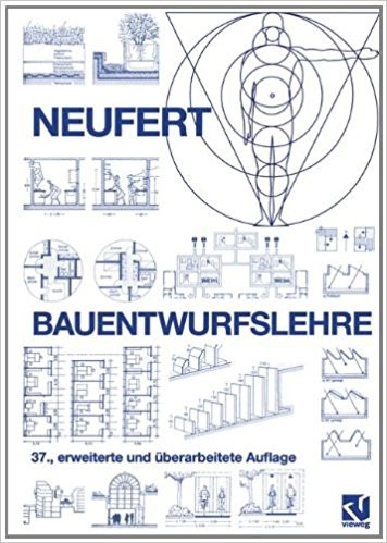 Unlike Speer, Neufert was never accused of collaboration with the Nazis or convicted of any wrongdoing. Technically, he did not actively participate in the Nazi war machine, and there is no record of party membership. [5] For Neufert, it was as if the whole episode never happened. After the war, he simply resumed his career as professor of architecture at Darmstadt University, and was appointed emeritus professor in 1965.  StandardizationNeufert's involvement in the standardization of architectural dimensions and building practices, for which he is best known, started in 1926, when he began teaching at the Staatliche Bauhochschule in Weimar. Here, a compulsory module for new students was Schnellentwerfen (fast design), which allowed a very limited time to develop architectural solutions to a given brief. The academic catalog from 1929 described the class: Schnellentwerfen (fast design), which allowed a very limited time to develop architectural solutions to a given brief. The academic catalog from 1929 described the class:
To make the exercise as efficient as possible—this was, after all, mass higher education—students were provided with the exact same drafting tools. Neufert even insisted that the studio's desks, documents, and storage systems conform to the Deutsches Institut für Normung (DIN) 476 standard. [7] The DIN 476 standard is better known through the A series of paper formats. Released in 1922 and set out by German engineer Walter Porstmann, the system is based on the metric system (an A0 sheet has a surface area of 1 square meter), with fixed proportions (1:√2). These standard paper sizes allowed for increased efficiency in publishing and were first championed by the German War Ministry during World War I. [8] Neufert explicitly acknowledged the influence of the DIN 476 standards on his work, in his book's opening pages: "Standard [paper] formats constitute the basis for the dimensions of furniture used for writing and record keeping. These are also constitutive of the dimensions of spaces. Exact knowledge of standard [paper] formats is important for the builder." [9[ Neufert's obsessive belief in standard systems even affected his book; unusually, it is the size of an A4 sheet of paper, making production inexpensive and the book easy to store and carry. Furthermore, the book engages with the notion of Existenzminimum, variously describing methods of achieving efficient spatial planning and the use of movable, collapsing furniture, such as the Pullman bed.[10] The first edition of the book, published in March 1936, sold out in a matter of weeks. The Book and the Method The publication of Architect's Data in 1936 was the high point of Neufert's long, uninterrupted career. Its German title, Bauentwurfslehre, translates literally as "teachings on building design," more forceful than the neutral Architect's Data. The work is simultaneously a handbook, a textbook, and a reference; it is a didactic treatise rather than a mere repository of data. An equivalent of sorts, the Metric Handbook, was published in 1968 for a British readership and according to United Kingdom standards, and has sold about 100,000 copies. [11] Possibly this was the impetus for the English-language edition of Neufert's tome, released only in 1970. Neufert's first edition is divided into five sections: Arbeitsvorbereitung (Preparatory work), Entwurf (Design), Bauliche Einzelheiten (Construction details), Gestaltung und Bemessung der Umgebung, der Räume und Einrichtungen (Giving shape and dimension to the environment, spaces, and domestic furnishings), and Gebäudekunde (Building types). The book includes organizational diagrams, recommended minimum measurements for spaces, exact measurements of standard-sized furnishings, and treatises on standard building typologies such as dwellings (high-rise and low-rise), factories, schools, and office buildings. [12] The 2015 German edition runs to 594 pages.  In 1943 Neufert published a second book, Bauordnungslehre, on behalf of Speer, who, in addition to being Hitler's court architect, was by this time his minister of armaments and war production. Often regarded as a sequel to Bauentwurfslehre, it adopts a more urgent tone toward standardization and rationalization, as critical to total war. Speer wrote:
Neufert himself wrote:
Although adoption of his ideas was progressing slowly, by the sixth edition of Introduction to DIN Standards, Neufert was given a full two and a half pages to discuss his e orts to standardize architecture. [14] He was already exploring new applications of his standardizing principles.  BricksDuring the war, Neufert began to focus on one of the humblest building components: the brick. Like the A-series format for paper, Neufert's ideal brick was based on the metric system: one meter should contain eight bricks, so Neufert named his principle "the Octametric system." Neufert's brick sizes were all multiples of 12.5 centimeters, one-eighth of a meter. "The logical clarity of these brick measurements will help ease difficulties associated with its implementation in annexed countries." [15] Neufert published his recommendations on Octametric bricks in 1941, a date that suggests sinister motives behind the obsessive drive for standardization. Not only did Hitler and Speer need to rebuild German cities quickly to keep up morale, but a standardized building system was also essential because forced laborers, prisoners, and volunteers had no prior experience in building, and the first two groups were suspected of sabotage and perhaps 30 to 40 percent less productive due to malnutrition, disease, and torture. Furthermore, with prison and slave labor hailing from all lands occupied by the Reich, a standardized building system would eliminate much miscommunication. [16] Neufert hoped that a standard grid of 12.5 centimeters could be set for all architects and builders, in effect standardizing design itself. From 1941 the SS adopted Neufert's Octametric system in Poland and some of its furniture-production facilities. [17] Neufert wrote, "If a building is planned according to the Octametric system, the contractor only needs an Octametric levelling rod in order to organize the entire building, the axial distances, windows, doors, posts, and partitions, on a rapid and mistake-free basis." [18] Neufert, however exhilarated he might have been by success, was not above self-correction. In the 1944 version of Bauentwurfslehre—in a process similar to Le Corbusier's in developing his Modular Man—he retroactively amended measurements relating to the human body to suit his newly developed system of proportions. For instance, the ideal shoulder height was raised from 143 to 150 centimeters even though he kept the height of the human body itself at 175 centimeters. [19] After the war, the dubious political origin of Neufert's brick system posed no barrier to its adoption. In 1950 his Octametric system became an official DIN standard called "Dimensional Coordination in Building Construction," DIN 4172, which led to the prescription of standard-sized windows, doors, kitchens, bathrooms, and even ceiling heights. In 1952 DIN 152, the updated version, was enshrined in West German law: state subsidies for public housing would be extended only to builders who followed the norm. East Germany followed suit a few years later. The norms were so influential that even a few years after reunification, the only bricks available in Germany adhered to Neufert's Octametric system. [20]  The Importance of Being ErnstErnst Neufert worked toward standardization regardless of circumstances or regimes. His work was tied to no political ideology, save for its absolute devotion to the efficiency of industry. He kept a wide network of collabora- tors throughout his life. His e orts were apolitical and, to some extent, amoral: he was a man who accepted work on plans to resettle the Aryan population in the newly conquered Eastern Europe, and a technocrat who would later argue for standardizing building and the design industry as a whole during the early years of West Germany's Wirtschaftswunder. Tellingly, one product of his Octametric system was the Z-Möbel, a mail-order furnishing system developed by a Bavarian wood-carver, Alfred Oskar Zwink (together with prisoners from the Dachau concentration camp), using Neufert's spatial diktat. The cupboards were quite vernacular in style but could be assembled without any knowledge of carpentry. To Neufert, this proved his standards did not impose stylistic or ideological paradigms on those who followed them. [21] This was a man who, over the course of his life, associated with the likes of Gropius, Antoni Gaudí, and Frank Lloyd Wright, as well as Albert Speer. It would seem, for the rational-above-all Ernst Neufert, that the end really did justify the means. The 1970s: The World Falls Out with Modularity For Neufert, the modular system was as much about construction as about redefining spatial realities, whether they were idealized or derived from reality. British prime minister Harold Macmillan even described modular coordination as "a way of drawing Britain and the rest of Europe closer together." The European Productivity Agency studied modular systems in 1954, and the United Nations published detailed reports extolling their advantages in 1962 and 1966. [22] But by the 1970s, with the "death of modern architecture" in the cards, modularity had fallen from grace as a practicality, a mere building "method" for housing the dispossessed or the aspirational upper-middle class. Walter's Way was such an endeavor: an experimental and self-built private housing development in South London, initiated in the 1980s by Walter Segal. [23] Back in 1964, another Walter—Walter Gropius, founder of the Bauhaus—had anticipated this rejection of modular building techniques:
Neufert died in 1986 at the age of eighty-five, simply of old age, having lived roughly a decade longer than the average life expectancy at the time. Only in death did Neufert defy the norm. But even there, maybe he didn't: his age exactly doubled the life expectancy of 1900, the year he was born. The total length of his life constitutes a perfect multiple—almost like the system of standard paper sizes he promoted. A firm bearing his name, Neufert Consulting GmbH, in the village of Bergisch Gladbach just outside Cologne, carries on his work. In addition to producing updates of Architect's Data, the company consults on human resources, organizational structures, and information technology infrastructure. [25] Neufert is everywhere.
 Four Walls and a Roof: The Complex Nature of a Simple Profession Notes
This posting includes an audio/video/photo media file: Download Now |
| Da Vinci-Inspired Wooden Pedestrian Bridge Can Hold 500 Kilograms Without Using Any Fixings Posted: 29 Oct 2017 11:00 PM PDT  Cortesía de Departamento de Arquitectura de la Universidad Técnica Federico Santa María Cortesía de Departamento de Arquitectura de la Universidad Técnica Federico Santa María Inspired by Leonardo da Vinci's self-supporting bridge, architect Diego Poblete has developed a structure that can be assembled in less than 15 minutes and, according to his study, can support up to 500 kilograms. Focusing on the issue of connectivity in rural towns, Poblete developed a wooden system that is assembled without using a single screw, optimizing the use of the resource and facilitating easy construction:
The project was born from Poblete's thesis project as a pedestrian walkway and is based on a modular design that could be repeated to cover larger stretches. Its main advantage is the fact that it uses no nails or screws, using digitally-manufactured traditional carpentry joints.  Cortesía de Departamento de Arquitectura de la Universidad Técnica Federico Santa María Cortesía de Departamento de Arquitectura de la Universidad Técnica Federico Santa María Text description provided by the architects. The Department of Architecture of the Federico Santa María Technical University offers 6 types of degrees. Research + Development (I+D) is one of the areas of specialization within the Department of Architecture. In Wood Week 2017, we present the Research + Development (I+D) thesis work of Diego Poblete, within the specialist area of computation, which was completed in January 2017. The design is a prototype pedestrian walkway 4 meters long, without intermediate supports and without fittings, entirely machined in wood by a KUKA KR125/2 industrial robot.  Cortesía de Departamento de Arquitectura de la Universidad Técnica Federico Santa María Cortesía de Departamento de Arquitectura de la Universidad Técnica Federico Santa María .jpg?1505312507 "Cortesía de Departamento de Arquitectura de la Universidad Técnica Federico Santa María") Cortesía de Departamento de Arquitectura de la Universidad Técnica Federico Santa María Cortesía de Departamento de Arquitectura de la Universidad Técnica Federico Santa María The prototype, manufactured by Diego Poblete and Professor Francisco Quitral (Architect) at the Integrated Center for Manufacturing and Automation (CIMA) of our University, is inspired by a self-supporting bridge whose invention is attributed to Leonardo da Vinci.  Cortesía de Departamento de Arquitectura de la Universidad Técnica Federico Santa María Cortesía de Departamento de Arquitectura de la Universidad Técnica Federico Santa María The principle of structural reciprocity on which the original design is based was complemented by the design and machining of trapezoidal dovetail joints, to avoid displacement of the structural members. The prototype corresponds to one of multiple possible instances of a parametric model that automatically associates its geometry and the machining paths necessary for its manufacture in wood with an industrial robot.  Cortesía de Departamento de Arquitectura de la Universidad Técnica Federico Santa María Cortesía de Departamento de Arquitectura de la Universidad Técnica Federico Santa María The bridge model applies the fundamentals of Variational Design in the production stage, bridging the gap between design and production. This posting includes an audio/video/photo media file: Download Now |

| You are subscribed to email updates from ArchDaily. To stop receiving these emails, you may unsubscribe now. | Email delivery powered by Google |
| Google Inc., 1600 Amphitheatre Parkway, Mountain View, CA 94043, United States | |
Nema komentara:
Objavi komentar