Arch Daily |
- Sports Center Csomád / Kolossa Architects
- House in Kobylanka / Anna Thurow
- BAITAcinema / BaO Architects
- Courtyard House at the foot of the Great Wall / IAPA Design Consultants
- Autumn Art Breeze at Sejong Art Center / Boundaries architects
- College Football Hall of Fame / Tvsdesign
- AZPML + DFN Win Competition for Rippling Bridge in Bellinzona, Switzerland
- Aesop Mile End / NatureHumaine
- Vincent Callebaut Architectures' Double Helix Eco-Tower Takes Shape in Taiwan
- House in Rua da Torrinha / Sofia Granjo Arquitetos
- Beautifully-Designed, Downloadable Bauhaus Architecture Books
- Enclave at the Cathedral / Handel Architects
- Interview with WOHA: “The Only Way to Preserve Nature is to Integrate it into Our Built Environment”
- Hydraulic and Electrical Installations / DATA
- 10 Awesome Sketchup Plugins That Will Up Your Modeling Game (Explained With GIFs)
- Finnish Architect Juhani Pallasmaa Refuses to Support Guggenheim Helsinki Project
- These Space-Saving Home Elevators are Vacuum Powered
- Specus Corallii / Antonino Cardillo
| Sports Center Csomád / Kolossa Architects Posted: 25 Nov 2016 09:00 PM PST  © Tamás Bujnovszky © Tamás Bujnovszky
 © Tamás Bujnovszky © Tamás Bujnovszky From the architect. The Sports Center is located in Csomád, Hungary. Csomád is a small settlement in the northern metropolitan area of Budapest with the population of ca. 1500 people. The leadership of the village is dedicated toward architectural quality: in 2008 they won 2nd prize on Pest County's Architectural Award, and in 2015 they won the special award for village renewal of the Association of Hungarian Architects (Magyar Építőművészek Szövetsége)!  © Tamás Bujnovszky © Tamás Bujnovszky The Sports Center is the first phase of the local sport area development. The building was placed between the two existing football pitches. The 2nd phase future extension will be placed alongside the bigger football field, hidden partially under the hillside. Phase one is designed to perform as a balanced architectural element on its own, yet the two phases are also going to provide a nice composition. The thin, concrete slab serving as a "levitating" outdoor bridge connecting the two phases is built already in phase one lending a somewhat dynamic touch to the otherwise closed shape of the Sports Center.  1st Floor Plan 1st Floor Plan  2nd Floor Plan 2nd Floor Plan The geometry of the building evolved a lot through the design process. In the end it "found" its place and shape interacting sensitively with the site and its urban function.  © Tamás Bujnovszky © Tamás Bujnovszky The ground floor contains a pub and the restrooms while the changing rooms and the spaces of the football club are on the first floor. The ground floor is open to visitors and the two floors can be used separately.  Sections Sections Due to its dynamic, simple design, the new building stands out among the pitched roof residential buildings of its surroundings. Small gestures and detailing like the special blue color used many places throughout the building which is typical to the village, or the abstract reappearance of the inner yard of traditional local houses however make locals recognize the Sports Center as their own, and they seem to take pride in showing it to all the guests of various sports and village events.  © Tamás Bujnovszky © Tamás Bujnovszky Product Description. The white plaster is the principal material used on the façade and emphasizes the simple and dynamic form of the new Sports Center in Csomád, Hungary. The white plaster facade gives a characteristic, modern look to the Sport Centre among the residential houses and the green landscape in the village. Moreover plaster is one of simplest facade materials and easy to maintain.  © Tamás Bujnovszky © Tamás Bujnovszky This posting includes an audio/video/photo media file: Download Now |
| House in Kobylanka / Anna Thurow Posted: 25 Nov 2016 06:00 PM PST  © Bartłomiej Bieliński © Bartłomiej Bieliński
 © Bartłomiej Bieliński © Bartłomiej Bieliński In close vincinity of Szczecin, in Kobylanka there is one house, differing from the "typical" suburban cityscape. Designed by architect's couple Anna and Krzysztof Paszkowski-Thurow resembles immediately a picture of modern barn. Compact and energy-saving house is exploring archetype of typical polish countryside architecutre yet Anna and Krzysztof have merged it with innovation by using modern material and colour settings like dark-grey fibre cement slates as facade and roof cladding. On the contrary gable walls were plastered in white. Southern wall has a dynamic cut-out which forms roofed sundeck. Bold silhouette of the building makes a strong statement: there is a border between contemporary and "typical" architecture.  © Bartłomiej Bieliński © Bartłomiej Bieliński This house was a comission from a young couple and although it may not seem obvious, this is a family friendly "barn". To proove that, there is a clear distiction between day, working and resting zones both for parents and yougsters. There is also a double height living room interconnected with common space on the 1st floor, allowing for good communication among the house.  Ground Floor Ground Floor  First Floor First Floor When designing interiors of this house, Anna has referred to the character of the owners, their job as landscape developers and their numerous travels. Therefore all surfaces in the house might be characterised as rough and natural. Floor is paved with open-pore travertine and white-oiled oak planks. Kitchen is open integrated with the dining room. Spine of the building is created by centrally located staircase housing also storage area underneath, finished with white-oiled oak. Modern bathroom was designed in black emperador marble inspired by turkish-bath look, resembling distant eastern voyages of owners.  © Bartłomiej Bieliński © Bartłomiej Bieliński Anna and Krzysztof are architects, graduated from Szczecin's Technical University and Copenhagen School of Design and Technology. Their style is underpinned by a subtle play of clean lines and natural materials as well as love for nordic internal warmth and order. They are often referring to Oskar Hansen's saying: "We're treating architecture as a backgroung exposing life's processes, not like a majority of architects, understanding it (architecture) as a thing itself - composed and described"  © Bartłomiej Bieliński © Bartłomiej Bieliński Product Description. Creaton STRUKTONIT fibre cement slates enables homogenous covering for modern buildings. Due to its positive environmental characteristics it can achieve an A+ rating in the BRE Green Guide* providing extra credits under BREEAM Schemes. It is not only the environmental benefits that make Creaton STRUKTONIT fibre cement slates an attractive option for those specifying slate or cladding. This product was developed with the architect in mind and offer the opportunity to produce innovative and imaginative designs either as vertical cladding or slate roof pitches as low as 15°. Unlike other materials, fibre cement slates do not require wet-cutting due to the composition and workability of the material.  © Bartłomiej Bieliński © Bartłomiej Bieliński This posting includes an audio/video/photo media file: Download Now |
| Posted: 25 Nov 2016 02:00 PM PST  © BaO Architects © BaO Architects
 © BaO Architects © BaO Architects The BAITAcinema is an ephemeral activation of a small courtyard located in the historical Baitasi district in Beijing. Realized for the Beijing Design Week 2016, the project is in fact the first step in a longer-term strategy that BaO architects is undertaking with the French Embassy in China to transform this courtyard into a permanent cultural space for collective and shared actions.  Floor Plan Floor Plan The core gesture of the project was the construction of a wooden amphitheater within the existing layout of the house. Invading both outdoor and indoor spaces and entirely transforming the visitor's experience of the place, the installation purposely provokes its vernacular host and creates accidental encounters or spatial events between the new and the old. It opens up a new range of usages, postures and potentials in a space that was considered a straightforward traditional residential space.  © BaO Architects © BaO Architects BaO's architectural intervention focused on the desire and the possibility to create a spatial event that would enable a socio-political one. In essence, the amphitheater proposed to create a space that is traditionally associated with public life, community space, and civic gathering, within a setting that epitomizes domesticity and the intimacy of the Chinese family life. This cadavre exquis approach was a conscious architectural tactic to trigger an optimistic and progressive outlook on the opportunities of Beijing's Hutongs' renewal. It is uninhibited in its design, celebrates the possibilities of smallness, and is bold in its attitude toward its historical setting. It tries to break away from conventional and somewhat too polite approaches to historical district regeneration that is unfortunately too often associated with cultural pride and nostalgia.  © BaO Architects © BaO Architects The project and its associated "open-door policy" created a ambiguity between private public space that was intended as a way to signal the coming creation of a public-oriented program in the heart of the neighborhood. It was designed as an open cultural platform, a flexible artifact, an infrastructure that enables gatherings and celebrates collective actions. The ambition of the pop-up BAITAcinema was to create moments of encounter and shared pleasure where the hutongs community and the design week visitors alike can relax, watch a movie together, attend and participate in a variety of discussion on the city, assist to performances and artistic happenings, and participate in creative workshops.  © BaO Architects © BaO Architects The BAITAcinema program ran successfully for 2 consecutive weeks with a screening program intermingling old Chinese movies, documentaries, silent movies, children cinema, lectures, talks, workshops, and a special Sino-French Environment Month documentaries selection. BaO architects, alongside the French Embassy, local authorities, and the local community, will work on the formulation of the long-term project for the courtyard during this winter with the intention to start construction in the spring 2017.  © BaO Architects © BaO Architects  Render Render  © BaO Architects © BaO Architects This posting includes an audio/video/photo media file: Download Now |
| Courtyard House at the foot of the Great Wall / IAPA Design Consultants Posted: 25 Nov 2016 12:00 PM PST  © ZENG Zhe © ZENG Zhe
 © ZENG Zhe © ZENG Zhe From the architect. Courtyard houses are a famous type of historic residence mostly found in Beijing. Courtyards used to be essential living spaces for Beijing locals. "A house, a courtyard, a story" is the design theme used throughout the project. This theme inspired the project design and through the design process, traditional Chinese architecture was reinterpreted. The design aims to attach a different feeling to each courthouse through manipulating space, layout and building materials. Each courtyard house evokes a different emotion, ranging from calmness and tranquility to vitality and energy. The designs will inspire and uplift the guests, bringing them closer to nature. At the Courtyard House you can let your imagination run wild and find what you truly wish for in life.  3D Model 3D Model Product Description. The modularity of the Composite panel allowed for fast and flexible construction. The Composite panel also has good thermal properties. The panels incorporated with stone texture paint created an aged look which blends in harmoniously with the natural landscape.  © ZENG Zhe © ZENG Zhe This posting includes an audio/video/photo media file: Download Now |
| Autumn Art Breeze at Sejong Art Center / Boundaries architects Posted: 25 Nov 2016 11:00 AM PST  © Hwang Hyo Chel © Hwang Hyo Chel
 © Hwang Hyo Chel © Hwang Hyo Chel The project was a work for dual purpose. One is a movable concert stage for midday concerts sponsored by the Sejong Arts Center, and the other is an installation at Yein-madang.  Elevation Elevation  Elevation Elevation  View View We intend to expose power and heat generated by performances. Irregular trapezoid shapes make frames outside and wires weaves into each relation between those trapezoid shapes as a double helix like shape.  © Hwang Hyo Chel © Hwang Hyo Chel The wave of wires from breezes that can not be captured in sight becomes music touching our eyes.  © Hwang Hyo Chel © Hwang Hyo Chel  Detail Detail  © Hwang Hyo Chel © Hwang Hyo Chel This posting includes an audio/video/photo media file: Download Now |
| College Football Hall of Fame / Tvsdesign Posted: 25 Nov 2016 09:00 AM PST  © Shawn Brasfield © Shawn Brasfield
 © Shawn Brasfield © Shawn Brasfield Where Legends Play Located adjacent to Atlanta's Centennial Olympic Park, the College Football Hall of Fame is an architecture icon. Perched on a custom-formed concrete "Y" column, the rotunda sits atop the entrance and in front of the lobby, providing views into and out of the Hall. Inside, upper level exhibit spaces wrap around a ground floor field. This field acts as an organizing element for the interior of the facility and is available both for interactive play and special events. This 94,000 sf facility includes exhibit space, the field/ballroom, and retail plus restaurant space along the street edge.  © Shawn Brasfield © Shawn Brasfield  Plan 1 Plan 1  © Shawn Brasfield © Shawn Brasfield  Plan 2 Plan 2  © Shawn Brasfield © Shawn Brasfield This posting includes an audio/video/photo media file: Download Now |
| AZPML + DFN Win Competition for Rippling Bridge in Bellinzona, Switzerland Posted: 25 Nov 2016 08:00 AM PST  Spring Perspective. Image Courtesy of AZPML Spring Perspective. Image Courtesy of AZPML The team of AZPML + DFN has won a competition for the design of the Passerella Ex-Torretta, a new bridge spanning the Ticino River in Bellinzona, Switzerland. The bridge will connect two existing medieval structures, the Torretta tower to the west of the river and medieval arcades on the eastern bank, and will provide a gradual 6% slope to allow for pedestrian and bicycle access.  Summer Perspective. Image Courtesy of AZPML Summer Perspective. Image Courtesy of AZPML The bridge design draws inspiration from the "organic geometry of the waves" in the river, employing an undulating sinusoidal structure to retain a respectful and graceful profile. "Our project aims to respect and enhance the natural beauty of the fluvial context of the Ticino River. Our intention has been not only to minimize the visual impact of the bridge in the natural landscape, but also to create a visual resonance with the meanders and the ripples of the moving water surface of the Ticino River," said the architects in a press release.  Shape Diagram. Image Courtesy of AZPML Shape Diagram. Image Courtesy of AZPML  Elevation 1-250. Image Courtesy of AZPML Elevation 1-250. Image Courtesy of AZPML The bridge was shaped through 3 contextual conditions. First, its position between and respect for the two existing medieval structures. Secondly, to place structural supports to minimize the transfer of loads to preexisting structures. And thirdly, for the bridge structure to react to the varying conditions pedestrians will experience as they pass over the river.  Views. Image Courtesy of AZPML Views. Image Courtesy of AZPML  Geometry Relations. Image Courtesy of AZPML Geometry Relations. Image Courtesy of AZPML The structure is located below the deck at points where enhancement of the connection to the surrounding context is desired, such as in the center of the river, and located above the deck where the environment is more aggressive, when the bridge reaches the canopy height of the trees along the bank. "The design of the bridge is defined according to the structural behavior as well as the experience of the pedestrians, alternating along its trajectory between an integrative and protective structural section," explain the architects.  Views. Image Courtesy of AZPML Views. Image Courtesy of AZPML The budget for the project is estimated to reach €4.5 millions. A timetable for construction has not yet been released. News via AZPML.  Winter Perspective. Image Courtesy of AZPML Winter Perspective. Image Courtesy of AZPML
This posting includes an audio/video/photo media file: Download Now |
| Aesop Mile End / NatureHumaine Posted: 25 Nov 2016 07:00 AM PST  © Adrien Williams © Adrien Williams
 © Adrien Williams © Adrien Williams The design of the Aesop store in the Mile End portrays in simple ways, the underlying theme of movement found through the heritage of the neighborhood. From the 1880's to the 1980's, different waves of immigrants settle in this neighbourhood as described by the documentary of Montreal filmmaker Albert Kish "Our Street was paved with gold".  © Adrien Williams © Adrien Williams  Floor Plan Floor Plan  © Adrien Williams © Adrien Williams The design of this Aesop store presents itself as a common, but deconstructed, structure. The store appears to be stripped to the bare bones, showing its structural "guts". As visitors glimpse into the storefront, they are confronted at first with a familiar raw palette of materials – plaster, plywood, limestone, brass, and reclaimed wood.  © Adrien Williams © Adrien Williams  © Adrien Williams © Adrien Williams  © Adrien Williams © Adrien Williams A monolithic demonstration sink, covered in local limestone stands as a visual anchor in the middle of the store compelling visitors to move around it in order to explore the nuances and elements of the walls. The recognizable stud wall is transformed into a plywood structure that unfolds its colors with the motion of its visitors. In front of the ever-changing colors of the walls, the amber glass bottles are placed on thin brass shelves appear to float as they seem to be timeless.  © Adrien Williams © Adrien Williams This posting includes an audio/video/photo media file: Download Now |
| Vincent Callebaut Architectures' Double Helix Eco-Tower Takes Shape in Taiwan Posted: 25 Nov 2016 06:00 AM PST  Courtesy of Vincent Callebaut Architectures Courtesy of Vincent Callebaut Architectures Vincent Callebaut Architectures has released in-progress images of their Tao Zhu Yin Yuan sustainable tower, under construction in the Xinjin District of Taipei City, Taiwan. The tower's rotating form draws inspiration from the double helix structure of DNA and will be covered in 23,000 trees in its aim to become a pioneering sustainable residential eco-construction that finds "the right symbiosis between the human being and the Nature."  Courtesy of Vincent Callebaut Architectures Courtesy of Vincent Callebaut Architectures After being awarded the project commission in a 2010 competition, Vincent Callebaut Architectures set out to create a building "like an inhabited tree" that could create a fragment of vertical landscape with minimal energy consumption. The design consists of a 20-story tower that completes a 90 degree twist as it rises – a 4.5 degree turn per level. This form was chosen based on four criteria:  Courtesy of Vincent Callebaut Architectures Courtesy of Vincent Callebaut Architectures  Courtesy of Vincent Callebaut Architectures Courtesy of Vincent Callebaut Architectures to integrate into the pyramidal profile of the building volume determined by urban setbacks; to generate a maximum area for cascading, suspended open-air gardens; to offer panoramic views of the Taipei skyline to all residents; and to provide each apartment unit with privacy by avoiding direct visual axes.  Courtesy of Vincent Callebaut Architectures Courtesy of Vincent Callebaut Architectures  Courtesy of Vincent Callebaut Architectures Courtesy of Vincent Callebaut Architectures The tower has also been eco-designed to take advantage of the climatic and environmental conditions of its site. VCA conducted sunlight, thermal and wind analyses to fine tune the design, optimizing natural light and ventilation throughout the building. In addition, the large planted areas will allow the building to absorb 130 tons of carbon dioxide from the air annually.  Courtesy of Vincent Callebaut Architectures Courtesy of Vincent Callebaut Architectures  Courtesy of Vincent Callebaut Architectures Courtesy of Vincent Callebaut Architectures The central core of the building features a double skin curtain wall system, that enables passive climate control for the vertical circulation and inner spaces. Other environmental features include a rainwater recycling system, low e-glass, a photovoltaic solar array on the roof and canopies, energy-saving lifts and automated energy saving monitors that adapt to climatic conditions.  Courtesy of Vincent Callebaut Architectures Courtesy of Vincent Callebaut Architectures Floorplans of the units follow two typical layouts on alternating floors, so to best fit into the virendeel beam structure. Each unit contains 550 square meters of column free floorspace, allowing for maximum flexibility of the interior layouts. Additional amenities will include a swimming pool and fitness center, and several levels of integrated parking.  Courtesy of Vincent Callebaut Architectures Courtesy of Vincent Callebaut Architectures The Tao Zhu Yin Yuan is expected to be completed in September 2017. You can learn more about this project, here. News via Vincent Callebaut Architectures.  Courtesy of Vincent Callebaut Architectures Courtesy of Vincent Callebaut Architectures  Courtesy of Vincent Callebaut Architectures Courtesy of Vincent Callebaut Architectures
This posting includes an audio/video/photo media file: Download Now |
| House in Rua da Torrinha / Sofia Granjo Arquitetos Posted: 25 Nov 2016 05:00 AM PST  © A Caixa Negra © A Caixa Negra
 © A Caixa Negra © A Caixa Negra The intervention was aimed to keep the preexistent use of the building – single housing -, seeking to improve its dwelling, salubrity, comfort and security conditions. On a conceptual level, the project is based on the rehabilitation of the existent house, developed in order to balance the infrastructural needs of a modern home with the delicacy of a centenary construction.  © A Caixa Negra © A Caixa Negra  Section Section  © A Caixa Negra © A Caixa Negra However, when confronted with new spatial and functional necessities, it takes a different approach, clearly distinguishing itself from the pre-existence, not only in its shape and also by its materiality.  © A Caixa Negra © A Caixa Negra It's our understanding that, by exploring this relation, we are able to find meaning and a framework that allow the contemporary dwelling of historical buildings.  © A Caixa Negra © A Caixa Negra This posting includes an audio/video/photo media file: Download Now |
| Beautifully-Designed, Downloadable Bauhaus Architecture Books Posted: 25 Nov 2016 04:00 AM PST
Last year Monoskop delighted the architecture and art community by making many of the Bauhaus publications available to freely download. As a perennial fan of all types of architecture communication, I had previously written about the exceptional qualities of Bauhaus-produced books and journals and how these visual teaching tools ultimately influenced more recent, canonical publications. Below we share an edited excerpt from "Architects' Books: Le Corbusier and The Bauhaus," a chapter from the larger research project, Redefining The Monograph: The Publications of OMA and Rem Koolhaas. To access Monoskop's treasure trove, which includes titles by visionaries such as Walter Gropius, László Moholy-Nagy, Wassily Kandinsky, Paul Klee, and others, visit Monoskop's Bauhaus archive. As the Bauhaus operated in a generally experimental and revolutionary status, the information taught was not unified in any particularly accessible form. The Bauhausbücher were produced in order to expose the elements of the Bauhaus education to the original, small student body. These books later proved invaluable when the school was closed by the National Socialist Government in 1933, their contents holding authentic records of Bauhaus education. Merging theory and practice, the books, designed by Moholy-Nagy, are a testament to his creative ideas. He saw traditional forms of information dissemination as supplying information to students without stressing the relevance and relationship to the world in which they were living. His books sought to clarify these relationships through stimulating images and insightful (though at times lengthy and ethereal) text.  Much of Moholy-Nagy's work drew influence from the futurist poets, Dadaists and the Russian Constructivists. Their use of imaginative expression embodied the idea of a unified experience of textual media with visual communication. In these avant-garde works, harsh diagonals and bold text suggest the style of contemporaneous advertisements. The futurist emphasis on youth, speed and technology reflected the changes that the Bauhaus sought to incorporate into its style. Futurist typography communicated movement and captured dynamic thought processes. Whereas earlier prominent book designers, like William Morris, saw mass-production, typesetting and standardization as a detriment to the quality of publications, others embraced the new technology as an opportunity to take the art of book making to a more technological level. In his discussion of the "new typography" Moholy-Nagy explains,
Dull or low-quality typography was avoided through the use of devices such as position, size and pictorial composition. The Dadaists and futurists ascribed to these methods, abandoning traditional horizontal typesets. Moholy-Nagy warned however, that typological shorthand easily loses meaning and becomes merely decorative; thus it was important to understand the fundamentals of typography. He lauded the modernist magazines and advertisements for achieving the right blend of simultaneous action with refined organization. , Internationale Architektur, 1925. Image via Monoskop") 1. Walter Gropius (ed.), Internationale Architektur, 1925. Image via Monoskop 1. Walter Gropius (ed.), Internationale Architektur, 1925. Image via Monoskop In his book Bauhaus, Modernism and the Illustrated Book, Alan Bartram suggests that the Bauhaus indeed operated with the language of advertising. Stationery, posters and the Bauhausbücher all exhibited the "aggressive" Bauhaus style and typography. This provocative style, however, was not necessarily always accessible or easy to read. In many of his books, Moholy-Nagy used strange notations and dismissed the convention of using indents to mark new paragraphs. As futurist poetry demonstrated, however, the "expressive presentation of content" the Bauhaus artists held so important did not always result in clear communication.  L. Moholy-Nagy, Malerei, Fotografie, Film, 2nd ed., 1927. Image via Monoskop L. Moholy-Nagy, Malerei, Fotografie, Film, 2nd ed., 1927. Image via Monoskop The trademarks of the "Bauhauserie" include heavy rules, large numbers and headings, shapes (arrows, circles and squares) and vertically or angled typesets. While the main text of the books did not always follow these trademarks, some of the illustrations in the books, particularly charts, display this dynamic aesthetic. These books are meant to be picked up, opened to an arbitrary page and flipped-through. The inclusion of many photographs leaves the text as secondary to the image. In Moholy-Nagy's book Malerei, Fotografie, Film (Painting, Photography and Film), he explained that unlike traditional books (in which illustrations supplement texts) the text in his book supplemented the image. This is striking, but yet understandable. The Bauhaus designers maintained that the connections made visually between images in a book, or what one experiences in quotidian life are more important than the text that illuminates it. The purpose was not to instruct what to see, but how to process that which is seen. The new concept of space developed by the Bauhaus was not limited to three-dimensional built space. Moholy-Nagy and other important teachers in the school played with traditional page layouts and created new designs that manipulated and challenged established conventions of book design. Emphasizing the visual qualities of a page, the books edify through textual content as well as through the principles of design expressed in the layout. The publications put forth by the Bauhaus reflected a revitalized take on the collaboration between the visual and built arts. In von material zu architektur and later in Vision in Motion, Moholy-Nagy incorporated photography, literature, poetry and other forms of art to create a novel design teaching tool. Whereas books in the traditional sense are carefully read for their textual content, art and architecture readers will scan and look, arrested by things that are literally (and figuratively) bold. The importance of the images is underscored by the general weakness of the Bauhausbüchermain body texts. At times lofty and repetitive, the passages occasionally act merely as filler. When these books are read critically however, it is apparent that they are true works of complete art. The deliberateness with which they were designed is the ultimate testament to the design principles contained within. Pushing the limits of book design, Moholy-Nagy and his contemporaries set the stage for the publication of the elaborate, intricate architecture books which Koolhaas brought to the mainstream. This posting includes an audio/video/photo media file: Download Now |
| Enclave at the Cathedral / Handel Architects Posted: 25 Nov 2016 03:00 AM PST  © Bruce Damonte © Bruce Damonte
 © Bruce Damonte © Bruce Damonte From the architect. The Enclave at the Cathedral is a new residential development located on the property of Manhattan's Cathedral of St. John the Divine. The Cathedral and its surrounding gardens and buildings form an 11.3-acre campus collectively referred to as "The Close." The new residences sit on the site that formerly housed stone sheds used by skilled masons to cut the granite used to construct the Cathedral. Given the proximity of the new building to the Cathedral, the siting, massing, and design of the building were critical. In response, the building is set back on all sides, providing a continuous border of landscape and an extension of The Cathedral Close to the street edge. The building is stepped to open views of the Cathedral's North Tower at Amsterdam Avenue, and a new landscaped plaza is created at the intersection of West 113th Street. The fifteen-story building is separated into two volumes along its 113th Street frontage, opening views of the Cathedral's Transept, and a new grand stair provides access to the Cathedral's nave. The carving of the building's corners and setbacks allows multiple interior views of the Cathedral, as well as to Morningside Park to the northeast.  © Bruce Damonte © Bruce Damonte The Enclave's façade is composed of a series of different shaped cast-in-place structural concrete ribs, derived from the transformation of the Cathedral's buttresses. The depth of the ribs varies along West 113th Street, creating an articulated façade that changes as one moves around the building. When viewed obliquely, the ribs obscure the glazing and unify as a building face. At the top of the building, the concrete ribs taper and separate from the glass façade, mimicking the Cathedral's buttresses. At the bottom, this same tapering increases the size of the landscape border.  © Bruce Damonte © Bruce Damonte  © Bruce Damonte © Bruce Damonte The hand-chiseled concrete of the stepped Amsterdam Avenue façade recalls the work that once took place on the site and presents a quiet deferential expression to the Cathedral. Along Morningside Drive, the solidity of the building disappears, and becomes an abstract form of glass, contained within a delicate concrete frame.  Elevation Elevation Inside, the entrance lobby connects the eastern and western portions of the building by way of a sky-lit gallery below the new transept stairs. The gallery and amenity spaces open to an outdoor terrace overlooking the park. The building interiors follow the material expression of the exterior and contain 430 apartment homes.  © Bruce Damonte © Bruce Damonte Product Description. The formwork was a created with plywood faced with a high-density plastic overlay creating a smooth finish to accentuate the undulating facade. The concrete mix, from Casino Concrete, was a slag/cement mix (no fly ash) with a 40% slag content in order to lighten the color as much as possible to appear more like limestone in the context of the Cathedral. The West facades were hand chipped by a mason. The top surfaces of the exposed perimeter beams were protected from weather by coating the top surface with a polymer membrane matching the concrete color and texture.  © Bruce Damonte © Bruce Damonte This posting includes an audio/video/photo media file: Download Now |
| Interview with WOHA: “The Only Way to Preserve Nature is to Integrate it into Our Built Environment” Posted: 25 Nov 2016 01:30 AM PST  PARKROYAL on Pickering, Singapore. Image © Patrick Bingham-Hall PARKROYAL on Pickering, Singapore. Image © Patrick Bingham-Hall Driven by the hyper-density of the city-state from which they operate, WOHA have emerged as Singapore's quintessential architects. Combining a locally-specific approach to climate control and spatial planning with an international approach to form and materials, their work holds lessons that can be instructive to architects in all climates. In this interview, the latest in his "City of Ideas" column, Vladimir Belogolovsky speaks to WOHA founders Wong Mun Summ and Richard Hassell about their environmental approach and the future of our global cities.  Newton Suites, Singapore. Image © Patrick Bingham-Hall Newton Suites, Singapore. Image © Patrick Bingham-Hall Vladimir Belogolovsky: How did you two meet and what was it that attracted you to each other? Wong Mun Summ: I graduated from the National University of Singapore in 1989 and Richard graduated from the University of Western Australia in Perth the same year. There was a recession at the time in Australia so he came to Singapore to look for work. Richard Hassell: Asia was a natural place to go to, as it was the early days of the Asian economic bubble and construction was booming. When it burst, suddenly, no one could sell their properties. That's when design became very important for developers. Before that, they could sell anything off the plan. After, the attention shifted from the exuberance of form-making to aiming at providing quality living and smart economical solutions. We started with small projects, mainly houses.  Newton Suites, Singapore. Image © Patrick Bingham-Hall Newton Suites, Singapore. Image © Patrick Bingham-Hall VB: Your work can be identified as green architecture. Was it intended as a conscious direction from the beginning? WMS: Yes. As far back as at our universities, we both studied environmental design with a focus on passive, energy efficient buildings. RH: The dean at my school was an environmental scientist, not an architect. We had many professors who came out of the energy crisis, so they were environmentally conscious. It was in the 1980s when architects started embracing such slogans as "greed is good." WMS: Then came the form-making contest among architects and out of that, star architecture evolved. But our training was more based on being conscious about the environment and that's what formed our design strategies. Introducing landscaping and greenery, and creating social spaces within our buildings became the backbone and key features of our work.  SkyVille@Dawson, Singapore. Image © Patrick Bingham-Hall SkyVille@Dawson, Singapore. Image © Patrick Bingham-Hall VB: One of your exhibitions was called Breathing Architecture. Is this the key principle of your work—to create buildings that breathe? RH: Absolutely. That exhibit was held in Germany where they are required by regulation to design buildings that are entirely sealed from nature and provide very controlled environments. But for us it was important to demonstrate the alternative of porous and perforated buildings, because in the tropics the difference between comfort and something that's very uncomfortable is just a matter of air movement. Sealing a building means consuming a great deal of energy to create comfort. WMS: So for us, shaping and forming buildings is all about finding the best ways for providing breezes and air movement. Air should be constantly moving across spaces within buildings.  PARKROYAL on Pickering, Singapore. Image © Patrick Bingham-Hall PARKROYAL on Pickering, Singapore. Image © Patrick Bingham-Hall VB: Another one of your shows was called Exotic More or Less. RH: That was also in Germany where our work was paired with W Architects, also from Singapore. The combined show was called Exotic More or Less, within that our section was titled WOHA More on Less. We demonstrated how to achieve more comfort with fewer resources for high-density living in the environment, which is viewed as exotic in Germany and "More on Less" of course, is a play on Miesian phrase "Less is More."  PARKROYAL on Pickering, Singapore. Image © Patrick Bingham-Hall PARKROYAL on Pickering, Singapore. Image © Patrick Bingham-Hall VB: Would you say there is such a thing as Singapore architecture? WMS: There is a broad repertoire of what architects are pursuing in architecture but it is very recognizable, yes. RH: The local climate is a very powerful influence for Singapore architects. If you don't provide cross ventilation the environment may be unbearable, so a common set of forms and strategies have evolved for this particular reason. VB: Can climate alone produce distinctive architecture? What about Kuala Lumpur? Climatically it is right next to Singapore, but its architecture is not as distinctive. WMS: Yes, the climate there is very similar but in Singapore, we push the boundaries a lot more. RH: Also Singapore is constrained by its size while Malaysia has a lot of land. Kuala Lumpur has an option to spread horizontally, whereas we can only grow upwards. Real estate prices in Singapore are much higher and that pushes up the construction budgets we work with, which gives us more opportunities to innovate with form and materials.  Duxton Plain Housing Competition, Singapore. Image © WOHA Duxton Plain Housing Competition, Singapore. Image © WOHA VB: Was there a particular project for you that could be called as your defining moment? In other words, was there a project that would make you realize—aha, now this is the right direction for us? WMS: It was a competition project called Duxton Plain Public Housing International Competition held in Singapore in 2001 organized by the Urban Redevelopment Authority. We didn't win it but it presented an opportunity for us to experiment with many of the design strategies we operate with today. The project became very instrumental for us, but at the time, conservative building codes would not allow such a project to be built, so we did not win that competition. But years later, in 2015, we built our SkyVille@Dawson public housing project also in Singapore, which is based on those initial ideas. The project consists of twelve 47-story towers. They are placed to form three diamond-shaped interconnected atriums spanned by public sky terraces that effectively multiply the ground level.  SkyVille@Dawson, Singapore. Image © Patrick Bingham-Hall SkyVille@Dawson, Singapore. Image © Patrick Bingham-Hall VB: Where do you derive your inspiration from? RH: We are interested in many things. Many inspirations come from outside of architecture. We are interested in traditional arts and crafts such as textiles and weaving. That informs us about how to design our facades and other form-defining components. We are also inspired by landscapes... WMS: Almost everything and nothing specific. What we are really driven by, being in Singapore, a land-limited place, is that we are forced to think about high density. That is the most important driving force for us.  Oasia Hotel Downtown, Singapore. Image © Patrick Bingham-Hall Oasia Hotel Downtown, Singapore. Image © Patrick Bingham-Hall VB: And what do you think about the work of such pioneering green architects as Emilio Ambasz? WMS: Sure, we went to school at the time when Ambasz was most influential and so buildings buried under the landscape were quite an influence on us. VB: What words would you use to describe your architecture? RH: Generous. WMS: Responsible. RH: Delightful. WMS: Sensuous. RH: And if you go deeper into our work, there are many connections to Asian visual culture, arts and crafts. WMS: And also the scale. Many of our projects are quite big, on the scale of megastructures, but we always address the issue of how to humanize our buildings, so people can relate to them.  PARKROYAL on Pickering, Singapore. Image © Patrick Bingham-Hall PARKROYAL on Pickering, Singapore. Image © Patrick Bingham-Hall VB: What is the main intention of your work? RH: Our intention is to be good in the broadest sense—good for the planet, good for the city, good for the people. WMS: And good for the developer. [Laughs.] The more people are satisfied the better. It is important to achieve certain outcomes that are objectively good for everybody. VB: How would you describe this moment in architecture? Are we going through a crisis and would you say green architecture is a trend of philosophy? RH: I wouldn't say architecture is in crisis. Perhaps the world is in crisis and architecture responds to that. We are for sure in transition from having our focus on formal innovation in the last fifteen years.  PARKROYAL on Pickering, Singapore. Image © Patrick Bingham-Hall PARKROYAL on Pickering, Singapore. Image © Patrick Bingham-Hall VB: Are you interested in formal innovation yourselves? WMS: That's part of architecture! We don't want to give up on that. Architecture is about form making. But we think there is a lot more to it. We need to be making more than just interesting shapes. VB: Singapore evokes vertical possibilities with horizontal connections in midair. How do you see your city's future? WMS: Singapore is an island city and a nation. It can't get bigger. We need to work on making it denser in the most exiting way. We are an example for other cities not to get too large and to grow responsively ecologically. RH: With our students, we explore ideas about how future cities can be entirely self-sufficient within city limits and not rely on enormous suburbs and hinterlands. So we are developing strategies to limit the ecological footprint of megacities to their actual physical size—and finding out the limits to density.  Oasia Hotel Downtown, Singapore. Image © Patrick Bingham-Hall Oasia Hotel Downtown, Singapore. Image © Patrick Bingham-Hall VB: When you design your high-rises shooting up into the sky, such as your recently completed permeable Oasia Downtown tower in the heart of Singapore, do you imagine these structures one day becoming a singular megastructure holding pedestrian bridges connecting to neighboring towers? WMS: We hope so. VB: So these towers, in a way, serve as bridges into the future, right? WMS: That is the whole point. We try to instigate with our projects ideas about the potentials for our cities in the future. Someday the future will offer cities that are much more connected. Cities will be truly three-dimensional.  SkyVille@Dawson, Singapore. Image © Patrick Bingham-Hall SkyVille@Dawson, Singapore. Image © Patrick Bingham-Hall VB: So the ideas of futuristic megacities from the 1960s may be revisited. WMS: Sure. But in the past the focus was on machine looking aesthetics, whereas now the goal is to make our cities more livable. RH: We aim at merging the megacity project from the past with the idea of a garden city for the future. We want our cities to be cozy, comfortable, natural, and domestic. WMS: Our ideal is to create a comfortable garden suburb experience and then replicate it vertically through a megastructure for everyone to enjoy.  Newton Suites, Singapore. Image © Patrick Bingham-Hall Newton Suites, Singapore. Image © Patrick Bingham-Hall VB: Are you aiming at achieving your own voice in architecture? RH: We feel we have a voice, even though it may not be distinctive stylistically as some formalistic architects have achieved. Our projects may not look 100% consistent stylistically, but our strategic ideas and philosophy of what is critical and valuable all have become our signature. We are erasing boundaries between architecture and landscape. The beliefs that man is separate from nature and cities are separate from countryside are obsolete. In the Anthropocene era, the whole world is a managed landscape. The only way to preserve nature is to integrate it into our built environment. It is supercritical.  SkyVille@Dawson, Singapore. Image © Patrick Bingham-Hall SkyVille@Dawson, Singapore. Image © Patrick Bingham-Hall VLADIMIR BELOGOLOVSKY is the founder of the New York-based non-profit Curatorial Project. Trained as an architect at Cooper Union in New York, he has written five books, including Conversations with Architects in the Age of Celebrity (DOM, 2015), Harry Seidler: LIFEWORK (Rizzoli, 2014), and Soviet Modernism: 1955-1985 (TATLIN, 2010). Among his numerous exhibitions: Anthony Ames: Object-Type Landscapes at Casa Curutchet, La Plata, Argentina (2015); Colombia: Transformed (American Tour, 2013-15); Harry Seidler: Painting Toward Architecture (world tour since 2012); and Chess Game for Russian Pavilion at the 11th Venice Architecture Biennale (2008). Belogolovsky is the American correspondent for Berlin-based architectural journal SPEECH and he has lectured at universities and museums in more than 20 countries. Belogolovsky's column, City of Ideas, introduces ArchDaily's readers to his latest and ongoing conversations with the most innovative architects from around the world. These intimate discussions are a part of the curator's upcoming exhibition with the same title which premiered at the University of Sydney in June 2016. The City of Ideas exhibition will travel to venues around the world to explore ever-evolving content and design. This posting includes an audio/video/photo media file: Download Now |
| Hydraulic and Electrical Installations / DATA Posted: 25 Nov 2016 01:00 AM PST  © Javier Callejas © Javier Callejas
 © Javier Callejas © Javier Callejas From the architect. The house's existing structure was in impeccable condition and DATA had merely to give it a good sand blasting to refresh the brickwork and canopy. The inside however was to undergo a complete makeover to thwart the constraints of a relatively small floor space of 120 m2. It reinvented the volume of the building while keeping its proportions. It had good head room but to change the volume while maintaining the proportions was a key aim. DATA gutted the building to create a three floors (ground, first and mezzanine) exhibition space. The main room has been separated o by a wall to screen the stairwell, bathrooms, storage and technical rooms.  © Javier Callejas © Javier Callejas In the main space, a large cylindrical structure which combines the transparency of glass with the lightness of the metal, solves the main challenge of the project: freeing the ground floor as much as possible, inviting visitors to mount the stairs to the upper floors by offering a light and airy set design. Composed of curved glass walls to a height of 5m on a metal structure, the cylinder enjoys an additional exhibition level while it is also doted with a 50 m2 mezzanine, carried by the retaining wall. Suspended from the underside of the sphere is the flagship component of the exhibition space of the Semapa: thanks to a pulley the model appears and disappears into the heights of the cylinder in a matter of minutes freeing the floor for other events like presentations and inaugurations. This architectural device has the double merit of adding scale instead and maintaining an important scenography without cluttering an already reduced space.  © Javier Callejas © Javier Callejas  Axonometric Axonometric  © Javier Callejas © Javier Callejas Anticipating the uses of the director's house, more than a set design, Semapa will actually deliver a useful building. A genuine workspace, a workshop and meeting place, a base from which the urban project will spring. Despite the cylinder which concentrates the place's technology and is supported by large PRS type beams and braced by metal rods to the wall, the space remains in effect raw and open to multiple uses. The existing openings have been retained and set o by large windows, orchestrating the transparency of the building from the Seine as from the School of Architecture, which just happens to be facing it.  Section Section Having also won a further prize for the scenography of the place, the agency is developing a series of seven themed routes to follow through the neighborhood. Heritage; Crossings; Neighborhoods today; City on the Move; Innovation and sustainable development; Urban Arts and General public. The exhibition also presents two films: an overview of the Parisian left bank, and several interviews on characteristical topics concerning the neighborhood.  © Javier Callejas © Javier Callejas This posting includes an audio/video/photo media file: Download Now |
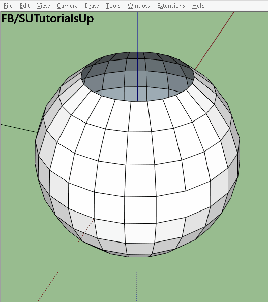
| 10 Awesome Sketchup Plugins That Will Up Your Modeling Game (Explained With GIFs) Posted: 25 Nov 2016 12:00 AM PST  © Wikipedia user: Takuro1202, bajo licencia CC BY-SA 3.0 © Wikipedia user: Takuro1202, bajo licencia CC BY-SA 3.0 After the success of its 6th edition in 2007, Sketchup became one of the world's most widely used 3D modeling software products. This is thanks to its intuitive toolbar, interdisciplinary use within the creative industry (not just architects) and having a free version that doesn't use watermarks. Its open source library helped the software to provide a wide range of 3D objects, while hundreds of users developed their own plugins not only to solve the problems of each version but also to exploit the potential of their tools. We’re going to introduce you to 10 of the plugins shared by Sketchup Tutorials Facebook page using their demonstrative GIFs. If you don’t know how to add a SketchUp plugin, don’t worry! You can learn in this video also posted by them. Multipe Offsets v4
Created by Sam D Mitch, this plugin creates multiple offsets of selected surfaces in a model. Angular Dimension
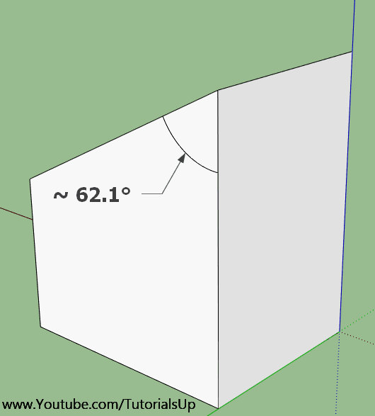
It seems so basic that it’s surprising this wasn’t already included with Sketchup, but someone actually took the time to program a plugin to fix it. Developed by the user SLBaumgartner, this plugin allows you to calculate and draw angles on the surface of a volume. Chain Along Path
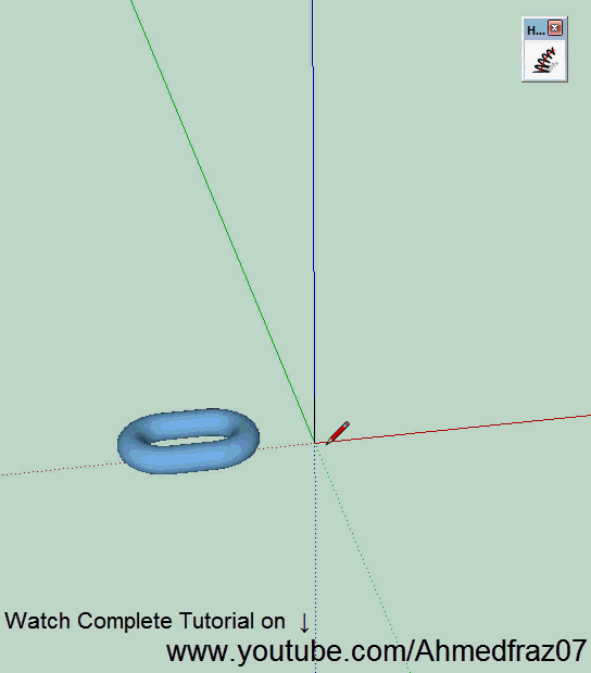
Created by 3dalbertsoft, this plugin allows you to create a helical turbine by selecting a curve and a predefined shape in SketchUp. A dialog window lets you choose numerous parameters to create the final shape. We think it is quite useful to define seams, seals, springs, tensioners and cables. And there’s a YouTube tutorial! LSS Matrix
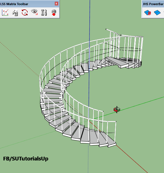
Created by Kirill B, LSS Matrix allows you to create a sequence of chained components by simply updating the parent block. As the GIF accompanying this description demonstrates, you can create a spiral staircase by creating a block with two steps and then choosing the number of copies. You can learn how in 2 minutes with this tutorial on Youtube. Quad Face ToolCreated by ThomThom, this plugin solves one of Sketchup's major shortcomings: its trouble working with non-flat quad surfaces. With Quad Face Tool we create figures with continuous edges as topographies or, as we see in the GIF that accompanies this description, give a much more real surface to a helmet that was originally reticulated. Yes, there is a Youtube tutorial! Location
In 2012, Google sold Sketchup to Trimble Navigation. Although this case is not a plugin, it is a good example of the positive synergy Sketchup achieved with Google: the "Location" tool allows you to choose the satellite image of the place your project is going to end up by entering an exact address in Google Maps. Then, with a click, you can replicate the actual topography of that location. Very useful. Sketchy FFD
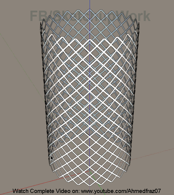
Created by CPhillips, this plugin allows you to create an invisible control cage around an object. What does that mean? It is a mesh defined by a series of control points in its vertices and edges that let you manipulate the dimensions of a selected object. The GIF that accompanies this description uses the example of a diagrid mesh transformed into a bowl by adjusting the lower points or into a vase if you adjust the upper points. Highly recommended tutorial here. Components
Created by Chris Fullmer, this plugin allows you to replicate a component onto a surface. As in previous cases, when editing the base component, the rest are automatically updated. Highly recommended for designing parameterized façades. Camer Tools
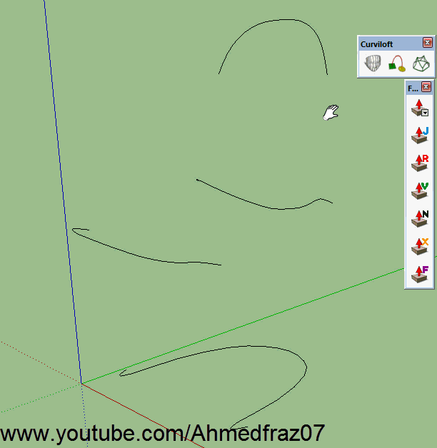
Another one by ThomThom, this plugin offers a series of new cameras for your projects’ animations. Curviloft
Created by Fredo6, this plugin generates parameterized volumes when selecting a series of curves on a 3D model. Once created, it offers nine different possibilities, including the possibility to redefine its final thickness. Very useful for designing furniture. This posting includes an audio/video/photo media file: Download Now |
| Finnish Architect Juhani Pallasmaa Refuses to Support Guggenheim Helsinki Project Posted: 24 Nov 2016 11:10 PM PST  Moreau Kusunoki's 'Art in the City' Proposal for Guggenheim Helsinki. Image © Moreau Kusunoki Architectes / Guggenheim Moreau Kusunoki's 'Art in the City' Proposal for Guggenheim Helsinki. Image © Moreau Kusunoki Architectes / Guggenheim In a comment to the Architects' Journal, Finnish architect Juhani Pallasmaa has expressed concern over the Guggenheim's plans to build a bew museum in the city of Helsinki.
Pallasmaa's criticism follows a recent suggestion by Finnish Member of Parliament and architect Anders Adlercreutz, alongside British architecture critic Jonathan Glancey, that a second competition should be held for a new design on a different site. They have said that Moreau Kusunoki Architects' winning proposal is the "wrong building for the wrong site," reports the AJ. See Pallasmaa's comment in full and learn more about the Guggenheim Helsinki ordeal at the Architects' Journal. This posting includes an audio/video/photo media file: Download Now |
| These Space-Saving Home Elevators are Vacuum Powered Posted: 24 Nov 2016 10:00 PM PST Pneumatic Vacuum Elevators, LLC has created a series of air-powered, space-saving, "plug & play" elevators designed to be easily installed into home environments. Ranging from a single-passenger to a three-passenger, wheelchair accessible model, the elevators—called Pneumatic Vacuum Elevators (PVE)—are self-supporting, and do not require equipment rooms or other additional spaces above or below the shaft. Similarly, the elevators are completely enclosed and are not built into the framework of the home around them, and thus it can easily be relocated.  Courtesy of Pneumatic Vacuum Elevators, LLC Courtesy of Pneumatic Vacuum Elevators, LLC During a PVE ride, air pressure is used to lift and gently lower the cabin using only about zero to 4.7 kilowatts of electricity, for descent and ascent, respectively. According to the manufacturers, PVE machines have very few moving parts and do not require lubrication, so they only require maintenance about once every four to five years or 15,000 rides.  Courtesy of Pneumatic Vacuum Elevators, LLC Courtesy of Pneumatic Vacuum Elevators, LLC Learn more about Pneumatic Vacuum Elevators here. News via: Pneumatic Vacuum Elevators, LLC. This posting includes an audio/video/photo media file: Download Now |
| Specus Corallii / Antonino Cardillo Posted: 24 Nov 2016 09:00 PM PST  © Antonino Cardillo © Antonino Cardillo
 © Antonino Cardillo © Antonino Cardillo The Coral Cave is a refuge from the world. A grotto where love can still happen. The place where the city regains its sacral dimension that binds those who were to those who are.  © Antonino Cardillo © Antonino Cardillo The Coral Cave explores a Pre-Modern idea: when architecture was imagination and the city was the labyrinth of memory. That labyrinth renewed every day with the caresses of our eyes; that speaks to us, mutedly, of lives lived. The image is the place where the dead speak to the living. Where it confirms the idea of life as permanence and tradition. Without this silent dialogue, the city dies; entertainment and alienation take over neutralizing the subversive potential of love.  Plan Plan The Coral Cave speaks of the sacred that comes from the sea. The cadence of space recounts the allegories of beauty and metamorphosis imaged from shells evoked by the sediments of the stone base, and corals, to whose willowy asperities alludes the pink asperity of the perpendicular vault. Shells and corals populate the imagery of the town of Trapani. The story of the arrival of the Madonna from the sea and the carved stones of her sanctuary reveal how, along with the tradition of corals, the theme of the shell is a fundamental myth of the sacredness of the city. The colour and tactile surfaces of the Specus rediscover the sensuality of the stone and dust that speak of the place and the bowels of the earth where they were carved. Thus the Coral Cave, with its evocation of a mysterious underwater dimension, relates that consciousness which, from the sea, has sedimented for millennia the sense of the life of the city and its landscape.  © Antonino Cardillo © Antonino Cardillo The Coral Cave looks like an antique oratory. The classic configuration of its architecture, a rectangle governed by the 'silver ratio', makes it available for different uses and interpretations; preventing the dominance of function and technology, always casual and transitory pretexts for architecture, from bringing about the obsolescence of the work. (Antonino Cardillo)  © Antonino Cardillo © Antonino Cardillo This posting includes an audio/video/photo media file: Download Now |


| You are subscribed to email updates from ArchDaily. To stop receiving these emails, you may unsubscribe now. | Email delivery powered by Google |
| Google Inc., 1600 Amphitheatre Parkway, Mountain View, CA 94043, United States | |
Nema komentara:
Objavi komentar