Arch Daily |
- Jolimont / NOMOS
- Highlights at the 2016 Dutch Design Week Center on Reinventing the Humble Brick
- House in Estoril Beach / José Adrião Arquitectos
- Gazeta.ru News Agency Office / Nefa Architects
- Liuzhou Suiseki Hall / TianJin University Research Institute
- Never Built New York at LIVE from the NYPL
- EN-House / Meguro Architecture Laboratory
- On Ne Sait Jamais + Felt series / Nameless Architecture
- Ruyton Girls' School / Woods Bagot
- Richard Meier & Partners Unveils Milestone Black-Glass Residential Tower for New York City
- Toproof Apartment / Atelier Data
- Turned House / MZC Plus
- Trimble's SketchUp Viewer Allows You To Manipulate Hologram Models in the Real World
- 6 Shortlisted Designs Unveiled in London’s Illuminated River Competition
- Pennovation Center / HWKN + KSS architects
- Take a Look Inside VIA 57 West with Photographs by Danica O. Kus
- 21 Careers You Can Pursue With A Degree in Architecture
- Villa Muurame / Marco Casagrande
- Pierre Koenig’s Historic Case Study House #21 Could Be Yours... for the Right Price
- KWK Promes Selected to Extend Bunker of Arts Contemporary Art Gallery in Poland
| Posted: 07 Nov 2016 09:00 PM PST  © Miguel de Guzmám © Miguel de Guzmám
 © Miguel de Guzmám © Miguel de Guzmám From the architect. The building is located on the higher grounds of Geneva's Mervelet neighbourhood. At the heart of a rapidly changing residential area, the site has the remains of a garden-city with scattered century-old houses and trees.  © Miguel de Guzmám © Miguel de Guzmám Depending on use and context, the outside skin of the building can have several expressive overlays. It reacts like a sensitive interface between inhabitants and their perceived and lived environment. Facing south and west, the alternate assembly of prefabricated concrete modules creates the structure of an inhabited hive.  © Miguel de Guzmám © Miguel de Guzmám  7th Floor 7th Floor  © Miguel de Guzmám © Miguel de Guzmám On the loggias, stainless steel railings lean forward and rotate gradually. The create a curved lining that is perceived differently depending on daylight and location. This arrangement offers both intimacy and transparency.  © Miguel de Guzmám © Miguel de Guzmám The rough combination of building materials continues in common areas; a polished concrete slab on the floor, walls covered with cement and iron for the stairs' railings. The oakwood used for the handrail and entrance doors creates a domestic and nostalgic feeling when entering the apartments.  © Miguel de Guzmám © Miguel de Guzmám Inside the apartments, the large hallway allows views across the day and night areas, and creates a space with multiple uses. In the rooms, alternating high and low windows define the volume. Living rooms with fullwidth glazed windows continue onto loggias. These exterior living quarters project themselves towards the surrounding trees and scenery.  Section Section These typologies and arrangements provide the dwellings with the distinctive attributes of a family house surrounded by a garden. In doing so, the 63 public utility housing units are designed as a Building-Villa.  © Miguel de Guzmám © Miguel de Guzmám This posting includes an audio/video/photo media file: Download Now |
| Highlights at the 2016 Dutch Design Week Center on Reinventing the Humble Brick Posted: 07 Nov 2016 08:00 PM PST  © Nick Bookelar © Nick Bookelar The strength of Dutch Design Week (DDW), held annually at the end of October, lies primarily in product design. Although the event has expanded over the past five years to incorporate more fashion, graphics and architecture, small-scale industrial design has retained its preeminence. Many of the designers on show in this year's edition, however, have embraced the challenges of other design disciplines and allowed them to feed into their work. But where does product design meet architecture? Building materials and, most notably at the 2016 event, some really nice bricks. Rotterdam-based architect Alison Killing guides us through her top installations.  UpcyclingA number of designers across DDW have been working on ways to put industrial waste to constructive use. Often the result of their research is to have the relevant waste product—be it rotten fruit, broken glass, worn out leather or fragments of stone—crushed down and compressed into, you've guessed it, bricks. What may at first appear reductive nevertheless involves a complex research and design process in order to ensure that the material binds correctly, is able to bear the loads required for its use in construction, and is also aesthetically attractive. Of the many projects which have travelled this track, two projects stand out. Thomas Missé's From Ash at the Design Academy Eindhoven graduation show takes a large number of the by-products from a coal power plant—fly and bottom ash, water vapour, heat, and the portion of electricity which is wasted without making it to the grid—to create a "geopolymer," a hard, ceramic-like material, as well as a small number of bricks which incorporate a shiny, black, coal-like aggregate.  Courtesy of Dutch Design Week. Image © Nick Bookelar Courtesy of Dutch Design Week. Image © Nick Bookelar Tom van Soest is a graduate of the Design Academy and is showing at DDW as part of the Young Designer section of the Dutch Design Awards. His graduation work, from 2012, is also a study of transforming waste products into bricks – this time, waste from the construction industry. It is a strength of the Academy that many of their students go on to develop their thesis work into industrial products for sale and van Soest is far from the only designer at DDW showing professional work that was initially developed during their study days. In the past four years van Soest has worked with the industry in developing the bricks to meet the technical standards for new build construction in The Netherlands, and to create a company—"Stonecycling"—that can produce them at scale. On display is one of the company's designs, incorporating crushed glass to produce a wall with a shimmering, silvery surface.  Courtesy of Dutch Design Week. Image © Cleo Goossens Courtesy of Dutch Design Week. Image © Cleo Goossens Bricks of the FutureOver at the Klokgebouw, students from Amsterdam's Academie van Bouwkunst have displayed their designs for the bricks of the future. Producing bricks is both energy and material intensive, so the students have spent the past three months working with three brick manufacturers from across The Netherlands, experimenting with substitute materials and shapes that require less energy to make. The resulting forms—zigzags, crosses, and lozenges—also produce interesting textural effects as they are stacked into walls.  © Nick Bookelar © Nick Bookelar Best in ShowThe best brick on show however, goes to Rotterdam-based practice MVRDV, and the solid glass block that they developed for Chanel's Amsterdam storefront together with the Technical University at Delft, ABT and Poesia. The brick is part of the Product section of the Dutch Design Awards, on show here as an object in its own right rather than simply one element, albeit a notable one, in a wider architecture project. They're displayed, unglued, in a low wall through which light can refract and where, since they're unfixed, they can be handled by visitors. Heavier than they initially appear, smoothly polished, and with rounded corners they come across as an unlikely construction material – they lack the rough edges and appearance of toughness you would typically expect. They look instead like really expensive paperweights, and yet they are also able to meet the stringent demands of being the main structural element in a load bearing facade. MVRDV's larger claim for them—that creating buildings with transparent glass walls will transform architecture and our cities—didn't stack up in the early 20th Century, and almost certainly doesn't stack up now. That said the bricks that they have created are an impressive aesthetic and technical achievement.  Courtesy of Dutch Design Week. Image © Nick Bookelar Courtesy of Dutch Design Week. Image © Nick Bookelar The strength of Dutch Design Week lies in the close links between the work of design schools and the younger designers who are driven primarily by the exploration of concepts, alongside wider industry, whose main interest is in presenting goods for sale. Dutch Design Week 2016 ran from the 22nd to the 30th October. This posting includes an audio/video/photo media file: Download Now |
| House in Estoril Beach / José Adrião Arquitectos Posted: 07 Nov 2016 07:00 PM PST  © Nuno Almendra © Nuno Almendra
From the architect. The detached houses at Praia do Estoril are located in a privileged area in Sal-Rei, Boavista Island, Cape Verde. The location is excellent due to the great proximity to the city centre – within a few minutes walking distance –and the direct access to the magnificent beach and the dunes of Praia do Estoril.  Model Model The residential project consists of 18 detached houses, creating a small residential area located in the middle of an alley connecting the houses directly to the seafront promenade of Sal Rei and to the beach.  © Nuno Almendra © Nuno Almendra The units have two or three bedrooms and a courtyard. The walls surrounding the courtyards provide a private and intimate atmosphere, as well as a protection from the wind and the sand from the beach.  © Nuno Almendra © Nuno Almendra Each unit has two floors. The common areas are located on the ground floor, with a spacious kitchen and living room area. The living rooms, depending on the type of house, open directly to one or two porches that create a relation between the interior of the house and the outside area. The window's framework and its deep opening allow an almost complete connection with the exterior, reinforcing this relation. The porch along the house is an exterior lounge area with shade, protecting the interior of the house from the direct sunlight and the occasional rain.  © Nuno Almendra © Nuno Almendra In the upper floor, is the private area of the house, with the bedrooms and the two bathrooms. The bedrooms and the bathrooms open to a balcony, protected from direct sunlight, creating a relation with the surroundings and the sea.  © Nuno Almendra © Nuno Almendra The house's main yard has a garden area with local plants, that are easy to maintain, and a swimming pool.  Section Section The finishing of the houses is simple and informal. The paving is made of weak concrete, the walls and the ceilings are plastered and painted in white and the aluminium frameworks are lacquered in matt white. The concept of the house was designed to reflect the casual and relaxed living of a beach house.  © Nuno Almendra © Nuno Almendra This posting includes an audio/video/photo media file: Download Now |
| Gazeta.ru News Agency Office / Nefa Architects Posted: 07 Nov 2016 06:00 PM PST  © Ilya Ivanov © Ilya Ivanov
 © Ilya Ivanov © Ilya Ivanov From the architect. Gazeta.ru is one of the oldest news agencies in Russia. Owned by a large media holding Rambler&Co, the editorial office of Gazeta.ru was relocated to Danilovskaya Manufactura, a 19th century former manufacture building, to join other subdivisions of the media group.  © Ilya Ivanov © Ilya Ivanov Business goal. The challenge was to create a comfortable and multifunctional work space for a journalists' team that included areas for different activities - zones for concentrated work along with various meeting and social spaces.  Floor Plan Floor Plan  Floor Plan Floor Plan The editorial office of Gazeta.ru occupies the third and the fourth floors of a 4-storey building. Office accommodation comprises workspace areas for individuals and teams, meeting rooms, lounge-zones, mini coffee points as well as a kitchen-dining-room located on the 4th mansard floor.  © Ilya Ivanov © Ilya Ivanov Besides, employees can use a multifunctional hall equipped with most modern audio-visual equipment for conferences, lectures, meetings and presentations. Formally, the hall belongs to Chempionat.com – another subdivision of the media holding Rambler&Co - but both teams have it at their disposal.  © Ilya Ivanov © Ilya Ivanov The whole publication process is very fast so the speed of communications between different departments is extremely important. That`s why working desks are placed in an open space. The chief editor`s and his assistants` cabinets are located right in the middle of the editorial office for the convenience of communications and information transfer with all the departments of the news agency.  © Ilya Ivanov © Ilya Ivanov The portal`s reports cover a wide range of news: politics, style, auto news. Architects decided to show the scope of information the agency reported using only one color- White. Graphic black accents on the floors and windows create an image of a newspaper page or an information web-site.  © Ilya Ivanov © Ilya Ivanov The interior is made up mostly with custom furniture produced in local workshops according to the architects` sketches.  © Ilya Ivanov © Ilya Ivanov This posting includes an audio/video/photo media file: Download Now |
| Liuzhou Suiseki Hall / TianJin University Research Institute Posted: 07 Nov 2016 02:00 PM PST 
 From the architect. Fuzhou city in Guangxi province is a beautiful ancient town. Liujiang River washed out a island of dozens of square kilometers which shapes like a boat in Guangxi karst land, offers great views which is far more better than Guilin. Liuzhou Suiseki hall is located in the southeast of Deer hill park. Behind the Liuzhou Suiseki hall there are two mountains which one is lower and rounded and another is higher and steeper, the local people call them Mother red deer hill and Red deer eggs Hill,they stay harmony and contrast the characters of each other, called the masterpiece of nature gods.As a Perfect echo of the two hills,a prior architectural form was born with the right folded and the left curved.  On the architectural space and shape design, first, the rectangular plane is distorted in "X"and"Y" dimension into a parallelogram which is divided to 12 parts by "s" shaped curves, these 12 parts have self-similar characteristics. Second, after tearing the plane, the z axis entered. Each part is extruded vertical along a S shape, the movement of each part participate with the other parts and the macroeconomic effects.  Height become lower from the southwest to the northeast gently .At last, two different kind of force were exerted on the two end of this building , so at last, the building is curved in one elevation and linear in the opposite one, which is a rejection of water and mountain in nature landscape .  Sectional View Sectional View We have become accustomed to the way that round and rectangle cannot exist in one shape,but in this building Curves and straight lines are no longer in contrast like in Euclidean geometry, but become a Integrate under series of topological nonlinear transformation. I call it " manifold ", a movement variation from beginning to end and filled with two or more different forms in one body, the body is not a result but a process, a Continuous changes from linear to nonlinear geometric composition, with both topological and fractal characteristics.   Floor Plans Floor Plans  From the cultural point view of, in Chinese landscape culture, a mountain and a stream are not opposite , but a harmony worldview, philosophy and aesthetics view. Mountain and Flowing Water like "yin" and"yang" are the performance of all things ' two sides, is a unity of opposites and can transform into each other between the two. The heavy part is earth, while the light part is heaven. Such thought is not only an literal ideal of the Intellectuals, a comprehensive ancient people feel about nature, but also a phenomenon we can observe in nature. In karst landform, stone surface pattern under the impact of fast-flowing water will have manifold changes.  This is a special texture stone waterlines in the impact of years of water erosion, which I call the solidification of water. In other side, high temperatures will change stone into liquid form too. This special liquid under high temperature at the sudden change in temperature will also show the characteristics of the water, still filled with a sense of movement . Various changes described above belong to the topological fractal transform or change in the geometry.  The form of Liuzhou Suiseki hall is composed by a series of topological transformation and fractal geometry of self-similar and self-affine random variation,one elevation is composed by water-like curve while the other one is composed by rock-like poly line, but they look harmony in one building and perform a amazing view.According to the author's study, architecture and mathematics manifold are similar in geometry, different disciplines, different focus. The difference is that one is mathematics, one is aesthetics.  This posting includes an audio/video/photo media file: Download Now |
| Never Built New York at LIVE from the NYPL Posted: 07 Nov 2016 01:00 PM PST  Courtesy of Unknown Courtesy of Unknown Metropolis Books, LIVE from the NYPL + ARTBOOK | D.A.P. invite you to celebrate the publication of Never Built New York with a conversation between Daniel Libeskind, Elizabeth Diller, Steven Holl and Sam Lubell, moderated by Paul Holdengräber. Monday, November 14, 2016 | 7pm - 9pm It's hard to imagine a New York different from the one we know, but what would the city have been like if the ideas of some of the greatest architectural dreamers had made it beyond the drawing boards and into built form? The new book Never Built New York paints the picture of an alternative New York, with renderings, sketches, models, and stories of proposals for the city that never came to be. Internationally acclaimed architects Daniel Libeskind. Steven Holl and Elizabeth Diller along with the book's coauthor Sam Lubell come together to envision this alternate city. DANIEL LIBESKIND established his architectural studio in Berlin, Germany, in 1989 after winning the competition to build the Jewish Museum in Berlin. In February 2003, Studio Libeskind moved its headquarters to New York City when Daniel Libeskind was selected as the master planner for the World Trade Center redevelopment. Libeskind's practice is involved in designing and realizing a diverse array of urban, cultural and commercial projects internationally. The studio has completed projects that range from museums and concert halls to convention centers, university buildings, hotels, shopping centers and residential towers. As Principal Design Architect for Studio Libeskind , Libeskind speaks widely on the art of architecture in universities and professional summits. His architecture and ideas have been the subject of many articles and exhibitions, influencing the field of architecture and the development of cities and culture. He lives in New York with his wife and business partner, Nina Libeskind. ELIZABETH DILLER is a founding partner of Diller Scofidio + Renfro, an interdisciplinary design studio that works at the intersection of architecture, the visual arts and the performing arts. Diller and her partner, Ricardo Scofidio, were the first architects to receive the MacArthur Foundation's "genius" award. Founded in 1979, her studio established its identity through independent, theoretical and self-generated projects before reaching international prominence with projects such as the Institute of Contemporary Art, Boston, the renovation and expansion of Lincoln Center for the Performing Arts in New York, and the High Line on Manhattan's West Side. Recently completed projects include The Broad Museum in downtown Los Angeles and The Vagelos Education Center at Columbia University in New York City. Diller has been recognized by the Smithsonian Institution with the National Design Award; the National Academy of Design with a Lifetime Achievement Award; and the American Academy of the Arts and Letters with the Brunner Prize. She is a Fellow of the American Academy of Arts and Sciences and an International Fellow of the Royal Institute of British Architects. Diller graduated from the Cooper Union School of Architecture in 1979. She is a Professor of Architecture at Princeton University. STEVEN HOLL joined the Architectural Association in London in 1976 and established Steven Holl Architects in New York City. As founder and principal of Steven Holl Architects, Holl is the designer of all projects ongoing in the office. He is recognized for his ability to blend space and light with great contextual sensitivity and to utilize the unique qualities of each project to create a concept-driven design. He has received the 2014 Praemium Imperiale International Arts Award for Architecture, the 2012 AIA Gold Medal, the RIBA 2010 Jencks Award, and the first Arts Award of the BBVA Foundation Frontiers of Knowledge Awards (2009). He is a tenured Professor at Columbia University's Graduate School of Architecture and Planning, and has also taught at the University of Washington, the Pratt Institute, and the University of Pennsylvania. SAM LUBELL has written five other books about architecture: Never Built Los Angeles, Julius Shulman Los Angeles: The Birth of a Modern Metropolis, Paris 2000+, London 2000+ and Living West. He is a contract writer for Wired and has written for The New York Times, The Los Angeles Times, Los Angeles Magazine, New York Magazine, Architect, The Architect's Newspaper, Architectural Record, Architectural Review, Wallpaper*, Contract and other publications. He co-curated the A+D Architecture and Design Museum, Los Angeles, exhibition Never Built Los Angeles in 2013. He lives in New York City. A note to our patrons: LIVE from the NYPL programs begin promptly at 7p.m. We recommend arriving twenty minutes before the scheduled start time to get to your seats. In order to minimize disturbances to other audience members, we are unable to provide late seating.
This posting includes an audio/video/photo media file: Download Now |
| EN-House / Meguro Architecture Laboratory Posted: 07 Nov 2016 12:00 PM PST  © Koichi Torimura © Koichi Torimura
 © Koichi Torimura © Koichi Torimura From the architect. Meguro Architecture Laboratory has completed an experimental residence that can be opened out liberally onto the town by reducing construction through renovation.  © Koichi Torimura © Koichi Torimura 'En' in Japanese connects to the outside world from the occurrence of phenomena such as omens and fate and it is in this that there is significance that expresses the relationship in which change occurs. This expressed the structure and framework of the world with the word relationship. The 'en' in this residence is exactly this kind of place and is a platform for creating various lifestyle landscapes.  © Koichi Torimura © Koichi Torimura  Section Section  © Koichi Torimura © Koichi Torimura The grounds are in Teramachi and it is possible to feel the elegance of Edo from the townscape. However, in recent years many residences with high walls have been built facing on to the road and the residences and the town are detached from each other and have become closed off. The existing residence for which work was planned this time was surrounded by high walls in the same way and furthermore, it was necessary to backspace the south of the grounds by widening the front road as a legal requirement.  © Koichi Torimura © Koichi Torimura First of all, the structure was reduced to a skeleton then it was all updated to current earthquake-resistant standards by reinforcing the foundations and reinforcing weak earthquake resistance. While doing this, a sash was inserted after backspacing the existing exterior wall on the boundary facing the south road on the 1st floor by 910mm. The backspaced area was covered with wood decking and while this ensured an expansion of garden space, the interior and exterior boundaries were distanced from the road. The wood decking area is called ENGAWA and was determined as an interim area that connects the garden with the interior space. ENGAWA is an exterior location enveloped in calm due to the existing oblique exterior wall.  © Koichi Torimura © Koichi Torimura It has been made possible to convert the interior and exterior portions by installing an external blind in the original wall portion. Through these kinds of multi-layered relationships, even though the distance between the road and the building is now closer, the height of the line of sight can be controlled by the backspaced wall and the small garden has been transformed into a new space that connects the residence with the town.  Floor Plans Floor Plans The interior is a space in which you can experience the connection with the outside as is. A round atrium has been installed in the centre of the house in order to create a sense of unity between the upper and lower floors. (The pronunciation for 'round' in Japanese is also 'en'.) This gently cuts an arc for various lifestyle scenarios and creates new landscapes.  © Koichi Torimura © Koichi Torimura Beyond the small 2nd floor window that faces the atrium are the bedrooms and it is possible to make yourself heard in them from the 1st floor.  © Koichi Torimura © Koichi Torimura The large fixed fittings window in the gallery depicts the look of the sky on one side from the 1st floor kitchen past the atrium and when you ascend to the 2nd floor, the forest bursts in from beyond the town. In this way, people are connected with far away landscapes through buildings.  © Koichi Torimura © Koichi Torimura This posting includes an audio/video/photo media file: Download Now |
| On Ne Sait Jamais + Felt series / Nameless Architecture Posted: 07 Nov 2016 11:00 AM PST  © Kyung Roh © Kyung Roh
 © Kyung Roh © Kyung Roh Fabric  © Kyung Roh © Kyung Roh  Courtesy of Nameless Architecture Courtesy of Nameless Architecture  © Kyung Roh © Kyung Roh Stacking Fabric  © Kyung Roh © Kyung Roh Floating Fabric * The French expression 'On ne sait jamais' means 'You never know'.  © Kyung Roh © Kyung Roh  Floor Plan Floor Plan  © Kyung Roh © Kyung Roh This posting includes an audio/video/photo media file: Download Now |
| Ruyton Girls' School / Woods Bagot Posted: 07 Nov 2016 09:00 AM PST  © Michael Downes © Michael Downes
 © Michael Downes © Michael Downes From the architect. New campus building at Ruyton Girls' School has opened with architecture and interiors by Woods Bagot. Woods Bagot has designed a new education facility for one of Melbourne's preeminent girls schools, Ruyton Girls' School, transforming the site into a dynamic offering for students and staff.  © Michael Downes © Michael Downes The design sees a move away from traditional classroom planning framework where desks are lined in rows and a teacher educates from the front, to a model that prioritises natural light, flexible furniture and technology-enabled teaching and learning spaces for task-based, student-centred flexible learning.  Courtesy of Woods Bagot Courtesy of Woods Bagot Situated in the Melbourne suburb of Kew, Ruyton has a clear focus on personalised learning, an approach that exemplifies the shift towards student-centred learning where collaboration, creativity and critical thinking are all essential components.  Courtesy of Woods Bagot Courtesy of Woods Bagot "This project saw the existing Margaret McRae building demolished and a striking new facility erected in its place. The transformation has enabled additional amenity and application of best practice teaching and learning environments at the school.  Ground Floor Ground Floor Woods Bagot Principal and Design Leader Bruno Mendes said the crafted design brings the social agenda inside, with a variety of zones including a significant breakout space offering the ability to be used as a secondary learning space and enabling students to spill out of classrooms as needed. "With its fluid plan and organic form, the building subtly responds to the heritage Henty House built at the school in 1872. Sitting centrally within the school campus, the building embraces and celebrates the central gathering space for Ruyton students."  © Michael Downes © Michael Downes Comprising four levels including a basement, the building sits within the heart of the campus. The entry has been positioned on the western elevation, while the building footprint at ground level has been deliberately reduced in area to ensure the landscaped footprint is maximised for students. A complex sculptural form, there are two wings to the building. Circulation around the floorplate has been designed to be fluid, with the main circulation space highlighted by curtain walls that bring the flow of the breakout space of the main courtyard and link to a tennis court on the east side of the building.  1st Level 1st Level Timber veneer walls and bulkheads, timber joinery and blue stone flooring and carpets made of recycled fishnets, create a refined aesthetic finish. The colour palette has been intentionally pared back, with classrooms adding pops of blue in conjunction with the school colours.  © Peter Bennetts © Peter Bennetts The insertion of a new landscaped forecourt and external theatre along the south western frontage of the site was an important move in reinforcing the social agenda for the precinct as it aligned with the original masterplan also designed by Woods Bagot.  Courtesy of Woods Bagot Courtesy of Woods Bagot The western external performance area has been gently carved out of the building form with a timber clad soffit providing protection from the elements. The space serves a multitude of functions including a stage large enough to host Ruyton bands or ensembles, a formal and informal theatre and a sheltered space to sit during lunch breaks. The new performance area greatly enhances the central spine through the Ruyton campus and strengthens the social heart of the School.  © Peter Bennetts © Peter Bennetts "We wanted to give something back whereby the central courtyard continued to be the social hub with an external theatre for multi-use activity," said Bruno. "Working with a simple palette of neutrally-toned base materials, the girls' blue uniform brings the space to life." said Bruno.  © Michael Downes © Michael Downes Architecturally, the structure has a softness to the form as well as the materiality. In an unprecedented move, stone pavers normally used on the floor have been used in a vertical application. Four types of pavers with subtle textural and tonal differences added to the overall softness of the finish. While factors such as sunlight proved a challenge for the design team, showing imperfections and misalignment of the pavers not normally visible in a horizontal application, Woods Bagot worked with the manufacturer of the product to refine and perfect its usage on the façade, resulting in an extremely satisfactory outcome for the client.  © Michael Downes © Michael Downes Ruyton Principal Linda Douglas said the Margaret McRae Centre embraces future-focused learning through its offering of varied and student focused facilities. "The Margaret McRae Centre is an important hub of learning for the Ruyton community. Our work with Woods Bagot has enabled us to bring the expertise of learning and teaching, architecture and design together in a building that provides flexible and fluid learning spaces for students and staff."  © Michael Downes © Michael Downes The new building is now the home base for Ruyton Year 7 and Year 8 students (ages 12 to 14), and incorporates the School's science facilities, a dedicated multipurpose function space and drama studios. This posting includes an audio/video/photo media file: Download Now |
| Richard Meier & Partners Unveils Milestone Black-Glass Residential Tower for New York City Posted: 07 Nov 2016 08:00 AM PST  © bloomimages © bloomimages Richard Meier & Partners has revealed the design of 685 First Avenue, a new 42-story residential tower to be located just south of the United Nations Headquarters along the East River in Manhattan. The 460-foot-tall building, Meier's tallest in New York City, will be primarily constructed of black glass and metal panels, marking a surprising departure away from Meier's signature all-white aesthetic.  © bloomimages © bloomimages "We asked ourselves, can formal ideas and the philosophy of lightness and transparency, the interplay of natural light and shadow with forms and spaces, be reinterpreted in the precise opposite – white being all colors and black the absence of color?" explains Meier. "Our perspective continues to evolve, but our intuition and intention remain the same – to make architecture that evokes passion and emotion, lifts the spirit, and is executed perfectly."  © bloomimages © bloomimages The building takes a minimalist approach to form, drawing attention to its considered "materiality, lightness, transparency and order." The facade's sleek, black-glass curtain wall presents a solid figure on its eastern elevation, interrupted only by an architectural cut-out at the 27th and 28th floors, while on the western side, balconies, canopies and corners have been introduced to break up the elevation into human-scaled elements. Individual window modules spanning full floor-to-floor heights have been subdivided into a system of operable window panels, joints and reveals. According to the architects, the use of black glass "unifies the façade, provides privacy for residents, and modulates the reflections of the context."  © bloomimages © bloomimages  © Scott Frances © Scott Frances The interiors of the 556 rental and condominium apartments have also been designed by Richard Meier & Partners, and will feature a material palette of white, gray and earth tones complemented by wood, plaster and glass. Residents will have access to a multitude of building amenities located on the second floor, including an indoor swimming pool, fitness center, child playroom, work room, game room, private dining room, and lounge.  © bloomimages © bloomimages Down at street level, a double-height glazed lobby space will act as a link to the site context, while retail space along First Avenue will inject urban activity into the building. "The singular form of 685 First Avenue is borne of a desire to create an iconic building unique to Midtown Manhattan," said Meier. "With advanced technologies and building materials, we seek an innovative and timeless design that adds to the history and roster of Manhattan's landmark buildings. The architecture will be finely crafted, precise, elegant and striking. It is very meaningful to me personally to work in New York City, and to give something enduring to the city I call home." 685 First Avenue is being developed by Sheldon Solow's East River Realty Development, becoming Meier's 19th designed project in New York City, with other designs including the Perry Street & Charles Street Condominiums, the Westbeth Artists' Housing in the West Village, and the Aye Simon Reading Room at the Guggenheim Museum. News via Richard Meier & Partners.
This posting includes an audio/video/photo media file: Download Now |
| Toproof Apartment / Atelier Data Posted: 07 Nov 2016 07:00 AM PST  © Richard John Saymour © Richard John Saymour
 © Richard John Saymour © Richard John Saymour Set in a Lisbon neighbourhood from the thirties, the apartment occupies the last two floors of a building, benefiting from views that from northeast are headed by urban landscape and from southeast, in turn, are dominated by great canopies of trees that inhabit a secular garden near by the building.  © Richard John Saymour © Richard John Saymour The strategic position of the apartment due to his urban context in articulation with domestic space issues prompted the project to focus on the following principles: -Spatial and functional readaptation in order to explore crossed views, communicability and continuity of and between spaces in active articulation with the pre-existing constrains;  © Richard John Saymour © Richard John Saymour -Program organization and distribution through a logic that promotes clear distinction between social areas [terrace, living room, dinning room, kitchen, library] from service areas [laundry, wc, vertical accesses] on the groundfloor and private area [bedrooms] on the 1st floor;  Floor Plans Floor Plans - Concentration of infrastructures, equipment and storage into functional walls and cores, in order to free up space;  © Richard John Saymour © Richard John Saymour - Enrichment of the relation between interior and exterior through the redesign of the openings, emphasizing the connection between those areas;  Sections Sections - Selection of materials that reinforce the natural light of the overall spaces through the extensive use of white color in articulation with the wood pavements and the ceramic tiles of the terrace;  © Richard John Saymour © Richard John Saymour - Insertion of the "natural" as an element brought in from the secular garden, that is interpreted and reinvented into domestic environment;  © Richard John Saymour © Richard John Saymour MAIN ELEMENTS OF THE SPACE  © Richard John Saymour © Richard John Saymour Mutable in its usage conditions, it allows various interactions and different hierarchies between spaces. Panels that open to reveal the stairs and close to privatize the rooms, panels that open while cooking and close when the kitchen becomes an workspace, panels that extend or gather inside the cabinets gap to individualize spaces, and so are manageable from this structuring as an unifying element of the space.  © Richard John Saymour © Richard John Saymour THE LIVING ROOM ROOF  © Richard John Saymour © Richard John Saymour The rhythm of the beams that make up the horizontal plan of the social area, thus reinforces the initial and intuitive desire to create a large space, that goes through the full depth of the apartment, and is crossed by diverse environments, uses and actions. This posting includes an audio/video/photo media file: Download Now |
| Posted: 07 Nov 2016 05:00 AM PST  © Marco Zanta © Marco Zanta
 © Marco Zanta © Marco Zanta The house is located in the first outskirts of Treviso, between others residential sites. The place was previously occupied by a typical house characterized by a two slopes roof, main elevation towards south, rectangular plan and east/west orientation.  © Marco Zanta © Marco Zanta The house had been built along the north edge, leaving a great empty space on the south. We could only increase the building in that direction, the only one with right distances from the neighbors.  © Marco Zanta © Marco Zanta  Plan 1 Plan 1  © Marco Zanta © Marco Zanta After various studies, we decided for a "T" shaped volume, maintaining the original part and imaging the extension like a graft. So this started to develop an interesting theme: to represent the housing archetypical form instead having a plan not representing the housing typology.  Section Section After sketches, models and various proofs we have been convinced about this realized form.  © Marco Zanta © Marco Zanta In this fase, it was very important to study the vertical distribution of the house. The stair become the foundamental tridimensional pivot of the building: the architectonic element that, linking the two plans, allow the circulation absorbing the slipping of the levels.  © Marco Zanta © Marco Zanta In fact, by going up the stair, we realise that the first level is slightly rotated compared to the ground one: this movement became the aim of the project. We worked with the two slopes roof form in various other projects, after and before this one, starting from this basic shape.  © Marco Zanta © Marco Zanta We worked with this by breaking it, empting it, adding volumes, making them sliding rather than rotating, following the raunplan Loos logic. This form modification have a functional meaning: to adapt the archetypal house form to the ever new needs of living, trying to make the house the place of comfort, of family warmth, of everyday actions.  © Marco Zanta © Marco Zanta The purpose is to make every family being able to live inside a space made by one-another organic spaces.  © Marco Zanta © Marco Zanta This posting includes an audio/video/photo media file: Download Now |
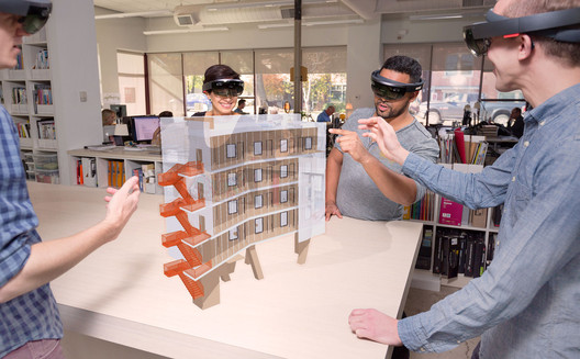
| Trimble's SketchUp Viewer Allows You To Manipulate Hologram Models in the Real World Posted: 07 Nov 2016 04:30 AM PST SketchUp developer Trimble has launched SketchUp Viewer, a new virtual and mixed reality app for the Microsoft HoloLens that will allow users to inhabit and experience their 3D designs in a completely new way. Using the holographic capabilities of the HoloLens, SketchUp Viewer creates hologram versions of models that can be placed in real-world environments –allowing architects to study and analyze how their buildings will react to their context while still in the design stage. At today's Trimble Dimensions keynote, architect Greg Lynn presented SketchUp Viewer for the first time, demonstrating the technology using his re-imagining of the Packard Plant in Detroit, commissioned as part of the "Architectural Imagination," the U.S. Pavilion at the 2016 Venice Biennale exhibition. "Trimble mixed-reality technology and Microsoft HoloLens bring the design to life and bridge the gap between the digital and physical. Using this technology I can make decisions at the moment of inception, shorten the design cycle and improve communication with my clients," said Lynn.  via SketchUp Viewer via SketchUp Viewer SketchUp Viewer uses the newly launched AR|VR Extension for SketchUp Desktop, and is compatible with models from Trimble's 3D Warehouse and the cloud-based collaboration platform Trimble Connect. Once in Tabletop mode, models can be scaled as needed to fit into an available space or to zoom into specific design details. Models can be moved, rotated, anchored and re-anchored in physical space, giving users the ability to walk around the project and examine it from any vantage point. "What truly differentiates SketchUp Viewer from any other product on the market is the ability for users to transition seamlessly to an immersive experience," explained Trimble. "Mixed reality enables unique opportunities to overlay physical models in real world environments; and as a completely untethered device, HoloLens allows users to move freely as they inhabit their digital surrounds." In addition to its visualization capabilities, SketchUp Viewer will also contain remote collaboration technology, allowing designers and consultants from around the world to review and cooperate on projects in real time. "Empowering people to design and communicate better in 3D is part of our DNA. Across the SketchUp platform, we are dedicated to the idea that technology should get out of the way of our users," said Chris Keating, general manager of Trimble's SketchUp. "With SketchUp Viewer, we are taking another big step toward delivering the ultimate experience for designers and their clients—the experience of inhabiting their own work." More information on the SketchUp Viewer can be found here. The AR|VR extension for SketchUp Desktop can be found in SketchUp's Extension Warehouse. Microsoft HoloLens devices are available for purchase from the Microsoft Store, here. News via Trimble. This posting includes an audio/video/photo media file: Download Now |
| 6 Shortlisted Designs Unveiled in London’s Illuminated River Competition Posted: 07 Nov 2016 03:15 AM PST  The Illuminated River Foundation has unveiled the six designs shortlisted to transform the river Thames in London by lighting up key bridges along the length of the river. The six teams were selected in September and asked to work their initial schemes into concept designs for the Westminster, Waterloo, London and Chelsea bridges. The teams comprise: Adjaye Associates; A_LA; Diller Scofidio + Renfro; Leo Villareal with Lifschutz Davidson Sandilands and Future\Pace; Les Éclairagistes Associés with ecqi and Federico Pietrella; and Sam Jacob Studio with Simon Heijdens. Read on to see all six designs. Blurring Boundaries / Adjaye AssociatesAdjaye Associates' design aims to highlight the unique histories of each individual bridge, assembling a number of artists and designers to bring their own touch to each location. The cumulative effect of these interventions will be, as they describe it in their project description, "to reimagine the bridges not as connectors, but as the heart of London itself... they join to form a cohesive stitching for London's heart, a vibrant new epicenter anchoring the two banks." The design also includes a number of urban pavilions, with uses ranging from lookout towers to a new auditorium.  Blurring Boundaries / Adjaye Associates. London Bridge. Image © Malcolm Reading Consultants and Adjaye Associates Blurring Boundaries / Adjaye Associates. London Bridge. Image © Malcolm Reading Consultants and Adjaye Associates Full team: Adjaye Associates with Cai Guo-Qiang, Chris Ofili, Larry Bell, Jeremy Deller, Philippe Parreno, Richard Woods, Mariko Mori, Lorna Simpson, Teresita Fernández, Joana Vasconcelos, Angela Bulloch, Thukral & Tagra, Katharina Grosse, Glenn Ligon, Doug Aitken, Tomás Saraceno, onedotzero digital consultants, Plan A Consultants, DHA, Hurley Palmer Flatt, AKT II, AECOM, Arup, Sir Robert McAlpine, Tavernor Consultancy, DP9, Four Communications, Hayes Davidson digital visualisers, Bosch and iGuzzini. The Eternal Story of the River Thames / A_LAA_LA's design focuses on exploring the river as a natural entity, which has constantly been ignored or even suppressed by the construction of the city around it. This is highlighted by continuous lighting along the river walls, creating "a constant thread of light through the city that gently illumines the expanses of foreshore exposed at low tide." On the bridges, the lighting changes with the tides: at low tide the undersides of the bridges are illuminated, while at high tide the illumination shifts to the light up the bridges' elevations.  The Eternal Story of the River Thames / A_LA. High tide. Image © Malcolm Reading Consultants and AL_A The Eternal Story of the River Thames / A_LA. High tide. Image © Malcolm Reading Consultants and AL_A Full Team: AL_A, Asif Kapadia, Simon Stephens, SEAM Design, Arup, GROSS. MAX., Mark Filip, Soundings and DP9. Synchronizing the City: Its Natural and Urban Rhythms / Diller Scofidio + RenfroDiller Scofidio + Renfro's design also highlights natural rhythms, in this case the natural rhythm of daylight. In the "magic hour" when the sun has set, each bridge will begin to "fill up" with light, reaching its maximum illumination one hour after the sun sets. At this moment, a beam of light will be briefly directed towards the sky, offering a "night kiss" at the end of twighlight. The lighting for each bridge will be carefully calibrated to its position along the river, with the precise timing of this display varying depending on the exact timing of the sunset in that location, thus giving a visual representation of the rotation of the earth.  Synchronizing the City: Its Natural and Urban Rhythms / Diller Scofidio + Renfro. Waterloo Bridge. Image © Malcolm Reading Consultants and Diller Scofidio + Renfro Synchronizing the City: Its Natural and Urban Rhythms / Diller Scofidio + Renfro. Waterloo Bridge. Image © Malcolm Reading Consultants and Diller Scofidio + Renfro Full Team: Diller Scofidio + Renfro with Oliver Beer, Arup, Copper Consultancy, L'Observatoire International, Penoyre & Prasad, Jennifer Tipton and Transsolar. Current / Leo Villareal with Lifschutz Davidson Sandilands and Future\PaceLeo Villareal, the designer behind The Bay Lights on San Francisco's Bay Bridge, worked with London architecture firm Lifschutz Davidson Sandilands and placemaking agency Future\Pace to imagine a design which not only includes site-specific colored displays at each bridge, but also incorporates forward-looking strategic plans and partnerships which aim to control commercial lighting along the river and increase public engagement through a variety of installations.  Current / Leo Villareal with Lifschutz Davidson Sandilands and Future\Pace. Westminster Bridge. Image © Malcolm Reading Consultants and Leo Villareal and Lifschutz Davidson Sandilands Current / Leo Villareal with Lifschutz Davidson Sandilands and Future\Pace. Westminster Bridge. Image © Malcolm Reading Consultants and Leo Villareal and Lifschutz Davidson Sandilands Full Team: Leo Villareal with Lifschutz Davidson Sandilands and Future\Pace. Atelier Ten, Beckett Rankine, Bradley Hemmings, Core Five, Futurecity, Greenwich+Docklands International Festival, MBNA Thames Clippers, Montagu Evans, Pentagram, Price & Myers. A River Ain't Too Much To Light / Les Éclairagistes Associés with ecqi and Federico PietrellaSimilar to the proposal by Diller Scofidio + Renfro, the design by Les Éclairagistes Associés hopes to light each bridge at the opportune time between day and night, resulting in the timing of the bridges lighting being dependent on their precise location. In addition, the concept hopes to highlight London's position as a global city by placing symbols of other global cities—specifically, faithful recreations of their lampposts—in the river itself, where they will be revealed to a greater or lesser extent depending on the height of the tides.  A River Ain't Too Much To Light / Les Éclairagistes Associés with ecqi and Federico Pietrella. Lampposts. Image © Malcolm Reading Consultants and Les Éclairagistes Associés A River Ain't Too Much To Light / Les Éclairagistes Associés with ecqi and Federico Pietrella. Lampposts. Image © Malcolm Reading Consultants and Les Éclairagistes Associés Full Team: Les Éclairagistes Associés (L.E.A.), ecqi ltd. and Federico Pietrella in association with GVA Lighting Europe Limited and ewo srl. Thames Nocturne / Sam Jacob Studio and Simon HeijdensThe design by Sam Jacob and Simon Heijdens seeks to create a three-dimensional "ribbon" of light between Chelsea and Wapping that forms an overlay on top of the river. The ribbon itself will be formed of multiple planes of projected light, which through their overlapping layers will form an ethereal representation of the river directly below; the lower edge of each plane will vary depending on the depth of the river, while the upper edge will change constantly based on real-time measurements of the movement of the surface. Similarly, the bridges will be illuminated with a shifting monochromatic light that causing the perception of their form "to wax and wane as the tide rises and falls."  Thames Nocturne / Sam Jacob Studio and Simon Heijdens. London Bridge. Image © Malcolm Reading Consultants and Sam Jacob Studio and Simon Heijdens Thames Nocturne / Sam Jacob Studio and Simon Heijdens. London Bridge. Image © Malcolm Reading Consultants and Sam Jacob Studio and Simon Heijdens Full Team: Sam Jacob Studio and Simon Heijdens with Studio Dekka, Daisy Froud, Elliott Wood, Jackson Coles and Professor John Tyrer. More information about each design can be found at the webpage of competition organizers Malcolm Reading. This posting includes an audio/video/photo media file: Download Now |
| Pennovation Center / HWKN + KSS architects Posted: 07 Nov 2016 03:00 AM PST  © Michael Moran © Michael Moran
 © Michael Moran © Michael Moran An Icon for Innovation The Pennovation Center is a 20th century paint factory, transformed into a 21st century idea factory. The building is the centerpiece of a new, twenty-three acre development at the University of Pennsylvania known as Pennovation Works.  © Michael Moran © Michael Moran While much of the building is occupied by shared wet labs and efficient coworking areas, key social spaces tempt entrepreneurs to leave their desks and engage with their colleagues. These spaces are tucked into a new angular facade that reaches outward towards the Schuylkill River, featuring a conference room, coworking counter with a view of campus and the city, and bleacher seating where inventors can share ideas, pitch to investors, and gain crucial perspective. The building inspires creativity within, while simultaneously telling the world outside that Penn is committed to putting knowledge into action for the greater good.  © Michael Moran © Michael Moran "This is a unique business and technology incubator where innovators' ideas go to work," said Anne Papageorge, Vice President of Penn Facilities and Real Estate Services. "The Center is designed to bring together the University's eminent researchers and students, along with the private sector, to foster creative exploration, entrepreneurship, new alliances, and generate economic development for the region."  Diagram Diagram  Diagram Diagram "Having personally navigated through the startup experience ourselves when we launched Hollwich Kushner and Architizer, we understand the needs and challenges of emerging companies," said Hollwich Kushner Principal, Marc Kushner.  © Michael Moran © Michael Moran "Inventors love to invent things. That means a lot of time spent in labs hunched over workbenches and computers. We wanted to create a building that encouraged entrepreneurs to get up from their labs and pitch their ideas and socialize with their colleagues. That's why we took all of the social action of the building and packed it into the spiky geometric facade" added Matthias Hollwich of Hollwich Kushner.  © Michael Moran © Michael Moran A beacon for the next generation of entrepreneurship in the region, the Pennovation Center will advance the dynamic role of the University as both an inspiration for and a facilitator of cutting-edge invention.  © Michael Moran © Michael Moran This posting includes an audio/video/photo media file: Download Now |
| Take a Look Inside VIA 57 West with Photographs by Danica O. Kus Posted: 07 Nov 2016 01:30 AM PST  © Danica O. Kus © Danica O. Kus Architectural photographer Danica O. Kus has shared with us new images of BIG's VIA 57 West. Having opened earlier this year, the "courtscraper" has already been the recipient of several awards, including its unanimous victory of the 2016 International Highrise Award last week. This new photoset takes us inside the public and private spaces of the 32-story building, including interior shots of the lobby, lounge, pool and the residential units. Check out the full set after the break.  © Danica O. Kus © Danica O. Kus  © Danica O. Kus © Danica O. Kus  © Danica O. Kus © Danica O. Kus  © Danica O. Kus © Danica O. Kus  © Danica O. Kus © Danica O. Kus  © Danica O. Kus © Danica O. Kus  © Danica O. Kus © Danica O. Kus  © Danica O. Kus © Danica O. Kus  © Danica O. Kus © Danica O. Kus  © Danica O. Kus © Danica O. Kus  © Danica O. Kus © Danica O. Kus  © Danica O. Kus © Danica O. Kus  © Danica O. Kus © Danica O. Kus  © Danica O. Kus © Danica O. Kus  © Danica O. Kus © Danica O. Kus  © Danica O. Kus © Danica O. Kus  © Danica O. Kus © Danica O. Kus  © Danica O. Kus © Danica O. Kus  © Danica O. Kus © Danica O. Kus  © Danica O. Kus © Danica O. Kus  © Danica O. Kus © Danica O. Kus  © Danica O. Kus © Danica O. Kus This posting includes an audio/video/photo media file: Download Now |
| 21 Careers You Can Pursue With A Degree in Architecture Posted: 07 Nov 2016 12:30 AM PST  © Ariana Zilliacus © Ariana Zilliacus Completing a degree in architecture can be a long and arduous process, but also wonderfully rewarding. Despite this, many freshly graduated architects find themselves unsure about where to begin, or deciding that they actually don't want to be architects at all. Here is a list of 21 careers you can pursue with a degree in architecture, which may help some overcome the daunting task of beginning to think about and plan for the professional life that awaits. Careers in ArchitectureArchitecture: the art or practice of designing and constructing buildings. Architects often argue over the actual definition of our discipline, but can never really escape the use of broad terms, coming from a fantastically broad education. It's unsurprising then, that the task of figuring out what kind of architect you want to be is a daunting one. Below is a list of 7 branches of architecture for you to consider: 1. Landscape Architect Designing outdoor landscapes, including infrastructure, public areas, agriculture and forestry is vital for constructing the webs that bind our urban and rural spaces, but also, and perhaps more importantly, it's essential for responding to globalization and climate change. Landscape architects are involved in storm water management, environmental restoration, and recreational areas among other things. If you enjoy working with and in the natural environment, this could be the path for you. 2. Urban Planner As a result of a rapidly growing percentage of our population moving into urban areas, the conditions of urbanism are constantly in a state of flux. The dynamic state of the urban environment makes it an exciting path to take as an architect, covering everything from economic and demographic changes, to sustainable development. It's an essential responsibility within our profession, but a challenging one; it requires adaptability and problem solving on a large scale.  © Ariana Zilliacus © Ariana Zilliacus 3. Restoration Architect Our societies' heritage and history as presented through architecture are not only beautiful glimpses into the past, but also crucial to understanding our culture as a discipline. Conservation and restoration of buildings is undeniably a challenge; it is never possible to please everyone. The media often targets the act of restoration as a "heritage massacre," in spite of the often very beautiful solutions. 4. Research Architect With the current wave of digital design and constant advancement of digital tools, our methods of representation and expression are changing dramatically. Information technology has had a profound impact upon architecture that is far from over. These constant improvements are in part made possible by the exciting research being done by architects, not necessarily consisting of designing buildings, but focusing more on how these new tools can enhance our work. 5. Lighting Architect Light has a profound impact on our mental and physical health, as anyone living at high latitudes can empathize with. Delving into the architecture of lighting entails improving the quality of our experiences, our health and well-being, and the sustainability of not only the natural environment, but also smaller spaces such as our work environments. 6. Political Architect Some argue that architecture is by nature political, however being active in the political decision of a city or country is a different story. Architecture is more than just creating beautiful objects; the discipline has a value in organizing society. Architecture firm Terroir, for example, has worked with the Burnie City Council as well as with the Parramatta City Council in Australia, to argue for a certain structure for the city, to predict what may happen, and to design a set of criteria for the evolution of the city. It is a case of architecture influencing politics, instead of the other way around.  © Ariana Zilliacus © Ariana Zilliacus 7. Extreme Architect With the current development of climate change, extreme weather conditions such as floods, heat waves and hurricanes are predicted to increase. Existing extreme environments, such as deserts, are likely to expand due to phenomena such as desertification. Being an architect who specializes in extreme weather conditions is therefore not only an incredibly fascinating way to tackle the subject, but also invaluable for us to adapt to the future of our planet. Careers in Art and DesignIf, upon graduating, you realize that architecture is in fact not for you, design and art might be. Architecture already is a form of design (or maybe it's the other way around), making it easier to create direct links between your education as an architect, and your profession as an artist or designer. Another alternative is to combine two disciplines, such as graphic design and architecture. Perhaps your passion is to make it easier for architects to communicate through graphics? 8. Artist Although Olafur Eliasson did not study architecture, he works with many architects at Studio Olafur Eliasson, exemplifying how harmonious and imperative the relationship between space and art is. The spatial reasoning and visualization skills one gains from an education in architecture lends themselves perfectly to installation art, sculpture and spatial experiences, without the necessity for functionality. 9. Industrial Designer Several architecture firms have branched into industrial design, due to their close creative ties. However, industrial design focuses on smaller scale objects of mass production, as opposed to large-scale buildings designed for a specific context. If the prospect of designing something enormous, permanent, and landscape changing sounds all too intimidating, industrial design is a great, smaller scaled alternative.  © Ariana Zilliacus © Ariana Zilliacus 10. Furniture Designer Even more so than industrial design, furniture design can be seen as architecture's little sister. Countless famous architects have made significant contributions to furniture design: Charles and Ray Eames, Alvar Aalto and Arne Jacobsen, among others. Contemporary architects such as Zaha Hadid Architects are following suit, proving that the two can even be done simultaneously. 11. Textile Designer Designing textiles requires sensitivity for color, tactility, construction, patterns and forms, all of which are developed during any student's years at architecture school. The relationship between "skin" and structure is in some ways even more literal than in a building, as the two merge together. High fashion is also reminiscent of architecture in many ways, adopting the geometric and sculptural constructions of contemporary buildings.  © Ariana Zilliacus © Ariana Zilliacus 12. Graphic Designer Graphic design is the way in which we take in our world and identify it. It is invaluable when it comes to communication. It can also be so aesthetically pleasing that one can hardly resist becoming a graphic designer. Taking a short course in graphic design to supplement a degree in architecture can open up a range of possibilities to still work within the field, but take charge of tasks that are more suited to your interests in communication. 13. Video Game Designer The near-limitless boundaries that come with designing a virtual world may be one of the most fun things a newly graduated architect could think of doing with their education. Constructing the architecture of a video game is a way of letting your imagination roam free, but could also add more depth to your spatial reasoning. 14. Photographer Architecture photography is becoming increasingly popular, possibly due to the beautiful geometry that can emerge by constraining something within a lens. Photography concerns itself more with the aesthetic, with the object and the composition in that unique moment, within that specific frame. It concerns itself with the fleeting atmosphere, more than with the permanent organization of people and spaces. Yet it still consists of composition, colour, environment and experiences.  © Ariana Zilliacus © Ariana Zilliacus 15. Production Designer Although a set or a stage are far smaller platforms than a virtual planet, designing theater and film sets allows for just as much creative flow. It lifts the pressure of traditional spatial design and expression, allowing for experiences that may be more evocative, sensuous, and story-driven, while still utilizing all the knowledge and skills one gains from an education in architecture: time pressures, conceptual environments and collaborative creativity. Careers Outside of DesignIf you find yourself scrolling through this list and shaking your head at any mention of architecture, art or design, perhaps this final list is for you. It covers 6 careers outside of the stereotypical fields of design, mostly within the human sciences as architecture is inherently directed towards the human experience. Drawing the essence of this from your architectural education and injecting it into another discipline may even make you a stronger candidate in the professional sphere.  © Ariana Zilliacus © Ariana Zilliacus 16. Teacher/Professor Young teachers at architecture schools are becoming more common, and if you're looking for more time to learn about the field before making a decision on whether or not you want to remain in it, taking up a year or two of teaching could be an ideal way to do so. Teaching is a two way street, especially at such a young age, which provides you with an excellent method to learn from your students and reflect on your view of architecture. Here are some tips on how to succeed as a young professor. 17. Philanthropist In the past, architecture was a gentleman's profession, taken up as a philanthropic endeavour as opposed to an economic one. In our present day, women have begun to get a strong hold on the profession, but thankfully the philanthropic ideal has not died out. Contemporary architecture has a necessary focus on sustainability: environmental, social, psychological, and economic. The knowledge and awareness of these ideals can be converted into other types of philanthropy, if that's what interests you. Founding a sustainable foundation towards a humanitarian aim is never a waste of time.  © Ariana Zilliacus © Ariana Zilliacus 18. Politician As mentioned previously, architecture and politics are in many ways inherently tied together. The knowledge one gains of people, and the way they interact with their environment, the way they are organized, what makes the human body and psyche feel comfortable; all of these skills contribute hugely to making a good politician. In fact, in Finland, Anders Adlercreutz, a current first-term Member of Parliament, is educated as an architect and practiced as one for many years before turning to politics, while in Britain Richard Rogers serves in the House of Lords alongside running his practice. 19. Conservationist Similar to philanthropy, conservation of the environment is becoming a focal point within architecture. Despite many efforts, our planet is still heading down a path leading to disaster when it comes to our natural surroundings. Using your knowledge of spatial organization to develop a method of environmental conservation is not only intellectually stimulating, but also vitally important for our society.  © Ariana Zilliacus © Ariana Zilliacus 20. Writer Becoming a writer or journalist can be a great way to utilize an architectural education; we learn to articulate ourselves using (mostly) descriptive language and rhetoric, in order to communicate our complex projects to teachers and critics. Turning that into writing, whether fictional or not, is another way of constructing another world and an experience for others. Despite the print being two-dimensional, the stories definitely aren't. 21. Entrepreneur Problem solving, creative thinking and the art of persuasion are three skills architects and entrepreneurs have in common that you can use to your advantage. Your experience with abstract concepts and human interaction can make you a stronger competitor with an alternative way of thinking. The list above is of course incomplete, as the careers mentioned here can be combined in many ways, and other, unmentioned vocations can be brought to the table to provide virtually infinite possibilities. As German educator Kurt Hahn said, "there is more in us than we know. If we can be made to see it, perhaps, for the rest of our lives, we will be unwilling to settle for less." Don't forget that there is a sea of possibilities out there. This posting includes an audio/video/photo media file: Download Now |
| Villa Muurame / Marco Casagrande Posted: 07 Nov 2016 02:00 AM PST  © Jenni Moilanen © Jenni Moilanen
 © Jenni Moilanen © Jenni Moilanen From the architect. Villa Muurame is a wooden 3-story single-family home by Lake Jyväsjärvi in Jyväskylä, Finland. The spatial elements of the house (approx. 3m wide, 7.8 longa and 3.1 high) were pre-fabricated during the winter in the Muurametalot housing factory in Karunki, Finnish Lapland and the elements were erected in Jyväskylä after the snow had melted. The timber used is extremely slow grown and high quality Lappish spruce and pine.  © Jenni Moilanen © Jenni Moilanen  1st Floor Plan 1st Floor Plan  © Jenni Moilanen © Jenni Moilanen The house is getting more private as one moves up the floors. The ground floor is an open space with collective functions, the bedrooms are on the second floor and on the third floor you get naked. Each floor has their own terrace or balcony and the second floor opens to an extensive roof garden.  Elevation Elevation The house is warmed up during the harsh Finnish winters with geothermal heating, which also cools down the house during summers.  © Jenni Moilanen © Jenni Moilanen This posting includes an audio/video/photo media file: Download Now |
| Pierre Koenig’s Historic Case Study House #21 Could Be Yours... for the Right Price Posted: 06 Nov 2016 11:00 PM PST  © Grant Mudford © Grant Mudford One of modernism's most iconic houses, Case Study House 21 (Bailey House) by Pierre Koenig, is now on sale. The two-bed/two-bath Hollywood Hills landmark has been touted as among the finest of Arts & Architecture Magazine's Case Study Houses, and one of the program's few truly experimental projects to explore groundbreaking design and materials.  © Grant Mudford © Grant Mudford In this early-career exploration, Koenig used a constrained set of industrial materials—primarily steel and glass—to execute a pure expression of his design approach. His philosophy of functionality and honesty in aesthetics manifests in a structure that appears simple but contains complexity in plan and organization.  © Grant Mudford © Grant Mudford The design emphasizes harmony of materials and balance between interior and exterior through the use of terraces, water, glazing, and skylights. A 60-foot reflecting pool frames the undulating steel facade on the east and another pool traces the covered carport. Interlocking steel decking on the roof and an all-glass north wall add drama to the main entry, drawing visitors in, while the southern wall's sliding glass doors extend the living area into the exterior terrace.  © Grant Mudford © Grant Mudford Views of the expansive and carefully considered landscaping permeate the house. In the core of the house is a courtyard and the bathrooms; the bedrooms are also connected to the exterior via sliding glass doors.  © Grant Mudford © Grant Mudford Built in 1958, Case Study House 21 underwent a restoration by Koenig to his original intent and design in 1998, including the addition of updated appliances and cabinetry. The house was last sold in an auction in December 2006 for an estimated $2.5 million – $3.5 million. Update [Nov. 7, 2016]: A previous headline for this article suggested that the house is currently on the market for $3 million – this was based on the estimated sale price from its last sale in 2006. Instead, the listing is currently on the market as "Price Upon Request." News via: Sotheby's International Realty This posting includes an audio/video/photo media file: Download Now |
| KWK Promes Selected to Extend Bunker of Arts Contemporary Art Gallery in Poland Posted: 06 Nov 2016 10:00 PM PST  © KWK Promes © KWK Promes The winning proposal has just been announced for an extension to the Bunkier Sztuki ("Bunker of Arts") contemporary art gallery in Cracow, Poland. Out of 33 entries in the international competition, the underground design by Robert Konieczny - KWK Promes has been selected to be executed in the heart of Cracow's Old Town.  © KWK Promes © KWK Promes The proposal includes a new 3900–square meter exhibition space in front of the existing building with moveable slabs and an elevatable roof, which can be adjusted according to program. This ultra-modern mechanical system allows for interaction between the exhibition space and the city: the roof can be lifted to give the gallery a direct physical connection to the street level. Meanwhile, by eliminating a superstructure to the extension, the architects have given deference to the existing building. The intervention also includes a plan to refurbish the historical gallery to reveal its original brutalist form.  © KWK Promes © KWK Promes  © KWK Promes © KWK Promes Situated in one of Poland's most culturally vibrant cities, Bunkier Sztuki is a rare icon of Polish brutalism. Since its founding in Planty Park in 1965, the gallery has undergone several alterations, including a cafeteria pavilion directly in front of the exhibition space. The planned restoration will eliminate all unnecessary additions and return the building to its initial intent.  © KWK Promes © KWK Promes
News via: KWK Promes This posting includes an audio/video/photo media file: Download Now |


| You are subscribed to email updates from ArchDaily. To stop receiving these emails, you may unsubscribe now. | Email delivery powered by Google |
| Google Inc., 1600 Amphitheatre Parkway, Mountain View, CA 94043, United States | |
Nema komentara:
Objavi komentar