Arch Daily |
- New Boarding Accommodation at The King’s School / Walters & Cohen
- AD Classics: Acropolis of Athens / Ictinus, Callicrates, Mnesikles and Phidias
- Open Patio House / PROD arquitectura & design
- Thurøhus / EFFEKT
- UAH campus / Truong An architecture + UAH Department of Architecture
- Bengbu Museum & Urban Planning Exhibition Center / MengArchitects
- Brougham Place / Smart Design Studio
- The Studios / Graham Baba Architects
- IKEA Lab Releases Open-Source Plans for DIY Spherical Garden
- Mühlgrund / Nerma Linsberger
- World Architecture Festival Launches Manifesto for the Architectural Profession
- PLICO at the Flatiron / Elliott + Associates Architects
- Feilden Clegg Bradley Studios Wins Competition for University of Warwick Arts Hub
- Apartment In Vilnius Old Town / Interjero Architektūra
- The Fossilized Soviet Architecture of Belarus, in Photos
- House Between-Lines / OLAestudio
- The Watch of An Architect
- Francis Kéré to Design 2017 Serpentine Pavilion
| New Boarding Accommodation at The King’s School / Walters & Cohen Posted: 21 Feb 2017 09:00 PM PST  © Dennis Gilbert © Dennis Gilbert
 © Dennis Gilbert © Dennis Gilbert From the architect. In early 2014, Walters & Cohen won an invited competition to design new boarding accommodation for the school which was looking to increase pupil numbers and strengthen its co-educational balance by enhancing provision for girl boarders with an additional 50-60 places.  © Dennis Gilbert © Dennis Gilbert Phase 1 comprised the refurbishment of the Grade II listed Butterfield building and Master's House to create boarding accommodation for 30 pupils of Kingsdown House, a new girls' boarding House, and includes a common room, quiet study area, kitchen and 'brew' areas. This was completed in time for the new school year in 2015.  © Dennis Gilbert © Dennis Gilbert Phase 2 of the project recently completed, was the construction of a new building for older pupils of Kingsdown House. The site was acquired by The King's School as part of a larger masterplan project; close to the existing campus, adjacent to the city wall and with fine views of the Cathedral, it offered the opportunity to create a new relationship and interaction between contemporary design and the historic setting. Different options were explored for the new building footprint, its position on site, height, composition and roofscape, in close consultation with Canterbury City Council, Historic England and members of the public.  Ground Floor Plan Ground Floor Plan  First Floor Plan First Floor Plan  Second Floor Plan Second Floor Plan The design is of a gabled, two-storey building with rooms in the roof, accommodating 23 single study bedrooms, and housing the 6th form girls who require a more private and quiet setting to study for exams. A modest, single storey element connects to the Butterfield building with a frameless glass link joining them to the new accommodation building and allowing views out towards the city wall.  © Dennis Gilbert © Dennis Gilbert The new building is clad in handmade clay tiles, drawing on local architecture and construction techniques, while the building's elegant profile and gabled roof complement the features of its neighbours. The dormer windows allow additional rooms to be located in the roof without raising the height of the building. This was a crucial consideration in order not to intrude on the existing rooflines which form part of the historic setting. The use of clay tiles also allows the continuous stone plane of the Butterfield building, Master's House and the street wall to retain its prominence.  © Dennis Gilbert © Dennis Gilbert The landscape was conceived as an integral part of the design, offering spaces for study and socialising, with views towards the Cathedral. The design draws on the historic gardens beside the city wall and aims to revive the relationship between the two. It provides a series of connected external spaces of different character, allowing routes through, seating and a balance between soft and hard landscaping.  © Dennis Gilbert © Dennis Gilbert This posting includes an audio/video/photo media file: Download Now |
| AD Classics: Acropolis of Athens / Ictinus, Callicrates, Mnesikles and Phidias Posted: 21 Feb 2017 08:00 PM PST ") An elevation of the entire Acropolis as seen from the west; while the Parthenon dominates the scene, it is nonetheless only part of a greater composition. ImageCourtesy of Wikimedia user Quibik (Public Domain) An elevation of the entire Acropolis as seen from the west; while the Parthenon dominates the scene, it is nonetheless only part of a greater composition. ImageCourtesy of Wikimedia user Quibik (Public Domain) The Parthenon, perhaps the most celebrated example of Classical Greek architecture, was only the first of a series of remarkable buildings to be constructed atop the Athenian Acropolis in the wake of the Persian Wars. Led by the renowned statesman Pericles, the city-state embarked on an ambitious rebuilding program which replaced all that had been razed by the Persians. The new complex, while dedicated to the gods and the legends that surrounded the Acropolis, were as much a declaration of Athens' glory as they were places of worship – monuments to a people who had risen from the ashes of a war to become the most powerful and prosperous state in the ancient world.  Throngs make their way up the causeway to the Acropolis in this artistic imagining of the Panathenaic Procession.. ImageCourtesy of Yale University Press Throngs make their way up the causeway to the Acropolis in this artistic imagining of the Panathenaic Procession.. ImageCourtesy of Yale University Press Once the structure of the Parthenon was in place, Pericles commissioned the next great project: the Propylaea. Situated at the western end of the complex, the monumental gateway was the sole entrance to the Acropolis. Like the Parthenon that preceded it, the new structure was built of Pentelic marble – an indication of the generous budget that financed its construction. The architect Mnesikles, faced by the challenge of reconciling a steep sloping site with the prevailing architectural standards of Classical Greece, split the building into eastern and western sections, each with its own Doric colonnade and pediment. The space between the two central columns was greater than that of the others, an irregularity born from practical concerns: after making their way through the city and climbing a lengthy causeway, it was here that the animals and chariots would pass into the Acropolis every four years during the Panathenaic Procession; the celebrating Athenians entered via stairways to either side.[1,2] ") Although the western façade of the Propylaea has not survived the passage of time, its columns still stand guard at the entrance to the Acropolis. ImageCourtesy of Flickr user Thomas Hackl (licensed under CC BY-NC 2.0) Although the western façade of the Propylaea has not survived the passage of time, its columns still stand guard at the entrance to the Acropolis. ImageCourtesy of Flickr user Thomas Hackl (licensed under CC BY-NC 2.0) Flanking the western façade were two enclosed wings. The wing to the northeast, the only one to be completed, was notably used as a picture gallery, or pinakotheke, in Roman times; it is unknown if this was the original purpose of the space, but if so, it is the first known structure in history intended for the display of works of art.[3] Like the architects of the Parthenon, Mnesikles chose to use Ionic columns for the interior of the Propylaea, suggesting that this synthesis was the prevailing trend in Athenian architecture at the time; however, different orders would not be mixed in the same façades until the Hellenistic period.[4] ") These Ionic columns, standing in what was once the interior of the Propylaea, can be readily contrasted with their Doric counterparts at the bottom of the picture. ImageCourtesy of Flickr user lovemonlin (licensed under CC BY-NC-ND 2.0) These Ionic columns, standing in what was once the interior of the Propylaea, can be readily contrasted with their Doric counterparts at the bottom of the picture. ImageCourtesy of Flickr user lovemonlin (licensed under CC BY-NC-ND 2.0) The outbreak of the Peloponnesian War in 431 B.C. suspended work on the Propylaea. When work on the Acropolis fully resumed ten years later, it was not on the gateway – the original plans for which were never fully realized. Instead, the city moved forward with a second temple: the Erechtheion.[5] Before the Persian Wars, the predecessors to the Parthenon and the Erechtheion had been a pair of standard temples, placed parallel to one another and virtually indistinguishable. While the Parthenon broke from tradition in its scale and proportion, the complex layout of the Erechtheion seemed to abandon the precedent set by its predecessor altogether.[6] ") The irregular layout of the Erechtheion was a response to both complicated topography and the multifaceted religious significance of the ground on which it stands. Original etching by Ernst Wallis, 1875. ImageCourtesy of Wikimedia user HerrAdams (Public Domain) The irregular layout of the Erechtheion was a response to both complicated topography and the multifaceted religious significance of the ground on which it stands. Original etching by Ernst Wallis, 1875. ImageCourtesy of Wikimedia user HerrAdams (Public Domain) As with the Propylaea, the Erechtheion adapts to the irregular topography of its site through the use of multiple spaces and façades at different levels. The striking similarity of this approach, in fact, has led some historians to conjecture that the Erechtheion was also the work of Mnesikles. It is worth noting, however, that there was a less mundane explanation for the temple's incongruous asymmetry: the site on which it stood, bearing significance for multiple deities involved in the mythological tale of the founding of Athens, required a single structure to function as multiple temples simultaneously.[7] ") Courtesy of Flickr user Aleksandr Zykov (licensed under CC BY-SA 2.0) Courtesy of Flickr user Aleksandr Zykov (licensed under CC BY-SA 2.0) According to legend, the Erechtheion stood on the ground where Athena and Poseidon had competed for rule over Attica. Poseidon struck the ground with his trident, bringing forth a stream of saltwater; the temple's northern porch, projecting from one end of an otherwise smooth marble wall, sheltered the trident mark left in the rocks. In response to Poseidon's display of power, Athena struck the ground with her spear, bringing forth an olive tree from the rock. (Since the construction of the Erechtheion, an olive tree has always been present on this spot.) The western façade bridged the significant ground elevation difference between the tall northern porch and the smaller—yet no less impressive—southern porch. Here, the roof was supported not by Ionic columns as on the other façades, but by serene sculptures of women balancing the architrave atop their heads, or caryatids. The eastern porch, standing on the same level as the Parthenon, was the most conventional, with six Ionic columns supporting a symmetrical pediment.[8] ") Courtesy of Flickr user Aleksandr Zykov (licensed under CC BY-SA 2.0) Courtesy of Flickr user Aleksandr Zykov (licensed under CC BY-SA 2.0) Before the end of the Peloponnesian War and the construction of the Erechtheion, Athens' fortunes had recovered well enough for the construction of the comparatively tiny Temple of Athena Nike.[9] Only four Ionic columns stood along its eastern and western façades, with none lining its northern and southern edges. Were it not for the temple's prominent location on an outcropping to the right of the Propylaea, it may have been easy to overlook altogether in comparison with its much larger, grander neighbors. However, its small size does not negate the potency of its symbolism: one of the first structures visible to those who visit the Acropolis is a dedication to the personification of victory.[10] ") While the Temple of Athena Nike is smaller than most of the structures on the Acropolis, its position looming over the stairs to the Propylaea ensures it is one of the first things visitors to the sacred hilltop see. ImageCourtesy of Flickr user Aleksandr Zykov (licensed under CC BY-SA 2.0) While the Temple of Athena Nike is smaller than most of the structures on the Acropolis, its position looming over the stairs to the Propylaea ensures it is one of the first things visitors to the sacred hilltop see. ImageCourtesy of Flickr user Aleksandr Zykov (licensed under CC BY-SA 2.0) Fittingly, the Temple of Athena Nike was adorned with lavish sculptures depicting victory in its various forms. The temple that had once stood on the site had been built in commemoration of the Athenian victory in the Battle of Marathon, an event immortalized in the frieze of the newer building. The exaggerated corners of the new temple's columns, meanwhile, are noted by some to draw the viewer's eye toward the sea, where the combined Greek navy's victory at Salamis liberated Athens and drove the invading Persians out of mainland Greece. Approximately fifteen years after the Temple of Athena Nike itself was built, an additional parapet was erected around the building and adorned with several reliefs depicting Nike. These sculptural portrayals, whether showing Nike enjoying the spoils of victory over Persia or even stooping to adjust a sandal, were carved with deep, intricate detail, adding great visual interest to an otherwise straightforward building.[11,12] ") The exaggerated Ionic capitals in the Temple of Athena Nike purportedly direct one's gaze to the sea, a reference to the victory over Persia that allowed Athens to take its place as the premier city-state in Ancient Greece. ImageCourtesy of Flickr user Aleksandr Zykov (licensed under CC BY-SA 2.0) The exaggerated Ionic capitals in the Temple of Athena Nike purportedly direct one's gaze to the sea, a reference to the victory over Persia that allowed Athens to take its place as the premier city-state in Ancient Greece. ImageCourtesy of Flickr user Aleksandr Zykov (licensed under CC BY-SA 2.0) The reconstruction of the Acropolis marked the apex of Greek Classical architecture. In the three centuries between the Peloponnesian War and the fall of Greek civilization to the Roman Empire, very little was done to build on the models used in the design of the Periclean Acropolis; evidently, the rules governing Classical architecture which had been refined for Athens' great monuments became impediments restricting further innovation until the disturbance of Roman influence.[13]  A plan of the Acropolis before its destruction by the Persians A plan of the Acropolis before its destruction by the Persians  A plan of the Acropolis after Pericles' building program transformed it into one of the greatest monuments of the ancient Mediterranean A plan of the Acropolis after Pericles' building program transformed it into one of the greatest monuments of the ancient Mediterranean Although subsequent generations would build other temples in the surrounding city, as well as multiple amphitheaters in its slopes, the Acropolis itself remained largely unaltered by its Roman, Catholic, and eventually Ottoman Turkish rulers, the last of which put the Erechtheion to use as a harem. The War for Greek Independence saw catastrophic bombardment of the Acropolis, and in particular the Erechtheion, but under Greek administration, an extensive reconstruction effort has repaired much of the damage. Along with the Parthenon, the Propylaea, Erechtheion, and Temple of Athena Nike stand as the last remaining elements of the greatest architectural endeavor in Greek history, their 2,500-year old marble stones giving silent testimony to the bygone glories of Athens.[14,15] ") Courtesy of Flickr user Aleksandr Zykov (licensed under CC BY-SA 2.0) Courtesy of Flickr user Aleksandr Zykov (licensed under CC BY-SA 2.0) References
AD Classics: The Parthenon / Ictinus and Callicrates This posting includes an audio/video/photo media file: Download Now |
| Open Patio House / PROD arquitectura & design Posted: 21 Feb 2017 07:00 PM PST  © João Morgado © João Morgado
 © João Morgado © João Morgado From the architect. The proposal for this house started from the client's desire to enjoy a protected exterior space, intimately connected to the interior program. The available lot resulted from the division into parcels of a family plot, a markedly longitudinal strip bounded by two distinct roads. On the north a high traffic national road to which a decharacterized surrounding structure has joined along time. On the south, a stone paved local road that delimits a set of agriculture fields forms a clear rural landscape with major interest. The patio typology, ancestrally tested in urban environment, emerged naturally as a solution to test. The two opposed realities on the north and south motivated its adaptation by opening a partial opening in one of the sides, thereby creating an open patio.  © João Morgado © João Morgado  Plan Plan  © João Morgado © João Morgado The construction consists on a quadrangular plan volume with 18 m side, with a central patio, around which the whole program is organized, disposed in one single floor. The roof, composed of various slopes, develops along an evolutionary ascending movement, from the borders to the centre, where the more social area is localized. At this point it projects to form an exterior roof, opening to receive the winter sun look to the landscape. It was intended with this volumetric solution to establish a harmonious dialogue with the traditional surroundings, always affirming its contemporary character.  © João Morgado © João Morgado The material choice was driven by the desire to emphasize the contrast between the patio space and the surrounding terrain. The former should be smoother and brighter, approaching the character of the inner space while the exterior should be more rugged and dark, affirming the outer "shell" of protection. The face brick became the ideal solution to express this contrast in a very serene way. The bloc on block tectonic rhythm is only interrupted by the opening of sporadic spans. The grey brick allowed, through various tests at the site, to approximate the construction to the existing walls in granite masonry, naturalizing its implantation in place. The same brick was used to partially pave the exterior space of the patio, vertically applied, following the skirting that goes through the whole perimeter of the house.  © João Morgado © João Morgado This posting includes an audio/video/photo media file: Download Now |
| Posted: 21 Feb 2017 06:00 PM PST  Courtesy of EFFEKT Courtesy of EFFEKT
 © Enok Holsegaard © Enok Holsegaard Thurøhus is a new apartment building located on Thurøvej - a unique location in the dense city fabric of Frederiksberg, Copenhagen. Thurøhus is a reinterpretation of the typical Frederiksberg perimeter block, referencing the existing historical surroundings in materials and details, but at the same time offering a new interpretation and rejuvenation of the typology.  Courtesy of EFFEKT Courtesy of EFFEKT The design follows the same logic as the traditional town house hierarchy, in terms of plot ratio, height and depth, while a tapered backside and the large tilted roof surfaces, mimics the opposing volume of the neighbouring church, Godthåbskirken.  © Enok Holsegaard © Enok Holsegaard  Section Section  © Enok Holsegaard © Enok Holsegaard The volume is set back from the road allowing for a small front yard softening the division of public and private zones. A trichotomy breaks down the volume into three smaller sections and allows for variation in the apartment typologies.  Courtesy of EFFEKT Courtesy of EFFEKT The building creates a new architectural identity that interacts with both the facade rhythm of the town houses and the distinctive church volume.  © Enok Holsegaard © Enok Holsegaard This posting includes an audio/video/photo media file: Download Now |
| UAH campus / Truong An architecture + UAH Department of Architecture Posted: 21 Feb 2017 02:00 PM PST  © Hiroyuki Oki © Hiroyuki Oki
 © Hiroyuki Oki © Hiroyuki Oki From the architect. University of Architecture, Ho Chi Minh City (UAH) was founded in 1951 in the center of Ho Chi Minh City (HCMC) formerly known as Saigon at address 196 Pasteur street, district 03, HCMC. Sixty-five years ago, the university was a school which had a closed relationship with French École des Beaux-Arts. Until now, UAH has been developing rapidly from a small architecture school to become a university with many departments and subjects including architecture, urban planning, interior design, industrial design, structural engineering and infrastructural technology. At the moment, the university has welcomed more 8,000 students of all years and courses. A huge number of students is really a challenge for the capacity of the existing university campus. This problem leaded to a vital need of the new additional construction of UAH in Thu Duc district, HCMC. The campus building was opened officially in 2015  © Hiroyuki Oki © Hiroyuki Oki Integration of the building form and urban characteristics  © Hiroyuki Oki © Hiroyuki Oki  Section Section  © Hiroyuki Oki © Hiroyuki Oki Organization of open spaces alternative with 'Babylon gardens'  © Hiroyuki Oki © Hiroyuki Oki Spatial layout adapting to tropical climate  Diagram Diagram Architectural style  © Hiroyuki Oki © Hiroyuki Oki Solutions for building fabric conform to hot-humid climate condition  © Hiroyuki Oki © Hiroyuki Oki This posting includes an audio/video/photo media file: Download Now |
| Bengbu Museum & Urban Planning Exhibition Center / MengArchitects Posted: 21 Feb 2017 12:00 PM PST  © Zhang Guangyuan © Zhang Guangyuan
 © Zhang Guangyuan © Zhang Guangyuan  © Zhang Guangyuan © Zhang Guangyuan From the architect. In China, urban plan usually put cultural buildings with administrative center, trying to build a political and cultural center under axis control. Consequently, the layout of cultural complex is forced to meet the political needs, and their publicity has to merge with political seriousness. While our design manages to give consideration to both symmetrical layout and solemn political image, and openness as well as closeness to people.  © Zhang Guangyuan © Zhang Guangyuan  © Zhang Guangyuan © Zhang Guangyuan Covering an area of 68,333㎡, Bengbu Museum & Urban Planning Exhibition Center, located in Bengbu, Anhui Province, is composed of two buildings, a museum and a planning exhibition center. The design strategy is to introduce people-oriented public activity first through leaving urban green space in the north side, building urban square in the middle of the two buildings, which can satisfies the need of performing local art "flower-drum lantern" and residents' daily entertainment.  © Zhang Guangyuan © Zhang Guangyuan  Planning Pavillion Perspective Section Planning Pavillion Perspective Section  © Zhang Guangyuan © Zhang Guangyuan The facade of museum resembles the texture of rock stratum section in order to create a sense of stack-up; in the sunny atrium, suspension bridge is not only a space statue, but also an important public space. Atrium becomes an urban saloon, rather than a simple visual place. While Urban Planning Exhibition Center shows a totally different style with silver gray perforated aluminum panel. The designing of the center changes traditional sand-table viewing mode, so that visitors can look at the Bengbu Model from different angles and heights via rising spiral ramp.  © Zhang Guangyuan © Zhang Guangyuan Inspired by picturesque gardens built in the Southern Song Dynasty, our design attempts to create an "roaming around" experience mode, so as to explore the possibility of ramp spatial narrative. Only with user' participation, can the space be more significant. Imagining that people walk on the folded and roundabout ramp in the museum or spiral ramp in the exhibition hall, one can see that the combination of linear narrative mode and continuous and causal spatial sensation turns out to be marvelous experience and dramatic space construct.  © Zhang Guangyuan © Zhang Guangyuan  Museum Perspective Section Museum Perspective Section  © Zhang Guangyuan © Zhang Guangyuan This posting includes an audio/video/photo media file: Download Now |
| Brougham Place / Smart Design Studio Posted: 21 Feb 2017 11:00 AM PST  © Ross Honeysett © Ross Honeysett
 © Ross Honeysett © Ross Honeysett Brougham Place is a bold courtyard building in the inner-Sydney suburb of Potts Point. The brief called for a home, office and studio; and the owners brought with them a love of their dense, inner-urban neighbourhood and a passion for Le Corbusier's houses. They sought a place to live and work that would reflect both the rough grain of the streetscape and their modernist inspiration.  © Ross Honeysett © Ross Honeysett The result is a design consisting of two separate dwellings, a secluded central courtyard and green roof. The two volumes are conceived as off-form concrete boxes sitting atop a sandstone plinth. This sandstone was salvaged from the original building and rough-cut by stonemasons to create a beautifully textured element that wraps around the front facade and side lane of the site. It is a wonderfully tactile surface that enlivens the street and reflects the traditional stone footings of the local terraces and the grand cut-rock faces that line Brougham Street. Above the plinth, the concrete boxes feature large openings infilled with an array of multi-coloured louvre blades. These operable and retractable louvres attenuate visual privacy and light, while the long east-west orientation of the dwelling maximises solar access and the extraordinary view of the city and harbour.  Section Section The front building contains the owners' home and office, while the rear houses a garage with studio apartment above. The planning is based on simple Miesian-inspired volumes: rooms are created by floating platforms, sliding and pivoting planes and joinery pods. On each floor one can move freely around the spaces on all sides, while vertical circulation slips by along the perimeter.  © Ross Honeysett © Ross Honeysett The internal spaces feature a palette of travertine stone floors, off-form concrete walls and ceilings and timber stairs. White joinery is detailed to reveal subtle accents in colours matching those of the external louvres; while timber elements marry with the client's beautiful antique furniture collection. Carefully detailed joinery pieces are designed as integral to the life and operation of the house: reading lamps, book and touchscreen shelves and a self-opening television compartment unfold from the master bed suite; while a coffee table opens up to reveal a hidden television with speakers, smart devices and storage all concealed inside a deceptively simple form.  © Ross Honeysett © Ross Honeysett The central courtyard extends the internal composition outside, with planes of timber and concrete hovering over a reflective black granite sitting pool. It is a place of calm and introspection nestled between the two dwellings. In contrast, the green roof atop the front dwelling celebrates the exposure of the corner site, akin to a lookout on a rocky cliff.  © Ross Honeysett © Ross Honeysett The clients brought their passion for design to the construction process, taking on the work as owner-builders. Their whole-hearted support for the integrity of the detailing is evident in the finished project which has completely transformed the site to provide contemporary inner-urban living while maintaining a distinct link to the history of the area.  © Ross Honeysett © Ross Honeysett Product Description. The sandstone used to clad the plinth and boundary walls was salvaged from the original building and rough-cut by stonemasons to create a beautifully textured element that wraps around the front facade and side lane of the site. It is a wonderfully tactile surface that enlivens the street and reflects the traditional stone footings of the local terraces and the grand cut-rock faces that line Brougham Street.  © Ross Honeysett © Ross Honeysett This posting includes an audio/video/photo media file: Download Now |
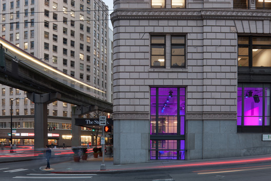
| The Studios / Graham Baba Architects Posted: 21 Feb 2017 09:00 AM PST  © Lara Swimmer © Lara Swimmer
 © Lara Swimmer © Lara Swimmer The Studios is a 10,000-square-foot venue dedicated to the disciplines of acting, dance, and music. Occupying two floors of the historic Carl Gould-designed Times Square Building (constructed in 1916), the project transforms a dated, street-level retail space and basement into a bustling community and arts educational center. Composed of seven rentable studios, The Studios was established to fill a city-wide void in state-of-the-art space for rehearsals, auditions, readings, recording sessions, and performances.  © Lara Swimmer © Lara Swimmer With four 1,000-square-foot studios, two flexible classrooms, and a recording studio set within the walls of a former bank vault, the facility provides a venue to incubate and launch local talent, and meet the growing demand for flexible performance space. Studio floors are sprung for dancing; two of the basement floors have resilient flooring for specialized dance and dance shoes, such as ballet point, and tap.  © Lara Swimmer © Lara Swimmer  © Lara Swimmer © Lara Swimmer Having served a variety of uses over the past century, the surface conditions of the building—walls, floors, and ceiling plane—were in poor condition. The design concept for The Studios was to create a simplified background where the activity of its occupants becomes the focal point. Volumes were stripped back to their essential forms, and virtually every surface was painted white. The exposed mechanical systems at the ceiling plane were sprayed with an acoustic material to create an visually simplified surface while enhancing acoustic performance. Perimeter windows were preserved to provide the city with opportunities to vicariously experience the artistic process occurring inside. Crisp modern insertions, such as the office which appears to float above one of the dance studios—the office is accessed via a step ladder—are rendered in simple, geometric forms. The custom-designed front desk is made from powder-coated steel and topped with large slabs of maple. Locker rooms are outfitted with minimal built-ins for temporary storage. Smaller studios feature glazed openings which visually connect the studios to one another and to common areas.  © Lara Swimmer © Lara Swimmer  Courtesy of Graham Baba Architects Courtesy of Graham Baba Architects  © Lara Swimmer © Lara Swimmer The two-level space was opened up to yield twenty-foot-high spaces, sharing light and visually connecting the spaces. A new, floor-to-ceiling, steel-framed window wall divides the street-level performance space from the entry sequence making the activity visible to all. In addition to providing a direct visual connection, the window wall symbolically creates a frame to capture the dancers movements, celebrating the activity as you would art on a gallery wall. Similarly, people in the common spaces are framed from the perspective of the dancers, thereby fully merging art with daily life. This posting includes an audio/video/photo media file: Download Now |
| IKEA Lab Releases Open-Source Plans for DIY Spherical Garden Posted: 21 Feb 2017 08:20 AM PST  The Growroom exhibited at Copenhagen Opera House. Image © Alona Vibe. Via Space10 The Growroom exhibited at Copenhagen Opera House. Image © Alona Vibe. Via Space10 Fresh off winning the "Design of the Year" for their refugee housing solution, the "Better Shelter," IKEA is again making waves for a pioneering, flat pack solution to societal needs. Developed by the IKEA innovation lab Space10 alongside architects sine lindholm and mads-ulrik husum, the spherical "Growroom" is a DIY garden structure intended to help people "grow their own food much more locally in a beautiful and sustainable way." And now, plans for the structure have been made available online for free via Space10's open source platform, giving anyone the opportunity to build their own 3-dimensional garden. . Image © Rasmus Hjortshøj. Via Space 10") The original Growroom exhibited at CHART ART FAIR (with Bjarke Ingels). Image © Rasmus Hjortshøj. Via Space 10 The original Growroom exhibited at CHART ART FAIR (with Bjarke Ingels). Image © Rasmus Hjortshøj. Via Space 10 Designed for communities to affordably start their own urban gardens, the Growroom takes up only 2.8 x 2.5 meters of space, using a spherical shape that allows plants to receive ample light within a vertical setup. "It is designed to support our everyday sense of well being in the cities by creating a small oasis or 'pause'-architecture in our high-paced societal scenery, and enables people to connect with nature as we smell and taste the abundance of herbs and plants," Space10 explained in a Medium post. "The pavilion, built as a sphere, can stand freely in any context and points in a direction of expanding contemporary and shared architecture."  Growroom designers Mads-Ulrik Husum and Sine Lindholm. Image © Niklas Vindelev. Via Space10 Growroom designers Mads-Ulrik Husum and Sine Lindholm. Image © Niklas Vindelev. Via Space10 Building your own Growroom requires just 17 sheets of plywood, a rubber hammer, some metal screws and a CNC milling machine (or access to a local fab lab). From there, the instructions read as if it were any other piece of self-assembly IKEA furniture, with step-by-step diagrams and directions.  © Niklas Vindelev. Via Space10 © Niklas Vindelev. Via Space10 "From Taipei to Helsinki and from Rio de Janeiro to San Francisco, the original version of The Growroom sparked interest and people requested to either buy or exhibit The Growroom," explain Space10. "But it doesn't make sense to promote local food production and then start shipping it across oceans and continents. That is why we now release The Growroom as open source design and encourage people to build their own locally as a way to bring new opportunities to life."  You can learn more about the Growroom here, and download the cutting files for yourself, here. News via Space10. IKEA's Better Shelter Wins Design of the Year 2016 IKEA Recreates Syrian Home Inside their Store in Efforts to Aid Refugee Crisis This posting includes an audio/video/photo media file: Download Now |
| Posted: 21 Feb 2017 07:00 AM PST  © Daniel Hawelka © Daniel Hawelka
 © Daniel Hawelka © Daniel Hawelka Urban Concept  Floor Plan Floor Plan Building Structure  © Daniel Hawelka © Daniel Hawelka Within the complex, the court houses conquer the free space of the area for itself. The portico connects the three main buildings and allows exciting views and one of a kind living atmosphere.  © Daniel Hawelka © Daniel Hawelka Apartment Structure The modular, economically optimized structure allows big diversity.  © Daniel Hawelka © Daniel Hawelka By putting together B-type apartments bigger flats are created, each with a complete full-size sanitary unit without the necessity of creating extra infrastructure for one of the apartments. The possibility to connect the rooms between the B and C apartments is given, as well as, the possibility to merge them together if the need of assisted living is necessary. The apartments are very compact and economically optimized.  Floor Plan Floor Plan The flats offer the same quality and category of living having less usable space. To give the compact apartments more space to "breath", some of the B Type apartments have been designed with a living room height of 4 meters.  © Daniel Hawelka © Daniel Hawelka Façade  © Daniel Hawelka © Daniel Hawelka  © Daniel Hawelka © Daniel Hawelka Reduction of costs through planning  © Daniel Hawelka © Daniel Hawelka Living for changing needs  © Daniel Hawelka © Daniel Hawelka Product Description. Perforated metal plate as a sun and rain protection which as well serves as an important architectural element to give the building a recognizable identity. This posting includes an audio/video/photo media file: Download Now |
| World Architecture Festival Launches Manifesto for the Architectural Profession Posted: 21 Feb 2017 06:15 AM PST  2016 World Building of the Year, National Museum in Szczecin by Robert Konieczny + KWK Promes . Image © Juliusz Sokołowski 2016 World Building of the Year, National Museum in Szczecin by Robert Konieczny + KWK Promes . Image © Juliusz Sokołowski The World Architecture Festival has announced the launch of the 10th edition of the event referred to as the "Oscars of architecture" by launching the "WAF Manifesto," which identifies key challenges the profession will face over the next ten years. Aimed at generated funding for architectural research, the manifesto outlines a range of topics where architects can use their influence to affect society as a whole. "In a period of profound change across the world, architects will play an important part in creating building, cities, public places and landscapes that respond to the challenges we have identified," said WAF Programme Director Paul Finch. "There are immense amounts of research being undertaken across the profession which we hope we can draw attention to, and which we intend to support through publication, exhibition and funding initiatives. "These are big-picture initiatives which concern architects both individually and collectively, and we want WAF to play a part in promoting initiatives which are aimed at making life better." Specific challenges outlined in the manifesto include climate, energy and carbon; water; ageing and health; re-use; smart city technology; building technology; cultural identity; ethics and values; power and justice; and virtual worlds. By identifying these key issues, the WAF hopes to draw interest and funding to universities and architectural practices investigating aspects of the these subjects. Resulting research will be submitted for exhibition at upcoming WAF events. Returning to the Arena Berlin in Germany, WAF 2017 will be held from November 15-17, 2017. Entries for this year's awards slate (encompassing 30 categories across completed buildings, future projects and landscape) are now open. Special awards will be given this year to exemplary projects to display in a tenth anniversary exhibition featuring key winners from the past decade. Award entries are open until 18 May, and potential entrants can take advantage of an early bird rate until 27 April. Practices submitting three or more projects will be able to enjoy a 15% discount on entry fees. For more information, visit the World Architecture Festival website, here. News via World Architecture Festival. Robert Konieczny + KWK Promes' National Museum in Szczecin Named World Building of the Year 2016 Winners of Day 1 World Architecture Festival Awards 2016 Announced World Architecture Festival Awards 2016 Announces Day 2 Winners This posting includes an audio/video/photo media file: Download Now |
| PLICO at the Flatiron / Elliott + Associates Architects Posted: 21 Feb 2017 05:00 AM PST  © Scott McDonald © Scott McDonald
 © Scott McDonald © Scott McDonald Built in 1924 by C.F. Meadors and originally the Como Hotel, this historic blond brick flatiron stood vacant and boarded up for 27 years. We have been waiting for 20 years for the opportunity to bring this corner to its full potential. We believe this corner should be the site of an enduring building, a lantern at the east gateway to downtown Oklahoma City. The project includes the renovation of the two-level flatiron building and the construction of a modern, yet complimentary rooftop addition.  © Scott McDonald © Scott McDonald The "flatiron" term originated around 1740, describing a cast-iron clothes iron, forerunner to the electric iron. Most were triangular, making it easier to iron around buttons. By the mid-19th century, the term had been ascribed to wedge-shaped sites and buildings. The 1902 Flatiron Building in Manhattan (the original Fuller Building) at 23rd and Broadway made the shape famous. Found in cities around the U.S., iconic flatiron architecture is sought-after and illustrates purity, stability and strength.  © Scott McDonald © Scott McDonald  Floor Plan Floor Plan  © Scott McDonald © Scott McDonald The area's historic triangular buildings were built soon after OKC's electric streetcar routes were drawn a century ago. The Harrison-NE 8 Route cut a diagonal path from NW 4th Street east of Broadway to NE 8th at Stiles Park, west of Lincoln. The four surviving historic triangular blocks form the core of the city's emerging Flatiron district. Streetcar tracks are still clearly visible under the adjacent railroad overpass. The renovation of the existing two-level and the addition of a third for a 1924 flatiron building into an office for PLICO, an insurance company serving physicians and other professional groups.  © Scott McDonald © Scott McDonald The third floor will be used for company functions including a boardroom, conference room, rooftop terrace, a kitchen and space for future growth of the company. The design approach is to make the new third floor addition a modern feature and a respectful, complimentary addition to the existing building. The third floor is differentiated from the existing brick building through materials and setbacks, and relates to the Flatiron building in shape, scale, color and detailing. Spectacular views of the Downtown skyline are rare.  © Scott McDonald © Scott McDonald This posting includes an audio/video/photo media file: Download Now |
| Feilden Clegg Bradley Studios Wins Competition for University of Warwick Arts Hub Posted: 21 Feb 2017 04:00 AM PST  Courtesy of RIBA Competitions Courtesy of RIBA Competitions Feilden Clegg Bradley Studios has been selected as the winners of the Royal Institute of British Architects (RIBA) competition to design the new Faculty of Arts Building at the University of Warwick, in Coventry, England. Lauded for its flexibility and collaboration-fostering design, the winning proposal was selected over finalist entries from Foster + Partners, Grimshaw, White Arkitekter and Wilkinson Eyre.  Courtesy of RIBA Competitions Courtesy of RIBA Competitions "This exciting project continues to raise the bar in the standards of the facilities we provide to support teaching and research on our campus, further enhancing the staff and student experience we seek to offer at Warwick," commented Professor Stuart Croft, Vice-Chancellor and President of the University of Warwick. "I'm extremely pleased that the new building, in close proximity to the Warwick Arts Centre, also further strengthens the University's appeal as a cultural destination, creating space to engage with our local community through a range of opportunities including: language training, access to fantastic performance and exhibition zones, and other activities to support Coventry's Cultural Strategy." Selected unanimously by the jury, Feilden Clegg Bradley received top marks for the Quality criterion as the panel felt they had best "captured the essence of the University's vision" for the enhancement of the Central Campus. "The competition has been immensely valuable in generating a wealth of ideas for a building that will serve students, staff and the public over the coming decades," said Professor Simon Gilson, Chair of the Arts Faculty. "The successful architects, Feilden Clegg Bradley Studios (FCB) will be helping us move into the exciting next phase of the development as we look to create a building that is open, inviting and flexible, allows collaboration, creativity and innovation to flourish, and acts as a hub both for public engagement in the humanities and for nurturing cultural value."  Courtesy of RIBA Competitions Courtesy of RIBA Competitions Andy Theobald, Partner at Feilden Clegg Bradley Studios (FCB), said: "Feilden Clegg Bradley Studios are delighted to have been selected to lead the design team for this exciting new Faculty of Arts building at The University of Warwick. This will be a very significant new building for the campus and one that will embody the cultural values of both the University and the Faculty. We are very much looking forward to an exciting collaboration with the Faculty to develop our competition- winning proposals and together create a building for interaction, learning and research right across the Humanities." Feilden Clegg Bradley Studios will now proceed to work with the University's Estates team to develop the project over the coming months. News via RIBA Competitions. This posting includes an audio/video/photo media file: Download Now |
| Apartment In Vilnius Old Town / Interjero Architektūra Posted: 21 Feb 2017 03:00 AM PST  © Leonas Garbačauskas © Leonas Garbačauskas
 © Leonas Garbačauskas © Leonas Garbačauskas From the architect. The task - to create a small apartment in the Vilnius Old Town. Clients - intelligent middle-aged couple living in another city, and the apartment is intended for temporary break in their visits to Vilnius.  © Leonas Garbačauskas © Leonas Garbačauskas Interior design of this flat was dictated by renovated building. Historically, this building was built as a residential building in the heart of the Old Town in 1904, , which was later transferred the owner of the Jesuit Order. In Soviet times, nationalized church property, this building was set up in police commissariat, which after bringed back independence have been raised again and the property handed over to the Order. Renovation of building company decided to restore the original purpose of the building and its use of administrative returned to the residence.  Floor Plan Floor Plan The interior concept was dictated by the history of the building, but the result is an eclectic, where you can find and 20century modern, vintage and insutrial style.  © Leonas Garbačauskas © Leonas Garbačauskas The apartment has very high ceilings, so we have designed mezzanine above the kitchen, covered with tinted mirror for a storage.  © Leonas Garbačauskas © Leonas Garbačauskas Important apartment accent - wood veneer entry solid wood wall with graphite gray color goes into the ceiling and floor moldings, creating a contrast framing effect.  © Leonas Garbačauskas © Leonas Garbačauskas The main living area design axis - glamor ceiling view. According to our project of created pattern has been taken over on the photo wallpaper and glued on the ceiling. This was intended to highlight the greatest advantage of the apartment - high ceilings.  © Leonas Garbačauskas © Leonas Garbačauskas Bedroom walls painted in ombre effect, creating an allusion to the sky scenery outside the window.  © Leonas Garbačauskas © Leonas Garbačauskas This posting includes an audio/video/photo media file: Download Now |
| The Fossilized Soviet Architecture of Belarus, in Photos Posted: 21 Feb 2017 01:30 AM PST  The Mound of Glory. A monument to the soldiers who fought for the liberation of Belarus during World War II. By architect O. Stakhovich and sculptor A. Bembel, 1967-1969. Image © Stefano Perego The Mound of Glory. A monument to the soldiers who fought for the liberation of Belarus during World War II. By architect O. Stakhovich and sculptor A. Bembel, 1967-1969. Image © Stefano Perego The history of what is now the Republic of Belarus is a turbulent one. It has been part of the Russian Empire, occupied by the Germans during both World Wars, divided between Poland and the Soviet Union, and finally declared its independence in 1991. Although Belarus is now an independent nation, it is also an isolated dictatorship that has in some ways remained unchanged since the 1990s, and is largely seen both culturally and architecturally as a sort of time warp, Europe's most vivid window into life in the Soviet Union. Photographer Stefano Perego recently documented the postwar Soviet legacy of Belarus' architecture from the 1960s-80s, and has shared the photos from his 2016 cross-country drive with ArchDaily.  House of Fashion, by architect Vasilij Iosifovich Gerashenko 1962-1967. Relief "Solidarity" by sculptor Anatol' Yafimovich Arcimovich. Minsk, Belarus. Image © Stefano Perego House of Fashion, by architect Vasilij Iosifovich Gerashenko 1962-1967. Relief "Solidarity" by sculptor Anatol' Yafimovich Arcimovich. Minsk, Belarus. Image © Stefano Perego As a result of heavy resistance to German invasion in WWII, much of the traditional Belarusian architecture, which included wooden houses, Baroque palaces and cathedrals, and Renaissance-inspired castles, was destroyed. [1] In 1919 the city of Minsk was chosen by the USSR as the capital of the Byelorussian Soviet Socialist Republic, and as such was the site of Soviet efforts to rebuild and modernize after the wars, along with other cities such as Kiev and Smolensk. [2]  Pavilion of International Exhibitions "Belexpo", by architect Leonard Moskalevich, 1988. Minsk, Belarus. Image © Stefano Perego Pavilion of International Exhibitions "Belexpo", by architect Leonard Moskalevich, 1988. Minsk, Belarus. Image © Stefano Perego The rebuilding process of newly Soviet cities had to happen quickly, as many people had been displaced from their homes during the war. New apartment buildings and public transportation infrastructure were constructed in urban centers to facilitate industry by housing labor close to the country's production zones. The massive, concrete housing blocks that still exist in Belarus are a direct result of this urgency to house the populace, and constitute one aspect of the country's remaining Soviet Architecture.  "Courage", a gigantic soviet sculpture inside the Memorial Complex "Hero Fortress", by a team of sculptors and architects headed by sculptor Alexander Kibalnikov, 1968-1971. Brest, Belarus. Image © Stefano Perego "Courage", a gigantic soviet sculpture inside the Memorial Complex "Hero Fortress", by a team of sculptors and architects headed by sculptor Alexander Kibalnikov, 1968-1971. Brest, Belarus. Image © Stefano Perego But social and economic need was far from the only factor for urban construction in the Soviet Republic of Belarus. Expansive boulevards, monuments to the city's resistance of Naziism during WWII, squares, and grandiose government buildings still remain from Minsk's communist days. [3] These projects were carefully planned to convey an image of the Soviet Union as both powerful and egalitarian victors. , by architect Vladimir Pushkin, 1982. Minsk, Belarus. Image © Stefano Perego") Housing complex "Kukuruza" (Corn), by architect Vladimir Pushkin, 1982. Minsk, Belarus. Image © Stefano Perego Housing complex "Kukuruza" (Corn), by architect Vladimir Pushkin, 1982. Minsk, Belarus. Image © Stefano Perego Large public squares are found in front of majestic state offices, city halls, and upscale apartment buildings that were almost always inaccessible for most citizens. The juxtaposition of elitist structures with public space provided a veneer of populism that fit with the communist ideology. [4] These buildings used a state-approved set of architectural vocabulary that drew on political histories of the time periods in which they were popular--for example, pastiches of classical styles were acceptable because of the Greek's association with democracy. [5]  Cinema Oktyabr, by architect Valentin Malyshev, 1975. Minsk, Belarus. Image © Stefano Perego Cinema Oktyabr, by architect Valentin Malyshev, 1975. Minsk, Belarus. Image © Stefano Perego Although some street and square names have been changed to reflect nationalism rather than communism, today this Soviet urban planning remains largely unchanged in Belarus. However, traveler's accounts of the city explain that the lavish scars of the USSR sometimes feel like a touristic facade in the über clean streets of Minsk, possibly an attempt by the state to mask the more humble parts of the city frequented by locals. [6] , by architect Vladimir Galuschenko, 1980. Bobruisk, Belarus. Image © Stefano Perego") Dom Skvorechnik (Birdhouse), by architect Vladimir Galuschenko, 1980. Bobruisk, Belarus. Image © Stefano Perego Dom Skvorechnik (Birdhouse), by architect Vladimir Galuschenko, 1980. Bobruisk, Belarus. Image © Stefano Perego Under President Alaksandr Lukašenka, present-day Belarus has produced few architectural changes of note, further contributing to the image of Minsk as a Soviet-era fossil. Restoration of the colorful homes in Minsk's Trinity Suburb is aimed at tourists (although the fact that they are surrounded by metal bars makes them difficult to enjoy), and the government is working on an application to UNESCO to preserve the city's 20th century architecture, which speaks to its continued reverence of the Soviet style. [6] 2006 saw the opening of the infamous National Library of Belarus, which can be seen as a kind of postmodern interpretation of socialist monumentalism.  Faculty of Architecture and Construction, by architects Igor Esman and Viktor Anikin, 1983. Minsk, Belarus. Image © Stefano Perego Faculty of Architecture and Construction, by architects Igor Esman and Viktor Anikin, 1983. Minsk, Belarus. Image © Stefano Perego Interestingly, the official website of the Republic of Belarus is eager to advertise what remains of the country's 17th-century architecture, while there is little mention of the Socialist Architecture for which it is most known, which could be symbolic of a coming change in Belarus as a "window to the Soviet past."  Palace of Arts, by architect Boris Semyonovich Popov, 1989. Bobruisk, Belarus. Image © Stefano Perego Palace of Arts, by architect Boris Semyonovich Popov, 1989. Bobruisk, Belarus. Image © Stefano Perego References:
 The Mound of Glory. A monument to the soldiers who fought for the liberation of Belarus during World War II. By architect O. Stakhovich and sculptor A. Bembel, 1967-1969. Image © Stefano Perego The Mound of Glory. A monument to the soldiers who fought for the liberation of Belarus during World War II. By architect O. Stakhovich and sculptor A. Bembel, 1967-1969. Image © Stefano Perego This posting includes an audio/video/photo media file: Download Now |
| House Between-Lines / OLAestudio Posted: 21 Feb 2017 01:00 AM PST  © Hector Santos Diez © Hector Santos Diez
 © Hector Santos Diez © Hector Santos Diez From the architect. Located in Santiago de Compostela, Galicia. The house between-lines arises from the desire to systematize and expedite the constructive solutions. Our clients had a tight budget so, in a sense, we had to escape from constructive rhetoric and anything that was not essential. This home is a simple system, both implantation and constructive. Order patterns easily repeatable and without complex technologies. Its form arises from the interior uses being able to be varied by virtue of these.  © Hector Santos Diez © Hector Santos Diez  Floor Plan Floor Plan  © Hector Santos Diez © Hector Santos Diez In a flat and green plot rises a concrete platform, a slab on which are placed a set of walls, of thermoclay, parallel and equidistant. On them the structure of laminated wood and the traditional and flat tile roof. Fronts are covered depending on the client's desire for privacy, light and views. The space for housing is already defined by these walls, the wooden ceiling and the fronts.  © Hector Santos Diez © Hector Santos Diez Nothing in my pockets, nothing up my sleeves. A flexible system adaptable to different needs, atmospheres and budgets.  © Hector Santos Diez © Hector Santos Diez This posting includes an audio/video/photo media file: Download Now |
| Posted: 21 Feb 2017 12:00 AM PST  Courtesy of The Leewardists Courtesy of The Leewardists The legendary John Lennon once said, "Time you enjoy wasting, was not wasted." And had a group of disgruntled, bespectacled, darkly clad architects been present when he spoke these words, their response probably would've been: "Time? What time, Johnny boy?" But as a matter of fact, there was no group of architects listening to these wise words, because they were probably furiously puffing on their last cigarette, tearing up another piece of trace, or lying collapsed somewhere. It's common knowledge that time is not exactly an architect's best friend. Sleepless nights, endless hours of painstaking work and coffee expenses are but a few of the side effects that are all too familiar within the profession. But if the watch on your wrist looks something like this, don't worry, because ours do too.  Courtesy of The Leewardists Courtesy of The Leewardists Centuries of civilizations built on structures designed by architects and yet, their voice is lost among the countless stories of rulers and armies and sometimes wondrous monsters. The Leewardists are rewriting the contemporary history of our civilization through the voice of this elusive being, The Architect. For more of The Architect Comic Series follow them on Facebook, Instagram or visit their website. This posting includes an audio/video/photo media file: Download Now |
| Francis Kéré to Design 2017 Serpentine Pavilion Posted: 20 Feb 2017 11:30 PM PST  Serpentine Pavilion 2017, Designed by Francis Kéré, Design Render, Interior. Image © Kéré Architecture Serpentine Pavilion 2017, Designed by Francis Kéré, Design Render, Interior. Image © Kéré Architecture The Serpentine Galleries have announced that the 2017 Serpentine Pavilion will be designed by Diébédo Francis Kéré (Kéré Architecture), an African architect based between Berlin, Germany, and his home town of Gando in Burkino Faso. The design for the proposal, which will be built this summer in London's Kensington Gardens, comprises an expansive roof supported by a steel frame, mimicking the canopy of a tree. According to Kéré, the design for the roof stems from a tree that serves as the central meeting point for life in Gando. In line with the criteria for the selection of the Serpentine Pavilion architect Kéré has yet to have realised a permanent building in England.  Serpentine Pavilion 2017, Designed by Francis Kéré, Design Render, Exterior. Image © Kéré Architecture Serpentine Pavilion 2017, Designed by Francis Kéré, Design Render, Exterior. Image © Kéré Architecture According to the Serpentine Galleries: "When the sun in shining, visitors will be able to find shade underneath the canopy, or sit and bask in the courtyard that surrounds it. But on wet days, rainwater will drain down through an oculus in the pavilion's roof structure, creating a 'spectacular waterfall effect', before escaping down into a drainage system hidden beneath the ground. The structure will also take on a different character by night, when its wooden walls become a source of illumination."  Francis Kéré. Image © Erik Jan Ouwerkerk Francis Kéré. Image © Erik Jan Ouwerkerk Design StatementThe proposed design for the 2017 Serpentine Pavilion is conceived as a micro cosmos – a community structure within Kensington Gardens that fuses cultural references of my home country Burkina Faso with experimental construction techniques. My experience of growing up in a remote desert village has instilled a strong awareness of the social, sustainable, and cultural implications of design. I believe that architecture has the power to, surprise, unite, and inspire all while mediating important aspects such as community, ecology and economy. In Burkina Faso, the tree is a place where people gather together, where everyday activities play out under the shade of its branches. My design for the Serpentine Pavilion has a great over-hanging roof canopy made of steel and a transparent skin covering the structure, which allows sunlight to enter the space while also protecting it from the rain. Wooden shading elements line the underside of the roof to create a dynamic shadow effect on the interior spaces. This combination of features promotes a sense of freedom and community; like the shade of the tree branches, the Pavilion becomes a place where people can gather and share their daily experiences. Fundamental to my architecture is a sense of openness. In the Pavilion this is achieved by the wall system, which is comprised of prefabricated wooden blocks assembled into triangular modules with slight gaps, or apertures, between them. This gives a lightness and transparency to the building enclosure. The composition of the curved walls is split into four elements, creating four different access points to the Pavilion. Detached from the roof canopy, these elements allow air to circulate freely throughout.
In the evening, the canopy becomes a source of illumination. Wall perforations will give glimpses of movement and activity inside the pavilion to those outside. In my home village of Gando (Burkina Faso), it is always easy to locate a celebration at night by climbing to higher ground and searching for the source of light in the surrounding darkness. This small light becomes larger as more and more people arrive to join the event. In this way the Pavilion will become a beacon of light, a symbol of storytelling and togetherness. This posting includes an audio/video/photo media file: Download Now |

.jpg?1487170739)
| You are subscribed to email updates from ArchDaily. To stop receiving these emails, you may unsubscribe now. | Email delivery powered by Google |
| Google Inc., 1600 Amphitheatre Parkway, Mountain View, CA 94043, United States | |
Nema komentara:
Objavi komentar