Arch Daily |
- House in Vilnius / Laurynas Žakevičius Architects
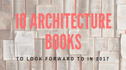
- 10 Architecture Books to Look Forward to in 2017
- Site de Thales / LCR ARCHITECTES
- N2 House / Pitsou Kedem Architects
- Mutipurpose Classroom and Phu Chi Fah Forest Fire Control Station / Geodesic Design
- Hafye / CUBO design architect
- Shenzhen Maoshuli Cafe / Elsedesign
- Pergola Pavilion / PAR Arquitectos
- Mecanoo's Bruce C. Bolling Building Wins 2017 Harleston Parker Medal
- Teachers Village / Richard Meier & Partners
- David Chipperfield's West Village Apartment Complex Finally Given Greenlight
- Sunset House / Mcleod Bovell
- Experimenta 21 Tower / MORINI Arquitectos
- 2.8 Million-square-foot Apple Campus to Open in April... And It Looks Incredible
- INTERIORS: La La Land
- House Obidos / Russell Jones Architects + RSM arquitecto
- Richard Rogers Fellowship 2017 - Winners Announced
- Paper Models of the Most Controversial Buildings Erected Behind the Iron Curtain
- "MethodKit for Cities" 105 Cards to Discuss and Plan the Future of our Cities
| House in Vilnius / Laurynas Žakevičius Architects Posted: 22 Feb 2017 09:00 PM PST  © Leonas Garbačauskas © Leonas Garbačauskas
 © Leonas Garbačauskas © Leonas Garbačauskas From the architect. It was cozy, mature plot overgrown with old pine trees. The project had to be reconstruction of an old house with no architectural value, but reconstruction work unexpectedly turned into almost a new modern house. At first, clients hoped to save at least part of the building, butlater it turned out that it simply is not worth rescuing as was built very faulty. Little by little it was demolished, and the housing took on a whole new look and style.This is one part of blocked building and is designed on former house outlines for the family of three. Austere building volumes is intersection of cubes in different sizes and heights with black wood planking from the outside. Deep skylights are used for southern sunlight to enter the main premises on the ground floor and lighten the dark part of the kitchen.  © Leonas Garbačauskas © Leonas Garbačauskas Interior. Different heights of ceilings and skylights create a playful mood of inner spaces. Exposed yellow brick wall is the old building fragment that remained and has become an exclusive interior element that is seen and felt in all the ground floor rooms. Chaotic composition of windows in lofty living area over the daytime creates a play of shadows, and during the night time shadows are changed to the lighting in the ceiling. Raw concrete floors, minimalistic black steel staircase, roughly plastered wallsenabled to create a relaxing and not really ascetic spaces. Large dining room glazing wipes the line between indoor and outdoor giving the residents to enjoy the fresh air.  © Leonas Garbačauskas © Leonas Garbačauskas  Ground Floor Plan Ground Floor Plan  © Leonas Garbačauskas © Leonas Garbačauskas Product Description. The house is constructed using a prefabricated timber-frame panel system. It was chosen as fast and reliable construction. The exterior of the house applies black coloured timber planks with white coloured planks for terrace ceiling and walls. Dark colours allows to mesh this building with natural surrounding of the old pine trees and make it more particular from blocked house on the south.  © Leonas Garbačauskas © Leonas Garbačauskas This posting includes an audio/video/photo media file: Download Now |
| 10 Architecture Books to Look Forward to in 2017 Posted: 22 Feb 2017 08:00 PM PST  In this article, originally published by Strelka Magazine, journalist and writer Stanislav Lvovskiy recommends ten forthcoming books (which will be published this year) on architecture and urbanism written by leading experts and scholars. A person of prescience never renounces the pleasures (and, yes, perils) of forecasting, especially the realistic kind, and even more so after all the "bad news" of the past year. Without a doubt, the year to come has its own surprises in store. For those who still relish reading or, at the very least, find it useful, let's now have a preview of the pleasures we can expect from the university presses in 2017. Forensic ArchitectureWeizman E., Forensic Architecture: Violence at the Threshold of Detectability (MIT Press) – April 2017 Eyal Weizman is professor of Spatial and Visual Cultures at Goldsmiths College (University of London), Director of the Centre for Research Architecture and Global Scholar at Princeton University, as well as the founder of the ERC-funded Forensic Architecture project, the book resulting from which, Before and After (co-authored with Ines Weizman) was published by Strelka Press in 2014. His new book presents an in-depth description of the novel research methods developed by the Forensic Architecture collective to investigate human rights abuses, military conflicts and destruction through the unique lens of architecture. The book features insights into the history of Forensic Architecture's methods, peculiarities of their practice, their underlying assumptions and perils, as well as a representative collection of relevant documents, maps and images. The subjects of Forensic Architecture vary from the architectural reconstruction of a secret detention centre in Syria to the detailed investigation of environmental violence in the Guatemalan highlands. For those more inclined to a synthetic rather than analytic approach, Jenny Donovan's remarkable Designing to Heal: Planning and Urban Design Response to Disaster and Conflict may also prove to be a useful complementary reading.
 Forensic Architecture: Violence at the Threshold of Detectability Walking in BerlinHessel F., Walking in Berlin: A Flaneur in the Capital (MIT Press) – March 2017 It's hard to image a new book having something to add to our understanding of the flâneur, a figure (and concept) thoroughly studied by scholars coming from both urban studies and architecture, urban and cultural history. However, here it is: the first English translation of Franz Hessel's Walking in Berlin, capturing the images, sounds and rhythms of the German capital through the years of the Weimar Republic, catching onto the tectonic transfigurations of German and European culture and politics. Hessel, known mostly for his connection to Walter Benjamin, with whom he produced the German translation of Marcel Proust's In Search of Lost Time, is a thoughtful and sensitive observer of the city in his own right. Focusing on the theatres, clubs, cinemas and public spaces of the city, he contextualizes the Berlin of the 1920s, sharing with the reader tales of the past as well as his analysis of the links between the parts of the city, from the Alexanderplatz to Kreuzberg, so meticulously that the 1929 book, after everything that has happened to Berlin since it was written and published, can still be sort of a guide for the present-day flâneur. Aside from the complete translation, this edition includes Walter Benjamin's essay on Hessel's book, which was written as a review of the original edition.
 Walking in Berlin: A Flaneur in the Capital (MIT Press) The Icon ProjectSklair L., The Icon Project: Architecture, Cities, and Capitalist Globalization (Oxford University Press) – April 2017 Leslie Sklair, Professor of Sociology at the London School of Economics and Political Science, is the author of numerous works on the role that iconic architecture plays in a globalised economy (and the globalised world as such). Here he offers his perspectives on a new form of architecture that has appeared in the course of the last decades in the world's major cities: designed by several architectural stars or architectural firms, it is owned by them as well, and inevitably serves private interests by externalizing power in the form of buildings, renovation projects or even whole cities. This in turn, according to Sklair, helps to promote consumerist values, be it by the "buildings recognised as works of art in their own right" or by what he calls "typical icons," which copy the unique ones. Though the ideological component of Sklair's project may seem predominant in this work, The Icon Project proves to be more of a case of sober critical analysis of vanity-fueled global architectural practices.
 The Icon Project: Architecture, Cities, and Capitalist Globalization Across Space and TimeHaughey P., Across Space and Time: Architecture and the Politics of Modernity (Transaction Publishers) – February 2017 The concept of modernity is at one and the same time one of the most widely used concepts in various contexts and one of the most problematic. We tend to think of this concept as recent and applicable mostly to the West, or in other words to the Anglo-Saxon and several other Western European countries. The architectural history of modernity is in turn, according to Patrick Haughey, the editor of this volume, "unstable" since we always have to rethink "how humanity and its interventions transform space over time. We inhabit the buildings, but our beliefs, languages, politics, social structures, and environmental influences are subject to permanent change." What makes it possible for architectural history to exist as an optical device that can be used to explore the world are the remnants and physical traces we leave in the environment. Across Space and Time brings together scholars of art and architectural history to in a collective effort to see architecture through the lens of modernity as defined in different parts of the world. The resulting book provides strong architectural and cultural evidence for the claim of modernity being a far more powerful concept in terms of geography and time, in no way limited to the "Wext" of just a few (albeit politically, economically, and culturally influential) countries. Undergoing various transformations in the course of its expansion across the globe, modernity "has been negotiated through architecture, urban planning, design pedagogies, preservation, and art history in diverse locations around the world." Each chapter focuses on a particular case of such negotiation, from Robert Cowherd's Identity Tectonics, which explores the story of two Dutch architects who met in 1923 in the Dutch metropole of Bandung, Java (contemporary Indonesia) to Jeremy Bentham's Russian journey, during which the idea of his famous Panopticon was arguably conceived, and further to the study of competing discourses on urban modernity in 1960s Slovenia, Yugoslavia by Veronica E. Alpenc. Across space and Time is a contribution to the contemporary social critique of architecture as well as to the process of rethinking the theoretical frames and methodologies of architectural history.
 Across Space and Time: Architecture and the Politics of Modernity What Happened to My Buildings?De Haan H., Keesom J., What Happened to My Buildings: Learning from 30 Years of Architecture with Marlies Rohm (NAi010 Publishers) – February, 2017 Architecture and time are condemned to a relationship that is at the very least complicated. However, this complicity is generally seen as somehow theoretical: it is something discussed by John Dewey, Yuri Lotman or other scholars. The one who is going to dedicate his or her life to architecture has to address these issues—usually once, usually during the early career stages—simply because one has to address them. Once we've elaborated our stance on architecture and time, we rarely rethink it, precisely because of its philosophical, theoretical nature. But what do you do when you realise your craft has changed so dramatically that you are not sure anymore if your buildings are good or bad? When Dutch architect Marlies Rohmer found himself in this very situation, he bought a van and went for a trip—well, let's say along memory lane—to reexamine 25 buildings he had created as an architect. Re-examination is probably an understatement here since Rohmer did a great deal of work talking with commissioners, residents and users, systematising and analysing information and making sense of the resulting insights. Hilde de Haan and Jolanda Keesom then wrote a book, a "sometimes moving, often hilarious and always informative exploration of what really counts in architecture." In short, they put the lessons learned by Marlies Rohmer into the broad contexts of urban life and city planning. Rohmer's study cases provoke "questions of cause and effect, of control and contingency:" do an architect's individual design choices matter and to what extent? Do the building's users continue to construct it after the architect leaves, and if yes, then how? What about the significance of rules and regulations? And last but not least, what is the nature of the relationship between architecture and time at the relatively small scale of a human life, especially if this human happens to be an architect?
 What Happened to My Buildings: Learning from 30 Years of Architecture with Marlies Rohmer Architecture and WasteKara H., et al. (ed.)., Architecture and Waste: A (Re)planned Obsolescence (Actar) – February 2017 This book also pursues, in particular, the same theme: that is to say the perishable nature of the mortal plane and architects' issues with this fact. When it comes to industrial buildings, the role of designer generally and, in particular, a kind of ambiguous due to the complexity and technical purposes of such buildings. Architects are rarely involved in addressing the economic, logistic and ecological issues that emerge in the process of industrial construction, and the case of waste-to-energy facilities is no exception. However, this type of industrial buildings is still in high demand even within the de-industrialized developed economies. This collection's primary editor, Hanif Kara, is well-known for his expertise in design structural engineering: he is, among other things, design director and co-founder of London-based structural engineering practice AKT II and professor of the Practice of Architectural Technology at Harvard Graduate School of Design. Consequently, this book presents a "refreshed, design-led approach to waste-to-energy (WTE) plants," reflecting work done at Harvard University Graduate School of Design (GSD). The volume compares the well-established waste-to-energy industries in Sweden with less established cases in the northeast of the United States. According to the results of the study, architects should definitely have a role to play in "integrating waste-to-energy plants physically and programmatically within their urban or suburban contexts, as well as potentially lessening the generally negative perception of energy recovery plants." While industrial architecture is much less trendy nowadays than, say, in the 1920s and 1930s, the re-industrialization trend emerging across the developed economies as well as the constantly growing demand for the relevant specialists in the Third World, along with the noticeable disappointment in "iconic architecture" (see Leslie Sklair's book above), can make industrial architecture once again an attractive career choice. There's no harm in giving it a thought anyway, right?
 Architecture and Waste: A (Re)planned Obsolescence Post-Metropolitan TerritoriesBalducci A., Fedeli V., Curci F. (eds.)., Post-Metropolitan Territories: Looking for a New Urbanity (Routledge) – February 2017 Some of us have just managed to get used to the idea of the metropolitan areas as the future main centers of power, finance, innovation and culture. But that's because some of us are still a bit slow for the brave new world of globalization, or one may even say that according to the latest electoral trends in the West many of us are too slow for it. But there are others who are fast enough to think several moves ahead. Among these are, of course, the editors of this collection, Alessandro Balducci, Valeria Fedeli and Francesco Curci, all urban studies scholars from the Politecnico di Milano. What we have historically thought of cities, how we have imagined and built them was always in a state of constant reconfiguration. The worldwide process we call today "multi-scalar regional urbanization" is different from the similar processes of the previous two hundred years: neither city, nor metropolis (or our ideas of those) are the same now as they were in the 19th and 20th centuries. Post-Metropolitan Territories features a thorough, albeit broad overview of Italy, one of the most complex and diverse European countries, which makes it a perfect subject for scholarship focused on regional development and performance. This collection, a result of a research project funded by the Italian Ministry for Education, Universities and Research (MIUR), studies several "Italian cities and their hinterlands and looks at new forms of urbanization, exploring themes of sustainability, industrialization, deindustrialization, governance, city planning and quality of life." The ultimate goal of Post-Metropolitan Territories is to find the right, if still preliminary words to describe the contemporary turn in the very ideas of "cityness" and "urban.". As the editors write in the introductory chapter in relation to Rome: "[it] is today a metropolitan region which, connected and interacting [...] with the surrounding areas, arrives to include confining regions. It is an 'urban region' with specific characteristics, where the territories and the way the city is lived are experiencing a reorganization which is following unusual routes and is creating new urban realities which requires new political solutions." Since "not only living conditions have changed, but also the way the urban reality is conceptualized, perceived, represented and imagined." we face the necessity to distinguish "new forms of appropriation and reappropriation of the living space, new way of giving sense to abandoned spaces, new forms of 'territorialization' as well as the explosion of alternative economic strategies and, in order to respond to diverse urban challenges, to promote new networking systems and new organizational forms." This book seems to be essential reading for those who plan on entering the terrain of urban and spatial planning in the years to come, since chances are that it will be already referred to as "the pioneering study."
 Post-Metropolitan Territories: Looking for a New Urbanity (Routledge Advances in Regional Economics, Science and Policy) Urban AnimalsHolmberg T., Urban Animals: Crowding in Zoo-Cities (Routledge) – April 2017 Urban Animals is not just another expression from Urban Dictionary, akin to, say, "party animal." Neither is it an ancient but now commonplace metaphor like "political animal." Urban animals are very real living creatures roaming our cities, whether by four paws on Earth's surface or by a couple of wings high above. Tora Holmberg, Associate Professor in Sociology and Senior Lecturer at the Institute for Housing and Urban Research in Uppsala University (Sweden) argues that cities provide various opportunities to animals (and, of course, impose various constraints on them) as well as to humans. Our attitudes to urban animals are ambivalent: notwithstanding the fact that until the early 20th Century human-animal encounters even in the largest European capitals were merely a matter of everyday life and that such encounters involved a much larger variety of species than cats, dogs and pigeons, nowadays we often complain about urban animals and perceive them as dangerous or at least unwanted. Animals generally "transgress geographical, legal, and cultural ordering systems," which is why we tend to see them as uncontrollable, and anything uncontrollable within the limits of contemporary cities becomes a source of anxiety, sometimes unconscious. At the same time, we care about urban animals; they are involved in conservation practices and are subject to bio-political actions (see sterilization of stray dogs). So how can we "consider spatial formations and urban politics from the perspective of human/animal relations" and why do we need to? Holmberg offers a number of case studies exploring the controversial nature of human/animal relations in the city. These cases include, but are not limited to: companion animals, free-ranging dogs, homeless and feral cats, and urban animal hoarding (consider "crazy cat ladies"). The theoretical framework of "zoo cities" is suggested, embracing two very different fields of scholarship: animal studies and urban studies. This results in a reframing of urban relations and space. On the one hand, Holmberg expands the theoretical instruments of urban studies beyond the human, and on the other, she brings to life familiar sociological theories using the animal studies apparatus. Ultimately, her book seeks to describe the phenomenon that she calls "humanimal crowding;" numerous "urban controversies and crowding technologies are analyzed, finally pointing at alternative modes of trans-species urban politics through the promises of humanimal crowding – of proximity and collective agency." While urban ideology, intended to enforce the social order, requires the exclusion of animals, a look at reality reveals a multitude of practices that add up to a picture of diverse, disordered, and sometimes even disturbing experiences.
 Urban Animals: Crowding in zoocities (Routledge Human-Animal Studies Series) Making Places for PeopleCoffin C.J., Young J., Making Places for People: Twelve Questions Every Designer Should Ask (Routledge) – February 2017 This title is of a more practical nature but, at the same time, it is in no way a mere manual. Making Places for People, written by Christie Johnson Coffin from the Design Partnership architectural firm, and Jenny Young, Professor at the University of Oregon, combines the best of two worlds, offering new questions as well as answers to old ones. Their book is focused on the twelve social questions of environmental design. Using their unique combination of theoretical and practical expertise, the authors challenge common assumptions about how places meet human needs and offer a much more complex view, which is far from being self-evident. Coffin and Young ask themselves (and us), whether answers for the usual, "by-the-book" questions of urban and environmental design, e.g."What is the story of this place? What logic orders it? How big is it? How sustainable is it?" can be easy and if there are easy ways to find answers. While the underlying assumption of the authors looks quite familiar ("critical understanding of the relationships between people and their built environments can inspire designs that better contribute to health, human performance, and social equity"), the book is thought-provoking and is recommended for those who are not strangers to the particular kind of excitement we use to call "curiosity."
 Making Places for People: 12 Questions Every Designer Should Ask Digital ArchitectureBurry M. (ed.), Digital Architecture (Routledge) – June 2017 Mark Burry, Professor of Innovation and Director of the Spatial Information Architecture Laboratory (SIAL) of the RMIT University (Melbourne), who is well known for his expertise on the work of Antoni Gaudi, takes on the editing duties for the unprecedented summae of digital architecture scholarship. Of course, it's not the first time he has turned to this subject (see for example his Scripting Cultures: Architectural Design and Programming). This collection, one of the opening titles for the new Routledge series Critical Concepts in Architecture, which is intended "to meet today's research, reference, and teaching needs" by bringing together :canonical and cutting-edge scholarship to provide users with historical context as well as a thorough, broad overview of current issues and debates," seems to be truly unique. The four volumes, amounting to 1600 pages, summarise the whole of contemporary scholarship on all aspects of architecture engaged with computation. Digital Architecture proves that its subject has developed into a full-fledged field in its own right and has invaded all other architectural subdisciplines, as well. These two volumes feature all the relevant key texts on a wide variety of issues, including but not limited to info and data management, digital representation, computer science philosophy and trans-disciplinary approaches. Such a collection, focusing on the period starting from 1980s but also embracing earlier scholarship, will undoubtedly be a very useful addition to the library of any academic, practitioner or, for that matter, student interested in this subject, as well as for those who would like to have a glimpse into the future of architecture, near and distant alike.
 Digital Architecture (Critical Concepts in Architecture)  This posting includes an audio/video/photo media file: Download Now |
| Site de Thales / LCR ARCHITECTES Posted: 22 Feb 2017 07:00 PM PST  © Mathieu Ducros / Opictures © Mathieu Ducros / Opictures
 © Mathieu Ducros / Opictures © Mathieu Ducros / Opictures From the architect. The project was designed for the aeronautical industry group Thales. The lake is the major component of the site. It is accompanied by a thick and large vegetable filter. It offers with its shores a green lung to the whole neighbourhood.  Site Plan Site Plan The new site of Thales by its geographical and strategic location in the heart of the large block as well by the quality of its environment, corresponds to a major stake. The presence of the motorway axis reinforces its visibility. The project plays the role of signal on the scale of the agglomeration of Toulouse.  © Mathieu Ducros / Opictures © Mathieu Ducros / Opictures The tertiary building, limited to 9 levels, is composed of 2 distinct volumes developed around a central core. It plays the erasure being transparent over its entire height and has a uniformly tinted glass skin that smooth its surface and ensures the solar control.  © Mathieu Ducros / Opictures © Mathieu Ducros / Opictures The raw material of the composition of the facades is light. In front of this skin, a set of sun blocker blades get developed freely with a desired graphic effect allowing to blur the stratification of the different office levels. This "over-frontage" offset forms spiral rings distributed over the whole envelope of the building. Half of these elements are lacquered in white, the other lacquered in anthracite gray. This game is accentuated by the effect of shadow cast and reflection of the blades on the glazing. A depth is thus perceived which makes it possible to lighten the volume. The reflections of a privileged environment line the facades, animated exclusively by the graphic game of the sun blockers.  © Mathieu Ducros / Opictures © Mathieu Ducros / Opictures This posting includes an audio/video/photo media file: Download Now |
| N2 House / Pitsou Kedem Architects Posted: 22 Feb 2017 06:00 PM PST  © Amit Geron © Amit Geron
 © Amit Geron © Amit Geron From the architect. Seven states of passage are set between the main gate and the back yard of this house. The first passage is under a grate lattice that floats above the entrance. To its left is a massive concrete wall that hangs above a dark reflection pool and hides the house interior.  © Amit Geron © Amit Geron The second stage is beyond this wall, at a more private entrance hall that reveals the house and yet is separated from it with a glass wall.  © Amit Geron © Amit Geron The third stage is at the main front door where there are two hallways – the main one crosses through the house whereas the second leads to the guest bathroom.  © Amit Geron © Amit Geron The fourth stage is when moving along the main hall, which at its left is an internal patio rising three stories high, and housing both the staircase and a sitting area.  © Amit Geron © Amit Geron Walking along the hall reveals the fifth stage, when the more private kitchen and family room are seen through slits in the hallway wall.  Ground Floor Plan Ground Floor Plan  Elevations Elevations The last stages are at the end of the hallway, where the living room is and, eventually, the open yard above which, echoing the entrance, floats a grate lattice.  © Amit Geron © Amit Geron  © Amit Geron © Amit Geron The hallway holds two windows. One is long and narrow and set at eye level. It is situated between the house's two private cubes that are separated by the public spaces. Another, sky window opens above the hallway and illuminates it with light that softens by its fall on the slanted railing wall of the second story bridge. Here too the grate lattice pattern appears, as it filters the light entering through the sky window.  © Amit Geron © Amit Geron This posting includes an audio/video/photo media file: Download Now |
| Mutipurpose Classroom and Phu Chi Fah Forest Fire Control Station / Geodesic Design Posted: 22 Feb 2017 02:00 PM PST  © Jeerawat Chutiwattanathada © Jeerawat Chutiwattanathada
 © Jeerawat Chutiwattanathada © Jeerawat Chutiwattanathada Phu Chi Fa Forest Fire Control Station is located two hours' ride up the mountain on the Thai-Laos border in Chiangrai, 800 kilometers from Bangkok. The station takes care of about 3,000 square kilometers forest area. Firefighters also tour schools in this area to give lectures on forest fire prevention. They need a new classroom in the station.  © Jeerawat Chutiwattanathada © Jeerawat Chutiwattanathada  Exploded Axonometric Exploded Axonometric  © Jeerawat Chutiwattanathada © Jeerawat Chutiwattanathada Friends of the station raised a small fund for the classroom. Staffs and architects decided on the solution of minimum purchasing and transporting of materials from city. Firefighters also volunteered to build the classroom themselves.  © Jeerawat Chutiwattanathada © Jeerawat Chutiwattanathada Walls are of red earth dug up on site mixed with cement. Roof structure is of bamboo from nearby groves. Thatching is an old local wisdom. Skylight dome is custom made in Bangkok. Moreover, other parts and details can be made locally.  © Jeerawat Chutiwattanathada © Jeerawat Chutiwattanathada  © Jeerawat Chutiwattanathada © Jeerawat Chutiwattanathada  © Jeerawat Chutiwattanathada © Jeerawat Chutiwattanathada Local carpenter came in to helped ( thanks to Sla Don, Sla Kiad, Sla Udd ). They shared technics and construction traditions which were greatly appreciated.  Floor Plan Floor Plan  Section Section The architects and the firefighters wish that locals will adapt the same use of materials and methods to build houses and other things in future.  © Jeerawat Chutiwattanathada © Jeerawat Chutiwattanathada This posting includes an audio/video/photo media file: Download Now |
| Posted: 22 Feb 2017 12:00 PM PST  © Hiroshi Ueda © Hiroshi Ueda
 © Hiroshi Ueda © Hiroshi Ueda Located in a terraced residential district, the lot for this project was half flat and half sloping. Nearby is Odawara Castle, built in the 15th century. The property looks down on the neighborhood that grew up around the castle, and beyond that Sagami Bay and Enoshima island in the distance. The client, who was born and raised in Odawara, wanted a relaxing home where he and his family could look out on this familiar yet constantly changing landscape.  © Hiroshi Ueda © Hiroshi Ueda  Floor Plan Floor Plan  © Hiroshi Ueda © Hiroshi Ueda We envisioned a mid-air space with all the core elements for daily living lifted up onto the second story, and thought about how to bring the scenery of Odawara into every room. The entryway, guest room, and music room had to be located on the ground floor, so we proposed raising everything else up above them.  © Hiroshi Ueda © Hiroshi Ueda The three ground-floor elements are located inside two boxy feet that support the second floor. The feet are connected by a single large slab that runs down to the road, and on top of this sits the light wood-framed structure containing the remaining rooms. The children's bedroom is located in a section of the structure that angles down diagonally due to the slope of the road; directly below is the approach used by students who take piano lessons with the client. Outside, part of the sloped area was terraced using sheet piles so the family can grow a vegetable garden.  Section Section Passing through the dim entryway and up the stairs, one emerges into a space filled with light from large windows that overlook a sweeping view of Odawara. The gently linked rooms are divided into zones by differing floor elevations and ceiling heights, but one can enjoy the views and natural light from each space.  © Hiroshi Ueda © Hiroshi Ueda Lifted into the air by its strong, boxy feet, this home provides a comfortable window onto nature's ever-changing scenery.  © Hiroshi Ueda © Hiroshi Ueda This posting includes an audio/video/photo media file: Download Now |
| Shenzhen Maoshuli Cafe / Elsedesign Posted: 22 Feb 2017 11:00 AM PST  © Bai Yu © Bai Yu
 © Bai Yu © Bai Yu From the architect. The project is located outside the West Gate of Shenzhen University. The owner is the same of our DW design and two projects are next to each other. This is also our first architectural project completed in urban context.  © Bai Yu © Bai Yu The west side of the site is facing Nanhai road and Guimiao village, where most of teachers and students live. This district is one of popular area for coffee shops and restaurants, it contrasts with the peaceful and charm environment of the campus.  © Bai Yu © Bai Yu The client is based at Shenzhen University as guest lecturer and also owns a multimedia / advertisement company. We had designed his 600sqm office, after its completion, he plans to open a coffee shop right opposite to his office. The site is used to be BBQ restaurants for students at night. The client set the coffee shop as creative business hub, people may periodically share their projects and search for potential investors.  © Bai Yu © Bai Yu The site is long in shape with around 500sqm and having limitations in terms of planning. We had divided the spaces into three areas: Interaction, Dining and Supporting. Interactive areas is an independent glass box with courtyard and outdoor theatre. Dining area is a open plan with bar table island in the middle, also with different levels of book shelves. We make the building in one single floor with glazings to harmonise with site and minimise the weight of the architecture in the context. We wish people may feel they are having coffee in a pavilion or garden only.  © Bai Yu © Bai Yu  Plan Plan  © Bai Yu © Bai Yu This posting includes an audio/video/photo media file: Download Now |
| Pergola Pavilion / PAR Arquitectos Posted: 22 Feb 2017 09:00 AM PST  © Diego Elgueta © Diego Elgueta
 © Diego Elgueta © Diego Elgueta From the architect. An isolated and open construction, next to an existing swimming pool, was ordered at the end of the house garden. The place is presented with an outstanding geographical support, which contains and frames a privileged green environment, typical of the pre-mountain range area east of Santiago.  © Diego Elgueta © Diego Elgueta The project strategy refers to the pergola as an architectural reference; That light and autonomous frame as an integral support of nature and multiple activities.  © Diego Elgueta © Diego Elgueta Taking into account these premises, the project proposes as a general party a sequence of 5 modules configured through 6 mixed structural trusses composed of a system of 100x100x3 white painted steel pillars and composed beams of 2x8" Oregon Pine worked in commercial formats, which stand on a stone base that gives the project a new layer over the natural terrain level.  Plan Plan  Sections Sections The project contemplates two programmatic areas, which are divided and articulated by a central concrete wall transversal to the volume that contains the grill`s equipment.  © Diego Elgueta © Diego Elgueta A permeable and translucent area of recreation contained by the closure of a 1 "x 4" Oregon Pine louver that accompanies the volume throughout its length, and a sealed service module uncoupled and detached from the established modulation, which houses the kitchenette, Bathroom and wine cellar.  © Diego Elgueta © Diego Elgueta At the same time, as a conditioning of the approach, a certain flexibility is established in the future composition of the pavilion, which by the repetition of the structural framework, can constitute a new programmatic unit of a playroom or spa, without breaking the composition Unit of the skeleton.  © Diego Elgueta © Diego Elgueta For the anchoring of the structural pieces the detail of the encounter is worked through a metallic joinery that assembles the Union as part of the character and image of the project.  © Diego Elgueta © Diego Elgueta Complementing the East orientation established, the transparencies are worked integrally with skylights and louvers in search of different areas of light and natural ventilation, and certain openings by cutting of the deck and the floor platform that give rise to an interior planter.  © Diego Elgueta © Diego Elgueta In relation to the materialities are favored noble materials, easy to maintain and long lasting. The structure and pallets are Oregon Pine lumber dried and dressed in chambers and treated with Wetproff extra colorless waterproofing varnish. In the case of pavement, WPC gray-gray deck of Lorenzini was chosen. As ceiling cladding, 1"x 4” wood board pine is used, of Arauco treated with white varnish Wetproff, nailed on rafters which are anchored to the main steel beams forming a rigid diaphragm with the OSB wood board of the roof.  © Diego Elgueta © Diego Elgueta This posting includes an audio/video/photo media file: Download Now |
| Mecanoo's Bruce C. Bolling Building Wins 2017 Harleston Parker Medal Posted: 22 Feb 2017 08:05 AM PST  Courtesy of Mecanoo Courtesy of Mecanoo The Boston Society of Architects (BSA) has announced Mecanoo as the winners of the 2016 Harleston Parker Medal for their design of the Bruce C. Bolling Municipal Building. Awarded each year by the BSA and the City of Boston, the prestigious award honors "the single most beautiful" building or structure built in the metropolitan Boston area over the past 10 years. The building was selected from a shortlist of 4 projects including: East Boston Branch Library, Boston Public Library, William Rawn Associates, Architects; Education and Community Center, Korean Church of Boston, Brian Healy Architects; and Tozzer Anthropology Building, Harvard University, Kennedy & Violich Architecture. Designed in collaboration with local firm Sasaki Associates, the Bruce C. Bolling Municipal Building now serves as the home of the Boston Public Schools department and the Roxbury Innovation Center. The building is notable for its integration of three historic facades and its textured masonry which uses a variety of techniques to achieve rhythmic reliefs and intricate shadows. "The building is the most important catalyst for the revitalization of Roxbury," said Francine Houben, creative director of Mecanoo architecten from Delft, the Netherlands. "The building is very well-used by the community and was made with a beautiful, time-honoured level of craftsmanship: Boston bricks with a Dutch touch." One of the oldest prizes in the country, the medal was established in 1921, and has celebrated projects from Le Corbusier, Frank Gehry and I.M. Pei. Recent winners of the award include: Isabella Stewart Gardner Museum Addition by Renzo Piano Building Workshop with Stantec (2015) and Foster + Partners' Art of Americas Wing at the Museum of Fine Arts, Boston (2014). Learn more about the award here. News via Mecanoo, Boston Society of Architects. Bruce C. Bolling Municipal Building / Mecanoo + Sasaki Associates This posting includes an audio/video/photo media file: Download Now |
| Teachers Village / Richard Meier & Partners Posted: 22 Feb 2017 07:00 AM PST  © Scott Frances © Scott Frances
 © Scott Frances © Scott Frances  Site Plan Site Plan From the architect. Teachers Village is a mixed-use development by RBH Group in downtown Newark located south of Market Street and west of Broad Street. It encompass six new buildings, including Workforce Housing, three Charter Schools, an early childhood leaning center, and small to mid-scale retail located along Halsey Street between Branford and Pearl Streets. Sustainable design, new landscaping and streetscape improvements are integral to the goal of creating an exemplary development for a flourishing community in Newark. Five of the building have been completed and occupied, and the sixth and final residential building will open this spring.  © Scott Frances © Scott Frances Ron Beit, President and CEO of RBH Group LLC said, "We have worked closely with Richard Meier & Partners Architects over the past decade to design not only these three outstanding mixed-use buildings in Teachers Village, but also the two school buildings of Teachers Village as well as the catalytic SoMa master plan that will transform Newark's critical retail corridors in and around Market Street. The hard work of Richard, Vivian Lee and Dukho Yeon on this project, and their careful attention to detail and the long-term sustainability of this project are a testimony to their professionalism and commitment to setting a high standard for design and livability in the heart of downtown Newark. " "It was the brilliance of our partner Nicolas Berggruen who made the introduction to Richard and insisted that we adhere to international quality design to reflect our global aspirations for the City of Newark."  Diagram Diagram Each new building is site specific and designed relative to its context. Street façade heights are regulated in accordance with the Newark Living Downtown Plan. The new Halsey Street retail corridor is at the heart of the development and offers a mix of venues for a vibrant street life. The residential spaces and schools are designed with generous windows that are open to the light and activity of the streets below. As required by the Newark Living Downtown Plan, all of the new building fronts facing Halsey Street are four-stories tall, not exceeding 60-feet in height. As permitted by zoning regulations, the buildings are setback from Halsey Street.  © Paul Rivera © Paul Rivera  © Paul Rivera © Paul Rivera Richard Meier, comments: "Teachers Village is one important component of several new development initiatives in New Jersey, and the construction of all these new buildings reflects our commitment to the revitalization of downtown Newark. Natural light has been a very important consideration and all the different apartments, classrooms and retail spaces will be full of natural light with various views to the neighborhood. Light touches every component and all the interiors of the various buildings bringing everything into a harmonious whole."  Diagram Diagram Teachers Village is one of the first developments in America to pursue the LEED Neighborhood Development designation by the US Green Building Council, indicating that the project meets the highest levels of sustainable design and that the neighborhood integrates the principles of smart growth, urbanism and green building strategies. Former parking lots are transformed into a sustainable new neighborhood that offers its teacher residents opportunities to live near where they work and to experience high-quality healthy living in an affordable, safe environment downtown. The development is conveniently located to benefit from Newark's efficient public transportation system, from extensive local and regional bus lines to a short walk to the Washington Street light rail and Newark Penn Station, hub for NJTRANSIT, AMTRAK trains and PATH train service to Manhattan.  © Paul Rivera © Paul Rivera Vivian Lee, Associate Partner-in-Charge, comments: "Teachers Village is a unique addition to our office's design portfolio as these buildings have all together created a new community and neighborhood. We are proud to be part of the RBH team, in achieving an incredible development vision that will deliver both a social and economic impact to Newark's downtown district. With already a changing environment in this area with the schools, housing and businesses for Teachers Village, we look forward to continuing our effort in further contributing to future phases of this development, transforming and enhancing a part of the urban fabric."  © Scott Frances © Scott Frances Teachers Village will restore a sense of place by activating the streetscape, along Halsey Street and William Street, attracting residents, students, and visitors to this dynamic new community and to the existing cultural, entertainment and educational infrastructure with institutions such as the New Jersey Performing Arts Center, the NJ Historical Society, Newark Museum, the main branch of the Newark Public Library and the Prudential Center Arena. Access to open space for Teachers Village residents includes proximity to three city parks and community gardens.  © Scott Frances © Scott Frances Dukho Yeon, Associate Partner-in-Charge, comments: "We are especially proud to realize this project that we envisioned together with RBH group many years ago with modest means but ambitious goals; with architecture that is sensitive to context but purposeful in creating generous living spaces for teachers, and a vibrant new neighborhood in downtown Newark." This posting includes an audio/video/photo media file: Download Now |
| David Chipperfield's West Village Apartment Complex Finally Given Greenlight Posted: 22 Feb 2017 06:10 AM PST  Rendering of the latest proposal. Image via LPC Review Materials Rendering of the latest proposal. Image via LPC Review Materials David Chipperfield's West Village Apartment Building in New York City is finally getting off the ground. Following three rejected planning applications, originally submitted in July 2016, the city's Landmarks Preservation Commission (LPC) has finally given the six-story building the go-ahead. Located at 11-19 Jane Street, the site sits within the Greenwich Village Historic District, designated as a historic preservation district by the LPC in 1969.  and February proposal (right). Image via LPC Review Materials") Minor changes have been made between the January proposal (left) and February proposal (right). Image via LPC Review Materials Minor changes have been made between the January proposal (left) and February proposal (right). Image via LPC Review Materials Originally designed with a light-colored, precast concrete facade, the design was revised over concerns that it would clash with the historic neighborhood's primarily brick aesthetic. Over the project's iterations, the material was changed to red brick and brick-colored cast stone and the size of the openings reduced. The top story of the building has also been pushed back to give the building a smaller presence from the street, and to create a terrace for the penthouse.  Existing site. Image via LPC Review Materials Existing site. Image via LPC Review Materials  and February proposal (right). Image via LPC Review Materials") Minor changes have been made between the January proposal (left) and February proposal (right). Image via LPC Review Materials Minor changes have been made between the January proposal (left) and February proposal (right). Image via LPC Review Materials Last presented in January, the most recent tweaks include the removal of a 2nd story balustrade and a redesign of the sliding panel windows to casement-style fixture accented by a recessed lintel and a red cast stone mullion. A garage door providing access to 12 public parking spaces below the residences remains in the center. While approval has been granted, the LPC suggested that the team continue to refine how the building looks along the street on the ground floor.  and February proposal (right). Image via LPC Review Materials") Minor changes have been made between the January proposal (left) and February proposal (right). Image via LPC Review Materials Minor changes have been made between the January proposal (left) and February proposal (right). Image via LPC Review Materials Not everyone was pleased with the changes, however – the Greenwich Village Society for Historic Preservation released a statement voicing the disagreement with the commission's decision. "It is disappointing that the Landmarks Preservation Commission chose to approve a design which is so patently inappropriate for the Greenwich Village Historic District and for Jane Street," the organisation said. "The design is barely changed from the one roundly criticised by the public and rejected by the Commission in January. It still looks like a chain motel, it's still too large, and it still sticks out like a sore thumb."  The original design featured a white, concrete facade. Image via LPC Review Materials The original design featured a white, concrete facade. Image via LPC Review Materials You can read the full report on the presentation, here. News via LPC, H/T Curbed NY. This posting includes an audio/video/photo media file: Download Now |
| Posted: 22 Feb 2017 05:00 AM PST  © Ema Peter © Ema Peter
 © Ema Peter © Ema Peter Situated on a steep and technically challenging site, this single family home was designed to capture views of the expansive harbour and heavy marine traffic along the jagged West Vancouver coast line. The homes irregular shape traces the site boundary, coming to an angled blinder that provides privacy from tight adjacent properties, while a natural, minimalist palate of raw concrete, steel, leather and wood creates a calm interior space that doesn't distract from the framed ocean view beyond.  © Ema Peter © Ema Peter  Floor Plan 02 Floor Plan 02  © Ema Peter © Ema Peter Movement into the house is carefully choreographed to disguise the considerable elevation change from street to living space - no individual stair run is greater than 1/2 story, allowing an unobstructed sightline from the oversized pivot entrance door through to the rear deck. Similarly, the split level arrangement allows for generous volumes in the main living spaces and a closer connection between upper and main floor, while also providing dramatic elements such as the 40 foot elevation drop from the suspended deck and plunge pool to the rear garden below.  © Ema Peter © Ema Peter The home has a cave-like feeling due to its predominant concrete construction, with carefully carved spaces that feel intimate yet expansive. Limited materiality creates a meditative and calming experience, with contrast between solid and soft elements throughout. Board-formed concrete mimics the texture of the wood siding both on the exterior and interior of the home, its directionality used to either elongate surfaces or emphasize double height spaces between floor levels. While leather pulls on white millwork juxtapose against carved wood handrails, and warm, wide plank oak flooring. Fundamentally the palette was stripped to the essentials, allowing the home to feel cohesive and solid.  © Ema Peter © Ema Peter This posting includes an audio/video/photo media file: Download Now |
| Experimenta 21 Tower / MORINI Arquitectos Posted: 22 Feb 2017 03:00 AM PST  © Gonzalo Viramonte © Gonzalo Viramonte
 © Gonzalo Viramonte © Gonzalo Viramonte The Experimenta 21 tower and a new open amphitheater now join a series of buildings that have been completed over time as well as a fully developed grove to provide a boundary for the large yard designed by César Pelli in 1999 as part of the Master Plan for Universidad Siglo 21.  © Gonzalo Viramonte © Gonzalo Viramonte This new building is made up of a set of workshops and laboratories where teaching utilizes advanced and clearly unconventional techniques and technologies.  © Gonzalo Viramonte © Gonzalo Viramonte Consequently, the building, as a container, also had to express both externally and internally this unconventional and somehow disruptive character.  © Gonzalo Viramonte © Gonzalo Viramonte At the same time, it had to manifest itself as the visual icon of the University adopting a vertical development of slender proportions as opposed to the horizontal development of the Campus, clearly marking its location in the City’s profile.  © Gonzalo Viramonte © Gonzalo Viramonte The designed image is that of a concrete prism perforated randomly as a porous body in which no scalar relationship can be perceived.  © Gonzalo Viramonte © Gonzalo Viramonte This porosity reveals a luminous and transparent interior in which the dynamics of all the building’s activities unfold. This effect is magnified at night by the brightness of its irregular perforations cut out against the dark background of the sky.  © Gonzalo Viramonte © Gonzalo Viramonte The functional scheme is simple, elements of vertical circulation provide access to a hall whose dimensions allow it to function as an expansion of the workshops it serves and that can potentially accommodate future growth.  Section Section  Floor Plans Floor Plans This space is practically transparent and composed of two vertical courtyards—the free space left by the metallic structure of the elevator passage and the glass floors supported by a metallic lattice that transform it virtually into a great courtyard of light through which workshops are Illuminated and that allow, at the same time, students to view the diversity of activities carried out there.  © Gonzalo Viramonte © Gonzalo Viramonte The technical resolution of the building was conceived based on the unconventional use of resources available in the local market.  © Gonzalo Viramonte © Gonzalo Viramonte The technical-economic problems posed by its slenderness and the need to not place intermediate supports in the utilized spaces, led to approach the buildingthrough the sliding concrete technique that allowed the execution of a structural façade with the form of a prism container 41 meters in height in only 14 days of continuous pouring of concrete.  © Gonzalo Viramonte © Gonzalo Viramonte The prefabricated and prestressed slabs that areviewedfrom the workshopswere mounted on continuous metal brackets fixed to the perimeter partitions. The rest of the building, including its interior storefrontwas resolved through a metallic structure of rolled profiles assembled on site by means of bolted joints that help to reaffirm an image close to that of an active workshop. The building has been designed with special regard to its energy efficiency. From the point of view of its sustainability, the design has operated at several levels. The first is to have the greatest natural lighting with the least thermal gain or loss. The perforations that lead directly outdoors are regulated according to the interior needs and are complemented by the full illumination through inner courtyards with temperatures controlled by natural means. In this sense, and considering the climatic conditions of the site, a porous surface wetted laminarly was placed on the inner side of the concrete walls of the courtyards, where the outside air provides latent heat, cools down, and enters in a controlled way through the windows of the workshops exiting through the opposite wall by an also regulated evacuation plenum.  Elevation Elevation All rainwater is stored in a cistern on the roof from where it descends through the concrete walls of the courtyards, is collected, and accumulates in a transparent tank that serves as the entrance hall roofand is recirculated back to the upper reservoir in a continuous cycle.  © Gonzalo Viramonte © Gonzalo Viramonte The exterior concrete walls complement its great thermal inertia with its insulation and inner lining helping to naturally regulate the periods of average temperatures.  Diagram Diagram Although the building is equipped with air conditioning, the goal is for its use to be minimal and only in extreme temperature situations.  © Gonzalo Viramonte © Gonzalo Viramonte Si bien el edificio consta con equipos de aire acondicionado, el objetivo es que su uso sea mínimo y sólo en situaciones de picos extremos. This posting includes an audio/video/photo media file: Download Now |
| 2.8 Million-square-foot Apple Campus to Open in April... And It Looks Incredible Posted: 22 Feb 2017 02:30 AM PST Apple today announced that Apple Park (also referred to as Apple Campus 2) will be ready to occupy beginning in April. Envisioned by Steve Jobs as a "center for creativity and collaboration," the 175-acre campus will serve as a new home for more than 12,000 employees, who will be moved-in over a six month period. Construction on outer buildings and park spaces will continue through the summer. Designed by Foster + Partners, Apple Park is organized around a ring-shaped, 2.8 million-square-foot central building clad entirely in the world's largest panels of curved glass. In addition to the office buildings, the campus will contain a visitors center with a publicly-accessible Apple Store and Cafe, a 100,000-square-foot fitness center for Apple employees, and state-of-the-art research and development facilities. The surrounding parklands will offer two miles of walking and running paths, as well as an orchard, meadow and pond to create a relaxing work environment.  © Apple © Apple Apple has also announced the naming of the Steve Jobs Theater, in honor of the company's visionary founder and his enduring influence on the world. Set to open later this year, the theater will hold up to 1,000 people, and will be accessed via a 20-foot-tall, 165-foot-diameter glass cylinder capped with a metallic carbon-fiber roof. "Steve's vision for Apple stretched far beyond his time with us. He intended Apple Park to be the home of innovation for generations to come," said Tim Cook, Apple's CEO. "The workspaces and parklands are designed to inspire our team as well as benefit the environment. We've achieved one of the most energy-efficient buildings in the world and the campus will run entirely on renewable energy." "Steve was exhilarated, and inspired, by the California landscape, by its light and its expansiveness. It was his favorite setting for thought. Apple Park captures his spirit uncannily well," said Laurene Powell Jobs. "He would have flourished, as the people of Apple surely will, on this luminously designed campus." Before his passing in October of 2011, Jobs spent a large portion of his time working with Foster + Partners designing strategies for the Apple Park campus.  © Apple © Apple "Steve invested so much of his energy creating and supporting vital, creative environments. We have approached the design, engineering and making of our new campus with the same enthusiasm and design principles that characterize our products," said Jony Ive, Apple's chief design officer. "Connecting extraordinarily advanced buildings with rolling parkland creates a wonderfully open environment for people to create, collaborate and work together. We have been extremely fortunate to be able to work closely, over many years, with the remarkable architectural practice Foster + Partners." The campus has also been held to strict environmental standards. Building rooftops will hold panels capable of producing 17 megawatts of solar energy, one of the largest on-site installations in the world; 100 percent of campus energy will come from renewable sources. Apple Park will also feature the world's largest naturally ventilated building, predicted to require no heating or air conditioning for nine months of the year. Additionally, over 5 million-square-feet of existing asphalt and concrete have been replaced with natural fields and more than 9,000 native and drought-resistant trees.  © Apple © Apple News via Apple.  © Apple via screenshot from video © Apple via screenshot from video  © Apple via screenshot from video © Apple via screenshot from video  © Apple via screenshot from video © Apple via screenshot from video Apple Campus 2 Held to "Fantastical" Standard of Detail, New Report Reveals This posting includes an audio/video/photo media file: Download Now |
| Posted: 22 Feb 2017 01:30 AM PST  Courtesy of INTERIORS Journal Courtesy of INTERIORS Journal Interiors is an Online Publication about the space between Architecture and Film, published by Mehruss Jon Ahi and Armen Karaoghlanian. Interiors runs an exclusive column for ArchDaily that analyzes and diagrams films in terms of space. Damien Chazelle's La La Land (2016) is an ode to the Technicolor musicals of Hollywood by way of Jacques Demy and Paul Thomas Anderson. The film is less of a musical and more of a love story with music, as its rich color palette and Cinemascope presentation create an idealized world that strips away its artificiality over the course of its runtime, ultimately becoming more and more realistic. La La Land uses its filmmaking—particularly its long, unbroken takes—to bring its audience into its world and its spaces. The opening sequence, for instance, where helpless drivers stuck in a traffic jam hop out of their cars and break into a synchronized dance number, was filmed on the 105/110 freeway interchange and was edited to appear as one take, ultimately resulting in an immersive experience that highlights the architecture of the scene.  Courtesy of INTERIORS Journal Courtesy of INTERIORS Journal La La Land's interest in exploring space and time comes together in a four-minute scene in which Mia (Emma Stone) and Sebastian (Ryan Gosling) walk to their cars on a paved road in the hills of Griffith Park, after leaving a Hollywood party. In this scene, the two leads break into song and dance, as director Damien Chazelle and cinematographer Linus Sandgren film the entire scene in a long, unbroken take. In this scene, Damien Chazelle subverts our expectations of the usual meet-cute often seen in romantic comedies. Mia and Sebastian are combative and proclaim their distaste for one another, but the surrounding space is made as romantic as possible. The colors of the sky, along with the city lights below them, almost demand romance. Mia and Sebastian's conflicting attitudes create a contrast with what is shown visually in the architecture of the space. It's no surprise, then, that this becomes the setting where the characters first fall in love. In addition, given the film's relationship with Hollywood, it's also interesting to note that the setting overlooks Burbank—a city whose deep-rooted history with the entertainment industry makes it arguably more Hollywood than Hollywood itself. The setting of this scene is Cathy's Corner in Griffith Park. The original location—which is usually far more sparse than what is seen in the film—was modified in an effort to create the look the filmmakers wanted to achieve. The original location, which didn't have any lampposts, was outfitted with a row of custom lampposts, designed to evoke the nostalgic look which permeates the film's design. The production also added the bench that kickstarts Mia and Sebastian's dance number. In making these architectural additions and altering the existing space, the characters have objects to interact with, including Sebastian looping around the lamppost like Gene Kelly in Singin' in the Rain (1952), and Mia and Sebastian sitting on the bench together. The bench becomes a focal point throughout their musical number, first bringing them together physically as they sit side by side, and later, becoming an integral part of their dance number as they interact with it. Midway through the dance number, the bench conspicuously connects the pair with the romantic setting: Mia and Sebastian run and leap to stand on top of the bench, and the camera zooms above their heads to allow the audience, albeit briefly, to take in the twinkling lights of the city alongside the couple. The scene was extensively choreographed and rehearsed; because of the fact that the entire sequence is filmed in one take during magic hour, the characters (and camera crew) had to battle against time. This meant hitting the 27 marks the camera crew had for the scene, resetting immediately after each take, and leaving no room for error. The scene used in the final cut of the film is the last take filmed on the second (and last day of shooting in the location) at 7:30 pm.  Courtesy of INTERIORS Journal Courtesy of INTERIORS Journal Interiors has created a Site Plan of Cathy's Corner in Los Angeles, California. The diagram depicts the entire 4-minute musical sequence between Mia and Sebastian. There are three specific moments that are highlighted on the diagram which represent the moment Sebastian begins to sing by the lamppost, the moment Mia and Sebastian begin their choreography on the bench, and the iconic dance move between the two characters seen in the movie's advertising. These moments not only represent key points in the scene, but also show how the characters become progressively closer during this sequence. These diagrams, along with others, are available for purchase in our Official Store.  Courtesy of INTERIORS Journal Courtesy of INTERIORS Journal Architectural Drawings and Graphics were created by Interiors (www.INTJournal.com). Interiors is an Online Publication about the space between Architecture and Film. It is run by Mehruss Jon Ahi and Armen Karaoghlanian. Check out their Website and Official Store and follow them on Facebook and Twitter. This posting includes an audio/video/photo media file: Download Now |
| House Obidos / Russell Jones Architects + RSM arquitecto Posted: 22 Feb 2017 01:00 AM PST  © Joao Morgado © Joao Morgado
 © Joao Morgado © Joao Morgado The house is in Praia del Rey on the outskirts of the historic city of Obidos. The area is characterised by neo- traditional modern villas, old farms, golf courses and is surrounded by conifer forests.  © Joao Morgado © Joao Morgado The client's brief to the architect was to create a clean modern sustainable house which would respond to its environment, enable the family to interact with each other and the landscape and surrounding countryside.  © Joao Morgado © Joao Morgado  Ground Floor Plan Ground Floor Plan  © Joao Morgado © Joao Morgado The site faces south-west surrounded by trees overlooking a famous golf course and views of the Atlantic sea. It is accessed of a local road and the site slopes gently towards the golf course with a few mature conifer trees on the site itself.  © Joao Morgado © Joao Morgado The main pedestrian access off the road into the house is over a bridge into the ground floor. This is the heart of the house with the living areas. There is a separate access for cars to the lower ground floor under the bridge. This floor also houses the plant rooms, garage and wine store. The ground floor accommodates the living area, kitchen, utility, inside and outside dining areas and guest wing. The first floor which is via a double height naturally lit staircase accommodating three bedrooms, a master bedroom and a main bathroom.  © Joao Morgado © Joao Morgado The three storey building layout has been designed to facilitate maximum use of the south and west views from the site. The L-shaped plan of the ground floor wraps around an infinity pool with the dining areas and lounge directly facing the sea. The large overhang to these spaces enables solar protection from the Portuguese sun yet enables a seamless transition on to a large terraced area accessible from anywhere on the ground floor. The large glazed areas can be opened up as the windows slide into large pockets in the walls to enhance this connection. The interiors follow one another, link and relate visually, always offering distant perspectives and specific visual relations with the outside.  © Joao Morgado © Joao Morgado Surrounding the house is a landscaped buffer zone which forms a real and visual link to the surrounding forest. To the west and south large indigenous mature trees have been planted with wild meadow grass for ground cover. The east and north zones have been planted with low shrubs and grasses to blend in with the golf course and to not obscure the views from the terrace. There is a glazed link between the dining area and kitchen enabling the landscape to relate to the terrace and allow sun light to penetrate deeper parts of the house.  © Joao Morgado © Joao Morgado  Sections Sections  © Joao Morgado © Joao Morgado Part of the philosophy of the design has been to face the lower ground floors in local stone as if sculptured from nature and with the contrasting first floor white box resting on it. This will be further enhanced with the landscaping which will be allowed to grow over the stone and envelop the ground floor. The window openings in the stone and on the public side have been made intentionally small to enhance privacy. This contrasts with the fenestration on the terraced west facade which has been maximised to enjoy the views and create a sense of openness.  © Joao Morgado © Joao Morgado The house has been designed to maximise passive solar gain without overheating. There is solar water heating, air source heat pumps for heating, large opening windows and sliding solar screens and internal blinds. This will enable all year comfort with minimal costs. The home, full of light and privacy will hopefully ensure a positive experience for all its users in the future.  © Joao Morgado © Joao Morgado This posting includes an audio/video/photo media file: Download Now |
| Richard Rogers Fellowship 2017 - Winners Announced Posted: 22 Feb 2017 12:00 AM PST  Fellows will be based at the Grade II listed Wimbledon House designed by Richard Rogers. Image Courtesy of Harvard Graduate School of Design Fellows will be based at the Grade II listed Wimbledon House designed by Richard Rogers. Image Courtesy of Harvard Graduate School of Design The Harvard University Graduate School of Design in Massachusetts has announced the winners of the Richard Rogers Fellowship 2017. Launched in October 2016, the Fellowship seeks to act as an international platform assembling experts and practitioners from a broad range of disciplines, using the built environment to positively impact on the quality of human life. The six inaugural Fellows, selected from 200 applicants worldwide, will undertake three months of research at the Wimbledon House, a Grade II listed residence in London gifted to the School by world-renowned British architect Richard Rogers. Spring Fellowships were awarded to Namik Mackic of Oslo, Norway, and Maik Novotny of Vienna, Austria. Mackic is currently a research associate with the Harvard Mellon Urban Initiative and guest critic at the Rhode Island School of Design. His research will highlight and compare the potential roles of refugees, immigrants and other disadvantaged populations in the spatial development of London and Berlin following Brexit and the refugee crisis. Novotny is an architect, planner, and teacher at the Department of Spatial and Sustainable Design at TU Vienna University. His research will also compare European cities, examining the approach of London and Vienna to public housing, and seeking solutions for current social housing challenges. Summer Fellowships were awarded to Jose Castillo and Saidee Springall, both from Mexico City. Castillo is the principal of award-winning architecture firm a|911. His research will connect urban food economies with issues such as climate change and migration, investigating how food and cooking can transform cities. Springall is also a principal at a|911, which she co-founded with Castillo in 2002. Her research will tackle the UK housing crisis, exploring new models of community participation, and the "social contract" between the state, developers, civic agencies, and citizens. Fall Fellowships were awarded to Shantel Blakely from Cambridge, Massachusetts, and Dirk van den Heuvel from Amsterdam. Blakely holds an MArch from Princeton University, a PhD in the history and theory of architecture from Columbia University, and is currently completing an MA in Philosophy at Tufts University. Her research will compare the work and philosophies of Herbert Read, John Dewey, and Charles Eames, examining their views of art as an instrument for education, and a means to achieve social harmony. Van den Heuvel is an associate professor at TU Delft. His research will examine the relationship between architecture, planning and social policies with reference to the Smithsons' Robin Hood Gardens estate. News via: Harvard Graduate School of Design. This posting includes an audio/video/photo media file: Download Now |
| Paper Models of the Most Controversial Buildings Erected Behind the Iron Curtain Posted: 21 Feb 2017 11:50 PM PST  Brutal East. Image Courtesy of Zupagrafika Brutal East. Image Courtesy of Zupagrafika Zupagrafika, creators of make-your-own-paper-model sets of "brut-iful" architecture in London, Paris, Warsaw, and Katowice, have released their newest set, Brutal East. The creators' selection captures the "certainly brutal" charm of the "functionalist panelák estates and otherworldly concrete grand designs" of the Eastern Bloc. With Brutal East you can build your own... Eastern Gate of Belgrade. Belgrade (Serbia)  Belgrad. Brutal East. Image Courtesy of Zupagrafika Belgrad. Brutal East. Image Courtesy of Zupagrafika "Romanița" Collective Housing Tower. Chisinau (Moldova)  Chisinau. Brutal East. Image Courtesy of Zupagrafika Chisinau. Brutal East. Image Courtesy of Zupagrafika House of Soviets. Kaliningrad (Russia)  Kaliningrad. Brutal East. Image Courtesy of Zupagrafika Kaliningrad. Brutal East. Image Courtesy of Zupagrafika Jižní Město Panelák Housing Estate. Prague (Czech Republic)  Prague. Brutal East. Image Courtesy of Zupagrafika Prague. Brutal East. Image Courtesy of Zupagrafika Novosmolenskaya Housing Complex. St. Petersburg (Russia)  St. Petersburg. Brutal East. Image Courtesy of Zupagrafika St. Petersburg. Brutal East. Image Courtesy of Zupagrafika Sporto Rūmai. Vilnius (Lithuania)  Vilnius. Brutal East. Image Courtesy of Zupagrafika Vilnius. Brutal East. Image Courtesy of Zupagrafika "Manhattan" Housing Complex. Wrocław (Poland)  Wroclaw. Brutal East. Image Courtesy of Zupagrafika Wroclaw. Brutal East. Image Courtesy of Zupagrafika Printed on eco-friendly paper, the kit includes the stories behind the buildings and a note about the architects. You can pick up a set from Zupagrafika's online shop.  Brutal East. Image Courtesy of Zupagrafika Brutal East. Image Courtesy of Zupagrafika  Brutal East. Image Courtesy of Zupagrafika Brutal East. Image Courtesy of Zupagrafika  Brutal East. Image Courtesy of Zupagrafika Brutal East. Image Courtesy of Zupagrafika Zupagrafika Honors Brutalism in Paris with Paper Models Build Your Own Paper Models of Polish Modernist Buildings Zupagrafika's "Eastern Block" Series Brings Warsaw to Life in Paper Zupagrafika Honors London's Brutalist Architecture with Paper Models This posting includes an audio/video/photo media file: Download Now |
| "MethodKit for Cities" 105 Cards to Discuss and Plan the Future of our Cities Posted: 21 Feb 2017 10:00 PM PST  Courtesy of MethodKit Courtesy of MethodKit Planning can be a complex task depending on the factors at play such as time, participants, and topics. Since 2012 a Swedish firm called MethodKit has dedicated itself to designing kits to simplify task in many professional disciplines using cards that raise an issue and guide the discussion. Initially, these kits were oriented towards design and digital technology, however, with such a collaborative and easy to use tool they were expanded to architecture and urban planning.   Courtesy of MethodKit Courtesy of MethodKit One of the firm's most recent releases involves the latter discipline. "MethodKit for Cities," is a kit aimed at architects, citizens, students, social organizations, planners, etc. to participate in constructing their environments. To find out more about this kit Plataforma Urbana talked with the founder of the firm, Ola Möller, who is also the co-author of this kit along with architect Jordan Lane. According to them, the idea behind creating this material for cities was "the need to create a visual tool that is deliberately simple and easy to use." So this kit is "a visual overview of the most important elements, actions, and aspects that make up the fabric of a city."  Courtesy of MethodKit Courtesy of MethodKit This means that kit creates an opportunity to talk about public spaces, environment, transportation and various urban projects, as well as other things. While keeping in mind that "some urban planning tools may impose certain solutions or be designed for a specific group of users," in this case, they realized that they create a closeness and a common language among users, independent of their occupation. This is largely due to conversations based on the 105 cards that raise a topic and explain what makes it so important for a city. However, there is also the option of classifying the cards into seven major themes as a way to focus the discussion on a particular topic. Designing these cards was no simple job. In fact, just defining the topics took a year and a half of research. During this period, several meetings were held with experts in the field, workshops and focus groups served to establish nine selection criteria including; acting as a base space for development, having a direct language, and favoring discussion of important urban issues. Accordingly, Möller mentions that the "cards should be as relevant and beneficial in Santiago as they are in Stockholm, Seoul or Sydney." This way, the usefulness of the "MethodKit for Cities" is intended for various parts of the world. To find out if that was the case, Möller explained that there are several various sized cities in Sweden that are implementing the kits through their municipalities.  Courtesy of MethodKit Courtesy of MethodKit That includes large cities like Malmö and Nacka, and smaller ones such as Nässjö and Kristianstad, which are actually using it for a joint project, the new train line to the north of Sweden. The White Arkitekter architecture studio is considering including it in citizen participation phase of its projects. In the short time the kit has been on the market a new project emerged from the Swedish Housing and Planning Council (Boverket) to develop a line that includes urban planning gender equality in cities. Different examples how the kit can be used:
See how you can get "MethodKit for Cities" here. News via: MethodKit. This posting includes an audio/video/photo media file: Download Now |

.jpg?1484622360)
| You are subscribed to email updates from ArchDaily. To stop receiving these emails, you may unsubscribe now. | Email delivery powered by Google |
| Google Inc., 1600 Amphitheatre Parkway, Mountain View, CA 94043, United States | |
Nema komentara:
Objavi komentar