Arch Daily |
- Greenwich Peninsula Low Carbon Energy Centre / C.F. Møller Architects
- Villa N1 / Jonas Lindvall A & D
- STH_Stair House / Deline architecture consultancy & construction
- Ross Pavilion International Design Competition Launches for Emblematic Edinburgh Site
- Fitzroy Loft / Architects EAT
- The Street Ratchada / Architectkidd
- Sunshine Canyon House / Renée del Gaudio
- Watch the Construction of Roland Garros' New Tennis Stadiums in These Animations
- MA House / Cadaval & Solà-Morales
- Immigration-Themed Valentine's Day Heart Erected in Times Square
- Hacienda El Barreno Visitors Pavilion / Grupoarquitectura
- Apple Campus 2 Held to “Fantastical” Standard of Detail, New Report Reveals
- The Ice Balls / Mjölk architekti
- Jean Moulin High School / Duncan Lewis Scape Architecture
- 5 Techniques to Incorporate Solar Panels into Your Architecture Beautifully (Not as an Ugly Afterthought)
- Free Online Course on Urban Challenges in Emerging Countries is Open for Enrollment
- Denise Scott Brown Wins 2017 Jane Drew Prize
| Greenwich Peninsula Low Carbon Energy Centre / C.F. Møller Architects Posted: 08 Feb 2017 07:00 PM PST  © Mark Hadden © Mark Hadden
 © Mark Hadden © Mark Hadden From the architect. The Greenwich Peninsula is one of London's major urban development areas, including 15,700 new homes, over 300,000 m2 of office space and the conversion of the former Millennium Dome into the indoor arena renamed The O2.  © Mark Hadden © Mark Hadden Committed to sustainability Responding to a cross-party drive to increase the use of Combined Heat & Power (CHP) across the UK and to realize a vision of decentralized energy power generation in London, the Greenwich Peninsula Low Carbon Energy Centre houses technically advanced boilers and CHP that provide heat energy to the businesses and homes due to be built on the Peninsula in the coming years and is part of the Peninsula's Sustainability Strategy.  Site Plan Site Plan The Energy Centre is the largest new build residential heat network in Europe, saving over 20,000 tonnes of carbon every year.  © Mark Hadden © Mark Hadden The 3000 m2 Low Carbon Energy Centre, situated in a prominent location at the entrance to the peninsula, adjacent to the Blackwall Tunnel Approach, is a highly visible and important new landmark that demonstrates the applicants' and stakeholders' commitment to sustainable and affordable energy for all. Heat energy will be distributed via a District Heating Network (DHN) from the Energy Centre to each plot across the development.  Floor Plan Floor Plan Sculptural landmark Designed by British artist Conrad Shawcross, the cladding of the 49 metre high stack tower unites sophisticated engineering and complex optic research to create an impressive sculptural concept on a huge scale: The cladding for the structure is formed of hundreds of triangular panels that fold and flow across the surface of the tower forming complex geometric patterns that visually break up the flat planes to create an uneven, sculpted surface that plays with the vanishing points and perspective.  © Mark Hadden © Mark Hadden The panels are perforated so as to exploit the phenomena of the Moiré Effect, and at night an integrated lighting design produces a shifting series of 'compositions' lit from within the structure. The work of art by Conrad Shawcross is named 'The Optic Cloak*  © Mark Hadden © Mark Hadden  Axonometric Detail Axonometric Detail  © Mark Hadden © Mark Hadden Prepared for the future To demystify the process of energy generation, the Energy Centre's machine room and flexible ancillary office accommodation is supplemented with a Visitor Centre offering an interactive educational experience for prearranged groups of visitors. Construction started in 2015, and was completed in 2016. The building footprint further allows for flexibility in adopting new energy technology over the building's substantial lifetime.  © Mark Hadden © Mark Hadden Simultaneously with the Energy Centre, C.F. Møller has also designed one of the new mixed tenure housing developments within the Greenwich Peninsula site for site-wide developer Knight Dragon.  © Mark Hadden © Mark Hadden This posting includes an audio/video/photo media file: Download Now |
| Villa N1 / Jonas Lindvall A & D Posted: 08 Feb 2017 06:00 PM PST  © Åke E:son Lindman © Åke E:son Lindman
 © Åke E:son Lindman © Åke E:son Lindman From the architect. Villa N1, designed by Jonas Lindvall of Malmö-based architecture and design studio, Lindvall A & D, is a single-family summerhouse located on the west coast of Sweden. It is situated in an area that was once a popular holiday region, but is now inhabited all year-round. Drawing on the vernacular of the region, which is renowned for its wooden barns with horizontal planks, the 190 m2 single-storey house is built entirely of wood, including the façade and roof.  © Åke E:son Lindman © Åke E:son Lindman  Axonometric View Axonometric View  © Åke E:son Lindman © Åke E:son Lindman Villa N1 comprises five interconnected pavilion-like volumes, organised in a sequence. The children's bedrooms and master bedroom sit at either end of the main communal areas. Inspired by the typology of the traditional pitched-roof barn, its language is more modernist. The objective was to create a building that is rooted in history, while at the same time totally modern. This is particularly apparent within the interior. The architect created rhythm by mixing the depths of each volume. In addition, the architecture follows the sloping topography of the site, which to some extent differentiates the areas not only in plan, but also in section. On the west-facing side, the children's playroom and master bedroom are placed at a lower level.  © Åke E:son Lindman © Åke E:son Lindman  Floor Plan Floor Plan  © Åke E:son Lindman © Åke E:son Lindman While the use of wood for the external façade was integral to the concept, so was the choice of materials used within the interior. The austerity of the architecture allows the materials to stand out without distraction. The master bathroom is made entirely from Carrara marble. The objective was to create an opulent contrast to simplicity of the untreated wood façade, reminiscent of trinket boxes. Throughout the rest of the house, Pietra Serena stone floors within the hall and main areas continue beyond the windows that slide into pocket walls, linking interior and exterior spaces. The villa was completed in 2014.  © Åke E:son Lindman © Åke E:son Lindman This posting includes an audio/video/photo media file: Download Now |
| STH_Stair House / Deline architecture consultancy & construction Posted: 08 Feb 2017 02:00 PM PST  Courtesy of Deline Courtesy of Deline
 Courtesy of Deline Courtesy of Deline From the architect. Understanding we can only fulfill people's needs when we understand what they are. We dig deep down to understand their priorities, values, inspirations, likes and dislikes and mostly how they want to live. And what we got for the answer is "a home circulated with emotional needs and a renovation in living qualities for this typical tube house" from our client, a very passionate about architecture, active young couple.  Courtesy of Deline Courtesy of Deline In order to think out of the box, instead of pushing people in close-boxes and no communication between living spaces like traditional way, we staged out our considerations. How to innovatively improve family relationship, activities (emotional needs) and mankind with Mother Nature (living qualities renovation) by connecting these through spaces? Why trying squeeze a stair to some death corner just for the function of moving up and down only while leaving all other issues such as moving up an oversize furniture ?  Courtesy of Deline Courtesy of Deline By answering two questions above, we came up with the final solution. Using Stairs, Voids, Bridges and positioning them at the center of the site as an atrium. Blending different functional spaces such as living room, kitchen and bedrooms around by creating split-level structure. We defined two "in one-glimpse space" spaces with "story-teller" stairs as features. The welcoming area is group of aquatic workshop, high volume living room and kitchen with the suspended exposed concrete stair to complete the atrium. In order to create open space, no wall or column support the Stairs provided. Only one Fengshui partition, which combined by timber fins to shield for the kitchen. Therefore, whoever wonders what others are up to could tell by one glimpse, from living room view toward aquatic workshop, from living room to kitchen, bedrooms and vice versa, fulfil the request of "emotional needs". Same thing could happen for the bedrooms area and kid playroom. Parents are easily keeping their eyes on children.  Section Section In a typical tube house, increasing the use of every space is essential. Large stair landing works as a waiting lounge to welcome people to living room or a stage for family activities to watch from the workshop besides being just a shoe changing area. All the support for the stairs are hidden away in wall and small steel rods used to support the "in one-glimpse space" concept. Bridges connects two rooms; create a playing area for kids where parent could interact with them as well as leaving a breathing space for this tube house.  Courtesy of Deline Courtesy of Deline Other feature of this project is its double skin facade. The first layer is a combination of stainless steel frame cubes and perforated panels, which controls the sun light, reduces heat and creates interesting visual effects. It enhances the view from inside to outside as well as increasing owner's privacy. Furthermore, the facade is also acting as guide frames for plants to hook and grow. The second layer is temper glass facade with aluminum frame in between the gardens and indoor, hopefully bringing the breathe of nature which is rarely found in big city.  Courtesy of Deline Courtesy of Deline This posting includes an audio/video/photo media file: Download Now |
| Ross Pavilion International Design Competition Launches for Emblematic Edinburgh Site Posted: 08 Feb 2017 01:00 PM PST  The Ross Development Trust in collaboration with the City of Edinburgh Council and Malcolm Reading Consultants has launched a global search for an outstanding team of architects, landscape designers, engineers and other specialists for the new circa £25m Ross Pavilion and Gardens project in the heart of Edinburgh. The Ross Pavilion International Design Competition will award the commission to regenerate and renew an emblematic site at the heart of West Princes Street Gardens, which is presently occupied by the Ross Bandstand. This nationally-important space, perfectly positioned below Edinburgh Castle in the Old and New Towns of Edinburgh UNESCO World Heritage site and adjoining Edinburgh's most famous shopping street, has become 'a place for people'. It is the rallying point for some of Scotland's most high-profile events and celebrations, notably Hogmanay and the Edinburgh International Festival's closing fireworks concert. The design challenge comprises a new landmark Pavilion, a visitor centre with café, and subtle updates and improvements to the surrounding Gardens, which are of outstanding cultural significance and operated and managed by the City of Edinburgh Council as Common Good Land. The Pavilion will host the kind of imaginative arts programming which Edinburgh excels in, from large to small scale events. The Chairman of the Ross Development Trust and Competition Jury Chair, Norman Springford, said: 'This is a project for one of the most important places in Scotland and we want it to communicate the very essence of Edinburgh: a dynamic city with an unrivalled arts and cultural pedigree – a city that's forward-looking while tuned into its history. 'We would like the Pavilion to have an original design of international quality and significance that says 'Edinburgh'. 'Designers will need to be sensitive to context and historic setting – the Castle being a Scheduled Ancient Monument, the Gardens having botanical, commemorative and civic interest. But the design for the new Pavilion and the wider project must also communicate Edinburgh's creative energies and international profile. 'We all really look forward to being involved in this exciting public-private partnership.' Malcolm Reading, Competition Director, said: 'This is a site with strategic position, a rich and varied topography, not to mention a 900-year-old Castle on hand. 'A Pavilion offers designers one of the ultimate creative tests – the potential to create a world-within-a-world. 'The competition will create not only a civic emblem but also a living entity, a much-needed platform at the heart of the city, for national and local events, to re-energise this valued green space.' Full details of the project and how to enter the competition are available on the dedicated website: https://competitions.malcolmreading.co.uk/rosspavilion The competition is being run according to EU procurement guidelines and the Public Contracts (Scotland) Regulations 2015. It is independently organised by Malcolm Reading Consultants (MRC). MRC specialises in competitions for museums and arts, heritage, and non-profit organisations and recently organised high-profile contests for the Illuminated River, the Museum of London and Tintagel Castle Bridge. Established in 2016, the Ross Development Trust is a Scottish Charitable Incorporated Organisation whose purpose is to advance the appreciation and promotion of the arts, culture and heritage within West Princes Street Gardens, and through this, encourage the rejuvenation of Edinburgh city centre. The Trust, which has committed a substantial gift towards the project, is raising funds from both private and public sources, and is working closely with the land owners, the City of Edinburgh Council, on this initiative. Other key project stakeholders include Edinburgh World Heritage, Historic Environment Scotland, the Edinburgh Festival, the Cockburn Association, and the Old Town Community Council. Competition teams should be led by an architect and demonstrate expertise in landscape design, engineering, heritage and planning. Competitors will need to fill out the online form on the competition website and upload documents detailing their proposed team and experience. The deadline for this is 14:00 GMT Monday, March 13, 2017. Teams selected for the second stage of the process will subsequently be invited to submit concept designs. The shortlist of finalists is expected to be announced in March. A public and digital exhibition of concept designs will allow for local, national and visitor feedback and the winner will be announced in August 2017. Full details of the competition jury, which will be chaired by Norman Springford, will be announced later in the process, and will include representatives from the City of Edinburgh Council, local stakeholders, and specialists in the fields of architecture, urban design, and landscape design. Construction is expected to begin in 2018. Press Release via Malcolm Reading Consultants.
This posting includes an audio/video/photo media file: Download Now |
| Posted: 08 Feb 2017 12:00 PM PST  © Derek Swalwell © Derek Swalwell
 © Derek Swalwell © Derek Swalwell Fitzroy Loft is located inside the 125 years old MacRobertson Chocolate Factory in Fitzroy, adapted for mostly residential use in the early 90s. With original concrete floor and sawtooth roof structure, the space that our project occupies is a strata title on the first floor, with its own entry door at street level.  © Derek Swalwell © Derek Swalwell We approached the conversion mindful of its context and historical significance. Up keeping the integrity of the original factory bones was vital. Walls and floors that were built in more recent years, where torn down to expose charred beams and remnant paint, scares of its past. This was left untouched.  © Derek Swalwell © Derek Swalwell Within this, the architectural strategy was to devise a series of spaces linked by 3 internal voids: these vertical emptiness not only allow us to highlight the original factory heights, but more importantly let light and air deep inside, allowing it to breathe.  Section Section
The first void is the Courtyard. Enclosed by the Northern boundary wall and terminated at the ridge of the first gable, it is directly connected to the main living room and kitchen; the homes own "Aussie Backyard". In place of the roof we removed to create the open air garden, a fine galvanised expanded mesh is used on top of the existing roof joists, minimising disruption to the original façade and maintaining consistency in view from the public domain.  © Derek Swalwell © Derek Swalwell The second void is located as a zoning device, separating the living spaces from the private zones. A suspended steel bridge is used to link the upper spaces, its perforated floor further hints at its lightness. Louvre windows are placed at the top of the sawtooth, allowing hot air to escape in summer months by way of cross ventilation.  © Derek Swalwell © Derek Swalwell  First Floor Plan First Floor Plan  © Derek Swalwell © Derek Swalwell The third void is placed in the library, displaying the original timber column and beam, and allowing the soft southern ambient light to touch the library and the mezzanine study above.  Section Section Steel structure and fenestrations are used throughout the new insertions so as to distinguish them from their original timber counterpart. Whereas the joinery finishes are chosen for the slight industrial lineage to the historic fabric.  © Derek Swalwell © Derek Swalwell This posting includes an audio/video/photo media file: Download Now |
| The Street Ratchada / Architectkidd Posted: 08 Feb 2017 11:00 AM PST  © Luke Yeung © Luke Yeung
 © W Workspace © W Workspace With over 10 million inhabitants, Bangkok continues to grow into its urban form. Architectkidd's approach for The Street Ratchada project attempts to introduce public and urban characteristics into a newly developing neighborhood outside of the central metropolitan area. Comprising of cafes, restaurants and other retail and commercial functions, The Street Ratchada creates new exterior and semi-interior urban spaces to engage with the surrounding people and community.  © Aey Somsawat © Aey Somsawat The structure and parking garage of the previous commercial development on the site remain intact. The top floor and front of the five-storey building were rebuilt to accommodate the new client's capacity needs. The interior program introduces a variety of uses and activities to reach out to young people and the new design strips away most of the previous finishings to reveal the steel, concrete and brick elements of the original structure.  Section Section Occupying an important intersection of Rachadapisek Avenue, the open space in front of the building has been transformed from car-parking overflow to a pedestrian-orientated space. Architectkidd along with the Interior Designer (PIA) and Landscape Architect (P Landscape) worked with the client to design the outdoor space and amenities that not only facilitate commercial uses but also public programs and events.  © W Workspace © W Workspace The building facade is designed to interact between the open plaza and the interior retail spaces. Upon first impression, the continuous metallic surface seems to convey a monumental presence but it is actually a porous layer composed of triangulated panels uniquely sized and cut. The gradient transparencies of the perforated panels unveil the underlying framework and the atrium behind which serves as an intermediate public space. At night, the lighting dematerializes the facade and creates an inviting glow from within the atrium that spreads on to the outdoor and public areas.  © W Workspace © W Workspace The outdoor plaza and exterior envelope work together with the atrium and interior volume to create a total space for The Street Ratchada. Visitors can gather on walkways and landings within the atrium, and with its multiple visual apertures, look inward, outward and peripherally across the building. This enhances not only the functional circulation but also creates a connected spatial experience between the exterior and interior areas.  © W Workspace © W Workspace With this project Architectkidd attempts to break through common expectations of what might be considered a purely commercial large-scale building type and to inject a diversity of urban and architectural scales into a rapidly developing area of Bangkok.  © W Workspace © W Workspace Product Description: Reynobond - Aluminum Composite Panel: Located in an important urban space at a busy intersection in Bangkok, Architectkidd proposed to design a permeable architectural envelope for The Street Ratchada where interior activities could be showcased along with outdoor urban activities. The design was realized with the use of Reynobond Aluminum Composite Panels. The panels were perforated in a variety of densities and angled in section to create a light-catching "deep surface" through the use of over 1,000 2-dimensional panels pieces. Facade contractor KYS individually cut the flat panels and manually installed them on site, giving a new identity for The Street Ratchada and achieving a more dynamic urban and interactive experience for its users.  © W Workspace © W Workspace This posting includes an audio/video/photo media file: Download Now |
| Sunshine Canyon House / Renée del Gaudio Posted: 08 Feb 2017 09:00 AM PST  © David Lauer © David Lauer
 © David Lauer © David Lauer From the architect. The Sunshine Canyon house, designed for a family of four, is located on a high alpine hillside in a rocky canyon five miles above Boulder. A small cabin, surrounded by a dense forest of pine and fir trees, once occupied the site. In 2010, the Four Mile Canyon fire ravaged this property, burning the cabin and 4.5 acres of 100 year-old trees to the ground. When the ash had settled, what remained were granite outcrops, steep slopes, and newly revealed expansive vistas. The barren site eerily resembled the treeless landscape of Boulder at the turn of the century. Rediscovering the architectural language of that era―particularly the region's mining and agricultural heritage―provided the necessary design inspiration. While the home's gabled roof form and rustic materials recall the area's early vernacular, the design seeks to establish a language of its own―reflective of and specific to its current context and geographic location.  © David Lauer © David Lauer  Floor Plan - Upper Floor Plan - Upper  © David Lauer © David Lauer The stepped form of the house provides a counterbalance to the site's rugged features. A prominent granite outcropping establishes the datum and links the home to the landscape via a steel footbridge. The structure is inserted into the adjacent hillside allowing the home to visually cascade down the site's natural contours. Two linear volumes―one containing family living space, the other bedrooms―are stacked and rotated to optimize solar access and to capture different views from each room. The cantilevered forms create shady, protected spaces below and sun-filled living spaces above.  © David Lauer © David Lauer Exposed beams (with 85% recycled content), rusted steel cladding, and industrial-size barn doors visually link the home to the community's rural roots, but principally serve to create a fire- resistant, maintenance- free structure.  © David Lauer © David Lauer A 3.5kW photo-voltaic array, combined with high efficiency electric appliances and LED lighting, produce an average monthly electric bill of $9. Closed and open cell foam insulation, double and triple pane windows with low-e glass, and rolling barn door shutters keep the house cool in the summer and warm in the winter. Heating is provided with a 96% efficiency boiler, hydronic radiant floor tubing, and a high efficiency wood burning stove. A light, open plan, with few walls allows daylight and breezes to naturally filter through all sides of the home.  © David Lauer © David Lauer This posting includes an audio/video/photo media file: Download Now |
| Watch the Construction of Roland Garros' New Tennis Stadiums in These Animations Posted: 08 Feb 2017 08:15 AM PST
Stade du Roland Garros, home of one of tennis' four grand slam tournaments, the French Open, has revealed animations of the two new stadia planned for the historic park grounds. The renovations will include a $400 million redesign of the event's main stadium and a brand new greenhouse-inspired court, the first of its kind at a major tournament.  Court Philippe Chatrier. Image © FFT / Architects: ACD Girardet and Associates / Daniel Vaniche and Associates / Perspective: 3dfabrique Court Philippe Chatrier. Image © FFT / Architects: ACD Girardet and Associates / Daniel Vaniche and Associates / Perspective: 3dfabrique As shown in the video, the event's main stadium, Court Philippe-Chatrier, will be rebuilt nearly from the ground up to provide foundation work for a new retractable roof system. Planned to be completed by 2020, it will make the French Open the final Grand Slam tournament to accommodate indoor play after the U.S. Open completed a $150 million dollar roof addition to its main stadium in 2016. The stadium renovations have been designed by ACD Girardet and Associates along with Daniel Vaniche and Associates.
The second video shows the construction of Roland Garros' new Court des Serres, a 5,000 seat sunken garden stadium that will be surrounded by four greenhouses containing flora from four different continents. The facility, designed by architect Marc Mimram, will be connected to the park grounds via a new tree-lined allée that will allow fans to relax and stroll.  Roland Garros Village. Image © FFT / Architects: Atelier d'architecture Chaix & Morel and associates / ACD Girardet et associés / Paysagistes: Team Corajoud / Perspectiviste: 3dfabrique Roland Garros Village. Image © FFT / Architects: Atelier d'architecture Chaix & Morel and associates / ACD Girardet et associés / Paysagistes: Team Corajoud / Perspectiviste: 3dfabrique The third main component of the masterplan will be a new "Roland Garros Village." Designed by Atelier d'architecture Chaix & Morel and associates with ACD Girardet and associates, the village will include new public relations and receptions areas, as well as shops and eating options arranged around hanging gardens by landscape architects Team Corajoud. More information on the renovation plans can be found on the official project website, here. News via Roland Garros. This posting includes an audio/video/photo media file: Download Now |
| MA House / Cadaval & Solà-Morales Posted: 08 Feb 2017 07:00 AM PST  © Sandra Pereznieto © Sandra Pereznieto
 © Sandra Pereznieto © Sandra Pereznieto  Site Plan Site Plan  © Sandra Pereznieto © Sandra Pereznieto From the architect. The commission of the house comes together with the explicit petition to use stone as the main construction material. The decision doesn't respond necessarily to esthetic reasons but more likely to its common existence in the place, its little need for maintenance and its low cost for built square meter. Such premises are taken as a project challenge both in a structural, typological and esthetic way.  Transition Diagram Transition Diagram The MA house is set up in the outskirts of Tepoztlán, a small picturesque village of prehispanic origins, that has a colonial urban center. Located at 60 Km from Mexico City, Tepoztlán is well known for its sunny days, a comfortable temperature all year long, and its lush vegetation. Water is a key actor over the rainy season, time when nature demonstrates its intense vitality.  © Sandra Pereznieto © Sandra Pereznieto The project for the MA house responds to the search of a bright, wide and comfortable space built through a material that, at first, is hard and uncomfortable: the stone. With the presence of two major mountains on both sides of the plot, and two neighbors in the opposite direction, the house is a basic volumetric exercise: open the views and the main spaces to the mountains, and neglect the openings to the sides; and the definition of a central and open patio, a crack that defines the access of the house. However, this house doesn't behave as a standard patio-house: typically, those are built through a central space around which all the relations and circulations take place; the MA house, meanwhile, develops all the circulations at its outer perimeter.  © Sandra Pereznieto © Sandra Pereznieto The house is a succession of spaces with differentiated uses that define the outer limit, a generic geometrical square. On top of such continuity of regular and perimeter circulations, the project overlays a second spatial strategy: the definition of a sequence of open and enclosed spaces; the exterior spaces -roofed patios-, intersect diagonally the volume and break with the rigidity of the perimeter performance.  © Sandra Pereznieto © Sandra Pereznieto The house is finally drawn as the addition of three pavilions unified by a unique roof, generating two covered patios; the roof is continuous, and rests on top of the structural stone walls that are the main asset of the house, the texture, a rough and imposing material that builds up the space, and reinforces the views and the power of nature. The house is a sequence of open and ever-changing relations with the nature; and always, as a backstage, the two immense mountains of Tepoztlán.  Section Section This posting includes an audio/video/photo media file: Download Now |
| Immigration-Themed Valentine's Day Heart Erected in Times Square Posted: 08 Feb 2017 06:00 AM PST  © Justin Bettman for @TSqArts © Justin Bettman for @TSqArts The Office for Creative Research's winning design for the 2017 Times Square Valentine Heart Design Competition, We Were Strangers Once Too, has officially opened in New York City's Times Square. A celebration of New York City's rich immigrant culture, the sculpture takes the form of 33 metal poles inscribed with the origins of foreign-born NYC residents. As visitors travel around the sculpture, the red and pink blocks come together to create an iconic Valentine's Day heart.  © Justin Bettman for @TSqArts © Justin Bettman for @TSqArts "We Were Strangers Once Too, titled after President Obama's 2014 address to the nation on immigration, is a public data sculpture highlighting the role that immigrants have played in the founding, development, and continued vibrancy of New York City," explain Times Square Arts. "Conceived as both a striking visual object and as a point of dialogue and conversation, We Were Strangers Once Too champions the value of diversity in the city, and specifically the city's immigrant populations, new and old, at a time when they are increasingly under siege."  © Justin Bettman for @TSqArts © Justin Bettman for @TSqArts "Now more than ever New Yorkers need to stand up and say we are proud to live in a city of immigrants," add The Office for Creative Research. "We Were Strangers Once Too is our way to acknowledge and say thank you to the diverse communities of NYC for their many contributions historically, currently and into the future." Visitors to the sculpture are encouraged to contribute their experiences on social media using the hashtag #oncestrangersTSq. Previous winners of the Times Square Valentine Heart Design include: Collective-LOK (2016); Stereotank (2015); Young Projects (2014); Situ Studio (2013); BIG (Bjarke Ingels Group) (2012); Freecell (2011); Moorhead & Moorhead (2010); and Gage / Clemenceau Architects (2009). News via Times Square Arts. Winning Times Square Valentine's Day Installation Will Celebrate NYC's Immigrants This posting includes an audio/video/photo media file: Download Now |
| Hacienda El Barreno Visitors Pavilion / Grupoarquitectura Posted: 08 Feb 2017 05:15 AM PST  © Agustín Garza © Agustín Garza
 © Agustín Garza © Agustín Garza From the architect. The Project is built in a 19th Century Hacienda in the City of San Juan del Río, Mexico, is a Pavilion to receive guests to events, the concept is to build a very light glass body among the old stone walls of the Hacienda, we design a metallic structure for the large clear bookstore and have the fewest supports so that it looks as transparent as possible, we have a water mirror perimeter to refresh the environment where the whole structure is reflected.  © Agustín Garza © Agustín Garza  First Floor Plan First Floor Plan  © Agustín Garza © Agustín Garza  Section Section  Section Section  © Agustín Garza © Agustín Garza The materials that were used basically are structures of metal, glass, stone and wood. The furniture of the room is Minotti and the kitchen is Bulthaup.  © Agustín Garza © Agustín Garza This posting includes an audio/video/photo media file: Download Now |
| Apple Campus 2 Held to “Fantastical” Standard of Detail, New Report Reveals Posted: 08 Feb 2017 03:50 AM PST  © Foster + Partners, ARUP, Kier + Wright, Apple © Foster + Partners, ARUP, Kier + Wright, Apple As the finishing touches are applied to the long-awaited Apple Campus 2 (due to be completed in spring of this year), a new report from Reuters has revealed the fantastical strive for perfection demanded by Apple's in-house project management team. Compiled from interviews with over 20 current and former workers on the project, the piece delves into the exceptional level of detail to which they have held their construction team, which is said to have been the cause of the delay from the project's original 2016 completion date. As stated in the report, the attention to detail in constructing the Foster + Partners-designed structure and masterplan has been positively Jobs-ian. For example, the thousands of custom polished concrete panels that will make up the ceiling of the main building each received individual approval from Apple's team twice, once in the shop and again on site prior to installation. Even the organization and precision of hidden elements such as mechanical and ventilation systems were subject to intense scrutiny – no vent or pipe could be located in a position where their reflection could be picked up by the building's enormous glass panels (including the world's largest single pane of curved glass). Other examples include a 30-page guide to acceptable wood glues, and a demand for tolerances far lower than construction standard:
Reuters also spoke to former architect on the project German de la Torre, who relayed that many of the architectural details, such as elevator buttons, draw inspiration from the curves of iconic Apple products. "They have arrived at design principles somehow through many years of experimentation, and they are faithful to those principles," de la Torre said. According to the report, All of this extra time has been spent with the mental wellness of Apple employees in mind – the belief being that any architectural distraction can lead to a disrupted workflow:
The report concludes with stories of the years long process to design building details such as exit signs ("I've never spent so much time on signage," said the consulting deputy fire chief) and door handles to offices and conferences rooms, which reportedly still remain undecided. Read the report in full here, and check out the latest drone footage of the project's construction above. News via Reuters, H/T Mac Rumors. Updated Plans Released for Foster + Partners' Apple Campus in Cupertino This posting includes an audio/video/photo media file: Download Now |
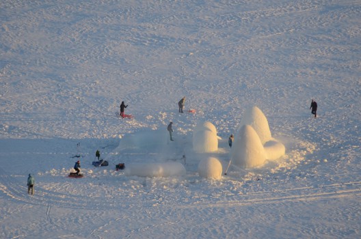
| The Ice Balls / Mjölk architekti Posted: 08 Feb 2017 03:00 AM PST  Courtesy of Mjölk architekti Courtesy of Mjölk architekti
 Courtesy of Mjölk architekti Courtesy of Mjölk architekti Five years ago our studio has won the Warming Huts competition in Winnipeg, Canada. The main task was to design shelter for skaters on the worlds longest skating rink.  Concept Concept Altogether with ten other studios from all around the world (including for example Frank Gerhy studio) we have spent one beautiful week realizing our competition proposal. During the implementation we were testing technology of building ice object only by spraying water on big air balloons shaped like balls.  Courtesy of Mjölk architekti Courtesy of Mjölk architekti As a result we have created ice igloos slightly different from the typical ones. Our igloo creating device called Polar Hen made very thick ice shell characteristic with very specific trait of light conductivity. From outside these object have very mysterious appearance as if they were not from this planet at all. Thanks to water these object are light blue tint. Visiting the inside space is original and unexpected experience as one doesn't imagine the scale of inner space.  Floor Plan Floor Plan Due to unexpectedly warm weather we were headed home with only one completely finished object but on the other hand with very good feeling that our original idea actually worked.  Courtesy of Mjölk architekti Courtesy of Mjölk architekti Our enthusiasm was so big and weather in Czech republic so cold that after arriving back to Liberec we have spontaneously built another object on Liberec dam. Among the passerby and ice skaters this ice ball was extremely popular and for us it was some kind of successful completion to this project.  Courtesy of Mjölk architekti Courtesy of Mjölk architekti This autumn we got an offer from Jan Smetana and Vojtěch Hejtmánek who together in Norway run an agency for extreme outdoor events, Full On (www.fullon.no). This outdoor company is based in national park Hardangervidda. Trying to explore offers they have discovered our project from Canada and there was the idea. Our aim was to create unique ice village on one of the frozen lakes in central part of Hardangervida. These objects can be used as a potential spot to just spend the night and watch aurora borealis same as a shelter for fishermen or as temporary hide out for cross country skiers to hide from bad weather.  Courtesy of Mjölk architekti Courtesy of Mjölk architekti After several weeks of preparation our studio went to Norway packed with three new air balloons. We have chosen geometrically simple forms because these work best easthetically and staticlly. The biggest form was refunded loaf which measured 3,5 m. Next was simple ball with diameter of 2 m. Last object was long cylinder which could stand alone or serve as a connection of two other objects.  Courtesy of Mjölk architekti Courtesy of Mjölk architekti Weather forecast wasn't any better this time so right after arrival we have decided to start building our village. The spot was amazing. Due to frost we literally watched the village grow. Within four days we were done with it. Ten whole objects. We were satisfied. Unfortunately then came predicated temperature rise and our work was ended and destroyed by the force of nature.  Courtesy of Mjölk architekti Courtesy of Mjölk architekti The aim of expedition was to explore all features of ice itself in different temperatures conditions same as exploring stability of each object and confirming functionality of whole technology. All this was done and our expectations same as our investors were fulfilled. The installation itself became very popular and it is quite possible that few more object will rise this year.  Courtesy of Mjölk architekti Courtesy of Mjölk architekti There should be official opening of Ice Balls village in new Dagali Outdoor center next year.  Courtesy of Mjölk architekti Courtesy of Mjölk architekti Product Description: Ice Balls Technology is based on water spraying on air inflated balloon during freezing. After creating the ice crust, these balloons are deflated and used for another icy object. One necessary condition is temperature under -6 degrees. Newly formed objects have very characteristic light and acoustic features. These features differentiate them from other standard igloos or ice hotels. This posting includes an audio/video/photo media file: Download Now |
| Jean Moulin High School / Duncan Lewis Scape Architecture Posted: 08 Feb 2017 01:30 AM PST  © Matthieu Tregoat © Matthieu Tregoat
 © Cyrille Weiner © Cyrille Weiner From the architect. The city of Revin is nestled in the meanders of the river Meuse, surrounded by forest, steep hills and gentle slopes. The Cite Scolaire Jean Moulin was built at the dawn of the 60s, it was designed in an orthogonal configuration of three levels, in line with the Modern style, in the era of the rationalist. Half a century later time has taken its toll and the aging of both building and equipment has made its reconstruction necessary. Especially since teaching methods and technology have progressed considerably, and the "wonder" material asbestos has been proven to cause harm. On July 14th 2010 a violent gust of wind removed the roof of Jean Moulin secondary school, a few months later 50cm of snow fell in a few hours. In 2007, the region launched a competition for the redevelopment of the school.  © Matthieu Tregoat © Matthieu Tregoat The aim was to demolish and rebuild the entire school complex. The phasing of the work was crucial so as to have limited impact on school activities. The winning project was based on a strong and shared concern for the rebuilding of the relationship between the built and the natural environment, long before it had become a trend among new generation of architects. The building had to develop a relationship with the landscape, one that would help merge them together.  © Cyrille Weiner © Cyrille Weiner  Section Section  © Cyrille Weiner © Cyrille Weiner Jean Moulin school website naturally evokes the idea of the forest balcony, unique and archetypal of this region of the Ardennes, but after 60years the school building still seemed foreign in the landscape, its strong geometries clashing with this ideal. Dismantling this great bars, that had lost all of their redeeming qualities, became a public service. The land  © Cyrille Weiner © Cyrille Weiner occupied by the city presents itself as a kind of spur, rounded by erosion. It's boundary to the north is the ridge of the plateau, the road is to the west and along the south there is a sports court. To the east is a steep slope with a river at its base, barely visible through the trees but the audible slow swish of its waters and the ghostly mists of the morning announce its presence. The ambition of the architect was to mimic the mountain silhouette and to redress the building as far as possible in vegetation. The most recent restorations were kept near to the campus entrance, and its architectural vocabulary are incongruous. From the Esplanade the entrance opens into a large foyer. The new school closely follows the topography of the land, it literally sticks to the bedrock which it occupies, from the crest of the plateau all the way to the residential area that separates it from the river. The educational elements of the programme are distributed across two long, low buildings (referred to as 'strips'.). These buildings are arranged in terraces that provide all the classrooms wide panoramic views to the south west. The two rows are well spaced and strips of roofing swell into folds, with vertical and oblique windows to provide good overhead lighting.  Ground Floor Ground Floor The 'Agora', as it is called, adheres to the slope and winds down to its lowest point in a series of ramps, discreetly echoing the curves of the river. From these ramps you gain access to classrooms and workshops, through wide corridors that are also open to the air, and can be used for evacuation in case of emergency. 'La Place' is a large, friendly space for breaks and recreation, whilst enabling people with disabilities to use the space. By being panoptical in design it allows monitoring of students and enables detection of problems. The lower part of the site is devoted to sports. An athletics track makes the transition to a smart gym, with provision for basketball, volleyball and handball. A green roof helps make a smooth transition between the built and natural environments, combining tall trees, bushes and 'rock chaos'. The entire new high school offers an architecture that is both radically innovative in its reconciliation with nature, whilst also being in tune with the spirit of an age that is conscious of energy issues.  © Cyrille Weiner © Cyrille Weiner This posting includes an audio/video/photo media file: Download Now |
| Posted: 08 Feb 2017 01:00 AM PST This article was originally published by Autodesk's Redshift publication as "5 Ways to Design Solar Architecture Beautifully—Not as an Ugly Afterthought." No one puts solar panels on their house because they're sexy—at least, not yet. Jon Gardzelewski, an architect and associate lecturer at the University of Wyoming in the Building Energy Research Group (UW-BERG), wants to change that. He believes the fact that solar panels are usually an afterthought to the design of a building is a big barrier to integrating them into a critical mass of houses and buildings. "Economics is the biggest barrier, and aesthetics are the second," Gardzelewski says. He says these two things stand in the way of solar becoming the standard for architecture design, rather than a risky and costly add-on. The economic aspect of solar panels is multifaceted. First, there's cost and risk perception, and then there's the larger impact on the economy, such as the creation of green-collar jobs. Some people think that their home's resale value is at risk when they install solar. One appraiser Gardzelewski spoke to said, "I won't give a house with solar panels any more value in an appraisal. The appraisal will be the same with or without them." Because the appraisal industry itself is ambivalent about assigning value to solar panels, many homeowners fear that installing them could actually decrease the value of their home—despite potential savings for buyers on future energy bills. The initial cost of installing solar panels is notoriously exorbitant. Gardzelewski insists that the actual price of the panels has decreased tremendously, so there is no reason that solar-panel installation costs should remain so high. "Solar-panel installers will give you a quote to put solar panels on your home, and they will tell you it costs a lot more than it should cost or what it needs to cost," he says. "The panels themselves have come down to where they're just a fraction of the overall expense." One reason solar installation remains such a high-ticket item is that builders haven't wholeheartedly adopted it. "Once solar integrates into the home-building industry, the price of labor will go down because the contractor is going to manage that pretty tightly,"Gardzelewski says. "If you manage the cost and the labor of solar-panel installation, there's no room for the price to get jacked way up." In coal-industry-driven states, there is also some fear that the rise of solar energy will hurt the economy and take away jobs. But Gardzelewski disagrees. He believes that the long-standing blue-collar jobs of the coal industry could become the long-standing green-collar jobs of the solar industry. "People who are the salt of the earth are usually the ones who carry traditions forward from generation to generation," he says. "So we need to work at creating new traditions and a new working culture around the solar industry." Hopefully, more green-collar jobs are coming: San Francisco now requires that new buildings feature solar panels on their roofs, and California State Senator Scott Wiener recently introduced legislation "to make California the first state in the nation to require solar panels on new buildings," he said in a Medium post. But even beyond economic barriers, Gardzelewski says there would still be resistance to using solar panels because of the way they look. Currently, they're often integrated into a design as an afterthought, which explains why a solar installation is often perceived as an eyesore. "Even in zero-energy houses—and definitely in solar installations on conventional homes—the solar panels do not fit with the design of the architecture, and it stands out in a bad way," he says. So the architect/researcher and other members of UW-BERG (including Dr. Anthony Denzer) came up with a taxonomy to help architects and designers integrate solar panels into the architecture early and with intention. That way, the panels will become a feature of the house instead of a mismatched visual burden. And according to research presented at the 2017 AEI (Architectural Engineering Institute) conference, consumers are willing to spend up to $7,300 more for design-integrated solar. BERG's architectural taxonomy for integrating solar panels into building design consists of five strategies: 1. LegibilityRevealing and celebrating the building systems so you can see how they work. This is an industrial look with the "guts" of the building exposed. In this paradigm, seeing the inner workings, wiring, structure, and connection of the solar panels fits in with the overall industrial design.  Courtesy of UW-BERG Courtesy of UW-BERG 2. Material PlanesGerrit Rietveld's Schroder House and Ludwig Mies van der Rohe's Barcelona Pavilion are two examples of buildings focused on planar composition. In the case of the Barcelona Pavilion, Mies used planar composition to celebrate the richness of materials such as glass, marble, onyx, and travertine. With this strategy, the material aspect of a solar panel is celebrated, too. "We really love looking at the crystals and the wiring and all the intricacies of a solar panel," Gardzelewski says. 3. Form FollowsFrom the principle "form follows function," this concept means designing a building that adapts its shape to the path of the sun. This strategy is obvious when a design is altered to provide optimal orientation for a large number of solar panels, often with a stretched-out or swooping form on the south roof. "A solar panel is a huge module of 3 1/2 feet by 5 1/2 feet, and this can seriously influence the size of your roof," Gardzelewski says. Designing a roof to fit this module can make the actual solar installation not only easier and more effective but also much better looking. 4. ShadingSolar panels can provide shade for the building itself or the adjacent outdoor space; this method is a good solution when you have a difficult existing roof. "If you build an exterior structure and you can pull out an enclosed porch—a space that you're not trying to fit onto the existing roof—you can use it to shade a small space outside," he says. "You can add solar panels to this new area, and it won't have to blend into the rest of the roof because it is a completely separate thing."  Courtesy of UW-BERG Courtesy of UW-BERG 5. DisguiseIn this approach, the solar panels are hidden through either compositional strategy or design innovation. This strategy is best used in conjunction with "form follows," as architecture designed around the size and shape of a solar panel is best suited to disguise the panel (like these solar rooftops from Tesla). "If you can fit them perfectly onto your roof, then you can float or frame the solar panels so you don't see all of the infrastructure under it—you just see the reflective glass," Gardzelewski says. Getting the economic equation for solar panels to work for average middle- and working-class families may take some time. But incorporating BERG's architectural taxonomy, which integrates solar panels in the design phase, is something architects can do now. Even if a client isn't going to install solar right away, the taxonomy can help home and building owners incorporate solar panels more aesthetically down the road. And by considering solar as an early constraint that influences building design, architects may be able to usher in an era when solar is finally ubiquitous. This posting includes an audio/video/photo media file: Download Now |
| Free Online Course on Urban Challenges in Emerging Countries is Open for Enrollment Posted: 08 Feb 2017 12:00 AM PST  "Rethink the City; New Approaches to Global and Local Urban Challenges" is a free online course given by Delft University of Technology in the Netherlands, starting on March 28, 2017. The course aims to address urban challenges in emerging countries to provide a new perspective in understanding and analyzing the southern hemisphere. For this reason, the content is structured in the following three thematic axes: "Spatial Justice," "Housing Provision and Management," and "Urban Resilience". Enrollment is now open through the Edx.org online education platform. The course has a duration of six weeks between 3 to 4 hours per week and is aimed especially at undergraduate students, especially those in Latin America, Asia, and Africa, according to the course content.
Rethink the City is a completely free... - Rethink the City | Facebook The coordinating team is composed of Luz Maria Vergara d'Alençon, architect of the Catholic University of Chile, and Igor Pessoa, urbanist of the Federal University of Rio de Janeiro; both are PhD candidates at Delft University of Technology. The official language of the course will be English but the classes will be translated into Spanish and even Chinese to facilitate the understanding of students, according to Vergara d'Alençon. In the case of Spanish-speaking students, they will be able to solve specific doubts through interaction with academics who speak the language. In addition, one student who completes the course will be awarded the "Rethink the City" award, gaining entry to participate in the Summer School "Planning and Design with Water," also offered by Delft University of Technology. The summer school program will be held between the 17 - 28 of July this year at Delft. By participating in the Rethink the City; New Approaches to Global and Local Urban Challenges free online course, students will be given the opportunity to enter in the running to enroll in the summer program with flights to Holland and accommodation paid for (visa costs will not be covered). More information will be given during the introductory week of the course. Those interested in learning more about the course and registering can do so here. This posting includes an audio/video/photo media file: Download Now |
| Denise Scott Brown Wins 2017 Jane Drew Prize Posted: 07 Feb 2017 10:00 PM PST  © Robert Venturi © Robert Venturi Denise Scott Brown has won the 2017 Jane Drew Prize, an award that recognizes an architectural designer who has "raised the profile of women in architecture" through their work and commitment to design excellence, as a part of The Architectural Review's (AR) Women in Architecture Awards. Scott Brown's receipt of the prize is a culmination of the grassroots drive to see her contribution to the profession adequately recognized – a movement that sprung from the Women in Architecture campaign in 2013–a quarter of a century after her partner Robert Venturi was awarded the Pritzker. "Things have happened which have made me very happy in my old age and one of those is this prize," said Scott Brown. Previous winners of the Drew prize, named after advocate Jane Drew, include Odile Decq, Yvonne Farrell, Shelley McNamara, and Zaha Hadid. Learn more about Denise Scott Brown, here. News via: The Architectural Review. This posting includes an audio/video/photo media file: Download Now |


| You are subscribed to email updates from ArchDaily. To stop receiving these emails, you may unsubscribe now. | Email delivery powered by Google |
| Google Inc., 1600 Amphitheatre Parkway, Mountain View, CA 94043, United States | |
Nema komentara:
Objavi komentar