Arch Daily |
- Physical Education Ground of Saint-Paul Gardens / NP2F
- Korça Icon Museum - National Museum of Medieval Art / Bolles + Wilson
- ZCB Bamboo Pavilion / The Chinese University of Hong Kong School of Architecture
- Pitch House / Atelier M+A
- Yangzhou Li Ning Sports Park / Australia PT Design Consultants Limited
- Applecross Residence / iredale pedersen hook architects
- Biotrial North American Headquarters / Francis Cauffman
- Studio Gang Designs Tiered Mixed-Use Tower on Forest Park in St. Louis
- Steven Holl Architects Designs Libary and Campus Masterplan in Malawi, Africa
- Goh Lanno School / Studio 02
- Asymptote’s Designs for Moscow Contemporary Hermitage Museum Revealed
- The Attic / f+f architectes
- Makoto Tanijiri on Architectural Education and “Japanese-ness” in Design
- Villa Black / K2A
- 10 Innovative Materials That Could Revolutionize the Construction Industry
- Sunken Bath Project / Studio 304 Architecture
| Physical Education Ground of Saint-Paul Gardens / NP2F Posted: 09 Dec 2016 09:00 PM PST  © Antoine Espinasseau © Antoine Espinasseau
 © Antoine Espinasseau © Antoine Espinasseau From the architect. The Physical Education Ground of Saint-Paul Gardens meets the new sportive program which stems from the participative budgets vote, and offers a wide range of sports in the heart of Saint-Paul area in the 4th district of Paris.  © Antoine Espinasseau © Antoine Espinasseau The French studio NP2F architectes dedicated itself to organize the project in reflecting the place force: its own characteristics (the Philippe August enclosure bordering the field), its aesthetic appearance (a unique site-specific colorimetry), and its long morphology.  © Antoine Espinasseau © Antoine Espinasseau The main idea of the project was to develop and characterize the ground, about 3,000 m2, by making it more efficient and functional in terms of optimal use for game and sport. To do so, the studio NP2F put into place a sport ground (toping) made of yellow, white, and black aggregates overall the Physical Education Ground. Then, the agency made up the sport areas: the existing 100m running track with a basketball court, a volley/tennis court, a football field at 5, and a sport initiation space for young children.  Axonometric Axonometric To organize the practices, while leaving the most open spaces to each other, the studio put ball impact guards divided by 2 pitches, and sport furniture on this large ground.  © Antoine Espinasseau © Antoine Espinasseau Delimited by an octagonal ball impact guard of 6m high, the sport initiation space for toddlers allows the children to discover sport and to awaken with a climbing hill, balance rods, gymnastic rings, a basket for basketball (170cm high) and 3 punching bags.  Plan Plan Fully derived from their previous works on urban sport spaces, this operation promotes a decompartmentalization of sport spaces for the town and revendicates a strong and vernacular aesthetic for each one, in a particularly constrained location.  © Antoine Espinasseau © Antoine Espinasseau The specific furniture required for practicing is combined with a more neutral equipment (concrete bench, metallic arch) which leaves infinite and undefined beforehand opportunities to the sport practitioners. This posting includes an audio/video/photo media file: Download Now |
| Korça Icon Museum - National Museum of Medieval Art / Bolles + Wilson Posted: 09 Dec 2016 06:00 PM PST  © Roman Mensing © Roman Mensing
 © Roman Mensing © Roman Mensing The building for the Korça Icon Museum was originally a structure of columns and floor slabs (maison domino) abandoned when communism collapsed in Albania. The Albanian office DEA Studio sh.p.k. were comissioned to design facades and BOLLES+WILSON were then asked by the municipality of Korça to design and develop an interior exhibition design for the 300 orthodox icons.  © Roman Mensing © Roman Mensing The heavy walls on the exterior with their small windows were intended to give an appropriate medieval reading. The small windows from the inside did give an appropriate mysterious atmosphere but in terms of viewing Icons they were too bright and needed some interior masking to avoid too much contrast between a small area of bright outside light and the surrounding.  © Roman Mensing © Roman Mensing Exhibition Orgaization The given three levels subdivide well into Basement Archive with ground level laboritories/administration. The Exhibition spaces belong on the entrance level and the 1st floor - here the interior concept proposes a specific circulation route for visitors and an absolute division between public spaces and 'back of- house'. This is necessary for reasons of security (the public must not have the possibility to enter rooms where Icons are being worked on).  Axonometric Axonometric The floor between entrance level and 1st floor has been removed over the entire left hand exhibition room. This allows a new stair facilitating a simple and spectacular visitors circulation route. The new stair gives panorama views of a 9.5 metre high golden wall - for this wall the Petersburg hanging system was chosen - a close packing of Icons, a tapestry of images covering the entire wall, impressing visitors with the size of the Korca collection.  © Roman Mensing © Roman Mensing A Sequence of Rooms The interior concept develops zones of strong individual character defined by colour (gold on the left, black matt and gloss black in the central 'Black Labyrinth' zone and Red for the iconastas (Altar screen)on the right. The Sequential Rooms are carefully choreographed for the most dramatic effect:  © Roman Mensing © Roman Mensing (a) Entrance Lobby - an abstract collage of shelves for merchandising, - postcards, posters, local handcrafts and even small Icons painted by Korca artists (a new local industry) are displayed and sold.  Drawing Drawing (b) The Gold Room - a two floor high gold screen (one that also wraps the sidewalls and tames natural light from slit windows). The screen is packed with Icons. Visitors promenade freely and then step up to the stair landing where an information handrail tells them what they are looking at.  © Roman Mensing © Roman Mensing (c) The White Balcony - overlooking the Gold Room, it has a heavy Black handrail and a white (conventional museum) rear wall for a row of small Icons. These lead to an opening on the right.  © Roman Mensing © Roman Mensing (d) The Black Labyrinth - the central zone of the museum is particularly dark and mysterious with individually lit Icons floating in the penumbra. Walls are painted in a collage of matt and gloss black and grey to enhance the collage effect. Side alcoves with lower ceilings and wooden floors bring individually hung Icons intimately close to viewers.  © Roman Mensing © Roman Mensing (e) The Red Salon - from the Black Labyrinth visitors emerge into a sensual space where all surfaces are red. The central zone is defined by a 10cm high platform on which stands the iconastas (Altar screen).  © Roman Mensing © Roman Mensing (f) The final exhibition room is white with an illuminated ceiling - an ethereal space. The room displays the two most valuable icons from the 14h century.  © Roman Mensing © Roman Mensing This posting includes an audio/video/photo media file: Download Now |
| ZCB Bamboo Pavilion / The Chinese University of Hong Kong School of Architecture Posted: 09 Dec 2016 02:00 PM PST  © Michael LAW © Michael LAW
 © Michael LAW © Michael LAW From the architect. The ZCB Bamboo Pavilion is a public event space built for the Construction Industry Council's Zero Carbon Building (ZCB) in the summer of 2015 in Kowloon Bay, Hong Kong. It is a four-storey-high long-span bending-active bamboo gridshell structure with a footprint of approximately 350m2 and a seating capacity of 200 people.  © Michael LAW © Michael LAW It is built from 475 large bamboo poles that are bent onsite to shape the structure and that are hand-tied together with metal wire using techniques based on Cantonese bamboo scaffolding craftsmanship. The shape is a large diagrid shell structure that is folded down into three hollow columns. These columns rest on three circular concrete footings. A tailor-made white tensile fabric is stretched over the structure and is brightly lit from inside the three legs.  © Kevin NG © Kevin NG  © Kevin NG © Kevin NG  © Kevin NG © Kevin NG The project is the outcome of the concerted efforts of the Construction Industry Council (CIC), the Chinese University of Hong Kong (CUHK) and different contractors. It was designed by a research team led by Prof. Kristof Crolla at CUHK's School of Architecture. The research investigates how computational design tools can be strategically inserted into existing construction methods to allow for a more engaging and innovative architectural outcome. The ZCB Bamboo Pavilion showcases this and illustrates how the endangered craftsmanship of Bamboo Scaffolding Construction in Hong Kong can be expanded through the introduction of digital form-finding and real-time physics simulation tools.  Top view-bamboo skeleton Top view-bamboo skeleton The project's design is based on an architecture student design internship held at the CUHK School of Architecture. The design was developed further by the research team in collaboration with structural engineers and bamboo consultants, using digital physics simulation engines, physical model making, and large-scale prototyping to derive its final form.  © Michael LAW © Michael LAW Bamboo is a widely available, environmentally friendly material that grows abundantly and at remarkably high speeds in the Asia-Pacific region, Africa and the Americas. It is an excellent renewable natural resource which captures CO2 and converts it into oxygen. It is strong, light and easy to process and transport. In Hong Kong bamboo mostly appears in temporary theatres, scaffolding, or structures for religious festivals. Globally it is usually applied as a surrogate for wood or steel, rather than in ways that utilise the material's unique bending properties and strength. In contrast, the ZCB Bamboo Pavilion presents an alternative architectural application that maximise these latent material properties.  Elevation 2 Elevation 2 The pavilion is geometrically complex, bamboo has widely varying geometric, dimensional, and performative properties, and the scaffolding industry does not use conventional architectural drawings for its intuitive constructions. Building the project therefore challenged the boundaries of the architect's design control. In response, new methods were developed that merged precise digital design systems with inconsistent natural resources in order to deal with these unpredictabilities.  © Michael LAW © Michael LAW The ZCB Bamboo Pavilion promotes innovative and ecological architectural design to the broader public and design community. It will be used to host exhibitions, performances and events that advocate low carbon living, construction, and development. By promoting sustainable, light-weight building methods for large span architecture the project seeks ways for traditional Cantonese craftsmanship to evolve for the 21st century.  © Kevin NG © Kevin NG Pavilion:
Bamboo:
Ties:
Fabric:
Concrete footing:
This posting includes an audio/video/photo media file: Download Now |
| Posted: 09 Dec 2016 12:00 PM PST  © Jaume Albert Martí © Jaume Albert Martí
 © Masaki Harimoto © Masaki Harimoto The house is situated in an old residential district with predominant single-storey houses for the past century, and the recent reconstruction activities has seen sprouting of multiple-storey houses rising awkwardly within the neighbourhood. The Pitch House has been retained as a single storey house to preserve the existing scale of the houses in the neighbourhood.  © Jaume Albert Martí © Jaume Albert Martí A single pitch roof is designed to slope away from the three-storey high party wall of the adjacent house, and the roof is positioned low in height with a gentle roof angle. The car porch roof at the front of the house forms a layering effect with the main roof in the same angle.  © Masaki Harimoto © Masaki Harimoto The Pitch House is designed with a simple form, where the family of the house can unwind and enjoy tranquility in this suburban part of the island.  Floor Plan Floor Plan The interior space is intimate in scale, with the Living room opening out to the front patio and towards the garden, to serve as an extended space for family activities and occasional outdoor dining.  © Jaume Albert Martí © Jaume Albert Martí An indoor open courtyard is also inserted in the middle of the house for the Master Bedroom to enjoy outdoor space.  © Jaume Albert Martí © Jaume Albert Martí In line with its simple form, the house also employs simplicity in its materials. In this tiny island where land is scarce and the city is overcrowded with development, the Pitch House remains single-storey and petite in size as it blends quietly with its neighbourhood.  © Masaki Harimoto © Masaki Harimoto Product Description. We used the 'Accoya' wood as it is stable and durable as an outdoor timber material, it does not warp, split, expand or rot which is crucial, especially with the humid climate in Singapore. This posting includes an audio/video/photo media file: Download Now |
| Yangzhou Li Ning Sports Park / Australia PT Design Consultants Limited Posted: 09 Dec 2016 11:00 AM PST  © Zhang Xuetao, Gao Yu © Zhang Xuetao, Gao Yu
 © Zhang Xuetao, Gao Yu © Zhang Xuetao, Gao Yu From the architect. Yangzhou Li Ning Sports Park is built based on the principle that integrates modern city functions with traditional historical culture, thus creating sustainable modern sports facilities that reflect the contemporary lifestyle.  © Zhang Xuetao, Gao Yu © Zhang Xuetao, Gao Yu The following are a few highlights in the design of the park: 1. Reflection of the City Culture Located within the Sports Park in Guangling New City, the project has broken the building volume into pieces by adopting the design philosophy of landscape architecture. As an integral part of the park, the buildings reflect Yangzhou's spirit of including both mountains and water in traditional parks by combining the artificial "built mountains" with the "natural water" in the area, which provides the city with a vibrant center with its sports culture.    © Zhang Xuetao, Gao Yu © Zhang Xuetao, Gao Yu 2. Manifestation of Function Innovations In recent years, China's sport industry has gradually transformed from prioritizing competitive sports to developing public sports. The design has kept up with the change, avoiding simplification in function deployment. Modern leisure sports functions such as rock climbing and trampolining have been introduced on the basis of traditional sports activities. Meanwhile, relevant derived functions have also been introduced such as sports training, health maintenance and rehabilitation, and catering services, offering the community an area for complex activities.  © Zhang Xuetao, Gao Yu © Zhang Xuetao, Gao Yu   © Zhang Xuetao, Gao Yu © Zhang Xuetao, Gao Yu 3. Concern on Financial Operation Learning the lesson from previous cases where some stadiums ignored the operation after sports competitions, the design has been focused on the relationship between function and operation streamline in terms of the space, which promotes the consumption in related businesses such as rehabilitation and catering through the crowd from the stadium. At the same time, it also focuses on the multi-function and openness in using internal and external space, thus improving the utility efficiency and avoiding idleness.  © Zhang Xuetao, Gao Yu © Zhang Xuetao, Gao Yu The structure modeling has achieved the best cost efficiency by reasonably using concrete structure and large-span steel roofing system according to the span of the space.  © Zhang Xuetao, Gao Yu © Zhang Xuetao, Gao Yu 4. Demonstration of an Artistic Style The traditional Yangzhou paper cutting techniques have been adopted in the building style, where landscape was cut to an concave-convex effect on the ground. The convex parts are where the buildings are built while the concave parts become multi-function squares. The combination can be seen through the walking and running lanes indoor and outdoor, bringing a spatial sequence experience with a layered structure and rich visual points. The technology of aluminum alloy curtain wall and enameled glass has been used in building elevation corresponding to the paper cutting effect.  © Zhang Xuetao, Gao Yu © Zhang Xuetao, Gao Yu  © Zhang Xuetao, Gao Yu © Zhang Xuetao, Gao Yu 5. Focus on Ecological and Environmental Protection In the planning, the site water system has been used to create a rainwater collection and drainage system, and combined the landscape design and buildings, the natural landscape garden effects have been achieved; the earth-sheltered architecture improves the energy efficiency of buildings, and makes use of the roof space, which improves the green coverage in the area; the design has taken into consideration the features of public sports activities, making use of the natural light to a maximum effect and enhancing the natural light induction by the roof.  © Zhang Xuetao, Gao Yu © Zhang Xuetao, Gao Yu Modern leisure sports buildings are integrating complex functions including public sports, entertainment leisure and cultural business, bringing new challenges to urban planning, architecture design, sports operations, etc. It is hoped that the practice of Yangzhou Li Ning Sports Park will provide a beneficial case for the construction of the Chinese public sports. This posting includes an audio/video/photo media file: Download Now |
| Applecross Residence / iredale pedersen hook architects Posted: 09 Dec 2016 09:00 AM PST  © Peter Bennetts © Peter Bennetts
 © Peter Bennetts © Peter Bennetts Our clients desired a building that would endure time, evoke a sense of permanence and a sense of already existing on the site. Brick was the natural choice that immediately met this requirement.  © Peter Bennetts © Peter Bennetts The site sits on the edge of the Swan River with views to the city of Perth. The design creates an experiential connection to the meandering river, a fluid and dynamic body of water that has carved out mass forming a direct engagement with the occupant.  Sketch Sketch The street is revealed through the pushing and pulling of the protective brick walls while opening on to the river view. The walls wrap around the east and west side boundaries filtering the intense Perth light and views through brick screens and bouncing light from reflective brick on deep reveals.  © Peter Bennetts © Peter Bennetts The bricks mass is simultaneously heavy and light; one storey is hung from the upper level and the cranked columns on the east boundary. At a finer level brick patterning slips and slides continuing the sense of movement.  © Peter Bennetts © Peter Bennetts The house extends over five levels with the ground semi embedded in to the earth. This is used as an opportunity to explore a change in experiential weight and movement as the house frees itself from the ground. Each level becomes lighter and more fluid finishing with the upper level roof terrace that opens and welcomes the meandering Swan River.  © Peter Bennetts © Peter Bennetts It is purposely placed to the north of the site and allows for future sub-division to include an additional dwelling as part of a suburban densification program. One level of the house is designed to be self-sufficient and act as a separate apartment dwelling allowing friends, relatives or other people to occupy the site.  Diagram Diagram Geo-thermal heating and cooling maintain constant temperatures. The thermal mass of the house has enabled no additional heating in winter to date. A thermal chimney over the entry space extends for three levels, extracting hot air in summer using a low velocity fan.  © Peter Bennetts © Peter Bennetts The house position creates a long and stretched entry garden that includes a meandering path through the evolving forest. The mature trees partly screen the house from the street and slowly reveal the house and entry to visitors as one walks through the garden. A sense of mystery and surprise begins with the entry to the house and finishes on the upper roof terrace level.  Site Drawing Site Drawing Product Description. One material is used on the house and on the boundary walls, Austral Elements Platinum and Zinc. Slightly different in appearance both bricks reveal a mysterious depth and shimmer over the duration of a day.  © Peter Bennetts © Peter Bennetts  Detail Detail This posting includes an audio/video/photo media file: Download Now |
| Biotrial North American Headquarters / Francis Cauffman Posted: 09 Dec 2016 07:00 AM PST  © Chris Cooper © Chris Cooper
 © Chris Cooper © Chris Cooper A Global Leader A contract research organization, based in France with offices in Paris, London and Montreal, strategically sought a North American Headquarters. Setting a precedent for future city development, the architect was engaged for the first phase of the research organization's master plan located in the University Heights Science Park of Newark, NJ. In the project's preliminary stages ensuring the confidentiality of the laboratory, pharmacy and clinical facility operations was paramount in the building's design, layout and overall conception.  © Chris Cooper © Chris Cooper Two Interlocking Planes The architect's basic concept of the five-story building is formed by two interlocking planes; one plane comprises primarily of solid black brick with matching mortar and the other plane encompasses a fritted curtain wall. A ribbon of metal panels ties the two planes together and represents the fluid nature of chemistry and science. This metal ribbon begins on the private side of the building, forming the canopy, and continues inside the building, where it becomes the lobby ceiling. It emerges on the public side as a frame for the vestibule.  Diagram Diagram A Building Design of Contrast Although the 70,000 GSF building is considered modest, the architect was inspired to design an iconic structure that reflects the high quality nature and state-of-the-art clinical practices. This design concept also incorporated a balancing act between the open versus restricted - both contrasting approaches were carefully contemplated.  © Chris Cooper © Chris Cooper The architect was motivated by the research organization's desire to build enduring relationships with clients and to have an impactful and dynamic North American Headquarters. A taller five-story building with smaller plates was opted for and the relatively narrow long floors allow natural light to penetrate deeply into the interior spaces. This design also gave the building a feeling of grandeur that was appropriate within its urban setting.  © Chris Cooper © Chris Cooper The Ground Floor With a continuous glazed wall, sunlight penetrates into the two-story lobby. A grand staircase accesses a bridge connecting the two sides of the second floor and the upper floors of the building appear to hover above this transparent base. The two-story lobby runs through the building, connecting two exterior plazas.  © Chris Cooper © Chris Cooper Multiple Streams of Influence Despite the regulatory demands brought on by the research organization, the resulting structure is far from conventional. The architectural approach has maximized the building's impact and the lobby design leaves visitors and clients with a strong impression of the research organization's expertise, state-of-the-art practices and cutting-edge services within the highly-competitive life sciences industry.  Diagram Diagram This posting includes an audio/video/photo media file: Download Now |
| Studio Gang Designs Tiered Mixed-Use Tower on Forest Park in St. Louis Posted: 09 Dec 2016 06:45 AM PST  Courtesy of Studio Gang Courtesy of Studio Gang Studio Gang has revealed their design for One Hundred, a mixed-use tower to be located on Forest Park in St. Louis, Missouri. Studio Gang's first project in the city, the tower will rise over 350 feet and include retail, amenities, parking and residential apartments featuring views of the park and the Gateway Arch.  Courtesy of Studio Gang Courtesy of Studio Gang Developed by Mac Properties, Studio Gang's design calls for a tiered, angled tower that will provide each unit with views and improve energy performance. Each tier will comprise four stories, creating space for outdoor terraces for a quarter of the apartments. Inside the tower, each apartment features a corner living room with double exposures to capture and enhance the quality of natural light throughout the unit. All units will have access to a communal terrace atop the building's green roof podium, which will house a range of amenities and social spaces. On the ground floor, a series of retail spaces will activate the street and create connections between St. Louis' Central West End district and Forest Park, strengthening the city's overall urban fabric.  Courtesy of Studio Gang Courtesy of Studio Gang "In a climate with four distinct seasons, we wanted to make it possible for residents to enjoy the different views and natural changes in light over the course of the year," explains Jeanne Gang. "By experimenting with the geometry of the facade and refining the apartment layouts, we were able to make every apartment into a corner unit perched above the park and city." The building has also been designed with environmental concerns in mind – the leaf-shaped plan and tiered massing will both contribute to an efficient performance, reducing overall energy use. The building's green roofs will double as rainwater collection banks for irrigation and to abate stormwater runoff. One Hundred is expected to break ground next year, and is scheduled for completion in 2019. Learn more about this project, here. News via Studio Gang. This posting includes an audio/video/photo media file: Download Now |
| Steven Holl Architects Designs Libary and Campus Masterplan in Malawi, Africa Posted: 09 Dec 2016 05:25 AM PST  Courtesy of Steven Holl Architects Courtesy of Steven Holl Architects Steven Holl Architects have revealed plans for a new library and campus design in Malawi, coinciding with the project's approval by The Miracle for Africa Foundation. To be constructed of local stone, bamboo and concrete, the library will provide 66,000 square feet (6,132 square meters) of study and gathering space to the community.  Courtesy of Steven Holl Architects Courtesy of Steven Holl Architects The 66,000 sq. ft. library is organized via a section that provides maximum reflected light to the interior with optimum solar PV collection on the roofs The library has been organized using a tiered section that will provide maximum reflected light to the free plan interior space, with meeting rooms and archives housed within glass, humidity-controlled enclosures. A rain collection pool in the center of the plan will direct visitors to the main circulation desk and bounce rippling reflections throughout the building in a "cloud-like light."  Courtesy of Steven Holl Architects Courtesy of Steven Holl Architects  Courtesy of Steven Holl Architects Courtesy of Steven Holl Architects The project's signature element, the building's curving, prefabricated Ductile concrete roof, will further bounce natural light through the space, creating what the architects call a "field within a field," while PV panels on the rooftop will provide energy for the library. Around the building perimeter, local bamboo will be utilized to create a patterned screen to filter light and create a shaded arcade encircling the structure.  Courtesy of Steven Holl Architects Courtesy of Steven Holl Architects  Courtesy of Steven Holl Architects Courtesy of Steven Holl Architects The library will be the first construction within a new campus masterplan, whose morphology draws inspirations from the paintings of a Malawi batik artist.  Courtesy of Steven Holl Architects Courtesy of Steven Holl Architects  Ground Floor Plan. Image Courtesy of Steven Holl Architects Ground Floor Plan. Image Courtesy of Steven Holl Architects "There is great excitement about this project as an artistic masterpiece, and about the solar energy concept as it works with maximal light, ventilation, and humidity control, said the client, Mr. Y.K. Chung, chairman of the Miracle for Africa Foundation. "I'm astonished at the consideration and interpretation of Malawian batik art, the reflective pool, waves in a field of light, and the philosophical axes of the campus. This project is historic, the library will be an iconic marker for a great moment in the architectural history of Malawi and for all of Africa; especially Malawi, which has been away from modern civilization for so long."  Courtesy of Steven Holl Architects Courtesy of Steven Holl Architects  Courtesy of Steven Holl Architects Courtesy of Steven Holl Architects Known as "The Warm Heart of Africa," Malawi is one of the smaller countries on the African continent by area, containing a population of 16.7 million people. It is also among the world's least developed countries, with a GDP per capita of only $381.40. The Miracle for Africa Foundation was founded to serve the people of Malawi and Africa by expanding healthcare, education, and agricultural opportunities. You can learn more about the Miracle for Africa Foundation, here. News via Steven Holl Architects.  Courtesy of Steven Holl Architects Courtesy of Steven Holl Architects  Courtesy of Steven Holl Architects Courtesy of Steven Holl Architects  Courtesy of Steven Holl Architects Courtesy of Steven Holl Architects  Courtesy of Steven Holl Architects Courtesy of Steven Holl Architects This posting includes an audio/video/photo media file: Download Now |
| Posted: 09 Dec 2016 05:00 AM PST  © Luc Boegly © Luc Boegly
 © Luc Boegly © Luc Boegly From the architect. We designed a very simple, elegant and pure facade design. The project is an extension of a school, we hung the wooden project to the ancient.  Diagram Diagram  Diagram Diagram  Diagram Diagram  Diagram Diagram  Diagram Diagram  Diagram Diagram We worked with timber chestnut tree. We designed very special timbers related to the dimensions of our project. It is a a unique facade, «sur mesure».  © Luc Boegly © Luc Boegly  © Luc Boegly © Luc Boegly This posting includes an audio/video/photo media file: Download Now |
| Asymptote’s Designs for Moscow Contemporary Hermitage Museum Revealed Posted: 09 Dec 2016 04:00 AM PST  © Asymptote - Hani Rashid & Lise Anne Couture. Courtesy of Archcouncil of Moscow © Asymptote - Hani Rashid & Lise Anne Couture. Courtesy of Archcouncil of Moscow Asymptote Architecture has revealed renderings of their design for a new Contemporary branch of the Hermitage Museum, to be located adjacent to a new residential district in the area of the former ZIL automotive plant in Moscow. Presented at the V Saint Petersburg International Cultural Forum by Asymptote Co-founder and Design Partner Hani Rashid, the museum will house a collection of contemporary art from 20th and 21st centuries.  © Asymptote - Hani Rashid & Lise Anne Couture. Courtesy of Archcouncil of Moscow © Asymptote - Hani Rashid & Lise Anne Couture. Courtesy of Archcouncil of Moscow "ZIL will turn into not just a new city district with residential and commercial real estate but will also have a museum as a center of attraction for the city residents," said Sergey Kuznetsov, Chief Architect of Moscow. The museum design has been separated chronologically – lower levels have been designated for art from the first half of the 20th century, while the raised-ceiling galleries on the upper floors will exhibit the contemporary collection. Public spaces will include a cafeteria, a gift shop/library, a cinema hall, a rooftop sculpture garden and a wood-clad amphitheater designed for public events.  © Asymptote - Hani Rashid & Lise Anne Couture. Courtesy of Archcouncil of Moscow © Asymptote - Hani Rashid & Lise Anne Couture. Courtesy of Archcouncil of Moscow "The Museum will be a place where in some cases you can exhibit really high sculptures or hang very unusual objects of art on the ceiling, if needed. You can do whatever you like here, it's a space for an endless experiment with perspective," explains Rashid. "In the wing of contemporary art with the help of the curtain one can decorate and darken some parts of the hall. Museum curators will have vast spaces in the building." "We sought to create a constant up and down movement inside the galleries, one can easily get lost here, and it's a great thing. We want to leave behind a standard paradigm of a museum where its architecture dictates certain scripts. Here the architecture is symbolic but it's predetermined by museum functions," the architect said.  © Asymptote - Hani Rashid & Lise Anne Couture. Courtesy of Archcouncil of Moscow © Asymptote - Hani Rashid & Lise Anne Couture. Courtesy of Archcouncil of Moscow  © Asymptote - Hani Rashid & Lise Anne Couture. Courtesy of Archcouncil of Moscow © Asymptote - Hani Rashid & Lise Anne Couture. Courtesy of Archcouncil of Moscow The external envelope will consist of a double glazed, UV-resistant facade system, which will give the building a luminous, transparent aesthetic that will transform in different atmospheric conditions. Walls and transparencies have been arranged in a dynamic composition, and will be ornamented with an abstract design.  © Asymptote - Hani Rashid & Lise Anne Couture. Courtesy of Archcouncil of Moscow © Asymptote - Hani Rashid & Lise Anne Couture. Courtesy of Archcouncil of Moscow "People come to a museum to touch history, culture, that is why we thought it would be only right to saturate the Museum space with them. So it is a really wonderful idea that the cafeteria on the first floor will have an installation on Malevich's Black Square. One can just come here for a cup of coffee, thus becoming a part of the city, a part of art," Hani Rashid added. The museum project is latest addition of the "Big Hermitage" project, which was seen the museum open new branches in cities worldwide, including Amsterdam, London, Barcelona, Kazan, Vyborg and Omsk.  © Asymptote - Hani Rashid & Lise Anne Couture. Courtesy of Archcouncil of Moscow © Asymptote - Hani Rashid & Lise Anne Couture. Courtesy of Archcouncil of Moscow "Each branch museum of the Hermitage has its own focus, and we decided that in Moscow it will be contemporary art of the 20th -21st centuries. The concept of this branch museum was developed together with Hani Rashid," explained Mikhail Piotrovsky, Director of the State Hermitage Museum. The Hermitage Modern Contemporary is expected to open to the public in 2020. Learn more about the design, and Asymptote's residential tower in Moscow, here. News via Archcouncil of Moscow. This posting includes an audio/video/photo media file: Download Now |
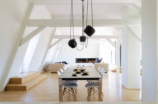
| Posted: 09 Dec 2016 03:00 AM PST  © Johan Fritzell © Johan Fritzell
 © Johan Fritzell © Johan Fritzell From the architect. The project is located in an old jugendstil building from 1901, in the Neustadt area in Strasbourg.  © Johan Fritzell © Johan Fritzell This large duplex apartment occupies the former attic of the building. It has been created through the conversion of old maid rooms and the above loft that was used for storage.  Section Section Throughout the project the material palette is restrained: wood flooring, black MDF that is dyed in the mass for the fixed furniture, large sheets of thin ceramic in the bathrooms and kitchen top.  © Johan Fritzell © Johan Fritzell The organisation is simple: all rooms (bedrooms, bathrooms, office, family room) are located on the entrance level of the apartment, whereas the top floor is one open loftspace with kitchen, living and dining area.  Lower Floor Lower Floor The entrance hall is a double ceiling height space with skylight that opens largely onto the family room. It is positioned att the heart of the apartment distributing on one side the master bedrooms and children bedrooms, and on the other guest bedroom and office space. Here, a black box consisting of dyed MDF panels and doors act as boundary concealing bedroom, bathroom and storage spaces.  © Johan Fritzell © Johan Fritzell The existing varnished pinewood flooring, that had become orange-yellow over time, has been kept and renovated. The pine boards have been treated in a scandinavian fashion with lye to block the pigments and prevent the wood from yellowing, then soaped for the finish. This gives the boards a pale-white, semi-mat aspect that is very soft to the touch.  © Johan Fritzell © Johan Fritzell The master bedroom is conceived as a little suite with walk-in wardrobe and adjoining bathroom. Natural light flows through an added large glazed panel in the roof while the existing small windows offer a view on the surrounding park. The bathroom flooring, walls and top are made of large mat marble ceramic tiles (3x1m), while the furniture is made of black dyed MDF.  © Johan Fritzell © Johan Fritzell The same black MDF material, being dyed in the mass and less prone to surface chipping compared to tainted or lacquered wood, is also used for the stairs. The railings are made of laminated glass.  © Johan Fritzell © Johan Fritzell The upper floor is organized with the kitchen on one side, a fireplace and living room on the other, dining area in the center. Only the chimney masonry from the lower floor apartments interrupts the open plan.  Upper Floor Upper Floor The living room faces a large terrace that is partly sunken into the roof. The built in fireplace is flanked with concealed storage spaces and bar.  © Johan Fritzell © Johan Fritzell In the kitchen, the same MDF has been used for the woodwork and wall paneling. The kitchen island is finished with marble ceramic.  © Johan Fritzell © Johan Fritzell Product Description. - Restrained material palette: wood for the flooring (either existing pine wood that was re-used with a Scandinavian soap treatment or lacquered oak in the upper area (kitchen)) Varnished Valchromat Black MDF Panels for all the fix furniture (wardrobe, kitchen, bathroom furniture) including the stairs Laminam extra large thin ceramic tiles for all bathroom surfaces and kitchen island. This posting includes an audio/video/photo media file: Download Now |
| Makoto Tanijiri on Architectural Education and “Japanese-ness” in Design Posted: 09 Dec 2016 01:30 AM PST  <a href='http://www.archdaily.com/779568/hiroshima-hut-suppose-design-office'>Hiroshima Hut</a>. Image © Toshiyuki Yano <a href='http://www.archdaily.com/779568/hiroshima-hut-suppose-design-office'>Hiroshima Hut</a>. Image © Toshiyuki Yano At just 42 years old, Makoto Tanijiri and the office he founded in 2000, Suppose Design Office, have emerged as one of Japan's most prolific medium-sized architecture and design firms. However, Tanijiri's path to success was somewhat different to the route taken by his contemporaries. In this interview, the latest in Ebrahim Abdoh's series of "Japan's New Masters," Tanijiri discusses the role that education plays in a successful career and his work's relation to the rest of Japanese architecture. Ebrahim Abdoh: What was your earliest memory of wanting to be an architect? Makoto Tanijiri: When I was about 5 years old. Of course at that age I did not know the word "architect" or "architecture," all I remember was how small our house was, and all the things I didn't like about it. Back then, my dream was to be a carpenter, so that I could build my own house and live on my own.  <a href='http://www.archdaily.com/779568/hiroshima-hut-suppose-design-office'>Hiroshima Hut</a>. Image © Toshiyuki Yano <a href='http://www.archdaily.com/779568/hiroshima-hut-suppose-design-office'>Hiroshima Hut</a>. Image © Toshiyuki Yano EA: Where did you go to university? MT: I didn't think I needed to go to university. EA: So how exactly did you go from high-school to owning one of Japan's fastest growing and most exciting architecture firms? MT: After graduating high-school, I went to the Anabuki Design College, in Hiroshima, for two years.  <a href='http://www.archdaily.com/192453/house-in-seya-suppose-design-office'>House in Seya</a>. Image Courtesy of Suppose Design Office <a href='http://www.archdaily.com/192453/house-in-seya-suppose-design-office'>House in Seya</a>. Image Courtesy of Suppose Design Office EA: With only two years in design school under your belt, you were able reach and surpass so many 'fully qualified' people in your field. Have you ever felt in any way lacking in terms of a formal education, or would you say instead that spending 6 years studying is unnecessary? MT: This should be for everyone, as it was for me, a personal choice. I don't think there is a clear right or wrong path when it comes to this profession. I personally felt very strongly about not needing to go to university. Many people will not have such strong convictions. And yes, I am successful, and although I accomplished everything myself and without the need for an architecture degree, I did get lucky.  <a href='http://www.archdaily.com/161689/52-suppose-design-office'>52</a>. Image © Toshiyuki Yano <a href='http://www.archdaily.com/161689/52-suppose-design-office'>52</a>. Image © Toshiyuki Yano EA: You are just 40 years old, and you are a multi award winning architect, with a hugely successful firm with 2 branches (Tokyo & Hiroshima), and dozens of projects under your belt, some of which are very large scale. When you are at a dinner or cocktail party with other friends or colleagues who are architects, or any other scenario where you are surrounded by other architects, do you feel in any way insecure for your unusual path to success? MT: Honestly, yes. At the beginning of my career, I constantly had a sort of complex, because I didn't have a degree, because I hadn't been to university; it felt like shame. I felt as though I hadn't earned the title of "architect," and that I was lying by saying I was. It was a long time before I felt the awesome relief of pride.  <a href='http://www.archdaily.com/458511/house-in-tousuien-suppose-design-office'>House in Tousuien</a>. Image © Toshiyuki Yano <a href='http://www.archdaily.com/458511/house-in-tousuien-suppose-design-office'>House in Tousuien</a>. Image © Toshiyuki Yano EA: How did you overcome these insecurities? MT: Fortunately, like most teenagers, I have dealt with insecurity before. I used to play basketball, and at quite a competitive level, and well... I wasn't the tallest guy in the world. I was still a very good player, but my height made me very insecure. Later on, in my professional life, I looked back at that time had and what I did to overcome those feelings. It's all the same.  <a href='http://www.archdaily.com/50421/karis-suppose-design-office'>Karis</a>. Image © Toshiyuki Yano <a href='http://www.archdaily.com/50421/karis-suppose-design-office'>Karis</a>. Image © Toshiyuki Yano EA: The most important thing is that you recognise yourself as an architect, however others may not still. Your firm is quickly becoming one of the most famous "new" outfits in Japan. Surely this has attracted some envy or resentment from your peers. Has anyone ever tried to diminish you for your less orthodox education? MT: I have been in this industry for some time now and met many people. In this time I have observed two patterns, or two types of people. There are the "creators" and then there's everyone else: the rest. The latter do refer to their education quite heavily in discussion, and this is also clear in their projects. They do not do it to discredit me; people in Japan are not like that. Education is supremely important to the Japanese, and this is taken to an even greater extreme in architecture. The "sempai/kohai" (master and student) relationship is central to most architects in Japan, which in a way makes me a bit of an orphan. I owe no-one that level of respect, I do not see it as my duty to carry on anyone else's legacy, or apply their principles – I am free. If anyone were to envy me, I think it would be for this freedom I have, rather than for my success.  <a href='http://www.archdaily.com/638083/nicoe-bus-stop-suppose-design-office'>Nicoe Bus Stop</a>. Image Courtesy of Suppose Design Office <a href='http://www.archdaily.com/638083/nicoe-bus-stop-suppose-design-office'>Nicoe Bus Stop</a>. Image Courtesy of Suppose Design Office EA: Are the two linked? MT: The two what? EA: This special freedom you have and your success? MT: No. Maybe. I don't know. Most successful architects in Japan are in fact very educated individuals; they hold several masters from the best universities in Japan like Tokyo University and some even additional degrees from Ivy League universities in America like Harvard etc... I can only speak for myself, and all I can say is that I have no regrets, and that I love my work; that is real success. As for the success you are referring to, as in all my projects this could be for several reasons. I am actually ahead of the curve of a new trend, whereby it is not so "cool" to call yourself an architect. In Japan now, it is more fashionable now to say you are a designer, or craftsman, etc... So maybe this new trend has helped me.  <a href='http://www.archdaily.com/783995/house-in-anjo-suppose-design-office'>House in Anjo</a>. Image © Toshiyuki Yano <a href='http://www.archdaily.com/783995/house-in-anjo-suppose-design-office'>House in Anjo</a>. Image © Toshiyuki Yano EA: Would you say you have a style? MT: No, I believe quite strongly that I do not have any particular style. EA: I can actually believe that. When I look through your all your projects it looks like three or four different firms or design companies. MT: I see what you mean. I think having a clear design philosophy or a set of things you like or aspire to can be very helpful in the very early design stages to give you that initial direction but it can also trap you. You should never forego a better alternative for the sake of continuity or style.  <a href='http://www.archdaily.com/633627/onomichi-u2-suppose-design-office'>ONOMICHI U2</a>. Image © Toshiyuki Yano <a href='http://www.archdaily.com/633627/onomichi-u2-suppose-design-office'>ONOMICHI U2</a>. Image © Toshiyuki Yano EA: I have always said that there is a distinct "Japanese-ness" that many Japanese contemporary architects share; please pardon the expression - a sort of Japanese "je ne sais quoi." And although I think a few of your projects possess that quality, some of them despite being very daring and cutting edge, have an additional dimension which is at once more traditionally Japanese, but also more gentle and demure, particularly in the interiors. What would you say to that? MT: I have never tried to design in a Japanese way, at least not consciously; in fact it is something that I have even tried to hide. Yes in Japan our walls are almost always white and the spaces are bright – we favour light woods over dark ones and timber furniture over heavy upholstery. I believe exteriors should be striking and original; this is what makes Tokyo one of the most architecturally diverse cities in the world. Interiors should be more humane, gentler or at the very least more subtle. When I was born, my mother was still very young, so I was raised by my grandmother. From a very young age, I understood the importance of, and need for, quiet.  <a href='http://www.archdaily.com/103398/house-in-kodaira-suppose-design-office'>House in Kodaira</a>. Image © Toshiyuki Yano <a href='http://www.archdaily.com/103398/house-in-kodaira-suppose-design-office'>House in Kodaira</a>. Image © Toshiyuki Yano EA: What type of project do you find easiest or where you find the design comes to you most naturally? MT: No project is easy. So far, every single one of them has been difficult.  <a href='http://www.archdaily.com/103398/house-in-kodaira-suppose-design-office'>House in Kodaira</a>. Image © Toshiyuki Yano <a href='http://www.archdaily.com/103398/house-in-kodaira-suppose-design-office'>House in Kodaira</a>. Image © Toshiyuki Yano EA: When you look at a modern house in the West and one in Japan, what for you are the big differences? MT: I would say size, but size is not a difference in architecture but a difference in parameters like a site constraint. It may be the cause behind a difference in the resulting architecture but not a difference itself. For me the main distinction between the West and Japan is layout. Our layout is smart, very clever. Japanese architects know how to make a small space appear much bigger than it is. We have been doing this for centuries. A good example is the shoji. Shoji screens are translucent, you cannot see through but the light still passes through which makes you imagine the space on the other side. This adds a lot of volume to the space you are in.  <a href='http://www.archdaily.com/780286/house-in-kiirenakamyo-suppose-design-office'>House in Kiirenakamyo</a>. Image Courtesy of Suppose Design Office <a href='http://www.archdaily.com/780286/house-in-kiirenakamyo-suppose-design-office'>House in Kiirenakamyo</a>. Image Courtesy of Suppose Design Office EA: In Japan it is very common for architects to make spaces all white, or all concrete, everything one thing like a museum. In your projects however there is far more variation and even color which is not common in Japan. How do you explain this choice? MT: These architects like Ito, SANAA, Ando, Ishigami, or Fujimoto, etc... do spaces that are beyond beautiful; they are very moving and powerful. But I believe this is because they are a bit alien – not completely human spaces. I am not a collector of white spaces; I want my work to be enjoyed by human beings with different personalities, and each one calls for a different approach and a different palette.  <a href='http://www.archdaily.com/783995/house-in-anjo-suppose-design-office'>House in Anjo</a>. Image © Toshiyuki Yano <a href='http://www.archdaily.com/783995/house-in-anjo-suppose-design-office'>House in Anjo</a>. Image © Toshiyuki Yano EA: So far 2015, and especially 2014 have been very big years for you. In this short time you have completed so many large and varied projects, shops, restaurants, showrooms, interiors, houses, hotels, etc... You are one of the most prolific firms in Japan at the moment. What are you doing differently to get all this work? MT: The last couple of years have been huge years for us. To give you an idea, in 2014 we were working on eighty projects and managed to complete thirty in just one year. The project management experience I acquired at that little known firm I went to after I finished my studies really taught me how to progress projects very quickly. I do not need to teach my staff how to design, but where I do instruct them is on time efficiency, so that they can move projects on as quickly and smoothly as possible. Timeliness is one of the most important things to clients. I think that is a big part of our recent success.  <a href='http://www.archdaily.com/455768/the-house-of-yagi-suppose-design-office-ohno-japan'>The House of Yagi / Suppose Design Office + Ohno Japan</a>. Image © Toshiyuki Yano <a href='http://www.archdaily.com/455768/the-house-of-yagi-suppose-design-office-ohno-japan'>The House of Yagi / Suppose Design Office + Ohno Japan</a>. Image © Toshiyuki Yano EA: In Japan most firms rely on line drawings and physical models. You however use 3D design and computing at a very high level. When did you first start using 3D tools and why? MT: It all started with competitions. In order to compete in the international design competitions and have a fighting chance you need to bring your standard of presentation up the level of the other participants, which is very high. Models and line drawings are good but sometimes to sell your design you need to create an atmosphere, and that's what 3D does. Also I my material palette is very varied, I can't rely on my imagination to see if it works or not, so 3D is the thing that brings me closest to reality and allows me to try out various materials and details.  <a href='http://www.archdaily.com/455768/the-house-of-yagi-suppose-design-office-ohno-japan'>The House of Yagi / Suppose Design Office + Ohno Japan</a>. Image © Toshiyuki Yano <a href='http://www.archdaily.com/455768/the-house-of-yagi-suppose-design-office-ohno-japan'>The House of Yagi / Suppose Design Office + Ohno Japan</a>. Image © Toshiyuki Yano EA: Japan is one of if not the most technologically advanced country in the world with the biggest market share in the technology and electronics industry, yet its architects almost never use any of it. Why is that? MT: I think you are absolutely right in asking. This has always seemed very strange to me. I think it goes back to the "master and student" relationship. The Japanese masters had enormous influence on their students. Not only did they teach their design principles but also how they designed, which back then was always models and line drawings. Many years later both the principles of design, working methods and distrust of computation have been passed on to their students and their students' students. Once again, seeing as I did not attend an architecture faculty and did not have a master, I was free to implement to tools that I thought were best. I will say, however, the trend is quickly evolving and younger architects are finally starting to use more 3D and they are learning very quickly.  <a href='http://www.archdaily.com/458511/house-in-tousuien-suppose-design-office'>House in Tousuien</a>. Image © Toshiyuki Yano <a href='http://www.archdaily.com/458511/house-in-tousuien-suppose-design-office'>House in Tousuien</a>. Image © Toshiyuki Yano In 2014, Ebrahim Abdoh spent six months as an intern at Hiroshi Nakamura & NAP. In that time he conducted a number of interviews with the young architects that are forming the next generation of Japanese design leaders; his column, "Japan's New Masters" presents edited versions of these interviews in order to shed light on the future of Japanese Architecture. This posting includes an audio/video/photo media file: Download Now |
| Posted: 09 Dec 2016 01:00 AM PST  © Nicolas Schimp © Nicolas Schimp
 © Nicolas Schimp © Nicolas Schimp From the architect. The original house was built in the 1960s, in a style vaguely reminiscent of the cottage familiar to this part of Brussels. It is situated in an affluent and green residential neighbourhood in the outskirts of the city.  © Nicolas Schimp © Nicolas Schimp  Plan 1 Plan 1  © Nicolas Schimp © Nicolas Schimp The former house was essentially a 2-story white brick building. It took advantage of the slope of the terrain to include a two-car garage in the basement. There was an exterior staircase leading to the main entrance on the first floor.  © Nicolas Schimp © Nicolas Schimp Strict building codes required that the geometry of the old building could not be changed, including its sloped roofs, its height and the materials it was originally built in. However, there were few regulations about "carving out" the ground or choosing the colour palette.  © Nicolas Schimp © Nicolas Schimp The intervention thus consists of renovating and extending the existing house: I. Creating a "plinth" for the home: the ground floor of the house was extended enhancing the geometry of the building and giving the impression that it now sits on a plinth. This extension also offers a new exterior staircase linking the two levels of the garden and creating a passageway along the south façade. Finally, three niches are carved within the mass of the plinth: the garage, the office entrance, and the new main entrance.  © Nicolas Schimp © Nicolas Schimp II. Revisiting the interior: The new entrance to the home was brought down to the ground level, offering a direct and generous access for its occupants. It also completely liberated the first floor. Once inside, a new sculptural staircase carves its way up along the walls. Furthermore, the new living room is now 2 stories high.  © Nicolas Schimp © Nicolas Schimp III. Framing Nature: To give the impression of a monolithic structure, a dark coloured palette was used for the façade, the roof and the window frames. The interior walls of the home, seen as a "camera obscura", are mainly painted white offering a perfect contrast to the outside world: the windows become framed moments of the surrounding natural landscape.  © Nicolas Schimp © Nicolas Schimp Product Description. To give an expansive view of the surroundings, very thin window frames are used. Furthermore, instead of using the traditional technique of placing the frames within the opening, they are placed on the exterior side. In certain cases, it thus seems that the frames disappear altogether.  © Nicolas Schimp © Nicolas Schimp This posting includes an audio/video/photo media file: Download Now |
| 10 Innovative Materials That Could Revolutionize the Construction Industry Posted: 09 Dec 2016 12:00 AM PST Cement that can generate light? Concrete for building on Mars? Translucent wood? Biodegradable furniture? Pollution absorbing bricks? At first, it sounds crazy but these are only some of the research projects taking place around the world in order to take the construction industry to the next level. Translucent wood, as new material developed by KTH: A group of researchers from KTH Royal Institute of Technology in Stockholm, has recently developed Optically Transparent Wood (TW), a new material that could greatly impact the way we create architectural projects. According to an article published in Biomacromolecules, the journal from the American Chemical Society, it is a process that chemically removes lignin from wood, causing it to become very white. The resulting porous substrate is impregnated with a transparent polymer, evening out both of their optical properties.  Peter Larsson / KHT Peter Larsson / KHT Walls that could replace air conditioning: The material is called Hydroceramics and it's made up of hydrogel bubbles that are able to retain up to 400 times their volume in water. Thanks to this property, the spheres absorb liquid and on hot days their contents evaporate, reducing a space's temperature.  La hidrocerámica se compone de burbujas de hidrogel que son capaces de retener hasta 400 veces su volumen en agua. Imagen vía Pensamento Verde La hidrocerámica se compone de burbujas de hidrogel que son capaces de retener hasta 400 veces su volumen en agua. Imagen vía Pensamento Verde Cigarette butts used to make more effective bricks: One man's trash is another man's building material. Researchers at the Royal Melbourne Institute of Technology (commonly known as RMIT University) have developed a technique for making bricks using cigarette butts. The team, led by Dr. Abbas Mohajerani, found that making clay bricks with 1 percent of their volume being cigarette butts could completely offset the annual worldwide production of cigarettes and at the same time make a lighter and more efficient brick.  © Usuario Flickr: letsbook. Licencia CC BY-NC-ND 2.0. Used under <a href='https://creativecommons.org/licenses/by-sa/2.0/'>Creative Commons</a> © Usuario Flickr: letsbook. Licencia CC BY-NC-ND 2.0. Used under <a href='https://creativecommons.org/licenses/by-sa/2.0/'>Creative Commons</a> How Christo and Jeanne-Claude's floating piers were constructed: The piece consists of a 3-kilometer walkway wrapped in 100,000 square meters of yellow cloth and a floating dock system consisting of 220,000 cubes of high- density polyethylene.  © Wolfgang Volz © Wolfgang Volz Will this be the concrete used to build on Mars? Assuming that when we finally colonize Mars, water will be one of our most valuable resources, the Northwestern University team sought an alternative to the usual concrete mix required to make concrete. They opted for a technology that has been in development since the early 1970s: sulfur-based concrete.  Clouds AO and SEArch won NASA's Mars Habitat Competition with a 3D-printed house made of ice; would Martian concrete have been a simpler option?. Image © Clouds AO and SEArch Clouds AO and SEArch won NASA's Mars Habitat Competition with a 3D-printed house made of ice; would Martian concrete have been a simpler option?. Image © Clouds AO and SEArch This cement generates its own light: As a response to new construction models, Dr. José Carlos Rubio Ávalos of the UMSNH of Morelia, has developed a cement with the capacity to absorb and irradiate light energy, in order to provide concrete with more functionality and versatility from an energy efficiency standpoint.  Cortesía de Cybersis.com Cortesía de Cybersis.com The world's lightest anti-seismic reinforcement: The Japanese company Komatsu Seiren Fabric Laboratory has created a new thermoplastic carbon fiber called CABKOMA Strand Rod. The carbon fiber is covered with synthetic and inorganic fibers then coated with a thermoplastic resin. The new fiber, created by C Kengo Kuma, has been tested on the exterior of the company's headquarters in Japan.  © Takumi Ota © Takumi Ota Terreform ONE biodegradable furniture: What if your chair was made out of compost? This is the question posed by this series of experiments with biologically produced benches that are grown rather than manufactured. Together, Terreform ONE and Genspace have developed two bioplastic chairs through similar processes: The first one, a chaise lounge, is formed from a series of white ribs in a parametric shape, with a cushioned top. The second, a children's chair, consists of interlocking segments that can be used to twist the chair into different shapes.  Cortesía de Terreform ONE Cortesía de Terreform ONE Pollution absorbing bricks: Breathe Brick is designed to be part of a building's normal ventilation system, with a double-layer brick facade with specialized bricks on the outside, complemented by an inner layer that provides standard insulation. The concept behind Breathe Brick is Cyclone Filtration, an idea taken from modern vacuum cleaners, which separates heavy contaminating particles from the air and drops them into a removable hopper at the base of the wall.  © Carmen Trudell & Natacha Schnider © Carmen Trudell & Natacha Schnider TU Delft developed a bioconcrete prototype, concrete that repairs itself: The formula developed by the TU Delft goes beyond repairing merely aesthetic damages, because if cracks in concrete grow, they allow water to pass through and corrode the reinforced steel. This not only compromises the mechanical qualities of the structure but also forces engineers to use larger amounts of reinforced steel in their calculations, increasing final production costs. La hidrocerámica se compone de burbujas de hidrogel que son capaces de retener hasta 400 veces su volumen en agua. Imagen vía Pensamento Verde This posting includes an audio/video/photo media file: Download Now |
| Sunken Bath Project / Studio 304 Architecture Posted: 08 Dec 2016 09:00 PM PST  © Radu Palicica Photography © Radu Palicica Photography
 © Radu Palicica Photography © Radu Palicica Photography Studio 304's Sunken Bath project in Clapton, east London, adds a new kitchen, dining area, toilet and bathroom to a ground floor apartment within a terraced period property. Central to the brief was to separate the toilet and shower room in order to create a standalone bathroom that would facilitate ritual bathing.  © Radu Palicica Photography © Radu Palicica Photography The existing layout of the apartment was inefficient and had a poor relationship with the shared south-facing rear garden. In addition, the bathroom made the rear of the property feel gloomy and unwelcoming. Prior to work commencing, the client negotiated with the neighbouring property to split the shared garden creating two small private gardens to the south and east.  Floor Plan 01 Floor Plan 01  Floor Plan 02 Floor Plan 02 The functions of the new bathroom are separated and placed against the east facade, allowing each area to have a view of the garden and benefit from natural light. Outside, the east facade is partly clad with larch slats, to maximise the garden aspect while also ensuring privacy.  © Radu Palicica Photography © Radu Palicica Photography Incorporating a sunken bath, the glass- walled bath enclosure extends out into the garden, allowing light into the adjacent bedroom window. A slatted larch screen covers the bathroom's glass roof, again ensuring privacy from neighbouring windows. Granite gravel, polished concrete and bamboo complete the garden, creating a concealed, peaceful space.  © Radu Palicica Photography © Radu Palicica Photography  Section Section  © Radu Palicica Photography © Radu Palicica Photography Inside, A copper worktop and wall surround in the kitchen are intended to give a sense of warmth to the living space. Larch slats charred using the ancient Japanese Shou Sugi Ban method are used to conceal the extract system and appliance storage space. Polished concrete flooring runs from inside to outside at the rear of the apartment creating a new relationship with the garden.  © Radu Palicica Photography © Radu Palicica Photography This posting includes an audio/video/photo media file: Download Now |


| You are subscribed to email updates from ArchDaily. To stop receiving these emails, you may unsubscribe now. | Email delivery powered by Google |
| Google Inc., 1600 Amphitheatre Parkway, Mountain View, CA 94043, United States | |
Nema komentara:
Objavi komentar