Arch Daily |
- Oak House High School Building / Trasbordo Arquitectura
- Cabin Geilo / Lund Hagem Architects
- Transformation Potato Barn / Houben & Van Mierlo
- The Inverted Truss / B+P Architects
- Dogok Maximum / Moon Hoon
- Zhao Hua Xi Shi Living Museum / IAPA Design Consultants
- MullenLowe / TPG Architecture
- How the Crystal Cathedral Is Adapting for a New Life Out of the Spotlight
- House in Piedra Roja / 332 Arquitectos
- New York Times Names Alejandro Aravena Among 28 "Creative Geniuses" of 2016
- Agora / Brenac + Gonzalez et associés
- The Totora Cube Investigates the Techniques of Incan-Era Craftsmanship
- GS House / MWS arquitectura
- Hexagons for a Reason: The Innovative Engineering Behind BIG's Honeycomb
- University College North / ADEPT
- 30 Plans, Sections and Details for Sustainable Projects
- Architecture on Instagram: The Best Shots of 2016
- 5 Monuments to Progress
| Oak House High School Building / Trasbordo Arquitectura Posted: 28 Dec 2016 09:00 PM PST  © Enrique Cabeza de Vaca © Enrique Cabeza de Vaca
 © Enrique Cabeza de Vaca © Enrique Cabeza de Vaca From the architect. Throughout human history, the expression genius loci has been given different meanings, reflecting man's need to understand something beyond the physical presence and morphology of places.  © Enrique Cabeza de Vaca © Enrique Cabeza de Vaca The plot of land where Oak House School's new building has been erected was laden with scenic meaning and the community's own values. One of this project's fundamental aims has been to listen to that meaning and conserve those values.  © Enrique Cabeza de Vaca © Enrique Cabeza de Vaca Division into two volumes meets the need to expose as much of the façade as possible to natural light and ventilation. The positioning of these volumes gives southward facing exposure to the largest possible area of the vertical surface. Their location conserves the original villa's leisure area: the French garden.  Axonometric Axonometric The final form results from a dialogue between these strategies: Two material levels separated by a transparent strip. Above it, two suspended natural wood pavilions interact with and frame the original villa's tower. Below it, a system of white concrete walls sunk into the land domesticates the topography, shapes the plot's inner circulation and houses a small pre-university campus in the old French garden.  © Enrique Cabeza de Vaca © Enrique Cabeza de Vaca From an architectural point of view, this project's solution arises from the dialectics between the upper and lower levels. In the semi-buried layer, the enveloping system is "monolithic", in that it is formed by a single layer of material. In the aerial layer, the enveloping system is a multi-layered ventilated façade of dry-jointed wood. One is massive, the other light.  Section Section The monolithic layer, where a single material sustains, insulates, clads and contains the facilities, follows the way we have built for centuries: Greek temples, Florentine palaces, Gothic cathedrals and traditional adobe houses. In the design stage we requested CEMEX the possibility of creating a tailor-made concrete with specific levels of heat transfer and resistance for a white-finish concrete on both sides. It had to be very thick (45cm) to achieve the required comfort, given that, despite significant improvements in heat transfer, it was impossible to reach our specifications using conventional levels of thickness.  © Enrique Cabeza de Vaca © Enrique Cabeza de Vaca The aerial level, on the other hand, has been devised using the opposite construction system: a dry-joint ventilated façade. Here, the envelope is made with different overlapping layers, each of which plays a specific role, and which as a whole meet all the required specifications. Special mention should be made of the acetylated wood cladding "Accoya Wood". This treatment modifies the organic structure of the wood, removing its hygroscopic properties, making it possible to leave the wood in a natural state, without varnish or woodstain.  © Enrique Cabeza de Vaca © Enrique Cabeza de Vaca From an environmental perspective: The project incorporates precise passive measures, which result in a lower demand for energy: Its semi-buried position and vegetation cover stabilise the interior temperature against the changes in the exterior climate. Exposure to light from the south captures the energy needed in winter, and the circulation spaces and shading systems protect the building from direct sunlight, eliminating the need for air conditioning in summer.  © Enrique Cabeza de Vaca © Enrique Cabeza de Vaca  Axonometric Axonometric Active measures are also incorporated, which translate into an efficient use of solar energy: The main source of energy is found at the site itself. The cooling and heating system gets its energy from the subsoil, via a geothermal energy system.  © Enrique Cabeza de Vaca © Enrique Cabeza de Vaca This posting includes an audio/video/photo media file: Download Now |
| Cabin Geilo / Lund Hagem Architects Posted: 28 Dec 2016 07:00 PM PST  © Marc Goodwin © Marc Goodwin
 © Marc Goodwin © Marc Goodwin From the architect. Situated at 982 meters above sea level, this cabin has harsh winter conditions and heavy snowfall. The site has a panoramic view overlooking the valley of Geilo. During winter the cabin is only accessible with ski or snowmobile.  © Marc Goodwin © Marc Goodwin The cabin consists of three volumes; the main cabin, guest house and carport connected under a u-shaped pitched roof creating a sheltered inner courtyard. This south-facing courtyard allows the low winter sun to enter during the day. The outer geometry is formed by the important views and the adaption to the landscape. The cabin is placed as low as possible in the landscape and during winter is almost covered in snow.  © Marc Goodwin © Marc Goodwin  Floor Plan Floor Plan  © Marc Goodwin © Marc Goodwin The facades facing the terrain are made of concrete. The rest of the cabin is a wood construction, painted black as the traditional buildings in the area. The concrete formwork is made out of the same dimensions as the timber cladding. The concrete is tinted black.  © Marc Goodwin © Marc Goodwin The materials inside are black concrete floors and oak treated with iron sulphate. The dark tone allows the nature outside to come closer and a darkness that contrasts the white winter landscape. A long single frame skylight placed at the top of the roof and a fireplace hanging from the roof are other sources of light.  © Marc Goodwin © Marc Goodwin Product Description.The exterior of cabin Geilo applies dark coloured timber reference to the traditional houses in the area. The cabin applies consistently dark tones throughout interior and exterior. The dark tone allows to unite the building and the nature as well as contrasts the white winter landscape. Exterior:  © Marc Goodwin © Marc Goodwin Interior:  © Marc Goodwin © Marc Goodwin This posting includes an audio/video/photo media file: Download Now |
| Transformation Potato Barn / Houben & Van Mierlo Posted: 28 Dec 2016 06:00 PM PST  © Scheltens & Abbenes © Scheltens & Abbenes
 © Scheltens & Abbenes © Scheltens & Abbenes From the architect. Amsterdam North is rapidly developing into a diverse and desirable district of Amsterdam. In a special location in the heart of this neighbourhood, Houben & Van Mierlo Architecten have designed the renovation of two old 'potato barns' into contemporary residential properties for two families, including an in-house photo studio for the famous photography duo Scheltens & Abbenes.  © Scheltens & Abbenes © Scheltens & Abbenes One barn dates back to the Second World War and was built using hybrid construction techniques; the second was added in the sixties and built as a steel construction with wooden floors and a concrete stone facade. In accordance with the plan for the redevelopment and the renovation of the land and buildings, several old extensions were demolished and the existing interior completely stripped. Following a sophisticated plan, the main rooms were re-formatted into large, loft-like living and working spaces.  Floor Plans Floor Plans In the arrangement of these spaces, the original constructions of the barns have remained visible. Together with the new plastered cement screed floor, they define the basic character of these interiors. Furthermore, the finish is simple yet stylishly designed and realized, whereby the characteristics of a robust industrial past go hand in hand with a modernist interior of art and design fittings.  © Scheltens & Abbenes © Scheltens & Abbenes One of the involved clients is the photography duo Scheltens & Abbenes. They make both autonomous work for cultural institutions and commissioned work for a variety of international companies, in a world ranging from product design to fashion. The special finish of the interior of their residential house and studio was realized in collaboration with several of their clients, such as Delta Light, Farrow & Ball, Scholten & Baijings and Muller Van Severen. The use of fixtures and furniture, paint and wall tiles from these 'partners' with a simple yet sophisticated light and colour scheme gives the interior an extra dimension.  © Scheltens & Abbenes © Scheltens & Abbenes In addition to the existing constructions, the robust custom made front doors, stairs and kitchens, and the furnishings with personal items and autonomous work by the photographers themselves, give this interior a unique quality and transform it into a truly 'gesamtkunstwerk'.  © Scheltens & Abbenes © Scheltens & Abbenes Product Description. The original, raw constructions of the barns have remained visible. These constructions consist of a steel structure; the roof and first floor in existing wood boards; external walls in concrete bricks. Existing and new facade openings designed with a combination of wooden window frames and industrial-like steel doors. Together with the new plastered metalstud walls and a plastered cement-screed floor, these define the basis character of these interiors.  © Scheltens & Abbenes © Scheltens & Abbenes This posting includes an audio/video/photo media file: Download Now |
| The Inverted Truss / B+P Architects Posted: 28 Dec 2016 02:00 PM PST  © Hey! Cheese © Hey! Cheese
 © Hey! Cheese © Hey! Cheese Renovation of a Historical Building The historical building contains many strong characteristics of space and living and it expresses the significance of the certain age. While facing the renovation of a historical building, our first intention is to "re-specify" the initial gestures of the space in order to remain the condition for the traces of time could be experienced. Therefore, carefully but distinctive inserting an element to shape new spaces become the key issue of this project.  © Hey! Cheese © Hey! Cheese Structure as furniture Minimal utilizing the historic space and re-using original materials are our main concept of the design. The main timber truss for the retail shop at the front room introduces the idea of "Structure as furniture", a free-standing individual component that is detached with the existing wall. The idea of moderate intervention with minimal attaches and less anchoring that will undermine the existing building is taking place in this project.  © Hey! Cheese © Hey! Cheese  Structure Diagram Structure Diagram  © Hey! Cheese © Hey! Cheese The timber truss is a structure designed to support the display shelf and to integrate the wiring of lighting and air-conditioning units. The truss appeared as an inverted frame is a modest response to a new insertion to an old building.  © Hey! Cheese © Hey! Cheese Yeh family is one of the many grain stores locate in Dihua street, where it is the central commercial area of Taipei during the time. We remain considerable amount of existing furniture and grain equipment replaced back to the space to give its presence of the historic context. The timber used for the truss is made from Japanese cypress that is also used to make gain utensils at the time as well. Besides the gentle explicit response of the form, the implicit connection of materials and textures is also our design thinking towards a historic building.  © Hey! Cheese © Hey! Cheese This posting includes an audio/video/photo media file: Download Now |
| Posted: 28 Dec 2016 12:00 PM PST  © Namgoong Sun © Namgoong Sun
 Drawing Drawing From the architect. It reflects the client's personality in a frank manner. Considering that the client, who had dreamt all kinds of mysterious dreams only to overcome them while living in a house built on a rock of mystical forces at a high area of Gangbuk, Seoul, purchased the plot of a fortuneteller and a shaman beside a tall wall in Gangnam, this is a world that must be full of many unexplainable things. In contemporary terms, this building would be considered a mixed-use narrow house, combining a basement studio for the client's son, a photographer, a reception area, as well as a residence for mother and son that has been equipped with a compact elevator to account for the weakened joints of the elderly.  © Namgoong Sun © Namgoong Sun I feel uncomfortable whenever I see contemporary buildings with large openings. Such an entrance could be even worse if it is for a residence because personally I think it is often feared that it would only allow too much light inside and violate my privacy. Of course, it can be controlled with a variety of devices, such as curtains or louvers, but they can't be used as the fundamental solution. Thus, I proposed small and unique windows to my client for this project. At first, they were concerned that it would be too dark inside but it has resulted in a space that has both sufficiently bright spots and dark ones.  © Namgoong Sun © Namgoong Sun  Longitudinal Section Longitudinal Section  © Namgoong Sun © Namgoong Sun While I was blithely dancing along with the imaginary building line, in addition to my habit of desiring 'to connect things that seem irrelevant with lines', I also established the order of randomness and this became the basis for designing external appearance of buildings. Virtually projected on the building, the lines were left as decorative marks on the interior walls. The biggest reason for taking on an uncontrollable situation as a designer or handing over the role of designer to random events and chance is not because I am indifferent but because they often present better solutions than I.  © Namgoong Sun © Namgoong Sun  © Namgoong Sun © Namgoong Sun This posting includes an audio/video/photo media file: Download Now |
| Zhao Hua Xi Shi Living Museum / IAPA Design Consultants Posted: 28 Dec 2016 11:00 AM PST  © ZENG Zhe © ZENG Zhe
 © ZENG Zhe © ZENG Zhe Yin Ma Chuan of the Great Wall – The Seeking the Happiness of Mother Earth Area is the first cultural resort at the foot of the Great Wall of China. IAPA partnered with The Mother Earth Happiness Group to design works from planning, architecture, landscape, interior, to construction documentation. The design of the resort has a unique emphasis on environmental protection and art culture. Zhao Hua Xi Shi Living Museum is now complete and in use.  © ZENG Zhe © ZENG Zhe  Axonometric Axonometric  © ZENG Zhe © ZENG Zhe The Zhao Hua Xi Shi Living Museum has a modular container as the main body of its structure, which incorporates exhibition, catering, leisure and office spaces. The modular container is connected with galleries, bridges and platforms to create an enjoyable space using the style of the Courtyard House. The design embraces the scenic nature of the Great Wall, offering visitors a magnificent landscape view.  © ZENG Zhe © ZENG Zhe  © ZENG Zhe © ZENG Zhe Zhao Hua Xi Shi Living Museum is a representation of the continuity of traditional cultural heritage. The structural form, the indoor and outdoor spaces, the contrast of stone and steel, the timber and hemp, the interaction of corridors, bridges, and viewing platforms, provide a pleasing environment to enjoy the enchanting, unique experience of Seeking the Happiness of Mother Earth.  © ZENG Zhe © ZENG Zhe Product Description. The project is located within the historic site of the Great Wall. The modular containers were chosen to form the main structure body. Locally sourced woven reeds, used for the outdoor corridor ceilings, and recycled timber decking create a natural aesthetic that represents the traditional cultural heritage of the site.  © ZENG Zhe © ZENG Zhe This posting includes an audio/video/photo media file: Download Now |
| Posted: 28 Dec 2016 09:00 AM PST  © Eric Laignel © Eric Laignel
 © Eric Laignel © Eric Laignel From the architect. After a successful teaming for the design of their Boston headquarters, MullenLowe engaged TPG Architecture to design its new office in Winston-Salem, NC: a 37,500 square foot space in the city's newly developed Wake Forest Innovation Quarter. The office design was an opportunity to create a strong communications touchpoint expressing MullenLowe's identity as a "challenger" in the advertising industry, a scrappy do-everything ad firm with a global reach.  © Eric Laignel © Eric Laignel MullenLowe's staff work in multiple disciplines for diverse clientele, so their space had to be flexible and inspirational. The space itself was breathtaking when the design team first walked through. Built in the 1930's, the building was originally a tobacco factory. A large, deep floorplate, 14' ceilings and metal-frame windows were the raw materials that provided the framework for MullenLowe's new offices.  © Eric Laignel © Eric Laignel The design concept was to respect and celebrate the existing structure, leaving the walls and ceiling untouched by using floating free forms – rectangular boxes built between the columns – to create space within the space.  © Eric Laignel © Eric Laignel The L-shaped floor plate naturally split the space in two distinct wings. The reception area is logically situated at the vertex of the wings, in an existing open atrium with stairs to the lobby. By placing reception there and using the free form boxes to subdivide the space, the design team was able to bring focus and continuity to the plan, dividing the raw space into functional neighborhoods and providing myriad open and inspiring creative environments. The program required an assortment of collaborative spaces including conference rooms, huddle booths, photo and recording studios, and a media screening room with stadium seating.  Plan Plan Structural columns and beams were left exposed, still coated with nearly a century of layered paint, which was minimally sandblasted to prevent peeling. Finishes and furniture were inspired by the raw space; the free form boxes are clad in plywood and dark-gray painted sheetrock, while the chair colors were sampled from the peeling paint on the concrete walls. The designers devised a system of perforated metal screens to allow for magnetic pin-up space throughout the office without interrupting the openness and fluidity of the floor.  © Eric Laignel © Eric Laignel Today, MullenLowe's space is more conducive for hosting events for local groups such as the Arts Council, as well as outside vendors, such as the local coffee house who provide the staff with on-site barista. Internally, the open work environment and common areas allow for more accidental collisions and natural collaborations, all of which are selling points when hiring new talent and pitching clients.  © Eric Laignel © Eric Laignel This posting includes an audio/video/photo media file: Download Now |
| How the Crystal Cathedral Is Adapting for a New Life Out of the Spotlight Posted: 28 Dec 2016 08:00 AM PST  The interior of the Crystal Cathedral in 2005. Image © <a href='https://commons.wikimedia.org/wiki/File:CrystalCathedral.jpg'>Wikimedia user Nepenthes</a> licensed under <a href='https://creativecommons.org/licenses/by-sa/3.0/deed.en'>CC BY-SA 3.0</a> The interior of the Crystal Cathedral in 2005. Image © <a href='https://commons.wikimedia.org/wiki/File:CrystalCathedral.jpg'>Wikimedia user Nepenthes</a> licensed under <a href='https://creativecommons.org/licenses/by-sa/3.0/deed.en'>CC BY-SA 3.0</a> When the Crystal Cathedral was constructed near Los Angeles in 1980, its design was pure Hollywood: designed by Philip Johnson and John Burgee for televangelist star Robert Schuller, the design combined traditional elements of church design with features that made it suitable for television broadcasts. However, when Crystal Cathedral Ministries filed for bankruptcy in 2010, the building was passed to a very different tenant, the Roman Catholic Diocese of Orange, who then commissioned Los Angeles-based firm Johnson Fain to adapt the building to be a better fit for the Catholic Church. A recent article by Mimi Zeiger for Architect Magazine investigates how Johnson Fain are converting the 1980 classic into something more suitable for its new life out of the spotlight—including modulating the light within the vast all-glass structure and rearranging the seating. Visit Architect Magazine here to find out more about the renovation by Johnson Fain—including a set of renders—or find out more about Philip Johnson's original design for the cathedral via the link below. AD Classics: The Crystal Cathedral / Philip Johnson This posting includes an audio/video/photo media file: Download Now |
| House in Piedra Roja / 332 Arquitectos Posted: 28 Dec 2016 07:00 AM PST  © Nico Saieh © Nico Saieh
 © Nico Saieh © Nico Saieh Architectural assignment.  © Nico Saieh © Nico Saieh It was also a requirement that parents have some control over spaces in the house, understanding its spread dimensions.  Floor Plan 02 Floor Plan 02 In addition, the house had to be developed on one floor and take full advantage of the relationship with its surroundings and natural lighting through large windows.  © Nico Saieh © Nico Saieh The land and the location of the house.  © Nico Saieh © Nico Saieh Therefore, the first design strategy was to extend the house as much as possible, in order to generate a protected border from the outside, where the main enclosures of the house will be located, in a succession of open volumes To the north, separated by small courtyards and interior planters. This would keep the house garden indoor and private, and all rooms open to this interior space.  © Nico Saieh © Nico Saieh The Algarrobo. (Prosopis chilensis)  Elevations Elevations Passive architecture.  © Nico Saieh © Nico Saieh  Section Section It emphasizes the projection of ceilings with eaves, according to the solar inclination in order to take care of the room´s sunning, which makes that the house is formally distinguished, without pretending, of the rest of the neighborhood.  © Nico Saieh © Nico Saieh Promenade.  © Nico Saieh © Nico Saieh Currently, the gardens of the house have been integrated with the adjacent park and the natural landscape of the hills, making their boundaries blur. Likewise, it is the house that defines its limits and the scope of protection of family privacy, regardless of fences or other normative obligations of the condominium. Indoor, the house is constantly looking at itself.  © Nico Saieh © Nico Saieh This posting includes an audio/video/photo media file: Download Now |
| New York Times Names Alejandro Aravena Among 28 "Creative Geniuses" of 2016 Posted: 28 Dec 2016 06:00 AM PST  licensed under CC BY-NC 2.0") Alejandro Aravena at TEDGlobal 2014. Image © TED Conference (Flickr) licensed under CC BY-NC 2.0 Alejandro Aravena at TEDGlobal 2014. Image © TED Conference (Flickr) licensed under CC BY-NC 2.0 Chilean architect Alejandro has been selected as one of "28 creative geniuses who defined culture in 2016" by the New York Times, in a list that includes personalities such as First Lady of the United States Michelle Obama, singer Lady Gaga, photographer William Eggleston and designer Junya Watanabe. Aravena achieved spectacular success this year, being awarded the Pritzker Prize in January and acting as director of the 15th Venice Architecture Biennale which opened in May. Through his work, he directed a discussion about the role of architects and their impact on society. Together with musicians, chefs, designers and artists, the Chilean is one of three architects selected by the publication alongside the iconic duo of European Postmodernism Trix and Robert Haussmann. See the complete list here. This posting includes an audio/video/photo media file: Download Now |
| Agora / Brenac + Gonzalez et associés Posted: 28 Dec 2016 05:00 AM PST  © Sergio Grazia © Sergio Grazia
 © Sergio Grazia © Sergio Grazia The new building of the CHU de Poitiers gathers all the administrative services, which were originally scattered around the campus of la Milétrie, in a single place. The personnel, whose members have been working without ever meeting or seeing each other, are henceforth grouped together in the same building.  © Sergio Grazia © Sergio Grazia It is mainly comprised of an agora in the middle of a wooded park, a genuine public place of exchange, generating links and encouraging sociability.  © Sergio Grazia © Sergio Grazia The project is based on three powerful ideas:  Floor Plan Floor Plan More than just the form, the originality of the administrative building of the CHU de Poitiers resides in the ambiguity created inside and on the exterior by the presence of an immense central lobby.  © Sergio Grazia © Sergio Grazia The project of the CHU of Poitiers is composed of two E-shaped branches joined by the large central void, the agora. The site is characterized by the presence of a magnificent wooded landscape and a traffic circle that will undoubtedly become a new axis for entering the CHU.  © Stefan Tuchila © Stefan Tuchila The two naves frame the landscape. The ETFE roof further links these volumes, creating a sort of display case for the scenery. In this interior/exterior space, plants and a waterfall are domesticated evocations of a luxuriant natural environment.  © Sergio Grazia © Sergio Grazia  © Sergio Grazia © Sergio Grazia The two branches of the building are placed in parallel and, through a series of gaps and raised volumes, the forecourt and the lobby can be seen from the intersection. These branches enjoy interior patios and generate pleasant workspaces and an interior distribution that enjoys generous natural light, all brought together around the great central plaza.  Section Section  Section Section The interior street, the first contact with the administrative building serves as reception area and visitor orientation, while also offering a pleasant environment for users. Spaces designed for rest and relaxation and sharing are made available on every level; they all benefit from natural light and the views offered by their triple height volume.  © Stefan Tuchila © Stefan Tuchila This posting includes an audio/video/photo media file: Download Now |
| The Totora Cube Investigates the Techniques of Incan-Era Craftsmanship Posted: 28 Dec 2016 04:00 AM PST  Courtesy of Archquid / Federico Lerner Courtesy of Archquid / Federico Lerner Developed by the architects of the "think-act tank" Archquid, in connection with the indigenous community and other institutions of the parish of San Rafael de la Laguna (Otavalo, Ecuador), this project revolves around the material research of the totora plant, a subspecies of the giant bulrush sedge. The Totora Cube project deepens the understanding of the art and craft with which these fibers have been used since pre-Inca times. From the architects: The "Totora Cube" is an experimental structure and although it has a specific function —to promote the handicrafts created in the local community and to raise awareness of their culture— also has a degree of flexibility that allows different programs. It is clearly a definable object: the view we have of it from the adjacent road, and its morphology and materiality, make evident their qualities as an object that are well beyond the limits of the idea of "Architectural Program."  Courtesy of Archquid / Federico Lerner Courtesy of Archquid / Federico Lerner A fundamental part of this project revolves around the material investigation of the vegetable fiber known as "totora" from the design and building of a structure. Inside the multiple implications needed to concrete the project, it was essential the understanding for the art and craft with which these fibers have been worked since pre-Inca times. It was created an experimental cubical module of 3 meters long, with nine panels on each side, forming what it can be seen as an experiential catalogue of the different fabrics worked by the artisans. It was used a simple pure morphology, resignified from the material aspect, where they explored certain technical, structural and expressive qualities.  Courtesy of Archquid / Federico Lerner Courtesy of Archquid / Federico Lerner An unprecedented use of totora allowed reaching a specific and significant interiority that sieves the light and changes its character in a constant way.  Courtesy of Archquid / Federico Lerner Courtesy of Archquid / Federico Lerner The development of the building, as a result of communitarian work, was able to impregnate in a notorious way the inhabitants' identity, which recognized and stimulated the autochthonous practices.  Courtesy of Archquid / Federico Lerner Courtesy of Archquid / Federico Lerner In the shores of San Pablo Lake, there are "totorales" in constant regeneration. It can be perceived the existence of a spirit and consciousness in the permanent relationship between the people of San Rafael and the material, which establishes an identity with the territory, the population, and the architecture.  Courtesy of Archquid / Federico Lerner Courtesy of Archquid / Federico Lerner The structure is made of wood, formed by two beams with a support strip and joints design to link the elements. The lower plane simply leans on a concrete slab where the cube stays pinned by its own weight. A secondary structure allows the collocation of the totora panels.  Courtesy of Archquid / Federico Lerner Courtesy of Archquid / Federico Lerner We propose, from the start, to consider this project as a living structure that allows changes, replacements, different configurations and combinations with other cubes. All these, allow us to put into practice the idea of program change. This is an interesting fact: locals, as the days passed and they were starting to see results, and especially at the end when they saw and felt the impact of the new structure began to talk to me in a different way. They began to think of different possible uses. And this raises an interesting challenge. In a community where resources are not many, therefore we must manage them with special care, it is important to think about these structures as projects that meet several functions at once.  Courtesy of Archquid / Federico Lerner Courtesy of Archquid / Federico Lerner The "Totora Cube" raises several issues and challenges:
 Plan / Section Plan / Section How to organize a particular teamwork, combining very local interests (those of the communal handicraft company and the local population in general) with other topics specifically related to our field (e.g.: ideas and program use, morphology, durability and strength of materials, context, etc.) Apart from these issues, we must consider the governments, the local one (village council) plus the provincial authorities: they also have, of course, their own goals and procedures. The cube finally establishes itself as a milestone highly visible from a very busy way, in a particular geographical context (a lake and a volcano) and a specific sociocultural area, which generates a center of identity, reunion, and participation. The link between the local artisans, the architects, the academy and the government reached identity reinforcement, a vernacular rescue that represented an opportunity to leave a contribution to the community which was tectonically manifested.  Diagram Diagram Architect: Archquid think-act tank The Totora Cube project was one of the winners on the XX Panamerican Biennale of Architecture Quito 2016 (BAQ 2016) in the C category. This posting includes an audio/video/photo media file: Download Now |
| Posted: 28 Dec 2016 03:00 AM PST  © Gonzalo Viramonte © Gonzalo Viramonte
 © Gonzalo Viramonte © Gonzalo Viramonte From the architect. Building an unper ceved 750m2 house are two feactores that should not appear in the same operation, but never the less this two requirements/condition are assencial for the request/petition.  © Gonzalo Viramonte © Gonzalo Viramonte It is a weekend house proyect, and future residentt place, for a family that lives in Cordoba now adays. They also sped most of ther affective and work life in Ascochinga. This location is a 60 kilometres north of the city, between the rural areas and the Sierras Chicas foot hill.  © Gonzalo Viramonte © Gonzalo Viramonte In a place saturated of acacias (aproximatels 1 ha). surrounded by a gully from south to west that ceids in a hidden river, that happens to be the best view-side, is where we try to "disolve" the impact of this big surface.  © Gonzalo Viramonte © Gonzalo Viramonte  First Floor Plan First Floor Plan  © Gonzalo Viramonte © Gonzalo Viramonte In splite of we nigth think the program does not have anything at of the ordinary. It is very gererous with each space and by requirement of the client, a one floor house. The place is orieted west and south.  © Gonzalo Viramonte © Gonzalo Viramonte It will sum 4 bedrooms, a kitchen, livign - room, a studiowork space, garage, techinques apace, "circulation" and of course, big galleries.  © Gonzalo Viramonte © Gonzalo Viramonte In the case of this project, looking for a small construction would be a mistake. We have plentique land and great views for adding several yords to dispere the succesions of the different areas on the house.  Axonometric Axonometric Taking advantage of a slightly slape on the field (8 metres high and 80 metres lang) we can accomplish the clients requirements: the big building is at the same time, looking smaller. We take as a pont of reference the unique algarrobo tree, that now is inside a gallery. We were able to "buty" port of the bedrooms volume, and at the same time, the material that was dig up we used it on other areas of the constructions to hide it from the outsiders.  © Gonzalo Viramonte © Gonzalo Viramonte The quality space of the haouse is we to the galleries, in addictios to the yards and the magnificent landascape. This argument give significance to the whole proyect. In this space where there is no difference between inside and outside is where makes the difference with the life. This new one is more relaxed and bucolic to finished, we would like to emphasise that mis dwelling is mean to be ageless, timellss, beyond ony style. The materials used in the constructions.  © Gonzalo Viramonte © Gonzalo Viramonte We reached to store, wood, concrete, steel profile and elements that give personality to the building.  © Gonzalo Viramonte © Gonzalo Viramonte This posting includes an audio/video/photo media file: Download Now |
| Hexagons for a Reason: The Innovative Engineering Behind BIG's Honeycomb Posted: 28 Dec 2016 01:30 AM PST  © BIG © BIG BIG are known for unconventional buildings that often raise the question "how were they able to do that?" Such is the case for BIG's Honeycomb, a luxury eight-story condominium currently under construction in the Bahamas. The project's hallmark is its hexagonal façade made up of private balconies, each with its own glass-fronted outdoor pool. The façade was also the project's greatest engineering challenge, with each balcony (including pool water) weighing between 108,000 and 269,000 pounds (48,000-122,000 kilograms) while cantilevering up to 17.5 feet (5.3 meters) from the structure. Tasked with this challenging brief were DeSimone Consulting Engineers, who previously worked with BIG on The Grove. Read on for more detail on the Honeycomb's innovative engineering.  © BIG © BIG Central to the Honeycomb's design of is the use of a specially engineered concrete "superslab" which is able to cantilever over 17 feet without wall brackets below. This was achieved by reducing the slab's weight while maintaining its strength and stiffness. As explained by Bill O'Donnell, the project lead at DeSimone, "to control deflection and reduce self-weight, 12-inch (300 millimeter) diameter tubes were embedded in a 17-inch (430 millimeter) thick conventionally reinforced roof slab." These voids hollow out the slab, reducing its weight and increasing the section's overall efficiency. This step also "eliminated the need for a post-tension slab, further reducing the overall weight and reducing the cost of the project."  Courtesy of DeSimone Consulting Engineers Courtesy of DeSimone Consulting Engineers  Courtesy of DeSimone Consulting Engineers Courtesy of DeSimone Consulting Engineers The balcony decks themselves are constructed from a 13-inch (330 millimeter) thick conventionally reinforced slab. What is especially clever, and what allows the slab to be kept at 13 inches, is that the slabs "fold down at the deepest point of the pool to align with the shear wall of the lower unit" for extra support.  © BIG © BIG  © BIG © BIG Because of the staggered partition walls and varied façade, these shear walls sometimes connect to a structural column, acting "as a rigid bracket supporting the slab above and below." At other junctions there is no column - here "the wall is not as stiff in these locations but still carries vertical load back to the column strip." These 18-inch (450 millimeter) thick concrete shear walls not only increase structural support, but join into the sloped pool floors in order to form the hexagonal honeycomb structure.  Courtesy of DeSimone Consulting Engineers Courtesy of DeSimone Consulting Engineers  Courtesy of DeSimone Consulting Engineers Courtesy of DeSimone Consulting Engineers While the depths of the cantilevers allow for plentiful outdoor space, the balcony's utilities added further challenges. Both the summer kitchen and pool required a host of services, while also needing waterproofing and long-term serviceability. This meant the need for thoughtful detailing, with "nearly a dozen conduits that had to be carefully placed to get across the column strip and emerge on the sloped slab in the proper location". The concrete shear walls were also once again utilised, with embedded pool drains serving as a path for balcony drainage.  © BIG © BIG Because of the Honeycomb's innovative structural system, conventional materials were able to be used, but used carefully. As all the concrete in the building is conventionally reinforced cast-in-place concrete, special attention was paid to the concrete mixture itself. To ensure durability, "limiting initial soluble chlorides, providing a tight water-cement ratio, and additional concrete cover over the reinforcing steel were critical design measures." Finally, for further protection, an integral waterproofing admixture and surface applied coating were also used.  Courtesy of DeSimone Consulting Engineers Courtesy of DeSimone Consulting Engineers Correction update: This article originally mistakenly named the project lead at DeSimone Consulting Engineers as Bill O'Simmons. His actual name is Bill O'Donnell. This posting includes an audio/video/photo media file: Download Now |
| University College North / ADEPT Posted: 28 Dec 2016 01:00 AM PST  © Jakob Lerche © Jakob Lerche
 © Jakob Lerche © Jakob Lerche From the architect. UCN Campus in Aalborg (DK) is a vision of an educational hub bringing together several specialized study programs under one roof. Faced with the demands for an alternative and sustainable learning environment, ADEPT have worked closely with both staff and students to design a building that merges innovative spaces and new synergy. UCN Campus is education in three dimensions.  © Jakob Lerche © Jakob Lerche The new building is now the natural meeting place on Campus and has quickly become the backbone of the building complex. Coming through the new main entrance it is obvious why, as your eyes start to explore the atrium landscape of group spaces, small terraces, the library and several study platforms. The variety of spaces walk hand in hand with the client's vision of an attractive and future oriented study environment. Besides the new building of 6.000 m2, large parts of the remaining 20.000 m2 within existing property was transformed and renovated.  Diagram Diagram  Section Section The heart of the building is a large atrium creating the identity of the Campus. With an almost cliff-like character, it creates small niches and plateaus, supporting a varied study life spanning all floors. An airy and multifaceted space that adds life, color and movements to its three dimensions from customized furniture and the students themselves.  © Jakob Lerche © Jakob Lerche The new identity of the Campus stands out in a design that connects space, facade and interior design. The tree in the center of the atrium is a symbol of the shared expertise and synergy springing from the many study programs exchanging ideas and results. Adding to the expression of life and presence, students and staff alike are visible to each other throughout the building.  Level 1 Level 1  Level 2 Level 2 The unity between new and old reflects in the interior spaces as well as in the facade design and the outdoor areas. The design focuses on creating an overall architectural kinship by bridging, both physically and mentally, between the existing structure and the new building. The new building has its own identity in the play of unique details in the brick work.  © Jakob Lerche © Jakob Lerche Product Description. The brick used for the UCN facades have a careful adaption to the overall design of the existing campus buildings. Our aim was to create an obvious kinship between the new building and the old ones by translating the brick tradition into a modern design.  © Jakob Lerche © Jakob Lerche The rational outer shape does not reveal much of the lively interior atrium and the play of open and closed, shadow and reflection in the façade is a way of creating a relationship between inside and outside. This posting includes an audio/video/photo media file: Download Now |
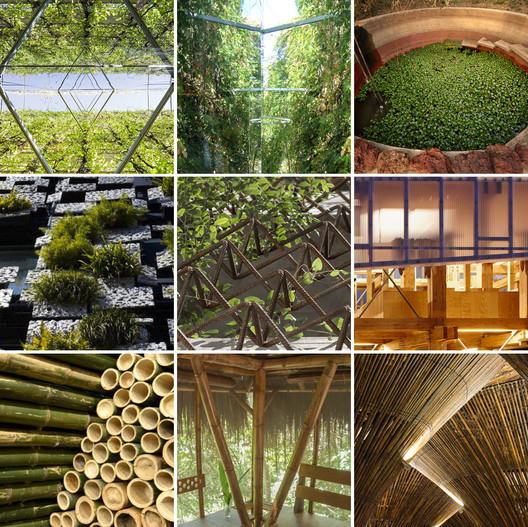
| 30 Plans, Sections and Details for Sustainable Projects Posted: 28 Dec 2016 12:00 AM PST  The dramatic improvement in recent decades in our understanding of sustainable design has shown that designing sustainably doesn't have to be a compromise—it can instead be a benefit. When done correctly, sustainable design results in higher-performing, healthier buildings which contribute to their inhabitants' physical and mental well-being. The benefits of incorporating vegetation in façades and in roofs, as well as materials and construction systems that take energy use and pollution into account, demonstrate that sustainable design has the potential to create buildings that improve living conditions and respect the natural environment. Below we have compiled 30 plans, sections and construction details of projects that stand out for their approach to sustainability. Incorporation of vegetation: A layered system that incorporates the use of vegetation on roofs and facades—which can also incorporate other systems such as urban gardens or water recycling systems—provides significant economic, social and environmental benefits. These systems are particularly useful in improving sustainability in crowded urban areas. 01. AA House / IR arquitectura via © IR arquitectura via © IR arquitectura 02. Lacapelle-del-fraisse / Atelier du Rouget Simon Teyssou & associés via © Atelier du Rouget Simon Teyssou & associés via © Atelier du Rouget Simon Teyssou & associés 03. Tarrawarra Abbey / Baldasso Cortese Architects via © Baldasso Cortese Architects via © Baldasso Cortese Architects 04. GPL House / Estudio BLT via © Estudio BLT via © Estudio BLT 05. Casa Scout / BAAG Courtesy of © BAAG Courtesy of © BAAG 06. Silvina and Omar House / IR arquitectura via © IR arquitectura via © IR arquitectura 07. Edificio Consorcio Santiago / Enrique Browne + Borja Huidobro via © Enrique Browne + Borja Huidobro via © Enrique Browne + Borja Huidobro 08. Once Building / Adamo Faiden via © Adamo Faiden via © Adamo Faiden 09. Green Cast / Kengo Kuma & Associates Courtesy of Kengo Kuma & Asociados Courtesy of Kengo Kuma & Asociados 10. Pasaje Cabrer Collective Housing / AFRa via AFRA via AFRA 11. Eco Boulevard in Vallecas / Ecosistema Urbano via © Ecosistema Urbano via © Ecosistema Urbano Use of local materials and the study of construction systems: The choice of material responds to both the availability of local resources and to the local climate, allowing the interior spaces to be adapted to the external climatic conditions. The use of local resources and the design of a construction system which responds to the natural characteristics of the place also gives the benefit of a lower cost with respect to transportation and maintenance. 12. House in the Woods / Parque Humano via © Parque Humano via © Parque Humano 13. Lienzo de Barro House / Chaquiñán via © Chaquiñán via © Chaquiñán 14. Centro Holístico Punto Zero / Dio Sustentable via © Dio Sustentable via © Dio Sustentable 15. Museum & Biodiversity Research Center / Guinée et Potin Architects via © Guinée et Potin Architects via © Guinée et Potin Architects 16. Zenkonyu / Tadashi Saito + Atelier NAVE via © Tadashi Saito + Atelier NAVE via © Tadashi Saito + Atelier NAVE 17. 21st Century Vernacular House / Edra arquitectura km0 via © Edra arquitectura km0 via © Edra arquitectura km0 18. Bamboo Wing / Vo Trong Nghia via © Vo Trong Nghia via © Vo Trong Nghia 19. El Guadual Children Center / Daniel Joseph Feldman Mowerman + Iván Dario Quiñones Sanchez via © Daniel Joseph Feldman Mowerman + Iván Dario Quiñones Sanchez via © Daniel Joseph Feldman Mowerman + Iván Dario Quiñones Sanchez 20. Hostal and Capacitation Center / IR arquitectura via © IR arquitectura via © IR arquitectura 21. Kontum Indochine Café / Vo Trong Nghia Architects via © Vo Trong Nghia Architects via © Vo Trong Nghia Architects 22. Temporary Pavillion at UNAM / México Courtesy of Taller Carlos Leduc Montaño UNAM Courtesy of Taller Carlos Leduc Montaño UNAM 23. Snow House / Emilio Marin, Nicolas Dorval-Bory, Juan Carlos Lopez via © Emilio Marin, Nicolas Dorval-Bory, Juan Carlos Lopez via © Emilio Marin, Nicolas Dorval-Bory, Juan Carlos Lopez The study of bio-environmental design: When carrying out a project that aims to optimize building performance using only natural environmental factors, an understanding of the mechanics of those environmental factors is key. These buildings must take advantage of the natural energy of the sun and the wind, incorporating them into an architectural design. 24. Patagonia's Sustainable Social Housing / Aysén, Chile via © B+V Arquitectos via © B+V Arquitectos 25. Bioclimatic Dwelling in Tenerife / Ruiz Larrea y Asociados Courtesy of Ruiz Larrea y Asociados Courtesy of Ruiz Larrea y Asociados 26. World's First Prefabricated Carbon Positive House / ArchiBlox via © ArchiBlox via © ArchiBlox 27. Dixon Water Foundation Josey Pavilion / Lake|Flato Architects via © Lake Flato Architects via © Lake Flato Architects 28. Nest We Grow / College of Environmental Design UC Berkeley + Kengo Kuma & Associates via College of Environmental Design UC Berkeley + Kengo Kuma & Associates via College of Environmental Design UC Berkeley + Kengo Kuma & Associates 29. Casa Meztitla / EDAA via © EDAA via © EDAA 30. Quito Publishing House / Estudio A0 via © Estudio A0 via © Estudio A0 13 Spectacular Living Roofs in Detail This posting includes an audio/video/photo media file: Download Now |
| Architecture on Instagram: The Best Shots of 2016 Posted: 27 Dec 2016 10:00 PM PST Instagram and architecture go together like milk and cookies—an irresistible combination in which one brings out the best of the other. As Instagram continues to add features to its globally appealing platform, we take a look back on the year's most-liked photos posted to our ArchDaily account. #9#8#7#6#5#4#3#2... and #1Remember, you can tag your architecture photos with #archdaily. Here you can see over 1 million pics taken by the ArchDaily community. We also invite you to follow the other accounts on the ArchDaily network! ArchDaily HQArchDaily BrasilArchDaily MéxicoArchDaily en EspañolPlataforma UrbanaThis posting includes an audio/video/photo media file: Download Now |
| Posted: 27 Dec 2016 08:00 PM PST ") Space Needle / John Graham & Company. Image Courtesy of Wikimedia user Rattlhed (Public Domain) Space Needle / John Graham & Company. Image Courtesy of Wikimedia user Rattlhed (Public Domain) Buildings, perhaps unlike any other art form or edifice, have a capacity to influence or become part of a place's cultural identity and history. Defining an architectural monument is, however, an ambiguous exercise – most of their ilk only reach this status years after completion. AD Classics are ArchDaily's continually updated collection of longer-form building studies of the world's most significant architectural projects. Here we've assembled five structures and buildings which, often aside from original intentions, embody that most ephemeral feeling: a sense of progress. Eiffel Tower / Gustave Eiffel (1889)The world had never seen anything like the graceful iron form that rose from Paris' Champ de Mars in the late 1880s. The "Eiffel Tower," built as a temporary installation for the Exposition Universelle de 1889, became an immediate sensation for its unprecedented appearance and extraordinary height. It has long outlasted its intended lifespan and become not only one of Paris' most popular landmarks, but one of the most recognizable structures in human history. AD Classics: Eiffel Tower / Gustave Eiffel Space Needle / John Graham & Company (1962)The opening of the Century 21 Exposition on April 21, 1962 transformed the image of Seattle and the American Northwest in the eyes of the world. The region, which had been known until that point more for its natural resources than as a cultural capital, established a new reputation as a center of emergent technologies and aerospace design. This new identity was embodied by the centerpiece of the exposition: the Space Needle, a slender assemblage of steel and reinforced concrete which became—and remains—Seattle's most iconic landmark. AD Classics: Space Needle / John Graham & Company Roman Pantheon / Emperor Hadrian (125)Locked within Rome's labyrinthine maze of narrow streets stands one of the most renowned buildings in the history of architecture. Built at the height of the Roman Empire's power and wealth, the Roman Pantheon has been both lauded and studied for both the immensity of its dome and its celestial geometry for over two millennia. During this time it has been the subject of countless imitations and references as the enduring architectural legacy of one of the world's most influential epochs AD Classics: Roman Pantheon / Emperor Hadrian Empire State Building / Shreve, Lamb and Harmon (1931)Even in Manhattan—a sea of skyscrapers—the Empire State Building towers over its neighbours. Since its completion in 1931 it has been one of the most iconic architectural landmarks in the United States, standing as the tallest structure in the world until the Twin Towers of the World Trade Center were constructed in Downtown Manhattan four decades later. AD Classics: Empire State Building / Shreve, Lamb and Harmon National Congress / Oscar Niemeyer (1960)The concept of a purpose-built capital city in the interior of the country dates back to Brazil's independence from Portugal following the Napoleonic Wars, and was even enshrined in Brazil's first Republican Constitution in 1891.[1] It was not until Niemeyer's friend and patron Juscelino Kubitschek was elected president in 1956 that progress truly began in earnest. AD Classics: National Congress / Oscar Niemeyer This posting includes an audio/video/photo media file: Download Now |


.jpg?1482783603)
.jpg?1482810048)
Sergio_Grazia-IMP-A-12.jpg?1482811293)
| You are subscribed to email updates from ArchDaily. To stop receiving these emails, you may unsubscribe now. | Email delivery powered by Google |
| Google Inc., 1600 Amphitheatre Parkway, Mountain View, CA 94043, United States | |
Nema komentara:
Objavi komentar