Arch Daily |
- Terraced Garden / Atelier du Pont
- Monument to Privacy: Is This Manhattan Skyscraper a NSA Listening Post?
- Konieczny's Ark / KWK Promes
- Spine Wall House / Drew Architects
- House in Akitsu / Kazunori Fujimoto Architect & Associates
- Chengdu Museum / Sutherland Hussey Harris
- Bake / Yusuke Seki
- Call for Submission: Place and Displacement - A Marketplace in Refugee Settlements
- Zurich North America Headquarters / Goettsch Partners
- Shanghai Tower Wins 2015 Emporis Skyscraper Award
- Faust Store / Snøhetta
- See The Engineering Behind This Floating, Award-Winning Stone Helical Stair
- Scenario's House / Scenario Architecture
- COBE Designs Housing and Culinary Experiences to be Built on Top of Copenhagen Metro Station
- M6B2 Tower of Biodiversity / Edouard Francois
- Freelancing as an Architect: The Pros, The Cons, and Tips for Success
- Grove Houses / WMR arquitectos
- 50 AutoCAD Commands You Should Know
- Light, Space, and Movement Become Art During the Mesmerizing Sensory Experience of "VOID"
- Wasserwacht Lifeboat Station / Kunze Seeholzer Architekten
| Terraced Garden / Atelier du Pont Posted: 22 Nov 2016 09:00 PM PST  © Takuji Shimmura © Takuji Shimmura
 © Takuji Shimmura © Takuji Shimmura Close to avenue de Flandre and just a stone's throw from the canal de l'Ourcq, rue de Nantes is a fairly traditional Parisian street of Haussmann and inner-suburb buildings.  © Takuji Shimmura © Takuji Shimmura The project gently inserts itself into a narrow parcel bordered by dense, adjoining housing. On the street side, it extends the building streetscape in a simple manner. On the garden side, the staggering from the 1st to the 6th floors creates large, private, south-facing terraces and allows for an unencumbered view of the sky.  Scheme Scheme The "L" shape and the general volumetrics allowed for the creation of a true, collective garden at the ground level, planted with tall trees. The three townhouses integrated into the overall volume look out onto this landscape. The building is clad with a façade of black enamel terracotta tiles whose reflections change depending on the quality and direction of the light. It provides an elegant and subtle continuity to the building constructed by Philippe Gazeau in 1993 for Toit et Joie on the facing parcel, situated along rue de l'Ourcq.  © Takuji Shimmura © Takuji Shimmura  Floor Plan Floor Plan  © Takuji Shimmura © Takuji Shimmura  Section Section We created a small collective that blends into its urban environment with its simple salute and enlivens the center of the block with a beautiful version of convivial, green living. And to inject art into its everyday life, Atelier YokYok created a site-specific drawing on the common walls: silhouettes that choreograph the space and accompany the inhabitants in their daily movements.  © Takuji Shimmura © Takuji Shimmura This posting includes an audio/video/photo media file: Download Now |
| Monument to Privacy: Is This Manhattan Skyscraper a NSA Listening Post? Posted: 22 Nov 2016 08:00 PM PST Many have walked by and wondered what purpose this vast, windowless skyscraper in the heart of Manhattan serves. 33 Thomas Street, also known as the "Long Lines Building" (LLB), is an impenetrable monolithic fortress amid canyons of glass and steel. Ostensibly an AT&T telecoms building, the New York Times have recently reported (based on investigative work by The Intercept) that this "blank face[d] monument to privacy" may in fact be a NSA (National Security Agency) listening post, hidden in plain sight. Designed by San Franciscan John Carl Warnecke—an architect who worked closely with the Kennedy administration, and designer of the late President's mausoleum—the Brutalist tower was completed in 1974. Built to withstand a nuclear attack on New York or, at the very least, a devastating loss of power to the city, the 550 foot-tall (169 meters) structure is supported by systems that allow it to provide enough food, water and fuel to sustain 1,500 people for two weeks completely removed from public infrastructure. It has been said that during the aftermath of the September 11, 2001 attacks it was the only operational building south of lower Manhattan. 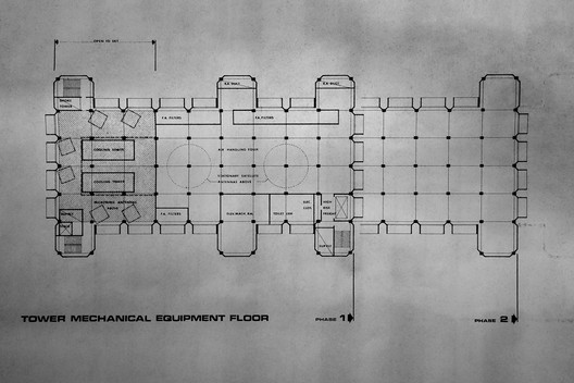 Plan for the tower mechanical equipment floor at 33 Thomas Street. Image via The Intercept Plan for the tower mechanical equipment floor at 33 Thomas Street. Image via The Intercept The history of the LLB's programme is not a total fabrication. While it continues to house AT&T's long distance telephone switches and carrier exchanges (originally as the New York Telephone Company), it now operates as a data-center and "gateway switch" – a threshold for international calls. John Carl Warnecke & Associates' vision, according to The Intercept, was to create "a communication nerve center" built as a "20th Century fortress, with spears and arrows replaced by protons and neutrons laying quiet siege to an army of machines within." They continue:
Story via New York Times. At this time no concrete evidence is available which connects the building to the NSA – for more information read The Intercept's article in full.  33 Thomas Street, New York City. Image Courtesy of wikimedia user Marcin Wichary (CC BY 2.0) 33 Thomas Street, New York City. Image Courtesy of wikimedia user Marcin Wichary (CC BY 2.0) This posting includes an audio/video/photo media file: Download Now |
| Posted: 22 Nov 2016 07:00 PM PST  © Olo Studio © Olo Studio
 © Olo Studio © Olo Studio From the architect. The highest value of the plot is a wonderful view stretching out. The idea was for the house to become its framework that crops it. The most appropriate building turned out to be a fully open on mountain landscape one-storey building, which gives the same view to all of the interiors.
 Scheme Scheme
Because of the plot being located in an absolute wilderness a problem of security came out. The solution turned out to be "twisting" the building so as only its one corner touches the ground and the rest is hang over the edge of the hill. With this solution, part of the ground floor where the bedrooms were located was pulled up to the level of the first floor. Because of the fact that there are wide glass openings in the building, my wife asked me to effectivly close the entrance side of the house. A 10 meter wall and a drawbridge, which combines the function of stairs and a window shutter, appeared.  © Jakub Certowicz © Jakub Certowicz  © Jakub Certowicz © Jakub Certowicz Location of the house on a steep slope, was followed by high risk of landslip, more and more frequent in polish mountains. As to limit the movement of the subsoil the house was treated as a bridge, under which rain water flows naturally.  © Jakub Certowicz © Jakub Certowicz  Floor Plan Floor Plan  © Jakub Certowicz © Jakub Certowicz Realities of mountain landscape as well as the local law constrained a gable roof. House took the form of a typical barn standing on three thin walls  Courtesy of Robert Konieczny Courtesy of Robert Konieczny  Courtesy of Robert Konieczny Courtesy of Robert Konieczny To give rigidity to the building the walls were tensed by the planes of the ''inverted" roof, slightly lifted over gound. Their incline increased the feeling of security. And so, we basically created a house with two roofs that protect it from water, it began to resamble an arc floating over the fields. After some time I realized, that in order not to disturb this impression, the best garden design would be lack of it, the best fence would be a temporary herding fence, the best approach - few rocks. In the same time the building was supposed to be cheap and easy to construct. That is why I deciced on insulating it from the inside, the concrete structure became an finnished elevation. This is how I got rid of complicated details and finish, they were replaced by poured concrete from a local producer. Sprayed closed-cell-structure foam turned out to be the optimal insulation. It is also a vapour barrier.  © Olo Studio © Olo Studio This posting includes an audio/video/photo media file: Download Now |
| Spine Wall House / Drew Architects Posted: 22 Nov 2016 06:00 PM PST  © Tristan McLaren © Tristan McLaren
 © Tristan McLaren © Tristan McLaren The site is located overlooking a golf course fairway on a prominent Johannesburg golf estate. Orientation is due north-east and there are distant views beyond the golf course to the horizon.  © Tristan McLaren © Tristan McLaren Access is taken from the south-west and the site is positioned on a bend on one of the main arterial roads within the estate. The land is predominantly flat with no natural features other than two thorn trees on the golf course interface.  Ground Plan Ground Plan The home was designed for a bachelor with limited mobility looking for a modern, single storey home characterized by a strong connection to nature and views from all rooms in the home. The client loves natural materials and the bushveld and was looking for a home which imbued a sense of being away in the bushveld: a place of comfort, a refuge from the world but reinterpreted in a more contemporary, urban context.  © Tristan McLaren © Tristan McLaren Given the clients requirement for a sense of seclusion and privacy and the location of the site on the bend of a main arterial roadway within the estate, the departure point for the design and defining gesture of the home is a large dry-packed natural stone wall which defines the line between public and private space. The intention to create a sense of protection and enclosure on the private side of the home but also to create an increased sense of interest and anticipation in the approaching visitor by the restrained use of line, form, pattern and materiality on the street. The bulk of the home hunkers down behind the spine wall, the only suggestion of what lies beyond being three chimney structures with an intentionally exaggerated vertical scale and a steel and timber roof terrace structure above the main terrace space. Given the position of the site the architects felt that providing an opportunity to access the incredible views and perspective from a first floor vantage point was too valuable an opportunity to miss. Accordingly, the architects planned a rooftop entertainment space taking full advantage of the panoramic views available looking north down the 13 th fairway and to the horizon beyond accessed from the ground floor entertainment space.  © Tristan McLaren © Tristan McLaren The spine wall also defines the primary movement route within the home and, whether experienced from inside or outside the home, provides powerful visual legibility. A naturally filtered koi pond runs the length of the wall on both sides which not only provides life and movement at the wall but also the illusion, through reflection, that the wall continues into the ground.  © Tristan McLaren © Tristan McLaren Natural materials such as dry-packed stone, solid hardwood, solid granite tiles and copper create contrasted against more clean, contemporary materials such glass and off-shutter concrete.  © Tristan McLaren © Tristan McLaren Product Description. Our client has a physical disability and was looking for a single storey home. To create the most modest silhouette in the landscape and 'hide' the home behind the large 4m stone feature spine wall we opted for a flat in-situ concrete roof slab. For complete peace of mind and in order to simplify the construction of the roof slab and waterproofing thereof we chose Penetron Admix which is added to the concrete mix at the batch plant at the time of batching and renders the concrete completely waterproof without the need for cement screeds to fall and a waterproofing bituminous membrane of any sort. Penetron was pivotal to the success of this building.  © Tristan McLaren © Tristan McLaren This posting includes an audio/video/photo media file: Download Now |
| House in Akitsu / Kazunori Fujimoto Architect & Associates Posted: 22 Nov 2016 02:00 PM PST  © Kazunori Fujimoto © Kazunori Fujimoto
 © Kazunori Fujimoto © Kazunori Fujimoto Located on a small peninsula, the project site faces directly the beautiful scenery of the Seto Inland Sea.  © Kazunori Fujimoto © Kazunori Fujimoto  Axonometric Axonometric  © Kazunori Fujimoto © Kazunori Fujimoto The most interesting challenge for this project was to create a comfortable inside silence combined with a new openness atmosphere.  © Kazunori Fujimoto © Kazunori Fujimoto In this plan I set two squares intersecting each other and thought about the good balanced interaction between the wall structure and the openings.  Floor Plans Floor Plans The moving line inside the house becomes fluid thanks to the use of skipping floors and short stairs that connect the living area with the sleeping rooms. The use of a polish concrete finish for the living room and the kitchen floor became important in order to give an additional value to the external light.  © Kazunori Fujimoto © Kazunori Fujimoto The first floor is slightly buried and its ceiling was set lower rather than the living room in order to achieve a more private and cozy feeling.  © Kazunori Fujimoto © Kazunori Fujimoto Here resides a very special concrete spiral staircase. The thickness of the supporting slab becomes invisible to its outer and inner end and it was designed in order to avoid any necessity of a central pillar. In this way from its central axe only a perfect straight line appears.  © Kazunori Fujimoto © Kazunori Fujimoto This posting includes an audio/video/photo media file: Download Now |
| Chengdu Museum / Sutherland Hussey Harris Posted: 22 Nov 2016 12:00 PM PST _Arch-Exist_photography.jpg?1479803730) © Arch-Exist Photography © Arch-Exist Photography
_Arch-Exist_photography.jpg?1479803671) © Arch-Exist Photography © Arch-Exist Photography From the architect. In 2007 Sutherland Hussey Harris, in collaboration with Beijing based Pansolution, won first prize in the international competition for the design of the new City Museum for Chengdu in Sichuan, China. _Hu_Lin.jpg?1479803629) Courtesy of SHH Courtesy of SHH Tian-Fu Square was recently established in the historic core as a new central focus of Chengdu. The Existing Science museum forms the entire Northern edge with a giant statue of Chairman Mao saluting the main North South city axis, and on the East side a new concert hall is planned.  Ground Floor Ground Floor The New Chengdu Museum sits on the West side of the square and maximises its profile to present a façade of commensurate scale and proportion to embrace and address the huge scale of this new square and establishes a strong formal relationship to it by forming a simple enclosing rectilinear profile. The building further enjoys and celebrates this relationship to this monumental public space by extending an internal promenade of public foyers and circulation behind the entirety of the veiled façade addressing Tian-Fu Square. _Arch-Exist_photography.jpg?1479804033) © Arch-Exist Photography © Arch-Exist Photography The long narrow site is exploited using all the public areas to maximise a dramatic relationship with the new square, the remaining façades consequently enclose the largely hermetic exhibition halls, these are represented as a giant crafted artefact in the city cloaked in a precious skin of copper alloy rigorously profiled to play with light, shade and texture whilst accommodating all the technical requirements for ventilation grilles. Aside from the east face this skin is 'lifted' to reveal glazing at street level, allowing a more human scaled intimacy and a relationship to the interior. _Arch-Exist_photography.jpg?1479803863) © Arch-Exist Photography © Arch-Exist Photography _Arch-Exist_photography.jpg?1479803833) © Arch-Exist Photography © Arch-Exist Photography The form envelopes a new undercover outdoor public space - a monumental gateway through the building, offering a large outdoor public space where people can gather, cultural events can take place, even the local street market extends through to the square. This gateway within the building also creates an important connection between the C16th Huang Cheng Mosque, the most significant in South West China, and the main square. The main entrances to the museum, theatre and museum offices all connect with this route through the building. _Arch-Exist_photography.jpg?1479803762) © Arch-Exist Photography © Arch-Exist Photography The Museum requirements extend to over 65,000m2 of development and includes exhibition space for Natural History, History and Folk, and an 800 seat Chinese Shadow Play Theatre as well as a 1000m2 Temporary Exhibition space. A huge challenge within the project was to be able to provide the museum with their requested 30m clear span exhibition halls whilst assuring the structure is capable of withstanding an earthquake measuring up to 8 on the Richter scale. In addition to this the city's subway network runs under the Northern half of the building, resulting in the above ground section of the building cantilevering over the tunnels.  Long Section Long Section A rigid diagrid steel lattice forms the structural shell enclosing the enormous interior volumes of large climatically controlled halls, The building further extends 24m into the ground to accommodate the conservation stores, theatre and plant rooms and is structurally isolated from the effects of any earthquake via a protective box structure into which the whole construction sits. _Arch-Exist_photography_2.jpg?1479803951) © Arch-Exist Photography © Arch-Exist Photography Unusually for China, Sutherland Hussey Harris with Pansoloution design, Beijing, were retained beyond the conceptual design phase and contracted to deliver the detailed and production information stages for all the public areas of the building, the detailed design of the skin and its integration with the structure and the landscape and subsequently all site supervision related to this work. _Arch-Exist_photography.jpg?1479803639) © Arch-Exist Photography © Arch-Exist Photography This posting includes an audio/video/photo media file: Download Now |
| Posted: 22 Nov 2016 11:00 AM PST  © Takumi Ota © Takumi Ota
 © Takumi Ota © Takumi Ota The confectionary company BAKE traces its origins to the famed dairy farming tradition of Hokkaido.This project is the newest bakery storefront, tasked with the production and sales of the brand's signature item — a freshly baked cheese tart– in a Kyoto shopping district.  © Takumi Ota © Takumi Ota The layers of Japanese history remain deepest and most wholly intact here. The culture that is local to Kyoto has always attracted many, but in recent years, at times, the number of guests on its streets swells to nearly double the resident population. By nature of this influx, the tradition that appeals to so many has itself modulated, incorporating patterns of behavior that are more accepting in international terms.  © Takumi Ota © Takumi Ota Experimentation with this context, deforming and re-conceptualizing 'Local' until global in scope, inspired the selection of building materials. A correlating push for an expansion in local's mode of communication demanded that they be both relational and rich in potential.  Floor Plans Floor Plans Cheese tarts, freshly baked in the open kitchen at the back of the store, are soon lined up and displayed on a counter constructed of Lego. This architectural fabric serves as the shared language of communication between those whose spoken language may differ. Its appeal is universal, intuitive, and its attraction felt by nearly every generation. It evokes a sense of intimacy, creating a moment that connects people to this space.  © Takumi Ota © Takumi Ota  © Takumi Ota © Takumi Ota  © Takumi Ota © Takumi Ota At the same time, the walls of the retail area employ "Shitaji-Mado", a lattice framework technique traditionally used in the construction of Japanese teahouses. The exact specifications of the grid are strictly governed by each locality's respective guild of artisans, with no two being exactly the same. Left partially exposed, these walls allow customers to interact with a new iteration of tradition, while simultaneously encouraging an interaction the older exterior wall cladding. The store is thereby given a firm sense of place, reverberating with a reverence for the region.  © Takumi Ota © Takumi Ota Through this project, Seki has uncovered a new significance by reflecting on and tapping into the potential intrinsic to the locality itself.  © Takumi Ota © Takumi Ota This posting includes an audio/video/photo media file: Download Now |
| Call for Submission: Place and Displacement - A Marketplace in Refugee Settlements Posted: 22 Nov 2016 10:00 AM PST  Call for Submission: Place and Displacement - A Marketplace in Refugee Settlements Call for Submission: Place and Displacement - A Marketplace in Refugee Settlements Challenge Opportunity Most inhabitants in refugee settlements rely on humanitarian aid and cannot fully exercise their agency and skillsets. A marketplace can become an embodiment of dignity and resilience that respects refugee inhabitants' autonomy, creativity and capability. Through trading activities, refugee inhabitants can connect with the world and a future beyond transient settlements. As more policy makers, social workers and architects engage in the discourse surrounding refugee livelihoods, we are proposing a competition to formulate an interdisciplinary architecture and public administration proposal for a marketplace in refugee settlements. The finalist teams will come to New York City to attend a workshop and present at a symposium, in order to:
Jury Prize 1 Overall Winning Team $3,000 3 Winning Teams $7,000 Per Team 6 Honorable Mentions $1,000 Per Team *All awarded proposals will be presented to a group of related humanitarian organizations and philanthropies with credits to participants. To view the jury, download competition brief and register for competition: http://www.idevelopment.us/competition/ Download the information related to this competition here.
This posting includes an audio/video/photo media file: Download Now |
| Zurich North America Headquarters / Goettsch Partners Posted: 22 Nov 2016 09:00 AM PST  © James Steinkamp Photography © James Steinkamp Photography
 © James Steinkamp Photography © James Steinkamp Photography  © James Steinkamp Photography © James Steinkamp Photography From the architect. The new Zurich North America Headquarters is designed to reflect the company's global reach and world-class stature. The formal architectural resolution strives to represent both strength and stability, which are core values of the Zurich business model. Composed of three primary "bars" that are offset and stacked, the arrangement creates unique spaces for collaboration, opens views of the surrounding landscape, optimizes solar orientation for amenities, and provides programmatic flexibility not found in typical center-core office buildings. The top "bar" of the complex soars 11 stories and cantilevers toward downtown Chicago, providing visual identity along the interstate while projecting the strength and future focus of the company.  © James Steinkamp Photography © James Steinkamp Photography  Level 1 Level 1  © James Steinkamp Photography © James Steinkamp Photography  Render Render  © James Steinkamp Photography © James Steinkamp Photography Certified LEED Platinum, the 783,800-square-foot complex reinforces Zurich's commitment to environmental stewardship. A network of horizontal sunshades clads the perimeter of the complex, with the sunshades varying in depth depending on orientation, while floor-to-ceiling glass offers extensive natural light for the shallow office plates. A soaring three-story double wall faces south toward the multi-level plazas, showcasing an architecture that responds to the changing Chicago climate. In the end, a timeless material palette married to a bold, clear form creates a unique identity for the Zurich headquarters that embodies the core values of the company.  © James Steinkamp Photography © James Steinkamp Photography This posting includes an audio/video/photo media file: Download Now |
| Shanghai Tower Wins 2015 Emporis Skyscraper Award Posted: 22 Nov 2016 07:21 AM PST  Gensler's Shanghai Tower has won the 2015 Emporis Skyscraper Award. Selected from over 300 buildings of over 100 meters in height completed in 2015, the Emporis jury was impressed by the Shanghai Tower's "elegant spiraling cylindrical shape," and the "extraordinary energy efficiency" provided, in part, by the building's double-skin facade. Currently the world's second tallest building at 632 meters, the Shanghai Tower becomes the second Chinese building to win the Emporis award, after Zaha Hadid Architects' Wangjing SOHO took the prize last year. In addition to Gensler's first-place project, Emporis also recognized 9 runners-up including Rafael Viñoly Architects' 432 Park Avenue, Arquitectonica's Icon Bay in Miami, and the Evolution Tower in Moscow by Kettle Collective and RMJM Edinburgh. Read on to see all ten awarded projects. 1. Shanghai Tower (Shanghai, China, 632 meters) / Gensler Architects, 2Define Architecture Shanghai Tower / Gensler Architects, 2Define Architecture. Image © Connie Zhou Shanghai Tower / Gensler Architects, 2Define Architecture. Image © Connie Zhou 2. Evolution Tower (Moscow, Russia, 246 meters) / Kettle Collective, RMJM Edinburgh Evolution Tower / Kettle Collective, RMJM Edinburgh. Image © Igor Butyrskii Evolution Tower / Kettle Collective, RMJM Edinburgh. Image © Igor Butyrskii 3. Il Dritto (Milan, Italy 210 meters) / Arata Isozaki & Andrea Maffei Associati Il Dritto / Arata Isozaki & Andrea Maffei Associati. Image © Boris Kauffer Il Dritto / Arata Isozaki & Andrea Maffei Associati. Image © Boris Kauffer 4. Jiangxi Nanchang Greenland Central Plaza (Nanchang, China 303 meters) / Skidmore, Owings & Merrill LLP Jiangxi Nanchang Greenland Central Plaza / Skidmore, Owings & Merrill LLP. Image © Lv Hengzhong Jiangxi Nanchang Greenland Central Plaza / Skidmore, Owings & Merrill LLP. Image © Lv Hengzhong 5. Abode318 (Melbourne, Australia 187 meters) / Elenberg Fraser, Disegno Australia Abode318 / Elenberg Fraser, Disegno Australia. Image © Wang-Hsin Pei Abode318 / Elenberg Fraser, Disegno Australia. Image © Wang-Hsin Pei 6. Icon Bay (Miami, USA 139 meters) / Arquitectonica7. D1 Tower (Dubai, United Arab Emirates 284 meters) / Holfords & Associates D1 Tower / Holfords & Associates. Image © Alan Millin D1 Tower / Holfords & Associates. Image © Alan Millin 8. 432 Park Avenue (New York City, USA 426 meters) / Rafael Viñoly Architects, Schuman, Lichtenstein, Claman & Efron 432 Park Avenue / Rafael Viñoly Architects, Schuman, Lichtenstein, Claman & Efron. Image © Royce Douglas 432 Park Avenue / Rafael Viñoly Architects, Schuman, Lichtenstein, Claman & Efron. Image © Royce Douglas 9. Citygate Tower (Vienna, Austria 110 meters) / Querkraft Architekten Citygate Tower / Querkraft Architekten. Image © Lukas Dostal Citygate Tower / Querkraft Architekten. Image © Lukas Dostal 10. ÏCE II (Toronto, Canada 234 meters) / architectsAlliance ÏCE II / architectsAlliance. Image © Edvard Mahnic ÏCE II / architectsAlliance. Image © Edvard Mahnic  This posting includes an audio/video/photo media file: Download Now |
| Posted: 22 Nov 2016 07:00 AM PST  © Lasse Fløde © Lasse Fløde
 © Lasse Fløde © Lasse Fløde From the architect. For the high-end shoemaker Faust, Snøhetta has created a complete visual identity and the brand's very first signature store. With a truly interdisciplinary approach, Snøhetta presents a coherent design including retail design, web design, signage, and brand design for everything from business cards to shoe boxes, as well as a customized typeface bringing all the elements together.  © Lasse Fløde © Lasse Fløde Coming from a family of shoemakers, Faust founder Álvaro Miranda started up his Oslo-based bespoke boutique earlier this year. The store offers both tailor-made shoes as well as handcrafted ready-made shoes. Customers are invited into the mysterious world of Faust to be part of the long-established craft of shoemaking – from the measuring of the feet and carving of the last, to the final sculpting and sewing of the shoes. The art of shoemaking has remained practically unchanged for centuries, and Faust aims to continue the cordwainer's tradition with a contemporary approach while honoring their time-tested methods. The artisanship is central in the design concept, striving to create a personalized experience and a customized result.  © Lasse Fløde © Lasse Fløde  Render Render  © Lasse Fløde © Lasse Fløde The interior design and visual identity both have a strong link to shoemaking as a craft, with focus on tactility, quality, and elegance. Another important reference for the design is Johann Wolfgang von Goethe's legend of Faust from Renaissance times – a legend which has been the basis for many literary, artistic, cinematic, and musical works through the ages. The interior elements of the design, including the vaulted shapes, carved patterns, and the material palette, as well as the brand's reconceived typography and color scheme, reference this historical period in which Goethe first penned the manuscript.  © Lasse Fløde © Lasse Fløde Located in Oslo's Barcode-area, the 20 square meter space consists of ve custom concrete niches with massive carved wooden doors. The ve niches and their vaulted shapes each have their own specific programmatic purpose; the designer's personal cabinet with tools and materials, a place for sitting, a display niche, and two storage niches. With large-scaled oiled oak doors with a milled and brushed finish, the design of the cabinetry reflects the handmade details and the tactility of the products being displayed and sold in the shop. The niches reference a historic, almost religious architectural language, giving homage to the thoughtful and quality driven trade of shoemaking. The concrete niches with their weight and massiveness possess a surreal scale in an otherwise small space, while disappearing into the darkness of the charcoal colored walls.  © Lasse Fløde © Lasse Fløde This posting includes an audio/video/photo media file: Download Now |
| See The Engineering Behind This Floating, Award-Winning Stone Helical Stair Posted: 22 Nov 2016 06:00 AM PST  Courtesy of Webb Yates Engineers Courtesy of Webb Yates Engineers Helical staircases are often designed to be show-stoppers, focal points of architectural spaces that are intended to impress. But even compared to its eye-catching peers, this staircase developed by Webb Yates Engineers is unusually audacious. Developed for a residential design by RAL Architects in Formby, UK, each step of the two-story, 4.6-meter diameter helical staircase is composed of an individual block of stone, giving an impression of weightlessness as the structure circles its way up through the building's atrium towards the glazed roof above. For their efforts, Webb Yates recently won the Award for Small Projects at the Institution of Structural Engineers' 2016 Structural Awards, whose judges said that they were "amazed by the grace and audacity" of the design. Read on to find out how Webb Yates achieved this feat of engineering.  Courtesy of Webb Yates Engineers Courtesy of Webb Yates Engineers The key to achieving the design was two 12.9-millimeter steel cables running through the center of the stairs. After all the stone steps were in place, these cables were post-tensioned to a load of 150 kilonewtons. However, while this may sound like a simple answer, the truth is anything but: "Straight post-tensioned stone stairs are a common design with the structural analysis being similar to that of post-tensioned concrete beams or slabs, a construction method which is well documented and codified," explains Webb Yates in a press release.  Courtesy of Webb Yates Engineers Courtesy of Webb Yates Engineers "To post-tension a stone stair to sweep through 320 degrees is a much more complicated problem and requires full 3D modeling and analysis of the stone as well as a complete understanding of the structural principles at work. It was realized early on that the stresses the stone was subjected to were too complicated to analyse with simple 1D or 2D finite element models so a full 3D model was constructed using Rhino and Grasshopper scripting to generate the complex shape of each tread and the mortar joints between. The stair works in both bending and torsion simultaneously and the joints are prone to cracking or slipping if the frictional resistance is not high enough. In addition to this, the strength of the material used is direction-dependant so the exact direction and nature of each stress the treads are subjected to is very important."  Courtesy of Webb Yates Engineers Courtesy of Webb Yates Engineers To decrease the vertical load on the stairs—and simultaneously to make the stairs appear more slender and graceful—the steps were profiled to be more slender at the edges, with a thicker "spine" running up the center. This decreased the weight of the stairs (to a mere 150 kilograms per step) and directed most of the load through the central spine, where the post-tensioning cables are located.  Courtesy of Webb Yates Engineers Courtesy of Webb Yates Engineers In order to ensure the success of the design, Webb Yates even constructed a model at 70% of full size running through a 180-degree turn, which was then tested to destruction. As they put it in their press release, "in order to push the engineering design as far as we could, we needed to test the stone to its limits."  Courtesy of Webb Yates Engineers Courtesy of Webb Yates Engineers Once the design was set, The Stonemasonry Company cut the stairs from 2D CAD templates in 4 weeks. On-site installation of the stairs took 8 weeks, including the construction and removal of the temporary blockwork wall that held the stone in place until post-tensioning.  Courtesy of Webb Yates Engineers Courtesy of Webb Yates Engineers For Webb Yates, constructing the stairs in solid stone was more than just an exercise in pushing engineering to its limits, however. Had the structure been created in steel or concrete, they argue, the embodied energy of the staircase would be much higher, making stone the environmentally friendly option. And, while it may have been possible to construct the staircase in another material and clad it in stone, this would have required much higher stone-cutting costs and much more time on site, making a solid stone design the economical option too. This posting includes an audio/video/photo media file: Download Now |
| Scenario's House / Scenario Architecture Posted: 22 Nov 2016 05:00 AM PST  © Matt Clayton © Matt Clayton
 © Matt Clayton © Matt Clayton This house was a chance to be our own clients. It was purchased with the intention of completely renovating, extending and adapting it to the scenarios of our own family life. It presented us with the opportunity to 'practice what we preach' to its fullest expression and create the scenario house.  © Matt Clayton © Matt Clayton The main design challenge was finding a way of connecting the front part of the house, which originally had two separate Victorian reception rooms with the basement level, a full floor height below, both physically and visually, in order to create a sense of single and connected open living and kitchen spaces.  © Matt Clayton © Matt Clayton Creating a split-level open double reception, connected to the kitchen and garden floor by an angled glazed roof extension and a 'floating' library feature leading up to the bedroom floors, solved this challenge.  © Matt Clayton © Matt Clayton  Plan 0 Plan 0  © Matt Clayton © Matt Clayton Considerable thought was given to developing our brief both for current and future scenarios and conscious effort was made to use every available space the house had to offer. This included using spaces under the stairs, in the eves, in hallways and limited height areas.  © Matt Clayton © Matt Clayton One such space was the relatively low ceiling height area resulted by the lowering of part of the reception above. This presented an opportunity for a fun and practical kids area. A storage unit under the stairs complete with a pull out table and bench invites the kids to spend time playing, doing their homework and artwork ina designated but connected part of the home.  © Matt Clayton © Matt Clayton Our children took a central part in developing both the brief and the design of their own bedroom. Resulting in a climbing wall leading to a 'secret space' at the eves of the single pitch original house extension. And what better way to come back down than use the fireman pole!  © Matt Clayton © Matt Clayton This posting includes an audio/video/photo media file: Download Now |
| COBE Designs Housing and Culinary Experiences to be Built on Top of Copenhagen Metro Station Posted: 22 Nov 2016 04:00 AM PST  Courtesy of COBE Courtesy of COBE The City of Frederiksberg, along with Real-dania By and Byg Foundation have selected a team led by Danish architects COBE to develop the "House of Food Culture." The project will be constructed on top of the new metro stations in Copenhagen's new Metro City Ring. The House of Food Culture and its townhouses will be built in brick, imitating the neighbouring facade lines and keeping with the style of the historic surroundings. The House of Food Culture is to be built on top of the entrance to the forthcoming metro station that will host a daily flow of 10,000 people, while focusing on making it the focal point for urban life and a central meeting place.  Courtesy of COBE Courtesy of COBE With the expected completion for 2019, the project will hold a prominent location in Frederiksberg Allé, one of the most significant avenues in Copenhagen holding a large number of cultural and recreational activities including theatres, museums and a zoo. On the ground floor, visitors will be presented with an array of culinary experiences including food stalls, workshops and educational facilities, while 30 new housing units will be built on top in an L-shape, filling in the corner of Frederiksberg Allé and the adjacent road.  Courtesy of COBE Courtesy of COBE "The building is going to complete the vacant plot on the historic avenue of Frederiksberg Allé and adapt to its unique cultural heritage," says Dan Stubbergaard, Founder and Creative Director of COBE. "Besides becoming a new infrastructural node for public transport, the House of Food Culture will also be a focal point in the district. Located on top of the coming metro station, it will be a gate to Frederiksberg Allé, and the nearby theatres, museums and recreational offers, generating life and activity, and reinforcing its position as an attractive, prominent destination in the capital." With views through the treetops, the 30 different housing units will accommodate families, students and singles with distribution around many common areas, creating the perfect conditions for social settings.  Courtesy of COBE Courtesy of COBE "With both a distinguished and modern architecture, the House of Food Culture is an example of how many different considerations can bring a project to a higher level," said Jacob Eiskjær Olesen, Director of the project's investor NRE Denmark. "That requires close collaboration from the very first idea to the finished project."  Courtesy of COBE Courtesy of COBE
News via: COBE This posting includes an audio/video/photo media file: Download Now |
| M6B2 Tower of Biodiversity / Edouard Francois Posted: 22 Nov 2016 03:00 AM PST 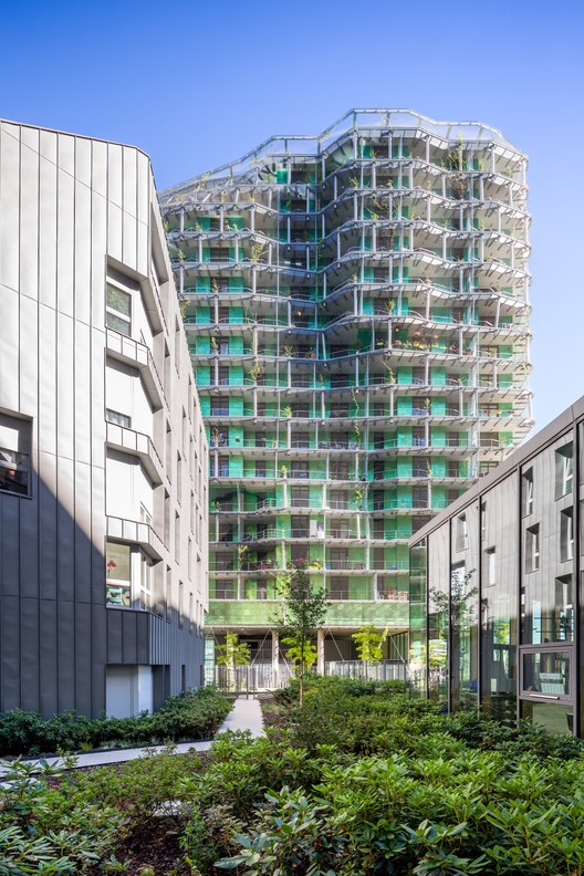 © Pierre L'Excellent © Pierre L'Excellent
 © Pierre L'Excellent © Pierre L'Excellent From the architect. The relationship between building height and sustainability is a subject that currently occupies the minds of many city planners. This is because the city cannot expand infinitely into the landscape. In France, however, "village" urbanism seems to be adamantly resisting the vertical city, without truly considering its potential. One of the objectives of our project is to quell these hesitations. .jpg?1479798359) © Pierre L'Excellent © Pierre L'Excellent  Elevation Elevation  © Pierre L'Excellent © Pierre L'Excellent Benefiting from an exception to the 37 meter building height restriction in Paris, the tallest building of our project is 50 meters tall. Covered with plants from wild natural areas, our tower is a tool for seeding: it allows the wind to spread class one purebred seeds into the urban environment. Its height is a key element for its capacity to regenerate urban biodiversity. Its titanium cladding generates moiré patterns that give it a subtle, fluctuating character. The tower is thus not only a tool for neighborhood development but also a tool for development on a bigger scale as it distills a "green" aura to the Parisian cityscape.  © Pierre L'Excellent © Pierre L'Excellent  Axonometric Axonometric  © Pierre L'Excellent © Pierre L'Excellent The landscaping strategy unfolds in three stages: first with rapidly climbing vines, later with conifer trees that develop in five to ten years, and lastly with slow-growth trees like oaks that develop in twenty years or more  © Pierre L'Excellent © Pierre L'Excellent  Detail Detail  © Pierre L'Excellent © Pierre L'Excellent The green vegetal façade of the tower extends over the center of the block to the surrounding buildings. These smaller buildings are simpler, with metal facades in zinc and aluminum. They are placed at the corners of the block, allowing for the pedestrian to stroll through a calm, protected garden filled with low vegetation, as if outside of the city.  © Pierre L'Excellent © Pierre L'Excellent This posting includes an audio/video/photo media file: Download Now |
| Freelancing as an Architect: The Pros, The Cons, and Tips for Success Posted: 22 Nov 2016 01:30 AM PST .jpg?1479760771) This article was originally published by Archipreneur as "The Pros and Cons of Starting out as a Freelance Architect." Freelancing can be a great option for architects looking for more autonomy and freedom in their work. Although there are drawbacks to this kind of work, there are specific strategies that you can use to overcome the challenges and uncertainties of going solo. It is easy to look down on freelancing. Those who are employed by a traditional company or firm see freelancing as an inferior work model that automatically implies less financial security and suggests to employers a loose definition of responsibility. People often imagine freelancers as slumming it in their pajamas doing just a few hours of work per day, or as Jacks-of-all-trades, overworked and constantly chasing new commissions. While data from recent studies and surveys show that freelancers do indeed work fewer hours than those in traditional employment, the rising number of freelancers proves that this trend is not waning. In fact, according to recent reports, increasing numbers of US and European workers are choosing to go freelance. A recent survey of the freelance economy, conducted by the NYC-based Freelancers Union and the freelancing platform Upwork, shows that the number of freelancers is growing, making up 35% of the US workforce. The survey also showed that freelancers are upping their rates and earning more than they did while in more traditional roles. Around 63% of surveyed freelancers said that they chose to go freelance, which is a significant jump from 53% in 2014. This also destroys the stereotype that freelancing is a primary consequence of the recession. Although the economic crisis did play a major role in the proliferation of freelancing, figures suggest that an increasing number of workers are not forced into freelancing by unfortunate circumstances. Before getting into the nitty-gritty of what freelancing is, we should make a distinction between sole proprietorship and freelancing. A sole proprietor has to file appropriate paperwork with local and state authorities to register his firm and acquire the option of hiring workers. Freelancers don't have the legal ability to hire employees. A freelancer can later choose to file the necessary paperwork to acquire a taxpayer identification number and a business license, in which case they are no longer registered as self-employed but as a sole proprietor. While sole proprietors have to register the address of their business, freelancers have the opportunity to work from anywhere in the country. Freelancers can telecommute, work from home or work part-time in an office while simultaneously pursuing their freelancing gigs outside work hours. Working abroad depends on the type of requirements of each state, and will potentially require you to file for specific Visas and permits. Self-employed EU citizens have the right to work in any EU member state. As an EU national, you generally do not need a work permit to work in a country within the EU, with a few exceptions. There are also several freelancer associations that promote the interests of freelancers across the EU.  Infographic showing the results of <a href='https://www.upwork.com/press/2015/10/01/freelancers-union-and-upwork-release-new-study-revealing-insights-into-the-almost-54-million-people-freelancing-in-america/'>the survey of the freelance economy</a> conducted by the Freelancers Union. Image via Archipreneur Infographic showing the results of <a href='https://www.upwork.com/press/2015/10/01/freelancers-union-and-upwork-release-new-study-revealing-insights-into-the-almost-54-million-people-freelancing-in-america/'>the survey of the freelance economy</a> conducted by the Freelancers Union. Image via Archipreneur Some of the main advantages of being a freelance architect are: greater control over every aspect of your business, more autonomy, and less bureaucracy that comes with running or working in a large firm. Although the financial insecurity of freelancing is typically linked to the volatile relationship between freelancer and client (as opposed to established, long-term contracts with a single company), around 53% of freelancers believe that having several employers is a more financially secure option than working full-time for one business. The truth is that every job post-recession is relatively insecure, as markets change and companies close or downsize. However, having versatility and freedom also supposes a lack of employee support, as offered in companies and firms. Freelancing can, in addition, be quite lonely. Not having the opportunity to learn from superiors and talk things through with colleagues can be an isolating experience, causing freelancers to become less productive. Furthermore, managing work hours, figuring out rates, acquiring clients and protecting work can be tricky hurdles to overcome. To circumvent these problems, freelancers are advised to follow a few key guidelines: Create Relationships and AffiliationsWhile there are many websites where you can find work, the best way to find work is the same as with any other form of employment: through networks, connections, and relationships with other architects, construction companies and builders. Keep in touch with former co-workers and colleagues, join professional associations, and consider teaming up with other professionals on new projects. Figure out Your RateSome of the common mistakes that freelancers make is undercharging for their services, thus lowering the standard for the entire freelancing community. Set up a contract that ensures you get paid independently of the project development. Construction projects often take months to complete. If you offer design services and commit yourself to a project, you might consider asking for a monthly fee, or getting paid in installments. This will ensure you get paid even when the firm doesn't need you at specific times, or if the project goes into overtime. Protect Your WorkDon't give usable digital copies of your work to anyone until you are paid. If you do give anything away, it must be in accordance with your contract. Create read-only versions of signature-protected files. Similarly, make sure to respect the intellectual property of your clients. Stealing projects, violating authorship regulations and passing off other people's work as your own will not benefit you in the long run. *** Setting up a freelancing business isn't much different to running a firm. You'll need expertise, a good marketing strategy, and good relationships to compete against others for work. It might be useful to start off by working full time in an office or studio before going into freelancing. This can be a great learning experience and a way to gather a number of contacts. What's more, if you do decide to establish your own firm after a few years of freelancing, the transition will go much more smoothly because you will be aware of the similarities and differences. Another smart strategy is to create additional income streams to support your freelancing career. Similar to archipreneurs, freelancing architects are on a less conventional career path, which brings with it a specific set of challenges. As with startups and small to medium-sized businesses, it is important that freelancers have contingency plans and income sources that get them through tough times. Start blogging, podcasting, and creating digital products to get steady income streams that free you up to work on the type of projects you want. Your brand identity and long-term success depend on it. This posting includes an audio/video/photo media file: Download Now |
| Grove Houses / WMR arquitectos Posted: 22 Nov 2016 01:00 AM PST  © Sergio Pirrone © Sergio Pirrone
 © Sergio Pirrone © Sergio Pirrone From the architect. The commission is from two young surfer brothers with the need to build a house for each in an area where the sea views are favored for both houses.  © Sergio Pirrone © Sergio Pirrone The idea is to generate narrow volumes to open views of the neighboring sites behind and each other.  Main Level Plan Main Level Plan  Elevations Elevations Seeking height to see the wave from the inside, the houses rise from the ground level with a wooden structure with stilts in an area, and a concrete base in another.  © Sergio Pirrone © Sergio Pirrone Sliding partitions allow to separate or join the master bedroom with the living-dining area, achieving greater breadth to the spaces.  © Sergio Pirrone © Sergio Pirrone A terrace on the roof takes advantage of the view of the waves. The views to the north and south are closed, to achieve privacy within the spaces.  © Sergio Pirrone © Sergio Pirrone A simple materiality was considered (wood, forest area) and local labor (very cheap). The structure is made of black pinewood. The interior finishes of the walls and ceilings are 1"x8" natural color pine, and floors in 1"x2" tongue and groove pine also natural color, with vitrification. The wood deck terraces are made of vitrified cypress. The completion of the exterior 1"x8" pine wood walls is impregnated and dark oak color.  © Sergio Pirrone © Sergio Pirrone This posting includes an audio/video/photo media file: Download Now |
| 50 AutoCAD Commands You Should Know Posted: 22 Nov 2016 12:00 AM PST
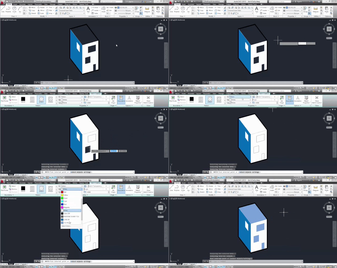
After spending countless hours in front of AutoCAD working on a project, you’re bound to have your own set of favorite commands to standardize a few steps. We also bet that you don’t have them all memorized or often forget them. To help you remember, we've made a list of 50 commands that can help you speed up your work game, discover new shortcuts, or come in use as a handy tool for when you forget what the command you need is called. The following listing was developed and corroborated by our team for the 2013, 2014 and 2015 versions of AutoCAD in English. We also prepared a series of GIFs to visualize some of the trickier ones. When you’ve finished reading, we would love to know what your favorite commands are (including those that we didn’t include). We will use your input to help us update the article! APPLOAD
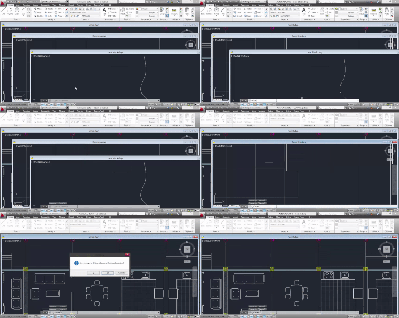
Defines which applications to load when starting / opening AutoCAD. Very useful if AutoCAD and your computer don’t get along so well. AREACalculates the area and perimeter of a defined object or a surface that you select vertex by vertex, according to the metric units defined in settings. BACKGROUNDChoose a background image for the work area. It can be a single color (Solid), a gradual color (Gradient) or an image (Image) from your computer. BMPOUTGenerates a bitmap image (.bmp format) after selecting a series of objects, surfaces, or regions. BOXCreates a 3D box, defining height, width and depth. BURSTExplodes a block or an object, but keeps its attributes intact after exploding it. Highly recommended. CHSPACEMoves objects from the layout to the model, and vice versa. The best part is that the objects are scaled automatically in the new space. CLOSEALL
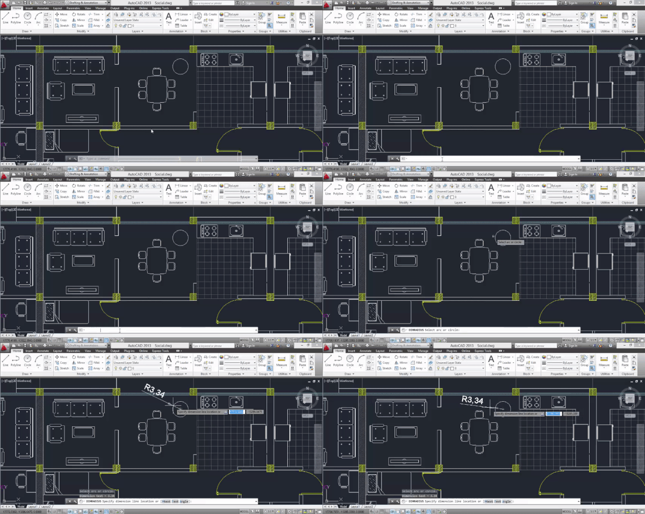
Closes all open AutoCAD windows. If there are changes to any of your files that you haven’t saved yet, you will be asked if you want to save them. Unlike QUIT, you won’t exit AutoCAD with this command, just return to Start. COLORChoose a layer color for future objects, lines and surfaces. DIMALIGNEDCreates a dimension aligned with an axis / line. DIMANGULARCreates a dimension aligned with an arc or circle. DIMBASELINECreates a linear, angular or coordinate dimension, starting from a baseline of an earlier dimension. DIMRADIUS
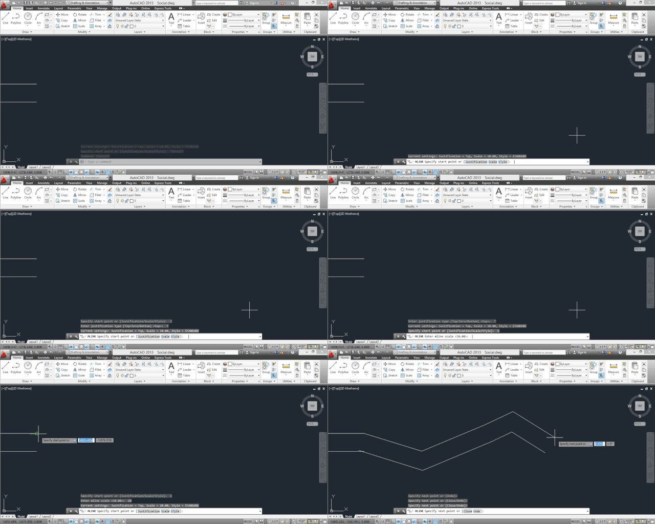
Creates a radius dimension for circles and arcs. Not to be confused with DIMANGULAR and DIMBASELINE. DIMTEDITEdits the text location of existing dimensions. EDGESURFCreates a three-dimensional polygonal mesh. EXPLODEBreaks up an object or block into each of its individual components. Before using, make sure you’re on the right layer. IDDisplays the coordinates of any point on the worksheet. LIGHTManage lights and lighting effects on 3D models. You will most likely be prompted to change the viewport, or turn off the default lighting. LINETYPECreate, organize, and select line types. MATLIBImport and export materials from and to a library. MLINE
Creates multiple parallel lines. MLEDITEdit multiple parallel lines. MULTIPLERepeats the next command until you cancel (Esc) MVSETUPSets up the layout of a drawing. OOPS
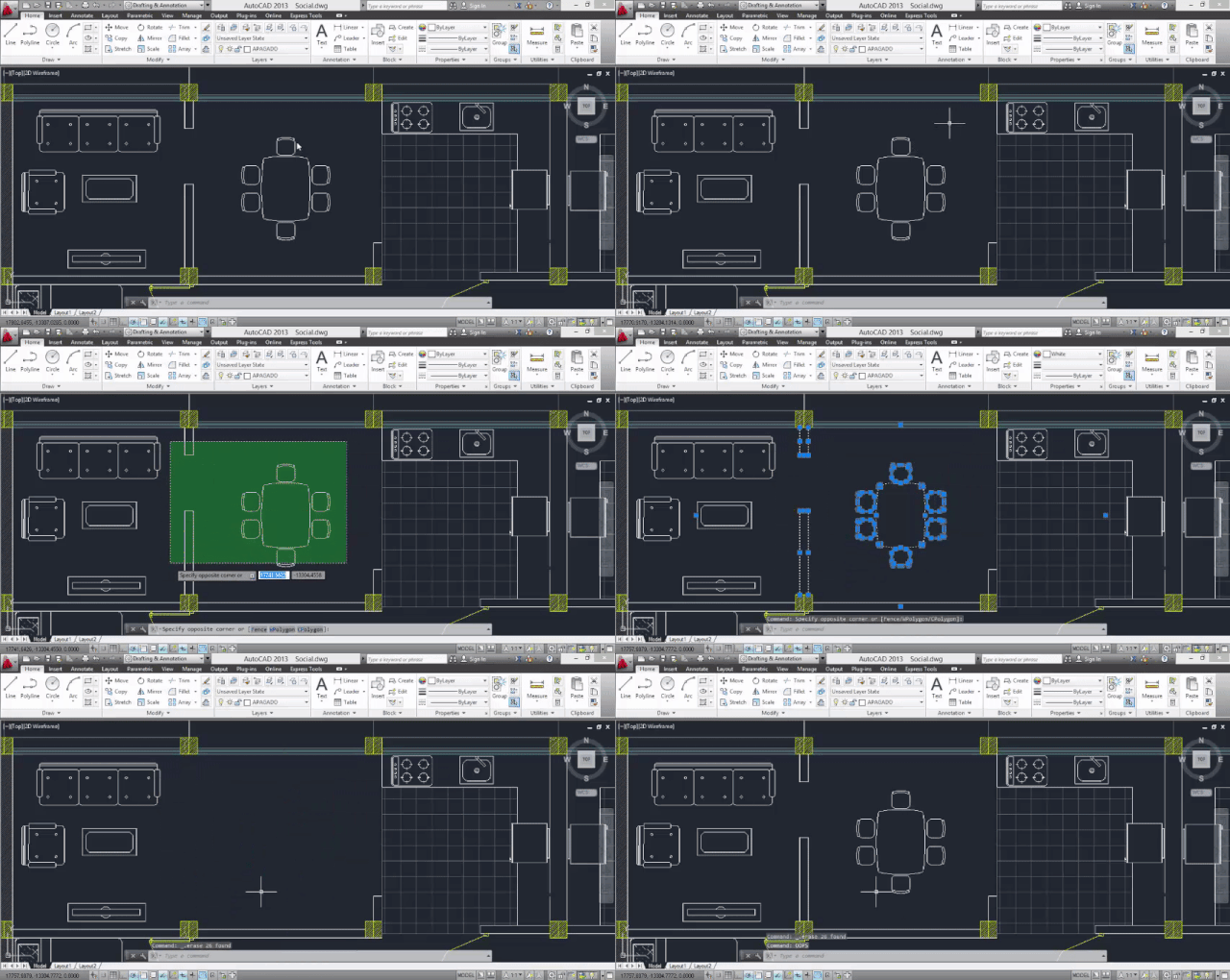
Restores the most recently deleted items. Its advantage over U is that you can use it after using BLOCK (or WBLOCK, export selected items to a new .DWG file), because those commands can delete selected objects after creating a block. Unfortunately, you can’t use OOPS after PURGE. OVERKILL
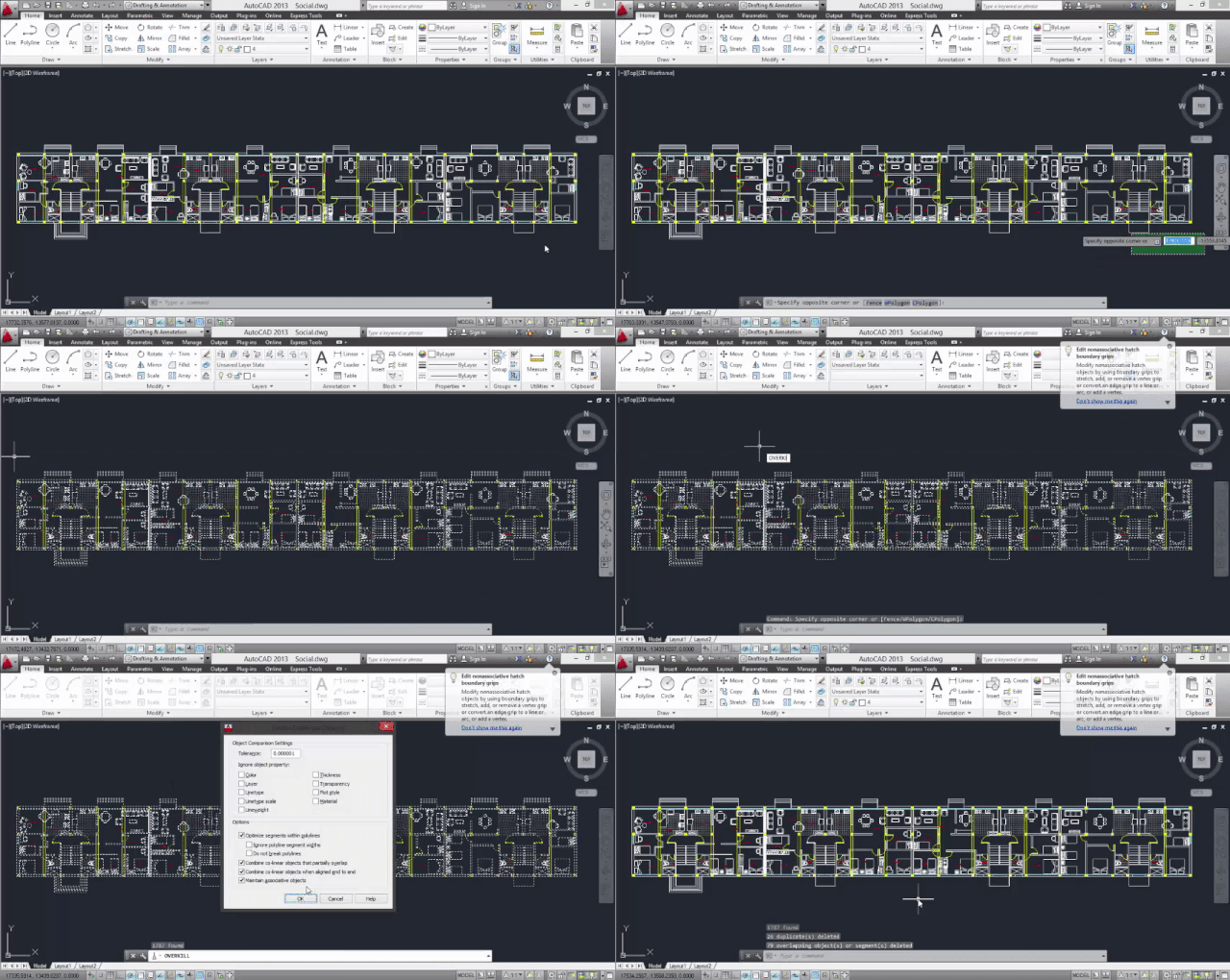
Cleans up your drawings. It goes over your entire model and deletes any duplicate or overlapping items. An incredible help for those who are obsessed with order and clarity in planimetry. PAGESETUPSpecifies the page layout, plus the plotting device, paper size, and other settings for each new layout. PFACECreates a 3D mesh vertex by vertex. PREVIEWShows how the drawing will look when printed or sent to a plotter. Before you do this, you need to have configured the layout of the page (PAGESTEUP). PURGERemove unused objects in the drawing you are working on, through a series of filters: blocks, layers, materials, thickness of lines, texts, among others. QDIMQuickly creates a dimension, after selecting objects. QLEADERQuickly creates a leader, and a leader annotation. QSAVEAutosave the file. Very useful when AutoCAD stops working and you’ve gone hours without saving any work. If you haven’t named the file yet, it’s the same as SAVEAS. QSELECT
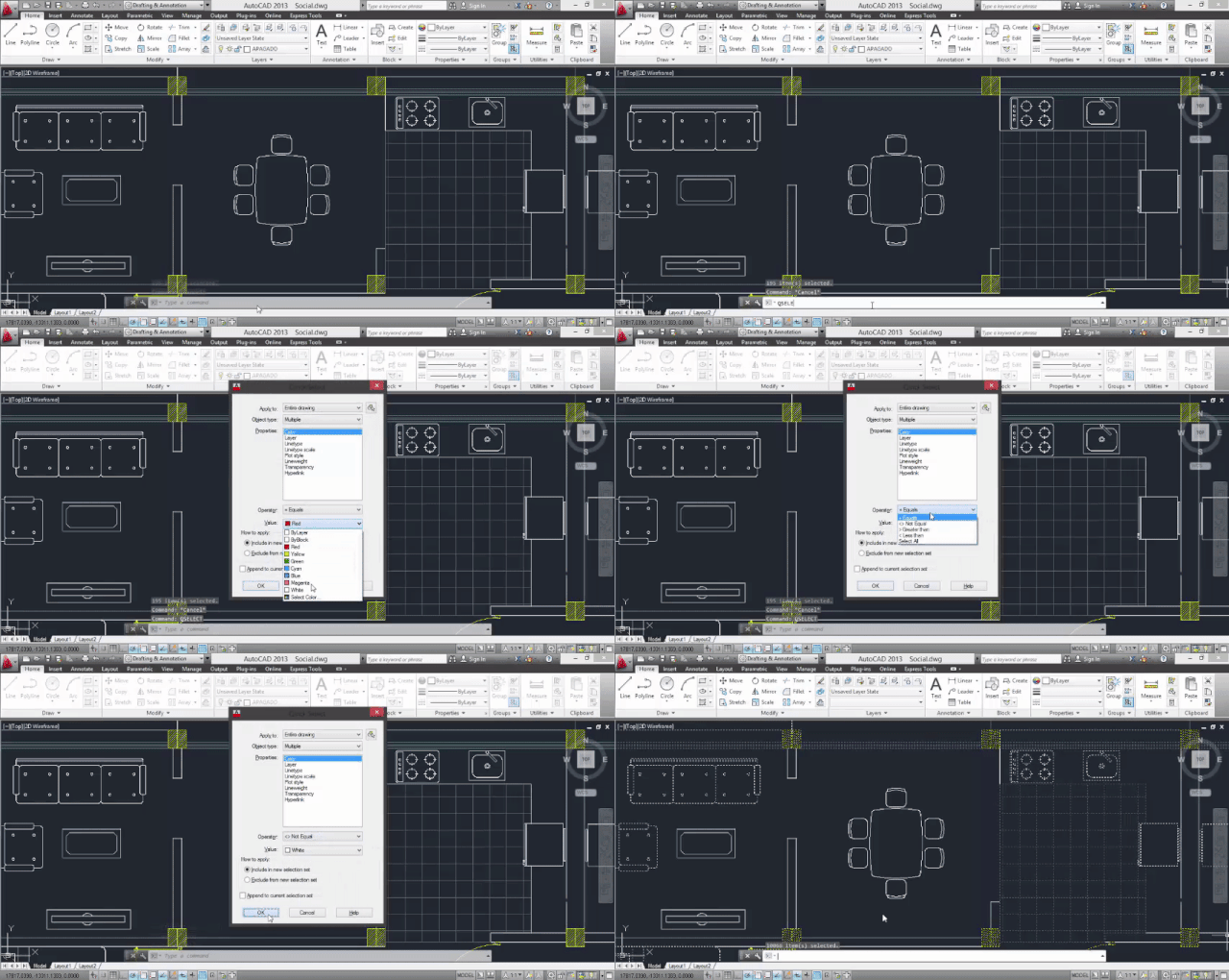
Quickly select objects according to a list of available filters: colors, line type and layers, among others. RECOVERRecovers a damaged file. RENDERCreates a render of the model you're working on. REVOLVECreates revolved solids (3D) by rotating 2D objects around a user-defined axis. RULESURF
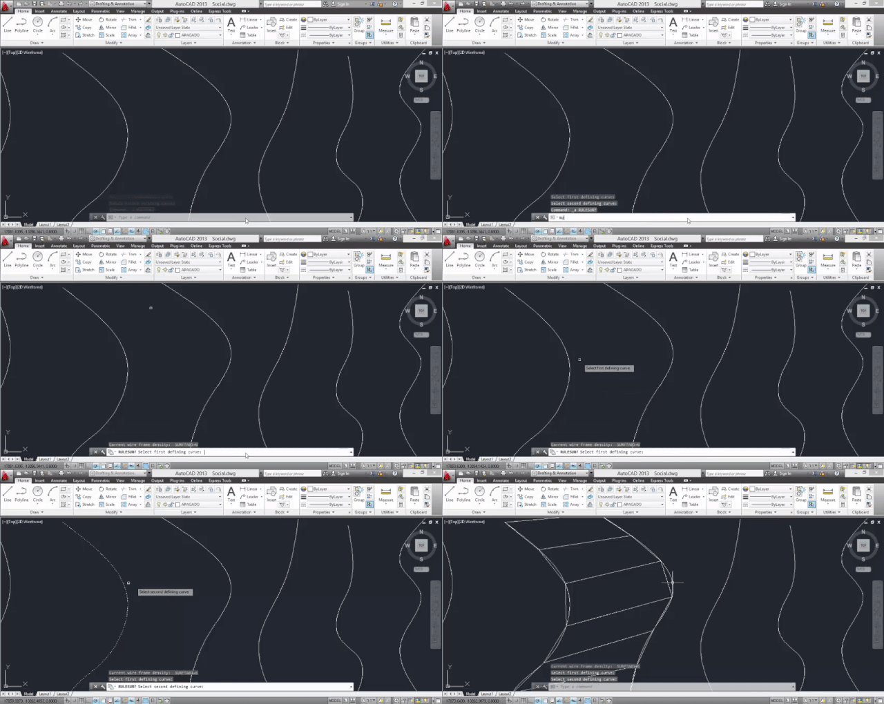
Creates a surface that joins two curves previously defined by the user. SAVEALLAutomatically saves all drawings you are working on. SHOWMATDisplays a set of information for a selected object, including line thickness, color, dimensions, radius, and area. SKETCHCreate a series of freehand drawing segments. SPELLChecks the spelling in texts using the language settings from your operating system, not AutoCAD. SUBTRACTCreates a region from a solid, surface, or region by subtraction. TABLETCalibrates and configures a tablet or Wacom. TIME
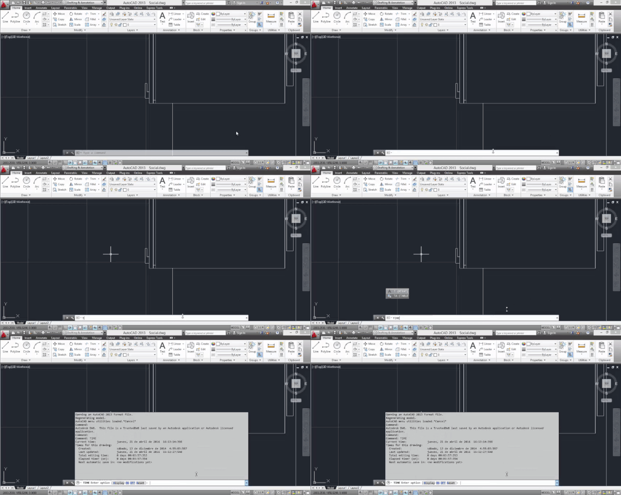
Displays a statistics table of the file you are working on: creation date, last update, and edit time. If you’re interrupted, you can activate / deactivate the stopwatch. UThe same as Ctrl + Z, undoes the most recent operation. UNDEFINEDeletes an AutoCAD command, even this one. If you want to reverse your decision, REDEFINE. VPORTSManages AutoCad windows for 2D and 3D models. XLINECreates an infinite line. 3DSOUTExport a file compatible with 3D Studio (.3ds format). Created using information from Autodesk Knowledge Network. This posting includes an audio/video/photo media file: Download Now |
| Light, Space, and Movement Become Art During the Mesmerizing Sensory Experience of "VOID" Posted: 21 Nov 2016 10:00 PM PST VOID is an interactive sensory art installation created by New York-based artists Sergio Mora-Diaz, Oryan Inbar and Jordan Backhus, that manipulates light in physical space to generate an immersive interaction arena and a meditative, transcendent spatial experience, which reminiscent of the cosmic sky and streams of information. The installation is composed of an arrangement of translucent screens, digital generative images displayed through a projector and sensors that respond directly and visually to the proximities and movements of its users.  Courtesy of Sergio Mora-Díaz Courtesy of Sergio Mora-Díaz The experience takes place in a closed room with a single entrance and in complete darkness, where the only light source comes from the projector. The arrangement of screens gives light a three-dimensional effect in space, while allowing people to walk through the installation.  Courtesy of Sergio Mora-Díaz Courtesy of Sergio Mora-Díaz  Courtesy of Sergio Mora-Díaz Courtesy of Sergio Mora-Díaz With their work, the artists seek to create an experience that connects to the physicality and emotions of the users, attracting their attention and use of the body as a conduit to the mind.  Courtesy of Sergio Mora-Díaz Courtesy of Sergio Mora-Díaz Given the scale of the installation, its arena, the immersive optical effects and the non-traditional display, it will appear that one is traveling through time and space.  Courtesy of Sergio Mora-Díaz Courtesy of Sergio Mora-Díaz VOID has been exhibited in New York at the Tisch School of the Arts and Livestream Public as a part of Frieze Art Week in 2015. In their last showcase, the artists had the support of Performa and the collaboration of New York City Ballet choreographer Troy Schumacher, to exhibit the installation accompanied by a performance by New York Ballet dancers Sean Suozzi and Claire Kretzschmar. This posting includes an audio/video/photo media file: Download Now |
| Wasserwacht Lifeboat Station / Kunze Seeholzer Architekten Posted: 21 Nov 2016 09:00 PM PST  © Jann Averwerser © Jann Averwerser
 © Jann Averwerser © Jann Averwerser  © Jann Averwerser © Jann Averwerser With optimum orientation and reference to the height differences of the site the construction of the new Lifeboat Station on Lerchenauer See in Munich was designed. In the basement there is the boat garage, which can be operated directly from the lake. On the ground floor are located the common rooms and the control centre. The functional structure follows the selection of the formative materials. The timber frame construction is fitted on a concrete base, formed from the hang out. Wood and stone are the key elements of the place - it can be found in the Lifeboat Station again and reflected in the water of the lake.  Section Section  © Jann Averwerser © Jann Averwerser  Plan 0 Plan 0 This posting includes an audio/video/photo media file: Download Now |
| You are subscribed to email updates from ArchDaily. To stop receiving these emails, you may unsubscribe now. | Email delivery powered by Google |
| Google Inc., 1600 Amphitheatre Parkway, Mountain View, CA 94043, United States | |


_Hu_Lin.jpg?1479803629)
_Arch-Exist_photography.jpg?1479804033)
_Arch-Exist_photography.jpg?1479803671)
_Arch-Exist_photography.jpg?1479803798)


.jpg?1479828101)


_%E2%88%8FPierre_L'Excellent.jpg?1479798534)





Nema komentara:
Objavi komentar