Arch Daily |
- Zalando / Bruzkus Batek Architects
- Architect-US: How to Work in the U.S. and Not Die in The Process
- Belarusian Memorial Chapel / Spheron Architects
- Headquarter Mitsubishi Electric Europe / Kresings
- [In]Exterior, Falahatian Yard-House / [SHIFT] Process Practice
- Chetian Tourist Center / West-line studio
- Residence S-91 / Design Buro Architects
- 12-249 Laurentians Home / BONE Structure®
- Aedas Releases Plans for Blooming Bamboo-Inspired Tower in China
- Prendre Place / MGAU
- Mecanoo Unveils Design for Experimental Garden and Palace Restoration in The Netherlands
- Three-Gable Roof House / Arrokabe Arquitectos
- Daniel Valle Architects Unveils Winning Kindergarten Design for Seoul
- Nursing Faculty of the Universidad Nacional de Colombia / Leonardo Álvarez Yepes
- 10 Young Chinese Architecture Firms To Watch Out For
- Gallery House / Neil Dusheiko Architects
- Designing for Clients
- Hexagons for a Reason: The Innovative Engineering Behind BIG's Honeycomb
| Zalando / Bruzkus Batek Architects Posted: 10 Jan 2017 09:00 PM PST  © Jens Bösenberg © Jens Bösenberg
 © Jens Bösenberg © Jens Bösenberg Based in the old Knorr Braking Systems factory, Friedrichshain - a protected historical site, is one of three of the online retailer Zalando's locations in Berlin, employing around 2000 people. Bruzkus Batek architects have designed and conceptualised a multi-use "fashion hub" at the site, including a modern, fully featured canteen and terrace onto the interior courtyard.  © Jens Bösenberg © Jens Bösenberg The space-efficient design of the wooden framed seating units with OSB surfaces, blends inviting warmth with the austere, industrial design of the host building in a truly exciting way. Up to 300 Personnel gather daily in this canteen to enjoy a selection of meals, or simply coffee. Outside of break time, the space is used for informal meetings and associated activities.  © Jens Bösenberg © Jens Bösenberg  © Jens Bösenberg © Jens Bösenberg Out on the terrace, two adjoining huts and a large area of wooden decking, with a bright yellow "garden hut" nestled in the courtyard, provide a great space for sunny weather eating and is the ideal space for parties and functions.  Terrace Section Terrace Section  © Jens Bösenberg © Jens Bösenberg  Terrace Floor Plan Terrace Floor Plan The Hub itself is a central event space of approx. 650 square metres, serving as an incubator for creative projects, and an event space. Showboxes - freestanding cubes made of either aluminium, copper, tiling or layered plastic sheeting - provide a space for the dynamic presentation of new fashion collections. The materially varied, precise construction of these cubes stands in contrast to the open, industrial atmosphere of the surrounding building, where the framework and substructures remain visible. Multi-use exhibition platforms and a catwalk are also provided, constructed from OSB.  © Jens Bösenberg © Jens Bösenberg  Floor Plan Level 02 Floor Plan Level 02  © Jens Bösenberg © Jens Bösenberg The windows facing onto the vibrant Neue Bahnhof Strasse are equipped with individual, boutique-like showcases behind each one. Individual doors give access and they are used to show a selection of fashion displays, reflecting the company's currently sold lines to this busy, upmarket Berlin street. Inside the room they also form an interesting design feature.  © Jens Bösenberg © Jens Bösenberg Stark, bright neon lighting lights the main space, creating the character of a gallery, while individual exhibits and points of interest have their own, subtle light design as an offset and accent. This posting includes an audio/video/photo media file: Download Now |
| Architect-US: How to Work in the U.S. and Not Die in The Process Posted: 10 Jan 2017 08:00 PM PST As a young architect, there are crucial moments and decisions that begin to define your professional career. What type of architecture do I relate to? Who or what inspires me to create and design? Where do I form my architectural references and context? Should I stay or should I look for a professional experience abroad? At this point, most of us have dreamed of living and working in New York, Chicago, San Francisco... but we often have no clue where to start and immigration bureaucracy seems so obscure, expensive and complicated that we easily get discouraged and give up on our American Dream.  Courtesy of Architect US Courtesy of Architect US
The most common way Internationals make it to the States is through enrollment in a graduate or post-graduate school. However, not everyone can afford the academic track and thus University doesn't seem to be a realistic way forward either. In addition to this, the global issues affecting the architectural profession and the proliferation of a new model of networked international practice, lead us to think the industry is in real need of platforms that encourage global dialogues and promote cross-pollination while breaking down the immigration barriers.
Aiming to reduce these hurdles, Architect-US Career Training Program the First Exchange Program specialized in international Architects and Engineers interested in working in the United States- facilitates the liaison between rising global architectural talents and U.S. based firms, sponsoring the J-1 Visa of participants as part of the U.S. Government's Exchange J-1 Visitor Program. In 2016, Architect-US placed and sponsored the J-1 Visa of participants from 11 different nationalities -Argentina, France, England, Spain, Brazil, Canada, China…- making the American Dream of over 50 participants come true.
The goal of Architect-US's outreach is to change the culture of opportunities, advocating for talent and excellence, while reinforcing the value of personal determination and sacrifice. In other words, Architect-US is conceived as a win-win Program: participants get the opportunity to live a unique professional experience and to gain entry into one of the most competitive markets of the world, by covering their J-1 visa expenses; on the other hand, US firms get access to international talent at zero cost by offering participants waged internships or trainings. Architect-US Program is a virtually free service to employers -they pay no program, visa or placement fees-, while connecting and strengthening ties with young professionals eager to learn from American techniques and methodologies, who hail from Europe, South America, Asia, Canada and Australia. It frees the hosts from visa costs and paperwork and facilitates a speedy bureaucratic process (4-6 weeks).
In this sense the Program provides the J-1 Visa sponsorship to top-notch architecture students and young professionals, aged 18-35, for them to have the opportunity of pursuing an internship or professional training for up to 18 months in the U.S.; accepting only paid positions that will ensure anyone can afford participating regardless of their economic means. Some of the most prestigious U.S. based companies - such as SOM, OMA, HOK, Grimshaw, IBI Group and FR-EE among others- already trust Architect-US Professional Career Training Program, having brought a variety of cross-cultural benefits to their workplace and standing up for diversity inclusion.  Courtesy of Architect US Courtesy of Architect US
Beyond an educational training service, Architect-US Career Training Program promote opportunities to provide international young professionals with the chance of having a first approach to the American Building Industry while raising public awareness of the benefits of hosting international talent. In 2016, Architect-US hosted an International Competition for the Design and Construction of the program's booth at the American Institute of Architects 2016 National Convention, held between May 19-21st in Philadelphia, PA. The competition counted with an international panel of industry leaders including Nuno Ravara (Herzog&de Meuron Associate), Ivan Shunkov (President of Harvard Architectural & Urban Society Alumni), Alex Alaimo (AIA National Associates Committee Director at Large), Salvador Pérez Arroyo (Honorary Professor of the Bartlett School of Architecture UCL), Blanca Lleó (Vice Dean of Madrid Polytechnic School of Architecture External and International Relations) y Patricia Garcia Chimeno (Architect-US CEO and U.S. Director of Operations). Out of the 60 registered entries, three awards were given based on self-supporting structural solution, material usage optimization, design ingenuity and ease of assembly. The 1st prize was won by Rebecca Lou Zhenyuan -a young talented architect working at Arup Hong Kong at the time- who not only saw her first design built in the most prestigious U.S. Architecture event of the year but also found her dream job at Kieran Timberlake, where she is currently pursuing the Architect-US J-1 Training Program.  Courtesy of Architect US Courtesy of Architect US
Internationals, Architects & Engineers, interested in participating in the Architect-US Program should register at their website. Furthermore, Architect-US The Blog serves as a forum for the exchange of international architects experiences, ideas and resources, addressing global challenges and bringing those in the architecture community closer together. More information about the outreach is available on Instagram, Facebook, Twitter and YouTube .
This posting includes an audio/video/photo media file: Download Now |
| Belarusian Memorial Chapel / Spheron Architects Posted: 10 Jan 2017 07:00 PM PST  © Joakim Borén © Joakim Borén
 © Joakim Borén © Joakim Borén From the architect. The first wooden church built in London since the Great Fire of 1666 has been built for the Belarusian diaspora community in the UK, and is dedicated to the memory of victims of the 1986 Chernobyl nuclear disaster.  © Joakim Borén © Joakim Borén The chapel sits surrounded by 13 statutorily protected trees in the grounds of Marian House, a community and cultural centre for the UK Belarusian community in north London. Its design offers a mixture of traditional and contemporary elements and, like many rural churches in Belarus, the chapel will offer a gentle presence among the trees of its garden setting.  © Joakim Borén © Joakim Borén The chapel was designed by Spheron Architects, an emerging London-based architecture practice, following painstaking research into Belarus's wooden church tradition. Spheron Architects Tszwai So spent time in rural Belarus, recording and sketching traditional churches there.  Ground Floor Ground Floor The after-effects of the nuclear reactor explosion were felt particularly severely in Belarus, where 70% of the fallout fell, forcing many thousands of people to leave their homes and resettle around the world, including in the UK. The domed spire and timber shingle roof are common features of hundreds of traditional churches in Belarus and will offer familiarity, comfort and memories to London's Belarusian community, many of whom moved to the UK following the Chernobyl disaster, while others have displaced by subsequent political and economic upheaval in their homeland.  © Ioana Marinescu © Ioana Marinescu A series of contemporary twists have been introduced to the basic traditional form, such as the undulating timber frill of the flank walls which enlivens the exterior. Natural light enters through low-level and concealed clerestory windows running the length of the chapel, and through tall frosted windows on the front elevation. At night, soft light from within allows the chapel to gently glow. Inside the chapel will be decorated with a series of historic icons set into a timber screen separating the nave from the altar area in the apse.  Section Section The chapel has been funded by the Holy See, and replaces the Belarusian Catholic Mission's makeshift place of worship inside the existing community centre. Accommodating up to 40 people, the new chapel serves not only as an important spiritual focus for the Belarusian community, but also as a lasting memorial to the victims of the 1986 Chernobyl disaster.  © Ioana Marinescu © Ioana Marinescu Product Description. Belarusian Memorial Church has been designed to serve as a reminder of the traumatic loss of a great number of rural settlements in Belarus and Ukraine after the Chernobyl Disaster, since many villages with their wooden architectural heritage were razed to the ground. The materials palette was restricted to wood and glass, and very small areas of lead. Soft wood was chosen instead of Oak, a prevalent choice in the UK, in order to reflect the Wooden Church Heritage of Belarus.  © Joakim Borén © Joakim Borén The principal structural frame was made from Douglas Fir and prefabricated off site. It went up in just a few days, infilled with pine CLT panels manufactured in Spain. The timber floor is made up of 35mm thick T&G Douglas Fir boards and the entrance doors and handles are also made from Douglas Fir with infill glazing.  Detail Detail With the exception of the floor boards and entrance doors, which are finished in a clear lacquer, the entire interior is of natural unfinished wood  © Joakim Borén © Joakim Borén The internal area is approximately 69sqm and is level throughout with the exception of the raised altar, which is 200mm above finished floor level and only accessible to the clergy. The altar is divided by the iconostasis, which is again formed of Douglas Fir posts with infill CLT panels, occasionally broken by the Royal Doors, made from Douglas Fir  © Ioana Marinescu © Ioana Marinescu 600mm high fixed thermally broken frameless glazing units run at low level along within the nave with clerestory glazing running around the perimeter of the chapel with further glazing units in the tower. All double glazed units are 28mm thick made up of two panes of toughened glass with clear outer pane consisting of low-e soft coat (cavity face) and inner pane Pilkington Optifloat Opal  © Hélène Binet © Hélène Binet The warm roof and cupola are clad in Canadian cedar shingles with the cupola housing a bell donated by Chevetogne Abbey, Belgium. Above that is a ventilation stack made up of oak grilles with insect mesh internally. The dome is a timber frame structure clad entirely in lead. This is topped off with a metal cross, anchored within the dome.  © Joakim Borén © Joakim Borén This posting includes an audio/video/photo media file: Download Now |
| Headquarter Mitsubishi Electric Europe / Kresings Posted: 10 Jan 2017 06:00 PM PST  © HG Esch Photography © HG Esch Photography
 © HG Esch Photography © HG Esch Photography The architectural conception of the new construction of the head office of Mitsubishi Electric Europe is based on the target of connecting different departments both horizontally and vertically across a total of six floor levels.  © HG Esch Photography © HG Esch Photography  Floor Plans Floor Plans  © HG Esch Photography © HG Esch Photography The building with its great variety of types of use including office space, conference rooms, workshops and a show room is grouped around a class-clad connecting hallway. Thanks to its transparent appearance, which contrasts with the otherwise massive parts of the building, it sends out an appealing and welcoming flair that can already be noticed from a distance.  © HG Esch Photography © HG Esch Photography The manifold occupation with flexible furniture, product exhibitions and small meeting rooms makes the connecting hallway a central venue for both the 750 employees of the company and for any visitors, thus facilitating intercommunion and sociability and creating a sense of well-being. Its effect as a recognition feature of the building is intensified and kept up through the vegetated courtyards annexed. Across these courtyards, the floor-to-ceiling windows establish visual connections to each workplace at each spot of the building. In this way, an open and lively spatial feeling, which conveys a sense of coherence and identity, is created within the flexibly designable working environments and office landscapes, with sufficient natural light being provided.  © HG Esch Photography © HG Esch Photography  Floor Plans Floor Plans  © HG Esch Photography © HG Esch Photography In addition to the product exhibitions, the building equipment and appliances are made visible in a purposeful manner. The uncovered ceiling installations and air conditioning systems present themselves self-confidently as further developments and innovations of the company. That way, the building does not only constitute a meeting point and a place of communication, but it also develops further to turn into an aggregate, identity-generating Mitsubishi world.  © HG Esch Photography © HG Esch Photography  Sections Sections  © HG Esch Photography © HG Esch Photography The building, which was designed and realized by the architecture firm kresigns, received the Platinum Award as the highest level possible of LEED ("Leadership in Energy and Environmental Design") certifications.  © HG Esch Photography © HG Esch Photography This posting includes an audio/video/photo media file: Download Now |
| [In]Exterior, Falahatian Yard-House / [SHIFT] Process Practice Posted: 10 Jan 2017 02:00 PM PST  © Parham Taghioff © Parham Taghioff
 © Parham Taghioff © Parham Taghioff [In]Exterior is an exercise in challenging the well-established conventions of designing for a second home or a retreat family house.  © Parham Taghioff © Parham Taghioff Conventionally speaking, retreat homes are conceptualized as villas in the park with a focus on maximizing the visual access of the interiors to the surrounding natural vista through transparent exterior thresholds of a solid volume.  © Parham Taghioff © Parham Taghioff  First Floor Plan First Floor Plan  © Parham Taghioff © Parham Taghioff [In]Exterior is a family house located in a retreat village in the periphery of City of Isfahan. The suburban context of the project offers no substantial natural view or meaningful topographic variation. Hence, the spatial organization of the project is fundamentally transformed to introduce two connected semi-courtyards. Instead of looking outward at a non existing natural vista or impressive view, the project is shifting its visual focus to the inner yards, arriving at maximum transparency of the architectural thresholds where the interior spaces meet the interiorized yards.  Section Section The redefinition of inside/outside relation is also deriving the material condition of the architectural surfaces. The commonalities of surface material and texture, both in interior and exterior voids, allow for certain level of ambiguity in differentiating the interior and exterior condition from a perceptual point of view.  © Parham Taghioff © Parham Taghioff The spatial uncertainty in identifying the borderline between in and out is further established through the introduction of sliding walls that transforms the interior yards of the project to semi-open gardens.  © Parham Taghioff © Parham Taghioff Meanwhile, the introduction of the yards within the heart of the spatial organization of the house, allows for performative division of the house between the categorically different functions with private and public nature.  © Parham Taghioff © Parham Taghioff Product Description: For the facade of the building we decided to go for a white modular material to emphasize on the abstractness of the platonic forms of the project. Hence, the white industrially produced bricks of Namachin Esfahan were chosen.  © Parham Taghioff © Parham Taghioff This posting includes an audio/video/photo media file: Download Now |
| Chetian Tourist Center / West-line studio Posted: 10 Jan 2017 12:00 PM PST  © Jingsong Xie / West-line studio © Jingsong Xie / West-line studio
 © Jingsong Xie / West-line studio © Jingsong Xie / West-line studio The Tourist Center is located just outside Chetian Village (车田村), on the main road arriving from Guiyang, the capital of Guizhou province. The stone village, famous for its houses built with local blue-stones, has more than 400 years of history and its population is mainly composed by Miao (苗), one of the oldest ethnic minority groups in China.  © Jingsong Xie / West-line studio © Jingsong Xie / West-line studio The Village runs parallel to a river and the local traditional architectural style is characterized by single units (stone houses with open air courtyards) repeated in a parallel way. Each unit is linked to the others and all these parallel bands form separated groups.  © Jingsong Xie / West-line studio © Jingsong Xie / West-line studio  Floor Plans Floor Plans  © Jingsong Xie / West-line studio © Jingsong Xie / West-line studio The Architects integrated this characteristic parallel feature in the design of the tourist center. Three parallel units (bands) are arranged following a L shape, which creates interesting outdoor spaces, in China categorized as "Yuan" (院), courtyard. This first band is characterized by white walls embracing the courtyards, white walls which create a ritualistic impression in contrast with the stone ones.  © Jingsong Xie / West-line studio © Jingsong Xie / West-line studio Categorized as "Xiang" (巷), lane, the space created by the second band is located on the widest area on site, on its north end. The building at the very end of the long quite secluded corridor hosts the restrooms facilities and has been built according to Chetian Village's traditional stone masonry techniques.  © Jingsong Xie / West-line studio © Jingsong Xie / West-line studio The third band is the largest volume on site and it is categorized as "Tang" (堂), hall. Here are located the visitor center's public functional areas: reception and info point, an exhibition hall and a tea room. Upstairs is the private office area. The interior units follow the parallel flow and have been partitioned according to their functions. Architects deliberately designed the turn near the south end of the first band and the second band in order to combine the three bands into one structural group. Group which still preserves the singular L shape units in aim of retaining the relative independence among the parallel bands, while gaining the benefits of uniformity and integrity.  © Jingsong Xie / West-line studio © Jingsong Xie / West-line studio  Axonometric Axonometric  © Jingsong Xie / West-line studio © Jingsong Xie / West-line studio This posting includes an audio/video/photo media file: Download Now |
| Residence S-91 / Design Buro Architects Posted: 10 Jan 2017 11:00 AM PST  © Aman Sonel © Aman Sonel
 © Aman Sonel © Aman Sonel The house was conceptualized around keeping the family interactive all round the day. The footprint of the residence was confined to only half of the available site, overlapping the spaces for increased interaction; as well provide an open space for various activities. The dichotomy between the built and the un-built, play of light, space and materials provided for the quality of spaces.  Section Section The residence is built only on a narrow plot of 1050 sqft, and utilizing the complete width of the plot, the rooms and spaces stay comfortable for a lavish living. The walls are only 125m thick and with no columns in the residence, the spaces come out to be neat and cozy.  © Aman Sonel © Aman Sonel The minimalistic approach makes the whole depth read as a single space, integrating the way the family lives. The sequence of spaces ensured that the privacy wasn't hindered but at the same time maintained a connection when required. The extended living room eradicated the feeling of living on a busy city street with the hybrid between the organic nature and rectilinear concrete.  © Aman Sonel © Aman Sonel The void in the centre of the building envelope celebrates the spaces connected to it and maintains the joy in the family. Sunlight filling in from the courtyards and the greens segregating the spaces provide a comfortable atmosphere for living. 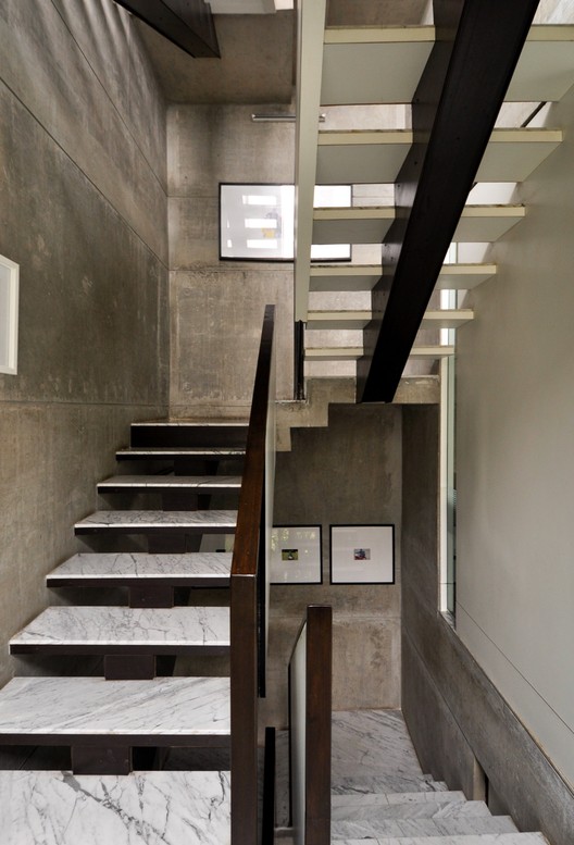 © Aman Sonel © Aman Sonel The light washes smoothly on the walls through the large glass opening and skylights, creating a strong dialogue between the rough and the smooth.  © Aman Sonel © Aman Sonel Product Description:The postform sunmica panels provided for a clean and minimalistic furniture that blends seamlessly with the plain concrete walls and roof and at the same time providing a contrast in the colour and texture. This posting includes an audio/video/photo media file: Download Now |
| 12-249 Laurentians Home / BONE Structure® Posted: 10 Jan 2017 09:00 AM PST  © Ulysse Lemerise / OSA © Ulysse Lemerise / OSA
 © Ulysse Lemerise / OSA © Ulysse Lemerise / OSA Quebec is known worldwide for its picturesque landscapes and natural beauty – and along the horizon a new technology is disrupting how North Americans are building their homes. At the forefront of high-performance custom homes lies BONE Structure®, a company devoted to designing and building energy efficient steel structure homes.  © Ulysse Lemerise / OSA © Ulysse Lemerise / OSA Situated two hours northwest of Montreal, in the township of Wentworth, this 3,000 sq. ft. home is characterized by its open concept main floor and easy access walk-out basement.  Floor Plan Floor Plan The wrap-around balcony encourages the occupants to step outside and enjoy the natural view of the Laurentians. Indoors, they continue to breathe easy in the completely open-concept main floor. The sense of peace comes from a combination of the open floor plan and the 15' ceilings above the living and lounge space. The floor to ceiling black aluminum windows allow light to completely flood the social spaces of the main floor and highlight the elegantly simple furnishings of the home. The main floor boasts primarily white furnishings, accented with natural wooden and sandy tones that complement the natural forest outside. Most notably, the kitchen stands out on its own, with its quartz Caesarstone countertop and black walnut natural tone cabinets. The polished concrete flooring that supports this floor is radiant and emits heat as necessary for comfort in the chilly Canadian winter months. The master bedroom has arguably one of the best views in the house and a personal walk-out balcony that allows occupants to completely immerse themselves in it.  © Ulysse Lemerise / OSA © Ulysse Lemerise / OSA Descending into the walkout basement, guests may find themselves seated in the supplementary lounge space or in one of the two additional bedrooms available in the home. The walkout to the outdoors is an excellent complement to the balcony of the main floor. Guests can now venture outside, unrestricted and as far into the woods as desired.  Floor Plan Floor Plan This home would not have been complete without the exterior's classic finish of wood siding from Maibec, outlined with black metal that gives this home its modern feel.  Courtesy of BONE Structure® Courtesy of BONE Structure®  Detail Detail  © Ulysse Lemerise / OSA © Ulysse Lemerise / OSA BONE Structure challenges the traditional construction process with its innovative patented steel construction system, allowing a home of this size to be built and ready to move in within a few months. All BONE Structure homes are pre-engineered to the highest standards with incomparable precision and flexibility; while making it simple and fun for their clients.  © Ulysse Lemerise / OSA © Ulysse Lemerise / OSA This posting includes an audio/video/photo media file: Download Now |
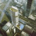
| Aedas Releases Plans for Blooming Bamboo-Inspired Tower in China Posted: 10 Jan 2017 08:00 AM PST  Courtesy of Aedas Courtesy of Aedas Aedas has released its design for Gmond International Building, a representative regeneration project located in the old town area of Shenzhen, China. The 200-meter super high-rise building is inspired by the traditional form of Chinese totem bamboo, which symbolizes prosperity and moral integrity. With nearly 60,000 square meters of gross floor area, the building will house the headquarters for Tellus-Gmond, Grade 5A lettable office spaces, and a jewelry-trading center.  Courtesy of Aedas Courtesy of Aedas  Courtesy of Aedas Courtesy of Aedas
 Courtesy of Aedas Courtesy of Aedas  Courtesy of Aedas Courtesy of Aedas Additionally, the podium façade resembles large bamboo leaves, and encloses the commercial component of the building, "forming an interesting duet with the blooming tower."  Courtesy of Aedas Courtesy of Aedas Gmond International Building is expected to be completed in 2019. News via Aedas. This posting includes an audio/video/photo media file: Download Now |
| Posted: 10 Jan 2017 07:00 AM PST  © Takuji Shimmura © Takuji Shimmura
 © Takuji Shimmura © Takuji Shimmura The project for Lot B1 of the Saint Denis Confluence urban project is located on the south side of the West Square in front of the RER Saint Denis station. It is one of the first projects to be built in this new district, and is a natural extension of the overarching vision of the coordinating urban planners. Thanks to its location, it is exceptionnaly visible from the front square of the railway station. The building takes full advantage of this location on the square, while masking effects and shadows created by inserting the building between the public space and the sun are minimized in order to ensure the highest possible quality of housing.  Axonometric Axonometric  Schemas Schemas It is a relatively compact building aligned along the streets, it can be considered from different angles: its urban presence, its multi-functional street level that enlivens the public space, and as the part of a built environment encircling a central interior garden.  © Takuji Shimmura © Takuji Shimmura A large vertical fault opens a passage out of the north façade, revealing a less massive silhouette from the far end of the square, and allowing the planted, sunny interior of the block to be felt all the way from the station. Light and sun can therefore shine through from the south to the square and diminish the shadows cast by the building. The reflection of light on the interior façades of this passageway add vibrancy and a variable component that changes according to the hour of the day and the season.  © Takuji Shimmura © Takuji Shimmura  Floor Plan Floor Plan  © Takuji Shimmura © Takuji Shimmura Dividing the building in such a way allows for the multiplication of orientations, and maximizes the light and energy provided by the sun. All the landings are naturally lit.  Section Section The interior and city façades are in contrast one to another. On the city side, a strict pattern of openings confirms its urban stature. These facades are finished with a dark material (dark plaster) that is in keeping with the urban surroundings. The interior façades, on the other hand, largely exposed to the sun, are finished with a light-colored paint (light metal paint), which reflects the sunlight all the way to the square. A planted, open-ground garden sits in the center of the block.  © Takuji Shimmura © Takuji Shimmura This posting includes an audio/video/photo media file: Download Now |
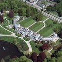
| Mecanoo Unveils Design for Experimental Garden and Palace Restoration in The Netherlands Posted: 10 Jan 2017 06:00 AM PST  © Omega Render © Omega Render Mecanoo has unveiled its design to transform The Soestdijk Estate into Eden Soestdijk, "an experimental garden for a sustainable society and a paradise destination for all" in The Netherlands. In an effort to become an educational tool for environmental awareness, the project aims to make a significant contribution to meeting the UN's Sustainable Development Goals.
An architectural greenhouse behind the palace gardens will be the centerpiece of the project, and will house an interactive exhibition focusing on topics like circularity, ecological balance, and social aspects of sustainability.  © Mecanoo architecten © Mecanoo architecten  © Mecanoo architecten © Mecanoo architecten The existing palace and gardens will be restored to their original character. Chambers within the palace will showcase the estate's history and residents, and will serve as cultural and business event space, as well as an incubator space for entrepreneurial sustainability efforts. Moreover, the wing chambers of the palace will house multimedia, interactive exhibitions.  © Mecanoo architecten © Mecanoo architecten  © Rijksvastgoedbedrijf © Rijksvastgoedbedrijf
 © Mecanoo architecten © Mecanoo architecten A pedestrian and cycling tunnel beneath the Amsterdamse Straatweg will provide public access to the front square, which connects the palace and restaurant in the conservatory.
 © Mecanoo architecten © Mecanoo architecten  © Mecanoo architecten © Mecanoo architecten From 2020 onwards, more than half a million visitors are expected to come to Eden Soestdijk annually, which is projected to feed 57 million euros back into the regional economy each year. As a response to the redevelopment competition for the Palace organized by the Dutch government, the proposal is a collaboration between the Eden Soestdijk foundation, Mecanoo architecten, Kossmann.dejong and Royal HaskoningDHV. Development of the project additionally is in dialogue with residents, entrepreneurs, and organizations from the region. Learn more about the project here. News via Mecanoo. This posting includes an audio/video/photo media file: Download Now |
| Three-Gable Roof House / Arrokabe Arquitectos Posted: 10 Jan 2017 05:00 AM PST 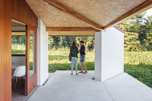 © Luis Díaz Díaz © Luis Díaz Díaz
 © Luis Díaz Díaz © Luis Díaz Díaz From the architect. The project is resolved as a single storey household covered by a three-gable roof that covers the enclosed part and the open exterior spaces including a garage. This seminal decision allowed to reduce the scale of the set by adjusting the height of the facades.  © Luis Díaz Díaz © Luis Díaz Díaz The garage is located by the access limits of the plot, some 50 cm above the ground level of the household and adapts to the original topography, thus reducing the needs for ground preparation and conditioning for vehicle access whilst contributing to the privacy of the more domestic areas.  Ground Floor Ground Floor The room program is organized around a main living-dining room that can be enlarged by opening completely towards a southeast porch, where the kitchen also opens. Variations in height and the way the relationship between inner spaces is resolved contribute equally to a greater feeling of spaciousness. The outlines featured in the storey plan respond to purpose of finding the best aspect for each room together with views above the valley and the nearby woodland.  © Luis Díaz Díaz © Luis Díaz Díaz The result is a single volume, low, stout and anchored to the ground. From the point of view of the composition, it recalls resources that are usual in traditional buildings (heavy closings with a rugged texture contrasting with the use of wood in panels and carpentry work). From an structural point of view the project is resolved with a simple system of bearing walls and a covering woodwork.  Sections Sections References to traditional architecture are far from literal as they are rather expressed in solutions meaning a respectful attitude towards both the environment and to former presences in the area.  © Luis Díaz Díaz © Luis Díaz Díaz This posting includes an audio/video/photo media file: Download Now |
| Daniel Valle Architects Unveils Winning Kindergarten Design for Seoul Posted: 10 Jan 2017 04:00 AM PST  Courtesy of Daniel Valle Architects Courtesy of Daniel Valle Architects Daniel Valle Architects has been awarded first prize in the public competition to design a kindergarten and senior welfare center in Seoul, South Korea, with its project, Maebong Daycare Center. Located in the neighborhood of Oksu-dong, the 700-square-meter Center is designed around the idea of shifting the scale of the building, so that children feel more comfortable. For example, the massing of the space is broken down into five units that utilize various colors, geometries, and materials to emphasize smaller units within the whole.
 Courtesy of Daniel Valle Architects Courtesy of Daniel Valle Architects  Courtesy of Daniel Valle Architects Courtesy of Daniel Valle Architects  Courtesy of Daniel Valle Architects Courtesy of Daniel Valle Architects  Courtesy of Daniel Valle Architects Courtesy of Daniel Valle Architects  Courtesy of Daniel Valle Architects Courtesy of Daniel Valle Architects All spaces in the daycare face the central playroom, which features a double-height ceiling and natural lighting, and which will additionally serve as a lobby, circulation space, and learning area. Moreover, for lighting optimization, most of the classrooms and teacher's rooms are oriented towards south and east, whereas vertical communications and mechanical rooms are located on the north and west sides.  Courtesy of Daniel Valle Architects Courtesy of Daniel Valle Architects  Courtesy of Daniel Valle Architects Courtesy of Daniel Valle Architects  Courtesy of Daniel Valle Architects Courtesy of Daniel Valle Architects Three playgrounds will occupy a portion of the space at the entrance level—one indoor, one semi-exterior space surrounded by fencing, and one exterior garden.  Courtesy of Daniel Valle Architects Courtesy of Daniel Valle Architects  Courtesy of Daniel Valle Architects Courtesy of Daniel Valle Architects  Courtesy of Daniel Valle Architects Courtesy of Daniel Valle Architects Learn more about the project here. Location: Oksu-dong. Seoul, South Korea Size: 700 m2 Year: 2016 Credits: Daniel Valle, Irene R Vara, Saemin Kim, Sunmin Lee, Iago Blanco News via Daniel Valle Architects. This posting includes an audio/video/photo media file: Download Now |
| Nursing Faculty of the Universidad Nacional de Colombia / Leonardo Álvarez Yepes Posted: 10 Jan 2017 03:00 AM PST  © Rodrigo Dávila © Rodrigo Dávila
 © Rodrigo Dávila © Rodrigo Dávila History The Project Nursing Faculty of the Universidad Nacional de Colombia was planned for over 20 years. In 1995 the architect Rogelio Salmona developed a preliminary project. In 2003 a competition for a design was made and in 2008 under the policy of the Regularization and Management Plan (PRM) of the university the project was reborn and finally in 2013 the construction started.  Site Plan Site Plan Heritage and Site The Project is located in the Campus of the Universidad Nacianal following the line of the master plan of Leopoldo Rother, surrounded by a building of historic value, that are on a high level of preservation: The Faculty of Law and Political Science building, the Faculty of Social Science building and the assembly of construction of the veterinary medicine. The building is placed perpendicular to the core block of the Faculty of Law and Political Science building, organizing and defining the exterior areas draw by the nearest buildings maintaining the visual relation between one and other, while the longest facing is parallel to the main walk that connects two principal highways of Bogotá, the El dorado avenue and N.Q.S. avenue, with the center of the university campus.  © Rodrigo Dávila © Rodrigo Dávila Landscape and Roam The decision of lifting the building from the ground surface and arrange the least number of structural elements enabling the maximum of visual relations and attending the urban connections among the open spaces of campus. This condition is enhanced with the second-floor slabs inclination, avoiding the visual superposition with the Faculty of Law and Political Science building when roaming through the walks designed by Leopoldo Rother  Ground Plan Ground Plan When approaching, the tilt plane the space compresses near the entrance and opens the sight towards the landscape, upon ascending with the stairway begins a lengthwise roam tensing the visuals to the near and far landscape. In the terrace roof the three open patios instructs an austere and passive atmosphere encouraged by the oriental hills of the city.  © Rodrigo Dávila © Rodrigo Dávila The experience of roaming through the project is emphasized by the luminous condition in each floor, which various along the floor and allows transitions between dark and bright spaces. The reflection of light on the ocher concrete creates an environment that transmits warmth and stability in an academic building.  Sketch Sketch  Sketch Sketch Corporeity and Technique The disposition of a constant ventilation system in the classrooms allows a passive way of controlling the air flows with the use of a vertical duct in the central wall, that permits the air renewal in the classrooms and drive out the hot air on the top of the building. this same solution was raised for the office spaces where the central hall is the extraction system that is regulated by the façade ventilation.  © Rodrigo Dávila © Rodrigo Dávila The shuttering of the concrete forms leave a wooden texture on the ochre concrete of walls and ceilings maintaining vivid the traditional techniques of construction, and also making a quality and durable building.  © Rodrigo Dávila © Rodrigo Dávila This posting includes an audio/video/photo media file: Download Now |
| 10 Young Chinese Architecture Firms To Watch Out For Posted: 10 Jan 2017 01:30 AM PST  2016 has been a momentous year for Chinese architecture. From the completion of the Harbin Opera house by MAD to the Aga Khan Awards recognizing Zhang Ke of Standard Architecture for his micro-scale design of the Hutong Children's Library and Art Centre in Beijing. It seems the general perception of Chinese architecture has finally moved beyond the big, weird and ugly. Since we've started to branch out into China, the ArchDaily China team has been able to discover the rich layers beyond just these rising Chinese stars. As part of the country's large-scale urbanization process, last year, we posted some of the large-scale projects designed by China's (largely unknown) Design & Research institutions such as train stations and cultural centers. In addition, we've also come across a series of smaller, lesser known, younger practices that focuses more on small-scale experimental work. Here are our top ten favorites:  CATable 2.0. Image Courtesy of LYCS Architecture CATable 2.0. Image Courtesy of LYCS Architecture Led by principle Ruan Hao, LYCS is one of the most diverse young design practices in China. Based in Hangzhou, the practice has a team structure of 3 partners and 2 associates to allow the firm to operate at all scales, from Masterplans to their infamous Cat Table.  Tiantai No.2 Primary School . Image © Yu Xu Tiantai No.2 Primary School . Image © Yu Xu LYCS are one of the first young architectural practices in China to explore the typology of urban schools with the Roof Track School. The practice claims to be invested in critical issues of design building, urban development, and construction within China. Duo Xiang Studio  Vanke Pavilion, Shanghai World Expo 2010. Image Courtesy of Dou Xiang Studio Vanke Pavilion, Shanghai World Expo 2010. Image Courtesy of Dou Xiang Studio Duo Xiang Studio is a Beijing-based studio which explores everyday objects, focusing on appropriateness. This fresh approach has led to an interesting array of works from the Comb Chair, made out of hundreds of combs, to the Vanke Pavilion as a part of the 2010 Shanghai World Expo.  Comb Chair . Image Courtesy of Dou Xiang Studio Comb Chair . Image Courtesy of Dou Xiang Studio  Public Folly - Water Tower Renovation. Image Courtesy of Department of Architecture, Chinese University of Hong Kong Public Folly - Water Tower Renovation. Image Courtesy of Department of Architecture, Chinese University of Hong Kong A research-based practice, META-Projects focuses on discovering and responding to the unusual socio/cultural potential of Asian cities. From the 'Regeneration-by-intervention' of their own office, (a courtyard house in the Hutong laneways of ancient Beijing), to the research-based projects designed in collaboration with Vanke (one of the largest real estate developers in China). META-Projects has been very demonstrative of the renewed desire of local architects to connect architecture to its social environment.  Huludao Beach Exhibit Center. Image Courtesy of Department of Architecture, Chinese University of Hong Kong Huludao Beach Exhibit Center. Image Courtesy of Department of Architecture, Chinese University of Hong Kong He Wei  Xihe Cereals and Oils Museum and Village Activity Center. Image © He Wei, Qi Honghai, Chen Long Xihe Cereals and Oils Museum and Village Activity Center. Image © He Wei, Qi Honghai, Chen Long He Wei has carved out his architectural approach from his background as a researcher and professor at the Central Academy of Arts (CAFA) in Beijing. With a passion for China's minorities vernacular architecture and concerns over the future of China's villages, Hei Wei is seeking to create a dialogue between the past and the potential future of China's leftover buildings.  Elongated Industrial Box - Ding Hui Yuan Zen & Tea Chamber. Image © Zou Bin Elongated Industrial Box - Ding Hui Yuan Zen & Tea Chamber. Image © Zou Bin  Tea House in Hutong. Image © Wang Ning Tea House in Hutong. Image © Wang Ning ArchStudio first caught the attention of local and international media with their visually seductive and contextually sensitive interventions within historic parts of Beijing. Their breakthrough project, the Hutong Tea House in Beijing uses a 'curvy corridor' to physically link and repair the relationship between the past and present while providing the necessary modern day creature comforts.  Zi Bo The Great Wall Museum of Fine Art. Image Courtesy of ARCHSTUDIO Zi Bo The Great Wall Museum of Fine Art. Image Courtesy of ARCHSTUDIO More recently, they have extended their approach to renovation of industrial era spaces and striking new structures such as the Tangshan Organic Farm, winner of ArchDaily's Project Of The Month for November.  Tangshan Organic Farm. Image © JIN Wei-Qi Tangshan Organic Farm. Image © JIN Wei-Qi Zhu Jingxiang / Zhu Jingxiang Architects  NewBud Eco-School. Image © Xia Heng NewBud Eco-School. Image © Xia Heng Zhu Jingxiang started his career by building a lot and fast, caught up in the fast pace development of mainland China. After designing over 100,000 square meters of buildings in his early career, he took a professor position at the Chinese University in Hong Kong to take a break to research and teach. However, the devastating Sichuan earthquake in 2008 drew him into a crusade of design custom, prefabricated and economically viable buildings for disaster prone zones worldwide.  Dou Pavilion, as a part of the China Pavilion, The 15th Venice Architecture Biennale. Image Courtesy of Department of Architecture, Chinese University of Hong Kong Dou Pavilion, as a part of the China Pavilion, The 15th Venice Architecture Biennale. Image Courtesy of Department of Architecture, Chinese University of Hong Kong More recently he has extended the scope of his work practically and geographically. Zhu was one of the principle designers/participants in the China pavilion at the Biennale with his Dou Pavilion, while his innovative light-weight system and post-disaster reconstruction projects have extended beyond remote parts of China to Africa.  Dou Pavilion, as a part of the China Pavilion, The 15th Venice Architecture Biennale. Image Courtesy of Department of Architecture, Chinese University of Hong Kong Dou Pavilion, as a part of the China Pavilion, The 15th Venice Architecture Biennale. Image Courtesy of Department of Architecture, Chinese University of Hong Kong  Long Museum West Bund. Image © Su Shengliang Long Museum West Bund. Image © Su Shengliang Perhaps young is not the most appropriate way to categorize Atelier Deshaus, as both of the partners, Chen Yifeng and Liu Yichun are both seasoned architects who have been through the largely unknown Chinese system of Design Institutes. However, the refreshing designs of Atelier Deshaus surprise time and time again, ranging from the brutalist beauty of the Long Museum West Bund to their recent art installation Blossom Pavilion.  Blossom Pavilion. Image © Zhou Dingqi Blossom Pavilion. Image © Zhou Dingqi  Fab-Union Space On The West Bund. Image © Su Shengliang Fab-Union Space On The West Bund. Image © Su Shengliang Based in Shanghai, Archi-Union combines digital technology and craftsmanship through a low-tech, locally sensitive digital fabrication method of 'Digital Tectonics'.  Chi She. Image © Su Shengliang Chi She. Image © Su Shengliang The use of digital fabrication extends beyond facade treatments and mere aesthetics to the transformation of circulation flows and folding of space itself in projects such as Fab-Union Space on the West Bund.  Songjiang Art Campus. Image Courtesy of Archi-Union Architects Songjiang Art Campus. Image Courtesy of Archi-Union Architects  Youth Hotel of iD Town. Image © Chaos.Z Youth Hotel of iD Town. Image © Chaos.Z O-Office, unlike most other offices on this list, is located in the southern Chinese city of Guangzhou. Having experienced the Chinese urbanization climax first hand from their local context, the firm now seeks to exploit architectural design as a critical instrument for research on our spatial and economic reality. The transformation of the top floor of Guangzhou's oldest beer factory into the Silo-top Studio was one of the studio's first projects, complete with 38 meter high terraces overlooking the city's old downtown.  Silo-top Studio. Image © Likyfoto Silo-top Studio. Image © Likyfoto PAO - People's Architecture Office  The Courtyard House Plugin. Image Courtesy of PAO The Courtyard House Plugin. Image Courtesy of PAO People's Architecture Office believe architecture is for the masses, in fact, it is the masses that inspire their work. From their Courtyard Plugin's within which a modular system is integrated into century-old houses to enable them for modern living, it is clear to see that PAO's architecture is not based on form or pure aesthetics but everyday realities.  Courtyard House Plugin en Masse – Second Phase. Image Courtesy of PAO Courtyard House Plugin en Masse – Second Phase. Image Courtesy of PAO This posting includes an audio/video/photo media file: Download Now |
| Gallery House / Neil Dusheiko Architects Posted: 10 Jan 2017 01:00 AM PST  © Agnese Sanvito © Agnese Sanvito
 © Tim Crocker © Tim Crocker From the architect. Neil Dusheiko Architects have completed a beautiful and very personal renovation of a Victorian terraced house in Stoke Newington. The house was designed for the architect's father-in-law, just around the corner from the architect's own house where he lives with his wife and family.  © Agnese Sanvito © Agnese Sanvito Neil Dusheiko said: "My wife wanted her father to be closer to us so we could easily pop in and out of each other's homes. We found a house in the road parallel to ours but it was a bit dark and damp. I wanted to make it into a light and airy home where my father-in-law could live comfortably and easily in a really beautiful space."  © Tim Crocker © Tim Crocker One of the priorities was to make sure that there was plenty of room for to display his collection of art and ceramics. The kitchen wall is lined with bespoke, oak shelving, where ceramics and glassware are displayed. The materials in the kitchen have been carefully chosen for their texture and warmth, complementing the numerous objects d'art. The floor is paved with brick pammets and the worktops are wood, as are the floors in the adjoining sitting room area.  Section Section The kitchen was very important as the client is a keen cook. It is a light filled space with a skylight over the dining table, a large, glass door leading into the garden and a comfortable window seat, the perfect place for visitors to sit and chat to the cook.  © Tim Crocker © Tim Crocker In the sitting room there are simple, bespoke wooden cabinets but the design has been kept simple as the walls are filled with the owner's collection of paintings and prints. Art works also line the walls on the landing and in the bedrooms throughout the rest of the house.  © Tim Crocker © Tim Crocker Neil Dusheiko, Director of Neil Dusheiko architects said: "It was important in the design to strike a balance between bringing in light but also creating a private and intimate space that felt very personal. We wanted to modernise the house and make it a more comfortable place to live but retain a feeling of warmth." A new loft has been added, which is light and bright with skylights, and large windows through which you can see the spire of the local church in the distance. It is also cosy and private, with wooden cupboards and floors and dusty red walls which complement the client's kilims and textiles.  © Agnese Sanvito © Agnese Sanvito Practice Director Neil Dusheiko said: "We wanted the house to feel light and to be comfortable and modern but at the same time to be very personal. By designing the house around all of my father-in-laws beautiful things I hoped to make the move from the old family home a little easier. My wife and I and our daughter are always in and out of the house and every time I visit there's another picture up or another ceramic dish on the shelves. I'm really enjoying seeing him settle into the house."  Section Section Product Description. Reclaimed Brick  © Tim Crocker © Tim Crocker Glass  © Tim Crocker © Tim Crocker Oak Joinery  © Agnese Sanvito © Agnese Sanvito Zinc Cladding  © Tim Crocker © Tim Crocker This posting includes an audio/video/photo media file: Download Now |
| Posted: 10 Jan 2017 12:00 AM PST  Courtesy of Leewardists Courtesy of Leewardists As every good design professional knows, the client is at the forefront of every project. Sometimes this can feel like the client plays judge, jury, and executioner to every last revision, and in a field as detailed and complex as architecture, satisfying these demands, as well as the designer's own creative vision, can be bewildering and aggravating. But in the end, doesn't adapting to another person's tastes just push us to be better?  Courtesy of Leewardists Courtesy of Leewardists Centuries of civilizations built on structures designed by architects and yet, their voice is lost among the countless stories of rulers and armies and sometimes wondrous monsters. The Leewardists are rewriting the contemporary history of our civilization through the voice of this elusive being, The Architect. For more of The Architect Comic Series follow them on Facebook, Instagram or visit their website. This posting includes an audio/video/photo media file: Download Now |
| Hexagons for a Reason: The Innovative Engineering Behind BIG's Honeycomb Posted: 09 Jan 2017 10:00 PM PST  © BIG © BIG BIG are known for unconventional buildings that often raise the question "how were they able to do that?" Such is the case for BIG's Honeycomb, a luxury eight-story condominium currently under construction in the Bahamas. The project's hallmark is its hexagonal façade made up of private balconies, each with its own glass-fronted outdoor pool. The façade was also the project's greatest engineering challenge, with each balcony (including pool water) weighing between 108,000 and 269,000 pounds (48,000-122,000 kilograms) while cantilevering up to 17.5 feet (5.3 meters) from the structure. Tasked with this challenging brief were DeSimone Consulting Engineers, who previously worked with BIG on The Grove. Read on for more detail on the Honeycomb's innovative engineering.  © BIG © BIG Central to the Honeycomb's design of is the use of a specially engineered concrete "superslab" which is able to cantilever over 17 feet without wall brackets below. This was achieved by reducing the slab's weight while maintaining its strength and stiffness. As explained by Bill O'Donnell, the project lead at DeSimone, "to control deflection and reduce self-weight, 12-inch (300 millimeter) diameter tubes were embedded in a 17-inch (430 millimeter) thick conventionally reinforced roof slab." These voids hollow out the slab, reducing its weight and increasing the section's overall efficiency. This step also "eliminated the need for a post-tension slab, further reducing the overall weight and reducing the cost of the project."  Courtesy of DeSimone Consulting Engineers Courtesy of DeSimone Consulting Engineers  Courtesy of DeSimone Consulting Engineers Courtesy of DeSimone Consulting Engineers The balcony decks themselves are constructed from a 13-inch (330 millimeter) thick conventionally reinforced slab. What is especially clever, and what allows the slab to be kept at 13 inches, is that the slabs "fold down at the deepest point of the pool to align with the shear wall of the lower unit" for extra support.  © BIG © BIG  © BIG © BIG Because of the staggered partition walls and varied façade, these shear walls sometimes connect to a structural column, acting "as a rigid bracket supporting the slab above and below." At other junctions there is no column - here "the wall is not as stiff in these locations but still carries vertical load back to the column strip." These 18-inch (450 millimeter) thick concrete shear walls not only increase structural support, but join into the sloped pool floors in order to form the hexagonal honeycomb structure.  Courtesy of DeSimone Consulting Engineers Courtesy of DeSimone Consulting Engineers  Courtesy of DeSimone Consulting Engineers Courtesy of DeSimone Consulting Engineers While the depths of the cantilevers allow for plentiful outdoor space, the balcony's utilities added further challenges. Both the summer kitchen and pool required a host of services, while also needing waterproofing and long-term serviceability. This meant the need for thoughtful detailing, with "nearly a dozen conduits that had to be carefully placed to get across the column strip and emerge on the sloped slab in the proper location". The concrete shear walls were also once again utilised, with embedded pool drains serving as a path for balcony drainage.  © BIG © BIG Because of the Honeycomb's innovative structural system, conventional materials were able to be used, but used carefully. As all the concrete in the building is conventionally reinforced cast-in-place concrete, special attention was paid to the concrete mixture itself. To ensure durability, "limiting initial soluble chlorides, providing a tight water-cement ratio, and additional concrete cover over the reinforcing steel were critical design measures." Finally, for further protection, an integral waterproofing admixture and surface applied coating were also used.  Courtesy of DeSimone Consulting Engineers Courtesy of DeSimone Consulting Engineers Correction update: This article originally mistakenly named the project lead at DeSimone Consulting Engineers as Bill O'Simmons. His actual name is Bill O'Donnell. This posting includes an audio/video/photo media file: Download Now |
| You are subscribed to email updates from ArchDaily. To stop receiving these emails, you may unsubscribe now. | Email delivery powered by Google |
| Google Inc., 1600 Amphitheatre Parkway, Mountain View, CA 94043, United States | |







Nema komentara:
Objavi komentar