Arch Daily |
- Four Practices Reveal Runner-Up Proposals in Lithuania's Science Island Contest
- Ackerstraße 29 / Nps Tchoban Voss
- 35m2 Flat / Studio Bazi
- Busan Times / Moon Hoon
- Store Renovation for Lost and Found in Beijing / B.L.U.E. Architecture Studio
- Kai Tak Primary School / ArchSD
- Burrawong House / Bijl Architecture
- Alagoas House / Tavares Duayer Arquitetura
- British Architects Ridicule Government Plans for 14 New "Garden Villages"
- Logistics and Auxiliary Services for JATA / José Miguel García Pérez
- GAIA / Leppanen + Anker
- What the Way You Sketch Scale Figures Says About You
- La Grande Passerelle / Atelier Pierre Thibault
- White Arkitekter Proposes Transparent "Lantern" Design for Akershus Art Center
- Martin Duplantier Architectes Designs "Illusionist" Bridges and Pavilions for Chinese National Park
| Four Practices Reveal Runner-Up Proposals in Lithuania's Science Island Contest Posted: 02 Jan 2017 08:30 PM PST  Earlier this year, Prime Minister Algirdas Butkevičius of Lithuania announced three winners and five runners-up of the Science Island international design contest. The competition drew 144 entries from 44 countries, and among the three winners selected by the international competition jury, Kaunas City Municipality will choose one to realize their proposal, which is scheduled to open in 2018. Given the competition's high profile, ArchDaily has received a number of additional entries to the contest showing alternative possibilities for the site. Read on to learn about four of these entries from WAH Studio, Andrew Burns Architects, TheeAe Limited, and FARA-ON Union. WAH Studio Courtesy of WAH Studio Courtesy of WAH Studio  Courtesy of WAH Studio Courtesy of WAH Studio From the architects. The Science Island museum is space to experience knowledge, building as a void, the mass becomes the outline, the skin holds the enclosure, the inner space where the simulations of climates and contexts, the supporting function becomes the columns of the void, like space, time machine, from the outside nothing more than sculpture in that unique garden, trying not to erase or change its roots and movements, allowing new ones to appear by its walkers around sculpture. Andrew Burns Architects Courtesy of Andrew Burns Architects Courtesy of Andrew Burns Architects  Courtesy of Andrew Burns Architects Courtesy of Andrew Burns Architects From the architects. The exterior is a form with two presences, both a building and a landscape, enriching and preserving the landscape of Nemunas Island in full. The southern face of the building is organic, responding to the undulating geometries of the river. The northern face is rectilinear, resonating with the urban pattern of the city center. The building synthesizes the geometries of nature and machine. TheeAe LimitedFrom the architects. With such a diverse set of young minds, thinkers, and creators around, the new Cultural and Science Center Building on the Science Island will act as the catalyst for the development of new ideas, philosophies, and ideologies. Along with this notion of regional needs for the new center, the provided island for the new building has its vast open nature to embrace the new idea to be part of its nature ground. Our main concern has been decisively driven to locate the new building into the center of the island to ease the approaches for people from both the south and the north region. FARA-ON Union Courtesy of FARA-ON Union Courtesy of FARA-ON Union  Courtesy of FARA-ON Union Courtesy of FARA-ON Union From the architects. The design of the Kaunas Science and Innovation Centre is based on the idea of the implementation of two fundamental factors of the physical environment. The physical environment highly focused on the knowledge of science and technology as the main bearer of human activity which comes into contact with the physical environment created by nature. We perceive this visual and architectural contact as an expression based on the utmost harmony of both factors which are capable of not competing with one another but working together and creating future opportunities for themselves and their environment. On the one hand, the innovative building of a science center taking over a landmark, a symbol of the specific area, preserving the character of a green island as a place for relaxation and recreation. This relationship is based on the intersection of both factors.  Courtesy of FARA-ON Union Courtesy of FARA-ON Union You can also view the five honorable mentions via the website of competition organizer Malcolm Reading Consultants here. News via Malcolm Reading Consultants This posting includes an audio/video/photo media file: Download Now |
| Ackerstraße 29 / Nps Tchoban Voss Posted: 02 Jan 2017 07:00 PM PST  © Werner Hutchmacher © Werner Hutchmacher
 © Werner Hutchmacher © Werner Hutchmacher From the architect. The residential building in the Ackerstraße is part of a vivid area in Berlin-Mitte. Little nice stores, cafes and restaurants are forming a very special authentic urban area.  © Werner Hutchmacher © Werner Hutchmacher This four-storey building with an additional stacked storey is presenting its elaborate façade cladding on three exposed sides. Burnt in a circular kiln the bricks have a bright beige colouring. Massive elements of white architectural concrete give the surface of the building a particular structure serving as window cladding. The vertically and horizontally aligned windows in different sizes are absorbing and reflecting the heterogeneous character of the neighbourhood.  © Werner Hutchmacher © Werner Hutchmacher The building comprises eight residential units with an area of 70-190 square metres. The stacked storey comprises a 290 square metres penthouse with a spacious terrace. The ground floor and the first floor as well as partly the basement are used for commercial purposes. In addition to commercial units there are 10 parking lots the basement.  © Werner Hutchmacher © Werner Hutchmacher  © Werner Hutchmacher © Werner Hutchmacher The building is completed according to low energy standards. The residents are furthermore provided with solar energy, since the whole roof area is equipped with a photovoltaic system. A geothermal system supplies the building with heating and air conditioning.  © Werner Hutchmacher © Werner Hutchmacher This posting includes an audio/video/photo media file: Download Now |
| Posted: 02 Jan 2017 06:00 PM PST  © Ilya Ivanov © Ilya Ivanov
 © Ilya Ivanov © Ilya Ivanov From the architect. Main task was to create a comfortable open space plan with enough area for storage with access to natural light . I decided to design a furniture system that would make the most of the existing space. 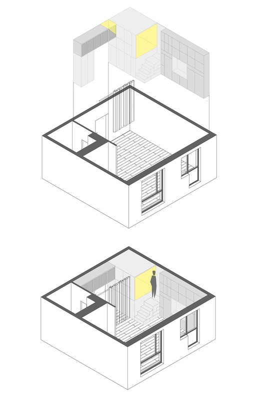 Axonometric Axonometric The wooden sleep box with storage system provides a level of privacy separating the sleeping quarters in a raised corner of the apartment, from the kitchen and living area on the other side. There is a good view of whole flat and to the windows from inside of the sleep box which makes it very cozy place.  © Ilya Ivanov © Ilya Ivanov Stair's height leading to the sleep box, lets a person stand comfortably on it, and also can be used as storage. Under the sleep box, there are three sliding shelves for large appliances. The furniture system incorporates a dresser, drawer and wardrobe. Shelves on top of wardrobe at the entrance, connect to the sleep box which create a mini storage for inside of the box. 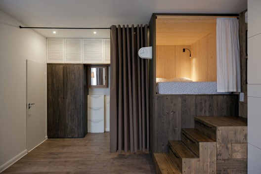 © Ilya Ivanov © Ilya Ivanov Sleep box is covered with stained pine sheets, as wood gives warmth to the interior and visually defines different areas. pine wood sheets are available in standard sizes which also make it easy to process, transport and install. 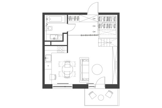 First Floor Plan First Floor Plan A curtain separates the sleeping unit , kitchen and living zone from entrance, which can be pushed back when it's needed. Living and dining zones are quite flexible, by moving sofa and extending dining table, it easily become a comfortable space for 10 guests.  © Ilya Ivanov © Ilya Ivanov Handmade Iranian tiles used in the kitchen emphasize and reminds the Iranian origin of inhabitants.  © Ilya Ivanov © Ilya Ivanov Product Description: Batik ceramic tiles by Baker - Due to small bath space, i decided to use these type of textured and bumped tiles (10 x 10 cm) as texture make bath look more complex, cozy and visually make it bigger. Blue textured tile are like painting, you can look at them while taking a bath or shower. 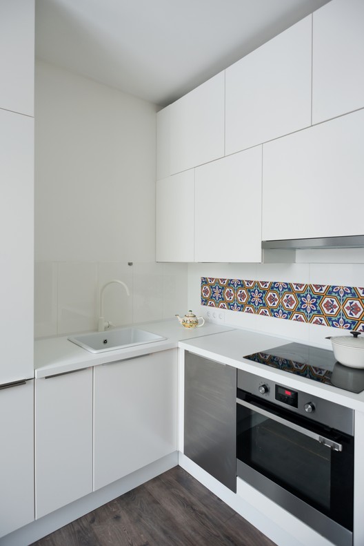 © Ilya Ivanov © Ilya Ivanov This posting includes an audio/video/photo media file: Download Now |
| Posted: 02 Jan 2017 02:00 PM PST .jpg?1482896506) © Shin Kyungsub © Shin Kyungsub
.jpg?1482896163) © Shin Kyungsub © Shin Kyungsub From the architect. Although I am afraid that if I call it the owl, it will continue going by this nickname and it will be regarded within this context, I would nevertheless like to call it the owl. If you look at the building from the roadside, you may associate the shape formed by the angles of the setback regulation that has now been abolished with big head and two eyes.  Busan Times Busan Times Amazingly, the building looks exactly like an owl when you see from the rear side of the building after passing through a walkway. The staircase is a wing and the windows of a child's room are the eyes within a head. Does it only apply to the architect? In addition, considering that the client is working in the security industry, which makes him stay up all night with glaring eyes, the house really looks like an owl. .jpg?1482896415) © Shin Kyungsub © Shin Kyungsub .jpg?1482896449) © Shin Kyungsub © Shin Kyungsub .jpg?1482896516) © Shin Kyungsub © Shin Kyungsub Sometimes, admirers of my paintings commission me for an architectural project. This is the case again. I, as an architect, am greatly pleased to have them as my clients because they usually have very strong personalities and an open-minded taste for new things. In addition, many of them are young people who want a special space for their children, and this helps in the creation of a house full of quirks and fun. The view of the night sky can be seen through a small circular skylight from the bed in the child's room, and the hole in the floor leads to a low playing space that is not included in the building coverage or total floor area. Although I designed it imagining a child climbing down a pipe through the opening like a firefighter, I had to give it up as the client and their parents became concerned at the time of completion.  Concept Render Concept Render This posting includes an audio/video/photo media file: Download Now |
| Store Renovation for Lost and Found in Beijing / B.L.U.E. Architecture Studio Posted: 02 Jan 2017 12:00 PM PST  © Yuya Hoshino © Yuya Hoshino
 © Yuya Hoshino © Yuya Hoshino From the architect. This project is a store renovation for the furniture brand "Lost and Found" located in Guozijian Street, a historic district in Beijing. As nowadays, more and more people tends to live alone, the concept of a traditional family gradually disintegrated, and the city's public space is becoming another "home" for people. Under such contexts, the renovation intends to bring the sense of "home" into the store, and to introduce a new vision for the future commercial space that connects people with urban public space.  © Yuya Hoshino © Yuya Hoshino By adding an alc, the traditional single-storey siheyuan building is transformed to a loK while most of the original wooden structure were retained. The indoor garden in the centre of the building divides the whole space into four independent areas living room, dining room, bedroom and a study. Since all the rooms open up to indoor courtyard, each space benefits from the sunlight that coming through the large skylight above and gets a view of the indoor garden.  © Yuya Hoshino © Yuya Hoshino  Plan 1 Plan 1  © Yuya Hoshino © Yuya Hoshino Natural materials are used in all areas such as terrazzo floor, diatom mud wall paint, and wooden furniture. The rough texture and the plain look bring a warm and friendly feeling to people, waking up people's initial memories and senses of home and family.  © Yuya Hoshino © Yuya Hoshino This posting includes an audio/video/photo media file: Download Now |
| Kai Tak Primary School / ArchSD Posted: 02 Jan 2017 11:00 AM PST  Courtesy of ArchSD Courtesy of ArchSD
 Courtesy of ArchSD Courtesy of ArchSD From the architect. A school is a community: a micro-society, a mini city within a city. It is an oasis yet has a direct relationship with the city at large. Our idea is simple; the spatial concept for the Kai Tak Primary School is to bring the students and teachers together with the playground and other spaces and activities, to encourage interactions. Breaking away from the typical densely built 8-storey school building in Hong Kong with the ball court on the ground, this school adopts a low-rise 4-storey design, with the basketball court raised on the first floor, sited in the middle of the school campus, creating a focus, pulling together spaces and activities.  Courtesy of ArchSD Courtesy of ArchSD  Axonometric Axonometric  Courtesy of ArchSD Courtesy of ArchSD From the school entrance plaza, students follow a staircase route to encounter the covered playground, central ball court and library roof garden, creating a sense of discovery of spaces, to stimulate the passion for self-discovery. This staircase path connects the three major open spaces of the school, setting the orientation of the campus.  Courtesy of ArchSD Courtesy of ArchSD The old tradition of Hong Kong's walled village is re-interpreted in the design of the school. In similar way as a village's ancestral hall, houses, square and lanes would be strategically laid out within the village wall. Within the wall of the School campus, the assembly hall which reads as the town hall of the school complex, the library and the classrooms are arranged in different blocks around the central ball court, with link bridges, courtyards, street and colonnades, shaping the school as a micro polis, conceived as a whole by using major urban design elements of a city. Courtyards, streetscapes and overlooking terraces bring closer the different spaces and activities, encouraging interactions.  Courtesy of ArchSD Courtesy of ArchSD Gardens and roof gardens are arranged on different levels throughout the campus to provide green scenery for the interiors and attract communications between the indoor and the open spaces. Gardens and vertical greening together with fair-faced concrete, metal and timber screens compose a variety of spatial experiences to be discovered, to stimulate learning. The selection of materials and generous use of greening also create an oasis in the city.  Courtesy of ArchSD Courtesy of ArchSD Product Description. Metal screen of weaved mild steel plates was used as window screen of the classroom block close to the main entrance of the school. Mild steel, along with other natural materials such as fair-faced concrete, timber and vertical greening, creates a variety of spatial experiences to be discovered. The language of the weaved screen was inspired by the Chinese traditional screen, a common element for windows and partitions in traditional houses of walled-villages in Hong Kong. By incorporating screens that mediate the outdoor and indoor environments, the design re-interprets the tradition in a contemporary way.  Courtesy of ArchSD Courtesy of ArchSD This posting includes an audio/video/photo media file: Download Now |
| Burrawong House / Bijl Architecture Posted: 02 Jan 2017 09:00 AM PST  © Katherine Lu © Katherine Lu
 © Katherine Lu © Katherine Lu Set on the edge of a national park, the Burrawong House has undergone a transformation that establishes compelling links between the dwelling and its bushland surrounds, providing opportunities for serenity and retreat. Bijl Architecture was engaged by the owners from the very conception of the project, assisting with identifying an ideal site that captured both tranquillity and suburban amenity.  © Katherine Lu © Katherine Lu Through careful manipulation, alteration and augmentation of the original 1970s brick dwelling, the scheme interacts with its bush surroundings in an interplay of light and shadow. The simple form of the original 1970s dwelling required specific formal responses, with the new additions designed to nestle under and into the existing building form.  © Katherine Lu © Katherine Lu Key design elements such as large picture windows, clerestories, raking ceilings and internal/external spatial flows have been leveraged so as to compete with the shading of the extensive foliage and deal with the difficult bush fire zoning. Utilising this design approach, an equilibrium of spaces come together, making the house work vertically as well as horizontally.  Floor Plan Floor Plan A series of careful insertions – under the house to create a music studio, at the side of the house to create a magnificent lap pool that juts into the bush – translates into a multiplicity of soft or transitional spaces for escape and relaxation. The result is a house that bows to the bush, that makes the most of its original, modest form by offering a flexible family home focused on quiet beauty.  © Katherine Lu © Katherine Lu Product Description. As the property is in the highest level bushfire planning zone, any new external materials needed to consider not only the aesthetic and form of the original 1970s brick dwelling, but also the ability to withstand stressful bushfire conditions. We also considered how any additions to the existing dwelling would best blend with the highly textured and coloured brickwork as well as the dense bushland surrounds. Thinking about these various parameters, we decided to preserve the original long line of the existing dwelling by placing a 'pop-out' addition on the street façade, accommodating a modest extension to the ground floor plane. This addition is clad in Terracade panels, made by Austral Bricks – the terracotta panels comply with the bushfire requirements and allow an efficient wall thickness to be achieved. The panels allow the new addition to make a contemporary reference to the brick 'units' of the existing dwelling, while contributing to a slick rectilinear aesthetic. Overall, the box form and its clean, grid-like surface complements the existing building fabric whilst making its own statement as the new street-facing element. This posting includes an audio/video/photo media file: Download Now |
| Alagoas House / Tavares Duayer Arquitetura Posted: 02 Jan 2017 07:00 AM PST  © João Duayer & Nathalie Ventura © João Duayer & Nathalie Ventura
 © João Duayer & Nathalie Ventura © João Duayer & Nathalie Ventura From the architect. The scenery is the backwoods of Alagoas, Brazil, a place so atypical of great beauty and simplicity. It helped us understand that the kickoff should be to enhance local culture by using regional techniques on the design and construction of a home and its interior. The result is a cozy, clear and light environment.  © João Duayer & Nathalie Ventura © João Duayer & Nathalie Ventura Thermal comfort was a priority in the project. We created cross ventilation and holes in the roof so that the hot air could be exhausted, while the cold air was coming in. Translucent roofing tiles and perforated bricks also helped to bring ventilation and natural light to the house interior, almost absent previously.  First Floor Plan First Floor Plan Neutral colored furniture highlighted local craft objects. Works of art from natives as well as the reuse of typical objects in the interior design were some of the actions that nurtured the design.  © João Duayer & Nathalie Ventura © João Duayer & Nathalie Ventura Kitchen has a special treatment in the house, since there is a cook in the family that helps many community institutions. The dining room is integrated to the kitchen in a way that this space is shared intensely by the family. At the rooms, studying was the focus.  © João Duayer & Nathalie Ventura © João Duayer & Nathalie Ventura At the facade, we decided to use mostly white paint so as to talk with the light colours of the local architecture, while the green, the blue and the vegetation in strategic places give life to the project.  © João Duayer & Nathalie Ventura © João Duayer & Nathalie Ventura This posting includes an audio/video/photo media file: Download Now |
| British Architects Ridicule Government Plans for 14 New "Garden Villages" Posted: 02 Jan 2017 05:30 AM PST  Houses in Hardwick "Garden City," a suburb of Chepstow in Wales, that was built in the early 20th century. Image © <a href='http://www.geograph.org.uk/photo/1038431'>Geograph user Ruth Sharville</a> licensed under <a href='http://creativecommons.org/licenses/by-sa/2.0/'>CC BY-SA 2.0</a> Houses in Hardwick "Garden City," a suburb of Chepstow in Wales, that was built in the early 20th century. Image © <a href='http://www.geograph.org.uk/photo/1038431'>Geograph user Ruth Sharville</a> licensed under <a href='http://creativecommons.org/licenses/by-sa/2.0/'>CC BY-SA 2.0</a> Yesterday, the UK Government announced plans for 3 new garden towns and 14 new "garden villages" across England, expanding a plan that already includes 7 previously announced garden towns. Explaining the concept of the garden villages, the Department for Communities and Local Government described settlements of 1,500 to 10,000 homes, saying that together the 14 locations have the potential to deliver 48,000 new houses. In order to expedite the creation of these new settlements, the government has set aside a fund of £6 million (US$7.4 million), which housebuilders will be permitted to use in order to accelerate development at the sites. However, the architectural community in the UK has mocked the proposals and the government's use of language, highlighting what appears to be a poor understanding of Ebenezer Howard's Garden Cities concept. Many have also pointed out that the plans are relatively meager in a country that, by many estimates, is falling hundreds of thousands of new homes short of the number needed every year.
Speaking with ArchDaily, Charles Holland—co-founder of Ordinary Architecture and a former member of FAT—said: "I think the idea of new villages is a very interesting and important one which I have been researching at the University of Brighton. As part of an answer to the current housing crisis, I think new villages offer a plausible model that could reflect changing work patterns and the role of digital culture. This could facilitate a sort of reverse modernity or rural futurism—a migration from urban to rural."
However, regarding the UK government's announcement, Holland was less positive: "As for the 'garden' bit, well that seems like a lazy, unthreatening way to evoke places like Letchworth minus the radical model of communal land ownership that was an essential part of Ebeneezer Howard's original vision."
Others were also pointed out how the original socialist intentions of the Garden City movement were at odds with the government's plans, with writer Gillian Darley referring to an article from 2012 which criticized a previous misuse of the term by the government:
This posting includes an audio/video/photo media file: Download Now |
| Logistics and Auxiliary Services for JATA / José Miguel García Pérez Posted: 02 Jan 2017 05:00 AM PST  © José Manuel Cutillas © José Manuel Cutillas
 © José Manuel Cutillas © José Manuel Cutillas From the architect. JATA is a company with more than 50 years of experience in the manufacture and marketing of household appliances. With its original headquarters already obsolete, it was decided to build new, larger facilities, which would cover the current requirements of the company and the market. These requirements were mainly a large logistical area and spaces destined to activities of manipulation, recovery, production lines, laboratory, etc. On the other hand a properly administrative area.  © José Manuel Cutillas © José Manuel Cutillas With this distribution of the program and under operating guidelines studied by Jata throughout its history, the project was born with two volumes of pure lines and an industrialized construction based on prefabricated concrete elements, as a reference to the company and its production in series, which allowed to reduce the execution time. The largest volume houses the logistics program meanwhile the smaller one embraces the rest of the areas.  © José Manuel Cutillas © José Manuel Cutillas The logistic warehouse has 14.6 m of maximum height, 100 m of width and 120 m of length. It is a building with a closed facade of concrete panels placed horizontally, prefabricated structure of concrete sconces of big lights to achieve an interior space as clear as possible, naturally illuminated thanks to skylights and exutorios in deck. The offices, of smaller size and greater complexity, is defined by a facade with prefabricated elements of vertical concrete from floor to deck, with an orientation S-SO that allows to take advantage of the natural light for the whole day, achieving a uniform natural illumination throughout the building, and allowing the best possible views of the open landscape and the Moncayo peak. Light is present everywhere and transparency is intended in all spaces, creating connections between different working areas and achieving greater efficiency and better working conditions within the company.  First Floor Plan First Floor Plan Despite all difficulties, the program has been developed to achieve a project with an architectural value associated to the company, a design that corresponds to the innovative but, at the same time, traditional character of Jata Appliances.  © José Manuel Cutillas © José Manuel Cutillas This quality of the building based on repetition, austerity and functionality generates a rigorous piece that is necessary to disrupt in order to mark the access to the interior. Therefore, the entrance to the office building fractures a corner of the main parallelepiped, creating an atrium of double height and broken shape that contrasts with the austerity of the totality.  © José Manuel Cutillas © José Manuel Cutillas This posting includes an audio/video/photo media file: Download Now |
| Posted: 02 Jan 2017 03:00 AM PST  © Sebastián Crespo © Sebastián Crespo
 © Sebastián Crespo © Sebastián Crespo It is a 14 story, 15,000 m2 mixed use building: commercial on the lower floor, offices for the next four floors and residential units on the next nine floors.  Diagram Diagram The building is located at an important intersection within the city where urban elements converge, such as a new metro stop, an important government building, a commercial shopping center and the most emblematic park of the city. Being the first new construction in this zone and highly visible, the building attempts to combine the many existing and new diverse elements through movements that bring new shadow lines reflections and points of view.  © Sebastián Crespo © Sebastián Crespo  Floor Plan Floor Plan
 © Sebastián Crespo © Sebastián Crespo  Floor Plan Floor Plan  © Sebastián Crespo © Sebastián Crespo These new exterior areas at the top of the building take advantage of the park's visual and excellent equatorial climate that prevails throughout the year. Deep perimeter balconies around the building help to reduce solar gain in the interior spaces allowing for the use of larger portions of glass in the façade, without sacrificing passive climate controlled spaces.  Section Section The building contains a large roof garden that makes a visual connection with the surrounding Andes Mountains while creating usable green space for the building’s residents. The façade of the building uses a material process known as GFRC (glass fiber reinforced concrete). Molds were made in close collaboration with the architect’s digital model and the fabricators work shop to provide accurate and a well coordinated process. The concrete material in then sprayed onto the molds to create the final product.  © Sebastián Crespo © Sebastián Crespo The design and the construction process of the building utilizes a repeatable patterning system to reduce the overall amount of molds used in creating the dynamic building facade. Advantages of this material are efficiency of installation, as panels are fabricated up to 4 meters by 2 meters tall. Molds are also able to be reused, reducing the material used and fabrication time. Also designed and built into the installation process is a system of adjustable metallic connections allowing the complex forms to align with ease. The final product is a continuous dynamic façade system. The coordination between the Leppanen + Anker Architects, the developer and builder, Uribe & Schwarzkopf, was vital for the development of the GAIA building, resulting in a new landmark for the city, a new architectural and constructive reference, which is incorporated enriching urban life and local architecture, in the Ecuadorian capital.  © Sebastián Crespo © Sebastián Crespo  Detail Detail  © Sebastián Crespo © Sebastián Crespo This posting includes an audio/video/photo media file: Download Now |
| What the Way You Sketch Scale Figures Says About You Posted: 02 Jan 2017 01:30 AM PST  © Sharon Lam © Sharon Lam Sketches of scale figures can be seen as an architectural signature. These miniature stand-ins for human life not only bring scale and understanding to a sketch, they also offer a glimpse into the architect's personality. Some designers automatically go for realistic, anatomically correct people, while others have more abstract interpretations of the human body. But what exactly do these predilections say about their illustrator? Read on to find out: Figures with tiny, tiny heads © Sharon Lam © Sharon Lam For some reason, figures with tiny heads, often neckless and floating, make frequent appearances in architectural drawings. It's just a thing. If these figures are your go-to, you're someone who's happy to go with the flow, even if it's kind of a weird flow featuring hovering miniature heads. Super abstract, at least a bit messy © Sharon Lam © Sharon Lam These vague scribbles and blobs say one of two things. Either you see yourself as a misunderstood genius who's way ahead of your time, or you ran out of time or just couldn't be bothered, and hope the abstract approach comes across as "intentional creativity" rather than "last-minute panic." Neat, realistic © Sharon Lam © Sharon Lam Wow, these figures have body parts that are all in proportion to each other! Just like a real person! These figures suggest an architect who's put together, organized and responsible. If this is you, you probably also enjoy a fulfilling career, good work-life balance, and even go jogging on your lunch break. How inspirational! Good for you! We're definitely not envious at all! Empty outlines © Sharon Lam © Sharon Lam It's what's on the inside that counts—or not, with these outline-only figures. If you're an empty outliner you have no room for excess in your life, especially not 2D representations of depth. Who has time for that? Not you! You are also likely to have no unnecessary items on your desk, wear crisp, neat clothing and are always annoyingly early for appointments. Sketchy, moody figures © Sharon Lam © Sharon Lam Cross-hatching is the black leather jacket of architectural drawing. Such wistful figures could only have been sketched by a deep, brooding individual. In the studio you keep silent, appearing cool and aloof. Underneath it all, however, you just hope that someone will notice the forlornness of your scale figures and listen to you talk about your own feelings. Aww. Figures that actually have facial features © Sharon Lam © Sharon Lam No way! Figures that can smile because they actually have a mouth! And eyes, ears, and a nose... such a rare sight in design drawings. And their head is connected to their shoulders too! Did you even go to architecture school? Magazine cutout © Sharon Lam © Sharon Lam You are a clever individual who is well aware of the fact that you can't draw people to save your life. Column-to-beam details, yes. Perspective interiors, yes. People, no. Thus, you know to hide this fact from others by using magazine cutouts instead, with your sketches also benefiting from an effortless retro aesthetic. Smart! Stick figures © Sharon Lam © Sharon Lam Many architecture schools will drill into you early on that stick figures are a huge no-no. So if you're using stick figures this can only mean you are either a) a brave individual whose design is so convincing that it doesn't matter at all what else you draw, or b) three years old. Really well-dressed figures © Sharon Lam © Sharon Lam Whether it's a sketch of a house, a tree-laden outdoor site, or a detailed doorframe, your trendy scale figures always distract instead of assist. Do you really need seven people wearing haute couture walking through a drawing of a single door? If you're getting more compliments on your stylish, but overdressed and out of place figures, perhaps it's time to given fashion school a think. Make it work! Every figure has your face © Sharon Lam © Sharon Lam There's a fine line between self-love and narcissism. When it comes to figures with your own face, they most definitely fall into the latter category. While it's great that you clearly love yourself (a lot), the seas of people drawn in your likeness that you think are cute are just a bit weird for everyone else. Sorry. Every figure is wearing a cap and holding a skateboard © Sharon Lam © Sharon Lam You're not like other architects, you're a cool architect. If these are what your scale figures look like, then you're either an architect wanting to relate to the young hip kids, or you are the young hip kid. Sick. 100 emoji flame emoji clapping hands emoji. This posting includes an audio/video/photo media file: Download Now |
| La Grande Passerelle / Atelier Pierre Thibault Posted: 02 Jan 2017 01:00 AM PST  Courtesy of Atelier Pierre Thibault Courtesy of Atelier Pierre Thibault
 Courtesy of Atelier Pierre Thibault Courtesy of Atelier Pierre Thibault La Grande passerelle is designed for a young family wishing to enjoy a peaceful lifestyle on the shores of a scenic lake in Quebec, Canada. Two volumes of wood anchored against a gentle slope generate a luminous inner courtyard delimited by the forest. The first, acting as a screen to the street, contains a luminous training room, located under the garage, which overlooks the private courtyard.  © Maxime Brouillet © Maxime Brouillet  © Maxime Brouillet © Maxime Brouillet Below, a second volume comprising the rooms seems to float above the fully fenestrated ground floor. The connection between the two volumes of wood is made by a large footbridge which penetrates the interior spaces of the house and projects itself towards the lake. The visitors reach the residence by the upper floor to discover step by step the living room, the kitchen and finally the lower level that opens generously on the backyard and the dock. The play of transparency connect the different rooms of the house to the lake that the family can contemplate from all places.  Courtesy of Atelier Pierre Thibault Courtesy of Atelier Pierre Thibault  Floor Plan Floor Plan  Courtesy of Atelier Pierre Thibault Courtesy of Atelier Pierre Thibault This posting includes an audio/video/photo media file: Download Now |
| White Arkitekter Proposes Transparent "Lantern" Design for Akershus Art Center Posted: 02 Jan 2017 12:00 AM PST  Courtesy of White Arkitekter Courtesy of White Arkitekter White Arkitekter has proposed a timber-framed "lantern" design for in a new addition to the local art center in Akershus, Norway as part of a limited architecture competition. The design by White Arkitekter was selected as a runner-up, with Haugen/Zohar Arkitekter named the winner. White's design aims to connect the art facilities to adjacent historical institutions and create additional public space. The proposal is a direct response to the long-standing establishment of Akershus Kunstsenter as a cultural hub for its community just outside of Oslo and hopes to further cultivate the cultural quarter of Lillestrøm. Physically, this cultural development manifests in a new public space dubbed the Lantern; this area would allow for events, debates, and exhibitions both inside and outside the building. The timber-framed building is composed of galleries joined in a ring around a courtyard, which is not specifically programmed but is equipped for more exhibitions. The daylit interior space is flexible enough to evolve with rotating exhibitions.  Courtesy of White Arkitekter Courtesy of White Arkitekter According to the architects, the design aims "to keep the creative and curative process as transparent and accessible as possible" to optimize community engagement. To this end, the designers kept many galleries visible from the exterior and laid out circulation patterns to draw visitors through the exhibitions.  Courtesy of White Arkitekter Courtesy of White Arkitekter
News via: White Arkitekter This posting includes an audio/video/photo media file: Download Now |
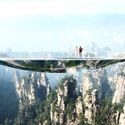
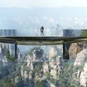
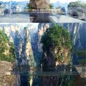
| Martin Duplantier Architectes Designs "Illusionist" Bridges and Pavilions for Chinese National Park Posted: 01 Jan 2017 10:00 PM PST  © Martin Duplantier Architectes © Martin Duplantier Architectes Martin Duplantier Architectes has won a competition organized by Chinese tour company ZTG with a design for a series of "illusionist" bridges and pavilions in western Zhangjiajie, China. Contrasting with the surrounding "baroque" landscape, which is a world heritage site, the project utilizes geometric forms and delicate placement to "create a physical relationship" with its neighboring rock faces. The project features three footbridges: "the illusion of a mirror for one, the fear of the void for the next, and lastly the setting in abyss for the final."  © Martin Duplantier Architectes © Martin Duplantier Architectes  © Martin Duplantier Architectes © Martin Duplantier Architectes Through its elliptical disk shape, one footbridge mirrors the surrounding environment, and offers views into the gap between rock faces through an off-centered hole, which will be covered in a strong netting, so that visitors can "lay down in the void."  © Martin Duplantier Architectes © Martin Duplantier Architectes Another of the bridges—the "water mirror"—is made from two centimeters of water covering black stone. Every seven minutes, the water disappears and reappears through spray nozzles, creating a cloud that later settles back onto the stone.  © Martin Duplantier Architectes © Martin Duplantier Architectes This black stone flooring material, as well as reflective stainless steel, is not only utilized in the footbridges, but also throughout the project's three pavilions: a terrace with panoramic views, a café, and a royal guesthouse, organized from high to low, respectively. News via v2com. This posting includes an audio/video/photo media file: Download Now |
| You are subscribed to email updates from ArchDaily. To stop receiving these emails, you may unsubscribe now. | Email delivery powered by Google |
| Google Inc., 1600 Amphitheatre Parkway, Mountain View, CA 94043, United States | |


.jpg?1482896449)
.jpg?1482896516)
.jpg?1482897021)
.jpg?1482896415)



Nema komentara:
Objavi komentar