Arch Daily |
- Refurbishment of an Apartment in the Italian Alps / Philipp Kammerer
- Swiss Simplicity / Wohlgemuth & Pafumi Architekten
- VGramsci Building / Giovanni Vaccarini Architects
- Cyber Hub Social / Chromed Design Studio
- The Wood Duck / L’Abri
- PANDEA | Art Pavilion / MX TAD
- Theaster Gates Wins 2017 Edmund N. Bacon Award
- Extension of a Post-War House / Lab-S + Kraal Architecten
- TRIAS Proposes Museum to House Jørn Utzon Archive in Sydney
- Forti Holding Spa HQ and Office Building / ATIproject
- Winning Proposal for Finland Bay Masterplan Transforms Industry into Innovation
- Anapra / Jorge Urias Studio
- 10 Traditional Festivals Around the World: A Good Excuse to See New Architecture
- Fast Horse / Salmela Architect
- The Results Are In: 2016 Is a Record-Breaking Year for Tall Buildings
- A Selection of Name-Based Architecture Memes
| Refurbishment of an Apartment in the Italian Alps / Philipp Kammerer Posted: 13 Jan 2017 09:00 PM PST  © Philipp Kammerer © Philipp Kammerer
 © Philipp Kammerer © Philipp Kammerer From the architect. In the project the attic apartment of an apartment house was expanded by an additional room. The apartment is conformed over 2 floors. On the upper floor there are the living-room and the kitchen, on the lower the bedrooms.  Axonometric Axonometric Due to the client's wish that the extension should meet several uses, this expansion was consciously left without precise function. The additional space must therefore be able to accommodate various functions such as (guest room, study, office). The furniture is integrated into the wall element of the new timber construction. It contains the required areas for wardrobe, storage space and open shelf.  © Philipp Kammerer © Philipp Kammerer There is also an empty, reduced space that can be used by the user in various forms and is currently used as an office. In order to provide a suitable answer to the problem of the high density of the residential complex and to meet the desire for privacy, it was necessary to pre-construct an introverted volume. The new construction backs up to the front edge of the terrace, creating a new access to the residential unit. Apart from the lateral access, the extension has no opening to the outside.  Floor Plan Floor Plan Care was taken to keep the existing structure as far as possible. Only the sloping part of the roof had to be demolished and rebuilt. A new design of prefabricated mass timber construction elements. The rest of the roof was maintained.  © Philipp Kammerer © Philipp Kammerer Between the existing living room and the new room, the roof is cut out. The courtyard provides the interior with daylight and serves as an organizational element in the open space floor plan of the residence. The visual relations between the public living functions and the new space can be controlled by the user thus providing a buffer between the private building and the public housing functions. The intervention is perceptible from the inside. The new wood and concrete components were left untreated.  © Philipp Kammerer © Philipp Kammerer This posting includes an audio/video/photo media file: Download Now |
| Swiss Simplicity / Wohlgemuth & Pafumi Architekten Posted: 13 Jan 2017 06:00 PM PST  © Chibi Moku © Chibi Moku
 © Chibi Moku © Chibi Moku From the architect. If you like homes that are designed for close family lifestyle, then you'll find that "Swiss Simplicity" brings comfortable family living to near perfection. By using simple shapes and forms and bringing them together in a unique architectural layout, this modern-meets-traditional home gives you the best in all areas of design. Elements such as wood, concrete, stone, & steel come together harmoniously to balance the interior pallet as well as the overall architecture.  © Chibi Moku © Chibi Moku  Section Section  © Chibi Moku © Chibi Moku Located in Seltisberg, Switzerland, this residential home follows the strict Swiss construction guidelines while artistically breaking away from them. In this film, we speak with the homeowner, Tina, and the architects at Wohlgemuth & Pafumi Architekten, about the design of this home. With the use of 3D renderings, sketches, & walkthroughs, we learn about the interior layout of this home as well as the incredibly cute lifestyle lived within.  Sketch Sketch WP Architekten is one of the most thorough firms we have come across in all of our travels. They take a deep holistic approach to design and explore pretty much every avenue of technology the market offers to create and convey their ideas.  © Chibi Moku © Chibi Moku This posting includes an audio/video/photo media file: Download Now |
| VGramsci Building / Giovanni Vaccarini Architects Posted: 13 Jan 2017 02:01 PM PST  © Sergio Camplone © Sergio Camplone
 Location Location From the architect. The multifunctional building is a replacement construction on an area in the margins of the historical center of the high city of Giulianova (Teramo).  © Sergio Camplone © Sergio Camplone The area, situated on the slope, marking the crossroads of Via Gramsci and Via Cesare Battisti.  Sketch Sketch These first instances were immediately a reflection element on the role of intervention as a hinge between two parts of the city (the ancient and contemporary) and between two completely different urban areas: a compact (the historic city) and another spread and built to void rather than volume, belonging to the contemporary city.  © Sergio Camplone © Sergio Camplone The building stands on a pedestal "carved" that divides the area into two portions: A first (level 0.00) with access directly from via gramsci; part that distributes the commercial part of the building and services  1st Floor Plan 1st Floor Plan A second with access from Via Cesare Battisti (level +3.50 mt) that distributes all the residential part; a kind of artificial soil on which are also resting roof gardens and pedestrian access. The volume of the residences comes cantilevered from the base; the volume is placed in the northeast, so marks the crossroads of the two main roads. 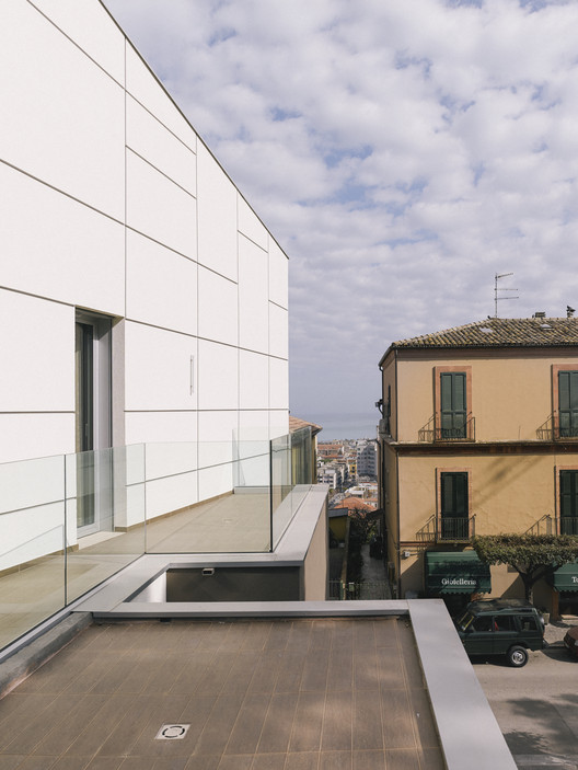 © Sergio Camplone © Sergio Camplone The idea is to have an artificial soil lifted from the road on which "floats" the volume of the residences. This solution clearly identifies the different parts of the building and allows to design the east elevation with a large terrace overlooking the sea. The residences of the block, backs onto the north side, manages to frame the existing glimpse in east building in the other side of the road.A point of view that looks toward the horizon.  © Sergio Camplone © Sergio Camplone The inflection of the main facade take the light in a different ways, it is evident the different hours of the day; a citation of the beloved building in Via Archimede in Rome made by Ugo Luccichenti. The materials are simple: plaster (for all facades) and glass (for balustrades).  © Sergio Camplone © Sergio Camplone Product Description. The main Materials for the project are glass and plaster. The contrast and the overlap between these two materials create a dynamic effect which amplifies the plasticity of the wall mass. This posting includes an audio/video/photo media file: Download Now |
| Cyber Hub Social / Chromed Design Studio Posted: 13 Jan 2017 12:00 PM PST  © Saurabh Suryan © Saurabh Suryan
 © Saurabh Suryan © Saurabh Suryan From the architect. True to its design philosophy of minimal intervention and maximum up-cycling, the anti-design theme runs right through the new Cyber Hub Social's decor. With an area of 5000 square feet, it makes an unexcelled impact, adapting a low cost housing model in a fun urban café.  © Saurabh Suryan © Saurabh Suryan Conceptually, this new Social uses the mindset of a localite with behavioural references from chawls of Mumbai, creating and producing an everyday comforting and interactive space. Chawls were first created to house as many mill workers in one building – a space that was efficient and functional. In the same way, Social has evolved into a space that symbolises community living – a place that stands for unity, togetherness, security, camaraderie, cultural essence and ethos – minus all of the pretences of modern day life.  © Saurabh Suryan © Saurabh Suryan Seceding from the rigid design theory in metropolitans, it creates spaces with varying scales ranging from a 2 tier local train seating to a courtyard setting and private chawl rooms with beds. It is a celebration of the unity and togetherness of people in a settlement, making nonpareil use of space in a home bound milieu.  Floor Plan Floor Plan The bunting design overhead created with elaborate decorations, enhances the festivity full flegedly. The space unveils through a revealing narrow gali flanked by rooms on both sides, leading to a large central courtyard housing the bar and the dance floor. The experience is complete when one turns the corner to get to this area. The courtyard has seating with carom board table tops for a casual chawl evening. Immense detail is given to user experience and surprise, as all the rooms reveal distinct characters flowing to the bar and dance floor. Taking the essence of urban settlements, the outdoor furniture is also formatted inside concrete hume-pipes, which are artistically vandalised with graffiti inside. Ar. Abhigyan Neogi and his team incorporated colour, theme and majestic emulative forms of Mumbai chawls, making it very close to actuality, while still ticking all the boxes of creativity, minutely detailing each piece of furniture and design.  © Saurabh Suryan © Saurabh Suryan The rustic open balconies, alfresco tables, the clothes hanging outside and the very grungy pan shop at the entrance gives one the very feel of a realistic environment. There are corrugated sheets chajjas on the exterior and interiors, wooden railings on the sides, black and white photographs giving a 60s effect on the wall, chairs in the shade of orange-black in tune with Social's logo, vitrified tiles on the bar counter enhance the ruggedness of a low cost housing model. Lighting pattern is innovative with the use of lit planters, bulbs topped with mini table clothes, antique lamps and even bare distressed bulbs. Flooring pattern varies from pandamo and terrazzo in corridors and pattern tiles in chawls and kotastone in the lobby. The walls are adorned with painted exposed brick and wallpapers or kept bare minimal white. The meeting room serves as a co-working space with cladded wooden panels on the walls and a false ceiling shouting 'play & work'.  © Saurabh Suryan © Saurabh Suryan Cyber Hub Social also brings alive a realistic Bollywood set, set in Mumbai's tone; right in front of one's eyes. It is a space that fosters creativity, culture and change. This posting includes an audio/video/photo media file: Download Now |
| Posted: 13 Jan 2017 11:00 AM PST _-_Jack_Je%CC%81rome.jpg?1481157782) © Jack Jérôme © Jack Jérôme
_-_Jack_Je%CC%81rome.jpg?1481157772) © Jack Jérôme © Jack Jérôme The Wood Duck is L'Abri's first built house design. A simple concept, rational plan and traditional methods of construction where put forward to simplify the construction of the project, self-build by a young carpenter with a modest budget. The architecture is humble : the little wood volume recedes in the landscape. _-_Jean-Christophe_Laniel.jpg?1481157884) © Jean-Christophe Laniel © Jean-Christophe Laniel This little house was drawn for a young carpenter wishing to self-build his first home in Bolton, in the Eastern Townships of Quebec. .jpg?1481158004) Axonometric Axonometric .jpg?1481157828) Floor Plan Floor Plan .jpg?1481157840) Floor Plan Floor Plan The land faces the ski slopes of Mont Glen to the south and overlooks the river below. This topography orients the house plan. The south facade opens fully to the valley. The north facade, headed towards the public domain, is only punctuated by two discrete punch windows. _-_Jack_Je%CC%81rome.jpg?1481157861) © Jack Jérôme © Jack Jérôme The footprint of the house is modest, its plan is square. On the ground floor, natural light pours down on the living spaces, through the curtain-wall of the double height set to the south. Serving spaces are positioned to the north. The upper level houses two bedrooms and one bathroom. _-_Jean-Christophe_Laniel.jpg?1481157794) © Jean-Christophe Laniel © Jean-Christophe Laniel The project inhabits the landscape humbly. Its simple form and the uniform board and batten siding participate to blend the little rough hemlock volume in its environment. The evolutive and rough nature of its skin preserves the natural surroundings. Its owner baptised it the Wood Duck. _-_Jean-Christophe_Laniel.jpg?1481157805) © Jean-Christophe Laniel © Jean-Christophe Laniel Product Description. Hemlock spruce constitutes the exterior cladding of the Wood Duck. This material provides the opportunity to be installed as raw product, and offers an evolving aspect over time. Besides, hemlock has the additional benefit of being very cost-effective. The board and batten laying technique has been chosen for its simplicity and the interesting rhythm it gives to the façade. _-_Jack_Je%CC%81rome.jpg?1481157727) © Jack Jérôme © Jack Jérôme This posting includes an audio/video/photo media file: Download Now |
| PANDEA | Art Pavilion / MX TAD Posted: 13 Jan 2017 09:00 AM PST  © Diana Arnau © Diana Arnau
 © Diana Arnau © Diana Arnau From the architect. PANDEA is a space designed to serve as platform for artists and designers in Puebla; located in Sonata District, one of the fastest growing & modern zones of the city.  © Diana Arnau © Diana Arnau The architectural design was developed simultaneously with the visual identity of the pavilion in order to achieve a global concept, which transmits constant movement & modernity, projected in a versatile space with intense color and subtle polygonal applications.  Sketch Sketch  Sketch Sketch The project itself is an intervention, which sought to take full advantage of what was already in place, which previously served as real estate sales offices. The intention was to take that "office essence" out and transform it into a space that resembled a disused warehouse; an industrial pavilion that could be easily adapted to any art or designer.  © Diana Arnau © Diana Arnau The entry level has 47 square meters for display, equipped with 6 removable screens that create different exhibition routes depending on their accommodation, allowing to expose large format pieces. The existing floor was used and the walls were lined with white painted bricks, as well as the windows were covered with a designed decal to block the view towards the offices. Both the front desk and the central lamp were designed to be in tune with the identity of the Pavilion, based on irregular polygons that generate different shapes depending on the angle at which you see them.  Ground Floor Ground Floor  Top Floor Top Floor To unify the 2 levels and make the visitor follow the tour, we transform the staircase into a transition tunnel, an intense blue space that will attract and arouse the curiosity to see what is at the next level. On the way out, an anamorphic sign that reads "PANDEA" concludes the exhibition tour.  © Diana Arnau © Diana Arnau On the upper level, 18 square meters serve as a second exhibition room or as an ideal space to display pieces of greater importance, which can be better appreciated with controlled lighting, which the lower level cannot offer due to the natural light from the façade. Here, to avoid the view of the existing offices behind the crystal walls, translucent vinyls were applied in order to generate a completely different and private environment. PANDEA is a mutable space.  © Diana Arnau © Diana Arnau This posting includes an audio/video/photo media file: Download Now |
| Theaster Gates Wins 2017 Edmund N. Bacon Award Posted: 13 Jan 2017 08:00 AM PST  The Rebuild Foundation's Dorchester Art + Housing Collaborative (DA+HC); Chicago / Landon Bone Baker Architects. Image © Barry Rustin The Rebuild Foundation's Dorchester Art + Housing Collaborative (DA+HC); Chicago / Landon Bone Baker Architects. Image © Barry Rustin The Center for Architecture and Design has announced Theaster Gates as the 2017 recipient of its Edmund N. Bacon Award, which honors one individual who has advocated for excellence in urban development, planning, thought, and design. A Chicago-based artist and community developer, Gates is the founder of the Rebuild Foundation, which focuses on improving the quality of urban life by planning and designing active and engaged communities. "Under Gates' leadership, the Rebuild Foundation currently manages projects in the Greater Grand Crossing neighborhood of Chicago. Program sites include the Stony Island Arts Bank, the Black Cinema House, the Dorchester Art + Housing Collaborative, Archive House, and Listening House." Gates will be honored at the 11th annual Edmund N. Bacon Awards + Talk, which will feature a talk by Gates and presentations of the winning student designs of the 2017 Better Philadelphia Challenge. This urban design competition asked college students to propose a design for the currently unused City Branch tunnel, which runs under Pennsylvania Avenue in Philadelphia. Past winners of the award include Judith Rodin, President of the Rockefeller Foundation, Denise Scott Brown, co-founder of VSB Architects, and Jan Gehl, founder of Gehl Architects. News via the Center for Architecture and Design. This posting includes an audio/video/photo media file: Download Now |
| Extension of a Post-War House / Lab-S + Kraal Architecten Posted: 13 Jan 2017 07:00 AM PST  © Ed van Rijswijk © Ed van Rijswijk
 © Ed van Rijswijk © Ed van Rijswijk From the architect. A timber clad extension creates a new relationship between a brick semi-detached house and its green surrounding.  Elevation Elevation Kraal Architecten and Lab-S have joined forces for the renovation of a semi-detached house in Zeist, the Netherlands. The project consists of a large interior transformation with a total new layout and a new addition at the back of the original house.  © Ed van Rijswijk © Ed van Rijswijk The original post-war house has a brick facade and a pitched roof construction with ceramic roof tiles. Large trees stand at the back of the rear garden creating a beautiful natural scenery, viewed from the house. The new extension opens the original house to this scenery. Its appearance is distinct from the original house. Using natural materials, it relates to the natural surroundings, while maintaining a clear contrast between existing and newly developed parts.  Section Section The extension provides additional space on the ground floor for a new entrance hall and contains a storage room. On the outside, the storage room has a timber façade in which only the door knob reveals the presence of a door. Whereas the storage has a closed character, the new entrance opens itself to the street using large window frames and a new canopy above the entrance door.  © Ed van Rijswijk © Ed van Rijswijk The design brief contained requests for spatial additions on each floor. Three new residential programs at the back of the house (kitchen, bedroom and study) are located one above the other and connected to each other by a new staircase. This clustering results in a vertical extension on the rear side in which parts of the old façade and roof construction maintain visible.  Elevation Elevation The new rooms in this part of the extension all have floor to ceiling windows, providing nice garden views. Whereas the bedroom on the first floor protrudes more into the garden, the study on the second floor is placed behind the raised volume of the staircase. This segmentation breaks up the high volume of the new extension and makes each space more distinct on the exterior.  © Ed van Rijswijk © Ed van Rijswijk This posting includes an audio/video/photo media file: Download Now |
| TRIAS Proposes Museum to House Jørn Utzon Archive in Sydney Posted: 13 Jan 2017 06:00 AM PST  Courtesy of TRIAS Courtesy of TRIAS TRIAS has created a speculative museum proposal for the MA | UA (Museum of Architecture | Utzon Archive), a permanent exhibition space for Danish architect Jørn Utzon's archive in Sydney, Australia.
 Courtesy of TRIAS Courtesy of TRIAS Sited on a slender wedge adjacent to Sydney's "Goods Line" urban park, the building consolidates and catalogues Utzon's archive in a single place. Three protective, archival pillars are featured at the museum's core, with public programs and contemporary exhibits taking place in between.  Courtesy of TRIAS Courtesy of TRIAS  Courtesy of TRIAS Courtesy of TRIAS On a larger scale, the building is composed of three key elements: the display pillars, a viewing sequence that expands on Utzon's ideals of counterpoint, and a clouded façade. Additionally, the MA|UA is open and permeable to the neighboring park.  Courtesy of TRIAS Courtesy of TRIAS  Courtesy of TRIAS Courtesy of TRIAS
 Courtesy of TRIAS Courtesy of TRIAS The MA|UA proposal was the recipient of the 2015 NSW Design Medal and has been shortlisted for the 2017 Archiprix Award. By: TRIAS Project leads: Jennifer McMaster, Jonathon Donnelly Location: Ultimo, Sydney, Australia Designed: 2015 Status: Unbuilt News via TRIAS. This posting includes an audio/video/photo media file: Download Now |
| Forti Holding Spa HQ and Office Building / ATIproject Posted: 13 Jan 2017 05:00 AM PST  © Daniele Domenicali © Daniele Domenicali
 © Daniele Domenicali © Daniele Domenicali The new Forti Holding S.p.a. headquarter is situated between Pisa and Livorno. It houses shops and the corporate group's administrative centre. The building is designed by ATIproject studio and it stands as a coherent and remarkable example of green architecture in the area. Taking environmental responsibility as a core value, the team has put great attention into the bioclimatic planning, thus resulting in incredibly high energetic performances.  Scheme Scheme In fact, the building makes extensive use of passive energy devices like thermal and shading technologies, passive ventilation and sensitive use of daylight. From the main road, an airy lobby located in the middle of a ventilated facade welcomes visitors with its triple-height-ceiling; a wide glass curtain wall guarantees natural ventilation and plenty of natural light. On the other side, the southeast facade is completely realized by glass. For this reason, in order to filter sunlight and to avoid overheating, an horizontal sunscreen system has been set up in front of the windows, allowing free sights and sun protection simultaneously.  © Irene Taddei © Irene Taddei Structural and formal choices affect the inner working environment, offering nice and open views on the surrounding countryside and the mountains. Opaque and transparent surfaces have been studied according to their specific orientation. A roof garden and large outdoor terraces cladded with natural materials create relax areas overlooking the mountains. They also contributing to shape the volumes, regulate the microclimate as well as bringing nature inside the building. The South facade is entirely covered with solar panels and has been designed and dimensioned together with other green energy devices to fully meet the building's energetic needs.  © Irene Taddei © Irene Taddei Remarkably, this office building lacks of methane gas plants, which is traditionally used in Italy for the heating system. Photovoltaic production covers most of winter and summer conditioning and lighting energy demand (> 80%). Thanks to special architectural solutions, cladding becomes the first technologic system of this building. A cutting-edge plant apparatus has been developed in parallel with the building smart shell, which employs LED lighting systems, a geothermal system for air conditioning and regenerative heat exchanger. The mix of renewable sources and strategies aims to limit consumption, making this headquarter a benchmark for sustainable building throughout the Tuscan region. The building is currently awaiting the LEED - Gold rating certification for sustainability.  Floor Plan Floor Plan Schueco Curtain wall. A detailed design study has been developed by Atiproject studio from the earliest planning stages in close collaboration with Schueco. The object of this delicate integrated planning was the transparent curtain wall and its related solar screening. The collaboration has allowed to fully analyze the technical aspects by identifying the most suitable solutions for the building's complex geometry. The curtain walls change their radius of curvature at each floor in order to accommodate terraces and gardens, bending into soft and sinuous shapes. This aspect has required a specific study on modeling and construction joints solutions to achieve optimal results in terms of realization technique and esthetics. This specific curtain wall system consists of a thermal and acoustic low-emissive double glazing panel with integrated solar control. This solution provides a good light transparency and a differentiated solar factor according to the exposure of the façade.  © Irene Taddei © Irene Taddei Product Description: Schueco sunscreens.This complex construction system is fixed directly to the curtain wall, being the subject of a specific study which led eventually to a custom engineered solution in terms of walkway's structural support and screening profiles. The final outcome is the realization of a dramatic façade, efficient and dynamic at the same time, which fully embodies the innovative and technological philosophy of the whole intervention.  © Irene Taddei © Irene Taddei This posting includes an audio/video/photo media file: Download Now |
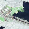
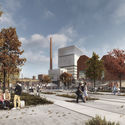
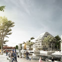
| Winning Proposal for Finland Bay Masterplan Transforms Industry into Innovation Posted: 13 Jan 2017 04:00 AM PST  Courtesy of Schauman & Nordgren Architects + Mandaworks Courtesy of Schauman & Nordgren Architects + Mandaworks The City of Tampere, Finland has announced the proposal by Schauman & Nordgren Architects and Mandaworks as the winner of an open international competition for Hiedanranta Bay's new master plan. The design, entitled "Hiedanranta Innovation Bay," responds to the rapid growth of Tampere's central region. Over the next 20 years, the Innovation Bay will see the transformation of the former industrial district into an innovation hub for sustainable economic development, creating 10,000 new jobs, and housing over 25,000 new residents.  Courtesy of Schauman & Nordgren Architects + Mandaworks Courtesy of Schauman & Nordgren Architects + Mandaworks  Courtesy of Schauman & Nordgren Architects + Mandaworks Courtesy of Schauman & Nordgren Architects + Mandaworks
 Courtesy of Schauman & Nordgren Architects + Mandaworks Courtesy of Schauman & Nordgren Architects + Mandaworks The master plan aims to connect Hiedanranta to its surrounding environment, move toward carbon neutral development, and integrate the Bay's public space with its transportation network. This objective is conceived with a block division organized by two grids. At the intersection of the two grids, the proposed structure converges into an innovation corridor, or a north-south aisle of public spaces—historical buildings, schools, manufacturing facilities, and an innovation campus—connected by tram.  Courtesy of Schauman & Nordgren Architects + Mandaworks Courtesy of Schauman & Nordgren Architects + Mandaworks Another corridor, oriented east to west, features recreational spaces connected by water. Alongside the grand canal, the blue square, and the harbor, the meeting of the perpendicular corridors creates a network of pedestrian access, public transportation, and key destinations. The development's multi-modal transportation network includes two tram lines, cycling routes, and pedestrian infrastructure.  Courtesy of Schauman & Nordgren Architects + Mandaworks Courtesy of Schauman & Nordgren Architects + Mandaworks  Courtesy of Schauman & Nordgren Architects + Mandaworks Courtesy of Schauman & Nordgren Architects + Mandaworks Finally, the urban development is tied together with the natural landscape, mainly through the nearby natural lakeshore. To complement this environment, the landscaping structure includes a waterfront park, a sport and recreation hill, and a lake delta. The built landscape not only provides visitors with recreational green space, but also serves as stormwater management infrastructure. Location: Tampere, Finland Client: City of Tampere Type: Open, International Competition - Shared 1st Prize Assignment: Urban Design and City Planning Size: 1,500,000 m2 built area, 246 Hectares land-area Architects: Schauman & Nordgren Architects + Mandaworks Collaborators: Traffic consultant Jouni Lehtomaa News via Schauman & Nordgren Architects. This posting includes an audio/video/photo media file: Download Now |
| Posted: 13 Jan 2017 03:00 AM PST  © Rafael Gamo © Rafael Gamo
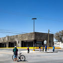
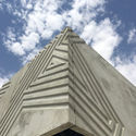
 © Rafael Gamo © Rafael Gamo From the architect. The Anapra neighborhood in the city of Juarez Mexico is a place with richness of textures and exposed materials, where the built environment can be seen as a reflection of its people's creativity portrayed in their unique construction systems.  © Rafael Gamo © Rafael Gamo We were commissioned the design of a low-cost commercial structure with an open floor plan that could be redistributed as needed.  © Rafael Gamo © Rafael Gamo Given the brief, we opted for an exposed material that would resonate with the site. A solid concrete mass emerges from the ground and is carved by a continuous pattern resembling the outlines of hidden potentialities within settlers and their surroundings.  East Elevation East Elevation  © Rafael Gamo © Rafael Gamo  Details Details  © Rafael Gamo © Rafael Gamo The raw materiality of the tilt-up concrete panels, inherits the dynamic activities and informalities found in the neighborhood, and creates an unprecedented structure which mirrors the qualities on site, becoming the building's skin.  © Rafael Gamo © Rafael Gamo This posting includes an audio/video/photo media file: Download Now |
| 10 Traditional Festivals Around the World: A Good Excuse to See New Architecture Posted: 13 Jan 2017 01:30 AM PST
We experience our cities daily through ordinary acts, whether it’s commuting, looking for a quiet place, having lunch downtown, or even exercising. However, one of the most exceptional ways to experience the different roles of a city's urban space is through traditional festivals, rooted in local cultures presented through different clothing, culinary arts, dances and other arts. Through these festivals, one can see the uses and the demands of the urban public space, in which cultural actions offer new ways to take over the city - at a time when the streets are no longer just a transit space and become a space of leisure and residence, overtaken by a different atmosphere. New cultures are built on new practices. Through travel, architects can expand their repertoire and gain new influences for their projects. Here, we take a look at some traditional festivals around the world that serve as a good excuse to unveil new ways of thinking about a city and, as a result, to see great architectural works. Read on to see ten amazing festivals to visit on your next trip. Harbin International Ice FestivalJanuary 5 / Harbin, China ![By Shanghai killer whale (Own work) [CC BY-SA 3.0 (http://creativecommons.org/licenses/by-sa/3.0)], via Wikimedia Commons By Shanghai killer whale (Own work) [CC BY-SA 3.0 (http://creativecommons.org/licenses/by-sa/3.0)], via Wikimedia Commons](http://images.adsttc.com/media/images/584e/d2a0/e58e/ce5a/1700/001e/medium_jpg/Tower_at_Harbin_Ice_and_Snow_Festival_2012.jpg?1481560723) By Shanghai killer whale (Own work) [CC BY-SA 3.0 (http://creativecommons.org/licenses/by-sa/3.0)], via Wikimedia Commons By Shanghai killer whale (Own work) [CC BY-SA 3.0 (http://creativecommons.org/licenses/by-sa/3.0)], via Wikimedia Commons China hosts the world's largest ice festival. Based in Harbin, during winter you may come across the largest sculptures—and even buildings—made of ice on the planet. While you're there, take the opportunity to visit the incredible Harbin Opera House and the China Wood Sculpture Museum, both by MAD Architects.  Harbin Opera House / MAD Architects. Image © Hufton+Crow Harbin Opera House / MAD Architects. Image © Hufton+Crow CarnivalFebruary 28 / Brazil ![By Foto:Antônio Cruz/ABr (Agência Brasil [1]) [CC BY 3.0 br (http://creativecommons.org/licenses/by/3.0/br/deed.en)], via Wikimedia Commons By Foto:Antônio Cruz/ABr (Agência Brasil [1]) [CC BY 3.0 br (http://creativecommons.org/licenses/by/3.0/br/deed.en)], via Wikimedia Commons](http://images.adsttc.com/media/images/584e/d164/e58e/ce4a/be00/0007/medium_jpg/2048px-Noite_dos_tambores_silenciosos.jpg?1481560408) By Foto:Antônio Cruz/ABr (Agência Brasil [1]) [CC BY 3.0 br (http://creativecommons.org/licenses/by/3.0/br/deed.en)], via Wikimedia Commons By Foto:Antônio Cruz/ABr (Agência Brasil [1]) [CC BY 3.0 br (http://creativecommons.org/licenses/by/3.0/br/deed.en)], via Wikimedia Commons Carnival originated in Greece between 600 and 520 BC. The feast of "carnis levale" marked "farewell to the flesh" and came before a great period of abstinence and fasting: Lent. After two millennia the festivities have become extravagant, and the largest carnival in the world grew up across the ocean in Brazil. Carnival celebrations are distinctive, from parades of internationally famous samba schools to clubs, parties and—most interestingly for those who seek to experience urban space—blocks of processions in the streets. Each city has a unique carnival, and we recommend five: Rio de Janeiro, Recife, Salvador, Ouro Preto and São Paulo. 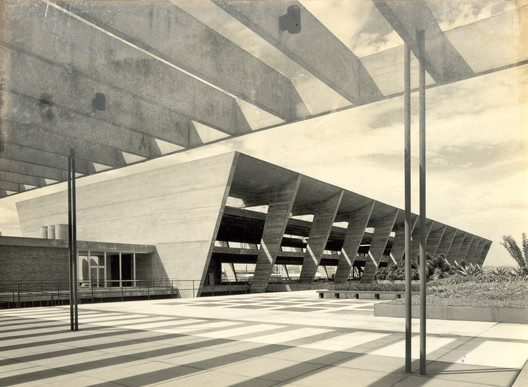 Museu de Arte Moderna do Rio de Janeiro / Affonso Eduardo Reidy. Image © Centro de Documentação e Pesquisa do MAM. Museu de Arte Moderna do Rio de Janeiro / Affonso Eduardo Reidy. Image © Centro de Documentação e Pesquisa do MAM. Mardi GrasFebruary 28 / New Orleans, USA ![By Team at Carnaval.com Studios [CC BY 2.0 (http://creativecommons.org/licenses/by/2.0)], via Wikimedia Commons By Team at Carnaval.com Studios [CC BY 2.0 (http://creativecommons.org/licenses/by/2.0)], via Wikimedia Commons](http://images.adsttc.com/media/images/584e/d222/e58e/ce4a/be00/0009/medium_jpg/Half_Fast_Walking_Club.jpg?1481560596) By Team at Carnaval.com Studios [CC BY 2.0 (http://creativecommons.org/licenses/by/2.0)], via Wikimedia Commons By Team at Carnaval.com Studios [CC BY 2.0 (http://creativecommons.org/licenses/by/2.0)], via Wikimedia Commons Speaking of Carnival, we can’t forget "Mardi Gras"—which means "fat Tuesday" in French, reflecting the practice of eating rich and fatty foods before fasting during Lent. The most traditional party takes place in New Orleans, bringing color and fun to the streets of the city. In addition to celebrating, you will have the opportunity to see how the city rebuilt itself after Hurricane Katrina, understanding the role of architecture and urbanism in this reconstruction. A good tip is to check out the residential projects made by Make It Right.  The Float House / Morphosis, Make It Right. Image © Iwan Baan The Float House / Morphosis, Make It Right. Image © Iwan Baan HoliMarch 13 / India ![By Jitenderasingh (Own work) [CC BY-SA 4.0 (http://creativecommons.org/licenses/by-sa/4.0)], via Wikimedia Commons By Jitenderasingh (Own work) [CC BY-SA 4.0 (http://creativecommons.org/licenses/by-sa/4.0)], via Wikimedia Commons](http://images.adsttc.com/media/images/584e/d245/e58e/ce4a/be00/000a/medium_jpg/Holi_Celebration_Huranga.jpg?1481560632) By Jitenderasingh (Own work) [CC BY-SA 4.0 (http://creativecommons.org/licenses/by-sa/4.0)], via Wikimedia Commons By Jitenderasingh (Own work) [CC BY-SA 4.0 (http://creativecommons.org/licenses/by-sa/4.0)], via Wikimedia Commons Also known as the Festival of Colors, Holi celebrates the arrival of spring in India. Between drinks, food, and a lot of music, in this festival colors are given great prominence: the people throw colored powders and paints at each other. Despite the festive tone, this is an important event in Hindu culture because it is the moment that celebrates the legend of Radha and Krishna, which recounts the pleasure that Krishna felt when coloring Radha and Gopis. Holi Hai! If you are traveling in India, don’t miss the chance to see Chandigarh, planned by none other than Le Corbusier.  Palace of Assembly / Le Corbusier. Image © Fernanda Antonio Palace of Assembly / Le Corbusier. Image © Fernanda Antonio FallasMarch 19 / Valencia, Spain ![By Rafa Esteve (Own work) [CC BY-SA 4.0 (http://creativecommons.org/licenses/by-sa/4.0)], via Wikimedia Commons By Rafa Esteve (Own work) [CC BY-SA 4.0 (http://creativecommons.org/licenses/by-sa/4.0)], via Wikimedia Commons](http://images.adsttc.com/media/images/584e/d232/e58e/ce5a/1700/001d/medium_jpg/Fallas2015_Calles_Iluminadas_07.jpg?1481560612) By Rafa Esteve (Own work) [CC BY-SA 4.0 (http://creativecommons.org/licenses/by-sa/4.0)], via Wikimedia Commons By Rafa Esteve (Own work) [CC BY-SA 4.0 (http://creativecommons.org/licenses/by-sa/4.0)], via Wikimedia Commons This party was born from burning leftover wood from carpentry workshops in Valencia, Spain. The Valencians transformed this burning into a huge event that occupies the whole city. The festival features large wooden sculptures, the "Fallas" or failures—which are often designed after satirical themes or show traces of their culture and local history—that will be burned on the last day of the party, the day of the cremà, on the day of Saint Joseph. The festival begins a few days before, but the must-see day is the 14th when la planta takes place. On the 17th there’s a beautiful flower offering and on the 18th is the great nit del foc, when there is an unforgettable spectacle of Fireworks on the River Turia - a river that also hosts the City of Arts and Sciences, the controversial project by Santiago Calatrava. ![Diego Delso [CC BY-SA 3.0 (http://creativecommons.org/licenses/by-sa/3.0)], via Wikimedia Commons Diego Delso [CC BY-SA 3.0 (http://creativecommons.org/licenses/by-sa/3.0)], via Wikimedia Commons](http://images.adsttc.com/media/images/584e/db66/e58e/ce4a/be00/0020/medium_jpg/Museo_Pr%C3%ADncipe_Felipe__Ciudad_de_las_Artes_y_las_Ciencias__Valencia__Espa%C3%B1a__2014-06-29__DD_59.jpg?1481562969) Diego Delso [CC BY-SA 3.0 (http://creativecommons.org/licenses/by-sa/3.0)], via Wikimedia Commons Diego Delso [CC BY-SA 3.0 (http://creativecommons.org/licenses/by-sa/3.0)], via Wikimedia Commons Boryeong Mud FestivalJuly / Boryeong, South Korea ![By Stinkie Pinkie (originally posted to Flickr as Mud Fest 2008) [CC BY 2.0 (http://creativecommons.org/licenses/by/2.0)], via Wikimedia Commons By Stinkie Pinkie (originally posted to Flickr as Mud Fest 2008) [CC BY 2.0 (http://creativecommons.org/licenses/by/2.0)], via Wikimedia Commons](http://images.adsttc.com/media/images/584e/d28f/e58e/ce4a/be00/000c/medium_jpg/Korea-Boryeong_Mud_Festival-19.jpg?1481560707) By Stinkie Pinkie (originally posted to Flickr as Mud Fest 2008) [CC BY 2.0 (http://creativecommons.org/licenses/by/2.0)], via Wikimedia Commons By Stinkie Pinkie (originally posted to Flickr as Mud Fest 2008) [CC BY 2.0 (http://creativecommons.org/licenses/by/2.0)], via Wikimedia Commons The Mud Festival takes place annually in the city of Boryeong during the summer, attracting more than two million visitors to the city. The event began as an advertisement for the cosmetics that carried the mineral-rich Boryeong mud as an ingredient. The fun seems guaranteed and in addition to improving your skin, you can take advantage of a trip 200 kilometers north to Seoul to see the city's incredible buildings and urban landscape.  Paisagem transparente / UnSangDong Architects. Image © Fernando Guerra | FG+SG Paisagem transparente / UnSangDong Architects. Image © Fernando Guerra | FG+SG OktoberfestSeptember and October / Munich, Germany ![By Aschuff (Own work) [GFDL (http://www.gnu.org/copyleft/fdl.html), CC-BY-SA-3.0 (http://creativecommons.org/licenses/by-sa/3.0/) or CC BY-SA 2.5-2.0-1.0 (http://creativecommons.org/licenses/by-sa/2.5-2.0-1.0)], via Wikimedia Commons By Aschuff (Own work) [GFDL (http://www.gnu.org/copyleft/fdl.html), CC-BY-SA-3.0 (http://creativecommons.org/licenses/by-sa/3.0/) or CC BY-SA 2.5-2.0-1.0 (http://creativecommons.org/licenses/by-sa/2.5-2.0-1.0)], via Wikimedia Commons](http://images.adsttc.com/media/images/584e/d155/e58e/ce5a/1700/001c/medium_jpg/2048px-Oktoberfest_inside_Hippodrom.jpg?1481560391) By Aschuff (Own work) [GFDL (http://www.gnu.org/copyleft/fdl.html), CC-BY-SA-3.0 (http://creativecommons.org/licenses/by-sa/3.0/) or CC BY-SA 2.5-2.0-1.0 (http://creativecommons.org/licenses/by-sa/2.5-2.0-1.0)], via Wikimedia Commons By Aschuff (Own work) [GFDL (http://www.gnu.org/copyleft/fdl.html), CC-BY-SA-3.0 (http://creativecommons.org/licenses/by-sa/3.0/) or CC BY-SA 2.5-2.0-1.0 (http://creativecommons.org/licenses/by-sa/2.5-2.0-1.0)], via Wikimedia Commons You've probably already heard of Oktoberfest, the biggest beer festival in the world. Created by the Bavarian king Ludwig I to celebrate his marriage in 1810, it currently receives approximately six million visitors a year. The festival also celebrates Germanic traditions and has become international, happening in several cities across the world. The second largest Oktoberfest celebration is in Blumenau, Brazil, with an average audience of 700,000 people per year. Visiting Munich offers a chance to see one of the greatest works designed by 2015 Pritzker Prize Winner Frei Otto, the Olympic Park.  Estádio Olímpico de Munique / Frei Otto & Gunther Behnisch. Image © Victor Delaqua Estádio Olímpico de Munique / Frei Otto & Gunther Behnisch. Image © Victor Delaqua Nuit BlancheEnd of summer (around October) / Paris, France (and many other cities) ![By Yann Caradec from Paris, France [CC BY-SA 2.0 (http://creativecommons.org/licenses/by-sa/2.0)], via Wikimedia Commons By Yann Caradec from Paris, France [CC BY-SA 2.0 (http://creativecommons.org/licenses/by-sa/2.0)], via Wikimedia Commons](http://images.adsttc.com/media/images/584e/d2b1/e58e/ce4a/be00/000d/medium_jpg/Waterlicht_-_Daan_Roosegarde_-_Parc_Martin_Luther_King_09.jpg?1481560740) By Yann Caradec from Paris, France [CC BY-SA 2.0 (http://creativecommons.org/licenses/by-sa/2.0)], via Wikimedia Commons By Yann Caradec from Paris, France [CC BY-SA 2.0 (http://creativecommons.org/licenses/by-sa/2.0)], via Wikimedia Commons The main idea behind this event is to bring contemporary artistic creation to the citizens and invite everyone to spend the night immersed in an exchange of experiences. "White Night" is a Parisian cultural initiative that was created in 2002. Its great success has caused several other cities including Brussels, Madrid, Riga, and Rome to adopt the event and adapt it to their local contexts. The event arrived in Latin America for the first time in São Paulo, under the name of "Virada Cultural," and then in Lima, La Paz and Bogota. It certainly is an event not to be missed in any of these places, but here we recommend the original city: Paris. In 2017 the artistic direction will be realized by Charlotte Laubard. In all cities the events are free and allow citizens to experience and occupy urban spaces throughout the night with the artistic avant-garde.  Centro Georges Pompidou / Renzo Piano + Richard Rogers. Image © Victor Delaqua Centro Georges Pompidou / Renzo Piano + Richard Rogers. Image © Victor Delaqua Day of the DeadNovember 02 / Mexico ![By Thetambourinekid (Own work) [CC BY-SA 3.0 (http://creativecommons.org/licenses/by-sa/3.0)], via Wikimedia Commons By Thetambourinekid (Own work) [CC BY-SA 3.0 (http://creativecommons.org/licenses/by-sa/3.0)], via Wikimedia Commons](http://images.adsttc.com/media/images/584e/d31e/e58e/ce4a/be00/000e/medium_jpg/OfrendaCU-Catrina.jpg?1481560855) By Thetambourinekid (Own work) [CC BY-SA 3.0 (http://creativecommons.org/licenses/by-sa/3.0)], via Wikimedia Commons By Thetambourinekid (Own work) [CC BY-SA 3.0 (http://creativecommons.org/licenses/by-sa/3.0)], via Wikimedia Commons The celebration of the lives of ancestors has long been present in Mexican culture, starting more than three thousand years ago. The Day of the Dead was inscribed on UNESCO's List of the Intangible Cultural Heritage of Humanity in 2008. November 2 became a festive day because, as they say, it is when the dead have divine permission to visit their relatives and friends. And as good hosts, Mexicans decorate their homes with flowers, candles, and incense, celebrating this visit with food, music and their favorite sweets. In the streets there are parades of people who dress up in skull masks, wear clothes with painted skeletons, or fantasize about death. This is also a great time to bring to the surface one of the characters of Mexican popular culture: the Catrina Skull. If you are in Mexico, among other tips, do not miss the chance to see the works of the great Mexican architect Luis Barrágan, or to go deeper into surrealism by visiting Las Pozas.  Las Pozas. Image © Victor Delaqua Las Pozas. Image © Victor Delaqua FESTIMA: International Festival of Masks and Arts2018 / Dédougou, Burkina Faso The use of masks was part of a culture that was in danger of being forgotten in Burkina Faso, so the Asama decided to create the FESTIMA: an event that seeks to enhance the tradition of masks in Africa, fostering their expression through dances, parades, exhibitions and a mask market. The festival takes place only in even years, so its 21st edition will take place in 2018. Want another beautiful reason to visit Burkina Faso? There you will have the opportunity to visit the works of Francis Keré and see how good architecture influences the day-to-day life of a community. 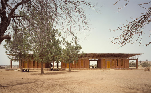 Primary School in Gando / Kéré Architecture Image © Siméon Duchoud Primary School in Gando / Kéré Architecture Image © Siméon Duchoud De fato, as ruas também foram feitas para dançar. This posting includes an audio/video/photo media file: Download Now |
| Fast Horse / Salmela Architect Posted: 13 Jan 2017 01:00 AM PST  © Paul Crosby © Paul Crosby
 © Paul Crosby © Paul Crosby Fast Horse is an award-winning, fast-growing, brand agency in Minneapolis with a unique work environment. As explained in the business case, employees have no assigned desk. "Ponies", as Fast Horse worker are know, are encouraged not to occupy the same seat two days in a row and are encouraged to extend their "work space" beyond the office to the coffee shop, bar, or home as they choose suitable environment for the work that they are trying to accomplish on that particular day.  © Paul Crosby © Paul Crosby  Floor Plans Floor Plans  © Paul Crosby © Paul Crosby In response to this method of work, a unique program description of S,M,L, XL closed and open spaces was developed by the team. "Closed" engendered visual and acoustic privacy to various extents. "Open" could include indoor but non-enclosed, public spaces and outdoor spaces. The entire construct is a serious of spaces with varying sizes and varying degrees of visual and acoustic privacy.  Section + Elevations Section + Elevations These spaces not only permeate the interior but the exterior as well. The architectural artifact that embodies this idea of spaces of varying light conditions, privacy and size is contained in the exterior stairway that are functionally fire exits but much more. The fire exits stairs were placed between the street and the front facade of the building in response to the small footprint of the existing building and the tight constraints of the site. Design as an "open to the elements" fire exit, they act as the major visual marker for the building, a shade buffer for the southwest light, and create several spaces of varying sizes and exposures that can be used for sitting, taking phone calls, and walking. This "transition" architectural space between street and building allows for various levels of privacy, indoor/outdoor transitions, infinite permutations of movement patterns in support of the Fast Horse philosophy of work.  © Paul Crosby © Paul Crosby This posting includes an audio/video/photo media file: Download Now |
| The Results Are In: 2016 Is a Record-Breaking Year for Tall Buildings Posted: 13 Jan 2017 12:00 AM PST K11-_New_World_Development.jpg?1484227242) Guangzhou CTF Finance Centre. Image Courtesy of K11 New World Development Guangzhou CTF Finance Centre. Image Courtesy of K11 New World Development In its annual report, the 2016 Tall Building Year in Review, the Council on Tall Buildings and Urban Habitat (CTBUH) has announced that 2016 saw the completion of a record 128 buildings 200 meters or higher. This number surpasses the previous record of 114 completions set in 2015. Eighteen of these buildings became the tallest in their city, country, or region, and ten earned the designation of supertall, at 300 meters and above.  via Council on Tall Buildings and Urban Habitat via Council on Tall Buildings and Urban Habitat The majority of these buildings—107, or 84% of them—stand in Asia, which thusly maintains its position as global skyscraper epicenter. China topped this list with a record 84 completions, including the tallest building among those completed last year, the Guangzhou CTF Finance Centre. The 530-meter mixed-use skyscraper, designed by Kohn Pedersen Fox, now stands the second-tallest building in China and the fifth-tallest building in the world. Shenzhen saw the most new 200-meter-plus buildings of any city in 2016 with 11 completions for a total height of 2,608 meters. Tied for second with six buildings each were Guangzhou, China; Chongqing, China; and Goyang, South Korea.  via Council on Tall Buildings and Urban Habitat via Council on Tall Buildings and Urban Habitat The United States took a distant second to China with seven new completions—representing all the 200-meter-plus development in North America—while six tall buildings were built in South Korea, five in Indonesia, and four each in the Philippines and Qatar.  via Council on Tall Buildings and Urban Habitat via Council on Tall Buildings and Urban Habitat View the full report from the Council on Tall Buildings and Urban Habitat here. News via The Council on Tall Building and Urban Habitat (CTBUH). This posting includes an audio/video/photo media file: Download Now |
| A Selection of Name-Based Architecture Memes Posted: 12 Jan 2017 10:00 PM PST  The world of architecture can be a serious place. Though the rest of the world holds quite a few stereotypes about architects, unfortunately none of them include us having a sense of humor—and perhaps that seriousness explains why one of the most popular memes involving architects isn't exactly favorable to the profession. Here at ArchDaily we thought we'd do just a little to correct that with some memes riffing on some of the profession's most beloved names—as our gift to the entire architectural profession. Read on to see what we've come up with, and don't forget to get involved with your own architecture funnies. 
      And, since we're talking about correcting architecture's meme situation, why don't we take another look at that old "classic" we mentioned earlier:  This posting includes an audio/video/photo media file: Download Now |
| You are subscribed to email updates from ArchDaily. To stop receiving these emails, you may unsubscribe now. | Email delivery powered by Google |
| Google Inc., 1600 Amphitheatre Parkway, Mountain View, CA 94043, United States | |




K11-_New_World_Development.jpg?1484227242)
Ningbo_Eastern_New_City_Development_Investment_Co._Ltd..jpg?1484227144)
UNK_Ghelamco.jpg?1484227122)
Cheng_Chen.jpg?1484227185)

Nema komentara:
Objavi komentar