Arch Daily |
- Museum of Mechanical Music / Miguel Marcelino
- Considering the Airport Terminal of Tomorrow
- Eco-lodges_les Echasses / Patrick Arotcharen Architecte
- Marubi” National Museum of Photography / Casanova+Hernandez architects
- New Youth Commune / META-Project
- Hamyangjae / guga Urban Architecture
- Mành Mành salon / H&P Architects
- Estrade Residence / MU Architecture
- Foster + Partners to Masterplan New Indian State Capital
- Casa Lissen / Studio Wet
- Lahdelma & Mahlamäki Wins Competition for Housing and Transportation Complex in Finland
- Gdanski Business Center / E&L Architects + Hermanowicz Rewski Architects
- Snøhetta Designs World’s Northernmost Energy Positive Building in Norway
- Bibliothèque Alexis de Tocqueville / OMA + Barcode Architects
- Office Building Kennedy-Wisconsin / Alemparte-Morelli y Asociados Arquitectos
- Zaha Hadid Leaves Net Fortune of £67 Million
- The Ultimate Guide to Revit Shortcuts
- Bourgainvile 2 House / Solange Cálio Arquitetos
- Guide to Getting Your Work Published
- Get to Know the Projects of Grafton Architects, Directors of the 2018 Venice Biennale
| Museum of Mechanical Music / Miguel Marcelino Posted: 18 Jan 2017 09:00 PM PST  Courtesy of Miguel Marcelino Courtesy of Miguel Marcelino
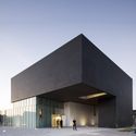
 Courtesy of Miguel Marcelino Courtesy of Miguel Marcelino  Plan Plan From the architect. The museum consists of a completely closed, opaque and abstract box. Just the main façade has a concavity that marks the entrance of the building. It houses a private colection of mechanical music boxes.  Courtesy of Miguel Marcelino Courtesy of Miguel Marcelino The organization is cruciform, around a central patio, that distributes to the buildings four sides. In one side there is the lobby, that works as a vertical distribution space, and to the other sides are three galleries of varying sizes. The transition between each of these four spaces is done through four antechambers.  Courtesy of Miguel Marcelino Courtesy of Miguel Marcelino The result is a box that seen outside looks very elementary, but whose interior dismantle this simplicity: exploring long diagonal perspectives that open as spaces are crossed - letting us see glimpses of galleries in a game of spatial seduction that seeks to maintain the curiosity of the visitor from the beginning to the end of the visit.  Courtesy of Miguel Marcelino Courtesy of Miguel Marcelino  Section Section This posting includes an audio/video/photo media file: Download Now |
| Considering the Airport Terminal of Tomorrow Posted: 18 Jan 2017 08:00 PM PST  Courtesy of Aerial Futures Courtesy of Aerial Futures Aerial Futures, Grounded Visions: Shaping the Airport Terminal of Tomorrow was a two-day symposium held in October 2016 as part of the European Cultural Center's collateral event at the 2016 Venice Biennale. It encouraged discussion about the future of air travel from the perspectives of architecture, design, technology, culture and user experience. The event featured presentations and discussions by the likes of airport architect Curtis Fentress, Nelly Ben Yahoun, Donald Albrecht, Director of the Museum of the City of New York; Anna Gasco, post-doctoral researcher at the ETH-Future Cities Laboratory in Singapore; Jonathan Ledgard, co-founder of the Droneport Project; and Ashok Raiji, Principal at Arup New York.
Keynote: Curtis Fentress, Principal Terminal Designer at Fentress ArchitectsFantastic Infrastructure: 21st Century TerminalsWe are all familiar with current terminal paradigms, from Arrivals to Departures and all of the complex spatial gymnastics in between. What do advances in technology and contemporary demands on air travel infrastructure mean for the terminals of the future - and how do past projects inform current trajectories?
Icons and Engines: Catalysts for Urban DevelopmentThe 21st century has seen an increase in high-profile terminals that act as economic engines and emblematic portals for cities. In an era of global competition between cities – in addition to nations – superior airports have a significant influence. Development –and redevelopment– play a critical role defining the urban and even regional dynamics beyond the airport. How can a single building have cultural, economic and political implications?
Keynote: Nelly Ben Hayoun, award-winning director and experience designerGetting to Departures: User ExperienceArchitecture facilitates the intricate transition between airspace and passengers' much-anticipated destinations. Moving through time and space in airport terminals is still often perceived as more of an obstacle than an enjoyable experience. As interaction with terminal infrastructure increases in frequency and engagement, airports can offer travellers choices to relieve the stress of travel. How should architects balance functional design, digital interfaces, place specificity and comfort to heighten user experiences across the board?
Landing in the World of TomorrowA bit of speculation is essential when we consider the future of airports. Trends and demographic shifts may help forecast the future of air travel and infrastructure. If change is constant on all are fronts, what are the critical considerations when projecting future scenarios? How will architecture adapt to transformations in the aviation industry and the culture of global travel over the next century?
This posting includes an audio/video/photo media file: Download Now |
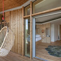
| Eco-lodges_les Echasses / Patrick Arotcharen Architecte Posted: 18 Jan 2017 07:00 PM PST  © Vincent Monthiers © Vincent Monthiers
 © Mathieu Choiselat © Mathieu Choiselat  Site Plan Site Plan From the architect. Right in the heart of the Landes region of France, this hotel installation interacts with a landscaped tableau where human intervention is in dialogue with nature. The first stage of the project consists in transforming the existing lake into a landscape of dunes crowned with slender pines: the dredged sand is heaped up around the edges of the lake in order to create little bays where the bungalows lie. Built in wood, these are characterised by a notably prismatic arrangement which favours openings onto the lake whilst conserving the privacy of the occupants.  © Mathieu Choiselat © Mathieu Choiselat  © Mathieu Choiselat © Mathieu Choiselat The pavilion's oblique lines, as well as the reception building's, form a contrast with the rounded dunes and the linear canopy behind. The harmony between the constructions and the environment is not built on imitation: the architecture and the site are defined by a contrasting homology. Placed over the water that mirrors them, these small, autonomous units are a point in the landscape and allow nature to form a continuous milieu. Different pathways snake between the hills and, through the variety of perspectives on offer on the site, this feeling is confirmed.  © Mathieu Choiselat © Mathieu Choiselat Product Description: The project was developed with the aim of using as many local resources as possible (maritime pines_Landes Forest). Constructed in timber and steel, the material elements respond to the desire to reduce the architectural impact within this landscape.  Detail Detail This posting includes an audio/video/photo media file: Download Now |
| Marubi” National Museum of Photography / Casanova+Hernandez architects Posted: 18 Jan 2017 06:00 PM PST  © Christian Richters © Christian Richters
 Site Plan Site Plan  © Christian Richters © Christian Richters From the architect. In 2013, the Albanian Ministry of Culture envisioned a plan to rebuild the cultural infrastructure reactivating abandoned historical buildings. The Marubi Museum is a pioneer project of this programme. The plan to create the museum has enjoyed an enormous national repercussion because of the historical importance of exhibiting, among others, the photographic legacy created during more than one century by three generations of photographers from the Marubi family.  © Christian Richters © Christian Richters Dialogue between tradition and modernity  © Christian Richters © Christian Richters  Section Section Open, accessible and alive cultural landmark  © Christian Richters © Christian Richters Museum Identity  © Christian Richters © Christian Richters  © Christian Richters © Christian Richters The abstract pattern, which is always mixed with the photos and objects of the collection, becomes the symbol of the museum. It can be recognized at different scales and in several parts of the building such as in the logo of the museum, in the design of the street showcase, in the layout of the functional boxes inside the building, and even in the structure of the new artistic facades of the courtyard that frame the views over the surroundings and filter the light within the building. Marubi National Museum of Photography acquires its own specific identity by linking all spatial, structural, functional, graphic and visual aspects, helping visitors to identify building and collection with a complete, rich and unique experience.  © Christian Richters © Christian Richters  Concept Concept Product Description: The design of the different parts of the museum is based on the abstract pattern inspired by the geometry of the aperture of the photographic camera. This pattern is used on different scales within the building and defines its identity. On the bigger scale, the pattern is used to define the geometry of the curtain walls of the courtyard that frame glasses of three different transparencies. On the smaller scale it defines the geometry of the supporting aluminum cladding system of the functional boxes. The Deko GV cladding system has been adapted specifically to the necessities of the functional boxes in order to allow, on the one hand, the creation of frames to exhibit photos, documents and information texts and, on the other hand, show cases to exhibit objects. Other frames support translucent glasses where there are no pictures or objects behind. This posting includes an audio/video/photo media file: Download Now |
| New Youth Commune / META-Project Posted: 18 Jan 2017 02:00 PM PST  View from basketball court to east facade View from basketball court to east facade
 View from the pathway to the basketball court View from the pathway to the basketball court _copy.jpg?1484541505) Location plan Location plan From the architect. New Youth Commune, a mixed youth community on the edge of Vanke Songhua Lake Resort bordering natural villages, contains 800 people with the upper space for Vanke staff, the middle rented to self-employed townspeople and the ground facilitating camping students and open to surrounding villagers. _copy_2.jpg?1484541396) Sunken playground under the entrance bridge Sunken playground under the entrance bridge Addressing the ant tribe problem, having investigated the mixed dwelling phenomena peculiar to China from hutong, tube-shaped apartment to village-in-city and comprehended the inner dynamics of youth communities, the architect proposes a new spatial paradigm restructuring interpersonal relations in a gesellschaft.  Mountain view from the north side Mountain view from the north side The ordinary residential pattern is mutated into a quartet, externally undulating and internally interlocked. Bridges, stairs and tiered seating around the full-height atriums compose an open-street-like public route connecting all communal spaces for varied daily utilities. Thus, the simple and flexible framework blends innovative spaces into daily lives, encouraging inter-level encounters among the private, shared and collective zones and finally the community growth.  Interior facade in the atrium Interior facade in the atrium The project responds to the hybrid contemporaneity and proposes a new paradigm for community symbiosis: mutual cooperation and positive environmental interaction through inter-spatial sharing based on equality and self-sufficiency – a prototype community for contemporary 'new youths'.  The step seats near the entrance The step seats near the entrance The practice continues [META:HUTONGS] and Reset Apartment, a series of experiments that analyses the spontaneous evolution of urban space production and elicits a valid composite social-cultural-spatial archetype.  Evolution of share-living Typology Evolution of share-living Typology This posting includes an audio/video/photo media file: Download Now |
| Hamyangjae / guga Urban Architecture Posted: 18 Jan 2017 12:00 PM PST  © Yoon Joon-Hwan © Yoon Joon-Hwan
 © Yoon Joon-Hwan © Yoon Joon-Hwan From the architect. This contemporary red brick house embraces Hanok, a traditional Korean architecture, for a family with two children near Seoul. Clients had specific demands for their own house that it should have a restful space for them and a spacious home for their children. A fifth of the population of the entire country now resides in the capital. As a response to the growing demand, it has been inevitable to build tall apartments with less consideration on design to speed up the whole process. Correspondingly, it became the most popular type of living. However, there are also shortages. "Clients told us that they could hardly feel at home in their house. Apartment blocks are famous for noise issues between the floors." Architect continued "Accordingly, activities are highly limited" The identical design and restrained lifestyle now make many inhabitants to find an alternative way to dwell in the city.  © Yoon Joon-Hwan © Yoon Joon-Hwan Embedding Hanok into a contemporary building was a big challenge for the architect. "There were two requests. Firstly, a part of the house should be Hanok. Secondly, it should have Madang, Korean garden, facing south" The contrast between the Hanok part and the contemporary part seems to be prominent. Balancing these two different construction methods was the main concern in this project. "Madang is like a buffer zone to dilute any possible disconnection" said architect. Madang also naturally blends into the living room through the large windows. It functions like a big playground for the children where they can run around all day. This playful moment continues to upstairs where the small library and the study room can be found.  © Yoon Joon-Hwan © Yoon Joon-Hwan  Section Section The three big volumes of Hamyangjae was the manoeuvre to enclose Madang. The architect had to seek an alternative solution that could keep Madang private since having fences is not allowed in the neighbourhood. As a result, the entrance is enlarged that has a terrace on the top and a storage below. The three masses of Hamyangjae makes every side of the building distinctive. From the outside of the entrance, Hanok completely disappears. On the other side, the whole mass splits into three volumes and gives a hint of Hanok. "Hanok unit can be completely detached from the red brick part without any damage" explained the architect.  © Yoon Joon-Hwan © Yoon Joon-Hwan Product Description. Bay window: The bay window was carefully chosen in order to fit with the whole conceptual design. Apart from bringing a strong visual connection, the bay window is able to open from the center to the extremity, allowing a strong physical continuity from the inside to the outside Madang.  © Yoon Joon-Hwan © Yoon Joon-Hwan Traditional design system windows: Windows are important elements in the traditional korean architecture. First, they allow the light to enter in the house while giving a strong privacy to the habitants. Secondly, the type of pattern are related to the inside program and also symbolic to the status of the habitants. Finally, it is also an important factor of the inside atmosphere. In this project the use of a modern system window allowed the project to keep those traditional qualities but also to have a good isolation and ease of use.  © Yoon Joon-Hwan © Yoon Joon-Hwan Wooden floor: Wooden floor is usually need to in the Hanok to symbolize the meeting spaces. The use of the precious material give some importance to those space that we used to call Maru. It is also used to differentiate the meeting space from the individual room called Bang. In this way a Hanok can be seen as an alternating of Maru and Bang. The Maru can also be seen as a threshold which connect the inside space between themselves and also the inside spaces with the outdoor spaces. In this project, the whole Hanok is covered with a modern wooden floor in order to take advantage of the floor heating system which is not compatible with the traditional one.  Plan Plan Granite stone: Granite stone is an important element in the traditional Hanok. They are used for the foundation of the project Gidan and also the wooden columns are standing on a strong piece of stone called Choseok. In this project, in order to fit with the modern life style, we decided to extend the granite stone as the ground material for the whole Madang Korean courtyard. Compared to the originally soil covered Madang, the stone pavement allows the children to play in a clean environment but also multiply the programmatic possibilities. The living room rather than covered with a wooden floor is covered with a stone pavement which highlight the continuity between the Madang to the inside space.  © Yoon Joon-Hwan © Yoon Joon-Hwan Red bricks: The red bricks are an important outside materials for the contemporary and traditional Korean architecture. It is also, usually, used for the urban Hanok. It is then logical to use this material to connect the contemporary and traditional part of the house into a unique ensemble. Hanji paper wall: Hanji paper are used in order to create a limit between spaces. It separate in a subtle way the spaces between them. Those frameless elements, when they are closed, give the feeling that the wall is unified. In the other hand, when opened, they give the feeling that 2 connected spaces look like a unique space. Finally, the slight transparency of the Hanji give an impressive and harmonious atmosphere to the space.  © Yoon Joon-Hwan © Yoon Joon-Hwan This posting includes an audio/video/photo media file: Download Now |
| Mành Mành salon / H&P Architects Posted: 18 Jan 2017 11:00 AM PST _Nguyen_Tien_Thanh_-_(8).jpg?1484698327) © Nguyen TienThanh © Nguyen TienThanh
_Nguyen_Tien_Thanh_-_(17).jpg?1484698546) © Nguyen TienThanh © Nguyen TienThanh  Plan Renovation Plan Renovation From the architect. Mành Mành salon is renovated from a deteriorated hair dressing salon in a populous community in Van Quan urban area. The project develops an approach to reuse available materials such as door, glass, table and chair, brick, low-quality wood,.. to create a fresh and distinctive but friendlier space to the nature. _Nguyen_Tien_Thanh_-_(13).jpg?1484698468) © Nguyen TienThanh © Nguyen TienThanh  Diagram Diagram The ordinary and simple charm at street hairdresser's in Hanoi, which is closely associated with Trees giving wide shade and Old brick walls, inspires designers to create an unusual but familiar space- a space suggesting the idea of A long hair as well as Mành Mành climbing plant garden or Cissus sicyoides pergola (a quite popular climbing plant in Vietnam, also known as Princess vine, Millionaire vine and Curtain Ivy) with its long roots covering the space underneath. _Nguyen_Tien_Thanh_-_(9).jpg?1484698388) © Nguyen TienThanh © Nguyen TienThanh Highlights of the project are some 200 thousand wooden beads (diameter d=2.7cm) recycled from low-quality wood (of 2 types: colorless and color of vine fruits at their ripeness). These wooden beads are chained into strings of various lengths (11 beads/ string in average) to produce effects on human senses of zigzag–styled ceiling and beaded curtain separating the space underneath. _Nguyen_Tien_Thanh_-_(10).jpg?1484698406) © Nguyen TienThanh © Nguyen TienThanh Five human senses will be awoken in Mành Mành climbing plant garden by gentle light (sight), soft rustle among the beads (hearing), blend of light fragrance of leaves and beads (smell) while one is there, sipping at his tea (taste), and hairdresser's skill fulness that brings about comfort (touch) and relaxation to customers upon their experiencing the hair service. Like Architecture, Human will become more Beautiful and Healthier once he lives in a harmony with the Nature. _Nguyen_Tien_Thanh_-_(20).jpg?1484698728) © Nguyen TienThanh © Nguyen TienThanh This posting includes an audio/video/photo media file: Download Now |
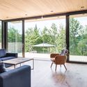
| Estrade Residence / MU Architecture Posted: 18 Jan 2017 09:00 AM PST  © Ulysse Lemerise Bouchard (YUL Photo) © Ulysse Lemerise Bouchard (YUL Photo)
 © Ulysse Lemerise Bouchard (YUL Photo) © Ulysse Lemerise Bouchard (YUL Photo) From the architect. Located in the verdant Laurentians in Quebec, the Estrade Residence reveals itself discretely on the shores of Lac de la Cabane in St-Adolphe d'Howard. It is by studying the steep and rocky topography of the place that MU Architecture decided to highlight the peculiarities of this site with an adapted and captivating architectural intervention. The first objective was to design a house in total harmony with its environment.  © Ulysse Lemerise Bouchard (YUL Photo) © Ulysse Lemerise Bouchard (YUL Photo)  Floor Plan Floor Plan The singular topography of the project takes the form of a rocky crest that plunges into the lake. In order to create a discovery path, a series of animated volumes come to anchor, skirt or levitate on this unevenness. Their staggered and superimposed layout generates a multitude of terraces that embrace the site. This deployment creates a rich dialogue between architecture and the wild landscape. The Estrade gives birth to long walls of natural stones which seem to be born from the depth of the ground. As they seem to project themselves towards the landscape, these long walls generate and protect the apartments on the ground floor while giving users direct access to the land bellow. The rocks extracted during excavation were reused in the landscaping around the house, becoming also actors of this architectural narrative.  © Ulysse Lemerise Bouchard (YUL Photo) © Ulysse Lemerise Bouchard (YUL Photo) Discreet and intriguing thanks to its blind masses; the Estrade Residence is revealed slowly, volume after volume. A wide recess under what seems to be a floating cube invites us to penetrate into the place. From the entrance, an aerial and magisterial staircase welcomes the visitor and unfolds in a vast luminous space. Lined up precisely on large openings, it connects all levels in asymmetric flights. The absence of columns in the design makes the glass railings levitate, thus giving the impression of great lightness. Minimalism and attention to detail bring to the residence a certain purity and comfort that immediately gives the tone to the project. Each corridor leads to a luminous opening and makes us discover a larger and more complex residence than at first sight. The spaces offer both conviviality and intimacy through a different atmosphere at each level.  © Ulysse Lemerise Bouchard (YUL Photo) © Ulysse Lemerise Bouchard (YUL Photo) At ground floor level, the open space is well defined and offers breathtaking views of the lake. Bathed in natural light the main floor ends with a veranda that extends the kitchen to the outside. This large volume of the ground floor stretches perpendicularly to the natural ridge so as to maximize the panorama over more than 60 feet in length. The black ash coloured kitchen and integrated furniture contrasts with the whiteness of the walls and breaks the monochromy. In addition, the double-sided fireplace located in the center of the common room accentuates the warm feel of the place. The floors, covered with natural wood as well as the terrace allows for a seamless and subtle transition from the interior to the exterior. This main volume cladded with natural cedar forms the heart of the project and brings the family together. It marks the transition between the activity of the lower spaces devoted to children and the calm of the parental suite upstairs.  © Ulysse Lemerise Bouchard (YUL Photo) © Ulysse Lemerise Bouchard (YUL Photo) At the top, a second black cedar mass dramatically overlooks the entrance and dominates the surroundings. It houses the master's apartment, complete with a bathroom and a large walk-in.  © Ulysse Lemerise Bouchard (YUL Photo) © Ulysse Lemerise Bouchard (YUL Photo) The volumetric and vernacular aspect of the Estrade residence combined with its materiality testifies to an architectural writing that composes with its environment. This tripartite composition, spread over several levels, blends with nature following the seasons. Moreover, the articulation of its areas within its masses integrates the house softly and reduces the impact of its 3600sq.ft. Its spatial quality is due to the comfort and feeling of well-being, reflecting the image of the tranquility of the place.  © Ulysse Lemerise Bouchard (YUL Photo) © Ulysse Lemerise Bouchard (YUL Photo) This posting includes an audio/video/photo media file: Download Now |
| Foster + Partners to Masterplan New Indian State Capital Posted: 18 Jan 2017 08:10 AM PST  The site of the future Amavarati. Image The site of the future Amavarati. Image Foster + Partners has been selected as the winners of an international competition to design a new £500 million capital for the state of Andhra Pradesh in southeastern India. The brief calls for a new 365 hectare masterplan that will serve as a new municipal capital for India's eighth largest state, which lost its previous capital, Hyderabad, when state lines were redrawn two years ago. The new 740,000 square meter civic core will be located on the southern bank of the Krishna River near the existing cities of Guntur and Vijayawada, and will feature an assembly building, a secretariat, and offices for departments leaders, as well as ministerial residences and guest houses. Following the competition win, Foster + Partners will now work with Mumbai architect Hafeez Contractor to finalize plans. The project is expected to be completed by 2022. The new capital complex will serve as the centerpiece of a ground-up 200 square kilometer settlement to be known as Amaravati, which is expected to take up to 25 years to complete. News via Architect's Journal. This posting includes an audio/video/photo media file: Download Now |
| Posted: 18 Jan 2017 07:00 AM PST  © Fernando Alda © Fernando Alda
 © Fernando Alda © Fernando Alda From the architect. We have designed the extension for a single family house, which is settled in an urban fabric that has been consolidated since long ago. The existing atmosphere of the neighbourhood -facades, colors, materials, trees- is legally protected by urban regulations. The design also faces the wishes of the client to take the maximum profit from the spare square meters, always within a low budget and some reasonable programmatic requirements. There are also some specific urban regulations on regard to the new volumes and its aesthetics that we have to deal with, along with the inherent technological restrictions of a small construction company from Southern Spain. All these issues come together to build up a way of working, a way we feel comfortable with, which we use to call "Critical Pragmatism"  © Fernando Alda © Fernando Alda Through this approach we build a project of the tangible matter, a project that regards all contingencies as new possibilities and potentialities, and never as an abdication. We then combine all contingencies into one which is the construction itself.  © Fernando Alda © Fernando Alda Our proposal respects the personality and context of the existing building by either changing nothing (we avoid modifying its original structure and external aesthetics) or changing everything (adopting a completely different language for the design of the extension). Through the reverberation of curves we also gain visual coherence, some coherence that works for us in the design process, but also for the client in the understanding of the project. To simply put it, the curves help to indicate the new elements and spaces added.  Sections Sections The result is a project slowly developed and slowly built. Too slowy probably, and we are perfectly aware of the fact that this is some kind of luxury nowadays. This methodology of work, within the current economical situation of the profession, heads unavoidably towards extinction. This posting includes an audio/video/photo media file: Download Now |
| Lahdelma & Mahlamäki Wins Competition for Housing and Transportation Complex in Finland Posted: 18 Jan 2017 06:00 AM PST  View from City Center. Visualization by Brick Visual. Courtesy of Lahdelma & Mahlamäki View from City Center. Visualization by Brick Visual. Courtesy of Lahdelma & Mahlamäki Lahdelma & Mahlamäki, with associate architect Arkkitehdit m3, has won a competition for the design of a new Travel Services Center and residential block to be located in the city of Oulu, Finland. Located between the low-lying neighborhood of Puu-Raksila and the high-rising city center, the complex will connect districts through large, arching openings puncturing through a dynamic, horizontal profile, while providing new housing for the city.  View from Puu-Raksila. Visualization by Brick Visual. Courtesy of Lahdelma & Mahlamäki View from Puu-Raksila. Visualization by Brick Visual. Courtesy of Lahdelma & Mahlamäki The heart of the development will be the Travel Services Center and its two public open urban spaces. Here, two large openings in the triangular profile provide access to a bus terminal, train and bus passenger services, a multipurpose hall for sports and culture, a hotel, and shopping and restaurant areas. "The curvilinear shapes of the Travel Services Centre and the multi-arena belonging to it radiate the impact of their urban image far beyond both sides of the railway," explain the architects. "The Travel Services Centre also forms a natural hub of public transport, where it is made easy to change from one transport mode to another."  Inside the Travel Service Center. Visualization by Brick Visual. Courtesy of Lahdelma & Mahlamäki Inside the Travel Service Center. Visualization by Brick Visual. Courtesy of Lahdelma & Mahlamäki Extending from the southwest end of the Travel Services Center, three courtyard typology housing blocks will combine the scale of nearby apartment blocks and the architecture of small-scale residential buildings. The blocks will reach up to eight floors, creating wind-protected communal spaces within. Employing a significant change in elevation, each face of the building responds to its corresponding neighborhood in scale: towards Puu-Raksila, the building meets datum lines established by existing buildings, while to the city, the hub's distinctive profile will stand out along the skyline.  Site Plan. Visualization by Brick Visual. Courtesy of Lahdelma & Mahlamäki Site Plan. Visualization by Brick Visual. Courtesy of Lahdelma & Mahlamäki Gross floor areas Residential blocks: 65,000 square meters (700,000 square feet) News via Lahdelma & Mahlamäki. This posting includes an audio/video/photo media file: Download Now |
| Gdanski Business Center / E&L Architects + Hermanowicz Rewski Architects Posted: 18 Jan 2017 05:00 AM PST  © HB Reavis Poland © HB Reavis Poland
 © HB Reavis Poland © HB Reavis Poland From the architect. Gdanski Business Center comprises four office buildings totalling approximately 100,000 sq m of modern Class A office space. HB Reavis broke ground on the first of the complex's four buildings in 2012. Since then, each distinctly designed standalone building has contributed to brownfield revival of this former Warsaw bus depot area. The first phase designed by E&L Architects has been delivered in 2014, while the second phase created by Hermanowicz Rewski Architects has been completed in 2016. Gdanski Business Centre is home to over 9600 employees working across tech, media, shared service and finance sectors. More than just an office compound, this is a vibrant, mixed-use offering that seamlessly blends in with the surrounding residential neighbourhood.  © HB Reavis Poland © HB Reavis Poland Apart from the excellent accessibility, employees benefit also from a wide range of amenities including shops, bars and restaurants available in the close vicinity. Additionally, HB Reavis has provided a kindergarten and a dedicated playground for employees and a green courtyard that is open to the public. Roof-top terraces are also available to buildings' tenants.  © HB Reavis Poland © HB Reavis Poland The office complex is ideally located in the highly sought-after city fringe of Warsaw, with excellent communication links just minutes away allowing staff to easily get to work and to meetings. It is considered the best connected office complex in Warsaw, with unrivalled access to public transportation due to its close proximity to the Dworzec Gdanski metro station, numerous bus and tram stops, Warszawa Gdanska railway station and with the municipal rental bikes Veturilo located nearby. The entire complex has been delivered in line with the requirement of sustainable BREEAM "Excellent" certification.  © HB Reavis Poland © HB Reavis Poland This posting includes an audio/video/photo media file: Download Now |
| Snøhetta Designs World’s Northernmost Energy Positive Building in Norway Posted: 18 Jan 2017 04:10 AM PST A country known for economic dependency on its rich oil deposits, Norway is now looking toward the future of energy production: net-positive architecture. Taking the lead in this initiative, developer Emil Eriksrød has commissioned American-Norwegian firm Snøhetta to design Norway's first energy positive building, Powerhouse Telemark, a 6,500 square meter (70,000 square foot) office building located in the tiny Norwegian town of Porsgrunn, home to just 35,000 people. When completed, it will be the world's northernmost plus-energy building.  © Loft Visual Group/Snøhetta © Loft Visual Group/Snøhetta The form of the 11-story building is dictated by site and environmental conditions, resulting in a diamond-shaped structure optimized for capturing and retaining solar energy. A system of heat exchangers and heat pumps will also contribute to producing energy for the building.  © Loft Visual Group/Snøhetta © Loft Visual Group/Snøhetta "Powerhouse Telemark will put Norway on the map when it comes to energy solutions and architecture," said Snøhetta founding partner Kjetil Trædal Thorsen. "The future is all about thinking big, bold and long term, and we need someone to pave the way. With its innovative solutions and design, we believe this building will inspire commercial real estate developers worldwide to push the limits of what buildings can accomplish."  © Loft Visual Group/Snøhetta © Loft Visual Group/Snøhetta Tenants will have access to modern office facilities, a foyer, gym, cafeteria and a open, vegetated roof terrace with views into town and of the water that the developers are considering opening up for public access.  © Loft Visual Group/Snøhetta © Loft Visual Group/Snøhetta "I hope we will be plagiarised and copied, replicated in all seven continents," said Eriksrød, CEO of R8 Property. "This building should do wonders in lowering the bar for daring to do both spectacular and environmentally forward buildings, hopefully in a combination. Just imagine, when Porsgrunn has the customer base for such a building, imagine how many other places that have the same potential. There are tens of thousands of cities with a bigger population in the world," Eriksrød continued.  © Loft Visual Group/Snøhetta © Loft Visual Group/Snøhetta The Powerhouse Telemark team will also include real estate company Entra Eiendom, construction and development company Skanska, environmental NGO ZERO, aluminium company Hydro, aluminium profile company Sapa and consulting firm Asplan Viak. Together they will create a structure that is aimed at achieving a energy-positive metric over a life cycle of 60 years.  © Loft Visual Group/Snøhetta © Loft Visual Group/Snøhetta "The combination of extreme energy performance and a favourable indoor climate, low environmental impact and robust solutions at commercial terms requires a different approach than in most traditional building projects. Buildings that produce the same or a greater amount of energy than they consume could be an important contribution to reducing global energy consumption – and consequently also greenhouse gas emissions," says Kim Robert Lisø, Chief Innovation Officer at Skanska and Managing Director of the Powerhouse collaboration.  © Loft Visual Group/Snøhetta © Loft Visual Group/Snøhetta Initial cost estimates for the project come in at $17 million USD. The project is scheduled for completion in 2019. News via R8 Group. This posting includes an audio/video/photo media file: Download Now |
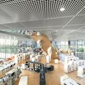
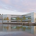
| Bibliothèque Alexis de Tocqueville / OMA + Barcode Architects Posted: 18 Jan 2017 03:12 AM PST  © Delfino Sisto Legnani and Marco Cappelletti © Delfino Sisto Legnani and Marco Cappelletti
 © Philippe Ruault © Philippe Ruault  Level 00 Level 00 From the architect. Bibliothèque Alexis de Tocqueville is a public library for the metropolitan region Caen la Mer in Normandy, France. The 12,000 m2 multimedia library is located at the tip of the peninsula that extends out from the city of Caen to the English Channel. Its key position – between the city's historic core and an area of Caen that is being developed – supports the city's ambition for the library to become a new civic center. The library's glass facade visually connects the adjacent park, pedestrian pathway and waterfront plaza to the interior and together with two large ground floor entrances at both sides of the building, enables a fluid interaction of the library with its surroundings. On the upper floors, the urban belvedere provides unobstructed views in all four directions.  © Delfino Sisto Legnani and Marco Cappelletti © Delfino Sisto Legnani and Marco Cappelletti
The building's cross-shaped design responds to the urban context, with each of the four protruding planes of the cross pointing to a landmark point in Caen: to the historical sites of the Abbaye-aux-Dames in the north and the Abbaye- aux-Hommes in the west, to the central train station in the south, and to the area of new construction in the east. At the same time, the geometry of two intersecting axes is informed by the library's programmatic logic. The four planes, each housing a pedagogic discipline -- human sciences, science and technology, literature, and the arts -- meet in a large reading room on the first floor, to encourage maximum flow between the departments. This main library space is carved out of the center of the solid cross, defining the building's design as an opposition between mass and void.  © Delfino Sisto Legnani and Marco Cappelletti © Delfino Sisto Legnani and Marco Cappelletti  Longitudinal Sections Longitudinal Sections As a civic center where people meet and share knowledge and information, public space is at the core of the library's design. At the entrance level on the ground floor, there is a large open space with a press kiosk and access points to an auditorium with 150 seats, an exhibition space and a restaurant with an outdoor terrace on the waterfront. The first floor contains a large variety of work and reading spaces and 120,000 documents, with physical and digital books placed side-by-side in the bookshelves. The digital extension of the physical collections, integrated within the bookshelves, is one of the new multimedia features of the library. The top floor of the library is occupied by a space for children, as well as offices and logistics. The archive and special historical collections are stored in safe and dry conditions in the concrete basement, protected from the surrounding water by an innovative waterproof membrane applied on the inner side of the concrete walls.  © Delfino Sisto Legnani and Marco Cappelletti © Delfino Sisto Legnani and Marco Cappelletti This posting includes an audio/video/photo media file: Download Now |
| Office Building Kennedy-Wisconsin / Alemparte-Morelli y Asociados Arquitectos Posted: 18 Jan 2017 03:00 AM PST  © Marcos Mendizabal © Marcos Mendizabal
 © Marcos Mendizabal © Marcos Mendizabal From the architect. The edificatory model contained in the norm of the Decree of the Regulatorty Plan of the Vitacura Municipality for Kennedy Ave. in the section of Manquehue-Padre Hurtado, defines a typology of isolated medium height building, this condition leads us to conceive this commission as an architectural piece which by the addition to others may have the capacity to contribute to the configuration of an urban course on a large scale such as is Kennedy Ave.  First Floor Plan First Floor Plan The land in particular, its corner condition and its buildable area give us a volume of 9 levels plus mechanical floor, with a height of 35.62 meters., and a plant of 21.30 meters per 36.00 meters; these dimensions produce a rather flat volume that proportionally to its height displaces a considerable mass; Our interest arises from the challenge of managing this condition regarding the city; how to integrate a prismatic volume which performs its activity(services) that throw itself into, with the city?; for this we developed two significant operations: first, to provide the building envelope with relevant degrees of transparency to enable the citizen, the observer to understand , the activity that takes place in the building without thereby lose the conditionsof energy conservation, efficient use of economic resources, which we are obliged due to the high environmental comfort standard required for office buildings.  © Marcos Mendizabal © Marcos Mendizabal Consequently, there has been designed a skin type "window belt" between slabs with an exterior structuring made of laminated crystal ribs that replace the traditional aluminum "mullions" on the inside, to the above is added a horizontal division in tranches of two levels alternating the vertical elements of facade achieving a "vibrato" of the south facade, east and north, the degree of reflectivity of the glass in "soft code" does meet the requested standars of the project so the facade contribute to control thermal gain thus reducing the initial investment in climate mechanical equipment.  © Marcos Mendizabal © Marcos Mendizabal Towards the west facade the building envelope generates a double skin based on aluminum lattice rotated in relation to the facade plane thus producing a shadow box adequate to be protected against excess light radiation generated by this orientation at the end of the day.  © Marcos Mendizabal © Marcos Mendizabal The second operation consisted of set free all the outdoor spaces, first level to public use, eliminating cars from the surface, thus providing the peaton a better offer of accessibility through a continuous succession of spaces such hard squares to the program of commercial stores in this level and in the plinth.
This posting includes an audio/video/photo media file: Download Now |
| Zaha Hadid Leaves Net Fortune of £67 Million Posted: 18 Jan 2017 02:15 AM PST  Dame Zaha Hadid. Image © Brigitte Lacombe Dame Zaha Hadid. Image © Brigitte Lacombe As reported by The Guardian and the Architects' Journal, the last will and testament of the late Zaha Hadid—who passed away in March 2016 aged 65—has revealed that the Dame of the British Empire and Principal of Zaha Hadid Architects had a net fortune of £67,249,458 (around $82.5million or €77million). This sum, which was filed in the UK High Court in December last year, will be bequeathed in small parts to nieces and nephews (£1.7million), her brother Haytham Hadid (£0.5million), and her business partner Patrik Schumacher (£0.5million). At the time of her death, Hadid was unmarried with no children. Her practice, of which she acted as sole owner, has been left in trust. Her executors—Patrik Schumacher, developer Lord Peter Palumbo, artist Brian Clarke, and her niece Rana Hadid—have been given powers to distribute "all or some of the income from her several businesses [...] to a wide range of parties." This includes the Zaha Hadid Foundation. News via The Guardian, Architects' Journal This posting includes an audio/video/photo media file: Download Now |
| The Ultimate Guide to Revit Shortcuts Posted: 18 Jan 2017 01:30 AM PST  This article was originally published on ArchSmarter. For all the work you do in Revit, there's a keyboard shortcut that can help you do it faster. Here's a roundup featuring some of my favorite Revit keyboard shortcuts to create and organize your model. Keep reading to learn how to create your own shortcuts. This shortcut cheat sheet is also available in a convenient pdf form; simply sign up here to download it. Create and Modify ElementsCS – When element is selected, creates new similar element DL – Create detail lines DR – Create Door M + Space – Match properties MV – Move UP – Unpin RM – Create room RT – Insert room tag SL – Split elements Select ElementsArrow Keys – Nudges the selected element Shift + Arrow – Nudges the selected element 10x. CTRL – Select multiple elements MD – Activate the Modify tool TAB – Cycle through multiple overlapping elements SHIFT + TAB – Reverse the order of TAB cycling ViewsHI – Isolate element HH – Hide element HC – Hide category SD – Shaded with edges TL – Thin Lines VV – Visibility / Graphics dialog for the current view WF – Wire frame ZE – Zoom to fit SHIFT + Middle Mouse – Orbit in 3D views or pan in 2D views. Selecting an object before pressing SHIFT + Middle Mouse will cause the orbit to rotate around the selected object. File OperationsCTRL + O – Open a new file CTRL + N – Create a new project file CTRL + S – Save the current file MiscellaneousALT – Activates the keyboard designation for all the items on the interface. Might be useful if your mouse kicks the bucket before you've saved your file. Create Your Own Revit ShortcutsYou can easily program your own Revit keyboard shortcuts. To do so, go to View > User Interface > Keyboard Shortcuts or type "KS".  View > User Interface > Keyboard Shortcuts. Image Courtesy of ArchSmarter View > User Interface > Keyboard Shortcuts. Image Courtesy of ArchSmarter This will open the Keyboard Shortcuts dialog box. 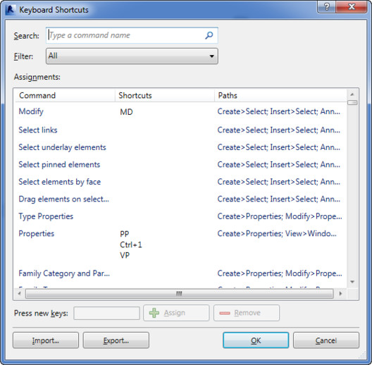 Keyboard Shortcuts dialog. Image Courtesy of ArchSmarter Keyboard Shortcuts dialog. Image Courtesy of ArchSmarter All of the default keyboard shortcuts are listed. Any shortcut listed in gray is a system shortcut and cannot be changed. To add a shortcut, find the command in the "Command" column or enter the command name in the "Search" field. Once you've selected the command, enter the shortcut combination in the "Press new keys" text box then click the "Assign" button. You have a lot of flexibility assigning shortcuts. A single command can have multiple shortcuts. Likewise, a single shortcut can be used on multiple commands. In this case, you use the arrow keys to cycle through the commands as displayed in the status bar. Once you have the command you want, press the space bar to execute the command. Some custom shortcuts you might want to consider are: 33 – Default 3D View AA – Activate view DD – Deactivate view JJ – Join geometry ML – Manage Links MM – Macro Manager SAV – Select all instances in view SAS – Select all instances in project WS – Worksets WW – Create walls Want some more suggestions? Check out this discussion on LinkedIn. Naming Your ShortcutsSpeed is king when it comes to naming your shortcuts. Consider defining your shortcuts using the same letter or letters closely located on the keyboard. JJ for Join Geometry or AA for Activate View are two good examples. You can even create three or four letter shortcuts if you need similarly named shortcuts. You could define WW for Create Wall and WWW for Worksets. This method minimizes the amount of hunting and pecking required to find your shortcuts. It lets you keep one hand on the keyboard and the other on the mouse. So how about you? How do you save time in Revit? What are your favorite shortcuts? You can also download a convenient PDF of these shortcuts – simply sign up here to get the PDF, the ArchSmarter Newsletter, and free access to the ArchSmarter Toolbox, a library of time-saving Revit tools. This posting includes an audio/video/photo media file: Download Now |
| Bourgainvile 2 House / Solange Cálio Arquitetos Posted: 18 Jan 2017 01:00 AM PST  © MCA Estudio © MCA Estudio
 © MCA Estudio © MCA Estudio  Section Section From the architect. Within a small condominium with 24 lots, in S.J.Rio Preto, the architect Solange Cálio chose a lot of 1,100 m2, to make her home, for family and friends. The main idea was to design a project based on the desire to be together and enjoy the company of the two children and the husband. The concept was achieved through integration between environments.  © MCA Estudio © MCA Estudio The architecture project was born along with the landscaping. Through large gaps the internal and external part of the house has total union, and brings natural lighting into the house  © MCA Estudio © MCA Estudio The house has 3 suites, being 2 of the children, the closest, and the double, near the balcony, which provides privacy and warmth. The floor in cumaru follows from the entrance of the house to the pool, on the deck. In the kitchen was placed glassy insert, only in the wet area, in front of the work bench.  © MCA Estudio © MCA Estudio This posting includes an audio/video/photo media file: Download Now |
| Guide to Getting Your Work Published Posted: 18 Jan 2017 12:00 AM PST
As editors on the Projects Team at ArchDaily, we wanted to reflect on the projects published in 2016—and, based on those submissions, to consider what we hope to see from the submissions we will publish in 2017. During 2016, the projects we published had a high level of visual impact. Axonometric views were part of the vast majority of our publications, democratizing understanding by creating easily accessible views which closely resemble reality. Secondly, the development of immersive video technology has allowed us to publish full 360-degree tours through the interiors of works of different sizes, generating images which are increasingly representative of the physical reality of the work in question. In general terms, the graphic representation of published projects has shown a user-oriented approach, typically using methods that eliminate the barriers of technical representation to generate universal participation. However, this graphical progress towards transmitting ideas in a clear way has not, on the whole, been reflected in the texts that accompany published works. We are now hoping to publish works whose graphics take into account specific contextual situations. As Massimo Scolari discusses in his book "Oblique Drawings":
We expect for each work to be represented by drawing techniques selected not only for their aesthetic effects, but instead because they reflect the ideology of the architect—since it is not the same to use, for example, an axonometric perspective with parallel projection as it is to use an oblique projection. In reference to texts, we seek to promote descriptions which give a complete understanding of the work while clearly highlighting the project's main aspects, using references if necessary to engage the reader through reflection on the work itself and the proposed design decisions. The text as a catalyst for thoughtVila Matilde House / Terra e Tuma Arquitetos Associados We seek to publish clear and objective project texts that reveal the fundamental aspects of each project in a coherent way, capable of communicating the essential information to the reader and inviting them to create opinions about the work. Here are some good examples we received in 2016: Estonian National Museum / DGT Architects (Dorell.Ghotmeh.Tane) Images as a way of thinking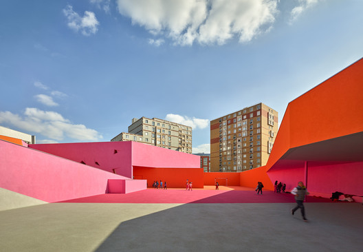 'Simone Veil' Group of Schools in Colombes / Dominique Coulon & associés. Image © Eugeni Pons 'Simone Veil' Group of Schools in Colombes / Dominique Coulon & associés. Image © Eugeni Pons Photographs:  The Bahá'í Temple of South America by Nico Saieh. Image © Nico Saieh The Bahá'í Temple of South America by Nico Saieh. Image © Nico Saieh  Diamond Island Community Center / Vo Trong Nghia Architects. Image © Hiroyuki Oki Diamond Island Community Center / Vo Trong Nghia Architects. Image © Hiroyuki Oki Plans and drawings:  Courtesy of fala atelier Courtesy of fala atelier This posting includes an audio/video/photo media file: Download Now |
| Get to Know the Projects of Grafton Architects, Directors of the 2018 Venice Biennale Posted: 17 Jan 2017 10:00 PM PST  Yesterday, the Board of La Biennale di Venezia appointed Yvonne Farrell and Shelley McNamara of Grafton Architects as curators of the 2018 Venice Architecture Biennale. Farrell and McNamara established Grafton Architects in 1978. They have held the Kenzo Tange Chair at Harvard GSD and the Louis Kahn Chair at Yale University. The pair has also been invited as visiting teachers at EPFL in Lausanne and the Accademia d'Archittettura, in Mendrisio, where they were appointed as teachers in 2013, in addition to visiting several other universities worldwide for lectures and crits. At the end of last year the Royal Institute of British Architects (RIBA) awarded their UTEC Engineering and Technology University - UTEC project with the first RIBA International Prize, hailing it for "setting a new global standard for architectural achievement." The award was judged by a grand jury chaired by Richard Rogers. In addition to UTEC, you can see all of Grafton Architects' projects featured on ArchDaily via the links below: Engineering and Technology University - UTEC / Grafton Architects + Shell Arquitectos.jpg?1484674663) © Shell Arquitectos © Shell Arquitectos .jpg?1484674688) Engineering and Technology University - UTEC Engineering and Technology University - UTEC Waterloo Lane / Grafton Architects © Ros Kavanagh © Ros Kavanagh  Waterloo Lane Waterloo Lane University of Limerick Medical School / Grafton Architects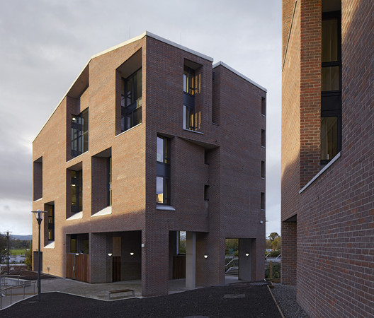 © Dennis Gilbert © Dennis Gilbert  University of Limerick Medical School University of Limerick Medical School Solstice Arts Centre / Grafton Architects © Ros Kavanagh © Ros Kavanagh .jpg?1484674695) Solstice Arts Centre Solstice Arts Centre "Sensing Spaces" Installation / Grafton Architects Installation by Grafton Architects © Royal Academy of Arts, London, 2014. Image © James Harris Installation by Grafton Architects © Royal Academy of Arts, London, 2014. Image © James Harris  Installation by Grafton Architects © Royal Academy of Arts, London, 2014. Image © James Harris Installation by Grafton Architects © Royal Academy of Arts, London, 2014. Image © James Harris This posting includes an audio/video/photo media file: Download Now |
| You are subscribed to email updates from ArchDaily. To stop receiving these emails, you may unsubscribe now. | Email delivery powered by Google |
| Google Inc., 1600 Amphitheatre Parkway, Mountain View, CA 94043, United States | |




_(1)_copy.jpg?1484541686)


_Nguyen_Tien_Thanh_-_(13).jpg?1484698468)
_Nguyen_Tien_Thanh_-_(11).jpg?1484698431)
_Nguyen_Tien_Thanh_-_(29).jpg?1484698911)
_Nguyen_Tien_Thanh_-_(3).jpg?1484698233)






.jpg?1483037626)




.jpg?1484674663)
Nema komentara:
Objavi komentar