Arch Daily |
- Dra. Campoy Dental Clinic / Jaime Sepulcre Bernad
- Sunbeams Music Centre / MawsonKerr Architects
- Enjoy Concrete HQ / Govaert & Vanhoutte Architects
- Córdoba-Flat / Cadaval & Solà-Morales
- 13 Spectacular Living Roofs in Detail
- Detail: Washrooms, Restrooms, Bathrooms, Lavatories, and Toilets
- The Dunn House / The Practice of Everyday Design
- 13 Stunning Inner Courtyards
- 16 CAD Files of Skylights and Light Tubes Available for Your Next Project
- Spazio Lilt / Ottavio Di Blasi & Partners
- The 10 Best Global* Architecture Projects of 2016 (*Asia, Africa and South America Not Excluded)
| Dra. Campoy Dental Clinic / Jaime Sepulcre Bernad Posted: 15 Jan 2017 09:00 PM PST  © David Frutos © David Frutos
 © David Frutos © David Frutos From the architect. On a perfectly square diaphanous room -15 x 15 m- with four central pillars, the project proposes the structuring of the future clinic in three programmatic bands of very similar proportions:  Sections Sections Waiting Area: The first band is the most public, which is accessed and basically contains the reception and a large waiting room. All this generous space of reception and waiting opens its views towards an outer square through the great circles that make up the facade. The reception, organized in a circular piece of furniture, becomes the centerpiece of this first space and from it is controlled its operation. After the reception, there is a small administration office and a small relaxation room.  © David Frutos © David Frutos Dental Space: The most intimate and protected part of the clinic is the properly clinical band that appears alongside the back facade facing a boulevard. This dental care space is composed of a battery of five cabinets connected to each other visually. In this band also appears a secondary access for exclusive use of the personnel.  © David Frutos © David Frutos Server Area: Finally, between the most extrovert and the more introverted space appears an intermediate band that makes of filter and that contains all the uses properly servants. This servant band is carried out by the sterilization room around which the functioning of the dental offices gravitates. In this band are also the ray room, the laboratory, the engine room, the staff room, the wardrobe, the office of the doctor and the toilets for patients.  © David Frutos © David Frutos Three materials: Three material ideas formalize this space with vocation of continuous space - constant height 2.70 m-: 1 / The idea of achieving maximum transparency through the use of "glass"; 2 / The idea that the only pieces that appear loose are the three boxes that make up the intermediate band and that materialize like metal boxes, of "aluminum"; And 3 / the idea that the whole plane of the ground is a single material, continuous, and warm, human, "wood" - which is finally a good laminate-. And the rest, white.  © David Frutos © David Frutos Urban Logo: The idea for the facade was to take a fragment of the logo of the clinic and expand it to scale city. The new facade therefore relies on a corporate image that was already consolidated and now acquires an urban scene size.  © David Frutos © David Frutos This posting includes an audio/video/photo media file: Download Now |
| Sunbeams Music Centre / MawsonKerr Architects Posted: 15 Jan 2017 07:00 PM PST  © Simon Kennedy Photography © Simon Kennedy Photography
 © Simon Kennedy Photography © Simon Kennedy Photography Completion of the £2.0 million Sunbeams Music Centre marks a significant milestone in an extraordinary journey for Sunbeams Music Trust and Newcastle based MawsonKerr Architects.  © Simon Kennedy Photography © Simon Kennedy Photography This journey began 12 years ago as a university thesis project for MawsonKerr director Will Mawson then studying the charity for his final year project at Newcastle University; in an unusual turn of events this became a live project following unanimous approval by the board of trustees.  Pencil Render Pencil Render Established in 1992, Sunbeams Music Trust deliver their 'Music For Life' programme to tens of thousands of needing members of society each year and were eager for a home.  © Simon Kennedy Photography © Simon Kennedy Photography A green field site with transformational therapeutic qualities was generously donated overlooking Ullswater Valley near Penrith following which a lengthy fund raising period began for the centre including a number of sponsored "endurance challenges" by MawsonKerr and friends of the charity such as a Forrest Gump style 24 hour coast to coast run.  Floor Plan Floor Plan MawsonKerr's resultant building is designed to embody musical qualities of rhythm, timbre and melody within the landscape; shaped along the curved natural contours it grows with a crescendo at the canopy to the eastern main entrance. Inserted along the rhythmical elevation are a series of playful introverted volumes housing key activities.  © Simon Kennedy Photography © Simon Kennedy Photography The architecture is intended to reflect synthesis between the natural context, a contemporary vernacular and musical union; housing several unique functions it is also importantly an outward facing advert for the charity.  © Simon Kennedy Photography © Simon Kennedy Photography External envelope materials are primarily slate stone clad spine walls with an oak façade to the main curved elevation, a series of lozenge shaped cedar shingle clad volumes all topped with an extensive green roof; many of these materials continue internally to create a rich interior texture. Radially spanning glulam beams run with a rhythm throughout the building creating the projecting eaves and entrance canopy.  © Simon Kennedy Photography © Simon Kennedy Photography The primary function of the centre is providing music therapy, in acoustically treated spaces specifically designed for group sessions or one on one. Secondly the important administrative requirement for a growing charity like Sunbeams Music Trust and thirdly the centre allows promotion of Sunbeams work throughout with exhibitions open to the public and music concerts generating funds for the programmes they run.  © Simon Kennedy Photography © Simon Kennedy Photography There is a strong sustainable agenda to the design based on first principles; the six hundred square metre Sunbeams Music Centre is predominantly naturally ventilated, naturally lit and the heating provided by ground source heat pump. U-values are to passivhaus standards with a large amount of locally sourced sheep wool and carefully designed south facing elevation to limit overheating. All materials are sustainably sourced and from as local a source as possible.  Section Section Integrated into the centre are a host of bespoke designed elements, such as the reception desk formed around the music signature of a harp, green walls, musically derived ironmongery, tiling incorporating imagery of the fund raising challenges and the main Glassical Hall (named after Philip Glass one of the patrons) whose oak clad walls are design to create an optimum acoustic performance.  © Simon Kennedy Photography © Simon Kennedy Photography Product Description. Burlington Slate Wall – One of the key drivers to the design is in creating a beautiful aesthetic of natural materials that are resilient and locally sourced. We were able to have great buy in by local quarry Burlington who were the source of all the amazing stone which runs radially throughout the building internally and externally. This posting includes an audio/video/photo media file: Download Now |
| Enjoy Concrete HQ / Govaert & Vanhoutte Architects Posted: 15 Jan 2017 06:00 PM PST  © Tim Van De Velde © Tim Van De Velde
 © Tim Van De Velde © Tim Van De Velde From the architect. Enjoy Concrete produces and installs architectural prefabricated concrete elements. The brief for their new corporate building was to combine a production hanger together with offices, while integrating their own product within the building. Being on a strategic point in between an industrial estate and a green canal, they wanted to be seen by the passing traffic, as well as to become a transition from green to industrial.  © Tim Van De Velde © Tim Van De Velde The design for the headquarters for Enjoy Concrete became a true showcase for their own capabilities, being constructed entirely out of prefabricated concrete elements. Its facade are made out of concrete slabs of 6 by 3 meters. All windows share these same proportions.  © Tim Van De Velde © Tim Van De Velde The building mainly consists out of a hall for production and storage. The office spaces are in front of the building, spread over 4 levels, allowing light and visibility onto the main road. A cantilevered volume (12m50 in total) containing the board room is located at the top corner of the building. This box also shares the same 6x3 meters proportion. The long volume was made out of a lighter steel structure, allowing large windows on the south west façade. The steel structure is internally anchored into the concrete staircase, creating a counter weight for the long cantilever. Inside the boardroom a solid steel table stands only on 2 legs, having an over span of 7m50.  © Tim Van De Velde © Tim Van De Velde The facade is further characterized by a pattern image, of the beautiful treeline along the canal "Damse Vaart" on the prefab slabs through the application of the "Graphic Concrete" procedure. The digital image was broken down into big dots, making the total picture become clear only from a distance. The facade creates an interesting interaction between the building and its surroundings, as the building reflects the nature across the street and canal.  Section Detail Section Detail In essence the HQ for enjoy concrete is one big concrete block. The floating boardroom functions as an eye catcher for the approaching traffic, and also breaks the simple volume. The print of the treeline blends the concrete mass into the green surroundings.  © Tim Van De Velde © Tim Van De Velde Product Description. - Enjoy Concrete produces and installs architectural prefabricated concrete elements. The brief for their new corporate building was to combine a production hanger together with offices, while integrating their own product within the building. Being on a strategic point in between an industrial estate and a green canal, they wanted to be seen by the passing traffic, as well as to become a transition from green to industrial.  © Tim Van De Velde © Tim Van De Velde The design for the headquarters for Enjoy Concrete became a true showcase for their own capabilities, being constructed entirely out of prefabricated concrete elements. Its facade are made out of concrete slabs of 6 by 3 meters. All windows share these same proportions.  © Tim Van De Velde © Tim Van De Velde The building mainly consists out of a hall for production and storage. The office spaces are in front of the building, spread over 4 levels, allowing light and visibility onto the main road. A cantilevered volume (12m50 in total) containing the board room is located at the top corner of the building. This box also shares the same 6x3 meters proportion. The long volume was made out of a lighter steel structure, allowing large windows on the south west façade. The steel structure is internally anchored into the concrete staircase, creating a counter weight for the long cantilever. Inside the boardroom a solid steel table stands only on 2 legs, having an over span of 7m50.  Section Detail Section Detail The facade is further characterized by a pattern image, of the beautiful treeline along the canal "Damse Vaart" on the prefab slabs through the application of the "Graphic Concrete" procedure. The digital image was broken down into big dots, making the total picture become clear only from a distance. The facade creates an interesting interaction between the building and its surroundings, as the building reflects the nature across the street and canal.  © Tim Van De Velde © Tim Van De Velde In essence the HQ for enjoy concrete is one big concrete block. The floating boardroom functions as an eye catcher for the approaching traffic, and also breaks the simple volume. The print of the treeline blends the concrete mass into the green surroundings. This posting includes an audio/video/photo media file: Download Now |
| Córdoba-Flat / Cadaval & Solà-Morales Posted: 15 Jan 2017 12:00 PM PST  © Imagen Subliminal © Imagen Subliminal
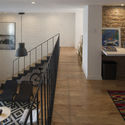
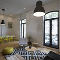
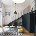
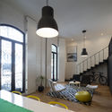
 © Imagen Subliminal © Imagen Subliminal From the architect. The project is located in the Colonia Roma, a historic neighbourhood in the central sector of Mexico City. La Roma developed in the 19th century as one of the first extensions of the city centre, with an orthogonal grid of large houses inhabited by the upper classes of the city. With the emergence of suburban life in the 50s, la Roma decreased its population throughout the second half of the 20th century, getting to its worst with earthquake of 1985.  © Imagen Subliminal © Imagen Subliminal Due to the location of la Roma in what once was Lake Texcoco, the subsoil is highly muddy, so seismic waves are amplified; thus, during the strong earthquake of 85, la Roma was one of the more affected areas of the city: many buildings collapsed, and many of those which resisted were abandoned by its inhabitants because of their structural damage or because of the fear that the buildings would not resist another earthquake.  © Imagen Subliminal © Imagen Subliminal  Plan Plan  © Imagen Subliminal © Imagen Subliminal The neighbourhood became deeply deteriorated, with high levels of insecurity and abandoned buildings, until its recent re-emergence as one of the most active areas of the city, filled with art galleries, small restaurants, cafés and young people occupying again its streets and public areas.  © Imagen Subliminal © Imagen Subliminal  Plan Plan  © Imagen Subliminal © Imagen Subliminal The project seeks to explore new possible configurations within the framework of the spatial distribution that allows the existing space. The intervention acts on the horizontal planes, divi- ding the space into two. An area of rooms with low ceilings, of small and cozy spaces and a spacious public area with double height. Two rooms, a studio relate to a unique space containing the living room, dining room and kitchen. A simplification of the spatial structure of the apartment is sought as a tool to allow a clear reading of the main space and their relationship with the city.  © Imagen Subliminal © Imagen Subliminal This posting includes an audio/video/photo media file: Download Now |
| 13 Spectacular Living Roofs in Detail Posted: 15 Jan 2017 08:00 AM PST  © Paul Warchol © Paul Warchol In Le Corbusier's 5 points of architecture, he advocates the inclusion of flat roofs hosting roof gardens, providing valuable outdoor space for the inhabitants of the building in order to replace the ground lost to the construction of the building. But while this acknowledgement of outdoor space was important for people, Le Corbusier's sculptural concrete roof gardens were little consolation to the non-human flora and fauna that were displaced by his works. Recent improvements in our understanding of ecosystems and the environment, as well as a better scientific understanding of the needs of plants, have changed this dramatically. In the past few decades, green roofs and living roofs have exploded in popularity, and now adorn every kind of building--from small private houses to the gigantic surface of Barclay's Center in Brooklyn. We've collected together some excellent examples of these living roofs, including the structural detailing that makes them possible. Read on for 13 spectacular green roofs that achieve environmental benefits including reduced stormwater runoff, and reductions in energy use and the heat island effect.  © Paul Warchol © Paul Warchol  Lakeside Retreat / GLUCK+ Lakeside Retreat / GLUCK+ + House for Trees / Vo Trong Nghia Architects  © Hiroyuki Oki © Hiroyuki Oki  House for Trees / Vo Trong Nghia Architects House for Trees / Vo Trong Nghia Architects + Vias Cultural Center / Estudio SIC  © Esaú Acosta © Esaú Acosta  Centro Creación Joven Espacio Vias / Estudio SIC Centro Creación Joven Espacio Vias / Estudio SIC + House at León / ALARCÓN + ASOCIADOS  © Cortesía de Alarcón + Asociados © Cortesía de Alarcón + Asociados  Casa en León / Alarcón + Asociados Casa en León / Alarcón + Asociados + House C / Hiroshi Nakamura & NAP  © Hiroshi Nakamura & NAP © Hiroshi Nakamura & NAP  Casa C / Hiroshi Nakamura & NAP Casa C / Hiroshi Nakamura & NAP + Galeria Mario Sequeira / Carvalho Araújo  © Pedro Lobo © Pedro Lobo  Galería Mario Sequeira / Atelier Carvalho Araújo Galería Mario Sequeira / Atelier Carvalho Araújo + Cubierta Verde / Cardoso + Zúñiga  © Luis Alonso © Luis Alonso  Cubierta Verde / Cardoso + Zúñiga Cubierta Verde / Cardoso + Zúñiga + Senior Citizen Community Center / F451 Arquitectura  © José Hevia © José Hevia  Senior Citizen Community Center / F451 Arquitectura Senior Citizen Community Center / F451 Arquitectura  © José Hevia © José Hevia  Casa OS / Nolaster Casa OS / Nolaster  © RPBW © RPBW  Vulcano Buono / Renzo Piano Vulcano Buono / Renzo Piano  © Lluís Ros / Optical Adiction © Lluís Ros / Optical Adiction  Villa Bio / Enric Ruiz Geli Villa Bio / Enric Ruiz Geli + Line of Work / Jill Anholt Studio  © Martin Tessler © Martin Tessler  Line of Work / Jill Anholt Studio Line of Work / Jill Anholt Studio + Sports Pavilion / Filipe Brandão and Nuno Sanches  © Nuno Sanches © Nuno Sanches  Pabellón de Deporte / Felipe Brandão y Nuno Sanches Pabellón de Deporte / Felipe Brandão y Nuno Sanches Check out more great projects with green roofs here. This posting includes an audio/video/photo media file: Download Now |
| Detail: Washrooms, Restrooms, Bathrooms, Lavatories, and Toilets Posted: 15 Jan 2017 06:00 AM PST  Besides the kitchen, the bathroom often takes top priority when building or renovating a home. However, choosing a look is not always easy, so here we have gathered 13 stunning bathrooms from previously published projects to provide inspiration in your own designs. Each is filled with inspiring ideas for your own project; from relaxing tubs to sleek showers, one of these bathrooms is sure to suit your style. The first steps in the evolution of the physical space of the bathroom that we know of today occurred in Scotland, where the first rustic latrines were constructed, and in Pakistan, where systems of pipes of cooked mud embedded in brick constructions have been found. These innovations date back to 3000 BC, later evolving into the first vats, toilets and ceramic pipes of the Minoan nobility, then to the copper plumbing of the Egyptians (who used their baths to celebrate religious ceremonies), then to the Romans, who transformed personal hygiene into a social act with public baths, covered with tiles. During the middle ages, a widespread lack of concern for hygiene arose, but plumbing systems resurfaced in the early seventeenth century - although some of this era's most impressive constructions, such as the palace of Versailles, did not include bathrooms. The early industrial revolution in England also did not contribute much, since the rapidity of urbanization and industrialization caused an overcrowding that was very difficult to control. It was only in the 1830s that an outbreak of cholera in London forced the authorities to launch a campaign to incorporate sanitary facilities into homes, taking the first step towards the toilets with cisterns that we use today. Today the bathroom as a space has gone beyond its purely hygienic function and has entered into an exclusive area of its own design. Now, regardless of whether you are a bath person or strictly a shower person, these 13 awe-inducing bathrooms take daily cleansing to a whole new level. + Returning Hut / FM.X Interior Design  © WU Yong-Chang © WU Yong-Chang + Takapuna House / Athfield Architects  Takapuna House / Athfield Architects. Image © Simon Devitt Takapuna House / Athfield Architects. Image © Simon Devitt  Casa W / 01Arq . Image © Mauricio Fuertes Casa W / 01Arq . Image © Mauricio Fuertes + Tigh Port na Long / Dualchas Architects  Tigh Port na Long / Dualchas Architects . Image © Andre Lee Tigh Port na Long / Dualchas Architects . Image © Andre Lee + Caterpillar House / Sebastián Irarrázaval  Casa Oruga / Sebastián Irarrázaval Delpiano . Image © Sergio Pirrone Casa Oruga / Sebastián Irarrázaval Delpiano . Image © Sergio Pirrone + Refugi Lieptgas / Georg Nickisch + Selina Walder  © Ralph Feiner © Ralph Feiner  Courtesy of rzlbd Courtesy of rzlbd + Casa L / Serrano Monjaraz Arquitectos  Casa L / Serrano Monjaraz Arquitectos. Image © Jaime Navarro Casa L / Serrano Monjaraz Arquitectos. Image © Jaime Navarro + Can Manuel d'en Corda / Marià Castelló + Daniel Redolat  Can Manuel d'en Corda / Marià Castelló + Daniel Redolat . Image © Estudi Es Pujol de s'Era Can Manuel d'en Corda / Marià Castelló + Daniel Redolat . Image © Estudi Es Pujol de s'Era + Apartment Refurbishment in Pamplona / Iñigo Beguiristain  JA Rehabilitación de departamento en Pamplona / Iñigo Beguiristáin . Image © Iñaki Bergera JA Rehabilitación de departamento en Pamplona / Iñigo Beguiristáin . Image © Iñaki Bergera + Grow / APOLLO Architects & Associates  Grow / APOLLO Architects & Associates . Image © Masao Nishikawa Grow / APOLLO Architects & Associates . Image © Masao Nishikawa + Fagerstrom House / Claesson Koivisto Rune  Vivienda Fagerstrom / Claesson Koivisto Rune . Image © Åke E:son Lindman Vivienda Fagerstrom / Claesson Koivisto Rune . Image © Åke E:son Lindman + House On The River Reuss / Dolmus Architects  Casa en el río Reuss / Dolmus Arquitectos. Image © Roger Frei Casa en el río Reuss / Dolmus Arquitectos. Image © Roger Frei Need more inspiration? Check out our Pinterest bathroom board, and remember you can find all the latest materials by checking out our Product Catalog. This posting includes an audio/video/photo media file: Download Now |
| The Dunn House / The Practice of Everyday Design Posted: 15 Jan 2017 05:00 AM PST  © Arnaud Marthouret © Arnaud Marthouret
 © Arnaud Marthouret © Arnaud Marthouret From the architect. Our clients, a young married couple, purchased a two and a half story historic home in Parkdale, Toronto. The house had previously been subdivided into three apartments that they wished to convert back into a single family dwelling to accommodate their future family. They wanted a friendly, open concept house that would allow them to entertain anything from dinner parties to sports viewing. The design strategy was to open up the common areas so that everyone could more easily be connected. A variety of nooks were created throughout the house which serve as both reading and hangout spaces.  © Arnaud Marthouret © Arnaud Marthouret The front of the house was largely left intact. Some minor repairs were done to the brickwork and new windows were installed that respect the historic character of the house. The interior was completely gutted and a new, underpinned basement was dug out. An extension, clad in black aluminum to contrast it from the existing house, was constructed in the back. Between this addition and the original house is a load-bearing brick wall which was stripped bare on the inside, white washed, and pierced to create passages between the new and the old.  © Arnaud Marthouret © Arnaud Marthouret  © Arnaud Marthouret © Arnaud Marthouret The front entrance opens onto a large living-dining-room space and a kitchen beyond. A stair, lined with a large wooden bookcase, leads up to a double-height family room and a wood-clad structure housing two bedrooms and a bathroom. Above these rooms is a cozy loft accessible by ladder and which overlooks the double-height space below. Through an opening in the brick wall is the master bedroom suite overlooking the garden below.  © Arnaud Marthouret © Arnaud Marthouret  Section Section  © Arnaud Marthouret © Arnaud Marthouret Product Description: The original rear brick facade was left exposed and painted white, emphasizing the passage between the old house and the new addition.  © Arnaud Marthouret © Arnaud Marthouret This posting includes an audio/video/photo media file: Download Now |
| Posted: 15 Jan 2017 04:00 AM PST  We would like to take a second to focus on the wonderful, yet often overlooked, inner courtyard. The inner courtyard is essentially a "contained outside space" made up of transparent walls, and a well thought-out drainage system is a must. Other elements such as furnishings, decks, vegetation, stairs, water are then added, complicating the space created. The inner courtyard also plays a role in the building's layout; in most cases it functions as the central point from which the other rooms and functions of the project are organized, giving them air and light when the façade openings are not enough. Here is our selection of 13 stunning inner courtyards of houses and buildings that we have previously published on our site.   + House Quinta Do Carvalheiro / GSMM Architetti 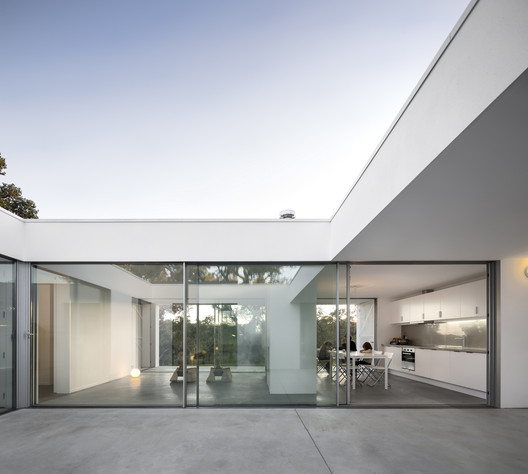 Casa Quinta Do Carvalheiro / GSMM Architetti . Image © FS + SG Casa Quinta Do Carvalheiro / GSMM Architetti . Image © FS + SG  Casa W / 01Arq . Image © Mauricio Fuertes Casa W / 01Arq . Image © Mauricio Fuertes + Residence In Legrena / Thymio Papayannis and Associates  Residencia en Legrena / Thymio Papayannis and Associates . Image © Charalampos Louizidis Residencia en Legrena / Thymio Papayannis and Associates . Image © Charalampos Louizidis + Chilean House / Smiljan Radic  Casa Chilena 1 y 2 / Smiljan Radic . Image © Gonzalo Puga Casa Chilena 1 y 2 / Smiljan Radic . Image © Gonzalo Puga + Evangelical Temple in Terrassa / OAB  Templo Evangelico en Terrassa / OAB . Image © Alejo Bagué Templo Evangelico en Terrassa / OAB . Image © Alejo Bagué 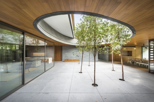 The Wall House / FARM . Image © Bryan van der Beek & Edward Hendricks The Wall House / FARM . Image © Bryan van der Beek & Edward Hendricks + Spa Querétaro / Ambrosi I Etchegaray  Spa Querétaro / Ambrosi I Etchegaray . Image © Luis Gordoa Spa Querétaro / Ambrosi I Etchegaray . Image © Luis Gordoa + Casa SL / Llosa Cortegana Arquitectos  Casa SL / Llosa Cortegana Arquitectos . Image Courtesy of Llosa Cortegana Arquitectos Casa SL / Llosa Cortegana Arquitectos . Image Courtesy of Llosa Cortegana Arquitectos + Bamboo Courtyard Teahouse / Harmony World Consulting & Design  Casa del Té de Bambú / Harmony World Consulting & Design . Image © T+E Casa del Té de Bambú / Harmony World Consulting & Design . Image © T+E  Casa PR / Bach Arquitectes . Image © Lluís Casals Casa PR / Bach Arquitectes . Image © Lluís Casals + Roku Museum / Hiroshi Nakamura & NAP  Museo Roku / Hiroshi Nakamura & NAP . Image © Masumi Kawamura Museo Roku / Hiroshi Nakamura & NAP . Image © Masumi Kawamura + Casa in Palmela / Pedro Rogado + Catarina Almada  Casa en Palmela / Pedro Rogado + Catarina Almada . Image © Thorsten Humpel Casa en Palmela / Pedro Rogado + Catarina Almada . Image © Thorsten Humpel + Joanopolis House / Una Arquitetos  Casa en Joanopolis / Una Arquitetos . Image © Bebete Viégas Casa en Joanopolis / Una Arquitetos . Image © Bebete Viégas Find more inspiration by visiting our Pinterest boards, and remember you can find all the latest materials by checking out our Product Catalog. This posting includes an audio/video/photo media file: Download Now |
| 16 CAD Files of Skylights and Light Tubes Available for Your Next Project Posted: 15 Jan 2017 01:30 AM PST 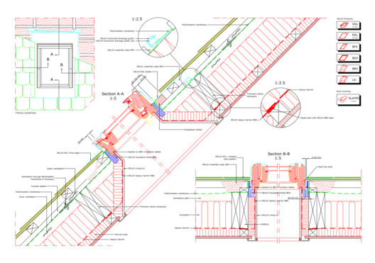 GGL single standard install into natural slate © Velux GGL single standard install into natural slate © Velux In the spirit of supporting our readers' design work, the company Velux has shared a series of .DWG files with us of their different roofing windows models. The files can be downloaded directly from this article and include great amounts of detail and information. Check the files below, separated into 'Pitched Roofs', 'Flat Roofs' and 'Light Tube'. Pitched Roofs+ Pitched Roofs / Basic Installation  GGL single standard install into natural slate © Velux GGL single standard install into natural slate © Velux  GGL single standard install into low profiled tile © Velux GGL single standard install into low profiled tile © Velux + Pitched Roofs / Multiple Installations  GGL combi standard install into natural slate © Velux GGL combi standard install into natural slate © Velux  GGL coupled standard install into plain tile © Velux GGL coupled standard install into plain tile © Velux  GGL combi standard install into profiled tile © Velux GGL combi standard install into profiled tile © Velux Flat Roofs+ Flat Roofs / CFP-CVP Extension  CVPCFP extension install into timber flat roof © Velux CVPCFP extension install into timber flat roof © Velux + Flat Roofs / CFP-CVP Standard  CVPCFP standard install into timber flat roof © Velux CVPCFP standard install into timber flat roof © Velux Light TubeThese are designed to provide natural light in corridors, stairwells, bathrooms and closets, where installing a skylight isn't possible. + Sun Tunnel / Residential Tunnel  TCR TCF © Velux TCR TCF © Velux  TLF flexible sun tunnel into slate © Velux TLF flexible sun tunnel into slate © Velux  TLR rigid sun tunnel into slate © Velux TLR rigid sun tunnel into slate © Velux  TWF flexible sun tunnel into tile © Velux TWF flexible sun tunnel into tile © Velux  TWR rigid sun tunnel into tile © Velux TWR rigid sun tunnel into tile © Velux + Sun Tunnel / Industrial  TTK TTC Hard finished ceiling © Velux TTK TTC Hard finished ceiling © Velux  TTK TTC Hard finished ceiling © Velux TTK TTC Hard finished ceiling © Velux  TOC Open ceiling installation © Velux TOC Open ceiling installation © Velux  TTK TTC Tile ceiling installation © Velux TTK TTC Tile ceiling installation © Velux *Find more related products here. This posting includes an audio/video/photo media file: Download Now |
| Spazio Lilt / Ottavio Di Blasi & Partners Posted: 15 Jan 2017 01:00 AM PST  © Beppe Raso © Beppe Raso
 © Beppe Raso © Beppe Raso From the architect. The new center, designed by OTTAVIO DI BLASI & Partners (Milan), has an area of 2,700 square meters. It represents a point of excellence of the Health Care Network of Piedmont hosting Prevention and Rehabilitation facilities managed by LILT (Italian league against Cancer) SPAZIO LILT is a two-storey building conceived around a central distribution core articulating two juxtaposed curved wings. It is not just the container of LILT activities but it is also its mirror by embodying the image and values of the League.  Scheme Scheme • An "open house" and a landmark for the entire city of Biella- The modern curved shape make it easily accessible for all the citizens and is a reference point for the whole community. In addition to LILT offices, it houses surgeries, the prevention center, the rehabilitation gym, a conference room and hosts a number of volunteers associations operating in the area. • A friendly and efficient building – Easy access, immediacy guidance and the quality of services offered play a major role to the perception of warmth and efficiency that characterize LILT – SPAZIO LILT is a place where prevention and treatment coexist as two aspects of the same human reality.  © Beppe Raso © Beppe Raso • A place where the link between health and environment is fully expressed by the relationship between architecture, light and efficient and green environment. SPAZIO LILT is energy efficient and built with environmentally friendly and recyclable materials. The unique features of the building are due to the glazed terracotta façade in red and white, the colors of LILT. The large terracotta louvers shield the building from direct sunlight and provide privacy to clinics. The choice of terracotta has to do with the durability and the self-clean ability of the surfaces.  © Beppe Raso © Beppe Raso In this project, the emotional value and the technical features of the louvers façade are an unicum in which the brightness of the surfaces is most fitting with the bright and positive atmosphere that inspires the entire building. The open floor plan and the curved shape of the facades of the building and amplify the dynamism that characterize it in an original way.  © Beppe Raso © Beppe Raso Product Description. The custom Glazed terracotta façade give the unique features of the building. Glazed terracotta profiles are about 150/160 cm long.- They are assembled on an aluminum frame holding louvers of two different sizes ( 21 cm end 8 cm) . An aluminum tube inside the hollow profile of every terracotta louver secures the structure. Glazed terracotta provides bright looking and self-cleaning features. The ventilated façade ensure privacy and shelter sunrays. The empty space between the terracotta skin and the building façade host maintenance walkway.  © Beppe Raso © Beppe Raso This posting includes an audio/video/photo media file: Download Now |
| The 10 Best Global* Architecture Projects of 2016 (*Asia, Africa and South America Not Excluded) Posted: 15 Jan 2017 12:00 AM PST 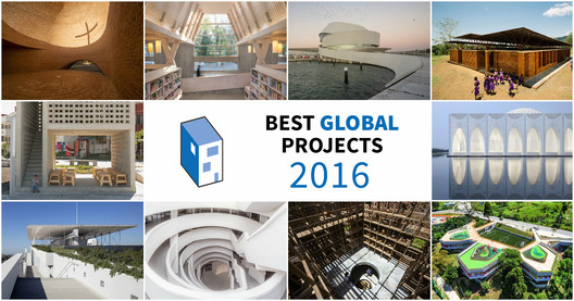 As the common phrase attests, "history is written by the victors." We therefore know that the story of the West is that of Europe and the United States, while the other actors in world history are minimized or invisible: it happened to the Chinese and Japanese during World War II, to the Ottoman Empire in sixteenth-century Europe, and to racial majorities in the common reading of Latin American independence. The same thing happens in architecture. The current boom of the Global South is based not only on new work, but rather on the recognition of an invisible architecture which was apparently not worthy of publication in the journals of the 1990s. The world stage has changed, with the emergence of a humanity that is decentralized yet local; globalized, yet heterogeneous; accelerated, yet unbalanced. There are no longer red and blue countries, but a wide variety of colors, exploding like a Pollock painting. This serves as a preamble to consider the outstanding projects of 2016 according to the British critic Oliver Wainwright, whose map of the world appears to extend from New York in the West to Oslo in the East, with the exception of Birzeit in Palestine. The Global South represents more than 40% of the global economy and already includes most of the world's megacities, yet has no architecture worthy of recognition? We wanted to highlight the following projects in order to expand the western-centric world view, enabling us to truly comprehend the extent of architectural innovation on a global scale. Lideta Market / Vilalta Arquitectura |
| You are subscribed to email updates from ArchDaily. To stop receiving these emails, you may unsubscribe now. | Email delivery powered by Google |
| Google Inc., 1600 Amphitheatre Parkway, Mountain View, CA 94043, United States | |










Nema komentara:
Objavi komentar