Arch Daily |
- Santa María de Vilanova de la Barca / AleaOlea architecture & landscape
- Vizor / STUDIO11
- LESS / AAVP Architecture
- Grown House / FHHH FRIENDS
- Morphosis, Teeple Architects Among Firms to Lead OCAD University's Expansion in Toronto
- Belsize Architects Creates Pavilion Residences for Oxford University Students
- Boarding School in Nimes / MDR Architectes
- Ateliers 2/3/4/ Unveils Paris Garden Tower
- The Noble Simplicity of Peter Zumthor's Allmannajuvet Zinc Mine Museum
- Essay 4 Spatial Prosthesis / MANADA Architectural Boundaries
- 10 Project Details That Show How to Make Stunning Storage Spaces
| Santa María de Vilanova de la Barca / AleaOlea architecture & landscape Posted: 22 Jan 2017 09:00 PM PST .jpg?1484713680) © Adrià Goula © Adrià Goula
.jpg?1484713568) © Adrià Goula © Adrià Goula .jpg?1484713605) © Adrià Goula © Adrià Goula .jpg?1484714554) Diagram Diagram The Old Church of Vilanova de la Barca The Old Church of Vilanova de la Barca (Lleida, Spain) is a 13th-century Gothic building that was partially demolished in 1936 because of the bombings of Spanish Civil War. Since then, the church was in a general state of ruin preserving just its apse, some fragments of the naves and the western façade. The main aim of the project was the restoration of the original appearance of the church and its transformation in a new multi-purpose hall. The most important part of this intervention has focused on the covering elements.The project establishes a new brick façade based on a latticework texture and a new gabled Arab tile roof. The whole system is conceived as a new architectural ceramic shell that is gently supported on the remains of the ancient walls. From outside, the perception of the old church is restored, meanwhile inside the building, the project intensifies the entrance of natural light due to the new windows, the new proposed patio or thanks to the white rendering walls that have been introduced. Thus, the project establishes an architectural dialogue between the old and the new, past and present. .jpg?1484714502) Isometry Isometry .jpg?1484714575) Sketch Sketch .jpg?1484713641) © Adrià Goula © Adrià Goula .jpg?1484714803) Detail Detail .jpg?1484713656) © Adrià Goula © Adrià Goula This posting includes an audio/video/photo media file: Download Now |
| Posted: 22 Jan 2017 07:00 PM PST  © Dmitry Tsyrencshikov © Dmitry Tsyrencshikov
 © Dmitry Tsyrencshikov © Dmitry Tsyrencshikov From the architect. If you look at the society in Belarus you can still find many traces of Soviet era present. This is embedded both in people's way of thinking and lifestyle as well as architectural environment: the interior of the subway we take was designed in the 70s and 80s, and the streets are full of modernist buildings of those times. However, the attitude to the significance of this artistic phenomenon is filled with disdain. Such speculations and the interest in the aesthetics of the Soviet and international modernism led us to the idea of creating a space which inherits local modernist tradition and demonstrates its stylistic significance.  Isometry Isometry The interior of Vizor company is a reinterpretation of Soviet design and architecture of the 70s and 80s of the 20th century where we focus public attention on the aesthetic value of this trend.  © Dmitry Tsyrencshikov © Dmitry Tsyrencshikov In general the interior is filled with light and clear space extending and flowing from one volume to another. The floor designed in the same material and the red ceiling are the main elements shaping the interior. The floor represents the spirit of Soviet public buildings embedded into a pattern of small tiles of different geometric shapes. The ceiling with open communications is painted in a complex accent color. The entrance is designed in the form of a rounded lobby executed with the help of light-rose glass blocks. The entrance unit is topped with a strap of green hanging plants. As you exit the lobby you are welcomed by a dimensional inscription of the company name made of brass sheets. The style, font and material were chosen based on the inscriptions of Soviet underground stations. Standing right at the entrance we hit the main axis of the entire space.  © Dmitry Tsyrencshikov © Dmitry Tsyrencshikov Long vista is supported by working areas proportions as well as the rhythm of hanging spherical lamps; it concentrates in the arch and ends with a black point. The effect of such method is almost sacred. The central interior panel is located perpendicular to this axis. The ceramic modules were analyzed by comparison with analogues and designed into the general composition. A two-tone wall cover complements the main area. One of the zones is formed by low partitions in the style of Le Corbusier handrails.  © Dmitry Tsyrencshikov © Dmitry Tsyrencshikov The walls of the second workspace are finished with wood panels, just like the facades of the kitchen. Kitchen stylistics is complemented by Scandinavian furniture and abstract composition based on the modernist art of the last century. WC facilities organically convey modernity and spirit of the 30s. We also used specially designed ceramic elements and wash-basins in the proportions of those years. The interior is filled with neatly selected techniques and details, but at the same time looks light and airy. This work is a reinterpretation of the original local architectural and design tradition.  © Dmitry Tsyrencshikov © Dmitry Tsyrencshikov This posting includes an audio/video/photo media file: Download Now |
| Posted: 22 Jan 2017 06:00 PM PST  © Luc Boegly © Luc Boegly
 © Luc Boegly © Luc Boegly Urban amplifier In 1891 the city of Paris registered this 100-meter passageway, open two years prior on the property of sieur Delessert, between the Rue Pierre Dupont and the Quai de Valmy. On the eastern end lies the Canal Saint-Martin, today an area for strolling and recreation, but in that period a thoroughfare leading to the Bassin de la Villette, the fourth largest industrial port after Marseille, Le Havre and Bordeaux. The activity of the port was intense and traces of it persist in some of the enormous industrial buildings, i.e., the Cité Clémentel, the former power station for the Compagnie d'Air Comprimé, among other more discreet buildings facing the street. The intervention embraces the context as a blend of populations, memories, and activities along with a wide variety of building types in a single area.  © Luc Boegly © Luc Boegly  Site Plan Site Plan The operation includes a gymnasium, sold off plan to the city of Paris, where 69 units of social housing are located. This intervention seeks first to achieve a hybridization of the grand industrial scale found in the area with the private scale of the housing unit. The building stands along the Delessert passageway, forming the angle of the two streets before turning back toward the rue Pierre Dupont with the use of a loggia motif on five levels built in larch wood, without there being any intention of erasing or diminishing its presence or hiding the major changes brought on by its arrival on this empty lot of the neighborhood, a bucolic vacant space long occupied by a prefabricated structure and an inflatable structure housing abandoned tennis courts. It has been difficult for the neighborhood to bid farewell to this last little piece of the country in Paris, and the densification of an open space explains the group lawsuit brought against the project by 180 neighbors recorded during the waiting period for the building permit. This densification nevertheless includes a diversification of the program that benefits the entire neighborhood, and an obligation of a mixed-use facility registered with the Local  © Pierre L'Excellent © Pierre L'Excellent Planning Program (PLU). Located along the Passage Delessert in a volume partially underground, the facility generates constraints that have given the project its specific nature. Most of the housing units stand above the structure of the gymnasium, which is a series of arcades spanning a distance of more than 20 meters, whose beams form the steel plates for the first level of housing, and determine the framework for the upper-level load bearing walls. A vertical fracture separates the first gymnasium/housing complex from a smaller parcel, which is comprised of housing units in the upper stories as well as a series of technical areas on the ground floor: guardian reception, diverse storage areas, access to parking garage, etc. Access to each housing unit is an individual promenade that starts in the main hall, open to the semi-private garden, according to a layout inspired by the ones often found in Parisian apartment buildings dating from the 1960s and 70s―the golden age for such constructions. Marble laid out in a herringbone pattern welcomes visitors and occupants, in an expression of the desire to offer a level of quality in the social housing sector usually reserved for upscale housing programs.  © Luc Boegly © Luc Boegly  Program Program  Program Program The utilization of raw materials in most of the circulations made it possible to make occasional use of symbolically luxurious materials, just as durable as stone but without the premium to pay. Once beyond the entry hall, occupants access their apartments by taking a long passageway placed five meters out from the back façades. The final threshold, a short individual footbridge will provide access to a housing unit, always with a shotgun floorplan, and a landscaped terrace placed over the base formed by the gymnasium, for all the apartments on the building's second level. The superstructure of metal passageways is a landscape in itself in the heart of the city block, a floating balcony overlooking a garden designed by Atelier Roberta. Each housing unit is appointed with an individual loggia, whose variable depth is calculated to allow occupants their legitimate degree of privacy. On the ground floor, metal mesh filters the light to avoid disturbing the practice of sports, reduced to the exposure of sports practitioners and dancers to the view of passersby.  © Luc Boegly © Luc Boegly The many loggias, passageways, footbridges, stairs, and garden buffer areas take privacy into account yet increase the occasions for transparency and visual porosity throughout, taking the risk of going against a contemporary desire for new buildings to totally isolate occupants from the each other's view. Access to the half-buried rooms is enhanced and facilitated by a central stairway fully transparent in all four cardinal directions. The people living in the terrace houses become a kind of show, unfolding as the occupant strolls along his path, literally thrown into the multiple worlds of the rear courtyards and smaller courtyards filled with the rustling of diverse destinies.  © Luc Boegly © Luc Boegly Drawing inspiration more from the picturesque domestic passageways and footbridges of Jacques Tati's film "Mon Oncle", and from ambiances like the one in Alfred Hitchcock's "Rear Window", the building is intended as much as a machine for living as a machine for viewing. Street, city, passersby, the heart of the city block, neighbors, everything is alternately veiled and unveiled as one moves about the site, and with these fleeting visions come increased opportunities for encounters, enhancing the diversity and energy that generate the best aspects of living in a metropolis.  Axonometric Axonometric This posting includes an audio/video/photo media file: Download Now |
| Posted: 22 Jan 2017 12:00 PM PST .jpg?1484823493) © Kyung Roh © Kyung Roh
.jpg?1484823456) © Kyung Roh © Kyung Roh From the architect. This cute house is standing in middle of old house town in Seoul, south Korea. Despite the house contains highly compressive function, we tried not to lose the taste of life by adding some redundant spaces here and there. In designing of a small house, it is usually considered that The Small house must be designed compressively as possible, so the spaces without function are discounted as wasting spaces too easily. But is function all in the house? .jpg?1484823557) © Kyung Roh © Kyung Roh In this small project, we rather focused on the factors having no function. Because we wanted to pull up value of life in this house, and thought the value of life is not comes from the function but comes from the factors have no special function, such spaces like a small garden what is good to read, and an opened roof that make feel the weather inside, Etc .jpg?1484823321) © Kyung Roh © Kyung Roh And paradoxically, the desire for the space with plentiful life make house more compressively. Because we could inject some flexibility to the spaces having no special function. A private front yard alters to the Parking lot by opening the gate. In this house, the entrance is not a space for taking off the shoes only. We aimed an entrance that occurs various events. this spacious entrance extends to the garden. .jpg?1484823373) © Kyung Roh © Kyung Roh  Section Section Between skipped floor, there are stairs and a fountain connected from the step. Despite the fountain is not necessary factor in the house, we focused on the various occurrences that can be happened by the fountain. Giving a kitty a bath, washing camping equipment, and playing with water, etc. To commune with nature, the space gets brighter by climbing up the stairs. That small opening on the wall is a door to the rooftop for kitties. That small house on rightward is the house used to be. People say "the house have grown!" .jpg?1484823505) © Kyung Roh © Kyung Roh This posting includes an audio/video/photo media file: Download Now |
| Morphosis, Teeple Architects Among Firms to Lead OCAD University's Expansion in Toronto Posted: 22 Jan 2017 08:00 AM PST  OCAD U's Sharp Centre for Design, designed by Will Alsop. Image via Wikimedia Commons user Taxiarchos228. Licensed under CC-BY-3.0. OCAD U's Sharp Centre for Design, designed by Will Alsop. Image via Wikimedia Commons user Taxiarchos228. Licensed under CC-BY-3.0. The Ontario College of Art and Design University (OCAD U) has selected firms Morphosis Architects, Teeple Architects, and Two Row Architect to manage the design and execution of the university's new Creative City Campus (CCC) expansion project. The project aims to extend and reinvigorate the campus core along McCaul Street in downtown Toronto and will include approximately 55,000 square feet of new construction, in addition to the renovation of 95,000 square feet of existing campus space. Having collaborated frequently on previous projects, acclaimed firms Morphosis and Teeple Architects will be joined by local practice Two Row Architect, a 100-percent native owned firm based on the Six Nations - Canada's largest First Nations reserve. The firm will help ensure a strong indigenous presence throughout the project, particularly through the creation of the Indigenous Visual Culture and Student Centre. The CCC project is partly funded by a $27-million investment from Ontario's Ministry of Training, Colleges, and Universities, which was granted to OCAD U in early 2016. Latest technology and state-of-the-art digital fabrication will contribute to the modernization of classrooms and learning spaces, offering new avenues of experiential learning and social interaction.
The Creative City Campus project is expected to be completed during the OCAD U's 2020/2021 academic year. News via: Morphosis Architects. Bortolotto Unveils Design for Rosalie Sharp Pavilion in Toronto This posting includes an audio/video/photo media file: Download Now |
| Belsize Architects Creates Pavilion Residences for Oxford University Students Posted: 22 Jan 2017 06:00 AM PST  Courtesy of Belsize Architects Courtesy of Belsize Architects Belsize Architects has released the plans for 6 Pavilions, a new student accommodation project that will form a part of the University College's larger masterplan in north Oxford. To be built on the site of a Victorian residential home, the project will feature 30 units arranged within six pavilions around a central courtyard. Communal areas of the pavilions will be connected at the ground level.  Courtesy of Belsize Architects Courtesy of Belsize Architects Each pavilion will contain four-, five-, or six-bedroom units, with private bedrooms and studies alongside communal living and recreation space.  Courtesy of Belsize Architects Courtesy of Belsize Architects
 Courtesy of Belsize Architects Courtesy of Belsize Architects  Courtesy of Belsize Architects Courtesy of Belsize Architects In response to the site's location in the North Oxford Suburb Conservation Area, the buildings will be low-rise.  Courtesy of Belsize Architects Courtesy of Belsize Architects The project received planning permission is October of 2015, and is currently "ready to go on the site." News via: Belsize Architects. This posting includes an audio/video/photo media file: Download Now |
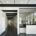
| Boarding School in Nimes / MDR Architectes Posted: 22 Jan 2017 05:00 AM PST  © Mathieu Ducros © Mathieu Ducros
 © Mathieu Ducros © Mathieu Ducros From the architect. The boarding house project is a continuation of Philippe Lamour high school: then its design takes into account the logical organization of the existing facilities and must ensure consistency and overall harmony. The area where the building fits, places the project as a figurehead of this big island, position both strategic and symbolic: the facilities plays a special role because it has to be the link between the exterior and the interior. Shared by several schools of Nîmes and physically attached to Philippe Lamour high school, its reception, conviviality and reference character must be emphasized. The precise location of the project reflects this link between public space and high school territory.  First, Second and Third Floor Plan First, Second and Third Floor Plan Regarding the public space, the project takes into account the existing profile of the high school and particularly the space of the courtyard and of the large canopy which protects it: it allows complementing and strengthening the perspective to give a steep slope to the facade of the high school overlooking the avenue Allende by structuring the currently vacant space of the parking, where the current bicycle sheds are not large enough to do it.  © Mathieu Ducros © Mathieu Ducros The project consists of a ground floor volume extending lengthwise following the south shore of the land area: by ensuring the building base, this ring beam reflects both the protective and sturdy character by its imprinted rough concrete monolith aspect. The three floors are linked within a flexible volume, lightened by a punctually perforated immaculate wall panel. It bends and moves towards the crossroad resulting in a real call from the general entrance of the high school.  © Mathieu Ducros © Mathieu Ducros This bending allows controlling the privacy: the building courteously stands aside from the caretaker dwelling existing to the East of the site to open up its view and allows it to benefit from the landscaped area and from the light from the southwest while affording protection against the boarding house. This torsion of the room bodies to the North, also allows a better orientation of the accommodation units and protecting them from the general entrance of the high school.  © Mathieu Ducros © Mathieu Ducros Regarding the high school, the project is located following the teaching buildings: it respects their overall size and renews perfectly their equidistance and the rhythm which links them. The area between the boarding house and the first building of the high school allows redefining totally the circulation space currently occupied by the bicycle sheds converting it into a landscaped area similar to the one existing in the center of the high school. The pedestrian walks perpetuate the link crossing the diverse teaching entities going to the sports facilities.  © Mathieu Ducros © Mathieu Ducros Introduced by a gate from the high school courtyard, the pedestrian access to the boarding house leads to a generous courtyard protected from the elements by the part of the floor volume on stilts: this protection largely opens the entrance facade showing clearly its access. The entrance hall benefits from abundant permeability and light, completed by a facade largely open to the inner landscaped area on the high school side: this buffer area has a good orientation to the South and a preserved swale planted with bamboos, which protects it from the wind and provides privacy.  Section Section The common areas also benefit from crossed views and are flooded with natural light due to the arrangement of openings, more moderate on the street side, more generous on the inner side. The household has a lot of subareas: generously open to the landscape buffer area to the South overlooking a large terrace, it features a more "cosiness" area towards the TV lounge.  © Mathieu Ducros © Mathieu Ducros The access to the upper floor leads to a circulation area designed on the same pattern and on which the shared areas open featuring inner large windows. Thus the natural light enters this warm crossing center.  © Mathieu Ducros © Mathieu Ducros Pedestrian walkways to the rooms are open at their ends with entirely glazed wooden frames serving as an exit to the escape stairs: the natural light coming from East and West in theses walkways reduces the effect of corridor.  © Mathieu Ducros © Mathieu Ducros The rooms benefit from natural light thanks to a good size central window with glass wall. The Corian facade cladding is studied for privacy and for protecting from strong sunshine. The perforations of this skin, arranged according to the orientations bring a pleasant subdued lighting.  © Mathieu Ducros © Mathieu Ducros The rooms are rational but their atmosphere is softened with simple, adapted and customizable contemporaneous furniture. Only the adapted rooms have shower rooms for persons with reduced mobility which still benefit from a large size area in front of the sinks and of a built shower block.  Elevation Elevation This posting includes an audio/video/photo media file: Download Now |
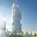
| Ateliers 2/3/4/ Unveils Paris Garden Tower Posted: 22 Jan 2017 04:00 AM PST  Courtesy of Ateliers 2/3/4/ Courtesy of Ateliers 2/3/4/ Ateliers 2/3/4/ has unveiled its design for Jardins de l'Arche Tower, a 200-meter-tall building in Nanterre La défense, Paris. An effort to "extend the great historical axis of Paris," the 65,000-square-meter tower will feature a series of hanging gardens around superimposed volumes.  Courtesy of Ateliers 2/3/4/ Courtesy of Ateliers 2/3/4/
 Courtesy of Ateliers 2/3/4/ Courtesy of Ateliers 2/3/4/  Courtesy of Ateliers 2/3/4/ Courtesy of Ateliers 2/3/4/ In total, the tower will feature a 700-bed hotel, swimming pool, spa, conference center, viewpoint, restaurants, offices, co-working space, fab-lab space, and fitness space.  Courtesy of Ateliers 2/3/4/ Courtesy of Ateliers 2/3/4/  Courtesy of Ateliers 2/3/4/ Courtesy of Ateliers 2/3/4/ The design considers sustainability, and aims for several certifications, like BREEAM Excellent, LEED Gold, and HQE Excellent.
News via: Ateliers 2/3/4/. This posting includes an audio/video/photo media file: Download Now |
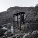
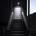
| The Noble Simplicity of Peter Zumthor's Allmannajuvet Zinc Mine Museum Posted: 22 Jan 2017 01:30 AM PST 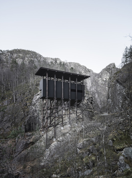 © Aldo Amoretti © Aldo Amoretti After previously documenting the Bruder Klaus Field Chapel, photographer Aldo Amoretti once again captures the grounded simplicity of Peter Zumthor, this time with images of his Allmannajuvet Zinc Mine Museum in Sauda, Norway. The three-building campus calls upon the aesthetics of the country's abandoned zinc mines from the 1800s, evoking the toilsome labor of the workers in its rough stone and exposed joint work. The museum is situated on one of Norway's National Tourist Routes and was commissioned by the state as part of an effort to increase tourism in the region. As such, the buildings are poised in and above the landscape, providing views of the natural gorge that unfold as visitors move through Zumthor's dark, shaftlike interiors. Amoretti's photos express the modesty of the project, from the blackness of the interior galleries to the thin stilts that support the buildings within their rocky surroundings. The museum structures are suspended in balance with the harsh, gray climate—a noble representation of the working conditions of the miners the project aims to memorialize.  © Aldo Amoretti © Aldo Amoretti  © Aldo Amoretti © Aldo Amoretti  © Aldo Amoretti © Aldo Amoretti  © Aldo Amoretti © Aldo Amoretti  © Aldo Amoretti © Aldo Amoretti  © Aldo Amoretti © Aldo Amoretti  © Aldo Amoretti © Aldo Amoretti  © Aldo Amoretti © Aldo Amoretti  © Aldo Amoretti © Aldo Amoretti  © Aldo Amoretti © Aldo Amoretti  © Aldo Amoretti © Aldo Amoretti
This posting includes an audio/video/photo media file: Download Now |
| Essay 4 Spatial Prosthesis / MANADA Architectural Boundaries Posted: 22 Jan 2017 01:00 AM PST  © Jaime Navarro © Jaime Navarro
 © Jaime Navarro © Jaime Navarro From the architect. Prostheses were developed by human beings with two purposes: first, to correct a damaged organ's function; second, to extend an organ's inherent capability. For the sake of exemplifying, the glasses that an optometrist produces are corrective prostheses; the frames and their different dioptric powers help the user to recover the average eyesight of 20/20. The telescope and the microscope, in contrast, are extensive prostheses—offering the possibility to see things so minute and so distant that the naked eye would be unable to distinguish.  3D Model 3D Model  3D Model 3D Model The architectural project that took place at an apartment in the Condesa neighborhood, Mexico City, is one of those projects that blur binary distinctions. By calling it Essay 4, the literary term par excellence for 'exploration', the intervention to the existing space—an apartment of style classical to the neighborhood's contemporary architecture, with apparent structural elements, double-height ceilings and a pursuit for transparency—reveals it will not be an easy approach to space. As in any essaying practice, we approach the space from different angles. It can be said that the existing space is literally enveloped to rediscover its potential. Thus, a finely articulated wood structure is assembled following the same rationale of a scaffold to conform a series of deep structures that extend the space's original function. At times the scaffold is filled out with steps; at times it holds a mezzanine fitted with bookshelves. From there, the scaffold extends to the patio to shape a service hallway which in the end rests on the wall that holds a vertical garden.  © Jaime Navarro © Jaime Navarro In other words, a scaffold was woven, one that climbs, is filled, turns, twists, swells, is left empty and is saturated with plants, to equip and activate the apartment's unarticulated spaces. The scaffold binds interior and exterior, connects levels, is solidified where privacy is needed and remains as a skeleton when pursuing transparency.  © Jaime Navarro © Jaime Navarro Just as Constant, the Dutch artist, did with his New Babylon project, in which he merely offered a scaffold structure for the users to adapt their living space, MANADA gave rise to an intervention that may well be considered both a corrective and extensive prosthesis. Corrective since there are new connections between spaces which were previously unarticulated; and extensive since the structure is equipped with different devices that allow for sitting, keeping books or hanging plants. All these prosthetic forms offer more functions to the space than those expected from a structure that is only for support. This posting includes an audio/video/photo media file: Download Now |
| 10 Project Details That Show How to Make Stunning Storage Spaces Posted: 22 Jan 2017 12:00 AM PST  One of the hallmarks of architectural sensibility is a clean, clutter-free space – "a place for everything and everything in its place." Every project requires some element where things can be neatly stored away, whether it be books, kitchen appliances, or entire furniture pieces. Solutions for these storage needs can range from invisible and out of the way, to stunning, textural centerpieces – either way adding necessary functionality to our most-used spaces. Check out this selection of ten brilliant storage spaces. House in Balsthal / PASCAL FLAMMER  House in Balsthal / PASCAL FLAMMER. Image © Ioana Marinescu House in Balsthal / PASCAL FLAMMER. Image © Ioana Marinescu  Moose Road / Mork-Ulnes Architects  Moose Road / Mork-Ulnes Architects. Image © Bruce Damonte Moose Road / Mork-Ulnes Architects. Image © Bruce Damonte  X House / Cadaval & Solà-Morales  X House / Cadaval & Solà-Morales. Image © Sandra Pereznieto X House / Cadaval & Solà-Morales. Image © Sandra Pereznieto   Loft MM / C.T. Architects. Image © Tim Van de Velde Loft MM / C.T. Architects. Image © Tim Van de Velde  Musashino Art University Museum & Library / Sou Fujimoto  Musashino Art University Museum & Library / Sou Fujimoto. Image © Daici Ano Musashino Art University Museum & Library / Sou Fujimoto. Image © Daici Ano  Flat Renovation in the Eixample of Barcelona / M2arquitectura 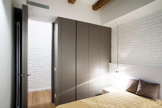 Flat Renovation in the Eixample of Barcelona / M2arquitectura. Image © Gerard García Vilarrasa Flat Renovation in the Eixample of Barcelona / M2arquitectura. Image © Gerard García Vilarrasa  Hazukashi House / ALTS Design Office  Hazukashi House / ALTS Design Office. Image © Daici Ano Hazukashi House / ALTS Design Office. Image © Daici Ano  Vertical Patio House / Estudi NAO 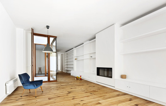 Vertical Patio House / Estudi NAO. Image © José Hevia Vertical Patio House / Estudi NAO. Image © José Hevia  Apartment Refurbishment / Anna & Eugeni Bach  Apartment Refurbishment / Anna & Eugeni Bach. Image © Eugeni Bach Apartment Refurbishment / Anna & Eugeni Bach. Image © Eugeni Bach  Enlargement of Los Alamos House / Rodrigo Piwonka Ariztía + Juan Luis Martínez Nahuel  Enlargement of Los Alamos House / Rodrigo Piwonka Ariztía + Juan Luis Martínez Nahuel. Image © Rodrigo Piwonka Enlargement of Los Alamos House / Rodrigo Piwonka Ariztía + Juan Luis Martínez Nahuel. Image © Rodrigo Piwonka  Don't forget, you can find a range of materials for your next project in our Products Catalogue. This posting includes an audio/video/photo media file: Download Now |
| You are subscribed to email updates from ArchDaily. To stop receiving these emails, you may unsubscribe now. | Email delivery powered by Google |
| Google Inc., 1600 Amphitheatre Parkway, Mountain View, CA 94043, United States | |
.jpg?1484713437)
.jpg?1484713500)
.jpg?1484713547)
.jpg?1484713568)




.jpg?1484823274)
.jpg?1484823285)
.jpg?1484823456)
.jpg?1484823310)








Nema komentara:
Objavi komentar